Lighting Design
By reading this book, you will develop the skills to perceive a space and its contents in light, and be able to devise a layout of luminaires that will provide that lit appearance.
Written by renowned lighting expert Christopher (Kit) Cuttle, the book:
explains the difference between vision and perception, which is the distinction between providing lighting to make things visible, and providing it to influence the appearance of everything that is visible;
demonstrates how lighting patterns generated by three-dimensional objects interacting with directional lighting are strongly influential upon how the visual perception process enables us to recognise object attributes, such as lightness, colourfulness, texture and gloss;
reveals how a designer who understands the role of these lighting patterns in the perceptual process may employ them either to reveal, or to subdue, or to enhance the appearance of selected object attributes by creating appropriate spatial distributions of light;
carefully explains calculational techniques and provides easy-to-use spreadsheets, so that layouts of lamps and luminaires are derived that can be relied upon to achieve the required illumination distributions.
Practical lighting design involves devising three-dimensional light fields that create luminous hierarchies related to the visual significance of each element within a scene. By providing you with everything you need to develop a design concept – from the understanding of how lighting influences human perceptions of surroundings, through to engineering efficient and effective lighting solutions – Kit Cuttle instils in his readers a new-found confidence in lighting design.
Publisher’s Note:
Lighting Design
A perception-based approach
First published 2015 by Routledge
2 Park Square, Milton Park, Abingdon, Oxon OX14 4RN
and by Routledge
711 Third Avenue, New York, NY 10017
Routledge is an imprint of the Taylor & Francis Group, an informa business
© 2015 Christopher Cuttle
The right of Christopher Cuttle to be identified as author of this work has been asserted by him in accordance with sections 77 and 78 of the Copyright, Designs and Patents Act 1988.
All rights reserved. No part of this book may be reprinted or reproduced or utilised in any form or by any electronic, mechanical, or other means, now known or hereafter invented, including photocopying and recording, or in any information storage or retrieval system, without permission in writing from the publishers.
Trademark notice: Product or corporate names may be trademarks or registered trademarks, and are used only for identification and explanation without intent to infringe.
British Library Cataloguing in Publication Data
A catalogue record for this book is available from the British Library
Library of Congress Cataloging in Publication Data
Cuttle, Christopher.
Lighting design : a perception-based approach / Christopher Cuttle. pages cm
Includes bibliographical references and index.
ISBN 978-0-415-73196-6 (hardback : alk. paper) — ISBN 978-0-415-73197-3 (pbk. : alk. paper) — ISBN 978-1-315-75688-2 (ebook) 1. Lighting,
Architectural and decorative—Design. 2. Visual perception. I. Title. NK2115.5.L5C88 2015
747’.92—dc23 2014009980
ISBN: 978-0-415-73196-6 (hbk) ISBN: 978-0-415-73197-3 (pbk) ISBN: 978-1-315-75688-2 (ebk)
Typeset in Bembo
Contents
List of figures List of tables
Acknowledgements
Introduction
1 The role of visual perception 2 Ambient illumination
3 Illumination hierarchies
4 Spectral illumination distributions 5 Spatial illumination distributions 6 Delivering the lumens
7 Designing for perception-based lighting concepts
Figures
1.1 The Checker Shadow Illusion. Squares A and B are identical
1.2 A white sheet has been drawn over the Checker Shadow Illusion, with cut-outs for squares A and B, and now they appear to be identical
1.3 Previously the cylindrical object appeared to be uniformly green
1.4 The object attributes of this building are clearly recognisable (Chartres Cathedral, France)
1.5 Chartres Cathedral, France but a vastly different appearance
2.1 To start the thought experiment, imagine a room for which the sum of ceiling, walls, and floor area is 100m2
2.2 To the room is added a luminaire
2.3 All room surfaces are given a neutral grey finish so that ρrs = 0.5
2.4 Room surface reflectance is increased so that ρrs = 0.8
2.5 Room surface reflectance is reduced to zero, so ρrs = 0
2.6 The final stage of the thought experiment 2.7 Reflectance plotted against Munsell Value
2.8 Using an internally blackened tube mounted onto a light meter to obtain a measurement of surface reflectance
2.9 The value of the reflectance/absorptance ratio is proportional to mean room surface exitance, MRSE
3.1 Demonstration set-up for gaining assessments of noticeable, distinct, strong and emphatic illumination differences
3.2 Flowchart for achieving mean room surface exitance, MRSE, and task/ambient illumination, TAIR, design values
4.1 Relative sensitivity functions for V(λ), and the three cone types; long-, medium- and short-wavelength; L(λ), M(λ) and S(λ)
4.3 The V(λ) and V′(λ) relative luminous efficiency functions relate to photopic and scotopic adaptation respectively
4.4 Rea’s proposed VC(λ) function for the relative circadian response
4.5 The black-body locus (solid line) plotted on the CIE 1931 (x,y) chromaticity chart 4.6 The reciprocal mega Kelvin scale (MK−1) compared with the Kelvin (K) scale 4.7 Contours of perceived level of tint
4.8 Kruithof’s chart relating correlated colour temperature (TC) and illuminance (E) to
colour appearance
4.9 Output from CIE13 3W.exe computer program to calculate CRIs, for a Warm White halophosphate fluorescent lamp
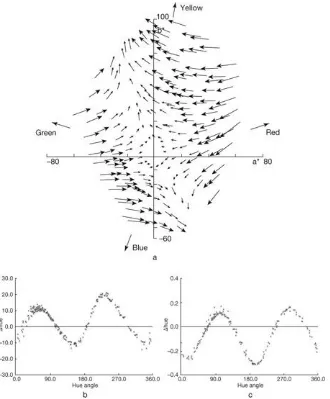
4.10 Colour-mismatch vector data for a halophosphate Cool White colour 33 fluorescent lamp
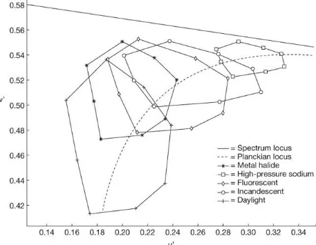
4.11 Gamut areas for some familiar light sources plotted on the CIE 1976 UCS (uniform chromaticity scale) diagram
4.12 The GretagMacbeth ColorChecker colour rendition chart being examined under daylight
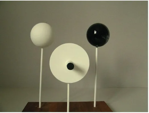
5.1 The triple object lighting patterns device
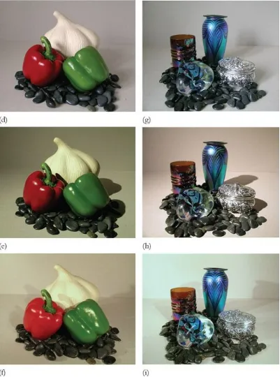
5.2 For the three lighting conditions described in the text
5.3 The striking first view of the interior of the QELA boutique, Doha
5.4 QELA – The display lighting in the central area has strong downward ‘flow’, with ‘sharpness’ creating crisp shadow and highlight patterns
5.5 QELA – In this display area, which is adjacent to the central area, the lower mean room surface exitance (MRSE) level has the effect of strengthening the shading patterns
5.6 QELA – In this display area, the mannequin appears isolated by the strong shading pattern generated by the selective lighting
5.7 QELA – On the upper floor, the ‘fire’ on the right matches the warm white illumination used throughout the boutique
5.8 The point P is located at the intersection of the x, y and z orthogonal axes 5.9 The three-dimensional illumination distribution about point P
5.10 The illumination solid is now the sum of component solids due to sources S1 and S2 5.11 The illumination solid at a point in a space where light arrives from every direction 5.12 The magnitude and direction of (EA – EB)max defines the illumination vector, which is
5.13 This is the symmetric solid
5.14 In (a), a small source S projects luminous flux of F lm onto a disc of radius r, producing a surface illuminance E = F/(π.r2). In (b), the disc is replaced by a sphere of radius r,
giving a surface illuminance E = F/(4π.r2)
5.15 (a): Vertical section through P showing illumination vector altitude angle α, and (b): Horizontal section through P showing azimuth angle φ of the horizontal vector
component
5.16 The point P is on a surface, and is illuminated by a disc-shaped source that is normal to the surface and of angular subtence α
5.17 This comparison surface has two mounted samples that respond differently to the disc source
5.18 As the subtence of a large disc source is reduced, the source luminance required to maintain an illuminance value of 100 lux increases rapidly as subtence falls below 30 degrees
5.19 For small sources, the increase in luminance required to maintain 100 lux increases dramatically for subtence angles less than 3 degrees
5.20 Highlight contrast potential HLC for three values of target reflectance
5.21 Light sources of smaller subtence angle produce less penumbra, increasing the ’sharpness’ of the lighting
6.1 Measuring surface reflectance, using an internally blackened cardboard tube fitted over an illuminance meter
6.2 Application of the point-to-point formula
6.3 Determining the illuminance at point P on a vertical plane 6.4 The point P is illuminated by two alternative sources
6.5 The correction factor C(D/r) to be applied to point source illumination formulae
6.6 The Cubic Illumination concept
6.7 The location of source S relative to a three-dimensional object is defined in terms of X, Y, and Z dimensions
6.8 Assessment of likely prospects for various roles for fenestration in buildings
6.9 A simple way of making an approximate measurement of MRSE using a conventional light meter
6.10 A six-photocell cubic illumination meter
three facets face upwards and three downwards
6.12 A vertical section through the tilted cube on the u axis, which lies in the same vertical plane as the y axis, against which it is tilted through the angle a
6.13 A photocell head mounted on a right-angle bracket, onto a photographic tripod 6.14 The photocell tilted to +35 degrees relative to the horizontal plane
7.1 A lighting design flowchart
Tables
2.1 Perceived brightness or dimness of ambient illumination 2.2 Perceived differences of exitance or illuminance
4.1 The 14 CIE TCS (Test colour samples). TCS 1–8 comprise the original set of moderately saturated colours representing the whole hue circle, and these are the only samples used for determining CRI. The other six have been added for additional information, and comprise four saturated colours, TCS 9–12, and two surfaces of particular interest. Regrettably, details of colour shifts for these TCS are seldom made available
5.1 Vector/scalar ratio and the perceived ‘flow’ of light
7.1 Values of target/ambient illuminance ratio, TAIR, against room index where the
Acknowledgements
The contents of this book have grown from the Advanced Lighting Design course that I have taught every year since 2005 at the Queensland University of Technology in Brisbane, Australia, for which I thank the programme coordinator, Professor Ian Cowling, and also the succession of lively and enquiring CPD (continuing professional development) students who have caused me to keep the curriculum in a state of continual revision.
While many people have contributed to the development of the ideas contained in this book, whether they realised it at the time or not, three former colleagues with whom I have maintained email contact have responded to specific issues that I encountered in preparing the text. They are, in no particular order, Joe Lynes and Professors Mark Rea and Peter Boyce. My thanks to each of them.
Introduction
The aim of this book is to enable people who are familiar with the fundamentals of lighting technology to extend their activities into the field of lighting design. While the text is addressed primarily to students, it is relevant to professionals working in the fields of building services, interior design and architecture.
The premise of this book is that the key to lighting design is the skill to visualise the distribution of light within the volume of a space in terms of how it affects people’s perceptions of the space and the objects (including the people) within it. The aim is not to produce lighting that will be noticed, but rather, to provide an envisioned balance of brightness that sets the appearance of individual objects into an overall design concept.
This is different from current notions of ‘good lighting practice’, which aim to provide for visibility, whereby ‘visual tasks’ may be performed efficiently and without promoting fatigue or discomfort. It is also quite different from some lighting design practice, where spectacular effects are achieved by treating the architecture as a backdrop onto which patterns of coloured light, or even brilliant images, are projected.
Several perception-based lighting concepts are introduced to enable distributions of illumination to be described in terms of how they may influence the appearance of a lit space. These descriptions involve perceived attributes of illumination, such as illumination that brings out ‘colourfulness’, or has a perceived ‘flow’, or perhaps ‘sharpness’. It is shown that the three-dimensional distributions of illumination that underlie this understanding of lighting can be analysed in quantitative terms, enabling their characteristics to be measured and predicted. The principles governing these distributions are explained, and spreadsheets are used to automatically perform the calculations that relate perceived attributes to photometric quantities.
1
Chapter summary
The evidence of your eyes
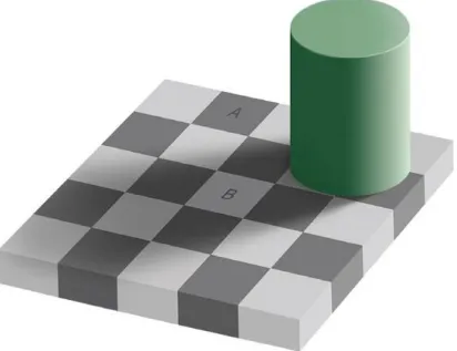
Figure 1.1 shows the Checker Shadow Illusion, and at first sight, the question has to be, where is the illusion? Everything looks quite normal. The answer lies in squares A and B: they are identical. That is to say, they are the same shade of grey and they have the same lightness, or to be more technical, they have the same reflectance (and thereby luminance) and the same chromaticity.
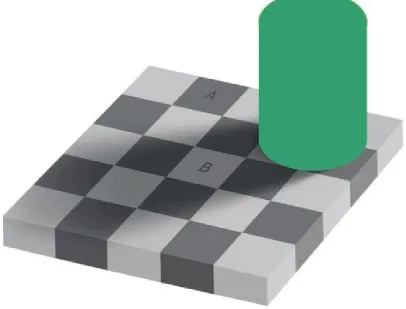
Do you find this credible? They certainly do not look the same. Now look at Figure 1.2, which shows a white sheet drawn over the figure with cut-outs for the two squares. Seen in this way they do look the same, and if you take a piece of card and punch a hole in it, you can slide it over the previous figure and convince yourself that the two squares are in fact identical and as shown in Figure 1.2.
This raises a question: how is it that, when the images of these two identical squares are simultaneously focussed onto the retina, in one case (Figure 1.2) they appear identical and in the other (Figure 1.1) they appear distinctly different?
Figure 1.1 The Checker Shadow Illusion. Squares A and B are identical. They are presented here as related colours, that is to say, they appear related to their surroundings. The lighting patterns that appear superimposed over the surrounding surfaces cause a viewer to perceive a ‘flow’ of light within the volume of this space, and which leads to the matching luminances of A and B being perceived quite differently.
Related and unrelated colours
The essential difference is that in Figure 1.1 the two squares are presented as related colours, that is to say, colours are perceived to belong to surfaces or objects seen in relation to other colours, and in Figure 1.2, they are shown as unrelated colours, meaning they are seen in isolation from other colours (Fairchild, 2005). As unrelated colours (grey is a colour), they are perceived to comprise nothing more than rectangular coloured shapes on a plain white background, but when they are set into the context of Figure 1.1, they are perceived as solid elements in a three-dimensional scene that have recognisable object attributes. It is this change in the way they are perceived that causes them to appear differently.
So what are the components of the surrounding scene that make this illusion so effective? Ask yourself, why is the cylindrical object there? Does it contribute something? In fact, it is a vital component of the illusion. So, what colour is it? Obviously, green. Is it uniformly green? Well, yes … but look more carefully at the image of the object and you will see that both its greenness and its lightness vary hugely. The image is far from uniform, so how did you suppose the object to be uniformly green? The answer is that you perceived a distinctive lighting pattern superimposed over the uniformly green object. In
Figure 1.3, the area enclosed by the object outline is shown as uniformly green and it appears as nothing more than a formless blob.
Figure 1.3 Previously the cylindrical object appeared to be uniformly green. Now it is uniformly green, but it does not look like a cylinder. That is because it is now lacking the lighting pattern due to interaction with the ‘flow’ of light.
Now look at the checker board surface. Again we have a pattern due to the lighting, but in this case it is a shadow pattern, which has a different appearance from the shading and highlight patterns, but nonetheless is quite consistent with our perception of the overall ‘flow’ of light within the volume of the space. It will be obvious to you that if two surfaces have the same lightness (which also means they have the same reflectance) and one occurs within the shadow pattern and one outside it, they will have different luminance values. The creator of this brilliant illusion, Edward H. Adelson, Professor of Vision Science at the Massachusetts Institute of Technology, has carefully set it up so that squares A and B have the same luminance value, which means of course, that their images on your retina are identical. However, the function of the visual process is to provide information to the visual cortex of the brain, and here your perceptual process is telling you that, although these two squares match for luminance, they cannot have the same lightness. The one in the shadow must be lighter, that is to say, it must have higher reflectance, than the one in full light. You hold this innate understanding of lighting in your brain, and you cannot apply your conscious mind to overrule it.
The role of ambient illumination
For most of the time, we live in a world of related colours. We are surrounded by surfaces and objects which, providing the entire scene is adequately illuminated, our perceptual faculties reliably recognise and make us aware of, sometimes so that we can cope with everyday life, and sometimes to elevate our senses to higher levels of appreciation, as when we encounter artworks or beauties of nature. Recognition involves identifying object attributes associated with all of the things that make up our surrounding environments, and our innate skill in doing this is truly impressive. Scientists working on artificial intelligence have tried to program super computers to perform in this way, but so far their best efforts fall far short of what human perception achieves every moment throughout our waking hours.
Provided that ambient illumination is sufficient, we are able to enter unfamiliar environments, orientate ourselves, and go about our business without hesitating to question the reliability of the perceptions we form of the surrounding environment. It is clear that substantial processing has to occur, very rapidly, between the retinal image and formation of the perception of the environment. There is no good reason why our perceptions of elements of the scene should show in-step correspondence with their photometric characteristics. Visual perception may be thought of as the process of making sense of the flow of sensory input through the optic nerve to the brain, where the purpose is to recognise surfaces and objects, rather than to record their images. Colours are perceived as related to object attributes, and effects of illumination are perceived as lighting patterns superimposed over them. As we recognised the cylinder in Figure 1.1 to be uniformly green with a superimposed shading pattern, so we also recognised the identical squares to differ in lightness because of the superimposed shadow pattern.
There will, however, be situations where we are confronted with elements seen in isolation from each other, and this is particularly likely to occur in conditions of low ambient illumination. When we find ourselves confronted by dark surroundings, reliance upon related colours and identification of object attributes may give way to perception of unrelated colours, and when this occurs, our perceptions do not distinguish lightness and illuminance separately, and luminance patterns dominate. That is to say, the appearances of individual objects within the scene relate to their brightness and chromaticity values, rather than upon recognition of their intrinsic attributes.
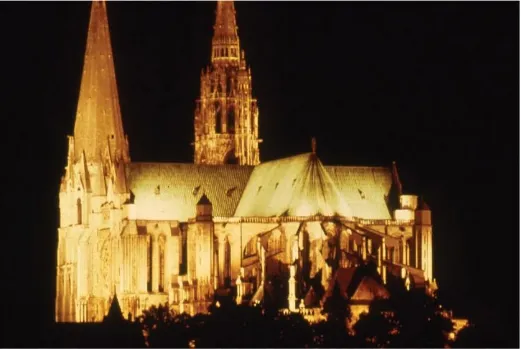
that does not distinguish between materials, and actually makes the building appear self-luminous. The building’s appearance is dominated by brightness, and object attributes are not discernible. These two views show clearly the difference between related colours, in the daylight view, and unrelated colours in the night-time view. They also give us due appreciation of the role that lighting may play in bringing about fundamental differences in our perceptions.
Under normal daytime lighting, two-way interactions occur that enable our perceptual processes to make sense of the varied patterns of light and colour that are continuously being focussed onto our retinas. Working in one direction, there is the process of recognising object attributes that are revealed by the lighting patterns, while at the same time, and working in the opposite direction, it is the appearance of these lighting patterns that provides for the viewer’s understanding of the light field that occupies the entire space.
Perception as a basis for lighting design
From a design point of view, lighting practice may be seen to fall into two basic categories. On one hand, for illumination conditions ranging from outdoor daylight to indoor lighting where the ambient level is sufficient to avoid any appearance of gloom, we live in a world of related colours in which we distinguish readily between aspects of appearance that relate to the visible attributes of surfaces and objects, and aspects which relate to the lighting patterns that appear superimposed upon them.
On the other hand, in conditions of low ambient illumination, where we have a sense of darkness or even gloom, whether indoors or, most notably, outdoors at night, we typically experience unrelated colours and this may lead to the appearances of objects and surroundings dominated by brightness patterns that may offer no distinction between object lightness and surface illuminance.
The implications of this dichotomy for lighting design are profound. Outdoor night-time lighting practice, such as floodlighting and highway illumination, is based on creating brightness patterns that may bear little or no relationship to surface or object properties. Alternatively, for situations where ambient illumination is at least sufficient to maintain an appearance of adequacy (apart from outdoor daylight, this may be taken to include all indoor spaces where the illumination complies with current standards for general lighting practice) we take in entire visual scenes including object attributes, and involving instant recognition of familiar objects and scrutiny of unfamiliar or otherwise interesting objects. The identification of object attributes may become a matter of keen interest, as when admiring an art object or seeking to detect a flaw in a manufactured product, and we depend upon the lighting patterns to enable us to discriminate and to respond to differences of object attributes.
Between these two sets of conditions is a range in which some uncertainty prevails. We have, for example, all experienced ‘tricks of the light’ that can occur at twilight, and generally, recommendations for good lighting practice aim to avoid such conditions. Perhaps surprisingly, it is within this range that lighting designers achieve some of their most spectacular display effects. By isolating specific objects from their backgrounds and illuminating them from concealed light sources, lighting can be applied to alter the appearance of selected object attributes, such as making selected objects appear more textured, or colourful, or glossy. All of this thinking will be developed in following chapters.
concerned with assessing or responding to luminance. Its role is to continually seek to recognise object attributes from the flow of data arriving from the eyes. When we are confronted with Figure 1.1 in a condition of adequate illumination, our perception process performs its task to perfection. A is correctly recognised as a dark checker board square, and B as a light square. Rather than labelling Figure 1.1 as an illusion, perhaps we should refer to it as an insight into the workings of the visual perception process.
References
Cuttle, C. (2008). Lighting by Design, Second Edition. Oxford: Architectural Press. Fairchild, M.D. (2005). Color Appearance Models, Second Edition. Chichester: Wiley. Purves, D. and R. Beau Lotto (2003). Why we see what we do: An empirical theory of
2
Chapter summary
The amount of light
An important decision in lighting design is, ‘What appearance of overall brightness (or dimness) is this space to have?’ General lighting practice gives emphasis to the issue of how much light must be provided to enable people to perform the visual tasks associated with whatever activity occurs within the space and, of course, this must always be kept in mind. In a banking hall, for example, we need to ensure that the counters are lit to an illuminance that is sufficient to enable the tellers to perform their work throughout the working day without suffering strain. While that aspect of illumination must not be overlooked, there is an overarching design decision to be made, which is whether the overall appearance of the space is to be a bright, lively and stimulating environment, or whether a more dim overall appearance is wanted. The aim of a dim appearance may be to present a subdued, and perhaps sombre, appearance, or alternatively, to create a setting in which illumination can be directed onto selected targets to present them in high contrast relative to their surroundings. Of course, the surroundings cannot be made too dim as illumination must always be sufficient for safe movement, but there is substantial scope for a designer to choose whether, in a particular situation, the overall impression is to be of a bright space, or of a dim space, or of something in between. Clearly, the impressions that visitors would form of the space will be substantially affected by the designer’s decision.
This raises a question. If we are not lighting a visual task plane for visibility, but are instead illuminating a space for a certain appearance of overall brightness, how do we specify the level of illumination that will achieve this objective? All around the world, lighting standards, codes, and recommended practice documents specify illumination levels for various indoor activities in terms of illuminance (lux) and a uniformity factor. If someone states that ‘This is a 400 lux installation’, that means that illuminance values measured on the horizontal working plane, usually specified as being 700mm above floor level and extending from wall to wall within the space, should average at least 400 lux, and furthermore, at no point should illuminance drop to less than 80 per cent of that average value.
A thought experiment
We are going to conduct a thought experiment as a first step to exploring how lighting does more than simply make things visible, and in fact, we are going to explore how lighting affects the appearance of everything we see. To start, you need to get yourself into an experimental mindset. The first requirement is to forget everything you know. Then, imagine an indoor space where the sum total of ceiling, wall and floor areas add up to 100m2, as shown in Figure 2.1.
Then, into this space is added a luminaire that emits a total a luminous flux, F, of 5000 lumens (Figure 2.2).
How brightly lit will the space appear? This might seem to be a difficult question to answer, which is as it should be because a vital piece of information is lacking. Until the room surface reflectance values are specified, you have no way of knowing how much light there is in this space.
Figure 2.2 To the room is added a luminaire with a total flux output F = 5000 lumens.
How much light do we have?
addition total
Initial flux (F) 5000 5000
First reflection 2500 7500
Second reflection 1250 8750
Third reflection and so on … 625 9375
Figure 2.3 All room surfaces are given a neutral grey finish so that ρrs = 0.5.
All of the initial 5000 lumens from the luminaire are incident on room surfaces that reflect 50 per cent back into the space, so the first reflection adds 2500 lm, bringing the total luminous flux in the space up to 7500 lm. These reflected lumens are again incident on room surfaces, and the second reflection adds another 1250 lumens to the total. The process repeats, so that you could go on adding reflected components of the initial flux until they become insignificantly small. Alternatively, the effect of an infinite number of reflections is given by dividing the initial flux by (1 – ρ), so that:
An interesting point emerges here. We have surrounded the luminaire with surfaces that reflect 50 per cent of the light back into the space, and this has doubled the number of lumens. Keep this point in mind. Now we divide the total flux by the total room surface area to get the average room surface illuminance:
way around the space, but not enough to make the room appear brightly lit. Let’s suppose that we want a reasonably bright appearance. Well, we could fit a bigger lamp in the luminaire, but before we take that easy option, let’s think a bit more about the effect of room surface reflectance. We have seen that it can have a quite surprising effect on the overall amount of light in the space.
What would be the effect of increasing ρrs to 0.8, as shown in Figure 2.4? Combining the expressions we used before, it follows that the mean room surface illuminance:
This deserves some careful attention. We increased ρrs from 0.5 to 0.8, which is a 60 per cent increase, and the total flux increased two-and-a-half times! How can this be so? Think about it this way. It is conventional to refer to surface reflectance values, but try thinking instead of surface absorptance values, where α = (1 – ρ). What we have done has been to reduce αrs from 0.5 to 0.2, and that is where the 2.5 factor comes from.
Figure 2.4 Room surface reflectance is increased so that ρrs = 0.8.
darkness. Thought experiments really can be fun. Now think about going in the opposite direction.
What would be the effect of reducing ρrs to zero? How brightly lit would the room appear? The question is of course meaningless. The only thing visible would be the luminaire, as shown in Figure 2.5. If you were sufficiently adventurous, you could feel your way around the room and you could use a light meter to confirm the value of the mean room surface illuminance:
The meter would respond to those 50 lux, but your eye would not. Here is another important point. The direct flux from the luminaire has no effect on the appearance of the room. It is not until the flux has undergone at least one reflection that it makes any contribution towards our impression of how brightly, or dimly, lit the room appears. To have a useful measure of how the ambient illumination affects the appearance of a room, we need to ignore direct light and take account only of reflected light.
Figure 2.5 Room surface reflectance is reduced to zero, so ρrs = 0.
Let’s think now about a general expression for ambient illumination as it may affect our impression of the brightness of an enclosed space. The luminaire is to be ignored, and so in
reflected from room surfaces, we need an expression for mean room surface exitance, MRSE, where exitance expresses the average density of luminous flux exiting, or emerging from, a surface in lumens per square metre, lm/m2.
Figure 2.6 The final stage of the thought experiment. A black luminaire emits F lm in a room of area A and uniform surface reflectance ρ, and mean room surface exitance, MRSE, is predictable from Formulae 2.1 and 2.2.
The upper line of Formula 2.2 is the first reflected flux FRF, which is the initial flux after it has undergone its first reflection. This is the energy that initiates the inter-reflection process that makes the spaces we live in luminous. More descriptively, it is sometimes referred to as the ‘first bounce’ lumens.
The MRSE concept
Of course, real rooms do not have uniform reflectance values, but this can be coped with without undue complication.
On the top line of Formula 2.1, Fρ is the First Reflected Flux, FRF, which is the sum of ‘first bounce’ lumens from all of the room surfaces, such as ceiling, walls, partitions and any other substantial objects in the room. It is obtained by summing the products of:
direct illuminance of each surface Es(d) surface area As
surface reflectance ρs
So, in a room having n surface elements:
On the bottom line of Formula 2.1, A(1 – ρ) is the Room Absorption, indicated by the symbol Aα, and it is a measure of the room’s capacity to absorb light. As it is conventional to describe surfaces in terms of reflectance rather than absorptance;
The general expression for mean room surface exitance, Formula 2.2, may be summarised as:
The mean room surface exitance equals the first bounce lumens divided by the room absorption. MRSE has three valuable uses:
1 The MRSE value provides an indication of the perceived brightness or dimness of ambient illumination. Table 2.1 gives an approximate guide for the two decades of ambient illumination that cover the range of indoor general lighting practice. These values are based on various studies conducted by the author and reported by other researchers, and it should be noted that ambient illumination relates to a perceived effect, while MRSE is a measurable illumination quantity, like illuminance, but not to be confused with working plane illuminance.
Table 2.1 Perceived brightness or dimness of ambient illumination
Mean room surface exitance (MRSE, lm/m2)
10 Lowest level for reasonable colour discrimination
30 Dim appearance
100 Lowest level for ‘acceptably bright’ appearance
300 Bright appearance
1000 Distinctly bright appearance
2 The MRSE ratio for adjacent spaces provides an index of the perceived difference of illumination. Table 2.2 gives an approximate guide for this perceived difference as one moves from space to space within a building, or to the appearance of differently
Table 2.2 Perceived differences of exitance or illuminance
Exitance or illuminance ratio Perceived difference
1.5:1 Noticeable
3:1 Distinct
10:1 Strong
40:1 Emphatic
illuminated surfaces or objects within a space. There is more about this perceived difference effect in the following chapter.
3 It may provide an acceptable measure of the total indirect illuminance received by an object or surface within the space, so that for a surface S, the total surface illuminance may be approximately estimated by the formula:
where Es(d) is the direct illuminance of surface S. Procedures for predicting direct illumination are explained in Chapter 6.
Applying the ambient illumination concept in design
Room surface reflectances are so influential upon both the appearance of indoor spaces and the distribution of illumination within them that, in an ideal world, lighting designers would take control of them. The reality is that generally someone else will make those decisions, but lighting designers must persist in making these decision makers aware of the influence they exert over ambient illumination and the overall appearance of the illuminated space.
The creativity of a lighting designer is largely determined by the ability to perceive a space and its objects in light, and as we have seen, the perceived light is reflected (not direct) light. A room in which high reflectance surfaces face other high reflectance surfaces is one in which inter-reflected flux persists, and it is this inter-reflected flux that provides for our sense of how brightly or dimly lit the space appears.
To initiate this inter-reflected flux, direct light, which travels from source to receiving surface without visible effect, has to be applied. The essential skill of a lighting designer may be seen as the ability to devise an invisible distribution of direct flux that will generate an envisaged distribution of reflected flux.
Figure 2.7 Reflectance plotted against Munsell Value, where a surface of MV0 would be assessed as a perfect black and MV10 as a perfect white. Perceptually MV5 is mid-way between these extremes and might be expected to have a reflectance of 0.5, but actually, it has a reflectance of approximately 0.2.
simply reflect without diffusion, so that if the meter is exposed to specular reflection, what is being measured is an image of a light source rather than the overall reflection of light from the surface.
Figure 2.8 Using an internally blackened tube mounted onto a light meter to obtain a measurement of surface reflectance. Two measurements are made without moving the meter, one of the surface as shown, and a comparison reading with a sheet of white paper in the measurement zone.
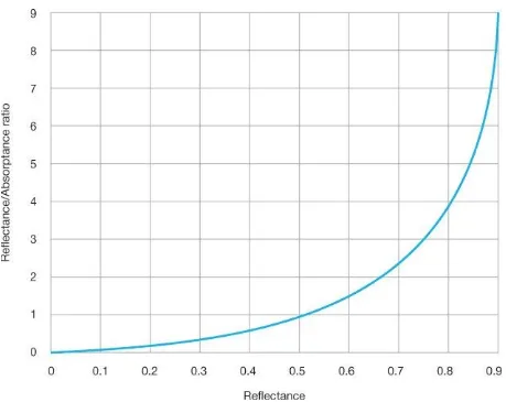
The effects of this tendency to overestimate reflectance values are compounded by the impact of surface reflectance values on MRSE. It can be seen from Formula 2.1 that MRSE is proportional to the ratio of room surface reflectance to absorptance, ρ/α. Figure 2.9 plots the value of this ratio relative to reflectance, and again it can be seen that the impact of room surface reflectance increases exponentially with reflectance, and could lead to grossly inflated MRSE values being predicted where reflectance values have been overestimated. We can see here the effects of reflectance that were observed in the thought experiment, and while these effects are real, they will not be realized unless reflectance values have been accurately assessed.
These considerations suggest an initial sequence for applying these concepts:
light’.
2. Calculate the room absorption, Aα, referring to Formula 2.4.
3. Determine the level of first reflected flux, turning Formula 2.2 around to FRF = MRSE × Aα
4. Determine a distribution of direct flux to provide the FRF value. At this point, we come to a central design issue: how to distribute the direct flux, Fs(d), or in other words, how to choose the surfaces onto which flux will be directed. To explain this issue we will consider two cases.
Figure 2.9 The value of the reflectance/absorptance ratio is proportional to mean room surface exitance, MRSE. Note how values increase exponentially at higher reflectance values.
Box 2.1
Ambient Illumination
140117
Project Case 1
MRSE 150 lm/m2
Room Dimensions
Length Width Height
12 9 3 m
Room absorption Aα 160.2 m2
First reflected flux (FRF) 24030 lm
Total luminaire flux (F) 32583 lm
Key
Notes
Direct Flux (%) is the direct flux incident on S as a percentage of total luminous flux.
Envisage an indoor space measuring 12m long, 9m wide, and 3m high. To keep life simple, we will not get too specific about the function of this room. For Case 1 we will work on the basis that the aim is to provide a fairly bright overall appearance, where everything appears adequately lit but no objects are to be selected for particular attention, and what is called for is a well-diffused, overall illumination. Decisions have been made for surface finishes, and it has been agreed that ceiling reflectance, ρclg, is to be 0.85, ρwall to have a value of 0.5, and ρflr will be 0.25, and Box 2.1 shows the dimensions and the reflectances entered on the Ambient Illumination Spreadsheet.
After giving due consideration to the points discussed in ‘The amount of light’, we decide upon a MRSE level of 150 lm/m2. This value is entered on the spreadsheet, noting that data are to be entered only into cells marked in red. To fully understand the procedure, the reader is advised to check the calculation on paper using the aforementioned formulae.
The FRF value shown in Box 2.1 is the number of lumens reflected from all of the room surfaces required to provide the moderately bright overall appearance that we have set as our goal. Now we address the first really important design issue: how to distribute the direct flux? The aim is to achieve a well-diffused illumination, and to do this without creating distinctly bright zones suggests a lighting installation that distributes illumination evenly over large surfaces. The only remaining red values are in the Direct Flux (%) column, and this is the column where the designer experiments with direct flux distributions. Two values have been entered: 15 per cent of total luminaire output is to be directed onto the walls, and 10 per cent onto the floor. As no objects have been entered, that leaves 75 per cent onto the ceiling. The next column, Fs(d), shows the number of lumens of direct flux required on each room surface; next, the Es column shows the illuminance (including indirect flux) on each surface; and in the final column, the ratios of surface illuminance to ambient illuminance, Es/MRSE. Below these columns are the values of Aα, FRF and the total luminous flux, F, to be emitted by the luminaires.
Ways of predicting luminaire layouts for direct light distributions are explained in
If the aim is to achieve the ambient illumination without any surface appearing noticeably more strongly lit than any other surface, then as indicated in Table 2.2, the aim should be to keep values of Es/MRSE below 1.5. A value of 2.7 for the ceiling indicates that this surface will appear distinctly more strongly lit than any other surface or object in this space, and in fact, for the case shown in Box 2.1, where some flux is directed onto the walls and floor, the Es/MRSE value is only slightly reduced to 2.5, so the appearance of the direct illumination onto the ceiling would certainly be ‘noticeable’, even if not ‘distinct’. We could try adjusting the percentage values on the spreadsheet to achieve a less pronounced effect, but watch the value of the total luminaire flux, F. As more luminaire flux is directed onto lower reflectance surfaces, so the flux required to provide the MRSE value goes up. It should not pass notice that this flies in the face of conventional practice. All around the world, lighting standards for illumination sufficiency for indoor activities are specified in terms of illuminance applied onto the horizontal working plane, from which it follows that ‘efficient’ lighting takes the form of a grid layout of luminaires that directs its output directly onto that plane. While it is widely acknowledged that indirect ceiling lighting installations can achieve pleasant effects, the way the standards are specified causes them to be classified as inefficient. When a designer is satisfied that a satisfactory distribution of direct flux has been achieved, a copy of the spreadsheet would be saved onto the design project file.
Now turn attention to Case 2, for which we have a quite different aim. Again, we will not get too specific about the situation, but this time the aim is that a few selected objects are to be presented for display, and these are to become the ‘targets’ for the lighting with the intention that they will catch attention by appearing brightly lit in a dim setting. The revised output for the Ambient Illumination spreadsheet is shown in Box 2.2, and it shows that most of the direct flux is to be directed onto these targets. Even so, this is a space that people would need to be able to find their way through, so a background of inky blackness would not be acceptable. This brings us face-to-face with a tricky design decision. On one hand we aim to achieve a luminous environment that is dark enough to provide for effective display contrasts, while on the other hand it needs to be light enough for people to find their way through safely, and, at least as important, we need to create an entry to the space that people find welcoming. We should keep in mind that in order to attract people to enter this dim space, at least part of the displayed material should be positioned so that it is visible to someone approaching the entrance to the space.
onto the floor, and based on all these inputs, the spreadsheet shows that we need a total luminaire flux of 8690 lumens. That luminous flux, appropriately directed, will provide a display illuminance of 401 lux, and, referring again to Table 2.2, the visual effect will be ‘emphatic’, as it will provide a Es/MRSE value of 40. Note that in order to achieve this dramatic effect we did not start by setting the target illuminance, but rather, we set the ambient illuminance and then determined the flux distribution. To provide a higher level of target illuminance would have the effect of raising the ambient illumination above the design value without adding to the Es/MRSE ratio.
From these two cases it can be seen that in order for lighting to exert its potential for influencing the appearance of everything we see, control over room surface reflectance values is as important as being able to control direct flux distributions. Between these two quite extreme cases, many options exist for designers to control ambient illumination level to support chosen lighting design objectives. The Ambient Illumination Spreadsheet is a useful tool for achieving this control.
Box 2.2
Ambient Illumination Spreadsheet
140117
Project Case 2
MRSE 10 lm/m2
Room Dimensions
Length Width Height
12 9 3 m
Room absorption Aα 291.1 m2
First reflected flux (FRF) 2911 lm
Key
Notes
3
Chapter summary
Where ambient illumination is sufficient for illuminance and lightness (which is related to reflectance) to be perceived separately, as typically occurs for conventional indoor lighting practice, lighting may be planned in terms of illuminance (rather than luminance) distributions. Local concentrations of illumination can be applied to direct attention, to give emphasis and identify objects that the designer deems to be visually significant. The notion of ordered distributions of illumination leads to the concept of illumination hierarchy, whereby illumination distributions are structured as a principal means by which the designer may express his or her design intentions. Such distributions are planned as changing balances of direct and indirect illumination, and are achieved by specifying
Ordered illumination distributions
Most forms of life are attracted towards light, and humans are no exception. Phototropism is the process by which attention is drawn toward the brightest part of the field of view. It can be detrimental, as when a glare source creates a conflict between itself and what a person wants to see, and in general lighting practice much attention is given to avoiding such effects. However, for lighting designers it is a powerful tool, enabling us to draw attention to what we want people to notice and away from things of secondary or tertiary significance. An ordered illumination distribution is the underpinning basis for structuring a lighting design concept.
It is important to spend some time looking carefully at how our perceptions of space and objects are influenced by selective illumination. It was noted in Chapter 1 that colours that make up an overall scene are generally perceived as related colours, and as long as illumination is sufficient to ensure photopic adaptation, we have no difficulty in recognising all the surrounding surfaces and objects that make up our environments. The process of recognising the multitude of ‘things’ that may, at any time, comprise our surroundings falls within the topic of perceptual psychology, but without getting involved in that field of learning it is sufficient here to acknowledge that this recognition process involves discriminating differences of object attributes such as lightness, hue and saturation, from which we form perceptions of spaces, people, and objects. We achieve this without conscious effort throughout our waking hours over a very wide range of ‘adequate’ lighting conditions. In this context, the onset of dimness may be thought of as the borderline of reliable recognition of object attributes.
Illuminance ratios
When we place an attractive object, such as a vase of flowers, beside a window to ‘catch the light’, we are exploiting the potential for a pool of local illumination to identify this object as having been selected for special attention. Similarly, electric lighting can provide a planned gradation of illumination that expresses the designer’s concept of layers of difference. Hard-edged contrasts can give emphasis to such effects, but alternatively, a different but equally striking effect may be achieved by a build-up of illuminance that leads the eye progressively towards the designer’s objective. High drama requires that surroundings are cast into gloom, but in architectural situations, safety requirements generally require surroundings to remain visible, although perhaps distinctly dim, at all times. Planning such distributions is more than simply selecting a few objects for spotlighting. It involves devising an ordered distribution of lighting to achieve an
illumination hierarchy.
The concept of a structured illumination distribution was pioneered by J.M. Waldram (1954). Working from a perspective sketch of the location, he would assign an ‘apparent brightness’ value to each significant element of the view, and then he would convert those subjective values into luminance values so that he could apply illumination engineering procedures to determine a suitable flux distribution. Waldram’s notion of creating an ordered brightness distribution related to luminance would seem to be valid for low adaptation situations, such as occur in outdoor lighting, but not for situations where surface lightness is readily recognised, such as in adequately illuminated indoor scenes. As has been noted, for these situations our perceptions distinguish illumination differences more or less independently of surface reflectance values.
J.A. Lynes (1987) has proposed a design approach based on Waldram’s method with the difference that the designer develops a structured distribution of surface illuminance values. Lynes introduces his students to the topic through an exercise in perceived difference of illumination, and his simple procedure is illustrated in Figure 3.1. He stands in front of his class with a spotlight shining onto a white screen. Point 0 is the brightest spot, and from this point a numbered scale extends across the screen. Each student completes a score card, and starts by indicating the scale value that, in his or her assessment, corresponds to the point along the scale at which a ‘noticeable difference of brightness’ occurs. This is the student’s ‘N’ value, and would be followed by a ‘D’ value for a distinct difference, an ‘S’ value for a strong difference and an ‘E’ value for an emphatic difference. The cards are then gathered, average values calculated and consensus values for N, D, S and E are marked on the screen. After that, Lynes measures the illuminance level at each point, from which illuminance ratios are calculated for each perceived difference.
the results are repeated year after year. The data presented in Table 2.2 is typical, and while this simple procedure may not qualify as ‘good science’, it is well worth going through the procedure. It calls for thoughtful observation, and, perhaps surprisingly, it provides useful guidance for lighting design. Not only students, but anyone interested in designing lighting should go through the process of making these illumination difference assessments at least once during their lifetime.
Figure 3.1 Demonstration set-up for gaining assessments of noticeable, distinct, strong and emphatic illumination differences.
is to achieve high illuminance differences, target objects need to be small in relation to their surrounding space, or more specifically, to the room absorption of the surrounding space.
Target/ambient illuminance ratios
While the perceived adequacy of illumination (PAI) criterion is concerned with ensuring adequate inter-reflected flux (MRSE) within a space, the illumination hierarchy criterion is concerned with how the direct flux from the luminaires may be distributed to create an ordered pattern of illumination that supports selected lighting design objectives, which may range from directing attention to the functional activities of the space to creating aesthetic or artistic effects. For all of this, we make use of the target/ambient illuminance ratio, TAIR, where target illuminance is the sum of direct and indirect components, and TAIR relates target illuminance to the ambient illumination level. The designer selects target surfaces and designates values according to the level of perceived difference of illumination brightness to be achieved both between room surfaces, and between objects and the surroundings against which they are seen. As the point has been made that illumination is not visible until it has undergone its first reflection, it may be wondered why we are now dealing with incident target illumination, which comprises both direct and indirect illumination. The answer is that as both components undergo reflection at the same surface, it makes no difference whether we take the ratio of the incident or reflected values.
MRSE provides the measure of ambient illumination within a space, and except where there are obvious reasons to the contrary, it is reasonable to assume that the incident illumination on each target surface tgt will be the sum of direct illuminance and MRSE, so the total illuminance on a target surface:
and the target/ambient illuminance ratio:
The TAIR concept provides a basis for planning a distribution of direct flux from the luminaires that will achieve an envisioned illumination distribution within a space. It follows that for any chosen target surface, the direct illuminance:
sculpture, or a featured retail display, or the preacher in his pulpit; or it may comprise a number of even smaller items, such as display of coins, or individually lit items of glassware. Whatever the situation, the designer first needs to decide upon the MRSE level to achieve the required ambient illumination for the space, and then to decide upon the
TAIR for each target surface for the differences of illumination brightness. This enables Formula 3.3 to be applied to draw up the distribution of direct target illuminance values.
This puts the designer in the position of being able to determine the distribution of direct light to be applied throughout the space in order to achieve the envisioned distribution of reflected light. The total indirect flux provided by first reflections from all surfaces receiving selective target lighting:
Note that the suffix tgt indicates an individual target surface, and ts refers to all target surfaces within the space. This value of Fts(i) indicates the extent to which all of the selective target lighting will contribute towards the first reflected flux required to achieve the ambient illumination MRSE. The usefulness of this formula becomes apparent in the following section.
Illumination hierarchy design procedure
Without wishing to give the impression that creative lighting design can be achieved by following a step-by-step procedure, the concepts previously described imply a sequence for logical decision making. The flowchart shown in Figure 3.2 should be referred to while following this procedure.
Figure 3.2 Flowchart for achieving mean room surface exitance, MRSE, and task/ambient illumination, TAIR, design values.
no minimum levels are specified, designing for an appearance of dimness becomes an option providing safety concerns are kept in mind.
2. Decide upon the design value of MRSE, this being the overall density of inter-reflected flux to be provided within the volume of the space, and enter this value into the Illumination Hierarchy spreadsheet (see Box 3.1, and use your own downloaded copy of the spreadsheet).
3. Estimate the area and reflectance value for each significant surface S within the room, making sure to include any surfaces or objects that you might decide to highlight with selective lighting, and enter these onto the spreadsheet. The spreadsheet calculates the room absorption value, Aα(rs), and the total first reflected flux, FRFrs, required to provide the MRSE value.
4. Consider the illumination hierarchy that the light distribution is to create in this space. Think about which objects or surface areas you want to highlight with selective lighting, and by how much. You will provide direct light onto these target surfaces, while surrounding areas will be lit mainly, or perhaps entirely, by reflected light.
5. Enter your design value of TAIR for each target area, taking account of how the appearance of the selected objects or surfaces will be affected by localised direct illumination. This listing of TAIR in Column 5 of the spreadsheet becomes the record of your illumination hierarchy for the space.
6. The spreadsheet completes the calculations, giving the first reflected flux to be provided by light reflected from the targets, FRFts, and the difference between this value and the total FRF required to provide the MRSE value, FRFrs – FRFts.
Then:
If the first reflected flux from the targets is less than the total first reflected flux required, that is to say, if FRFts < FRFrs, then in addition to the light directed onto the target areas, the surrounding room surfaces will need some direct illumination to make up for the difference, FRFrs – FRFts. This is needed to ensure that the MRSE design value will be achieved. The direct illumination onto the room surfaces does not need to be applied uniformly, and often the most effective way will be to spread light over large, high-reflectance surrounding surfaces such as ceiling and walls. Concentrating this light onto small areas may cause them to compete visually with the target areas, as has been discussed in Chapter 2. There is plenty of scope for ingenuity in devising ways of raising the overall illumination brightness without detracting from the selected targets.
Example: a banking premises
Box 3.1 shows a worksheet from the Illumination Hierarchy spreadsheet, and again, readers are strongly recommended to experience the use of these design tools. Room surface data have been entered for a banking premises, so take a moment to familiarise yourself with the location.
A bright and business-like appearance is wanted, and a MRSE level of 200 lm/m2 is proposed. This value has been entered, and as previously, data shown in red are input by the user and all other values are calculated automatically. Column 4 gives the computed room absorption values, and the bottom line shows that 39,096 lumens of first reflected flux from the room surfaces is required to provide the MRSE level. Next the designer enters a TAIR value for selected target surfaces. This is the vital component of this stage of the design process, and Column 5 forms the statement of the designer’s initial intent for illumination hierarchy. At the bottom of the final column it is shown that 20,899 lm of the required FRF will be provided from the target surfaces, so that the difference of 18,197 lm will need to be made up by applying additional direct light onto room surfaces.
This is the information that the designer needs to determine the balance of direct and indirect illumination. Various options for providing the deficit FRF may come to mind, but a simple and efficient solution would be uplighting. The required direct ceiling illuminance is:
This direct illuminance added to the MRSE value of 200 lm/m2 would give a total ceiling illuminance Eclg of 414 lux, giving a TAIR value of just over two. Table 2.2 indicates that this would correspond to a perceived difference that would appear somewhere between noticeable and distinct, and so would create a visible effect that might compete with the planned distribution of TAIR values. This effect could be reduced by applying less illumination onto the ceiling and making up for the deficiency by adding some direct light onto other surfaces, particularly the walls.
Box 3.1
Illumination Hierarchy Spreadsheet
Symbols
whether this could be relied upon, and after all, this is the way that lighting design happens. It is part of the reason why no two designers would come up with identical schemes.
Box 3.2
Illumination Hierarchy Spreadsheet
Date: 140119
Box 3.2 shows a design proposal. The TAIR values in Column 5 have been adjusted to provide various levels of unnoticeable, noticeable, distinct and strong perceived differences, and by adding more target surfaces in this way, the FRFrs – FRFts difference has been reduced to a negligible value. This means that the first reflected flux from the targets will provide the required 200 lm/m2 of mean room surface exitance, and with the exception of the blinds, the visible effect of this additional illumination will not be bright enough to be noticed. In this way, the original design intent will be maintained. It can be seen not all surfaces are to receive direct light.
References
Lynes, J.A. (1987). Patterns of light and shade. Lighting in Australia, 7(4): 16–20.
4
Chapter summary
Luminous sensitivity functions
Before 1924, the only way of measuring light was to make comparisons with a familiar light source, which led to metrics such as the candle power and the foot candle, but in that year the CIE (International Commission on Illumination) introduced the V(λ) luminous sensitivity function which defines the relative visual response, V, as a function of the wavelength of radiant power, λ, as shown in Figure 4.1. This was a significant breakthrough that required innovative research, and it enabled luminous flux, F, to be defined in terms of lumens from a measurement of spectral power distribution:
where:
P(λ) = spectral power, in watts, of the source at the wavelength λ V(λ) = photopic luminous efficiency function value at λ
Δλ = interval over which the values of spectral power were measured
It can be seen from Figure 4.1 that V(λ) has its maximum value of 1.0 at 555nm, and so the luminous efficiency of radiant flux at this wavelength is equal to the value of the constant in Formula 4.1, 683 lm/W. At 610nm, where the value of V(λ) is approximately 0.5, the luminous efficiency reduces to half that value.
Figure 4.1 Relative sensitivity functions for V(λ), and the three cone types; long-, medium- and short-wavelength; L(λ), M(λ) and S(λ). It can be seen how closely V(λ) represents the responses of the L and M cones, and ignores the S cone response.
Formula 4.1 assumes a human observer operating within the range of photopic vision, and this means that error is incurred whenever V(λ) is applied for mesopic or scotopic conditions. Also, the researchers who established the V(λ) function had their subjects observing a quite small luminous patch that subtended just 2 degrees at the eye, so that it was illuminating only the foveal regions of the subjects’ retinas. The photoreceptors in these central regions are only long- and medium-wavelength responsive cones, which are often (but inaccurately) referred to as the red and green cones, and their luminous sensitivity functions are shown in Figure 4.1 as L(λ) and M(λ) respectively. It should be noted how similar are the responses of these two cones, particularly when it is borne in mind that it is the difference in response of this pair of two cone types that enables colour discrimination on the red–green axis, and also, how closely similar they are to V(λ). The responses of the short-wavelength (blue) cones, shown as the S(λ) function, as well as all of the rods, are simply not taken into account by the V(λ) function.
where the value of g is related to field luminance. In this way, a variable allowance for the response of the short-wavelength cones can be added to the long- and medium-wavelength cones dominated V(λ), and Mark Rea has tentatively suggested that for the range of luminous environments discussed in this book, for which 10 <MRSE <1000 lm/m2, a g value of 3.0 would be appropriate. The resulting luminous sensitivity function, indicated as VB3(λ), is shown in Figure 4.2. It is proposed that applying this function for predicting or measuring MRSE would give more reliable results, in terms of better matching metrics to assessments, than using conventional lumen-based metrics.
Meanwhile the CIE has given attention to other deficiencies of V(λ) by defining additional luminous sensitivity functions, the most notable being the V′(λ) function introduced in 1951, which defines the relative response of the rod photoreceptors, and so relates to scotopically-adapted vision (Figure 4.3). This function shows substantially greater sensitivity for shorter wavelength (blue) radiant flux, but while research scientists are able to recalculate luminous flux according to the viewing conditions, this does not happen in general lighting practice. The notion that the lumen output of a lamp might depend on the circumstances of its use is a complication that the lighting industry would not welcome, and so the 1924 V(λ) function persists. Until lighting practice comes to terms with this discrepancy, some level of mismatch between measured or predicted lighting performance and human response is inevitable. For designers, it becomes a matter of how we balance simplicity and convenience against actually providing what we have promised.
Figure 4.2 The VB3(λ) spectral sensitivity of brightness function for daytime light levels, where the contribution of the S
cones relative to V(λ) is high (g = 3). After Rea (2013).
Figure 4.3 The V(λ) and V′(λ) relative luminous efficiency functions relate to photopic and scotopic adaptation respectively.
Some other visual and non-visual responses
While it would seem quite straightforward that F′ should be used as the measure for luminous flux for scotopic conditions, these conditions are in fact so dim that nobody actually provides illumination to achieve them. Lighting practice for outdoor spaces, such as car parks, roadways and airport runways, aims to provide conditions in the mesopic range, which extends from 0.001 cd/m2 up to the lower limit of the photopic range, at 3 cd/m2. Within this substantial adaptation luminance range, spectral sensitivity undergoes transition between scotopic and photopic adaptation, and where we are concerned with brightness assessments, this means transition between the very dissimilar V′(λ) and VB3(λ) functions, which makes accurate assessment of the likely visual response problematic (Rea, 2013). This is a real issue for providing illumination at outdoor lighting levels.
For indoor lighting at photopic levels, there are some different issues that concern researchers. It has been established that, at the same luminance levels, pupil size is smaller