Full Terms & Conditions of access and use can be found at
http://www.tandfonline.com/action/journalInformation?journalCode=cbie20
Bulletin of Indonesian Economic Studies
ISSN: 0007-4918 (Print) 1472-7234 (Online) Journal homepage: http://www.tandfonline.com/loi/cbie20
Changes in Household Welfare, Poverty and
Inequality During the Crisis
Emmanuel Skoufias & Asep Suryahadi
To cite this article:
Emmanuel Skoufias & Asep Suryahadi (2000) Changes in Household
Welfare, Poverty and Inequality During the Crisis, Bulletin of Indonesian Economic Studies,
36:2, 97-114, DOI: 10.1080/00074910012331338903
To link to this article:
http://dx.doi.org/10.1080/00074910012331338903
Published online: 18 Aug 2006.
Submit your article to this journal
Article views: 134
View related articles
CHANGES IN HOUSEHOLD WELFARE, POVERTY AND
INEQUALITY DURING THE CRISIS
Emmanuel Skoufias
International Food Policy Research Institute (IFPRI), Washington DC
Asep Suryahadi and Sudarno Sumarto*
Social Monitoring and Early Response Unit (SMERU), Jakarta
This study provides evidence about changes in the distribution of living standards among Indonesian households during the economic crisis. It uses consumption expenditure data from a panel of households that were surveyed in May 1997, just before the onset of the crisis, and then again in August 1998, about a year after the crisis began. A household-specific deflator is used to make nominal consumption expenditures comparable across this period. The results suggest that there was a considerable drop in household welfare during the economic crisis. Average per capita expenditures fell significantly, and at the same time inequality increased. The poverty rate also appears to have doubled from the pre-crisis level. However, transitions into and out of poverty before and after the crisis reveal remarkable fluidity.
INTRODUCTION
In this article, we present evidence about changes in Indonesian household living standards—measured by per capita real consumption expenditures—and in the distribution of living standards across households—measured by indices of inequality—during the economic crisis. Our study has two distinguishing characteristics.
The second characteristic relates to the price deflator we use to make nominal consumption expenditures comparable across years. Given the large shifts in the relative prices of food and non-food items during the crisis, different price deflators result in very different estimates of the magnitude and severity of its impact.2 We adopt a household-specific
deflator that is a weighted average of the food and non-food price indices. The weights applied to food and non-food prices vary from household to household and are calculated from an ‘Engel curve’, which predicts each household’s food share in consumption expenditure, based on the household’s (logarithms of) per capita consumption and family size. We believe that such a deflator is more appropriate than the standard deflator for evaluating the impact of the economic crisis, since it captures more accurately the impact of higher food prices on poorer households.
DATA AND KEY VARIABLES
Data
The data we use are part of the 100 village survey conducted by Indonesia’s central statistics agency, BPS, and funded by UNICEF.3The
purpose of this survey is to monitor changes in health, education, nutrition and socio-economic status in 100 villages purposively selected from 10 districts (kabupaten) in 8 provinces throughout Indonesia. In each village, 120 households were chosen—giving a total sample of 12,000 households—and information was collected for the household and all family members about factors such as education, employment sector and type of work. Although the sample is large in terms of number of households, and represents a variety of areas across the country, it is important to note that the selection of villages was not random. Hence, readers should keep in mind that the findings of this study apply only to this sample.
of the households. This resulted in the matching of 8,141 (68%) of the households across the two rounds, implying that, of the 120 households in each village, an average of 82 were actually followed across rounds.4
Measuring Household Welfare
We use per capita consumption expenditures (PCE) as one indicator of household living standard.5 Of course, consumption expenditure is only
one of many components of household welfare. Others include employment, health conditions, and the ability to access and use basic services such as water, sanitation, health care and education. We examine the changes in household welfare by using household PCE in each year to calculate a variety of poverty and inequality indices. As discussed in detail in Deaton (1997) and Deaton and Zaidi (1999), the social welfare function approach developed by Atkinson (1970) provides a useful framework for interpreting statistical measures of poverty and inequality. For example, if we were to describe social welfare in period t, W(t), as a function of the PCE of all the households in the population in period t, i.e.:
W t
( )
=W PCE t PCE t(
1( )
, 2( )
,...,PCE tK( )
)
(1)where K is the number of households in the population, then with a set of relatively innocuous assumptions about the properties of the function
W,6 we may express social welfare in period t as:
W t
( )
=PCE t( )
(
1−I t( )
)
(2)i.e. as a function of the mean level of PCE in period t, denoted by the bar over PCE(t), multiplied by one minus the level of inequality in the distribution of PCE in period t (denoted by I(t)).7 Along similar lines, the
common indices of poverty (described in more detail below) can also conceivably be regarded as particular forms of the social welfare function.
Construction of Key Variables
Per capita expenditures are defined as PCE(t) = C(t)/N(t), where C(t)
denotes deflated food and non-food consumption expenditures in period
t (see below for details on the deflators used) and N(t) denotes total family size in period t.8 In various instances we also look at PCE for food and
and alcohol and tobacco.9 The reference period for expenditures on these
items was the week preceding the day of the interview. These weekly expenditures were transformed into monthly expenditures by multiplying by (30/7).
For non-food expenditures two measures were collected, each for a different reference period—the previous month and the previous 12 months. To minimise recall errors, but at the risk of introducing exclusion errors, we used the expenditures reported for the previous month. Non-food expenditure is defined as the sum of expenditures on housing, health, education, clothing and shoes, durable goods, taxes and insurance, ceremonies, and other expenses.
It is important to take note of two qualifications about the data. First, the surveys were conducted in different months of the calendar year (May in 1997 and August in 1998), thus introducing the possibility that some of the observed changes in consumption may be due to seasonality. This is particularly true of items such as education and clothing expenditures, which are influenced by the educational calendar. Second, although our sample consists primarily of households in rural areas, there are some households or villages that are classified as being in ‘urban’ areas (17.8% of the sample). The reader is cautioned that villages in urban areas in our sample are not part of large metropolitan agglomerations (such as Jabotabek, Surabaya and Medan), but are villages that are close to the district capitals. Such villages are classified administratively as kelurahan
instead of desa, and coded as urban areas in our sample.
Deflating Expenditures
The nominal consumption expenditures in the two rounds of the survey need to be adjusted in order to allow meaningful comparisons about household welfare across the two rounds. For example, because of the large increases in the price of rice during the economic crisis, an expenditure of Rp 10,000 on rice during August 1998 represents a much smaller quantity of rice than the same expenditure in May 1997.
To control for the large price differences across the rounds we construct a Laspeyres price index using the following steps. First, we construct a deflator for food and non-food items using the mean shares of the food and non-food items in the May 1997 survey as weights, and the price indices published in the BPS monthly statistical bulletin Indikator Ekonomi
in May 1997 and in August 1998.10 We have not used region-specific
Second, we construct a household-specific deflator that is a weighted average of the food and non-food price indices calculated above. Specifically, if we denote by t the periods May 1997 and August 1998, and the price deflators for food and non-food in period t by PF(t) and
PNF(t) respectively, then the price deflator for period t for household h,
Ph(t) can be expressed as:
P t W P t W P t
h
Fh F Fh NF
( )= √ ( ) ( )97 +
(
1− √ ( )97)
( ) (3)The weights applied to food and non-food items vary from household to household. The weight for each household was calculated from the predicted value of the regression of household food share in May 1997,
W√ ( )Fh 97 on the logarithm of per capita consumption, ln
(
PCE(97))
, and thelogarithm of household size.12 In this manner the influence of
household-specific unobserved components or tastes on the share of food is eliminated.
As is the case for all Laspeyres price deflators, the share of food is assumed to be constant. To the extent that the changes in relative prices are such that the share of food also increases as a result of the crisis (as indicated by the data), then the above deflator may be underestimating the increases in prices. In an effort to check for this possibility, we also constructed another deflator with variable weights for food based on the coefficients from an Engel curve estimated separately for May 1997 and for August 1998. However, the changes in the results obtained using the deflators with fixed and varying food shares were very small, so we choose to present only the results obtained using the deflator based on a fixed food share.
WELFARE CHANGES DURING THE CRISIS
Distribution of Per Capita Expenditure
We begin with a graph that provides a quick visual impression of changes in household consumption expenditures between May 1997 and August 1998. Figure 1 graphs the cumulative distribution functions (CDF) of ln(PCE) in both periods. The figure shows that the 1998 CDF lies to the left of the 1997 CDF with no ‘crossings’, implying that the 1998 CDF ‘stochastically dominates’ the 1997 CDF.13 This means that the poverty
Moreover, the shift to the left in the CDF between 1997 and 1998 was not exactly parallel, with the lower part of the CDF shifting more to the left than the upper part. For example, the respective implied falls in PCE
for the 1st, 5th, 10th and 20th percentiles are 41, 27, 22 and 20%, while for
the 80th, 90th, 95th and 99th percentiles they are 14, 12, 10 and 10%. This
means that the fall in consumption expenditures was greater for those at the lower than at the upper end of the distribution, indicating a worsening of the distribution and an increase in inequality.15
Poverty Rates
There are various methods of calculating a poverty line, and they can produce widely differing results. Moreover, at any given point in time the level of poverty reported is quite sensitive to the poverty line estimate used. Equally reasonable poverty lines can produce very different poverty rates for the same data. In this instance we are interested principally in the changes in poverty over time. Hence, to match the official pre-crisis poverty rate, we chose as the poverty line in 1997 the 11th percentile of
the distribution of ln(PCE) in the full sample of 12,000 households (not just the matched sample).16 In other words, the poverty line was chosen
FIGURE 1 Cumulative Distribution Functions of ln(PCE)
0.0
8.0 9.0 10.0 11.0 12.0 13.0 14.0
0.2 0.4 0.6 0.8 1.0
ln(PCE) Cumulative
distribution
to produce an 11% poverty rate in the full sample. With this poverty line, the poverty rate in our matched sample of 8,141 households in May 1997 turned out to be 12.4%. From that level we can calculate changes that are, while not invariant, robust to the initial assumed level of poverty.
In table 1 we report the values of the Foster–Greer–Thorbecke (FGT) poverty indices (Foster et al. 1984). This class of poverty measures is highly regarded because it meets all the axioms desirable in consumption-based poverty measures, and contains a parameter αthat can be set to generate results showing varying levels of sensitivity to income distribution among the poor. Specifically, the FGT family of poverty measures is summarised by the formula:
where N is the number of households, ci is the per capita consumption (or income) of the ith household, z is the poverty line, q is the number of
poor households, and αis the weight attached to the severity of household poverty (or the distance from the poverty line). When α = 0, the FGT measure collapses to the Headcount Index, or P(0), i.e. the proportion of the population that is below the poverty line. This measure, while useful for general poverty comparisons, is insensitive to differences in the depth of poverty, in the sense that households far below the poverty line receive the same weight as households just below the poverty line. Moreover, as Deaton (1997) points out, it serves as an unsatisfactory indicator of welfare, for it is possible for this measure to indicate a decline in headcount poverty when some very poor households become even poorer and some not so poor households’ expenditures increase sufficiently to push these households above the poverty line.
This shortcoming is overcome by assigning higher values to the parameter α. When α = 1, the FGT measure gives the Poverty Gap, or P(1), a measure of the average depth of poverty, and indicates the average
TABLE 1 Foster–Greer–Thorbecke (FGT) Poverty Indicesa
P(0) P(1) P(2)
1997 0.124 0.023 0.006
1998 0.245 0.060 0.023
Percentage changeb 98 163 259
aSee text for explanation of P(0), P(1) and P(2).
money gap by which the consumption of the poor falls short of the poverty line. When α = 2, the FGT index is called the Severity of Poverty index, or P(2). This measure differs from P(1) in that it assigns relatively more weight than P(1) to individuals whose expenditures are further away from the poverty line and who are thus in more severe poverty.
Based on the poverty line in 1997, the poverty rate (Headcount Index) doubled in our panel of households from 12.4% in May 1997 to 24.5% in August 1998.17 Although this rate in 1998 is remarkably close to the rural
area poverty rate of 25.7% estimated by BPS (Sutanto 1999), the two rates are not strictly comparable because they are derived by very different methods.
The higher order poverty indices also increased, and by a factor higher than the increase in the Headcount Index. For example, the Poverty Gap index rose from 0.023 to 0.06, which means that the average poverty gap increased from 2.3% to 6% of the poverty line. Meanwhile, the Poverty Severity Index increased by a factor of almost 4, i.e. from 0.006 to 0.023.
Poverty Transitions
In table 2 we present a poverty transition matrix. We classify households into one of four categories based on the relationship between their PCE
and the poverty line (PL): poor (PCE < PL); near poor, above the poverty line but by less than 25% (PL ≤ PCE < 1.25*PL); near non-poor, more than 25% but less than 50% above poverty line (1.25*PL ≤ PCE < 1.5*PL); and
non-poor, 50% or more above poverty line (PCE≥ 1.5*PL). This allows us to examine both how those in poverty in 1997 fared and who moved into poverty in 1998. The first column shows the distribution of households in 1997, indicating that 1,010 households were poor and 5,029 non-poor. The first row shows the distribution of households across these categories in 1998, with 1,997 poor households and 3,562 non-poor.
In terms of percentages, only 10.4% of those non-poor in 1997 had become poor in 1998. However, since the non-poor were 61.8% of the 1997 population, they are 26.2% of the poor in 1998. On the other hand, even though 44.5% of the near poor in 1997 had become poor in 1998, as only 12.1% of the 1997 population was near poor, only 22.0% of the poor in 1998 came from the near poor category in 1997.
Although during the crisis many of the households that were marginally poor before the crisis became impoverished, the transition matrix reveals considerable fluidity. Approximately 31% of the poor in
TABLE 2 Poverty Transition Matrix
Poverty Status in 1998a
Total 1997 Poor Near Poor Near Non-poor Non-poor
Total 1998 8,141 1,997 1,369 1,213 3,562
Row percentage 100.00 24.53 16.82 14.90 43.75
Column percentage 100.00 100.00 100.00 100.00 100.00 Total percentage 100.00 24.53 16.82 14.90 43.75
Poverty Status in 1997
Poor 1,010 697 177 78 58
Row percentage 100.00 69.01 17.52 7.72 5.74
Column percentage 12.41 34.90 12.93 6.43 1.63
Total percentage 12.41 8.56 2.17 0.96 0.71
Near poor 988 440 239 140 169
Row percentage 100.00 44.53 24.19 14.17 17.11
Column percentage 12.14 22.03 17.46 11.54 4.74
Total percentage 12.14 5.40 2.94 1.72 2.08
Near non-poor 1,114 336 282 190 306
Row percentage 100.00 30.16 25.31 17.06 27.47
Column percentage 13.68 16.83 20.60 15.66 8.59
Total percentage 13.68 4.13 3.46 2.33 3.76
Non-poor 5,029 524 671 805 3,029
Row percentage 100.00 10.42 13.34 16.01 60.23
Column percentage 61.77 26.24 49.01 66.36 85.04
Total percentage 61.77 6.44 8.24 9.89 37.21
aPoor: PCE < PL (poverty line) Near poor: PL ≤ PCE < 1.25*PL
1997 had moved out of poverty in 1998, although mainly to the near poor category (17.5%). Also, 44.5% of the near poor in 1997 had become poor in 1998, but there were 17% that had managed to become non-poor. More surprisingly, almost 17% of the poor households in 1998 were near non-poor and more than a quarter (26.2%) were non-poor in 1997. These are the households that in 1997 had expenditures that were more than 25 and 50% above the poverty line respectively. Only 35% of the poor in 1998 are those who were also poor in 1997. This implies that reaching ‘the poor’ in 1998 will be difficult, as many families who otherwise would not have been at all poor have suffered large reversals in fortune during the crisis and become poor.
Thus the first impressions created by the shift to the left of the CDF of ln(PCE) in figure 1 miss a large part of the story. That is, while those classified as poor in 1998 were poorer than those classified as poor in 1997, it is not simply that poor households got poorer. Many of the households classified as poor in 1998 were entering newly into poverty, in many instances replacing previously poor households that had moved out of poverty. A possible explanation for this is that in rural areas the crisis is more likely to have had a negative effect on those without land or with little land and relying primarily on wage income, as the data on wages suggest very large falls in real wages (Papanek and Handoko 1999). In contrast, the real incomes of producers of some food and export crops in rural areas were likely to remain unchanged, if not to increase, as they benefited from relative price shifts favouring these commodities.18 In
urban areas, evidence from other studies—particularly the Indonesian Family Life Survey known as IFLS2+, and particularly in provinces on Java (Frankenberg et al. 1999)—suggests the shock has affected the relatively well-off.
Household Correlates of Transitions
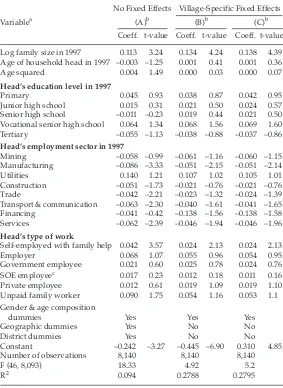
What household characteristics are associated with the patterns of change in per capita consumption observed during the crisis? To examine the household covariates of the change in ln(PCE) between the two rounds, we have estimated a number of exploratory regressions, reported in table 3. Column (A) in this table contains the estimates obtained from regressing the change in ln(PCE) on a set of household and head of household characteristics in 1997, such as family size, age of the head, education level of the head, sector of employment and type of work of the head, detailed age and gender composition of the household, and some variables characterising the geographic location of the household. Meanwhile, columns (B) and (C) control for village-specific fixed effects.19
TABLE 3 Correlates of the Change in ln(PCE) (dependent variable: ln(PCE98)–ln(PCE97))
No Fixed Effects Village-Specific Fixed Effects
Variablea (A)b (B)b (C)b
Coeff. t-value Coeff. t-value Coeff. t-value
Log family size in 1997 0.113 3.24 0.134 4.24 0.138 4.39 Age of household head in 1997 –0.003 –1.25 0.001 0.41 0.001 0.36
Agesquared 0.004 1.49 0.000 0.03 0.000 0.07
Head’s education level in 1997
Primary 0.045 0.93 0.038 0.87 0.042 0.95
Junior high school 0.015 0.31 0.021 0.50 0.024 0.57 Senior high school –0.011 –0.23 0.019 0.44 0.021 0.50 Vocational senior high school 0.064 1.34 0.068 1.56 0.069 1.60
Tertiary –0.055 –1.13 –0.038 –0.88 –0.037 –0.86
Head’s employment sector in 1997
Mining –0.058 –0.99 –0.061 –1.16 –0.060 –1.15
Manufacturing –0.086 –3.33 –0.051 –2.15 –0.051 –2.14
Utilities 0.140 1.21 0.107 1.02 0.105 1.01
Construction –0.051 –1.73 –0.021 –0.76 –0.021 –0.76
Trade –0.042 –2.21 –0.023 –1.32 –0.024 –1.39
Transport & communication –0.063 –2.30 –0.040 –1.61 –0.041 –1.65
Financing –0.041 –0.42 –0.138 –1.56 –0.138 –1.58
Services –0.062 –2.39 –0.046 –1.94 –0.046 –1.96
Head’s type of work
Self-employed with family help 0.042 3.57 0.024 2.13 0.024 2.13
Employer 0.068 1.07 0.055 0.96 0.054 0.95
Government employee 0.021 0.60 0.025 0.78 0.024 0.76
SOE employeec 0.017 0.23 0.012 0.18 0.011 0.16
Private employee 0.012 0.61 0.019 1.09 0.019 1.10
Unpaid family worker 0.090 1.75 0.054 1.16 0.053 1.1 Gender & age composition
dummies Yes Yes Yes
Geographic dummies Yes No No
District dummies Yes No No
Constant –0.242 –3.27 –0.445 –6.90 0.310 4.85
Number of observations 8,140 8,140 8,140
F (46, 8,093) 18.33 4.92 5.2
R2 0.094 0.2788 0.2795
aExcluded dummy variables (reference category): ‘no schooling’ for education;
‘agriculture’ for employment sector; ‘self-employed without any family help’ for type of work.
bSee text for explanation of (A), (B) and (C).
whereas in columns (A) and (B) it is the difference in real ln(PCE). The purpose of the specification in (C) is to allow inflation rates to vary across villages. The results of the three specifications do not differ greatly.
Briefly, the results provide a weak indication that households with a tertiary educated head experienced greater falls in consumption. However, the negative coefficient is not statistically significant at conventional significance levels. Households with heads working in the manufacturing, transport and communication, and services sectors in 1997 seem to have experienced larger falls in consumption than those whose heads were employed in agriculture (the reference employment sector).20 In contrast, households with a head who is self-employed and
working with help from paid or unpaid family workers seem to have experienced significantly higher consumption growth than those of the reference category (table 3).
Inequality
In order to examine the impact of the crisis on the distribution of living standards across households we have also calculated the values of a variety of inequality indices, such as the Generalised Entropy class of indices (denoted by GE(α)), the Gini index, and the Atkinson index (denoted by A(ε)). The GE(α) and A(ε) indices offer the advantage of being more sensitive to differences in different parts of the expenditure distribution, depending on the value of the sensitivity parameters α and
ε. For example, the larger α is, the more sensitive GE(α) is to consumption differences at the top of the distribution; and the more negative α is, the more sensitive GE(α) is to differences at the bottom of the distribution. Along similar lines, in Atkinson’s index of inequality, the larger ε (known as the inequality aversion parameter) is, the more sensitive A(ε) is to income differences at the bottom of the distribution.21
Another advantage offered by the GE(α) and A(ε) inequality indices is that both are additively decomposable into within-group and between-group inequality. This allows us to examine whether consumption inequality changed differently within and across (or between) urban areas and rural areas or within and between districts. Such a decomposition is not possible for the Gini index, although this is the measure more commonly used as an index of inequality.22
In table 4 we report, for each of the two rounds of the survey, the values of the GE(α) index for selected values of α (–1, 0, 1 and 2); the values of the Gini coefficients of inequality; and the values of the Atkinson index for ε = 0.5, 1 and 2. As can be seen from the table, inequality in real expenditures increases substantially according to the GE(–1) (23%) and A(2) (17%) measures. Both of these measures are more sensitive to consumption differences at the bottom of the distribution. The Gini coefficient, meanwhile, increases by only 7%. Inequality using the GE(2) measure, however, falls by 7%.
These findings appear to reflect two phenomena during the crisis. First, inequality in rural areas increased, as the nominal wages of rural wage earners did not keep pace with price inflation of their consumption basket. While real wages fell, some rural net producers benefited from
TABLE 4 Generalised Entropy, Gini and Atkinson Indices of Inequality
GE(–1) GE(0) GE(1) GE(2) Gini A(0.5) A(1) A(2)
1997 0.140 0.133 0.152 0.245 0.283 0.068 0.125 0.219 1998 0.173 0.154 0.166 0.228 0.304 0.076 0.143 0.257
% change 23 16 9 –7 7 13 15 17
By district
Within-group
1997 0.119 0.112 0.131 0.223 0.057 0.104 0.179
1998 0.141 0.123 0.134 0.195 0.061 0.111 0.192
% change 18 9 3 –13 6 7 7
Between-group
1997 0.021 0.021 0.021 0.022 0.011 0.023 0.049
1998 0.032 0.031 0.032 0.033 0.017 0.036 0.080
the depreciation and relative price shift. This is consistent with the findings of Sutanto (1999), which show increasing P(2) indices, potentially indicating rising inequality among the poor. Second, even though this sample does not capture the major metropolitan areas, it does provide an indication of some large falls in the expenditure of the rich in urbanised areas. Thus, inequality as measured by indices sensitive to the upper tail—e.g. GE(2)—appears to be falling.
The increase in inequality in the sample was accompanied by an increase in both within-group and between-group inequality. What is more interesting, however, is that the growth in inequality between districts was proportionately higher than the growth in inequality within districts. Thus, inequalities in mean consumption across districts that were present before the crisis were reinforced as a result of it.
We have also recalculated all of the inequality indices reported in table 4 using nominal instead of real consumption expenditures. We still found that inequality was higher in 1998 than in 1997, but the proportional increase from the 1997 level was smaller. Though suggestive, these results indicate that using nominal consumption expenditures or using deflators that vary only across regions but not across households is likely to underestimate the changes in inequality in Indonesia during the crisis.
CONCLUDING REMARKS
NOTES
* We would like to thank Lant Pritchett and two referees for valuable comments and suggestions, Yusuf Suharso for research assistance, and BPS and UNICEF for providing access to the data. The remaining errors and weaknesses, however, are solely ours.
1 For other studies of social changes during the Indonesian crisis, see Frankenberg et al. (1999); Levinsohn et al. (1999); Papanek and Handoko (1999); Poppele et al. (1999); and Sumarto et al. (1998).
2 This is shown by Suryahadi and Sumarto (1999) and Thomas et al. (1999). Asra (1999) also shows that headcount poverty estimates in Indonesia are sensitive to the choice of inflation rates and cost of living differences between urban and rural areas.
3 See Suryahadi and Sumarto (1999) for a more detailed description of the 100 village survey, and Molyneaux (1999) for a descriptive analysis of the data. 4 This figure slightly exceeds the ‘target’ number of re-interviews, a result
probably due to variations in the rules actually applied in the field. 5 Consumption expenditures here include those on items purchased at the
market as well as imputed values of own production consumed by the household, and gifts. For further details, see Skoufias et al. (1999).
6 These assumptions include W being non-decreasing in each of its arguments, symmetric and quasi-concave, and homogeneous of degree one.
7 Note that this formulation allows for the possibility that social welfare may increase from one period to another even if PCE falls, as long as inequality in the distribution of PCE falls by more than mean PCE.
8 For cross-household comparisons it is more appropriate to use C/Nθ, where
‘θ‘ is a parameter that represents economies of scale at the household level (e.g. θ = 1 implies no economies of scale). For our present purposes of comparison over time, the use of the special case of θ = 1 is not overly limiting. 9 In our calculation of total food expenditures we include alcohol and tobacco
for consistency with BPS practice.
10 Beginning in April 1998, the base year used to calculate price indices in BPS publications was changed from April 1988 – May 1989 to 1996. As a result, month-specific values of the price indices in the first and second rounds of the survey are calculated using different base years. Therefore, before constructing the deflator for non-food items we had first to convert the base of the May 1997 food and non-food price indices to August 1996.
11 Alternative price indices include the general price indices for 44 cities, or the category-specific prices indices for the same 44 cities (BPS, Indikator Ekonomi). All measures suffer from the disadvantage that price indices based on the prices of food items or groups of food items in cities may be quite different from indices based on prices prevailing in rural areas.
13 A distribution f ‘stochastically dominates’ another distribution g if
14 This is true because if we draw any vertical line on the graph, it will always cross the 1998 CDF at a higher distribution value than the 1997 CDF. 15 However, when the analysis is disaggregated into urban and rural areas, there
is some indication that in urban areas the falls in consumption were greater at the upper end of the distribution. For more details on this, see the longer version of this paper in Skoufias et al. (1999).
16 The alternative is to use the standard approach to estimating a poverty line. However, this ‘standard’ approach is not free from questionable assumptions about the composition of the food bundle, the reference population, or the minimum level of calorie availability used to define the poverty level. For more discussion of these issues, see Ravallion (1992) and Chesher (1998). 17 When we deflated nominal expenditures with the deflator that allows the
share of food to vary from year to year, the results changed little, yielding a headcount poverty rate in 1998 of 25.6 % instead of 24.5%.
18 It is difficult to quantify this here, as the data do not include information on types of crops cultivated. Furthermore, the prevalence of marginal farmers who owned small plots of land makes the distinction of landowning farmers and non-landowning agricultural workers less than clear cut. Still, another study by Pritchett et al. (2000), who use the same data, finds that owning land reduces vulnerability to poverty.
19 ‘Village-specific fixed effects’ are the effects of village characteristics that do not change over time.
20 The coefficient of a dummy variable indicates distance from the reference category. For more discussion of regression with dummy variables, see Berndt (1991: ch. 5).
21 The Generalized Entropy index GE(α) is given by the expression:
Technically, GE(0) equals the standard deviation of ln(PCE), GE(1) is the Theil index of inequality, and GE(2) is half the square of the coefficient of variation of ln(PCE). The Atkinson index is given by the expression:
22 If we were to deflate nominal consumption expenditures with a common price deflator such as the national consumer price index, the corresponding inequality indices for each year would be identical to those obtained using nominal consumption expenditures in each year. That is because inequality indices are independent of the scale of the variable analysed. Since our price deflator varies from household to household, our analysis of inequality is based on the deflated PCE.
REFERENCES
Asra, A. (1999), ‘Urban–Rural Differences in Costs of Living and Their Impact on Poverty Measures’, Bulletin of Indonesian Economic Studies 35 (3): 51–69. Atkinson, A. (1970), ‘On the Measurement of Inequality’, Journal of Economic Theory
2: 244–63.
Berndt, E.R. (1991), The Practice of Econometrics: Classic and Contemporary, Addison Wesley, Reading MA.
Chesher, A. (1998), Local Poverty Lines and Poverty Measures for Indonesia, Report prepared for the World Bank, Department of Economics, University of Bristol, Bristol (mimeo).
Cowell, F. (1995), Measuring Inequality, 2nd ed., LSE Handbooks in Economics Series, Prentice Hall/Harvester WheatSheaf, London.
Deaton, A. (1997), The Analysis of Household Surveys: A Microeconometric Approach to Development Policy, Johns Hopkins University Press, Baltimore MD. Deaton, A., and S. Zaidi (1999), Guidelines for Constructing Consumption
Aggregates for Welfare Analysis, The World Bank, Washington DC (mimeo). Foster, J., J. Greer and E. Thorbecke (1984), ‘A Class of Decomposable Poverty
Measures’, Econometrica 52: 761–6.
Frankenberg, E., D. Thomas and K. Beegle (1999), The Real Costs of Indonesia’s Economic Crisis: Preliminary Findings from the Indonesian Family Life Survey, July, RAND, Santa Monica CA (mimeo).
Levinsohn, J., S. Berry and J. Friedman (1999), ‘Impacts of the Indonesian Economic Crisis: Price Changes and the Poor’, NBER Working Paper No. 7194, June, National Bureau of Economic Research, Cambridge MA.
Molyneaux, J. (1999), Descriptive Statistics and Analysis of the First Two Rounds of the 100 Village Survey, RAND, Santa Monica CA (mimeo).
Papanek, G.F., and B.S. Handoko (1999), The Impact on the Poor of Growth and Crisis: Evidence from Real Wage Data, Paper presented at a Conference on the Economic Issues Facing the New Government, LPEM–FEUI, August 18–19, Jakarta.
Poppele, J., S. Sumarto and L. Pritchett (1999), Social Impacts of the Indonesian Crisis: New Data and Policy Implications, SMERU Report, February, Social Monitoring and Early Response Unit, Jakarta.
Pritchett, L., A. Suryahadi and S. Sumarto (2000), ‘Quantifying Vulnerability to Poverty: A Proposed Measure, with Application to Indonesia’, SMERU Working Paper, January, Social Monitoring and Early Response Unit, Jakarta. Ravallion, M. (1992), ‘Poverty Comparisons: A Guide to Concepts and Methods’,
Skoufias, E., A. Suryahadi and S. Sumarto (1999), ‘The Indonesian Crisis and Its Impacts on Household Welfare, Poverty Transitions, and Inequality: Evidence from Matched Households in the 100 Village Survey’, SMERU Working Paper, September, Social Monitoring and Early Response Unit, Jakarta.
Sumarto, S., A. Wetterberg and L. Pritchett (1998), The Social Impact of the Crisis in Indonesia: Results from a Nationwide Kecamatan Survey, SMERU Report, December, Social Monitoring and Early Response Unit, Jakarta.
Suryahadi, A., and S. Sumarto (1999), ‘Update on the Impact of the Indonesian Crisis on Consumption Expenditures and Poverty Incidence: Results from the December 1998 Round of the 100 Village Survey’, SMERU Working Paper, August, Social Monitoring and Early Response Unit, Jakarta.
Sutanto, A. (1999), The December 1998 Poverty in Indonesia: Some Findings and Interpretations, Paper presented at the Round Table Discussion on the Number of Poor People in Indonesia, July, National Development Planning Agency (Bappenas), Jakarta.