FREE
107 MINUTES
OF JS VIDEOS
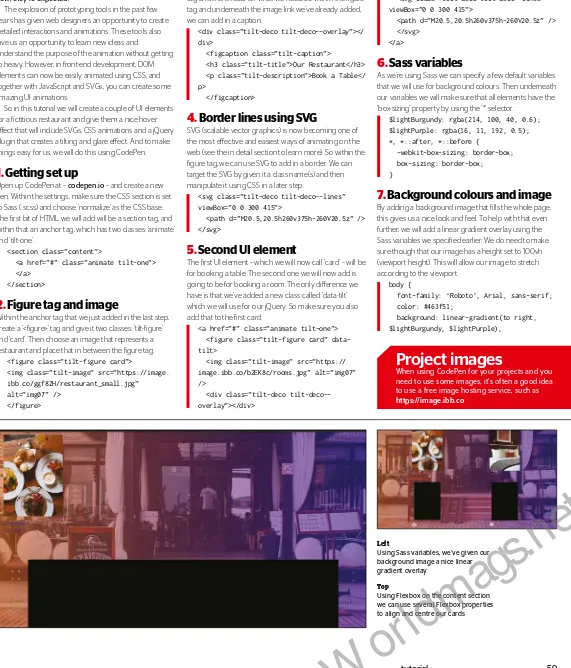
30
PA
G
E
S
O
F
E
X
P
E
R
T
TUT
O
R
IA
L
S
INTERACTIVE
IMAGES
ES MODULES IN
JAVASCRIPT
ANGULAR ST
ATE
MANAGEMENT
UI TILT EffEC
T
wITh SVG
>
Framework
s
>
Prototyping
>
Browser ex
tensions
>
IDEs
>
Code playgr
ounds
>
Testing
>
Animation
>
Colour
>
Fonts
AwESOME
Add the pow
er of sound t
o your projec
ts
AUDIO
>
50 must-try t
ools for toda
y’s designer
s and developer
s
CSS
HTML
JavaScript
PROGRESSIVE
Get oline suppor
t with Google’
s workbox
WEB APPS
Issue 275
W
or
ldm
ag
W
or
ldm
ag
very designer and developer needs the right tools in their creative and/or coding arsenal. The pros know all the best tools to use and that’s exactly who has chosen our collection for this issue’s lead feature. There is a cornucopia of talent that will make your everyday workflow, faster, easier, and, quite simply, better.
Included in the line-up are 50 of the best prototyping and build tools, frameworks, colour tools and fonts, web animation, methodologies and testing, IDEs, code playgrounds and must-try browser extensions. Have a good look through the collection and see what fits your workflow.
Audio and sound are crucial elements if you want a complete online experience. Imagine an app without simple notification pings or a site without music, sound efects and ambient noise. They will survive without sound, but add audio to visuals and you have a complete experience. Richard Mattka explains why and how to use sounds, and implement them with the help of the <audio> tag and the Web Audio API.
Elsewhere, we look at Progressive Web Apps — or PWAs, your choice :-). Find out what Google’s Workbox collection of JavaScript libraries has to help make it easier to build web apps which work ofline. Plus, we have our regular line-up of top tutorials and industry interviews. Enjoy the issue.
Welcome
to the issue
“
I’ve seen no
innovation in web
design in a long time.
It’s unfortunately
become the most
boring design
medium of all
”
Wefail add a little anarchy to design with their distinctive and striking style. Web Designer finds out more. Page 36“
Sounds create the mood and set the pace of an
interactive experience. Music enhances the suspense,
and ramps up the intensity
”
Follow us on Twitter for all the news & conversation
@WebDesignerMag
Visit our blog for opinion, freebies & more
www.creativebloq.com
Highlight
E
50 tools to make you better
Video Tuition – 107 minutes of Beginner’s JavaScript video guides from StudioWeb (www.studioweb.com)
Assets – 14 Midnight Photoshop filters and 6 Hi-res postcard and card mockups from Sparklestock (sparklestock.com)
49
Designer resources
FREE
– exclusive with this issue
www.filesilo.co.uk/webdesigner
– Tutorial files and assets
THE WEB DESIGNER MISSION
To be the most accessible and inspiring voice for the industry, offering
cutting-edge features and techniques vital to building future-proof online content
Steven Jenkins
Editor
Meta
Welcome
welcome ________________________________________________3
W
or
ldm
ag
Contributors
Follow us!
This issue’s panel of experts
“
Choosing the right tools to work with is essential
for any designer or developer. Discover what you
should be using to perfect your workflow
”
Welcome to that bit of the mag where we learn more
about the featured writers and contributors…
Steven Roberts
Steven is a frontend designer and developer from Stockton-on-Tees. He’s currently leading UX, Design and frontend at Asemblr.com. This issue he’s taken a deep dive into the tools, frameworks, methodologies, extensions and playgrounds as used by the pros and recommended for you. Page 44Facebook: www.facebook.com/ WebDesignerUK
Twitter:https://twitter.com/ webdesignermag
Meta
Frank Kagumba
Daniel Crisp
Neil Pearce
Frank is a frontend developer specialising in WordPress CMS, HTML5, CSS3 and JS. In this issue, he shows you how to employ advanced WebGL techniques to reveal text on your webpages using ThreeJS. Page 62
Daniel Crisp is a senior frontend developer currently working on projects for Google. This issue he shows how to set up and use a Redux data store within an Angular 5 application that uses lazy-loading. Page 80
Neil is a front-end developer and designer who has worked in the industry for as long as we can remember. This issue he will be demonstrating how you can use CSS, SVG and a little bit of jQuery to create a tilting UI hover effect. Page 58
Tam Hanna
Leon Brown
Tam quickly realised the benefits of modularisation during his work in the embedded space. He has always been interested in object-oriented JS, and considers ECMAScript 6’s modularisation API a must-discover. Page 86
Leon is a freelance web developer and trainer who assists web developers in creating efficient code for projects. This issue he recreates a host of techniques as inspired by the top-class sites seen in Lightbox. Page 16
Simon Jones
Mark Shufflebottom
Richard Mattka
Simon has led software engineering teams for many years, and is tremendously excited by the potential for service workers — the technology behind Workbox — to bridge the gap between native and web
development. Page 74
Mark is a Professor of Interaction Design at Sheridan College. In this issue, Mark will be showing you how to bring images to life by capturing the user’s mouse movements and triggering reveal animations. Page 54
Richard Mattka is an award-winning interactive technologist. This issue he explores the power of sound in web experiences. Dive into the Web Audio API, libraries and resources to take your projects to the next level. Page 66
4 __________________________________________________experts
Future PLC Richmond House, 33 Richmond Hill, Bournemouth, Dorset, BH2 6EZ
Editorial
Editor Steven Jenkins [email protected]
01202 586233 Designer Harriet Knight
Group Editor in Chief Amy Hennessey Senior Art Editor Will Shum
Contributors
Bryant Chou, Tobias Van Schneider, Mark Billen, Leon Brown, David Howell, Steven Roberts, Mark Shuflebottom, Neil Pearce, Frank Kagumba, Richard Mattka, Simon Jones, Daniel Crisp, Tam Hanna, Philip Morris, Rob Mead-Green, Will Shum
Photography
James Sheppard
All copyrights and trademarks are recognised and respected
Advertising
Media packs are available on request Commercial Director Clare Dove [email protected] Senior Advertising Manager Mike Pyatt
[email protected] 01225 687538
Account Director George Lucas [email protected] Account DIrector Chris Mitchell [email protected]
International
Web Designer is available for licensing. Contact the International department to discuss partnership opportunities International Licensing Director Matt Ellis [email protected]
Subscriptions
Email enquiries [email protected] UK orderline & enquiries 0344 848 2852
Overseas order line and enquiries +44 (0) 344 848 2852 Online orders & enquiries www.myfavouritemagazines.co.uk Group Marketing Director, Magazines & Memberships Sharon Todd
Circulation
Head of Newstrade Tim Mathers
Production
Head of Production Mark Constance Production Project Manager Clare Scott Advertising Production Manager Joanne Crosby Digital Editions Controller Jason Hudson Production Manager Nola Cokely
Management
Brand Director Matthew Pierce Chief Operations Oficer Aaron Asadi Commercial Finance Director Dan Jotcham Editorial Director Paul Newman Head of Art & Design Greg Whittaker
Printed by William Gibbons, 28 Planetary Road, Willenhall, WV13, 3XT
Distributed by Marketforce, 5 Churchill Place, Canary Wharf, London, E14 5HU www.marketforce.co.uk Tel: 0203 787 9060 ISSN 1745-3534
We are committed to only using magazine paper which is derived from responsibly managed, certiied forestry and chlorine-free manufacture. The paper in this magazine was sourced and produced from sustainable managed forests, conforming to strict environmental and socioeconomic standards. The manufacturing paper mill holds full FSC (Forest Stewardship Council) certiication and accreditation
All contents © 2018 Future Publishing Limited or published under licence. All rights reserved. No part of this magazine may be used, stored, transmitted or reproduced in any way without the prior written permission of the publisher. Future Publishing Limited (company number 2008885) is registered in England and Wales. Registered ofice: Quay House, The Ambury, Bath BA1 1UA. All information contained in this publication is for information only and is, as far as we are aware, correct at the time of going to press. Future cannot accept any responsibility for errors or inaccuracies in such information. You are advised to contact manufacturers and retailers directly with regard to the price of products/services referred to in this publication. Apps and websites mentioned in this publication are not under our control. We are not responsible for their contents or any other changes or updates to them. This magazine is fully independent and not afiliated in any way with the companies mentioned herein.
If you submit material to us, you warrant that you own the material and/ or have the necessary rights/permissions to supply the material and you automatically grant Future and its licensees a licence to publish your submission in whole or in part in any/all issues and/or editions of publications, in any format published worldwide and on associated websites, social media channels and associated products. Any material you submit is sent at your own risk and, although every care is taken, neither Future nor its employees, agents, subcontractors or licensees shall be liable for loss or damage. We assume all unsolicited material is for publication unless otherwise stated, and reserve the right to edit, amend, adapt all submissions.
Future plc is a public company quoted on the London Stock Exchange (symbol: FUTR) www.futureplc.com
Chief executive Zillah Byng-Thorne Chairman Richard Huntingford Chief inancial oficer Penny Ladkin-Brand Tel +44 (0)1225 442 244
W
or
ldm
ag
W
or
ldm
ag
Cutting-edge features, techniques and inspiration for web creatives
Chat with the team and other readers and discuss the latest tech, trends and techniques. Here’s how to stay in touch…
[email protected]
•
@WebDesignerMag
•
www.creativebloq.com
Contents
44
Inside issue 275
Meta
08
What’s new in Firefox 60?
The Mozilla browser gets an update and offers
better support. Web Designer takes a look
10
WebKit: The best must-try
resources out there
Discover the libraries and frameworks that
will make your site a better place to visit
11
The future of eCommerce
Webflow CTO and cofounder Bryant Chou talks
about what lies ahead for shopping online
16
Lightbox
A showcase of inspirational sites and the
techniques used to create them
28
Home comforts
When a travel firm needed a new website design
it went local. Web Designer finds out more
36
Breaking the mould
Distinctive and opinionated. Web Designer talks
to the talented trio at Wefail
44
Design faster, code quicker
A collection of 50 must-try tools and extensions
for the modern day designer and developer
66
Awesome Web Audio
Discover why you need audio and how to add the power of sound to your projects
74
Progressive Web Apps
Learn how to add offline support to your apps with the help of Google’s Workbox JS libraries
92
Hosting listings
An extensive list of web hosting companies.
Pick the perfect host for your needs
94
Course listings
Want to start learning online? Check out what courses are out there with this list
98
Next month
What’s in the next issue of Web Designer?
6 ________________________________________________contents
Cover focus
66
Why and how to add web audio
The power of sound
74
How to add offline support with Workbox
Progressive Web Apps
W
or
ldm
ag
Tutorials
Web gurus take you step-by-step
through professional techniques
74
Progressive Web Apps
Introduce offline support to your applications the easy way with Google’s Workbox JS libraries
80
Angular state managment
Learn how you can use the power of RxJS to manage your application’s state with Redux
86
Understand how ES modules work
ECMAScript 6 brings a new native modularization API. Find out how to use it in your projects
FileSilo
• 107 minutes of Beginner’s JavaScript
video guides from StudioWeb
• 14 Midnight Photoshop filters
• 6 Hi-res postcard and card mockups
96
Get the latest must-have resources and videos
Web Developer
Web Workshop
52
Ripple effects and transitions
themustafacelik.com
Add engagment with awe-inspiring interactive effects for background images
54
Add interactive directional images
Use the Direction-Reveal library to respond to user movement and animate images in different directions
58
UI tilt effect with SVG
Introduce animated hover effects to landing pages using CSS, JavaScript and SVG
62
Code animated text with WebGL
Employ the power of WebGL and ThreeJS to create an effect that blows text away in the wind
96
The state of
eCommerce, on the
other hand, seems
mired in the past
CommEnt — Bryant Chou - p11
contents _________________________________________________7
Visit the
WEB DESIGnER
online shop at
for the latest issue, back issues and specials
myfavouritemagazines.co.uk
Never miss
an issue
Subscribe
Turn to page 34 now
Save on the cover price and get the mag delivered to your door
36
16
Adding a little anarchy to design
ProFile:
Wefail
Introducing simple but smart effects
Lightbox:
Crypton
W
or
ldm
ag
t’s no secret that Google Chrome is the world’s number one browser. But popular as it is, it still only has just over 57 per cent worldwide market share. Admittedly that is a huge chunk of the market, and around 40 per cent more than its nearest competitor, Safari. Think of this in real terms and even five or ten per cent still serves millions of users. So when one of the major browsers, that isn’t Chrome, gets an update it is still big news. And as designers and developers, it is still important to know what browsers beyond Chrome are doing.
Firefox sits in the major browser department — and is the popular choice at Web Designer — but we love them all of course. Firefox 60, the latest update at the time of writing, includes some noteworthy new additions. ES modules bring an oficial, standardised module system to JavaScript, but support has not been available across all browsers. Firefox has now joined those which do ofer support, so now is the time
to start using them as intended. There is a great post by Lin Clark at https://mzl. la/2Gjkqy4, which gives a great overview of what ES modules are all about and you can find out more about how they can be used on page 86. For a more technical view of what’s going on be sure you a pay a visit to https://mzl.la/1PY7nnm.
So what else does Firefox 60 bring to the masses? Not the sexiest of subjects, but still vitally important, is security. The latest Firefox update now supports the Same-Site attribute when setting cookies. This helps prevent a malicious site from deep-linking to a page. If you want to read more about this head over to https://mzl.la/2IsDr5t. Sitting in the same arena is the Web
Authentication API. Again not sexy, but still vital. To find out more about what the API is about head to https://mzl.la/2jPvDwJ. And to find out what Firefox 60 ofers, in turn, head to https://mzl.la/2rAAI01.
This one is not such a big deal but we always like an update that adds something simple and potentially attractive — it’s the
designer in us; Firefox 60 adds support for the paint-order CSS property — the only major browser which currently ofers it. You can find out more at https://mzl.la/2rBtisr.
If you are a Firefox lover, or a diligent designer and developer, you can check out the release list for number 60 at https:// developer.mozilla.org/en-US/Firefox/
Releases/60.
The popular browser introduces a new set of features and
support.
Web Designer
takes a look at what’s new
What does Firefox
60 have to offer?
I
News
[email protected] | @WebDesignerMag
CONTACT US AT:
Header
The tools, trends and news to
inspire your web projects
Google is the
dominant force, but
how dominant?
Microsoft’s ofering not quite as popular Number one, as might be expected
90.61
%
In-depth tutorials, expert tips, cutting-edge features, industry interviews, inspiration and opinion. Make sure to get your daily dose of creativity, design
and development. Source: gs.statcounter.com
(correct as of April 2018)
8 _____________________________________________________news
Ever used this search engine? We haven’t
Yandex RU
0.68
%
“
The latest Firefox update now
supports the Same-Site attribute
when setting cookies
”
The old stalwart still the third most popular
Yahoo
2.09
%
Popular-ish Google alternative in Asia
Baidu
2.04
%
Subscribe
today and save
Header
Graphics
Robert Romanowicz
bit.ly/2K5bgqcGorgeous illustrations from the very talented pencil of Robert Romanowicz.
WordPress
Kings and Queens
kingsqueens.ancorathemes.com A simple, straightforward single-page theme with neatly themed sections. Includes eCommerce options.Colour picker
Typesetter
Scotch
bit.ly/2wrLw5DA clean, modern serif font that offers a nod to a historic past. Great for headlines.
05.05.18
bit.ly/2I8dUeu01. Amazonia Font
amazoniafont.comInspired by the exotic wildlife of the Amazon. Choose from the alphabet for more.
02. Barovier & Toso
barovier.com/enTypography speed effects, plus stretch and snap image effects.
03. Célia LOPEZ
celialopez.frMultiple scrolling backgrounds, 3D objects, interactive expanding backgrounds.
04. Prince discography
princeestate.comA simple pop-up window on hover presents music, images and video from the maestro.
Inspiration
Sites of the month
02.03. 01.
04.
#58286F
#E87D55 #C31A7A
#E0B048 #ED146D
01.
header ___________________________________________________9
W
or
ldm
ag
Grid to Flex
gridtoflex.com
CSS Grid is the way forward for layouts,
however for full adoption browser support is always an issue. This is where
Grid to Flex steps in and helps out. If you
need support for IE11 or Edge 15 or below, so you have a complete solution,
this is the answer. Flexbox is the fallback option and the site provides option for
the more obvious layouts.
Calendar
ui.toast.com/tui-calendar
A fully featured JavaScript schedule
calendar that is customisable. View daily, weekly, monthly dates, and resize your
schedule to fit. Plus lots more.
Tone.js
tonejs.github.io
A framework for creating interactive
music in the browser. Provides synths, efects and intuitive musical abstractions
built on top of the Web Audio API.
Facebook Container
mzl.la/2IUqvT8
Want to make it harder for Facebook to
track your activity around the web. Then this Firefox extension/add-on from
Mozilla is the place to get started.
webkit
TOP 5
Web conferences – July 2018
Get yourself a seat at the biggest and best conferences coming your way soon
Angular Camp
angularcamp.tech
A two-day developer-driven conference and one-day
workshops, brought to you by the community.
ScotlandJS
scotlandjs.com
Want to learn about JavaScript and get a bit of whisky and gin
tasting in as the same time? Then sign up now.
Design & Content
content.design
A conference where designers and content strategists team up.
Get a day of workshops and two days of talks.
FullStack 2018
bit.ly/2G0pw12
Get three intensive days of learning and sharing from 68
experts who’re keen to pass on their skills and knowledge.
Curry On 2018
curry-on.org/2018
Set in Amsterdam, Curry On is ‘a conference focused on the
intersection of emerging languages and challenges’.
Header
Resources
[email protected] | @WebDesignerMag
CONTACT US AT:
Discover the must-try resources that
will make your site a better place
10 _____________________________________________resources
W
or
ldm
ag
Header
Comment
t’s 2018. We’re at the height of innovation — and tomorrow will see us reach all-new heights. Technologies like self-driving cars, true artificial intelligence (AI), anthropomorphic robots, and privatised space travel are all right around the corner. They’re so imminently
possible that we’re already seriously considering how these technologies stand to completely transform our civilisation. The state of eCommerce, on the other hand,
seems mired in the past — 1997, to be exact.
A prime example could be the comparison of a couple of reviews of top eCommerce platforms.
Back in 1997 CNET ran a review stating: “For people who’ve been hanging back wondering if they should put their small business on the web, Viaweb’s product says, Yes, you can get involved and
you don’t need a rocket scientist to do it”. Fast forward to 2018 and PC Mag ran a review stating something very similar: “Shopify makes it easy to get of the ground with basic features and the
ability to fine-tune features at a later date. Shopify is our Editors’ Choice for shopping cart tools for its intuitive and easy-to-navigate dashboard, and its ease of use for first-time merchants”.
It’s almost unsettling how similar these descriptions sound.
Over 20 years later, the emphasis remains on ease of use, speed, and accessibility to beginners. All noble goals that help entrepreneurs worldwide get their businesses up and running fast — and
driving a transition to a more diverse, localised, yet global economy.
But there’s not much said about the output of eCommerce website tools: the experience store
owners create for shoppers, which — as any UX designer will argue — has a powerful influence over the success of a store and its underlying brand.
When we do talk about the output of eCommerce tools, it tends to be about how beautiful and modern the templates are. It is about how easy it is to customise a theme thanks to its built-in drag
and drop editor, and how easy it is to edit the HTML/CSS through another built-in editor. All of which creates a ‘design process’ that can be boiled down to the something simple. Once
the user is happy with a theme, all they need to do it hit the Publish button to apply.
Now, I’m not here to excoriate template-based site builders. There’s a clear, market-confirmed
place for such tools in the world. Webflow itself ofers a variety of templates that are ready to publish to the web once the content’s ready.
But this single sentence highlights a gap in the eCommerce site build process today. I call it the ‘experience gap’, because it results in the flattening, or homogenisation, of the shopper’s experience.
Ideally, every store you visit, whether online or IRL, should present a wholly unique experience. An experience infused with brand attributes in everything from the colour scheme to the voice of the
promotional banners, from the staf’s outfits to the clarity and precision of the wayfinding system. Think of your favourite brick-and-mortar shopping experiences. Whether it’s a tatty, well-used
bookstore-café or a freshly opened Anthropologie, the experience is unique, multi-sensory, and most of all, memorable. You think about these places and you can feel the bookstore’s dog-eared paper
between your fingers, smell the wood pulp and leather — or hear Lana del Rey pumping through the state-of-the-art sound system, almost taste the perfume of Anthropologie.
These are places where you don’t just want to buy some of their wares. You want to buy into
the whole paradigm, become part of the experience.
At Webflow, we believe you can bring that to the web. Without sacrificing most of the ease. We believe that you should be able to build a bespoke eCommerce store that’s shaped by its
product lines and manifests the brand in ways that move you. That you should be able to take control of the look and feel of every single element of your site — without having to master some
arcane or proprietary markup language.
We believe there should be a platform that ofers the best of both worlds: intuitive store
management for the entrepreneur, balanced by speedy but powerful design tools for the designer. And we’re going to build it: webflow.com/ecommerce.
I
Can code-free platforms provide a much-needed catalyst to innovation?
eCommerce needs
a shot in the arm
Bryant Chou
Every store you visit,
whether online or IRL,
should represent a wholly
unique experience. An
experience infused
with brand attributes
in everything
header __________________________________________________11
CTO and cofounder, Webflow
Webflow.com
W
or
ldm
ag
Cypress
cypress.io
Testing is a process that every website needs to go through, but the question is what do you use to do it? Cypress claims to ofer ‘fast, easy and reliable testing for anything that runs in a browser.’ So what does it have to ofer? A complete end-to-end testing experience. Setup (no dependencies), execute tests in real-time and view results via its Dashboard.
Probot
https://probot.github.io
This is a framework for building GitHub Apps in Node.js. Probot enables you to code and create your own apps to automate and improve your workflow.
react-web-animation
react-web-animation.surge.sh
A collection of React components that expose the Web Animations API. Contains a number of examples, source code and documentation.
Simple Print
pdf.fivefilters.org/simple-print
This is a free service that provides an easy way to produce printable PDFs from web articles. Enter the URL of the article and press the button.
webkit
TOP 5 WordPress themes
Need to get a good-looking website up and running quickly? Try one of these themes
Phase
bit.ly/2Ia0heN
In a band? Want to start your own record label? This theme has all the elements needed to make it happen.
Buzznote
bit.ly/2IuQiny
A minimalist and easy-to-use theme. Big imagery coupled with serif and sans serif fonts equals a good-looking blog.
Brewski
bit.ly/2K8kWQW
A bar-and-beer themed theme with big landing page images, neat animations and a shop layout for selling your beers.
Benri
bit.ly/2Ia0kat
Not quite sure what you want? This multi-purpose theme has a host of layouts to choose from and is fully customisable.
Baroque
bit.ly/2jLmiWA
An architectual-based theme with a fullscreen image slider. Big, bold typography and a clean design complete the look.
Header
Resources
[email protected] | @WebDesignerMag
CONTACT US AT:
Discover the must-try resources that
will make your site a better place
12 _____________________________________________resources
W
or
ldm
ag
LONDON
19-21 SEPTEMBER 2018
www.generateconf.com
#generateconf
TICKETS ON
SALE NOW
3 DAYS OF INSIGHT AND INSPIRATION
BROUGHT TO YOU BY
W
or
ldm
ag
2.
Mobile ready
Your Semplice site is responsive by default, but you can also adjust mobile
breakpoints straight from the desktop editor for seamless presentation at
any screen size.
1.
Visual content editor
Semplice is built on WordPress, but you won’t see the WordPress CMS.
The visual drag and drop content editor provides a live view of your
page as you create it.
14 _______________________________________________semplice
Web Designer talks to co-founder
Tobias van Schneider
semplice.com
What’s the story behind Semplice? How did it come into existence?
My co-founder, Mike, and I originally built Semplice for our personal portfolios. We were dreaming about a perfect design portfolio, completely customised with beautifully branded case studies for each project. No other portfolio tool out there offered what we needed, so we built it ourselves. We imagined other creatives felt the same way; as a designer you have a specific vision for your portfolio, but not necessarily the time or coding knowledge to make it happen. With Semplice, you can make it happen.
What sets Semplice apart from other portfolio builders?
Many portfolio builders are focused on maintaining the status quo with trendy templates. Semplice is focused on building with pride. You have the freedom and power to create a completely custom website, no coding required. If you do know how to code, you can take it even further. Semplice is built on WordPress, so you have the power of the WordPress community behind you.
What plans do you have for the future of Semplice?
Just last year we launched our latest product, Semplice 4. We stripped Semplice down and built it again from scratch, streamlining the experience and adding a ton of helpful new features. Now we continue releasing new Semplice 4 updates, like our new navigation options or recent Unsplash integration, that make it even better. Aside from that, we have a big project underway for Semplice. It’s focused on our belief that portfolios should be a living thing, continually updated as a designer evolves in their career.
5 key features
Semplice 4 boasts a range
of modern features for the
independent designer,
artist or illustrator
Semplice is the first fully customisable
portfolio system based on WordPress.
Built by designers, for designers.
W
or
ldm
ag
3.
Fully brandable
Nothing is off limits with Semplice. Every element of your portfolio is
customisable, from navigation to button style to footer. You can
even upload custom fonts.
4.
Animations and transitions
Add page transitions or motion to any piece of content. Choose triggers
(on load, click, hover or scroll) and effects to create an elegant and
interactive experience.
5.
Efficient workflows
Create site-wide presets for heading and paragraph text to work more
efficiently. The Studio edition enables you to save content sections
as Blocks and repurpose them.
semplice________________________________________________15
Chances are, designers and studios
you admire already use Semplice
PORTFOLIO SHOWCASE
MICHELA PICCHI
michelapicchi.com
PAWEL NOLBERT
nolbert.com
VERENA MICHELITSCH
verenamichelitsch.com
NOEMIE LE COZ
noemielecoz.com/hello/
W
or
ldm
ag
16 ________________________________________________lightbox
Crypton
https://crypton.trading
Evrone
https://evrone.comDesigner:
W
or
ldm
ag
lightbox _________________________________________________17
LightBox
Ruby on Rails, jQuery, Bodymovin, Amazon CloudFront
Tools
Colours
#431E88 #FFFFFF #111111 #FF2842
This dynamic Ruby-built site represents a cryptocurrency bot that
utilises machine-learning algorithms to forecast profitable trading
Fonts
Space Mono by Colophon Foundry is employed in Regular and Bold weights to add the distinctive robotic style to the typography.
Work Sans by Wei Huang, available via Google Fonts, is used across the subsequent span text snippets.
W
or
ldm
ag
Above
Scrolling the page triggers a series of data visualisations that thoughtfully illustrate Crypton’s various feature highlights
Above
On smaller screens the site reformats its layout accordingly and enjoys more control over the scrolling animations
Above
The opening splash header is very utilitarian, favouring little more than stark typography to underline the robotic theme
18 ________________________________________________lightbox
W
or
ldm
ag
Present webpage content using a typing effect, complete with an animated face
Code an animated
typing effect with narrative face
1
.
Document initiation
The first step is to initiate the structure of the webpage. This consists of the HTML container responsible for storing the head and body sections. While the head section's main responsibility is to load the external CSS, the body section will store the HTML content created in step 2.
<!DOCTYPE html> <html>
<head>
<title>Typing Effect</title>
<link rel="stylesheet" type="text/css" href="styles.css"/>
2
.
HTML content
The HTML content consists of a container that uses the ‘typing’ class. This will be used by the CSS to apply the typing efect to any child elements. The child content element is made from a h1 tag, but you could use another element such as ‘p’ to create the element as a paragraph.
<div class="typing">
<h1>Put your title here...</h1> </div>
3
.
CSS initiation
Create a file called ‘styles.css’. The first step of the CSS defines the document and body containers to cover the full browser window without any visible border spacing. The default colours for the black page background and white text colours are also set in this step. Content elements within the page will inherit the colour set in this step as their default colour.
body,html{
display: block; width: 100%;
height: 100%; background: #000;
color: #fff; padding: 0;
margin: 0; }
4
.
Typing children
All children within the typing container are set to display over one line without the use of text wrapping. Most
importantly, these child elements have the ‘typing’ animation applied to them. This animation is set to play over 5 seconds with 50 frame snapshots – allowing for the staggered typing efect.
.typing > *{
overflow: hidden; white-space: nowrap;
animation: typingAnim 5s steps(50); }
5
.
Face eyes
The efect is also accompanied by an animated face that appears to narrate the typed text. This step creates the eyes of this face as a CSS ‘virtual’ element using the ‘after’ selector. The eyes are placed relative to the parent text, with its content set as two dot text characters.
.typing > *::after{
content: ". ."; display: block;
position: absolute; top: 1em;
left: .35em; }
6
.
Face mouth
Like with the eyes, the face’s mouth is made from a CSS virtual element – this time using the ‘before’ selector. The mouth is positioned in relation to the parent text element, as well as having a border radius to appear with a rounded shape. The ‘typingSpeak’ animation is applied; it will last for 0.5 seconds using two frames of animation. With the animation being repeated five times, the total
animation time will be 2.5 seconds.
.typing > *::before{ content: "";
position: absolute; display: block;
top: 2.1em; left: .25em;
width: 1em; height: .1em;
border-radius: 100%; background: #fff;
animation: typingSpeak .5s steps(2); animation-iteration-count: 5;
}
7
.
Animation definitions
This step defines the animations referenced by elements created in previous steps. The ‘typingAnim’ animation that has been used for the typing efect changes its element from no width to full width. The ‘typingSpeak’ animation used for the face’s mouth changes its element from appearing flat to more open.
@keyframes typingAnim{
lightbox ������������������������������������������������19
LightBox
Crypton
W
or
ldm
ag
Creddy
20 _______________________________________________lightbox
https://en.creddy.ru
Red Collar
http://redcollar.digitalDesigner:
W
or
ldm
ag
A modern p2p online equity lender of Russian origin, Creddy’s
multi-lingual site unfolds colourful stylised SVG animations on scroll
lightbox _________________________________________________21
LightBox
#BC9A80 #FA4E40 #4C6AD6 #182EC4
PHP, Bitrix, HTML5, JavaScript
Tools
Colours
Fonts
The Aperçu Pro font by Colophon is featured in Regular, Italic and Bold weights across page headings and quotations.
Museo Sans Cyrillic 500 by Jos Buivenga and Irina Smirnova for exljbris styles the site’s paragraphs.
W
or
ldm
ag
Above
Click the links to navigate sections and the browser windows fills with multi-coloured waves to smooth page transitions
Above
Responsive enough to look identical in smaller browsers, the site also promotes links to native apps for iOS and Android devices Above
Stacked <div> elements containing SVG assets combine over static backgrounds, using subtle motion techniques to add life
22 ________________________________________________lightbox
W
or
ldm
ag
Use CSS keyframe animation to create independently animated elements for your web page banners
Create an animated header
1
.
Initiate HTML document
The first step is to initiate the document with HTML. This consists of a document container element used to store
the head and body sections. While the head section is primarily used to load the external CSS, the body is used
to store the content elements created in step 2. <!DOCTYPE html>
<html> <head>
<title>Animated Banner</title>
<link rel="stylesheet" type="text/css" href="styles.css" />
2
.
HTML content
The HTML content consists of a head element to be used as a container for the content elements to show.
Each content that is to be animated uses a ‘data-animation’ attribute to describe which animation is to be
applied. This attribute is picked up by the CSS in a later step to apply the required animation.
<header>
<h1 animation="in" data-title>Title</h1>
<div data-animation="up"></div> <div data-animation="down"></div> </header>
3
.
CSS start: header
Create a new file called ‘styles.css’. The first step in this file defines how to display the header container. Its size is set
in relation to the browser window size using the vw and ch unit measurements. Overflow is also set to hidden, so
that content outside the defined size is clipped. header{
position: relative; width: 100vw; height: 50vh; overflow: hidden; }
4
.
Inner elements and title
The elements inside the header section are displayedusing absolute positioning; appearing in relation to the parent header. The element with the ‘data-title’ attribute is
set to display 5 times bigger than the page font size. The ‘left’ property will display it in a specific position – 10%
from the left, while ‘z-index’ will guarantee its appearance above all other content.
header > *{
position: absolute;
}
header > [data-title]{ font-size: 5em; left: 10%; z-index: 99999; }
5
.
First div child
The div elements are used to represent where pictures
will appear; the ‘nth-of-type’ selector is used to select the first div inside the header. Use an image of your choice
with the ‘background’ property – this example sets a semi-transparent colour for default visibility. The
background is set to cover the element size defined through the width and height properties.
header > div:nth-of-type(1){ top: 5%;
left: 10%; width: 50%; height: 50%;
border: 1px solid #000;
background: url(your-image.png) rgba(0,255,0,.25);
background-size: cover; }
6
.
Second div child
The same type of formatting is applied to the second div child inside the header. Unique positioning using top
and left are applied, along with width and height for its size. The background colour defined by ‘rgba’ is for
display purposes of this tutorial – so feel free to take this out when using your image.
header > div:nth-of-type(2){ top: 20%;
left: 40%; width: 50%; height: 50%;
background: url(your-image.png) rgba(0,0,255,.25);
background-size: cover; }
7
.
Animation application
Elements that have the ‘data-animation’ attribute need to
have an associated animation applied to them. This step searches for these elements inside the header container
and applies the correct animation. The settings are made to make the animation last for one second using ‘1s’; alter
this to change the speed of the animation. header [data-animation="up"]{ animation: openUp 1s forwards; }
header [data-animation="down"]{ animation: openDown 1s forwards; }
header [data-animation="in"]{ animation: openIn 1s forwards; }
8
.
Animation definitions
The diferent animations are defined using just one keyframe – which will be the starting point for theanimation to start ‘from’. The final animation frame will be the default settings created for the element in previous
steps 4 - 6. This allows the same animation to be applied to many items.
@keyframes openUp { from{ top: 100%; } }
@keyframes openDown { from{ top: -100%; } }
HURU Backpack
24 ________________________________________________lightbox
https://huru.rocks
Bachoo
https://bachoodesign.comDesigner:
W
or
ldm
ag
lightbox ________________________________________________25
LightBox
#DECDB9 #646A68 #CBAC90 #68986A
Colours
Integral CF Demi Bold, published by Connary Fagen Type Design, is the display sans typeface used across the site’s headings.
PF DIN Text Pro Regular by Parachute is used to style the nuggets of text found within page paragraphs. PHP, jQuery, GSAP, WooCommerce
Tools
Fonts
This boutique backpack brochure scrolls to transition between
typography, photography, video clips and spinning product samples
W
or
ldm
ag
LightBox
HURU Backpack
An effect for page titles where you can choose between changing the background style and content
Create an inverted text swipe
animation effect
1
.
Initiate HTML template
The first step is to define the template structure of the HTML document. This consists of the HTML document container, which is responsible for storing the head and body sections. While the head section is responsible for loading the external CSS stylesheet, the body section will be used to store the content elements created in step 2.
<!DOCTYPE html> <html>
<head>
<meta charset="utf-8" />
<meta http-equiv="X-UA-Compatible" content="IE=edge">
<meta name="description" content="description">
<title>Typewriter Effect</title> <link rel="stylesheet" type="text/css"
media="screen" href="styles.css"/>
The HTML content consists of individual headings with the ‘swipe’ class used as containers for the animated text. Each heading has two first level children – the first being visible by default, with the second being the text to transition into. The first element needs to have its text contained with another container for reasons of the CSS.
<h1 class="swipe">
<span><span>Same text.</span></span>
<span>Same text</span> </h1>
<h1 class="swipe">
<span><span>Some text.</span></span>
<span>Different text.</span> </h1>
3
.
CSS initiation
Create a new file called ‘styles.css’. This step initiates the document to display with a red coloured background that covers the full space of the window. Additionally, the padding property is eliminated to ensure that no visible border spacing is presented around the sides of the web page window area.
body,html{ display: block;
width: 100%; height: 100%;
background: #f00;
padding: 0; }
4
.
Swipe container
Each container element using the ‘swipe’ class is required to use relative positioning and to be displayed with a set height. The height set to 1em will show the element with the same height as the text characters it will display. These settings are important for the CSS defined in following steps.
.swipe{
position: relative;
height: 1em; }
5
.
Swipe children defaults
All of the first level children inside the swipe containers are required to have a set of default properties for the efect to work. These include absolute positioning so that they can be positioned at the top of their container. It’s important for these items to be floated to the right for their animation to work.
.swipe > *{
position: absolute;
display: block; overflow: hidden;
width: 100%; height: 1em;
color: #000; background: #fff;
white-space: nowrap; float: right;
top: 0; margin: 0;
}
6
.
Swipe child one
The nth-child selector is used to apply specific styles to the first element that appears within the swipe container. While the outer container uses an animation to push the black box forwards, the inner container uses an animation to pull its inside text backwards. This keeps the text positioned in the same place while the black background swipes forward to reveal the second level child element.
.swipe *:nth-child(1){ position: relative;
color: #fff; background: #000;
animation: outer 5s forwards; }
.swipe *:nth-child(1) > *{ display: block;
z-index: 3; width: 100%;
float: right;
animation: inner 5s forwards;
}
7
.
Animation definitions
The final step is to define the animations required for step 6. The outer element is animated by changing its width from 100% to 0 – hence the importance of it being floated right in step 5. The inner animation needs to pull the text backwards, which is achieved by increasing its width to double the size of its container.
Graphic design
Web design
3D
Digital art
www.creativebloq.com
The number one
destination for web design
news, views and how-tos.
Get Creative
Bloq
direct to
your inbox
with
our weekly
web design
newsletter
W
or
ldm
ag
28 __________________________________________design diary 28 __________________________________________design diary
Home
Comforts
When award-winning
travel specialists
Inside Asia Tours Ltd
requested a new
web experience
celebrating exotic
away days, they kept
it local with a
standout agency
close to their hearts
28 __________________________________________design diary
W
or
ldm
ag
design diary _________________________________________29
Home Comforts
design diary _________________________________________29
When to Travel
insideasiatours.com/
when-to-travel
by
Green
Chameleon
craftedbygc.com
@CraftedbyGC
video and animation. Formed in 2012 and growing to boast a 12-strong team boasting designers, animators, UX specialists, developers and videographers, it’s no surprise the talented team keep their impressive client list coming back. So when the people at Inside Asia Tours, a travel and tourism brand already working with GC for almost three years, wanted to deliver a new digital presence they knew where to go. In fact the previous ‘Step Inside Asia’ campaign between the two was featured in Web Designer 252’s Lightbox, so IAT knew that ‘When to Travel’ would be in good hands. “This time the brief was designing a tool to showcase IAT’s expert knowledge of local events, weather and generally the best time of year to visit the countries that they operate in,” begins GC’s Design Director, Nathan Riley. “Our aim became to create an evergreen content hub that the client could easily add to and amend over time whilst ensuring that the piece was visually striking and engaging for potential customers.”
O
VER THE MANY issues that Design Diaryhas appeared, featuring the many agencies and projects, a big theme of loyalty keeps popping up. There’s very much a refreshing sense of devotion and partnership between client and agency, or agency and client too, which speaks volumes for how the web design industry seems to function. Instances where projects are ‘pitched out’ blind to a pool of fervent takers seem rare, avoiding a creative clamouring or stampede for business. In fact, if the ‘pick me’ process exists for an agency that succeeds in satisfying a client it might occur at the very start of a relationship
that tends then to prevail. Often this is because a follow-up commission leads directly on from work the trusted agency is already attached to, which is precisely the case this month. For those who haven’t spotted them already, Green Chameleon are a Bristol-based creative production studio that specialise in crafting experiences across digital, branding, packaging,
Project duration
6 months
People involved
Nathan Riley
Design Director
Paul Thomas
Developer
Jess Caddick
Designer
Mike Babb
Developer
Tom Anderson
Creative Director
“Our aim became to create an
evergreen content hub that the client
could add to and amend over time”
W
or
ldm
ag
30 _________________________________________design diary
Home Comforts
Close communications
If the first little part of an initial brief was to represent the client’s expertise in an efective way, another big focus was promotional and not purely in typical form. A second objective for the campaign would be as a tool that could also be used as part of the client’s exhibition and trade show stand, making the need for versatile access essential. “With this in mind we knew we’d spend a lot of time refining the experience across mobile and tablet devices ensuring that when demos were given to potential customers the experience was as smooth as possible.” All these requirements and early ideas were established immediately when the project kicked of with a brainstorming session to discuss possible avenues and get IAT’s thoughts on their brief. “Following this the GC team went away and started putting together look-and-feel concepts along with user flows to explore how the site might work in more detail, and the overall art direction. During the early stages we try to bring in the development team as much as possible to ensure that what we are designing is buildable, however challenging,
Home Comforts
30 _________________________________________design diary As we know, a strong defining factor for the production process of the ‘When to Travel’ project has been the connection between client and agency. It’s clear from speaking to them that Green Chameleon takes considerable pride in the on-going working relationship it enjoys with Inside Asia Tours, partaking in a variety of campaigns and projects. “We’re always thrilled when they come to us with a new brief as their in-depth knowledge and passion for travel makes working with them and coming up with concepts a real pleasure,” enthuses Design Director Nathan Riley. “The focus of this last project was always in highlighting IAT’s expert knowledge of the locations and the events that take place there, so working closely with them to ensure this was always
kept at the forefront of the creative was extremely important.” Of course, it’s all very well and good working so close and talking things out but only when the discussions can be productively applied. Creative design inspires such an emotional kind of evaluation and assessment of what feels right, that it demands some formal techniques to make a myriad of opinions practically useful. “Along with face-to-face meetings we present a lot of design work with InVision and always encourage clients to leave feedback via the commenting system. This enables us to keep track of changes and evolutions of the design as the project goes on, it also gives us a good record to refer back to if any issues crop up later down the line.”
Closer calls
W
or
ldm
ag
design diary __________________________________________31
Home Comforts
and makes sense from a technical perspective. This also helps to inform the technologies and development approach and brings everyone involved onto the same page, which helps massively in keeping the project running smoothly, the scope agreed and defined, and deadlines hit.” Having worked previously as part of a continuing client-agency relationship, both sides would, of course, know that strong and close communication would be easy enough. IAT are based just around the corner from Green Chameleon’s Bristol ofice, so regular catch-up meetings were convenient and deemed vital to the producing a successful site for giving users easy access to the best events and weather at selected destinations.
Evoking reactions
“As always we started with a kick-of meeting where ideas were thrown about between designers, strategists and developers,” elaborates Creative Director Tom Anderson. “The content types to include were clear at this stage so the discussions revolved around how best to create an interesting but intuitive user
interface for the destination information being conveyed. The real challenge was how we cohesively tied that info together with locational-based weather and then split that content up between diferent countries. As we were dealing with events and dates we all settled on some form of timeline, which allowed users to view events sequentially, but at any time they could toggle to the weather for that time and destination. This seamless navigation between the two core content threads is where we focused our eforts and eventually spawned the final outcome.” Once the GC team had sign-of on the initial art direction both sides had agreed, then a second stage of design commenced. Here the focus was the rollout of the design across all the inner pages pertaining to mobile and desktop views, before a final stage tackling the interaction design. “We would spend considerable time producing animations
of page transitions and load efects to help guide the development of the site,” Nathan recalls. “We’re strong believers that a website provides the opportunity to design not just how it looks but how it feels to a user and therefore the emotions and reactions it can evoke are revealed more vividly than from just a flat design.”
Visual assurances
Given that the project would represent a travel brand so versed in the value of good sightseeing, it’s no surprise that engaging visuals would be pushed up front. The graphical work poured into honing the frontend would therefore utilise the collective talents of the whole GC crew, with a preference for keeping the deeper development team well informed of where things were headed. “As with all our projects it’s a real team efort, we generally
“A website provides the opportunity to
design not just how it looks but how it feels”
Home Comforts
“Although a relatively small piece of the puzzle, the draggable timeline at the bottom of the month pages was a feature that seemed simple by design but
the usability issues once prototyped became apparent, screen real estate being one of the biggest challenges. The resulting functionality, being able to drag and scroll through the months whilst the line animates was a real labour
of love but we’re glad we persevered and completed it for the final build.”
Site Highlight
Designer Director Nathan Riley sticks his neck out
and reveals the team’s opinion on a favourite
feature for showing the project’s true colours.
W
or
ldm
ag
32 __________________________________________design diary
Home Comforts
32 __________________________________________design diary
use rapid visual prototyping in all our projects to start to generate a unique look-and-feel concept,” Tom explains. “While developing a clear visual direction we carefully plan out the user’s experience in tandem. Using wireframes and visual prototyping along with animated interaction prototypes we construct the final product. We’re careful to include developers throughout the decision-making process in order to keep the designs realistic.” From this work the team would have something tangible on the visuals to take back to the folks at IAT and gauge their reactions. Only after getting the OK and the necessary agreements here would allow GC’s developers to start writing the code for running the show. “The development stage kicks of after all designs and mock-ups have been oficially signed of,” says Nathan. “As the site relies on a Laravel backend to allow the client to upload and manage content, we realised the task at hand of uploading over 200 events and weather details would take
considerable time so we focused on delivering the CMS first whilst the frontend team push forward with their tasks with an eye to connect the two parts up in the final stages of the build.”
Arresting development
This Laraval-based content management system was custom-built specifically with the purposes of assisting the client. From here IAT would have the necessary control most clients
demand when it comes to managing old and new content in-house throughout the life of the site. “On the backend, there’s a content management system that was custom-built in Laravel so the client can manage all the site’s
content,” reiterates Senior Developer, Mike Babb. “The data from that
CMS is exposed to a React frontend that
was so quick we actually had to slow things down a little in order to allow the nice transitions and animations to take place! We spent a long time reviewing and tweaking them so that every single one felt just right. Slow enough to have time to complete and flow nicely, but
not so slow that you ever feel you’re like you’re waiting for them to finish to get to the content you clicked to see.”
Moving back towards the frontend coding, the majority of the site’s animations were created using GSAP, the GreenSock Animation Platform. A popular choice for
many of the agencies we cover here, GSAP was GC’s firm studio favourite for adding necessary creative flourish to ‘When to Travel’ and solving a few issues in the process. “A particular challenge was adding the little animated touches to the Google Map powering the weather pages, as we couldn’t implement them directly with the Google Maps API and instead had to work the GreenSock magic on a cleverly positioned layer over the top of the map. The result is a beautiful, customised map bursting with animated interactions. Another significant challenge was getting the site’s homepage to perform well. The background efects for the three screens of the country selector were originally JavaScript writing to HTML5 Canvas elements, but some browsers and devices really struggled to render the efects smoothly enough to meet our standards. In the end, we scrapped the JavaScript and Canvas approach and implemented them using some creative CSS trickery instead to
“A particular challenge was adding the
little animated touches to the Google
Map powering the weather pages”
Home Comforts
The period after development and delivery of ‘When to Travel’ revealed a curious additional challenge for taking the project live. As part of Green Chameleon’s agreed service remit and relationship with client Inside Asia Tours, the campaign sites are actually hosted on GC’s own servers. This is because each, including this one, are all built with diferent frameworks and technologies that are separate to IAT’s main commercial website. “So one of the challenges faced here was the setup of a reverse proxy, which is essentially a set of server rules that allow users and search engines to see the campaign site as part of the IAT domain and therefore gain all of the
SEO value generated, even though it is hosted somewhere else,” explains Tom Anderson, Creative Director. “This approach allowed us to continue ofering maintenance and updates on the site without interfering with their main website. Plus, generally we have a very integrated relationship with Inside Asia Tours, which includes ofering aftercare as well as continued support on digital marketing campaigns as part of an ongoing arrangement. An example of a previous campaign site we also created for them is ‘Step Inside Asia’, which was a resounding success, and there is more to come this year that we’re all very excited about!”