EVALUATING USER INTERFACE DESIGN OF SKYPE AND
GOOGLE TALK BASED ON ANDROID PLATFORM
Arnold Nasir
Program Studi Teknik Informatika, Fakultas Teknologi Informasi, Universitas Atma Jaya Makassar Alamat email : [email protected]
ABSTRACT
As technology advances, more and more applications are developed with the intent of making our lives easier. Communication is an important part of our everyday lives; so many technologies have been developed for this purpose. Voice over Internet Protocol (VoIP) is a technology that is used for making both textual and vocal communication. VoIP applications are gaining popularity due to the low cost and high quality service, which is comparable to the traditional telephone service [3]. Nowadays, Skype, which is owned by Microsoft, is the most popular VoIP service with 405 million registered users and 15 million active online users [3, 6]. Google Talk, owned by Google is also a popular VoIP application. This study compared the interface and usability of both these applications and found that Skype was by far the most user friendly and attractive.
Keywords: User Interface Design, GoogleTalk, Skype
1. PENDAHULUAN
Effective ways to bring people together using technology is an area of extensive research. People are always trying to find ways to communicate with each other in a more efficient manner. Nowadays, the demand for social interaction in our society is increasing dramatically. The general public is moving away from the traditional phone service to satisfy their need for interaction. Many are switching over to VoIP systems that can replace their traditional mobile service simply by installing an application [8]. This experiment aims to evaluate two VoIP systems, Google Talk and Skype, as they are the two most widely used VoIP applications on the market [15]. The experiment will be carried out on the Android Operating System, as it is the most popular mobile operating system in the United Kingdom [11]. We are evaluating two of the most popular VoIP systems in order to find out which is the most effective in terms of usability. The experiment aims to answer our research question by evaluating the following aspects:
1. The effectiveness of the system. Which application will allow users to communicate in the most intuitive manner?
2. The usability of the GUI: Which is easier to use when you are searching for a task?
3. Which application the user prefers to utilize for communication.
In addition to the research question the experiment evaluates the overall user interface by querying the user opinion on the color, layout and how attractive the interface of each application is.
2. TINJAUAN PUSTAKA
The user interface of a mobile application plays an important role in determining its success [1]. Unfortunately, there is very little research comparing the Skype and GoogleTalk user interface. However, there is extensive research in the general field of general application usability. For the iOS Operating System, Apple mentions several important design aspects that an application should have in order to have an effective user interface. This section will be split into two subsections: the appearance of the app and the logical path. These are the two most important points highlighted by apple [6]
2.1 User Interface
is the time that the user needs to learn on how to interact with the system. The second factor highlighted is the rate of errors that are produced by the user. The retention over time was another important factor, which aims to measure how much a user can retain their knowledge about working with the system after a period of time. Finally the user satisfaction was found to be the most important aspect. Guidelines for user interface design are proposed by [14] in order to create a more effective user interface. 1. Consistency: The system should use a
specific model by using clear words and commands as a standard based on the platform in whole system.
2. Flexibility and efficiency of use/user: The interaction and the satisfaction of expert and non-expert users should be the same.
3. Color utilization: Not all people have the same mental standards. There should be a more careful approach when the layout and the formatting style of the application is designed.
4. Reduce latency: Long visual or aural acknowledging against button clicks should be avoided.
5. User control and freedom: The requirements of the user and their personality should be taken into consideration
6. Minimize the user's memory load: The system should use its memory and adapt to the user rather than requiring the user to remember how to achieve an action. 7. Creating multilingual forms: The
widgets when the user is selecting a language should be carefully designed. 8. Aesthetic aspects: The design should be
ordered and well-formed. Additional information should not be visible to the user.
9. Error handling/prevention: Commit / rollback commands can be used to prevent the user from losing their work. 10. Anticipation: A simple but complete menu design, where the items are properly organized is recommended
2.2 Usability
Usability is defined by ISO 13407 as extent to which a product can be used by specified users to achieve specified goals
with effectiveness, efficiency and satisfaction
in a specified context of use.” [7, 9].
According to the researchers [14] applications that have a limited feature-set are harder to use compared to a more feature complete version. In addition to this, McCall and Boehm suggest usability as one of the primary quality attributes [9]. According to Mahemoff and Johnston there are some
properties to assure the quality of a ‘usable’
interactive system [5].
1. Task Efficiency: Its aims to provide help to users of varied experience levels to minimize their effort to perform their tasks.
2. Reuse: sure that user can reuse existing effort and knowledge.
3. User-Computer Communication: Encourage the collaboration between humans and computers by appropriately representing changes to the system 4. Robustness: Minimize the likelihood of
user missed-performing tasks and facilitate recovery from errors when they occur.
5. Flexibility: The system should take into account the variety of the different backgrounds and experience of the users by allowing them for to interact with multiple ways and by enabling user customizations of the system.
2.3 Color
The combination of typography and color theory is the key point in presenting attractive visuals to the customer [13]. In a panel session, a panelist named Marcus, A., expressed his views on color as an effective
tool for computer graphics. He states, “As
display equipment, applications, and users become more sophisticated, color will be used in more subtle ways to affect positively the efficiency and pleasure with which people
work with computers.” [12]. During that
From the explanation above, we know that it is crucial for developers to use the appropriate color for each element of an application; not just from the aesthetic side but developers also need to consider whether the color will affect the functionality of the application.
The choice of an appropriate color palette is a significant issue in designing graphical user interfaces. The color choice is not only based in on aesthetics and psychology but there are also other requirements. In order to find a suitable match between different colors one need to
undertake experiments and try many colors’
combinations. Thus, finding an appropriate color palette can be regarded as a combinatorial optimization problem.
In [2] genetic algorithms are suggested in order to find a solution on making a
combinational colors’ analysis. [2] Suggests
that amount of colors in each form should be limited by using mostly 5 colors. Furthermore, it is also stated that designers should focus more on the graphic design of the applications by using appropriate fonts and colors.
When choosing the colors for an application design, it is suggested that: 1. The choice of the combination of the
colors should be made very carefully. One bad example is a blue background with red typography, which according to [14] exhausts the eyes of the reader. 2. The application interface needs to be
Another important aspect that developers need to appreciate is the logical path of the application. The logical path helps users to understand where they are in the application and know that they are heading on the right path for their desired goal. The researchers Chaudry et al. [3] examined how
low-literacy people navigate throughout applications. From their experiment, they discovered that linear-structure navigation was the easiest to navigate, compared to other structural navigation techniques. The result of their experiment found that applications that have multiple paths to navigate tend to be difficult to use, thus reducing the user experience of the application.
3. RESEARCH METHODOLOGY
The experiment lasted one week and it was based on several tasks that the participants had to undertake. They all used the same equipment, a Samsung Galaxy Tab P-1000. Initially we planned to use the university Wi-Fi connection to access the apps, but unfortunately there were some problems with the connection as it blocked GoogleTalk traffic. Thus, we decided to use a 3G data-plan as the Internet connection for the experiment. At the end of the experiment the participants had to complete a questionnaire.
3.1 Participants
The participants that took part in the experiment were 12 MSc. IT students aged 23-30. There was not a specific criteria used for the selection of participants. The familiarity of the participants with the two applications assessed in this project varied, this was discovered when analyzing the results of the survey.
3.2 Tasks
The participants were instructed to undertake specific tasks for each application, the choice of the first application utilized was changed every few participants. The order of the tasks was kept constant throughout the experiment. The participants were already logged in to both applications, so the
experience of logging in wasn’t assessed.
The time for implementing each task was recorded. The tasks are listed below: 1. Add the contact
[email protected]
2. Make a voice call to the contact “Tom”. End the call
3. Make a video call to the contact “Tom”.
4. Send the instant message “hello world”
to the contact “Tom”. Insert a smiley
icon to the message.
5. Rename the contact “Tom” to “Test”.
6. Block the contact “Test”.
7. Unblock the contact “Test” and delete it.
3.3 Questionnaires
After completing the tasks the participants had to complete a paper-based questionnaire. The questionnaire aimed to
rate and records the participants’ experience.
Firstly, we wanted to record how many had used Skype and GoogleTalk before the experiment and how often. Then we evaluated whether the users were aware of the shortcut access and if so which tasks they utilized it. Finally the participants had to evaluate each task separately by rating them based on how confusing or complicated they were to use. Finally they rated the interface. Particularly the layout, the color and how attractive they found the interface of each application.
Figure 1.The percentage of participants that have experience in using the apps before the
experiment
4. RESULTS
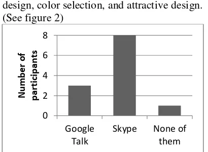
Of the 12 participants that took part in this experiment, only 4 participants (33%) had used either GoogleTalk or Skype on the Android environment previously, while the rest of the participants (67%) had no experience in using either application on the Android Operating System (See figure 1). Also, more than half the total number of participants (74%) said that GoogleTalk was harder to navigate than Skype (26%). A scale ranging from 1 (worst) to 10 (best) was used in the survey evaluation. Overall, there were 8 participants (67%) that thought Skype had a good layout design, color, and an attractive interface, while there were just 3 participants (25%) that believed GoogleTalk had a good
design, color selection, and attractive design. (See figure 2)
Figure 2. User interface design preferred by participants
Furthermore, we also observed whether participant had knowledge of the shortcut functions, which aims to help users complete the tasks faster. There were 7 participants (58%) who were aware of the shortcut access in Skype compared to only 5 participants (42%) who were not aware of the shortcut access available in Skype. In contrast, there were just 5 participants (42%) who were aware of the shortcut access in GoogleTalk and 7 participants (58%) who were not aware of it
Figure 3.The average time required by participants to complete the tasks
4.1 Assessing Difficulties in Navigating GoogleTalk and Skype
When participants tried to finish tasks that were assigned to them, we also observed the participant in order to evaluate their performance while analyzing which task the participant will have difficulty.
a. Navigation Difficulties on GoogleTalk From the observation, we noticed that some tasks were hard for the participants to accomplish. Out of the total number of 12 participants, there were 9 participants that had difficulty attempting to make a voice call
in GoogleTalk. We believe that participants were having difficulty making a voice call because the voice call menu is located on the
sub-menu of “More” under the Contact
Menu. (See figure 4)
List contacts Contact Contact Menu
(More) Voice Chat
Figure 4.Navigation Scheme for Making Voice Call in GoogleTalk
Another possible hypothesis for the reason that participants had trouble attempting to make a voice call was that GoogleTalk might have used an inappropriate label to represent voice call functionality. During observation, we noticed that some participants did not
click on “Voice Chat” even though it clearly
visible on the screen. We believe that this situation was because participants might
unsure of whether the “Voice Chat” was the
function to make voice call or not. b. Navigation Difficulties on Skype
Before we did the experiment, we made an initial hypothesis that Skype would be easier to navigate. Indeed, from our observation we have seen that when participants were using Skype, they did not have much difficulty. However, we found that when participants were given the
instruction to “unblock” specific contact,
there were 4 participants who used the
“Search” function in order to find the blocked
contact. We expected participants to follow the desired path (See Figure 5) instead of
using “Search” function.
Contacts List
Blocked Contact Blocked Contacts List
Unblock Contact
Search blocked contact Change display
contacts list
Unblocked
= Alternative path = Alternative path
= Desired path = Desired path
Figure 5.Navigation Scheme for Unblocking Particular Contact in Skype
4.2 Assessing Graphical Interface Design
When evaluating the color composition, 3 participants found that Skype had an attractive choice of color composition; most participants preferred the choice of light shades. However, there were 2 out of 12 participants, who made the comment that
Skype should change its color scheme, as it
was too “old-style” or “girly”. (See figure 6).
Figure 6. Graphical User Interface of Skype
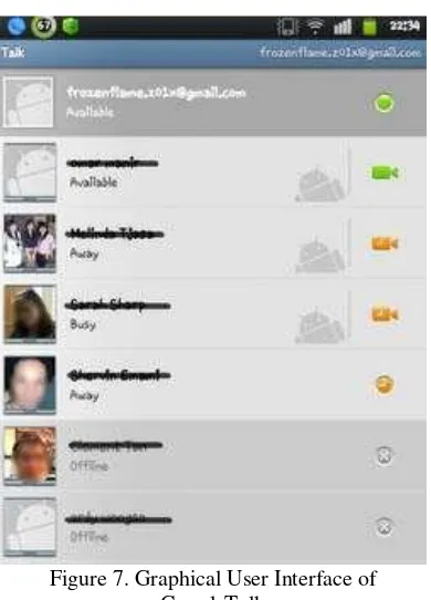
Figure 7. Graphical User Interface of GoogleTalk
Similarly, there were many comments on the
color of GoogleTalk’s interface. There were
3 participants who believe that Google Talk
utilized colors that are “bland” or “not
attractive”. (See figure 7) Surprisingly, there
was only one participant who liked the color composition of GoogleTalk. GoogleTalk also got negative comments from participants in terms of the layout design. There were 2 participants that had complained about
GoogleTalk’s layout, commenting that it was
4.3 LIMITATIONS
While conducting this experiment, we believe that it is too early to justify the result of this experiment as concrete evidence on the usability of the two applications. There are some limitations in this experiment, which affected the result of the experiment both directly and indirectly. As mentioned earlier, there were only 12 participants who took a part in this experiment. With such a small number of participants, the results of this experiment could potentially be very different when carried out using over 100 participants. Another limitation of the experiment is this project has only used participants from the University of Glasgow who are studying for an MSc in Information Technology. So the results can’t be applied to conclude that all users around the world have the same view. Also students studying MSc IT will have more technical experience than the people in general.
5. CONCLUSION
The conclusion of this experiment is that Skype is generally preferred over GoogleTalk in terms of usability and attractiveness. Participants had more difficulty finding some tasks in Google Talk compared to Skype. In addition to this, the interface of Skype was preferred over
GoogleTalk’s interface. This experiment also
considered the impact of the familiarity that the participants had with each of the applications on the outcome of this experiment. The participants who used Google Talk on a daily basis preferred GoogleTalk to Skype. However, the participants that had never used either GoogleTalk or Skype on Android before made a clear preference to Skype. Furthermore, during the experiment, we witnessed a learning process where after a participant had finished all of the tasks for the first application, they tended to be more would use the application they would do all of the tasks faster and they would remember how to accomplish them. This experiment
concludes that Skype’s user interface and
functionally was found to be better that
GoogleTalk’s in this small user study.
6. REFERENCES
[1] Ayob, N., Ab. R.C. Hussin, and H.M. Dahlan. Three Layers Design Guideline for Mobile Application. International Conference on Information Management and Engineering, 2009.
[2] Birtolo, Cosimo; Pagano, Paolo; Troiano, Luigi. Evolving colors in user interfaces by interactive genetic algorithm. Nature & Biologically Inspired Computing, 2009. Page(s): 349
– 355. NaBIC 2009, IEEE
[3] Chaudry, B.M., K.H. Connelly, K.A. Siek, and J.L. Welch. Mobile interface design for low-literacy populations.
IHI’12, 2012.
[4] Chen, Kuan-Ta, Chun-Ying Huang, Polly Huang, and Chin-Laung Lei. Quantifying Skype User Satisfaction.
SIGCOMM ’06, 2006.
[5] Hussey, Andrew; MacColl, Ian; Carrington, David A. Assessing usability from formal user-interface designs. Page(s): 40 - 47 .Software Engineering Conference, 2001, IEEE.
[6] IOS Developer Library. User process for interactive systems, First edition, 1999-06-01. ISO.
[9] Juárez-Ramírez, Reyes ; Gómez-Ruelas, Manuel ; Gutiérrez, Alan A. ; Negrete, Pavel. Towards improving user interfaces: A proposal for integrating functionality and usability since early phases. Uncertainty Reasoning and Knowledge Engineering (URKE), Page(s): 119 – 123, International Conference on . 2011, IEEE.
[10] Kho, W., S. A. Baset, and H. Schulzrinne. Skype Relay Calls: Measurements and Experiments. Department of Computer Science Columbia University.
[11] MobileUsers. Android is the most popular mobile OS in the UK. http://www.mobileusers.com/2012/02/2 2/android-is-the-most-popular-mobile-os-in-the-uk/ .
[12] Marcus, A., W.B. Cowan, and W.Smith. Color in user interface design:
functionality and aesthetics. CHI ’89,
1989.
[13] Nielsen, J. The importance of being beautiful [user interfaces]. SunSoft, Mountain View, CA, Volume 13, Page(s) 92-94. 1996.
[14] Sajedi, A.; Mahdavi, Mehregan; Mohammadi, Amir Pour shir; Nejad, Minoo Monajjemi. Fundamental Usability Guidelines for User Interface Design.Page(s): 106 – 113. IEEE, 2008.