22
CHAPTER 3
Exploratory Data Analysis
Exploring data can help to determine whether the statistical techniques that you are considering for data analysis are appropriate. The Explore procedure provides a variety of visual and numerical summaries of the data, either for all cases or separately for groups of cases. The dependent variable must be a scale variable, while the grouping variables may be ordinal or nominal.
With the Explore procedure, you can: Screen data
Identify outliers Check assumptions
Characterize differences among groups of cases
3.1. Descriptive Statistics across Groups
Corn crops must be tested for aflatoxin, a poison whose concentration varies widely between and within crop yields. A grain processor has received eight crop yields, but the distribution of aflatoxin in parts per billion (PPB) must be assessed before they can be accepted.
This example uses the file aflatoxin.sav. The data consist of 16 samples from each of the 8 crop yields. See the topic Sample Files for more information.
3.1.1. Running the Analysis
To begin the analysis, from the menus choose:
23
Figure 24 Explore dialog box
1. Select Aflatoxin PPB as the dependent variable. 2. Select Corn Yield as the factor variable.
3. Click OK.
3.1.2. Pivoting the Descriptives Table
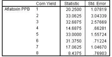
To assess how the mean of Aflatoxin PPB varies by Corn Yield, you can pivot the Descriptives table to display the statistics that you want.
1. In the output window, double-click the Descriptives table to activate it.
2. From the Viewer menus choose: Pivot > Pivoting Trays...
24
Figure 25 Pivoting Trays window with Statistics in the layer
5. Close the Pivoting Trays window.
6. Deactivate the table by clicking outside of its boundaries.
Figure 26 Mean aflatoxin level
25 3.1.3. Using Boxplots to Compare Groups
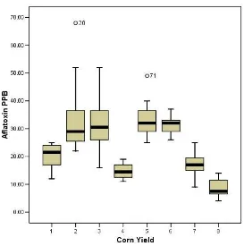
Figure 27 Boxplots of aflatoxin level by yield
Boxplots allow you to compare each group using a five-number
summary: the median, the 25th and 75th percentiles, and the minimum and maximum observed values that are not statistically outlying. Outliers and extreme values are given special attention.
The heavy black line inside each box marks the 50th percentile, or median, of that distribution. For example, the median aflatoxin level of yield 1 is 21.50 PPB. Notice that the medians vary quite a bit across the boxplots.
The lower and upper hinges, or box boundaries, mark the 25th and 75th percentiles of each distribution, respectively. For yield 2, the lower hinge value is 24.75, and the upper hinge value is 36.75. Whiskers appear above and below the hinges. Whiskers are
26 observation is found. Extreme values are marked with an asterisk (*). There are no extreme values in these data.
3.1.4. Summary
Using the Explore procedure, you created a summary table that showed the mean alfatoxin level to be unsafe for five of eight corn yields. You also created a boxplot for visual confirmation of these results.
Boxplots provide a quick, visual summary of any number of groups. Further, all the groups within a single factor are arrayed on the same axes, making comparisons easier. While boxplots provide some evidence about shape of the distributions, the Explore procedure offers many options that allow a more detailed look at how groups may differ from each other or from expectation.
3.2. Exploring Distributions
A manufacturing firm uses silver nitride to create ceramic bearings, which must resist temperatures of 1500 degrees centigrade or higher. The heat resistance of a standard alloy is known to be normally distributed.
27
Figure 28 Explore dialog box
1. Select Degrees Centigrade as the dependent variable. 2. Select Alloy as the factor variable.
3. Label cases by labrunid. 4. Click Statistics.
Because the heat-resistant properties of premium bearings are unknown, robust estimates of central tendency and a table of outliers should be requested.
5. Select M-estimators and Outliers. 6. Click Continue.
7. Click Plots in the Explore dialog box.
You should also request tests of normality for these data. These tests will be calculated individually for each alloy.
8. Select Normality plots with tests. 9. Click Continue.
28 3.2.2. Numerical Descriptions of Shape
Figure 29 Descriptive statistics, standard grade bearings
The Descriptives table is pivoted so that Alloy is in the layers of the pivot table, with standard bearings displayed first. The mean, trimmed mean, and median are nearly equal, and the skewness and kurtosis statistics are close to 0. This is strong evidence that heat resistance in standard bearings is normally distributed.
Figure 30 Descriptive statistics, premium grade bearings
29 3.2.3. Robustness and Influential Values
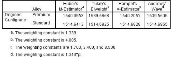
Figure 31 Robust estimates of center
In this case, the robust estimates for premium bearings are quite close to the median (1539.72). Since none of these measures are near the mean, this may be an indication that the distribution is not reasonably normal.
Figure 32 Table of extreme values
30 3.2.4. Are the Distributions Normal?
Figure 33 Tests of normality
The tests of normality overlay a normal curve on actual data, to assess the fit. A significant test means the fit is poor. For the standard alloy, the test is not significant; they fit the normal curve well. However, for the premium alloy, the test is significant; they fit the normal curve poorly.
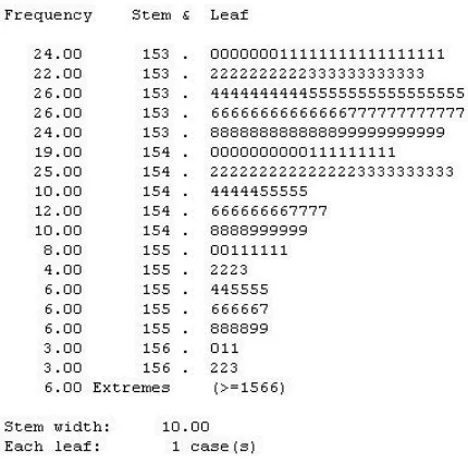
Figure 34 Stem-and-leaf plot, premium bearings
Stem-and-leaf plots use the original data values to display the
31
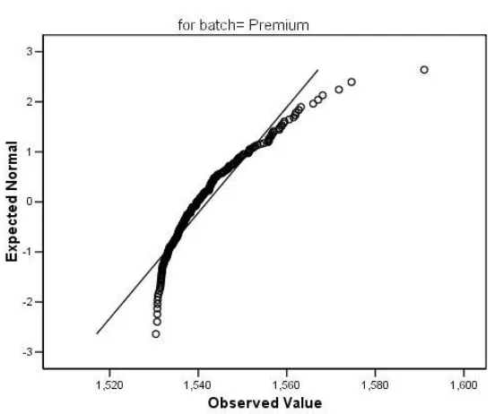
Figure 35 Q-Q plot, premium bearings
Finally, a Q-Q plot is displayed. The straight line in the plot represents expected values when the data are normally distributed. The observed premium bearing values deviate markedly from that line, especially as temperature increases.
3.2.5. Summary