ISBN: 978-1-449-31695-2 [CK]
R Graphics Cookbook by Winston Chang
Copyright © 2013 Winston Chang. All rights reserved. Printed in the United States of America.
Published by O’Reilly Media, Inc., 1005 Gravenstein Highway North, Sebastopol, CA 95472.
O’Reilly books may be purchased for educational, business, or sales promotional use. Online editions are also available for most titles (http://my.safaribooksonline.com). For more information, contact our corporate/ institutional sales department: 800-998-9938 or [email protected].
Editors: Mike Loukides and Courtney Nash
Production Editor: Holly Bauer
Illustrator: Rebecca Demarest and Robert Romano
December 2012: First Edition
Revision History for the First Edition:
2012-12-04 First release
See http://oreilly.com/catalog/errata.csp?isbn=9781449316952 for release details.
Nutshell Handbook, the Nutshell Handbook logo, and the O’Reilly logo are registered trademarks of O’Reilly Media, Inc. R Graphics Cookbook, the image of a reindeer, and related trade dress are trademarks of O’Reilly Media, Inc.
Many of the designations used by manufacturers and sellers to distinguish their products are claimed as trademarks. Where those designations appear in this book, and O’Reilly Media, Inc., was aware of a trade‐ mark claim, the designations have been printed in caps or initial caps.
Table of Contents
Preface. . . ix
1. R Basics. . . 1
1.1. Installing a Package 1
1.2. Loading a Package 2
1.3. Loading a Delimited Text Data File 3
1.4. Loading Data from an Excel File 4
1.5. Loading Data from an SPSS File 5
2. Quickly Exploring Data. . . 7
2.1. Creating a Scatter Plot 7
2.2. Creating a Line Graph 9
2.3. Creating a Bar Graph 11
2.4. Creating a Histogram 13
2.5. Creating a Box Plot 15
2.6. Plotting a Function Curve 17
3. Bar Graphs. . . 19
3.1. Making a Basic Bar Graph 19
3.2. Grouping Bars Together 22
3.3. Making a Bar Graph of Counts 25
3.4. Using Colors in a Bar Graph 27
3.5. Coloring Negative and Positive Bars Differently 29
3.6. Adjusting Bar Width and Spacing 30
3.7. Making a Stacked Bar Graph 32
3.8. Making a Proportional Stacked Bar Graph 35
3.9. Adding Labels to a Bar Graph 38
3.10. Making a Cleveland Dot Plot 42
4. Line Graphs. . . 49
10.7. Removing a Legend Title 236
13.14. Creating a Graph of an Empirical Cumulative Distribution Function 301
13.15. Creating a Mosaic Plot 302
13.16. Creating a Pie Chart 307
13.17. Creating a Map 309
13.18. Creating a Choropleth Map 313
13.20. Creating a Map from a Shapefile 319
15.18. Summarizing Data with Standard Errors and Confidence Intervals 361
Preface
I started using R several years ago to analyze data I had collected for my research in graduate school. My motivation at first was to escape from the restrictive environments and canned analyses offered by statistical programs like SPSS. And even better, because it’s freely available, I didn’t need to convince someone to buy me a copy of the software— very important for a poor graduate student! As I delved deeper into R, I discovered that it could also create excellent data graphics.
Each recipe in this book lists a problem and a solution. In most cases, the solutions I offer aren’t the only way to do things in R, but they are, in my opinion, the best way. One of the reasons for R’s popularity is that there are many available add-on packages, each of which provides some functionality for R. There are many packages for visualizing data in R, but this book primarily uses ggplot2. (Disclaimer: it’s now part of my job to do development on ggplot2. However, I wrote much of this book before I had any idea that I would start a job related to ggplot2.)
This book isn’t meant to be a comprehensive manual of all the different ways of creating data visualizations in R, but hopefully it will help you figure out how to make the graphics you have in mind. Or, if you’re not sure what you want to make, browsing its pages may give you some ideas about what’s possible.
Recipes
This book is intended for readers who have at least a basic understanding of R. The recipes in this book will show you how to do specific tasks. I’ve tried to use examples that are simple, so that you can understand how they work and transfer the solutions over to your own problems.
Software and Platform Notes
Most of the recipes here use the ggplot2 graphing package. Some of the recipes require the most recent version of ggplot2, 0.9.3, and this in turn requires a relatively recent version of R. You can always get the latest version of R from the main R project site.
If you are not familiar with ggplot2, see Appendix A for a brief intro‐ duction to the package.
Once you’ve installed R, you can install the necessary packages. In addition to ggplot2, you’ll also want to install the gcookbook package, which contains data sets for many of the examples in this book. To install them both, run:
install.packages("ggplot2")
install.packages("gcookbook")
You may be asked to choose a mirror site for CRAN, the Comprehensive R Archive Network. Any of the sites should work, but it’s a good idea to choose one close to you because it will likely be faster than one far away. Once you’ve installed the packages, run this in each R session in which you want to use ggplot2:
library(ggplot2)
The recipes in this book will assume that you’ve already loaded ggplot2, so they won’t show this line.
If you see an error like this, it means that you forgot to load ggplot2:
Error: could not find function "ggplot"
The major platforms for R are Mac OS X, Linux, and Windows, and all the recipes in this book should work on all of these platforms. There are some platform-specific differences when it comes to creating bitmap output files, and these differences are covered in Chapter 14.
Conventions Used in This Book
The following typographical conventions are used in this book: Italic
Indicates new terms, URLs, email addresses, filenames, and file extensions.
Constant width
Constant width bold
Shows commands or other text that should be typed literally by the user.
Constant width italic
Shows text that should be replaced with user-supplied values or by values deter‐ mined by context.
This icon signifies a tip, suggestion, or general note.
This icon indicates a warning or caution.
Using Code Examples
This book is here to help you get your job done. In general, you may use the code in this book in your programs and documentation. You do not need to contact us for permis‐ sion unless you’re reproducing a significant portion of the code. For example, writing a program that uses several chunks of code from this book does not require permission. Selling or distributing a CD-ROM of examples from O’Reilly books does require per‐ mission. Answering a question by citing this book and quoting example code does not require permission. Incorporating a significant amount of example code from this book into your product’s documentation does require permission.
We appreciate, but do not require, attribution. An attribution usually includes the title, author, publisher, and ISBN. For example: “R Graphics Cookbook by Winston Chang (O’Reilly). Copyright 2013 Winston Chang, 978-1-449-31695-2.”
If you feel your use of code examples falls outside fair use or the permission given above, feel free to contact us at [email protected].
Safari® Books Online
Safari Books Online (www.safaribooksonline.com) is an on-demand digital library that delivers expert content in both book and video form from the world’s leading authors in technology and business.
Technology professionals, software developers, web designers, and business and creative professionals use Safari Books Online as their primary resource for research, problem solving, learning, and certification training.
Safari Books Online offers a range of product mixes and pricing programs for organi‐ zations, government agencies, and individuals. Subscribers have access to thousands of books, training videos, and prepublication manuscripts in one fully searchable database from publishers like O’Reilly Media, Prentice Hall Professional, Addison-Wesley Pro‐ fessional, Microsoft Press, Sams, Que, Peachpit Press, Focal Press, Cisco Press, John Wiley & Sons, Syngress, Morgan Kaufmann, IBM Redbooks, Packt, Adobe Press, FT Press, Apress, Manning, New Riders, McGraw-Hill, Jones & Bartlett, Course Technol‐ ogy, and dozens more. For more information about Safari Books Online, please visit us
online.
How to Contact Us
Please address comments and questions concerning this book to the publisher:
O’Reilly Media, Inc.
1005 Gravenstein Highway North Sebastopol, CA 95472
800-998-9938 (in the United States or Canada) 707-829-0515 (international or local)
707-829-0104 (fax)
We have a web page for this book, where we list errata, examples, and any additional information. You can access this page at:
http://oreil.ly/R_Graphics_Cookbook
To comment or ask technical questions about this book, send email to:
For more information about our books, courses, conferences, and news, see our website at http://www.oreilly.com.
Find us on Facebook: http://facebook.com/oreilly
Follow us on Twitter: http://twitter.com/oreillymedia
Watch us on YouTube: http://www.youtube.com/oreillymedia
Acknowledgments
and for fostering a dynamic ecosystem around it. Thanks to Hadley Wickham for cre‐ ating the software that this book revolves around, for pointing O’Reilly in my direction when they were considering a book about R graphics, and for opening up many oppor‐ tunities for me to deepen my knowledge of R.
Thanks to the technical reviewers for this book: Paul Teetor, Hadley Wickham, Dennis Murphy, and Erik Iverson. Their depth of knowledge and attention to detail has greatly improved this book. I’d like to thank the editors at O’Reilly who have shepherded this book along: Mike Loukides, for guiding me through the early stages, and Courtney Nash, for pulling me through to the end. I also owe a big thanks to Holly Bauer and the rest of the production team at O’Reilly, for putting up with many last-minute edits, and for handling the unusual features of this book.
Finally, I would like to thank my wife, Sylia, for her support and understanding—and not just with regard to the book.
CHAPTER 1
R Basics
This chapter covers the basics: installing and using packages and loading data.
If you want to get started quickly, most of the recipes in this book require the ggplot2 and gcookbook packages to be installed on your computer. To do this, run:
install.packages(c("ggplot2", "gcookbook"))
Then, in each R session, before running the examples in this book, you can load them with:
library(ggplot2)
library(gcookbook)
Appendix A provides an introduction to the ggplot2 graphing package, for readers who are not already familiar with its use.
Packages in R are collections of functions and/or data that are bundled up for easy distribution, and installing a package will extend the functionality of R on your com‐ puter. If an R user creates a package and thinks that it might be useful for others, that user can distribute it through a package repository. The primary repository for distrib‐ uting R packages is called CRAN (the Comprehensive R Archive Network), but there are others, such as Bioconductor and Omegahat.
1.1. Installing a Package
Problem
You want to install a package from CRAN.
Solution
Use install.packages() and give it the name of the package you want to install. To
install ggplot2, run:
install.packages("ggplot2")
At this point you may be prompted to select a download mirror. You can either choose the one nearest to you, or, if you want to make sure you have the most up-to-date version of your package, choose the Austria site, which is the primary CRAN server.
Discussion
When you tell R to install a package, it will automatically install any other packages that the first package depends on.
CRAN is a repository of packages for R, and it is mirrored on servers around the globe. It’s the default repository system used by R. There are other package repositories; Bio‐ conductor, for example, is a repository of packages related to analyzing genomic data.
1.2. Loading a Package
Problem
You want to load an installed package.
Solution
Use library() and give it the name of the package you want to install. To load ggplot2,
run:
library(ggplot2)
The package must already be installed on the computer.
Discussion
Most of the recipes in this book require loading a package before running the code, either for the graphing capabilities (as in the ggplot2 package) or for example data sets (as in the MASS and gcookbook packages).
One of R’s quirks is the package/library terminology. Although you use the library()
function to load a package, a package is not a library, and some longtime R users will get irate if you call it that.
1.3. Loading a Delimited Text Data File
Problem
You want to load data from a delimited text file.
Solution
The most common way to read in a file is to use comma-separated values (CSV) data:
data <- read.csv("datafile.csv")
Discussion
Since data files have many different formats, there are many options for loading them. For example, if the data file does not have headers in the first row:
data <- read.csv("datafile.csv", header=FALSE)
The resulting data frame will have columns named V1, V2, and so on, and you will probably want to rename them manually:
# Manually assign the header names
names(data) <- c("Column1","Column2","Column3")
You can set the delimiter with sep. If it is space-delimited, use sep=" ". If it is tab-delimited, use \t, as in:
data <- read.csv("datafile.csv", sep="\t")
By default, strings in the data are treated as factors. Suppose this is your data file, and you read it in using read.csv():
"First","Last","Sex","Number" "Currer","Bell","F",2
"Dr.","Seuss","M",49 "","Student",NA,21
The resulting data frame will store First and Last as factors, though it makes more sense in this case to treat them as strings (or characters in R terminology). To differentiate this, set stringsAsFactors=FALSE. If there are any columns that should be treated as factors, you can then convert them individually:
data <- read.csv("datafile.csv", stringsAsFactors=FALSE)
# Convert to factor
data$Sex <- factor(data$Sex)
str(data)
'data.frame': 3 obs. of 4 variables:
$ First : chr "Currer" "Dr." "" $ Last : chr "Bell" "Seuss" "Student" $ Sex : Factor w/ 2 levels "F","M": 1 2 NA $ Number: int 2 49 21
Alternatively, you could load the file with strings as factors, and then convert individual columns from factors to characters.
See Also
read.csv() is a convenience wrapper function around read.table(). If you need more
control over the input, see ?read.table.
1.4. Loading Data from an Excel File
Problem
You want to load data from an Excel file.
Solution
The xlsx package has the function read.xlsx() for reading Excel files. This will read the first sheet of an Excel spreadsheet:
# Only need to install once
install.packages("xlsx")
library(xslx)
data <- read.xlsx("datafile.xlsx", 1)
For reading older Excel files in the .xls format, the gdata package has the function
read.xls():
# Only need to install once
install.packages("gdata")
library(gdata) # Read first sheet
Discussion
With read.xlsx(), you can load from other sheets by specifying a number for sheetIn dex or a name for sheetName:
data <- read.xlsx("datafile.xls", sheetIndex=2)
data <- read.xlsx("datafile.xls", sheetName="Revenues")
With read.xls(), you can load from other sheets by specifying a number for sheet: data <- read.xls("datafile.xls", sheet=2)
Both the xlsx and gdata packages require other software to be installed on your computer. For xlsx, you need to install Java on your machine. For gdata, you need Perl, which comes as standard on Linux and Mac OS X, but not Windows. On Windows, you’ll need ActiveState Perl. The Community Edition can be obtained for free.
If you don’t want to mess with installing this stuff, a simpler alternative is to open the file in Excel and save it as a standard format, such as CSV.
See Also
See ?read.xls and ?read.xlsx for more options controlling the reading of these files.
1.5. Loading Data from an SPSS File
Problem
You want to load data from an SPSS file.
Solution
The foreign package has the function read.spss() for reading SPSS files. To load data from the first sheet of an SPSS file:
# Only need to install the first time
install.packages("foreign")
library(foreign)
data <- read.spss("datafile.sav")
Discussion
The foreign package also includes functions to load from other formats, including:
• read.octave(): Octave and MATLAB
• read.systat(): SYSTAT
• read.xport(): SAS XPORT
• read.dta(): Stata
See Also
CHAPTER 2
Quickly Exploring Data
Although I’ve used the ggplot2 package for most of the graphics in this book, it is not the only way to make graphs. For very quick exploration of data, it’s sometimes useful to use the plotting functions in base R. These are installed by default with R and do not require any additional packages to be installed. They’re quick to type, are straightforward to use in simple cases, and run very quickly.
If you want to do anything beyond very simple graphs, though, it’s generally better to switch to ggplot2. This is in part because ggplot2 provides a unified interface and set of options, instead of the grab bag of modifiers and special cases required in base graphics. Once you learn how ggplot2 works, you can use that knowledge for everything from scatter plots and histograms to violin plots and maps.
Each recipe in this section shows how to make a graph with base graphics. Each recipe also shows how to make a similar graph with the qplot() function in ggplot2, which has a syntax similar to the base graphics functions. For each qplot() graph, there is also an equivalent using the more powerful ggplot() function.
If you already know how to use base graphics, having these examples side by side will help you transition to using ggplot2 for when you want to make more sophisticated graphics.
2.1. Creating a Scatter Plot
Problem
You want to create a scatter plot.
Solution
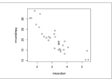
To make a scatter plot (Figure 2-1), use plot() and pass it a vector of x values followed by a vector of y values:
plot(mtcars$wt, mtcars$mpg)
Figure 2-1. Scatter plot with base graphics
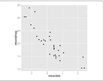
With the ggplot2 package, you can get a similar result using qplot() (Figure 2-2): library(ggplot2)
qplot(mtcars$wt, mtcars$mpg)
If the two vectors are already in the same data frame, you can use the following syntax:
qplot(wt, mpg, data=mtcars) # This is equivalent to:
ggplot(mtcars, aes(x=wt, y=mpg)) + geom_point()
See Also
Figure 2-2. Scatter plot with qplot() from ggplot2
2.2. Creating a Line Graph
Problem
You want to create a line graph.
Solution
To make a line graph using plot() (Figure 2-3, left), pass it a vector of x values and a vector of y values, and use type="l":
plot(pressure$temperature, pressure$pressure, type="l")
Figure 2-3. Left: line graph with base graphics; right: with points and another line
To add points and/or multiple lines (Figure 2-3, right), first call plot() for the first line, then add points with points() and additional lines with lines():
plot(pressure$temperature, pressure$pressure, type="l")
points(pressure$temperature, pressure$pressure)
lines(pressure$temperature, pressure$pressure/2, col="red")
points(pressure$temperature, pressure$pressure/2, col="red")
With ggplot2, you can get a similar result using qplot() with geom="line" (Figure 2-4): library(ggplot2)
qplot(pressure$temperature, pressure$pressure, geom="line")
If the two vectors are already in the same data frame, you can use the following syntax:
See Chapter 4 for more in-depth information about creating line graphs.
2.3. Creating a Bar Graph
Problem
You want to make a bar graph.
Solution
To make a bar graph of values (Figure 2-5), use barplot() and pass it a vector of values for the height of each bar and (optionally) a vector of labels for each bar. If the vector has names for the elements, the names will automatically be used as labels:
barplot(BOD$demand, names.arg=BOD$Time)
Sometimes “bar graph” refers to a graph where the bars represent the count of cases in each category. This is similar to a histogram, but with a discrete instead of continuous x-axis. To generate the count of each unique value in a vector, use the table() function:
table(mtcars$cyl)
4 6 8 11 7 14
# There are 11 cases of the value 4, 7 cases of 6, and 14 cases of 8
Simply pass the table to barplot() to generate the graph of counts:
# Generate a table of counts
barplot(table(mtcars$cyl))
With the ggplot2 package, you can get a similar result using qplot() (Figure 2-6). To plot a bar graph of values, use geom="bar" and stat="identity". Notice the difference in the output when the x variable is continuous and when it is discrete:
Figure 2-5. Left: bar graph of values with base graphics; right: bar graph of counts
library(ggplot2)
qplot(BOD$Time, BOD$demand, geom="bar", stat="identity")
# Convert the x variable to a factor, so that it is treated as discrete
qplot(factor(BOD$Time), BOD$demand, geom="bar", stat="identity")
Figure 2-6. Left: bar graph of values with qplot() with continuous x variable; right: with x variable converted to a factor (notice that there is no entry for 6)
# cyl is continuous here
qplot(mtcars$cyl)
# Treat cyl as discrete
qplot(factor(mtcars$cyl))
Figure 2-7. Left: bar graph of counts with qplot() with continuous x variable; right: with x variable converted to a factor
If the vector is in a data frame, you can use the following syntax:
# Bar graph of values. This uses the BOD data frame, with the #"Time" column for x values and the "demand" column for y values.
qplot(Time, demand, data=BOD, geom="bar", stat="identity") # This is equivalent to:
ggplot(BOD, aes(x=Time, y=demand)) + geom_bar(stat="identity")
# Bar graph of counts
qplot(factor(cyl), data=mtcars) # This is equivalent to:
ggplot(mtcars, aes(x=factor(cyl))) + geom_bar()
See Also
See Chapter 3 for more in-depth information about creating bar graphs.
2.4. Creating a Histogram
Problem
You want to view the distribution of one-dimensional data with a histogram.
Solution
To make a histogram (Figure 2-8), use hist() and pass it a vector of values: hist(mtcars$mpg)
# Specify approximate number of bins with breaks
hist(mtcars$mpg, breaks=10)
Figure 2-8. Left: histogram with base graphics; right: with more bins. Notice that because the bins are narrower, there are fewer items in each bin.
With the ggplot2 package, you can get a similar result using qplot() (Figure 2-9): qplot(mtcars$mpg)
If the vector is in a data frame, you can use the following syntax:
library(ggplot2)
qplot(mpg, data=mtcars, binwidth=4) # This is equivalent to:
ggplot(mtcars, aes(x=mpg)) + geom_histogram(binwidth=4)
See Also
Figure 2-9. Left: histogram with qplot() from ggplot2, with default bin width; right: with wider bins
2.5. Creating a Box Plot
Problem
You want to create a box plot for comparing distributions.
Solution
To make a box plot (Figure 2-10), use plot() and pass it a factor of x values and a vector of y values. When x is a factor (as opposed to a numeric vector), it will automatically create a box plot:
plot(ToothGrowth$supp, ToothGrowth$len)
If the two vectors are in the same data frame, you can also use formula syntax. With this syntax, you can combine two variables on the x-axis, as in Figure 2-10:
# Formula syntax
boxplot(len ~ supp, data = ToothGrowth)
# Put interaction of two variables on x-axis
boxplot(len ~ supp + dose, data = ToothGrowth)
With the ggplot2 package, you can get a similar result using qplot() (Figure 2-11), with
geom="boxplot": library(ggplot2)
qplot(ToothGrowth$supp, ToothGrowth$len, geom="boxplot")
Figure 2-10. Left: box plot with base graphics; right: with multiple grouping variables
Figure 2-11. Left: box plot with qplot(); right: with multiple grouping variables
If the two vectors are already in the same data frame, you can use the following syntax:
qplot(supp, len, data=ToothGrowth, geom="boxplot") # This is equivalent to:
ggplot(ToothGrowth, aes(x=supp, y=len)) + geom_boxplot()
# Using three separate vectors
qplot(interaction(ToothGrowth$supp, ToothGrowth$dose), ToothGrowth$len,
geom="boxplot")
# Alternatively, get the columns from the data frame
qplot(interaction(supp, dose), len, data=ToothGrowth, geom="boxplot") # This is equivalent to:
ggplot(ToothGrowth, aes(x=interaction(supp, dose), y=len)) + geom_boxplot()
You may have noticed that the box plots from base graphics are ever-so-slightly different from those from ggplot2. This is because they use slightly different methods for calculating quantiles. See ?geom_box plot and ?boxplot.stats for more information on how they differ.
See Also
For more on making basic box plots, see Recipe 6.6.
2.6. Plotting a Function Curve
Problem
You want to plot a function curve.
Solution
To plot a function curve, as in Figure 2-12, use curve() and pass it an expression with the variable x:
curve(x^3 - 5*x, from=-4, to=4)
You can plot any function that takes a numeric vector as input and returns a numeric vector, including functions that you define yourself. Using add=TRUE will add a curve to the previously created plot:
With the ggplot2 package, you can get a similar result using qplot() (Figure 2-13), by using stat="function" and geom="line" and passing it a function that takes a numeric vector as input and returns a numeric vector:
Figure 2-12. Left: function curve with base graphics; right: with user-defined function
library(ggplot2)
# This sets the x range from 0 to 20
qplot(c(0,20), fun=myfun, stat="function", geom="line") # This is equivalent to:
ggplot(data.frame(x=c(0, 20)), aes(x=x)) + stat_function(fun=myfun, geom="line")
Figure 2-13. A function curve with qplot()
See Also
CHAPTER 3
Bar Graphs
Bar graphs are perhaps the most commonly used kind of data visualization. They’re typically used to display numeric values (on the y-axis), for different categories (on the x-axis). For example, a bar graph would be good for showing the prices of four different kinds of items. A bar graph generally wouldn’t be as good for showing prices over time, where time is a continuous variable—though it can be done, as we’ll see in this chapter.
There’s an important distinction you should be aware of when making bar graphs: sometimes the bar heights represent counts of cases in the data set, and sometimes they represent values in the data set. Keep this distinction in mind—it can be a source of confusion since they have very different relationships to the data, but the same term is used for both of them. In this chapter I’ll discuss this more, and present recipes for both types of bar graphs.
3.1. Making a Basic Bar Graph
Problem
You have a data frame where one column represents the x position of each bar, and another column represents the vertical (y) height of each bar.
Solution
Use ggplot() with geom_bar(stat="identity") and specify what variables you want on the x- and y-axes (Figure 3-1):
library(gcookbook) # For the data set
ggplot(pg_mean, aes(x=group, y=weight)) + geom_bar(stat="identity")
Figure 3-1. Bar graph of values (with stat="identity”) with a discrete x-axis
Discussion
When x is a continuous (or numeric) variable, the bars behave a little differently. Instead of having one bar at each actual x value, there is one bar at each possible x value between the minimum and the maximum, as in Figure 3-2. You can convert the continuous variable to a discrete variable by using factor():
# There's no entry for Time == 6
BOD
Time demand 1 8.3 2 10.3 3 19.0 4 16.0 5 15.6 7 19.8
# Time is numeric (continuous)
str(BOD)
'data.frame': 6 obs. of 2 variables: $ Time : num 1 2 3 4 5 7
$ demand: num 8.3 10.3 19 16 15.6 19.8 - attr(*, "reference")= chr "A1.4, p. 270"
ggplot(BOD, aes(x=Time, y=demand)) + geom_bar(stat="identity")
# Convert Time to a discrete (categorical) variable with factor()
Figure 3-2. Left: bar graph of values (with stat="identity”) with a continuous x-axis; right: with x variable converted to a factor (notice that the space for 6 is gone)
In these examples, the data has a column for x values and another for y values. If you instead want the height of the bars to represent the count of cases in each group, see
Recipe 3.3.
By default, bar graphs use a very dark grey for the bars. To use a color fill, use fill. Also, by default, there is no outline around the fill. To add an outline, use colour. For
Figure 3-3, we use a light blue fill and a black outline:
ggplot(pg_mean, aes(x=group, y=weight)) +
geom_bar(stat="identity", fill="lightblue", colour="black")
Figure 3-3. A single fill and outline color for all bars
In ggplot2, the default is to use the British spelling, colour, instead of the American spelling, color. Internally, American spellings are re‐ mapped to the British ones, so if you use the American spelling it will still work.
See Also
If you want the height of the bars to represent the count of cases in each group, see
Recipe 3.3.
To reorder the levels of a factor based on the values of another variable, see
Recipe 15.9. To manually change the order of factor levels, see Recipe 15.8.
For more information about using colors, see Chapter 12.
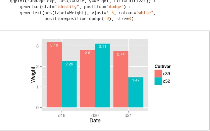
3.2. Grouping Bars Together
Problem
You want to group bars together by a second variable.
Solution
Map a variable to fill, and use geom_bar(position="dodge").
In this example we’ll use the cabbage_exp data set, which has two categorical variables,
Cultivar and Date, and one continuous variable, Weight:
library(gcookbook) # For the data set
Figure 3-4. Graph with grouped bars
Discussion
The most basic bar graphs have one categorical variable on the x-axis and one contin‐ uous variable on the y-axis. Sometimes you’ll want to use another categorical variable to divide up the data, in addition to the variable on the x-axis. You can produce a grouped bar plot by mapping that variable to fill, which represents the fill color of the bars. You must also use position="dodge", which tells the bars to “dodge” each other hori‐ zontally; if you don’t, you’ll end up with a stacked bar plot (Recipe 3.7).
As with variables mapped to the x-axis of a bar graph, variables that are mapped to the fill color of bars must be categorical rather than continuous variables.
To add a black outline, use colour="black" inside geom_bar(). To set the colors, you can use scale_fill_brewer() or scale_fill_manual(). In Figure 3-5 we’ll use the
Pastel1 palette from RColorBrewer:
ggplot(cabbage_exp, aes(x=Date, y=Weight, fill=Cultivar)) +
geom_bar(position="dodge", colour="black") +
scale_fill_brewer(palette="Pastel1")
Other aesthetics, such as colour (the color of the outlines of the bars) or linestyle, can also be used for grouping variables, but fill is probably what you’ll want to use. Note that if there are any missing combinations of the categorical variables, that bar will be missing, and the neighboring bars will expand to fill that space. If we remove the last row from our example data frame, we get Figure 3-6:
ce <- cabbage_exp[1:5, ] # Copy the data without last row
ce
Cultivar Date Weight c39 d16 3.18 c39 d20 2.80
c39 d21 2.74 c52 d16 2.26 c52 d20 3.11
ggplot(ce, aes(x=Date, y=Weight, fill=Cultivar)) +
geom_bar(position="dodge", colour="black") +
scale_fill_brewer(palette="Pastel1")
Figure 3-5. Grouped bars with black outline and a different color palette
Figure 3-6. Graph with a missing bar—the other bar fills the space
If your data has this issue, you can manually make an entry for the missing factor level combination with an NA for the y variable.
See Also
To reorder the levels of a factor based on the values of another variable, see Recipe 15.9.
3.3. Making a Bar Graph of Counts
Problem
Your data has one row representing each case, and you want plot counts of the cases.
Solution
Use geom_bar() without mapping anything to y (Figure 3-7):
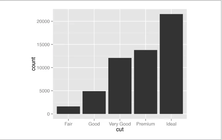
ggplot(diamonds, aes(x=cut)) + geom_bar() # Equivalent to using geom_bar(stat="bin")
Figure 3-7. Bar graph of counts
Discussion
The diamonds data set has 53,940 rows, each of which represents information about one
diamond:
diamonds
carat cut color clarity depth table price x y z 1 0.23 Ideal E SI2 61.5 55 326 3.95 3.98 2.43
2 0.21 Premium E SI1 59.8 61 326 3.89 3.84 2.31 3 0.23 Good E VS1 56.9 65 327 4.05 4.07 2.31 ...
53939 0.86 Premium H SI2 61.0 58 2757 6.15 6.12 3.74 53940 0.75 Ideal D SI2 62.2 55 2757 5.83 5.87 3.64
With geom_bar(), the default behavior is to use stat="bin", which counts up the num‐ ber of cases for each group (each x position, in this example). In the graph we can see that there are about 23,000 cases with an ideal cut.
In this example, the variable on the x-axis is discrete. If we use a continuous variable on the x-axis, we’ll get a histogram, as shown in Figure 3-8:
ggplot(diamonds, aes(x=carat)) + geom_bar()
Figure 3-8. Bar graph of counts on a continuous axis, also known as a histogram
It turns out that in this case, the result is the same as if we had used geom_histo
gram() instead of geom_bar().
See Also
If, instead of having ggplot() count up the number of rows in each group, you have a column in your data frame representing the y values, see Recipe 3.1.
You could also get the same graphical output by calculating the counts before sending the data to ggplot(). See Recipe 15.17 for more on summarizing data.
3.4. Using Colors in a Bar Graph
Problem
You want to use different colors for the bars in your graph.
Solution
Map the appropriate variable to the fill aesthetic.
We’ll use the uspopchange data set for this example. It contains the percentage change in population for the US states from 2000 to 2010. We’ll take the top 10 fastest-growing states and graph their percentage change. We’ll also color the bars by region (Northeast, South, North Central, or West).
First, we’ll take the top 10 states:
library(gcookbook) # For the data set
upc <- subset(uspopchange, rank(Change)>40)
The default colors aren’t very appealing, so you may want to set them, using
scale_fill_brewer() or scale_fill_manual(). With this example, we’ll use the latter,
and we’ll set the outline color of the bars to black, with colour="black" (Figure 3-10). Note that setting occurs outside of aes(), while mapping occurs within aes():
ggplot(upc, aes(x=reorder(Abb, Change), y=Change, fill=Region)) +
geom_bar(stat="identity", colour="black") +
scale_fill_manual(values=c("#669933", "#FFCC66")) +
xlab("State")
Figure 3-9. A variable mapped to fill
Figure 3-10. Graph with different colors, black outlines, and sorted by percentage change
This example also uses the reorder() function, as in this particular case it makes sense to sort the bars by their height, instead of in alphabetical order.
See Also
For more about using the reorder() function to reorder the levels of a factor based on the values of another variable, see Recipe 15.9.
3.5. Coloring Negative and Positive Bars Differently
Problem
You want to use different colors for negative and positive-valued bars.
Solution
We’ll use a subset of the climate data and create a new column called pos, which indi‐ cates whether the value is positive or negative:
library(gcookbook) # For the data set
csub <- subset(climate, Source=="Berkeley" & Year >= 1900)
csub$pos <- csub$Anomaly10y >= 0
csub
Source Year Anomaly1y Anomaly5y Anomaly10y Unc10y Berkeley 1900 NA NA -0.171 0.108 FALSE Berkeley 1901 NA NA -0.162 0.109 FALSE Berkeley 1902 NA NA -0.177 0.108 FALSE ...
Berkeley 2002 NA NA 0.856 0.028 TRUE Berkeley 2003 NA NA 0.869 0.028 TRUE Berkeley 2004 NA NA 0.884 0.029 TRUE
Once we have the data, we can make the graph and map pos to the fill color, as in
Figure 3-11. Notice that we use position="identity" with the bars. This will prevent a warning message about stacking not being well defined for negative numbers:
ggplot(csub, aes(x=Year, y=Anomaly10y, fill=pos)) +
geom_bar(stat="identity", position="identity")
Figure 3-11. Different colors for positive and negative values
Discussion
There are a few problems with the first attempt. First, the colors are probably the reverse of what we want: usually, blue means cold and red means hot. Second, the legend is redundant and distracting.
We can change the colors with scale_fill_manual() and remove the legend with
guide=FALSE, as shown in Figure 3-12. We’ll also add a thin black outline around each
of the bars by setting colour and specifying size, which is the thickness of the outline, in millimeters:
ggplot(csub, aes(x=Year, y=Anomaly10y, fill=pos)) +
geom_bar(stat="identity", position="identity", colour="black", size=0.25) +
scale_fill_manual(values=c("#CCEEFF", "#FFDDDD"), guide=FALSE)
Figure 3-12. Graph with customized colors and no legend
See Also
To change the colors used, see Recipes 12.3 and 12.4.
To hide the legend, see Recipe 10.1.
3.6. Adjusting Bar Width and Spacing
Problem
You want to adjust the width of bars and the spacing between them.
Solution
For example, for standard-width bars:
library(gcookbook) # For the data set
ggplot(pg_mean, aes(x=group, y=weight)) + geom_bar(stat="identity")
For narrower bars:
ggplot(pg_mean, aes(x=group, y=weight)) + geom_bar(stat="identity", width=0.5)
And for wider bars (these have the maximum width of 1):
ggplot(pg_mean, aes(x=group, y=weight)) + geom_bar(stat="identity", width=1)
Figure 3-13. Different bar widths
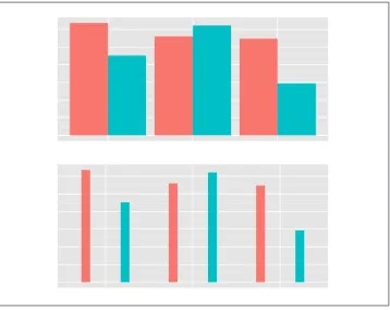
For grouped bars, the default is to have no space between bars within each group. To add space between bars within a group, make width smaller and set the value for posi tion_dodge to be larger than width (Figure 3-14).
For a grouped bar graph with narrow bars:
ggplot(cabbage_exp, aes(x=Date, y=Weight, fill=Cultivar)) +
geom_bar(stat="identity", width=0.5, position="dodge")
And with some space between the bars:
ggplot(cabbage_exp, aes(x=Date, y=Weight, fill=Cultivar)) +
geom_bar(stat="identity", width=0.5, position=position_dodge(0.7))
The first graph used position="dodge", and the second graph used position=posi tion_dodge(). This is because position="dodge" is simply shorthand for position=po
sition_dodge() with the default value of 0.9, but when we want to set a specific value,
we need to use the more verbose command.
Discussion
The default value of width is 0.9, and the default value used for position_dodge() is the same. To be more precise, the value of width in position_dodge() is the same as
width in geom_bar().
Figure 3-14. Left: bar graph with narrow grouped bars; right: with space between the bars
All of these will have the same result:
geom_bar(position="dodge")
geom_bar(width=0.9, position=position_dodge())
geom_bar(position=position_dodge(0.9))
geom_bar(width=0.9, position=position_dodge(width=0.9))
The items on the x-axis have x values of 1, 2, 3, and so on, though you typically don’t refer to them by these numerical values. When you use geom_bar(width=0.9), it makes each group take up a total width of 0.9 on the x-axis. When you use posi
tion_dodge(width=0.9), it spaces the bars so that the middle of each bar is right where
it would be if the bar width were 0.9 and the bars were touching. This is illustrated in
Figure 3-15. The two graphs both have the same dodge width of 0.9, but while the top has a bar width of 0.9, the bottom has a bar width of 0.2. Despite the different bar widths, the middles of the bars stay aligned.
If you make the entire graph wider or narrower, the bar dimensions will scale propor‐ tionally. To see how this works, you can just resize the window in which the graphs appear. For information about controlling this when writing to a file, see Chapter 14.
3.7. Making a Stacked Bar Graph
Problem
You want to make a stacked bar graph.
Solution
Use geom_bar() and map a variable fill. This will put Date on the x-axis and use
Cultivar for the fill color, as shown in Figure 3-16: library(gcookbook) # For the data set
Figure 3-15. Same dodge width of 0.9, but different bar widths of 0.9 (top) and 0.2 (bottom)
Figure 3-16. Stacked bar graph
Discussion
To understand how the graph is made, it’s useful to see how the data is structured. There are three levels of Date and two levels of Cultivar, and for each combination there is a value for Weight:
cabbage_exp
Cultivar Date Weight sd n se c39 d16 3.18 0.9566144 10 0.30250803 c39 d20 2.80 0.2788867 10 0.08819171 c39 d21 2.74 0.9834181 10 0.31098410 c52 d16 2.26 0.4452215 10 0.14079141 c52 d20 3.11 0.7908505 10 0.25008887 c52 d21 1.47 0.2110819 10 0.06674995
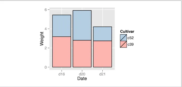
One problem with the default output is that the stacking order is the opposite of the order of items in the legend. As shown in Figure 3-17, you can reverse the order of items in the legend by using guides() and specifying the aesthetic for which the legend should be reversed. In this case, it’s the fill aesthetic:
ggplot(cabbage_exp, aes(x=Date, y=Weight, fill=Cultivar)) +
geom_bar(stat="identity") +
guides(fill=guide_legend(reverse=TRUE))
Figure 3-17. Stacked bar graph with reversed legend order
If you’d like to reverse the stacking order, as in Figure 3-18, specify order=desc() in the aesthetic mapping:
libary(plyr) # Needed for desc()
ggplot(cabbage_exp, aes(x=Date, y=Weight, fill=Cultivar, order=desc(Cultivar))) +
Figure 3-18. Stacked bar graph with reversed stacking order
It’s also possible to modify the column of the data frame so that the factor levels are in a different order (see Recipe 15.8). Do this with care, since the modified data could change the results of other analyses.
For a more polished graph, we’ll keep the reversed legend order, use scale_fill_brew er() to get a different color palette, and use colour="black" to get a black outline (Figure 3-19):
ggplot(cabbage_exp, aes(x=Date, y=Weight, fill=Cultivar)) +
geom_bar(stat="identity", colour="black") +
guides(fill=guide_legend(reverse=TRUE)) +
scale_fill_brewer(palette="Pastel1")
See Also
For more on using colors in bar graphs, see Recipe 3.4.
To reorder the levels of a factor based on the values of another variable, see
Recipe 15.9. To manually change the order of factor levels, see Recipe 15.8.
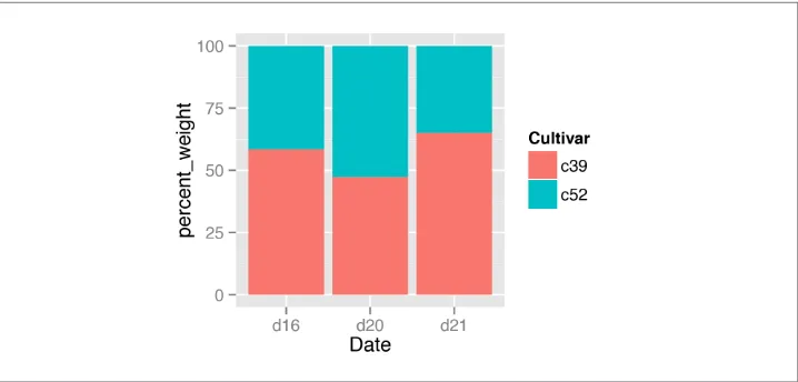
3.8. Making a Proportional Stacked Bar Graph
Problem
You want to make a stacked bar graph that shows proportions (also called a 100% stacked bar graph).
Figure 3-19. Stacked bar graph with reversed legend, new palette, and black outline
Solution
First, scale the data to 100% within each stack. This can be done by using ddply() from the plyr package, with transform(). Then plot the resulting data, as shown in
Figure 3-20:
library(gcookbook) # For the data set
library(plyr)
# Do a group-wise transform(), splitting on "Date"
ce <- ddply(cabbage_exp, "Date", transform,
percent_weight = Weight / sum(Weight) * 100)
ggplot(ce, aes(x=Date, y=percent_weight, fill=Cultivar)) +
geom_bar(stat="identity")
Discussion
To calculate the percentages within each Weight group, we used the ddply() function. In the example here, the ddply() function splits the input data frame, cabbage_exp, by the specified variable, Weight, and applies a function, transform(), to each piece. (Any remaining arguments in the ddply() call are passed along to the function.)
This is what cabbage_exp looks like, and what the ddply() call does to it: cabbage_exp
Figure 3-20. Proportional stacked bar graph
c52 d16 2.26 0.4452215 10 0.14079141 c52 d20 3.11 0.7908505 10 0.25008887 c52 d21 1.47 0.2110819 10 0.06674995
ddply(cabbage_exp, "Date", transform,
percent_weight = Weight / sum(Weight) * 100)
Cultivar Date Weight sd n se percent_weight c39 d16 3.18 0.9566144 10 0.30250803 58.45588 c52 d16 2.26 0.4452215 10 0.14079141 41.54412 c39 d20 2.80 0.2788867 10 0.08819171 47.37733 c52 d20 3.11 0.7908505 10 0.25008887 52.62267 c39 d21 2.74 0.9834181 10 0.31098410 65.08314 c52 d21 1.47 0.2110819 10 0.06674995 34.91686
Once the percentages are computed, making the graph is the same as with a regular stacked bar graph.
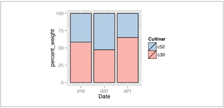
As with regular stacked bar graphs, it makes sense to reverse the legend order, change the color palette, and add an outline. This is shown in (Figure 3-21):
ggplot(ce, aes(x=Date, y=percent_weight, fill=Cultivar)) +
geom_bar(stat="identity", colour="black") +
guides(fill=guide_legend(reverse=TRUE)) +
scale_fill_brewer(palette="Pastel1")
Figure 3-21. Proportional stacked bar graph with reversed legend, new palette, and black outline
See Also
For more on transforming data by groups, see Recipe 15.16.
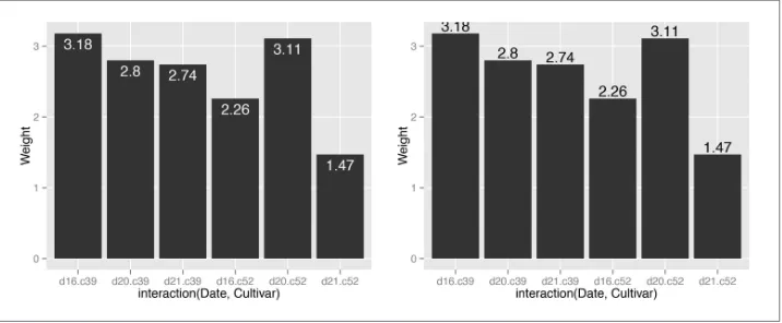
3.9. Adding Labels to a Bar Graph
Problem
You want to add labels to the bars in a bar graph.
Solution
Add geom_text() to your graph. It requires a mapping for x, y, and the text itself. By setting vjust (the vertical justification), it is possible to move the text above or below the tops of the bars, as shown in Figure 3-22:
library(gcookbook) # For the data set
# Below the top
ggplot(cabbage_exp, aes(x=interaction(Date, Cultivar), y=Weight)) +
geom_bar(stat="identity") +
geom_text(aes(label=Weight), vjust=1.5, colour="white")
# Above the top
ggplot(cabbage_exp, aes(x=interaction(Date, Cultivar), y=Weight)) +
geom_bar(stat="identity") +
Figure 3-22. Left: labels under the tops of bars; right: labels above bars
Notice that when the labels are placed atop the bars, they may be clipped. To remedy this, see Recipe 8.4.
Discussion
In Figure 3-22, the y coordinates of the labels are centered at the top of each bar; by setting the vertical justification (vjust), they appear below or above the bar tops. One drawback of this is that when the label is above the top of the bar, it can go off the top of the plotting area. To fix this, you can manually set the y limits, or you can set the y positions of the text above the bars and not change the vertical justification. One draw‐ back to changing the text’s y position is that if you want to place the text fully above or below the bar top, the value to add will depend on the y range of the data; in contrast, changing vjust to a different value will always move the text the same distance relative to the height of the bar:
# Adjust y limits to be a little higher
ggplot(cabbage_exp, aes(x=interaction(Date, Cultivar), y=Weight)) +
geom_bar(stat="identity") +
geom_text(aes(label=Weight), vjust=-0.2) +
ylim(0, max(cabbage_exp$Weight) * 1.05)
# Map y positions slightly above bar top - y range of plot will auto-adjust
ggplot(cabbage_exp, aes(x=interaction(Date, Cultivar), y=Weight)) +
geom_bar(stat="identity") +
geom_text(aes(y=Weight+0.1, label=Weight))
For grouped bar graphs, you also need to specify position=position_dodge() and give it a value for the dodging width. The default dodge width is 0.9. Because the bars are narrower, you might need to use size to specify a smaller font to make the labels fit. The default value of size is 5, so we’ll make it smaller by using 3 (Figure 3-23):
ggplot(cabbage_exp, aes(x=Date, y=Weight, fill=Cultivar)) +
geom_bar(stat="identity", position="dodge") +
geom_text(aes(label=Weight), vjust=1.5, colour="white",
position=position_dodge(.9), size=3)
Figure 3-23. Labels on grouped bars
Putting labels on stacked bar graphs requires finding the cumulative sum for each stack. To do this, first make sure the data is sorted properly—if it isn’t, the cumulative sum might be calculated in the wrong order. We’ll use the arrange() function from the plyr package, which automatically gets loaded with ggplot2:
library(plyr)
# Sort by the day and sex columns
ce <- arrange(cabbage_exp, Date, Cultivar)
Once we make sure the data is sorted properly, we’ll use ddply() to chunk it into groups by Date, then calculate a cumulative sum of Weight within each chunk:
# Get the cumulative sum
ce <- ddply(ce, "Date", transform, label_y=cumsum(Weight))
ce
Cultivar Date Weight sd n se label_y c39 d16 3.18 0.9566144 10 0.30250803 3.18 c52 d16 2.26 0.4452215 10 0.14079141 5.44 c39 d20 2.80 0.2788867 10 0.08819171 2.80 c52 d20 3.11 0.7908505 10 0.25008887 5.91 c39 d21 2.74 0.9834181 10 0.31098410 2.74 c52 d21 1.47 0.2110819 10 0.06674995 4.21
ggplot(ce, aes(x=Date, y=Weight, fill=Cultivar)) +
The result is shown in Figure 3-24.
Figure 3-24. Labels on stacked bars
When using labels, changes to the stacking order are best done by modifying the order of levels in the factor (see Recipe 15.8) before taking the cumulative sum. The other method of changing stacking order, by specifying breaks in a scale, won’t work properly, because the order of the cumulative sum won’t be the same as the stacking order.
To put the labels in the middle of each bar (Figure 3-25), there must be an adjustment to the cumulative sum, and the y offset in geom_bar() can be removed:
ce <- arrange(cabbage_exp, Date, Cultivar)
# Calculate y position, placing it in the middle
ce <- ddply(ce, "Date", transform, label_y=cumsum(Weight)-0.5*Weight)
ggplot(ce, aes(x=Date, y=Weight, fill=Cultivar)) +
geom_bar(stat="identity") +
geom_text(aes(y=label_y, label=Weight), colour="white")
For a more polished graph (Figure 3-26), we’ll change the legend order and colors, add labels in the middle with a smaller font using size, add a “kg” using paste, and make sure there are always two digits after the decimal point by using format:
ggplot(ce, aes(x=Date, y=Weight, fill=Cultivar)) +
geom_bar(stat="identity", colour="black") +
Figure 3-25. Labels in the middle of stacked bars
geom_text(aes(y=label_y, label=paste(format(Weight, nsmall=2), "kg")),
size=4) +
guides(fill=guide_legend(reverse=TRUE)) +
scale_fill_brewer(palette="Pastel1")
See Also
To control the appearance of the text, see Recipe 9.2.
For more on transforming data by groups, see Recipe 15.16.
3.10. Making a Cleveland Dot Plot
Problem
You want to make a Cleveland dot plot.
Solution
Cleveland dot plots are sometimes used instead of bar graphs because they reduce visual clutter and are easier to read.
Figure 3-26. Customized stacked bar graph with labels
library(gcookbook) # For the data set
tophit <- tophitters2001[1:25, ] # Take the top 25 from the tophitters data set
ggplot(tophit, aes(x=avg, y=name)) + geom_point()
Discussion
The tophitters2001 data set contains many columns, but we’ll focus on just three of
them for this example:
tophit[, c("name", "lg", "avg")]
name lg avg Larry Walker NL 0.3501 Ichiro Suzuki AL 0.3497 Jason Giambi AL 0.3423 ...
Jeff Conine AL 0.3111 Derek Jeter AL 0.3111
In Figure 3-27 the names are sorted alphabetically, which isn’t very useful in this graph. Dot plots are often sorted by the value of the continuous variable on the horizontal axis.
Figure 3-27. Basic dot plot
Although the rows of tophit happen to be sorted by avg, that doesn’t mean that the items will be ordered that way in the graph. By default, the items on the given axis will be ordered however is appropriate for the data type. name is a character vector, so it’s ordered alphabetically. If it were a factor, it would use the order defined in the factor levels. In this case, we want name to be sorted by a different variable, avg.
To do this, we can use reorder(name, avg), which takes the name column, turns it into a factor, and sorts the factor levels by avg. To further improve the appearance, we’ll make the vertical grid lines go away by using the theming system, and turn the horizontal grid lines into dashed lines (Figure 3-28):
ggplot(tophit, aes(x=avg, y=reorder(name, avg))) +
geom_point(size=3) + # Use a larger dot
theme_bw() +
theme(panel.grid.major.x = element_blank(),
panel.grid.minor.x = element_blank(),
Figure 3-28. Dot plot, ordered by batting average
It’s also possible to swap the axes so that the names go along the x-axis and the values go along the y-axis, as shown in Figure 3-29. We’ll also rotate the text labels by 60 degrees:
ggplot(tophit, aes(x=reorder(name, avg), y=avg)) +
geom_point(size=3) + # Use a larger dot
theme_bw() +
theme(axis.text.x = element_text(angle=60, hjust=1),
panel.grid.major.y = element_blank(),
panel.grid.minor.y = element_blank(),
panel.grid.major.x = element_line(colour="grey60", linetype="dashed"))
It’s also sometimes desirable to group the items by another variable. In this case we’ll use the factor lg, which has the levels NL and AL, representing the National League and the American League. This time we want to sort first by lg and then by avg. Unfortu‐ nately, the reorder() function will only order factor levels by one other variable; to order the factor levels by two variables, we must do it manually:
Figure 3-29. Dot plot with names on x-axis and values on y-axis
# Get the names, sorted first by lg, then by avg
nameorder <- tophit$name[order(tophit$lg, tophit$avg)]
# Turn name into a factor, with levels in the order of nameorder
tophit$name <- factor(tophit$name, levels=nameorder)
To make the graph (Figure 3-30), we’ll also add a mapping of lg to the color of the points. Instead of using grid lines that run all the way across, this time we’ll make the lines go only up to the points, by using geom_segment(). Note that geom_segment() needs values for x, y, xend, and yend:
ggplot(tophit, aes(x=avg, y=name)) +
geom_segment(aes(yend=name), xend=0, colour="grey50") +
geom_point(size=3, aes(colour=lg)) +
scale_colour_brewer(palette="Set1", limits=c("NL","AL")) +
theme_bw() +
theme(panel.grid.major.y = element_blank(), # No horizontal grid lines
legend.position=c(1, 0.55), # Put legend inside plot area
legend.justification=c(1, 0.5))
Another way to separate the two groups is to use facets, as shown in Figure 3-31. The order in which the facets are displayed is different from the sorting order in
Figure 3-30; to change the display order, you must change the order of factor levels in the lg variable:
ggplot(tophit, aes(x=avg, y=name)) +
geom_segment(aes(yend=name), xend=0, colour="grey50") +
scale_colour_brewer(palette="Set1", limits=c("NL","AL"), guide=FALSE) +
theme_bw() +
theme(panel.grid.major.y = element_blank()) +
facet_grid(lg ~ ., scales="free_y", space="free_y")
Figure 3-30. Grouped by league, with lines that stop at the point
Figure 3-31. Faceted by league
See Also
For more on changing the order of factor levels, see Recipe 15.8. Also see Recipe 15.9
for details on changing the order of factor levels based on some other values.
CHAPTER 4
Line Graphs
Line graphs are typically used for visualizing how one continuous variable, on the y-axis, changes in relation to another continuous variable, on the x-axis. Often the x variable represents time, but it may also represent some other continuous quantity, like the amount of a drug administered to experimental subjects.
As with bar graphs, there are exceptions. Line graphs can also be used with a discrete variable on the x-axis. This is appropriate when the variable is ordered (e.g., “small”, “medium”, “large”), but not when the variable is unordered (e.g., “cow”, “goose”, “pig”). Most of the examples in this chapter use a continuous x variable, but we’ll see one example where the variable is converted to a factor and thus treated as a discrete variable.
4.1. Making a Basic Line Graph
Problem
You want to make a basic line graph.
Solution
Use ggplot() with geom_line(), and specify what variables you mapped to x and y
(Figure 4-1):
ggplot(BOD, aes(x=Time, y=demand)) + geom_line()
Figure 4-1. Basic line graph
Discussion
In this sample data set, the x variable, Time, is in one column and the y variable,
demand, is in another: BOD
Time demand 1 8.3 2 10.3 3 19.0 4 16.0 5 15.6 7 19.8
Line graphs can be made with discrete (categorical) or continuous (numeric) variables on the x-axis. In the example here, the variable demand is numeric, but it could be treated as a categorical variable by converting it to a factor with factor() (Figure 4-2). When the x variable is a factor, you must also use aes(group=1) to ensure that ggplot() knows that the data points belong together and should be connected with a line (see Recipe 4.3
for an explanation of why group is needed with factors): BOD1 <- BOD # Make a copy of the data
BOD1$Time <- factor(BOD1$Time)
ggplot(BOD1, aes(x=Time, y=demand, group=1)) + geom_line()
Figure 4-2. Basic line graph with a factor on the x-axis (notice that no space is allocated on the x-axis for 6)
With ggplot2, the default y range of a line graph is just enough to include the y values in the data. For some kinds of data, it’s better to have the y range start from zero. You can use ylim() to set the range, or you can use expand_limits() to expand the range to include a value. This will set the range from zero to the maximum value of the demand
column in BOD (Figure 4-3):
# These have the same result
ggplot(BOD, aes(x=Time, y=demand)) + geom_line() + ylim(0, max(BOD$demand))
ggplot(BOD, aes(x=Time, y=demand)) + geom_line() + expand_limits(y=0)
Figure 4-3. Line graph with manually set y range
See Also
See Recipe 8.2 for more on controlling the range of the axes.
4.2. Adding Points to a Line Graph
Problem
You want to add points to a line graph.
Solution
Add geom_point() (Figure 4-4):
ggplot(BOD, aes(x=Time, y=demand)) + geom_line() + geom_point()
Figure 4-4. Line graph with points
Discussion
Sometimes it is useful to indicate each data point on a line graph. This is helpful when the density of observations is low, or when the observations do not happen at regular intervals. For example, in the BOD data set there is no entry for Time=6, but this is not apparent from just a bare line graph (compare Figure 4-3 with Figure 4-4).
In the worldpop data set, the intervals between each data point are not consistent. In the far past, the estimates were not as frequent as they are in the more recent past. Displaying points on the graph illustrates when each estimate was made (Figure 4-5):
library(gcookbook) # For the data set
ggplot(worldpop, aes(x=Year, y=Population)) + geom_line() + geom_point()
# Same with a log y-axis
ggplot(worldpop, aes(x=Year, y=Population)) + geom_line() + geom_point() +
Figure 4-5. Top: points indicate where each data point is; bottom: the same data with a log y-axis
With the log y-axis, you can see that the rate of proportional change has increased in the last thousand years. The estimates for the years before 0 have a roughly constant rate of change of 10 times per 5,000 years. In the most recent 1,000 years, the population has increased at a much faster rate. We can also see that the population estimates are much more frequent in recent times—and probably more accurate!
See Also
To change the appearance of the points, see Recipe 4.5.
4.3. Making a Line Graph with Multiple Lines
Problem
You want to make a line graph with more than one line.
Solution
In addition to the variables mapped to the x- and y-axes, map another (discrete) variable to colour or linetype, as shown in Figure 4-6:
# Load plyr so we can use ddply() to create the example data set
library(plyr)
# Summarize the ToothGrowth data
tg <- ddply(ToothGrowth, c("supp", "dose"), summarise, length=mean(len))
# Map supp to colour
ggplot(tg, aes(x=dose, y=length, colour=supp)) + geom_line()
# Map supp to linetype
ggplot(tg, aes(x=dose, y=length, linetype=supp)) + geom_line()
Figure 4-6. Left: a variable mapped to colour; right: a variable mapped to linetype
Discussion
The tg data has three columns, including the factor supp, which we mapped to col our and linetype:
tg
supp dose length OJ 0.5 13.23 OJ 1.0 22.70 OJ 2.0 26.06 VC 0.5 7.98 VC 1.0 16.77 VC 2.0 26.14
'data.frame': 6 obs. of 3 variables:
$ supp : Factor w/ 2 levels "OJ","VC": 1 1 1 2 2 2 $ dose : num 0.5 1 2 0.5 1 2
$ length: num 13.23 22.7 26.06 7.98 16.77 ...
If the x variable is a factor, you must also tell ggplot() to group by that same variable, as described momentarily.
Line graphs can be used with a continuous or categorical variable on the x-axis. Some‐ times the variable mapped to the x-axis is conceived of as being categorical, even when it’s stored as a number. In the example here, there are three values of dose: 0.5, 1.0, and 2.0. You may want to treat these as categories rather than values on a continuous scale. To do this, convert dose to a factor (Figure 4-7):
ggplot(tg, aes(x=factor(dose), y=length, colour=supp, group=supp)) + geom_line()
Figure 4-7. Line graph with continuous x variable converted to a factor
Notice the use of group=supp. Without this statement, ggplot() won’t know how to group the data together to draw the lines, and it will give an error:
ggplot(tg, aes(x=factor(dose), y=length, colour=supp)) + geom_line()
geom_path: Each group consists of only one observation. Do you need to adjust the group aesthetic?
Another common problem when the incorrect grouping is used is that you will see a jagged sawtooth pattern, as in Figure 4-8:
ggplot(tg, aes(x=dose, y=length)) + geom_line()