An Evaluation Model for Graphic Design Works
Yin-Tzu Chen
*, Dengchuan Cai
**, HsinFu Huang
***, and Jane Kuo
*****
Department of Industrial Design, National Yunlin University of Science and Technology, Doului, Yunlin,
Taiwan 640, R.O.C.
**
Department of Industrial Design, National Yunlin University of Science and Technology, Doului,
Yunlin, Taiwan 640, R.O.C.
***
Department of Industrial Design, National Yunlin University of Science and Technology, Doului,
Yunlin, Taiwan 640, R.O.C.
****
Department of Industrial Design, National Yunlin University of Science and Technology, Doului,
Yunlin, Taiwan 640, R.O.C.
Abstract: The current study is to explore and develop a model for the evaluation of graphic design works. A total of 25
graphic design works constituting with five circles in different sizes and locations were assessed with 75 designers in 10
evaluation criteria of graphic design by a 9-point scale system. A factor analysis was used to reduce the number of
evaluation criteria. The two crucial criteria (balance and contrast) explaining 57.6 % of the variance was derived from the
25 graphic design works. In order to test the evaluating validity of graphic design works with the scores of balance and
contrast, another set of 25 logo design works were evaluated with 21 designers in the two criteria and in a overall scores.
A multiple linear regression analysis using the stepwise method was conducted to predict the design scores with the two
crucial criteria. The result indicates that the regression equation has a highly predicting power to the design scores based
on the two crucial criteria (R2= 0.518).
Keywords: graphic design, principles of aesthetics, design evaluation, constitution.
1. Introduction
Advertising design, show window design, editing design, corporate identity system design, photograph and packing design all are the examples of graphic design. In those cases, the designers conveyed the messages of products or ideas to the consumers with their design works. The quality of graphic design has become a significant factor for selling a product or an idea. For a graphic design the two elements are words and images [1]. In the purposes of teaching and learning we will define graphic design as the selection and arrangement of elements for a printed format. In other word, to evaluate a graphic design work is to evaluate the result of selection and arrangement of words and images.
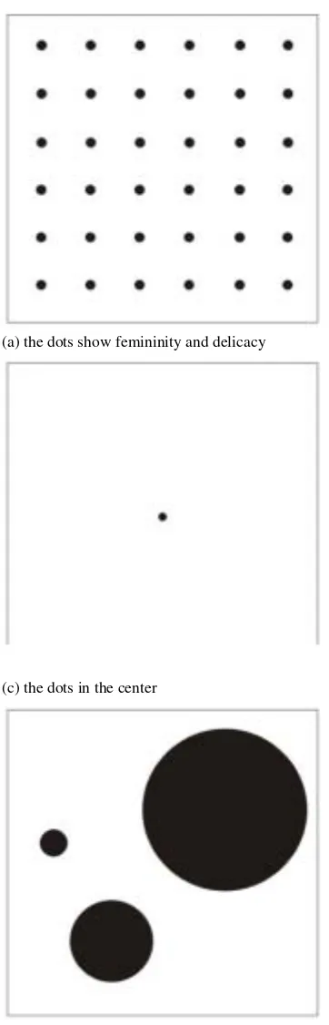
Generally speaking, the quality of a design work depends on the selection and arrangement of elements. The most basic image elements are dots, lines and planes, producing different visual perception and variation in various arrangement, for instance, order, size, direction, radiation, and tension. Besides, they can produce light and shade, materials, visual interesting and effects [10]. Dot is the most important graphic element. The idea of a dot is understood in a very broad sense. All plane figures which have a center and are perceived as closed forms may be described as a dot-shaped. Even if a dot expands, it still remains a dot. A mere increase in the size of an element is not enough to alter its essential character (figure 1). Because it is circumscribed, balanced, non-figurative and weightless, the smallest dot is particularly well adapted to demonstrating the most important principles of composition. It is also maneuverable element in the whole field of pictorial art [3]. With different sizes and positions, the dots convey the different perception (figure 2). Every dot, even the smallest, has radiating power, but the dot-plane relationships invariably proceed exclusively outwards from the dot or inwards towards it. If we placed another dot by the side of the first one, the dot-background relation ship now becomes secondary. The two dots determine what happens on the plane. Working with a large number of dots gives a rich variety of formulations: simple rows of dots, vertical and horizontal rows of dots (grid pattern), massing, variability in size, grey tone and color, and in texture [3].
(a) the dots show femininity and delicacy (b) the dots show roughness and grandness
(c) the dots in the center (d) the dots in mass, single value, line formation
(e) the dots in the three different sizes and position (f) the dots in the various sizes and positions
Line is the visible trace of a moving dot [3, 10]. If the dot is an important element in structure and analysis, the line performs the important duty of construction [3]. Lines are divided into straight line and curve; the former one is static and the later one is dynamic. The lines can be mentally grasped on terms of the relationship in width and space; the lines show the perception of distance, weight and solid [6, 10].
(a) the lines with different width show distance (b) the lines in different space show distance
Figure 3. The lines with different constituting show the different perception.
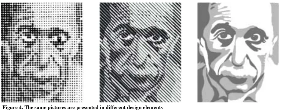
The dot is bound to a center and is static; the line is stretch; the plane is weight and area [2, 5]. Design works constituting with dots, lines and planes skillfully could express various emotion and visual impression [5]. For example, the picture is divided into several areas of colors and constituted with dots, lines and planes separately in different sizes, widths or tone values [3], showed as figure 4.
Figure 4. The same pictures are presented in different design elements
their basic construction. Perhaps it should be emphasized that we resort to the basic elements of creative art when we compose or receive a written message [3]. Logos are a primary means of communicating corporate value to customers and employees, to shareholders and investors, in the marketplace and in the world [8]. It delivers a clear, well-defined message of uniqueness and individuality. Many times, logos are the first and only impression consumers encounter when they are shopping for a particular product or service [7]. For example, fashion needed contemporary, instantly recognizable marks and Nike and Calvin Klein chose symbols and lettering that would state they designed the products carrying them [9].
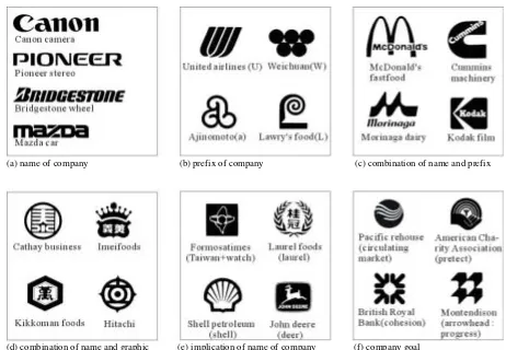
History has proven that the ideal trademark - from a marketing viewpoint - must be simple and unique, distinctive and, most importantly, memorable. It must conjure instant association with one particular product or service and must encourage repeat purchase [9]. Thus, logo takes the place of graphic mark gradually [5]. From this point of view, logos assume considerable importance in that, apart from their actual function as a means of communication, they also afford one of the few occasions when modern man has to deal with the pure formal element [3]. All masks fall under one of six categories: (a) name of company, (b) prefix of company, (c) combination of name and prefix, (d) combination of name and graphic, (e) implication of name of company, and (f) company goal.
(a) name of company (b) prefix of company (c) combination of name and prefix
(d) combination of name and graphic (e) implication of name of company (f) company goal
A graphics professional depends on some basic design principles to make communication work. These design principles are valuable as guides, but not absolute rules to follow [11]. The principles of design include ten criteria: repetition, gradation, symmetry, balance, harmony, contrast, proportion, rhythm, simplicity, and unity [1, 5] (a) Repetition: the same shape is presented repeatedly and they are not either primary or subordinate. (b) Gradation: the similar shapes are presented gradationally, such as from big to small, or small to big. (c) Symmetry: the layout of the shapes is identical in the both side of the datum line that is vertical or horizontal. (d) Balance: the layout of the shapes looks equivalent in the both side of the datum line that is vertical or horizontal. (e) Harmony: the similar shapes or materials are presented harmoniously. (f) Contrast: the opposite shapes or materials are presented with conflicts. (g) Proportion: there is mathematical relation between the parts and the parts, or the whole design work. (h) Rhythm: the shapes are arranged repeatedly in a regular pattern, so that the design work looks well-ordered and kinetic. (i) Simplicity: the simple lines and shapes are performed with the sensation of pure and plane. (j) Unity: the various shapes are performed to express the same theme with order [1, 5].
2. Methods
2.1. Deriving crucial factors from ten criteria by factor analysis
Subjects: A total of 75 (42 males and 33 females) undergraduate and graduate students served as evaluator to assess 25 graphic design works. The students are studying in college of design at NYUST (National Yunlin University of Science and Technology) and well-educated in professional design courses at least for three years. All the subjects have learned the basic design course in university and are able to evaluate the graphic design works.
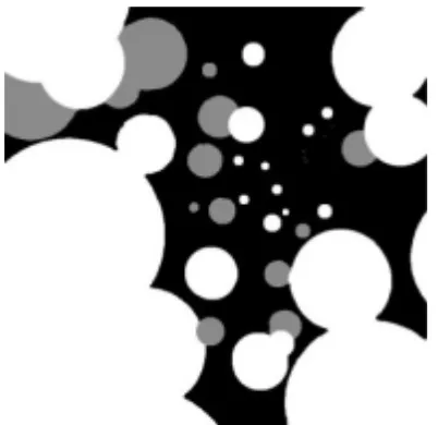
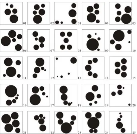
Materials: A total of 25 graphic design works constituting with five circles in different sizes and locations. The graphic design works were created from the researchers. Each design work is printed in a 10 10 cm square area. All of the 25 design works were arranged in an A0 (84 119 cm) poster and presented with a exhibition panel (Figure 6).
Methods: The subjects were explained the purposes and steps of the experiment before evaluation. Then they were asked to evaluate the 25 graphic design works along the 10 criteria with a 9-point scale system. The evaluation work lasted for around 50 minutes and the subjects could take a break to rest during the evaluation process. Each subject was paid $4/hour for his/her evaluation work.
Figure 6. 25 graphic design works for deriving crucial factors
2.2. Testing validity of the crucial factors by regression analysis
In order to test the validity of the crucial factors that deriving from the ten criteria, the methods such as linear regression analysis and correlation were used to test the predicting power and correlation coefficient.
Materials: Evaluating samples are 25 logo design works constituting with English letters and in black color to diminish the influence of color and to unify the format. 25 logo design works in each square of 10 cm respectively are arranged and encoded randomly in twenty-five squares of 13 cm separately to avoid the interference between the samples during evaluating (figure 7).
Methods: Explaining the purposes and steps of the experiment to the subject before evaluating. The evaluating items are two: one is to evaluate 25 logo design works with two crucial criteria, balance and contrast, derived from the previous experiment, the other is to evaluate them with individual aesthetic perception. Both of items are in a 9-point scale system.
3. Results
3.1. Factor analysis
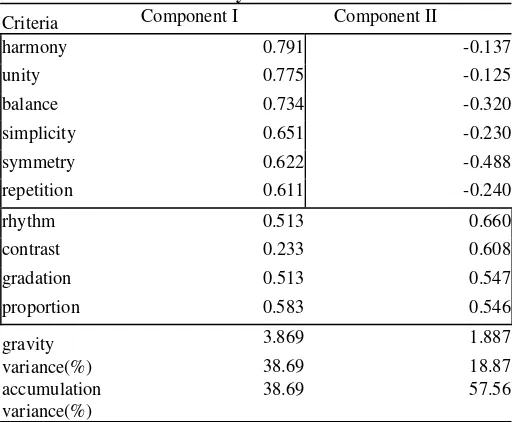
In order to derive crucial and useful factors from various criteria, a factor analysis was used to reduce the number for criteria. The results showed that two crucial factors were extracted from the ten criteria explaining 57.56% of variance (Table 1). The factor 1 was formed by harmony explaining 38.69% of variance and the factor 2 was formed by contrast explaining 18.87 of variance. The two criteria shall be used for evaluating the other set of graphic design works to test their validity.
Table 1. Results of factor analysis
Criteria Component I Component II
harmony 0.791 -0.137
The correlative analysis is also used in order to explore the correlation among the ten criteria scores. The results (Table 2) showed that balance is highly correlative with symmetry and harmony; unity is highly correlative with harmony and simplicity; rhythm is highly correlative with gradation and proportion; overall score is most highly correlative with unity; contrast is negatively correlative with repetition and symmetry. The results are compatible with our aesthetic experience.
Table 2. Results of correlative analysis
repetition gradation symmetry balance harmony contrast proportion rhythm simplicity unity
gradation 0.25
symmetry 0.44 0.04
balance 0.39 0.18 0.63
harmony 0.40 0.29 0.45 0.65
contrast -0.02 0.25 -0.04 0.07 0.12
proportion 0.18 0.43 0.15 0.26 0.34 0.40
rhythm 0.17 0.57 0.02 0.15 0.29 0.33 0.57
simplicity 0.37 0.18 0.38 0.37 0.45 0.00 0.26 0.16
3.3. Regression analysis
In order to confirm the validity of the two crucial criteria, balance and contrast, the linear regression analysis using the stepwise method was conducted in the 25 logo design works. The equation 1 indicates that the regression equation has a highly predicting power to the overall score based on the two crucial criteria (R2 = 0.518). In the equation 1, Ymeans overall score, A means balance and B means contrast.
Y= 0.593A+ 0.440B 0.009………(1)
3.4. Assessment of graphic and logo design works
Finally, the logo design works are assessed in overall score. The best five logo design works are no. 21, 6, 1, 4, and 11 and the worse ones are no. 7, 9, 24, 23, and 17 (Table 3). Compare with these deign works, we can conclude that the good design works should be with several features of: (a) emphasizing the performance of the subject, (b) smoothing the path of movement, (c) leaving some space, (d) noticing the visual performance of form, (e) constituting the status of subjects, (f) well-matching the perception of stabilization and rhythm, (g) avoiding the meaningless ornament, (h) pursuing the completeness with difference.
Table 3. Ranking of 25 logo design works
4. Conclusion and Suggestion
The purpose of the study is to develop an evaluation model for graphic design works. The conclusions of this study can be summarized as following.
4.1. The results of factor analysis showed that the two crucial factors involving in design evaluation were balance and contrast, which can be the reference using for evaluating graphic design works.
4.2. The linear regression analysis indicated that the regression equation had a highly predicting power to the overall score based on the two crucial criteria.
4.3. The results of correlative analysis were the same as our expectation. Contrast is negatively correlative with repetition and symmetry; balance is highly correlative with symmetry and harmony; rhythm is highly correlative with gradation and proportion; unity is highly correlative with harmony and simplicity.
4.4. With the progress of computer technology, we suggest that the regression equation can be written in a computer program for testing the validity of computer aided design evaluation in the future.
Reference
1. Bevlin, Marjorie Elliott. Design Through Discovery. Holt, Rinehart and Winston, New York, 3rd Ed., (1977).
2. He, Yiao-Zong. The Introduction of Commercial Design. Xiong-Shi Book Co., Taipei, (l974).
3. Hofmann, Armin. Graphic Design Manual-Principle and Practice. Academy Edition, London, 4th Ed., (1988).
4. John Sayles and Sheree Clark. Letterhead & Logo Design 7. Rockport Publishers, Massachusetts, (2001). 5. Lin, Pin-Zhang. Commercial Design. Yishujia publish Co., Taipei, (1986).
6. Liu, Qing-Fu. Art, Design and construction. Liu-He publish Co., Taipei, (1990).
7. Miller, Anistatia R and Brown, Jared M. What logos do and how they do it. Rockport Publishers, Massachusetts, (1998).
8. Morgan, Conway Lloyd. Logos(Logo, identity, brand, culture). RotoVision SA, New York, (1999). 9. Thomas, Gregory, 2000, How to design logos, symbols, and icons, North Light Books, Ohio.
10. Wallschlaeger, Charles. and Busic-Snyder, Cynthia. and Morgan, Meredith. Basic visual concepts and principles for artists, architects, and designers. Wm. C. Brown Publishers, Iowa, (1992).