www.elsevier.com / locate / econbase
Tick size and the compass rose: further insights
*
Eliza Wang, Robert Hudson , Kevin Keasey
International Institute of Banking and Financial Services, The University of Leeds, Leeds LS2 9JT, UK
Received 24 June 1999; accepted 22 December 1999
Abstract
This paper investigates two differing perspectives on the compass rose – those of Crack and Ledoit [1996,
The Journal of Finance 51 (2), 751–762] and Szpiro [1998, Journal of Banking and Finance 22, 1559–1569].
Neither perspective has explicitly considered the effect of time and we consider the implications of this with illustrations using market micro data. 2000 Elsevier Science S.A. All rights reserved.
Keywords: Stock returns; Structure; Time
JEL classification: C12
1. The compass rose: prior literature
In 1996 Crack and Ledoit (1996) (henceforth CL) investigated if stock returns have structure. From an analysis of phase diagrams, where daily returns are plotted against themselves with a one day lag, they note a structure, which they term the compass rose. They identify three conditions for the appearance of a compass rose:
1. ‘Daily price changes of Stock XYZ are small relative to the price level;
2. Daily price changes of Stock XYZ are in discrete jumps of a small number of ticks; and 3. The price of Stock XYZ varies over a relatively wide range.’ p. 754 (our italics).
They argue that the compass rose is the norm for NYSE stocks and they illustrate their argument with the example of Berkshire Hathaway. In contrast, they note how portfolios of more than two stocks and individual assets need not display a compass rose. For example, they show how gold returns for the period 1978 to 1994 do not display a compass rose. The reason they give for this
*Corresponding author. Tel.: 144-113-233-4505; fax: 144-113-233-4459. E-mail address: [email protected] (R. Hudson)
absence, and this is also the case for portfolios, is that condition 2 is violated; namely, the ‘effective 1
tick size’ is negligible with respect to their price changes.
‘ . . . London gold fixing prices do not generate a compass rose . . . Although gold price levels do cluster on quarter dollars and dimes . . . ..the degree of clustering is not sufficient to raise the effective tick size above the official one, a nickel. A nickel is negligible when compared to typical gold price changes, thus condition 2 is violated.’, p. 757.
In other words, it is this effective tick size (when compared to the typical price change) condition which gives the underlying space its grid like structure – a space with sufficient discreteness to create a compass rose.
In contrast to CL, Szpiro (1998) argues that the
‘the sole necessary and sufficient condition for the appearance of the micro and the nanostructure of the compass rose, is the requirement that price changes take place in discrete jumps.’, p. 1569.
In the case of Szpiro, therefore, all assets which display discrete changes should have a compass rose and this includes portfolios of stocks.
These two perspectives on the compass rose, therefore, lead to very different conclusions. From the CL perspective, a compass rose should only be apparent if the effective tick size is sufficiently large as compared to the average price change. Therefore, a compass rose should not be expected for all assets and for portfolios of more than two assets. In contrast, Szpiro suggests that a compass rose should exist for all data that displays discreteness.
We note that neither perspective explicitly considers the effect of time and we consider the implications of this.
2. The effect of time
Szpiro’s analysis is based on consideration of the locus of data points that form the structure of the compass rose. This approach is theoretically correct, given its framework of analysis, but the element of time has not been considered. It is tacitly assumed that all the potential data points that would form the phase-portrait have actually occurred. In practice, for any data set, formed in a finite period of time, all potential data points will not have occurred. Given this observation, the interesting issue to be resolved is what ‘characteristics’ does a data set need to have for the structure of a compass rose to be noted?
It seems reasonable to suppose that if a higher proportion of potential data points have occurred it is more likely that a rose will be apparent. It is possible to calculate this proportion given the underlying probability distribution of returns on the security, the frequency of observations, the price level of the security and the tick size of the security.
1
The following examples may be considered to illustrate the effect of tick size on the likelihood of a compass rose being observed:
(i) A share index (based on FTSE 100) in which returns are normally distributed with standard deviation 0.01 on a daily basis, a price level of 6000 and a tick size of 1 that is also the effective tick size. It is conventional to disregard outliers in work on the compass rose so we can conveniently disregard observations that fall more than 2 standard deviations from the mean. On the first day of an investigation (day t) the index may take all integer values between 5880 and 6120 i.e. there are 241 potential price outcomes. Similarly on day t11 there are 241 potential
2 2
price outcomes . Thus the potential number of data points on the compass rose plot is 241 5
58 081.
(ii) An individual share (not untypical of quoted UK shares) in which returns are normally distributed with standard deviation 0.01 on a daily basis, a price level of 300 and a tick size of 1 that is also the effective tick size. If outliers are again disregarded, on day t the share may take all integer values between 294 and 306; that is, there are 13 potential price outcomes. Similarly on day
t11 there are 13 potential price outcomes. Thus the potential number of data points on the 2
compass rose plot is 13 5169.
Therefore, for a given investigation period, it is clear that a much higher proportion of potential data points will occur in example (ii) than in example (i) – suggesting that a compass rose is much more likely to become apparent. In general, therefore, a higher proportion of potential data points will occur as the tick size increases relative to the standard deviation of the security or index.
We next examine how the frequency of sampling affects the proportion of the data points that actually occur. Table 1 shows for the share index and the share of examples (i) and (ii) how the proportion of data points occurring varies with the frequency of sampling. The calculations assume that the standard deviation of returns increases proportionately to the root of the sampling period.
Table 1 shows that a higher proportion of outcomes is realised and, therefore, a compass rose is more likely to appear as the sampling frequency increases.
Thus it can be seen that extending Szpiro’s analysis to include the effect of time indicates that the compass rose is more likely to appear in the following conditions:
I. a compass rose is more likely if the effective tick size is large compared to the standard deviation of the returns,
II. a compass rose is more likely as the frequency of observations increases.
In their analysis CL confine their attention to daily data. However, if their conditions for the appearance of the compass rose are slightly modified to apply to data at other frequencies they provide a guide to the appearance of the compass rose that is equivalent to conditions I and II above.
2
Table 1
a Proportion of data points occurring by sampling frequency Index
Sampling frequency Standard deviation Number of potential Proportion of of returns outcomes outcomes realised
In Table 1 a day is assumed to be made up of 7.5 trading hours.
Condition I will occur for a given frequency of observation if conditions 1 and 2 of CL are fulfilled. If condition II is considered, a higher frequency of observations will reduce the standard deviation of returns which will ensure that condition 2 of CL is fulfilled.
3. Data and results
To examine conditions I and II empirically, we consider phase diagrams constructed from observations taken from the real time Market-Eye data service.
3.1. Condition I – a compass rose is more likely if the effective tick size is large compared to the standard deviation of the returns
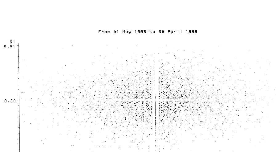
Fig. 1. Return (t) vs. return (t21): FTSE 100 shares.
Fig. 3. 15-Min return (t) vs. return (t21): FTSE 100 shares.
3.2. Condition II – a compass rose is more likely as the frequency of observations increases
To examine this condition we can compare Fig. 3 which shows a phase diagram for the 100 individual shares which make up the FTSE 100 index with a sampling frequency of 15 min with Fig. 4 which shows a phase diagram for the same shares with a sampling frequency of 10 days. Fig. 3 was based on an investigation period of 5 h allowing for 20 samples at intervals that were 15 min apart. Fig. 4 was designed to incorporate roughly the same number of observations and was based on 20 samples each 10 days apart. A compass rose can be seen clearly in Fig. 3 whereas there is no sign of a compass rose in Fig. 4. Thus there is empirical evidence to support condition II.
4. Conclusions
Fig. 4. Return (t) vs. Return (t21): FTSE 100 shares.
is only likely to be evident if the effective tick size (a measure of the discreteness of the underlying space) is sufficiently large as compared to the average price change. This means that where the effective tick size is relatively small, as in the case of stock portfolios or certain assets (for example, gold), a compass rose is not likely to be apparent. Another implication of considering the effect of time is that the compass rose will become more apparent as observations are made more frequently. Further empirical investigation of micro-data from the UK stock market confirms that the compass rose becomes more apparent as the frequency of observations increases.
References
Crack, T.F., Ledoit, O., 1996. Robust structure without predictability: the ‘compass rose’ pattern of the stock market. The Journal of Finance 51 (2), 751–762.