Informasi Dokumen
- Penulis:
- Jake Spurlock
- Pengajar:
- Dave Winer, Editor
- Sekolah: O’Reilly Media, Inc.
- Mata Pelajaran: Web Development
- Topik: Bootstrap Ebook Free Download
- Tipe: Ebook
- Tahun: 2013
- Kota: Sebastopol
Ringkasan Dokumen
I. Bootstrap Scaffolding
Bootstrap is an open-source front-end framework designed to facilitate responsive web design. It provides a standardized set of tools for developers, enhancing consistency and maintainability across web applications. The initial section introduces Bootstrap's purpose and its evolution from a CSS-driven project to a comprehensive framework that includes JavaScript plugins. The Bootstrap file structure is outlined, emphasizing its simplicity and ease of integration into projects. This section sets the foundation for understanding how Bootstrap organizes its components, which is essential for achieving educational objectives in web development courses.
1.1 What Is Bootstrap?
Bootstrap was developed by Mark Otto and Jacob Thornton at Twitter to standardize front-end development. It addresses the inconsistencies in web applications by providing a cohesive framework that simplifies the development process. This part highlights the significance of Bootstrap in modern web development, illustrating its role in promoting best practices and enhancing the learning experience for students and professionals alike.
1.2 Bootstrap File Structure
The Bootstrap file structure is straightforward, consisting of CSS, JavaScript, and image folders. This organization allows developers to easily integrate Bootstrap into their projects, promoting a better understanding of web development principles. By learning this structure, students can effectively manage their resources and streamline their workflow, which aligns with educational objectives in programming and design.
1.3 Basic HTML Template
Bootstrap simplifies the creation of HTML templates by providing a basic structure that includes links to Bootstrap's CSS and JavaScript files. This subsection emphasizes the importance of understanding HTML and how Bootstrap enhances it. Students learn to create responsive layouts quickly, which is crucial for achieving learning outcomes related to web development.
1.4 Global Styles
Bootstrap's global styles ensure a uniform appearance across web applications. By utilizing Normalize.css, Bootstrap enhances typography and link behaviors, which helps students grasp the significance of CSS in achieving design consistency. This knowledge is vital for developing aesthetically pleasing and user-friendly websites, meeting educational goals in design and usability.
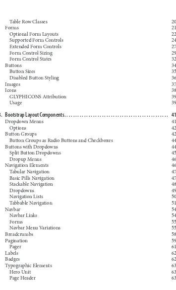
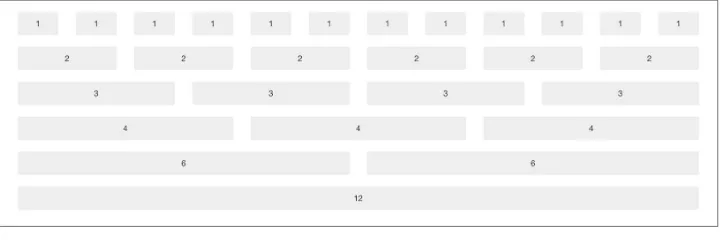
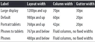
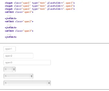
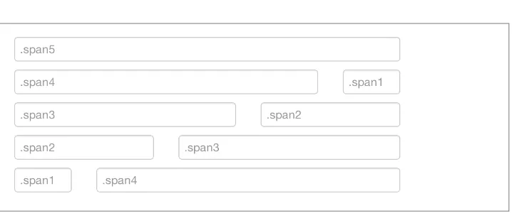
1.5 Default Grid System
The default grid system in Bootstrap is a core feature that enables responsive design. It allows developers to create layouts that adapt to various screen sizes, which is essential for modern web applications. Understanding the grid system is fundamental for students as it illustrates the principles of responsive design, aligning with learning outcomes focused on creating adaptable web interfaces.
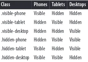
1.6 Responsive Design
Responsive design is a key concept in web development, and Bootstrap facilitates this through its grid system and media queries. This subsection explains how Bootstrap's responsive features optimize content for different devices. Students learn to apply these principles, which is crucial for achieving educational objectives related to accessibility and user experience.
II. Bootstrap CSS
This section delves into Bootstrap's CSS components, which are essential for styling web applications efficiently. It covers typography, forms, tables, and more, demonstrating how Bootstrap enhances standard HTML elements. By learning these styles, students can create visually appealing and functional websites. The academic value lies in understanding how CSS frameworks can streamline development processes and improve design quality, which aligns with learning outcomes in web design courses.
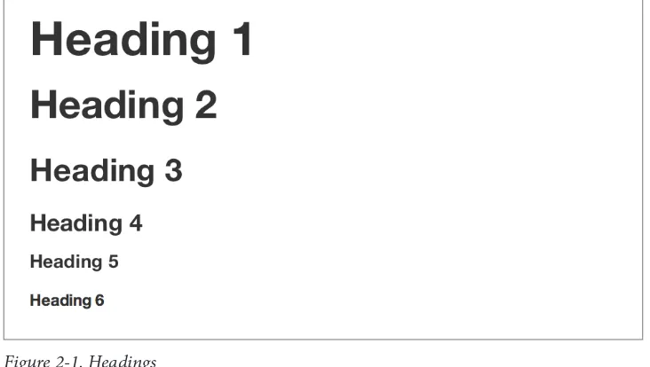
2.1 Typography
Bootstrap's typography settings provide a foundation for text styling, utilizing standard fonts and sizes. This subsection emphasizes the importance of typography in web design, highlighting how Bootstrap ensures readability and aesthetic appeal. Students learn to apply these principles, which is essential for creating user-friendly interfaces, thus meeting educational goals in graphic design.
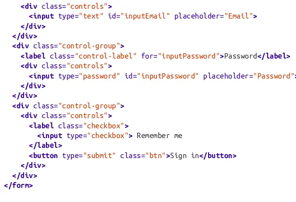
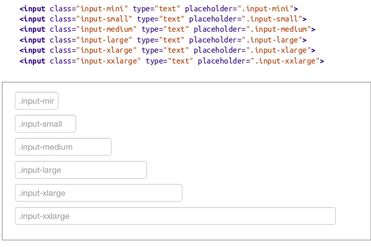
2.2 Forms
Bootstrap simplifies form creation with pre-defined styles and structures. This section covers various form layouts, enhancing students' understanding of user input handling. Mastery of form design is critical for developing interactive web applications, aligning with learning outcomes focused on user experience and functionality.
2.3 Tables
The tables section illustrates how Bootstrap enhances data presentation through clean and responsive table designs. Understanding how to style tables effectively is crucial for displaying data clearly, which is a key learning outcome in data visualization and web development courses.
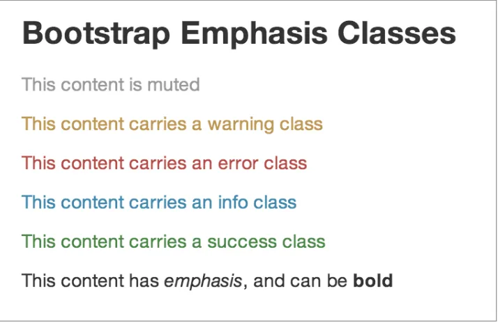
2.4 Emphasis Classes
Bootstrap provides emphasis classes to highlight important information within text. This feature is vital for guiding users' attention and improving content comprehension. Students learn to use these classes to enhance user experience, aligning with educational objectives in content strategy and web design.
III. Bootstrap Layout Components
Layout components in Bootstrap are critical for building structured and navigable web pages. This section covers various components such as navigation bars, dropdowns, and alerts, which are essential for creating interactive user interfaces. By mastering these components, students can design cohesive layouts that improve usability and accessibility, thus achieving learning outcomes in web design and development.
3.1 Navigation Elements
Navigation elements are crucial for guiding users through a website. Bootstrap provides a variety of navigation styles, including navbars and breadcrumbs. Understanding these components helps students create intuitive navigation systems, which is essential for enhancing user experience and meeting educational objectives in web usability.
3.2 Dropdown Menus
Dropdown menus are essential for organizing content and providing users with options. This subsection explains how to implement and style dropdowns using Bootstrap. Learning to create effective dropdowns is crucial for developing interactive applications, aligning with learning outcomes focused on user interaction design.
3.3 Alerts and Progress Bars
Bootstrap's alerts and progress bars enhance user feedback mechanisms within applications. This section covers how to implement these components effectively. Understanding feedback elements is vital for improving user engagement and satisfaction, which aligns with educational goals in interactive design.
IV. Bootstrap JavaScript Plugins
JavaScript plugins in Bootstrap add interactivity and dynamic features to web applications. This section outlines key plugins such as modals, tooltips, and carousels, illustrating how they enhance user experience. By learning to implement these plugins, students gain practical skills in creating engaging web interfaces, which is essential for achieving learning outcomes in front-end development.
4.1 Overview
The overview of Bootstrap's JavaScript plugins provides insights into their purpose and functionality. Understanding the role of these plugins is crucial for students as they learn to enhance web applications with interactive features, aligning with educational objectives in web development.
4.2 Modal and Tooltips
Modals and tooltips are vital for providing additional information without navigating away from the current page. This subsection explains how to implement these features effectively, enhancing user engagement. Mastery of modals and tooltips is essential for achieving learning outcomes related to user interaction and interface design.
4.3 Carousel
The carousel component allows for dynamic content presentation, making it a valuable tool for web developers. This section covers how to implement carousels using Bootstrap, which is crucial for creating visually appealing and interactive web applications. Understanding carousels aligns with educational goals in multimedia design.
V. Using Bootstrap
This section provides practical guidance on utilizing Bootstrap effectively in projects. It covers customization options, GitHub integration, and themes, which are essential for adapting Bootstrap to specific project needs. By learning these practices, students can enhance their development skills and achieve educational objectives related to project management and customization.
5.1 GitHub Project
Integrating Bootstrap with GitHub allows for version control and collaborative development. This subsection emphasizes the importance of using GitHub in web projects, aligning with educational goals in software development practices.
5.2 Customizing Bootstrap
Customization is key to tailoring Bootstrap to meet specific design requirements. This section explains how to modify Bootstrap's styles and components effectively. Understanding customization techniques is essential for achieving learning outcomes focused on design flexibility and creativity.
5.3 Themes
Bootstrap themes enable developers to apply pre-designed styles to their projects. This subsection discusses the benefits of using themes, which can save time and enhance visual appeal. Mastery of themes aligns with educational objectives in design efficiency and aesthetic development.
Referensi Dokumen
- Bootstrap snippets ( DEVtellect )
- Repix Design
- Built With Bootstrap
- CodeKit
- Sublime Text 2