Pro
CSS
and
HTML
Design Patterns
Michael Bowers
ailable
Increase creativity and productivity by using
patterns in your web designs while leveraging
CSS and (X)HTML best practices
Michael Bowers
All rights reserved. No part of this work may be reproduced or transmitted in any form or by any means, electronic or mechanical, including photocopying, recording, or by any information storage or retrieval system, without the prior written permission of the copyright owner and the publisher.
ISBN-13 (pbk): 978-1-59059-804-7 ISBN-10 (pbk): 1-59059-804-0
Printed and bound in the United States of America 9 8 7 6 5 4 3 2 1
Trademarked names may appear in this book. Rather than use a trademark symbol with every occurrence of a trademarked name, we use the names only in an editorial fashion and to the benefit of the trademark owner, with no intention of infringement of the trademark.
Lead Editor: Chris Mills Technical Reviewer: Paul Haine
Editorial Board: Steve Anglin, Ewan Buckingham, Gary Cornell, Jason Gilmore, Jonathan Gennick, Jonathan Hassell, James Huddleston, Chris Mills, Matthew Moodie, Jeff Pepper, Dominic Shakeshaft, Jim Sumser, Matt Wade
Project Manager: Kylie Johnston Copy Edit Manager: Nicole Flores Copy Editor: Ami Knox
Assistant Production Director: Kari Brooks-Copony Production Editor: Laura Esterman
Compositor: Dina Quan Proofreader: Elizabeth Berry Indexer: Julie Grady Cover Designer: Kurt Krames
Manufacturing Director: Tom Debolski
Distributed to the book trade worldwide by Springer-Verlag New York, Inc., 233 Spring Street, 6th Floor, New York, NY 10013. Phone 1-800-SPRINGER, fax 201-348-4505, e-mail [email protected], or visit http://www.springeronline.com.
For information on translations, please contact Apress directly at 2560 Ninth Street, Suite 219, Berkeley, CA 94710. Phone 510-549-5930, fax 510-549-5939, e-mail [email protected], or visit http://www.apress.com. The information in this book is distributed on an “as is” basis, without warranty. Although every precaution has been taken in the preparation of this work, neither the author(s) nor Apress shall have any liability to any person or entity with respect to any loss or damage caused or alleged to be caused directly or indi-rectly by the information contained in this work.
To my son, Joshua
To my daughter, Sydney
About the Author
. . . xv
About the Technical Reviewer
. . . xvii
Acknowledgments
. . . xix
Introduction
. . . xxi
■
CHAPTER 1
Design Patterns: Making CSS Easy!
. . . 1
■
CHAPTER 2
HTML Design Patterns
. . . 31
■
CHAPTER 3
CSS Selectors and Inheritance
. . . 59
■
CHAPTER 4
Box Models
. . . 77
■
CHAPTER 5
Box Model Extents
. . . 95
■
CHAPTER 6
Box Model Properties
. . . 107
■
CHAPTER 7
Positioning Models
. . . 123
■
CHAPTER 8
Positioning: Indented, Offset, and Aligned
. . . 147
■
CHAPTER 9
Positioning: Advanced
. . . 173
■
CHAPTER 10
Styling Text
. . . 199
■
CHAPTER 11
Spacing Content
. . . 215
■
CHAPTER 12
Aligning Content
. . . 237
■
CHAPTER 13
Blocks
. . . 255
■
CHAPTER 14
Images
. . . 283
■
CHAPTER 15
Tables
. . . 317
■
CHAPTER 16
Column Layout
. . . 343
■
CHAPTER 17
Layouts
. . . 371
■
CHAPTER 18
Drop Caps
. . . 417
■
CHAPTER 19
Callouts and Quotes
. . . 437
■
CHAPTER 20
Alerts
. . . 455
About the Author
. . . xv
About the Technical Reviewer
. . . xvii
Acknowledgments
. . . xix
Introduction
. . . xxi
■
CHAPTER 1
Design Patterns: Making CSS Easy!
. . . 1
Design Patterns—Structured Recipes
. . . 2
Using Design Patterns
. . . 2
Using Stylesheets
. . . 7
CSS Syntax
. . . 8
CSS Syntax Details
. . . 9
Using Whitespace in CSS
. . . 10
Using Property Values
. . . 11
Using Cascade Order
. . . 14
Simplifying the Cascade
. . . 17
CSS and HTML Links
. . . 18
CSS Properties
. . . 19
CSS Properties and Values: Common
. . . 20
CSS Properties and Values: Content
. . . 21
CSS Properties and Values: Layout
. . . 22
CSS Properties and Values: Specialized
. . . 23
Selectors
. . . 23
Flexible Units of Measure
. . . 24
Fixed Units of Measure
. . . 24
Ratios Between Units of Measure at 96 dpi
. . . 25
Typical font-size Values at 96 dpi
. . . 25
Troubleshooting CSS
. . . 26
■
CHAPTER 2
HTML Design Patterns
. . . 31
Chapter Outline
. . . 31
HTML Structure
. . . 32
XHTML
. . . 38
DOCTYPE
. . . 40
Header Elements
. . . 42
Conditional Stylesheet
. . . 44
Structural Block Elements
. . . 46
Terminal Block Elements
. . . 48
Multi-purpose Block Elements
. . . 50
Inline Elements
. . . 52
Class and ID Attributes
. . . 54
HTML Whitespace
. . . 56
■
CHAPTER 3
CSS Selectors and Inheritance
. . . 59
Chapter Outline
. . . 59
Type, Class, and ID Selectors
. . . 60
Position and Group Selectors
. . . 62
Attribute Selectors
. . . 64
Pseudo-element Selectors
. . . 66
Pseudo-class Selectors
. . . 68
Subclass Selector
. . . 70
Inheritance
. . . 72
Visual Inheritance
. . . 74
■
CHAPTER 4
Box Models
. . . 77
Chapter Outline
. . . 77
Display
. . . 78
Box Model
. . . 80
Inline Box
. . . 82
Inline-block Box
. . . 84
Block Box
. . . 86
Table Box
. . . 88
Absolute Box
. . . 90
■
CHAPTER 5
Box Model Extents
. . . 95
Chapter Outline
. . . 95
Width
. . . 96
Height
. . . 98
Sized
. . . 100
Shrinkwrapped
. . . 102
Stretched
. . . 104
■
CHAPTER 6
Box Model Properties
. . . 107
Chapter Outline
. . . 107
Margin
. . . 108
Border
. . . 110
Padding
. . . 112
Background
. . . 114
Overflow
. . . 116
Visibility
. . . 118
Page Break
. . . 120
■
CHAPTER 7
Positioning Models
. . . 123
Chapter Outline
. . . 123
Positioning Models
. . . 124
Positioned
. . . 126
Closest Positioned Ancestor
. . . 128
Stacking Context
. . . 130
Atomic
. . . 132
Static
. . . 134
Absolute
. . . 136
Fixed
. . . 138
Relative
. . . 140
Float and Clear
. . . 142
Relative Float
. . . 144
■
CHAPTER 8
Positioning: Indented, Offset, and Aligned
. . . 147
Chapter Outline
. . . 147
Offset Absolute and Offset Fixed
. . . 156
Offset Relative
. . . 158
Aligned Static Inline
. . . 160
Aligned and Offset Static Block
. . . 162
Aligned and Offset Static Table
. . . 164
Aligned and Offset Absolute
. . . 166
Aligned-center Absolute
. . . 168
Aligned Outside
. . . 170
■
CHAPTER 9
Positioning: Advanced
. . . 173
Chapter Outline
. . . 173
Left Aligned
. . . 174
Left Offset
. . . 176
Right Aligned
. . . 178
Right Offset
. . . 180
Center Aligned
. . . 182
Center Offset
. . . 184
Top Aligned
. . . 186
Top Offset
. . . 188
Bottom Aligned
. . . 190
Bottom Offset
. . . 192
Middle Aligned
. . . 194
Middle Offset
. . . 196
■
CHAPTER 10
Styling Text. . . 199
Font
. . . 200
Highlight
. . . 202
Text Decoration
. . . 204
Text Shadow
. . . 206
Text Replacement
. . . 208
Invisible Text
. . . 210
Screenreader-only
. . . 212
■
CHAPTER 11
Spacing Content
. . . 215
Spacing
. . . 216
Blocked
. . . 218
Nowrap
. . . 220
Preserved
. . . 222
Padded Content
. . . 226
Inline Spacer
. . . 228
Inline Decoration
. . . 230
Linebreak
. . . 232
Inline Horizontal Rule
. . . 234
■
CHAPTER 12
Aligning Content
. . . 237
Text Indent
. . . 238
Hanging Indent
. . . 240
Horizontal-aligned Content
. . . 242
Vertical-aligned Content
. . . 244
Vertical-offset Content
. . . 246
Subscript and Superscript
. . . 248
Nested Alignment
. . . 250
Advanced Alignment Example
. . . 252
■
CHAPTER 13
Blocks
. . . 255
Chapter Outline
. . . 255
Structural Meaning
. . . 256
Visual Structure
. . . 258
Section
. . . 260
Lists
. . . 262
Background Bulleted
. . . 264
Inlined
. . . 266
Collapsed Margins
. . . 268
Run-in
. . . 270
Horizontal Rule
. . . 272
Block Spacer
. . . 274
Block Space Remover
. . . 276
Left Marginal
. . . 278
Right Marginal
. . . 280
■
CHAPTER 14
Images
. . . 283
Chapter Outline
. . . 283
Image
. . . 284
Content over Image
. . . 294
Content over Background Image
. . . 296
CSS Sprite
. . . 298
Basic Shadowed Image
. . . 302
Shadowed Image
. . . 304
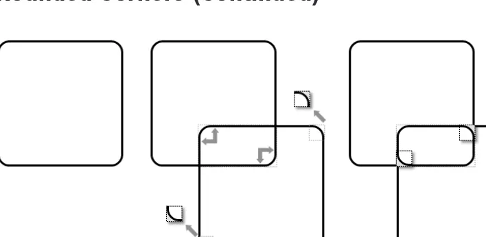
Rounded Corners
. . . 310
Image Example
. . . 314
■
CHAPTER 15
Tables. . . 317
Chapter Outline
. . . 317
Table
. . . 318
Row and Column Groups
. . . 320
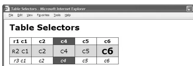
Table Selectors
. . . 322
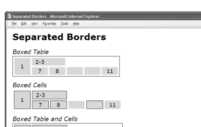
Separated Borders
. . . 324
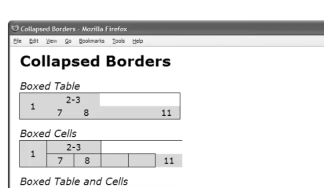
Collapsed Borders
. . . 326
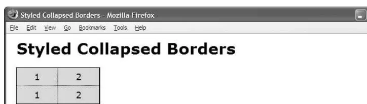
Styled Collapsed Borders
. . . 328
Hidden and Removed Cells
. . . 330
Removed and Hidden Rows and Columns
. . . 332
Vertical-aligned Data
. . . 334
Striped Tables
. . . 336
Tabled, Rowed, and Celled
. . . 338
Table Layout
. . . 340
■
CHAPTER 16
Column Layout
. . . 343
Table Layout Models
. . . 343
Using Column Layouts
. . . 344
Chapter Outline
. . . 344
Column Width
. . . 346
Shrinkwrapped Columns
. . . 348
Sized Columns
. . . 350
Content-proportioned Columns
. . . 352
Size-proportioned Columns
. . . 354
Percentage-proportioned Columns
. . . 356
Inverse-proportioned Columns
. . . 358
Equal Content-sized Columns
. . . 360
Equal-sized Columns
. . . 362
Undersized Columns
. . . 364
Flex Columns
. . . 366
■
CHAPTER 17
Layouts
. . . 371
Chapter Outline
. . . 371
Fluid Layout Overview
. . . 372
Outside-in Box
. . . 374
Floating Section
. . . 378
Float Divider
. . . 380
Fluid Layout
. . . 382
Opposing Floats
. . . 384
Event Styling
. . . 386
Rollup
. . . 390
Tab Menu
. . . 394
Tabs
. . . 398
Flyout Menu
. . . 402
Button
. . . 406
Layout Links
. . . 410
Layout Example
. . . 412
■
CHAPTER 18
Drop Caps
. . . 417
Chapter Outline
. . . 417
Aligned Drop Cap
. . . 418
First-letter Drop Cap
. . . 420
Hanging Drop Cap
. . . 422
Padded Graphical Drop Cap
. . . 424
Floating Drop Cap
. . . 426
Floating Graphical Drop Cap
. . . 428
Marginal Drop Cap
. . . 430
Marginal Graphical Drop Cap
. . . 432
■
CHAPTER 19
Callouts and Quotes
. . . 437
Chapter Outline
. . . 437
Left Floating Callout
. . . 438
Right Floating Callout
. . . 440
Center Callout
. . . 442
Left Marginal Callout
. . . 444
Right Marginal Callout
. . . 446
■
CHAPTER 20
Alerts
. . . 455
Chapter Outline
. . . 455
JavaScript Alert
. . . 456
Tooltip Alert
. . . 458
Popup Alert
. . . 460
Alert
. . . 464
Inline Alert
. . . 466
Hanging Alert
. . . 468
Graphical Alert
. . . 470
Run-in Alert
. . . 472
Floating Alert
. . . 474
Left Marginal Alert
. . . 476
Right Marginal Alert
. . . 478
■MICHAEL BOWERShas been writing software professionally for 18 years. He taught himself to program when he was 14 and hasn’t stopped since.
He has been the lead software developer, architect, and modeler for many projects ranging from web sites to application frameworks to data-base systems. He has built intranet applications, automated factories with robotics, developed languages along with interpreters and compil-ers, programmed handheld devices, integrated enterprise systems, and managed teams. His favorite languages include CSS, XHTML, XML, C#, C, Visual Basic, Java, JavaScript, ASP, and SQL.
■PAUL HAINEis a web designer currently working in London. He is the author of HTML Mastery: Semantics, Standards, and Styling(friends of ED, 2006) and runs a personal web site at
I
want to thank my family, Teresa, Joshua, and Sydney, for the sacrifices they made so I could write this book. I especially want to thank my wife, Teresa. Without her continued support and encouragement, I could not have written this book. I also want to thank my mother and father for teaching me the values of service, hard work, and continuous improvement.T
his is a solutions book for styling HTML 4.01 and XHTML 1.1 with CSS 2.1. It contains more than 350 design patterns you can put to use right away. Each design pattern is modular and customizable, and you can combine patterns to create an unlimited number of designs.Each design pattern has been thoroughly tested and proven to work in all major web browsers including Internet Explorer 7, Internet Explorer 6, Firefox 2, Opera 9, and Safari 2.
All the content in this book is usable and practical. You won’t waste time reading about things that don’t work! With this book, you will no longer have to use hacks, tricks, endless testing, and constant tweaking in multiple browsers to get something to work.
Using a design pattern is as easy as copying and pasting it into your code and tweaking a few values. This book shows you which values you can modify and how they affect the result so you can create the exact style and layout you want—without worrying whether it will work.
This is more than a cookbook. It systematically covers every usable feature of CSS and combines these features with HTML to create reusable patterns. Each pattern has an intuitive name to make it easy to find, remember, and talk about. Accessibility and best practices are carefully engineered into each design pattern, example, and source code.
You can read straight through the book, use it as a reference, and use it to find solutions. You’ll love how the book’s consistent layout makes it a joy to use.
The book puts examples on the left page and explanations on the right. Each example includes a screenshot and all relevant HTML and CSS code so you can easily see how each design pattern works. The explanation for each design pattern is included on the right-facing page of the example so you can easily study the example while you read how it works.
The layout also makes the book very usable as an e-book because you can see the example and explanation all on one screen; otherwise, you would have to flip back and forth between pages, which is difficult to do in an e-book.
Each design pattern has a name, which is placed at the top of each page. This makes it easy to find a design pattern, to remember it, and to talk about it with others. Since the name, screenshot, code, and explanation are placed in the same location in each set of facing pages, you can quickly thumb through the book to find what you are looking for.
Design patterns are organized by topic, and all usable CSS rules are covered in depth and in context like no other book. All design patterns are accessible and follow best practices, making this book a worthwhile read from cover to cover as well as an excellent reference to keep by your side while you are designing and coding.
Audience
This book is written for those who have some familiarity with CSS and HTML. It is for new-comers who have previously read an introductory book on CSS and HTML. It is for designers and developers who tried CSS at one time and gave up because it never seemed to work right. It is for professionals who want to take their CSS skills to a higher level. It is for all who want to create designs quickly without hacking around until they find something that works in all browsers.
This book assumes the reader knows the basics of codingCSS and HTML. If you work exclusively in WYSIWYG designers like Dreamweaver or FrontPage and never look at HTML or CSS code, you may find the code in this book overwhelming.
If you like to learn by example, like to see how code works, and have some familiarity with CSS and HTML, you will love this book.
In Chapters 17 and 20, seven design patterns use JavaScript. To fully understand them, you need to understand the basics of JavaScript, but you do not need to know JavaScript to use these patterns. Most importantly, you do not need to know anything about JavaScript to understand and use the remaining 343+ design patterns because they have nothing to do with JavaScript!
Innovations
This book contains several innovative concepts, terms, and approaches. These are not new or radical: the technology is already built into the major browsers, the concepts are implied in the CSS specification, and the terms are commonly used. What makes them innovative is how I define and use them to show what can be done with CSS and HTML. In other words, they are innovative because they simplify learning, understanding, and using CSS and HTML. These ideas change how you think about CSS and HTML, and that makes all the difference. Further-more, many of the design patterns in the book are innovative because they document combinations of properties and elements to solve difficult problems like never before.
Six Box Models
One innovation in the book is the idea that CSS has sixbox models instead of one. CSS offi-cially has one box model that defines a common set of properties and behaviors. A single box model is a very useful concept, but it is oversimplified. Over the years, I learned the hard way that box model properties work differently depending on the type of box.
This is one reason why so many people struggle with CSS. The box model seems simple, yet when one uses a box model property, such as width, it only works some of the time or may work differently than expected. For example, the widthproperty sets the interior width of a block box, but on table boxes it sets the outer width of the border, and on inline boxes it does absolutely nothing.
Furthermore, each box model defines its own way that it flows or is positioned. For exam-ple, inline boxes flow horizontally and wrap across lines. Block boxes flow vertically. Tables flow their cells in columns and rows. Floats flow horizontally, wrap below other floats, and push inline boxes and tables out of the way. Absolute and fixed boxes do not flow; instead, they are removed from the flow and are positioned relative to their closest positioned ancestor.
Box Model Extents
Another innovation in the book is the concept that there are three ways a box can be dimen-sioned: it can be sized, shrinkwrapped, or stretched (see Chapter 5). Each type of box requires different combinations of properties and property values for it to be sized, shrinkwrapped, or stretched. Various design patterns in Chapters 5 through 9 show how this is done. These three terms are not official CSS terms, but they are implied in the CSS 2.1 specification in its formu-las and where it mentions “size,” “shrink-to-fit,” and “stretch.”1
Of course, sizing, shrinkwrapping, and stretching are not new ideas. What is innovative is that this book clearly defines these three terms and shows how they are a foundational feature of CSS and a key generatorof CSS design patterns.
Box Model Placement
Another innovation is the idea that there are three ways a box can be placed in relation to its container or its siblings: specifically, it can be indented (or outdented), offset from its siblings, or aligned and offset from its container (see Chapter 8). The CSS 2.1 specification talks much about offsettingpositioned elements, and it talks a little about aligningelements (see Chapter 9 of the CSS 2.1 specification), but it does not discuss how elements can be indented, although this behavior is implied in its formulas.
Indenting, offsetting, and aligning are different behaviors. For example, an indentedbox is stretched and its margins shrink its width, whereas an alignedbox is sized or shrinkwrapped and its margins do not shrink its width. Aligned and indented boxes are aligned to their con-tainers, whereas offset boxes can be offset from their container or offset from their siblings.
Different combinations of properties and property values are needed to indent, offset, and align different types of boxes. The design patterns in Chapters 8 and 9 show how this is done.
Of course, indenting, offsetting, and aligning are not new ideas. What is innovative is that this book clearly defines these three terms and shows how they are a foundational feature of CSS and a key generatorof CSS design patterns.
1. In the CSS 2.1 specification, the terms “size” and “sized” occur 15 times in Chapters 8, 9, 10, 11, 17, and 18. These occurances refer to the general sense that a box has size.
The terms “shrink” and “shrink-to-fit” occur 9 times in Chapters 9 and 10 of the CSS 2.1 specification. The idea that different boxes can shrinkwrap to fit their content is implied in Sections 10.3.5 through 10.3.9 and Section 17.5.2.
Column Layouts
Another innovation is the discovery, naming, and documenting of 12 automated techniques built into browsers for laying out columns in tables (see Chapter 16).
All the major browsers include these powerful column layout features. They are compatible across the major browsers and are very reliable. Even though using tables for page layout is not recommended,2tabular datastill needs to be laid out, and you can take advantage of
these column layouts to make tabular data look great.
Fluid Layouts
Another innovation is Fluid Layouts (see Chapter 17). The concept of fluid layouts is not new, but the process of creating them is commonly one of trial and error. In Chapter 17, I present four simple design patterns you can use to create complex fluid layouts with confidence and predictability in all major browsers.
These design patterns, Outside-in Box, Floating Section, Float Divider, and Fluid Layout, use floats and percentage widths to make them fluid, but they do so without the problems you normally encounter using these techniques, such as collapsed containers, staggered floats, and percentages that push floats below each other.3
The Fluid Layout design pattern creates columnar layouts with the versatility of tables but without using tables. Even better than tables, these layouts automatically adjust their width and reflow from columns into rows as needed to fit into narrow displays.
Event Styling
Another innovation is the Event Styling JavaScript Framework presented in Chapter 17. This is a simple, powerful, open source framework for dynamically and interactivelystyling a docu-ment. It uses the latest best practices to ensure that HTML markup is completely free of JavaScript code and completely accessible, and all styling is done with CSS. Furthermore, the framework allows you to select elements in JavaScript using the same selectorsyou use to select elements in CSS. This vastly simplifies and unifies the styling and scripting of a dynamic HTML document!
The book includes this framework to show how to integrate JavaScript, CSS, and HTML so you can use styles interactively. Of course, if you do not want to use JavaScript, you can skip over the five JavaScript design patterns in Chapter 17 and the two JavaScript patterns in Chapter 20—the remaining 343+ design patterns do not use JavaScript.
Combining HTML and CSS to Create Design Patterns
The final and most pervasive innovation in the book is the idea of combining general typesof HTML elements with CSS properties to create design patterns. The book defines four major
2. Using tables for layout creates accessibility issues for nonsighted users. Furthermore, fluid layout techniques (as shown in Chapter 17) are completely accessible and much more adaptable than tables. 3. Internet Explorer 6 has a number of bugsthat may occur when you float elements. Unfortunately,
types of HTML elements in Chapter 2 (structural block, terminal block, multi-purpose block, and inline) and Chapter 4 maps them to the six box models (inline, inline-block, block, table, absolute, and float).
Each design pattern specifies how it applies to typesof HTML elements. In other words, a design pattern is more than a recipe that works only when you use specific elements; it is a pattern that applies to all equivalent typesof HTML elements.
For example, the Floating Drop Cap design pattern in Chapter 18 specifies a pattern that uses block and inline elements, but it does not specify which block and inline elements you have to use (see Listing 1). For example, you could use a paragraph for the BLOCKelement and a span for the INLINEelement (see Listing 2), or you could use a division for the BLOCKand a
<strong>for the INLINE, and so forth.
In some exceptional cases, a design pattern may specify an actual element, like a <span>. This happens when a specific element is the best solution, the only solution, or an extremely common solution. Even in these cases, you can usually swap out the specified element for another element of the same type. You can even use a different type of element as long as it produces valid XHTML and you change its box model to be compatible (see the Display design pattern and the box models in Chapter 4; also see Blocked in Chapter 11, Inlined in Chapter 13, and Tabled, Rowed, and Celled in Chapter 15).
Listing 1.Floating Drop Cap Design Pattern
HTML
<BLOCK class="hanging-indent">
<INLINE class="hanging-dropcap"> text </INLINE> </BLOCK>
CSS
*.hanging-indent { padding-left:+VALUE; text-indent:-VALUE; margin-top:±VALUE; } *.hanging-dropcap { position:relative; top:±VALUE; left:-VALUE; font-size:+SIZE;
line-height:+SIZE; }
Listing 2.Floating Drop Cap Example
HTML
<p class="hanging-indent">
<span class="hanging-dropcap" >H</span>anging Dropcap. </p>
CSS
Conventions
Each design pattern uses the following conventions:
• Uppercase tokens should be replaced with actual values. (Notice how the uppercase tokens in Listing 1 are replaced with values in Listing 2.)
• Elementsare uppercase when you should replace them with elements of your choice. If an element name is lowercase, it should not be changed unless you ensure the change produces the same box model. The following are typical element placeholders:
• ELEMENTrepresents any type of element. • INLINErepresents inline elements.
• INLINE_TEXTrepresents inline elements that contain text such as <span>, <em>, or<code>.
• BLOCKrepresents block elements.
• TERMINAL_BLOCKrepresents terminal block elements. • INLINE_BLOCKrepresents inline block elements.
• HEADINGrepresents <h1>, <h2>, <h3>, <h4>, <h5>, and <h6>.
• PARENTrepresents any element that can be a valid parent of its children. • CHILDrepresents any element that can be a valid child of its parent. • LISTrepresents any list element including <ol>, <ul>, and <dl>. • LIST_ITEMrepresents any list item including <li>, <dd>, and <dt>.
• Selectorsthat you should replace are uppercase. If a selector contains lowercase text, that part of the selector should not be changed unless you also modify the HTML pattern, such as changing a class name. The following are typical placeholders:
• SELECTOR {}represents any selector.
• INLINE_SELECTOR {}represents any selector that selects inline elements. • INLINE_BLOCK_SELECTOR {}represents any selector that selects inline-block
elements.
• BLOCK_SELECTOR {}represents any selector that selects block elements.
• TERMINAL_BLOCK_SELECTOR {}represents any selector that selects terminal block elements.
• SIZED_BLOCK_SELECTOR {}represents any selector that selects sized block elements. • TABLE_SELECTOR {}represents any selector that selects table elements.
• PARENT_SELECTOR {}represents any selector that selects the parent in the design pattern.
• SIBLING_SELECTOR {}represents any selector that selects the children in the pat-tern.
• TYPE {}represents a selector that selects elements by a type of your choice such as
h1or span.
• *.CLASS {}represents a selector that selects elements by a class name of your choice.
• #ID {}represents a selector that selects elements by an ID of your choice.
• Valuesthat you should replace are represented by uppercase tokens. If a value contains lowercase text, that part of the value should not be changed. The following are typical value tokens:
• Some values are literal and not meant to be replaced such as 0, -9999px, 1px, 1em,
none, absolute, relative, and auto. These values are always lowercase.
• +VALUErepresents a positive measurement greater than or equal to zero, such as
0, 10px, or 2em.
• -VALUErepresents a positive measurement less than or equal to zero, such as
0, -10px, or -2em.
• ±VALUErepresents any measurement. • VALUEemrepresents an em measurement. • VALUEpxrepresents a pixel measurement. • VALUE%represents a percentage measurement.
• VALUE_OR_PERCENTrepresents a value that can be a measurement or a percentage. • WIDTH STYLE COLORrepresents multiple property values, such as those required by
border. I use an uppercase token for each value.
• url("FILE.EXT")represents a background image where you replace FILE.EXTwith the URL of the image.
• CONSTANTrepresents a valid constant value. For example, white-spaceallows three constant values: normal, pre, and nowrap. For convenience, I often list the valid constant values in uppercase with underscores in between each possible value, such as NORMAL_PRE_NOWRAP.
• ABSOLUTE_FIXEDrepresents a list of constant values from which you can choose one value. The underscore separates the constant values. The complete list of values for
• -(TAB_BOTTOM + EXTRA_BORDER + EXTRA_PADDING)is an example of a formula that you would replace with a calculated value. The uppercase tokens in the formula are tokens that occur elsewhere in the design pattern. For example, if you assigned
TAB_BOTTOMto 10px, EXTRA_BORDERto 10px, and EXTRA_PADDINGto 10px, you would replace the formula with -30px.
Using This Book
You can use the book to master CSS.You can read straight through the book to take your CSS skills to a higher level and to discover the many golden nuggets tucked away inside design patterns. Each chapter is organized so that it builds on design patterns presented earlier in the chapter and presented in previous chapters. On the other hand, since individual chapters and design patterns are self-contained, you can read them one by one in any sequence to master a specific topic or technique.
You can use the book as a reference book.This book explains all of the usable CSS prop-erties and shows how to use them in examples. Even more importantly, many propprop-erties behave differently when combined with other properties. Each design pattern identifies and documents the unique combination of properties required to create a specific result. This makes it a reference book not only for how CSS properties work alone, but also for how they work in combination.
You can use the book to learn by example.Since all examples in the book follow best practices, you can learn good habits and techniques just by studying them. To make studying the book by example easier, you can use the “See also” sections to look up all related design patterns. This allows you to easily see many examples of how a specific CSS property or fea-ture can be used in a variety of contexts.
You can use the book as a cookbookto help you create designs or to solve problems. Design patterns are organized by topic so you can quickly find related solutions.
I have added extra features to the book to make it easy to find a solution when you need it. You can use the table of contents, the index, thumb tabs, chapter outlines, design pattern names, and the “See also” section of each design pattern to quickly find properties, patterns, answers, and solutions. Since the screenshots in each example are in the same location on every page, you can even thumb through the book while looking at screenshots to find a solu-tion. I find visual scanning a very easy, fast, and effective way to find solutions!
Companion Web Site
The companion web site, cssDesignPatterns.com, is designed to enhance your experience with the book. Each page contains links to related design patterns and a search box for finding patterns. Each design pattern contains the example and its source code as well as additional information, such as additional examples, errata, comments, and links to related resources on the Internet.
At the end of each design pattern in the book is a link to the design pattern on cssDesignPatterns.com. (Each design pattern on the web site is a directory named after the design pattern with spaces in the design pattern name replaced by hyphens.)
How This Book Is Structured
Chapters 1 through 3 explore the fundamentals of CSS and HTML:
• Chapter 1 shows how design patterns make CSS easy.Here I demonstrate how to com-bine simple design patterns into more complex and powerful patterns. I also review the syntax of CSS and the cascade order. In addition, I present several charts that make using CSS easy: a list of links to useful CSS web sites, a one-page summary of CSS prop-erties; a four-page listing of all usable CSS properties, values, and selectorsorganized by where they can be used; charts on units of measure and font size; two example stylesheets for normalizing the styles of elements in all browsers; and a 12-step guide to troubleshooting CSS.
• Chapter 2 introduces the design patterns that underlie HTML.In this chapter, I pres-ent the best practices of using HTML including coding in XHTML. I also explore the types of structures you can create with HTML including structural blocks, terminal blocks, multi-purpose blocks, and inlines. I also show how to use IDs and attributes for easy selection by CSS selectors.
• Chapter 3 introduces design patterns for CSS selectors and inheritance.Here I demonstrate how selectors are the bridge between HTML and CSS. I present design patterns for type, class, ID, position, group, attribute, pseudo-element, pseudo-class, and subclass selectors. I also explore CSS inheritance.
Chapters 4 through 6 explore the six CSS box models. They show how each HTML element is rendered as one of these six types of boxes (or not rendered at all). They demonstrate how the same properties produce different results in each box model, and how each box model flows differently from the other box models.
• Chapter 4 explores the six box models: inline, inline-block, block, table, absolute, and float.
• Chapter 5 explores the three ways of dimensioning a box: sized, shrinkwrapped, or stretched.
• Chapter 6 explores each of the box model properties: margin, border, padding, background, overflow, visibility, and pagebreak.
Chapters 7 through 9 explore how boxes flow or are positioned.
• Chapter 7 explores the five positioning models(static, absolute, relative, fixed, and floated) and relates them to the six box models.
• Chapter 8 explores the three ways a box can be positioned: for example, a box can be indented or outdented, offset from its siblings, or aligned and offset from its container. • Chapter 9 combines the patterns in Chapters 7 and 8: The combinations result in
Chapters 10 through 12 explore in detail how inline boxes flow and how to style, space, and align text and objects:
• Chapter 10 explores the properties that style textand also contains three design patterns for hiding text while remaining accessible to nonsighted users.
• Chapter 11 shows how to spaceinline contenthorizontally and vertically. • Chapter 12 shows how to aligninline contenthorizontally and vertically.
Chapters 13 and 14 explore in detail how blocks and images flow and how they can be styled: • Chapter 13 explores blocks, starting with a discussion of the structural meaning of
blocks and how you can visually display that meaning. It covers lists, inlining blocks, collapsed margins, run-in blocks, block spacing, and marginal blocks.
• Chapter 14 explores images, such as image maps, semi-transparent images, replacing text with images, sprites, shadowed images, and rounded corners.
Chapters 15 and 16 explore in detail how to style and lay out tables and cells.
• Chapter 15 explores tablesincluding table selectors, collapsed borders, hiding cells, vertically aligning content in cells, and displaying inline and block elements as tables. • Chapter 16 explores laying out table columns using 12 patterns, which automatically
shrinkwrap columns, size them, proportionally distribute them, and so forth. Chapter 17 explores how the flow of floats can be used to create fluid layouts:
• Chapter 17 shows how to create fluid layoutsthat automatically adapt to different devices, fonts, widths, and zoom factors. It also shows how to create interactive layouts using JavaScript.
Chapters 18 through 20 show how to combine design patterns to create a variety of solutions to the same problem. Each solution addresses different needs and has different advantages and disadvantages. Besides being useful solutions in and of themselves, they demonstrate how you can combine patterns to solve any design problem.
• Chapter 18 explores drop caps.Here I cover seven types of drop caps using seven different combinations of design patterns.
• Chapter 19 explores callouts and quotes.The chapter demonstrates five types of callouts and three types of quotes.
Downloading the Code
All code is available at www.cssDesignPatterns.com.
You can also download the code at www.apress.comby searching for and going to the detail page for Pro CSS and HTML Design Patterns. On the book’s detail page is a link to the sample code compressed into a ZIP file. You can use a utility like WinZip to uncompress the code.
Using the Code
The code is arranged in folders, with a folder for each chapter. To make chapter folders easy to navigate, each folder name includes the chapter number and title. Inside each chapter folder are example folders: one for each design pattern presented in the chapter.
So you can easily find examples, each example folder has the same name as its design pattern. This makes it easy and fast to find design patterns by searching folder names. Since the HTML in each example names and describes its design pattern, you can find a design pattern by searching for words inside HTML files. You could also search inside CSS files for examples that use a particular CSS property, such as display.
To make it easy to view examples in multiple browsers, I put a file named index.htmlin the root folder that links to all design pattern folders. In turn, each folder contains a file named index.htmlthat links to all the design patterns in that folder. These navigation pages make it quick to find and view each design pattern in each chapter.
Each example folder contains allthe files needed to make the example work. This makes it a breeze to use the examples in your own work: simply copy a folder and start making changes. You don’t have to worry about tracking down and including files from other folders.
The most important files in each example folder are example.htmland page.css.
example.htmlcontains the XHTML code for the example. page.cssis the main stylesheet for the example.
Each example also uses a CSS file named site.css. It contains a few nonessential font and heading rules that give all the examples in the book the same basic look and feel.
In a few exceptional cases, I use an additional CSS file to overcome bugs or nonstandard behavior in Internet Explorer.4ie6.csscontains rules to fix problems in Internet Explorer 6. ie7.csscontains rules to fix problems in Internet Explorer 7. ie67.csscontains rules to fix problems in both versions 6 and 7. Rules in these files override rules in page.css.
The seven JavaScript examples use five JavaScript files. These are explained in the Event Styling design pattern Chapter 17. page.jsis the most important file because it contains JavaScript code specific to the example. The remaining JavaScript files are open source libraries.
Lastly, each example folder contains all image files used by that example.
Errata
You can view errata at www.cssDesignPatterns.comand on the detail page of the book at
www.apress.com.
If you find an error in the book, I would greatly appreciate knowing about it. Please e-mail the problem to [email protected] [email protected].
Contacting the Author
Design Patterns: Making
CSS Easy!
O
n the surface, CSS seems easy. It has 45 commonly used properties you can employ to style a document. Below the surface, different combinations of properties and property values trig-ger completely different results. I call thisCSS polymorphismbecause the same property has many meanings. The result of CSS polymorphism is a combinatorial explosion of possibilities.Learning CSS is more than learning about individual properties. It is about learning the contexts in which properties can be used and how different types of property values work dif-ferently in each context. As an example, take the widthproperty, which has many different meanings depending on how it is combined with other rules and what values are assigned to it. For instance, widthhas absolutely no effect on inlines. width:autoshrinkwraps floats to the width of their content. width:autoshrinkwraps absolutes when leftand rightare set to
auto.width:autostretches blocks to the width of their parent element. width:autostretches absolutes to the width of their containing block when leftand rightare set to 0.width:100%
stretches blocks and floats to the width of their parent element as long as they do not have borders, padding, and margins. width:100%stretches tables to the width of their parent even if they do have borders and padding. width:100%stretches absolutes to the width of their closest positioned ancestor instead of their parent. width:100emsizes an element in relation to the height of its font-size, which allows the element to be sized wide enough to contain a certain number of characters. width:100pxsizes an element to a fixed number of pixels regardless of the font-sizeof its text.
To complicate matters further, not all of the rules are implemented by browsers. For example, over 40 out of 122 properties and over 250 out of 600 CSS rules are not implemented by one or more of the major browsers.
Trying to learn CSS by memorizing the extraordinary number of exceptions to each rule is extremely frustrating.
To make learning CSS easy, this book documents all usablecombinations of properties and property values. It puts properties in context and paints a complete picture of how CSS works.
I have boiled down these results into 350+ simple design patterns—all the CSS and HTML design patterns you need to create stunning, high-performance, and accessible web sites. After you learn these design patterns, you’ll wonder how you ever developed web sites without them!
In this chapter, I discuss the purpose of design patterns and how they work. I give some examples of how to combine design patterns to create new patterns. I also discuss how to use stylesheets, CSS syntax, and the cascading order to your advantage.
Next, I present a series of charts that list all the usable CSS properties and units of measure. I then present 12 techniques for troubleshooting CSS quickly. Lastly, I discuss how to stan-dardize the way various browsers style elements—so you can override these default styles with confidence.
Design Patterns—Structured Recipes
Design patterns have been used with great success in software programming. They improve productivity, creativity, and efficiency in web design and development, and they reduce code bloat and complexity. In the context of CSS and HTML, design patterns are sets of common functionality that work across various browsers and screen readers, without sacrificing design values or accessibility or relying on hacks and filters. But until now they have not been applied systematically to HTML and CSS web design and development.
Design patterns underlie all creative activities. We think in terms of patterns when we talk, write, and create. Design patterns are similar to document templates that we can fill in with our own content. In literature, they are like archetypal characters and plots. In music, they are like themes and variations. In programming, they are similar to reusable algorithms that can be systematically varied and combined with each other to produce a desired result.
Once a design pattern is revealed, it greatly increases creativity and productivity. It can be used by itself to create quick results, and it can be easily combined with other patterns to create more complex results. Design patterns simplify and amplify the creative process. They make creation as easy as building with blocks or Legos. You simply choose predesigned pat-terns, vary them, and combine them to create the result you want. Patterns do not limit creativity—they unleash creativity.
The seminal work Design Patterns: Elements of Reusable Object-Oriented Softwareby Erich Gamma, Richard Helm, Ralph Johnson, and John Vlissides (Addison-Wesley, 1995) explains that a design pattern consists of four elements: a pattern name, a problem, a solution, and tradeoffs. This book follows this approach.
Since this is a practical book, it focuses directly on the concrete patterns designed into CSS and HTML that are actually implemented in the major browsers. This book also creates new design patterns by combining built-in patterns into higher-level patterns.
In a very real sense, this is a book of patterns that you can use to create your designs.
Using Design Patterns
Chapters 1 through 7 present the basic properties and elements for styling layout. Chapters 8 and 9 combine these properties to create all possible block, positioned, and floated layouts. Chapters 10 through 12 present the basic properties for styling text and also present combina-tions of properties you can use to create inline layouts. Chapters 13 through 16 combine
M
AKING
CSS
design patterns from previous chapters with specialty properties and elements to style blocks, lists, images, tables, and table columns.
Together, Chapters 1 through 16 present over 300 design patterns created by combining 45 common CSS properties with four types of elements (inline, inline-block, block, and table) and five types of positioning (static, relative, absolute, fixed, and float).
This is the great power of design patterns: it is easy to take basic patterns and combine them to form more complex patterns. This makes learning CSS easy, and it makes using CSS very productive. Chapters 17 through 20 show how to combine these design patterns to create fluid layouts, drop caps, callouts, quotes, and alerts.
To illustrate the simplicity and power of design patterns, the next five examples show how to take a series of basic design patterns and combine them into more complex patterns. You do not need to understand the details of each pattern—just the process of combining pat-terns.
The first example in this series shows the backgroundproperty in action. backgroundis a design pattern built into CSS that displays an image behind an element. Example 1-1 shows the backgroundproperty combined with a division element. The division is sized 250 by 76 pixels so it will reveal the entire background image.1
Example 1-1. Background Image
HTML
<h1>Background Image</h1> <div></div>
CSS
div { background:url("heading2.jpg") no-repeat; width:250px; height:76px; }
Example 1-2 demonstrates the Absolute design pattern. The idea behind the Absolute design pattern is to remove an element from the flow and position it relative to another
MAKING
CSS
element. CSS provides the position:absoluterule for this purpose. When position:absolute
is combined with the topand leftproperties, you can position an element at an offset from the top left of its closest positioned ancestor. I used position:relativeto position the division so it would be the closest positioned ancestor to the span. I then absolutely positioned the span 10 pixels from the top and left sides of the division.2
Example 1-2. Absolute
HTML
<h1>Absolute</h1>
<div class="positioned">
<span class="absolute">Sized Absolute</span> </div>
CSS
*.positioned { position:relative; }
*.absolute { position:absolute; top:10px; left:10px; }
/* Nonessential styles are not shown */
Example 1-3 combines the design patterns in the first two examples to create the Text Replacement design pattern. The idea behind text replacement is to display an image in the place of some text (so you can have more stylistic control over the text because it is embedded in an image). In addition, you want the text to be present behind the image so that it becomes visible if the image fails to download.
M
AKING
CSS
EASY!
I combined the Background and Absolute design patterns to create the Text Replacement pattern. I placed an empty span inside a heading. I relatively positioned the heading so child elements can be absolutely positioned relative to it. I assigned a background image to the span and absolutely positioned it in front of the text in the heading element. I sized the span and the heading to the exact size of the background image.
The end result is that the background image of the span covers the text in the heading, and if the image fails to download, the styled text in the heading is revealed.3
Example 1-3. Text Replacement
HTML
<h1>Text Replacement</h1>
<h2 id="h2" >Heading 2<span></span></h2>
CSS
#h2 { position:relative; width:250px; height:76px; overflow:hidden; }
#h2 span { position:absolute; width:250px; height:76px; left:0; top:0; background:url("heading2.jpg") no-repeat; }
Example 1-4 demonstrates the Left Marginal design pattern. The idea behind this pattern is to move one or more elements out of a block into its left margin so you can have headings (or notes, images, etc.) on the left and content on the right.4
MAKING
CSS
EASY!
Example 1-4. Left Marginal
HTML
<h1>Left Marginal</h1>
<div class="left-marginal" >
<h2 class="marginal-heading">Heading</h2>
You want to excerpt an element and move it into the left margin.</div>
CSS
*.left-marginal { position:relative; margin-left:200px; }
*.marginal-heading { position:absolute; left:-200px; top:0; margin:0; }
Example 1-5 demonstrates the Marginal Graphic Dropcap design pattern. This pattern combines all the design patterns shown in the previous four examples. The idea behind this pattern is to create a graphical drop cap in the left margin of a block with all the advantages of the Text Replacement and Left Marginal design patterns.5
To meet these requirements, I used the indentclass to relatively position the paragraph so that it will be the closest positioned ancestor of the drop cap and to add a 120-pixel left mar-gin to the paragraph to make room for the drop cap. I used the graphic-dropcapclass to absolutely position the drop cap, to move it into the paragraph’s left margin, and to set it to the exact size of the dropcap image. I then absolutely positioned the span inside the graphic drop cap and moved it over the dropcap text so it covers the text with its background image.
Viewed by itself, the Marginal Graphic Dropcap pattern is a somewhat complex combina-tion of 16+ design patterns. On the other hand, when viewed as a combinacombina-tion of the Text Replacement and Left Marginal design patterns, it is quite simple. This is the power of design patterns.
M
AKING
CSS
EASY!
Example 1-5. Marginal Graphic Dropcap
HTML
<h1>Marginal Graphic Dropcap</h1>
<p class="indent"><span class="graphic-dropcap" >M<span></span></span>arginal Graphic Dropcap. The letter M has been covered by the dropcap image. Screen readers read the text and visual users see the image.
If the browser cannot display the dropcap image, the text becomes visible.</p>
CSS
*.indent { position:relative; margin-left:120px; }
*.graphic-dropcap { position:absolute;
width:120px; height:90px; left:-120px; top:0; }
*.graphic-dropcap span { position:absolute;
width:120px; height:90px; margin:0; left:0; top:0; background:url("m.jpg") no-repeat; }
Using Stylesheets
You can place styles in three locations: stylesheets, <style>, and style.
Astylesheetis an independent file that you can attach to an HTML document using the
<link>element or CSS’s@importstatement.<style>is an HTML element that you can embed within the HTML document itself. styleis an attribute that can be embedded within any HTML element.
I recommend putting styles in stylesheets. This reduces noncontent in your HTML
docu-MAKING
CSS
I recommend naming stylesheets using single-word, lowercase names. This keeps stylesheet names simple and easy to remember, and works safely in all operating systems. I suggest you use a name that describes the scope and purpose of the stylesheet, such as
site.css,page.css,handheld.css,print.css, and so forth. The standard extension for a stylesheet is .css. The standard Internet media type is text/css.
I recommend using the location of a stylesheet to control its scope. If a stylesheet is for an entire web site, you could place it in the root directory of the web site. If a stylesheet applies only to a document, you could place it in the same directory as the document.
To link a stylesheet to an HTML document, you can include a <link>element in the
<head>section of HTML documents, and you can place the URI of the stylesheet within the
hrefattribute of the <link>element. Listing 1-1 shows the stylesheet links that I use in each example in this book. See the Header Elements and Conditional Stylesheet design patterns in Chapter 2 for more information on linking stylesheets.
Listing 1-1.Attaching Stylesheets
<link rel="stylesheet" href="site.css" media="all" type="text/css" /> <link rel="stylesheet" href="page.css" media="all" type="text/css" /> <link rel="stylesheet" href="print.css" media="print" type="text/css" /> <!--[if lte IE 6]>
<link rel="stylesheet" href="ie6.css" media="all" type="text/css" /> <![endif]-->
For increased download performance, you may want to include page-specific styles in the
<style>element instead of in a separate page-specific stylesheet. Since these styles are page specific, there is little disadvantage to putting these styles in the header of the page. On the other hand, I do strongly recommend against using the styleattribute of HTML elements because this creates very hard-to-maintain code.
CSS Syntax
CSS syntax is easy. A stylesheet contains styles; a style contains selectorsand rules; and a rule contains a propertyand a value. The following is the design pattern for a style:
SELECTORS { RULES }
The following is the design pattern for a rule:
PROPERTY:VALUE;
For example, p{margin:0;}is a style. pis the selector, which selects all <p>elements in an HTML document. The curly bracket ({}) operators assign the rule, margin:0;, to the selector, p. The colon (:) operator assigns the value 0to the property,margin. The semicolon (;) operator terminates the rule.
A style may have one or more selectors and one or more rules. For example,
p.tip{margin:0; line-height:150%;}is a style. The curly bracket operators group the two rules, margin:0;and line-height:150%;, into a ruleset and assign it to the selector, p.tip, which selects all <p class="tip">elements in an HTML document.
M
AKING
CSS
CSS Syntax Details
The key points of CSS syntax are as follows:
• Unicode UTF-8 should be used to encode CSS files—the same way you should encode HTML files.
• CSS code should be lowercase.Selectors are case sensitivewhen referencing element names, classes, attributes, and IDs in XHTML.6CSS properties and values are case insensitive. For simplicity and consistency, I use lowercase characters for all CSS code including elements, classes, and IDs.
• Element names, classes, and IDsare restricted to letters, numbers, underscores (_), hyphens (-), and Unicode characters 161 and higher. The first character of an element, class, or ID must not be a number or a hyphen. A classname and ID must not contain punctuation other than the underscore and hyphen. For example, my_name2-1is a valid name for a class or ID, but the following are invalid:1,1my_name,-my_name,my:name,
my.name, and my,name.
• Multiple classescan be assigned to an element by separating each class name with a space, such as class="class1 class2 class3".
• Constant valuesshould not be placed in quotes. For example, color:black;is correct, but color:"black";is not.
• The backslash (\)can be used to embed characters in a context where they normally cannot occur; for example,\26Bembeds &in a string or identifier. Anywhere from two to eight hex codes can follow a backslash, or a character can follow a backslash. • A stringmay contain parentheses, commas, whitespace, single quotes ('), and double
quotes (") as long as they are escaped with a backslash, such as the following:
"embedded left parentheses \( " "embedded right parentheses \) " "embedded comma \, "
"embedded single quote \' " "embedded double quote \" "
"embedded single quote ' in a double-quoted string" 'embedded double quote " in a single-quoted string'
• A semicolonshould terminate each CSS rule and @importstatement.
color:red;
@import "mystylesheet.css";
• Rulesetsare created by enclosing multiple rules in curly braces, such as
{ color:red; font-size:small; }.
MAKING
CSS
• The right curly brace (})immediately terminates a set of properties, unless it is embedded within a string, such as "}".
• A CSS comment starts with /*and ends with */, such as /* This is a CSS comment */. Comments cannot be nested. Thus, the first time a browser encounters */in a
stylesheet, it terminates the comment. If there are subsequent occurrences of /*, they are not interpreted as part of the comment. For example:
/* This is an incorrect comment /* because it tries to nest
/* several comments. */
STARTING HERE, THIS TEXT IS OUTSIDE OF ALL COMMENTS! */ */
Using Whitespace in CSS
Whitespace in CSS includes only the following characters: space (\20), tab (\09), new line (\0A), return (\0D), and formfeed (\0C). A browser will not interpret other Unicode whitespace characters as whitespace—such as the nonbreaking space (\A0).
You can optionally place whitespace before and after the following: selectors, curly braces, properties, colons, values, and semicolons. For example, all the following statements are correct and produce the exact same result:
body{font-size:20px;line-height:150%;}
body { font-size:20px; line-height:150%; }
body { font-size : 20px ; line-height : 150% ; }
body {
font-size: 20px; line-height: 150%; }
In this book, I use a compact coding style in which I put no whitespace inside rules, and I put one space in between rules and selectors, such as the following:
body { font-size:20px; line-height:150%; }
Whitespace never occurs within a property name or within a constant property value. Whenever CSS uses multiple words for a property name or constant property value, it uses a hyphen to separate the words, such as font-familyand sans-serif. On rare occasions, CSS uses CamelCase to combine multiple words into one constant value, such as
ThreeDLightShadow.
M
AKING
CSS
EASY!
Using Property Values
Property values come in the following forms: constant text, constant numbers, lengths, per-centages, functions, comma-delimited lists of values, and space-delimited series of values. Each property accepts one or more of these types of values.
I have included all common types of values in Example 1-6. But first, I have listed them here along with an explanation:
• color:black;assigns the constant value blackto the colorproperty. Most properties have unique constant values. For example, the color property can be assigned to over 170 constants that represent colors ranging from papayawhipto ThreeDDarkShadow. • background-color:white;assigns the constant value whiteto the background-color
property. Notice that the following three rules do the same thing as this rule, but use different types of property values.
• background-color:rgb(100%,100%,100%);assigns the CSS function rgb()to
background-color.rgb()takes three comma-delimited parameters between its paren-theses, which specify the amount of red, green, and blue to use for the color. In this example, percentages are used. 100% of each color makes white.
• background-color:rgb(255,255,255);assigns white to the background-color. In this case, values from 0 to 255 are used instead of percentages. The value 0 is no color. The value 255 equals 100% of the color. Using 255 for red, green, and blue makes white. • background-color:WindowInfoBackground;assigns the operating system color
WindowInfoBackgroundto background-color. Notice how operating system color constants are in CamelCase.7
• font-style:italic;assigns the constant value of italicto font-style. The font-style
property also allows two other constant values: normaland oblique.
• font-size:20px;assigns a length of 20 pixels to font-size. You can assign a variety of measurements to most properties including px(pixel), em(height of the font or
font-size), ex(height of the letter “x”), pt(point, i.e., 1/72 of an inch), in(inch),
cm(centimeter), mm(millimeter), and pc(pica, i.e., 12 points, or 1/6 of an inch). • font-family:"Century Gothic", verdana, arial, sans-serif;assigns a
comma-delimited list of font names to font-family. If the first font name is unavailable, a browser uses the second, and so forth. The last font name should be one of the generic font names: serif,sans-serif, or monospace, which works in every browser. Whenever a font name contains a space, it must be enclosed in double quotes, such as
"Century Gothic".
• line-height:150%;assigns 150% of the font-sizeto line-height.
• margin:1em;assigns the size of the font to margin(i.e., font-sizemultiplied by 1).
MAKING
CSS