© The Author 2014. Published by Oxford University Press on behalf of the American Association for Public Opinion Research. All rights reserved. For permissions, please e-mail: [email protected]
CLICKING VS. DRAGGING:
DIFFERENT USES OF THE MOUSE AND THEIR
IMPLICATIONS FOR ONLINE SURVEYS
DIRK SIKKEL*
REINDER STEENBERGEN SJOERD GRAS
Abstract Web interviewing offers more and more response formats, available in commercial packages for most researchers. But does varying those formats increase respondent engagement while maintaining valid-ity and reliabilvalid-ity? To answer that question, we compare seven different techniques for web interviewing. For each technique there is a clicking version, where a respondent clicks on a response category, and a dragging version, where an answer is given by dragging an object. In a test-retest experiment, for five out of seven dragging formats, the psychometric properties appeared to be acceptable. However, the initial advantages of the dragging formats faded away in the retest. Consequently, dragging formats increase respondent engagement only if they are used sparingly.
The web survey is one of the many useful applications of the internet. The advantages are obvious: easy selection of respondents; automatic skipping and branching; automatically available meta information like variable labels and value labels; standardized forms of reporting; and above all, a large range of question formats that were unheard of in the time when surveys were adminis-tered with only paper and pencil (e.g., Dillman 2000). The new formats range from simple consistency checks and visual cues to complete gamification of surveys (Puleston and Sleep 2011). Many current interview software pack-ages offer two alternative ways of obtaining similar information: a “clicking” version and a “dragging” version. The clicking version resembles a paper-and-pencil format, mainly grids, in which respondents enter numbers or click
Dirk Sikkel is a professor of communication in the Department of Communication Science, University of Amsterdam, Amsterdam, The Netherlands. Reinder Steenbergen is with TNS NIPO, Amsterdam, The Netherlands. Sjoerd Gras is with NIPO Software, Amsterdam, The Netherlands. *Address correspondence to Dirk Sikkel, University of Amsterdam, Kloveniersburgwal 48, 1012 CX Amsterdam, The Netherlands; email: [email protected].
doi:10.1093/poq/nft077 Advance Access publication February 12, 2014
at Jordan University of Science and Technology on July 26, 2016
http://poq.oxfordjournals.org/
radio buttons that correspond to response categories. In the dragging version, the respondent usually has to drag an object with the mouse to a place on the screen, which may make the action of the respondent a more engaging activity than a simple mouse click. In a test-retest experiment, we assess seven formats in terms of reliability, validity, and respondent satisfaction.
A potential drawback of sophisticated interviewing methods on the internet is that they require a high-speed connection. Stern, Adams, and Elsasser (2009) showed that in rural areas in the United States the diffusion of fast internet connections is considerably lower than in urban areas. As a consequence, some internet users are forced to respond to questionnaires using only a clicking version. In the Netherlands, where our experiment was conducted, the current penetration of high-speed internet at the household level is 84 percent. This penetration is only weakly related to household characteristics like type of area, income, and size. Therefore, there is no compelling reason to assume that, at least in the Netherlands, there is a selection bias due to internet access.
Literature
RESPONSE EFFECTS
On the web, the questionnaire designer has many possibilities for influencing results by presentation of response categories. Couper, Traugott, and Lamias (2001) found that the use of radio buttons (instead of input of numbers) leads to less item nonresponse and more valid answers. Couper et al. (2004) compared the use of drop-down boxes with the use of radio buttons for choosing alternatives. This resulted in considerable order effects. In Tourangeau, Couper, and Conrad (2007), the shading of response categories was taken into account. When differ-ent hues are associated with the differdiffer-ent ends of a scale, responddiffer-ents give less extreme positive answers than when the same hues are being used. This sug-gests that respondents pay attention to incidental features in interpreting the scale points. Smyth et al. (2006) investigated the effects of grouping response catego-ries on questions on behavior and opinion questions. For both types of ques-tions, effects were found; the larger effects concerned opinions. Toepoel, Das, and Van Soest (2009) carried out some experiments in web surveys, varying the numerical, graphical, and symbolic language. They showed that this affected the response distributions; for example, it makes a difference if response categories are placed horizontally or vertically. An application of improved graphical or numerical language that was already developed in the 1970s, but which is greatly facilitated by the use of the internet, is psychophysical scaling or magnitude scal-ing (Stevens 1975; Saris 1988; Van Schaik and Ling 2007). Measurement of an attitude or opinion occurs by drawing a line. The magnitude of the result corre-sponds to the length of the line. In terms of precision, this method has proved to be more accurate than the standard five- and seven-point scales.
Sikkel, Steenbergen, and Gras 178
at Jordan University of Science and Technology on July 26, 2016
http://poq.oxfordjournals.org/
Apart from text and layout issues, inclusion of pictures may have a serious impact on the response patterns in surveys. Shropshire, Hawdon, and Witte (2009) used photographs to induce respondents to fill in specific modules about threatened species. The effect was an increased response, compared to the situation where such photographs were not used. Similar effects of visual design were found by Couper, Conrad, and Tourangeau (2007). Questions about health were answered differently when the picture of a healthy jogging woman was shown than when they were illustrated by a woman in a hospital bed. Toepoel and Couper (2011) showed, however, that good verbal instruc-tions can to a large extent neutralize the context effects of illustrainstruc-tions.
RESPONDENT ENGAGEMENT
It is a well-known fact that respondents may get bored by long, repetitive ques-tionnaires or quesques-tionnaires that are cognitively demanding (Krosnick 1991). A clear example is given in Barge and Gehlbach (2012), where satisficing clearly affected the reliability of scales and their correlation with other constructs. Hess, Hensher, and Daly (2012) reviewed the evidence since 1994 and concluded that the results were mixed: some authors reported clear fatigue effects, but others did not find any. A possible source of respondent fatigue may be the time dur-ing which respondents are members of an internet access panel. Toepoel, Das, and Van Soest (2008) compared trained and fresh respondents. They found little evidence of a relationship between panel membership duration and the given answers. However, experienced respondents had shorter completion times and higher inter-item correlations when multiple items were presented on the screen, as well as a stronger tendency to choose the first response option. It was sug-gested that trained respondents take less trouble to study the questions carefully. Respondent fatigue, or what Puleston and Sleep (2008) term “lack of respondent engagement,” is due mainly to an overdose of repetition in the questionnaire.
Research Questions
From the aforementioned literature, it is clear that any change in a question format is likely to lead to response effects, in the sense that there are differences in response distributions. It is to be expected that such differences also will be found when clicking versions of a question are compared to dragging versions. If this is the case, counts and percentages based on different versions are likely to be incomparable. However, many substantive questions in survey research are about relationships, for example what is the influence of variable X on vari-able Y? For such applications, conclusions on the basis of frequency distribu-tions may be too strict. There, the question is not whether a single response category has exactly the same interpretation across two versions, but whether the versions as a whole measure the same concept. For a market research agency, this may mean that the versions predict consumer behavior in the same
at Jordan University of Science and Technology on July 26, 2016
http://poq.oxfordjournals.org/
way. Consequently, statistics of interest are test-retest reliabilities and correla-tions between the true scores of different versions. An equally important ques-tion is whether the dragging format is suited to positively influence respondent engagement. Compared to the more traditional clicking format, it definitely is “something else.” Moreover, dragging obviously is a physically more active way of reacting to questions than clicking. The downside, however, may be that respondents find it more time consuming and cognitively demanding.
THE EXPERIMENT
Two versions of the same measurement instruments were tested in an internet survey on a PC (desktop or notebook). The “clicking version” contained no questions that required dragging. The “dragging version” contained the experi-mental questions. For explanatory demographic and psychological variables, both versions were identical, all in “clicking” style. In this test-retest experi-ment, respondents were drawn from NIPOBASE, the research panel of the Dutch marketing research agency TNS NIPO. This computer-access panel is recruited by phone, based on a random sample of Dutch households. Response rates are not reported as attrition over the years, thereby making it a nonprob-ability sample. The respondents were between 18 and 79 years of age; the sample was stratified by age and sex, with a light overrepresentation of older respondents. Within each stratum, respondents were randomly drawn. The first wave was between May 8 and 15, 2012, and the second wave between June 14 and June, 2012. The first wave yielded 1,082 respondents and the second wave 838 respondents, resulting in a loss of 22.5 percent between the first and second waves. In the first wave, the sample was evenly split between the clicking ver-sion and the dragging verver-sion. This was repeated in the second wave, where 50 percent of the respondents who had the clicking version in the first wave now have the dragging version, and vice versa. The 22.5-percent attrition was not related to the version in wave one, nor to variables by which satisfaction with the interviewing process was measured, nor to age, sex, or education.
In four different formats, the respondent had to drag objects to a place on the screen. They were:
- Card sorter pictures. Pictures of holiday activities had to be dragged to the response categories “like very much,” “like a little,” “don’t like at all,” or “don’t know.” The same pictures were shown in the clicking version, where the responders had to click on the response categories.
- Card sorter text. Same as above, but with descriptions of activities instead of pictures.
- Order labels. Order countries with respect to attractiveness as a holiday destination; in the clicking version, the respondents had to click the most attractive destination, then the second most attractive destination, then the third most attractive destination.
Sikkel, Steenbergen, and Gras 180
at Jordan University of Science and Technology on July 26, 2016
http://poq.oxfordjournals.org/
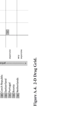
- 2-D drag grid. Drag countries to the cells of a grid that represents two dimensions: the expected quality of a holiday (horizontal) and the expected price (vertical); in the clicking version, the two dimensions cor-responded to two separate questions.
Graphical layouts of the questions are given in appendix A.
In three different formats, the respondents dragged a line to indicate their opinion about a statement. They were:
- Value slider. The line represents a numerical value that is also indicated on the screen. This technique is also known as magnitude scaling. In the example, respondents were asked to rate the importance of their motives for going on holiday. In the clicking version, they were asked to assign a number between 1 and 10.
- Category slider. The line displays a limited number of discrete values that correspond to “ordinary” response categories. The response categories were “disagree completely,” “disagree a little,” “neutral,” “agree a little,” and “agree completely.” The items were about the meaning of holidays and holiday spending.
- Category slider smileys. The same as category slider, but with the addi-tion of smileys that express a negative or positive opinion. The categories were “don’t like at all,” “don’t like,” “neutral,” “like,” and “like much.”
Again, graphical layouts of the dragging formats are given in appendix A. For analysis, we adopt the framework of classical test theory (Lord and Novick 1968). Each item is conceptualized as the sum of the true score and a random error term: yv = tv + εv, where v is the version, clicking or dragging. Reliability is expressed by rvv, the test-retest correlations between the first and second waves of each version. The correlation between the true scores of the clicking version and the true scores of the dragging version can be expressed by rt = rcd/(rccrdd)½, where rcd is the empirical correlation between the clicking and dragging versions, measured on the basis of those respondents who had different versions of the scales in the first and second waves, and rcc and rdd are the test-retest correlations. As the estimates of rcc, rdd, and rcd are based on different groups, these estimates are independent. As a consequence, due to sampling variability, the estimates of rt may occasionally exceed one.
Comparison of the Formats
The two versions of the card sorter both have acceptable test-retest correla-tions that are approximately equal (table 1). With correlations around 0.9 between the true scores of the different versions, they seem to measure the same concept. This, however, does not mean that the response distributions are equal over the versions. Equality of the complete response distributions had to
at Jordan University of Science and Technology on July 26, 2016
http://poq.oxfordjournals.org/
be rejected for five out of eight items (χ2, p = 0.05). Consequently, the clicking and the dragging versions can be considered to reflect the same substantive concept and to have the same quality, but not to have the same distribution. The practical consequence is that these versions cannot be mixed (e.g., for comparing demographic groups or in time series).
The “order labels” format was evaluated by examining which labels (in this case, countries) were chosen in the top three. The dragging version of ordering labels has a relatively low test-retest correlation. Still, the correlation between the true scores at .844 seems acceptable. Both versions measure the same con-cept, but the dragging version does this less reliably. Test-retest correlations of the 2-D drag grid are still lower. This format leads to unacceptable data quality.
The value slider confirms its reputation of being a reliable way of meas-uring. The test-retest correlation of the dragging version is higher than that of the clicking version (table 2). The category slider yields somewhat lower
Table 1. Average Test-Retest Correlations and Correlations between the True Scores (standard errors in parentheses) of the Versions for Dragging to Places
Test-retest
True scores
Number of items
Click Drag
Card sorter pictures 0.718
(0.043)
Card sorter text 0.659
(0.046)
Order labels (being chosen in top 3)
2-D drag grid horizontal 0.562
(0.051)
2-D drag grid vertical 0.463
(0.056)
Table 2. Average Test-Retest Correlations and Correlations between the True Scores (standard errors in parentheses) of the Versions for Dragging Lines
Category slider smileys 0.718
(0.043)
at Jordan University of Science and Technology on July 26, 2016
http://poq.oxfordjournals.org/
test-retest correlation but a high correlation between the true scores, and there-fore seems acceptable. However, the format of category slider smileys has an unacceptably low correlation between the true scores.
Time and Respondent’s Evaluation
The ultimate goal of the dragging procedure is to increase respondent engage-ment by making the interview a more active, lively process. A possible threat to this goal is the possibility that dragging procedures are slower than clicking procedures. This was confirmed in the experiment. For most formats, the drag-ging version took significantly longer, even for the respondents who used this version for the second time (table 3).
The most important question is whether the dragging format has a positive effect on respondent satisfaction with the interview. The columns regarding wave one in table 4 suggest that it does. Respondents found the questionnaire more pleasant, more interesting, and more important to them, although they found it more time consuming (test 1).
For wave two, this picture changes. The respondents who received the drag-ging version for the second time found the questionnaire less pleasant, less interesting, and more repetitive compared to the dragging version in the first wave (test 2) and compared to those respondents who received the dragging version in the second wave for the first time (test 3).
Conclusion
The usefulness of the dragging version appears to be limited. When the drag-ging version is designed to be a simple alternative to the clicking version, it yields valid results. The 2-D drag grid and the category slider smileys are more than just simple alternatives to clicking. In the 2-D drag grid, the respondent is asked to respond to two questions at the same time. In our example, the pur-pose of this was to convey the trade-off between price and quality. This obvi-ously was too ambitious and led to low test-retest reliability. In the case of the category slider smileys, the respondent simultaneously obtains feedback from the length of the line and the emotional expression of the smiley. This may be too confusing. The fact that such creative ideas apparently don’t work suggests that attempts to further “gamify” survey research are questionable. The plain, though not very attractive, truth may be that asking simple questions is the best route to valid answers. Such simple questions may be in clicking or in dragging format. Dragging is liked by the respondents, but only a single time. When the design is repeated, the liveliness of the procedure does not outweigh the extra amount of response time. Consequently, the dragging format may be used only sparingly.
at Jordan University of Science and Technology on July 26, 2016
http://poq.oxfordjournals.org/
Table 3. Average Response Times by Wave and Version
Wave 1 Wave 2
Test 1 Test 2 Click Drag Click-click Click-drag Drag-click Drag-drag
Card sorter pictures 37 87 37 68 38 61 * *
Card sorter text 37 61 41 54 34 53
Order labels 72 175 64 170 68 155 * *
2-D drag grid 101 160 109 160 107 136 * *
Value slider 98 210 107 203 102 186 *
Category slider 64 82 63 92 62 80 *
Category slider smileys 28 48 31 44 27 43
Test 1: wave 2, drag-drag < wave 1, drag, one-sided, * p = 0.05 Test 2: wave 2, drag-drag < wave 2, click-drag, one-sided, * p = 0.05
Sikk
el, Steenbergen, and Gras
184
Table 4. Average Evaluations by Wave and Version
Wave 1
Test 1
Wave 1 x wave 2
Test 2 Test 3 Click Drag Click-click Click-drag Drag-click Drag-drag
How pleasant was it to fill in this questionnaire compared to other
questionnaires from TNS NIPO?a 3.26 3.41 * 3.17 3.40 3.27 3.25 * *
The questionnaire was interesting.b 3.77 3.92 * 3.73 3.92 3.71 3.69 * *
The questions were easy to answer.b 4.16 4.14 4.30 4.09 4.33 4.04
The questions were repetitive.b 2.81 2.76 2.96 2.79 3.08 2.98 * *
The questionnaire contained issues
that are important to me.b 3.34 3.49 * 3.42 3.52 3.42 3.47
What is your opinion of the length of
the questionnaire?c 2.83 2.72 * 2.84 2.83 2.85 2.79
a1. much more unpleasant … 5. much more pleasant b1. completely disagree … 5. completely agree
c1. far too long; 2. a little too long; 3. just right; 4. could have been longer
test 1: wave 1 drag > wave 1 click, one-sided, * p = 0.05 test 2: wave 2, drag-drag > wave 1, drag, one-sided, * p = 0.05 test 3: wave 2, drag-drag > wave 2, click-drag, one-sided, * p = 0.05
185
Appendix A. Graphical Layouts of the Question Formats
Figure A.1. Card Sorter Pictures.
Figure A.2. Card Sorter Text.
Sikkel, Steenbergen, and Gras 186
at Jordan University of Science and Technology on July 26, 2016
http://poq.oxfordjournals.org/
Figur
e A.3.
Order
Labels.
Figur
e
A.4.
2-D Drag Grid.
Clic
king vs. Dragging
Figur
e A.5.
V
alue
Slider
.
Figur
e A.6.
Category
Slider
.
Sikk
el, Steenbergen, and Gras
188
at Jordan University of Science and Technology on July 26, 2016
http://poq.oxfordjournals.org/
Figure A.7. Category Slider Smileys.
References
Barge, Scott, and Hunter Gehlbach. 2012. “Using the Theory of Satisficing to Evaluate the Quality of Survey Data.” Research on Higher Education 53:182–200.
Couper, Mick P., Frederick G. Conrad, and Roger Tourangeau. 2007. “Visual Context Effects in Web Surveys.” Public Opinion Quarterly 71:623–34.
Couper, Mick P., Roger Tourangeau, Frederick G. Conrad, and Scott D. Crawford. 2004. “What They See Is What We Get: Response Options for Web Surveys.” Social Science Computer Review 2:111–27.
Couper, Mick P., Michael W. Traugott, and Mark J. Lamias. 2001. “Web Survey Design and Administration.” Public Opinion Quarterly 65:230–53.
Dillman, Don A. 2000. Mail and Internet Surveys: The Tailored Design Method. New York: Wiley.
Hess, Stephane, David A. Hensher, and Andrew Daly. 2012. “Not Bored Yet: Revisiting Respondent Fatigue in Stated Choice Experiments.” Transportation Research, Part A 46:626–44. Krosnick, Jon A. 1991. “Response Strategies for Coping with the Cognitive Demands of Attitude
Measures in Surveys.” Applied Cognitive Psychology 5:213–36.
Lord, Frederick M., and Melvin R. Novick. 1968. Statistical Theories of Mental Test Scores. Reading, MA: Addison-Wesley Publishing Company
Puleston, Jon, and Deborah Sleep. 2008. “Measuring the Value of Respondent Engagement: Innovative Techniques to Improve Panel Quality.” ESOMAR Online Dublin. Available at http:// www.esomar.org/web/research_papers/Web-Panel_1910_Measuring-the-value-of-respondent-engagement.php.
———. 2011. “The Game Experiments: Researching How Gaming Techniques Can Be Used to Improve the Quality of Feedback from Online Research.” Paper presented at the Annual Meeting of ESOMAR, Amsterdam, The Netherlands.
Saris, Willem E. 1988. “A Measurement Model for Psychophysical Scaling.” Quality and Quantity 22:417–33.
Shropshire, Kevin O., James E. Hawdon, and James C. Witte. 2009. “Web Survey Design: Balancing Measurement, Response, and Topical Interest.” Sociological Methods & Research 37:344–70.
Smyth, Jolene D., Don A. Dillman, Leah M. Christian, and Michael J. Stern. 2006. “Effects of Using Visual Design Principles to Group Response Options in Web Surveys.” International Journal of Internet Science 1:6–16.
at Jordan University of Science and Technology on July 26, 2016
http://poq.oxfordjournals.org/
Stern, Michael J., Alison E. Adams, and Shaun Elsasser. 2009. “Digital Inequality and Place: The Effects of Technological Diffusion on Internet Proficiency and Usage across Rural, Suburban, and Urban Counties.” Social Inquiry 79:391–417.
Stevens, Stanley S. 1975. Psychophysics: Introduction to Its Perceptual, Neural, and Social Prospects. New York: Wiley.
Toepoel, Vera, and Mick P. Couper. 2011. “Can Verbal Instructions Counteract Visual Context Effects in Web Surveys?” Public Opinion Quarterly 75:1–18.
Toepoel, Vera, Marcel Das, and Arthur Van Soest. 2008. “Effects of Design in Web Surveys.” Public Opinion Quarterly 72:985–1007.
———. 2009. “Design of Web Questionnaires: The Effect of Layout in Rating Scales.” Journal of Official Statistics 25:509–28.
Tourangeau, Roger, Mick P. Couper, and Frederick Conrad. 2007. “Color, Labels, and Interpretative Heuristics for Response Scales.” Public Opinion Quarterly 71:91–112.
Van Schaik, Paul, and Jonathan Ling. 2007. “Design Parameters of Rating Scales for Web Sites.” ACM Transactions on Computer-Human Interaction 14:4–39.
Sikkel, Steenbergen, and Gras 190
at Jordan University of Science and Technology on July 26, 2016
http://poq.oxfordjournals.org/