For your convenience Apress has placed some of the front
matter material after the index. Please use the Bookmarks
and Contents at a Glance links to access them.
Contents at a Glance
Foreword ...
xi
About the Authors ...
xiii
About the Technical Reviewer ...
xv
Acknowledgments ...
xvii
Introduction ...
xix
Chapter 1: Introduction to APEX for Mobile Web Development
■
...
1
Chapter 2: Creating Mobile Pages
■
...
9
Chapter 3: Presenting Data Through List Views
■
...
27
Chapter 4: Accepting Input via Forms
■
...
51
Chapter 5: Displaying Calendars and Charts
■
...
81
Chapter 6: Implementing a Navigation Standard
■
...
99
Chapter 7: Theming Your Mobile Application
■
...
117
Chapter 8: Working with Dynamic Actions
■
...
131
Chapter 9: Deploying Applications Natively
■
...
151
Chapter 10: Securing Your Mobile Application
■
...
191
Welcome to Oracle Application Express for Mobile Web Applications. Writing this book was hard work, but good fun and a thorough learning experience. I hope you will learn as much from reading it as I did writing it. I also hope that you will really enjoy making all the cool samples on your favorite mobile device. Although mobile devices are already used more than desktop devices, this difference will grow exponentially over the next few years. So go mobile now and be ready for the future!
Who This Book Is For
The readers of this book are assumed to have a reasonably sound knowledge of Oracle Application Express.
Throughout the book, the examples are based upon this knowledge, so there won’t be a detailed explanation on how to build pages or how to implement certain features that aren’t specific to mobile web development. When you need more background information about using Oracle Application Express, there are a few books that you might consider reading: Beginning Oracle Application Express 4 (Apress, 2013), for the developer who is just starting with APEX;
Pro Application Express 4 (Apress, 2008) and Oracle Application Express 4 Recipes (Apress, 2011), for the more experienced developer who wants to scale up his or her knowledge; and Expert Oracle Application Express 4 (Apress, 2011), if you want to know all the details about Application Express. For those that are just learning Oracle Application Express, there is a Getting Started page on the Oracle Technology Network (OTN) at
www.oracle.com/technetwork/developer-tools/apex/application-express/apex-getting-started-1863613.html. This page has links to a number of different resources based on learning style.
The examples in this book are based upon version 4.2.1 of Oracle Application Express. So if you have a newer release of Application Express, there may be some differences.
How This Book Is Structured
The idea of this book is to introduce you to the art of building mobile web applications at a good pace. So we’ll start with the basics: List Views, Forms, Charts, and so forth. Then we’ll move on with enhancing the look and feel of the application with special attention to mobile-specific Dynamic Actions. And finally we’ll dive into deploying an APEX application natively on a mobile device. The following is a brief description of each chapter in this book.
Chapter 1, “Introduction to APEX for Mobile Web Development,” introduces and explains the need for web development for mobile devices.
Chapter 2, “Creating Mobile Web Pages,” explains the necessary building blocks of mobile web pages.
Chapter 3, “Presenting Data Through List Views,” walks you through the process of creating List Views for your data. Chapter 4, “Accepting Input via Forms,” covers building Forms for mobile web pages, including the use of grids and HTML4 input types.
Chapter 5, “Displaying Calendars and Charts,” details the use of presenting data in the other formats APEX offers. Chapter 6, “Implementing a Navigation Standard,” covers the use of buttons, links, and other ways that users can find their way in an application.
Chapter 7, “Theming your Mobile Application,” takes you a little outside of APEX and explains how to use ThemeRoller to give your application the custom look and feel you need.
■ INTRODUCTION
Chapter 8, “Working with Dynamic Actions,” details all the specific differences between Dynamic Actions for desktop and for mobile devices.
Chapter 9, “Deploying Applications Natively,” offers a step-by-step description on how to use PhoneGap to leverage your APEX application by using native device capabilities like the camera.
Chapter 10, “Securing Your Mobile Applications,” addresses mobile-specific security risks and describes ways to mitigate these risks.
Downloading the Code
The code for the examples shown in this book is available on the Apress web site (www.apress.com). A link is on the book’s information page under the Source Code/Downloads tab. This tab is located underneath the Related Titles section of the page.
Contacting the Authors
CHAPTER 1
Introduction to APEX for Mobile
Web Development
Why is there so much hype around building mobile applications? The short answer is that mobile applications are the next frontier. Business professionals face increasing time constraints and the need to increase productivity, but there is only ever going to be 24 hours in a day. The answer is the ability to work from almost anywhere at any time. The majority of professionals carry a smartphone that is connected to a strong, reliable network provider. Mobile applications can be instrumental in allowing the busy user community to be more productive.
What sort of mobile applications are required? The traditional need for applications that support employees in the field, including emergency workers and service and sales people, will continue to expand. It is no longer good enough to have a mobile application that simply provides address and other contact information; nowadays, field personnel want to be equipped with service or sales history, background information, and so on. What about those who manage these field staff? Recently, the district supervisors of an ambulance service were given mobile applications that allow them to see in real time where their personnel are located, where they are headed, their current status, and the number of patients who are waiting for service. These features allow the supervisors to leave their desks but still stay fully informed and be able to make decisions as required.
There is also a large range of new mobile applications being requested by the business community for less traditional use cases. Employees who generally sit at a desk in a corporate office are looking for applications that allow them to do administrative and human resources tasks from any location. By using mobile applications, consultants on customer sites could benefit from the ability to remotely enter their time and expenses. Managers should be able to approve vacation requests and check on vital performance indicators while sitting at the airport waiting for a flight, and without needing to open a laptop and find Internet service. What about the database administrators who are on call 24/7? Wouldn’t mobile applications that allow them to review the health of a database and perform specific tasks while riding on the train be good for business?
Another class of mobile applications is those designed for customers. Banks, news services, fast-food companies, service providers, television companies, and more are all coming out with mobile solutions. Think about the tasks that you used to perform on your computer that you now perform on your smartphone. Providing that an application is useful and easy enough to use, it helps improve customer satisfaction. Obviously, customer-focused applications are markedly different from those built only for internal business use. Not only is it imperative that these applications are secure and only allow properly authenticated customers access to their data (but no one else’s), it is also important that these applications are of the highest quality because they provide customers an entrance point to the business.
CHAPTER 1 ■ INTRODUCTION TO APEX FOR MOBILE WEB DEVELOPMENT
build. The majority of time was spent entering and tweaking the data. Not only did this eliminate the need for multiple spreadsheets, last-minute changes could also easily be incorporated. Given the very low cost of development, the return on investment was very quick.
Look at your current business processes. You are sure to find many use cases where mobile applications can improve productivity or simply increase your users’ satisfaction. Making these tasks easy to use and more accessible should meet both objectives.
Designing Mobile Applications
As the underlying technology for building applications changes, so too does the way developers need to design the applications. The first mainstream business applications were developed for the old green-screen mainframe applications and were character based. Users navigated around using the Tab key and various key combinations. Many airline reservation systems still use such systems. If you watch a person at the check-in desk or at the departure gate, you will notice that they never use a mouse but press a variety of different key combinations to quickly navigate around the system. Such applications are difficult to learn and nonintuitive, but are exceedingly efficient for a skilled operator.
Following mainframe applications, the next major advance was client-server and desktop applications. As personal computer usage boomed and nearly everyone had one on their desks, business applications were designed to run under Microsoft Windows. The design philosophy with these applications was to fit everything required onto a single screen. A specific screen size was normally specified in the application design. Developers were not allowed to build a screen that didn’t fit the available real estate. As a result, developers generally designed input forms with multiple items on a single line and left very little white space. Navigation and specific operations primarily used function keys (F1–F12), tabs, and buttons, often with keyboard shortcuts. Another common attribute of such applications, especially when using Oracle Forms, is the multi-use screen. You navigate to a screen, press a function key to enter query criteria, press another function key to execute the query, and then scroll up and down through the records. Once you find the required record, you update it on the same screen before pressing another function key to save the changes. Client-server applications generally require end-user training and take time to master.
The Internet changed application design once again. Instead of just back-office applications, the Internet ushered in the explosion of self-service applications. Arguably, the most popular applications on the Internet are retail applications such as Amazon and other shopping sites that are aimed at customers instead of internal users.
The most important design goal of such applications is that they are exceedingly easy to use and look good to customers. The same design philosophy has also been adopted with web-based business applications. It is now common to use vertical scrolling and layout input forms in a visually pleasing manner, rather than cramming as much as possible into a single screen. Given that web-based applications are run on a variety of devices, not just Microsoft Windows–based PCs, navigation and operability no longer rely on function keys or keyboard shortcuts, but rather simplified tabs, buttons, and links. The goal of business web-based applications is to concentrate on the business processes, rather than training users how to use the application.
CHAPTER 1 ■ INTRODUCTION TO APEX FOR MOBILE WEB DEVELOPMENT
Figure 1-1. Desktop home page
CHAPTER 1 ■ INTRODUCTION TO APEX FOR MOBILE WEB DEVELOPMENT
Figure 1-3. Desktop master-detail page
Given the limited real estate on the screen, constructs such as breadcrumbs are removed, and instead of having a Cancel button, users utilize the built-in Back key. It is important to include a Home button or icon on every page to allow users to readily get back to the first page of the application. There are also several events that are specific to mobile devices—such as swipe, tap, and orientation change—that can be utilized to improve the user experience.
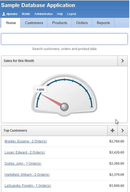
Looking at the Sample Database Application that is included with Oracle Application Express (APEX) 4.2, you first notice that the one application includes both desktop and mobile user interfaces. Each page can only be associated with one user interface. If a user logs into the application with a mobile device, the mobile pages will be rendered; if a desktop is used, the desktop user interface is shown. From either user interface, controls are provided to switch to the other user interface. Both provide the same functionality but the user experience is significantly different with either user interface. Common constructs in desktop web-based applications, such as a report linking to a form, are generally replaced by a list linking to a form in mobile applications. One of the reasons lists are so prevalent in mobile applications is that they are easy for users to select using touch, as opposed to a report where selecting the correct record can be difficult. Lists generally only display a few of the most important data elements and a user can press anywhere on a list entry to drill-down to the next level of detail. Simple reports can be included in a mobile application, but care must be taken to ensure the report displays well on mobile devices in both portrait and landscape orientations.
CHAPTER 1 ■ INTRODUCTION TO APEX FOR MOBILE WEB DEVELOPMENT
The mobile theme and templates in Oracle Application Express are built using jQuery Mobile. This allows the Application Express engine to be able to invoke the majority of events on a mobile device, such as tap, swipe, and so on. When on a mobile page, you will see a number of these mobile-specific events available under Dynamic Action events. It has also allowed the inclusion of HTML5 attributes such as e-mail, URL, and phone number input selections. If you run the Sample Database Application on a modern mobile device that supports full HTML5 and then edit a customer, you should see that the input keyboard changes when you edit the e-mail, phone numbers, and URL items. Within the text item definition is a new attribute—subtype—that allows you to specify the onscreen keyboard. These features will allow you to develop a mobile application with rich user interactivity.
Web-Based vs. Native Mobile Applications
The two main types of mobile applications are web-based and on-device or native applications. Native mobile applications are those that are built for a specific mobile operating system, such as iOS, Android, Windows Mobile, or BlackBerry. Native mobile applications are written in the target operating system’s application development language: Objective-C for iOS, Java for Android, and so forth. Mobile web-based applications, on the other hand, are written as web applications and are accessed using the mobile device’s browser.
CHAPTER 1 ■ INTRODUCTION TO APEX FOR MOBILE WEB DEVELOPMENT
There are currently many advantages to creating native mobile applications. Native mobile applications can better access the various features of the mobile devices on which they run, including contacts, cameras, and more. Additionally, these applications are known to perform better than their web-based counterparts do. Applications can be built to run locally and incorporate a local data store, such as SQL Lite, so that they can continue to work when disconnected from the Internet. In order for native applications to integrate with the Oracle database, it is generally required to utilize Web Services. Native applications are downloaded onto the device and stored locally.
Mobile web-based applications have their own advantages. One of the biggest advantages is that a single codebase can generally be accessed from any mobile device, regardless of the mobile operating system. To access the application, you simply enter the relevant Uniform Resource Locator (URL) into the mobile browser. Another major advantage is that the code itself is not stored on the device but on the server delivering the application. Therefore, performing application updates is very simple and can be delivered to everyone simultaneously, simply by updating the server hosting the application. This is in stark contrast to native applications where the user is responsible for manually downloading the latest version of an application. Given that the developer can’t guarantee that every user is running the latest version—because it is up to users to download the upgrade once they are aware of it—the developer of a native application may have to incorporate additional code to handle version discrepancies or raise an error when a user tries to use an older version of the application.
One of the largest disadvantages of mobile web-based applications is that they rely on an Internet connection in order to function. At the same time, emerging technologies such as HTML5’s application cache and local storage are rapidly bridging the gap between what’s possible between native and web-based mobile applications. To allow mobile web-based applications to interact with on-device components such as the camera or contact list, there are various programs, such as PhoneGap (covered in Chapter 9), which can be utilized to wrap the application. Such solutions still require the Internet access needed by the underlying web-based application.
When you review the business applications on your phone, they are predominantly native applications. There will probably be some web-based mobile applications as well. When you open your web browser on your mobile device, chances are it presents a site from your service provider, the phone maker, or most likely a search engine like Google. Remember that those same native applications are most likely “customer” applications, such as those provided by your bank to allow to you to do online banking. Here again, programs such as Phone Gap can be utilized to deliver a native application, but underneath, it is still a web-based application.
Oracle Application Express is designed to declaratively build web-based applications. Application Express 4.2 was specifically designed to allow developers to rapidly build web-based applications that can be run on the desktop, a mobile device, or both. The mobile user interface is a collection of templates that are based on the jQuery Mobile framework. Utilizing this framework enables mobile web-based applications to run seamlessly on any mobile device, old or new. The jQuery Mobile framework is designed to correct rendering anomalies or differences between operating systems, and for older devices that don’t have full HTML5 capabilities to render functional controls. From an Application Express developer’s perspective, you use the same application builder, the same SQL and PL/SQL, and the same method of building a mobile application that you are used to using when building a desktop application.
When deciding whether to build a native or web-based mobile application, it is important to understand the requirements of the application. If you determine that you have to build native mobile applications, you must realize that your development team will need to become proficient in multiple languages and that you will have several different code bases. This makes the development effort longer and more costly and the resulting applications harder to maintain. On the other hand, building web-based mobile applications with Oracle Application Express only requires SQL and PL/SQL skills and you can utilize a single code base.
Responsive Design
CHAPTER 1 ■ INTRODUCTION TO APEX FOR MOBILE WEB DEVELOPMENT
The concept of creating a web application using responsive design techniques is quite appealing because it allows developers to maintain a single set of application and business logic that is accessed from browsers that have anywhere from a few hundred pixels to several thousand. In order for this to work, the content for any given page must be able to adapt to the device on which it is being displayed. There are, however, some downsides to responsive web design. The upfront cost of designing a truly responsive page are much higher and require a much higher level of understanding grid layout, HTML, and CSS.
Oracle Application Express 4.2 introduces a responsive user interface theme: Theme 25. This theme provides the building blocks and templates for achieving a responsive layout. However, it is up to the developer to use those templates and to arrange the page content in such a way that the result is truly responsive. It is not just a matter of picking one set of templates vs. another set of templates.
Also note that converting an existing application to Theme 25 requires you to review the pages of the application to ensure that the appropriate template and layout are defined.
For examples of responsive applications, review the Sample Database Application that ships with Application Express 4.2 or the Oracle Cloud site (http://cloud.oracle.com). First, review the applications on your desktop in full-screen mode. Then, resize your browser, making it progressively narrower. You will notice as you resize that the regions automatically resize to fit the available screen width. At a certain threshold, the regions will realign from being next to each other (horizontal) to stacked vertically (see Figure 1-5). Similarly, if you are on a data entry form, such as Customers, the items will resize and then the labels will move from left of the items to above the items, and all the items will be the same width, as they are when you build mobile application pages.
CHAPTER 1 ■ INTRODUCTION TO APEX FOR MOBILE WEB DEVELOPMENT
Choosing Responsive Design, Desktop, or Mobile
You can run almost any Application Express application on any device, providing it has a browser and an Internet connection. Desktop applications can be run on tablets and mobile devices, and mobile applications can be run on personal computers. That said, the user experience of running a desktop application on a mobile device, or a mobile application on a personal computer, is not ideal and in the former case, it can be difficult and very frustrating. Given the small screen size on mobile devices, you may have to scroll around the screen excessively, some components may not render or operate correctly, and you will often need to zoom-in to be able to use controls such as tabs, buttons, and links. This is why the extra investment required to develop a desktop application using responsive design can be beneficial. It provides a good user experience on desktops and a relatively good experience on tablets and mobile devices. One limitation is that responsive design cannot take advantage of mobile-specific events such as touch and orientation changes.
Mobile design focuses on creating content that is specifically targeted to mobile devices. It is typically done in addition to or instead of a desktop application. To facilitate this, mobile applications need to be built with extremely minimal, semantic HTML that is optimized for mobile connections. Desktop applications, on the other hand, are generally much heavier, with substantially more content on a page, including larger headers, tabs, breadcrumbs, rich page content, and so forth. However, page weight is not a major concern for a computer with a strong Internet connection. When you run a responsive design application on a mobile device, it is heavier than a purpose-built mobile application, so it will take noticeably longer to load and process pages if the device does not have a strong connection.
The decision to create a single responsive application or a targeted mobile application is one that must be made carefully. Consider when and where the end users will be using the application and the content that is being presented. The more time spent using the application on a mobile device, the more the user will benefit from an application targeted to that device. Informational sites such as marketing pages, catalogs, and libraries are well-suited to responsive design. Processing or productivity applications that require data entry and quick response times would be better suited to being built specifically for mobile devices, where you can benefit from utilizing the device’s native controls and better performance.
If you already have a desktop application and you have decided to build a complimentary mobile solution or you have decided to build both a desktop application and a mobile application from scratch, you will need to decide whether you have them defined in a single application or in two distinct applications. The advantage of having two distinct applications is that you can manage them independently and release them separately. The advantage of having both user interfaces in a single application is that you can have a single URL and utilize the device autodetection to render the correct user interface, depending on the device used to log into the application. To provide this capability, it is important to define login pages, home pages, and global pages (formerly page 0) for each user interface. If you access the single application from a desktop, it will display the desktop login page, and then once logged in, it will show the desktop home page. Whereas if you access the same application from a mobile device, it will display the mobile home page once logged in.
Now that you understand the importance of designing for mobile devices, please continue through the book to learn how to build these applications with Oracle Application Express.
Wrap Up
CHAPTER 2
Creating Mobile Pages
APEX pages, aimed at mobile devices, are built using the jQuery Mobile framework. Therefore, to understand and influence the way APEX generates these pages, it is necessary to understand how the jQuery Mobile framework is built up and how the different parts of this framework are used in your APEX development environment.
In this chapter, you will learn the elements that are used to create a jQuery Mobile page and the different ways to show a page. This will be the start of our first mobile application!
How jQuery Mobile Pages Are Constructed
Basically, a jQuery Mobile page is very similar to any other HTML page. When you look at the HTML source, it contains an HTML header and an HTML body. The header references a specific jQuery Mobile CSS file and two jQuery files: a core jQuery file and a jQuery Mobile file. As jQuery Mobile is built upon a specific version of the jQuery core, you have to be sure to use a version of the jQuery core that is certified to work with your version of jQuery Mobile. So for instance, jQuery Mobile 1.1.1 requires either jQuery 1.6.4 or 1.7.1 and jQuery Mobile 1.2.0 requires jQuery version 1.7 or higher.
You can host the referenced files on your own domain, but when you use just the standard files, you could also let your users hammer other companies’ huge hardware by using a content delivery network (CDN). The jQuery files, amongst others, are hosted by Google, Microsoft, and jQuery itself. As we are developing for mobile devices, which are usually not used exclusively within the network of your company, that should be no problem. To be clear, as CDNs only host standard files, you may need to host additional or modified files from your own domain.
Tip
■
Reference standard files from a CDN to reduce load on your own servers. There is even a setting within APEX to
do that declaratively: navigate to Application Properties and then to User Interface, and you’ll see the options shown
in Figure
2-1
.
CHAPTER 2 ■ CREATING MOBILE PAGES
The HTML body of a jQuery Mobile page, the part that makes the actual content, contains your actual page definition. And that page definition can be broken up into three parts: header, content, and footer.
The main difference in this HTML structure is the use of an additional "data-role" attribute within the already familiar HTML tags. The jQuery Mobile and CSS do the magic of transforming your HTML document to a good-looking application on a mobile device. In jQuery terminology, that is called enhancing or even autoenhancing.
So the most basic jQuery Mobile page would consist of only the HTML in Listing 2-1.
Listing 2-1. Your First Mobile Page
<!DOCTYPE html> <html>
<head>
<link rel="stylesheet" href="http://code.jquery.com/mobile/1.1.1/jquery.mobile-1.1.1.min.css" /> <script src="http://code.jquery.com/jquery-1.7.1.min.js"></script>
<script src="http://code.jquery.com/mobile/1.1.1/jquery.mobile-1.1.1.min.js"></script> </head>
<body>
<div data-role="page">
<div data-role="header">The header on the top</div> <div data-role="content">The content in the middle</div> <div data-role="footer">The footer at the bottom</div> </div>
</body> </html>
Copy this HTML code in text editor, save it as a file with an .html extension. Then open the file in a browser on your mobile device, mobile simulator, or regular browser. You’ll see a page like the one in Figure 2-2. Of course, for accessing the file from your mobile device, you have to put it in on a web server that is accessible by your device.
CHAPTER 2 ■ CREATING MOBILE PAGES
Before we dig any deeper into the different page types that jQuery Mobile offers, we will create our first mobile application!
Your First Mobile APEX Application
Before you can start creating your application, you need to have access to a workspace in an APEX 4.2 (or higher) environment. The easiest way to get that access is to sign up for a workspace at http://apex.oracle.com, but of course you can host your own. In this book, we’ll use a standard workspace at http://apex.oracle.com, with the Sample Database Application installed.
Start creating an application using the Application Creation wizard. In the second page of the wizard, you’ll see the first reference to “Mobile” in the User Interface drop-down list (see Figure 2-3). Select the jQuery Mobile Smartphone interface and continue, accepting all default settings until you arrive at the User Interface Theme page of the wizard.
On the next-to-last page of the wizard, you can select a theme for your mobile application (see Figure 2-4). At the start of APEX 4.2, there is only one theme to choose from, but there might be more in the future. And you can add your own custom themes as well.
Figure 2-3. Select the mobile user interface
CHAPTER 2 ■ CREATING MOBILE PAGES
Now just finish the wizard and create your application. You’ll end up with a mobile application with three pages, like the one shown in Figure 2-5.
Figure 2-5. Your first three-page mobile application
Now it is time to run this mobile application! Just open your application’s home page URL in your mobile device browser, and you’ll see the login screen that was just created for you (see Figure 2-6).
Figure 2-6. The login page of your mobile application
CHAPTER 2 ■ CREATING MOBILE PAGES
After logging in, you’ll see an empty home page, as shown in Figure 2-8. The home page includes a nice Home icon that navigates to page 1, which is the Home screen.
Figure 2-7. The login page on a horizontal rotated device
CHAPTER 2 ■ CREATING MOBILE PAGES
When you inspect the definition of the home page in the APEX development environment, you won’t find a reference to that Home icon anywhere. That’s because the header (and footer) are defined on page 0, named Global Page - jQuery Mobile Smartphone. Remember the HTML layout of a jQuery Mobile page contained the following:
<body>
<div data-role="page">
<div data-role="header">The header on the top</div> <div data-role="content">The content in the middle</div> <div data-role="footer">The footer at the bottom</div> </div>
</body>
The "page" is defined in the page template; the "header" and "footer" are defined on the Global Page, as regions—with their own templates—on the top and the bottom positions on the page. The region(s) you define on a page make up the "content" of the HTML.
While you are on page 0, take a look at the definition of the Home button. The magic of that button is all defined by the button attributes: data-icon="home", data-iconpos="notext", and data-direction="reverse". The image is defined by the data-icon attribute. Try changing that to data-icon="grid" and see what happens: the home icon is replaced by a grid icon. The names you can use for the icons and how they look are determined by the icon set and the theme you are using. You can also use your own icon set. More about that in Chapter 8. The icon position (data-iconpos) can be left (the default), right, top, or bottom. Just play around with it and see what happens. The attribute data-direction="reverse" will result in using the reverse version of the transition that was used to show the page. Transitions will be covered later in this chapter.
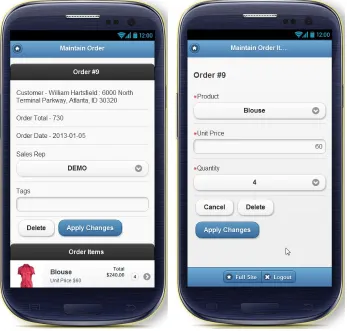
Now it is time to add more content to your application. Just for demo purposes, we create a page to select and edit records from the EMP table. So create a new page, pick a Form on the next page of the wizard, and then you’ll see a page like Figure 2-9. There are a few differences compared to creating a form for a desktop application. At first, you see there is no Master-Detail or Tabular Form option, as these make no sense in the mobile world. And there is a new option: Form on a Table with List View. Let’s pick that one.
CHAPTER 2 ■ CREATING MOBILE PAGES
Set the name of the List View page and region to “Employees” and look at the Region template options. There are quite a few—and all different from a regular desktop theme. For now, go for the “plain” one. On the Datasource page of the wizard, pick your EMP table, and on the third page of the wizard, specify the column you want to see in the list: ENAME. Just continue through the wizard and select all columns to be included in the Form page. Now run the page. You see pages like the ones shown in Figures 2-10 and 2-11. Notice the List View comes with an additional Search feature! Just play around with it and edit some data. And see what happens when you rotate your device. Now you can enhance the Form page by changing the labels, adding format masks, and so forth, as you would do in a regular desktop application.
Figure 2-10. Employees List View Figure 2-11. Employees Form View
To navigate from the Home screen to the List View, you need to add an HTML region to page 1, with a Page Item button that redirects to page 2. Thanks to jQuery Mobile, all links in your application are loaded using Ajax. Therefore, the href attribute of the link is used. And you get the loading spinner for free. But the button you just created on page 1, doesn’t contain an href attribute—it does a redirect! Luckily, the APEX development team changed the generated code to cover that. Prior to APEX 4.2, a button element like you just created contained an href attribute like
href="javascript:redirect('f?p=100:2');"
In the new version, that has been changed to
CHAPTER 2 ■ CREATING MOBILE PAGES
Figure 2-12. Dynamic Action definition for navigation button
This function takes care of the proper way of navigating with respect to the kind of browser and application you are running. So for a mobile page, it calls the jQuery Mobile method: $.mobile.changePage(url). This is one of the many methods jQuery Mobile has to offer. In order to show how this works, change the action of the button you just created on page 1 from Redirect to Page in This Application to Defined by Dynamic Action. Then create a Dynamic Action, defined as “on click of this button, execute a piece of JavaScript.” And here is the JavaScript to execute:
apex.jQuery.mobile.changePage('f?p=&APP_ID.:2:&SESSION.');.
CHAPTER 2 ■ CREATING MOBILE PAGES
Figure 2-13. Definition for navigation button
Another way of linking pages is adding an anchor tag somewhere on the page. So go to the region on page 1 and set the Region Source to:
<a href="f?p=&APP_ID.:2:&SESSION.">Link to Employees</a>
You see a regular link when you run that page, but the mobile-style navigation is already there. When you add data-role="button" as an attribute, you’ll end up with a handmade button that’s very similar to the one you created earlier. So, as you just experienced, jQuery Mobile enhances all links with this data-role="button" attribute—all regular button type input fields and regular button elements are enhanced as well—so they all look and act as native as possible.
Dialogs
The pages you’ve created until now are regular pages. But there is another type of page: a modal dialog. You can turn any page into a dialog by adding a data-rel="dialog" to the anchor that links to that page. The called page is automatically enhanced with rounded corners, extra margins, and a dark background, so it looks like the dialog is on top of another page.
As an example, change the anchor you created in the Region Source on page 1 to:
<a href="f?p=&APP_ID.:2:&SESSION." data-role="button" data-rel="dialog">Link to Employees</a>
CHAPTER 2 ■ CREATING MOBILE PAGES
Figure 2-14. Employee List View as a dialog using a Page template
CHAPTER 2 ■ CREATING MOBILE PAGES
In APEX 4.2, it isn’t possible to call a dialog page declaratively. So adding data-role="dialog" to the attributes of a button that does a redirect—like the first one you created on page 1—doesn’t do anything, as these settings aren’t propagated to the call of apex.navigation.redirect('f?p=100:2');. But, as in many cases, Dynamic Actions come to the rescue! With adding a role option to our previously created Dynamic Action JavaScript call, you can make it work. So change the line of code to
apex.jQuery.mobile.changePage('f?p=&APP_ID.:2:&SESSION.',{role:"dialog"});,
Then examine the result!
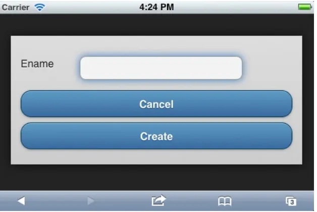
As this popup for a list of employees isn’t very functional in this case, you should change page 2’s Page template setting back to the default value. But that now we know how to do it, let’s create a better example: a tiny dialog for quickly adding an employee directly from the list.
Start with creating the Form:
1. Run the Create Page wizard and create a new page (4) with a Form on a Table EMP that just shows the ENAME and only the Create and Cancel buttons. Let the Form branch back to page 2 on Cancel and Submit.
2. Change the Page template to Popup.
3. Change both Button templates to 100% Button.
Now that we’ve got the Form, we need to add an icon on top of the List View to navigate to the Form:
CHAPTER 2 ■ CREATING MOBILE PAGES
2. Create a Dynamic Action on click of that button, with the piece of JavaScript you used earlier (with the {role:"dialog"} addition), but of course you need to change the page number from 2 to 4. To prevent the popup from showing up when the page is loaded, you might want to switch the default Fire On Page Load setting.
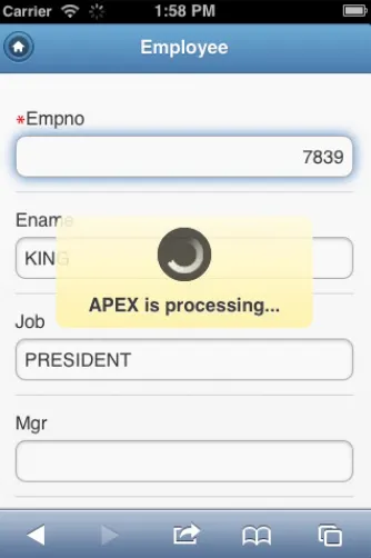
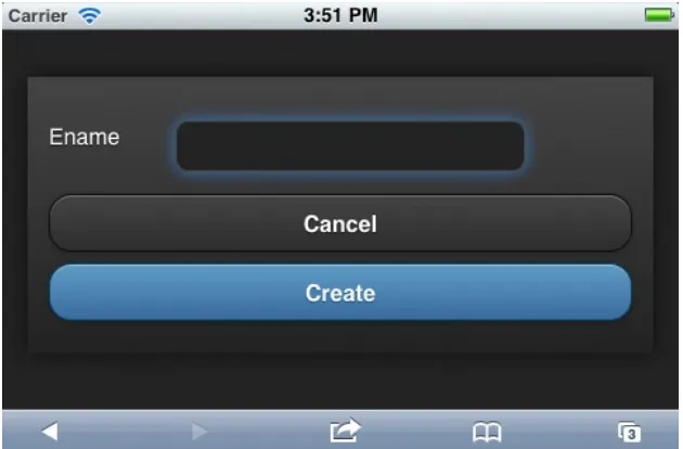
Run the application and then click the plus icon in the List View. You’ll see a small dialog pop up. You can enter a name for a new employee (see Figure 2-17). When you enter a name and press the Create button, you are redirected to the List View and can find the newly entered coworker there. This example assumes that the primary key, empno, is autopopulated in a trigger.
CHAPTER 2 ■ CREATING MOBILE PAGES
Transitions
While you tested the navigation of your application, switching from Home screen to List View to Form Page, you probably noticed the neat page transitions. This is one of the features that don’t apply in a regular desktop application. On a mobile device, these transitions provide a very native look and feel to web applications.
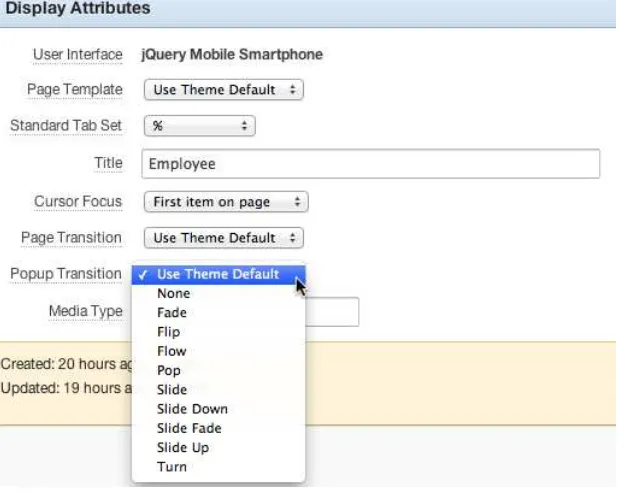
The Page Transition Defaults are defined on the Theme level. Navigate to Edit Theme, and you’ll see a region where you can set the defaults for a page and a popup (see Figure 2-18).
Figure 2-17. Dialog for quickly entering a new employee
Figure 2-18. Specifying the Transition Defaults on Theme level
Just change these values and examine your application. Did you notice any difference? If you did, you restarted your application or did a complete page refresh. If not, you probably expected the new settings to be applied when you move to another page—or at least when you move to a third page. So, why didn’t it work?
This behavior is caused by a small piece of JavaScript that is generated into your page by the APEX engine (see Listing 2-2). In this piece of code, the properties defaultPageTransition and defaultDialogTramsition are set, but the code will only run on the "mobileinit" event. And that event doesn’t run when you move from page to page using the standard Ajax style page loading. It will only run when the page is completely reloaded!
CHAPTER 2 ■ CREATING MOBILE PAGES
Listing 2-2. The mobileinit Function
<script type="text/javascript"
apex.jQuery(document).on("mobileinit", function() { apex.jQuery.mobile.defaultPageTransition = "slide"; apex.jQuery.mobile.defaultDialogTransition = "pop"; });
</script>
Due to the required location of this mobileinit function, it is rather impossible to make some changes to this code, other than changing the setting of these values in the APEX Builder. In a later version, the APEX development team might offer us a hook—as an application level attribute—where we can add some JavaScript code that will be generated into this mobileinit function. We’ve seen how to specify the default transition, but can we change that on a Page level as well? On some pages, you want the show sliding in from the left and others popping up. As you can see in Figure 2-19, you can override the template default setting on Page level. But as you try this, you might see nothing happens. Due to a bug (#14605541) in APEX 4.2, the engine doesn’t use these settings at all. This is fixed in the first patch set. Be aware: the transition you specify here is the one applied when you move out of the page.
Figure 2-19. Transition settings on Page level
When you don’t have access to APEX 4.2.1 and are limited to 4.2, are you stuck? Can’t you define or change transitions on Page level at all? Luckily, we do have full control over the two ways of linking pages manually, as we did before. We can add a data-transition attribute to the anchor tag we created earlier on Page 1. So you get something like
CHAPTER 2 ■ CREATING MOBILE PAGES
Valid values for data-transition are: "fade", "flip", "flow", "pop", "slide", "slidedown", "slidefade", "slideup", "turn", and "none".
The JavaScript code in the Dynamic Action can be changed in similar fashion:
apex.jQuery.mobile.changePage('f?p=&APP_ID.:2:&SESSION.',{role:"dialog", transition:"fade" });.
Another aspect of page transitions is the “loading indicator” that shows up between every page. The look and feel of this indicator can (in theory) be changed to your own likings and standards. But that requires access to the mobileinit function, and like we’ve just seen, that’s not natively available in version 4.2 of APEX.
Popups
The first shipped version of APEX 4.2 contains jQuery Mobile 1.1.1. But things change fast in this new world, so a new version, 1.2, ships with APEX 4.2.1. One of the many new features in jQuery Mobile 1.2 is the popup widget. Because a popup might look very similar to a dialog, there are some huge differences:
A dialog takes over the page, whereas a popup shows on top of a page.
•
Any page can be turned into a dialog by adding
• a data-rel="dialog" attribute to the link. However, a popup is an element that already exists in the page.
Popups are probably more suited for tooltips, menus, and small messages. Even the small page that you created earlier for quickly entering an employee might be a good use case for a popup. Creating a popup is very similar to creating a dialog: add the data-role="popup" as an attribute to a div that contains the popup contents. To open the popup, you have to use an anchor tag that links to the div using the id and has a data-rel="popup" attribute.
Just like in older versions of APEX, you can replace the substitution strings in the header of your Page template with references to newer versions of jQuery and jQuery Mobile, but then there is no guarantee that the standard APEX components will continue to work as before. And because jQuery Mobile doesn’t support multiple versions of jQuery Mobile on the same page (unlike jQuery), you can’t just add a newer version onto an existing template.
Note
■
Be aware of the different use of the words “popup” and “dialog” in APEX and jQuery Mobile. “Dialog” is not
used in APEX, but a jQuery dialog is termed an APEX popup. And a jQuery popup is not natively used in APEX yet.
Loading Widgets
When a new page is loaded, you see a standard loading widget that looks like a spinning wheel. When you have a requirement to change that into something else, you might find yourself stuck, as this widget is usually defined in the mobileinit function. And as we’ve seen previously, you can’t add or change any code in that generated piece of JavaScript. But again, Dynamic Actions is your friend here!
Create a Dynamic Action on page 0, the Global Page, that fires on Page Load and executes the snippet of JavaScript that you see in Listing 2-3.
Listing 2-3. Tweaking the Loading Widget
apex.jQuery.mobile.loadingMessageTextVisible=true;
CHAPTER 2 ■ CREATING MOBILE PAGES
When you refresh your page and navigate to another page, you see a different loading indicator, like the one shown in Figure 2-20.
Templates
As with regular desktop applications, all pages, regions, labels, and so forth are structured using templates. One of the things that is different is the integration with the jQuery Mobile theming framework. The framework contains multiple color “swatches;” the default ones are named "a" through "e". You can apply a swatch to any rendered HTML element—like pages, headers, buttons, and so forth—simply by adding the data-theme="d" attribute. A combination of elements with either the same or different data-theme settings make up your specific template. And the choice isn’t limited to just these five swatches. You can make up 21 more if you like!
So for instance, changing the data-theme in the body of the Popup template to "a" results in a totally different looking dialog (see Figure 2-21).
CHAPTER 2 ■ CREATING MOBILE PAGES
Mixed Applications
The application we have until now is a “mobile only” application. You can run it on a regular desktop browser, but it doesn’t look that good, mainly because our screen estate on the desktop is so much bigger. If you need to develop an application for desktop and mobile use, you have two options: develop two different ones as very different APEX applications or create one APEX application for two different targets. The advantage of the latter is that it is easier to share building blocks of code—so you only have to develop, test, and deploy it once and use it twice.
To add a desktop user interface type to our application, go to Edit Application Properties, select the User Interface tab, and click the Add New User Interface at the bottom. Just create one, picking the theme that you like—Theme 25 as an example—and you get another three pages generated for you: Global Page - Desktop, Login, and Home. Set the Auto Detect switch to Yes for both user interface types. When you try to access your application from a desktop browser without specifying a page number (like http://apex.oracle.com/pls/apex/f?p=13716), you will see a login screen different from what’s seen on a mobile device. You might have noticed you get a Global Page for every user interface, so you can define global coding and behavior, depending on your user interface, without using a lot of conditional rendering.
Wrap Up
In this introductory chapter on jQuery Mobile and APEX, we covered quite a lot of subjects:
The constructs of a jQuery Mobile page.
•
How to navigate from one page to another using three different techniques: the declarative
•
APEX, an HTML anchor element, and Dynamic Actions.
How to show a page as a jQuery dialog.
•
CHAPTER 2 ■ CREATING MOBILE PAGES
Transitions and how to change them—and what works and what doesn’t.
•
The upcoming Popups feature.
•
Modifying templates to change the look of the application.
•
Mixing mobile and desktop applications.
•
CHAPTER 3
Presenting Data Through List Views
One of the main differences between an APEX desktop application and a mobile application is the presence of the List View region type in the mobile world. Often, a List View is one of the first things you see when you open up an APEX mobile application. Even in the previous chapter, a List View was one of the first pages we created!
In this chapter, you will learn how to create a List View and how to use the all-powerful built-in options. And if that’s not enough, we will also add some cool features using jQuery Mobile plug-ins.
Create a Basic List
In this chapter, we will base our list examples upon the DEMO_PRODUCT_INFO table. So let’s start with creating a new report page with a List View region, as shown in Figure 3-1.
Figure 3-1. Creating a page with a List View region
Note that there is no interactive report–type available for a mobile theme because these kinds of reports are hard to use on a small mobile device. On the next page of the wizard, keep the suggested page number, and set both the page name and the region name to Products. Then you have to enter the Region Source, which is the SQL query that we will use for our Products List. We will start with the smallest query, so you can enter
CHAPTER 3 ■ PRESENTING DATA THROUGH LIST VIEWS
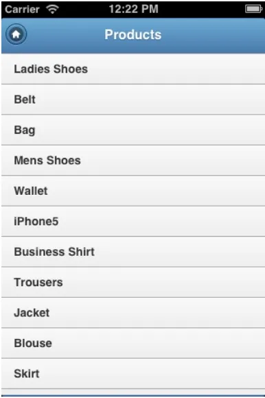
The next page in the wizard shows a number of interesting features: keep them all unchecked for now because we will cover those later in this chapter. Note the Text Column property is set to PRODUCT_NAME because that is our only column. Then finish the wizard and run the page. You will see what’s shown in Figure 3-2.
Figure 3-2. Our first Products List view
In the next section, you will learn how to style this list by adding pictures, dividers, links, and other features.
Style Your List
CHAPTER 3 ■ PRESENTING DATA THROUGH LIST VIEWS
The Inset List Feature
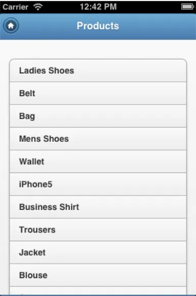
The first setting we will examine is the Inset List. This setting is often used when a list is not the only item on a page, but when it is embedded in a page with other types of content. An Inset List has some margins around the content area and rounded corners. Compare the Inset List in Figure 3-4 to the same list rendered in Figure 3-2. Can you spot the differences? Figure 3-3. The List View settings
CHAPTER 3 ■ PRESENTING DATA THROUGH LIST VIEWS
The Enable Search Feature
Go to the Region Attributes, uncheck the Inset List feature, and check the Enable Search feature. Three new search options appear: Search Type, Search Column, and Search Box Placeholder (see Figure 3-5).
Figure 3-5. List View search options
The Search Type has five options: one for client-side search and four for server-side search. Server-side search can be either exact or like and either case sensitive or insensitive. When you use server-side search, you always have to hit the Search button on the virtual keyboard. Client-side search, however, has an immediate effect: searching is performed on every keystroke. This setting is far more user-friendly and intuitive, but can have one disadvantage: all records will be loaded into the browser, regardless of the Number of Fetched Rows setting at the bottom of the Region Attributes page. So it works great, but it’s dependent on the record set size and your bandwidth.
Tip
■
From an end-user perspective, client-side search is the preferred option, as long as the record set size (in your
production environment) and your bandwidth guarantee an adequate performance.
Using the Search Column property, you can define how the search should be performed against a column other than the one defined as Text Column. To see that feature on action, add the PRODUCT_DESCRIPTION column to the Region Source query and use that column as the Search Column. When you now run the page and search for “simple”, the Ladies Shoes are returned— obviously because that word is contained in the product description. But, as you experienced, this is only useful (from an end-user point of view) when that column is shown one way or another. And we’ll take care of that later on.
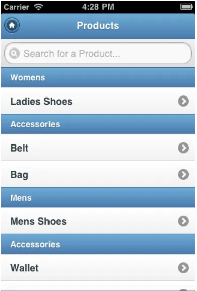
In the Search Box Placeholder, you can define the HTML5 placeholder attribute: the light-gray text in an input field that disappears when you enter text (see Figure 3-6). This feature is often used instead of the old-fashioned, more intrusive tool tip.
Figure 3-6. The Search Box Placeholder set to Search for a Product. . .
CHAPTER 3 ■ PRESENTING DATA THROUGH LIST VIEWS
The Show List Divider Feature
The next thing we will explore is the Show List Divider feature. First, add the CATEGORY column to the Region Source query. Then tick the Show List Divider option and select CATEGORY as the List Divider Column (see Figure 3-8). When you run the page, you see nice dividers between the actual Product records. Just as a reminder, the colors are defined by the theme you pick for your application.
Figure 3-7. Change the default value of the Search Placeholder in List Views
Figure 3-8. Defining the List Divider
CHAPTER 3 ■ PRESENTING DATA THROUGH LIST VIEWS
The Counter Column Feature
For the Counter Column feature, we need to add another column to the Region Source. Add the following subquery as a new column to your query. You might also need to add “p” as the table alias for the DEMO_PRODUCT_INFO table.
( select count(1) from demo_order_items i where i.product_id = p.product_id ) as items_ordered
Next, pick your new column as the Counter Column, as shown in Figure 3-10. Figure 3-9. List View with List Dividers
Figure 3-10. Define the Counter Column
CHAPTER 3 ■ PRESENTING DATA THROUGH LIST VIEWS
The Show Image Feature
The next feature to explore is Show Image. Before we can use this feature, we have to add an image to display. There’s an image contained in the PRODUCT_IMAGE column, which you should add to the select statement. Then navigate to the Region Attributes of our list and switch on the Show Image indicator. Another four properties appear in the Settings region, as shown in Figure 3-12.
Figure 3-11. List View with Counter Column
CHAPTER 3 ■ PRESENTING DATA THROUGH LIST VIEWS
Apart from showing an image or an icon contained in the record itself, you can also show an image or icon referred to by a URL that is a column in the record. That ability might be useful when you store the images on your web server.
The size of the image is defined by the jQuery Mobile CSS. An image created this way in a List View gets the ui-li-thumb class. In the CSS file, the max-width and max-height of items in this class is set to 80 pixels. If you think that the images are too big for a small device, you can add the CSS snippet in Listing 3-1 to the Inline CSS region of the page.
Listing 3-1. CSS to Reduce the Image Size
/* Reduce size thumbnail */ .ui-li-thumb
{
width : 50px; height : 50px; }
/* Reduce li height with thumb */ .ui-li-has-thumb
{
height : 52px; }
/* Reposition counter and icon */ .ui-li-has-count .ui-li-count,
.ui-btn-icon-right > .ui-btn-inner > .ui-icon {
top : 33%; }
CHAPTER 3 ■ PRESENTING DATA THROUGH LIST VIEWS
Tip
■
Be careful when showing large-sized images in your report. Although they might show up tiny, the full image
is loaded. And that might result in a page size of several megabytes. So when you need to show both full-size and
thumbnail images, you have to store both, either in your database or on your web server.
The Link Target Feature
In order to use the Link Target feature, we need to create a form to manage the product information. To quickly create a new Form page on the DEMO_PRODUCT_INFO table, select the PRODUCT_ID as the Primary Key, accept all defaults on the next pages, and set the branching to our Products List page.
Back to the definition of the Products List page, add the PRODUCT_ID column to the select statement. Replace the dummy “javascript:void(0);” code we added earlier, with
f?p=&APP_ID.:22:&APP_SESSION.::&DEBUG.::P22_PRODUCT_ID:&PRODUCT_ID.
Of course, you need to replace the page numbers, 22 in this example, with the page number of the Product form page you’ve just created. The link is now actually working and navigates to our very rudimentary Product form page. But we will enhance the look and feel of that page in the next chapter.
CHAPTER 3 ■ PRESENTING DATA THROUGH LIST VIEWS
The Has Split Button Feature
A list isn’t restricted to only one page to link to. Without any wizardry, you can even have two! So let’s assume we want to add another link to enter an Order for a selected Product.
Create another Form page, this time on the DEMO_ORDER_ITEMS table. Select ROWID as the Primary Key. Opt to make only the Create button because we don’t need a Save or Delete. Then, branch back to our Products List page. This page doesn’t look that impressive—and creating a record doesn’t work due to the foreign key constraint to the Order table. But we’ll fix all that in the next chapter. We only need the page for creating the additional link.
Navigate back to the Region Attributes of the Products List region and select the Has Split Button feature. Another property, Split Button Target, appears. Just copy the URL from the Link Target and paste it into the Split Button Target. Again, change the page numbers to the number of the newly created Order Item page. Running the Products List page now shows a splitter on every row, as shown in Figure 3-14. Clicking the first part of the row navigates to the Products page. Clicking the right arrow shows the Order Item page.
Figure 3-14. Products List with Split Button
The Is Nested List View Feature
The Is Nested List View feature isn’t applicable in the Products List because it is designed for hierarchical queries. You can quickly try it out by creating a new List page with an SQL statement:
SELECT empno, ename, mgr, level FROM emp
CHAPTER 3 ■ PRESENTING DATA THROUGH LIST VIEWS
In the Region Attributes, select ENAME as the Text Column, enable the Is Nested View List feature, and pick Level as the Nested List Column. When you run the page, you can walk through the hierarchy of the EMP table.
The Advanced Formatting Feature
Although we’ve already managed to style our list from a very basic text-only version to a version with images, counters, and two links—we’ve got even more options.
Add the column LIST_PRICE to the SQL query. Then, in Region Attributes, click Advanced Formatting. Another four options appear. Here we can style our list even further. Figure 3-15 shows an example.
The first option is used to style the list by overriding the standard list or divider theme. The List Entry Attributes can be set to pick an icon other than the standard right arrow. Text Formatting, the only required one (even when you just want to use another icon), gives you the opportunity to show more in the list than just the Product Name. In this
Figure 3-15. Advanced Formatting example
example, we add the Product Description to the list. And when even that is not enough, we can add Supplemental Information. We’ll use the Product Price for that. The Supplemental Information is usually a short piece of text that shows up on the right side of the list item, just before the counter. Please note the classes that are assigned to the paragraph tags of the additional elements. These are used in Listing 3-2 to get the exact look and feel we want.
Listing 3-2. Complete CSS for the Products List
/* Reduce size thumbnail*/ .ui-li-thumb
{
width : 50px; height : 50px; }
/* Reduce li height with thumb */ .ui-li-has-thumb
{
CHAPTER 3 ■ PRESENTING DATA THROUGH LIST VIEWS
/* Reposition counter and icon */
.ui-li-has-alt.ui-li-has-count .ui-li-count, .ui-btn-icon-right > .ui-btn-inner > .ui-icon {
top : 20px; right : 45px; }
/* Move Text to left */
.ui-li-has-thumb .ui-btn-inner a.ui-link-inherit {
padding-left : 55px; }
/* Style Price and Description */ .price
{
position : absolute; right : 45px; top : 37px; font-size : 11px; color : blue; }
.description {
font-size : 10px; margin : 0px -1px; }
CHAPTER 3 ■ PRESENTING DATA THROUGH LIST VIEWS
Number of Fetched Rows
Without doubt, you are familiar with the Pagination options for a report in a regular desktop application. These kinds of paginations don’t work very well on a mobile device. That’s why a mobile application in APEX works slightly different in this area. In the Advanced region of the Products List’s Region Attributes tab, you’ll find the Number of Fetched Rows setting. The default value of this property is 15. Originally, the DEMO_PRODUCT_INFO table didn’t contain that number of records, so for this example, change it to 5. When you run the page, you will see that changing this setting has no effect at all. That’s because the Search Type setting is still set to Client Side, so all records are loaded anyway. Change that setting to one of the server-side settings. When you run the page again and scroll down, you see a Load more… option at the bottom of your list, as shown in Figure 3-17. Clicking it will load another five records. Figure 3-16. The final result of the Products List
CHAPTER 3 ■ PRESENTING DATA THROUGH LIST VIEWS
If you don’t like the Load more . . . text, you can change it by defining a Text Message with APEX.REGION.JQM_ LIST_VIEW.LOAD_MORE as the name, just as we did with the default Search field placeholder.
Add Swipe-to-Delete Functionality
In many iOS applications, you can delete data from a List View by swiping over the row, which brings up a Delete button to delete the data. See Figure 3-18 for an example of the Evernote application.
Figure 3-18. Example of swipe-to-delete
Wouldn’t it be cool if we could implement this native application functionality in our apex mobile web application?
Implementing swipe-to-delete requires a number of steps:
1. We want to execute something when we do a swipe-right on one of the rows. Create a Dynamic Action on the Swipe-Right event. The Selection Type is a jQuery Selector that selects all list items that are not one of the dividers. Also excluded is the Load more… item at the bottom of the list. Here’s the jQuery Selector:
li[data-role!="list-divider"]:not(".apex-load-more")
CHAPTER 3 ■ PRESENTING DATA THROUGH LIST VIEWS
3. For the actual deletion of a record, you need to create a Hidden Item (like P13_PRODUCT_ID). Be sure to set the Value Protected property to No because we will assign a value to this item using JavaScript.
4. Create an “On Change” Dynamic Action on the field that will execute a piece of PL/SQL. Be sure to set Page Items To Submit to P13_PRODUCT_ID. For example:
DELETE FROM DEMO_PRODUCT_INFO WHERE PRODUCT_ID = :P13_PRODUCT_ID;
5. Now we can add our swipe2Delete JavaScript function to the page in the Function and Global Variable Declaration section (see Listing 3-3).
Listing 3-3. The swipe2Delete JavaScript Function Declaration
function swipe2Delete( pThis ) {
var $li = $( pThis.triggeringElement );
// This disables links on the page. If you click anywhere else, it removes the delete button $('li').bind('tap click', function(e){
// Remove any existing Delete Button $('.deleteButton').slideUp(); $('.deleteButton').remove();
var deleteButton = $('<a>Delete</a>')
.attr( { 'class': 'deleteButton ui-btn-up-r'
// Have the delete button delete the item
$('.deleteButton').bind('tap click', function () { event.preventDefault();
var $del = $(this);
CHAPTER 3 ■ PRESENTING DATA THROUGH LIST VIEWS
6. In the JavaScript function, you might have noticed the use of an “id” within the list item. This “id” is used to determine the PRODUCT_ID that is about to be deleted. We need to add that PRODUCT_ID to the HTML of the list item. This can be done by adding a line to the Text Formatting property, as shown in Figure 3-19.
Figure 3-19. Adding the PRODUCT_ID to the HTML of the list item
7. The only thing we need is (quite a lot of ) CSS to mimic the native styling of the Delete button (see Listing 3-4).
Listing 3-4. CSS to Style the Delete Button
.deleteButton
background-image : -moz-linear-gradient(top, #ec4a0b, #ad390c);
background-image : -webkit-gradient(linear,left top,left bottom,color-stop(0, #ec4a0b),color-stop(1, #ad390c));
-ms-filter: "progid:DXImageTransform.Microsoft.gradient(startColorStr='#ec4a0b', EndColorStr='#ad390c')";
CHAPTER 3 ■ PRESENTING DATA THROUGH LIST VIEWS
background-image : -moz-linear-gradient(top, #f15c22, #f15c22); text-decoration : none;
background-image : -webkit-gradient(linear,left top,left bottom,color-stop(0, #f15c22), color-stop(1, #f15c22));
background-image : -moz-linear-gradient(top, #bc770f, #e6590c);
background-image : -webkit-gradient(linear,left top,left bottom,color-stop(0, #bc770f), color-stop(1, #e6590c));
font-family : Helvetica, Arial, sans-serif; }
CHAPTER 3 ■ PRESENTING DATA THROUGH LIST VIEWS
Add Automatic Push of Next Records
In the default setting, you have to click the Load more… link to load the next set of records. Although this feature is seen a lot in native applications, you may also see a feature where a list is automatically extended with the next set of records when the bottom of the list is reached. We will implement this feature.
First, we need to download and install an external jQuery plug-in called Waypoints. You can get that from
http://imakewebthings.com/jquery-waypoints. Download the files and upload the minified JavaScript function as a static file for the current application. Next, reference that static file in the File URLs section of our page as
#APP_IMAGES#waypoints.min.js. Create a Dynamic Action that fires on Page Load and executes the JavaScript code you see in Listing 3-5.
Listing 3-5. JavaScript for Automatic Pushing of Records
$('div[data-role="content"]').waypoint(function(event, direction) { if (direction=='down') {
// Mimic a click to fire loading $('li.apex-load-more').hide();
$('li.apex-load-more').trigger('vclick');
// Recalculate waypoint position after 3 seconds - loading might take a while setTimeout(function(){$.waypoints('refresh');$('li.apex-load-more').show();},3000); }
},