Designing the
iPhone User Experience
Designing the
iPhone User Experience
A User-Centered Approach
to Sketching and Prototyping iPhone Apps
SUZANNE GINSBURG
Upper Saddle River, NJ • Boston • Indianapolis • San Francisco New York • Toronto • Montreal • London • Munich • Paris • Madrid
Capetown • Sydney • Tokyo • Singapore • Mexico City
Many of the designations used by manufacturers and sellers to distinguish their products are claimed as trademarks. Where those designations appear in this book, and the publisher was aware of a trademark claim, the designations have been printed with initial capital letters or in all capitals. The author and publisher have taken care in the preparation of this book, but make no expressed or implied warranty of any kind and assume no responsibility for errors or omissions. No liability is assumed for incidental or consequential damages in connection with or arising out of the use of the information or programs contained herein.
The publisher offers excellent discounts on this book when ordered in quantity for bulk purchases or special sales, which may include electronic versions and/or custom covers and content particular to your business, training goals, marketing focus, and branding interests. For more information, please contact:
U.S. Corporate and Government Sales (800) 382-3419
corpsales@pearsontechgroup.com
For sales outside the United States, please contact: International Sales
international@pearson.com Visit us on the Web: informit.com/aw
Library of Congress Cataloging-in-Publication Data
Ginsburg, Suzanne.
Designing the iPhone user experience : a user-centered approach to sketching and prototyping iPhone apps / Suzanne Ginsburg. p. cm.
Includes index.
ISBN 978-0-321-69943-5 (pbk.)
1. iPhone (Smartphone)—Programing. 2. Application software—Development. I. Title.
QA76.8.I64G56 2010 005.1—dc22
2010021718 Copyright © 2011 Suzanne Ginsburg
All rights reserved. Printed in the United States of America. This publication is protected by copy-right, and permission must be obtained from the publisher prior to any prohibited reproduction, storage in a retrieval system, or transmission in any form or by any means, electronic, mechanical, photocopying, recording, or likewise. For information regarding permissions, write to:
Pearson Education, Inc.
Rights and Contracts Department 501 Boylston Street, Suite 900 Boston, MA 02116
Fax: (617) 671-3447 ISBN-13: 978-0-321-69943-5 ISBN-10: 0-321-69943-2
To Mom and Dad,
who have always been inquisitive, supportive, and encouraging.
CONTENTS vii
Contents
Preface . . . xv
We’d Like to Hear from You . . . xxvii
Acknowledgments . . . xxix
About the Author . . . xxxi
PART ONE: iPhone Application and Device Overview
. . . 1Chapter 1: iPhone Application Overview . . . 3
Utility Apps . . . 4
Minimal Setup . . . 4
Simple Layouts and Flows . . . 5
Standard User Interface Elements . . . 5
Utility App Tour . . . 5
Productivity Apps . . . 7
Hierarchical Structure . . . 7
Accelerators and Shortcuts . . . 8
Productivity App Tour . . . 9
Immersive Applications . . . 12
Focus on the Content . . . 13
Customized User Experience . . . 14
Immersive App Tour . . . 14
Summary . . . 17
Chapter 2: iPhone Device Overview . . . 19
Reviewing the iPhone and iPod Touch’s Features . . . 20
Multi-Touch Display . . . 21
Supported Gestures . . . 22
Custom Gestures . . . 22
Keyboard . . . 23
Light, Proximity, and Motion Sensors . . . 27
Ambient Light Sensor . . . 27
Proximity Sensor . . . 27
Motion Sensor . . . 28
Location and Compass Information . . . 29
Location Information . . . 29
Compass . . . 29
Methods . . . 95
Drafting the Discussion Guide . . . 174
How Should I Present Tasks on the Productivity-Style Detail View? . . . 209
How Do I Choose the Right Control? . . . 210
Back-End UI Checklist . . . 215
Summary . . . 217
Case Study 9: Sonos . . . 218
Chapter 12: Accessibility and Localization . . . 265
Accessibility . . . 266
Built-in Accessibility Features . . . 266
VoiceOver . . . 266
Custom Accessibility Solutions . . . 269
Internationalization and Localization . . . 270
Language . . . 270
Dynamic Content . . . 270
Culture . . . 271
Local Laws . . . 273
Summary . . . 273
Looking to the Future . . . 275
Handheld Forms Will Evolve . . . 276
Mobile Payments Will Become Ubiquitous . . . 277
Health Care Monitoring and Delivery Will Improve . . . 277
Environmental Monitoring Will Lead to Scientific Discoveries . . . 278
Privacy Issues Will Come to a Head . . . 278
Conclusion . . . 279
PREFACE xv
Preface
With over 200,000 apps in the App Store, it has become increasingly challeng-ing for app designers and developers to differentiate their apps. The days are long gone when it was possible to crank out an app over the weekend and refine it after receiving a few not-so-flattering user reviews. Users now have choices—lots of them. If your app is difficult to use or doesn’t meet their needs, finding another one is just a tap away.
To illustrate, consider the ever-growing field of Twitter clients. There are hundreds of variations in the App Store, but only a handful stand out from the pack (such as Tweetie and Twitterific). For most apps, it boils down to one thing: the user experience. The same is true for countless other categories within the App Store; well-designed apps are more likely to attract and retain users. Of course there are other critical aspects of iPhone app development: the coding, the marketing, the customer support. All of the elements must come together.
Designing the iPhone User Experience will help you tackle the user experience part of the iPhone challenge. Three key themes will be reinforced throughout the book: know thy user, the design life cycle, and attention to detail.
Know Thy User
Millions of people depend on iPhone apps to get them to work, find their next meal, and stay in touch with family and friends. Professionals of all kinds also rely on iPhone apps: Doctors look up drug interactions; photographers fine-tune lighting; cyclists find the best routes. To truly understand how apps can fit into their lives, designers and developers must learn how users do things today, what’s important to them, and what needs have not been met. FIGURES P.1–P.5 illustrate contextual observations from field interviews, an effective way to uncover user needs. Part Two, “Defining Your iPhone App,” will introduce a variety of user research methods.
FIGURE P.1 Child using an iPhone in the yard. It’s his mother’s phone, but he uses it almost as much as she does! (Courtesy of Alison Oshinsky)
FIGURE P.2 The contents of a user’s handbag help show how the iPhone fits into the person’s life. This person has two phones to keep her work and personal lives separate. (Courtesy of Michael Massie)
FIGURE P.4 A cyclist incorporated the iPhone into his biking routine. (Courtesy of Marcus Kwan)
FIGURE P.5 A Volkswagen Beetle owner converted the bud vase into an iPhone holder. (Courtesy of Nathan Barry, njb@mac.com)
The Design Life Cycle
Award-winning designs rarely happen overnight; they usually occur only after many rigorous design cycles. To illustrate, FIGURE P.6 shows how USA TODAY went through at least seven iterations for the article view in its app. These kinds of iterations should happen before you launch your app; doing so will save valuable time and money. More important, you may have only one chance to impress your users—you do not want to sell them half-baked ideas.
Part Three, “Developing Your App Concept,” will explain how to iteratively design and test your app concepts.
FIGURE P.6 Progression of USA TODAY’s article view. Chapter 10, “Visual Design,” includes a case study about the USA TODAY iPhone app design. (Courtesy of Mercury Intermedia)
Attention to Detail
Most professionals know that attention to detail is important, but hundreds of apps fail to incorporate even the most basic design principles. This lack of atten-tion is not merely an aesthetic issue (which is important); it also affects the way apps function. For example, a news article without proper alignment is difficult to read, and a poorly rendered icon is challenging to interpret. Apps with a razor-sharp attention to detail stand out because they look good and perform well.
Part Four, “Refining Your iPhone App,” will show you how to make your app shine, from visual design and branding to accessibility and localization.
Mastering these three areas—know thy user, the design lifecycle, and attention to detail—will help set your app apart from the crowd. You may not have an award-winning app overnight, but knowing your users, iterative design, and attention to detail are important first steps.
PREFACE xvii
Audience for This Book
This book is intended for anyone who wants to improve an existing iPhone app or create a new app.
Individuals new to the iPhone should start with Part One, “iPhone Application and Device Overview.” This section of the book introduces important aspects of the iPhone and Apple’s iPhone Human Interface Guidelines (known as the “HIG”). Although the overview will be helpful, you should download the iPhone HIG and read through it at least once so you can familiarize yourself with the terms, con-cepts, and design principles.1 If you are already familiar with the iPhone’s capa-bilities and the HIG, feel free to skip ahead to Parts Two, Three, and Four, which jump into product definition, prototyping, and usability testing.
To learn how the book may benefit your specific role, read the following highlights:
•
EntrepreneursMany iPhone entrepreneurs wear more than one hat: developer, designer, product manager, and more! These individuals will appreciate the “guer-rilla” user research methods outlined in the book. They will also enjoy read-ing the case studies, which show how companies big and small approach user-centered design. As their companies grow, entrepreneurs can use this book to help build their own user experience team of iPhone designers and researchers.
•
DevelopersDevelopers who are new to user-centered design will learn how to bring users into their process, from up-front research to iterative design and usability testing. They may use this knowledge to run their own studies or to improve collaboration with designers and user researchers (e.g., internal or outsourced teams). Developers will also appreciate the best practices included throughout the book, particularly those outlined in Part Four, “Refining Your iPhone App.”
•
User experience professionalsDesigners, researchers, and other user experience (UX) professionals will learn how to adapt a variety of user-centered design methods for the iPhone (e.g., how to prototype and test location-based apps). These individuals may be inspired by the range of sketching and prototyping examples in
Part Three, “Developing Your App Concept.” The best practices outlined in Chapter 9, “User Interface Design,”will also be a valuable resource, particu-larly in the later design stages.
•
Product managersProduct managers who work with iPhone designers and developers will find the book valuable on a number of levels. First, product managers may want to participate in up-front user research and usability studies, so it will be helpful for them to learn more about user-centered design methods. Second, product managers may want to understand the rationale behind certain app flow and user interface decisions. References to the HIG and usability principles will provide a common vocabulary and improve team collaboration.
•
QA and customer careQuality assurance (QA) and customer care team members can also benefit from this book. Understanding iPhone task flows and usability issues will help QA folks create test plans and customer care folks create support docu-mentation. Additionally, these individuals may participate in team brain-storming and design review sessions. Having an understanding of the HIG and other iPhone best practices will help them contribute to these sessions.
Definitions
Before we delve into the book details, let’s quickly review some design terminol-ogy. User experience design and user-centered design are most synonymous with the book’s overarching goals:
•
User experience designAccording to Donald Norman, “User experience design [abbreviated to UX or UE] deals with all aspects of the user’s interaction with the product: how it’s perceived, learned, and used.”2 In the case of the iPhone, these “aspects” can include everything from the interaction and visual design to the app’s performance.
•
User-centered designUser-centered design (UCD) gives extensive attention to the needs, wants, and limitations of users at each stage of the design process. This book includes many user-centered design methods, but it’s not exclusively dedi-cated to UCD.
2. Donald Norman, The Invisible Computer: Why Good Products Can Fail, the Personal Computer Is So Complex, and Information Appliances Are the Solution (MIT Press, 1999).
PREFACE xix
•
User interface designStrictly defined, user interface (UI) design refers to the design of the “inter-face” between users and the underlying software. However, in reality, most UI designers think beyond this superficial level to create designs that meet users’ needs.
•
Interaction designDavid Kelley, the founder of IDEO, defines interaction design this way: “Interaction design is using your technical knowledge in order to make it useful for people, to delight someone, to make someone get excited about the new technology they’re using.”3 Given its broad scope, this definition is most closely aligned to UX design.
•
Information architectureInformation architecture (IA) is the categorization of information into a coherent structure. The term was popularized when vast web sites started cropping up during the dot-com boom. Many people use the term inter-changeably with interaction design but the scope is arguably narrower.
What This Book Teaches You
This book provides an end-to-end overview of the user-centered design process, specifically for iPhone applications. After reading this book, you will know how to
•
Conduct up-front user and competitive research to inform your app’s vision statement, also known as the Production Definition Statement.•
Brainstorm, sketch, and prototype your app concepts. The prototypes cov-ered take many different forms, from simple paper to scripted videos.•
Refine your app’s user interface and visual design, using best practices based on established design principles.•
Make your app accessible to individuals with impairments, with specific attention to VoiceOver, the screen-reading software built into the iPhone.•
Localize your app’s user experience with an emphasis on language, content, and culture.While the book is focused on the iPhone and iPod Touch, many of the principles you will learn here can also be applied to user experience design for the iPad. For example, the research methods in Part Two, “Defining Your iPhone App,” and sketching and prototyping in Part Three, “Developing Your App Concept,” can also be applied to the iPad. Many sections in Part Four, “Refining Your iPhone
App,” are also relevant; however, there are some new iPad user interface controls and transitions that are not covered in this book. To learn more, consider reading the iPad Human Interface Guidelines.4
How This Book Is Organized
This book is organized into four parts, which take you through the process of developing the Product Definition Statement for your app to prototyping and testing your designs with target users. The book concludes with best practices that cover key aspects of the user experience: the user interface, visual design, brand-ing, accessibility, and localization. Case studies are included throughout the book to illustrate how other companies approach user experience design.
•
Part One: “iPhone Application and Device Overview”The chapters in this part provide the grounding and foundation you’ll need for the rest of the book. You’ll learn about the iPhone Human Interface Guidelines, as well as specifics about the iPhone hardware and what that means for application design teams.
•
Chapter 1: “iPhone Application Overview”This chapter reviews applications that clearly fit into Apple’s three classic definitions—Productivity, Utility, Immersive—as well as apps that build upon principles set forth in the HIG. The chapter also provides advice on how to choose an application style.
•
Chapter 2: “iPhone Device Overview”Here we explore the iPhone device with an emphasis on the technologies and hardware that define the iPhone user experience, such as the multi-touch display, motion sensors, and location information.
•
Part Two: “Defining Your iPhone App”The chapters in this part discuss the value of up-front research, with an emphasis on user research and competitive research. Case studies are given to illustrate how companies have put these methods into practice.
•
Chapter 3: “Introduction to User Research”This chapter reviews a variety of user research methods such as shadow-ing, field interviews, and diary studies and suggests ways to tailor these methods for your app.
4. iPhone Dev Center, iPad Human Interface Guidelines, http://developer.apple.com/iphone/library/ documentation/General/Conceptual/iPadHIG/Introduction/Introduction.html .
PREFACE xxi
•
Chapter 4: “Analyzing User Research”This chapter has step-by-step advice on how to effectively analyze your user research. You’ll also learn how your findings can be used to create valuable design tools such as personas, scenarios, and user journeys.
•
Chapter 5: “Evaluating the Competition”Here I introduce a variety of ways to conduct competitive user experi-ence analyses and explain how your findings can help shape your Prod-uct Definition Statement.
•
Part Three: “Developing Your App Concept”Once armed with your up-front research findings, you’ll learn how to translate these discoveries into design solutions for your own applications. In addition to sketching and prototyping, Part Three explains how to evalu-ate your app designs through usability testing.
•
Chapter 6: “Exploring App Concepts”This chapter starts by explaining how to create a design-friendly envi-ronment and hold effective brainstorming sessions. The remainder of the chapter discusses ways to illustrate and communicate your early design explorations.
•
Chapter 7: “Prototyping App Concepts”In this chapter, we look at a variety of iPhone prototyping approaches— paper, software, and video—and I give suggestions for how to choose the best approach for your app.
•
Chapter 8: “Usability Testing App Concepts”A variety of usability testing methods—ranging from “traditional” tests to the Rapid Iterative Testing and Evaluation (RITE) method and guer-rilla testing—are explored in this chapter. It also discusses beta testing and ways to enhance it with traditional usability methods.
•
Part Four: “Refining Your iPhone App”Although user testing is a critical part of the iterative design process, the book also reviews best practices that have emerged in the iPhone space, considering a variety of application styles and categories. Topics covered in Part Four include user interface design, visual design, branding, accessibil-ity, and localization.
•
Chapter 9: “User Interface Design”•
Chapter 10: “Visual Design”This chapter begins with a discussion of visual structure—grouping, hierarchy, alignment—then explores how color, type, and imagery can reinforce visual structure and create harmonious designs.
•
Chapter 11: “Branding and Advertising”This chapter focuses on ways to express your brand within your app’s design. It also discusses mobile advertising and ways to integrate ads into your designs.
•
Chapter 12: “Accessibility and Localization”This chapter reviews accessibility on the iPhone, with specific attention to VoiceOver compatibility. Additionally, the chapter explains how to localize the user experience of your app, covering both built-in and cus-tom solutions.
The book wraps up with a look to the future of the iPhone and how its evolution may impact the user experience.
Case Studies
Parts Two through Four contain iPhone app case studies, which show how differ-ent companies approach user experience design. Although the methods and tools vary from company to company, these organizations have at least one common goal: the desire to offer the best user experience possible. You’ll learn how success-ful companies manage to deliver on this promise, and you may find ways to bring similar approaches into your own organization.
Here are some highlights from the 13 case studies:
•
Case Study 1: Windspire (Chapter 4)The Windspire app helps users determine whether they have enough wind for a turbine and how much money they could save with one. In the early design phase, the company conducted field research to understand the needs of potential customers.
•
Case Study 2: Aardvark Mobile (Chapter 4)The Aardvark iPhone app lets users ask friends and friends of friends for advice while on the go. The company involved users throughout the design and development process, from early-stage user interviews to late-stage alpha testing.
PREFACE xxiii
•
Case Study 3: Foodspotting (Chapter 6)Foodspotting is a visual local guide that helps users find dishes and earn points for spotting foods. Its creators used concept posters, paper proto-types, and simple on-screen prototypes to get user feedback.
•
Case Study 4: Not For Tourists (Chapter 6)NFT helps users navigate and explore cities like a local. Personas and sce-narios helped focus the team on the app’s core interactions. The scesce-narios were then used to create storyboards, which were translated into paper and on-screen prototypes.
•
Case Study 5: MUSE (Chapter 6)MUSE is an interface that visualizes your music library as a grid of dots; each dot is a track, and all tracks are playing. It was born out of a desire for a more right-brain tool for navigating music libraries and creating playlists.
•
Case Study 6: Prototyping at Dan4, Inc. (Chapter 7)Dan4 has experimented with many kinds of prototypes—paper, Keynote, video, and more. When choosing a prototype, the company factors in time, budget, and scope but also how the wider development team works and how the prototypes could be reused.
•
Case Study 7: What’s Shakin’ (Chapter 7)The What’s Shakin’ app is an egg shaker developed with OpenAL, a cross-platform 3D audio API. Over the course of designing the app, the inventors tested their prototypes with friends, musicians, and local bar patrons.
•
Case Study 8: REALTOR.com (Chapter 8)The REALTOR.com app is for individuals who are searching for a home. After several rounds of sketching and storyboarding, the design team cre-ated a paper prototype and conducted usability tests with prospective users.
•
Case Study 9: Sonos (Chapter 9)The Sonos iPhone app lets users access their wireless multi-room music sys-tem. In addition to internal design reviews, the team improved their design through usability tests with current Sonos customers, as well as iPhone users who had never heard of Sonos.
•
Case Study 10: FlightTrack (Chapter 9)•
Case Study 11: USA TODAY (Chapter 10)The USA TODAY app lets users access headlines, sports scores, weather, photos, and other content from USA TODAY. The final app’s design came after dozens of rigorous design explorations.
•
Case Study 12: Voices (Chapter 10)The Voices app lets users record their voice and change it with filters (such as Chipmunk and Fun House). The Voices team paid close attention to app details, adding special touches such as a roving strobe light and quirky background music.
•
Case Study 13: Convertbot (Chapter 10)The Convertbot app is used to convert time, mass, currency, and more. Depth was a really important aspect of the visual design; there were many iterations to make the app “feel” like a real robot.
The case studies appear in the chapters to which they are most applicable and are provided to give you additional insight into how other developers and designers approach iPhone UI design.
NOTE
Some of the case studies have been edited to fit within the confines of the printed book; however, we have compiled full-text ver-sions as a freely download-able PDF file on the book’s web site. To download the PDF, go to informit.com/ title/9780321699435and click on the Extras tab.
PREFACE xxv
WE’D LIKE TO HEAR FROM YOU xxvii
We’d Like to Hear
from You
You can visit our web site and register this book at informit.com/title/
9780321699435. There you will also find any updates, downloads, or errata that might be available for the book.
As the reader of this book, you are our most important critic and commentator. We value your opinion and want to know what we’re doing right, what we could do better, what areas you’d like to see us publish in, and any other words of wis-dom you’re willing to pass our way.
You can email or write me directly to let me know what you did or didn’t like about this book, as well as what we can do to make our books better.
When you write, please be sure to include this book’s title and the name of the author, as well as your name, phone, and/or email address. I will carefully review your comments and share them with the author and editors who worked on this book.
Email: chuck.toporek@pearson.com Mail: Chuck Toporek
Senior Acquisitions Editor, Addison-Wesley Pearson Education, Inc.
75 Arlington St., Ste. 300 Boston, MA 02116 USA
If you would like to contact Suzanne directly, she can be reached via email at
suzanne@iphoneuxreviews.com.
For more information about our books or conferences, see our web site at
informit.com.
NOTE
Please note that I cannot help you with technical problems related to the topic of this book, and that because of the high volume of email I receive, I might not be able to reply to every message.
ACKNOWLEDGMENTS xxix
Acknowledgments
This book would not have been possible without the support of many talented individuals.
The first person who paved the way was Raven Zachary, the president of Small Society. We met when he was presenting on an iPhone panel at the Web 2.0 Sum-mit in the fall of 2008. Raven encouraged me to start my iPhone user experience blog, iPhone UX Reviews (www.iphoneuxreviews), which led me to Tim Burks, the founder of the Silicon Valley iPhone Developer Meetup. Tim was impressed with one of my early blog posts and invited me to present at his monthly event. One of my presentations, “An Agile Approach to iPhone Development,” caught the attention of Chuck Toporek, who is now my editor at Addison-Wesley.
Chuck recognized the need for a book on the iPhone user experience. At the time there were plenty of iPhone programming books but not one on iPhone app design. Although Chuck and I saw eye to eye on the book’s vision, I was uncertain about writing an entire book on the subject. But Chuck, a seasoned editor, had faith in my abilities and encouraged me to submit a book proposal. He has been insightful and supportive throughout the entire process. Other wonderful indi-viduals at Addison-Wesley, including Karen Gettman, Romny French, Julie Nahil, and John Fuller, and copy editor Barbara Wood.
My phenomenal review panel of design and development experts also played a major role in this book. Their comments helped shape the overall organization, direction, and finer details. The design panel included the insightful Marion Buchenau, Nancy Frishberg, Patrick Jean, Christian Rohrer, and Mirjana Spasojevic. The development panel included the esteemed Mike Shields, Brian Arnold, Dan Grover, and August Trometer.
One of my favorite parts of the book is the series of case studies, covering every-thing from “green” energy to gourmet food. A special thanks to all of the talented designers and developers I interviewed: Alexa Andrzejewski, John Casasanta, Mark Jardine, Ben Kazez, Rob Lambourne, Rusty Mitchell, Margeigh Novotny, Matt Paul, Rob Spiro, Espen Tuft, Bill Westerman, Ilana Westerman, and Cliff Williams. Sincere thanks also go out to George Chen for his insights on mobile advertising, Max Bielenberg for his perspective on prototyping, and Robert Spencer for his advice on gesture interfaces.
Several colleagues and friends informally reviewed my initial proposal and selected chapters. This wonderful group included Nicole Celichowski, Blake Engel, Wendy McKennon, and Rachel Wear. Over the course of writing the book, I reached out to two mailing lists: the Silicon Valley iPhone Developers and IXDA (Interaction Design Association). I appreciate all of the individuals who read and responded to my questions. Also, a big thanks to Michelle Reamy for collaborat-ing with me on user research in the early stages of the book.
My gratitude also goes out to all of the individuals who contributed sketches and photos to the book. In particular, the talented Clive Goodinson was kind enough to create a Pixton comic especially for the book. And Scott Klemmer, Assistant Professor of Computer Science at Stanford, introduced me to a number of his HCI students who were creating iPhone apps. A few of the book’s sketches and photos are from current and past Stanford students.
Last but certainly not least, a very special thanks goes out to Lee, who read and commented on the entire manuscript, at least twice! He provided valuable feed-back on the content and corrected a semicolon or two.
ABOUT THE AUTHOR xxxi
About the Author
Suzanne Ginsburg is a user experience consultant based in San Francisco, Cali-fornia. She helps companies conceptualize and design software. She works with many different kinds of organizations, from established technology companies to small iPhone start-ups.
One of her favorite aspects of user experience design is exploratory user research that helps uncover users’ unmet needs and inspires innovation. She has conducted exploratory research for online communities, home networking software, and several iPhone apps. Sketching and prototyping also play a big role in her design process. Suzanne is constantly exploring new approaches and evolving her proto-typing toolkit.
Suzanne is most passionate about products that connect people. These projects often involve cross-platform design, which looks at the user experience across the web, desktop, and iPhone. Suzanne is also interested in the field of augmented environments, particularly software that helps users learn about the people, objects, and places around them.
Suzanne is an experienced speaker and writer. She regularly presents at meet-ups, UX book clubs, and conferences. She also maintains a UX blog, iPhone UX Reviews (www.iphoneuxreviews.com), where she reviews iPhone apps and pro-vides advice on iPhone app design.
Suzanne has a master’s degree in user interface design from UC Berkeley’s iSchool and an undergraduate degree in business management from Cornell University. You can learn more about Suzanne at Ginsburg Design (www.ginsburg-design. com), her company web site.
Yahoo! Weather; see page 6 CityTransit; see page 10 Mint; see page 12
1
PA RT
O NE
iPhone Application
and Device
Overview
Before designingyour iPhone app, it’s important to acquire a deeper understanding of the iPhone Human Interface Guidelines1 (often referred to as “the HIG”). Apps that follow these guidelines are often easier to learn and use since they are familiar to users.
iPhone designers should also learn about the hardware that defines the iPhone user experience. Having this knowledge may inspire creative app solutions, for example, augmented reality apps combine the compass, GPS, and camera.
The chapters you’ll find in Part One are the following:
•
Chapter 1, “iPhone Application Overview,” discusses the HIG, with an emphasis on the three iPhone application styles: Utility, Pro-ductivity, and Immersive.•
Chapter 2, “iPhone Device Overview,” switches gears and reviews the iPhone hardware as it relates to the user experience.By the end of Part One, you should be inspired to create apps that com-bine the iPhone user interface and hardware in innovative ways.
1. iPhone Dev Center, iPhone Human Interface Guidelines, http://developer.apple.com/iphone/library/ documentation/userexperience/conceptual/mobilehig/Introduction/Introduction.html.
3
1
iPhone
Application
Overview
THE IPHONE HUMAN INTERFACE GUIDELINES (HIG) define three different
iPhone application styles—Utility, Productivity, and Immersive—to ensure a
consistent user experience. These styles are based on visual and behavioral
characteristics, the type of information, and the desired user experience.
Before you start designing your iPhone app, read through the application
style guidelines included in the HIG. Having a strong grasp of these guidelines
will help you understand what’s possible within the iPhone framework and
how your app may use the framework.
This chapter will review applications that clearly fit into the three classic
definitions as well as apps that build upon principles set forth in the
HIG. Additionally, the chapter will provide advice on how to choose an
application style.
Utility Apps
Utility apps enable users to quickly access a specific type of information or per-form a narrowly defined task. Apps well suited to this style include weather, stocks, traffic reports, and sports scores. To illustrate how these apps are used in context, consider the following scenario:
Quick Information Lookup
Sarah, a mother of two young children, owns a MacBook Pro and an iPhone, but she prefers using the iPhone in the morning since it fits into her “flow.”
On weekdays she can be found dashing between the kitchen, bathroom, and bedrooms as she gets the children ready for school. She turns to a weather app when decid-ing what the children should wear that day: Does she need to pack an extra jacket? An umbrella? Sunscreen?
This scenario shows how users with limited time may turn to a Utility app to help them accomplish a task as quickly and efficiently as possible. They may have only a few seconds to spare, so there is no time to create an account, enter preferences, and so on.
Characteristics of most Utility apps include
•
Minimal setup•
Simple flows and layouts•
Standard user interface elementsNow, let’s take a look at each of those characteristics.
MINIMAL SETUP
UTILITY APPS 5
SIMPLE LAYOUTS AND FLOWS
Utility apps have easy-to-scan layouts that include only the most essential infor-mation. Users may glance at a Utility app for only a few seconds and won’t have time to wade through extraneous data or user interface elements. A good rule of thumb is that the app should still be legible from about five feet away. Also, keeping the task flow succinct allows users to quickly accomplish their goals. For example, Sarah can access weather in two steps: Go to the home screen, and tap on the app icon. When the app opens, she can quickly scan it to see the current temperature and the day’s forecast.
STANDARD USER INTERFACE ELEMENTS
Utility apps tend to incorporate the standard user interface elements outlined in the HIG: the selected page, the Info button, and the series of dots that indicate additional pages (FIGURE 1.1). Although custom user interface elements may seem more aesthetically pleasing, they may slow Utility app users down since they are less familiar.
i
Battery and network status indicators
Info button for configuration options
Dots indicate additional pages Displays one page
at a time
FIGURE 1.1 Utility schematic with standard user interface elements
UTILITY APP TOUR
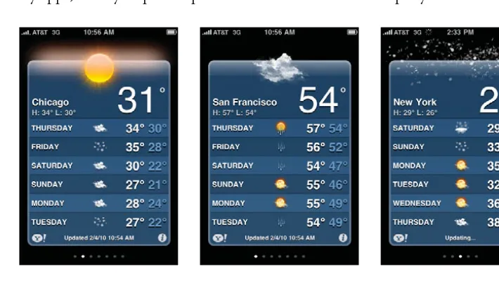
The Utility application style is predominantly used for “bite-sized” pieces of infor-mation like sports scores, stocks, and weather. FIGURES 1.2–1.4show how ESPN uses the Utility application style for sports scores. Notice how the background color changes depending on the league—NFL, NBA, NHL.
FIGURE 1.2 ESPN NFL scores FIGURE 1.3 ESPN NBA scores FIGURE 1.4 ESPN NHL scores
Similarly, the background image of the Yahoo! Weather app changes depending on the time of day and weather conditions. FIGURES 1.5–1.7 show the background images for sun, clouds, and snow; the background color switches to a dark plum shade in the evening. Consider incorporating relevant visual cues into your Util-ity apps, as they help users process the information more rapidly.
FIGURE 1.5 Yahoo! Weather with sunny graphic
FIGURE 1.6 Yahoo! Weather with cloudy graphic
PRODUCTIVITY APPS 7
Productivity-style apps are more full-featured than Utility apps and encompass everything from social networking to mobile banking. The time spent with these apps varies based on the context and task; for example, a user may spend a few seconds checking for new email messages but several minutes reading the mes-sages. To illustrate how several Productivity apps may be used in context, let’s look at another scenario:
Stay Connected
David is a college sophomore majoring in biochemistry. In the morning he wakes to the alarm on his iPhone, which charges on his nightstand while he sleeps.
While lying in bed, he scans through his Facebook and MySpace apps, looking for updates from his friends and family. Next, he checks for emails and reviews his calen-dar for the day. He relies heavily on the calencalen-dar since it has his school and work schedules.
After he has showered and dressed, he walks to the train, often double-checking the train schedule and location using an iPhone app.
This scenario shows how a user may use different Productivity apps to stay con-nected with family, friends, and work. Although Productivity apps may be used for long durations, the setup process should still be kept to a minimum.
Productivity apps are highly diverse, but most can be identified by the following characteristics:
•
Hierarchical structure•
Accelerators and shortcutsLet’s take a look at each of those characteristics.
HIERARCHICAL STRUCTURE
Nearly all Productivity apps have a hierarchical structure composed of list and de-tail views, as shown in FIGURE 1.8. List views contain a scrollable list of items (e.g., text, images, video), as well as tab controls to navigate to other sections of the app. Detail views provide more information on list items and tools related to the items, such as Favorites or Email.
FIGURE 1.8 Productivity schematic including list and detail views
ACCELERATORS AND SHORTCUTS
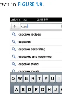
Productivity apps often require text entry for messages, search, or forms. Since these tasks are challenging in a mobile context and further complicated by the small keyboard, your app should minimize text entry as much as possible.
For example, as David views schedules on his way to the train station, it would be much easier if the app could detect his current location and display destinations in a predefined list. When free-form text is required, such as when he is compos-ing an email, the app should provide accelerators to minimize text entry and typing errors. Some of these features, such as spell check, are built into the iOS, and others, such as search suggestions, can be custom-designed. For example, the Google app suggests search matches based on the user’s past queries and popular queries on Google, as shown in FIGURE 1.9.
FIGURE 1.9 Google Search suggests search matches as the user types. NOTE
Productivity apps such as Facebook and Yelp use a grid to navigate to other sections of the app, not the tab bar. This will be dis-cussed in Chapter 9, “User Interface Design.”
Tab bar and options Title and navigation
List
> > > > >
Toolbar and actions Title and navigation
PRODUCTIVITY APPS 9
PRODUCTIVITY APP TOUR
Although there are thousands of Productivity apps, many of them can be grouped according to high-level user goals. These groupings are helpful when discussing user-centered design, but keep in mind they are not mutually exclusive.
In many cases, one app can help users achieve several related goals. For example, the Foursquare app enables users to “check-in” to places, navigate to places, and connect with members of the Foursquare community (FIGURES 1.10–1.12).
FIGURE 1.10 Foursquare check-in
FIGURE 1.11 Foursquare map FIGURE 1.12 Foursquare profile
We’ll review the following Productivity app groupings:
•
Stay connected•
Navigate the world•
Find information•
Transact and trackStay Connected
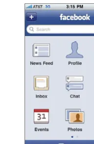
One of the primary reasons users have an iPhone is to stay connected with friends, family, and colleagues. Many apps in this category overlap with the iPhone’s built-in functionality, specifically the phone, text messagbuilt-ing, and email. Other widely used communication apps, such as Skype, Tweetie, and Facebook, support social networking and collaboration, as shown in FIGURES 1.13–1.15, respectively.
Common features in these apps are
•
Message creation•
Message management•
Contact management•
AlertsFIGURE 1.13 Skype FIGURE 1.14 Tweetie 2 FIGURE 1.15 Facebook
Navigate the World
With the iPhone’s built-in GPS capabilities (iPhone 3G and later) and magne-tometer (iPhone 3GS and later), users can locate themselves and get directions to almost anywhere in the world. The Maps application (default on every iPhone de-vice) is perhaps the most widely used mapping app, but there are many niche apps that focus on a particular city, method of transportation, or type of destination, as shown in FIGURES 1.16–1.18.
Common features in these apps include
•
Maps•
Directions•
The ability to pinpoint your current location•
The ability to find [something] nearbyFIGURE 1.16 Yelp FIGURE 1.17 CityTransit for the New York City subway
PRODUCTIVITY APPS 11
Find Information
Users turn to information-rich apps for news, entertainment, or reference mate-rial. These apps are typically connected to an existing web service but may also download and cache data for offline access. For example, the Dictionary.com app works as a stand-alone app but connects to the Internet for the “Word of the Day” as well as audio pronunciations. FIGURES 1.19–1.21show a variety of information-rich apps.
Common features in these apps include
•
Search•
Bookmarks•
Recents•
Favorites•
Featured content•
Content creation tools (for user-generated content)•
AlertsFIGURE 1.19 USA Today FIGURE 1.20 Howcast FIGURE 1.21 Thesaurus
Transact and Track
Many banks let their account holders check their account balances and pay bills using dedicated iPhone apps or third-party apps such as Quicken and Mint (FIGURES 1.22–1.23, respectively).
There are also numerous apps for tracking packages (such as FedEx’s app, shown in FIGURE 1.24), items for sale, and personal goals such as “to-do” lists, calorie counters, and exercise logs. Alerts, a common feature in this category, can be set for a particular date or milestone.
Common features in these apps are
•
Goal settings•
Ability to check current status•
Graphs that show progress over a specified time period•
AlertsFIGURE 1.22 Quicken FIGURE 1.23 Mint FIGURE 1.24 FedEx
The possibilities for Productivity apps are endless. As mentioned earlier in the chapter, the Productivity style may be combined with Utility or Immersive appli-cation styles. For example, a video app may offer the ability to find videos with the Productivity style but watch the videos with the Immersive style. The next section will discuss the Immersive style in more detail.
Immersive Applications
IMMERSIVE APPLICATIONS 13
Perform Specialized Task
About every three or four weeks, Sharon and her as-sistant receive a new shipment of artwork at her gallery. Although Sharon has a traditional level in the back of the gallery, she finds it easier to use the iHandy app since her iPhone is always in her pocket.
Her assistant typically holds the art in place as Sharon checks its level with iHandy. Afterward, she uses her iPhone to take photos of the art and then views it via the slideshow.
Although Immersive applications are relatively diverse, most can be recognized by the following characteristics:
•
Focus on the content•
Customized user experienceLet’s take a look at each of those characteristics.
FOCUS ON THE CONTENT
Immersive apps may take over the entire screen, including the status bar that displays battery and network information, as is done in many games, movies, books, and musical instruments. This immersion lets users focus exclusively on the primary content. Settings and other controls are within reach, but they may or may not be visible, depending on the app. For example, steering controls are of-ten shown when a driving game is played, but Play and Pause controls are hidden when a movie is being watched. FIGURES 1.25–1.26show a YouTube video in these two states.
FIGURE 1.25 YouTube video with controls hidden
FIGURE 1.26 YouTube video with controls shown
NOTE
While the iHandy Level is listed in the Utility section of the App Store, the appli-cation style is Immersive since the app takes over the entire screen and has a fully customized user experience.
CUSTOMIZED USER EXPERIENCE
Immersive apps often provide a fully customized user experience for which there are no standard controls outlined in the HIG. While it may be tempting to make all of your apps Immersive, be sure the design goals cannot be achieved with a Utility or Productivity application style. As mentioned earlier, incorporating stan-dard controls makes it easier for users to learn and use your app.
IMMERSIVE APP TOUR
Although you can theoretically create any type of app with the Immersive ap-plication style, the style is most effective for playing games, viewing media, and performing specialized tasks.
Play a Game
The App Store includes almost every kind of game imaginable: flight simulators, puzzles, role-playing games, board games, and so on. Some of these apps pro-vide simple graphical environments and controls, and others, such as The Sims 3 (FIGURE 1.27), offer multiplayer 3D experiences comparable to stand-alone gaming systems. Another growing area of interest is iPhone games that interact with “real-world” toys such as the Xachi iPhone app (FIGURE 1.28).
FIGURE 1.27 The Sims 3 (Courtesy of Electronic Arts Inc. © 2009 Electronic Arts Inc. All rights reserved. Used with Permission.)
FIGURE 1.28 Xachi iPhone app (Courtesy of Taptic Toys)
Viewing Media
IMMERSIVE APPLICATIONS 15
FIGURE 1.29 SlingPlayer FIGURE 1.30 Classics
Performing Specialized Tasks
The Immersive application style is appropriate for many specialized tasks, but a few use cases are popular: sound capture and creation, image creation, and mea-surement. The iPhone 3GS’s built-in Voice Memos app (FIGURE 1.31) and More Cowbell (FIGURE 1.32) rely heavily on metaphors, but apps such as Convertbot (FIGURE 1.33) can sport a customized UI that looks like none of the standard UI controls you’ll find in other apps.
FIGURE 1.31 Apple’s Voice Memos app
FIGURE 1.32 More Cowbell from Maverick Software
FIGURE 1.33 Convertbot from Tapbots
Choosing an Application Style
Whether you choose one application style or a combination of styles depends on your users’ needs, the type of experience you aim to provide, and the app con-tent. As mentioned earlier in the chapter, the Utility style tends to work well with “bite-sized” pieces of information, whereas the Productivity style is appropriate for more structured, hierarchical information. In contrast, the Immersive style is effective when the app has little or no structure, particularly with games.
To illustrate how you might choose an application style, imagine that your app has the following goal: to help users stay physically fit. Technically, all of the ap-plication styles can help users achieve this goal (as shown in FIGURES 1.34–1.36), but there are notable strengths and weaknesses associated with each style, as shown in TABLE 1.1.
The strengths and weaknesses of each application style will vary depending on your design goals, so it’s important to evaluate each project accordingly. Also, remember that many apps can contain more than one application style. With the previous exercise app example, it’s possible to use the Productivity style along with video instruction (Immersive style) as well as a flattened list of exercises (Utility style).
i
iExercise
Boat pose
• From a seated position, bring the legs straight up to a 45 degree angle. • Bring the arms out straight in line with
the shoulders. • Balance on the sit bones.
iExercise
Boat pose Wheel pose
Dolphin pose Bow pose
Excercises Goals Anatomy Search More
FIGURE 1.34 A Utility app could have separate screens for each exercise.
FIGURE 1.35 A Productivity app could use the tab bar to access different exercise tools.
SUMMARY 17
TABLE 1.1 Strengths and Weaknesses of Each Application Style Style Strengths Weaknesses
Utility Easy to swipe between exercises dur-ing a workout.
No overview screen, plus users may get bored with a small set of exercises (ten max).
Productivity Can provide a full-featured fitness app with many different exercise-related tools.
If lists are too deep, users may find it too difficult to navigate while working out.
Immersive Video is an established way to simu-late a real-world workout experience.
May be challenging to position in the gym; better suited for in-home use.
Summary
Apple’s iPhone Human Interface Guidelines describe three different application styles: Utility, Productivity, and Immersive:
•
Utility apps enable users to quickly access a specific type of information or perform a narrowly defined task.•
Productivity apps are more full-featured than Utility apps and encompass everything from social networking to mobile banking.•
Immersive apps are used to play games, view rich media, and perform spe-cialized tasks.Choosing an application style depends on your users’ needs, the experience you want to provide, and the content. You should evaluate the respective strengths and weaknesses of each type (as shown in TABLE 1.1) before determining which applica-tion type might be best. Keep in mind that the applicaapplica-tion styles outlined in the iPhone HIG are just a starting point; apps often include a combination of styles, and many build upon the guidelines to provide differing experiences. ■
19
iPhone Device
Overview
THIS CHAPTER WILL EXPLORE the iPhone device with an emphasis on the
technologies and hardware that define the iPhone user experience, such as
the multi-touch display, motion sensors, and location information.
In addition to explaining what’s possible with the device, this chapter will
provide best practices based on recognized usability principles and Apple’s
iPhone Human Interface Guidelines. Following these best practices will make
your app easier to use and may expedite its approval in the App Store.
At the conclusion of this chapter, you will understand how the iPhone’s
features can improve the user experience of your app. You may also be
inspired to explore and combine these features in innovative ways.
2
Reviewing the iPhone
and iPod Touch’s Features
On the surface the iPhone and iPod Touch look like simple devices, but upon closer inspection, their power and sophistication cannot be denied. Inside these devices are capacitive systems that support the multi-touch display as well as other sensors that detect light, motion, and direction. They are also packed with plenty of storage space, RAM, and a GPU (graphical processing unit) capable of rendering OpenGL (Open Graphics Library) graphics. In this chapter, we’ll review several features that are central to the user experience of many iPhone apps. Keep in mind that this list is constantly evolving. Visit the Apple web site for the most up-to-date information on both the iPhone1 and iPod Touch.2 Features reviewed in this chapter include
The Device Capabilities Framework
One addition you’ll find in the iPhone 3.0 SDK and later is the Device Capabili-ties Framework.3 This framework enables developers to detect which device
the app is being run on, as well as what sort of tasks the device can perform.
For example, let’s say that you’ve built an app for tracking your cycling activity. The app makes use of the GPS and maps, stores start and stop times (and way-points) along your ride, as well as calculates overall time, distance, and speed. You will want to make sure that the app can run on a particular device. In this case the app will work only on the iPhone 3G and later, since it uses Core Loca-tion and MapKit, features not found in the first-gen iPhone or the iPod Touch models. You could run a test when the application begins installation to ensure that the device has GPS capabilities. If it does, the app will install.
While this book won’t show you how to use the Device Capabilities Framework in your app, it’s nice to know it exists if you are building an app that requires some specific hardware feature. For examples of how to use the Device Capa-bilities Framework, see The iPhone Developer’s Cookbook, Second Edition, by Erica Sadun (Addison-Wesley, 2010).
1. www.apple.com/iphone/. 2. www.apple.com/ipodtouch/.
MULTI-TOUCH DISPLAY 21
•
Multi-touch display•
Light, proximity, and motion sensors•
Location information and compass•
Bluetooth•
Still and video cameras•
Microphone and speakerMulti-Touch Display
The iPhone’s multi-touch display lets users interact with the phone using their fingers. They can achieve these interactions through gestures (specific finger movements) performed on the user interface (FIGURE 2.1). Apple has defined a set of gestures for the iOS, but developers can create custom gestures for their applications. The keyboard, an integral part of the iPhone, is also accessed via the multi-touch display.
FIGURE 2.1 A user interacting with the iPhone multi-touch display
Multi-Touch Display Specifications
Screen size: 3.5 inches (diagonal)
Resolution: 480 x 320 at 163ppi (iPhone 3GS and earlier); 960 x 640 at 326ppi (iPhone 4)
Sensor system: The multi-touch display has a capacitive sensing system that contains a protective shield, a capacitive panel, and an LCD screen. When users touch the protective shield, the capacitive panel senses the position and pres-sure, then transfers the information to the LCD screen below.
SUPPORTED GESTURES
The iPhone supports eight different gestures, as noted in TABLE 2.1. Gesture usage varies based on the application and context. In the Photos app, for example, zoom is enabled in the built-in photo detail view but not when you’re looking at a grid of photos. As much as possible, you should keep gestures consistent with those sup-ported by the iOS and outlined in the HIG. Inconsistent gesture usage can lead to frustration, confusion, and usability problems. Users may generate more errors, take longer to complete tasks, and even wonder if your app is broken.
TABLE 2.1 The iPhone’s Gestures Gesture Action
Tap To select a control or item (analogous to a single mouse click)
Drag To scroll or pan (controlled; any direction; slow speed)
Flick To scroll or pan quickly (less controlled; directional; faster speed)
Swipe Used in a table-view row to reveal the Delete button
Double Tap To zoom in and center a block of content or an image
To zoom out (if already zoomed in)
Pinch Open To zoom in
Pinch Close To zoom out
Touch and Hold In editable text, to display a magnified view for cursor positioning
Also used to cut/copy, paste, and select text
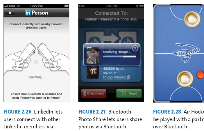
CUSTOM GESTURES
Apps sometimes include custom gestures to support an interaction not explicitly available in the iOS. Most custom gestures are created for immersive applications such as games, art, or music, as shown in FIGURES 2.2–2.4. They may simulate real-world interactions such as swinging a baseball bat or include entirely new gestures created especially for the application. Custom gestures are generally not appropri-ate for Productivity and Utility applications, as most tasks within these applica-tion styles can be accomplished with the gestures supported by the iOS.
If you plan to create custom gestures for your app, read the sidebar “Custom Gesture Tips,” contributed by Robert Spencer.
NOTE
For example, Single Tap is used to read labels associ-ated with UI elements and Double Tap is used to complete actions related to the element. Chapter 12, “Accessibility and Localiza-tion,” discusses this topic in more detail.
MULTI-TOUCH DISPLAY 23
FIGURE 2.2 FlickTunes uses Flick to enable users to play and pause while driving.
FIGURE 2.3 Baseball ’09 uses shorter gestures to generate a shorter swing.
(Courtesy of Prof. Robert J. Spencer, Creative Director, Spinfast)
FIGURE 2.4 Cricket uses an upward flicking motion to create a slashing drive.
(Courtesy of Prof. Robert J. Spencer, Creative Director, Spinfast)
KEYBOARD
The multi-touch keyboard can be customized for each task. Common keyboard use cases include search, messaging, filling in forms, and entering URLs.
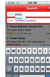
Search
Search keyboards follow the standard keyboard arrangement for each language, with the exception of a blue Search button that often appears in the Return key position (see FIGURES 2.5–2.7). The pane above the keyboard contains the query field(s) and related controls above a transparent gray results area.
FIGURE 2.5 Google Search FIGURE 2.6 Yelp Search FIGURE 2.7 NYTimes Search
Custom Gesture Tips
By Robert Spencer, Creative Director, Spinfast
When designing gestures for the iPhone, there are a number of unique issues to consider. The first is what will be hidden under the finger and hand as the gesture is made. This might not be an issue if the screen is static, but when things are mov-ing, as in a game, the finger can obscure quite a large amount of the display. In my sports games I often incorporate this into the challenge of the game, but in many cases the interface might need to be designed to ensure that important informa-tion is not obscured.
As in all UI design, I work to simplify gestures as much as possible, but it is impor-tant to be very specific about the requirements for a gesture. For example, an “up” gesture may be described as anything that starts at the bottom of the screen and ends at the top, but should an N-shaped gesture be treated differently? It can be algorithmically difficult to differentiate similar gestures even with clarity of the gesture descriptions, so it really pays to be very clear from the start.
It’s also important to provide good feedback to users that their gestures are being recognized. For simple gestures such as a Flick to turn pages, it is probably enough to trigger the “page-turning” animation once the gesture is recognized, but for more complex gestures or when finer control is required, I have found that more feedback is required, such as painting a “gesture trail” on the screen. Obviously it is important that the trail match the gesture with very high fidelity and be drawn quickly, so the application needs to reserve sufficient CPU resources to cope with that.
Similarly, it can sometimes be tempting to encourage fast gestures in an effort to capture an indication of velocity, but this approach can easily backfire if the device is unable to detect the gesture correctly. CPU limitations can lead to partial detec-tion of the gesture or sometimes no detecdetec-tion of the touch at all.
Depending upon your application, it might also be necessary to consider other physical issues such as the handedness of the users and the ease of making various gestures (it’s easier to slide a finger down glass than straight up, most people hold their devices on an angle, etc.).
MULTI-TOUCH DISPLAY 25
Messaging and Status Updates
Messaging apps typically include the standard keyboard arrangement (as shown in FIGURES 2.8–2.9) with additional “@” and “.” buttons when an email address must be entered (FIGURE 2.10). Clicking on the “123” button displays the numeric keyboard, and clicking on the “ABC” button takes the user back to the main key-board. The layout of the top pane varies among apps. At a minimum, it includes one form field along with Send/Post and Cancel buttons.
FIGURE 2.8 TweetDeck status update
FIGURE 2.9 LinkedIn status update
FIGURE 2.10 NYTimes article shared via email
International Keyboards
The iPhone enables users to add keyboards for other languages and access them via the Globe icon (shown earlier in FIGURES 2.8–2.10and also in FIGURES 2.11–2.12). Keyboards accessed via the Globe are not necessarily languages; for example, the Genius app enables users to access emoticons as a different language from any app with text entry (FIGURE 2.13).
FIGURE 2.11 Japanese keyboard
FIGURE 2.12 French keyboard
FIGURE 2.13 Emoticon keyboard
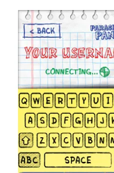
Custom Keyboards
Developers can also create custom keyboards, as was done in Parachute Panic, shown in FIGURE 2.14. Custom keyboards are most appropriate for games or other creative applications. If you’re creating a Productivity or Utility app, in most cases you should stick to the standard keyboard.
FIGURE 2.14 Parachute Panic’s custom keyboard
Other Text Entry Features
Other related text entry features include spell check and editing (copy, paste, insert cursor). These features are provided by the iOS, so you don’t have to develop custom solutions for your apps. They can be enabled or disabled via the UITextIn-putTraits Protocol Reference.5
Keyboard Usability Issues
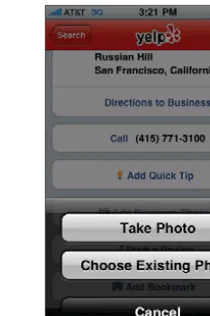
Some users find that the keyboard is too small. As a result, they tend to make more text entry mistakes than they would if they were using a traditional key-board. Although predictive auto-correct can minimize typing errors, it has its own set of usability issues. The control for rejecting recommendations is even smaller than the keyboard keys (FIGURE 2.15). Moreover, hurried users are known to accidentally accept an incorrect recommendation. You can try to minimize these issues by incorporating shortcuts and app-specific recommendations as much as possible.
LIGHT, PROXIMITY, AND MOTION SENSORS 27
FIGURE 2.15 The affordance for rejecting predictive auto-correct recommendations is smaller than the keyboard keys. Note that this is an iPhone standard; this was not introduced by Yelp.
Light, Proximity, and Motion Sensors
In addition to the sensors embedded in the multi-touch display, the iPhone includes light, proximity, and motion sensors that detect the orientation of the device.AMBIENT LIGHT SENSOR
The ambient light sensor brightens the screen in sunlight and dims the screen in darker conditions. This feature helps the phone conserve display power and improves the battery life. Although the sensor is not currently available through the API, this may change in the future and could lead to innovative context-aware applications.
PROXIMITY SENSOR
The proximity sensor can trigger events when the phone is close to the user’s face (about .75 inches away).6 The built-in phone app uses this sensor to turn off the display when users are talking, thereby preventing them from accidentally inter-acting with the screen. Similarly, the Google Search app uses the proximity sensor to activate voice search, as shown in FIGURE 2.16.
6. iPhone Dev Center, “UIDevice Class Reference,” http://developer.apple.com/iphone/library/ documentation/UIKit/Reference/UIDevice_Class/Reference/UIDevice.html.
FIGURE 2.16 Google Search activates voice search using the proximity sensor.
MOTION SENSOR
One of the most widely used sensors is the accelerometer, also known as a “ motion” sensor. The accelerometer can detect the iPhone’s orientation and adjust the display accordingly. Perhaps the most practical accelerometer feature is the ability to change the display from portrait to landscape when the iPhone is rotated. Other accelerometer-based features can be found in games, musi-cal instruments, contact management tools, photography tools, e-readers, and pedometers (see FIGURES 2.17–2.19for a few examples).
FIGURE 2.17 Marble Maze uses the motion sensor to move the silver ball through the maze.
FIGURE 2.18 Bump uses the accelerometer to detect when the user shakes the device as a way to exchange contact information.
FIGURE 2.19 ProCamera uses the motion sensor to improve image capture. NOTE