For your convenience Apress has placed some of the front
matter material after the index. Please use the Bookmarks
Contents at a Glance
About the Author ...
xvii
About the Technical Reviewer ...
xix
Acknowledgments ...
xxi
Introduction ...
xxiii
Chapter 1: Welcome to a Touch-First World
■
...
1
Chapter 2: The Windows Design Language
■
...
11
Chapter 3: Designing Windows 8 Applications
■
...
25
Chapter 4: Visual Studio 2012 and Windows Store Application Types
■
...
33
Chapter 5: XAML Controls in the Visual Studio Toolbox: The Common Controls
■
...
45
Chapter 6: XAML Controls in the Visual Studio Toolbox: Other Controls
■
...
67
Chapter 7: Building the User Interface
■
...
91
Chapter 8: Data Binding
■
...
105
Chapter 9: Introducing MVVM
■
...
127
Chapter 10: Starting the ViewModel
■
...
141
Chapter 11: Inversion of Control
■
...
165
Chapter 12: The Role of Service Agents
■
...
175
Chapter 13: Asynchronous Programming Model
■
...
181
Chapter 14: Mocking the Service Agent
■
...
199
Chapter 15: Connecting to Data in the Cloud
■
...
209
Chapter 17: Interacting with Windows Search and Share
■
...
243
Chapter 18: Notifications and Tiles
■
...
259
Chapter 19: Sensors, Devices, and the Location API
■
...
273
Chapter 20: Sharing Apps in the Windows Store
■
...
285
Index ...
293
Introduction
Welcome to Beginning Windows 8 Application Development: XAML Edition. When I was first asked to produce a sample table of contents for what my Windows 8 development book would include, I spent a lot of time thinking about the aspects of Windows 8 development that I felt would be most important to help a developer just learning to write software in a XAML-based environment. I thought back to when I was first learning to apply BASIC to an event-driven, GUI environment and realized that I would have been most helped by being walked step-by-step through the creation of a simple but complete application. The majority of this book focuses on introducing you to concepts that should be applied to production Windows 8 applications and then integrating those concepts into an application that should be relevant to most readers. I hope that you learn as much reading this book as I did writing it.
Whom This Book Is For
This book is intended for developers who have learned the basics of the C# programming language and the Microsoft .NET platform and are ready to expand their knowledge by learning how to combine these skills with XAML and the new Windows 8 platform. This book will also serve as a valuable resource for developers who have more experience but are new to building XAML-based applications.
How This Book Is Structured
This book can be logically split into three parts. In Chapters 1 through 6, you will learn about the design style used in Windows 8 applications and the tools that Visual Studio provides to create applications in this style. In Chapters 7 through 16, core concepts used in developing Windows 8 applications are unfolded and integrated into a sample application that you will build in exercises. Chapters 17 through 20 introduce additional concepts that were not integrated into the sample application but will be valuable to the developer beginning to write Windows 8 applications.
Downloading the Code
The code for the examples shown in this book is available on the Apress web site (www.apress.com). A link can be found on the book’s information page on the Source Code/Downloads tab. This tab is located in the Related Titles section of the page.
Contacting the Author
Chapter 1
Welcome to a Touch-First World
Following the light of the sun, we left the Old World.
—Christopher Columbus
In April 2010, I first heard the phrase that was Microsoft’s new strategy: “three screens and the cloud.”
This referred to a targeted approach to make sure that Microsoft’s products were ubiquitous on mobile phones, desktop computers, and television screens and that these platforms provided a seamless experience by being held together with data in the cloud. The products represented on the three screens were Windows Phone 7, Windows 7, and Xbox 360. Microsoft still dominates the television screen with its Xbox line accounting for approximately half of all game consoles sold worldwide and a continued focus to move that platform beyond gaming, but to me Windows 8 brings a different meaning to three screens and the cloud—one where the three screens include phones, tablets, and PCs all running on the Windows 8 core and tied together with cloud services, as shown in Figure 1-1.
This book is about developing applications in this new environment, but before you start any development, you need to understand the environment and how it will be used. In this chapter, I will discuss some background on the user interface of Windows 8 and how users will interact with applications running on this platform. I will focus mostly on touch, but because Windows 8 is touch-first environment and not a touch-only environment, I will also cover when touch is not appropriate and alternative input methods.
Moving to More Natural Interaction
In 1985 users interacted with PCs primarily using a keyboard, but the first Macintosh was increasing the popularity of the mouse, and Microsoft introduced Windows 1.0, which was essentially a shell that allowed people to point and click to open programs and documents instead of requiring them to remember appropriate commands to type. These mouse-based environments were successful in both the business and consumer markets and made computing accessible to the masses; by the time Windows 95 was released, PCs were not uncommon in people’s homes.
Over the years, computer and software makers have flirted with the idea of a computer that could be carried anywhere in a pocket or attached to your belt. Apple attempted to realize this vision as early as 1992, but it wasn’t until the mid-2000s that technology really caught up and hardware manufacturers could create small, lightweight computing devices capable of running software comparable to what would be found in the desktop. By the time hardware was ready for prime-time mobile computing by consumers, the Windows brand was firmly entrenched in the market, and Microsoft made several attempts with Windows CE, Pocket PC, and various flavors of Windows Mobile to create a mobile experience that was simply a scaled-down version of Windows. This approach yielded screens that required a lot of precision to interact with, and computers running the mobile version of Windows were largely looked at as specialized devices and not accepted by the average consumer.
The introduction of Windows Phone 7 in 2010, likely driven by the successes of Apple’s iPhone three years before and subsequent popularity of Android, discarded the notion of a tiny version of Windows and went with an entirely new user interface concept dubbed Windows design style. Windows design style is based on a set of core design principles focused around the user, and the finger became the primary tool for interacting with the computer. Unlike with previous versions of Microsoft’s mobile operating systems, Windows Phone devices no longer shipped with the stylus being a standard component.
With Windows 8, Microsoft has taken the opportunity to hit the “reset” button on user interface expectations and reversed its previous strategy by, instead of taking desktop concepts to the mobile world, bringing the interactions that are natural by necessity in the mobile world to the desktop environment.
Windows 8 Touch Language
With the full incorporation of touch as a first-class citizen in Windows 8, it is important to understand the language of touch gestures recognized by the operating system. This is important not only as a user of Windows 8 but even more so as a developer who wants to make sure users can learn applications as quickly as possible and have a consistent experience. The Windows touch language consists primarily of eight gestures, which I will discuss in this section.
Press and Hold
CHAPTER 1 ■ WELCOME TO A TOUCH-FIRST WORLD
Tap
While the press and hold gesture can easily be equated to a single mouse gesture, the same cannot be said for the
tap gesture. The tap gesture, illustrated in Figure 1-3, is intended to invoke the primary action on a user interface element. Often, this will be an action such as activating a button or following a link. The mouse gesture most closely resembled by the tap gesture is the left-click, but the left-click is also used for other tasks that have their own gestures in the touch language such as selection. This gesture is accomplished by placing a finger on the user interface element and then immediately lifting the finger straight up.
Figure 1-2. Press and hold
Slide
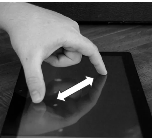
The slide gesture in the Windows touch language, shown in Figure 1-4, is used for panning or scrolling content that extends beyond the bounds of the screen or a screen section. In a mouse-driven environment this is accomplished using scrollbars, but with touch, the slide gesture is more natural, and the scrollbar would either have to grow to the point of taking up too much real estate on the screen or be a difficult touch target. To accomplish the slide gesture, a finger is placed on the screen and then pulled up and down or side to side depending on the orientation of the content.
Swipe
The swipe gesture is used to communicate selection, much like left-click, Control + left-click, and Shift + left-click are used when interacting with the computer using a mouse and keyboard. To achieve this gesture, shown in Figure 1-5, the finger is placed on the screen either on top of or adjacent to the item selected and then drawn through the item. The direction of the gesture depends on the orientation of the content, with horizontally oriented content being swiped vertically and vertically oriented content being swiped horizontally. The gesture going against what would be used to slide sometimes causes it to be referred to as a cross swipe. Use of this gesture as opposed to a tap eliminates the confusion that could be created when trying to accomplish multiselect scenarios with no keyboard modifier keys such as Control and Shift that aid in mouse selection.
CHAPTER 1 ■ WELCOME TO A TOUCH-FIRST WORLD
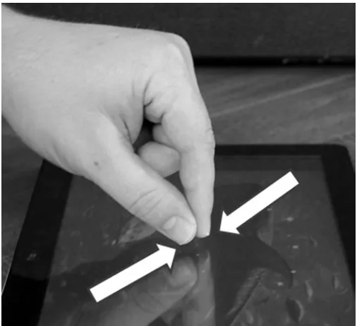
Pinch
The pinch gesture, illustrated in Figure 1-6, does not have a direct equivalent in most mice and is considered a “zoom” gesture. The pinch zooms out from a narrow view with a high level of detail to a broader view with less detail. You will see in later chapters that in addition to the optical zoom, applications can take advantage of this gesture at a semantical level as well and use it to navigate summary and detail data. To accomplish the pinch gesture, two fingers are placed separated and roughly equidistant from the center of the element that is the target of the gesture, and then the fingers are slid together until either the desired zoom is met or the fingers meet.
Figure 1-5. Swipe
Stretch
The stretch gesture, shown in Figure 1-7, is the opposite of the pinch gesture both in its execution and in the results. The stretch gesture is used to zoom in from a broader, less-detailed view to a narrower view with more detail. As with pinch, you will find that applications can be designed to allow the gesture to be either an optical zoom or a semantical one. To accomplish the gesture, fingers are placed together centered on the element to be zoomed and then are moved in opposite directions along the screen until either the desired zoom level is achieved or one of the fingers reaches the edge of the screen.
Swipe from Edge
As you learn more about Windows 8 and the Windows design language, you will find that content is king and anything that distracts from the content is to be left off the screen. You will also find that users need to be able to perform actions with the least effort possible. Windows applications balance these needs by placing less frequently accessed commands off the edge of the screen in what are called app bars and charm bars. The swipe from edge gesture, illustrated in Figure 1-8, is used to access these commands. To achieve the gesture, a finger is placed beyond the edge of the screen and then pulled onto the screen.
CHAPTER 1 ■WELCOME TO A TOUCH-FIRST WORLD
Turn
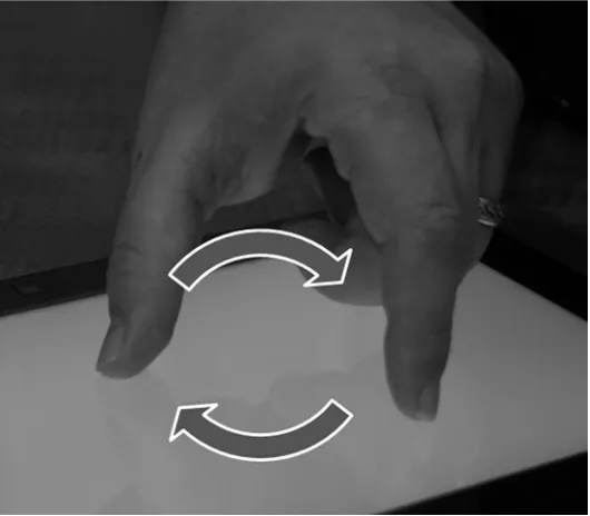
The turn gesture, illustrated in Figure 1-9, is used for rotating either the view or the content within the view. One example of where this type of gesture could be used would be in a touch version of the classic video game Tetris, where falling blocks can be rotated to fit together. To accomplish this gesture, two fingers are placed on the screen, and then either both fingers are pulled around the circumference of a circle or one is rotated around the other, which remains stationary.
Figure 1-8. Swipe from edge
Keys to a Successful Touch Interface
Building a successful touch interface requires careful thought and consideration on the part of the designer and developer. Many of these considerations are embedded in the design principles governing the Windows design style, which I will discuss in Chapter 2, but in this section I will discuss a few concepts that are critical to touch interfaces, whether or not they use the Windows design style.
Responsiveness
Although responsiveness is important for any application, it is especially important for users of a touch application to never be left looking at an unresponsive screen. Users are aware, even if only at a subconscious level, that a mouse pointer is a much more precise tool than the end of a finger, so if it is not readily apparent that the user’s last command was accepted and is being carried out, the user is likely to feel like they did not hit the target and issue the command again. Responsiveness can be achieved with actions such as giving a visual clue that a long-running process is begun or ensuring that content follows the user’s finger as it is dragged across the screen.
Touch Targets
As mentioned in the previous section, the mouse pointer is a far more precise tool than the human fingertip. While nothing can eliminate the possibility of the user missing targets within certain applications, using large touch targets spaced well apart is an important way to minimize missed targets. When at all possible, targets should be no smaller than 7mm square with at least 2mm between them. As a general rule, when hitting the wrong target has severe consequences or is hard to correct, the target should be larger in proportion and should also have more space between it and other targets.
Intuitive Interface
To the end user, the best applications “just work.” Usually this is because the application makes it easy for the user to do what needs done, rather than figure out how to do what needs to be done. Many desktop applications today make up for a lack of intuitiveness by providing detailed instructions in tooltips that appear as the user explores the application with their mouse pointer. Touch interfaces can still use tooltips, and the touch language defines the press and hold gesture for this type of learning, but it takes more effort than with a mouse, so more effort should be put into a design that clearly communicates what the user should do.
Beyond Touch
Like Windows 8 does, this chapter has put a lot of importance on the user interacting with the computer through the use of touch gestures. It should be noted, however, that the Windows 8 user interface is referred to as
touch-first and not as touch-only. Windows 8 boasts the ability to run on much of the hardware that ran on Windows XP and Windows 7 and in many cases will perform better because of optimizations that have been made to accommodate mobile devices. This means that even though vendors are rushing to market with innovative touch hardware, for the foreseeable future, application developers need to acknowledge that many of their users will approach the application equipped only with a keyboard and mouse.
CHAPTER 1 ■ WELCOME TO A TOUCH-FIRST WORLD
most monitors today. Hardware vendors will meet this new need by continuing to innovate, and you will likely see changes such as multitouch trackpads replacing the traditional mouse and monitors that adjust to lie flat or at least angled on the desk. Additionally, I expect to see Microsoft’s Kinect device used in even more innovative ways than seen today.
Conclusion
The Windows Design Language
It seems that perfection is reached not when there is nothing more to add, but when there is
nothing to remove.
—Antoine de Saint-Exupéry (translated from original French)
Beyond the basic touch principles discussed in the previous chapter, the design teams at Microsoft developed the Windows Design Language, which is used to guide the user interface development for Windows Phone 7, for Windows Phone 7.5, and now for Windows 8. The Windows Design Language was inspired by the simple, easily understood language seen in street signs in metropolitan areas and in mass transit and strives to bring this simplicity and intuitive flavor to computing. In this chapter, I will cover the elements of the Windows Design Language, show examples, and explain how Windows 8 incorporates them. Before jumping into the Windows Design Language itself, I will cover the Swiss design style, whose influence can be clearly seen in elements of Windows.
Swiss Design Style
The Windows Design Language is influenced most by a design style known as the Swiss design style or
international typographic style, which began development in Switzerland in the 1950s and really started coming into its own in the 1960s and 1970s.
Influence of Bauhaus
CHAPTER 2 ■ THE WINDOWS DESIGN LANGUAGE
Elements of Swiss Design
The Swiss design style is characterized by a number of elements, which I will discuss in this chapter. These elements include typography, photography, iconography, generous use of whitespace, and strict organization. Brought together, the elements produce the distinct look and feel of a work designed in the Swiss style.
Typography
Front and center in the Swiss design principles is typography. The developers of the Swiss style and those who design with it today hold steadily that text should be clear and simple and that unnecessary adornment not only occludes the message being conveyed in the text but also actively distracts from the message. In keeping with the idea that text should be clear, concise, and simple, Swiss designs will typically feature sans-serif fonts with text left justified and jagged on the right. Figures 2-2 and 2-3 are examples of a newsletter designed using justified columns and a serif font (Times New Roman) followed by the same newsletter designed using a sans-serif font (Helvetica) and left justified to align with Swiss design principles. Look at the marked difference specifically in the typeface between the two examples and how the sans-serif typeface produces a cleaner look. The headlines are especially good examples of this.
Figure 2-2. Mock newsletter in non-Swiss style
CHAPTER 2 ■ THE WINDOWS DESIGN LANGUAGE
In addition to the focus on simple, sans-serif typefaces, another key element of Swiss design with regard to typography is the use of contrasting font size and weight to draw attention to certain points in the text or to create emphasis. This calls for stark differences in font sizes when different font sizes are used, so while some design schools may allow for 12-point headlines and 10-point body text, the same publication designed using Swiss design may find 18-point headlines and 10-point body text to ensure that there is no question about the difference between the two.
Photography
Swiss design is also marked by the idea that the design should convey a sense of reality and that visual elements will be perceived as “more real” when photographs are used in place of drawn illustrations.
Figure 2-4 shows the sunset over a body of water. The photograph captures the ripples in the water and the effect of the sun’s light on the water in a way that feels very real to the viewer.
Figure 2-5 also depicts the sunset over a body of water. Many of the same elements are present, such as the sun’s reflection over ripples in the water and silhouetted figures, but the theories driving Swiss design hold that the viewer is not left feeling as though what they are viewing is real when illustration is used instead of photography. Both the photograph and the painting are pleasing to the eye, but the photograph is more in line with the Swiss style.
Iconography
While photographs are favored over drawings or other illustrations in many cases, works created using Swiss design often include extensive use of icons either to augment or in place of text. This is particularly the case when Swiss design is used in a setting where information must be conveyed to an international audience or one where you cannot be sure that the viewer needing to consume information being conveyed can read words printed regardless of the language. Rich iconography used in conjunction with other elements of Swiss design made a big show on the international stage during the 1972 Summer Olympics in Munich, Germany. Otl Aicher designed the brochures and leaflets for the Olympic Games in the Swiss style and used what is now a familiar system of figure icons to represent individuals participating in various events for the games. This helped communicate with the international audience present for the games. Additional places where you see prominent examples of Swiss design and iconography are in bus and train stations, on restrooms in public places (Figure 2-6), and as warning signs on many consumer goods.
Figure 2-5. Sunset over the water painting
CHAPTER 2 ■ THE WINDOWS DESIGN LANGUAGE
Generous Use of Whitespace
In Swiss design, content is king. Too much of anything packed haphazardly into a space is considered too cluttered or noisy and a distraction from the information being conveyed. This leads to a design goal that includes plenty of whitespace to ensure that anything appearing within an expanse of whitespace immediately becomes the center of attention.
Figure 2-7 shows a dog that appears to be on watch in a snowy country setting. “The Sentinel” is a descriptive caption, but no particular attention is drawn to either the dog or the caption because the contents are all allowed to run together without any separation and because the trees produce noise that detracts from the message of the caption. While this figure is visually appealing, it lacks the stark contrast pursued when using Swiss design principles. I’ll use the natural whitespace present in the expanse of snow to highlight both the portion of the photo where I want attention focused and the caption, as shown in Figure 2-8.
Figure 2-8. Photo and caption with whitespace for contrast
In Figure 2-8, the only change that I applied was to move the text out of the noise produced by the trees, allowing the caption to sit by itself within uninterrupted whitespace. This narrows the focus of the photograph to exclude more of it that is not that direct subject and really makes the caption stand out. More of the photograph could have been cropped from the top and bottom to bring even more focus to the subject, but in this case enough was left to ensure the winter scene was not lost on the viewer. Neither the first nor the second version should be considered better or worse because there are instances where the intent would be to keep focus on the entire setting and where adhering to the principles of Swiss design is not a goal, in which case the first may be preferred.
Strict Organization
In keeping with the overarching theme of clean simplicity and avoiding anything that distracts from the content, Swiss design is typically marked by strict organization. This is observed in the uniformity of geometric figures as well as in the use of font size to communicate informational hierarchy within text and adherence to a grid system to lay out both text and other visual elements in a structured manner. The use of grids is definitely not limited to the Swiss style and has been around typography design for centuries. With a grid-based design, the design surface is divided into one or more grids that are used to position text and elements with cells. This provides for an organized and aligned look. At times, the use of grid layout may not be quite as evident as at other times because the grid lines need not be perpendicular and parallel with the edges of the design surface, making it possible for a design to use a grid layout while the content appears angled to the viewer.
Figure 2-9 shows the structural organization achieved by using a grid layout, but it also demonstrates the way that typography is used to achieve organization within the Swiss design style by using a stark difference in font size to delineate different levels within the informational hierarchy. At the highest level of the informational hierarchy, the page header is presented in a 56-point font size. At the next level, group headers are given around one-half the font size of the page header. At the lowest level of the hierarchy for this page, the item title is about half the size of the group header.
CHAPTER 2 ■THE WINDOWS DESIGN LANGUAGE
Windows Design Language
Rooted heavily in the Swiss design style that we’ve just covered, the Windows Design Language guides user experience design for the Windows Phone 7/7.5 and Windows 8 operating systems as well as for current incarnations of the Zune and Xbox 360 user interfaces, striving to give a consistent look and feel regardless of which device you are interacting with.
Windows Design Principles
In the earliest guidance given by Microsoft on the Windows Design Language, the Windows design style was characterized as a confluence of five guiding principles rather than a book of rules or recipes. In this section, I’ll cover the principles that you should weigh when making design choices.
Show Pride in Craftsmanship
Not even the smallest detail should be left to chance in your user interface. Everything the user sees and experiences should be part of the plan and work according to that plan. Additionally, information should be presented according to a carefully thought out visual hierarchy and should be laid out using a grid-based design.
Be Fast and Fluid
Applications should allow users to interact directly with the content and should remain constantly responsive by using motion to provide feedback to interactions. Applications should typically be designed with “touch-first” in mind.
Be Authentically Digital
One of the most shining examples of a failed user experience experiment from Microsoft came with the release of Microsoft Bob in 1995. This application was a shell for the operating system that intended to abstract away the whole “computerness” of the computer by providing real-world analogies for different operations. If you wanted to retrieve documents, you clicked the file cabinet. Need to write a letter? Click the pen on the desk! Bob’s failure was driven ultimately by two factors. The first was that it was perceived as childish and patronizing (many shells similar to Bob do find favor in preschool classrooms). The second was that it simply was not an effective way for people to interact with the computer, and introducing abstractions intended to hide the computer tended to make interactions much less efficient, especially for people who have to use a computer all day. The Windows design principles acknowledge that people know they are interacting with a computer and call on designers to embrace the medium. This includes using the cloud to keep users and apps connected and effectively using motion and bold, vibrant colors to communicate with the user.
Do More with Less
Win As One
One of the keys to working in a Windows style application is that the style has been set. Users of a Windows application will be opening your application with the expectation that they will already have some level of familiarity with the application because they are familiar with the look and feel of other Windows applications. One of the things that can really be harmful to individual applications and eventually to the ecosystem in which the applications reside is design decisions that radically change the design paradigm of the application to give users something “new” and “better” than what they are used to having. You should strive to impress your users with how well your application does the things it is meant to be good at, but trying to surprise those users by changing user interface and navigation paradigms will only confuse them and make them lose trust in your application. Microsoft has provided guidance, tools, templates, and style sheets to make it easy for developers to create Windows applications with a consistent look and feel, and you should make full use of these resources.
Windows User Experience Guidelines
In addition to the more generalized principles that Microsoft has published for Windows applications, a comprehensive set of guidelines has also been made available in order to provide detailed prescriptive guidance in regard to the look, feel, and behavior of applications designed to run in the Windows ecosystem. Although not a comprehensive treatment of these guidelines, which are freely available in their entirety on the MSDN Library web site at http://dev.windows.com, this section covers a few of the aspects that are most applicable to designers/developers getting a feel for the Windows experience.
Application Layout
Applications should be designed using a grid layout organized using either a hierarchical navigation scheme or a flat view, as dictated by the content.
When a hierarchical approach is taken, the top of the hierarchy represents the lowest level of detail, and each subsequent level in the navigation hierarchy zooms in with increasing detail. Typically the highest level, sometimes referred to as Hub, is the entry point of the application and reveals one or more groups that the user can drill into (see Figure 2-10).
CHAPTER 2 ■ THE WINDOWS DESIGN LANGUAGE
By selecting (note “select” vs. “click” because we’re in a touch-first environment where “select” may be a “click”, a “tap”, or even a keystroke) a group from the main Hub, the next level of navigation (commonly referred to as Section) is revealed. The Section page is arranged to provide some context about the Section itself and lists the individual items that are the lowest level of navigation and highest level of detail (see Figure 2-11).
From the Section page, the user is offered a way to navigate back up a level, typically through the use of a back arrow, as shown in Figure 2-11, to the Hub; a means to navigate to sibling Section pages through a swipe gesture (if touch enabled) or through the use of arrows at the left and right edge of the screen centered vertically; or items to select in order to continue to the Detail page. At the Detail page level of navigation, a granular view of the item data is presented (see Figure 2-12). As with the Section page, the back arrow is presented to allow for navigation up the hierarchy to the Section page in which the item is organized. As with Section pages, users can choose to navigate between Detail pages within the same section through the use of a swipe gesture on touch-enabled systems or through interaction with arrows at the left and right edge of the screen. The hierarchical navigation is especially well suited for browsing and interacting with information that can be fit into master-detail categorization. For an excellent example of a Windows style application designed with a hierarchical navigation structure running on a platform other than Windows 8, take a look at the Microsoft Zune application running on Windows 7 or at the Windows style user interface on Xbox 360.
Many applications do not fit into the master-detail categorization that works well with a hierarchical navigation structure and focus more on the document-based style familiar with Microsoft Word, Excel, or Internet Explorer. For this type of application, a flat navigation system works much better. At the core of the flat navigation is that content is separated into pages with information that is either unrelated or at the same hierarchical level (see Figure 2-13). The Navigation Bar is presented when activated by the user and is used to switch between active documents, often presenting a command that the user can use to add a document to the session (see Figure 2-14).
Figure 2-12. Hierarchical navigation at Detail page
CHAPTER 2 ■ THE WINDOWS DESIGN LANGUAGE
Typography
With its heavy emphasis on typography and text-centered content, no coverage of the Modern UI user experience guidelines would be complete without providing advice for the formatting and use of text. Following in the tradition of Swiss design, consistent fonts should be used when building applications. Which specific font should be used varies by the purpose of the text. Text that is intended to be used for buttons or labels on UI elements should favor the Segoe UI font, which is used throughout Windows 8 user interface elements (see Figure 2-15).
Blocks of text that are to be presented to the reader in a read-only fashion, such as news articles, should favor the serif Cambria font because readers are accustomed to extended blocks of text being presented in a serif font (see Figure 2-16). This font should be presented in either 9 points, 11 points, or 20 points depending on the need to draw focus or show emphasis. This is a departure from the Swiss style’s preference for sans-serif fonts in all things because the Modern UI design team found serif fonts to be easier on the eyes for extended reading.
Figure 2-15. Segoe UI is used for labels and other UI elements
Figure 2-16. Cambria for read-only text blocks
Continuous blocks that are intended for the user to both read and edit should favor the sans-serif font Calibri (see Figure 2-17). The recommended size for this font is 13 points, which shares the same height as 11-point Segoe UI, so the two will maintain a consistent appearance when used together on the same line.
Regardless of the font face, when emphasis is needed on certain pieces of text, the appropriate way to produce emphasis is through the use of stark contrast with the font size or the font weight. At the same level within the information hierarchy, weight is used for emphasis, while size draws the distinction between levels. Using text decorations such as underline or italics reduces clarity and should not be used for emphasis in a Windows application.
Other Windows User Experience Guidelines
In this section, I have touched on some of the user experience guidelines but have intentionally focused on those that deal with the visual look of the application, leaving more of the behavioral aspects to topics that will be covered elsewhere in this book when I cover the tools available to developers for building great Windows applications. If you want to see these guidelines all in one place or don’t want to wait, I encourage you to take a deeper look at the Metro-style apps section of the MSDN web site (http://msdn.microsoft.com).
Styling in the Windows 8 User Interface
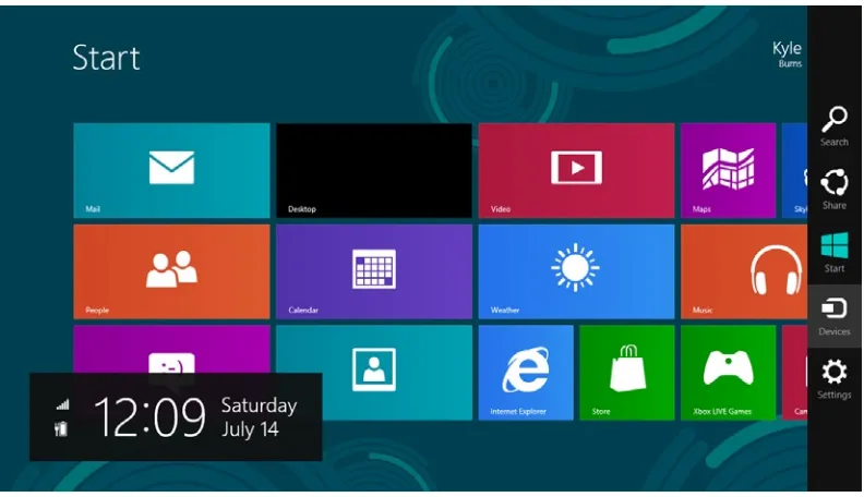
With the exception of Desktop mode, which is present in Windows 8 running Intel-based processors, the Windows 8 user interface is largely based on Windows style guidelines and principles. Let’s start by looking at the Start screen (see Figure 2-18).
Figure 2-17. Calibri for read-write text blocks
CHAPTER 2 ■ THE WINDOWS DESIGN LANGUAGE
The Start screen features a full-screen grid displaying the applications that are most important to the user (indicated by the user selecting the app for inclusion in the Start screen) from which the user selects the application they want to run. This assumes that the first thing the user wants to do is run one of the applications they normally use and is very much laid out to accomplish this very specific task in as efficient a manner as possible. By activating the App Bar (not shown), the user can request that all applications be presented instead of their narrower list of favorites, allowing the user to run any application that is installed on the machine through an additional step. If the user intends not to run an application but to perform some other task such as changing system settings or searching for a file, the user activates the charm bar on the right side of the screen, presenting a list of additional commands.
Earlier in this chapter, you saw how Internet Explorer running from the Start screen is a good example of the flat navigational style. For an example of the hierarchical navigational style, you can look to the Windows Store, where apps are available for purchase or free download. When you enter the application, the Hub is displayed, showing the different categories for which applications are available (see Figure 2-19).
From this Hub, users can either directly select certain Detail items or choose to drill down through Section pages.
Throughout the Windows 8 interface and the applications supplied with it, you can see a recurring theme of clean typographic-based interfaces, vibrant colors, and animation to ensure the user perceives the applications as being responsive and providing connectivity to information in other apps and the cloud.
Conclusion
In this chapter, you learned about the Windows Design Language, which is the basis for the Windows 8 user interface and modern Windows applications, and you learned about some of the earlier styles and design paradigms that influenced Windows development. These concepts will remain in either the background or the foreground whenever you are building Windows applications and should influence every design decision you make. Although simple enough in nature that a developer with little design skill can effectively create Windows style user interfaces, the guidelines also provide for much more sophisticated designs created by people skilled in the art and craft of visual design. These skilled designers are encouraged to dive more deeply into Bauhaus, the Swiss style, and Microsoft’s user experience design guidelines.
Designing Windows 8 Applications
It is easy to fail when designing an interactive experience. Designers fail when they do not know
the audience, integrate the threads of content and context, welcome the public properly, or
make clear what the experience is and what the audience’s role in it will be.
—Edwin Schlossberg
In a “perfect” world, application developers are handed clear, concise packets of paper that lay out exactly how their application should look and everything that it should do. They work from that paper, which from their perspective may have spontaneously generated itself, and produce a working and useful application. While many developers have managed to find such a world, to the majority of people who make their living writing code, this arrangement seems as unattainable as reaching Shangri-La.
Developers who are not handed a completed design have to become more than someone who translates requirements to code and instead have to take on what I view as the much more difficult and interesting task of designing software. This chapter is for developers who either by choice or by necessity will take part in the design of Windows 8 applications and is intended to provide an overview of important steps in this process. In it, I will introduce important concepts related to deciding what an application should do and how it should be presented to the user. My primary focus in this chapter is gathering requirements that serve as the input to the design, because a novice designer who fully understands the problems that need to be solved by an application can produce a more useful application than a skilled designer who does not.
Note
■
There are many different methodologies for gathering requirements and for designing and building software.
While some of the terminology I use in this chapter may lean toward one methodology or another, my intent is to capture
concepts that are important and relevant regardless of the methodology (if any) you use to build your software.
Communication Is Key
CHAPTER 3 ■ DESIGNING WINDOWS 8 APPLICATIONS
software hears, but in an atypical twist, the relative picked up on something that many business partners have not – namely that if you want something built, you need to clearly communicate your requirements. Figure 3-1 illustrates this disconnect, often referred to as impedance mismatch.
Figure 3-1. Impedence mismatch
The primary cause of the impedance mismatch that causes developers to often build what is asked for instead of what is needed is that everyone involved in the process sees their own view very clearly and cannot imagine how someone else could see things any differently. The impedance mismatch can be reduced, if not avoided altogether, by starting the design process with an acknowledgment that people will have varying understandings for different topics and by committing to an environment where nothing is taken for granted.
Note
■
Developers not participating in building software as part of a team should still separate the roles of developer
and user in their minds to force themselves to look at things from the vantage point of the user. Here, forcing yourself to
mentally “explain” everything as if trying to avoid impedance mismatch will help uncover hidden requirements.
What Should the Application Be Good At?
Note
■
Be sure to document the high-level purpose of your application in a manner that will be very visible
throughout the design and development. This forms the backbone of your application, and you will often refer to
it as you decide whether a piece of functionality belongs in the application. If it isn’t required for some sort of legal or
regulatory means and does not contribute to the application’s stated purpose, then it does not belong in the application.
Identify Functional Requirements
Once the primary purpose of the application has been identified as a sort of guiding principle, the work of identifying the requirements necessary to support the primary purpose, known as functional requirements, begins. Depending on the type of application you are building and the availability of others to participate in the requirements process, several techniques exist to discover or elicit requirements. Some of the more regularly practiced techniques include the following:
• Interviewing: Stakeholders, or people who have some sort of interest either in the software being produced or in the output or benefit produced by the software, are consulted to learn what they expect and need out of the application. During the interview, stakeholders should feel that they can freely express their wants and needs without being told they can’t have anything in order to make sure they don’t stay quiet about critical requirements.
• Brainstorming: Stakeholders and members of the design team work together to come up with ideas for requirements. This session begins with an “anything goes” atmosphere for the same reason stakeholders are not discouraged from voicing wants and needs using the interviewing technique. Brainstorming sessions are often most effective when all of the participants can be in the same room at the same time with tools such as whiteboards and sticky notes available, but a disciplined team can also accomplish this remotely using teleconferencing tools. The key is to get everybody focused and actively participating at the same time.
• Process mapping: Existing processes are walked through and thoroughly documented to capture all of the steps that are carried out to meet the goal. This technique requires an existing process and works best when each step can be subjected to scrutiny. It’s not enough to know what is currently done, but the motivations behind each step and how it contributes to meeting the end goal are also critical to understand.
Note
■
“We’ve always” and “we’ve never” are two phrases that can lead to an organization that never improves
unless the organization is willing to add “until now” to sentences when starting a beneficial activity or stopping
one that brings no value is necessary. This brings to mind an old tale of a woman who was taught by her mother to
begin preparing a roast by cutting 1 inch off of each end, just as was done by the woman’s grandmother. When the
grandmother came for dinner, she noticed her granddaughter cutting the ends off the roast and asked why she was
doing that. “Grandma, that’s the way you always made yours.” The grandmother just laughed and replied,
CHAPTER 3 ■DESIGNING WINDOWS 8 APPLICATIONS
Evaluate Identified Requirements
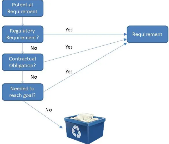
The techniques for identifying requirements all specify that care be taken not to discourage communication of any requirement that seems important or valid to any stakeholder or member of the team. This doesn’t mean that every identified requirement can or should be implemented in the finished product, just that they should all be available to evaluate. Once the realm of potential requirements has been identified, the next step is to review each requirement for appropriateness. The determining factor for appropriateness is simple and straightforward. If you can directly (and honestly) communicate how fulfilling the requirement is necessary to allow the application to meet its goal, the requirement is appropriate. The exception to this rule is that some requirements are driven by outside forces such as contractual obligations and regulatory requirements, and these must be met regardless of whether they contribute to meeting the application’s higher-level goal. Figure 3-2 illustrates the decision process used to decide whether to promote a potential requirement to a requirement that will be implemented.
Figure 3-2. Potential requirement to requirement decision
Note
■
Practitioners of Agile methodologies tend to express requirements in what is called a
user story
. The user
story often takes some form of the statement “As a _____, I need the system to _____ so that _____.” While the
term
user story
is specific to certain methodologies, the idea of identifying the key stakeholder and purpose for each
requirement is a valuable practice for any methodology.
The act of measuring requirements against the purpose of the application is not just an exercise in keeping the application true to purpose, but it is also intended to help maintain balance between the three key factors that drive any project whether it is building software or a skyscraper.
• Time: When must the project be complete in order to meet organizational goals? • Money: How much can be spent?
• Scope: What is the body of work to be completed?
These three factors are often depicted in what is known as the project management triangle, as illustrated in Figure 3-3. The triangle is a great way to depict the relationship between these factors because like the sides of the triangle, one cannot be changed without impacting the other two. For example, if more money is available, additional developers may be hired, and the time required to complete the project will be shortened. Often, the easiest way to rein in a software development project is to keep firm control over the scope.
Figure 3-3. Project management triangle
CHAPTER 3 ■ DESIGNING WINDOWS 8 APPLICATIONS
Decompose Requirements
Once the requirements necessary for the application to meet its goals have been identified, an iterative process called decomposition begins. Decomposition in software development is when a large problem is broken into individual steps. With iterative decomposition, the steps are then themselves broken into smaller pieces, and this continues either until there is nothing left to break down or until you’re “done.” Done is a bit of a subjective term, but I view it as having reached the point where a developer familiar with the project should have every expectation of being able to sit down and use the requirement as a blueprint for building the application. In organizations where the developers are very familiar with the problems that they are solving, “done” will not be decomposed to nearly as granular a level as when the development work will be performed by developers who are not as familiar with the problems that need to be solved.
Note
■
Decomposition is an important way to turn big problems that are daunting into a bunch of little problems
that are easily solved. Remember the saying about how to eat an elephant: “one bite at a time.”
Build Interaction Flows
Up until this point, all of the focus has been on what needs to be accomplished by the application as a whole, and you should have a good idea of what information needs to come into and out of the application to meet those requirements. Once those needs are established, you can turn your attention to determining how the user can most effectively get that information into and out of the application. Here for the first time you start to think about the idea of a screen, but it is still a bit of an amorphous concept because you are trying to determine what goes where. At this point in the design process, I typically prefer to avoid language that suggests decisions have been made about how the screen will be laid out and with what kind of controls. I favor phrases like “and then the user selects the save action” over “and then the user clicks the save button.” It’s a subtle turn of phrase, but it leaves the focus at this point on determining the sequence of steps needed to accomplish the application’s goals and how to organize information into screens for the users’ interactions. Coming out of this step, you should have a good idea of what screens the application will have and what will trigger movement between these screens. Figure 3-4 shows a navigation diagram, which is a useful document to help define and document these flows. In it, you clearly see the views that are anticipated within the application and how the user will move between them.
Visual Design
After the wireframes for the application are agreed upon, some project teams will pass the wireframes to a visual designer, who will use a tool such as Microsoft’s Expression Blend to turn the ideas in the wireframes into a visually appealing interface. Ideally, the designer will follow the guidelines in the Windows Design Language and the Swiss design style to produce an application that has a consistent look and feel with other Windows 8 applications. Because Expression Blend is XAML-based and its projects are compatible with Visual Studio, the designer’s work can become the base on which the developer adds code to create a finished application.
More often than not, teams will not have a dedicated visual designer. They may have a developer who has a better eye for design than the other developers on the team, or the visual design may just be left up to chance. Unlike like some design paradigms, using the new Windows design guidelines actually gives a developer who is not artistically inclined a chance at creating an appealing user interface. Additionally, Microsoft includes built-in styles in the project templates that can be used to help ensure the application has the new Windows look and feel. These styles will be discussed in Chapter 7.
Wireframes
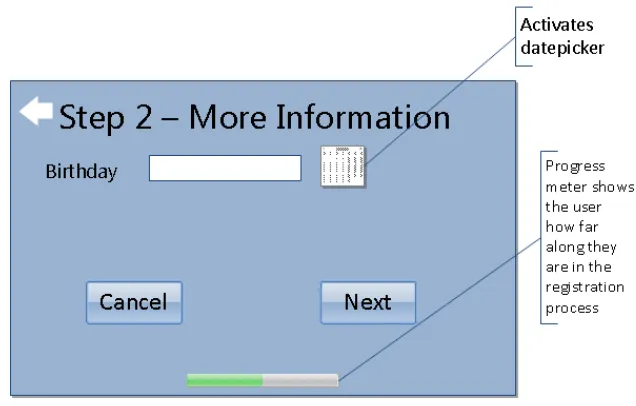
Once the team has settled on the flow of the application, it’s time to work on wireframes. Wireframes are low-fidelity sketches of the application screen that focus on what information and commands the screens will hold rather than worrying about making them pretty and getting bogged down in aesthetic details. Wireframes may be captured on the back of a napkin, a whiteboard (be sure to take a picture), or via tools such as Visio, Balsamic, or SketchFlow in Expression Blend. This is the step where you decide what type of controls will be most effective for the user to interact with the application. In a Windows 8 application, the wireframes should reflect full-screen experiences where the user can focus on content. Figure 3-5 illustrates a sample wireframe. Notice how no effort was put into making it look like a Windows application; it instead focuses on the information and what will happen with different interactions.
CHAPTER 3 ■ DESIGNING WINDOWS 8 APPLICATIONS
Conclusion
Visual Studio 2012 and
Windows Store Application Types
Our environment, the world in which we live and work, is a mirror of our attitudes and
expectations.
—Earl Nightingale
In application development, the integrated development environment (IDE) can make the difference between feeling like you can work easily and focus on the problem your application is supposed to solve and feeling like you are so distracted trying to figure out how to maneuver within the IDE that you cannot focus on the real task of producing software. With the last several versions of Visual Studio, Microsoft has increasingly built upon a reputation of having one of the best development IDEs available. Even many developers who don’t care to develop for the Microsoft platform will say (if grudgingly) that one is hard-pressed to find a better development environment. In this chapter, you will learn about Visual Studio 2012, which is the latest release in this line-up. While complete coverage of the tools and features would take a book of its own, I will cover in this chapter the topics that I consider to be important to finding your way around the environment well enough to complete the exercises in this book. In addition to learning about Visual Studio in general, you will also learn about the project templates that are used to develop applications designed to run on Windows 8.
Visual Studio Editions
Visual Studio is often used generically to describe the IDE for developing applications built on Microsoft platforms, but rather than a single product, it designates an entire line of products. Including the freely available Express editions, the Visual Studio 2012 line-up includes the following:
Visual Studio Express 2012 for Windows 8 •
Visual Studio Express 2012 for Web •
Visual Studio Express 2012 for Windows Desktop •
Visual Studio Test Professional 2012 •
Visual Studio Professional 2012 •
Visual Studio Premium 2012 •
Visual Studio Ultimate 2012 •
CHAPTER 4 ■ VISUAL STUDIO 2012 AND WINDOWS STORE APPLICATION TYPES
The Visual Studio Express 2012 editions each provide an environment to develop applications for different portions of the Microsoft stack that can be used without having to invest in one of the full Visual Studio 2012 products. Visual Studio Express 2012 for Windows 8 is focused on providing the necessary tools to build and test Windows applications as well as providing support for sharing and selling your applications in the Windows Store. Visual Studio Express 2012 for Windows 8 is sufficient for completing the exercises in this book, and features available in this edition will be the focus of discussion in this chapter. The following are key features of Visual Studio Express for Windows 8:
Basic analysis of code for errors or practices that could prevent Windows Store •
Profiler to help identify code that requires tuning •
Unit testing support •
With the exception of Visual Studio Test Professional 2012, which is designed for people assigned to the testing role in an application development organization, the non-Express editions of Visual Studio 2012 are designed for professional developers. Visual Studio Professional 2012, Visual Studio Premium 2012, and Visual Studio Ultimate 2012 each progressively add features to assist in the following areas of application development:
Design
You can find a full comparison of the features that come with each Visual Studio 2012 edition at www.microsoft.com/visualstudio. You can also find Visual Studio Express 2012 for Windows 8 at this site. If you do not already have a Visual Studio 2012 edition installed, I encourage you to install Visual Studio Express 2012 for Windows 8 before reading further.
Getting Started with Visual Studio
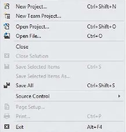
Figure 4-2. File menu
Figure 4-1. Visual Studio initial user interface
CHAPTER 4 ■ VISUAL STUDIO 2012 AND WINDOWS STORE APPLICATION TYPES
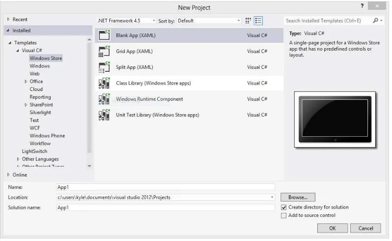
Figure 4-3. New Project dialog
for a solution to create and add the project to. Solutions are not covered in this book, so at this point I will just describe them as a collection of related projects that are opened and worked with at the same time. The option to create new projects within a solution is enabled by default because many applications will separate the business logic, the data access code, and the code used to present an interface to the user into their own projects to help create a clean division of these duties. Another common use for solutions is to have a separate project within the solution to test the application.
Figure 4-4. Solution Explorer window
CHAPTER 4 ■VISUAL STUDIO 2012 AND WINDOWS STORE APPLICATION TYPES
In addition to showing the XAML designer, Figure 4-6 also reveals some other useful items for somebody learning their way around Visual Studio. The Toolbox on the left side of the screen, which is hidden by default but can be shown by clicking the word Toolbox, contains controls that can be dragged onto the design surface to build your screens. Additionally, you may find that dragging controls onto the design surface does not give you enough control over the XAML created by the designer, so you instead might desire to create all or part of the XAML by hand. The designer defaults to a “split view,” which enables you to both work directly with the XAML and use the drag-and-drop functionality of the designer. In most real-world applications, you are likely to find yourself using a combination of these two methods.
The Properties window, shown in Figure 4-7, contains different content based on what is actively selected within Visual Studio. If the actively selected item is a control within the XAML designer, the properties and events attached to that control are displayed. If the selected item is a file within the Solution Explorer, the attributes of the selected file are displayed. The Properties window has a convenient feature, a search box, which will filter the displayed items in the list to those whose name contains the criteria entered in the search box. For controls with a significant number of properties, this feature will be a great time-saver over scrolling through the list looking for a particular property name.
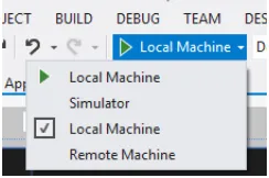
The final user interface element I will discuss in this chapter is the Debug button on the toolbar, which is shown in Figure 4-8. This button is used to initiate a build and debugging session of your application within either your local machine, the built-in Windows 8 simulator, or a remote machine on your network. By activating the drop-down in this button, you can change the default runtime environment for your application. In general, I prefer to run my applications in the simulator because it gives me easy access to do things such as change orientation and capture screenshots.
Figure 4-7. Properties window
Figure 4-8. Debug button
I have just guided you through a whirlwind tour of the Visual Studio interface, stopping only to show you those features that you will need to successfully work in this book. I strongly encourage you to explore the different windows, menus, and options that are available within Visual Studio and learn how each can help with your development tasks.
Windows Store Application Types
CHAPTER 4 ■ VISUAL STUDIO 2012 AND WINDOWS STORE APPLICATION TYPES
Class Library (Windows Store apps) •
Windows Runtime Component •
Unit Test Library (Windows Store apps) •
Blank App (XAML)
Blank App is the template that provides you with the most basic starting project of the Windows Store application project template. The project includes a starting set of images to be replaced with your own custom images for the application’s logo and splash screen as well as a standard style sheet (these will be discussed in Chapter 7) and a blank page. This project type works well when you have a single-page app that does not require the layout provided by the other templates.
Grid App (XAML)
The Grid App template gives everything provided by the Blank App template, but it also includes code files establishing a basic Model-View-ViewModel (MVVM) implementation (MVVM is introduced in Chapter 9) and provides the screens and application code for an application that drills down through varying levels of detail to browse hierarchical data. The application consists of three pages: a high-level view that shows all groups with a summarized view of the items within each group (illustrated in Figure 4-9), a group detail page that provides additional information about the group and a listing of the items that it contains (illustrated in Figure 4-10), and an item detail page that gives the finest level of detail on a single item within the group (illustrated in Figure 4-11). As you can see in the figures, this project template provides an application that has been practically prebuilt for you, requiring only that you modify it to fit your data. This project type will be the basis for an application that you will start building in Chapter 7 and continue to build across several chapters as you learn more concepts that can be applied to the application.
Split App (XAML)
The Split App project template, like Grid App, provides a ready-made application designed to browse hierarchical data. The main difference between Grid App and Split App is that Split App uses only two views to display the
Figure 4-11. Default Grid App item details view
CHAPTER 4 ■ VISUAL STUDIO 2012 AND WINDOWS STORE APPLICATION TYPES
information. The first view, which is shown in Figure 4-12, displays a list of the groups into which items are categorized. Unlike Grid App, this view contains information only about the groups and does not display any item information. Selecting any group navigates to that group’s item screen (shown in Figure 4-13), which provides a listing of the items in the group on the left side of the screen and shows the details of the selected item on the right side of the screen.
Figure 4-12. Default Split App group view
Conclusion
45
Chapter 5
XAML Controls in the Visual Studio
Toolbox: The Common Controls
The expectations of life depend upon diligence; the mechanic that would perfect his work must
first sharpen his tools.
—Confucius
One of the keys to becoming a productive developer on any technology stack is to fully understand the tools available to you on that platform. When developing Windows applications using C# and XAML, these tools include the following:
The C# language features •
The APIs available under the Windows Runtime •
The controls in the Visual Studio Toolbox •
In this chapter, I will focus on the controls in the Visual Studio Toolbox and, more specifically, pay attention to the user interface controls that are by default presented on the Common tab. I will focus in detail on these controls because they can be leveraged together to meet the user interface needs of many Windows applications. For each control, I will discuss the following:
The purpose of the control •
Common usage scenarios •
Important properties and methods of the control •
The XAML used to add the control to a page •
Windows design principles and the default functionality of each control are so well aligned that developers can build compelling user interfaces without having to take advantage of the rich customization options
Grid
A Grid control in almost any XAML development environment, including WPF, Silverlight, and Windows 8, is not to be confused with the control featured in Figure 5-1, which is more in line with what would be referred to with a name such as DataGrid or DataGridView in some environments and does not exist at all in the tools provided with Visual Studio for Windows development.
So, now that I have established that a Grid is not what probably came to mind when you saw the word, what is a Grid? The Grid is a member of a class of controls known as layout controls or panels, whose purpose is to provide a container responsible for the layout and arrangement of controls that they contain. Grids handle layout concerns by establishing one or more rows and columns into which other controls are placed. Each contained control, by default, will be in row 0 and column 0, with the developer or designer laying out the page and needing to specify a nondefault value to land the control in the desired location. Figure 5-2 illustrates a Grid with three rows and four columns ready to be used to lay out content. It is possible to configure the Grid to display gridlines as shown in the figure, but in most cases, a designer would choose not to actually display the lines.
Figure 5-1. This is not a Grid
CHAPTER 5 ■ XAML CONTROLS IN THE VISUAL STUDIO TOOLBOX: THE COMMON CONTROLS
The Grid panel is the default layout control in new Windows application pages and provides an excellent balance between effort and control by allowing you a good deal of control over how controls are arranged in relationship to each other without requiring you to specify exact coordinates for each element. In addition to the ease of use, the concept of using a grid layout is very familiar to designers aware of Swiss style. This makes translation from a designer’s proofs to a functional page smooth for many Windows designs.
These are some properties that are commonly specified for a Grid control:
• Height and Width: These properties control the size of the container. If these properties are not specified by the page author, the control will size itself appropriately to contain all of its content. When the Height or Width property is specified, any content that would push beyond these bounds is clipped and not displayed.
• Background: This property controls the Brush that is used for the background of the control. Notice that the term Brush is used as opposed to color. This is because the Windows Runtime API defines a Brush as an abstract class that defines how a region is to be painted. A Brush is not limited to a solid color but can be configured to output complex renderings such as gradients and images.
• DataContext: This property does not impact the way the control looks but can be important when used with data binding, which I will discuss in Chapter 8.
• ColumnDefinitions: This property contains a collection of ColumnDefinition objects describing the number of columns as well as their sizes.
• RowDefinitions: This property contains a collection of RowDefinition objects describing the number of rows as well as their sizes.
While you are able to place a Grid on a page using a single Grid element, it really makes no sense to have a Grid without the rows and columns that make it useful. The following XAML snippet demonstrates placing a Grid with three rows and four columns onto a page:
<Grid x:Name="LayoutRoot" Background="White" Width="500" Height="300">
Placing controls within the Grid requires placing additional controls within the <Grid> </Grid> pair, specifying the Grid.Row and Grid.Column properties to the zero-based desired position. For example, if I want to place a TextBlock in the second column of the third row, I could add the following within the grid:
<TextBlock Foreground="Black" Grid.Row="2" Grid.Column="1" Text="App Title" FontFamily="Segoe UI" FontSize="48" />