VISUALIZING THE QUALITY OF VECTUR FEATURES – A PROPOSAL FOR
CADASTRAL MAPS
G. Navratil a*, V. Leopoldseder b
a
TU Vienna, Department for Geodesy and Geoinformation, Vienna, Austria – [email protected] b
TU Vienna, Department for Geodesy and Geoinformation, Vienna, Austria – [email protected]
Commission VI, WG IV/3
KEY WORDS: Data Quality, Cadastre, Visualization, Interviews, Vector Geometry
ABSTRACT:
A well-known problem of geographical information is the communication of the quality level. It can be either done verbally / numerically or it can be done graphically. The graphical form is especially useful if the quality has a spatial variation because the spatial distribution is visualized as well. The problem of spatial variation of quality is an issue for cadastral maps. Non-experts cannot determine the quality at a specific location. Therefore a visual representation was tested for the Austrian cadastre. A map sheet was redesigned to give some indication of cadastral quality and presented to both experts and non-experts. The paper presents the result of the interviews.
* Corresponding author
1. INTRODUCTION
A major problem in treatment of data quality is the communication to the user. A study by Boin and Hunter (2007) showed that metadata using numerical descriptions of data quality are at least difficult to interpret for users. The problem was already observed before and solutions were presented (e.g., Devillers et al. 2002; Capiello et al., 2004; Goodchild, 2007). Approaches to help experts assess the fitness for use have been developed (e.g., Devillers et al., 2007; Pôças et al., 2014). However, a main problem is still unsolved: How to present uncertainty in a way that non-experts can intuitively grasp it.
The application used as an example is the Austrian cadastre. A cadastre has two simplifications that can be used to focus on a specific issue:
• Cadastral maps only contain vector data, no raster data is included. This simplifies the discussion. • Attributes are either assumed to be correct (e.g.,
parcel numbers) or not guaranteed (e.g., land use). Thus only positional accuracy needs to be represented in the visualization.
Jason Dykes presented design tools to visualize approximate geometries in his keynote at GI Science 2014 (Dykes, 2014). One of the tools was a library to approximate the geometry of drawings to give the observer the impression of inaccuracy (Wood et al., 2012). A logical question emerging from this work is, if similar approaches could be used for cadastral mapping and if users of cadastral maps could interpret such visualization.
In the paper we first discuss quality classes in the Austrian cadastre. Then possible visual variables that can be used to communicate these quality classes are listed and a specific design is selected. A map sheet of the Austrian cadastral is adapted according to the design and presented to both, experts
and non-experts and their answers are shown. Some ideas for future work conclude the paper.
2. CADASTRAL QUALITY
tB) and with different quality. So for the parcel A the common boundary with the parcel B has the quality of time tB whereas all other parts of the boundary have the quality of time tA. Thus, the boundary of a parcel may consist of pieces with different quality.
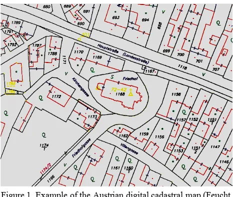
Therefore, when looking at an arbitrary section of the Austrian cadastre, there may be parcels created recently with high quality and parcels never checked since the initial survey. This difference is not reflected in the cadastral maps. The maps consist of line graphics only, and the boundary between two parcels is represented by a thin, black line. Figure 1 shows an example. The lines marked with a Z-signature indicate different types of land use within a parcel, e.g., between house and garden.
Since a change in the surveying law in 1969, a new quality layer is added whenever a parcel is completely surveyed. According to the old law, the surveyor documented the boundary for the cadastral map but the legal evidence was the marks in the field. The new law demands that the complete boundary of the parcel is presented to the owners and the neighbours and the geometry of the presented boundary is accepted by all of them. This
Figure 1. Example of the Austrian digital cadastral map (Feucht, 2008, p. 24, data: © BEV)
A number of rough quality categories can be easily identified: • parcels that were measured in the initial survey and
not checked since then,
• parcels that were resurveyed at least partially after the installation of the continuous update process, and • parcels that were surveyed according to the
regulations for the cadastre of boundaries.
Each of these categories has different quality specifications. The major improvements come from better measurement equipment. However, the first two categories cannot be distinguished in the cadastral maps. Only parcels in the third category can be identified because their parcel number is marked by a line
consisting of three dashes (e.g., parcel 1786 on the left side of Figure 1).
However, whereas the first class is reasonably homogeneous with respect to quality, the second and third category can be split into further classes:
• resurveyed parcels can be surveyed either locally or in the national reference system (Gauß-Krüger with the datum from the Military Geographic Institute). This difference is sometimes visible because in the latter case, measured boundary points may have point numbers plotted.
• Parcels in the cadastre of boundaries may be surveyed based on different versions of the surveying regulations. The main versions were issued in 1969, 1994, 2010, and 2016 and each version contains more severe quality regulations than the predecessors. These differences cannot be seen at all.
3. CARTOGRAPHIC REPRESENTATION OF
Van der Wel et al. (1994) already discussed their application for visualization of quality. They start from Bertin’s variables and identify possible applications for various aspects of spatial data quality like positional accuracy, attribute accuracy, lineage, and completeness. They then investigate the possibilities provided by digital tools, e.g., focus, sequences, or blinking.
For cadastral applications only the original variables seem possible, because cadastral applications may not always be embedded in digital systems. Traditional farmers, for example, may want to have a sheet of paper showing the extent of their property, and architects may want to start developing a design idea with pen and paper.
The use of colour in cadastral maps is a difficult topic because for purists it contradicts tradition. Another problem is that colour codes are already used for survey documents:
• The old situation is shown in black. • Changes are shown in red.
• Changes requested by the surveying office are shown in purple.
More colours could lead to confusion instead of clarifying the situation. Thus colour is not a good option.
Orientation is difficult to implement for linear features, which have to follow the orientation of the corresponding boundary line. Thus orientation seems to be impossible.
texturing. Texture of lines, on the other hand, is difficult to see with the fine lines used for cadastral maps.
Size seems to be an obvious candidate since it was representing scale and thereby quality (compare Frank, 2009) in the analogue cadastral map. When two map sheets with originally different scale had to be combined, then the sheet with the smaller scale was scaled by photocopy to fit the other sheet. In this process the lines widened and for the expert it was evident that wider lines have lower quality. ε-bands (Shi, 2005; Tong et al., 2013) fall into this category, although they are grounded in statistical theory and not in visual expression. However, when confronted with thick boundary lines, non-experts frequently assume that the centreline is the correct solution and used this skeleton line instead of accounting for the uncertainty of correct position. Thus line thickness seems to be visually misleading.
The last possibility is shape, which we tried to apply. Figure 2 shows different shapes for a line from A to B. Solution (a) is the currently applied solution. It is the shortest connection between the points, the straight line. Solution (b) is hand-drawn. It is deviates from the straight line and is irregular. The solution could provide an impression of uncertainty but it could be difficult to achieve. Tools like the sketchy rendering engine would need to be used but it could lead to different representations with each drawing of the map. Solution (c) is similar to (b) but does not consist of a single line. It looks like a quick sketch, where several lines were used to represent a longer line. The breaks could confuse the map reader, though, because gaps in cadastral maps usually indicate that there is no boundary and in this case this would not be true. Finally, solution (d) uses a regular zig-zag shape. The width could be based on the uncertainty, i.e. it fills the area that would have been used for a bone-shaped approach. Another advantage is, that it is easy to implement in software tools for GIS and CAD since it is only changed symbolization of the line. Thus the last approach is used in the experiment.
Figure 2. Different possibilities for line shape
4. ADAPTING THE MAP SHEET
A map sheet had to be selected for the test. In order to have a real distribution of parcels with different age, an area was selected where several surveys were done in the last decades. The selection was supported by the Austrian Federal Office of Metrology and Surveying (BEV) and a map sheet south of Vienna was selected in the village of Hennersdorf (see Figure 3 for the original map sheet). 18 surveys affecting 97 parcels were performed for the area of this map sheet since a complete resurvey in 1931. The resurveys were done mainly for the building lots and thus the large, agricultural parcels are of lower quality than the smaller building lots.
Figure 3. Map sheet 7634-75/1 used for the test (Leopoldseder, 2015, p. 35, data: © BEV)
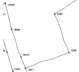
The selected map sheet was adapted using the shape from Figure 2 (d). The shape was defined as a new line type in AutoCAD and used to plot the map sheet. Figure 4 shows an example for the first attempt. All lines in the example are originally straight connections between the numbered breakpoints. The new line style was applied to selected lines only (15509 to 15510, 15511 to 7298, 7298 to 6763, starting at 6763) and it clearly visible, which lines were altered and which were not. An advantage of this approach is that the original geometry is not altered and thus the results of computations done on the data set are still correct.
Figure 4. Test using a new AutoCAD line type (Leopoldseder, 2015, p. 31)
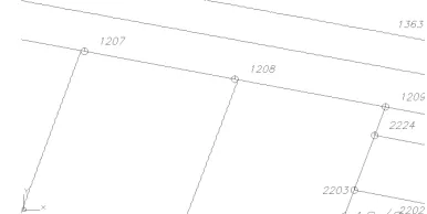
Figures 5 and 6 show the two different representations of the map sheet. Figure 5 shows the typical design of the digital cadastral map (DKM). All lines are represented equally and quality is not visualized. Figure 6 shows an adapted version. It is obvious that the two lines starting at points 1207 and 1208 are changed. Although none of the three agricultural areas in the centre is in the cadastre of boundaries, the left and right border are unchanged because they have been defined in a better quality when the adjoining building lots were surveyed.
A A A A
B B B B
Figure 5. Standard design of a detail from 7634-75/1 (Leopoldseder, 2015, p. 35, data: © BEV)
Figure 6. Adapted design of a detail from 7634-75/1 (Leopoldseder, 2015, p. 35, data: © BEV)
A final adaptation was to rotate the lines by a small amount. In Figure 6, all adapted lines do meet the boundary points. The non-expert should be informed that this is not guaranteed. Therefore, all adapted lines are rotated such that the end points do not correspond perfectly with the point symbol (see Figure 7). The vertical lines do not meet the points 1207 and 1208 directly. It is evident that they meet the horizontal line somewhere near these points but the exact correspondence is eliminated.
Figure 7. Example for rotated lines (Leopoldseder, 2015, p. 52, data: © BEV)
In order to achieve similar results for lines of different length, the rotation angle needs to be defined in relation to the line length. Table 1 shows the used classification.
Line length Rotation angle
# of lines affected
< 130 m 0.2° 13
50 – 130 m 0.7° 9
< 50 m 0.9° 22
Table 1. Rotation angles for adapted line visualization
5. USER QUESTIONING
The user questioning was done in front of the cadastral office responsible for the test area. 25 expert users and 25 non-experts were questioned. Experts were defined as people who work with cadastre or learned to use it during their education. This could be surveyors, architects, land developers, etc. These people are easiest to be found at cadastral offices during office hours.
The goal of the questioning was to decide if experts and non-experts see the visualization as suitable and if there is a difference between the two groups. The procedure for each interview was standardized and structure and questions were predefined:
1. Paper prints of the map sheets in the original and adapted design were shown to the interview partner. 2. If necessary, non-experts received a brief introduction
what the cadastre is.
3. Question “Which differences do you see between the two map sheets?”
This was an open question where the answer was recorded. The expected answers were the different line styles and the displacement at the points.
4. Question “What do you think that these differences express?”
This was an open question where the answer was recorded.
5. Explanation of the different cadastral qualities and the visualization used here.
6. Question “Do you rate the visualization as useful? This question only allowed ‘yes’ or ‘no’ as answers.
Statistical information collected for the interview partners included: Gender, age (four classes: 17-24, 25-39, 40-55, older than 55 years), education (four categories: compulsory education, professional school, qualified to attend university, university degree), status, and occupation. Half the interview partners were female and 48% had a university degree. The latter is caused by the fact that the majority of interviewed experts holds a university degree in surveying or similar. The age classes were almost equally distributed with 32% in the class 25-39 years and between 22 and 24% in all other classes.
Each of the interview partners saw the differences in the visualization. However, only three of them also saw the difference in line displacement. One of them was an expert, two were non-experts. After being informed about the differences, six experts stated that they had seen the displacement but had assumed that this was an effect of the changed line style.
answers included moved boundary stones, fences on boundary lines, tax differences, or agricultural use.
After a brief explanation what the representation clarifies, 90% if the interview partners said that the visualization is useful. Only five experts disagreed, which also means that 80% of the experts found the visualization helpful. This was the most surprising fact since we have to assume that experts can interpret the small hints provided in the cadastral map and know that they have to look at the detailed surveys to get a comprehensive picture.
Seven experts (five of them answered the final question with ‘yes’, two with ‘no’) stated, that a visualization of quality would be helpful but they disagreed with the used graphical representation form. The following arguments were raised against the approach:
• Reference numbers to survey documents should be provided (e.g., as pop-ups on digital sources)
• The waved lines do not allow measurements in the map
• Different line width would have been better • Tolerance bands would have been better • The displacement of lines is confusing
Some of these arguments point in directions that we excluded for a specific reason (see section 3), other arguments could solve the situation for experts. However, it is doubtful, if reference numbers to survey documents could help non-experts. The last point is interesting. The intention was not to create confusion but if it happens it could have a positive effect: Non-experts could seek advice from an expert instead of drawing wrong conclusions from the map.
6. CONCLUSIONS
The goal of the new visualization approach was to represent the varying quality of the Austrian cadastral map in visual form such that the differences become evident for experts and non-experts. The concept was tested using a map sheet of the Austrian cadastre and performing interviews with 50 randomly selected experts and non-experts.
Overall, the reactions were mainly positive. All of the interview partners saw the changed line style but only 6% recognized the displacement of lines as intended. Thus, the use of displacement can be questioned because it does not seem to be intuitive. However, after being informed about the intention, most of the interview partners described the displacement as useful, especially since it shows the level quality that a boundary point may have.
The selected line style triggered the most negative responses. Seven experts explicitly disliked the idea to replace something that is typically represented by a straight line in a map by a waved line. This could be connected to surveying tradition because the non-experts did not state such aversions. Future research should therefore check if different line styles would be received better.
Another question is, whether a waved line can represent grades of uncertainty. In the presented study, only accurate and inaccurate situations were determined. However, in section 2 showed, that there are at least five different quality groups in the Austrian cadastre. This leads to the problem first described by Miller, that starting with five different qualities we seem to be less capable of distinguishing between them (Miller, 1956).
Thus, we either define fewer classes for cadastral quality, or we combine elements to avoid problems connected to Miller’s observation.
ACKNOWLEDGEMENTS
The authors want to thank the BEV for providing the data and support during the selection process. The authors also thank the interview partners for their time and their contributions during the interviews.
REFERENCES
Bertin, J., 1982. Graphische Darstellung (translation from French original „La Graphique et le Traitement Graphique de lʼInformation“, 1977). Walter de Gruyter, Berlin.
Boin, A. T., Hunter, G. J., 2007. What Communicates Quality to the Spatial Data Consumers? In: Proceedings of the International Symposium on Spatial Data Quality. Enschede, Netherlands.
Capiello, C., Francalanci, C., Pernici, B., 2004. Data quality assessment from the user's perspective. In: IQIS '04 Proceedings of the 2004 international workshop on Information quality in information systems, Paris, France, ACM, New York, USA, pp. 68-73
Devillers, R, Gervais, M., Bédard, Y., Jeansoulin, R., 2002. From Metadata to Quality Indicators and Contextual End-User Manual. In: OEEPE/ISPRS Joint Workshop on Spatial Data Quality Management, Istambul, pp. 45-55.
Devillers, R., Bédard, Y., Jeansoulin, R., Moulin, B., 2007. Towards spatial data quality information analysis tools for experts assessing the fitness for use of spatial data. IJGIS, 21(3), pp. 261-282.
Dykes, J., 2014. [Geographic | Information] Visualization. Keynote presentation at GIScience 2014, Vienna, Austria, http://www.giscience.org/dykes.html.
Feucht, R., 2008. Flächenangaben im österreichischen Kataster. Master Thesis. TU Vienna.
Frank, A. U., 2009. Why is Scale an Effective Descriptor for Data Quality? The Physical, Ontological Reasons for Imprecision and Level of Detail. In: G. Navratil, ed., Research Trends in Geographic Information Science, Springer, Berlin Heidelberg, p. 39-62.
Goodchild, M. F., 2007. Beyond metadata: Towards user-centric description of data quality. In: Proceedings of the International Symposium on Spatial Data Quality, Enschede, Netherlands.
Leopoldseder, V., 2015. Visualisierung der Katasterqualität. Master Thesis, TU Vienna, Department for Geodesy and Geoinformation.
Lisec, A., Navratil, G., 2014. The Austrian Land Cadastre: From the Earliest Beginnings to the Modern Land Information System. Geodetski Vestnik, 58(3), pp. 482-516.
Navratil, G., 2011. Quality Assessment for Cadastral Geometry. Proceedings of the 7th International Symposium on Spatial Data Quality, INESC Coimbra, pp. 115-120.
Navratil, G., Hafner, J., Jilin, D., 2010. Accuracy Determination for the Austrian Digital Cadastral Map (DKM). In: Fourth Croatian Congress on Cadastre, Croatian Geodetic Society, pp. 171-181.
Pôças, I., Gonçalves, J., Marcos, B., Alonso, J., Castro, P., Honrado, J. P., 2014. Evaluating the fitness for use of spatial data sets to promote quality in ecological assessment and monitoring. IJGIS, 28(11), pp. 2356-2371.
Shi, W., 2005. Towards Uncertainty-Based Geographic Information Science (Part A): Modeling Uncertainties in Spatial Data. In: Proceedings of the 4th International Symposium on Spatial Data Quality, Beijing, China, pp. 14-26.
Tong, X., Sun, T., Fan, J., Goodchild, M. F., Shi, W., 2013. A statistical simulation model for positional error of line features in Geographic Information Systems (GIS). International Journal of Applied Earth Observation and Geoinformation, 21, pp. 136-148.
Van der Wel, F. M., Hootsmans, R. M., Ormeling, F., 1994. Visualization of Data Quality. In: Alan. M. MacEachren and D.R. Fraser Taylor (eds.) Visualization in Modern Cartography, Pergamon, Oxford, U.K., pp. 313-331.