MAKING SENSE
OF DATA I
Second Edition
GLENN J. MYATT
WAYNE P. JOHNSON
A Practical Guide
MAKING SENSE OF
DATA I
A Practical Guide to Exploratory
Data Analysis and Data Mining
Second Edition
Published by John Wiley & Sons, Inc., Hoboken, New Jersey Published simultaneously in Canada
No part of this publication may be reproduced, stored in a retrieval system, or transmitted in any form or by any means, electronic, mechanical, photocopying, recording, scanning, or otherwise, except as permitted under Section 107 or 108 of the 1976 United States Copyright Act, without either the prior written permission of the Publisher, or authorization through payment of the appropriate per-copy fee to the Copyright Clearance Center, Inc., 222 Rosewood Drive, Danvers, MA 01923, (978) 750-8400, fax (978) 750-4470, or on the web at www.copyright.com. Requests to the Publisher for permission should be addressed to the Permissions Department, John Wiley & Sons, Inc., 111 River Street, Hoboken, NJ07030, (201) 748-6011, fax (201) 748-6008, or online at
http://www.wiley.com/go/permission.
Limit of Liability/Disclaimer of Warranty: While the publisher and author have used their best efforts in preparing this book, they make no representations or warranties with respect to the accuracy or completeness of the contents of this book and specifically disclaim any implied warranties of merchantability or fitness for a particular purpose. No warranty may be created or extended by sales representatives or written sales materials. The advice and strategies contained herein may not be suitable for your situation. You should consult with a professional where appropriate. Neither the publisher nor author shall be liable for any loss of profit or any other commercial damages, including but not limited to special, incidental, consequential, or other damages.
For general information on our other products and services or for technical support, please contact our Customer Care Department within the United States at (800) 762-2974, outside the United States at (317) 572-3993 or fax (317) 572-4002.
Wiley also publishes its books in a variety of electronic formats. Some content that appears in print may not be available in electronic formats. For more information about Wiley products, visit our web site at www.wiley.com.
Library of Congress Cataloging-in-Publication Data:
Myatt, Glenn J., 1969– [Making sense of data]
Making sense of data I : a practical guide to exploratory data analysis and data mining / Glenn J. Myatt, Wayne P. Johnson. – Second edition.
pages cm
Revised edition of: Making sense of data. c2007. Includes bibliographical references and index. ISBN 978-1-118-40741-7 (paper)
1. Data mining. 2. Mathematical statistics. I. Johnson, Wayne P. II. Title. QA276.M92 2014
006.3′12–dc23
2014007303
Printed in the United States of America ISBN: 9781118407417
CONTENTS
PREFACE ix
1 INTRODUCTION 1
1.1 Overview / 1
1.2 Sources of Data / 2
1.3 Process for Making Sense of Data / 3
1.4 Overview of Book / 13
1.5 Summary / 16
Further Reading / 16
2 DESCRIBING DATA 17
2.1 Overview / 17
2.2 Observations and Variables / 18
2.3 Types of Variables / 20
2.4 Central Tendency / 22
2.5 Distribution of the Data / 24
2.6 Confidence Intervals / 36
2.7 Hypothesis Tests / 40
Exercises / 42
3 PREPARING DATA TABLES 47 3.1 Overview / 47
3.2 Cleaning the Data / 48
3.3 Removing Observations and Variables / 49
3.4 Generating Consistent Scales Across Variables / 49
3.5 New Frequency Distribution / 51
3.6 Converting Text to Numbers / 52
3.7 Converting Continuous Data to Categories / 53
3.8 Combining Variables / 54
3.9 Generating Groups / 54
3.10 Preparing Unstructured Data / 55
Exercises / 57
Further Reading / 57
4 UNDERSTANDING RELATIONSHIPS 59
4.1 Overview / 59
4.2 Visualizing Relationships Between Variables / 60
4.3 Calculating Metrics About Relationships / 69
Exercises / 81
Further Reading / 82
5 IDENTIFYING AND UNDERSTANDING GROUPS 83
5.1 Overview / 83
5.2 Clustering / 88
5.3 Association Rules / 111
5.4 Learning Decision Trees from Data / 122
Exercises / 137
Further Reading / 140
6 BUILDING MODELS FROM DATA 141
6.1 Overview / 141
6.2 Linear Regression / 149
6.3 Logistic Regression / 161
CONTENTS vii
6.5 Classification and Regression Trees / 172
6.6 Other Approaches / 178
Exercises / 179
Further Reading / 182
APPENDIX A ANSWERS TO EXERCISES 185
APPENDIX B HANDS-ON TUTORIALS 191
B.1 Tutorial Overview / 191
B.2 Access and Installation / 191
B.3 Software Overview / 192
B.4 Reading in Data / 193
B.5 Preparation Tools / 195
B.6 Tables and Graph Tools / 199
B.7 Statistics Tools / 202
B.8 Grouping Tools / 204
B.9 Models Tools / 207
B.10 Apply Model / 211
B.11 Exercises / 211
BIBLIOGRAPHY 227
PREFACE
An unprecedented amount of data is being generated at increasingly rapid rates in many disciplines. Every day retail companies collect data on sales transactions, organizations log mouse clicks made on their websites, and biologists generate millions of pieces of information related to genes. It is practically impossible to make sense of data sets containing more than a handful of data points without the help of computer programs. Many free and commercial software programs exist to sift through data, such as spreadsheet applications, data visualization software, statistical packages and scripting languages, and data mining tools. Deciding what software to use is just one of the many questions that must be considered in exploratory data analysis or data mining projects. Translating the raw data collected in various ways into actionable information requires an understanding of exploratory data analysis and data mining methods and often an appreciation of the subject matter, business processes, software deployment, project management methods, change management issues, and so on.
facts, patterns, and relationships in the data, and (4) how to create models from the data to better understand the data and make predictions.
The process outlined in the book starts by understanding the problem you are trying to solve, what data will be used and how, who will use the information generated, and how it will be delivered to them, and the specific and measurable success criteria against which the project will be evaluated.
The type of data collected and the quality of this data will directly impact the usefulness of the results. Ideally, the data will have been carefully col-lected to answer the specific questions defined at the start of the project. In practice, you are often dealing with data generated for an entirely different purpose. In this situation, it is necessary to thoroughly understand and prepare the data for the new questions being posed. This is often one of the most time-consuming parts of the data mining process where many issues need to be carefully adressed.
The analysis can begin once the data has been collected and prepared. The choice of methods used to analyze the data depends on many factors, including the problem definition and the type of the data that has been collected. Although many methods might solve your problem, you may not know which one works best until you have experimented with the alternatives. Throughout the technical sections, issues relating to when you would apply the different methods along with how you could optimize the results are discussed.
After the data is analyzed, it needs to be delivered to your target audience. This might be as simple as issuing a report or as complex as implementing and deploying new software to automatically reapply the analysis as new data becomes available. Beyond the technical challenges, if the solution changes the way its intended audience operates on a daily basis, it will need to be managed. It will be important to understand how well the solution implemented in the field actually solves the original business problem.
Larger projects are increasingly implemented by interdisciplinary teams involving subject matter experts, business analysts, statisticians or data mining experts, IT professionals, and project managers. This book is aimed at the entire interdisciplinary team and addresses issues and technical solutions relating to data analysis or data mining projects. The book also serves as an introductory textbook for students of any discipline, both undergraduate and graduate, who wish to understand exploratory data analysis and data mining processes and methods.
PREFACE xi
visualizing and describing relationships between variables, identifying and making statements about groups of observations, extracting interesting rules, and building mathematical models that can be used to understand the data and make predictions.
The book focuses on practical approaches and covers information on how the techniques operate as well as suggestions for when and how to use the different methods. Each chapter includes a “Further Reading” section that highlights additional books and online resources that provide back-ground as well as more in-depth coverage of the material. At the end of selected chapters are a set of exercises designed to help in understanding the chapter’s material. The appendix covers a series of practical tutorials that make use of the freely available Traceis software developed to accom-pany the book, which is available from the book’s website: http://www. makingsenseofdata.com; however, the tutorials could be used with other available software. Finally, a deck of slides has been developed to accom-pany the book’s material and is available on request from the book’s authors.
CHAPTER 1
INTRODUCTION
1.1 OVERVIEW
Almost every discipline from biology and economics to engineering and marketing measures, gathers, and stores data in some digital form. Retail companies store information on sales transactions, insurance companies keep track of insurance claims, and meteorological organizations measure and collect data concerning weather conditions. Timely and well-founded decisions need to be made using the information collected. These deci-sions will be used to maximize sales, improve research and development projects, and trim costs. Retail companies must determine which prod-ucts in their stores are under- or over-performing as well as understand the preferences of their customers; insurance companies need to identify activ-ities associated with fraudulent claims; and meteorological organizations attempt to predict future weather conditions.
Data are being produced at faster rates due to the explosion of internet-related information and the increased use of operational systems to collect business, engineering and scientific data, and measurements from sensors or monitors. It is a trend that will continue into the foreseeable future. The challenges of handling and making sense of this information are significant
Making Sense of Data I: A Practical Guide to Exploratory Data Analysis and Data Mining, Second Edition. Glenn J. Myatt and Wayne P. Johnson.
because of the increasing volume of data, the complexity that arises from the diverse types of information that are collected, and the reliability of the data collected.
The process of taking raw data and converting it into meaningful infor-mation necessary to make decisions is the focus of this book. The following sections in this chapter outline the major steps in a data analysis or data mining project from defining the problem to the deployment of the results. The process provides a framework for executing projects related to data mining or data analysis. It includes a discussion of the steps and challenges of (1) defining the project, (2) preparing data for analysis, (3) selecting data analysis or data mining approaches that may include performing an optimization of the analysis to refine the results, and (4) deploying and measuring the results to ensure that any expected benefits are realized. The chapter also includes an outline of topics covered in this book and the supporting resources that can be used alongside the book’s content.
1.2 SOURCES OF DATA
There are many different sources of data as well as methods used to collect the data. Surveys or polls are valuable approaches for gathering data to answer specific questions. An interview using a set of predefined questions is often conducted over the phone, in person, or over the internet. It is used to elicit information on people’s opinions, preferences, and behavior. For example, a poll may be used to understand how a population of eligible voters will cast their vote in an upcoming election. The specific questions along with the target population should be clearly defined prior to the inter-views. Any bias in the survey should be eliminated by selecting a random sample of the target population. For example, bias can be introduced in situations where only those responding to the questionnaire are included in the survey, since this group may not be representative of a random sam-ple of the entire population. The questionnaire should not contain leading questions—questions that favor a particular response. Other factors which might result in segments of the total population being excluded should also be considered, such as the time of day the survey or poll was conducted. A well-designed survey or poll can provide an accurate and cost-effective approach to understanding opinions or needs across a large group of indi-viduals without the need to survey everyone in the target population.
PROCESS FOR MAKING SENSE OF DATA 3
different values. Experiments attempt to understand cause-and-effect phe-nomena by controlling other factors that may be important. For example, when studying the effects of a new drug, a double-blind study is typically used. The sample of patients selected to take part in the study is divided into two groups. The new drug is delivered to one group, whereas a placebo (a sugar pill) is given to the other group. To avoid a bias in the study on the part of the patient or the doctor, neither the patient nor the doctor administering the treatment knows which group a patient belongs to. In certain situations it is impossible to conduct a controlled experiment on either logistical or ethical grounds. In these situations a large number of observations are measured and care is taken when interpreting the results. For example, it would not be ethical to set up a controlled experiment to test whether smoking causes health problems.
As part of the daily operations of an organization, data is collected for a variety of reasons.Operational databasescontain ongoing business transactions and are accessed and updated regularly. Examples include supply chain and logistics management systems, customer relationship management databases (CRM), and enterprise resource planning databases (ERP). An organization may also be automatically monitoring operational processes with sensors, such as the performance of various nodes in a communications network. Adata warehouse is a copy of data gathered from other sources within an organization that is appropriately prepared for making decisions. It is not updated as frequently as operational databases. Databases are also used to house historical polls, surveys, and experiments. In many cases data from in-house sources may not be sufficient to answer the questions now being asked of it. In these cases, the internal data can be augmented with data from other sources such as information collected from the web or literature.
1.3 PROCESS FOR MAKING SENSE OF DATA
1.3.1 Overview
Following a predefined process will ensure that issues are addressed and appropriate steps are taken. For exploratory data analysis and data mining projects, you should carefully think through the following steps, which are summarized here and expanded in the following sections:
1. Problem definition and planning: The problem to be solved and the
FIGURE 1.1 Summary of a general framework for a data analysis project.
2. Data preparation: Prior to starting a data analysis or data
min-ing project, the data should be collected, characterized, cleaned, transformed, and partitioned into an appropriate form for further processing.
3. Analysis: Based on the information from steps 1 and 2, appropriate
data analysis and data mining techniques should be selected. These methods often need to be optimized to obtain the best results.
4. Deployment: The results from step 3 should be communicated and/or
deployed to obtain the projected benefits identified at the start of the project.
Figure 1.1 summarizes this process. Although it is usual to follow the order described, there will be interactions between the different steps that may require work completed in earlier phases to be revised. For example, it may be necessary to return to the data preparation (step 2) while imple-menting the data analysis (step 3) in order to make modifications based on what is being learned.
1.3.2 Problem Definition and Planning
The first step in a data analysis or data mining project is to describe the problem being addressed and generate a plan. The following section addresses a number of issues to consider in this first phase. These issues are summarized in Figure 1.2.
PROCESS FOR MAKING SENSE OF DATA 5
It is important to document the business or scientific problem to be solved along with relevant background information. In certain situations, however, it may not be possible or even desirable to know precisely the sort of information that will be generated from the project. These more open-ended projects will often generate questions by exploring large databases. But even in these cases, identifying the business or scientific problem driving the analysis will help to constrain and focus the work. To illus-trate, an e-commerce company wishes to embark on a project to redesign their website in order to generate additional revenue. Before starting this potentially costly project, the organization decides to perform data anal-ysis or data mining of available web-related information. The results of this analysis will then be used to influence and prioritize this redesign. A general problem statement, such as “make recommendations to improve sales on the website,” along with relevant background information should be documented.
This broad statement of the problem is useful as a headline; however, this description should be divided into a series of clearly defined deliver-ables that ultimately solve the broader issue. These include: (1) categorize website users based on demographic information; (2) categorize users of the website based on browsing patterns; and (3) determine if there are any relationships between these demographic and/or browsing patterns and purchasing habits. This information can then be used to tailor the site to specific groups of users or improve how their customers purchase based on the usage patterns found in the analysis. In addition to understanding what type of information will be generated, it is also useful to know how it will be delivered. Will the solution be a report, a computer program to be used for making predictions, or a set of business rules? Defining these deliverables will set the expectations for those working on the project and for its stakeholders, such as the management sponsoring the project.
through additional marketing. To identify these customers, the company decides to build a predictive model and the accuracy of its predictions will affect the level of retention that can be achieved.
It is also important to understand the consequences of answering ques-tions incorrectly. For example, when predicting tornadoes, there are two possible prediction errors: (1) incorrectly predicting a tornado would strike and (2) incorrectly predicting there would be no tornado. The consequence of scenario (2) is that a tornado hits with no warning. In this case, affected neighborhoods and emergency crews would not be prepared and the con-sequences might be catastrophic. The consequence of scenario (1) is less severe than scenario (2) since loss of life is more costly than the incon-venience to neighborhoods and emergency services that prepared for a tornado that did not hit. There are often different business consequences related to different types of prediction errors, such as incorrectly predicting a positive outcome or incorrectly predicting a negative one.
There may be restrictions concerning what resources are available for use in the project or other constraints that influence how the project pro-ceeds, such as limitations on available data as well as computational hard-ware or softhard-ware that can be used. Issues related to use of the data, such as privacy or legal issues, should be identified and documented. For example, a data set containing personal information on customers’ shopping habits could be used in a data mining project. However, if the results could be traced to specific individuals, the resulting findings should be anonymized. There may also be limitations on the amount of time available to a compu-tational algorithm to make a prediction. To illustrate, suppose a web-based data mining application or service that dynamically suggests alternative products to customers while they are browsing items in an online store is to be developed. Because certain data mining or modeling methods take a long time to generate an answer, these approaches should be avoided if suggestions must be generated rapidly (within a few seconds) otherwise the customer will become frustrated and shop elsewhere. Finally, other restric-tions relating to business issues include thewindow of opportunityavailable for the deliverables. For example, a company may wish to develop and use a predictive model to prioritize a new type of shampoo for testing. In this scenario, the project is being driven by competitive intelligence indicating that another company is developing a similar shampoo and the company that is first to market the product will have a significant advantage. There-fore, the time to generate the model may be an important factor since there is only a small window of opportunity based on business considerations.
PROCESS FOR MAKING SENSE OF DATA 7
required, teams are essential—especially for large-scale projects—and it is helpful to consider the different roles needed for an interdisciplinary team. Aproject leaderplans and directs a project, and monitors its results.
Domain expertsprovide specific knowledge of the subject matter or busi-ness problems, including (1) how the data was collected, (2) what the data values mean, (3) the accuracy of the data, (4) how to interpret the results of the analysis, and (5) the business issues being addressed by the project.Data analysis/mining expertsare familiar with statistics, data analysis methods, and data mining approaches as well as issues relating to data preparation. AnIT specialisthas expertise in integrating data sets (e.g., accessing databases, joining tables, pivoting tables) as well as knowl-edge of software and hardware issues important for implementation and deployment.End usersuse information derived from the data routinely or from a one-off analysis to help them make decisions. A single member of the team may take on multiple roles such as the role of project leader and data analysis/mining expert, or several individuals may be responsible for a single role. For example, a team may include multiple subject matter experts, where one individual has knowledge of how the data was measured and another has knowledge of how it can be interpreted. Other individuals, such as the project sponsor, who have an interest in the project should be included as interested parties at appropriate times throughout the project. For example, representatives from the finance group may be involved if the solution proposes a change to a business process with important financial implications.
Different individuals will play active roles at different times. It is desir-able to involve all parties in the project definition phase. In the data prepa-ration phase, the IT expert plays an important role in integrating the data in a form that can be processed. During this phase, the data analysis/mining expert and the subject matter expert/business analyst will also be working closely together to clean and categorize the data. The data analysis/mining expert should be primarily responsible for ensuring that the data is trans-formed into a form appropriate for analysis. The analysis phase is primarily the responsibility of the data analysis/mining expert with input from the subject matter expert or business analyst. The IT expert can provide a valu-able hardware and software support role throughout the project and will play a critical role in situations where the output of the analysis is to be integrated within an operational system.
experts or to the data analysis/data mining experts. Team meetings to share information are also essential for communication purposes.
The extent of the project plan depends on the size and scope of the project. A timetable of events should be put together that includes the preparation, implementation, and deployment phases (summarized in Sec-tions 1.3.3, 1.3.4, and 1.3.5). Time should be built into the timetable for reviews after each phase. At the end of the project, a valuable exercise that provides insight for future projects is to spend time evaluating what did and did not work. Progress will be iterative and not strictly sequential, moving between phases of the process as new questions arise. If there are high-risk steps in the process, these should be identified and contingencies for them added to the plan. Tasks with dependencies and contingencies should be documented using timelines or standard project management support tools such as Gantt charts. Based on the plan, budgets and success criteria can be developed to compare costs against benefits. This will help determine the feasibility of the project and whether the project should move forward.
1.3.3 Data Preparation
In many projects, understanding the data and getting it ready for analysis is the most time-consuming step in the process, since the data is usually integrated from many sources, with different representations and formats. Figure 1.3 illustrates some of the steps required for preparing a data set. In situations where the data has been collected for a different purpose, the data will need to be transformed into an appropriate form for analysis. For example, the data may be in the form of a series of documents that requires it to be extracted from the text of the document and converted to a tabular form that is amenable for data analysis. The data should be prepared to mirror as closely as possible the target population about which new questions will be asked. Since multiple sources of data may be used, care must be taken not to introduce errors when these sources are brought together. Retaining information about the source is useful both for bookkeeping and for interpreting the results.
PROCESS FOR MAKING SENSE OF DATA 9
It is important to characterize the types of attributes that have been col-lected over the different items in the data set. For example, do the attributes represent discrete categories such as color or gender or are they numeric values of attributes such as temperature or weight? This categorization helps identify unexpected values. In looking at the numeric attributeweight
collected for a set of people, if an item has the value “low” then we need to either replace this erroneous value or remove the entire record for that person. Another possible error occurs in values for observations that lie outside the typical range for an attribute. For example, a person assigned a weight of 3,000 lb is likely the result of a typing error made during data collection. This categorization is also essential when selecting the appropriate data analysis or data mining approach to use.
In addition to addressing the mistakes or inconsistencies in data collec-tion, it may be important to change the data to make it more amenable for data analysis. The transformations should be done without losing impor-tant information. For example, if a data mining approach requires that all attributes have a consistent range, the data will need to be appropriately modified. The data may also need to be divided into subsets or filtered based on specific criteria to make it amenable to answering the problems outlined at the beginning of the project. Multiple approaches to understanding and preparing data are discussed in Chapters 2 and 3.
1.3.4 Analysis
As discussed earlier, an initial examination of the data is important in understanding the type of information that has been collected and the meaning of the data. In combination with information from the problem definition, this categorization will determine the type of data analysis and data mining approaches to use. Figure 1.4 summarizes some of the main analysis approaches to consider.
One common category of analysis tasks provides summarizations and statements about the data. Summarization is a process by which data is reduced for interpretation without sacrificing important information. Sum-maries can be developed for the data as a whole or in part. For example, a retail company that collected data on its transactions could develop sum-maries of the total sales transactions. In addition, the company could also generate summaries of transactions by products or stores. It may be impor-tant to make statements with measures of confidence about the entire data set or groups within the data. For example, if you wish to make a statement concerning the performance of a particular store with slightly lower net revenue than other stores it is being compared to, you need to know if it is really underperforming or just within an expected range of performance. Data visualization, such as charts and summary tables, is an important tool used alongside summarization methods to present broad conclusions and make statements about the data with measures of confidence. These are discussed in Chapters 2 and 4.
A second category of tasks focuses on the identification of important facts, relationships, anomalies, or trends in the data. Discovering this infor-mation often involves looking at the data in many ways using a combi-nation of data visualization, data analysis, and data mining methods. For example, a retail company may want to understand customer profiles and other facts that lead to the purchase of certain product lines. Cluster-ing is a data analysis method used to group together items with simi-lar attributes. This approach is outlined in Chapter 5. Other data mining methods, such as decision trees or association rules (also described in Chapter 5), automatically extract important facts or rules from the data. These data mining approaches—describing, looking for relationships, and grouping—combined with data visualization provide the foundation for basic exploratory analysis.
PROCESS FOR MAKING SENSE OF DATA 11
list of prospective customers that also contain information on age, gender, location, and so on, to make predictions of those most likely to buy the product. The individuals predicted by the model as buyers of the product might become the focus of a targeted marketing campaign. Models can be built to predict continuous data values (regression models) or categori-cal data (classification models). Simple methods to generate these models includelinear regression,logistic regression,classification and regression trees, andk-nearest neighbors. These techniques are discussed in Chapter 6 along with summaries of other approaches. The selection of the methods is often driven by the type of data being analyzed as well as the problem being solved. Some approaches generate solutions that are straightforward to interpret and explain which may be important for examining specific problems. Others are more of a “black box” with limited capabilities for explaining the results. Building and optimizing these models in order to develop useful, simple, and meaningful models can be time-consuming.
There is a great deal of interplay between these three categories of tasks. For example, it is important to summarize the data before building models or finding hidden relationships. Understanding hidden relationships between different items in the data can be of help in generating models. Therefore, it is essential that data analysis or data mining experts work closely with the subject matter expertise in analyzing the data.
1.3.5 Deployment
In the deployment step, analysis is translated into a benefit to the orga-nization and hence this step should be carefully planned and executed. There are many ways to deploy the results of a data analysis or data min-ing project, as illustrated in Figure 1.5. One option is to write a report for management or the “customer” of the analysis describing the business or scientific intelligence derived from the analysis. The report should be directed to those responsible for making decisions and focused on sig-nificant and actionable items—conclusions that can be translated into a decision that can be used to make a difference. It is increasingly common for the report to be delivered through the corporate intranet.
When the results of the project include the generation of predictive mod-els to use on an ongoing basis, these modmod-els can be deployed as standalone applications or integrated with other software such as spreadsheet applica-tions or web services. The integration of the results into existing operational systems or databases is often one of the most cost-effective approaches to delivering a solution. For example, when a sales team requires the results of a predictive model that ranks potential customers based on the likelihood that they will buy a particular product, the model may be integrated with the customer relationship management (CRM) system that they already use on a daily basis. This minimizes the need for training and makes the deployment of results easier. Prediction models or data mining results can also be integrated into systems accessible by your customers, such as e-commerce websites. In the web pages of these sites, additional products or services that may be of interest to the customer may have been identified using a mathematical model embedded in the web server.
Models may also be integrated into existing operational processes where a model needs to be constantly applied to operational data. For example, a solution may detect events leading to errors in a manufacturing system. Catching these errors early may allow a technician to rectify the problem without stopping the production system.
It is important to determine if the findings or generated models are being used to achieve the business objectives outlined at the start of the project. Sometimes the generated models may be functioning as expected but the solution is not being used by the target user community for one reason or another. To increase confidence in the output of the system, a controlled experiment (ideally double-blind) in the field may be undertaken to assess the quality of the results and the organizational impact. For example, the intended users of a predictive model could be divided into two groups. One group, made up of half of the users (randomly selected), uses the model results; the other group does not. The business impact resulting from the two groups can then be measured. Where models are continually updated, the consistency of the results generated should also be monitored over time.
OVERVIEW OF BOOK 13
and trust the results, the users may require that all results be appro-priately explained and linked to the data from which the results were generated.
At the end of a project it is always a useful exercise to look back at what worked and what did not work. This will provide insight for improving future projects.
1.4 OVERVIEW OF BOOK
This book outlines a series of introductory methods and approaches impor-tant to many data analysis or data mining projects. It is organized into five technical chapters that focus on describing data, preparing data tables, understanding relationships, understanding groups, and building models, with a hands-on tutorial covered in the appendix.
1.4.1 Describing Data
The type of data collected is one of the factors used in the selection of the type of analysis to be used. The information examined on the individual attributes collected in a data set includes a categorization of the attributes’ scale in order to understand whether the field represents discrete elements such asgender(i.e., male or female) or numeric properties such asageor
temperature. For numeric properties, examining how the data is distributed is important and includes an understanding of where the values of each attribute are centered and how the data for that attribute is distributed around the central values. Histograms, box plots, and descriptive statistics are useful for understanding characteristics of the individual data attributes. Different approaches to characterizing and summarizing elements of a data table are reviewed in Chapter 2, as well as methods that make statements about or summarize the individual attributes.
1.4.2 Preparing Data Tables
for data analysis. Mapping the data onto new ranges, transforming cate-gorical data (such as different colors) into a numeric form to be used in a mathematical model, as well as other approaches to preparing tabular or nonstructured data prior to analysis are reviewed in Chapter 3.
1.4.3 Understanding Relationships
Understanding the relationships between pairs of attributes across the items in the data is the focus of Chapter 4. For example, based on a collection of observations about the population of different types of birds throughout the year as well as the weather conditions collected for a specific region, does the population of a specific bird increase or decrease as the temperature increases? Or, based on a double-blind clinical study, do patients taking a new medication have an improved outcome? Data visualization, such as scatterplots, histograms, and summary tables play an important role in seeing trends in the data. There are also properties that can be calculated to quantify the different types of relationships. Chapter 4 outlines a number of common approaches to understand the relationship between two attributes in the data.
1.4.4 Understanding Groups
Looking at an entire data set can be overwhelming; however, exploring meaningful subsets of items may provide a more effective means of ana-lyzing the data.
Methods for identifying, labeling, and summarizing collections of items are reviewed in Chapter 5. These groups are often based upon the multiple attributes that describe the members of the group and represent subpopu-lations of interest. For example, a retail store may wish to group a data set containing information about customers in order to understand the types of customers that purchase items from their store. As another example, an insurance company may want to group claims that are associated with fraudulent or nonfraudulent insurance claims. Three methods of automati-cally identifying such groups—clustering,association rules, anddecision trees—are described in Chapter 5.
1.4.5 Building Models
OVERVIEW OF BOOK 15
of items with unknown values. For example, a mathematical model could be built from historical data on the performance of windmills as well as geographical and meteorological data concerning their location, and used to make predictions on potential new sites. Chapter 6 introduces important concepts in terms of selecting an approach to modeling, selecting attributes to include in the models, optimization of the models, as well as methods for assessing the quality and usefulness of the models using data not used to create the model. Various modeling approaches are outlined, including
linear regression, logistic regression, classification and regression trees, andk-nearest neighbors. These are described in Chapter 6.
1.4.6 Exercises
At the conclusion of selected chapters, there are a series of exercises to help in understanding the chapters’ material. It should be possible to answer these practical exercises by hand and the process of going through them will support learning the material covered. The answers to the exercises are provided in the book’s appendix.
1.4.7 Tutorials
Accompanying the book is a piece of software calledTraceis, which is freely available from the book’s website. In the appendix of the book, a series of data analysis and data mining tutorials are provided that provide practical exercises to support learning the concepts in the book using a series of data sets that are available for download.
1.5 SUMMARY
This chapter has described a simple four-step process to use in any data analysis or data mining projects. Figure 1.6 outlines the different stages as well as deliverables to consider when planning and implementing a project to make sense of data.
FURTHER READING
This chapter has reviewed some of the sources of data used in exploratory data analysis and data mining. The following books provide more infor-mation on surveys and polls: Fowler (2009), Rea (2005), and Alreck & Settle (2003). There are many additional resources describing experimental design, including Montgomery (2012), Cochran & Cox (1999), Barrentine (1999), and Antony (2003). Operational databases and data warehouses are summarized in the following books: Oppel (2011) and Kimball & Ross (2013). Oppel (2011) also summarizes access and manipulation of information in databases. The CRISP-DM project (CRoss Industry Standard Process for Data Mining) consortium has pub-lished in Chapman et al. (2000) a data mining process covering data mining stages and the relationships between the stages. SEMMA (Sample, Explore, Modify, Model, Assess) describes a series of core tasks for model development in the SAS
Enterprise MinerTM software authored by Rohanizadeh & Moghadam (2009).
CHAPTER 2
DESCRIBING DATA
2.1 OVERVIEW
The starting point for data analysis is a data table (often referred to as a data set) which contains the measured or collected data values represented as numbers or text. The data in these tables are calledrawbefore they have been transformed or modified. These data values can be measurements of a patient’s weight (such as 150 lb, 175 lb, and so on) or they can be differ-ent industrial sectors (such as the “telecommunications industry,” “energy industry,” and so on) used to categorize a company. A data table lists the different items over which the data has been collected or measured, such as different patients or specific companies. In these tables, information con-sidered interesting is shown for different attributes. The individual items are usually shown as rows in a data table and the different attributes shown as columns. This chapter examines ways in which individual attributes can be described and summarized: the scales on which they are measured, how to describe their center as well as the variation usingdescriptive sta-tistical approaches, and how to make statements about these attributes using inferential statistical methods, such as confidence intervals or hypothesis tests.
Making Sense of Data I: A Practical Guide to Exploratory Data Analysis and Data Mining, Second Edition. Glenn J. Myatt and Wayne P. Johnson.
2.2 OBSERVATIONS AND VARIABLES
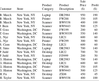
All disciplines collect data about items that are important to that field. Medical researchers collect data on patients, the automotive industry on cars, and retail companies on transactions. These items are organized into a table for data analysis where each row, referred to as anobservation, con-tains information about the specific item the row represents. For example, a data table about cars may contain many observations on different types of cars. Data tables also contain information about the car, for example, the car’s weight, the number of cylinders, the fuel efficiency, and so on. When an attribute is thought of as a set of values describing some aspect across all observations, it is called avariable. An example of a table describing different attributes of cars is shown in Table 2.1 from Bache & Lichman (2013). Each row of the table describes an observation (a specific car) and each column describes a variable (a specific attribute of a car). In this example, there are five observations (“Chevrolet Chevelle Malibu,” “Buick Skylark 320,” “Plymouth Satellite,” “AMC Rebel SST,” “Ford Torino”) and these observations are described using nine variables:Name,MPG, Cylin-ders,Displacement, Horsepower,Weight,Acceleration,Model year, and
Origin. (It should be noted that throughout the book variable names in the text will be italicized.)
A generalized version of the data table is shown in Table 2.2, since a table can represent any number of observations described over multiple variables. This table describes a series of observations (fromo1toon) where each observation is described using a series of variables (fromx1toxp). A value is provided for each variable of each observation. For example, the value of the first observation for the first variable isx11, the value for the second observation’s first variable isx21, and so on. Throughout the book we will explore different mathematical operations that make use of this generalized form of a data table.
The most common way of looking at data is through a spreadsheet, where the raw data is displayed as rows of observations and columns of variables. This type of visualization is helpful in reviewing the raw data; however, the table can be overwhelming when it contains more than a handful of observations or variables. Sorting the table based on one or more variables is useful for organizing the data; however, it is difficult to identify trends or relationships by looking at the raw data alone. An example of a spreadsheet of different cars is shown in Figure 2.1.
TABLE 2.1 Data Table Showing Five Car Records Described by Nine Variables
Name MPG Cylinders Displacement Horsepower Weight Acceleration Model Year Origin
Chevrolet Chevelle Malibu 18 8 307 130 3504 12 70 America
Buick Skylark 320 15 8 350 165 3693 11.5 70 America
Plymouth Satellite 18 8 318 150 3436 11 70 America
AMC Rebel SST 16 8 304 150 3433 12 70 America
Ford Torino 17 8 302 140 3449 10.5 70 America
19
TABLE 2.2 Generalized Form of a Data Table
Variables
Observations x1 x2 x3 . . . xp
o1 x11 x12 x13 . . . x1p
o2 x21 x22 x23 . . . x2p
o3 x31 x32 x33 . . . x3p
. . . .
on xn1 xn2 xn3 . . . xnp
the types of variables that they are able to process. As a result, knowing the types of variables allow these techniques to be eliminated from considera-tion or the data must be transformed into a form appropriate for analysis. In addition, certain characteristics of the variables have implications in terms of how the results of the analysis will be interpreted.
2.3 TYPES OF VARIABLES
Each of the variables within a data table can be examined in different ways. A useful initial categorization is to define each variable based on the type of values the variable has. For example, does the variable contain a fixed number of distinct values (discrete variable) or could it take any numeric value (continuousvariable)? Using the examples from Section 2.1, an industrial sector variable whose values can be “telecommunication industry,” “retail industry,” and so on is an example of a discrete variable since there are a finite number of possible values. A patient’sweightis an example of a continuous variable since any measured value, such as 153.2 lb, 98.2 lb, is possible within its range. Continuous variables may have an infinite number of values.
TYPES OF VARIABLES 21
Variables may also be classified according to thescaleon which they are measured. Scales help us understand the precision of an individual variable and are used to make choices about data visualizations as well as methods of analysis.
Anominal scaledescribes a variable with a limited number of different values that cannot be ordered. For example, a variable Industry would be nominal if it had categorical values such as “financial,” “engineering,” or “retail.” Since the values merely assign an observation to a particular category, the order of these values has no meaning.
Anordinal scaledescribes a variable whose values can be ordered or ranked. As with the nominal scale, values are assigned to a fixed number of categories. For example, a scale where the only values are “low,” “medium,” and “high” tells us that “high” is larger than “medium” and “medium” is larger than “low.” However, although the values are ordered, it is impossible to determine the magnitude of the difference between the values. You cannot compare the difference between “high” and “medium” with the difference between “medium” and “low.”
Aninterval scaledescribes values where the interval between values can be compared. For example, when looking at three data values measured on the Fahrenheit scale—5◦F, 10◦F, 15◦F—the differences between the
values 5 and 10, and between 10 and 15 are both 5◦. Because the intervals
between values in the scale share the same unit of measurement, they can be meaningfully compared. However, because the scale lacks a meaningful zero, the ratios of the values cannot be compared. Doubling a value does not imply a doubling of the actual measurement. For example, 10◦F is not
twice as hot as 5◦F.
Aratio scaledescribes variables where both intervals between values and ratios of values can be compared. An example of a ratio scale is a bank account balance whose possible values are $5, $10, and $15. The difference between each pair is $5; and $10 is twice as much as $5. Scales for which it is possible to take ratios of values are defined as having a natural zero.
Certain types of variables are not used directly in data analysis, but may be helpful for preparing data tables or interpreting the results of the analysis. Sometimes a variable is used to identify each observation in a data table, and will have unique values across the observations. For example, a data table describing different cable television subscribers may include a customer reference number variable for each customer. You would never use this variable in data analysis since the values are intended only to provide a link to the individual customers. The analysis of the cable television subscription data may identify a subset of subscribers that are responsible for a disproportionate amount of the company’s profit. Including a unique identifier provides a reference to detailed customer information not included in the data table used in the analysis. A variable may also have identical values across the observations. For example, a variableCalibrationmay define the value of an initial setting for a machine used to generate a particular measurement and this value may be the same for all observations. This information, although not used directly in the analysis, is retained both to understand how the data was generated (i.e., what was the calibration setting) and to assess the data for accuracy when it is merged from different sources. In merging data tables generated from two sensors, if the data was generated using different calibration settings then either the two tables cannot be merged or the calibration setting needs to be included to indicate the difference in how the data was measured.
Annotations of variables are another level of detail to consider. They provide important additional information that give insight about the context of the data: Is the variable a count or a fraction? A time or a date? A financial term? A value derived from a mathematical operation on other variables? The units of measurement are useful when presenting the results and are critical for interpreting the data and understanding how the units should align or which transformations apply when data tables are merged from different sources.
In Chapter 6, we further categorize variables (independent variables
andresponse variables) by the roles they play in the mathematical models generated from data tables.
2.4 CENTRAL TENDENCY
2.4.1 Overview
CENTRAL TENDENCY 23
values for that variable lie. There are several approaches to calculating this value and which is used can depend on the classification of the vari-able. The following sections describe some common descriptive statistical approaches for calculating the central location: themode, themedian, and themean.
2.4.2 Mode
Themodeis the most commonly reported value for a particular variable. The mode calculation is illustrated using the following variable whose values (after being ordered from low to high) are
3, 4, 5, 6, 7, 7, 7, 8, 8, 9
The mode would be the value 7 since there are three occurrences of 7 (more than any other value). The mode is a useful indication of the central tendency of a variable, since the most frequently occurring value is often toward the center of the variable’s range.
When there is more than one value with the same (and highest) number of occurrences, either all values are reported or a midpoint is selected. For example, for the following values, both 7 and 8 are reported three times:
3, 4, 5, 6, 7, 7, 7, 8, 8, 8, 9
The mode may be reported as{7, 8}or 7.5.
Mode provides the only measure of central tendency for variables mea-sured on a nominal scale; however, the mode can also be calculated for variables measured on the ordinal, interval, and ratio scales.
2.4.3 Median
Themedianis the middle value of a variable, once it has been sorted from low to high. The following set of values for a variable will be used to illustrate:
3, 4, 7, 2, 3, 7, 4, 2, 4, 7, 4
Before identifying the median, the values must be sorted:
2, 2, 3, 3, 4, 4, 4, 4, 7, 7, 7
There are 11 values and therefore the sixth value (five values above and five values below) is selected as the median value, which is 4:
For variables with an even number of values, the average of the two values closest to the middle is selected (sum the two values and divide by 2).
The median can be calculated for variables measured on the ordinal, interval, and ratio scales and is often the best indication of central tendency for variables measured on the ordinal scale. It is also a good indication of the central value for a variable measured on the interval or ratio scales since, unlike the mean, it will not be distorted by extreme values.
2.4.4 Mean
Themean—commonly referred to as the average—is the most commonly used summary of central tendency for variables measured on the interval or ratio scales. It is defined as the sum of all the values divided by the number of values. For example, for the following set of values:
3, 4, 5, 7, 7, 8, 9, 9, 9
The sum of all nine values is (3+4+5+7+7+8+9+9+9) or 61. The sum divided by the number of values is 61÷9 or 6.78.
For a variable representing a subset of all possible observations (x), the mean is commonly referred to asx̄. The formula for calculating a mean, where nis the number of observations and xi is the individual values, is usually written:
The notation ∑ni=1is used to describe the operation of summing all values of x from the first value (i = 1) to the last value (i = n), that is
x1+x2+⋯+xn.
2.5 DISTRIBUTION OF THE DATA
2.5.1 Overview
DISTRIBUTION OF THE DATA 25
location. The frequency distribution, which is based on a simple count of how many times a value occurs, is often a starting point for the analysis of variation. Understanding the frequency distribution is the focus of the following section and can be performed using simple data visualizations and calculated metrics. As you will see later, the frequency distribution also plays a role in selecting which data analysis approaches to adopt.
2.5.2 Bar Charts and Frequency Histograms
Visualization is an aid to understanding the distribution of data: the range of values, the shape created when the values are plotted, and the values called
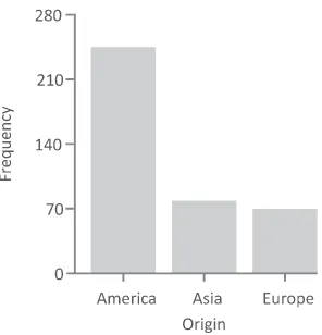
outliersthat are found by themselves at the extremes of the range of values. A handful of charts can help to understand the frequency distribution of an individual variable. For a variable measured on a nominal scale, abar chartcan be used to display the relative frequencies for the different values. To illustrate, theOriginvariable from the auto-MPG data table (partially shown in Table 2.2) has three possible values: “America,” “Europe,” and “Asia.” The first step is to count the number of observations in the data table corresponding to each of these values. Out of the 393 observations in the data table, there are 244 observations where theOriginis “America,” 79 where it is “Asia,” and 70 where it is “Europe.” In a bar chart, each bar represents a value and the height of the bars is proportional to the frequency, as shown in Figure 2.2.
For nominal variables, the ordering of thex-axis is arbitrary; however, they are often ordered alphabetically or based on the frequency value. The
FIGURE 2.3 Bar charts for theOriginvariables from the auto-MPG data table showing the proportion and percentage.
y-axis which measures frequency can also be replaced by values repre-senting the proportion or percentage of the overall number of observations (replacing the frequency value), as shown in Figure 2.3.
For variables measured on an ordinal scale containing a small number of values, a bar chart can also be used to understand the relative frequencies of the different values. Figure 2.4 shows a bar chart for the variable PLT
(number of mother’s previous premature labors) where there are four pos-sible values: 1, 2, 3, and 4. The bar chart represents the number of values for each of these categories. In this example you can see that most of the observations fall into the “1” category with smaller numbers in the other categories. You can also see that the number of observations decreases as the values increase.
DISTRIBUTION OF THE DATA 27
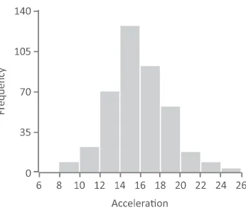
FIGURE 2.5 Frequency histogram for the variable “Acceleration.”
The frequency histogram is useful for variables with an ordered scale— ordinal, interval, or ratio—that contain a larger number of values. As with the bar chart, each variable is divided into a series of groups based on the data values and displayed as bars whose heights are proportional to the number of observations within each group. However, the criteria for inclusion within a single bar is a specific range of values. To illustrate, a frequency histogram is shown in Figure 2.5 displaying a frequency distri-bution for a variableAcceleration. The variable has been grouped into a series of ranges from 6 to 8, 8 to 10, 10 to 12, and so on. Since we will need to assign observations that fall on the range boundaries to only one category, we will assign a value to a group where its value is greater than or equal to the lower extreme and less than the upper extreme. For example, anAccelerationvalue of 10 will be categorized into the range 10–12. The number of observations that fall within each range is then determined. In this case, there are six observations that fall into the range 6–8, 22 observa-tions that fall into the range 8–10, and so on. The ranges are ordered from low to high and plotted along the x-axis. The height of each histogram bar corresponds to the number of observations for each of the ranges. The histogram in Figure 2.5 indicates that the majority of the observations are grouped in the middle of the distribution between 12 and 20 and there are relatively fewer observations at the extreme values. It is usual to display between 5 and 10 groups in a frequency histogram using boundary values that are easy to interpret.
FIGURE 2.6 Examples of frequency distributions.
constant. The second histogram is of a distribution where most of the observations are centered around the mean value, with far fewer obser-vations at the extremes, and with the distribution tapering off toward the extremes. The symmetrical shape of this distribution is often identified as a bell shape and described as anormaldistribution. It is very common for variables to have a normal distribution and many data analysis techniques assume an approximate normal distribution. The third example depicts a
bimodaldistribution where the values cluster in two locations, in this case primarily at both ends of the distribution. The final three histograms show frequency distributions that either increase or decrease linearly as the val-ues increase (fourth and fifth histogram) or have a nonlinear distribution as in the case of the sixth histogram where the number of observations is increasing exponentially as the values increase.
A frequency histogram can also tell us if there is something unusual about the variables. In Figure 2.7, the first histogram appears to contain two approximately normal distributions and leads us to question whether the data table contains two distinct types of observations, each with a separate
DISTRIBUTION OF THE DATA 29
frequency distribution. In the second histogram, there appears to be a small number of high values that do not follow the bell-shaped distribution that the majority of observations follow. In this case, it is possible that these values are errors and need to be further investigated.
2.5.3 Range
The range is a simple measure of the variation for a particular variable. It is calculated as the difference between the highest and lowest values. The following variable will be used to illustrate:
2, 3, 4, 6, 7, 7, 8,9
The range is 7 calculated from the highest value (9) minus the lowest value (2). Ranges can be used with variables measured on an ordinal, interval, or ratio scale.
2.5.4 Quartiles
Quartiles divide a continuous variable into four even segments based on the number of observations. The first quartile (Q1) is at the 25% mark, the second quartile (Q2) is at the 50% mark, and the third quartile (Q3) is at the 75% mark. The calculation for Q2 is the same as the median value (described earlier). The following list of values is used to illustrate how quartiles are calculated:
3, 4, 7, 2, 3, 7, 4, 2, 4, 7, 4
The values are initially sorted:
2, 2, 3, 3, 4, 4, 4, 4, 7, 7, 7
Next, the median or Q2 is located in the center:
2, 2, 3, 3, 4,4, 4, 4, 7, 7, 7
We now look for the center of the first half (shown underlined) or Q1:
2, 2,3, 3, 4,4, 4, 4, 7, 7, 7
FIGURE 2.8 Overview of elements of a box plot.
Finally, we look for the center of the second half (shown underlined) or Q3:
2, 2, 3, 3, 4,4, 4, 4,7, 7, 7
The value of Q3 is identified as 7.
When the boundaries of the quartiles do not fall on a specific value, the quartile value is calculated based on the two numbers adjacent to the boundary. Theinterquartile rangeis defined as the range from Q1 to Q3. In this example it would be 7−3 or 4.
2.5.5 Box Plots
Box plots provide a succinct summary of the overall frequency distribution of a variable. Six values are usually displayed: the lowest value, the lower quartile (Q1), the median (Q2), the upper quartile (Q3), the highest value, and the mean. In the conventional box plot displayed in Figure 2.8, the box in the middle of the plot represents where the central 50% of observations lie. A vertical line shows the location of the median value and a dot represents the location of the mean value. The horizontal line with a vertical stroke between “lowest value” and “Q1” and “Q3” and “highest value” are the “tails”—the values in the first and fourth quartiles.
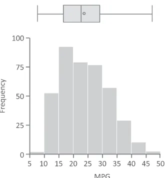
Figure 2.9 provides an example of a box plot for one variable (MPG). The plot visually displays the lower (9) and upper (46.6) bounds of the variable. Fifty percent of observations begin at the lower quartile (17.5)
DISTRIBUTION OF THE DATA 31
FIGURE 2.10 Comparison of frequency histogram and a box plot for the
vari-ableMPG.
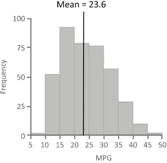
and end at the upper quartile (29). The median and the mean values are close, with the mean slightly higher (around 23.6) than the median (23). Figure 2.10 shows a box plot and a histogram side-by-side to illustrate how the distribution of a variable is summarized using the box plot.
“Outliers,” the solitary data values close to the ends of the range of values, are treated differently in various forms of the box plot. Some box plots do not graphically separate them from the first and fourth quartile depicted by the horizontal lines that are to the left and the right of the box. In other forms of box plots, these extreme values are replaced with the highest and lowest values not considered an outlier and the outliers are explicitly drawn (using small circles) outside the main plot as shown in Figure 2.11.
Box plots help in understanding the symmetry of a frequency distri-bution. If both the mean and median have approximately the same value,
there will be about the same number of values above and below the mean and the distribution will be roughly symmetric.
2.5.6 Variance
The variance describes the spread of the data and measures how much the values of a variable differ from the mean. For variables that represent only a sample of some population and not the population as a whole, the variance formula is
The sample variance is referred to ass2. The actual value (x
i) minus the mean value (x̄) is squared and summed for all values of a variable. This value is divided by the number of observations minus 1 (n−1).
The following example illustrates the calculation of a variance for a particular variable:
Table 2.3 is used to calculate the sum, using the mean value of 5.8. To calculates2, we substitute the values from Table 2.3 into the variance formula:
DISTRIBUTION OF THE DATA 33
TABLE 2.3 Variance Intermediate Steps
x x̄ (xi−x)̄ (xi−x)̄2
Thestandard deviationis the square root of the variance. For a sample from a population, the formula is
s=
of the mean (between 33 and 57). Standard deviations can be calculated for variables measured on the interval or ratio scales.
It is possible to calculate a normalized value, called az-score,for each data element that represents the number of standard deviations that ele-ment’s value is from the mean. The following formula is used to calculate thez-score:
z= xi−x̄
s
where z is the z-score, xi is the actual data value, x̄ is the mean for the variable, and s is the standard deviation. A z-score of 0 indicates that a data element’s value is the same as the mean, data elements with z -scores greater than 0 have values greater than the mean, and elements with
z-scores less than 0 have values less than the mean. The magnitude of the
z-score reflects the number of standard deviations that value is from the mean. This calculation can be useful for comparing variables measured on different scales.
2.5.8 Shape
Previously in this chapter, we discussed ways to visualize the frequency dis-tribution. In addition to these visualizations, there are methods for quanti-fying the lack of symmetry orskewnessin the distribution of a variable. For asymmetric distributions, the bulk of the observations are either to the left or the right of the mean. For example, in Figure 2.12 the frequency distribu-tion is asymmetric and more of the observadistribu-tions are to the left of the mean than to the right; the right tail is longer than the left tail. This is an example of a positive, or right skew. Similarly, a negative, or left skew would have more of the observations to the right of the mean value with a longer tail on the left.
DISTRIBUTION OF THE DATA 35
FIGURE 2.12 Frequency distribution showing a positive skew.
A skewness value of zero indicates a symmetric distribution. If the lower tail is longer than the upper tail the value is positive; if the upper tail is longer than the lower tail, the skewness score is negative. Figure 2.13 shows examples of skewness values for two variables. The variablealkphosin the plot on the left has a positive skewness value of 0.763, indicating that the majority of observations are to the left of the mean, whereas the negative skewness value for the variablemcvin the plot on the right indicates that the majority are to the right of the mean. That the skewness value formcv
is closer to zero thanalkphosindicates that mcvis more symmetric than
alkphos.
In addition to the symmetry of the distribution, the type of peak the distribution has should be considered and it can be characterized by a measurement called kurtosis. The following formula can be used for
20 40 60 80
5 10 15 20 25 30 35 40 45 50
FIGURE 2.14 Kurtosis estimates for two variables.
calculating kurtosis for a variable x, where xi represents the individual values, andnthe number of data values:
kurtosis= n−1
Variables with a pronounced peak near the mean have a high kurtosis score while variables with a flat peak have a low kurtosis score. Figure 2.14 illustrates kurtosis scores for two variables.
It is important to understand whether a variable has a normal distri-bution, since a number of data analysis approaches require variables to have this type of frequency distribution. Values for skewness and kurtosis close to zero indicate that the shape of a frequency distribution for a vari-able approximates a normal distribution which is important for checking assumptions in certain data analysis methods.
2.6 CONFIDENCE INTERVALS