Building Web Apps That Work Everywhere
Building Web Apps That Work Everywhere by Adam D. Scott
Copyright © 2016 O’Reilly Media, Inc. All rights reserved. Printed in the United States of America.
Published by O’Reilly Media, Inc., 1005 Gravenstein Highway North, Sebastopol, CA 95472. O’Reilly books may be purchased for educational, business, or sales promotional use. Online editions are also available for most titles (http://safaribooksonline.com). For more information, contact our corporate/institutional sales department: 800-998-9938 or [email protected].
Editor: Meg Foley
Production Editor: Nicole Shelby
Copyeditor: Amanda Kersey
Interior Designer: David Futato
Cover Designer: Randy Comer
Illustrator: Rebecca Demarest
July 2016: First Edition
Revision History for the First Edition 2016-07-07: First Release
The O’Reilly logo is a registered trademark of O’Reilly Media, Inc. Building Web Apps That Work Everywhere, the cover image, and related trade dress are trademarks of O’Reilly Media, Inc.
While the publisher and the author have used good faith efforts to ensure that the information and instructions contained in this work are accurate, the publisher and the author disclaim all
responsibility for errors or omissions, including without limitation responsibility for damages
resulting from the use of or reliance on this work. Use of the information and instructions contained in this work is at your own risk. If any code samples or other technology this work contains or describes is subject to open source licenses or the intellectual property rights of others, it is your responsibility to ensure that your use thereof complies with such licenses and/or rights.
Preface
As web developers, we are responsible for shaping the experiences of users’ online lives. By making ethical, user-centered choices, we create a better Web for everyone. The Ethical Web
Development series aims to take a look at the ethical issues of web development.
With this in mind, I’ve attempted to divide the ethical issues of web development into four core principles:
1. Web applications should work for everyone. 2. Web applications should work everywhere.
3. Web applications should respect a user’s privacy and security. 4. Web developers should be considerate of their peers.
The first three are all about making ethical decisions for the users of our sites and applications. When we build web applications, we are making decisions for others, often unknowingly to those users. The fourth principle concerns how we interact with others in our industry. Though the media often presents the image of a lone hacker toiling away in a dim and dusty basement, the work we do is quite social and relies on a vast web of connected dependencies on the work of others.
What Are Ethics?
If we’re going to discuss the ethics of web development, we first need to establish a common understanding of how we apply the term ethics. The study of ethics falls into four categories: Meta-ethics
An attempt to understand the underlying questions of ethics and morality Descriptive ethics
The study and research of people’s beliefs Normative ethics
The study of ethical action and creation of standards of right and wrong Applied ethics
The analysis of ethical issues, such as business ethics, environmental ethics, and social morality For our purposes, we will do our best to determine a normative set of ethical standards as applied to web development, and then take an applied approach.
value of an action is based on the result of the action. In short, the consequences of doing something become the standard of right or wrong. One form of consequentialism, utilitarianism, states that an action is right if it leads to the most happiness, or well-being, for the greatest number of people. This utilitarian approach is the framework I’ve chosen to use as we explore the ethics of web
development.
Whew! We fell down a deep dark hole of philosophical terminology, but I think it all boils down to this: Make choices that have the most positive effect for the largest number of people.
Professional Ethics
In the book Thinking Like an Engineer (Princeton University Press), Michael Davis says a code of conduct for professionals:
...prescribes how professionals are to pursue their common ideal so that each may do the best she can at a minimal cost to herself and those she cares about… The code is to protect each professional from certain pressures (for example, the pressure to cut corners to save money) by making it reasonably likely (and more likely then otherwise) that most other members of the profession will not take advantage of her good conduct. A code is a solution to a coordination problem.
My hope is that this report will help inspire a code of ethics for web developers, guiding our work in a way that is professional and inclusive.
The approaches I’ve laid out are merely my take on how web development can provide the greatest happiness for the greatest number of people. These approaches are likely to evolve as technology changes and may be unique for many development situations. I invite you to read my practical application of these ideas and hope that you apply them in some fashion to your own work.
This series is a work in progress, and I invite you to contribute. To learn more, visit the Ethical Web
Development website.
Intended Audience
Chapter 1. Introduction
In 2007, at the 3GSM conference in Barcelona, Tim Berners-Lee, the creator of the Web, gave a
keynote address on the mobile web. In this talk, which happened six months prior to the release of the
original iPhone, Berners-Lee states:
The Web is designed, in turn, to be universal: to include anything and anyone. This universality includes an independence of hardware device and operating system… and clearly this includes the mobile platform. It also has to allow links between data from any form of life, academic, commercial, private or government. It can’t censor: it must allow scribbled ideas and learned journals, and leave it to others to distinguish these. It has to be independent of language and of culture. It has to provide as good an access as it can for people with disabilities.
This idea of universality has become even more critical in our increasingly diverse world of web access. By design, the Web works across platforms and devices, easily connecting rich documents with one another and providing access to users around the world. Despite this universal default, as web developers, it is our responsibility to build a web that is accessible to all. But before we look at how of building an everywhere Web, let’s consider why.
In the United States, where I live, nearly 1 in 5 adults own a smartphone, but either do not have
access to high-speed internet at home or have limited access other than their cell phone according to a
Pew Research Center study. Additionally, mobile devices are heavily depended upon for access to a
wide range of social and cultural services. According to the study, smartphone users report that in the past year:
62% have used their phone to look up information about a health condition. 57% have used their phone to do online banking.
44% have used their phone to look up real estate listings or other information about a place to live.
43% to look up information about a job.
40% to look up government services or information. 30% to take a class or get educational content.
18% to submit a job application.
Meanwhile, smartphone ownership in emerging and developing nations has dramatically increased
over recent years, rising to a median of 37% in 2015 with worldwide 3G coverage reaching 69%.
in Zambia.
It’s predicted that by 2020 there will be 7.8 billion mobile-connected devices, exceeding the world’s population.
In his talk “Small, Faster Websites”, Mat “Wilto” Marquis describes the challenge of building for an everywhere web in this way:
Building massive, resource-heavy sites means excluding millions of users that have only ever known the Web by way of feature phones or slightly better—users paying for every kilobyte they consume; users that already have to keep tabs on which sites they need to avoid day-to-day because of the cost of visiting them. I don’t mean some nebulous hand-wavy “bandwidth cost,” either—I mean actual economic cost.
Despite the challenges of building for a diverse, multidevice Web served over a variety of connection speeds, we can make user-centered choices that enable greater access to our sites and data. We can do this through:
Exposing permanent, human-readable, deep links
Building sites that are responsive to a range of viewport sizes
Valuing the performance of our sites and the bandwidth they consume
Leveraging offline-first capabilities that support varying network conditions
Chapter 2. URLs
The humble hyperlink is one of the most powerful aspects of the Web. This ability to connect to any resource on the Web through a URL is what makes the everywhere web possible. As developers, we should aim to expose URLs that are stable and easy to understand for our users.
In 1996 the creator of the Web, Tim Berners-Lee, drafted “Universal Resource Identifiers—Axioms
of Web Architecture”. This document consists of several axioms of URL design, many technical in
nature; but the first (and arguably most important) is universality. By Berners-Lee’s definition, “any resource anywhere can be given a URI” and “any resource of significance should be given a URI” (emphasis mine). By conforming to these expectations of the Web we make it easier for our users to share and interact with it.
URL VERSUS URI
For the purposes of this chapter, I’ll be using the term URL; however, many quotes cited will use the term URI. Wikipedia helpfully clarifies the difference between these two terms:
A Uniform Resource Locator (URL), commonly informally termed a web address... is a reference to a web resource that specifies its location on a computer network and a mechanism for retrieving it. A URL is a specific type of Uniform Resource Identifier (URI), although many people use the two terms interchangeably. A URL implies the means to access an indicated resource, which is not true of every URI.
URL Permanence
What makes a cool URI?A cool URI is one which does not change. What sorts of URI change?
URIs don’t change: people change them.
—The W3C
One of the beautiful things about developing for the Web is the ability to evolve our applications over time, immediately deploying updates to every user. With this ability, however, we often introduce states of fluctuation as we change server configurations, undergo content redesigns, and adapt to new technologies and frameworks. In the paper “Perma: Scoping and Addressing the Problem of Link and
Reference Rot in Legal Citations,” the authors point out that “more than 70% of the URLs within the
Harvard Law Review and other journals, and 50% of the URLs found within United States Supreme Court opinions, do not link to the originally cited information.” This is often referred to as “link rot,” where once valid URLs no longer return the originally linked resource. The prevalence of link rot is something that online archiving tools such as the Internet Archive’s Wayback Machine and
domains 16 years ago, but this idea has, thus far, failed to become a reality.
As developers, we should avoid arbitrarily changing URLs for our applications as much as possible. If significant changes to content require a URL change, we should always forward the previous URL to the new page. When creating permanent URLs, the first step is to ensure that technology does not dictate the URL. Often, sites display language filetypes at the end of a URL, such as .php or .asp. This doesn’t accommodate future iterations of an application that may be built upon a different technology stack. By remaining technology independent in URL design, we take the first step toward more
permanent URLs.
The importance of persistent URLs is that they help to preserve the Web. When URLs persist, outside links remain active, user bookmarks remain relevant, and information remains consistent. By focusing on good URL design, we can help to ensure the permanence of URLs across the Web.
Sharable URLs
Commenting on an early draft of the “Principles for Ethical Web Development”, web developer Dean
Marano raised the important issue of creating sharable URLs:
One thing that for me is very important when building apps is the ability to share a URL, either with myself or with others, easily. By leveraging this built-in feature of the Web, it makes it much easier to share, bookmark, and be a good web citizen.
This ability to link and share is a key advantage that web development has over other forms of
application development. A few ways that we can aid this practice in our applications is to give our users the ability to link to content that is within our applications, without requiring a login when possible, ensuring that URLs are updated when doing client-side routing. Another way is to avoid non-standard URL formats such as hash-bang URLs (http://example.com/#!/foo/).
URL Design
Simply providing URLs is the first step, but as web usability pioneer Jakob Nielsen has said, URLs
are a form of user interface. Even in the era of search engines, a study from Microsoft Research
revealed that users spent 24% of their gaze time looking at the URLs in search results. With this in mind, how can we design URLs that are effective and usable?
Keep URLs Simple
Effective URLs are simple, short, and human-friendly. This makes them easier to type and remember. WordPress is the most popular content manager for the Web and powers over 25% of sites.
To a user, this URL format is seemingly random and arbitrary. Fortunately, WordPress allowed users to create “pretty” permalink structure; and as of 2015, WordPress now does this by default. The structure is descriptive and clean, such as /posts/effective-altruism/.
WordPress core contributor Eric Lewis told WP Tavern that “Delivering pretty permalinks by default seems in line with a bunch of core philosophies–great out-of-the-box, design for the majority,
simplicity, clean, lean and mean.” I agree with Eric. This is a great change, beneficial to users across the Web, and a great example of how much more legible a well-designed link can be.
By creating link structures that are simple and human readable, we are able to provide our users with a clear description of a URL’s content.
Make URLs Meaningful and Consistent
URLs should be both meaningful and consistent throughout a site. Meaningful URLs clearly represent a resource and accurately describe its contents with the title and, when useful, keywords. A website that holds a blog may put blog posts within a /blog/ URL structure such as /blog/url-design and
/blog/ethical-web. These URLs make the intent of the resource clear and are understandable to the user. URLs should also be consistent, using recognizable patterns. If when logged into an application my profile’s URL is https://example.com/user/adamscott, I would expect to find another user’s profile with the same URL structure of /user/username.
Make URLs Hackable
URLs should be “hackable” up the tree of the URL in a way that allows users to visualize the site structure. For example, if a URL is https://example.com/artist/albums/album-name/ changing the URL to https://example.com/artist/albums/ would return a page displaying the artist’s albums and
https://example.com/artist/ an artist page. Doing this makes our URLs more meaningful and
predictable for our users, while also allowing them to navigate down the tree and share URLs through only the logical URL structure.
The developer Peter Bryant describes this type of URL structure:
If your URLs are meaningful they may also be predictable. If your users understand them and can predict what a url for a given resource is then may be able to go ‘straight there’ without having to find a hyperlink on a page.
By providing users with a hackable URL tree, we enable them to visualize the site structure. This helps make our URLs more predictable and navigable for our users.
API URL Design
Just as we do when designing HTML URLs, when designing API URLs, we should focus on
permanence. As technology and services change, it is likely that our API will evolve. When exposing a public API, it is common practice to host our API on a subdomain named “API.” This allows us to run our API in its own environment while tying it to our top-level domain, https://api.example.com. Perhaps one of the most important things we can do for permanence is to always include an API version in the URL (for example, https://api.example.com/v1/). This allows us to adopt changes to our application’s technology and features while continuing to return results for past versions of the API.
In our URLs we should use nouns that describe what a resource returns rather than verbs that describe what a resource does. This means that we should favor identifiers such as users over verb-driven identifiers like getUsers or list-users. For example, https://api.example.com/v1/users/.
Similar to page URLs, APIs should work up and down the URL tree, making them “hackable.” If
/users/ returns a list of users /users/username/ should return the results for a specific username:
https://api.example.com/v1/users/, and then https://api.example.com/v1/users/psinger/.
Lastly, our API should filter advanced results by query parameters. This allows us to keep the base of our URLs reasonably simple and clean while allowing for advanced filters and sorting requirements:
/users/psinger/friends?sort=date.
As API developers, the URL is our interface. By considering the permanence of our URLs, we are able to build more useful and sustainable APIs.
Through purposeful design of our URLs, we can create URLs for our applications that are both easy to navigate and share. Focusing on URL permanence, simplicity, and predictability aids in building an everywhere web that simplifies access for everyone.
Further Reading
“Persistent Domains—Strawman Ideas on Web Architecture,” by Tim Berners-Lee
“Guidelines for URI Design,” by Jacob Gillespie
“Lessons From A 40 Year Old,” by Matt Haughey
“URL as UI,” by Jakob Nielsen
“REST-ful URI Design,” by Peter Bryant
Chapter 3. Responsive Design
For more than a decade of the Web’s existence, we could safely assume that each user of our site would be accessing it through a computer screen. Despite this, early websites were, by default, adaptive to a variety of screen sizes. The Web’s first site, Tim Berners-Lee’s World Wide Web, works beautifully at a range of screen sizes (Figure 3-1).
Despite this, we spent time researching and considering the typical browser width and assumed that our users would be perched in front of a reasonably large screen, with a dedicated keyboard. With the evolution of mobile devices, those assumptions have changed. Users may access our sites quickly, on the go, from a wide range of screen sizes. With the diversity of devices and screens, we can no longer safely make assumptions about the screen size of our users’ devices.
The initial reaction to the rise of smartphones was to create dedicated mobile versions of our sites. This often sat at a m. subdomain, such as http://m.example.com, and provided a mobile-optimized experience. At first, this seemed like a great solution because it allowed users to access our services in a format that was streamlined for their device. For developers, this also meant maintaining multiple codebases. For users, this often meant dealing with a limited subset of functionality when using a mobile device.
Figure 3-1. Screenshot of the first website with a narrow viewport
Today, the number of devices that connect to the Web is again expanding. Users may access our applications from a desktop computer, a mobile phone, a tablet, a reading device, a watch, a video game system, or in their car. The site Global Stat Counter reports that 119 different screen resolutions have accessed the Web over the past year.
In 2010, web designer and developer Ethan Marcotte coined the term responsive design, to describe the practice of building websites that adapt to a range of screen sizes. By building responsively, we can develop a single codebase that acclimates to the screen size of the device. This allows us to make fewer assumptions while delivering a site that works in any context.
Responsive design consists of three core elements: Fluid grids
strict width. Flexible media
Our images and videos are also not limited by a predetermined width, but adapt with the content of the page.
Media queries
A CSS technique that allow developers to apply different CSS rules in varying contexts. By combining these three browser capabilities, we are able to develop sites for a wide range of browser sizes. When we build responsively, we are ensuring that our sites are delivered to our users in a way that works well in the context that they are accessing our site.
Responsive Design Process
Responsive design is not about “designing for mobile.” But it’s not about “designing for the desktop,” either. Rather, it’s about adopting a more flexible, device-agnostic approach to designing for the web.
—Ethan Marcotte
The process of responsive design can be broken down into four steps: 1. Instruct the browser viewport to adapt to the screen size.
2. Set flexible media elements that can adapt to the width of the container. 3. Develop a device-agnostic baseline experience.
4. Use CSS3 media queries to enhance the experience at a variety of screen sizes (often termed “breakpoints”).
Let’s tease this process apart by creating a very simple responsive page.
By default, mobile browsers will render the page at a desktop screen width. This means that users will need to pinch and zoom to be able to read and access our content. To tell the browser to scale, we can add a meta viewport tag to the <head/> of the HTML document:
<meta name="viewport"
content="width=device-width, initial-scale=1">
The most basic approach to responsive media to scale our images and other media elements to the width of their parent container. In our CSS file, we apply a max-width: 100% to media objects to ensure that they never overflow beyond the container width. In Chapter 4, we will explore how to serve various image sizes depending on browser context:
img,
video {
max-width:100%; height:auto; }
With the baseline of a scaled browser viewport and flexible media, we can begin developing the core experience. The core experience can encompass things such as typography, color, and base styles that should appear in all browsers. By doing so, we ensure that every user is served a site that will work well in their browser regardless of capability. Originally, this approach was termed mobile first, but I’ve come to favor Trent Walton’s description of device agnosticism. By taking this approach, we are developing in a future-friendly way that is prepared for devices of all sizes.
With our baseline styles in place, we can begin adding styles based on browser width. To do this, we use CSS media queries, which allow us to apply specific styles to given browser widths. These can and should be based on the ideal conditions of our application content. For the purpose of responsive design, we’ll focus on max-width and min-width media queries.
A max-width media query allows us to define styles that will only appear up until a certain breakpoint:
@media (max-width: 600px) {
/* Smaller device/browser styles go here */ }
In contrast, min-width media queries allow us to set styles that are only applied at larger browser sizes:
@media (min-width: 601px) {
/* Larger device/browser styles go here */ }
In the end, we may wind up with a stylesheet that is structured with base styles followed by media queries defining styles for various browser sizes, often termed breakpoints:
/* Base Styles */
@media (max-width: 600px) {
/* Smaller device/browser styles */ }
@media (min-width: 601px) {
/* Large device/browser styles */ }
@media (min-width: 850px) {
/* Larger device/browser styles */ }
@media (min-width: 1100px) {
/* Largest device/browser styles */ }
By using breakpoints, we can define styles based on the context of the user’s browser, adapting the content of our site to better meet their needs.
CSS FRAMEWORKS
If you are not a fan of writing CSS (and who could blame you?), you may opt to use a CSS framework such as Bootstrap
or Foundation. These and many other UI frameworks are responsive by default and can be useful for rapid prototyping and quick interface development
Responsive Design Considerations
When developing a responsive design, there are a number of conditions a developer should take into account. Primarily, we should avoid making assumptions about user context and build for non-ideal conditions.
Some of the key considerations for developing responsive designs: Provide users with large click areas for links and buttons.
Ensure that site navigation is accessible and easy to understand.
Make forms as simple as possible, and autofill form content when possible.
Focus on the content of the application, and set breakpoints accordingly, rather than by common device sizes.
Further Reading
“Responsive Web Design,” by Ethan Marcotte
“This is Responsive,” by Brad Frost
Responsive Web Design, Second Edition (O’Reilly), by Ethan Marcotte
Though Berners-Lee’s first website adapts to any browser width, it still scales on most mobile browsers due to browser behavior. As we will discuss later in the chapter, adding a viewport meta tag to our HTML prevents this from happening.
Brad Frost filmed a demonstration of a project from 2013 on an Apple Watch.
1
Chapter 4. Web Performance
Each Tuesday morning, when a Facebook employee logs in to the application, they are presented with an option to try out the app on a slower connection for an hour. This is part of an initiative they call
2G Tuesdays, as an attempt to recognize the importance and challenges of designing and developing
applications that are served over a variety of network conditions.
As developers, we often have access to good hardware and quick web connections, but this may not always be the case for our users. Even those of us who live in major cities may experience variable network conditions, clogged or throttled by overuse. When we build our sites and applications with a performance mindset, we benefit all of our users.
File Size
80% of the end-user response time is spent on the front-end
—Steve Sounders, author of High Performance Websites
As of writing, the average web page requires a user to download roughly 2.3 MB worth of data. Using this metric, the first 5.25 inch hard drive, the 1980 Seagate ST–506 (Figure 4-1), would be able to hold just two modern web pages.
Figure 4-1. The Seagate ST–506 hard drive (image courtesy of Wikimedia Commons)
With varying connection speeds around the world, the cost of accessing our site’s can differ. The website What Does My Site Cost seeks to provide insight into the real-world data costs of sites accessed over a mobile connection. In many parts of the world, the cost of 500 MB of data far
exceeds the hourly minimum wage.
Here is the cost of a few different sites when accessed in various parts of the world (in US dollars):
Site Size Canada Botswana USA France
Wikipedia article 0.23 MB $0.03 $0.02 $0.01 $0.00
The Verge’s “Apple Watch Review” 8.02 MB $0.98 $0.60 $0.51 $0.16
To decrease the footprint of our websites, we can aim to: 1. Minimize the number of resources.
2. Optimize files, images, and fonts. 3. Serve responsive images.
4. Leverage gzip and caching.
By putting these four best practices in action, we ensure that our site’s users are transferring the lowest amount of data from our servers to their devices.
Number of Resources
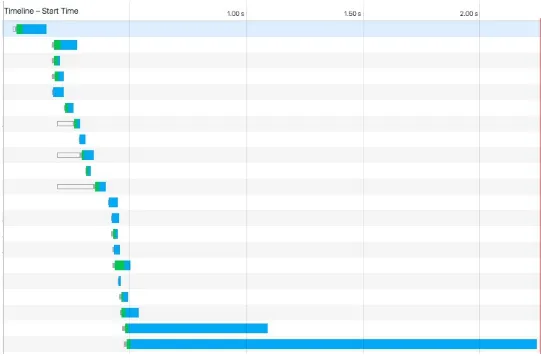
Perhaps the biggest impact we can have on reducing data transfer for first-time users is to limit the number of resources sent to the user. Each individual resource on a page requires an individual HTTP request. A waterfall chart, such as the ones found in Chrome’s developer tools (Figure 4-2), shows how long it takes to download each resource.
Figure 4-2. Image of Google Chrome’s Network waterfall chart
sprites.
HTTP/2
The HTTP/2 protocol may challenge some of our assumptions about combining resources. While HTTP/1.1 only services a single server request at a time, HTTP/2 enables multiple simultaneous connections. This means that bundling, inlining, and combining resources may be less effective as we move to the new protocol. In fact, these techniques may slow down our site when served over HTTP/2.
Learn more about HTTP/2:
Rebecca Murphy’s HTTP/2 resources “HTTP/2,” by Ilya Grigorik
“HTTP/2 for Web Developers,” by Ryan Hodson
“http2 explained,” by Daniel Sternberg
“Getting Ready For HTTP/2: A Guide For Web Designers And Developers,” by Rachel Andrew
Optimizing Files, Images, and Fonts
Once we have reduced the number of HTTP requests being made in our site, the next step is to
optimize the files we serve. We can do this by minimizing CSS and JS resources, optimizing and and serving proper images, and making good use of web fonts when used.
Minimizing files
Though whitespace and line breaks make CSS and JavaScript files readable to humans, they are necessary for the browser to properly parse them. To reduce the file size of these resources, we should minimize them for our production sites.
There are several desktop and web applications for minimizing CSS and JavaScript.
Closure Compiler
An online tool from Google for minifying JavaScript
Online JavaScript/HTML/CSS Compressor
A single web interface for compressing three file types
Smaller
A Mac OS X tool for HTML, CSS, and JavaScript compression.
UglifyJS
An online tool for JavaScript minification based on the popular Uglify.js utility.
npm-scripts. For these build tools, there are a number of minification plug-ins. Here are a few that I’ve used with success in the past:
node-minify
A Node interface for minifying both CSS and JavaScript, which utilizes a number of popular compression algorithms
uglify-js
A command-line utility, written in JavaScript, for minifying JavaScript Gulp: gulp-clean-css
A CSS minification plug-in for Gulp Gulp: gulp-uglify
A JavaScript minification plug-in for Gulp Grunt: grunt-contrib-cssmin
A CSS minification plug-in for Grunt Grunt: grunt-contrib-uglify
A JavaScript minification plug-in for Grunt
Optimizing images
Images comprise the largest file sizes on a typical web page, taking up more than 60% of the bytes on an average page (see Figure 4-3). By using images well and reducing their file sizes, we can
Figure 4-3. The average file size of common web resources at the time of writing (image courtesy of the http archive)
To do this, we should use the proper image formats, optimize images to reduce file size, and serve the image size needed by the browser.
When creating images, we need to consider their content and choose the most appropriate format. JPG
Use for photographs. PNG
Use as the default for most other static images and images that require transparency. GIF
Use for simple images. Supports transparency and animation. SVG
Small file size that scales well and is supported all modern browsers. Use for icons, illustrations, and logos.
ImageOptim
For sites using a frontend build process, such as Gulp, Grunt, or npm scripts, we can bake image optimization into our build process. The Node.js package imagemin provides a utility for minimizing images in a number of build environments (imagemin-cli for a command-line interface,
gulp-imagemin for Gulp, and grunt-contrib-imagemin for Grunt.
Optimizing web fonts
Web fonts have provided the ability to add rich typography to our sites. This has been a fantastic development for design, as 95% of web design is typography. 57% of websites now use custom fonts, with the average web font size of font resources measuring over 138 kb. This means that font
resources can account for a fairly large amount of our frontend resources; but through optimization and font-loading techniques, we can ensure that custom web fonts do not create a significant
performance hit for our site.
The first step to serving improved web fonts is through optimization. The simplest font optimization is to limit the number of styles and weights of a typeface that will be used on the page. Web font
services such as Typekit, Google Web Fonts, Webtype, and others allow users to be specific about the styles, weights, and character glyphs required when serving a typeface. If you are self-hosting or using an open source font the tools Subsetter or Font Squirrel’s Web Font Generator provide the ability to remove glyphs or additional language support, reducing the file size of the font files.
Once we have optimized file size of our typefaces, we can consider how they are served to our users. In Zach Leatherman’s post “How we use web fonts responsibly, or, avoiding a @font-face-palm,” he points out:
Some browsers will wait a predetermined amount of time (usually three seconds) for the font to load before they give up and show the text using the fallback font-family. But just like a loyal puppy, WebKit browsers (Safari, default Android Browser, Blackberry) will wait forever (okay, often 30 seconds or more) for the font to return. This means your custom fonts represent a potential single point of failure for a usable site.
This single point of failure means that it is in our user’s best interest to provide effective and performant fallbacks when loading web fonts. The CSS Font Rendering Controls standard would provide developers with greater support over when and how a font is downloaded and used with the font-display property. Unfortunately, at the time of writing, this standard has yet to be approved or
implemented in browsers. However, using the Font Face Observer library can provide us with the level of control intended for font-display.
Font Face Observer is a web font loader, which will load a font file and return a JavaScript promise that is resolved or rejected when the font loads or fails. This provides us with fine-grain control over how our site performs in these scenarios.
The two default font rendering behaviors are either to display a flash of invisible text (FOIT) or a
flash of unstyled text (FOUT). Originally all browsers defaulted to the FOUT rendering, displaying a local font before displaying the web font, occasionally causing a jarring effect and content reflows when the web font noticeably loaded. Using Font Face Observer, we can implement a technique called flash of faux text (FOFT), which will load only the default weight of the font initially, which causes the browser to implement faux bolding and italics, until all weights have loaded. This
significantly reduces the time needed to first render and removes the awkward reflow caused by FOUT. Taking this a step further, you may also implement only a subset of the default weight and load it instantly as a data URL as described bb Zach Leatherman in his post “Critical Web Fonts”. This causes near instant loading of web fonts while reducing the chance of font loading failures.
For simplicity’s sake, let’s look at implementing the FOFT technique with Font Face Observer. To begin, we would load our font family in our CSS using @font-face:
@font-face {
font-family: MyWebFont;
src: local('My Web Font'),
url('/fonts/myfont.woff2') format('woff2'),
url('/fonts/myfont.woff') format('woff'),
url('/fonts/myfont-bold.eot') format('eot');
font-weight: 700;
url('/fonts/myfont-italic.woff2') format('woff2'),
url('/fonts/myfont-italic.woff') format('woff'),
font-weight: 400;
font-style: normal;
}
Now, we would want to implement a series of classes for our type styles:
/* users on a slow connection may see FOUT, it may be worth setting a body font for
font load failures and as a backup */ body {
font-family:sans-serif; }
/* we can set a specific style if need be, for font loading failures */
.font-failed body { font-family:sans-serif; }
/* set the body to our base font once the file has loaded */ .font-loaded body {
font-family: MyWebFont; }
/* styles for bold, italic, and other font styles */ .font-b-loaded h1 {
Now in our JavaScript we can use Font Face Observer to detect the font loading and manipulate the class on our HTML tag:
var FontFaceObserver = require('fontfaceobserver');
// we can set a class on the html el when fonts are loading
var html =document.documentElement;
html.classList.add('font-loading');
// create an observer for the default font weight
var regular = new FontFaceObserver( 'MyWebFont', {
weight:400
});
var bold = new FontFaceObserver( 'MyWebFontBold', {
weight:700
});
var italic = new FontFaceObserver( 'MyWebFontItalic', {
});
regular.check().then(function() { // add the font-loaded class
// when our default weight has dowloaded html.classList.remove('font-loading');
html.classList.add('font-loaded');
// use a JS promise to add a class when additional weights // and styles have downloaded
// Font Face Observer ships with a promise polyfill Promise
html.classList.add('font-b-loaded'); });
The example code assumes that Font Face Observer is being loaded as a CommonJS module. The library is also available for direct download.
To further speed up our font loading for repeat visitors, we could also store a session storage
token, tracking when a user’s browser has already accessed our font files.
Using the technique demonstrated, we can ensure that our fonts load as quickly as possible, while minimizing the jarring effects of FOUT and FOIT. A full working example of this code is available on
GitHub.
Further reading
“Critical Web Fonts,” by Zach Leatherman
“Flash of Faux Text,” by Zach Leatherman
“Web Font Optimization,” by Ilya Grigorik
“FOUT, FOIT, FOFT,” by Chris Coyier
“Font Loading Revisited with Font Events,” by Scott Jehl
“Web Font Loading Patterns,” by Bram Stein
Responsive Images
If our site’s and applications are being accessed on a wide range of devices, serving a large image file that adjusts to each viewport width becomes less than ideal. By doing this, we are often sending images meant for a desktop browser to our most resource-constrained devices. Thankfully, the srcset
and picture element standards provide us with techniques to serve optimized images at different
screen resolutions.
srcset is an additional attribute added to the img element, providing the browser with guidelines for a variety of image sizes. By default, srcset is progressively enhanced. To use srcset, we can start with a standard image tag:
<img src="img/midfi.jpg" alt="…">
Now, using srcset, we can specify different images for viewport widths. For each image, we specify the image file along with the width of the image. The browser will then do the math to serve the appropriate image file based on the viewport width and device resolution:
<img srcset="
The example assumes that the images are being served at 100% of the viewport width. For images that are smaller, there is an additional sizes attribute. We can provide suggestions to the browser about how wide the image will be displayed compared to the viewport. If the image was going to be displayed at half of the viewport width, we would add the following sizes attribute:
sizes="50vw"
We can also include media queries in the sizes attribute, suggesting that the image may be displayed at a percentage below or above a certain breakpoint. The following example would suggest to the browser that an image is displayed at a third of the viewport size at sizes above 600 px and at the full browser width below that:
sizes="(min-width: 800px) 33vw, 100vw"
Putting it all together, our markup would appear as:
<img
sizes="(min-width: 800px) 33vw, 100vw" srcset="
img/midfi.jpg 840w, img/hifi.jpg 1200w, img/super-hifi.jpg 2400w, src="img/midfi.jpg"
alt="…">
For most responsive image use cases, the img element with srcset will provide the the flexibility that
we need. In some instances, however, we may want more fine-grained control over the images served to our users. This is typically referred to as art direction in responsive images, where we may want cropped or different images served to users dependent on browser context. In these instances we can use the picture element. While srcset works as a suggestion to the browser, picture provides exact specifications. The syntax for the picture element nests source elements, specifying the media width and src of the image file. Again, we can fall back to a progressively enhanced standard img tag for nonsupporting browsers:
<picture>
<source media="(min-width: 800px)" srcset="large.jpg"> <source media="(min-width: 600px)" srcset="medium.jpg"> <img src="small.jpg" alt="…">
</picture>
Through the use of responsive image techniques, we can provide users with smaller files optimized for their viewport sizes. This reduces file sizes, speeds up transfer times, and reduces bandwidth costs when dealing with the largest resources found on a typical web page.
Responsive image tools
Responsive Images Breakpoints Generator RespImageLint
Further reading
“Srcset and sizes,” by Eric Portis
Mozilla Developer Network’s “Responsive images”
“Native Responsive Images,” by Yoav Weiss
“Responsive Images: If you’re just changing resolutions, use srcset,” by Chris Coyier
GZip and Caching
Though we may optimize our files locally, we can also configure our server to ensure that files are served efficiently to our users. Two common and effective approaches are the use of Gzip and caching.
Gzipping is a server configuration that replaces repetitive strings with pointers to a previous instance of the string. Using Gzip dramatically decreases file sizes, far more so than minification alone. In the article “The Difference Between Minification and Gzipping,” Chris Coyier points out the difference in file sizes in the Bootstrap CSS file:
Original CSS file: 147 KB
Minified CSS file: 123 KB (83% of the original file) Gzipped CSS file: 22 KB (15% of the original file)
Gzipped and minified CSS file: 20 KB (14% of the original file)
Enabling Gzipping is done as part of our server configuration. HTML5 Boilerplate offers
configurations for popular servers, including Apache, IIS, and Nginx, which include gzipping.
Here is what the Apache 2 configuration, set to Gzip HTML, CSS, and JavaScript would look like:
<IfModule mod_filter.c>
AddOutputFilterByType DEFLATE "text/html" \ "text/css" \
"application/javascript" </IfModule>
For a look at a complete .htaccess with additional file types, see the HTML5 Boilerplate Apache configuration.
A quick and simple way to see Gzip in action is to open Chrome DevTools and inspect the “Size / Content” column in the Network panel: “Size” indicates the transfer size of the asset, and “Content” the uncompressed size of the asset.
The tool gzipWTF provides an easy way to check which assets on your site are being gzipped.
Caching
Caching allows us to temporarily store previously accessed resources such as HTML, JS, CSS, and images locally for our users. This means that instead of relying on bandwidth, a user’s browser is able to immediately access the needed resource. In his “Caching Tutorial” Mark Nottingham notes the two reasons that web caches are used:
To reduce latency
Because the request is satisfied from the cache (which is closer to the client) instead of the origin server, it takes less time for it to get the representation and display it. This makes the Web seem more responsive.
To reduce network traffic
In his article “Caching Best Practices & Max-Age Gotchas,” Jake Archibald described the two best practice patterns for caching:
1. Immutable content with a long max-age
2. Mutable content that is always server revalidated
For our purposes, we’ll focus on immutable content with a long max-age, though I encourage you to read Jake’s excellent article. There are two key components when following the immutable content with a long max-age caching practice. The first is the server setup. Again, using HTML5
Boilerplate’s server configurations as an exemplar we can look at setting mod_expires in Apache:
<IfModule mod_expires.c> ExpiresByType application/font-woff2 "access plus 1 month" </IfModule>
ABOUT THIS EXAMPLE
This an abbreviated example for demonstrative purposes. For the full list see HTML5 Boilerplate’s .htaccess file.
As you can see, we’ve given many of our resources long cache life cycles. For CSS and JavaScript, the caching extends to a year. However, when we update our site, it is unlikely that we would want users to experience a cached version of one of these resources. To avoid this, we need to bust the cache by changing the URL. The clearest way to do this is to append a hash to our resources. Rather than:
<link rel="stylesheet" href="styles-d41d8cd98f.css".css"> <img src="logo-115r1hss9h.png" alt="">
There are several tools to automate this process, depending on your framework and build processes:
gulp-rev
Django ManifestStaticFilesStorage
A Django setting for appending a MD5 hash to the name of static files.
Rails config.assets.digest
A Rails setting for appending a hash to static file assets. This is enabled in production environments by default.
static-asset
A static asset manager for Node.JS, designed for Express.
Optimizing the Rendering Path
The rendering path is the steps taken by the browser downloading our HTML, CSS, and JavaScript and displaying something on the screen. CSS is render blocking, meaning that it must be downloaded and the styles parsed before the browser moves on to the next rendering step. Similarly, JavaScript is parser blocking, meaning that whenever a script is encountered, it must be downloaded and executed before the browser can continue parsing the document.
To improve the rendering of our page, we can pay more attention to how our site’s CSS and
JavaScript are included in the page. First, we should have as little blocking JavaScript as possible, instead placing our <script> tags above the closing </body> tag in our page. Critical JavaScript that must be included on the initial render can be inlined for increased performance:
<html> <head>
<!— inline critical JS —>
<script type="text/javascript"> /* inlined critical javascript */ </script>
</head> <body>
<h1>Page Content</h1>
<!— place additional JS file just above /body tag —>
<script type="text/javascript" src="external.js"></script> </body>
</html>
Similarly, for an additional performance boost, critical CSS can be loaded inline while secondary styles are loaded in a non-blocking manner. Critical CSS can be considered anything that is
absolutely visually necessary for the initial page load, such as baseline typographic styles, color, header styles, and basic layout. I often think of these things as the “shell” of the site or application. If you are working on an existing site, the tool Critical automatically extracts critical CSS from our styles.
types to load a small file of necessary CSS or asynchronously load our other styles. Let’s look at both techniques.
In the Chapter 3 we explored the use of media queries to selectively style our site at different
breakpoints. We are also able to use media queries and media types within the <link> tags that point to our CSS files. When we do this, only the CSS files that apply to browser conditions will be render blocking. Other CSS files will download, but will do so asynchronously. This means that we can significantly decrease the file size of the CSS that the browser needs to download on the first render. To do this we would break our CSS into smaller files and add a media attribute to the <link> tags:
<head>
<!—inline critical CSS —> <style>
/* inlined critical styles */
</style>
/* referenced CSS files */
/* applies only when a site is being printed */
<link href="print.css" rel="stylesheet" media="print">
/* styles applied when viewport is 600px or less */
<link href="small.css" rel="stylesheet"
media="(max-width: 600px)">
/* styles applied when viewport is 601px or more */
<link href="large.css" rel="stylesheet"
media="(min-width: 601px)"> </head>
If we want to explore the asynchronous loading of CSS, Filament Group’s loadCSS provides a means for loading styles based on the preload pattern. Building upon our JavaScript loading example, we could handle styles in this way:
<html> <head>
<!— inline critical CSS —>
<style>
/* inlined critical styles */ </style>
<!— preload pattern for loading external CSS —>
<link rel="preload" href="path/to/mystylesheet.css" as="style" onload="this.rel='stylesheet'">
<!— no js fallback —>
<noscript><link rel="stylesheet"
href="path/to/mystylesheet.css"></noscript>
<!— inline critical JS —>
<script type="text/javascript"> /* inlined critical javascript */
/* includes filament group's loadCSS */
/* https://github.com/filamentgroup/loadCSS */ </script>
</head> <body>
<h1>Page Content</h1>
<!— place additional JS file just above /body tag —>
<script type="text/javascript" src="external.js"></script> </body>
</html>
As an alternative to loadCSS, Google’s app-shell demo includes a custom asynchronous style loader with a very small footprint.
ASYNCHRONOUS CSS AND JAVASCRIPT
Both loadCSS and Google’s app-shell CSS loader require JavaScript to load the secondary CSS file. As long as our inline styles include our site’s core styles, this will provide a usable, progressively enhanced experience for our users should JavaScript fail on a page. If you choose to use one of these techniques, I recommend testing your site with only the inlined CSS styles to ensure it remains usable.
Regardless of technique, by considering how our styles and scripts effect the rendering our page, we can increase the time to first render for our user’s.
Further Reading
“Web Fundamentals: Critical Rendering Path,” by Ilya Grigorik
“Optimizing the Critical Rendering Path,” by Stephan Max
The Critical Path CSS demo by Addy Osmani
The Google Developers page on optimizing the critical rendering path. The Google Developers page on optimizing CSS delivery
Testing Performance
Though we may follow a number of best practices for web performance within our application, it is useful to test and evaluate our site’s performance. We can measure performance while simulating devices and network conditions to provide us with a better understanding of how our site performs.
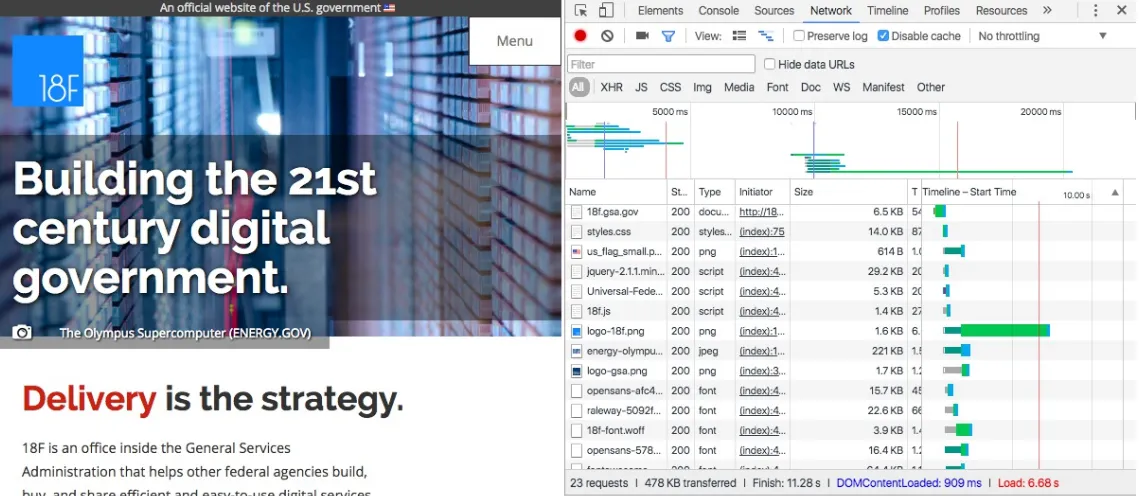
When developing locally, we can begin testing performance using our browser’s developer tools. Using Google Chrome, we can load our site, open DevTools, click the Network tab, and perform a hard refresh (Ctrl + F5, Windows and Linux; Cmd + Shift + R, Mac). As the page loads, we can see a waterfall chart of the assets loaded on our page.
The Network tab (Figure 4-4) also provides us with the option to simulate throttled data networks
(Figure 4-5). This gives us the opportunity to use our applications under varying network conditions,
getting a sense of how functional they are when assets load at a slower rate and allowing us to build empathy for users who access our tools under less ideal conditions.
Figure 4-4. Image of the Network tab along side a web page in Google Chrome’s developer tools
Figure 4-5. Google Chrome’s throttle options
“Page Load Performance,” by Meggin Kearney
“Using the Chrome Debugger Tools, Part 2: The Network Tab,” by Joshua Davies
WebPagetest
WebPagetest is web-based tool that allows us to examine the performance of a site with various
browsers and network conditions. To begin using WebPagetest, we need only to visit the site and add a URL. The results of the test will provide data about our site’s load time.
One of the useful features WebPagetest provides is an overview chart (Figure 4-6) containing information around load time for initial visits and repeat views to the site.
Figure 4-6. WebPagetest’s overview chart
Another useful feature is a filmstrip view of the site’s progress when loading (see Figure 4-7). This allows us to see more clearly the initial render of the page and how resources are loaded in the DOM.
Figure 4-7. WebPagetest’s filmstrip view
Using these features we are able to create metrics to measure the performance of our site and compare performance improvements throughout development.
WebPagetest is an open source tool, making it possible to contribute to its development as well as host your own instance, which can be valuable for testing sites before they are publicly available.
Further reading
WebPagetest documentation
Using WebPageTest (O’Reilly) by Rick Viscomi, Andy Davies, and Marcel Duran
Performance Budgets
When managing web performance, many choose to enact a performance budget. A performance budget is a self-determined limit on the size or number of assets, page load speed, and overall page weight.
Tim Kadlec documented the types of metrics that may be useful when setting a performance budget: Milestone timings such as load time, domContentLoaded, and time to render
SpeedIndex as provided by WebPagetest
Quantity based metrics such as the total number of requests;, the overall weight of the page, and the total image weight
Rule based metrics such as the PageSpeed or YSlow score
For existing projects, Daniel Mall points out that “people perceive tasks as faster or slower when there’s a least a 20% time difference.” Based on this, he suggests attempting to beat the current render times by 20%.
Performance Budgets and Build Processes
Setting a performance budget is a great first step, but running our site through WebPagetest on every build is impractical. In her post “Automate Performance Testing with Grunt.js,” Catherine Farman details how she has enabled performance budgeting in her build process. Though specific to Grunt, the format is easily applied to other build tools. If using Gulp, npm packages, or another Node-based build system, the WebPagetest module will provide similar output.
Through the use of a performance budget, we are able to set and maintain performance standards and expectations. This can provide a helpful guide to ensuring a project stays quick and performant. By emphasizing the performance of our sites, we are able to build a faster Web that is more readily available to a wider audience of people.
Further Reading
Designing for Performance (O’Reilly) by Laura Callendar Hogan
“The Website Obesity Crisis,” by Maciej Cegłowski
“Smaller, Faster Websites,” by Mat “Wilto” Marquis
Google Developers page on performance
“Building a Faster Web,” by Patrick Hamann
“Why Performance Matters,” Part 1, Part 2, and Part 3 by Denys Mishunov
The W3C Web Performance Working Group
The Opera Dev blog has a useful article explaining the upcoming Font Load Events standards. To learn more about preload, I recommend reading the post “Preload: What Is It Good For?” by Yoav Weiss.
1
Chapter 5. Offline
We live in a disconnected & battery powered world, but our technology and best practices are a leftover from the always connected & steadily powered past.
—Offline First
As discussed in the previous chapter, good web performance benefits all of our users, especially those on slow connections. But often, users are accessing our sites in variable network conditions. A person may pick up her phone and begin browsing through our site at home over WiFi, but open the browser again offline on the subway, only to be presented with dreaded offline error messages. Even more infuriating are the times where we appear to be connected to the network, but assets are failing to load. This experience is something that developer Jake Archibald has termed Lie-Fi. Everything seems like it should be working, but is slow to load as assets feebly connect to our struggling signal.
There are a number of potential reasons, besides a poor signal, that a user may experience poor network conditions, such as:
An overloaded cellular network Problems with the website’s server A misconfigured proxy
Being nearby a previously accessed WiFi network
Creating offline experiences for our users can provide us the ability to brand and give better error messaging to our users on a poor connection, provide limited functionality of our sites to offline users, or even create seamless offline experiences. As a bonus, offline web applications work blazingly fast, providing a benefit to users on all types of connections. In this chapter, we’ll look at two technologies that make offline experiences possible, Service Workers and in-browser databases.
Service Workers
Service workers are a script that runs separately from the page, which provide us with a way to make our sites to work offline, run faster, and add capabilities for background features. With the limits of connectivity, service workers provide us with a means to build offline-first capable applications, which will load content for our users, after an initial site visit, regardless of network conditions. Best of all, service workers are truly a progressive enhancement, layering on an additional feature to
Service workers present us with many possibilities for how we handle user connectivity. For our purposes, let’s build a simple static site example that will cache all of our site’s static assets. If you are interested in following along, you can download a service worker version of this example for free.
SERVICE WORKER GOTCHA’S
There are a potential gotchas when implementing service workers: 1. Sites using a service worker must be served over HTTPS.
2. Service workers do not work when a user is in private browsing mode.
3. Browser support is limited, but growing: At the time of writing, service workers are supported in Chrome, Firefox, and Opera, with planned implementation in Microsoft Edge, and they are under consideration for Safari.
4. Since service workers run as a separate thread in the browser, they do not have access to the DOM. 5. Service workers are scoped, meaning that they should be placed in the root of your application.
The first step of working with a service worker is registering the script that will contain our service worker code. Let’s begin by adding that code to our HTML pages. At the bottom of the page, just before the closing </body> tag let’s add the script registration:
<!-- initiate the service worker --> <script>
if( 'serviceWorker' in navigator ) { navigator.serviceWorker .register( '/service-worker.js' )
This script checks for service worker support, and if the support is available, points the browser to a service worker script (in our case service-worker.js). For debugging purposes, we’re also catching errors and logging the error to the console.
Now that we have our script registration, let’s write our service worker. To begin, create a service-worker.js file and place it in the root of the directory. Let’s start by specifying a version of our cache and listing the files we would like the service worker to cache. In our case, we’ll cache our two HTML pages, a CSS file, a JS file, and an image:
var cacheVersion = 'v1';
'/',
If we make changes to our site, we would need to increment the cacheVersion value or risk users being served content from our cache.
Now we can set up two event listeners in our service worker, install and fetch. The install service worker provides the browser with instructions for installing our cached files, while fetch provides the browser with guidelines for handling fetch events by providing the browser with either our cached files or those received over the network:
self.addEventListener('install', function (e) { e.waitUntil(caches.open(cacheVersion) .then(function (cache) {
return cache.addAll(filesToCache) .then(function () {
You can get the full version of our service-worker.js file from GitHub.
With these additions, our simple static site is ready to work offline. To see it in action, visit the demo page.
In Figure 5-1, we can see that the service worker has been downloaded in the Sources panel in
Figure 5-1. Our service worker in Chrome Developer Tools’ Sources panel
To test the offline capability of our site, we can visit the Network panel, change the Throttling setting to Offline, and reload our page (see Figure 5-2).
Figure 5-2. Throttling options in Chrome Developer Tools
Despite being offline, our site and site assets continue to load and are navigable. This example is simple, loading a two-page, static site and with minimal error handling. To dive into how these concepts can be applied to production ready sites and applications, see the further reading section at the end of this chapter.
Service Worker Tools
Managing our site’s service worker by hand can become unwieldy. Thankfully, the Google Chrome team has developed two incredibly useful tools for incorporating service workers into our
development process.
sw-precache is a Node.js module that generates service workers for precaching static resources,
similar to our demo. sw-precache even handles the versioning and cache busting, making it much simpler than managing a service worker by hand. Helpfully, they also provide sample Gulp and Grunt
configurations. The module can also be used standalone from the command line or as part of a
package.json script.
Here is a sample Gulp configuration for sw-precache that would cache all of our HTML, CSS, JS, and image files:
var swPrecache = require('sw-precache');
gulp.task('generate-service-worker', function(cb) {
sw-toolbox is a script that can be imported into a service working, providing an API for helpful
utilities such as caching strategies, Express-style and Regex routing, and cache age. The full API is available on the sw-toolbox GitHub.
In-Browser Databases
In-browser databases provide us with a way to store persistent data directly in a user’s browser. This allows us to store user data locally or to sync data from a database for offline use. This is similar to how a native mobile application might handle user data, storing user files locally and periodically syncing with a server when a device is connected to the network.
var indexedDB =window.indexedDB;
var open = indexedDB.open('ShuttleDatabase', 1);
Next we will create the schema for our database, by adding the object stores we will need for our database as part of the on upgradeneededmethod:
open.onupgradeneeded = function() { var db = open.result;
var store = db.createObjectStore('Missions', {keyPath: "id"}); };
Then we can create event handlers for both successful creation or to handle errors:
open.onerror = function(event) { // error handler
console.log(
'Houston, we have problem: ' + event.target.errorCode );
};
open.onsuccess = function(event) { // success
console.log('We have liftoff!'); };
Now let’s start a new database transaction and add some data to our database:
open.onsuccess = function() { var db = open.result;
var transaction = db.transaction('Missions', 'readwrite'); var objectStore = transaction.objectStore('Missions'); // our data
We can then query that data inside of our onsuccess handler:
var getDiscovery = objectStore.get('STS-41-D');
getColumbia.onsuccess = function() { console.log(getDiscovery.result.shuttle); };
getChallenger.onsuccess = function() { console.log(getAtlantis.result.launchDate); };
Lastly we need to close the database transaction once we are done:
transaction.oncomplete = function() { db.close();
};
Putting it all together, it would look like this:
var indexedDB =window.indexedDB;
// open or create the database
var open = indexedDB.open('ShuttlesDatabase', 1);
// open or create the schema
open.onupgradeneeded = function() { var db = open.result;
var store = db.createObjectStore('Missions', {keyPath: "id"}); };
// handle errors
open.onerror = function(event) { console.log(
'Houston, we have problem: ' + event.target.errorCode );
};
open.onsuccess = function() { // begin the transaction var db = open.result;
// query our data
var getDiscovery = objectStore.get('STS-41-D'); var getAtlantis = objectStore.get('STS-51-J'); getColumbia.onsuccess = function() { console.log(getDiscovery.result.shuttle); };
getChallenger.onsuccess = function() { console.log(getAtlantis.result.launchDate); };
// close the db when the transaction is done transaction.oncomplete = function() {
db.close(); };
}
IndexedDB is an exciting technology, but the API leaves a little to be desired. localForage is a library from Mozilla that creates an asynchronous API (using either Promises or Node-style callbacks) for in-browser databases. It also expands the browser capability of offline storage by supporting IndexedDB and WebSQL with a localStorage fallback. Through these additions, localForage simplifies the code needed to create, add data to, and retrieve data from our database. Here’s a version of the preceding code that would add our data to localForage and log the results:
// our data
console.log('Houston, we have a problem'); });
this, we will most likely want to sync user data when the user is online. We can do this with
IndexedDB and our database of choice. Another attractive option is PouchDB, which is a JavaScript implementation of Apache CouchDB. PouchDB provides a local database API and makes it easy to sync the local database with any remote instance of CouchDB.
Using an in-browser database may not be ideal for all applications, but it expands the suite of solutions for building applications that are responsive in a wide variety of network conditions. By considering these solutions, we give our users the opportunity to connect with our application’s data offline.
Additional Libraries and Tools
The libraries and tools covered in this chapter are just a small fraction of those available to us for developing offline capable applications. The following is a list of a few other useful tools that are worth your investigation:
Hoodie
remoteStorage Kinto
IndexedDB Promised Webpack offline-plugin UpUp
Offline.js Hyperboot
The site Offline States collects screenshots of mobile applications in a disconnected state, providing good inspiration for how to handle (or not handle) disconnected user states.
Further Reading
“The Offline Cookbook,” by Jake Archibald
“Designing Offline-First Web Apps,” by Alex Feyerke
The Offline-First “Awesome List,” maintained by Guille Paz
Service Worker Cookbook “Service Workers Explained”
Mozilla Developer Network’s “Using IndexedDB”
Mozilla Developer Network’s “Working offline”