Designing with the
Mind in Mind
Simple Guide to Understanding
User Interface Design Guidelines
Designing with the
Mind in Mind
Simple Guide to Understanding
User Interface Design Guidelines
Second Edition
Jeff Johnson
AMSTERDAM•BOSTON•HEIDELBERG•LONDON NEWYORK•OXFORD•PARIS•SANDIEGO SANFRANCISCO•SINGAPORE•SYDNEY•TOKYO
Acquiring Editor: Meg Dunkerley Editorial Project Manager: Heather Scherer Project Manager: Priya Kumaraguruparan Designer: Matthew Limbert
Morgan Kaufmann is an imprint of Elsevier 225 Wyman Street, Waltham, MA, 02451, USA
Copyright © 2014, 2010 Elsevier Inc. All rights reserved.
No part of this publication may be reproduced or transmitted in any form or by any means, electronic or mechanical, including photocopying, recording, or any information storage and retrieval system, without permission in writing from the publisher. Details on how to seek permission, further information about the Publisher’s permissions policies and our arrangements with organizations such as the Copyright Clearance Center and the Copyright Licensing Agency, can be found at our website:
www.elsevier.com/permissions.
This book and the individual contributions contained in it are protected under copyright by the Publisher (other than as may be noted herein).
Notices
Knowledge and best practice in this field are constantly changing. As new research and experience broaden our understanding, changes in research methods or professional practices, may become necessary. Practitioners and researchers must always rely on their own experience and knowledge in evaluating and using any information or methods described herein. In using such information or methods they should be mindful of their own safety and the safety of others, including parties for whom they have a professional responsibility. To the fullest extent of the law, neither the Publisher nor the authors, contributors, or editors, assume any liability for any injury and/or damage to persons or property as a matter of products liability,negligence or otherwise, or from any use or operation of any methods, products, instructions, or ideas contained in the material herein.
Library of Congress Cataloging-in-Publication Data
Application submitted
British Library Cataloguing-in-Publication Data
A catalogue record for this book is available from the British Library
ISBN: 978-0-12-407914-4
Printed in China
14 15 16 17 10 9 8 7 6 5 4 3 2 1
v
Contents
Acknowledgments ...vii
Foreword ... ix
Introduction ... xiii
CHAPTER 1
Our Perception is Biased
... 1
CHAPTER 2
Our Vision is Optimized to See Structure
... 13
CHAPTER 3
We Seek and Use Visual Structure
... 29
CHAPTER 4
Our Color Vision is Limited
... 37
CHAPTER 5
Our Peripheral Vision is Poor
... 49
CHAPTER 6
Reading is Unnatural
... 67
CHAPTER 7
Our Attention is Limited; Our Memory is Imperfect
... 87
CHAPTER 8
Limits on Attention Shape Our Thought and Action
... 107
CHAPTER 9
Recognition is Easy; Recall is Hard
... 121
CHAPTER 10
Learning from Experience and Performing Learned
Actions are Easy; Novel Actions, Problem Solving,
and Calculation are Hard
... 131
CHAPTER 11
Many Factors Affect Learning
... 149
CHAPTER 12
Human Decision Making is Rarely Rational
... 169
CHAPTER 13
Our Hand–Eye Coordination Follows Laws
... 187
CHAPTER 14
We Have Time Requirements
... 195
Epilogue ... 217
Appendix ... 219
Bibliography ... 223
vii
Acknowledgments
I could not have written this book without a lot of help and the support of many people.
First are the students of the human–computer interaction course I taught as an Erskine Fellow at the University of Canterbury in New Zealand in 2006. It was for them that I developed a lecture providing a brief background in perceptual and cognitive psychology—just enough to enable them to understand and apply user-inter-face design guidelines. That lecture expanded into a professional development course, then into the first edition of this book. My need to prepare more comprehensive psy-chological background for an upper-level course in human–computer interaction that I taught at the University of Canterbury in 2013 provided motivation for expanding the topics covered and improving the explanations in this second edition.
Second, I thank my colleagues at the University of Canterbury who provided ideas, feedback on my ideas, and illustrations for the second edition’s new chapter on Fitts’ law: Professor Andy Cockburn, Dr. Sylvain Malacria, and Mathieu Nancel. I also thank my colleague and friend Professor Tim Bell for sharing user-interface exam-ples and for other help while I was at the university working on the second edition. Third, I thank the reviewers of the first edition—Susan Fowler, Robin Jeffries, Tim McCoy, and Jon Meads—and of the second edition—Susan Fowler, Robin Jef-fries, and James Hartman. They made many helpful comments and suggestions that allowed me to greatly improve the book.
Fourth, I am grateful to four cognitive science researchers who directed me to important references, shared useful illustrations with me, or allowed me to bounce ideas off of them:
• Professor Edward Adelson, Department of Brain and Cognitive Sciences, Massachusetts Institute of Technology.
• Professor Dan Osherson, Department of Psychology, Princeton University.
• Dr. Dan Bullock, Department of Cognitive and Neural Systems, Boston University.
• Dr. Amy L. Milton, Department of Psychology and Downing College, University of Cambridge.
The book also was helped greatly by the care, oversight, logistical support, and nurturing provided by the staff at Elsevier, especially Meg Dunkerley, Heather Scherer, Lindsay Lawrence, and Priya Kumaraguruparan.
ix
Foreword
It is gratifying to see this book go into a second edition because of the endorsement that implies for maturing the field of human–computer interaction beyond pure empirical methods.
Human–computer interaction (HCI) as a topic is basically simple. There is a per-son of some sort who wants to do some task like write an essay or pilot an airplane. What makes the activity HCI is inserting a mediating computer. In principle, our person could have done the task without the computer. She could have used a quill pen and ink, for example, or flown an airplane that uses hydraulic tubes to work the controls. These are not quite HCI. They do use intermediary tools or machines, and the process of their design and the facts of their use bear resemblance to those of HCI. In fact, they fit into HCI’s uncle discipline of human factors. But it is the com-puter, and the process of contingent interaction the computer renders possible, that makes HCI distinctive.
The computer can transform a task’s representation and needed skills. It can change the linear writing process into something more like sculpturing, the writer roughing out the whole, then adding or subtracting bits to refine the text. It can change the piloting process into a kind of supervision, letting the computer with inputs of speed, altitude, and location and outputs of throttle, flap, and rudder, do the actual flying. And if instead of one person we have a small group or a mass crowd, or if instead of a single computer we have a network of communicating mobile or embedded computers, or if instead of a simple task we have impinging cultural or coordination considerations, then we get the many variants of computer mediation that form the broad spectrum of HCI.
The components of a discipline of HCI would also seem simple. There is an arti-fact that must be engineered and implemented. There is the process of design for the interaction itself and the objects, virtual or physical, with which to interact. Then there are all the principles, abstractions, theories, facts, and phenomena surround-ing HCI to know about. Let’s call the first interaction engineering (e.g., using Harel statecharts to guide implementation), the second, interaction design (e.g., the design of the workflow for a smartphone to record diet), and the third, perhaps a little overly grandly, interaction science (e.g., the use of Fitts’ law to design button sizes in an application). The hard bit for HCI is that fitting these three together is not easy. Beside work in HCI itself, each has its own literature not friendly to outsiders. The present book was written to bridge the gap between the relevant science that has been built up from the psychological literature and HCI design problems where the science could be of use.
Foreword
x
Technology tells us, technologies largely derive from other technologies, not sci-ence. The flat panel displays now common are a substitute for CRT devices of yore, and these go back to modified radar screens on the Whirlwind computer. Further-more, technologies are composed of parts that are themselves technologies. A laptop computer has a display for output and a key and a touchpad for input and several storage systems, and so on, each with its own technologies. But eventually all these technologies ground out in some phenomenon of nature that is not a technology, and here is a place where science plays a role. Some keyboard input devices use the natural phenomenon of electrical capacitance to sense keystrokes. Pressing a key brings two D-shaped pads close to a printed circuit board that is covered by an insu-lating film, thereby changing the pattern of capacitance. That is to say, this keyboard harnesses the natural phenomenon of capacitance in a reliable way that can be exploited to provide the HCI function of signaling an intended interaction to the computer.
Many natural phenomena are easy to understand and exploit by simple observa-tion or modest tinkering. No science needed. But some, like capacitance, are much less obvious, and then you really need science to understand them. In some cases, the HCI system that is built generates its own phenomena, and you need science to understand the unexpected, emergent properties of seemingly obvious things. Peo-ple sometimes believe that because they can intuitively understand the easy cases (e.g., with usability testing), they can understand all the cases. But this is not neces-sarily true. The natural phenomena to be exploited in HCI range from abstractions of computer science, such as the notion of the working set, to psychological theories of human cognition, perception, and movement, such as the nature of vision. Psy-chology, the area addressed by this book, is an area with an especially messy and at times contradictory literature, but it is also especially rich in phenomena that can be exploited for HCI technology.
I think it is underappreciated how important it is for the future development of HCI as a discipline that the field develops a supporting science base as illustrated by the current book for the field of psychology. It also involves HCI growing some of its own science bits.
xi
Foreword
Why isn’t there wider use of science or theory in HCI? There are obvious reasons, like the fact that it isn’t easy to get the relevant science linkages or results in the first place, that it’s hard to make the connection with science in almost any engineering field, and that often the connection is made, but invisibly packaged, in a way that nonspecialists never need to see it. The poet tosses capacitance with his finger, but only knows he writes a poem. He thinks he writes with love, because someone understood electricity.
But, mainly, I think there isn’t wider use of science or theory in HCI because it is difficult to put that knowledge into a form that is easily useful at the time of design need. Jeff Johnson in this book is careful to connect theory with design choice, and to do it in a practical way. He has accumulated grounded design rules that reach across the component parts of HCI, making it easier for designers as they design to keep them in mind.
xiii
Introduction
USER-INTERFACE DESIGN RULES: WHERE DO THEY COME FROM
AND HOW CAN THEY BE USED EFFECTIVELY?
For as long as people have been designing interactive computer systems, some have attempted to promote good design by publishing user-interface design guidelines (also called design rules). Early ones included:
• Cheriton (1976) proposed user-interface design guidelines for early interactive
(time-shared) computer systems.
• Norman (1983a, 1983b) presented design rules for software user interfaces
based on human cognition, including cognitive errors.
• Smith and Mosier (1986) wrote perhaps the most comprehensive set of
user-interface design guidelines.
• Shneiderman (1987) included “Eight Golden Rules of Interface Design” in the
first edition of his book Designing the User Interface and in all later editions.
• Brown (1988) wrote a book of design guidelines, appropriately titled Human–
Computer Interface Design Guidelines.
• Nielsen and Molich (1990) offered a set of design rules for use in heuristic
evaluation of user interfaces, and Nielsen and Mack (1994) updated them.
• Marcus (1992) presented guidelines for graphic design in online documents
and user interfaces.
In the twenty-first century, additional user-interface design guidelines have been offered by Stone et al. (2005); Koyani et al. (2006); Johnson (2007); and Shneiderman and Plaisant (2009). Microsoft, Apple Computer, and Oracle publish guidelines for designing software for their platforms (Apple Computer, 2009; Microsoft Corporation, 2009; Oracle Corporation/Sun Microsystems, 2001).
How valuable are user-interface design guidelines? That depends on who applies them to design problems.
USER-INTERFACE DESIGN AND EVALUATION REQUIRES
UNDERSTANDING AND EXPERIENCE
Introduction
xiv
their exact meaning and applicability to specific design situations is open to interpretation.
Complicating matters further, more than one rule will often seem applicable to a given design situation. In such cases, the applicable design rules often conflict— that is, they suggest different designs. This requires designers to determine which competing design rule is more applicable to the given situation and should take precedence.
Design problems, even without competing design guidelines, often have multiple conflicting goals. For example:
Satisfying all the design goals for a computer-based product or service usually requires tradeoffs—lots and lots of tradeoffs. Finding the right balance point between competing design rules requires further tradeoffs.
Given all of these complications, user-interface design rules and guidelines must be applied thoughtfully, not mindlessly, by people who are skilled in the art of user-interface design and/or evaluation. User-user-interface design rules and guidelines are more like laws than like rote recipes. Just as a set of laws is best applied and inter-preted by lawyers and judges who are well versed in the laws, a set of user-interface design guidelines is best applied and interpreted by people who understand the basis for the guidelines and have learned from experience in applying them.
Unfortunately, with a few exceptions (e.g., Norman, 1983a), user-interface design guidelines are provided as simple lists of design edicts with little or no rationale or background.
Furthermore, although many early members of the user-interface design and usability profession had backgrounds in cognitive psychology, most newcomers to the field do not. That makes it difficult for them to apply user-interface design guide-lines sensibly. Providing that rationale and background education is the focus of this book.
COMPARING USER-INTERFACE DESIGN GUIDELINES
xv
Introduction
Nielsen–Molich rule to “help users recognize, diagnose, and recover from errors” corresponds closely to the Shneiderman–Plaisant rule to “permit easy reversal of actions.” “User control and freedom” corresponds to “make users feel they are in control.” There is a reason for this similarity, and it isn’t just that later authors were influenced by earlier ones.
WHERE DO DESIGN GUIDELINES COME FROM?
For present purposes, the detailed design rules in each set of guidelines, such as those in Table I.1, are less important than what they have in common: their basis and origin. Where did these design rules come from? Were their authors—like clothing fashion designers—simply trying to impose their own personal design tastes on the computer and software industries?
If that were so, the different sets of design rules would be very different from each other, as the various authors sought to differentiate themselves from the others. In fact, all of these sets of user-interface design guidelines are quite similar if we ignore differences in wording, emphasis, and the state of computer technology when each set was written. Why?
The answer is that all of the design rules are based on human psychology: how people perceive, learn, reason, remember, and convert intentions into action. Many authors of design guidelines had at least some background in psychology that they applied to computer system design.
For example, Don Norman was a professor, researcher, and prolific author in the field of cognitive psychology long before he began writing about human–computer interaction. Norman’s early human–computer design guidelines were based on research—his own and others’—on human cognition. He was especially interested in cognitive errors that people often make and how computer systems can be designed to lessen or eliminate the impact of those errors.
Table I.1 Two Best-Known Lists of User-Interface Design Guidelines
Shneiderman (1987); Shneiderman Design task flows to yield closure Prevent errors
Permit easy reversal of actions Make users feel they are in control Minimize short-term memory load
Consistency and standards Visibility of system status
Match between system and real world User control and freedom
Error prevention
Recognition rather than recall Flexibility and efficiency of use Aesthetic and minimalist design
Introduction
xvi
Similarly, other authors of user-interface design guidelines—for example, Brown, Shneiderman, Nielsen, and Molich—used knowledge of perceptual and cognitive psychology to try to improve the design of usable and useful interactive systems.
Bottom line: User-interface design guidelines are based on human psychology. By reading this book, you will learn the most important aspects of the psychol-ogy underlying user-interface and usability design guidelines.
INTENDED AUDIENCE OF THIS BOOK
This book is intended mainly for software design and development professionals who have to apply user-interface and interaction design guidelines. This includes interaction designers, user-interface designers, user-experience designers, graphic designers, and hardware product designers. It also includes usability testers and eval-uators, who often refer to design heuristics when reviewing software or analyzing observed usage problems.
Designing with the Mind in Mind. http://dx.doi.org/10.1016/B978-0-12-407914-4.00001-4
© 2014 Elsevier Inc. All rights reserved.
CHAPTER
1
Our Perception is Biased
Our perception of the world around us is not a true depiction of what is actually there. Our perceptions are heavily biased by at least three factors:
l The past: our experience
l The present: the current context
l The future: our goals
PERCEPTION BIASED BY EXPERIENCE
Experience—your past perceptions—can bias your current perception in several different ways.
Perceptual priming
Imagine that you own a large insurance company. You are meeting with a real estate manager, discussing plans for a new campus of company buildings. The campus consists of a row of five buildings, the last two with T-shaped courtyards providing light for the cafeteria and fitness center. If the real estate manager showed you the map in Figure 1.1, you would see five black shapes representing the buildings.
Now imagine that instead of a real estate manager, you are meeting with an adver-tising manager. You are discussing a new billboard ad to be placed in certain markets around the country. The advertising manager shows you the same image, but in this scenario the image is a sketch of the ad, consisting of a single word: LIFE. In this scenario, you see a word, clearly and unambiguously.
When your perceptual system has been primed to see building shapes, you see building shapes, and the white areas between the buildings barely register in your perception. When your perceptual system has been primed to see text, you see text, and the black areas between the letters barely register.
CHAPTER 1 Our Perception is Biased
2
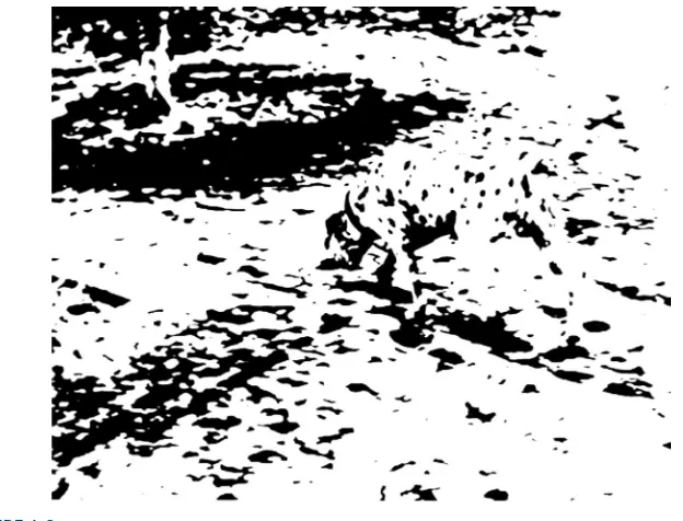
A relatively famous example of how priming the mind can affect perception is an image, supposedly by R. C. James,1 that initially looks to most people like a random
splattering of paint (see Fig. 1.2) similar to the work of the painter Jackson Pollack. Before reading further, look at the image.
Only after you are told that it is a Dalmatian dog sniffing the ground near a tree can your visual system organize the image into a coherent picture. Moreover, once you’ve seen the dog, it is hard to go back to seeing just a random collection of spots.
1 Published in Lindsay and Norman (1972), Figure 3-17, p. 146.
FIGURE 1.1
Building map or word? What you see depends on what you were told to see.
FIGURE 1.2
3
Perception biased by experience
These priming examples are visual, but priming can also bias other types of per-ception, such as sentence comprehension. For example, the headline “New Vaccine Contains Rabies” would probably be understood differently by people who had recently heard stories about contaminated vaccines than by people who had recently heard stories about successful uses of vaccines to fight diseases.
Familiar perceptual patterns or frames
Much of our lives are spent in familiar situations: the rooms in our homes, our yards, our routes to and from school or work, our offices, neighborhood parks, stores, res-taurants, etc. Repeated exposure to each type of situation builds a pattern in our minds of what to expect to see there. These perceptual patterns, which some researchers call frames, include the objects or events that are usually encountered in that situation.
For example, you know most rooms in your home well enough that you need not constantly scrutinize every detail. You know how they are laid out and where most objects are located. You can probably navigate much of your home in total darkness. But your experience with homes is broader than your specific home. In addition to having a pattern for your home, your brain has one for homes in general. It biases your perception of all homes, familiar and new. In a kitchen, you expect to see a stove and a sink. In a bathroom, you expect to see a toilet, a sink, and a shower or a bathtub (or both).
Mental frames for situations bias our perception to see the objects and events expected in each situation. They are a mental shortcut: by eliminating the need for us to constantly scrutinize every detail of our environment, they help us get around in our world. However, mental frames also make us see things that aren’t really there.
For example, if you visit a house in which there is no stove in the kitchen, you might nonetheless later recall seeing one, because your mental frame for kitchens has a strong stove component. Similarly, part of the frame for eating at a restaurant is paying the bill, so you might recall paying for your dinner even if you absentmind-edly walked out without paying. Your brain also has frames for back yards, schools, city streets, business offices, supermarkets, dentist visits, taxis, air travel, and other familiar situations.
Anyone who uses computers, websites, or smartphones has frames for the desk-top and files, web browsers, websites, and various types of applications and online services. For example, when they visit a new Web site, experienced Web users expect to see a site name and logo, a navigation bar, some other links, and maybe a search box. When they book a flight online, they expect to specify trip details, examine search results, make a choice, and make a purchase.
CHAPTER 1 Our Perception is Biased
4
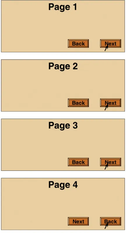
For example, if the positions of the “Next” and “Back” buttons on the last page of a multistep dialog box2 switched, many people would not immediately notice the
switch (see Fig. 1.3). Their visual system would have been lulled into inattention by the consistent placement of the buttons on the prior several pages. Even after unin-tentionally going backward a few times, they might continue to perceive the buttons
2 Multistep dialog boxes are called wizards in user-interface designer jargon.
FIGURE 1.3
5
Perception biased by experience
in their standard locations. This is why consistent placement of controls is a common user-interface guideline, to ensure that reality matches the user’s frame for the situation.
Similarly, if we are trying to find something but it is in a different place or looks different from usual, we might miss it even though it is in plain view because our mental frames tune us to look for expected features in expected locations. For exam-ple, if the “Submit” button on one form in a Web site is shaped differently or is a different color from those on other forms on the site, users might not find it. This expectation-induced blindness is discussed more later in this chapter in the “Percep-tion Biased by Goals” sec“Percep-tion.
Habituation
A third way in which experience biases perception is called habituation. Repeated exposure to the same (or highly similar) perceptions dulls our perceptual system’s sensitivity to them. Habituation is a very low-level phenomenon of our nervous sys-tem: it occurs at a neuronal level. Even primitive animals like flatworms and amoeba, with very simple nervous systems, habituate to repeated stimuli (e.g., mild electric shocks or light-flashes). People, with our complex nervous systems, habituate to a range of events, from low-level ones like a continually beeping tone, to medium-level ones like a blinking ad on a Web site, to high-level ones like a person who tells the same jokes at every party or a politician giving a long, repetitious speech.
We experience habituation in computer usage when the same error messages or “Are you sure?” confirmation messages appear again and again. People initially notice them and perhaps respond, but eventually click them closed reflexively without bothering to read them.
Habituation is also a factor in a recent phenomenon variously labeled “social media burnout” (Nichols, 2013), “social media fatigue,” or “Facebook vacations” (Rainie et al., 2013): newcomers to social media sites and tweeting are initially excited by the novelty of microblogging about their experiences, but sooner or later get tired of wasting time reading tweets about every little thing that their “friends” do or see—for example, “Man! Was that ever a great salmon salad I had for lunch today.”
Attentional blink
Another low-level biasing of perception by past experience occurs just after we spot or hear something important. For a very brief period following the recognition— between 0.15 and 0.45 second—we are nearly deaf and blind to other visual stimuli, even though our ears and eyes stay functional. Researchers call this the attentional blink (Raymond et al., 1992, Stafford and Webb, 2005).3 It is thought to be caused by
the brain’s perceptual and attention mechanisms being briefly fully occupied with processing the first recognition.
CHAPTER 1 Our Perception is Biased
6
A classic example: You are in a subway car as it enters a station, planning to meet two friends at that station. As the train arrives, your car passes one of your friends, and you spot him briefly through your window. In the next split second, your window passes your other friend, but you fail to notice her because her image hit your retina during the attentional blink that resulted from your recognition of your first friend.
When people use computer-based systems and online services, attentional blink can cause them to miss information or events if things appear in rapid succession. A popular modern technique for making documentary videos is to present a series of still photographs in rapid succession.4 This technique is highly prone to attentional
blink effects: if an image really captures your attention (e.g., it has a strong meaning for you), you will probably miss one or more of the immediately following images. In contrast, a captivating image in an auto-running slideshow (e.g., on a Web site or an information kiosk) is unlikely to cause attentional blink (i.e., missing the next image) because each image typically remains displayed for several seconds.
PERCEPTION BIASED BY CURRENT CONTEXT
When we try to understand how our visual perception works, it is tempting to think of it as a bottom-up process, combining basic features such as edges, lines, angles, curves, and patterns into figures and ultimately into meaningful objects. To take read-ing as an example, you might assume that our visual system first recognizes shapes as letters and then combines letters into words, words into sentences, and so on.
But visual perception—reading in particular—is not strictly a bottom-up process. It includes top-down influences too. For example, the word in which a character appears may affect how we identify the character (see Fig. 1.4).
Similarly, our overall comprehension of a sentence or a paragraph can even influence what words we see in it. For example, the same letter sequence can be read as different words depending on the meaning of the surrounding paragraph (see Fig. 1.5).
Contextual biasing of vision need not involve reading. The Müller–Lyer illusion is a famous example (see Fig. 1.6): the two horizontal lines are the same length, but the outward-pointing “fins” cause our visual system to see the top line as longer than the
4 For an example, search YouTube for “history of the world in two minutes.”
FIGURE 1.4
7
Perception biased by current context
line with inward-pointing “fins.” This and other optical illusions (see Fig. 1.7) trick us because our visual system does not use accurate, optimal methods to perceive the world. It developed through evolution, a semi-random process that layers jury-rigged—often incomplete and inaccurate—solutions on top of each other. It works fine most of the time, but it includes a lot of approximations, kludges, hacks, and outright “bugs” that cause it to fail in certain cases.
The examples in Figures 1.6 and 1.7 show vision being biased by visual context. However, biasing of perception by the current context works between different senses too. Perceptions in any of our five senses may affect simultaneous perceptions in any of our other senses. What we feel with our tactile sense can be biased by what we hear, see, or smell. What we see can be biased by what we hear, and what we hear can be biased by what we see. The following two examples of visual perception affect what we hear:
l McGurk effect. If you watch a video of someone saying “bah, bah, bah,” then
“dah, dah, dah,” then “vah, vah, vah,” but the audio is “bah, bah, bah” through-out, you will hear the syllable indicated by the speaker’s lip movement rather than the syllable actually in the audio track.5 Only by closing or averting your
eyes do you hear the syllable as it really is. I’ll bet you didn’t know you could read lips, and in fact do so many times a day.
5 Go to YouTube, search for “McGurk effect,” and view (and hear) some of the resulting videos.
Fold napkins. Polish silverware. Wash dishes.
French napkins. Polish silverware. German dishes.
FIGURE 1.5
The same phrase is perceived differently depending on the list it appears in.
FIGURE 1.6
CHAPTER 1 Our Perception is Biased
8
l Ventriloquism. Ventriloquists don’t throw their voice; they just learn to talk
without moving their mouths much. Viewers’ brains perceive the talking as coming from the nearest moving mouth: that of the ventriloquist’s puppet (Eagleman, 2012).
An example of the opposite—hearing biasing vision—is the illusory flash effect. When a spot is flashed once briefly on a display but is accompanied by two quick beeps, it appears to flash twice. Similarly, the perceived rate of a blinking light can be adjusted by the frequency of a repeating click (Eagleman, 2012).
Later chapters explain how visual perception, reading, and recognition function in the human brain. For now, I will simply say that the pattern of neural activity that corresponds to recognizing a letter, a word, a face, or any object includes input from
(A)
(B)
(C)
FIGURE 1.7
9
Perception biased by goals
neural activity stimulated by the context. This context includes other nearby per-ceived objects and events, and even reactivated memories of previously perper-ceived objects and events.
Context biases perception not only in people but also in lower animals. A friend of mine often brought her dog with her in her car when running errands. One day, as she drove into her driveway, a cat was in the front yard. The dog saw it and began barking. My friend opened the car door and the dog jumped out and ran after the cat, which turned and jumped through a bush to escape. The dog dove into the bush but missed the cat. The dog remained agitated for some time afterward.
Thereafter, for as long as my friend lived in that house, whenever she arrived at home with her dog in the car, he would get excited, bark, jump out of the car as soon as the door was opened, dash across the yard, and leap into the bush. There was no cat, but that didn’t matter. Returning home in the car was enough to make the dog see one—perhaps even smell one. However, walking home, as the dog did after being taken for his daily walk, did not evoke the “cat mirage.”
PERCEPTION BIASED BY GOALS
In addition to being biased by our past experience and the present context, our per-ception is influenced by our goals and plans for the future. Specifically, our goals:
l Guide our perceptual apparatus, so we sample what we need from the world
around us.
l Filter our perceptions: things unrelated to our goals tend to be filtered out
pre-consciously, never registering in our conscious minds.
For example, when people navigate through software or a Web site, seeking information or a specific function, they don’t read carefully. They scan screens quickly and superficially for items that seem related to their goal. They don’t simply ignore items unrelated to their goals; they often don’t even notice them.
To see this, glance at Figure 1.8 and look for scissors, and then immediately flip back to this page. Try it now.
Did you spot the scissors? Now, without looking back at the toolbox, can you say whether there is a screwdriver in the toolbox too?
Our goals filter our perceptions in other perceptual senses as well as in vision. A familiar example is the “cocktail party” effect. If you are conversing with someone at a crowded party, you can focus your attention to hear mainly what he or she is saying even though many other people are talking near you. The more interested you are in the conversation, the more strongly your brain filters out surrounding chatter. If you are bored by what your conversational partner is saying, you will probably hear much more of the conversations around you.
CHAPTER 1 Our Perception is Biased
10
many different conversations were occurring simultaneously on the same radio fre-quency, coming out of the same speaker in the control room (Arons, 1992). Research suggests that our ability to focus on one conversation among several simultaneous ones depends not only on our interest level in the conversation, but also on objective factors, such as the similarity of voices in the cacophony, the amount of general “noise” (e.g., clattering dishes or loud music), and the predictability of what your conversational partner is saying (Arons, 1992).
This filtering of perception by our goals is particularly true for adults, who tend to be more focused on goals than children are. Children are more stimulus-driven: their perception is less filtered by their goals. This characteristic makes them more distractible than adults, but it also makes them less biased as observers.
A parlor game demonstrates this age difference in perceptual filtering. It is similar to the Figure 1.8 exercise. Most households have a catch-all drawer for kitchen imple-ments or tools. From your living room, send a visitor to the room where the catch-all drawer is, with instructions to fetch you a specific tool, such as measuring spoons or a pipe wrench. When the person returns with the tool, ask whether another specific tool was in the drawer. Most adults will not know what else was in the drawer. Chil-dren—if they can complete the task without being distracted by all the cool stuff in the drawer—will often be able to tell you more about what else was there.
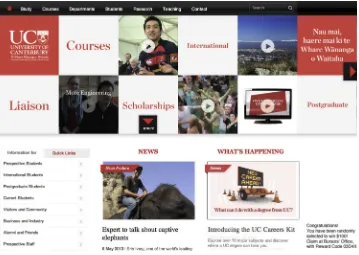
Perceptual filtering can also be seen in how people navigate websites. Suppose I put you on the homepage of New Zealand’s University of Canterbury (see Fig. 1.9) and asked you to find information about financial support for postgraduate students in the computer science department. You would scan the page and probably quickly click one of the links that share words with the goal that I gave you: Departments (top left), Scholarships (middle), then Postgraduate Students (bottom left) or Post-graduate (right). If you’re a “search” person, you might instead go right to the Search box (top right), type words related to the goal, and click “Go.”
Whether you browse or search, it is likely that you would leave the homepage without noticing that you were randomly chosen to win $100 (bottom right). Why? Because that was not related to your goal.
FIGURE 1.8
11
Perception biased by goals
What is the mechanism by which our current goals bias our perception? There are two:
l Influencing where we look. Perception is active, not passive. Think of your
perceptual senses not as simply filtering what comes to you, but rather as reach-ing out into the world and pulling in what you need to perceive. Your hands, your primary touch sensors, literally do this, but the rest of your senses do it too. You constantly move your eyes, ears, hands, feet, body, and attention so as to sample exactly the things in your environment that are most relevant to what you are doing or about to do (Ware, 2008). If you are looking on a Web site for a campus map, your eyes and pointer-controlling hand are attracted to anything that might lead you to that goal. You more or less ignore anything unrelated to your goal.
l Sensitizing our perceptual system to certain features. When you are
look-ing for somethlook-ing, your brain can prime your perception to be especially sensi-tive to features of what you are looking for (Ware, 2008). For example, when you are looking for a red car in a large parking lot, red cars will seem to pop out as you scan the lot, and cars of other colors will barely register in your con-sciousness, even though you do in some sense see them. Similarly, when you are FIGURE 1.9
CHAPTER 1 Our Perception is Biased
12
trying to find your spouse in a dark, crowded room, your brain “programs” your auditory system to be especially sensitive to the combination of frequencies that make up his or her voice.
TAKING BIASED PERCEPTION INTO ACCOUNT WHEN DESIGNING
All these sources of perceptual bias of course have implications for user-interface design. Here are three.Avoid ambiguity
Avoid ambiguous information displays, and test your design to verify that all users interpret the display in the same way. Where ambiguity is unavoidable, either rely on standards or conventions to resolve it, or prime users to resolve the ambiguity in the intended way.
For example, computer displays often shade buttons and text fields to make them look raised in relation to the background surface (see Fig. 1.10). This appearance relies on a convention, familiar to most experienced computer users, that the light source is at the top left of the screen. If an object were depicted as lit by a light source in a different location, users would not see the object as raised.
Be consistent
Place information and controls in consistent locations. Controls and data displays that serve the same function on different pages should be placed in the same position on each page on which they appear. They should also have the same color, text fonts, shading, and so on. This consistency allows users to spot and recognize them quickly.
Understand the goals
Users come to a system with goals they want to achieve. Designers should under-stand those goals. Realize that users’ goals may vary, and that their goals strongly influence what they perceive. Ensure that at every point in an interaction, the infor-mation users need is available, prominent, and maps clearly to a possible user goal, so users will notice and use the information.
Search
FIGURE 1.10
Designing with the Mind in Mind. http://dx.doi.org/10.1016/B978-0-12-407914-4.00002-6
© 2014 Elsevier Inc. All rights reserved.
CHAPTER
13
Our Vision is Optimized
to See Structure
2
Early in the twentieth century, a group of German psychologists sought to explain how human visual perception works. They observed and catalogued many important visual phenomena. One of their basic findings was that human vision is holistic: our visual system automatically imposes structure on visual input and is wired to per-ceive whole shapes, figures, and objects rather than disconnected edges, lines, and areas. The German word for “shape” or “figure” is Gestalt, so these theories became known as the Gestalt principles of visual perception.
Today’s perceptual and cognitive psychologists regard the Gestalt theory of per-ception as more of a descriptive framework than an explanatory and predictive
theory. Today’s theories of visual perception tend to be based heavily on the neuro-physiology of the eyes, optic nerve, and brain (see Chapters 4–7).
Not surprisingly, the findings of neurophysiological researchers support the observa-tions of the Gestalt psychologists. We really are—along with other animals—“wired” to perceive our surroundings in terms of whole objects (Stafford and Webb, 2005; Ware, 2008). Consequently, the Gestalt principles are still valid—if not as a fundamental expla-nation of visual perception, at least as a framework for describing it. They also provide a useful basis for guidelines for graphic design and user-interface design (Soegaard, 2007).
For present purposes, the most important Gestalt principles are Proximity, Simi-larity, Continuity, Closure, Symmetry, Figure/Ground, and Common Fate. The fol-lowing sections describe each principle and provide examples from both static graphic design and user-interface design.
GESTALT PRINCIPLE: PROXIMITY
CHAPTER 2 Our Vision is Optimized to See Structure
14
subgroups. Objects that are near each other (relative to other objects) appear grouped, while those that are farther apart do not.
In Figure 2.1A, the stars are closer together horizontally than they are vertically, so we see three rows of stars, while the stars in Figure 2.1B are closer together verti-cally than they are horizontally, so we see three columns.
(A)
(B)
FIGURE 2.1
Proximity: items that are closer appear grouped as rows (A) and columns (B).
FIGURE 2.2
15
Gestalt principle: proximity
The Proximity principle has obvious relevance to the layout of control panels or data forms in software, Web sites, and electronic appliances. Designers often sepa-rate groups of on-screen controls and data displays by enclosing them in group boxes or by placing separator lines between groups (see Fig. 2.2).
However, according to the Proximity principle, items on a display can be visually grouped simply by spacing them closer to each other than to other controls, without group boxes or visible borders (see Fig. 2.3). Many graphic design experts recom-mend this approach to reduce visual clutter and code size in a user interface (Mullet and Sano, 1994).
FIGURE 2.3
In Mozilla Thunderbird’s Subscribe Folders dialog box, controls are grouped using the Proximity principle.
FIGURE 2.4
CHAPTER 2 Our Vision is Optimized to See Structure
16
Conversely, if controls are poorly spaced (e.g., if connected controls are too far apart) people will have trouble perceiving them as related, making the software harder to learn and remember. For example, the Discreet Software Installer displays six horizontal pairs of radio buttons, each representing a two-way choice, but their spacing, due to the Proximity principle, makes them appear to be two vertical sets of radio buttons, each representing a six-way choice, at least until users try them and learn how they operate (see Fig. 2.4).
GESTALT PRINCIPLE: SIMILARITY
Another factor that affects our perception of grouping is expressed in the Gestalt principle of Similarity, where objects that look similar appear grouped, all other things being equal. In Figure 2.5, the slightly larger, “hollow” stars are perceived as a group.
The Page Setup dialog box in Mac OS applications uses the Similarity and Proxim-ity principles to convey groupings (see Fig. 2.6). The three very similar and tightly spaced Orientation settings are clearly intended to appear grouped. The three menus are not so tightly spaced but look similar enough that they appear related even though that probably wasn’t intended.
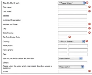
Similarly, the text fields in a form at book publisher Elsevier’s Web site are orga-nized into an upper group of eight for the name and address, a group of three split fields for phone numbers, and two single text fields. The four menus, in addition to being data fields, help separate the text field groups (see Fig. 2.7). By contrast, the labels are too far from their fields to seem connected to them.
FIGURE 2.5
17
Gestalt principle: similarity
FIGURE 2.6
Mac OS Page Setup dialog box. The Similarity and Proximity principles are used to group the Orientation settings.
FIGURE 2.7
CHAPTER 2 Our Vision is Optimized to See Structure
18
GESTALT PRINCIPLE: CONTINUITY
In addition to the two Gestalt principles concerning our tendency to organize objects into groups, several Gestalt principles describe our visual system’s tendency to resolve ambiguity or fill in missing data in such a way as to perceive whole objects. The first such principle, the principle of Continuity, states that our visual perception is biased to perceive continuous forms rather than disconnected segments.
For example, in Figure 2.8A, we automatically see two crossing lines—one blue and one orange. We don’t see two separate orange segments and two separate blue ones, and we don’t see a blue-and-orange V on top of an upside-down orange-and-blue V. In Figure 2.8B, we see a sea monster in water, not three pieces of one.
A well-known example of the use of the continuity principle in graphic design is the IBM® logo. It consists of disconnected blue patches, and yet it is not at all ambig-uous; it is easily seen as three bold letters, perhaps viewed through something like venetian blinds (see Fig. 2.9).
(A)
(B)
FIGURE 2.8
Continuity: Human vision is biased to see continuous forms, even adding missing data if necessary.
FIGURE 2.9
19
Gestalt principle: closure
Slider controls are a user-interface example of the Continuity principle. We see a slider as depicting a single range controlled by a handle that appears somewhere on the slider, not as two separate ranges separated by the handle (see Fig. 2.10A). Even displaying different colors on each side of a slider’s handle doesn’t completely “break” our perception of a slider as one continuous object, although Componen-tOne’s choice of strongly contrasting colors (gray vs. red) certainly strains that per-ception a bit (see Fig. 2.10B).
GESTALT PRINCIPLE: CLOSURE
Related to Continuity is the Gestalt principle of Closure, which states that our visual system automatically tries to close open figures so that they are perceived as whole objects rather than separate pieces. Thus, we perceive the disconnected arcs in Fig-ure 2.11A as a circle.
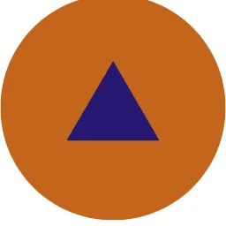
Our visual system is so strongly biased to see objects that it can even interpret a totally blank area as an object. We see the combination of shapes in Figure 2.11B as a white triangle overlapping another triangle and three black circles, even though the figure really only contains three V shapes and three black pac-men.
The Closure principle is often applied in graphical user interfaces (GUIs). For example, GUIs often represent collections of objects (e.g., documents or messages) as stacks (see Fig. 2.12). Just showing one whole object and the edges of others “behind” it is enough to make users perceive a stack of objects, all whole.
(A)
(B)
FIGURE 2.10
CHAPTER 2 Our Vision is Optimized to See Structure
20
GESTALT PRINCIPLE: SYMMETRY
A third fact about our tendency to see objects is captured in the Gestalt principle of
Symmetry. It states that we tend to parse complex scenes in a way that reduces the complexity. The data in our visual field usually has more than one possible interpre-tation, but our vision automatically organizes and interprets the data so as to simplify it and give it symmetry.
For example, we see the complex shape on the far left of Figure 2.13 as two over-lapping diamonds, not as two touching corner bricks or a pinch-waist octahedron with a square in its center. A pair of overlapping diamonds is simpler than the other two interpretations shown on the right—it has fewer sides and more symmetry than the other two interpretations.
In printed graphics and on computer screens, our visual system’s reliance on the symmetry principle can be exploited to represent three-dimensional objects on a two-dimensional display. This can be seen in a cover illustration for Paul Thagard’s book Coherence in Thought and Action (Thagard, 2002; see Fig. 2.14) and in a three-dimensional depiction of a cityscape (see Fig. 2.15).
FIGURE 2.12
Icons depicting stacks of objects exhibit the Closure principle: partially visible objects are perceived as whole.
(A)
(B)
FIGURE 2.11
21
Gestalt principle: figure/ground
GESTALT PRINCIPLE: FIGURE/GROUND
The next Gestalt principle that describes how our visual system structures the data it receives is Figure/Ground. This principle states that our mind separates the visual field into the figure (the foreground) and ground (the background). The foreground consists of the elements of a scene that are the object of our primary attention, and the background is everything else.
The Figure/Ground principle also specifies that the visual system’s parsing of scenes into figure and ground is influenced by characteristics of the scene. For exam-ple, when a small object or color patch overlaps a larger one, we tend to perceive the smaller object as the figure and the larger object as the ground (see Fig. 2.16).
not
= or
FIGURE 2.13
Symmetry: the human visual system tries to resolve complex scenes into combinations of simple, symmetrical shapes.
FIGURE 2.14
CHAPTER 2 Our Vision is Optimized to See Structure
22
However, our perception of figure versus ground is not completely determined by scene characteristics. It also depends on the viewer’s focus of attention. Dutch artist M. C. Escher exploited this phenomenon to produce ambiguous images in which figure and ground switch roles as our attention shifts (see Fig. 2.17).
In user-interface and Web design, the Figure/Ground principle is often used to place an impression-inducing background “behind” the primary displayed content FIGURE 2.16
Figure/Ground: when objects overlap, we see the smaller as the figure and the larger as the ground.
FIGURE 2.15
23
Gestalt principle: figure/ground
(see Fig. 2.18). The background can convey information (e.g., the user’s current loca-tion), or it can suggest a theme, brand, or mood for interpretation of the content.
Figure/Ground is also often used to pop up information over other content. Con-tent that was formerly the figure—the focus of the users’ atCon-tention—temporarily becomes the background for new information, which appears briefly as the new FIGURE 2.17
M. C. Escher exploited figure/ground ambiguity in his art.
FIGURE 2.18
CHAPTER 2 Our Vision is Optimized to See Structure
24
figure (see Fig. 2.19). This approach is usually better than temporarily replacing the old information with the new information, because it provides context that helps keep people oriented regarding their place in the interaction.
GESTALT PRINCIPLE: COMMON FATE
The previous six Gestalt principles concerned perception of static (unmoving) figures and objects. One final Gestalt principle—Common Fate—concerns moving objects. The cCommon Fate principle is related to the Proximity and Similarity principles— like them, it affects whether we perceive objects as grouped. The Common Fate prin-ciple states that objects that move together are perceived as grouped or related.
For example, in a display showing dozens of pentagons, if seven of them wiggled in synchrony, people would see them as a related group, even if the wiggling penta-gons were separated from each other and looked no different from all the other pentagons (see Fig. 2.20).
Common motion—implying common fates—is used in some animations to show relationships between entities. For example, Google’s GapMinder graphs animate dots representing nations to show changes over time in various factors of economic devel-opment. Countries that move together share development histories (see Fig. 2.21). FIGURE 2.19
25
Gestalt principles: combined
GESTALT PRINCIPLES: COMBINED
Of course, in real-world visual scenes, the Gestalt principles work in concert, not in isolation. For example, a typical Mac OS desktop usually exemplifies six of the seven principles described here, excluding Common Fate): Proximity, Similarity, Continu-ity, Closure, Symmetry, and Figure/Ground (see Fig. 2.22). On a typical desktop, Common Fate is used (along with similarity) when a user selects several files or fold-ers and drags them as a group to a new location (see Fig. 2.23).
FIGURE 2.20
Common Fate: items appear grouped or related if they move together.
FIGURE 2.21
CHAPTER 2 Our Vision is Optimized to See Structure
26
FIGURE 2.22
All of the Gestalt principles except Common Fate play a role in this portion of a Mac OS desktop.
FIGURE 2.23
27
Gestalt principles: combined
Designing with the Mind in Mind. http://dx.doi.org/10.1016/B978-0-12-407914-4.00003-8
© 2014 Elsevier Inc. All rights reserved.
CHAPTER
29
We Seek and Use Visual
Structure
Chapter 2 used the Gestalt principles of visual perception to show how our visual system is optimized to perceive structure. Perceiving structure in our environment helps us make sense of objects and events quickly. Chapter 2 also mentioned that when people are navigating through software or Web sites, they don’t scrutinize screens carefully and read every word. They scan quickly for relevant information. This chapter presents examples to show that when information is presented in a terse, structured way, it is easier for people to scan and understand.
Consider two presentations of the same information about an airline flight reser-vation. The first presentation is unstructured prose text; the second is structured text in outline form (see Fig. 3.1). The structured presentation of the reservation can be scanned and understood much more quickly than the prose presentation.
The more structured and terse the presentation of information, the more quickly and easily people can scan and comprehend it. Look at the Contents page from the California Department of Motor Vehicles (see Fig. 3.2). The wordy, repetitive links slow users down and “bury” the important words they need to see.
3
Unstructured:
You are booked on United flight 237, which departs from Auckland at 14:30 on Tuesday 15 Oct and arrives at San Francisco at 11:40 on Tuesday 15 Oct.
Structured:
Flight: United 237, Auckland San Francisco Depart: 14:30 Tue 15 Oct
Arrive: 11:40 Tue 15 Oct
FIGURE 3.1
CHAPTER 3 We Seek and Use Visual Structure
30
Compare that with a terser, more structured hypothetical design that factors out needless repetition and marks as links only the words that represent options (see Fig. 3.3). All options presented in the actual Contents page are available in the revision, yet it consumes less screen space and is easier to scan.
Displaying search results is another situation in which structuring data and avoid-ing repetitive “noise” can improve people’s ability to scan quickly and find what they seek. In 2006, search results at HP.com included so much repeated navigation data and metadata for each retrieved item that they were useless. By 2009, HP had elimi-nated the repetition and structured the results, making them easier to scan and more useful (see Fig. 3.4).
Of course, for information displays to be easy to scan, it is not enough merely to make them terse, structured, and nonrepetitious. They must also conform to the rules of graphic design, some of which were presented in Chapter 2.
For example, a prerelease version of a mortgage calculator on a real estate Web site presented its results in a table that violated at least two important rules of graphic design (see Fig. 3.5A). First, people usually read (online or offline) from top to bottom, but the labels for calculated amounts were below their corresponding values. Second, the labels were just as close to the value below as to their own
FIGURE 3.2
Contents page at the California Department of Motor Vehicles (DMV) Web site buries the important information in repetitive prose.
Licenses & ID Cards: Renewals, Duplicates, Changes • Renew license: in person by mail by Internet • Renew: instruction permit
• Apply for duplicate: license ID card
• Change of: name address
• Register as: organ donor
FIGURE 3.3
31
CHAPTER 3 We Seek and Use Visual Structure
value, so proximity (see Chapter 2) could not be used to perceive that labels were grouped with their values. To understand this mortgage results table, users had to scrutinize it carefully and slowly figure out which labels went with which numbers.
(A)
(B)
FIGURE 3.4
In 2006, HP.com’s site search produced repetitious, “noisy” results (A), but by 2009 was improved (B).
360
0.00 Mortgage Summary
Monthly Payment $ 1,840.59
Number of Payments
Total of Payments $ 662,611.22
Interest Total $ 318,861.22
Tax Total $ 93,750.00
PMI Total $
Pay off Date Sep 2037
(A)
(B)
FIGURE 3.5
CHAPTER 3 We Seek and Use Visual Structure
32
The revised design, in contrast, allows users to perceive the correspondence between labels and values without conscious thought (see Fig. 3.5B).
STRUCTURE ENHANCES PEOPLE’S ABILITY TO SCAN LONG
NUMBERS
Even small amounts of information can be made easier to scan if they are structured. Two examples are telephone numbers and credit card numbers (see Fig. 3.6). Tradi-tionally, such numbers were broken into parts to make them easier to scan and remember.
A long number can be broken up in two ways: either the user interface breaks it up explicitly by providing a separate field for each part of the number, or the inter-face provides a single number field but lets users break the number into parts with spaces or punctuation (see Fig. 3.7A). However, many of today’s computer presenta-tions of phone and credit card numbers do not segment the numbers and do not
Easy: (415) 123 4567
Hard: 4151234567
Easy: 1234 5678 9012 3456
Hard: 1234567890123456
FIGURE 3.6
Telephone and credit card numbers are easier to scan and understand when segmented.
(A)
(B)
FIGURE 3.7
33
Data-specific controls provide even more structure
allow users to include spaces or other punctuation (see Fig. 3.7B). This limitation makes it harder for people to scan a number or verify that they typed it correctly, and so is considered a user-interface design blooper (Johnson, 2007). Forms presented in software and Web sites should accept credit card numbers, social security numbers, phone numbers, and so on in a variety of different formats and parse them into the internal format.
Segmenting data fields can provide useful visual structure even when the data to be entered is not, strictly speaking, a number. Dates are an example of a case in which segmented fields can improve readability and help prevent data entry errors, as shown by a date field at Bank of America’s Web site (see Fig. 3.8).
DATA-SPECIFIC CONTROLS PROVIDE EVEN MORE STRUCTURE
A step up in structure from segmented data fields are data-specific controls. Instead of using simple text fields—whether segmented or not—designers can use controls that are designed specifically to display (and accept as input) a value of a specific type. For example, dates can be presented (and accepted) in the form of menus com-bined with pop-up calendar controls (see Fig. 3.9).
It is also possible to provide visual structure by mixing segmented text fields with data-specific controls, as demonstrated by an email address field at Southwest Air-lines’ Web site (see Fig. 3.10).
FIGURE 3.8
At BankOfAmerica.com, segmented data fields provide useful structure.
FIGURE 3.10
At SWA.com email addresses are entered into fields structured to accept parts of the address. FIGURE 3.9
CHAPTER 3 We Seek and Use Visual Structure
34
VISUAL HIERARCHY LETS PEOPLE FOCUS ON THE RELEVANT
INFORMATION
One of the most important goals in structuring information presentations is to pro-vide a visual hierarchy—an arrangement that:
l Breaks the information into distinct sections, and breaks large sections into
subsections.
l Labels each section and subsection prominently and in such a way as to clearly
identify its content.
l Presents the sections and subsections as a hierarchy, with higher-level sections
presented more strongly than lower-level ones.
A visual hierarchy allows people, when scanning information, to instantly sepa-rate what is relevant to their goals from what is irrelevant, and to focus their atten-tion on the relevant informaatten-tion. They find what they are looking for more quickly because they can easily skip everything else.
Try it for yourself. Look at the two information displays in Figure 3.11 and find the information about prominence. How much longer does it take you to find it in the nonhierarchical presentation?
Create a Clear Visual Hierarchy
Organize and prioritize the contents of a page by using size, prominence, and content relationships.
Let’s look at these relationships more closely:
• Size. The more important a headline is, the larger its font size should be. Big bold headlines help to grab the user’s attention as they scan the Web page.
• Content Relationships. Group similar content types by displaying the content in a similar visual style, or in a clearly defined area.
• Prominence. The more important the headline or content, the higher up the page it should be placed. The most important or popular content should always be positioned prominently near the top of the page, so users can view it without having to scroll too far.
Create a Clear Visual Hierarchy
Organize and prioritize the contents of a page by using size, prominence, and content relationships. Let’s look at these relationships more closely. The more important a headline is, the larger its font size should be. Big bold headlines help to grab the user’s attention as they scan the Web page. The more important the headline or content, the higher up the page it should be placed. The most important or popular content should always be positioned prominently near the top of the page, so users can view it without having to scroll too far. Group similar content types by displaying the content in a similar visual style, or in a clearly defined area.
(A)
(B)
FIGURE 3.11
35
Visual hierarchy lets people focus on the relevant information
The examples in Figure 3.11 show the value of visual hierarchy in a textual, read-only information display. Visual hierarchy is equally important in interactive control panels and forms—perhaps even more so. Compare dialog boxes from two different music software products (see Fig. 3.12). The Reharmonize dialog box of Band-in-a-Box has poor visual hierarchy, making it hard for users to find things quickly. In contrast, GarageBand’s Audio/MIDI control panel has good visual hierarchy, so users can quickly find the settings they are interested in.
(A)
(B)
FIGURE 3.12
CHAPTER 3 We Seek and Use Visual Structure
36