Demand and Supply, Offer
Curves, and the Terms of Trade
chapter
L E A R N I N G G OA L S :
After reading this chapter, you should be able to:
• Show how the equilibrium price at which trade takes place is determined by demand and supply
• Show how the equilibrium price at which trade takes place is determined with offer curves
• Explain the meaning of the terms of trade and how they changed over time for the United States and other countries
4.1 Introduction
We saw in Chapter 3 that a difference in relative commodity prices between two nations in isolation is a reflection of their comparative advantage and forms the basis for mutually beneficial trade. The equilibrium-relative commodity price at which trade takes place was then found by trial and error at the level at which trade was balanced. In this chapter, we present a more rigorous theoretical way of determining the equilibrium-relative commodity price with trade. We will first do this with partial equilibrium analysis (i.e., by utilizing demand and supply curves) and then by the more complex general equilibrium analysis, which makes use of offer curves.
Section 4.2 shows how the equilibrium-relative commodity price with trade is determined with demand and supply curves (i.e., with partial equilibrium analy- sis). We then go on to general equilibrium analysis and derive the offer curves of Nation 1 and Nation 2 in Section 4.3. In Section 4.4, we examine how the interaction of the offer curves of the two nations defines the equilibrium-relative commodity price with trade. In Section 4.5, we look at the relationship between general and partial equilibrium analyses. Finally, Section 4.6 examines the meaning, measurement, and importance of the terms of trade. The appendix to this chapter presents the formal derivation of offer curves and examines the case of multiple and unstable equilibria.
85
4.2 The Equilibrium-Relative Commodity Price with Trade—Partial Equilibrium Analysis
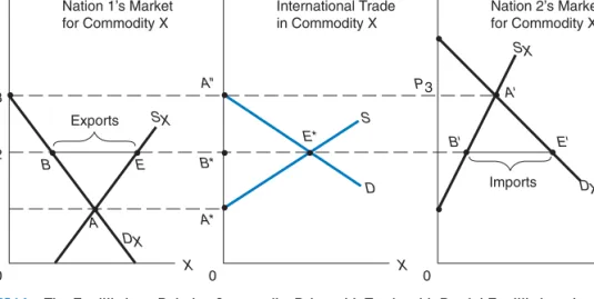
Figure 4.1 shows how the equilibrium-relative commodity price with trade is determined by partial equilibrium analysis. Curves DX and SX in panels A and C of Figure 4.1 refer to the demand and supply curves for commodity X of Nation 1 and Nation 2, respectively.
The vertical axes in all three panels of Figure 4.1 measure the relative price of commodity X (i.e.,PX/PY, or the amount of commodity Y that a nation must give up to produce one additional unit of X). The horizontal axes measure the quantities of commodity X.
Panel A of Figure 4.1 shows that in the absence of trade, Nation 1 produces and consumes at point Aat the relative price of X ofP1, while Nation 2 produces and consumes at point A atP3. With the opening of trade, the relative price of X will be betweenP1 andP3 if both nations are large. At prices above P1, Nation 1 will supply (produce) more than it will demand (consume) of commodity X and will export the difference or excess supply (see panel A). Alternatively, at prices below P3, Nation 2 will demand a greater quantity of commodity X than it produces or supplies domestically and will import the difference or excess demand (see panel C).
Specifically, panel A shows that at P1, the quantity supplied of commodity X (QSX) equals the quantity demanded of commodity X (QDX) in Nation 1, and so Nation 1exports nothing of commodity X. This gives point A∗ on curve S (Nation 1’s supply curve of exports) in panel B. Panel A also shows that at P2, the excess of BE of QSX overQDX represents the quantity of commodity X that Nation 1 would export at P2. This is equal to B∗E∗ in panel B and defines pointE∗ on Nation 1’sS curve of exports of commodity X.
P1 PX /PY
DX SX
SX
DX S
D
X P2
P3 P3
A*
E*
A
B E B*
A"
A'
B' E'
0
Panel A
Nation 1’s Market for Commodity X
Exports
Imports PX /PY
0 X
Panel B
International Trade in Commodity X
PX /PY
0 X
Panel C Nation 2’s Market for Commodity X
FIGURE 4.1. The Equilibrium-Relative Commodity Price with Trade with Partial Equilibrium Analysis.
AtPX/PYlarger thanP1, Nation 1’s excess supply of commodity X in panel A gives rise to Nation 1’s supply curve of exports of commodity X (S) in panel B. On the other hand, at PX/PY lower thanP3, Nation 2’s excess demand for commodity X in panel C gives rise to Nation 2’s demand for imports of commodity X (D) in panel B. Panel B shows that only at P2does the quantity of imports of commodity X demanded by Nation 2 equal the quantity of exports supplied by Nation 1. Thus,P2is the equilibriumPX/PYwith trade. At PX/PY>P2, there will be an excess supply of exports of commodity X, and this will drivePX/PYdown to P2. AtPX/PY<P2, there will be an excess demand for imports of X, and this will drivePX/PYup toP2.
4.2 The Equilibrium-Relative Commodity Price with Trade—Partial Equilibrium Analysis 87
On the other hand, panel C shows that atP3,QDX =QSX (pointA), so Nation 2 does not demand any imports of commodity X. This defines point A on Nation 2’s demand curve for imports of commodity X (D) in panel B. Panel C also shows that atP2, the excess BEofQDX overQSX represents the quantity of commodity X that Nation 2 would import at P2. This is equal to B∗E∗ in panel B and defines point E∗ on Nation 2’s D curve of imports of commodity X.
At P2, the quantity of imports of commodity X demanded by Nation 2 (BE in panel C) equals the quantity of exports of commodity X supplied by Nation 1 (BE in panel A).
This is shown by the intersection of theD andS curves for trade in commodity X in panel B. Thus,P2 is the equilibrium-relative price of commodity X with trade. From panel B we can also see that atPX/PY >P2 the quantity of exports of commodity X supplied exceeds the quantity of imports demanded, and so the relative price of X (PX/PY) will fall toP2. On the contrary, atPX/PY < P2, the quantity of imports of commodity X demanded exceeds the quantity of exports supplied, andPX/PY will rise toP2.
The same could be shown with commodity Y. Commodity Y is exported by Nation 2 and imported by Nation 1. At any relative price of Y higher than equilibrium, the quantity of
■CASE STUDY 4-1 Demand, Supply, and the International Price of Petroleum
Table 4.1 shows that the price of petroleum fluctuated widely from 1972 to 2011. As a result of supply shocks during the Arab-Israeli War in fall 1973 and the Iranian revolution in 1979–1980, OPEC (Organization of Petroleum Exporting Countries) was able to increase the price of petroleum from an average of $2.89 per barrel in 1972 to $11.60 in 1974 and to
$36.68 per barrel in 1980. These increases stim- ulated energy conservation and expanded explo- ration and petroleum production by non-OPEC countries. In the face of excess supplies during the 1980s and 1990s, OPEC was unable to prevent the price of petroleum from falling to a low of
■TABLE 4.1. Nominal and Real Petroleum Prices, Selected Years, 1972–2011
Year 1972 1973 1974 1978 1979 1980 1985
Petroleum Prices ($/barrel) 2.89 3.24 11.60 13.39 30.21 36.68 27.37
Real Petroleum Prices ($/barrel) 2.89 3.00 9.51 7.70 15.82 17.14 9.34
Year 1986 1990 1998 2000 2005 2008 2011
Petroleum Prices ($/barrel) 14.17 22.99 13.07 28.23 53.40 97.03 140.00
Real Petroleum Prices ($/barrel) 4.69 6.51 2.90 5.73 8.99 14.83 15.80
Source: Elaborated from data in International Monetary Fund, International Financial Statistics (Washington, D.C.: IMF, various issues).
$14.17 in 1986 and $13.07 in 1998. The price of petroleum then rose to $28.23 in 2000 and $104.00 in 2011 (the all-time monthly high was $132.60 in July 2008).
If we consider, however, that all prices have risen over time, we can see from Table 4.1 that the real (i.e., inflation-adjusted) price of petroleum rose from $2.89 per barrel in 1972 to $9.51 in 1974 and to $17.14 in 1980; it then fell to $4.69 in 1986 and
$2.90 in 1998, but it subsequently rose to $5.73 in 2000 and $14.83 in 2008, and it was $15.80 in 2011. Thus, the real price of petroleum was 5.47 times higher (15.80/2.89) in 2011 than in 1972, rather than by 35.99 times in nominal prices.
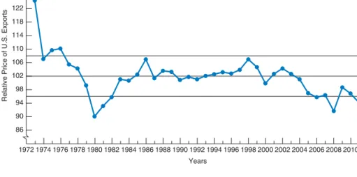
exports of Y supplied by Nation 2 would exceed the quantity of imports of Y demanded by Nation 1, and the relative price of Y would fall to the equilibrium level. On the other hand, at anyPY/PX below equilibrium, the quantity of imports of Y demanded would exceed the quantity of exports of Y supplied, andPY/PX would rise to the equilibrium level. (You will be asked to show this graphically in Problem 1.) Case Study 4-1 shows the international price of petroleum in nominal and real (i.e., inflation-adjusted) terms from 1972 to 2010, while Case Study 4-2 shows the index of export to import prices for the United States over the same period.
■CASE STUDY 4-2 The Index of Export to Import Prices for the United States
Figure 4.2 shows the index of U.S. export to import prices or terms of trade from 1972 to 2011. This index declined almost continuously from 1972 to 1980, it rose from 1980 to 1986, and then it remained in the 96–107 range (with 2000=100), except in 2008, when it fell to 92. The decline in the index was particularly large during the two
“oil shocks” of 1973–74 and 1979–80, and from 2002 to 2008 when the price of petroleum and other
86
1972 1974 1976 1978 1980 1982 1984 1986 1988 1990 1992 1994 1996 1998 2000 2002 2004 2006 2008 2010 2012 Years
Relative Price of U.S. Exports
90 94 98 102 106 110 114 118 122 126 130
FIGURE 4.2. Index of Relative U.S. Export Prices, 1972–2011 (2000=100).
The index of U.S. export to import prices declined from 127.1 in 1972 to 107.2 in 1974 (due to the sharp increase in petroleum prices in 1973 and 1974) and to 90.2 in 1980, as a result of the second ‘‘oil shock.’’ The index then rose to 107.1 in 1986, but it fell to 91.8 in 2008 as a result of the sharp increase in the price of petroleum and other primary commodities imports. The index was 94.6 in 2011.
Source: Elaborated from data in International Monetary Fund, International Financial Statistics Washington, D.C.: IMF, various issues.
primary commodities imports rose sharply. From the figure, we see that the averagerelativeprice of U.S. exports declined from 127.1 in 1972 to 90.2 in 1980, and 91.8 in 2008, and it was 94.6 in 2011.
This means that, on the average, the United States had to export 34 percent more of its goods and services in 1980, 32 percent more in 2008, and 29 percent more in 2011 to import the same quantity of goods and services that it did in 1972.
4.3 Offer Curves 89
4.3 Offer Curves
In this section, we define offer curves and note their origin. We then derive the offer curves of the two nations and examine the reasons for their shape.
4.3
AOrigin and Definition of Offer Curves
Offer curves (sometimes referred to as reciprocal demand curves) were devised and introduced into international economics by Alfred Marshall and Ysidro Edgeworth, two British economists, at the turn of the twentieth century. Since then, offer curves have been used extensively in international economics, especially for pedagogical purposes.
The offer curve of a nation shows how much of its import commodity the nation demands for it to be willing to supply various amounts of its export commodity. As the definition indicates, offer curves incorporate elements of both demand and supply. Alternatively, we can say that the offer curve of a nation shows the nation’s willingness to import and export at various relative commodity prices.
The offer curve of a nation can be derived rather easily and somewhat informally from the nation’s production frontier, its indifference map, and the various hypothetical relative commodity prices at which trade could take place. The formal derivation of offer curves presented in the appendix is based on the work ofJames Meade, another British economist and Nobel Prize winner.
4.3
BDerivation and Shape of the Offer Curve of Nation 1
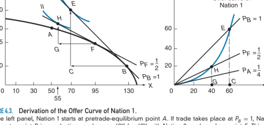
In the left panel of Figure 4.3, Nation 1 starts at the no-trade (or autarky) point A, as in Figure 3.3. If trade takes place atPB=PX/PY =1, Nation 1 moves to pointBin production, trades 60X for 60Y with Nation 2, and reaches pointE on its indifference curve III. (So far this is exactly the same as in Figure 3.4.) This gives pointE in the right panel of Figure 4.3.
At PF =PX/PY = 1/2 (see the left panel of Figure 4.3), Nation 1 would move instead from point A to point F in production, exchange 40X for 20Y with Nation 2, and reach pointH on its indifference curve II. This gives pointH in the right panel. Joining the origin with pointsH andE and other points similarly obtained, we generate Nation 1’s offer curve in the right panel. The offer curve of Nation 1 shows how many imports of commodity Y Nation 1 requires to be willing to export various quantities of commodity X.
To keep the left panel simple, we omitted the autarky price linePA= 1/4and indifference curve I tangent to the production frontier andPA at pointA. Note thatPA, PF, and PB in the right panel refer to the same PX/PY as PA, PF, and PB in the left panel because they refer to the sameabsoluteslope.
The offer curve of Nation 1 in the right panel of Figure 4.3 lies above the autarky price line ofPA= 1/4and bulges toward the X-axis, which measures the commodity of its comparative advantage and export. To induce Nation 1 to export more of commodity X, PX/PY must rise. Thus, at PF= 1/2, Nation 1 would export 40X, and atPB =1, it would export 60X. There are two reasons for this: (1) Nation 1 incurs increasing opportunity costs in producing more of commodity X (for export), and (2) the more of commodity Y and the less of commodity X that Nation 1 consumes with trade, the more valuable to the nation is a unit of X at the margin compared with a unit of Y.
Y
X A
H
H E
E II
III
F G
G C
C B
Nation 1
Offer curve of Nation 1
20 45 60 80 100
0 10 30 50 0 20
55
70 95 130
Y
X 20
40 60
40 60
PB = 1
PF =1 2
PB =1 PF =1
2 PA =1
4
"
FIGURE 4.3. Derivation of the Offer Curve of Nation 1.
In the left panel, Nation 1 starts at pretrade-equilibrium pointA . If trade takes place at PB =1, Nation 1 moves to pointB in production, exchanges 60X for 60Y with Nation 2, and reaches point E. This gives pointE in the right panel. AtPF=1/2in the left panel, Nation 1 would move instead from pointA to point F in production, exchange 40X for 20Y with Nation 2, and reach point H. This gives point H in the right panel. Joining the origin with pointsH and E in the right panel, we generate Nation 1’s offer curve. This shows how many imports of commodity Y Nation 1 requires to be willing to export various quantities of commodity X.
4.3
CDerivation and Shape of the Offer Curve of Nation 2
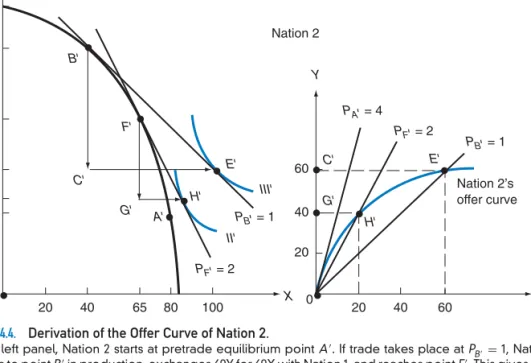
In the left panel of Figure 4.4, Nation 2 starts at the autarky equilibrium point A, as in Figure 3.3. If trade takes place at PB = PX/PY = 1, Nation 2 moves to point B in production, exchanges 60Y for 60X with Nation 1, and reaches pointE on its indifference curve III. (So far this is exactly the same as in Figure 3.4.) Trade triangle BCE in the left panel of Figure 4.4 corresponds to trade triangleOCE in the right panel, and we get pointEon Nation 2’s offer curve.
At PF = PX/PY = 2 in the left panel, Nation 2 would move instead to point F in production, exchange 40Y for 20X with Nation 1, and reach point H on its indifference curve II. Trade triangleFGH in the left panel corresponds to trade triangleOGH in the right panel, and we get point H on Nation 2’s offer curve. Joining the origin with pointsH andE and other points similarly obtained, we generate Nation 2’s offer curve in the right panel. The offer curve of Nation 2 shows how many imports of commodity X Nation 2 demands to be willing to export various quantities of commodity Y.
Once again, we omitted the autarky price linePA =4 and indifference curve I tangent to the production frontier andPA at pointA. Note thatPA,PF, andPB in the right panel refer to the samePX/PY asPA,PF, andPB in the left panel because they refer to the same absolute slope.
The offer curve of Nation 2 in the right panel of Figure 4.4 lies below its autarky price line of PA =4 and bulges toward the Y-axis, which measures the commodity of its comparative advantage and export. To induce Nation 2 to export more of commodity Y, the
4.4 The Equilibrium-Relative Commodity Price with Trade—General Equilibrium Analysis 91
Y
X X
A' H'
H'
E' E'
II' III' F'
G' G'
C'
C' B'
Nation 2
Nation 2’s offer curve 40
60 45 85 120 140
0 20 40 65 80 100
Y
40
20 60
0 20 40 60
PF' = 2
PF' = 2 PA' = 4
PB' = 1
PB' = 1
FIGURE 4.4. Derivation of the Offer Curve of Nation 2.
In the left panel, Nation 2 starts at pretrade equilibrium pointA. If trade takes place atPB=1, Nation 2 moves to pointBin production, exchanges 60Y for 60X with Nation 1, and reaches pointE. This gives point Ein the right panel. AtPF=2 in the left panel, Nation 2 would move instead fromAtoFin production, exchange 40Y for 20X with Nation 1, and reachH. This gives pointHin the right panel. Joining the origin with pointsHandEin the right panel, we generate Nation 2’s offer curve. This shows how many imports of commodity X Nation 2 demands to be willing to supply various amounts of commodity Y for export.
relative price of Y must rise. This means that its reciprocal (i.e., PX/PY) must fall. Thus, at PF =2, Nation 2 would export 40Y, and at PB = 1, it would export 60Y. Nation 2 requires a higher relative price of Y to be induced to export more of Y because (1) Nation 2 incurs increasing opportunity costs in producing more of commodity Y (for export), and (2) the more of commodity X and the less of commodity Y that Nation 2 consumes with trade, the more valuable to the nation is a unit of Y at the margin compared with a unit of X.
4.4 The Equilibrium-Relative Commodity Price with Trade—General Equilibrium Analysis
The intersection of the offer curves of the two nations defines the equilibrium-relative commodity price at which trade takes place between them. Only at this equilibrium price will trade be balanced between the two nations. At any other relative commodity price, the desired quantities of imports and exports of the two commodities would not be equal. This would put pressure on the relative commodity price to move toward its equilibrium level.
This is shown in Figure 4.5.
The offer curves of Nation 1 and Nation 2 in Figure 4.5 are those derived in Figures 4.3 and 4.4. These two offer curves intersect at pointE, defining equilibrium PX/PY =PB = PB = 1. At PB, Nation 1 offers 60X for 60Y (point E on Nation 1’s offer curve), and Nation 2 offers exactly 60Y for 60X (pointEon Nation 2’s offer curve). Thus, trade is in equilibrium at PB.
At any other PX/PY, trade would not be in equilibrium. For example, at PF = 1/2, the 40X that Nation 1 would export (see pointH in Figure 4.5) would fall short of the imports of commodity X demanded by Nation 2 at this relatively low price of X. (This is given by a point, not shown in Figure 4.5, where the extended price line PF crosses the extended offer curve of Nation 2.)
The excess import demand for commodity X atPF = 1/2by Nation 2 tends to drivePX/PY up. As this occurs, Nation 1 will supply more of commodity X for export (i.e., Nation 1 will move up its offer curve), while Nation 2 will reduce its import demand for commodity X (i.e., Nation 2 will move down its offer curve). This will continue until supply and demand become equal at PB. The pressure for PF to move toward PB could also be explained in terms of commodity Y and arises at any otherPX/PY, such asPF =PB.
Note that the equilibrium-relative commodity price ofPB =1 with trade (determined in Figure 4.5 by the intersection of the offer curves of Nation 1 and Nation 2) is identical to that found by trial and error in Figure 3.4. AtPB =1, both nations happen to gain equally from trade (refer to Figure 3.4).
Y
X H'
H
C G
E' E G'
C'
Nation 1
Nation 2
10 20 30 40 50 60
0 10 20 30 40 50 60
PB = PB' = 1
PF' = 2 PA' = 4
PF =12
PA =14
FIGURE 4.5. Equilibrium-Relative Commodity Price with Trade.
The offer curves of Nation 1 and Nation 2 are those of Figures 4.3 and 4.4. The offer curves intersect at point E, defining the equilibrium-relative commodity price PB=1. AtPB, trade is in equilibrium because Nation 1 offers to exchange 60X for 60Y and Nation 2 offers exactly 60Y for 60X. At anyPX/PY<1, the quantity of exports of commodity X supplied by Nation 1 would fall short of the quantity of imports of commodity X demanded by Nation 2. This would drive the relative commodity price up to the equilibrium level. The opposite would be true atPX/PY>1.
4.5 Relationship between General and Partial Equilibrium Analyses 93
4.5 Relationship between General and Partial Equilibrium Analyses
We can also illustrate equilibrium for our two nations with demand and supply curves and thus show the relationship between the general equilibrium analysis of Section 4.4 and the partial equilibrium analysis of Section 4.2. This is shown with Figure 4.6.
In Figure 4.6,S is Nation 1’s supply curve of exports of commodity X and is derived from Nation 1’s production frontier and indifference map in the left panel of Figure 4.3 (the same information from which Nation 1’s offer curve in the right panel of Figure 4.3 is derived). Specifically,S shows that the quantity supplied of exports of commodity X by Nation 1 is zero (pointA) at PX/PY = 1/4, 40 (pointH) at PX/PY = 1/2, and 60 (pointE) atPX/PY =1(as indicated in the left panel of Figure 4.3 and on Nation 1’s offer curve in the right panel of Figure 4.3). The export of 70X by Nation 1 atPX/PY =11/2(pointR on the S curve in Figure 4.6) can similarly be obtained from the left panel of Figure 4.3 and is shown as pointR on Nation 1’s offer curve in Figure 4.9 in Appendix A4.3.
On the other hand,D refers to Nation 2’s demand for Nation 1’s exports of commodity X and is derived from Nation 2’s production frontier and indifference map in the left panel of Figure 4.4 (the same information from which Nation 2’s offer curve in the right panel of Figure 4.4 is derived). Specifically,D in Figure 4.6 shows that the quantity demanded of Nation 1’s exports of commodity X by Nation 2 is 60 (pointE) atPX/PY =1 (as in the left panel of Figure 4.4), 120 (pointH) atPX/PY = 1/2, but 40 (pointR) atPX/PY =11/2. D and S intersect at point E in Figure 4.6, determining the equilibrium PX/PY = 1 and the equilibrium quantity of exports of 60X (as in Figure 4.5). Figure 4.6 shows that at
Excess supply
Excess demand D
H H'
E
R' R
S
A 112
1
1 2 1 4
0 20 40 60 80 100 120
Exports of commodity X PX /PY
FIGURE 4.6. Equilibrium-Relative Commodity Price with Partial Equilibrium Analysis.
S refers to Nation 1’s supply curve of exports of commodity X, while D refers to Nation 2’s demand curve for Nation 1’s exports of commodity X.S and D are derived from the left panel of Figures 4.3 and 4.4, and show the same basic information as Figure 4.5.D and S intersect at point E, determining the equilibrium PX/PY =1 and the equilibrium quantity of exports of 60X. AtPX/PY=11/2, there is an excess supply of exports ofRR =30X, and PX/PY falls toward equilibriumPX/PY =1. AtPX/PY=1/2, there is an excess demand of exports ofHH=80X, andPX/PYrises towardPX/PY=1.
PX/PY =11/2 there is an excess supply of exports of RR =30X, andPX/PY falls toward equilibriumPX/PY =1. On the other hand, at PX/PY = 1/2, there is an excess demand of exports of HH = 80X, and PX/PY rises toward PX/PY = 1. Thus, the relative price of X gravitates toward the equilibrium price of PX/PY = 1, given by pointE in Figure 4.6 (the same as in Figure 4.5). The same conclusion would be reached in terms of Y (see Problem 8, with answer at www.wiley.com/college/salvatore).
If, on the other hand, Nation 2 were small, its demand curve for Nation 1’s exports of commodity X would intersect the horizontal portion of Nation 1’s supply curve of exports of commodity X (near the vertical axis). In that case, Nation 2 would trade at the pretrade price ofPX/PY = 1/4 in Nation 1, and Nation 2 would receive all of the gains from trade.
(This could also be shown with offer curves; see Problem 10, with the answer on the Web.) Going back to our Figure 4.6, we see that it shows the same basic information as Figure 4.5, and both are derived from the nations’ production frontiers and indifference maps. There is a basic difference, however, between the two figures. Figure 4.5 refers to general equilibrium analysis and considers all markets together, not just the market for commodity X. This is important because changes in the market for commodity X affect other markets, and these may give rise to important repercussions on the market for commodity X itself. On the other hand, the partial equilibrium analysis of Figure 4.6, which utilizesD andS curves, does not consider these repercussions and the connections that exist between the market for commodity X and the market for all other commodities in the economy.
Partial equilibrium analysis is often useful as a first approximation, but for the complete and full answer, the more difficult general equilibrium analysis is usually required.
4.6 The Terms of Trade
In this section, we define the terms of trade of each nation and illustrate their measurement.
We also discuss the meaning of a change in a nation’s terms of trade. Finally, we pause to take stock of what we have accomplished up to this point and examine the usefulness of our trade model.
4.6
ADefinition and Measurement of the Terms of Trade
Theterms of tradeof a nation are defined as the ratio of the price of its export commodity to the price of its import commodity. Since in a two-nation world, the exports of a nation are the imports of its trade partner, the terms of trade of the latter are equal to the inverse, or reciprocal, of the terms of trade of the former.
In a world of many (rather than just two) traded commodities, the terms of trade of a nation are given by the ratio of the price index of its exports to the price index of its imports. This ratio is usually multiplied by 100 in order to express the terms of trade in percentages. These terms of trade are often referred to as the commodity or net barter terms of tradeto distinguish them from other measures of the terms of trade presented in Chapter 11 in connection with trade and development.
As supply and demand considerations change over time, offer curves will shift, changing the volume and the terms of trade. This matter will be examined in Chapter 7, which deals with growth and change, and international trade. An improvement in a nation’s terms of trade is usually regarded as beneficial to the nation in the sense that the prices that the nation receives for its exports rise relative to the prices that it pays for imports.
4.6 The Terms of Trade 95
4.6
BIllustration of the Terms of Trade
Since Nation 1 exports commodity X and imports commodity Y, the terms of trade of Nation 1 are given by PX/PY. From Figure 4.5, these are PX/PY = PB = 1 or 100 (in percentages). If Nation 1 exported and imported many commodities, PX would be the index of its export prices, andPY would be theindex of its import prices.
Since Nation 2 exports commodity Y and imports commodity X, the terms of trade of Nation 2 are given byPY/PX. Note that this is the inverse, or reciprocal, of Nation 1’s terms of trade and also equals 1 or 100 (in percentages) in this case.
If through time the terms of trade of Nation 1 rose, say, from 100 to 120, this would mean that Nation 1’s export prices rose 20 percent in relation to its import prices.
This would also mean that Nation 2’s terms of trade have deteriorated from 100 to (100/120)100=83. Note that we can always set a nation’s terms of trade equal to 100 in the base period, so that changes in its terms of trade over time can be measured in percentages.
Even if Nation 1’s terms of trade improve over time, we cannot conclude that Nation 1 isnecessarily better off because of this, or that Nation 2 is necessarily worse off because of the deterioration in its terms of trade. Changes in a nation’s terms of trade are the result of many forces at work both in that nation and in the rest of the world, and we cannot determine their net effect on a nation’s welfare by simply looking at the change in the nation’s terms of trade. To answer this question, we need more information and analysis, and we will postpone that until Chapter 11. Case Study 4-3 shows the terms of trade of
■CASE STUDY 4-3 The Terms of Trade of the G-7 Countries
Table 4.2 gives the terms of trade of the Group of 7 largest advanced countries (G-7) for selected years from 1972 to 2011. The terms of trade were mea- sured by dividing the index of export unit value by the index of import unit value, taking 2000 as 100. Table 4.2 shows that the terms of trade of the G-7 countries fluctuated very widely over the years
■TABLE 4.2. The Terms of Trade of the G-7 Countries, Selected Years, 1972–2011 (Export Unit Value÷Import Unit Value; 2000=100)
% Change 1972 1974 1980 1985 1990 1995 2000 2005 2010 2011 1972–2011
United States 127 107 90 103 101 103 100 97 97 95 −29
Canada 96 109 107 94 97 97 100 117 120 122 24
Japan 109 81 59 66 84 115 100 83 68 60 −58
Germany 118 105 98 94 110 108 100 105 103 99 −18
United Kingdom 107 82 103 102 101 100 100 105 103 103 −4
France 101 89 90 89 100 107 100 111 100* 100* −1*
Italy 106 80 78 78 94 96 100 101 99 96 −10
*refers to 2008
Source: Elaborated from data in International Monetary Fund, International Financial Statistics (Washington, D.C.: IMF, various issues).
and were much lower in 2011 than in 1972 for the United States, Germany, and especially Japan;
a little lower for the United Kingdom, France, and Italy; and much higher in the past decade for Canada (primarily because of the sharp increase in the price of petroleum and of other primary com- modities, of which Canada is a major exporter).
■CASE STUDY 4-4 The Terms of Trade of Advanced and Developing Countries
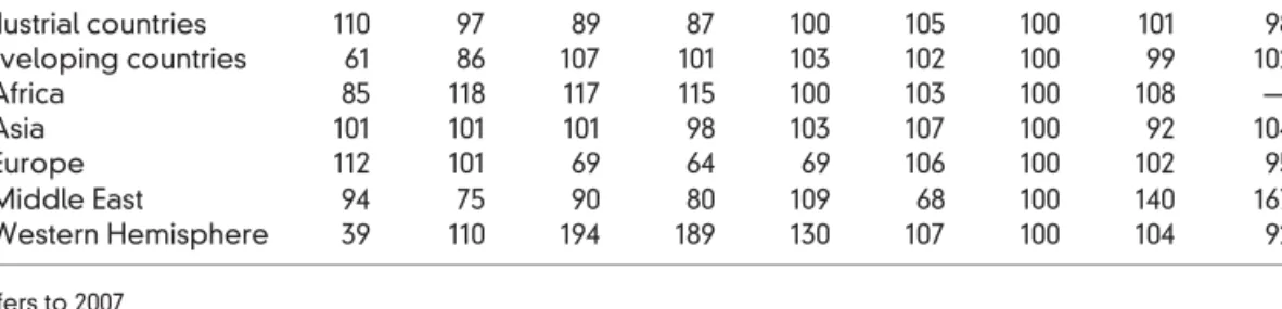
Table 4.3 gives the terms of trade of advanced countries and developing countries as a whole, as well as for African, Asian, European, Middle East- ern, and Western Hemispheric developing countries for selected years from 1972 to 2010. The terms of trade were measured by dividing the index of export unit value by the index of import unit value, with 2000 as 100.
Table 4.3 shows that the terms of trade of advanced countries declined from 1972 to 1985 but then rose until 1995, and they were 98 in 2010, as compared with 110 in 1972. For devel- oping countries, the terms of trade rose sharply from 1972 to 1980 primarily as a result of the very sharp increase in the terms of trade of West- ern Hemispheric countries, but they then declined until 1985 and they were 102 in 2010, as com- pared with 61 in 1972. The terms of trade of Africa increased from 85 in 1972 to 108 in 2005 (more recent data were not available). From 1972 to
■TABLE 4.3. The Terms of Trade of Advanced and Developing Countries, Selected Years, 1972–2010 (Export Unit Value÷Import Unit Value; 2000=100)
1972 1974 1980 1985 1990 1995 2000 2005 2010
Industrial countries 110 97 89 87 100 105 100 101 98
Developing countries 61 86 107 101 103 102 100 99 102
Africa 85 118 117 115 100 103 100 108 —
Asia 101 101 101 98 103 107 100 92 104
Europe 112 101 69 64 69 106 100 102 95
Middle East 94 75 90 80 109 68 100 140 167*
Western Hemisphere 39 110 194 189 130 107 100 104 92
*refers to 2007
Source: International Monetary Fund, International Financial Statistics (Washington, D.C.: IMF, various issues).
2010, the terms of trade rose for Asia from 101 to 104 and declined for European developing coun- tries from 112 to 95. The term of trade rose sharply for the Western Hemispheric countries from 39 in 1972 to 92 in 2010 and for the Middle East from 94 in 1972 to 167 in 2007 (more recent data were not available).
Although the terms of trade of industrial and developing countries reflected to a large extent the large fluctuations in the price of petroleum over the period examined, other forces were also clearly at work (note, for example, that the largest fluc- tuation was in the terms of trade of the Western Hemispheric countries, whose exports were mostly nonpetroleum and that the terms of trade of the Middle East as a whole declined between 1972 and 1974 because many Middle Eastern countries did not export petroleum). A detailed analysis and data of the forces that determine the terms of trade of developing countries are presented in Chapter 10.
the G-7 countries, and Case Study 4-4 gives the terms of trade of advanced and developing countries for selected years over the 1972–2010 period.
4.6
CUsefulness of the Model
The trade model presented thus far summarizes clearly and concisely a remarkable amount of useful information and analysis. It shows the conditions of production, or supply, in the two nations, the tastes, or demand preferences, the autarky point of production and
Summary 97
consumption, the equilibrium-relative commodity price in the absence of trade, and the comparative advantage of each nation (refer to Figure 3.3). It also shows the degree of specialization in production with trade, the volume of trade, the terms of trade, the gains from trade, and the share of these gains going to each of the trading nations (see Figures 3.5 and 4.5).
Because it deals with only two nations (Nation 1 and Nation 2), two commodities (X and Y), and two factors (labor and capital), our trade model is a completelygeneral equilibrium model. It can be used to examine how a change in demand and/or supply conditions in a nation would affect the terms of trade, the volume of trade, and the share of the gains from trade in each nation. This is done in Chapter 7.
Before doing that, however, our trade model must be extended in two important direc- tions: (1) to identify thebasis for (i.e., what determines) comparative advantage and (2) to examine the effect of international trade on the returns, or earnings, of resources or factors of production in the two trading nations. This is done in the next chapter.
S U M M A R Y
1. In this chapter, we derived the demand for imports and the supply of exports of the traded commodity, as well as the offer curves for the two nations, and used them to determine the equilibrium volume of trade and the equilibrium-relative commodity price at which trade takes place between the two nations. The results obtained here confirm those reached in Chapter 3 by a process of trial and error.
2. The excess supply of a commodity above the no-trade equilibrium price gives one nation’s export supply of the commodity. On the other hand, the excess demand of a commodity below the no-trade equilibrium price gives the other nation’s import demand for the com- modity. The intersection of the demand curve for imports and the supply curve for exports of the com- modity defines the partial equilibrium-relative price and quantity of the commodity at which trade takes place.
3. The offer curve of a nation shows how much of its import commodity the nation demands to be willing to supply various amounts of its export commodity. The offer curve of a nation can be derived from its pro- duction frontier, its indifference map, and the various relative commodity prices at which trade could take place. The offer curve of each nation bends toward the axis measuring the commodity of its comparative advantage. The offer curves of two nations will lie between their pretrade, or autarky, relative commod- ity prices. To induce a nation to export more of a
commodity, the relative price of the commodity must rise.
4. The intersection of the offer curves of two nations defines the equilibrium-relative commodity price at which trade takes place between them. Only at this equilibrium price will trade be balanced. At any other relative commodity price, the desired quantities of imports and exports of the two commodities would not be equal. This would put pressure on the relative commodity price to move toward its equilibrium level.
5. We can also illustrate the equilibrium-relative com- modity price and quantity with trade with partial equi- librium analysis. This makes use of the demand and supply curves for the traded commodities. These are derived from the nations’ production frontiers and indifference maps—the same basic information from which the nations’ offer curves (which are used in general equilibrium analysis) are derived.
6. The terms of trade of a nation are defined as the ratio of the price of its export commodity to the price of its import commodity. The terms of trade of the trade partner are then equal to the inverse, or reciprocal, of the terms of trade of the other nation. With more than two commodities traded, we use the index of export to import prices and multiply by 100 to express the terms of trade in percentages. Our trade model is a general equilibrium model except for the fact that it deals with only two nations, two commodities, and two factors.
A L O O K A H E A D
In Chapter 5, we extend our trade model in order to identify one of the most important determinants of the dif- ference in the pretrade-relative commodity prices and the comparative advantage among nations. This also allows us to examine the effect that international trade has on the
relative price and income of the various factors of pro- duction. Our trade model so extended is referred to as the Heckscher–Ohlin model. In Chapter 6, we present other more recent trade models.
K E Y T E R M S Commodity or net barter terms of trade,
p. 94
General equilibrium model, p. 97 Law of reciprocal
demand, p. 104
Offer curves, p. 89
Reciprocal demand curves, p. 89
Terms of trade, p. 94
Trade indifference curve, p. 100
Q U E S T I O N S F O R R E V I E W
1. How can the supply curve of exports and the demand curve of imports of a commodity be derived from the total demand and supply curves of a commodity in the two nations?
2. How is the equilibrium-relative commodity price with trade determined with demand and supply curves?
3. What is the usefulness of offer curves? How are they related to the trade model of Figure 3.4?
4. What do offer curves show? How are they derived?
What is their shape? What explains their shape?
5. How do offer curves define the equilibrium-relative commodity price at which trade takes place?
6. What are the forces that would push any nonequilibrium-relative commodity price toward the equilibrium level?
7. How is a nation’s supply curve of its export commodity and demand for its import commodity derived from the nation’s production frontier and indifference map?
8. Why does the use of demand and supply curves of the traded commodity refer to partial equilibrium analysis? In what way is partial equilibrium analysis of trade related to general equilibrium analysis?
9. Under what condition will trade take place at the pretrade-relative commodity price in one of the nations?
10. What do the terms of trade measure? What is the relationship between the terms of trade in a world of two trading nations? How are the terms of trade measured in a world of more than two traded commodities?
11. What does an improvement in a nation’s terms of trade mean? What effect does this have on the nation’s welfare?
12. In what way does our trade model represent a gen- eral equilibrium model? In what way does it not?
In what ways does our trade model require further extension?
P R O B L E M S
1. Show graphically how the equilibrium-relative commodity price of commodity Y with trade can be derived from Figure 4.1.
2. Without looking at the text, derive a nation’s offer curve from its production frontier, its indifference map, and two relative commodity prices at which
Problems 99
trade could take place (i.e., sketch a figure similar to Figure 4.3).
3. Do the same as Problem 2 for the trade partner (i.e., sketch a figure similar to Figure 4.4).
4. Bring together on another graph the offer curves that you derived in Problems 2 and 3 and deter- mine the equilibrium-relative commodity prices at which trade would take place (i.e., sketch a figure similar to Figure 4.5).
5. In what way is a nation’s offer curve similar to:
(a) a demand curve?
(b) a supply curve?
In what way is the offer curvedifferent from the usual demand and supply curves?
*6. Sketch a figure similar to Figure 4.5.
(a) Extend thePFprice line, and the offer curve of Nation 1 until they cross. (In extending it, let the offer curve of Nation 1 bend backward.) (b) Using the figure you sketched, explain the
forces that pushPF towardPB in terms of com- modity Y.
(c) What does the backward-bending (nega- tively sloped) segment of Nation 1’s offer curve indicate?
7. To show how nations can share unequally in the benefits from trade:
(a) Sketch a figure showing the offer curve of a nation having a much greater curvature than the offer curve of its trade partner.
(b) Which nation gains more from trade, the nation with the greater offer curve or the one with the lesser curvature?
(c) Can you explain why?
*8. From the left panel of Figure 4.4, derive Nation 2’s supply curve of exports of commodity Y. From
the left panel of Figure 4.3, derive Nation 1’s demand curve for Nation 2’s exports of commod- ity Y. Use the demand and supply curves that you derived to show how the equilibrium-relative commodity price of commodity Y with trade is determined.
9. (a)sfasfdWhy does the analysis in the answer to Prob- lem 8 refer to partial equilibrium analysis?
(b) Why does the analysis of Figure 4.5 refer to general equilibrium analysis?
(c) What is the relationship between partial and general equilibrium analysis?
*10. Draw the offer curves for Nation 1 and Nation 2, showing that Nation 2 is a small nation that trades at the pretrade-relative commodity prices in Nation 1. How are the gains from trade distributed between the two nations? Why?
11. Draw a figure showing the equilibrium point with trade for two nations that face constant opportu- nity costs.
12. Suppose that the terms of trade of a nation improved from 100 to 110 over a given period of time.
(a) By how much did the terms of trade of its trade partner deteriorate?
(b) In what sense can this be said to be unfa- vorable to the trade partner? Does this mean that the welfare of the trade partner has definitely declined?
13. It has often been said that OPEC (Organization of Petroleum Exporting Countries) operates as a car- tel and is able to set petroleum prices by restricting supplies. Do you agree? Explain.
*=Answer provided at www.wiley.com/college/
salvatore.
APPENDIX
This appendix presents the formal derivation of offer curves, using a technique perfected by James Meade. In Section A4.1, we derive a trade indifference curve for Nation 1, and in Section A4.2, its trade indifference map. In Section A4.3, Nation 1’s offer curve is derived
from its trade indifference map and various relative commodity prices at which trade could take place. Section A4.4 outlines the derivation of Nation 2’s offer curve in relation to Nation 1’s offer curve. In Section A4.5, we present the complete general equilibrium model showing production, consumption, and trade in both nations simultaneously. Finally, in Section A4.6 we examine multiple and unstable equilibria.
A4.1 Derivation of a Trade Indifference Curve for Nation 1
The second (upper-left) quadrant of Figure 4.7 shows the familiar production frontier and community indifference curve I for Nation 1. The only difference between this and Figure 3.3 is that now the production frontier and community indifference curve I are in the second rather than the first quadrant, and quantities are measured from right to left instead of from left to right. (The reason for this will become evident in a moment.) As in Figure 3.3, Nation 1 is in equilibrium at pointAin the absence of trade by producing and consuming 50X and 60Y.
Now let us slide Nation 1’s production block, or frontier, along indifference curveI so that the production block remains tangent to indifference curveI and the commodity axes are kept parallel at all times. As we do this, the origin of the production block will trace out curve TI (see Figure 4.7). PointA∗ is derived from the tangency atA, point B∗ from the tangency atB, pointW∗ from the tangency atW (not shown to keep the figure simple), and pointZ∗ from the tangency atZ.
CurveTI is Nation 1’s trade indifference curve, corresponding to its indifference curveI. TI shows the various trade situations that would keep Nation 1 at the same level of welfare as in the initial no-trade situation. For example, Nation 1 is as well off at pointAas at point B, since both pointsAandB are on the same community indifference curveI. However, at pointA, Nation 1 produces and consumes 50X and 60Y without trade. At pointB, Nation 1 would produce 130X and 20Y (with reference to the origin at B∗) and consume 30X and 70Y (with reference to the origin atO orA∗) by exporting 100X in exchange for 50Y (see the figure).
Thus, atrade indifference curveshows the various trade situations that provide a nation equal welfare. The level of welfare shown by a trade indifference curve is given by the community indifference curve, from which the trade indifference curve is derived. Also note that the slope of the trade indifference curve at any point is equal to the slope at the corresponding point on the community indifference curve from which the trade indifference curve is derived.
A4.2 Derivation of Nation 1’s Trade Indifference Map
There is one trade indifference curve for each community indifference curve. Higher com- munity indifference curves (reflecting greater national welfare) will give higher trade indif- ference curves. Thus, a nation’stradeindifference map can be derived from itscommunity indifference curve map.
Figure 4.8 shows the derivation of trade indifference curve TI from community indif- ference curve I (as in Figure 4.7) and the derivation of trade indifference curveTIII from
A4.3 Formal Derivation of Nation 1’s Offer Curve 101
Y
Y
X X
W
I
TI
TI I
Z*
W*
B*
A*
Z A
B
50
20
20 40 60 70 80 100 120
10 30 50 70 90 110
130 20 40 60 80 100
FIGURE 4.7. Derivation of a Trade Indifference Curve for Nation 1.
Trade indifference curve TI is derived by sliding Nation 1’s production frontier, or block, along its indifference curve I so that the production block remains tangent to indifference curve I and the commodity axes are kept parallel at all times. As we do this, theorigin of the production block will trace out TI. This shows the varioustrade situations that would keep Nation 1 at the same level of welfare as in the initial no-trade situation (given by pointA on indifference curve I).
community indifference curveIII for Nation 1. Note that community indifferencecurve III is the one shown in Figure 3.2. To reach community indifference curveIII in Figure 4.8, the production block must be shifted up parallel to the axes until it is tangent to that community indifference curve. Thus, the tangency pointJ givesJ∗ on TIII. Tangency pointE would giveE∗ onTIII, and so on.
Figure 4.8 shows only the derivation ofTI andTIII (to keep the figure simple). How- ever, for each indifference curve for Nation 1, we could derive the corresponding trade indifference curve and obtain the entire trade indifference map of Nation 1.
A4.3 Formal Derivation of Nation 1’s Offer Curve
A nation’s offer curve is the locus of tangencies of the relative commodity price lines at which trade could take place with the nation’s trade indifference curves. The formal derivation of Nation 1’s offer curve is shown in Figure 4.9.
In Figure 4.9, TI and TII are Nation 1’s trade indifference curves, derived from its production block and community indifference curves, as illustrated in Figure 4.8. LinesPA, PF,PB,PF, andPAfrom the origin refer to relative prices of commodity X at which trade could take place (as in Figure 4.5).
Joining the origin with tangency pointsH, E, R, S, and T gives Nation 1’s offer curve.
This is the same offer curve that we derived with a simpler technique in Figure 4.3. The only