THE BASICS OF EDITOR DESIGN 1. WYSIWYG EDITING
SELECTION 8.2. THE PATTERNS
COLOR
TYPOGRAPHY
WHAT THIS MEANS FOR DESKTOP APPLICATIONS
THE PATTERNS 88. deep background
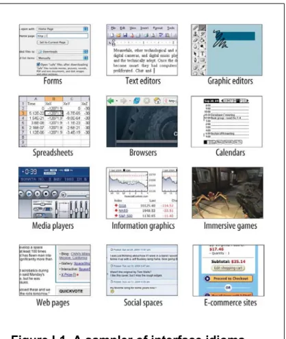
Designing Interfaces
Jenifer Tidwell
Preface
Worse still, if you've built an unusable website or web application, frustrated users may give up and switch to a competitor with just the click of a button. It's even harder when you're designing products outside of the desktop and web world, because there's very little good design advice out there.
SMALL INTERFACE PIECES, LOOSELY
You might say, "The applications that are easy to use are designed to be intuitive." Well, yes. But once you take ten seconds to learn how to use a mouse, it's familiar and you'll never forget it.
ABOUT PATTERNS IN GENERAL
OTHER PATTERN COLLECTIONS
Ground."[1] Many other collections and languages followed, notably Martijn van Welie's "Interaction Design Patterns,"[2]and Jan Borchers' book A Pattern Approach to Interaction Design (Wiley) More recently, a full-fledged website pattern language has been published, called The Design of Sites (Addison-Wesley). If you're building web or desktop applications, or if you're pushing the boundaries in either domain, check out all of these publications, you might find inspiration in any of them .
ABOUT THE PATTERNS IN THIS BOOK
But there's a deeper reason why this book won't give you a recipe for designing an interface. Most chapters in this book are arranged more or less by scale, and thus by their approximate order in the design progression: major decisions about content and scope are made first, followed by navigation, page design, and finally the details of interactions with forms and canvases and such.
AUDIENCE
Web designers who are now required to design web applications or websites with more interactivity. More experienced designers who want to see how other designs solve certain problems; examples can serve as a source of ideas.
HOW THIS BOOK IS ORGANIZED
It's about how to convey meaning simply by putting things in the right place. It discusses the cognitive aspects of data presentation and how to use it to convey knowledge and meaning.
COMMENTS AND QUESTIONS
ACKNOWLEDGMENTS
What Users Do
So as a UI designer, you can script this conversation, or at least define its terms. How user and machine ultimately communicate meaning to each other.
A MEANS TO AN END
Either way, the user interface mediates this conversation and helps the user achieve the goals they had in mind. This brings the user closer to the goal, with less time and effort on their part.
THE BASICS OF USER RESEARCH
You can ask users what their goals are and what tasks they typically perform. In both cases it is about understanding the audience as best as possible.
USERS' MOTIVATION TO LEARN
Applications in the first group have many complex functions, but generally do not guide the user through tasks step by step. Check out About Face 2.0: The Essentials of Interaction Design for a more nuanced explanation of poses.
THE PATTERNS
A new visitor to a company's home page clicks on various links just to see what's there, trusting that the Back button will always return them to the main page. You can imagine the confusion that can arise if a web application does something other than responding to the Back button - or if the application provides a button that looks like a Back button but doesn't quite behave like one.
They will be examined and speculated about; write them in such a way that the user's first guess about the meaning is correct. A long time ago, the user may have learned way A to do something, and even though a later version of the system offers way B as a better alternative (or it was there all along), they see no benefit in learning it - it takes effort, after all – and continues to use the less efficient route A.
Builder-style applications—word editors, code development environments, and painting programs—can allow a user to work on multiple projects simultaneously, allowing the user to put as many projects aside while working on another. Online surveys hosted by surveymonkey.com sometimes offer a button on each survey page that says "I'll complete it later." This button closes the browser page, records the choices you've made up to that point, and allows the user to return later to complete the survey.
Sometimes you can separate the few important questions or options from others that are less important. But keep in mind that prefilled answers still require the user to look at them just to change them.
When good tools support creative activities, the activities can induce a state of flow in the user. If the user has to wait even half a minute to see the results of the incremental change she just made, then her concentration is disrupted; the flow is disrupted.
This is also the reason why confirmation dialogs often do not protect the user from accidental changes. I've seen at least one application that sets the confirmation dialog buttons randomly from one call to the next.
Adding something to an interface usually doesn't cause problems, but rearranging existing controls can disrupt spatial memory and make things harder to find. Along with habituation, which is closely related, spatial memory is another reason why consistency across and within applications is good.
But note that almost none of the techniques in the list above were designed with this in mind. Also, don't automatically organize or sort things unless the user asks the system to do so.
You can take any set of commands you issue to the command line, put them in a for loop, and execute them by pressing the Return key once. Or you can put them in a shell script (or in a for loop in a shell script!) and run them as a single command.
The Tab key usually moves the keyboard focus—the control currently receiving keyboard input—from one control to another, and Shift-Tab moves it back. Forms, dashboards, and standard web pages are fairly easy to navigate with the keyboard.
Organizing the Content:Information
If you're really into it, you've written down some typical scenarios that describe how people might use high-level elements of the app to achieve their goals. You need to stay flexible and creative for a while until you get the overall organization of the app sorted out.
THE BASICS OF INFORMATION
ARCHITECTURE
DIVIDING STUFF UP
Most applications (and many websites) are organized according to one or more of the following approaches. You can also apply these splits not only at the top level of the application, but at several levels within them.
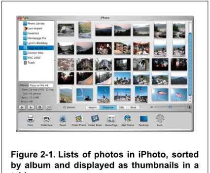
LISTS OF OBJECTS
There is much to be said for the organization and presentation of objects in such an interface. Your choice should depend on what people want to do with the application, what best fits their mental models, and what best fits the natural organization—if any—of the objects in question.
LISTS OF ACTIONS
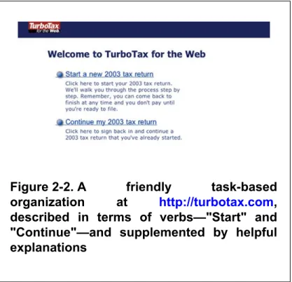
A friendly task-based organization at http://turbotax.com described by the verbs – "Start" and. All they easily do is present a selection of a few features with one click: three at a time if they're lucky, but usually just one or two.
LISTS OF SUBJECT CATEGORIES
This organizational model, combined with the familiar media player idiom, is really the heart of the iTunes application.

LISTS OF TOOLS
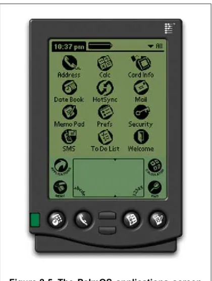
Linear organizations are common, as there usually aren't many of them in the first place. If there are a lot of tools - and maybe add a lot more - then you can group them by category, like the Windows start bar does.
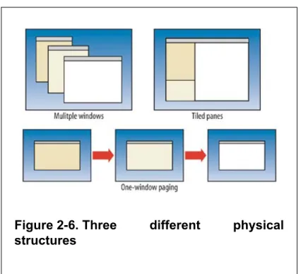
PHYSICAL STRUCTURE
MULTIPLE WINDOWS
ONE-WINDOW PAGING
TILED PANES
The next few patterns aren't much about the physical presentation, but instead are about the content in an abstract sense. Many patterns, here and elsewhere in the book, contribute to varying degrees the learnability of an interface.
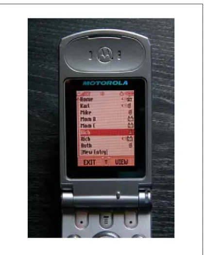
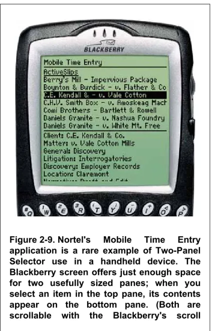
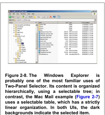
-Window Drilldown), the user suddenly has to pay more attention to what he is currently looking at; when the window remains largely stable, such as a two-pane selection, the user can focus on the smaller area that has changed. When the user selects an item, its contents or details are immediately displayed in the second panel.
This works regardless of what physical structure you chose, as long as you can see the canvas side by side with the palette. But the presence of icons seems necessary for users to recognize the palette for what it is.
Your application consists of many pages or panels of content that the user can navigate. Remember that a single-window application without a graphical representation of the structure of the application or where they are in that structure forces the user to rely on a mental picture of how all these spaces fit together.
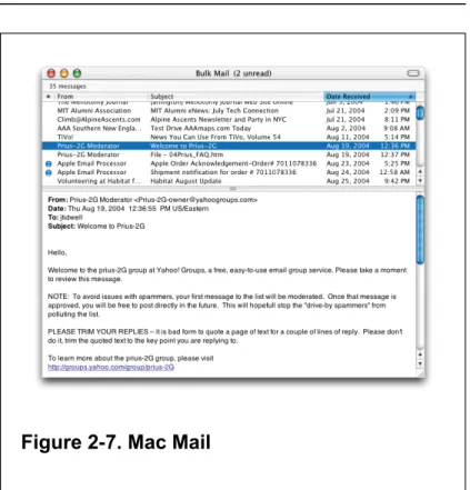
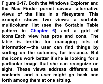
Applications that "remember" their users often retain the user's alternate display choices from one use to the next. Both programs place the Alternative Views buttons in the lower left corner of the document window. Note that in these Word examples, the selected text remains the same when the user switches from one view to another.
You are confident that those who design the user interface will know more than the user about how best to complete the task. The catch is that the user must be willing to surrender control over what ever happens.
34;CHUNKING" THE TASK
Responsive activation where all steps are present on the page but each remains disabled until the user has completed the previous step. Responsive Disclosure, where you wait to show a step on the user interface until the user finishes the previous one.

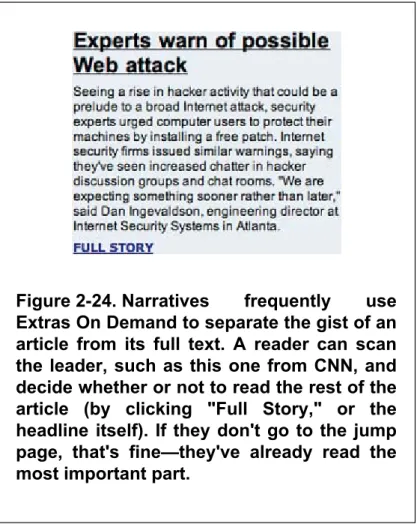
Hide that section by default; in the newly simplified UI, place a clearly marked button or link to the rest, such as "More options". Many UIs use arrows or arrows, ">>", as part of the link or button label. A reader can scan the leader, like this one from CNN, and decide whether or not to read the rest of the article (by clicking "Full Story," or the headline itself).
These doors can be underlined links (even in desktop applications), headings, buttons, menu items, icons, or clickable image areas. It's up to you to figure out how to label them in a way that arouses curiosity. Browsing photos on Flickr is often an exercise in following various intriguing branches: it offers 'excursions'.
Getting Around:Navigation,
Signposts, and Wayfinding
STAYING FOUND
Clear, unambiguous labels predict what you're looking for and tell you where to go; signs are where you expect them to be, and you're never left without guidance at a decision point. You can check this by walking through the artifact you are designing and following the paths of all the major use cases.