Getting Started with Flex
™3
Jack Herrington and Emily Kim
Getting Started with Flex™
3
by Jack Herrington and Emily Kim
Copyright © 2008 Jack Herrington and Emily Kim. All rights reserved. Printed in Canada.
Published by O’Reilly Media, Inc., 1005 Gravenstein Highway North, Se-bastopol, CA 95472.
O’Reilly books may be purchased for educational, business, or sales promo-tional use. Online editions are also available for most titles (http://safari.oreil ly.com). For more information, contact our corporate/institutional sales de-partment: (800) 998-9938 or [email protected].
Editor: Steve Weiss
Copy Editor: Audrey Doyle
Proofreader: Carol Marti
Indexer: Joe Wizda
Cover Designer: Karen Montgomery
Illustrators: Robert Romano and Jessamyn Read
Printing History:
June 2008: First Edition
The O'Reilly logo is a registered trademark of O'Reilly Media, Inc. The Pocket Reference/Pocket Guide series designations, Flex, and the image of the Brittle Star, and related trade dress, are trademarks of O'Reilly Media, Inc. While every precaution has been taken in the preparation of this book, the publisher and authors assume no responsibility for errors or omissions, or for damages resulting from the use of the information contained herein.
Adobe Developer Library, a copublishing partnership between O’Reilly Media Inc., and Adobe Systems, Inc., is the authoritative resource for developers using Adobe technolo-gies. These comprehensive resources offer learning solutions to help developers create cutting-edge interactive web appli-cations that can reach virtually anyone on any platform. With top-quality books and innovative online resources cov-ering the latest tools for rich-Internet application develop-ment, the Adobe Developer Library delivers expert training straight from the source. Topics include ActionScript, Adobe Flex®, Adobe Flash®, and Adobe Acrobat®.
Contents
Preface
xi
Chapter 1: Installing Flex Builder 3
1
Installing the IDE
1
Having Some Image Fun
2
Chapter 2: Flex in Action
7
E-Commerce
7
Online Applications
9
Multimedia
11
Plug-ins and Widgets
12
Dashboards
15
Desktop Applications
16
What Will You Do?
18
Chapter 3: Flex 101: Step by Step
19
A Flickr Viewer
20
Chapter 4: Flex Controls and Layout
37
The Application Container
37
The Box Class
39
The Form Container
44
Combined Layouts
46
The Panel Container
48
Controls
50
Data Grids
51
Tabs and Accordions
55
Menus
58
Divider Boxes
60
CSS
61
Filters and Effects
65
Chapter 5: Working with the Server
67
POSTing to the Server with Flex
69
Using the HTTPService Tag
70
Going on from Here
77
Chapter 6:
More Flex Applications
79
A Runner’s Calculator
79
A Simple Image Viewer
83
Drag-and-Drop
86
States and Transitions
88
Creating Better Movies
95
Chapter 7: Advanced Flex Controls
101
ILOG Elixir
101
Advanced Flash Components
104
The FlexLib Project
105
Distortion Effects
105
SpringGraph
106
Chapter 8: Flex for Widgets
109
Chat Widget
114
Chapter 9: Flex on AIR
119
Creating an AIR Version of the Runner’s Calculator
119
Chapter 10: Resources for Flex Developers
123
Flex Websites
123
Blogs and Sites
123
The Flex Cookbook
124
Community Resources
125
Books
125
Preface
How many times have you gotten an idea for a killer application in your mind, only to have the implementation fail when the framework you use bogs you down in the detail work? I know I certainly have experienced that. Fortunately, Flex came to my rescue and made the process of implementing my ideas fun again. I can think up amazing interfaces and pull them together quickly in Flex. While I concentrate on the design, Flex handles all the details of making it happen.
This book will inspire you to try Flex and to see just how much fun it can be to bring your ideas to life. Let Flex make your interface design and coding enjoyable again!
Who Should Read This Book
This book is primarily intended for people who are new to Flex or who have tried previous versions of Flex and are interested in what’s new in Flex 3. I’ve designed the book to be a quick tour of the Flex world without delving too deeply into any one topic. To provide in-depth coverage of every topic I present in the book would require five times the page count, which could present a health hazard to you, dear reader.
Google, which is your best friend when it comes to learning about the nooks and crannies of the Flex API.
How This Book Is Organized
Here is a summary of the chapters in the book and what you can expect from each:
Chapter 1
In this chapter, I’ll guide you through installing Flex Builder 3 and putting together a fun image manipulator application.
Chapter 2
This chapter presents several real-world examples of sites that make amazing use of Flex.
Chapter 3
This chapter provides a step-by-step walkthrough of how to build a Flex application.
Chapter 4
This chapter describes Flex layout mechanisms and con-trols. Filters and effects are also covered.
Chapter 5
This chapter covers the different forms of network com-munications supported by Flex applications, and includes examples for a few of them.
Chapter 6
This chapter presents additional example applications, including a calculator, an image viewer, a drag-and-drop application, and more.
Chapter 7
Chapter 8
This chapter discusses how to build small Flex movies for use on other people’s web pages. A full working chat widget is provided as an example.
Chapter 9
This chapter covers how to use Adobe’s AIR runtime to put Flex applications on the desktop.
Chapter 10
This chapter presents numerous resources for Flex devel-opers, including blogs, forums, podcasts, books, and more.
Conventions Used in This Book
The following typographical conventions are used in this book: Italic
Indicates new terms, URLs, email addresses, filenames, file extensions, pathnames, directories, and Unix utilities Constant width
Indicates commands, options, switches, variables, attrib-utes, keys, functions, types, classes, namespaces, meth-ods, modules, properties, parameters, values, objects, events, event handlers, XML tags, HTML tags, macros, the contents of files, and the output from commands Constant width bold
Shows commands or other text that should be typed lit-erally by the user
Constant width italic
Shows text that should be replaced with user-supplied values
How to Contact Us
O’Reilly Media, Inc.
1005 Gravenstein Highway North Sebastopol, CA 95472
800-998-9938 (in the United States or Canada) 707-829-0515 (international or local)
707-829-0104 (fax)
We have a web page for this book, where we list errata, exam-ples, and any additional information. You can access this page at:
http://www.oreilly.com/catalog/9780596520649
For more information about our books, conferences, Resource Centers, and the O’Reilly Network, see our website at:
http://www.oreilly.com
About the Author
Jack Herrington is an engineer, author, and presenter who lives and works in the San Francisco Bay area with his wife, daugh-ter, and two dogs. He is the author of three additional books, Code Generation In Action, Podcasting Hacks, and PHP Hacks, as well as numerous articles. You can check out his technical blog at http://jackherrington.com.
Emily Kim is the co-founder and managing partner of the com-pany Trilemetry, Inc., which specializes in software design, programming, and education.
Acknowledgments and Dedication
This book is dedicated to my beautiful wife, Lori, and awesome daughter, Megan. They are both the reason and the inspiration for this book.
—Jack Herrington
Publisher's Acknowledgments
CHAPTER 1
Installing Flex Builder 3
Getting started with Flex begins with downloading the Flex Builder 3 integrated development environment (IDE). You can do that for free by going to the Adobe website (http:// adobe.com/flex) and clicking on the Try Flex Builder 3 link. It’s a pretty big download, so while you are waiting you might want to check out Chapter 2 to get some inspiration regarding what you can do with Flex.
Installing the IDE
Flex Builder installs just like any other software you would in-stall on your Windows, Macintosh, or Linux box. The only small difference is that you will need to close your browser(s) so that the installer can upgrade your version of Flash Player to the debugger version. You will want to do that so that you can use the full debugging capabilities built into Flex Builder 3. The debugging system is very good, and becoming familiar with it will be well worth your time.
Once you have the software installed, launch it and you should see the splash screen shown in Figure 1-1.
On the splash screen you will see the words Built on Eclipse. Eclipse is an extensible cross-platform IDE developed by IBM that is popular in the Java™ world. However, you can also use it to build PHP as well as Rails or, in this case, Flex applications. If you are familiar with Eclipse you will be fairly familiar with what you see in Figure 1-2.
Figure 1-2 shows the IDE when no projects are defined. On the upper left is the project and file area. On the bottom left is the Outline inspector that will show you the nested tags in your Flex application files. On the top right is the Start page that comes up by default. You should check out the links on the Start page because they will bring you to helpful material to get you started. The bottom-right panel, labeled Problems, is where you are alerted to issues (e.g., syntax errors) in your Flex code that keep Flex Builder from successfully compiling your application.
Having Some Image Fun
To get started quickly with Flex, select a new Flex project from the New item in the File menu. Use whatever project name you like. I used “starter.” From there, take any image from your
computer, rename it to myimage.jpg, and drop it into the src folder of your new project.
Next, double-click on the MXML file for the application and add the code in Example 1-1.
Example 1-1. Starter.mxml
<?xml version="1.0" encoding="utf-8"?>
<mx:Application xmlns:mx="http://www.adobe.com/2006/mxml" layout="absolute">
<mx:Image source="@Embed('mypicture.jpg')" height="100" top="30"
left="30" rotation="−10"> <mx:filters>
<mx:DropShadowFilter /> </mx:filters>
</mx:Image> </mx:Application>
Now use the Run command in the Run menu to run the ap-plication. You should see your picture rotated a little bit, with a drop shadow added. Already, you can see that Flex can do
some things that are difficult to do in the browser without any code.
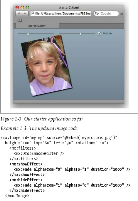
Our next step will be to add some dynamic behavior to the example by adding controls for the rotation, the sizing, and the visibility of the image. The updated code appears in Exam-ple 1-2.
Example 1-2. Starter.mxml updated with controls
<?xml version="1.0" encoding="utf-8"?>
<mx:Application xmlns:mx="http://www.adobe.com/2006/mxml" layout="absolute">
<mx:HBox top="10” left="10">
<mx:HSlider minimum="−30” maximum="30” value="−10” toolTip="Rotation”
change="myimg.rotation=event.currentTarget.value” liveDragging="true” />
<mx:HSlider minimum="100” maximum="300” value="100” toolTip="Size”
change="myimg.height=event.currentTarget.value” liveDragging="true” />
<mx:CheckBox label="Visible” change="myimg.visible= event.currentTarget.selected”
selected="true"/> </mx:HBox>
<mx:Image id="myimg" source="@Embed('mypicture.jpg')" height="100" top="60" left="30" rotation="−10"> <mx:filters>
<mx:DropShadowFilter /> </mx:filters>
</mx:Image> </mx:Application>
Now we have two sliders and a checkbox. One slider controls the rotation and the other controls the size of the image as the user adjusts the setting. The checkbox will hide or show the image. Figure 1-3 shows the result.
Example 1-3. The updated image code
<mx:Image id="myimg" source="@Embed('mypicture.jpg')" height="100" top="60" left="30" rotation="−10"> <mx:filters>
<mx:DropShadowFilter /> </mx:filters>
<mx:showEffect>
<mx:Fade alphaFrom="0” alphaTo="1” duration="1000” /> </mx:showEffect>
<mx:hideEffect>
<mx:Fade alphaFrom="1” alphaTo="0” duration="1000” /> </mx:hideEffect>
</mx:Image>
I’ve chosen to use a fade effect, but there are lots of different filters and effects that you can apply to any Flex control. You can even combine effects in parallel or as a sequence to create cool transitions almost always without using any ActionScript code.
CHAPTER 2
Flex in Action
Flash has always been a great tool for adding interactivity to a website. But with the advent of Flex a whole new group of engineers, designers, and enthusiasts have been able to build a wide variety of Flash applications. This chapter will discuss a cross section of applications to give you some ideas for what you can do with Flex. As you are looking through these exam-ples, bear two things in mind:
• Although these examples often look dauntingly complex to implement, the Flex framework makes much of this work very easy.
• All of these applications work without any changes on Windows, Macintosh, and Linux, both in the browser and, often, on the desktop using Adobe’s AIR technology. I found most of the examples in this chapter in the Flex Show-case portion of the Flex.org (http://flex.org) website (http:// flex.org/). The Showcase has an RSS feed that is worth sub-scribing to so that you can get a sense of what other people are producing using Flex.
E-Commerce
se-lector in Figure 2-1. At the top of the page you can hover your mouse pointer over each snowboard design to find out more about it, as well as filter the selection of boards to just those for men, women, or rookies/kids.
Choose your weapon indeed, my friend! This site also demon-strates how Flex applications can seamlessly integrate with HTML pages. Flex does not need to take up the entire page. You can use Flex to build any size page element you want. And you can have the Flex application talk back to the JavaScript on the page to further link the Flash application with the HTML.
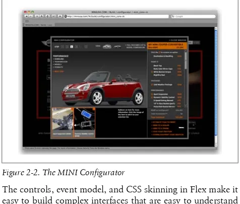
One of the most well-known Flash applications is the MINI car Configurator (http://miniusa.com/?#/build/configurator/ mini_conv-m) shown in Figure 2-2.
This astounding Flash application will walk you through con-figuring a MINI Cooper both inside and out. It’s inviting, fun, and thoroughly engaging. It certainly makes me want to buy a MINI.
When you try out the MINI Configurator, which I hope you do, don’t be taken aback by the complexity of the interface.
The controls, event model, and CSS skinning in Flex make it easy to build complex interfaces that are easy to understand and maintain at the ActionScript level.
Online Applications
It seems like every month another company comes out with a web version of an application that used to be available only on the desktop. Sure, it’s nice to be able to use an application without having to download and install it. However, I don’t know about you, but I don’t find them all that good. Well, I didn’t, until I saw SlideRocket (http://www.sliderocket.com/), a Flex-based version of a slide show editor and presenter. As you can see in Figure 2-3, the editor portion of the interface is both full-featured and elegant.
Figure 2-3. SlideRocket’s editor screen
SlideRocket is one of the most amazing applications I’ve seen on any platform in years. It’s well worth your time to check it out.
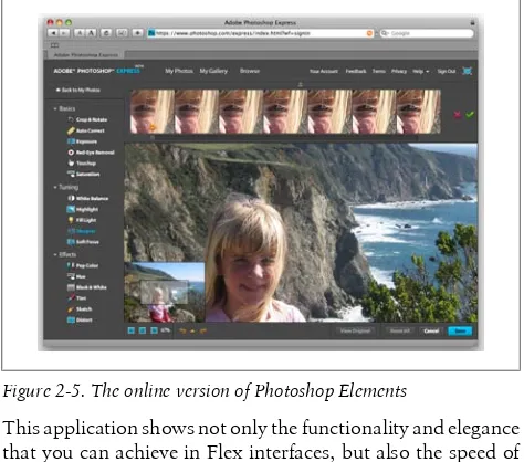
Another company doing some innovative application work is Aviary (http://a.viary.com). Shown in Figure 2-4 is Aviary’s on-line image editing application that is written in Flex.
This application shows not only the functionality and elegance that you can achieve in Flex interfaces, but also the speed of the Flash Player in executing image manipulation functions. Adobe itself is making use of Flex to build an online suite of applications. Shown in Figure 2-5 is the online version of Pho-toshop Elements built completely in Flex.
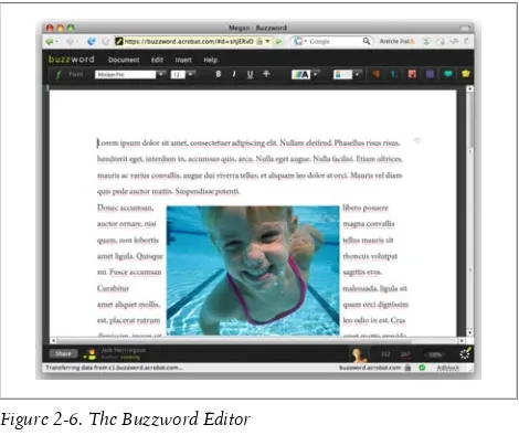
Another impressive online application is Adobe’s Buzzword project (http://buzzword.acrobat.com/), shown in Figure 2-6. Not only is it beautifully designed, but it’s also fast, works anywhere, and can be used in conjunction with other contrib-utors. Adobe developed Buzzword in Flex.
Multimedia
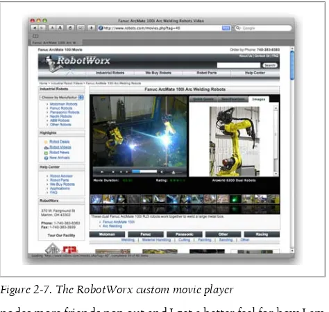
Of course, what catalog of Flash applications would be com-plete without a movie viewer? I don’t want to show you the usual YouTube thing, so I’ll show you video integrated with e-commerce to sell robots for a company called RobotWorx
(http://www.robots.com/movies.php?tag=40). Figure 2-7 shows the RobotWorx page with the embedded custom video player. The Flex application is seamlessly embedded within the larger HTML page. The videos available for the particular robot are shown along the bottom in the style of YouTube. The video of the robot (doing some arc welding in this case) is shown on the left. And a static image of the robot is shown on the right.
Plug-ins and Widgets
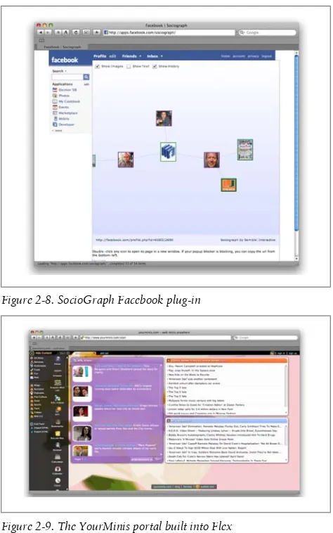
You can also use Flex to implement the plug-ins and widgets that go on sites such as Facebook. Shown in Figure 2-8 is a Flex-based node graph, called SocioGraph (http://apps.face book.com/sociograph/), which displays the connections be-tween you and your Facebook friends. It’s an easy add-in ap-plication to your Facebook account.
I admit that I don’t have a lot of Facebook friends; your graph is probably a lot busier than mine is. But as I click around the
nodes more friends pop out and I get a better feel for how I am connected to people simply by interacting with this control. Even with my sparse set of data there is a lot of fun to be had. You can also use Flex to host a set of widgets as a portal. YourMinis (http://www.yourminis.com/start), shown in Fig-ure 2-9, does a great job of presenting customizable portals that look great and work well.
Figure 2-9. The YourMinis portal built into Flex
You can have multiple pages in your portal. And you can even place a YourMinis widget on any regular HTML page as a
standalone piece. This makes YourMinis not only a great por-tal, but also a great place to build widgets that can go anywhere.
Dashboards
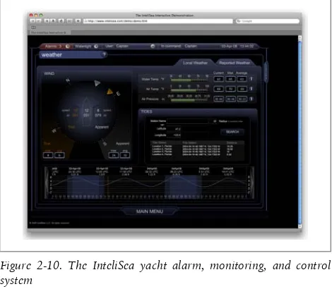
Controlling a business is one thing, but how about controlling devices—such as a yacht, for example? Yes, Flex has done that too. Have a look at Figure 2-10 to see the InteliSea yacht alarm, monitoring, and control system (http://www.inteli sea.com/demo/demo.htm).
Figure 2-10. The InteliSea yacht alarm, monitoring, and control system
It makes me want to go out and buy a yacht just so that I can play with this thing. Of course, there is the expense of the yacht. Hmmm... Oh, well. I wonder if I can get this trimmed down to work on radio-controlled boats.
U.S. government profiles of countries and territories around the world. This is shown in Figure 2-11.
Figure 2-11. The CIA World FactBook viewer
This shows a nice combination of the controls available in the ILOG Elixir toolkit, including 2D and 3D charts, a tree view, interactive maps, and more. For more information on the ILOG Elixir toolkit, visit http://www.ilog.com/products/elixir/. I also discuss ILOG Elixir in more detail in Chapter 7.
Desktop Applications
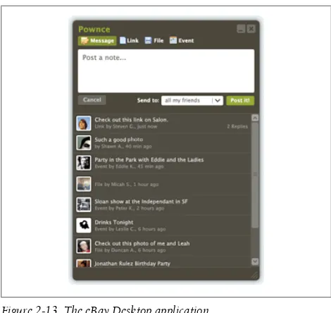
Figure 2-12. The Pownce chat client
I can tell you from experience that building this type of chat application in Ajax is a real hassle. Cross-domain security be-comes an issue that requires that you proxy all of the requests. And making lots of HTTP requests can create memory leaks on some browsers that will leave you banging your head against the wall trying to fix all of the bugs that may or may not appear at any given time. Flex gets around these hassles by sitting on top of the robust and cross-platform Flash Player.
Figure 2-13. The eBay Desktop application
From here, you can browse what is available for sale, bid on items, watch your auctions, and so on. And it even maintains the native look and feel of the operating system.
What Will You Do?
CHAPTER 3
Flex 101: Step by Step
This chapter will walk you step by step through the process of constructing a Flex application. That starts with learning how Flex works. Flex is an XML-based language that is compiled into Flash applications. You can see the process portrayed graphically in Figure 3-1.
Figure 3-1. The flow of Flex application building
Flex Builder is actually a bit more useful than this in that it really manages projects, which are sets of Flex applications and components, as well as assets (e.g., images and audio that are embedded in the SWF) and any libraries that your project ref-erences. This is shown in Figure 3-2.
Now that you have a general idea of how Flex Builder 3 creates Flex applications, it’s time to walk through the process of cre-ating a real Flex application.
A Flickr Viewer
The final sample application in this chapter is a Flickr image viewer. The end result looks like Figure 3-3.
With this application, you can type a search term into the text box, click the Search button, and see the result in the list view. This example is a bit more complex than the example in Chap-ter 1, so I’ll walk you through building it in Flex Builder. The first step is to create a new Flex application project named FlickrRIA, which you can do by following these steps:
1. In the Flex Builder IDE, select File→New→Flex Project and name the project FlickrRIA.
2. Accept the default location for the project and confirm that the Application Type is Web Application and that the Server Technology is set to None.
3. Click Finish to create the project.
The FlickrRIA.mxml application file opens in the MXML edi-tor. The editor is in Source mode. Now, you need to format the display. To do so, follow these steps:
1. In the opening Application tag, delete the code lay out="absolute".
2. For the Application tag, add a backgroundGradientCol ors attribute with a value of [0xFFFFFF, 0xAAAAAA], a horizontalAlign attribute with a value of left, a verti calGap attribute with a value of 15, and a horizontal Gap attribute with a value of 15.
Example 3-1 shows the code for the Application tag.
Example 3-1. The Application tag
<mx:Application xmlns:mx="http://www.adobe.com /2006/mxml"
backgroundGradientColors="[0xFFFFFF,0xAAAAAA]" horizontalAlign="left"
verticalGap="15" horizontalGap="15" >
Next, we’ll lay out the search form in Design mode:
1. Click the Design button to change to Design mode. Us-ing Design mode is the easiest way to lay out a form in Flex Builder.
2. From the Components view, drag an HBox component from the Layout folder to the design area. Keep the de-fault values of the component. The HBox component contains the label, input field, and button for the form and displays them horizontally.
NOTE
The blue lines that appear in the design area help you position the component. When you release the component in the design area, it snaps into position.
3. Drag the Label component from the Controls folder to the HBox component.
Figure 3-4. The search label
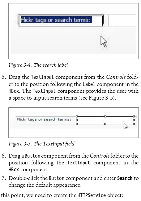
5. Drag the TextInput component from the Controls fold-er to the position following the Label component in the HBox. The TextInput component provides the user with a space to input search terms (see Figure 3-5).
Figure 3-5. The TextInput field
6. Drag a Button component from the Controls folder to the position following the TextInput component in the HBox component.
7. Double-click the Button component and enter Search to change the default appearance.
At this point, we need to create the HTTPService object: 1. Change to Source mode.
2. Use the HTTPService component to call the Flickr service and return the results. After the opening Application tag and before the HBox component, create an HTTPService component, but do not give it a closing tag.
dler(event). The photoHandler event packages the serv-ice results. We will create the {{photoHandler}} function later.
Example 3-2 shows the relevant code.
Example 3-2. The HTTPService control
<mx:HTTPService id="photoService"
url="http://api.flickr.com/services/feeds /photos_public.gne"
result="photoHandler(event)"/>
Now it’s time to create a bindable XML variable in ActionScript 3.0. To do so, follow these steps:
1. Before the HTTPService component, add a Script com-ponent by typing <mx:Script>. Flex Builder completes the tag for you. Alternatively, you can place the Script component after the HTTPService component, as shown in Example 3-3.
Example 3-3. The blank script tag
<mx:Script> <![CDATA[ ]]>
</mx:Script>
2. In the mx:Script block, enter import mx.collections.ArrayCollection. ArrayCollec tion is the type of object that is used as a data provider. The relevant code is shown in Example 3-4.
Example 3-4. The first import statement
<mx:Script> <![CDATA[
import mx.collections.ArrayCollection; ]]>
</mx:Script>
that the HTTPService generates. You can see this in Ex-ample 3-5.
Example 3-5. The second import statement
<mx:Script> <![CDATA[
import mx.collections.ArrayCollection; import mx.rpc.events.ResultEvent; ]]>
</mx:Script>
4. Create a bindable private variable named photoFeed of the ArrayCollection class after the import statement in the mx:Script block. The photoFeed ArrayCollection is populated with the HTTPService response data. Exam-ple 3-6 shows the comExam-pleted script.
Example 3-6. The completed script
<mx:Script> <![CDATA[
import mx.collections.ArrayCollection; import mx.rpc.events.ResultEvent;
[Bindable]
private var photoFeed:ArrayCollection; ]]>
</mx:Script>
With the bindable XML variable created, it’s time to create the Submit button click handler, and send the HTTPService request and keywords to the Flickr API:
Figure 3-6. The Button component in the Outline view
2. To the Button component, add a click attribute with a value of requestPhotos():
<mx:Button label="Search" click="requestPhotos()"/>
When a user clicks the button, it calls the requestPho tos() handler, which initiates the HTTPService call. 3. Using the Outline view, locate the TextInput component
in the HBox component and add an id attribute with a value of searchTerms. The instance name for the TextIn put component is id, as shown here:
<mx:TextInput id="searchTerms"/>
4. In the mx:Script block, create a private function named requestPhotos() with a return value of *void. This is the function where the HTTPService call is initiated. The relevant code appears in Example 3-7.
Example 3-7. The requestPhotos method
<mx:Script> <![CDATA[
import mx.collections.ArrayCollection; import mx.rpc.events.ResultEvent;
[Bindable]
private var photoFeed:ArrayCollection; private function requestPhotos():void{ }
]]>
5. In the function, cancel any previous requests to photo Service by using the cancel method. The instance name of the HTTPService component is photoService. 6. Create an Object variable named params.
7. Create a format parameter of the params variable with a value of rss_200_enc. This value tells Flickr how to pack-age the response.
8. Create a tags parameter of the params variable with a value of searchTerms.text. This is the value that was en-tered in the search field.
9. Send the request and params variable to Flickr by using the send method of photoService. Example 3-8 shows the complete function.
Example 3-8. The complete requestPhotos function
<mx:Script> <![CDATA[
import mx.collections.ArrayCollection; import mx.rpc.events.ResultEvent;
[Bindable]
private var photoFeed:ArrayCollection;
private function requestPhotos():void{ photoService.cancel();
var params:Object = new Object(); params.format = 'rss_200_enc'; params.tags = searchTerms.text; photoService.send(params); }
]]>
</mx:Script>
Now it’s time to create the HTTPService result handler and to populate the photoFeed XML variable:
vice call. At this point, your code should look like Ex-ample 3-9.
Example 3-9. The complete script block
<mx:Script> <![CDATA[
import mx.collections.ArrayCollection; import mx.rpc.events.ResultEvent;
[Bindable]
private var photoFeed:ArrayCollection;
private function requestPhotos():void{ photoService.cancel();
var params:Object = new Object(); params.format = 'rss_200_enc'; params.tags = searchTerms.text; photoService.send(params); }
private function photoHandler(event:ResultEvent) :void{
} ]]>
</mx:Script>
2. In the photoHandler() function, populate the photoFeed variable with the data located in the event object, event.result.rss.channel.item, and type it as ArrayCol lection. Your code should now look like Example 3-10.
Example 3-10. Adding the photoHandler
<mx:Script> <![CDATA[
import mx.collections.ArrayCollection; import mx.rpc.events.ResultEvent;
[Bindable]
private var photoFeed:ArrayCollection;
private function requestPhotos():void{ photoService.cancel();
params.tags = searchTerms.text; photoService.send(params); }
private function photoHandler(event:ResultEvent) :void{
photoFeed = event.result.rss.channel.item as ArrayCollection;
} ]]>
</mx:Script>
Now we’re ready to create the Tile component in MXML, bind the photoFeed XML data to the TileList component, and then create the thumbnails item renderer in the Tile component:
1. We will use a TileList component to display the images. After the HBox component and before the closing Appli cation tag, add a TileList component with a width of 100% and a height of 100%. This TileList is shown in Example 3-11.
Example 3-11. The TileList
<mx:TileList width="100%" height="100%"> </mx:TileList>
2. Using the Outline view, locate the TileList component and add an attribute of dataProvider with a value of {photoFeed} to bind the data to the tile component. (Re-member to move the > to the end of the dataProvider line.) Example 3-12 shows the completed TileList com-ponent.
Example 3-12. The completed TileList
<mx:TileList width="100%" height="100%" dataProvider="{photoFeed}"> </mx:TileList>
Example 3-13. The itemRenderer attribute
<mx:TileList width="100%" height="100%" dataProvider="{photoFeed}"> <mx:itemRenderer>
</mx:itemRenderer> </mx:TileList>
4. Now we’ll create a layout component for the item ren-derer. Within the itemRenderer property, add a Compo nent component using the code shown in Example 3-14.
Example 3-14. Adding the Component
<mx:TileList width="100%" height="100%" dataProvider="{photoFeed}"> <mx:itemRenderer> <mx:Component </mx:Component> </mx:itemRenderer> </mx:TileList>
5. To create the layout the item renderer will use, within the Component add the VBox component with a width at-tribute with a value of 125 and a height atat-tribute with a value of 125. Add paddingBottom, paddingLeft, padding Top, and paddingRight attributes each with a value of 5. The code is shown in Example 3-15.
Example 3-15. Adding the VBox
<mx:TileList width="100%" height="100%" dataProvider="{photoFeed}"> <mx:itemRenderer>
<mx:Component>
<mx:VBox width="125” height="125” paddingBottom="5” paddingLeft="5” paddingTop="5” paddingRight="5"> </mx:VBox> </mx:Component> </mx:itemRenderer> </mx:TileList>
attribute with a value of 75. The itemRenderer passes values to the Image component through the Image com-ponent’s data property. Add a source with a value of {data.thumbnail.url} to the Image component to popu-late the image. The code is shown in Example 3-16.
Example 3-16. Adding the Image tag
<mx:TileList width="100%" height="100%" dataProvider="{photoFeed}"> <mx:itemRenderer>
<mx:Component>
<mx:VBox width="125" height="125" paddingBottom="5"
paddingLeft="5" paddingTop="5" paddingRight="5">
<mx:Image width="75” height="75” source="{data.thumbnail.url}"/> </mx:VBox>
</mx:Component> </mx:itemRenderer> </mx:TileList>
7. After the Image component, create a Text component with the text attribute having a value of {data.credit} to display the name of the photographer. The code is shown in Example 3-17.
Example 3-17. Adding the Text component
<mx:TileList width="100%" height="100%" dataProvider="{photoFeed}"> <mx:itemRenderer>
<mx:Component>
<mx:VBox width="125" height="125" paddingBottom="5"
paddingLeft="5" paddingTop="5" paddingRight="5">
<mx:Image width="75" height="75" source="{data.thumbnail.url}"/> <mx:Text text="{data.credit}"/> </mx:VBox>
</mx:itemRenderer> </mx:TileList>
8. Save and then run the application. You should see a form. In the form, submit a search term and you should see the application display the relevant image(s). At this point, you should be ready to separate the thumbnail display into a custom component:
1. Create a new component by selecting File→New→MXML Component. The filename for this is FlickrThumbnail and the component should be based on VBox. Set the width to 125 and the height to 125. 2. Using the Outline view, locate the TileList component. 3. Cut the Image and Text components from the VBox com-ponent in TileList, and paste them into FlickrThumb nail.mxml. This starting code is shown in Example 3-18.
Example 3-18. The new FlickrThumbnail.mxml
<?xml version="1.0" encoding="utf-8"?>
<mx:VBox xmlns:mx="http://www.adobe.com/2006/mxml" width="125" height="125">
<mx:Image width="75" height="75" source="{data.thumbnail.url}"/> <mx:Text text="{data.credit}"/> </mx:VBox>
4. Add the following attributes to the VBox component: paddingBottom, paddingTop, paddingRight, and paddin gLeft, each with a value of 5; horizontalScrollPolicy and verticalScrollPolicy, both with a value of off; and horizontalAlign with a value of center. The updated code is shown in Example 3-19.
Example 3-19. Updating the VBox component source
<?xml version="1.0" encoding="utf-8"?>
<mx:VBox xmlns:mx="http://www.adobe.com/2006/mxml" width="125" height="125"
paddingBottom="5” paddingLeft="5” paddingTop="5” paddingRight="5”
"off”
horizontalAlign="center">
<mx:Image width="75" height="75" source="{data.thumbnail.url}"/> <mx:Text text="{data.credit}"/> </mx:VBox>
5. Using the Outline view, locate the TileList component in the FlickrRIA.mxml template.
6. Delete the code for the itemRenderer, Component, and VBox components.
7. Add the attribute itemRenderer to the TileList compo-nent with a value of FlickrThumbnail. The completed code is shown in Example 3-20.
Example 3-20. Referencing the itemRenderer
<mx:TileList width="100%" height="100%" dataProvider="{photoFeed}" itemRenderer="FlickrThumbnail"> </mx:TileList>
8. Compile and run the application.
At this point, you should see something very similar to what you had when you created the inline component itemRenderer. The final code for FlickrRIA.mxml is shown in Example 3-21.
Example 3-21. FlickrRIA.mxml
<?xml version="1.0" encoding="utf-8"?>
<mx:Application xmlns:mx="http://www.adobe.com/2006/mxml" backgroundGradientColors="[0xFFFFFF, 0xAAAAAA]" horizontalAlign="left" verticalGap="15" horizontalGap="15"> <mx:Script> <![CDATA[ import mx.collections.ArrayCollection; import mx.rpc.events.ResultEvent; [Bindable]
var params:Object = new Object(); params.format = 'rss_200_enc'; params.tags = searchTerms.text; photoService.send(params); }
private function photoHandler(event:ResultEvent) :void {
photoFeed = event.result.rss.channel.item as ArrayCollection; } ]]> </mx:Script> <mx:HTTPService id="photoService" url="http://api.flickr.com/services/feeds /photos_public.gne" result="photoHandler(event)" /> <mx:HBox>
<mx:Label text="Flickr tags or search terms:" /> <mx:TextInput id="searchTerms" />
<mx:Button label="Search" click="requestPhotos()" /> </mx:HBox>
<mx:TileList width="100%" height="100%" dataProvider="{photoFeed}" itemRenderer="FlickrThumbnail"> </mx:TileList>
</mx:Application>
The complete code for the image item rendering component is shown in Example 3-22.
Example 3-22. The custom image rendering component
<?xml version="1.0" encoding="utf-8"?>
<mx:VBox xmlns:mx="http://www.adobe.com/2006/mxml" width="125" height="125"
horizontalAlign="center"
paddingBottom="5" paddingLeft="5" paddingRight="5" paddingTop="5">
<mx:Image
width="75" height="75"
CHAPTER 4
Flex Controls and Layout
The first step in building a Flex application is to create the user interface. Flex not only has a rich set of controls. It also has a complete set of layout mechanisms that make it easy to build user interfaces that look good and can scale appropriately as the display area of the Flash application is resized.
This chapter covers both layout mechanisms and controls. We will start by covering the layout mechanisms, and then we will discuss the available controls.
The Application Container
At the root of a Flex application is a single container, called the Application container, which holds all other containers and components. The Application container lays out all its children vertically by default (when the layout property is not specifi-cally defined). There are three possible values for the Applica tion component’s layout property:
vertical
Lays out each child component vertically from the top of the application to the bottom in the specified order horizontal
absolute
Does no automatic layout, and requires you to explicitly define the location of each child component
If the Application component’s layout property is absolute, each child component must have an x and y coordinate de-fined; otherwise, the component will be displayed in the (0,0) position.
The Application container can also be formatted using any of the several style parameters that are available, including back groundGradientColors and verticalGap. In Example 4-1, the Application tag is used to lay out the child controls.
Example 4-1. The Application MXML
<?xml version="1.0" encoding="utf-8"?>
<mx:Application xmlns:mx="http://www.adobe.com/2006/mxml" backgroundGradientColors="[#FFFFFF, #FFDE00]" verticalGap="15" layout="horizontal">
<mx:Image source="assets/animals03.jpg" />
<mx:Label text="Photographed by Elsie Weil" fontSize="15" fontWeight="bold" />
</mx:Application>
Figure 4-1 shows the result of this code.
The Box Class
The Box class is the base class for the VBox and HBox classes: • The VBox container renders all child display objects
verti-cally.
• The HBox container renders all child display objects hori-zontally.
The Application object behaves like a VBox by default (vertical layout), but you can also set it to use absolute or horizontal layout.
VBox and HBox flow like HTML, only in one direction. Example 4-2 shows the default layout method used by the VBox container (vertical).
Example 4-2. Using the VBox container
<?xml version="1.0" encoding="utf-8"?>
<mx:Application xmlns:mx="http://www.adobe.com/2006/mxml" backgroundColor="#FFFFFF" backgroundAlpha="0">
<mx:VBox>
<mx:Button label="< prev" left="10" top="120" />
<mx:Image source="assets/animals03.jpg" horizontalCenter="0" top="30"/>
<mx:Label text="Photographed by Elsie Weil" horizontalCenter="0" top="250"/>
<mx:Button label="next >" right="10" top="120"/> </mx:VBox>
</mx:Application>
Figure 4-2. A VBox layout
Example 4-3 shows the default layout method used by the HBox container (horizontal).
Example 4-3. Using the HBox container
<?xml version="1.0" encoding="utf-8"?>
<mx:Application xmlns:mx="http://www.adobe.com/2006/mxml" backgroundColor="#FFFFFF" backgroundAlpha="0">
<mx:HBox>
<mx:Button label="< prev" left="10" top="120" />
<mx:Image source="assets/animals03.jpg" horizontalCenter="0" top="30"/>
<mx:Label text="Photographed by Elsie Weil" horizontalCenter="0" top="250"/>
<mx:Button label="next >" right="10" top="120"/> </mx:HBox>
</mx:Application>
Figure 4-3 shows the result.
demon-strating that container controls can have other containers as children.
Example 4-4. Using both the VBox and the HBox containers
<?xml version="1.0" encoding="utf-8"?>
<mx:Application xmlns:mx="http://www.adobe.com/2006/mxml" backgroundColor="#FFFFFF" backgroundAlpha="0">
<mx:VBox horizontalAlign="center" verticalGap="15"> <mx:HBox verticalAlign="middle" horizontalGap="15"> <mx:Button label="< prev" left="10" top="120" /> <mx:Image source="assets/animals03.jpg"
horizontalCenter="0" top="30"/>
<mx:Button label="next >" right="10" top="120"/> </mx:HBox>
<mx:Label text="Photographed by Elsie Weil" horizontalCenter="0" top="250"/>
</mx:VBox> </mx:Application>
Figure 4-4 shows the result of Example 4-4.
The Canvas Container (Absolute Positioning)
Canvas is the only container that lets you explicitly specify the location of its children within the container. The Canvas object has only one layout value: absolute. You can use the x and y properties of child components for pixel-perfect layouts. If the display window is resized, the child components stay fixed in place and may appear cut off. Using absolute positioning you can make child controls overlap if desired.
Example 4-5 is some sample code for an absolutely positioned layout.
Example 4-5. An absolutely positioned layout
<?xml version="1.0" encoding="utf-8"?>
<mx:Application xmlns:mx="http://www.adobe.com/2006/mxml" layout="absolute" backgroundColor="#FFFFFF"
backgroundAlpha="0"> <mx:Canvas x="23" y="34">
<mx:Button label="< prev" x="4" y="97" />
<mx:Image source="assets/animals03.jpg" x="85" y="4" /> <mx:Label text="Photographed by Elsie Weil" x="85" y="230" />
<mx:Button label="next >" x="381" y="97" /> </mx:Canvas>
</mx:Application>
Figure 4-5 shows the result.
The Canvas Container (Relative Positioning)
With relative positioning, also called constraint-based layout, you can anchor the sides or center of a component to positions which are relative to the component’s container. The size and position of the components change when the user resizes the
application window. The container’s layout property must be set to absolute. All constraints are set relative to the edges of the container, not to other controls in the container. The left, right, top, bottom, horizontalCenter, and verticalCenter properties are anchors in constraint-based layouts.
Example 4-6 shows the code for positioning children in a con-straint-based layout using the top, bottom, left, right, horizon talCenter, and verticalCenter styles.
Example 4-6. Photo.mxml
<?xml version="1.0" encoding="utf-8"?>
<mx:Application xmlns:mx="http://www.adobe.com/2006/mxml" layout="absolute backgroundColor="#FFFFFF"
backgroundAlpha="0">
<mx:HDividedBox width="100%" height="300"> <mx:Canvas backgroundColor="#FFFFCC" width="150" height="100%">
<mx:Label text="Adjust this section" left="15" /> </mx:Canvas>
<mx:Canvas>
<mx:Button label="< prev" left="10" top="120"/> <mx:Image source="animals03.jpg" horizontalCenter="0" top="30"/>
<mx:Label text="Photographed by Elsie Weil" horizontalCenter="0" top="250"/>
<mx:Button label="next >" right="10" top="120"/>
</mx:Canvas> </mx:HDividedBox> </mx:Application>
When you launch this application you should see something similar to Figure 4-6.
You can adjust the size of the panel on the right by grabbing the control and moving the mouse to the left or right. This will move the image to match the size of the panel.
The Form Container
The Form container lets you control the layout of a form, mark form fields as required or, optionally, handle error messages, and bind your form data to the Flex data model to perform data checking and validation.
The Form container, like all containers, encapsulates and lays out its children. The Form container controls the size and layout of the contents of the form. The FormHeader defines a heading for your Form. Multiple FormHeading controls are allowed. A FormItem container specifies a Form element consisting of the following parts:
• A single label
• One or more child controls or containers, such as input controls
You can also insert other types of components into a Form con-tainer.
The code in Example 4-7 demonstrates use of a Form container control.
Example 4-7. CommentForm.mxml
<?xml version="1.0" encoding="utf-8"?>
<mx:Application xmlns:mx="http://www.adobe.com/2006/mxml" layout="absolute" backgroundColor="#FFFFFF"
backgroundAlpha="0">
<mx:Form x="50" y="50" verticalGap="15"> <mx:FormHeading label="Send us comments" /> <mx:FormItem label="Full Name:">
<mx:TextInput id="fullName" /> </mx:FormItem>
<mx:FormItem label="Email:"> <mx:TextInput id="email" /> </mx:FormItem>
<mx:FormItem label="Comments:"> <mx:TextArea id="comments" /> </mx:FormItem>
<mx:FormItem>
<mx:Button id="submit" label="submit" /> </mx:FormItem>
</mx:Form> </mx:Application>
Figure 4-7. A form-based layout
Combined Layouts
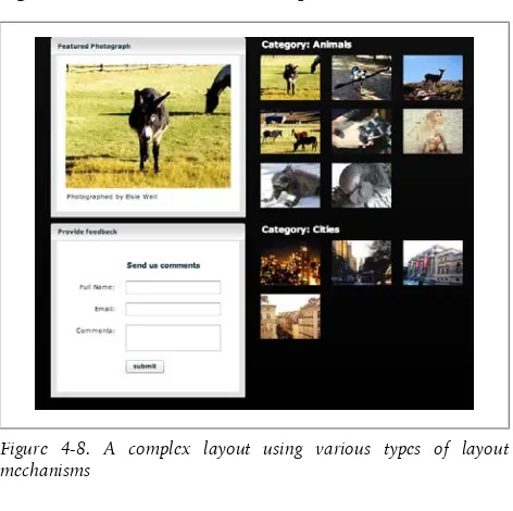
Containers can hold other containers. You can nest them to create sophisticated layouts, and you can create custom com-ponents that are made up of existing comcom-ponents. Exam-ple 4-8 shows an examExam-ple of a comExam-plex nested layout. You should take care to use these container classes wisely and not to overuse them. Using too many nested containers can be the cause of performance problems in your application.
Example 4-8. A complex nested layout
<?xml version="1.0" encoding="utf-8"?>
<mx:Application xmlns:mx="http://www.adobe.com/2006/mxml" backgroundColor="#000000" layout="horizontal"
horizontalGap="25">
<mx:Style> Panel { backgroundAlpha: 1; borderAlpha: 1; headerColors: #c7c7c7, #ffffff;
footerColors: #ffffff, #c7c7c7; paddingTop: 15; paddingRight: 15; paddingLeft: 15; paddingBottom: 15; shadowDirection: "right"; }
.header { color: #ffffff; fontSize: 15; fontWeight: "bold"; }</mx:Style> <mx:VBox verticalGap="10">
<mx:Panel title="Featured Photograph">
top="30" />
<mx:Label text="Photographed by Elsie Weil" horizontalCenter="0" top="250" /> </mx:Panel>
<mx:Panel title="Provide feedback"> <mx:Form x="50" y="50" verticalGap="15"> <mx:FormHeading label="Send us comments" /> <mx:FormItem label="Full Name:"><mx:TextInput id="fullName" />
</mx:FormItem>
<mx:FormItem label="Email:"><mx:TextInput id="email" /> </mx:FormItem>
<mx:FormItem label="Comments:"><mx:TextArea id="comments" />
</mx:FormItem>
<mx:FormItem><mx:Button id="submit" label="submit" /> </mx:FormItem> </mx:Form> </mx:Panel> </mx:VBox> <mx:VBox verticalGap="25"> <mx:Canvas>
<mx:Label text="Category: Animals" styleName="header" /> <mx:Image source="assets/animals03_sm.jpg" y="30" /> <mx:Image source="assets/animals08_sm.jpg" y="120" /> <mx:Image source="assets/animals09_sm.jpg" y="120" x="120" />
<mx:Image source="assets/animals10_sm.jpg" y="120" x="240" />
<mx:Image source="assets/animals11_sm.jpg" y="211" /> <mx:Image source="assets/animals12_sm.jpg" y="211" x="120" />
<mx:Image source="assets/animals06_sm.jpg" y="30" x="120" />
<mx:Image source="assets/animals07_sm.jpg" y="30" x="240" />
</mx:Canvas> <mx:Canvas>
<mx:Label text="Category: Cities" styleName="header" /> <mx:Image source="assets/city01_sm.jpg" y="30" /> <mx:Image source="assets/city02_sm.jpg" y="30" x="120"/> <mx:Image source="assets/city03_sm.jpg" y="30" x="240" /> <mx:Image source="assets/city04_sm.jpg" y="120" x="0" /> </mx:Canvas>
Figure 4-8 shows the result of Example 4-8.
Figure 4-8. A complex layout using various types of layout mechanisms
The Panel Container
The Panel container consists of a title bar, a caption, a status message, a border, and a content area for its children. You can use Panel containers to wrap self-contained application mod-ules. You can control the display layout by using the layout property set to vertical (the default), horizontal, or abso lute. Each child must have its x and y positions set when using an absolute layout, or they must use anchors for a constraint-based layout.
Example 4-9 shows a sample Panel layout.
Example 4-9. Photo2.mxml
<?xml version="1.0" encoding="utf-8"?>
backgroundGradientColors="[#FFFFFF, #000000]"> <mx:Panel title="Featured Photograph" backgroundAlpha=".25" borderAlpha="1" headerColors="[#c7c7c7, #ffffff]" footerColors="[#ffffff, #c7c7c7]"
paddingTop="15" paddingRight="15" paddingLeft="15" paddingBottom="15"
shadowDirection="right">
<mx:Image source="assets/animals03.jpg" horizontalCenter="0" top="30" />
<mx:Label text="Photographed by Elsie Weil" horizontalCenter="0" top="250" /> </mx:Panel>
</mx:Application>
Figure 4-9 shows this Panel-based layout.
Figure 4-9. A layout using the Panel container
Controls
So many controls are available for you to use with Flex that it’s almost hard to know where to begin. I suppose the best place to start is with the basic controls, such as labels, buttons, checkboxes, and so on. Example 4-10 shows an MXML appli-cation that provides a heaping helping of the basic control types.
Example 4-10. Buttons2.mxml
<?xml version="1.0" encoding="utf-8"?>
<mx:Application xmlns:mx="http://www.adobe.com/2006/mxml" layout="horizontal">
<mx:VBox horizontalAlign="left"> <mx:Label text="Text label" />
<mx:Label htmlText="<b>HTML</b> text" /> <mx:Button label="Button" />
<mx:CheckBox label="Check box" /> <mx:RadioButtonGroup id="cardType"/>
<mx:RadioButton label="Visa" groupName="cardType" /> <mx:RadioButton label="MasterCard" groupName="cardType"/> <mx:ComboBox dataProvider="{['a','b','c']}" />
<mx:HSlider /> <mx:TextInput /> </mx:VBox>
<mx:VBox horizontalAlign="left">
<mx:List dataProvider="{['a','b','c']}" width="200" height="100" />
<mx:ButtonBar dataProvider="{['a','b','c']}" /> <mx:NumericStepper />
<mx:Image source="@Embed('megan.jpg')" /> </mx:VBox>
</mx:Application>
When I run this in Flex Builder I see Figure 4-10.
Data Grids
We regularly have to build tables of structured information. This is easy in Flex, thanks to two controls: the DataGrid and the AdvancedDataGrid. I’ll start by showing the DataGrid control (see Example 4-11).
Example 4-11. Datagrid.mxml
<?xml version="1.0" encoding="utf-8"?>
<mx:Application xmlns:mx="http://www.adobe.com/2006/mxml" layout="vertical">
<mx:XMLList id="employees"> <employee>
<name>Christina Coenraets</name> <phone>555-219-2270</phone>
<email>[email protected]</email> <active>true</active>
</employee>
...
</mx:XMLList>
<mx:DataGrid width="100%" height="100%" dataProvider= "{employees}">
<mx:columns>
<mx:DataGridColumn dataField="name" headerText="Name"/> <mx:DataGridColumn dataField="phone" headerText="Phone"/> <mx:DataGridColumn dataField="email" headerText="Email"/> </mx:columns>
</mx:DataGrid> </mx:Application>
When I run this in Flex Builder I see Figure 4-11.
You don’t even have to define the columns in the DataGrid un-less you want to. The DataGrid control is smart enough to de-tect the columns from the data and set itself up if you haven’t defined the columns.
The AdvancedDataGrid is just like the DataGrid but with a more powerful set of features. For example, it has the ability to roll up sections of the data and provide users with spinners so that they can drill down into the data.
Example 4-12 shows AdvancedDataGrid in action.
Example 4-12. Advgrid.mxml
<?xml version="1.0" encoding="utf-8"?>
<mx:Application xmlns:mx="http://www.adobe.com/2006/mxml" layout="vertical"> <mx:Script> <![CDATA[ import mx.collections.ArrayCollection; [Bindable]
private var dpHierarchy:ArrayCollection = new ArrayCollection([ {Region:"Southwest", children: [ ... ]}
]); ]]>
</mx:Script>
<mx:AdvancedDataGrid width="100%" height="100%"> <mx:dataProvider> <mx:HierarchicalData source="{dpHierarchy}"/> </mx:dataProvider> <mx:columns> <mx:AdvancedDataGridColumn dataField="Region"/> <mx:AdvancedDataGridColumn dataField="Territory_Rep" headerText="Territory Rep"/> <mx:AdvancedDataGridColumn dataField="Actual"/> <mx:AdvancedDataGridColumn dataField="Estimate"/> </mx:columns> </mx:AdvancedDataGrid> </mx:Application>
When I run this in the browser and click around a little bit I get something similar to Figure 4-12.
As with any control, you can use the itemRenderer functionality in Flex Builder to format each cell however you choose.
In-Place Editing
The DataGrid control also allows for editing cell contents in place. Example 4-13 shows just how easy this is.
Example 4-13. Edit_table.mxml
<?xml version="1.0" encoding="utf-8"?>
<mx:Application xmlns:mx="http://www.adobe.com/2006/mxml" layout="vertical">
<customer><first>Jack</first> <last>Herrington</last></customer> <customer><first>Lori</first> <last>Herrington</last></customer> <customer><first>Megan</first> <last>Herrington</last></customer> </mx:XMLList>
<mx:DataGrid dataProvider="{customers}" editable="true"> <mx:columns>
<mx:DataGridColumn dataField="first" /> <mx:DataGridColumn dataField="last" /> </mx:columns>
</mx:DataGrid> </mx:Application>
All I needed to do was add the editable attribute to the Data Grid and set it to true.
When I bring this up in the browser and double-click on a cell, I see something similar to Figure 4-13.
Of course, to make the example functional I would need to listen to the editing events and update the backend data store to match.
By default, the DataGrid uses a text editor to edit the cell con-tents, but you can provide your own editor renderer to use whatever controls you like to edit the value in the cell.
Tabs and Accordions
Sometimes you have more content than you can reasonably fit on the screen, so you need some way to let the user navigate around groupings of content. Flex provides several solutions, two of which, tabs and accordions, I’ll demonstrate here. Tabs are very easy to create, as you can see in Example 4-14.
Example 4-14. Tabs.mxml
<?xml version="1.0" encoding="utf-8"?>
<mx:Application xmlns:mx="http://www.adobe.com/2006/mxml" layout="vertical">
<mx:TabNavigator borderStyle="solid" width="100%" height="100%">
<mx:VBox label="Tab One">
<mx:Label text="Tab one's content" /> </mx:VBox>
<mx:VBox label="Tab Two">
<mx:Label text="Tab two's content" /> </mx:VBox>
<mx:VBox label="Tab Three">
<mx:Label text="Tab three's content" /> </mx:VBox>
</mx:TabNavigator> </mx:Application>
When I run this example from Flex Builder I see Figure 4-14.
Figure 4-14. The tab control
Yep, it’s really that easy. And you can reskin the tabs to be in whatever form you please with CSS and skinning (more on that shortly).
An accordion works exactly the same way, as you can see in Example 4-15.
Example 4-15. Accord.mxml
<?xml version="1.0" encoding="utf-8"?>
<mx:Application xmlns:mx="http://www.adobe.com/2006/mxml" layout="vertical">
<mx:VBox label="Tab One">
<mx:Label text="Tab one's content" /> </mx:VBox>
<mx:VBox label="Tab Two">
<mx:Label text="Tab two's content" /> </mx:VBox>
<mx:VBox label="Tab Three">
<mx:Label text="Tab three's content" /> </mx:VBox>
</mx:Accordion> </mx:Application>
All I did was change the tag name from TabNavigator to Accor dion and the example works, as you can see in Figure 4-15. These are just two of the controls that you can use to manage the presentation of large sets of interface elements in a way that doesn’t overwhelm the user.
Menus
Flex also has support for menus, including those that appear at the top of the window as well as pop-up menus. Exam-ple 4-16 shows how to create a menu bar along the top of the window.
Example 4-16. Menu.mxml
<?xml version="1.0" encoding="utf-8"?>
<mx:Application xmlns:mx="http://www.adobe.com/2006/mxml" layout="absolute">
<mx:MenuBar labelField="@label"> <mx:XMLList>
<menuitem label="File"> <menuitem label="New" /> <menuitem label="Open"/> </menuitem>
<menuitem label="Edit"/> <menuitem label="Source"/> </mx:XMLList>
</mx:MenuBar> </mx:Application>
Figure 4-16. An example menu
There is also a handy control called ApplicationControlBar that gives a nice-looking control set along the top of the win-dow. Example 4-17 is the code for a sample ApplicationCon trolBar.
Example 4-17. Appbar.mxml
<?xml version="1.0" encoding="utf-8"?>
<mx:Application xmlns:mx="http://www.adobe.com/2006/mxml" layout="vertical">
<mx:ApplicationControlBar dock="true">
<mx:ButtonBar dataProvider="{['People','Places', 'Things']}" />
</mx:ApplicationControlBar> </mx:Application>
Figure 4-17. An application control bar
One thing I love about Flex is that even by default, it looks really good. I’m not a graphic designer by any stretch, so I like the fact that Figure 4-17 looks very slick but required absolutely no effort on my part.
Divider Boxes
Flex provides an easy way for your users to customize their own layout with divider boxes. The code in Example 4-18 shows just how easy it is to use a divider box.
Example 4-18. Divbox.mxml
<?xml version="1.0" encoding="utf-8"?>
<mx:HDividedBox width="100%" height="100%">
<mx:HBox backgroundColor="#ff9999" width="50%" height="100%" borderStyle="solid">
<mx:Label text="Left part" /> </mx:HBox>
<mx:HBox width="50%" height="100%" borderStyle="solid"> <mx:Label text="Right part" />
</mx:HBox> </mx:HDividedBox> </mx:Application>
When I run this in Flex Builder I see something similar to Figure 4-18.
I can the drag the divider control to adjust the size of the left and right parts to match my needs.
CSS
The best way to control the look of your Flex application is through CSS. If you are familiar with CSS for HTML you will find the CSS that’s supported by Flex to be very familiar. To demonstrate I’ll take a very simple data entry form, make the font size huge, and change the colors of the text inputs based on CSS classes (see Example 4-19).
Example 4-19. CSS.mxml
<?xml version="1.0" encoding="utf-8"?>
<mx:Application xmlns:mx="http://www.adobe.com/2006/mxml" layout="absolute">
<mx:Style>
Application { font-size: 30; } TextInput { color: #0000ff; } .important { color: #ff0000; } </mx:Style>
<mx:Form>
<mx:FormItem label="First Name"> <mx:TextInput id="first" width="300" /> </mx:FormItem>
<mx:FormItem label="Last Name">
<mx:TextInput id="last" width="300" /> </mx:FormItem>
<mx:FormItem label="Email">
<mx:TextInput id="email" styleName="important" width="300" />
</mx:FormItem> <mx:FormItem>
<mx:Button label="Subscribe" /> </mx:FormItem>
</mx:Form> </mx:Application>
The CSS styles are defined in the mx:Styles tag. I’ve defined three classes. The Application class, which controls all of the content within the Application tag, increases the font size. For the TextInput colors I specify that the text should be blue. For any control of the class important, the color should be red. When I launch this in Flex Builder I see Figure 4-19 in my browser.
Skinning
Flex also allows you to change the look of your whole appli-cation in a process called skinning. You can use CSS to apply new skins to your Flex controls. Skins are available for free as well as for purchase on the Web. A good repository for Flex skins is Scale Nine (http://www.scalenine.com/).
To demonstrate this I went to the Scale Nine website and found a pretty skin called “blue plastic.” I downloaded the ZIP file and copied the contents into my Flex Builder 3 project folder via drag-and-drop.
I then modified my form by adding a Panel and replacing my own styles with a reference to the “blue plastic” skin (see Ex-ample 4-20).
Example 4-20. Styleform.mxml
<?xml version="1.0" encoding="utf-8"?>
<mx:Application xmlns:mx="http://www.adobe.com/2006/mxml" layout="vertical">
<mx:Style source="/blueplastic/blue_plastic.css" />
<mx:Panel title="Subscription form" paddingTop="20"> <mx:Form>
<mx:FormItem label="First Name"> <mx:TextInput id="first" width="300" /> </mx:FormItem>
<mx:FormItem label="Last Name">
<mx:TextInput id="last" width="300" /> </mx:FormItem>
<mx:FormItem label="Email">
<mx:TextInput id="email" styleName="important" width="300" />
</mx:FormItem> <mx:FormItem>
<mx:Button label="Subscribe" /> </mx:FormItem>
</mx:Form> </mx:Panel> </mx:Application>
Figure 4-20 shows the result.
As you can see, the panel has gotten a bit glossy. The font of the title of the panel has changed, and the background color for the entire design has also changed.
Filters and Effects
Flex supports a wide variety of filters and effects that you can apply to any user interface object. Take, for example, how easy it is to add a drop shadow to an image. The code for two images, one with a shadow and one without, appe