BEGINNING CSS
INTRODUCTION . . . xxiii
⊲ PART I
THE BASICS
CHAPTER 1 Introducing Cascading Style Sheets . . . 3CHAPTER 2 The Bits that Make Up a Style Sheet . . . .17
CHAPTER 3 Selectors . . . 39
CHAPTER 4 The Cascade and Inheritance . . . 57
⊲ PART II
PROPERTIES
CHAPTER 5 Applying Font Faces . . . 73CHAPTER 6 Manipulating the Display of Text . . . 93
CHAPTER 7 Background Colors and Images . . . 115
CHAPTER 8 The Box Model: Controlling Margins, Borders, Padding, Width, and Height . . . .137
CHAPTER 9 Floating and Vertical Alignment . . . 175
CHAPTER 10 Styling Lists . . . 203
CHAPTER 11 Positioning . . . 219
CHAPTER 12 Styling Tables . . . 249
CHAPTER 13 Create a Complete Layout . . . 271
⊲ PART III ADVANCED CSS AND ALTERNATIVE MEDIA
CHAPTER 14 Advanced Selectors . . . 297CHAPTER 15 Styling for Print . . . 323
CHAPTER 16 Customizing the Mouse Cursor . . . 337
CHAPTER 17 Controlling Opacity and Visibility . . . 345
CHAPTER 18 Styling Content for Mobile Devices . . . 355
CHAPTER 19 Closing Comments . . . 367
APPENDIX D CSS Colors . . . 407
BEGINNING
CSS
BEGINNING
CSS
CASCADING STYLE SHEETS FOR WEB DESIGN
Third Edition
Indianapolis, IN 46256 www.wiley.com
Copyright © 2011 by Wiley Publishing, Inc., Indianapolis, Indiana ISBN: 978-0-470-89152-0
ISBN: 978-1-118-12177-1 (ebk) ISBN: 978-1-118-12176-4 (ebk) ISBN: 978-1-118-12178-8 (ebk)
Manufactured in the United States of America 10 9 8 7 6 5 4 3 2 1
No part of this publication may be reproduced, stored in a retrieval system or transmitted in any form or by any means, electronic, mechanical, photocopying, recording, scanning or otherwise, except as permitted under Sections 107 or 108 of the 1976 United States Copyright Act, without either the prior written permission of the Publisher, or authorization through payment of the appropriate per-copy fee to the Copyright Clearance Center, 222 Rosewood Drive, Danvers, MA 01923, (978) 750-8400, fax (978) 646-8600. Requests to the Publisher for permission should be addressed to the Permissions Department, John Wiley & Sons, Inc., 111 River Street, Hoboken, NJ 07030, (201) 748-6011, fax (201) 748-6008, or online at http://www.wiley.com/go/permissions.
Limit of Liability/Disclaimer of Warranty: The publisher and the author make no representations or warranties with respect to the accuracy or completeness of the contents of this work and specifi cally disclaim all warranties, including without limitation warranties of fi tness for a particular purpose. No warranty may be created or extended by sales or promotional materials. The advice and strategies contained herein may not be suitable for every situation. This work is sold with the understanding that the publisher is not engaged in rendering legal, accounting, or other professional services. If professional assistance is required, the services of a competent professional person should be sought. Neither the publisher nor the author shall be liable for damages arising herefrom. The fact that an organization or Web site is referred to in this work as a citation and/or a potential source of further information does not mean that the author or the publisher endorses the information the organization or Web site may provide or recommendations it may make. Further, readers should be aware that Internet Web sites listed in this work may have changed or disappeared between when this work was written and when it is read.
For general information on our other products and services please contact our Customer Care Department within the United States at (877) 762-2974, outside the United States at (317) 572-3993 or fax (317) 572-4002.
Wiley also publishes its books in a variety of electronic formats and by print-on-demand. Not all content that is available in standard print versions of this book may appear or be packaged in all book formats. If you have purchased a version of this book that did not include media that is referenced by or accompanies a standard print version, you may request this media by visiting http://booksupport.wiley.com. For more information about Wiley products, visit us at www.wiley.com.
Library of Congress Control Number: 2011926318
To Mum and Dad.
ABOUT THE AUTHORS
IAN POUNCEY, author of this revised edition of the book, is a web developer living in London, England, and working for the BBC. He has been working on the Web for over 11 years, building a wide range of websites, from small sites for local businesses to the latest version of the Yahoo! home page. He is a W3C Web Accessibility Initiative Education and Outreach Working Group member and a web accessibility advocate. Ian maintains a personal website at http://ianpouncey.com, where he writes about all aspects of the Web.
RICHARD YORK, author of the previous editions on which this edition is based, is a web developer for Westlake Design, a company specializing in website design and development, product branding, marketing and identity. He wrote his fi rst book,
EXECUTIVE EDITOR
VICE PRESIDENT AND EXECUTIVE GROUP
ACKNOWLEDGMENTS
I MUST FIRST THANK THE PEOPLE who gave me the opportunity to work on this, my fi rst book: Nicholas Zakas for recommending me and Scott Meyers for taking his advice.
Thanks also to my editor for being so patient with me. Thanks Tom.
Many thanks also to my tech editor and friend, Steve Webster. Possibly the smartest web developer I have had the pleasure of working with.
CONTENTS
INTRODUCTION xxiii
PART I: THE BASICS
CHAPTER 1: INTRODUCING CASCADING STYLE SHEETS 3
Advantages of Using CSS
4
How to Write CSS
5
Your First CSS-Enabled Document
6
Browsers 12
Webkit 12 Trident 13 Gecko 14 Presto 14CHAPTER 2: THE BITS THAT MAKE UP A STYLE SHEET 17
Rules 17
Selectors 18
Grouping Selectors 18
Declarations 19
Values 19
Keywords 19 Strings 23Length and Measurement 25
Numbers 29 Colors 31
The URI 33
Including CSS in a Document
34
Including an Embedded Style Sheet 35
Linking to External Style Sheets 35
The Importance of Good HTML
36
Doctypes and Quirks Mode 36
CHAPTER 3: SELECTORS 39
Class and ID Selectors
39
Class Selectors
40
xvi
The Universal Selector
48
Descendant Selectors
48
Pseudo-Classes 50
Dynamic Pseudo-Classes 50
CHAPTER 4: THE CASCADE AND INHERITANCE 57
The Cascade
57
Calculating the Specifi city of a Selector 60
!important Rules 66
Inheritance 66
PART II: PROPERTIES
CHAPTER 5: APPLYING FONT FACES 73
Setting Font Faces
73
Font Families 75
Making Text Italic, Bold, or Small Caps
78
Italic Text 78
Bold Text 79
Small Caps Text 79
The font-size Property
82
Absolute Font Sizes 82
Relative Font Sizes 83
Length and Percentage Font Sizes 83
The font Shorthand Property
86
The font Properties 87
CHAPTER 6: MANIPULATING THE DISPLAY OF TEXT 93
Line Height
94
Controlling the Spacing between Letters
97
Controlling the Spacing between Words
98
Indenting Text
101
Horizontally Aligning Text
102
Decorating Text with Underlines, Overlines,
or Strikethrough
104
Transforming Letter-Case to Lowercase or Uppercase or
Capitalizing the Initial Characters of Words
108
CONTENTS
CHAPTER 7: BACKGROUND COLORS AND IMAGES 115
Background Colors
115
Background Images
117
Controlling How Background Images Repeat
120
Positioning Background Images
124
Mixing Background Position Values 126
Repeating a Background Image and Controlling Its Position 128
Controlling Position with the Center Keyword 129
Fixing a Background Image in Place
131
Background Shorthand
133
CHAPTER 8: THE BOX MODEL: CONTROLLING MARGINS,
BORDERS, PADDING, WIDTH, AND HEIGHT 137
Overview 137
Margins 138
margin Property with Four Values 138
margin Property with Three Values 140
margin Property with Two Values 141
margin Property with One Value 142
Margin Collapsing 142
Horizontally Aligning Elements with the margin Property 147
Borders 151
border-width 151 border-style 153 border-color 154Border Shorthand Properties 156
Padding 159
Setting Dimensions
162
width 162 height 163
auto Values for width and height 165
Percentage Measurements 165
Quirks Mode width and height in Internet Explorer 165
Minimum and Maximum Dimensions 166
Overfl owing Content
169
xviii
Floating Content
175
Floating Box Model 178
Canceling Floated Content
181
Float Bugs in IE 6
184
The Peek-A-Boo Bug 186
The Guillotine Bug 188
The Three-Pixel Jog 190
The Double-Margin Bug 191
Vertically Aligning Content
193
Subscript and Superscript Text 193
The top, middle, and bottom Keywords 194
The text-top and text-bottom Keywords 195
Percentage and Length Value 197
Vertically Aligning the Contents of Table Cells 198
CHAPTER 10: STYLING LISTS 203
List Markup
203
The list-style-type Property
205
Styling Unordered Lists 205
Styling Ordered Lists 207
The list-style-image Property
212
The list-style-position Property
214
The list-style Shorthand Property
215
CHAPTER 11: POSITIONING 219
Introduction to Positioning
219
Absolute Positioning 220
Relative Positioning 224
Fixed Positioning 229
The z-axis and the z-index Property
235
The IE 6/IE 7 z-index Bug 245
CHAPTER 12: STYLING TABLES 249
Optional Table Elements
249
Table Captions
251
Table Columns
253
Controlling Table Layout
256
Collapsing Borders
261
CONTENTS
CHAPTER 13: CREATE A COMPLETE LAYOUT 271
Creating the Page with HTML
271
Styling Text and Custom Fonts
275
Building the Layout
281
Gradient Backgrounds
285
PART III: ADVANCED CSS AND ALTERNATIVE MEDIA
CHAPTER 14: ADVANCED SELECTORS 297
Direct Child Selectors
297
Next Sibling Selector
300
Attribute Selectors
302
Select by Presence of an Attribute 303
Select by Attribute Value 305
Attribute Substring Selectors 308
Pseudo-Elements :fi rst-letter and :fi rst-line
315
Structural Pseudo-Classes
317
:fi rst-child 318
:last-child 318 :nth-child(n) 318
CHAPTER 15: STYLING FOR PRINT 323
Benefi ts of Print Style Sheets
323
Applying Styles Based on Media
324
Controlling Styles for Media within a Style Sheet
328
Controlling Page Breaks
331
The Content Property
333
CHAPTER 16: CUSTOMIZING THE MOUSE CURSOR 337
The cursor Property
337
Cursor Compatibility
340
CHAPTER 17: CONTROLLING OPACITY AND VISIBILITY 345
The opacity Property
345
xx
MOBILE DEVICES 355
Why Mobile Is Important
355
Developing for Mobile
356
Testing Mobile Devices
356
Media Queries
357
CHAPTER 19: CLOSING COMMENTS 367
CSS Summary
367
Future of CSS
368
Closing Statement
368
APPENDIX A: ANSWERS TO EXERCISES 369
Chapter 1
369
Chapter 2
369
Chapter 3
370
Chapter 4
371
Chapter 5
372
Chapter 6
373
Chapter 7
374
Chapter 8
375
Chapter 9
375
Chapter 10
376
Chapter 11
376
Chapter 12
377
Chapter 13
377
Chapter 14
378
Chapter 15
379
Chapter 16
380
Chapter 17
380
Chapter 18
381
APPENDIX B: ADDITIONAL CSS RESOURCES 383
Text Editors
383
CONTENTS
APPENDIX C: CSS REFERENCE 385
Reference Conventions
385
Selectors 386
Pseudo-Classes 387
Pseudo-Elements 388
Color Properties
388
Font Properties
389
Background Properties
391
Text Properties
392
Box Model Properties
394
Visual Eff ects
399
Positioning 400
Table Properties
402
User Interface
403
Generated Content, Automatic Numbering, and Lists
404
APPENDIX D: CSS COLORS 407
Reds 407 Blues 409 Greens 410 Yellows 411 Browns 412 Grays 413
INTRODUCTION
WELCOME TO BEGINNING CSS: Cascading Style Sheets for Web Design, Third Edition.
Cascading Style Sheets (CSS) are the tool that web designers and developers use alongside markup languages such as HTML and XHTML to build websites. CSS provides web browsers with the information they need to control the visual aspect of a web page, such as the position of HTML elements, text styles, backgrounds, colors and images, and much more.
Advanced C SS techniques give website authors the ability to tailor layouts and designs for mobile web browsers, as well as the skills they need to create websites for regular desktop browsers. I will introduce you to the basics of writing CSS for mobile devices.
WHAT’S NEW IN THE THIRD EDITION?
The second edition of this book, written entirely by Richard York, provides very thorough and complete coverage of CSS at the time of its writing. Possibly no other CSS book for beginners goes into so much detail and depth.
For the third edition, I have taken Richard’s work and streamlined it to focus on the techniques that professional authors of CSS use every day to create the wide range of sites on the Web today. My intention is to provide an introduction to CSS that is easy to dive into and enables you, the reader, to get up, running, and productive with CSS as quickly as possible.
Many of the words you will read are Richard’s, but I have attempted to mould them around my own experience as a long-time author of CSS used on websites big and small, complex and simple. While some attention is paid to the older browsers still in use today, I have chosen to spend more time on the newer crop of browsers and those likely to be signifi cant in the future, providing you with up-to-date knowledge and skills.
The code in all of the examples is syntax highlighted for easy readability, and the exercises that you will encounter are inspired by real-world uses of CSS and HTML, helping you to write CSS in the right way from the start.
I encourage you to have fun with each exercise, learning not only by following my instructions, but also by experimenting with the properties and values that I introduce you to.
WHO IS THIS BOOK FOR?
xxiv
To get the most from this book, experience with HTML is useful. While all of the HTML you need to follow the examples is provided, you will gain a greater understanding of the best methods for using CSS to create websites if you already know how to write markup.
WHAT DOES THIS BOOK COVER?
This book covers portions of the CSS Level 1, 2, 2.1, and 3 specifi cations. These specifi cations are created by an independent, not-for-profi t Internet standards organization called the World Wide Web Consortium (W3C) that plans and defi nes how Internet documents work. The majority of the book is written using what is defi ned in the CSS Level 2.1 specifi cation, with a sprinkling of CSS 3 to make things interesting.
This book leads you through how to write CSS so that it is compatible with all of the most popular web browsers. I have focused on all of the following popular browsers:
➤ Microsoft Internet Explorer 8 and 9 for Windows
➤ Mozilla Firefox 3.6 for Mac OS X, Windows, and Linux
➤ Google Chrome 10 for Mac OS X and Windows
➤ Safari 5 for Mac OS X and Windows
➤ Opera 11 for Mac OS X, Windows, and Linux
The preceding browsers make up over 99 percent of the web browser market share at the time of this writing. For your convenience, this book also includes an integrated CSS feature reference throughout the book, as well as notes on browser compatibility. A CSS reference is also included in Appendix C.
HOW THIS BOOK IS STRUCTURED
This book is divided into three parts. The following explains each of these three parts in detail, and what each chapter covers.
Part I: The Basics
Throughout Chapters 1 through 4, you learn the founding principles of CSS-based web design.
➤ Chapter 1, “Introducing Cascading Style Sheets”: In this chapter I talk about what CSS is and the advantages it has over outdated ways of styling content, give a brief overview of the history of CSS, and then show you how to make a web page with HTML and CSS. The chapter fi nishes with an overview of the major web browsers available today.
INTRODUCTION
and values, and show you the range of value types that can be used in CSS. Next are the various methods of including CSS in HTML documents and fi nally a discussion of why good HTML is important.
➤ Chapter 3, “Selectors”: In Chapter 2, I introduce you to the simplest form of selectors. In Chapter 3, I talk about the other basic selectors that you will use throughout this book.
➤ Chapter 4, “The Cascade and Inheritance”: In Chapter 4, I look at the cascade, a
fundamental principle of CSS, and how inheritance and precedence works. You will learn how to calculate which styles take effect when rules confl ict, and how to use the cascade to your advantage.
Part II: Properties
Throughout Chapters 5 through 13, you learn about properties that are used to manipulate the presentation of a document.
➤ Chapter 5, “Applying Font Faces”: Part II starts with one of the fi rst things you are likely to want to do with CSS — style text. Chapter 5 shows you how to set a font and size for text to be displayed in, and how to make text italic, bold, or small caps.
➤ Chapter 6, “Manipulating the Display of Text”: In Chapter 5, I showed you the basics of styling text. Now I move on to further properties for styling text, such as adjusting the height of lines of text; controlling the spacing between letters and words; text alignment; and other variations like underlined, overlined, or strikethrough text. I also show how to control the case of text by making text all lowercase, uppercase, or capitalized.
➤ Chapter 7, “Background Colors and Images”: In Chapter 7, I move on to the CSS properties that control the setting of background colors and images, as well as properties that allow you to adjust the position of background images, the way they tile, and how to fi x them in place so that they remain static even when you scroll the browser window.
➤ Chapter 8, “The Box Model: Controlling Margins, Borders, Padding, Width, and Height”: In Chapter 8, I cover an important part of CSS, and the key to creating layouts: The Box Model. You will learn how to set margins and padding to elements, as well as borders, width, and heights.
➤ Chapter 9, “Floating and Vertical Alignment”: In Chapter 8, I introduce you to some of the properties that will allow you to create layouts with CSS. In Chapter 9, I will show you
how to take this a step further, by creating columns of content with float and clear. I
also discuss the vertical-align property, which is used to create effects like subscript or
superscript text, as well as to control vertical alignment in table cells.
xxvi
➤ Chapter 11, “Positioning Content within a Document”: In chapter 11, I cover the fi nal method for creating layouts, positioning content relative to other page elements or the viewport itself, as well as show you how to create layers of overlapping content.
➤ Chapter 12, “Styling Tables”: In Chapter 12, I present the different properties that CSS provides for styling HTML tables. The properties presented in this chapter let you control the spacing between the cells of a table, the placement of the table caption, and whether empty cells are rendered.
➤ Chapter 13, “Create a Complete Layout”: In the fi nal chapter of this Part, I give you an opportunity to put the CSS that you have learned so far into practice as we create a complete layout, from HTML to CSS. I also introduce you to some more advanced CSS: using custom fonts and setting gradient backgrounds.
Part III: Advanced CSS and Alternative Media
In Part II, I cover the basics; in Part III, we move on to advanced techniques, which give you more fi ne control when styling content, and show you how to style for different media types such as print and mobile, as well as introduce a few more properties.
➤ Chapter 14, “Advanced Selectors”: Chapter 3 introduces you to the basic selectors that you will use to write CSS. In Chapter 14, I show you more advanced selectors that don’t have good support in older browsers, such as Internet Explorer 6, but can be a powerful addition to your toolkit. I cover selectors that allow you to style elements based on their position in a document and based on the value of HTML attributes.
➤ Chapter 15, “Styling for Print”: In this chapter, I discuss what steps to take to use CSS to provide alternative style sheets to create a printer-friendly version of a web document.
➤ Chapter 16, “Customizing the Mouse Cursor”: In this chapter, I show you how you can change the user’s mouse cursor using CSS, how you can customize the mouse cursor, and what browsers support which cursor features.
➤ Chapter 17, “Controlling Opacity And Visibility”: In Chapter 17, I show you how to make HTML elements transparent or even invisible, while still affecting the elements around them
➤ Chapter 18, “Styling Content for Mobile Devices”: Chapter 18 shows you how to target web pages displayed in mobile phone browsers, giving mobile users a more tailored experience.
➤ Chapter 19, “Closing Comments”: I fi nish Part III with an overview of what you will have learned by the end of this book, as well as some of my thoughts on the future of CSS.
Appendixes
The fi nal part of the book is the Appendixes:
INTRODUCTION
➤ Appendix B, “Additional CSS Resources”: Appendix B provides you will all of the links contained within each chapter, as well as links to other resources that I think are worth reading to expand your knowledge of CSS.
➤ Appendix C, “CSS Reference”: The CSS reference is where you can look up which browsers support what properties.
➤ Appendix D, “CSS Colors”: Appendix D provides a reference to all of the named colors you can use within CSS.
WHAT YOU NEED TO USE THIS BOOK
To make use of the examples in this book, you need the following:
➤ Several Internet browsers to test your web pages
➤ Text-editing software
Designing content for websites requires being able to reach more than one type of audience. Some of your audience may be using different operating systems or different browsers other than those you have installed on your computer. This book focuses on the most popular browsers available at the time of this writing.
I discuss how to obtain and install each of these browsers in Chapter 1. The examples in this book also require that web page source code be composed using text-editing software. Chapter 1 also discusses a few different options for the text-editing software available on Windows or Macintosh operating systems.
CONVENTIONS
To help you get the most from the text and keep track of what’s happening, I’ve used a number of conventions throughout the book:
WARNING Boxes like this one hold important, not-to-be-forgotten information directly relevant to the surrounding text.
xxviii
Examples that you can download and try out for yourself generally appear in a box like this:
TRY IT OUT
The Try It Out is an exercise you should work through, following the text in the book.
1.
They usually consist of a set of steps.2.
Each step has a number.3.
Follow the steps through with your copy of the source code.How It Works
After each Try It Out, the code you’ve typed will be explained in detail.
As for styles in the text:
➤ I italicize important words when I introduce them.
➤ I show URLs and code within the text in a special monofont typeface, like this:
persistence.properties. We present code in two different ways:
We use a monofont type with no highlighting for most code examples.
We use bold to emphasize code that is particularly important in the present context or to show changes from a previous code snippet.
Also, code editors like Notepad++ provide a rich color scheme to indicate various parts of code syntax. That’s a great tool to help you learn language features in the editor and to help prevent mistakes as you code. The code listings in this book are colorized using colors similar to what you would see on screen in Notepad++ working with the book’s code. In order to optimize print clarity, some colors have a slightly different hue in print than what you see on screen. But all of the colors for the code in this book should be close enough to the default Notepad++ colors to give you an accurate representation of the colors.
SOURCE CODE
As you work through the examples in this book, you may choose either to type the code yourself or use the source code fi les that accompany the book. All the source code used in this book is available
for download at www.wrox.com. When at the site, simply locate the book’s title (use the Search box
INTRODUCTION
After you download the code, just decompress it with your favorite compression tool. Alternatively,
you can go to the main Wrox code download page at www.wrox.com/dynamic/books/download
.aspx to see the code available for this book and all other Wrox books.
ERRATA
We make every effort to ensure that there are no errors in the text or in the code. However, no one is perfect, and mistakes do occur. If you fi nd an error in one of our books, like a spelling mistake or faulty piece of code, we would be very grateful for your feedback. By sending in errata, you may save another reader hours of frustration, and at the same time, you will be helping us provide even higher quality information.
To fi nd the errata page for this book, go to www.wrox.com and locate the title using the Search box
or one of the title lists. Then, on the book details page, click the Book Errata link. On this page, you can view all errata that has been submitted for this book and posted by Wrox editors.
source code for the book. All the Try It Out example code is included in the download fi les for the
book at Wrox.com. In addition, any other code snippets that are included with the download fi les are
highlighted by the following icon:
Code snippets include the fi lename as it appears in the download fi les in a code note such as this:
code snippet /path/fi lename
NOTE Because many books have similar titles, you may fi nd it easiest to search by ISBN; this book’s ISBN is 978-0-470-89152-0.
NOTE A complete book list, including links to each book’s errata, is also avail-able at www.wrox.com/misc-pages/booklist.shtml.
If you don’t spot “your” error on the Book Errata page, go to www.wrox.com/contact/
xxx
P2P.WROX.COM
For author and peer discussion, join the P2P forums at p2p.wrox.com. The forums are a web-based
system for you to post messages relating to Wrox books and related technologies and interact with other readers and technology users. The forums offer a subscription feature to e-mail you topics of interest of your choosing when new posts are made to the forums. Wrox authors, editors, other industry experts, and your fellow readers are present on these forums.
At http://p2p.wrox.com, you will fi nd a number of different forums that will help you, not only as you read this book, but also as you develop your own applications. To join the forums, just follow these steps:
1. Go
to p2p.wrox.com and click the Register link.2.
Read the terms of use and click Agree.3.
Complete the required information to join, as well as any optional information you wish toprovide, and click Submit.
4.
You will receive an e-mail with information describing how to verify your account andcomplete the joining process.
Once you join, you can post new messages and respond to messages other users post. You can read messages at any time on the Web. If you would like to have new messages from a particular forum e-mailed to you, click the Subscribe to this Forum icon by the forum name in the forum listing. For more information about how to use the Wrox P2P, be sure to read the P2P FAQs for answers to questions about how the forum software works, as well as many common questions specifi c to P2P and Wrox books. To read the FAQs, click the FAQ link on any P2P page.
PART I
The Basics
⊲
CHAPTER 1:
Introducing Cascading Style Sheets
⊲
CHAPTER 2:
The Bits that Make Up a Style Sheet
⊲
CHAPTER 3:
Selectors
Introducing Cascading
Style Sheets
WHAT YOU WILL LEARN IN THIS CHAPTER:
➤ What CSS is
➤ The history of CSS
➤ How to create a CSS enhanced HTML document
Cascading Style Sheets (CSS) is a language designed for describing the appearance of
documents written in a markup language such as HTML. With CSS you can control the color of text, the style of fonts, the spacing between paragraphs, how columns are sized and laid out, what background images or colors are used, and a variety of other visual effects. One of the major benefi ts is that the same CSS can be used by more than one page, meaning that the style of an entire website can be adjusted without having to change each page individually.
The most common use for CSS is to style web pages, and in combination with HTML or XHTML (which is used to describe content) and JavaScript (which is used to add interactivity to a site), CSS is a very powerful tool.
The history of how CSS came to be isn’t actually all that relevant to CSS authors of today, so you can skip the next bit if you’re in a hurry. If, like me, you’re interested in the nitty-gritty, read on.
In the early days of the Web, nine different proposals were made to the World Wide Web Consortium, the main standards organization for the Web which is more commonly known as the W3C, for a style sheet language to help separate the visual appearance of a document from its content. In 1994, Cascading HTML Style Sheets was proposed by Håkon Wium Lie, now CTO of Opera Software (a company you’ll meet again later in this chapter), but at the time he was working at CERN with Tim Berners-Lee and Robert Cailliau, the two men who invented the World Wide Web. CHSS became CSS because CSS can be applied to more than just HTML, and in December 1996 the CSS level 1 Recommendation was published.
Since then, three more CSS specifi cations have been published by the W3C. CSS 2 became a recommendation in 1998, with CSS 2.1 (which fi xes a few mistakes in 2), and CSS 3 currently existing as candidate recommendations.
Although CSS 3 is still under development, CSS 2.1 is likely to become a fully fl edged
recommendation in the near future and is well supported by all modern browsers. In this book, you will cover CSS 2.1 as it stands today and take a look at some of the new features in CSS 3 that you can use in browsers today.
In the rest of this chapter, you will learn the advantages of using CSS and then get started with your fi rst Cascading Style Sheet.
ADVANTAGES OF USING CSS
By using CSS for the presentation of a document, you can substantially reduce the amount of time you spend composing not only a single document but an entire website As you’ll discover, CSS is much more versatile than the styling mechanisms provided by HTML alone. The versatility of CSS, when harnessed effectively, can reduce the amount of hard disk space that a website occupies, as well as the amount of bandwidth required to transmit that website from the server to the browser. CSS has the following advantages:
➤ The presentation of an entire website can be centralized to one or a handful of documents, enabling the look and feel of a website to be updated at a moment’s notice. In legacy HTML documents, the presentation is contained entirely in the body of each document. CSS brings a much needed feature to HTML: the separation of a document’s structure from its presentation. CSS can be written independently of HTML.
➤ Browsers are beginning to support multiple alternative style sheets, a feature that allows more than one design of a website to be presented at the same time. The user can simply select the look and feel that he or she likes most. This could only be done previously with the aid of more complex programming languages.
➤ Style sheets allow content to be optimized for more than one type of device. By using the
same HTML document, different versions of a website can be presented for handheld devices such as PDAs and cell phones or for printing.
➤ Style sheets download much more quickly because web documents using CSS commonly
consume less bandwidth. Browsers also use a feature called caching, a process by which your browser will download a CSS fi le or other web document only once, and not request that fi le from the web server again unless it’s been updated, further providing your website with the potential for lightning-fast performance.
➤ Users of a website can compose style sheets of their own, a feature that makes websites more accessible. For example, a user can compose a high-contrast style sheet that makes content easier to read. Many browsers provide controls for this feature for novice users, but it is CSS nonetheless.
How to Write CSS
❘
5with HTML alone. By using CSS to present your web documents, you can cut days of development and planning time.
HOW TO WRITE CSS
To write CSS, just as is the case when writing HTML source, you will need a text editor. Word processing programs such as Microsoft Word aren’t ideally suited for CSS, because they automatically do lots of things that are helpful when writing a letter or book, such as correct spelling but get in the way when writing code.
Instead, you want something that doesn’t make any changes that you don’t want to what you type but lets you write and save plain text.
The Windows Notepad program is one example of a text editor that is ideal for composing source code. To launch Notepad, choose Start ➪ Run and then type Notepad in the Open textbox. On Mac OS X, the Notepad equivalent is TextEdit, which can be found in the Mac OS X Applications folder.
There are more advanced text editors that will do useful things such as color your code so that it is clear which parts do what (this is known as syntax highlighting) or automatically complete code for you when you’ve started typing.
Editors available for Windows include:
➤ Notepad++: http://sourceforge.net/projects/notepad-plus/ (free)
➤ Crimson Editor: www.crimsoneditor.com (free)
➤ HTML-kit: www.chami.com/html-kit (free)
And here are some alternative text editors that work with Mac OS X:
➤ TextWrangler: www.barebones.com (free)
➤ TextMate: http://macromates.com/ (retail with 30 day free trial)
➤ You can fi nd more text editors suitable for CSS and HTML at http://en.wikipedia.org/ wiki/List_of_HTML_editors
In addition, there is the very popular Adobe Dreamweaver (www.adobe.com/products/dreamweaver), which combines a text editor with a WYSIWYG (or What You See Is What You Get) code
generator, which lets you use a graphical interface to create web pages in HTML and CSS. To follow along with the code in this book, you must use the code view of Dreamweaver or similar application rather than the WYSIWYG view.
You must create HTML fi les with the .html extension. If you use Notepad or TextEdit, beware of your fi les being saved with a .txt extension, which will not result in a web browser interpreting your fi le as ordinary text rather than HTML.
To ensure that your fi les are saved properly on Windows, choose Start ➪ Run and type Explorer
Windows Explorer is open, choose Tools ➪ Folder Options to open the Folder Options window, click the View tab, and uncheck the Hide Extensions for Known File Types box. Then click OK.
On Mac OS X, open Finder, and go to Finder ➪ Preferences. Select the Advanced tab, and check the box for Show All File Extensions.
YOUR FIRST CSS-ENABLED DOCUMENT
The following example is designed to introduce you to what CSS is capable of. It will help you get your feet wet and get straight down to the business of writing style sheets.
NOTE You can fi nd the images and source code for the following example at www.wrox.com. While for this example you should obtain the source code
from www.wrox.com, I recommend that for most chapters you type the example
so that you can get used to writing the syntax and take in the diff erent bits that come together in each example.
TRY IT OUT
Create a Web Page with HTML and CSS
Example 1-1
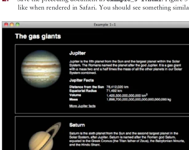
To write your fi rst CSS-enabled document, follow these steps.
1.
In your text editor of choice, enter the following markup: <!DOCTYPE html PUBLIC “-//W3C//DTD HTML 4.01//EN” “http://www.w3.org/TR/html4/strict.dtd”> <html lang=”en”><head>
<meta http-equiv=”Content-Type” content=”text/html; charset=utf-8”> <title>Example 1-1</title>
<link rel=”stylesheet” type=”text/css” href=”example_1-1.css”> </head>
<body>
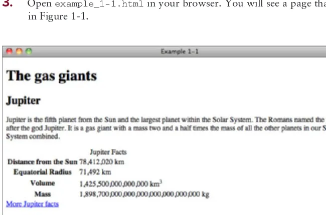
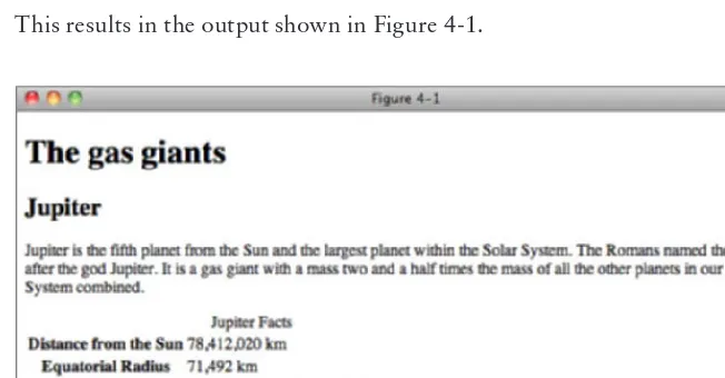
<h1>The gas giants</h1>
<div class=”planet jupiter”>
<h2>Jupiter</h2>
<p>Jupiter is the fifth planet from the Sun and the largest planet within the Solar System. The Romans named the planet after the god Jupiter. It is a gas giant with a mass two and a half times the mass of all the other planets in our Solar System combined.</p>
<table>
Your First CSS-Enabled Document
❘
7<a href=”http://solarsystem.jpl.nasa.gov/planets/profile.cfm?Object=Jupiter”> More Jupiter facts</a>
</div>
<div class=”planet saturn”>
<h2>Saturn</h2>
<p>Saturn is the sixth planet from the Sun and the second largest planet in the Solar System, after Jupiter. Saturn is named after the Roman god Saturn, equated to the Greek Cronus (the Titan father of Zeus), the Babylonian Ninurta, and the Hindu Shani.</p>
<table>
<caption>Saturn Facts</caption> <tbody>
More Saturn facts</a>
</div>
<div class=”planet uranus”>
<h2>Uranus</h2>
<p>Uranus is the seventh planet from the Sun, and the third-largest and fourth most massive planet in the Solar System. It is named after the ancient Greek deity of the sky Uranus the father of Cronus and grandfather of Zeus.</p>
<table>
<caption>Uranus Facts</caption> <tbody>
<a href=”http://solarsystem.jpl.nasa.gov/planets/profile.cfm?Object=Uranus”> More Uranus facts</a>
</div>
<div class=”planet neptune”>
<h2>Neptune</h2>
<p>Neptune is the eighth and farthest planet from the Sun in our Solar System. Named for the Roman god of the sea, it is the fourth-largest planet by diameter and the third-largest by mass.</p>
<table>
<caption>Neptune Facts</caption> <tbody>
<tr>
</tr> <tr>
<th>Equatorial Radius</th> <td>24,764 km</td>
</tr> <tr>
<th>Volume</th>
<td>62,526,000,000,000 km<sup>3</sup></td> </tr>
<tr>
<th>Mass</th>
<td>102,440,000,000,000,000,000,000,000 kg</td> </tr>
</tbody> </table>
<a href=”http://solarsystem.jpl.nasa.gov/planets/profile.cfm?Object=Neptune”> More Neptune facts</a>
</div>
</body>
</html>
2.
Save the preceding fi le in a new folder of its own as example_1-1.html.3.
Open example_1-1.html in your browser. You will see a page that looks something like the image in Figure 1-1.FIGURE 1-1
4.
Create a new, blank document in your text editor, and enter the following CSS:text-decoration: none; }
background-position: 20px 20px; background-repeat: no-repeat; }
background-image: url(jupiter.jpg); }
.saturn {
background-image: url(saturn.jpg); }
.uranus {
background-image: url(uranus.jpg); }
.neptune {
background-image: url(neptune.jpg); }
5.
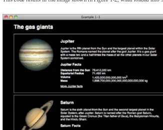
Save the preceding CSS in the same folder where you saved example_1-1.html, as example_1-1.css.This code results in the image shown in Figure 1-2, when loaded into Safari on Mac OS X.
FIGURE 1-2
To see how example_1-1.html looks in other browsers, you can load it up by going to the File menu of the browser you’d like to view it in, selecting Open or Open File, and locating example_1-1.html on your hard disk.
How It Works
Example 1-1 is an introduction to a little of what CSS is capable of. This example is designed to get your hands dirty up front with CSS, as a preview of what you can expect throughout the rest of the book. With each new chapter, I introduce and explain the nuts and bolts that come together to make examples like the preceding one. In Figure 1-2, you see that CSS can be used to specify background images and other aesthetic aspects of an HTML document. I continue to revisit and explain the CSS that resulted in Figure 1-2 throughout the book.
If you are feeling adventurous, play around with the CSS used here — try changing some of the values to see what happens. Don’t worry if things break, that’s all part of learning.
Some times you might fi nd that CSS requires some workarounds specifi cally to get older versions of Internet Explorer to display content in the same way as Safari, Firefox, Chrome, and Opera. Throughout this book, you also learn the hacks and workarounds that you need to make CSS-enabled web pages compatible with IE 6.
BROWSERS
Unlike with many traditional programming languages on the Web, we don’t get to choose the environment in which CSS and HTML is run; your end users make this decision by selecting which web browser they use. Although CSS is a standard supported by all major browsers, there are often differences between them, so it is important to be aware of the top players and to be able to test in each of them before releasing professional code.
It is worth taking a look at Yahoo!’s Graded Browser Support page at http://developer.yahoo .com/yui/articles/gbs/, which is regularly updated to show the current range of browsers that Yahoo! recommends that developers test in. It is based on traffi c analysis to the Yahoo! network and is quite representative of the Internet as a whole.
You can break down browsers into groups based on the engine that they use for rendering pages; this means browsers that share the same rendering engine are more likely to display things in the same way, which can cut down on testing.
Webkit
Webkit is the rendering engine used by the Apple Safari and Google Chrome browsers. It has good support for CSS 2.1 and supports many features of CSS3.
Safari
Safari is a browser based on the Webkit rendering engine from Apple. It is available for Windows and Mac OS X from www.apple.com/safari.
Browsers
❘
13Google Chrome
Google’s Chrome is also based on the Webkit rendering engine. It is available for Windows and Mac OS X from www.google.com/chrome.
Chrome (the current version is 10) has just over fourteen percent market share. While Chrome is the newcomer to the browser market it is showing rapid rates of adoption and is under heavily active development from Google with new versions released regularly.
Trident
Trident is the engine used by Internet Explorer from Microsoft and comes with the Windows operating system. After many years of market dominance, there are four versions of Internet Explorer in wide use today. Overall, Internet Explorer has more than 46 percent market share.
You can download all four versions from windows.microsoft.com/en-US/internet-explorer/
downloads/ie.
Internet Explorer 9
Internet Explorer 9 is the latest version of Microsoft’s browser; at the time of writing it hasn’t even been released yet but will be available by the time this book is published.
Internet Explorer 9 will have good support for both CSS 2.1 and CSS3.
Internet Explorer 8
Internet Explorer 8 is currently the most widely used version with around a 27 percent market share.
Internet Explorer has decent support for CSS 2.1 but is lagging behind other major browsers in support for CSS 3.
Internet Explorer 7
While Internet Explorer 7 never built the market share of version 8 or that of its predecessor, version 6, it still has over 10 percent market share.
While Internet Explorer has decent support for CSS 2.1, it is lacking in support for CSS 3.
Internet Explorer 6
Even though it was released back in 2001, Internet Explorer 6 still has over 16 percent market share. This is thankfully dropping, but this browser will be around for a while and still needs to be tested in for good coverage of the market.
Installing Multiple Versions of Internet Explorer for Testing
At the time of this writing, you cannot install different versions of Internet Explorer on the same copy of Windows. For development, you need a way to test IE 6, IE 7, IE 8, and IE 9, since you’ll have visitors to your website on all four browsers. The following are a few ways to do this.
➤ Use PC virtualization/emulation software such as Virtual PC or VirtualBox which allows you to install and run different versions of Windows (or other operating systems such as Linux) from within Windows or Mac OS X. You can load up a new instance of Windows from your Windows desktop and have that instance of Windows run in a window independently.
➤ Another option is setting up multiple different physical computers: one with each version of
Internet Explorer installed. This is obviously a more costly option, but might be possible in a commercial environment.
Gecko
While there are many uncommon browsers that use the Gecko rendering engine for practical purposes, you only need to consider one: Mozilla Firefox.
Firefox
You can download Firefox for Windows, Mac OS X, and Linux at www.firefox.com/.
At the time of writing, the current version of Firefox is 3.6 and has just over 30 percent market share, making it the second most popular browser. By the time this book is published, Firefox 4 will have been released, which will have similar support for the CSS I cover.
Firefox has good support for CSS 2.1 and supports many features of CSS3.
Presto
The Presto rendering engine is developed by Opera Software for their own range of browsers.
Opera
Opera is a web browser from Opera Software, which has a small marker share of just over 2 percent. While commanding a small market share for desktop browsers, it is a major player in the rapidly expanding mobile market.
Opera has good support for CSS 2.1 and supports many features of CSS3.
The current version of the Opera browser is 11. You can download this browser for Windows, OS X, and Linux from www.opera.com.
EXERCISES
1.
What are the key benefi ts of CSS?2.
Name the 5 main web browsers used today.Browsers
❘
15⊲ WHAT YOU LEARNED IN THIS CHAPTER
Cascading Style Sheets are the very necessary solution to a cry for more control over the presentation of a document. In this chapter, you learned the following:
TOPIC KEY CONCEPTS
Why CSS is needed CSS answers a need for a style sheet language capable of controlling the presentation of not only HTML documents but also several types of documents.
Benefi ts of CSS CSS has many advantages. These include accessibility, applicability to more than one language, and applicability to more than one type of device. CSS also allows websites to be planned, produced, and maintained in much less time. CSS enables websites to take up signifi cantly less bandwidth than formerly possible.
The Bits that Make Up
a Style Sheet
WHAT YOU WILL LEARN IN THIS CHAPTER:
➤ The elements that make up a style sheet
➤ The type of values that are used in CSS
➤ How to include CSS in HTML documents
In Chapter 1 you received a taste of what CSS is capable of in Example 1-1, a web page that contains the four gas giant planets of our solar system and some facts about them. In this chapter, you look at the elements that you combine to make a style sheet.
RULES
A style sheet can be broken down into progressively smaller bits. From large to small, those pieces are:
➤ Style sheet
➤ Rule
➤ Selector
➤ Declaration
➤ Property
➤ Value
Special characters — curly braces, colons, and semi-colons — are used to mark the beginning and ending of each part, separating them from each other. The following rule shows the parts of a style sheet and the special characters that separate them.
body {
width: 650px; margin: 0 auto; background: #000; color: #FFF;
font: 12px sans-serif; }
You can layout the rule according to your preferences; you can add line breaks and spacing to make CSS readable, sensible, and organized, or you can put everything on one line if you prefer.
Like HTML, CSS can use white space and line breaks to aid readability. In most cases the interpreter reading the CSS doesn’t care how much white space appears in the style sheet or how many line breaks are used; provided you have spaces where they are required you can use one or 10. Humans, however, must often add some sort of structure to prevent eyestrain, and to increase maintainability and productivity.
The style used in this book is recommended for readability, but you may fi nd that a different format makes more sense to you. The important thing is to be consistent — pick one style that suits you and stick to it.
Within a rule, selectors choose which elements to style in the HTML document. Your browser already applies a default style to most elements (for example, an h1 element is larger than regular text) and you only need to write CSS to change those default styles or to add styles.
SELECTORS
In CSS, a selector is the HTML element or elements to which a CSS rule is applied. Put simply, the selector tells the browser what to style. The simple selector that you saw in the previous section is called a type selector; it merely references a type of HTML element, and will style all that match. For example, a p type selector on its own will apply styles to all p elements.
As you saw in the example rule, body is written in the style sheet without the left and right angle brackets, <>, and the same applies when styling any element, just swap body with the element you wish to style. This rule applies the CSS properties: width, margin, background, color, and font to the <body> element. I talk more about what these properties do in later chapters, but you might be able to guess what they do just by their names.
Grouping Selectors
Values
❘
19th, td {
padding: 0 10px 0 0; text-align: left; }
You group selectors so that you don’t have to repeat the same declarations for each selector. Consider grouping if two or more selectors repeat all or the majority of their declarations.
For readability it is recommended that each selector goes on its own line.
DECLARATIONS
Declarations are enclosed within curly braces to separate them from selectors. In the rule shown previously, each line after body between the curly braces ({ and }) is a separate declaration. A declaration is composed of a property name, a colon, and, depending on the property, one or more values.
A colon is used to separate the property from the value, and the property appears before the colon. In our example selector (shown in the “Rules” section) width is a property and 650px is the value associated with it. A declaration always ends with a semi-colon.
VALUES
While the values for some properties can be quite simple, for example, just a single number in the case of the z-index property that you will learn about later, CSS can become quite complex in terms of what it allows a property’s value to be. So far, you have only seen a small number of the potential types of values that you see in CSS. In the coming sections I discuss each of the different types of values used in CSS in greater detail, beginning with keyword values.
Keywords
A keyword value is a named value; for example, red, green, and blue are CSS keywords. Color keywords can be used on any property that accepts a color value.
The keywords in the following code are bold, and left. bold, when used with the font-weight property, provides the browser with instructions for how to render the text of a caption element, and left is a keyword that when used with the text-align property tells the browser how text is to be aligned.
caption {
Many types of keywords are used in CSS, and sometimes a single keyword can apply different styles depending on the property or element on which it is used. The auto keyword, for example, is used by CSS to apply some default style or behavior, and although in both of the following examples its meaning is the same, the resulting effect is different. Try the auto keyword in the following Try It Out.
TRY IT OUT
Adding Auto Width to a Table
Example 2-1
To see the effects of the auto keyword as applied to a <table> element, follow these steps.
1.
Enter the following HTML-compliant markup.<!DOCTYPE html PUBLIC “-//W3C//DTD HTML 4.01//EN” “http://www.w3.org/TR/html4/strict.dtd”> <html lang=”en”>
<head>
<meta http-equiv=”Content-Type” content=”text/html; charset=utf-8”> <title>Example 2-1</title>
Values
❘
21</tbody> </table> </body>
</html>
2.
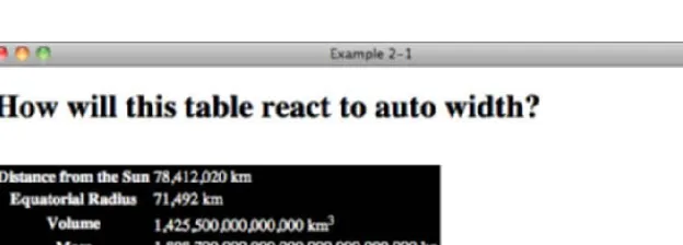
Save the preceding markup as example_2-1.html, and then load it into a browser. Figure 2-1 shows width:auto; applied to the <table> element.FIGURE 2-1
How It Works
In Figure 2-1, you can see that the table expands only enough to accommodate the text within it.
When width:auto; is applied to a <table> element, it invokes a different mechanism for width measurement than when it is applied to a <div> element. In the next Try It Out, see what happens when auto width is applied to a <div> element.
TRY IT OUT
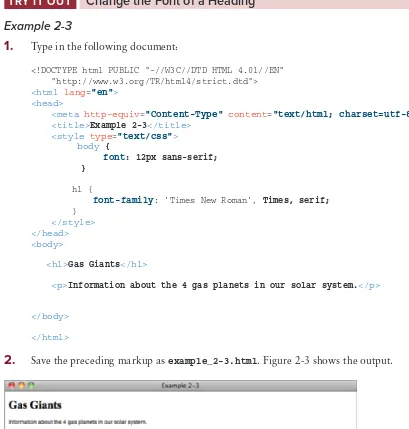
Applying Auto Width to a Div
Example 2-2
To see the effects of the auto keyword as applied to a <div> element, follow these steps.
1.
Enter the following document:<!DOCTYPE html PUBLIC “-//W3C//DTD HTML 4.01//EN” “http://www.w3.org/TR/html4/strict.dtd”> <html lang=”en”>
<head>
<meta http-equiv=”Content-Type” content=”text/html; charset=utf-8”> <title>Example 2-2</title>
<style type=”text/css”> div {
background: black; color: white; }
</style> </head> <body>
<h1>How will this div react to auto width?</h1> <div>
<h2>Jupiter</h2>
<p>Jupiter is the fifth planet from the Sun and the largest planet within the Solar System. The Romans named the planet after the god Jupiter. It is a gas giant with a mass two and a half times the mass of all the other planets in our Solar System combined.</p>
</div> </body>
</html>
2.
Save the preceding markup as example_2-2.html. Figure 2-2 shows width:auto; applied to the <div> element.FIGURE 2-2
How It Works
All elements with a width property have an auto value by default, but not all elements behave the same way when autowidth is applied. The <table> element, for instance, only expands horizontally to accommodate its data, which is a method called shrink-to-fi t. A <div> element, on the other hand, expands horizontally as far as there is space, which is called expand-to-fi t.
Values
❘
23Keywords always invoke some special, predefi ned behavior. Another example I can present is with the CSS border property: A border may take three separate keywords that defi ne how it appears when the browser renders it:
border: thin solid black;
This example defi nes a property with three keyword values: thin, solid, and black. Each value refers to a different characteristic of the border’s appearance: thin refers to its measurement, solid to its style, and black to its color.
Sometimes you need to include content from a style sheet, or referencing a fi le path, or including a font name that has spaces in its name, or referencing an HTML element’s attribute value. To accomplish these tasks, CSS supports a type of value called strings.
Strings
A string is any sequence of characters. For example, “Hello, World” is a string. As in most programming languages, strings in CSS are enclosed within either single or double quotation marks. Strings may contain text, numbers, symbols — any type of character.
NOTE A string is what is known as a data type. Other examples of data types are integers and real numbers. An integer can be a positive or negative number, but it can only be a whole number without decimal places. Real numbers are like integers, but they can have decimal places.
The purpose of data types is to tell us where we can use diff erent types of values. For example, we can’t use a string or a real number if a property requires an integer as a value.
One use of strings in CSS is to specify a font that contains spaces in its name.
font-family: ‘Times New Roman’, Times, serif;
Font faces with spaces in the name are enclosed with quotations to keep the program that interprets CSS from getting confused. The quotes act as marking posts for where the font face’s name begins and ends.
TRY IT OUT
Change the Font of a Heading
Example 2-3
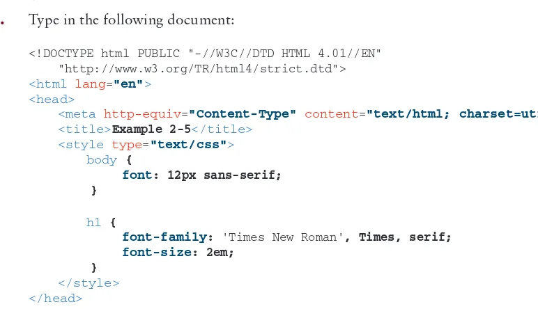
1.
Type in the following document:<!DOCTYPE html PUBLIC “-//W3C//DTD HTML 4.01//EN” “http://www.w3.org/TR/html4/strict.dtd”> <html lang=”en”>
<head>
<meta http-equiv=”Content-Type” content=”text/html; charset=utf-8”> <title>Example 2-3</title>
<style type=”text/css”> body {
font: 12px sans-serif; }
h1 {
font-family: ‘Times New Roman’, Times, serif; }
</style> </head> <body>
<h1>Gas Giants</h1>
<p>Information about the 4 gas planets in our solar system.</p>
</body>
</html>
2.
Save the preceding markup as example_2-3.html. Figure 2-3 shows the output.FIGURE 2-3
How It Works
Values
❘
25Length and Measurement
There are two kinds of lengths used in CSS: relative and absolute. Absolute lengths are not dependent on any other measurement. An absolute measurement retains its length regardless of the environment (operating system, browser, or screen resolution of a computer monitor) in which it is applied. Relative lengths, on the other hand, depend on the environment in which they’re used, such as the computer monitor’s screen resolution or the size of a font.
Absolute measurements are defi ned based on real-world units such as inches, centimeters, points, and so on. These measurements have been used for centuries in the print industry, and one would be accustomed to fi nding them on a ruler.
Absolute Measurement
CSS supports a variety of real-world measurements. Each absolute length unit supported by CSS is defi ned in the following table.
UNIT ABBREVIATION DESCRIPTION
in Inches
cm Centimeters
mm Millimeters
pt Points, 1 point is equal to 1/72nd of an inch
pc Picas, 1 pica is equal to 12 points
Absolute lengths are not intended for the computer screen; they are intended for where a physical measurement is necessary. For example, printing a document requires real-word measurements. You cover print styles in Chapter 15. For now you will not be using absolute measurements.
Relative Measurement
Relative measurement is better suited for the purpose of onscreen layout. The following table defi nes the four types of relative measurement that CSS allows.
UNIT ABBREVIATION DESCRIPTION
em Length relevant to the nearest font size.
ex The x-height of the relevant font (height of the letter x).
px Pixels, relative to the viewing device, for example, a computer monitor.