87 IJNMT, Vol. IV, No. 2 | December 2017
ISSN 2354-0082
Data Visualization Indicator Disease (Malaria,
Dengue Fever, and Measles) in The Year
2012-2015
Immanuel Luigi Da Gusta
1, Johan Setiawan
2Department of Information Systems Universitas Multimedia Nusantara, Tangerang, Indonesia
[email protected] [email protected]
Received on August 30th, 2017
Accepted on December 20th, 2017
Abstract— The aim of this paper are: to create a data visualization that can assist the Government in evaluating the return on the development of health facilities in the region and province area in term of human resources for medical personnel, to help community knowing the amount of distribution of hospitals with medical personnel in the regional area and to map disease indicator in Indonesia. The issue of tackling health is still a major problem that is not resolved by the Government of Indonesia. There are three big things that become problems in the health sector in Indonesia: infrastructure has not been evenly distributed and less adequate, the lack of human resources professional health workforce, there is still a high number of deaths in the outbreak of infectious diseases. Data for the research are taken from BPS, in total 10,600 records after the Extract, Transform and Loading process. Time needed to convert several publications from PDF, to convert to CSV and then to MS Excel 3 weeks. The method used is Eight-step Data Visualization and Data Mining methodology. Tableau is chosen as a tool to create the data visualization because it can combine each dasboard inside a story interactive, easier for the user to analyze the data. The result is a story with 3 dashboards that can fulfill the requirement from BPS staff and has been tested with a satisfied result in the UAT (User Acceptance Test).
Index Terms—Dashboard, data visualization, disease, malaria, Tableau
I. INTRODUCTION
Currently access to health data actually already very easy to be accessed, so wider community can access these data, unfortunately, most of the data still in the form of numbers. Based on the background, there is a need to have a data visualization in order to visualize the cases.
Processing data into useful information is very important, so researchers will create data visualization to (1) compare the distribution of hospital facilities and health workers for period 2012-2015, (2) show disease indicators will be displayed in 3 dashboard, filtered by year and province in order to make the user
can clearly see the level of transmission of disease cases every year in the province in Indonesia in the span of the year 2012–2015.
Based on the background of the problem, then the problem statement:
How to visualize the disease indicator (Malaria, dengue fever, and measles), and the availability of hospital and medical personnel? How the results compared per year based on
the indicators of the disease with the availability of hospital and medical personnel in the provinces of Indonesia?
How to display the visualization dashboard diseases indicator (Malaria, dengue fever, and measles), and the availability of hospital and medical personnel?
II. LITERATURE REVIEW
A. Health information systems
Health information systems are the management of information across levels of Government systematically within the framework of the Organization of the service to the community. It's just that in the contents of both Decisions of the minister of health contain flaws which are both just looked at health information systems from the viewpoint of health management, not utilizing state of the art information technology and are not related to the system of national information systems. Information and communication technologies are also not yet spelled out in detail so that the data presented is not appropriate and not on time [1].
B. Health facilities
IJNMT, Vol. IV, No. 2 | December 2017 88
ISSN 2354-0082
provides a place to care for patients and work space for medical personnel to care for patients. The hospital was an institution of professional health care services are provided by doctors, nurses, and other health experts. The following is a task at once a function of hospitals, namely:
Carrying out medical services, medical support services.
Implement the inpatient service. Carrying out medical education.
Implementing outpatient services or inpatient and emergency care (observation).
Hospitals type in Indonesia based on law No. 44 of 2009 can be distinguished into five types based on it’s capability, namely:
1. Hospital Type-A
The hospital is capable of providing services medical specialist and extensive subspecialty by the Government designated as the highest reference (Top Referral Hospital) or also called as the Hospital Center.
2. Type B Hospitals
The hospital is capable of providing services of medical specialists and sub-specialty is limited. The hospital was founded in every provincial capital which houses the reference services in the hospital district.
3. Hospital Type-C
Hospitals that are able to provide specialist medical services limited. The hospital was founded in every capital of the Regency (Regency hospital) that accommodate service referrals from clinics.
4. Hospital Type-D
The hospital is the transition with the ability to only give general medical and dental services. The hospital accommodates reference comes from the clinic.
5. Hospital Type-E
Specialty hospital (special hospital) which hosted only one waiter of medical health course. Currently, many hospitals of this class found e.g., Hospital leprosy, Pulmonary, cardiac, cancer, mother and child.
C. Data Visualization
Data Visualization is a tool used to support company or an agency organization in taking a decision which is presented in the form of design charts, maps or diagrams. Data Visualization is a
technology supporting visualization and interpretation of existing data and information at several points along the continuum of data processing. Data Visualization itself can display the data in the image into the form of visualizing digital, GIS (Geographic Information System), graphical user interface, virtual reality, three-dimensional presentation, video, and animation [3].
There are two main goals of data visualization according to White Paper Principles of Data
Visualization – What We See in Visual Explotary
visuals [4], namely:
a. Explain the data to solve specific problems: visualization can help users take the best decisions, answering questions in a particular delivered an information on a specific problem.
b. Explore large datasets for better understanding: exploratory visuals will provide plenty of dimension against a data set to the viewer, or compare data with other data. Exploratory visual will attract readers or users to be able to explore the visual, questions arise during the process, and answer any questions.
D. Several type Data Visualization
Multidimensional Data Visualization Tools
Is a tool used to simulate the data into the form of a 2D or 3D, his goal users can understand more about the content of the information because it is seen from a different perspective [5].
Multidimensional Pie Chart
89 IJNMT, Vol. IV, No. 2 | December 2017
ISSN 2354-0082
Fig. 1 Multidimensional Pie Chart
Multidimensional Bar Charts
Multidimensional Bar Charts allows users to create a data visualization of two to six variable at a time. One of the variables can be combined with three axes and one of three colors [5].
Multidimensional Histograms
Multidimensional Histograms allows the user to build a data visualization in the form of 3D and 2D from density data that can contain one to three independent variables, the Histogram is very suitable for the needs of large amounts of data visualization
Fig. 2 Multidimensional Bar Chart
Fig. 3 Multidimensional Histograms
Multidimensional Scatter Plot
Multidimensional Scatter Plot allows users to perform data visualization in the form of 3D and 2D. Data can be displayed in form of a plot consisting of one or two independent variables [5].
Fig. 4 Multidimensional Scatter Plots
E. Information Dashboard
Information Dashboard a great tool to present information at a glance, solutions for the information needs of the organization by providing the look of interface with a variety of forms such as diagrams, reports, visual indicators, alert mechanism, combined with a dynamic and relevant information [6].
F. Tableau
Tableau is a business intelligence software that lets everyone perform data integration easily wherever and whenever it can then be visualized using interactive dashboards.
Tableau Desktop is a data visualization application that can be used for easy and quick to answer the specific questions at issue. Tableau made the great amount of the data becomes much easier no matter what his needs.
Tableau Public is a data visualization application version, free service version that lets anyone can easily access and use such access for sharing information about data integration over the web. Everyone can use Tableau Public easily because it’s free.
G. Visual Data Mining Methodology
Visual Data Mining is a technique that can be done with the process over and over. Visualization and data mining can be done with the intention to see the business process of a company [7].
III. RESEARCH METHODOLOGY
This research was conducted with the use of health data obtained from the official portal of the Central Bureau of Statistics (BPS) www.bps.go.id i.e. indicator diseases data (dengue fever, Malaria, Polio), the availability of hospital and medical personnel.
The Central Bureau of Statistics is a Non-Government institution the Ministry is responsible directly to the President. Based on legislation that has been mentioned above, the role of which should be run are as follows:
IJNMT, Vol. IV, No. 2 | December 2017 90
ISSN 2354-0082
the census or survey conducted itself and also from other government departments or agencies as secondary data.
Assist the statistical activities in the Department, government body or other institution, in establishing a system of the national statistic.
Develop and promote standard statistical techniques and methodologies, and provide services in the field of education and training statistics.
Building cooperation with other countries and international institution for the benefit of the development of the Statistics Indonesia. The research method used is Visual Data Mining (VDM). Visual data mining is a method used to find data that is not known in advance, the pattern of behaviour of the data that is in the company or related institutions will be very helpful in doing searches on the data used through visual technique.
Fig. 5 Eight-step data Visualization and Visual data mining methodology
There are eight steps to be done:
A. Project Planning Phase
Justify and Plan the Project Identify the Top Business Questions
B. The Data Preparation Phase Choose the Data Set Transform the Data Set Verify the Data Set
C. The Project Analysis Phase
Choose the Visualization or Mining Tool Analyze the Visualization or Mining Model Verify and Present the Visualization or
Mining Model
IV. RESULTS
A. Project Planning Phase
Justify and Plan the Project
To be able to proceed to the next steps is to determine the type of visualization project to be created. Visualization type used is a type of visual data mining pilot project aims to investigate, analyze and answer one or two questions of the purpose of the study itself. Identify the Top Business Questions
The process to identify the top business questions is done by determining the question of the business must be traced further and answered. In this case, because researchers doing research on data visualization of health, questions that arise are: (1) how to display the dashboard to visualize data about medical personnel and hospitals in Indonesia (2) how to display the dashboard indicators of disease distribution maps that exist throughout Indonesia in the year 2012-2015.
B. The Data Preparation Phase
The data used in the visualization is taken from
www.kemenkes.go.id and www.bps.go.id both are Government website functions as a center of public information from ministries, government agencies, local governance and the relevant agencies with regard to data on Indonesia.
The data used for modeling data visualization use data in the span of 4 years (2012 – 2015) because it has the latest updates. Data for 2016 is excluded because data related to medical personnel, hospitals, and disease indicators are not yet updated.
Choose the Data Set
Based on consultation with parties from Ministry of Health and BPS the data that will be included in the Dataset are:
- Medical Personnel Data (contains Medical personnel: doctors, general doctors, physician specialist, and dentist).
- Hospital data (contains hospital data in county, city and province, and also bed availability)
- Disease indicator data (contains cases for Malaria, dengue fever, and measles based on IR – Incident Rate per 10,000 population)
91 IJNMT, Vol. IV, No. 2 | December 2017
Data that has been converted, not completely complete to make a map in Tableau. The data still not have latitude and longitude field.
Using a website www.gps-coordinate.net researchers put the complete address on this already prepared, without any missing values.
C. The Project Analysis Phase
Choose the Visualization or Mining Tool
Visualization Model
1. Data connection to the Tableau
Software
In this phase, data source from Microsoft Excel added to Tableau. The data source will be used to visualize the map. The data will be seperated into Dimension and Measures.
Dimension used are: District Name, City, Province and Year. Measures used are: number of hospitals, number of beds, total hospital, total beds, number of death cases, the incident rate per 10,000 population, latitude and longitude.
2. Visualization of Map
The visualization map is used to view the area with an information about how many hospitals in each region (province, district or city) in Indonesia using dimension and measures. To ease the visualization, filters are used for selecting the province, district, and city in one box selection, and another box selection is used to select the appropriate year with the selection of the year 2012 to 2015. By selecting the year chosen, users can see the differences of the data for each year.
3. Bar Chart Visualization
The next visualization is Bar Charts. This visualization is used to see the number of the dentist, general practitioner and physician specialist in each province, district, and city. Dimensions used are: year and province name. The measures used are: number of dentists, number of general practitioners and number of physician specialist.
To ease reading the map, color is used. Blue for a dentist, yellow for physician specialist, and red for the general practitioner.
Using doctor category in each province and district/city, visualization is used to see the number of dentists, and physician specialists in each of the provinces and District/City in more detail by using the dimension of the year and the name of the Province.
4. Treemaps Visualization
In this fourth type of visualization, treemaps are used, to classify types of hospitals in provinces in Indonesia. This visualization used to see types of hospitals in each province in Indonesia. Visualization of treemaps is made with 2 composition dimension (the type of the class, the name of the province) and 2 measures ((SUM) number of hospitals and (SUM) number of Beds).
Visualization Dashboard
After all of the visuals created, the next step is merging all visualization into the dashboard in order to be given an distribution of hospitals and doctors per district/city in 2012–2015, (3) dashboard map Indicator disease in Indonesia.
IJNMT, Vol. IV, No. 2 | December 2017 92
ISSN 2354-0082
read the visual appearance of the data. (see fig. 6 Visualization Dashboard )
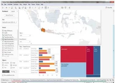
Fig. 6 Visualization Dashboard
Fig. 7 Visualization Story
Visualization Story
A Story is a collection of every dashboard which combined to become the story. The goal of a story is to make it easier for users to access any dashboards (see fig. 7 Visualization Story )
Analyze the Visualization or Mining Model
At this stage of analysis, the model visualization is done to ensure with this visualization top business questions you have in the phases of Visual Data Mining can not be missed.
1. Dashboard map of the spread of
hospital and medical personnel in the
provinces of Indonesia in 2012 –
2015.
The primary purpose of construction of hospital distribution and visualization of medical personnel is to know the overall number of
hospitals and medical personnel in each province in Indonesia.
Fig. 8 Type of Hospital in West Java Province
2. Dashboard distribution of hospital
and medical personnel at the
district/city in Indonesia year 2012 – 2015
The aim to build visualization of distribution of hospitals and medical personnel per district/city to be able to know the number of hospitals and medical personnel in more detail per district/city that exist in every province in Indonesia, as seen in Figure 8
Fig. 9 Details of medical personnel and hospitals at the district/city
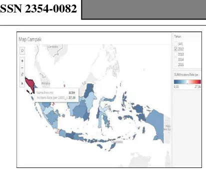
3. Dashboard indicator of the disease in
the province in Indonesia
93 IJNMT, Vol. IV, No. 2 | December 2017
ISSN 2354-0082
Fig. 10 Measles dashboard year 2015
Verify and Present the Visualization or Mining Model
The last stage in the technique of Visual Data Mining is to do a demo against the visualization model already built using the data in compliance. The visualizations appear in accordance with the existing data, when there is an error in the visualization then it can be inferred that there is an error in the data set and should be fixed.
The visual result is already uploaded to Tableau Public server. The visualization can be seen at http://bit.ly/diseaseindicator
V. CONCLUSION
Visualization indicator diseases, availability of medical personnel in the hospital and the provincial government, districts, and cities in Indonesia is created to provide information about the growth of the health facilities and medical personnel as well as the number of cases of infectious diseases that are in Indonesia to the community.
This visualization is made in the form of an interactive dashboard which further consolidated into a story of the dashboard so the society or users easier make an interaction with the data.
In 2012–2015 the Indonesian province of East Java Regional Hospital facility availability totaled 1,220 units. East Java province has a thick red color which means that area has a high amount of hospitals compared with another region; followed by Central Java, West Java, North Sumatera.
On the bar chart, medical personnel in 2012 – 2015 can be seen that the growth rate of human resources in the medical personnel with the highest number of both in the dentist, and physician
specialists are in 3 provinces in Java: West Java, Central Java, and East Java.
In the year 2012 medical personnel for the dentist, East Java has 1,591 people, and the highest number of general practitioners found in Central Java province amounted to 4,786 people while for physician specialists totaled 4,258 people.
On a bar chart for district/city in 2012 – 2015 regional human resources in the medical personnel are in the city of Surabaya have a total overall 54,508 dentist 3,616 people, general practitioner, a specialist doctor 10,916 people 39,976 people. For human resources in the medical personnel, the lowest in Pasaman West Sumatra Province with a total of 20 dentists, general practitioner 88 people and physician specialist 188 people.
The indicator for the disease in the province in Indonesia is divided into 3 maps (1) map for dengue fever (2) map for Malaria and (3) Measles maps. The maps distinguished into 2 colors blue and red, with red color for the caption shows the highest number of cases in each area and the blue color indicates the lowest number of cases in certain areas.
For the entire case in 2012 – 2015 in the number of cases occurred: on measles map, Aceh province has the highest with 47.45 %; on Malaria map, Papua Province indicated has the highest API with 164.7%; on the dengue map with IR per 10,000 population Bali province is found highest with 637,0%.
ACKNOWLEDGMENT
Immanuel Luigi Da Gusta. The author thanks, Mr. Johan Setiawan as a supervisor that has been guiding from the beginning.
REFERENCES
[1] S. Arianto, Understanding of learning and others, 2008. [2] Rainer; Turban, Introduction to Information Systems,
Danvers: John Wiley & Sons, Inc, 2007.
[3] V. Friedman, Data Visualization Infographics, Monday Inspirition, 2008.
[4] D. A. Keim, "Information Visualization and Visual Data Mining," IEEE Transactions on Visualization and Computer Graphics 8.1, pp. 1-8, 2002.
[5] Connolly and Begg, Database Systems, Boston: Pearson Education, Inc, 2010.
[6] E. Hariyanti, "Pengembangan Metodologi Pembangunan Information Dashboard Untuk Monitoring kinerja Organisasi," Konferensi dan Temu Nasional Teknologi Informasi dan Komunikasi untuk Indonesia, p. 1, 2008. [7] S. Darudiato, "Perancangan Data Warehouse Penjualan Untuk