WALKYOURPLACE - EVALUATING NEIGHBOURHOOD ACCESSIBILITY AT
STREET LEVEL
S. Steiniger a, M. E. Poorazizi a, A. J. S. Hunter a*
a Geomatics Engineering, University of Calgary, 2500 University Drive NW, Calgary, AB, T2N 1N4 Canada – {ssteinig, mepooraz, ahunter}@ucalgary.ca
Commission VI, WG VI/7
KEY WORDS: Accessibility, Network Paths, Circular Access Areas, Web Processing Services
ABSTRACT:
The popularity of a neighbourhood is often explained by its perceived “higher” quality of life. Good access to shops, restaurants, parks, etc., is seen as an indicator that reflects improved quality of life. We present a web-based tool for assessment of accessibility to such services. The system evaluates in real time an area that is accessible using pedestrian, transit, and cycling infrastructure. The accessible area is evaluated using “quality of life” indicators, such as the number of grocery stores, shopping and recreation facilities, and local crime within that area. This tool sets itself apart from pre-computed and neighbourhood-level walkability indices, because it makes use of detailed street-level data, rather than block-level generalizations. It uses real network travel time, and, when transit data are provided, permits the creation and evaluation of accessibility areas for a combination of travel modes such as walking with transit use.
*
Corresponding author.
1. INTRODUCTION
Within cities, different neighbourhoods experience different levels of demand for housing. Neighbourhoods attracting higher demand generally also attract higher purchase prices. Such value can be associated with a perceived quality of life (Barton et al. 2010) offered by different housing styles (i.e. house or apartment, new or old, big or small, etc.), and the services and amenities available from a particular location. A recent study by the National Association of Realtors (NAR 2011) has shown that for certain demographic groups in North America the ability to walk to services, shopping, parks etc., so-called walkability (Lo 2009), is of importance. In particular, the NAR study states that being within an easy walk of amenities in their community is perceived by 66% of the surveyed adults as very important or somewhat important when deciding where to live. Similarly, reduced commuting time (very important: 36%; somewhat important: 42%), as well as the existence of sidewalks, and places to walk (31%; 46%), are location factors that are highly favoured according to the NAR study. These factors are to be weighted against other considerations, such as privacy (45%, 42%), house type (80% for single-family home), budget constraints (59% prefer to stay in their budget), etc. What is also clear from studies such as the NAR’s, and newspaper and blog discussions (e.g., Harris 2012, Palmer 2012), is that walkable access to daily services is perceived by citizens to be more important today. That is, it is no longer just a concern of planners, health professions, and researchers.
For these reasons the PlanYourPlace project has developed an online tool for the evaluation of access to community services, parks, shops, etc., that we call “WalkYourPlace.” The objective of PlanYourPlace in general is the creation of a web-based platform that facilitates participation of citizens in planning (Hunter et al. 2012). The current geographic focus of PlanYourPlace prototype implementation and testing is the City of Calgary, Alberta, Canada.
Several web-based accessibility evaluators for use by citizens already exist, such as WalkScore.com, Walkonomics.com, and walkshed.org. In the remainder of the paper we will identify limitations of the walkability and access measures used by these systems that we wish to address. We will then describe our system architecture, and particular problem solutions for the WalkYourPlace tool. Finally we demonstrate the effects of our modifications, and the effects of different travel modes, on calculated accessibility areas and access measures.
2. EXISTING (PUBLIC) ACCESSIBILITY MEASURES AND THEIR LIMITATIONS
The intended audience of the WalkYourPlace tool is primarily citizens, but we also believe that planners, transit engineers, and municipalities in general would benefit from having access to this type of tool. Accessibility evaluation tools that can be used by everyone should therefore be available via the Internet. Three known tools that evaluate pedestrian accessibility and present so-called “walk scores”, or walkability surfaces to the user are WalkScore.com, Walkonomics.com, and walkshed.org. The “walk score” indices calculate a score based on facilities, such as shops, parks, restaurants, etc., that can be found within a certain distance from an evaluated location. Walkshed.org’s “walkability surface” lets users select and prioritize a number of indices that are then used to derive a heat map that highlights walkable neighbourhoods. The approach used in WalkScore.com has been described in detail (WalkScore 2011), whereas the methodology applied in Walkonomics.com is only outlined generally (Davies 2012).
Manaugh & El-Geneidy (2011) evaluated the WalkScore index and three other indices using origin destination survey data for the city of Montreal, Quebec, Canada. The three other indices tested were the “Walkability Index”, the “Walk Opportunities International Archives of the Photogrammetry, Remote Sensing and Spatial Information Sciences,
Index”, and the “Pedshed” method. However, these three indices were implemented using desktop GIS software, and hence are not readily accessible to citizens. According to Manaugh & El-Geneidy (2011), all four indices were found to describe pedestrian behaviour well on the Island of Montreal.
In our analysis of these approaches we discovered several limitations. For instance, Walkscore.com and Walkonomics.com focus on walking as the primary mode of travel, and one cannot obtain scores for other modes of transportation such as cycling and transit use. Benenson et al. (2010) have suggested that accessibility should be evaluated using different modes of transportation, as they discovered substantial differences in employment accessibility metrics for different modes of transit for the city of Tel Aviv, Israel.
The WalkScore and the “Walkability Index”, described in Manaugh & El-Geneidy (2011), determine the extent of an accessibility neighbourhood for a particular location by using a circular extent that mimics “as-the-crow-flies” distance (see also a summary of WalkScore limitations in Duncan et al. 2012). Such an approach (a) neglects topological constraints in the pedestrian network, and (b) neglects real-world travel times on transportation networks. Topology is important if rivers, railway tracks, or high volume roads, e.g. highways or freeways, divide city neighbourhoods — as is the case in Calgary. An evaluation method that is based on a circle that is relatively large (WalkScore uses a radius of 1 mile, or 1,609 m) compared to reported walking distances of 400 to 800 m — often found in planning, transportation, and health literature (see Barton et al. 2010, Congress for the New Urbanism 2012, Leslie et al. 2007, etc.) — will most likely estimate optimistic walk score values.
Finally an additional point that should be considered is data completeness, i.e., the completeness of information describing existing shops, restaurants, services, crime, etc. Sometimes services in neighbourhoods are closed, or new ones open. These changes are often only reflected in data delivered by commercial providers on an annual basis, a common database updated cycle. Hence, the walk indices calculated might be based on data that have not been updated for some time. It would, therefore, be beneficial to use a database that can be updated directly without the need to wait for the updates from the data provider.
3. THE WALK-YOUR-PLACE TOOL
3.1 System Architecture
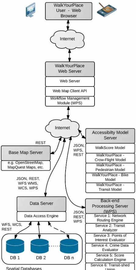
The WalkYourPlace system allows citizens to evaluate accessibility for a certain location, e.g., their home, or a road intersection in the city. The system has been designed and developed using a service oriented architecture. We describe the several logical and physical components that the system is composed of. The use of a service-based architecture allows modifications to the system, e.g., to the accessibility evaluation models, without adversely affecting the system in general. It enables the calculation of accessibility areas and scores in real-time, as processing demands can be spread over several servers. Furthermore, it enables access to distributed data sources, which allows the diverse data used for accessibility evaluation, and for map display, to be maintained by different data custodians. In Figure 1 we show a generalized view of the physical architecture for the WalkYourPlace tool. The user interface in this architecture is the web browser on the user’s device. This
entry component, i.e. the WalkYourPlace web page and map client, is loaded into the browser from the WalkYourPlace Web Server. The user triggers the accessibility evaluation tool by identifying a start location on the map component. Then the “Workflow Management Module” within the web processing service (WPS) will trigger one of the different accessibility evaluation models located on the Accessibility Model Server, for instance the WalkYourPlace Pedestrian Model. This model, then, performs the evaluation by obtaining data from the Data Server, and by interacting with the different services on the — perhaps different — Back-end Processing Server(s). Additionally we have included in Figure 1 a separate Base Map Server, which provides (street) maps that can be displayed directly to the user via the map client module on the web server.
Figure 1: A physical perspective of the WalkYourPlace system.
Communication and data delivery between the components is accomplished using standards published by the World Wide Web Consortium (W3C) and the Open Geospatial Consortium (OGC). This implementation has adopted the following standards: (i) W3C’s REST architecture style, (ii) the (Geo-) JSON standard that specifies a data interchange format International Archives of the Photogrammetry, Remote Sensing and Spatial Information Sciences,
(geojson.org), OGC’s Web Processing Service (WPS) to calculate the accessibility score for an accessibility area, and (iv) OGC’s Web Map Tile Service Implementation standard (WMTS) to display zoom-able maps of the urban area in the map client. Other OGC standards are also represented in Figure 1 as these services could equally be adopted for the retrieval and presentation of geographic data.
The geospatial-processing service framework includes a workflow management module on the server side. It performs the analysis through a chain of geospatial-processing services. The accessibility assessment process follows a multi-step pattern, which is established as a workflow. To achieve desired application flexibility, service reusability, and improve performance, the workflow-managed chaining method was used (Alameh 2003).
3.2 Solutions
In this section we will address in particular: (i) how we create the accessibility areas; (ii) how, and what types of accessibility scores we calculate; and (iii) how we address the data provider dependency problem. All descriptions are kept fairly brief as the detailed solutions, in most cases, can be explored by studying generated from a transportation network that includes both roads and pedestrian paths. Given a user location, a maximum time the user is willing to walk, and average walk-speed, a least cost path (graph) is generated using the A* search algorithm (Delling 2009), and a Shortest Path Tree (SPT) is produced. Roads that cannot be traversed by pedestrians, such as freeways, or streets without sidewalks are excluded in the shortest path search heuristic. The resulting SPT contains nodes and edges from the transportation network. From the set of edges within the maximum walk time, a concave hull geometry is generated using the algorithm implemented by Grosso (2012). This concave hull is assumed to be the final accessibility area.
(ii) Transit accessibility area generation — In principle we have two options for the calculation of transit-accessibility areas. Both are in reality a combination of walk and transit modes. In option (a) the “Integrated Transit-shed,” we define a general maximum travel time and combine routing on a transit graph and a road network graph. Shortest path routing uses a Multi-Objective A* algorithm (Mandow & Perez de la Cruz 2010). In option (b) the “Explicit Transit-shed,” we parse transit schedule data and use road network routing only for the walk part. In this option we distinguish between (1) the maximum travel time, (2) maximum time to find a transit stop / route, (3) the maximum transit waiting time, and (4) the maximum transit travel time. Only the integrated method is evaluated in this work.
The explicit transit shed method derives two accessibility areas using the maximum time to find a transit stop and the maximum travel time. The accessibility area derived using the maximum time to find a transit stop is searched for transit stops within the accessibility area. For the set of transit stops identified, the transit schedule data is parsed with respect to user defined transit wait times and travel times, i.e., how long are users willing to wait at a transit stop, and how long are they willing to travel on transit. This determines which transit routes are actually accessible to the user. Once the set of routes are identified the transit network is searched to identify the closest
transit stop on each route to the user’s start location. The third restriction, transit travel time, is then used to identify all transit stops within the transit travel time from the closest transit stop for each route. For each transit stop that can be reached within the maximum transit travel time, a new accessibility area is generated using the maximum walking time minus the time taken to walk to the closest stop (to the start location), minus the actual transit travel time to a stop. If the remaining walk time is less than 3 minutes it was increased to 3 minutes to ensure that nearby services to a transit stop can be reached. The union of the original user location accessibility area (calculated using the maximum travel time) with the accessibility areas for each transit stop forms the final transit accessibility area.
(iii) Cycling accessibility area — Estimation of this area follows the approach presented for pedestrian accessibility area generation. However, the road network graph traversal speed is higher (18 km/h), and access restrictions - e.g. for pedestrian only zones and one-way roads, are observed when the SPT is generated.
3.2.2 Calculation of four different accessibility scores
To calculate an accessibility score, the “content” of an accessibility area, i.e., (a) the circular, (b) pedestrian, (c) cycling, and (d) the transit areas are analysed. In the content analysis we look for certain types of services, such as parks, stores, libraries, etc. If they exist, then they receive a weight, which may decay the further away the service is from the start location. Adopting WalkScore’s (2011) approach, for certain types of services it is beneficial if more than one service is found within the accessibility area, e.g. shops and restaurants. If this is the case, then the second and third service location, for instance, receive weighted values as well, although their contribution is less than the initial service. For example, up to five shops contribute to the score for shops using the following weights, 0.5 for the first shop, 0.45 for the second, reducing to 0.4, 0.35, and 0.3 for the fifth shop. The final score is an aggregation of the scores for each relevant service identified within the accessibility area. The score is then normalized such that the minimum possible score is 0, and the maximum possible score is 100. For the circular “as-the-crow-flies” model the maximum distance used for weighting was 1,600 m to allow replication of the WalkScore “Street Smart” approach. For our circular model, however, we set a maximum distance of 1,250 m to reflect a 15 minutes walk at 5 km/hour.
As stated above we have attempted to replicate the WalkScore (2011) methodology for comparison purposes. In this method, and with respect to our point of interest dataset, we account for the following object types: (1) grocery stores, (2) restaurants, (3) shopping (shopping & business), (4) cafés and bars/pubs, (5) banks (ATMs), (6) parks, (7) schools, (8) books (libraries & book stores), and (9) entertainment (cinemas, sport venues, museums). We have also extended the model, which we call the WalkYourPlace (WYP) Score, to include (10) hospitals, and (11) pharmacies, as recommended by Doi et al. (2008). Additionally, we added an option to display a (generalized) crime-rate for the accessible area as suggested by Carr et al. (2011).
In addition to the accessibility score called “WalkYourPlace
Pedestrian Model” in Figure 1, we applied the WalkScore score
calculation to the circular neighbourhood, the “WalkScore
Model,” to compare our implementation against WalkScore’s as
there may be a bias due to the use of different data sources. We also applied our WYP scoring method using the circular neighbourhood, called “WalkYourPlace Crow-Flight Model,” to determine the effect of changes introduced by the WYP score, International Archives of the Photogrammetry, Remote Sensing and Spatial Information Sciences,
and to identify the effect of a smaller accessibility area that is comparable to a 15-minute walk. Application of the WYP scoring method to the transit and cycling accessibility areas, the
“WalkYourPlace Transit Model” and “WalkYourPlace Bike
Model”, enable comparison of accessibility scores based on differing modes of transportation.
3.2.3 Addressing data provider dependency through the use of OpenStreetMap (OSM) data
For the generation of transportation network graphs, and the points of interest, such as shops, banks, restaurants, etc., data can be obtained from specialized data providers. However, the typical update cycle is every 3 months. Changes to a transportation network due to road construction, new, or closed sections, will influence calculation of the accessibility score. Consequently, score values may be updated somewhat infrequently, which will affect system reliability. For this reason, the PlanYourPlace project has decided to build its database upon the free OpenStreetMap database. The advantage of OpenStreetMap in comparison to commercial data providers is that OpenStreetMap offers online tools, such as Potlatch, that allow updates to the database when the user encounters changes in their neighbourhood. Today, these updates find their way into the official OpenStreetMap database within minutes, and the user can access online or download the updated database immediately. However, a disadvantage may be that an OSM user or contributor, willingly or unknowingly, can also lower data quality at the same time, due to the false placement of tags, or incorrect database edits (Haklay & Weber 2008). Point of Interest (POI) data can also be extracted from OpenStreetMap using the OSM API. However, alternative POI sources exist, such as MapQuest.com’s POIs, Factual (factual.com), and FourSquare’s Venue database (developer.foursquare.com).
4. IMPLEMENTATION
So far the WalkYourPlace prototype has been implement for use in Calgary. Hence, the datasets required for this analysis were prepared for the Calgary area only. However, the software implementation is independent of the regional focus, although the PlanYourPlace website itself (see www.planyourplace.ca/elgg/) does cater to Calgary citizens. We use several datasets, of which most are freely available. OpenStreetMap.org provides the road and path data from which we generate the street network graph to calculate walk, bike, and transit accessibility areas. We also use OpenStreetMap data for the background map. MapQuest and OpenStreetMap were used to search for attractions within accessibility areas. Crime data is derived from the Calgary Police website and added to our database. Finally, for the calculation of the transit accessibility areas we use the General Transit Feed Specification (GTFS) formatted data provided by the City of Calgary.
To realize the system we have developed both client and server side software. On the client side we integrated JavaScript libraries for the creation of the webpage. Leaflet (leafletjs.com) is the mapping library used for display of and interaction with maps. On the server side we run a Linux-Apache-MySQL-Python/PHP configuration for serving the webpages and triggering the services that perform the accessibility evaluation. The different models and calculation services, shown in Figure 1, were implemented using Python and Java. In this context, PostGIS spatial functions were used to perform geometric computations such as calculating distances between pairs of points, calculating the area of polygons, and merging multiple geometric objects. Remaining functionality was developed
using built-in Python libraries. The geoprocessing services were then wrapped and exposed as standard Web Processing Services (WPS) using GeoServer WPS.
A central WPS service is the Network Routing Engine that calculates the walk and cycling accessibility areas. We implemented the calculation of these accessibility areas using the free OpenTripPlanner (OTP) software (see opentripplanner.org). OpenTripPlanner is accessed via the Network Routing Engine WPS module using OTP’s REST interface. OTP can also calculate transit connections and consequently transit accessibility areas. However, as we allow the user to explicitly define transit wait times, we analyse the GTFS schedule within our implementation. This (SQL) query is performed on a PostgreSQL/ PostGIS database into which we imported the GTFS data. The PostGIS database is also used to store and analyse Calgary crime data.
5. SELECTED RESULTS
To assess the WYP implementation we have calculated scores for different travel modes, walk speeds, and neighbourhood models to evaluate if differences between these options are significant. To do so we chose 45 sample locations that were distributed using a stratified random sampling approach within the bounds of the City of Calgary. The random locations were then assigned to the nearest road intersection as some locations fell within natural features such as rivers and lakes. To evaluate differences between travel modes and model approaches we applied ANOVA and Tukey’s HSD test, or paired-samples t -tests, to determine which accessibility score mean values were significantly different (α=0.05) (Miller 1981). Testing was carried out with the R software package. Below we compare selected access score calculations.
Test A - The purpose of the first test was to compare our implementation of the WalkScore model with scores from WalkScore.com. Differences between the original model and our implementation could be a result of different attraction data sources. We obtained WalkScore.com’s scores for the 45 sample locations from the WalkScore website using their classic model. The classic model uses a 1,609 m circular, “as-the-crow-flies,” neighbourhood and does not apply a distance decay function when deriving a WalkScore. We also calculated accessibility scores for a circular neighbourhood of 1,609 m, using the score calculation model described in WalkScore (2011) without applying distance decay weighting. There was no significant difference in scores between WalkScore.com
x=53.0, s=19.8 accessibility scores for both implementations together with distributions of the other methods evaluated. Different colours indicate different methodologies for estimating accessibility scores. The dark grey box labelled “WalkScore” refers to WalkScore.com’s web results. It is apparent from Figure 2 that the network models tend to estimate lower accessibility scores than does WalkScore, except for the cycling approach, and that walk speed does have an effect on the accessibility scores. Also the average accessibility score for the pedestrian plus transit approach is higher than the pedestrian only approaches, but not as high as cycling.
Test B - As outlined earlier, we augmented WalkScore.com’s model to include hospitals and pharmacies so that our accessibility measure considered aspects of health, as was recommended by Doi et al. (2008). For this analysis the neighbourhood methodology was restricted to “as-the-crow-flies” approaches for two different radii, 1,250 m and 1,609 m. To account for a possible scale effect because of the two radii, a two-way ANOVA was conducted. The test showed that the extension of WalkScore.com’s model to include hospitals and pharmacies did not significantly affect accessibility scores,
F(1,176) = 0.1, p = 0.746. We posit that this may be due to the low relative weight attached to pharmacies (2/24 if at least four pharmacies fall within an accessibility area) and there being few hospitals (1/24) in Calgary.
Figure 2: Box-and-Whisker plot showing the distribution of score values between different modelling methods, including the original WalkScore model.
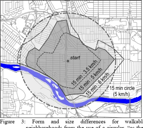
Test C - Next we compared circular neighbourhoods with
neighbourhoods generated using the pedestrian network. Figure 3 shows that differences in area between both approaches can be substantial. It is also apparent that accessible areas are dependent upon walking speed, and that a network approach does respect environmental constraints, Calgary’s Bow River in this case. A Welch two-sample t-test was conducted to compare the areas obtained for the 45 locations grouped by methodology: network based, versus “as-the-crow-flies.” The average accessible area for the network approach was 35.1 % of the circular approach, which is significantly lower, t = -32.5, 302.8 d.f., p << 0.001. This result suggests that it is very likely that circular neighbourhoods will tend to over estimate the accessible area given that the network approach more closely represents reality.
Test D - The distributions shown in Figure 2 give an indication
of differences between travel modes. However, it is important to note that the accessibility scores calculated for the transit-pedestrian approach can vary substantially throughout the day as the level of transit service varies over the day, and whether or not the request is made during the week, or on the weekend. A one-way between subjects ANOVA was conducted to compare the effect of travel methods (at 5 km/h) on the network-based accessibility score. There was a significant effect on the accessibility score at the p = 0.05 level, F(2, 132) = 37.5, p <<
0.001. Post hoc comparison using the Tukey HSD test indicated that the mean accessibility score for the pedestrian accessibility area (xˉ = 30.3, s = 22.3) was significantly lower than the transit-pedestrian (xˉ = 42.4, s = 24.4) accessibility score and the cycling accessibility area (xˉ = 66.6, s = 11.8) . Taken together, these results suggest that travel mode does have an effect on accessibility scores. Specifically, our results suggest that, cycling in Calgary will allow a user to access a greater number of attractors, or services, than either transit or walking will.
Figure 3: Form and size differences for walkable neighbourhoods from the use of a circular, “as-the-crow-flies” approach.
Test E - As described in Sandalack & Nicolai (2006) the City of Calgary consists of three general neighbourhood typologies that have evolved chronologically to form rings around the city’s central core. The first neighbourhood type, the inner city, typology I, was built prior to World War II and includes a grid street pattern that offers high levels of pedestrian connectivity, permeability, and route choice. The second neighbourhood type, typology II, was constructed post World War II through to the late 1970’s, and consists of a warped-grid street pattern with crescents and curved roads. The final neighbourhood type, typology III, has been built since the 1980s, and includes high-volume collector roads, a curvilinear ‘loops and lollipops’ road pattern, and strips of auto-oriented commercial land (i.e., convenience stores and services). The descriptors, inner, middle, and outer neighbourhoods are used to refer to typologies I, II, and III, respectively.
A one-way between subjects ANOVA was conducted to compare the effect of urban built form on the transit-pedestrian accessibility score, where build form was controlled for inner, middle, and outer neighbourhoods. There was a significant effect on the accessibility score at the p = 0.05 level for the three urban structure typologies, F(2, 42) = 22.5, p << 0.001. Post hoc comparison using the Tukey HSD test indicated that the mean accessibility score for outer suburbs (xˉ = 20.9, s = 19.3) is significantly lower than the mean accessibility scores for middle neighbourhoods (xˉ = 42.8, s = 20.4) and the inner city (xˉ = 63.4, s = 10.5). The average accessibility score for middle neighbourhoods was also significantly lower than the inner neighbourhoods average score. Taken together, these results suggest that built form does have an effect on accessibility scores. Specifically, our results suggest that, given the data, grid-like street patterns with higher population densities tend to support more services, as has been reported by Calthorpe (2011) and others.
6. CONCLUSIONS
We have developed and implemented an online tool to evaluate urban accessibility that we call WalkYourPlace. It is different from existing online tools such as WalkScore.com or Walkometrics.com, in that it allows a user to evaluate accessibility using a range of travel modes that include walking, cycling, transit use, and combinations of these modes. For citizens, the online tool should be helpful, as it allows them to assess “quality of life” indicators for a particular location, or neighbourhood. Similarly, for city planners, the use of the tool may help to gain insights about quality of life across a jurisdiction, and the effect of existing land use zoning conditions on accessibility. As outlined, the tool also allows the evaluation of accessibility via transit. Hence, transit planners may find the tool useful to evaluate effects of different transit schedules as one approach for identifying schedules that could increase ridership. Our future work will follow these broad paths, insofar as we aim to use the system as an analytic tool to evaluate transit schedule influences, and to simulate the effect of changes to land use zoning for urban neighbourhood planning.
ACKNOWLEDGEMENTS
We are thankful to the developers of OpenTripPlanner (OTP), in particular David Turner and Andrew Byrd, who answered our many questions on how to use OTP, and how best to implement changes to OTP. We are grateful for funding from the NEPTIS foundation and GEOIDE (Grant TSII 202).
REFERENCES
Alameh, N. 2003. Chaining Geographic Information Web Services. IEEE Internet Computing 7(5) (October): 22 – 29.
Barton, H., Grant, M., & Guise, R. 2010. Shaping
Neighbourhoods for Local Health and Global Sustainability. 2:
Routledge.
Benenson, I., Martens, K., & Rofé, Y. 2010. Measuring the Gap Between Car and Transit Accessibility. Transportation
Research Record 2144(1) (December 1): 28–35.
Calthorpe, P. 2011. Urbanism in the Age of Climate Change. Washington D.C.: Island Press.
Carr, L. J., Dunsiger, S. I., & Marcus, B. H. 2011. Validation of Walk Score for Estimating Access to Walkable Amenities.
British Journal of Sports Medicine 45(14) (November 1): 1144–
1148.
Congress for the New Urbanism. 2012. Transportation Tech
Sheet – Ped Sheds. CNU.
http://www.cnu.org/sites/www.cnu.org/files/CNU_Ped_Sheds.p df.
Davies, A. 2012. Walkonomics - How Walkable Is Your Street? - About. Walkonomics - How Walkable Is Your Street?
http://www.walkonomics.com/w/index.php/about.
Delling, D. 2009. Engineering and Augmenting Route Planning Algorithms. PhD thesis, Universität Karlsruhe (TH), Fakultät für Informatik. http://d-nb.info/1013721748/34.
Doi, K., Kii, M., & Nakanishi, H. 2008. An Integrated Evaluation Method of Accessibility, Quality of Life, and Social Interaction. Environment and Planning B: Planning and Design
35(6): 1098–1116.
Duncan, D. T., Aldstadt, J., Whalen, J., & Melly, S. J. 2012. Validation of Walk Scores and Transit Scores for Estimating Neighborhood Walkability and Transit Availability: a Small-area Analysis. GeoJournal: 1–10.
Grosso, E. 2012. Concave Hull Based on JTS. . http://www.rotefabrik.free.fr/concave_hull/.
Haklay, M., & Weber, P. 2008. OpenStreetMap: User-Generated Street Maps. IEEE Pervasive Computing 7(4) (December): 12 –18.
Harris, M. 2012. Neighborhood ‘walkability’ a Big Deal Now, Even Though It’s Tricky to Measure. BlogMinnPost. http://www.minnpost.com/cityscape/2012/08/neighborhood- %E2%80%98walkability%E2%80%99-big-deal-now-even-though-it%E2%80%99s-tricky-measure.
Hunter, A. J. S., Steiniger, S., Sandalack, B. A., Liang, S. H. L., Kattan, L., Shalaby, A. S., Alaniz Uribe, F., Bliss-Taylor, C. A. M., & Martinson, R. 2012. PlanYourPlace – A geospatial infrastructure for sustainable community planning. Revue
Internationale de Géomatique 22(2): 223–253.
Leslie, E., Coffee, N., Frank, L., Owen, N., Bauman, A., & Hugo, G. 2007. Walkability of Local Communities: Using Geographic Information Systems to Objectively Assess Relevant Environmental Attributes. Health & Place 13(1) (March): 111–122.
Lo, R. H. 2009. Walkability: What Is It? Journal of Urbanism:
International Research on Placemaking and Urban
Sustainability 2(2): 145–166.
Manaugh, K., & El-Geneidy, A. 2011. Validating Walkability Indices: How Do Different Households Respond to the Walkability of Their Neighborhood? Transportation Research
Part D: Transport and Environment 16(4) (June): 309–315.
Mandow, L., & Perez de la Cruz, J. L. 2010. Multiobjective A* Search with Consistent Heuristics. Journal of the ACM 57(5): 27.
Miller, R. G. 1981. Simultaneous Statistical Inference. 2nd ed. New York: McGraw-Hill.
NAR. 2011. 2011 Community Preference Survey. National Association of Realtors. http://www.realtor.org/reports/2011-community-preference-survey.
Palmer, K. 2012. Young Home Buyers Seek ‘Walkability’.
StarTribune, September 21, sec. Home + Garden.
http://www.startribune.com/lifestyle/homegarden/164822116.ht ml.
Sandalack, B. A., & Nicolai, A. 2006. The Calgary Project:
Urban Form/urban Life. Calgary: University of Calgary Press.
WalkScore. 2011. Walk Score Methodology. WalkScore. http://www2.walkscore.com/pdf/WalkScoreMethodology.pdf. International Archives of the Photogrammetry, Remote Sensing and Spatial Information Sciences,