•Reduceyourcode’sbandwidthtoachievespeedandcostsavings •Targetmultipledevicesfromthesamepage
•GetyourHTML5contenttogracefullydegradeonolderbrowsers •Createadvancedapplications,suchasanimations,withalightfootprint •MakeHTML5’ssemanticmarkupworkforyou
strikesabalancebetweenimpartingbest-practiceinfor-
For your convenience Apress has placed some of the front
matter material after the index. Please use the Bookmarks
Contents at a Glance
Foreword ...xiii
About the Authors...xiv
About the Technical Reviewer ...xv
Acknowledgments ...xvi
Part 1: Introduction ...1
Chapter 1: Introduction ...3
Part 2: Performance Basics ...7
Chapter 2: Development Principles ...9
Chapter 3: Performance Guidelines ...21
Chapter 4: Responsive Web Design ...37
Chapter 5: Understanding the Web Reuse Pattern ...51
Part 3: Building a Web Site ...65
Chapter 6: Page Template ...67
Chapter 7: Navigation ...81
Chapter 8: Masthead ...107
Chapter 9: Footer ...115
Chapter 10: Fractal Design Patterns ...131
Chapter 11: Link Control ...141
Chapter 12: Sidebox Control ...155
Chapter 13: Button Control ...165
Chapter 14: Price Control ...181
Chapter 15: Product Control ...193
Chapter 16: Table Control ...205
Chapter 17: Tab Control ...223
Chapter 18: Form Controls ...247
■ ■ ■
P A R T 1
Introduction
This book deals with creating high-performance web sites. Its focus is large and high-volume sites. We met while working for a company whose web site has upwards of 50,000 pages and gets more than 80,000,000 visitors a month (many more during the holiday shopping season). The advice the book gives, however, applies equally to smaller sites, sites that don’t get nearly as much traffic. Regardless of the site’s complexity or traffic load, everyone wants good performance, after all.
We discuss three kinds of performance in the book:
• client-side (that is, browser) performance • server-side and network performance • developer performance
As this list implies, we cover how to get the best possible page load times, how to limit HTTP requests and bandwidth usage as much as possible, and how developers can reuse content. In the book’s last two-thirds, we detail a system whereby developers can create reusable components and then use them to build pages. That technique is our ultimate lesson in how to boost developer performance. While we address making reusable components and building pages from them, we continue to focus on providing advice and techniques, supported by code samples, for maximizing client-side and server-side performance.
Along the way, we offer techniques for solving some of the trickier web development problems, such as fashioning tabs that can be individually addressed and leaders that always render correctly. We also show how to create visual interest with CSS, through the use of some lesser-known CSS selectors, including the :before and :after pseudo-selectors.
■ ■ ■
Introduction
Not long ago, while interviewing candidates for job openings, we discovered some appreciable knowledge gaps in the performance and scalability areas among our fellow developers. While many developers were fully versed in their server-side language of choice, they seemed to have no more than an anecdotal level of learning in HTML5 and CSS3. (By “anecdotal level,” we mean they’d seen examples of HTML5 and CSS3—or perhaps had read a synopsis of the new aspects of HTML5—and drew conclusions from those patterns but missed some of the deeper meaning behind them.) In other words, we found a lot of people who could tell us how to do something but not why they’d want to do that something. More importantly, they didn’t know how their favored techniques could make code perform better or reduce the time it took them to get work done. Seeing in this situation a great opportunity to help fellow developers elevate their front-end game, we decided to write this book.
The two of us met while working for a Fortune 50 company second only to Amazon in e-commerce business. In other words, we got to see what did and didn’t work at the high end of the scale. In addition, we were on a team tasked with writing a framework to be used across the company’s site, a site consisting of tens of thousands of pages. Also, we were starting from scratch during a conversion to MVC. So while our code had to perform extremely well for each visitor (to the tune of 80 million visitors a month), it also had to be efficient enough to meet the needs of many teams across the company— literally dozens of client teams.
The things we hope to pass on in this book derive from the lessons learned in that endeavor and from the unique perspective our experience provided: a deeper understanding of HTML5/CSS3 performance and, hopefully, some game-changing patterns that will elevate your front-end skills to the next level. We’d like to think we might even see a paradigm shift in web development, at least for large and complex sites.
A Live Site with Working Code Examples
In order to get the concepts and techniques we cover in this book across to as many readers as possible, we created a live site that has the working code examples shown in the book, as well as a responsive
CHAPTER 1 ■INTRODUCTION
What to Expect
Let’s be very clear about what this book is and isn’t. “HTML5” is such a loaded term that it can be misleading, especially when it’s in a book title. The term can mean a wide variety of things above and beyond its technical meaning, which is just a particular (and as of 2012, the latest) version of HTML. It is also used to describe any number of new technologies being introduced by browser makers: support for CSS3, native audio and video, Canvas, WebSockets, App Cache, Local Storage, Index Databases, File API, and Geolocation, among others.
While all of these things are exciting and well worth getting to know, this book focuses on the following areas:
• Delivering extremely high performance HTML5 (in the sense of the latest version of HTML), CSS3, and JavaScript; the JavaScript cover mostly provides a fallback for browsers that don’t support HTML5 and CSS3.
• Showing you new patterns and tricks to add to your cookbook, patterns and tricks that answer a lot of e-commerce and generic site needs in a way that delivers a great experience to your visitors and makes your job as a front-end developer more enjoyable and efficient;
• Integrating server-side logic into truly powerful and versatile front-end results. • Giving you a unique perspective on developing front-end code that maximizes what
each technology has to offer and cleanly separates concerns so your code scales well and has longevity.
Defining High Performance
We’ve defined four areas to focus on when it comes to performance. We started with the traditional definition of performance as it relates to page load, but then we found more performance gains, leading to the following kinds of performance:
• page-load times • browser performance • network performance • developer performance
Page-Load Times
Most people associate web site performance with page-load times. That’s a reasonable perspective, since slow page loads generate frustration and increased bounce rates (visitors leaving the site). Also, with Google now offering page rank based in part on page load time, you’ve got all the incentive you need to pay attention to this definition of performance.
Browser Performance
Modern browsers really focus on performance. From faster JavaScript engines to optimized parsing algorithms to complex animations handled by CSS—it’s a whole new ball game out there. As a result, if you’re code isn’t optimized to take advantage of these advances, you could be missing out on some significant performance gains.
Network Performance
CHAPTER 1 ■INTRODUCTION
Developer Performance
We think we speak for most developers when we say we don’t like continually rewriting a bunch of similar code and, worse, having to maintain it month after month and year after year. In that spirit, we share techniques and approaches that let you reuse code in a surprising number of circumstances. At their heart is the concept of starting with clean, flexible HTML5 as a content container and then leveraging CSS for what it does best, visual presentation of that content.
We also share approaches to segregating code for maximum reuse and a minimum of name clashing. Not only does this approach help if you’re the only developer, but it really shines if you’re on a team of people working on a site.
Besides making for a less repetitive and so happier day, the resulting performance yields a great bonus: the time saved and reduction of code used to express a wide variety of presentation goals let you gold-plate (i.e., optimize, make more robust and bulletproof, and otherwise improve) your code. This is often the step that gets missed in high-demand work environments. We all tell ourselves we’ll come back later and really optimize our code, but we rarely get the opportunity.
As we point out later in the book in talking about the button control, it may seem like a lot of extra code for a button, until you realize you’ll never have to make another button—ever.
Responsive/Adaptive Design
We also cover responsive/adaptive design techniques. This is the idea of your site adapting or responding to different devices (smart phones, tablets, etc.). We include these techniques in a book about performance to introduce the “one code base” concept. Instead of writing one site for a smart phone and another for a tablet, you write your code once and have it adapt. This is a big developer performance gain, both for the first version and for subsequent maintenance.
Grid Systems
CSS grid systems are all the rage these days and for good reason: A grid system can save a lot of time and many headaches. We give you the lowdown on grid systems and show you how to use one to reduce the CSS you’ll need and how it can be fully leveraged, in conjunction with responsive design, to really speed up development and make your pages more consistent and less error-prone.
A Deeper Understanding of CSS
We hope that, by the end of this book, you’ll have a deeper and clearer idea of what CSS does and why. We present some advanced techniques; you might be surprised by the power they give you. We also show you ways to take advantage of modern CSS techniques while adapting gracefully to older browsers. As
■ ■ ■
Performance Basics
This section of the book addresses our development methodology, how to boost page-load times (client-side performance), our use of Responsive Web Design, and the web reuse pattern. Basically, we’re setting context so that the rest of the book makes sense.
We cover how separation of concerns is useful to front-end developers, why we embrace progressive enhancement, and why we think you should embrace it, too. We also cover how a browser loads a web page, because it’s hard to talk about client-side performance without understanding how browsers render pages.
Then we cover basic performance guidelines that apply to all pages. As already mentioned, we cover how to improve page-load times and, to a lesser extent, how to minimize strain on the network by using as little bandwidth as possible. We also address why page-load time matters. Then we discuss each of the individual guidelines, including the long pole in the tent: reducing HTTP requests. If we succeed in teaching nothing else, we hope at least to show you how to limit fetching things from the server.
Next, we address Ethan Mercotte’s excellent technique: Responsive Web Design. We discuss how to use media queries, flexible images, and flexible grids to create pages that look good on almost any device. In addition to simply resizing elements and images, we add content as displays get larger.
Note that we don’t advocate taking away content as displays get smaller; rather, we embrace the Mobile First paradigm and start with the smallest device we intend to support. Embracing progressive enhancement involves giving visitors with better devices a better presentation. We want you to think in terms of adding to a minimal (but still good) presentation rather than subtracting from a complete presentation.
■ ■ ■
CHAPTER 2
Development Principles
Having found a few principles to be helpful, we use them repeatedly throughout the book (and throughout our work outside the book, of course). These principles underlie everything we’re going to say in the book. Consequently, we thought we should delineate them here, before we move on to the chapters that deal with more specific topics. The following sections show the design and development principles that we embrace:
• Code for Modern Browser Performance • Use CSS to Manage Boundaries • Embrace Progressive Enhancement • Embrace Separation of Concerns
These principles let us achieve the best possible performance for the people who visit our sites, for ourselves, and for our colleagues when we work on large development teams. Some of these principles (especially using CSS to manage boundaries) also let us avoid some of the biggest cross-browser headaches.
Code for Modern Browser Performance
If you want to be a performance ninja, you must understand how browsers work (at least in broad strokes). Only then can you know where the bottlenecks are and optimize around them. Figure 2-1 shows a
First, the HTML gets parsed into a DOM Tree, a.k.a. Document Object Model (DOM). That’s one reason why the first thing a browser does when it encounters a page is download the page’s HTML content. The other reason is that the HTML contains the references to all the other resources (style sheets, scripts, images, and so on) that define the page. Then a second tree is created by combining the DOM and the style rules (which are generated from CSS, both supplied by you and those native to the browser) into a Render Tree (or in Firefox a Frame Tree). From this Render Tree, the browser starts displaying or painting your elements onto the screen. This painting starts in the upper left and flows left to right and top to bottom.
You can gain performance in two ways:
• Reduce the number of elements in the HTML. • Limit redrawing.
Reduce the Number of Elements in the HTML
By reducing the number of HTML elements (which have to be first parsed into the DOM and then later into the Render Tree), you can let the browser more quickly get to the Display endpoint (shown in Figure 2-1). The easiest way to reduce HTML elements is not to use them to achieve style goals and to use the smallest amount of HTML you need to reach those design goals.
Remember the principle of Separation of Concerns, which we’ll cover in detail later in this chapter. Let HTML contain content, and let CSS contain presentation. Doing so increases client-side performance and, with its being easier to maintain, developer performance.
Limit Redrawing
While reducing the number of elements in your HTML helps, limiting the number of times that a browser has to redraw (or repaint, as the operation is sometimes known) an element is often a bigger help. Web developers force redrawing to happen by changing the DOM or changing the styles of elements that have already been displayed.
The performance cost of a change depends on the scope of the change. Modern browsers are designed to repaint only what is necessary. So while making a change to an element’s position or inserting a new element can cause an extensive redraw (because it affects sibling elements), a style change to a background color causes a redraw of only that element (and its child elements).
You should consider two issues when making changes to the DOM or restyling elements. The first issue is the depth of the change within the DOM. The deeper in the DOM tree, the more isolated the change; so you should make your changes as far down the tree as possible. The second and more important issue is that, if you’re going to make several changes to the DOM, make them all at once rather than one at a time. Because of that second issue, CSS can be your best friend when modifying the DOM.
For example, if you wanted to change an element’s width, background color, and text color on a double-click, you might use JavaScript similar to that shown in Listing 2-1.
Listing 2-1. JavaScript That Creates Multiple Redraw Events
<a href="javascript:;" id="example">I'm an Example</a> <script>
var example = document.getElementById("example"); example.ondblclick = function() {
example.style.backgroundColor = "red"; example.style.width = "200px";
CHAPTER 2 ■ DEVELOPMENT PRINCIPLES
</script>
In this example, we’re setting the styles for the element one at a time. First, the script sets the background color to red (forcing a redraw), then sets the width to 200px (forcing a second redraw), and then sets the text color to white (forcing a third redraw). And while you could certainly still use JavaScript in a number of ways to combine those style changes into one call, the easier and more maintainable way is to use JavaScript to set a CSS class that includes all those properties. Doing so combines all the style changes into one redraw. Listing 2-2 shows an example of restyling that forces only one redraw to happen.
Listing 2-2. JavaScript That Creates a Single Redraw Event
<style>
<a href="javascript:;" id="example">I'm an Example</a> <script>
var example = document.getElementById("example"); example.ondblclick = function() {
example.className = "dblClick"; }
</script>
Finally, you should put CSS (including references to external style sheets) in the head element and put scripts at the bottom of the body element. Because the browser can start to render elements before it has completely parsed the HTML, putting CSS in the head ensures those elements are styled correctly. More importantly for performance, you don’t want elements to have to be redrawn because you put a style declaration after the element it rendered. Also, it’s a bad visual effect to see items shifting about
unintentionally. Also, because browsers have to evaluate JavaScript files, putting them at the beginning of the HTML can delay rendering of your visual elements and give the visitor the perception of a slower page load.
We’ll cover putting CSS at the top and putting JavaScript at the bottom in the next chapter. We’ll also talk about some other ways to avoid redraw events in the next chapter.
Use CSS to Manage Boundaries
As we’ll discuss in greater detail later in this chapter in the section entitled “It’s All Just Boxes”, a browser renders a web page as a series of boxes, and those boxes often contain other boxes. Consequently, we can say that a browser’s natural rendering model is boxes within boxes. Knowing that, it’s wise to arrange your layout to work with rather than against the box-within-a-box rendering model that browsers implement.
To make the most of this box-within-a-box implementation, the good thing to do is arrange each element or group of elements such that it is fully contained within a box. Conversely, the bad thing to do is have things sticking out of your boxes. We’ll illustrate both the good and the bad practice with an example.
Listing 2-3 shows the HTML that provides the content for this article stack.
Listing 2-3. The HTML Behind Our Article Stack
<article class="browserArticle">
<h1 class="subTitle accentColor1">Chrome's Evil Twin Brother</h1> <span class="evilChromeLogo"></span>
<p>The logo is darker because they couldn't make it look right with a goatee.</p>
</article>
Listing 2-4 shows a set of CSS rules that would create a box and place all the content within the box with the relationships we want to have.
Listing 2-4. CSS to Put Our Article Stack in a Box
.browserArticle {
/* We set the position: relative so the absolutely positioned element within uses this box to position itself */
position: relative; width: 200px; padding-left: 48px;
/* We set a minimum height in case there's not enough content to make the box big enough to house the image. We use the height of the image plus 3 for the top offset. */ min-height: 39px;
}
.subTitle {
font-size: 18px; }
.evilChromeLogo {
background: url(images/evilChromeLogo.png) no-repeat 0 0; height: 36px;
width: 38px; position: absolute; left: 0;
top: 3px; z-index: 1; }
CHAPTER 2 ■DEVELOPMENT PRINCIPLES
.accentColor1 {
color: #1C70AD; }
The key style in Listing 2-2 is the .browserArticle rule. It specifies a width of 200 pixels and no height, giving us a box 200 pixels wide that will extend to the height of its content. It also specifies a left padding value of 48 pixels. We’ll use that 48 pixels as the place to put our image. The .evilChromeLogo rule, in addition to specifying the background image and its height and width, uses the position: absolute rule and the left: 0 rule to put the image on the box’s left margin. In this fashion, we’ve created a box that contains all of its content within its boundaries. That way, we don’t have to think about what might happen to any content that goes outside the boundaries, because that never happens.
Now let’s look at one wrong way to create the same layout. We’re still using the HTML in Listing 2-3 as our source of content. Listing 2-5 shows one variety of poor practice for laying out our article stack.
Listing 2-5. Flawed CSS for Our Article Stack
.browserArticle {
position: relative; width: 200px; margin-left: 48px;
/* Removed paddingleft setting */ }
background: url(images/evilChromeLogo.png) no-repeat 0 0; height: 36px;
Most of this listing is identical to Listing 2-4. We’ve highlighted the changes in bold. We’re still creating a 200-pixel-wide box, putting our text in the box, and putting the image to the left of the text. The
The trouble is that a margin is outside the box of the element that defines the margin. Padding is within the box of the element that defines the padding. Consequently, while both of these rulesets work on modern browsers, the ruleset in Listing 2-5 is more likely to encounter inconsistencies on older browsers. As we discuss in the next section, “Embrace Progressive Enhancement,” you don’t want to give any visitors a bad experience, even if they are using archaic software.
We also find that it’s more natural (Mike says, “It just feels right”) to define the box for the entire article stack and then set “left: 0" to put the image on the left margin. The intent of the code is clearer, and the code is more maintainable than the negative offset approach.
This example illustrates our belief that markup should
• Express its intent clearly (that is, embrace Meaningful Markup), which helps the people we work with know what we’re doing.
• Work for as many browsers as possible, which saves the trouble of writing and maintaining additional cross-browser code.
• Be easy to create and maintain, which empowers both ourselves and our team members later in the code’s life cycle.
• Be modular, which enables reuse.
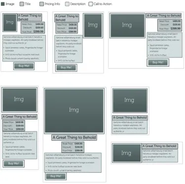
We should explain the reuse goal a bit more. If you write code that can be independent of context, it can be reused, because it’s not bound to any given setting. Consider the example of a Buy button. It’s an interface element with a particular purpose (enabling a purchase), but it might appear in a number of different contexts (such as a product details page, a product listing page, and a special offers page). Making that Buy button modular lets us plunk it down anywhere we want a Buy button without having to tinker with it in each place. Also, because we’re not doing any funky tricks with boundaries, any given module is more likely to play nice in different situations. We have found that reaching for reuse lets us get a lot done in a hurry, once we take the time to set up the code for reuse in the first place.
It’s not always easy to identify places where your code has wandered away from these goals. The trick is to watch for anything that makes neighboring boxes overlap, including negative offsets to the left or positive offsets to the right.
Embrace Progressive Enhancement
Progressive enhancement is the practice of having a base design of your site that’s acceptable on all browsers and then adding enhancements for increasingly modern browsers (that is, progressively). Starting with CSS/HTML fundamentals lets us have a site that works on all browsers and gives us the opportunity to enhance it greatly with HTML5 features for browsers that support those features. Listing 2-6 shows an HTML element that forms the basis for a simple example.
Listing 2-6. An HTML Element for a Simple Example of Progressive Enhancement
<div class="someClass"></div>
Listing 2-7 shows the CSS (which illustrates the progressive enhancement) to style the div element shown in Listing 2-6.
Listing 2-7. The CSS to Style Listing 2-6 via Progressive Enhancement
CHAPTER 2 ■DEVELOPMENT PRINCIPLES
width: 100px; height: 100px;
background-color: #2067f5;
background-image: -webkit-gradient(linear, left top, left bottom, from(#2067f5), to(#154096)); background-image: -webkit-linear-gradient(top, #2067f5, #154096);
background-image: -moz-linear-gradient(top, #2067f5, #154096); background-image: -ms-linear-gradient(top, #2067f5, #154096); background-image: -o-linear-gradient(top, #2067f5, #154096); background-image: linear-gradient(to bottom, #2067f5, #154096); }
Here we have a div that will make a 100 × 100 pixel box. The background of that div now has some progressive enhancements in the CSS. Every browser can understand the first background declaration: background-color: #2067f5. Now if your site’s visitors happen to view this code on a browser that understands one of the next six declarations, they would see not only a blue box but one with a nice gradient to it. In essence, everyone gets a blue box, but some visitors get a nicer blue box.
A number of tools exist to help with creating the various browser-specific settings. One that we use is http://css3please.com
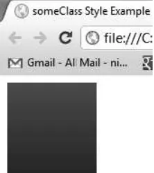
Figure 2-3 shows the result of the someClass style in the Chrome browser.
Figure 2-3. The someClass Style example in chrome
As you can see, it makes a gradient from a medium shade of blue down to a darker shade of blue.
Using Feature Detection to Drive Progressive Enhancement
With HTML5, never has progressive enhancement been more pronounced. Browsers that support HTML5 provide a great deal of functionality that we can use for very little overhead because they’re native to the browser. With HTML5, rather than send JavaScript Files to the browser, we simply specify new markup options and CSS3 and have the browser do the fancy work for us. However, for the time being, a lot of the great functionality of HTML5 will instead have to be done with scripts on older browsers so that we can get the same functionality on all browsers, whether they support HTML5 or not.
property it doesn’t understand. Thus, we can put in CSS3 progressive enhancements, and IE8 (for example) will ignore them (see Listing 2-7).
Before we talk more about feature detection, let’s consider a common alternative. Many sites try to detect which browser each visitor uses and present a page optimized for that browser. Let’s say, for example, that we detect a visitor using IE8 and offer some non-HTML5 alternative functionality. While workable in theory, this approach turns out to be a huge burden in practice. As browsers and versions proliferate, maintaining a version of a site quickly becomes very expensive. Adding yet more overhead, browsers like Chrome and Firefox have been versioning quickly, and, in the case of Chrome, auto-updating. So tying code to a specific version of a browser becomes even more unmanageable. Worse still, sites that try this strategy soon find that the developers do nothing but maintain all those browser-specific versions and never embrace new technologies that can create a better visitor experience and ultimately a more profitable web site. And none of the preceding addresses the issue of spoofing the User Agent, which further complicates the picture.
Consequently, we strongly recommend using feature detection rather than browser-specific versions of your web site. That way, you can detect whether the features you need are available and, if so, use them or, if not, present an attractive alternative to that visitor. Since few sites use every available feature, you can focus on just the few features you need, which makes for much more maintainable code and ensures that each visitor sees an attractive web site.
At the time of writing, we believed the best way to implement feature detection was to use the Modernizr open-source library. You can find the Modernizr project at http://www.modernizr.com/ and download it from http://www.modernizr.com/download/
Modernizr works by testing whether a feature is available using JavaScript; it then adds a class to the body tag either noting it’s available or not available (that is, the class canvas or no-canvas is added). You can also check its availability with JavaScript (that is, if(Modernizr.canvas){ do something }). However, each one of the tests it runs has a performance cost; while it’s very slight, each test still takes time. So another great thing about Modernizr is that you can choose just those features you want to detect when you download the Modernizr script files. For example, if you know your web site doesn’t use the canvas element, you can uncheck the canvas options.
For more information on using Modernizr, consult the Modernizr documentation at http:// modernizr.com/docs
Embrace Separation of Concerns
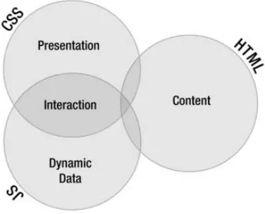
As we mentioned in Chapter 1, one kind of performance to consider is developer performance. Provided they won’t make the experience worse for site visitors, things you can do to improve the performance of the web developers often more than pay for the time needed to adopt a new methodology. Embracing separation of concerns is one of those things. Those familiar with MVC will have heard “separation of concerns” quite often, but the expression’s roots go back to 1974.1 If you haven’t heard about the idea before, it’s separating functions into logical areas so they’re less fragile and easier to understand. Indeed, we assert not only that separation of concerns in web development leads to code that is less fragile and easier to understand but that it also increases browser performance because separating out style to CSS is faster than using HTML or JavaScript to control the appearance. In the front end, HTML, CSS, and JavaScript constitute the critical trio.
In times past it was common to use an overlapping combination of HTML, CSS, and JavaScript as a solution to any problem—a technique lovingly (or not so lovingly) called DHTML. Figure 2-4 shows this overly interwoven relationship.
CHAPTER 2 ■DEVELOPMENT PRINCIPLES
Before web developers began to embrace separation of concerns, we’d use HTML tables as design elements, use JavaScript to generate large portions of the HTML, and otherwise do whatever seemed useful at the time. This approach was so pragmatic in character that it was only maintainable if the page had been written within the previous month or so; otherwise, we wouldn’t be able to remember how it worked and would have to figure out the code all over again.
A more logical and maintainable approach is to let each part of the trio do what it does best. And while the three must overlap each other, it’s possible (and definitely desirable) to have them overlap in a way that makes reading and maintaining code much easier and faster. Figure 2-5 shows this better relationship of the three concerns.
Figure 2-4. Overly interwoven web development concerns
Figure 2-5. A better separation of concerns
HTML
CSS
CSS is the master of presentation. For presentation purposes, CSS offers the best performance, especially if you’re mindful of using the correct selectors (which we’ll get to in Chapter 3). In addition to the existing benefits of CSS, CSS3 lets you reduce your dependency on images to assist in presentation of rounded corners, drop shadows, complex gradients, and other effects. You can also leverage SVG in your CSS to create some stunning effects. CSS3 also lets us create a great deal of interaction without reaching for JavaScript or other technologies that would normally handle menu fly-outs or other animation effects in your website. And while you still need to use JavaScript with browsers that don’t support CSS3 for the animation, you can use feature detection to only use that JavaScript when necessary. As Figure 2-4 shows, CSS can lessen the dependency on JavaScript to define interaction.
JavaScript
JavaScript is the king of dynamic data. For one thing, it’s the crucial part of AJAX. It overlaps HTML, because it can feed HTML into the browser (usually generated from a database interaction). Formerly also the king of interaction, JavaScript now has a new partner in the fight for user input, namely CSS (as noted in the preceding paragraph). In addition to being able to offload a lot of mouse interaction functionality, including hovers and clicks, CSS can also handle animation functionality, which used to be the exclusive purview of JavaScript.
Let’s consider an example of interaction: making the text appear when visitors hover over the title or the icon. Figure 2-6 shows the initial state (before the user moves the mouse over the title or the icon).
Figure 2-6. Interaction example initial state
When visitors hover over the title or icon, the description appears when the mouse slides down, as shown in Figure 2-7.
Figure 2-7. Interaction example during the interaction
CHAPTER 2 ■DEVELOPMENT PRINCIPLES
Listing 2-8. CSS for slide-out animation
.browserArticle {
position: relative; width: 200px; height: 45px; padding-left: 48px; overflow:hidden;
-webkit-transition: all 0.5s ease-in-out;
-moz-transition: all 0.5s ease-in-out;
-ms-transition: all 0.5s ease-in-out;
-o-transition: all 0.5s ease-in-out;
transition: all 0.5s ease-in-out; }
.browserArticle:hover {
height: 110px; }
.subTitle {
font-size: 18px; margin-top:0; }
.evilChromeLogo {
background: url(images/evilChromeLogo.png) no-repeat 0 0; height: 36px;
width: 38px; position: absolute; left: 0;
top: 3px; }
.accentColor1 {
color: #1C70AD; }
.description:hover {
Whenever possible, we prefer to offload interaction functionality to CSS because browsers can use their native code to handle it, which enables better performance. Also, getting the same functionality from CSS often requires less code than the JavaScript equivalent.
Summary
In this chapter, we’ve covered some helpful information for improving performance—for the people who visit our sites, for ourselves, and for our teammates. In particular, we looked at
• How a browser loads a web page.
• How to use CSS to keep areas of a page from trampling each other and to reduce cross-browser nastiness.
• How to use progressive enhancement to provide every visitor with a good experience.
• How to use the concept of separation of concerns to make our code easier to develop and maintain.
We’re certain that as you use these techniques, you’ll find your own ways to further refine them and match them to your working model, just as we have done. We hope that once you’ve done so, they’ll provide you with the same powerful benefits that they’ve given us.
■ ■ ■
CHAPTER 3
Performance Guidelines
Our experience and research have let us create a set of performance guidelines that we keep in mind when working on web sites. As it happens, we find that our guidelines mostly match those of Yahoo and Google and other companies that do best-in-breed web development.
With one exception, we believe these rules can make any web site better. They may help high-content, high-traffic sites more than sites with less content and traffic, but even personal web sites benefit from good performance. The exception in these guidelines is the use of a Content Delivery Network (CDN). A CDN makes sense if you have enough content and traffic to make it economically viable and doesn’t make sense otherwise.
■
Note
None of the rules presented in this chapter are specific to HTML5 or CSS3 or any other particular
technology. However, in a book about performance, we would be remiss in not presenting this information.
Why Page Load Time Matters
In addition to wanting to provide the best possible experience for the people who visit their sites and desiring simply to do the best work they can, web developers have another very good reason to concern themselves with page load times. In April 2010, Google started including how quickly a page loads as a factor in its search rankings.1 Pages that don’t rank high attract fewer customers to those web sites, and sales suffer accordingly. WebSiteOptimization.com pulled together the results of a number of studies and came to the following conclusion:
Google found that moving from a 10-result page loading in 0.4 seconds to a 30-result
page loading in 0.9 seconds decreased traffic and ad revenues by 20% (Linden 2006).
When the home page of Google Maps was reduced from 100KB to 70–80KB, traffic went
up 10% in the first week, and an additional 25% in the following three weeks (Farber
2006). Tests at Amazon revealed similar results: every 100 ms increase in load time of
Amazon.com decreased sales by 1% (Kohavi and Longbotham 2007).
WebSiteOptimization.com
2http://googlewebmastercentral.blogspot.com/2010/04/using-site-speed-in-web-search-In our minds, a 1% drop in sales for every 100 milliseconds is a huge impact. Clearly, page load time must be a key concern for web developers.
The Guidelines
Each of the following sections describes a particular guideline (in order of impact on page load time):
• Make Fewer HTTP Requests
• Use a Content Delivery Network (CDN) • Avoid Empty src or href Attributes • Add Expires Headers
• Compress Components with GZIP • Put CSS at the Top
• Put JavaScript at the Bottom • Avoid CSS Expressions • Remove Unused CSS • Minify JavaScript and CSS • Minimize Redrawing
Make Fewer HTTP Requests
Making fewer HTTP Requests is the shining star in the constellation of performance guidelines. It’s a complex topic, so we’ve split it into the following individual bits of performance guidance:
• Understand Parallel Connections • Combine Resource Files
• Use Image Sprites
Understand Parallel Connections
CHAPTER 3 ■PERFORMANCE GUIDELINES
The browser-side restriction that developers often fail to consider is how many resources a browser can load at a time. The HTTP 1.1 specification says, “A single-user client SHOULD NOT maintain more than 2 connections with any server or proxy.” In recent years, most browsers have exceeded this
suggestion. Many browsers currently support four parallel connections, while a few support six. IE8 varies its connections by the client’s bandwidth, from two connections for a dial-up connection to six
connections for a broadband connection.
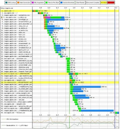
Nothing brings a point home like an illustration, so let’s consider an example. Figure 3-2 shows the loading of apple.com (through http://www.webpagetest.org/).
Notice that the HTML loaded in 327 milliseconds. In other words, the text content of a page comes down very quickly. Then notice that the other files (mostly images from images.apple.com) arrived in groups. That grouping pattern is the direct result of the number of parallel connections the browser can open. It’s a bit like a railroad marshaling yard. At a busy yard, there are a lot of trains but only a few outbound tracks. Consequently, the dispatchers have to send the trains in groups rather than all at once. Large web sites have the same problem.
CHAPTER 3 ■PERFORMANCE GUIDELINES
You can put resources into multiple hosts (such as www.apple.com and images.apple.com, in the example shown in Figure 3-2.) However, that practice improves performance only up to a point, as the cost of additional DNS lookups leads to rapidly diminishing returns.
Combine Resource Files
The result of the parallel connection problem is that bigger files are better files. We know that sounds like wild heresy to some developers, but it’s true. For a long time, we worked to make resources smaller. We remember the days of 1200-baud modems and dial-up connections, when watching the images come in was a sort of progress bar for the page. However, times have changed, and the vast majority of people have fast Internet connections. With our modern infrastructure, any given file isn’t likely to strangle the browser. Consequently, fewer big files are better than more small files. Going back to our marshaling yard example, if we can put more cars on each train, we can get more goods down the same tracks. (As an aside, railroads have long sought to get more cars per train. Jay is a bit of a railroad historian, among his other hobbies.) The same holds true for files and parallel connections.
Also, each HTTP request has at least some overhead, both in time and in bandwidth. Consequently, if you can combine your resources such that you need fewer HTTP requests to render a page, you gain that much more rendering speed for the site’s visitor.
The sum of all these considerations is that you should combine your content into fewer files. If possible, combine multiple CSS style sheets into a single file and multiple JS files into a single file. When different pages use different CSS and JS files, combining them such that each page gets a single CSS file and a single JS file can be an issue. However, you can solve that issue by using a build script that runs each time you modify your CSS and JS files. Such a build script would determine the files used by each page, create the required unique files, and add the needed link elements to each page. Dynamic content can still benefit from such a build system if the dynamic pages share a common set of CSS and JS files.
Another strategy is to combine the CSS and JS files on the fly when you deliver the page. Given that this step will require processing, it won’t be as fast as using prebuilt files. If your web site is complex enough, though, it may still be a better choice than using many separate files.
Finally, another strategy is to deliver a CSS file that’s common to all pages and then, as your visitors hit each page, deliver another CSS file specific to that page. Given that mastheads and footers and other large areas often remain the same from page to page, this strategy can make for easier maintenance and still provide a great deal of benefit, both for the company serving up the page and for the site’s visitors. The company saves the bandwidth and other overhead of delivering the contents of the common CSS file over and over, and the visitors get better performance. For very large sites, this final strategy often represents a good compromise between maintainability and performance.
Use Image Sprites
Image sprites are really just combined image files. They offer a handy way to achieve the goal of combining small files into larger files and delivering content more quickly over the browser’s relatively low number of parallel connections.
Most sites use a collection of images across the site’s pages. One way to reduce HTTP requests is to put all those common images into a single image (an image sprite). Then, every time you need one of those images, you refer to the sprite and specify a set of coordinates within the sprite. So put all your logos, custom bullets, navigation hints, and other common image collateral in a single image and use that image across all your pages.
company’s logo is red and gray, the firm’s marketing people may have created a bunch of images that use the company color scheme for navigation and other purposes. In that case, you might gain substantial size savings by having a file for those images and restricting the color range to red and gray.
If you have lots of common image collateral, you may need more than one image sprite, even if you don’t separate by color range. Also, if different parts of your company maintain separate parts of the common image collateral (perhaps one group maintains the navigation images while another maintains the logos), you may want to have separate files.
One of the questions that came up (from our technical reviewer, Jeff Johnson) while we were writing this chapter was, when is a sprite file so large that it should be split? It’s a good question, because there’s definitely a point at which one big file is more of a problem than two smaller files. However, that point varies because of a number of factors, such as how many other HTTP requests a client requires to fully load your site, whether the site uses a CDN, and even which browser a visitor uses. Consequently, we can’t give a hard and fast answer. We can only tell you that, if you think your page load times might benefit from splitting large sprite files into smaller sprite files or combining smaller files into larger files, establish some metrics and a way to monitor those metrics, and then try them. As with a lot of other things in web development, there’s not a single best way. Often, we have to test to find the answer that works for a given situation.
As a rule of thumb and a good starting point, though, holding down HTTP requests trumps other concerns. Consequently, if you can, combine all those commonly used images into just a few images. Ideally, get them into a single image. Then use offsets to display the right part of the image. Figure 3-3 shows a sprite from google.com.
Figure 3-3. Sprite from Google.com
To use this sprite, we created a div that uses a class and then defined the matching CSS class, which specifies the details of the image we want. Listing 3-1 shows the div element.
Listing 3-1. A div for an Image from a Sprite
CHAPTER 3 ■PERFORMANCE GUIDELINES
Listing 3-2 shows the CSS class.
Listing 3-2. CSS for a Sprite
. arrowPrev {
width: 22px; height: 25px;
background-image: url(googlesprite.png); background-position: -6px -13px;
background-repeat: no-repeat; }
The CSS specifies the sprite, the width and height of the viewport that contains the image within the sprite, and the starting point (the actual offset) of the image. It also specifies that the image should not repeat.
The result is the previous arrow, as shown in Figure 3-4.
Figure 3-4. Result of using a sprite
Another great benefit of sprites is that loading just one image from a sprite puts the entire sprite into the browser’s cache. Because every subsequent use of the sprite doesn’t need to fetch an image, many HTTP connections can be saved. In the example from Google, this one sprite, with its 60 smaller images, can save as many as 60 HTTP connections. That’s an enormous performance gain.
You can find a number of different web sites that can you help you work with sprite files. In the past, we have used http://www.spritecow.com and http://www.spritebox.net
Use a Content Delivery Network (CDN)
A content delivery network has many servers strategically placed to create a web that covers the world. So someone in Austin or in Paris who visits your site has a short hop to get to its assets. The catch is these files don’t change easily, so you should use them only for assets that don’t change much—assets such as images, fonts, JavaScript libraries, Media, and so on. Putting all that static content close to the user can really speed up performance.Conversely, content that has to be dynamic should usually be served from a single location. Even for large companies, the effort required to sync database transactions across geographically separated servers is rarely worth the effort. The timing issues alone often give network engineers fits. So most web businesses should keep purchases, logins, and other data-dependent transactions at a single location.
■
Note
If a content delivery network won’t help you, then it’s not really the second-best performance tip. We left it
here, though, because, if you do need one, a CDN is second only to lowering the number of HTTP requests in
boosting page-load performance.
Avoid Empty src or href Attributes
The pattern that we’ve seen is to create an img element with an empty src attribute and then dynamically assign the value of the src attribute during page load with JavaScript. The trouble with this is that elements always get evaluated before scripts get run (especially if you put your scripts after everything else, as we recommend later in this chapter). Consequently, the browser tries to evaluate that empty attribute and creates an HTTP request to do so.
A similar pattern and problem appears for href attributes, usually in anchor elements. Sometimes, developers want to use an anchor element as a trigger for a JavaScript-based interaction. The trouble is that, if the href attribute is blank, the browser sends an HTTP request to the server when the user triggers the interaction. That doesn’t affect page load time, but it does create needless traffic on the servers, wasting bandwidth and potentially slowing delivery for all visitors. The simple fix for this problem is to set the value of the href attribute to a JavaScript command that does nothing. Listing 3-3 shows an example of this fix.
Listing 3-3. Fixing an Empty href Attribute
<a href="javascript:;" class="triggerName">Trigger</a>
However, just using an empty JavaScript command is not the best solution. A better one is to provide a description (which appears in the status bar when the user hovers over the link) and block the href from being evaluated. Listing 3-4 shows how to do it.
Listing 3-4. Creating a Descriptive href Attribute
<a href="#Something_Descriptive" id="triggerName">Trigger</a> <script>
$("#triggerName").click(function(e){
e.preventDefault(); //This cancels the link capability and doesn't call the href.
// The rest of your code })
</script>
Now the site’s visitors get a hint before committing to doing something, and href isn’t creating a wasteful HTTP request.
We should point out that our approach to this problem differs when we have a separate presentation for visitors who have turned off or otherwise have no access to JavaScript. In those cases, we use an actual link.
CHAPTER 3 ■PERFORMANCE GUIDELINES
Of course, you also want to write to your log files every time you catch an empty attribute. If you get a lot of them, you definitely want to find out why it happens and fix it.
Add Expires Headers
You should add an Expires header to all your static components (images, stylesheets, scripts, flash, PDF, and so on). Adding an Expires header with a date far in the future lets your static content be cached by browsers. Listing 3-5 shows a typical Expires header.
Listing 3-5. A Typical Expires Header
Expires: Wed, 1 Jan 2020 00:00:00 GMT
Consequently, when those visitors return, their browsers won’t have to fetch the static content for subsequent visits and they’ll have a much faster loading time. Of course, adding Expires headers does nothing for first-time visitors or people who clear their cache between visits. On the other hand, it doesn’t do them any harm and it does benefit at least some visitors. In fact, since people tend to visit the same sites over and over, it may improve the experience for most visitors.
The downside to setting Expires headers far in the future is that you have to rename the files on which you set the Expires headers. Returning visitors will have cached your assets, and you want them to have your updated assets. Consequently, you’ll need a versioning scheme of some sort. One interesting way to do this is to incorporate a datestamp into your file names. For example, your base style sheet might be named base20120303.css. The interesting thing about adding datestamps to files is that you can instantly see the history of changes in your version control system. If you feel that adding datestamps makes the file names too long, you can use a simple version number that indicates the number of times the file has been revised. For example, if you have revised your base style sheet 13 times, it might be named base13.css.
For a good example of how to set the Expires header, look at the htaccess file from http://www. html5boilerplate.com (which we use in Chapter 6, too).
Compress Components with GZIP
The HTTP/1.1 specification introduced the Accept-Encoding header, which can indicate that the content in the HTTP request is compressed. Such a header appears in Listing 3-6.
Listing 3-6. An Accept-Encoding Header
Accept-Encoding: gzip, deflate
As you can see, that header specifies two kinds of compression. GZIP is more common, because it is the most effective compression scheme available. According to Yahoo’s “Best Practices for Speeding Up Your Web Site” page, GZIP reduces the size of a response by about 70%.3 A study by an engineer at Intel4
revealed savings of as much as 90% for some file types (text scored highest), but Yahoo’s 70% is probably a better average for all file types.
The one problem with compression is that there are still a few browsers (and, more rarely, proxies) that mishandle it. For that reason, you need to add a Vary field to the header, so that those browsers and proxies can negotiate for uncompressed content. Adding the Vary field to the header is done with an instruction in the header, as shown in Listing 3-7.
Listing 3-7. Adding a Vary Field to a Header
Header set Vary *
■
Note
Depending on the web server, how you set headers and the fields in them varies tremendously. What
we’ve shown is the output that needs to appear in the HTTP header rather than any particular set of code for
setting it.
You should compress any content that’s textual by nature. That means you should compress your HTML, CSS, scripts, XML, JSON, and anything else that’s really just text. Images and PDF files should not be compressed, as compression should be part of their storage format. If someone did make an
uncompressed image or PDF file (it’s possible, at least for PDF), the remedy is to fix the file, not to compress that kind of content.
The reason you don’t want to compress images and PDF files is that they can actually get bigger when you compress them. The compression engine can’t actually make the resource smaller, but because it still has to add its own control codes, the file gets larger. Consequently, you shouldn’t compress everything.
Put CSS at the Top
If your page contains style information, put that information at the top (in the head element). To avoid redrawing, many web browsers won’t start rendering a page until the browser has all the style information. Consequently, if your style information is at the bottom of the page, these browsers load everything before starting to render anything. Your poor site visitors sit there looking at a white screen for a long time, and, as a consequence, many will find somewhere else to visit.
Large sites and slow connections exacerbate the problem. The more content a page has, the more imperative it becomes that style information come before content. There are still some people using dial-up, and we ought to do what we can to make their web experience as pleasant as possible. Also, many people (including the authors of this book) do a fair bit of web surfing on mobile devices, and many places still have relatively slow performance for mobile connections. We certainly don’t want to lose the business of mobile visitors, so we need to let them see at least some content while the rest of the content loads. Consequently, we want to put CSS at the top of the page.
Interestingly, the fact that many browsers load all the style information before rendering anything also argues for combining a page’s external CSS into a single file. Fetching multiple files over the network is naturally slower than fetching a single file. Since we want the user to see at least something as quickly as possible, we ideally want just one fetching of the style content.
Put JavaScript at the Bottom
Scripts block parallel downloads. In other words, when the browser is downloading a script, it’s not downloading anything else. If your scripts are at the top of the page, you’ve blocked the ability to show the user part of the page while the rest of the page loads.
CHAPTER 3 ■ PERFORMANCE GUIDELINES
not all browsers honor the DEFER attribute. The second is that the contract for using the DEFER attribute is that any script with that attribute does not use document.write. Consequently, you can’t use the DEFER attribute with scripts that do use document.write. (Later in this chapter, when we talk about why rearranging the DOM isn’t a good idea, we’ll see why avoiding document.write is a good idea.)
By putting all your scripts at the end (just before the body element’s closing tag), you’ve in essence deferred script loading until the end and so handily avoided the problem of blocked parallel downloads altogether. Also, you won’t have to rely on a Ready event to ensure that elements are available, because all of your elements will be ready before any of your scripts run.
Avoid CSS Expressions
Internet Explorer supported CSS expressions for versions 5, 6, and 7. Other browsers never supported them.
A CSS expression lets a style be dynamically set when the page is loaded. Listing 3-8 shows a CSS expression (from Microsoft’s Dynamic Properties web page).
Listing 3-8. A CSS Expression
object.style.left=(document.body.clientWidth/2) - (object.offsetWidth/2);
That expression tries to center an element. You can achieve the same effect with the CSS shown in Listing 3-9.
Listing 3-9. A Replacement for a CSS Expression
.center {
margin-left: auto; margin-right: auto; width: 200px; }
When minified (which we’ll get to later in this chapter), the regular CSS is shorter than the CSS expression, so there’s not much point to this particular CSS expression.
The downside to CSS expressions is that they generally get evaluated far more often than their authors intend. Ideally, they would be evaluated only when the page is rendered (including when the page is refreshed). However, they are often reevaluated when the user scrolls up and down the page or just moves the mouse around. Many users (we’ve heard numbers in the 80% range)5 “look with their mouse”, which
means that wherever on the page their eyes go, their mouse follows. Imagine how much mouse movement that is if someone is reading an article. Because CSS expressions are reevaluated when the mouse moves, the expression may be evaluated thousands of times (we’ve seen references to tens of thousands) while the page is in the browser. That’s really going to strangle performance for the poor site visitor.
Remove Unused CSS
In most browsers (so far as we know, all of them, in fact), the browser’s styling engine evaluates the CSS rules to find a match for each element. In doing so, it has to work through all the CSS rules. Consequently, if a style sheet has any unused rules, it’s causing more work for the styling engine for no gain. Removing
unused rules also makes the CSS file smaller, which allows the browser to more quickly fetch it and saves bandwidth.
It can be tempting to make a single stylesheet for an entire site and use it even when some pages don’t use all the rules in the stylesheet. However, doing so is usually a mistake because those pages won’t load as quickly as they will if the unneeded rules aren’t present.
Of the existing solutions for this problem, our favorite is to make a stylesheet that contains rulesets common to all pages and then have other stylesheets for each area (or even page) on the site. For example, all pages might include a style sheet called all.css or base.css, while the pages related to buying a product might include an additional stylesheet called product.css or buy.css.
Another solution is to make a separate stylesheet for each unique combination of CSS rules used by your site’s pages. Depending on your development environment, you may be able to create these files with a build or other server-side script. Given that most large web sites create pages dynamically, the system that creates the pages needs logic to determine which style sheet to use.
Still another solution is to build style sheets dynamically as pages are requested. The downside to that is the additional processing required on the server side and the need to generate the same file names such that the stylesheets can be cached by browsers.
Finally, a developer can make a style sheet for each unique combination of CSS rules by hand and remember when to use each one. However, anything that relies on human memory is so unreliable that we’d rather take the performance hit of using the same stylesheet for every page.
Minify JavaScript and CSS
“Minifying” is removing all nonfunctional characters from source code. With JavaScript and CSS, you should remove all whitespace (including newline characters) whose removal won’t break the code, all block delimiters that won’t break the code, and all comments. In other words, ruthlessly strip any character that doesn’t absolutely have to be present to make the code work. Minifying code makes for faster loading and lower bandwidth usage.
We prefer to use a minifying tool to do our minifying for us. Humans are prone to mistakes, either removing something that shouldn’t be removed or leaving in things that can be removed. Also, by using a tool, we can be as verbose as we like, including comments for our fellow developers and making the source files easy to read, and still trust that we’ll get good performance because of our minifying tool.
One final benefit of a minifying tool (it’s an optional setting in most minifiers) is being able to replace all the variable names with very short names and otherwise replace long things with short things, which i provides another substantial saving in file size. The downside is that the content is very difficult to understand—and much more error prone if a change is made to it in that state—after that kind of replacement. That’s OK, though, provided you are maintaining source files as verbose files and then minified only for each release or only when delivered to your site’s visitors.
We use Yahoo’s YUI Compressor to minify our CSS and JavaScript. You can get it at http://developer. yahoo.com/yui/compressor/.
To provide a fair-sized example, we’ve repeated Listing 2-2 in Listing 3-10.
Listing 3-10. An Example of “Chatty” CSS
.browserArticle {
/* We set the position: relative so the absolutely positioned element within uses this box to position itself */
CHAPTER 3 ■PERFORMANCE GUIDELINES
/* We set a minimum height in case there's not enough content to make the box big enough to house the image. We use the height of the image plus 3 for the top offset. */
min-height: 39px; }
.subTitle {
font-size: 18px; }
.evilChromeLogo {
background: url(images/evilChromeLogo.png) no-repeat 0 0; height: 36px;
width: 38px; position: absolute; left: 0;
top: 3px; z-index: 1; }
.accentColor1 {
color: #1C70AD; }
Listing 3-11 shows the same CSS snippet after it’s been minified.
Listing 3-11. An Example of Minified CSS
.browserArticle{position:relative;width:200px;padding-left:48px;min-height:39px}.subTitle{font-size:18px}.evilChromeLogo{background:url(images/evilChromeLogo.png) no-repeat 0 0;height:36px;wi dth:38px;position:absolute;left:0;top:3px;z-index:1}.accentColor1{color:#1C70AD}
Listing 3-10 has 678 bytes. Listing 3-11 has 341 bytes. That’s a saving of 337 bytes, or just about half. This example may be an extreme case, due to the presence of the large comments in the original. However, minifying is still a good idea, even when the savings are not as dramatic.
We’d like to thank the folks at http://freeformatter.com for creating an online implementation of the YUI compressor. It’s handy for a quick check of how something compresses, and we used it to make the sample shown in Listing 3-11.
Minimize Redrawing
• Use Tables Only for Tabular Content • Specify a Character Set
• Don’t Rearrange the DOM
Specify Dimensions for Images
You should specify dimensions for img elements. When a browser is creating its area tree, it sets aside an area for each element. If you don’t specify the dimensions of an img element, the browser is likely to guess wrong at first and then correct its mistake after it has downloaded the image. When it corrects its initial guess, it has to redraw the page to properly place the element. You can avoid that redraw by providing dimensions.
Use Tables Only for Tabular Content
Among the many other reasons to use tables only for content that is tabular in nature (rather than as a layout device) is that tables often force a redraw as the browser renders them. As browsers receive each row, they often try to progressively layout tables. When a row with content that requires different column widths or row heights appears, the previous rows have to be redrawn. That’s not usually too much trouble if the site developers have used table elements only for tabular content. However, when developers use tables (and especially tables within tables, as in many poorly coded sites), whole sections of the page can “jump” from one place to another as the page loads. That can be very jarring for visitors to the site.
Specify a Character Set
Most browsers (but not IE6, 7, and 8) buffer a portion of the page until they find the character-set definition. They do so because the character set is a big factor in rendering the page. A different character set can mean an entirely different appearance from what the browser would render with its default character set. Consequently, you can make most browsers start to show content to your site’s visitors more quickly—much more quickly than if you don’t—by specifying the character set as the first child of the head element within the HTML.
The only thing worse than not specifying a character set is specifying one so late in the HTML that the browser finds the character set definition after it has started rendering with its default character set. In those cases, unless the developer is lucky enough to have specified the same character set as the browser’s default set, the browser throws away its current rendering and begins to redraw the page.
Don’t Rearrange the DOM
Rearranging the DOM often forces the browser to redraw the page. Usually, the browser works out the DOM pretty quickly, as loading the HTML file is the first thing a browser does (though it may load other resources specified within the HTML file at the same time). Consequently, any script that adds elements to or removes elements from the DOM is likely to cause the browser to redraw at least part of the page. Also, moving an element within the DOM really amounts to removing it from one location and adding it another, which is even worse than just adding or removing elements.
CHAPTER 3 ■PERFORMANCE GUIDELINES
three redraw operations. Instead, create a string that contains the HTML for the list you want to insert, and then insert that string all at once. That way, you force just one redraw operation.
A similar principle applies to dynamically setting style on an element. Don’t set each style element in your JavaScript. Instead, create a class with all the necessary style information, and then set the class on the element. Again, you get one redraw operation rather than multiple redraw operations.
You really should avoid modifying the DOM at all. However, if you must (we’ve been forced into it, too, so we know it happens), do it in such a way that you’re not repeatedly forcing redraw operations.
Further Reading
Among the many sources of information about HTML and CSS performance optimization, we find the following to be the most useful:
• http://developer.yahoo.com/performance/rules.html
• http://code.google.com/speed/page-speed/docs/rendering.html
Summary
This chapter presented a number of things you can do to optimize page load times for visitors to your web sites. The following items are simple changes that you can make quickly (if you haven’t already):
• Put CSS in the head element.
• Put JavaScript below the body element. • Specify dimensions for images. • Specify a character set.
Of course, if you have a lot of pages, even simple changes can be a lot of work, just because of the repetition.
If you’re in a position to make larger, more systemic changes, try the following improvements (if you haven’t already made them):
• Make fewer HTTP requests by: • Combining your resource files.
• Using image sprites.
• Avoid empty src or href attributes. • Compress components with GZIP. • Avoid CSS expressions.