Ted Alspach
Group Product Manager, Illustration
Products, Adobe Systems, Inc.
Barbara Obermeier
Coauthor of
Photoshop 6 For Dummies
The fun and easy w
create great pro
fessional artwor
k — on a Mac
Illustrator
®
10
Get the scoop on
new visual effects
and
Web tools
A Reference
for the
Studying Advanced Typography
(Type 1,000,001)
In This Chapter
䊳Creating type on a path
䊳Making type flow within shapes
䊳Making type flow around shapes
䊳Linking text blocks together
䊳Changing the path, not the type
䊳Using type as a mask
䊳Turning type into paths
I
n this chapter, we describe how to get the most out of type and how to turn Illustrator from a glorified word-processor into an astounding type-modifying tool that can do just about anything to type, such as put it on irreg-ularly shaped paths, wrap it around objects, give it an irregular shape, and put objects in it — and that’s just for openers.Typing on a Path
Getting type to stick to a slippery slope
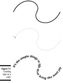
To place type on a path, such as the one shown in Figure 1-1, follow these steps:
1. Select the Pen or Pencil tool from the Toolbox. Using the Pen or Pencil tool, create the path on which you want to place your type.
For more information on creating paths, see Chapters 7 and 8.
Don’t be concerned with the fill and stroke of the path; they become invisible as soon as you type on the path.
2. Select the Path Type tool from the Toolbox.
The Path Type tool is hidden in the Type toolslot.
3. Click the path at the place where you want the text to begin.
A blinking insertion point appears at that juncture. Figure 1-1:
The text runs along the path while you type. When you’re done typing, select the regular Selection tool.
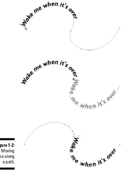
After the type appears, you can edit it just as you would edit regular type — with the exception that the type is stuck to your path. However, with the type attached to the path, you can move the type along the path in either direc-tion, as shown in Figure 1-2. Just follow these steps:
1. Using an arrow Selection tool, click the path that contains the path type.
An I-beam cursor appears at the left edge of the type.
2. Click the I-beam and drag it along the path.
The type moves while you drag. Figure 1-2:
3. Release the mouse button when the type is where you want it.
Be careful when you drag the I-beam cursor along the path. If you acciden-tally move the tip of your cursor below the path, the type flips upside down on the path. (As industry wags say of weird stuff that consistently happens onscreen, “That’s a feature, not a bug!” In this case, it isa feature, believe it or not.) Don’t panic; just move the cursor back above the path and watch while the type rights itself.
Press the Alt key (Option on a Mac) to duplicate text while you drag it along a path. Doing so duplicates both the type and the path. (Even though you don’t actually see the duplicated path, it’s there.)
In the next section, you find out how to use this technique to create type on both the top and bottom of a circle.
Solving the age-old type-on-a-circle
mystery
To place type on a circle, you simply click a circle (path) with the Path Type tool and begin typing. Putting text on both the top and the bottom of a circle (without half the text turning upside-down), however, isn’t as easy. All the type on a path must have the same orientation, which can be right-side up or upside down but not a mix of the two.
Read through the following steps to discover how to place type on the top of a circle (shown in Figure 1-3). Then read through the next set of steps to dis-cover how to put type on the bottom of the same circle (shown in Figure 1-4).
Here’s how to put type on the top of a circle:
1. Select the Ellipse tool (which looks like an oval) from the Toolbox to draw a circle. Press the Shift key while you draw to change the oval into a perfect circle.
Figure 1-3:
2. Select the Path Type tool from the Toolbox and click the top of the circle.
A blinking insertion point appears on the top of the circle.
3. Type your text.
Notice that the type starts to run down the right side of the circle. Don’t worry; it’s all part of the plan.
4. In the Paragraph palette, click the Align Center button.
You can find the Paragraph palette by choosing Window➪Type➪
Paragraph. The Align Center button is the second button from the left along the top row of buttons in the Paragraph palette. After you click the Align Center button, the text centers itself on the top of the circle.
Here’s how to put type in the bottom of a circle (see Figure 1-4):
1. Select the regular Selection tool from the Toolbox and then click the circle text that you created in the previous step list.
An I-beam cursor appears at the point where you click.
2. Press the Alt key (Option on a Mac), hold down the mouse button, and with the Selection tool drag the I-beam to the bottom of the circle.
Don’t release the mouse button until you move the cursor up into the circle just a bit.
Holding the Alt key (Option on a Mac) duplicates the text while you drag it. Doing so also duplicates the circle that the text is on — but because that circle is invisible, you won’t see it. Moving the cursor into the circle flips the type so that you can read it right-side up on the bottom and at the top of the circle.
Figure 1-4:
3. In the Character palette, click the down triangle of the Baseline Shift field until the type appears outside(below) the circle.
The Baseline Shift field is at the bottom left of the Character palette. If it isn’t visible, choose Show Options from the Character palette’s pop-up menu.
4. Select the Type tool from the Toolbox and then select the type at the bottom of the circle.
5. Type the text that you want to appear at the bottom of the circle.
In this set of steps, you actually create two separate circles with type on them. Because the circles overlap precisely, however, you get the illusion that the type is on just one circle. If you click and drag the circle with the
Selection tool, you drag away the circle with the text in the bottom, thus destroying the illusion.
Typing inside a Path
An interesting feature in Illustrator is the typographical capability to flow text within any shape. The shape acts as a container for the text, and the text fills the shape — matching it as closely as possible. For example, you can have a listing of the members of the California House of Representatives flow within a shape of the state of California.
To get text to flow within a specific shape, as shown in Figure 1-5, follow these steps:
1. Create a path by using the Pen, Pencil, or any of the basic shapes tools. (See Chapters 4, 7, and 8 for more on these tools.)
This works best with a closed path, but the one shape you shouldn’t flow text into is a rectangle because that’s identical to creating a text box (see Chapter 15), which defeats the purpose.
Figure 1-5:
3. Click the path through which you want type to flow. 4. Start typing.
While you type, text flows within the object.
For best results with text, make sure that you activate (click) Justify All Lines in the Paragraph palette. (See Chapter 15 for details.) This feature spreads lines of type evenly to the left and right edges of the path. In addition, use fairly small type because large letters usually can’t fill in the details of the path.
You can adjust the path of area type just as you do any other path by clicking and dragging a point with the Direct Selection tool (Chapter 6) or by using the Pencil tool (Chapter 8) to edit the path.
Typing around a Path
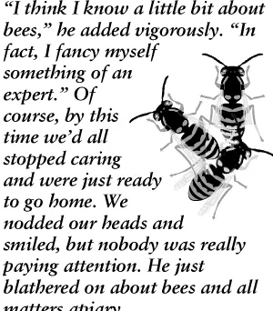
Typing around paths is sort of the opposite of typing within an area; type flows around the outside of a shape (or shapes) rather than within a shape. This technique is referred to as a text wrap or a type wrap. You don’t have a special tool for flowing type around paths, but you do have to choose a com-mand with both the type and the path selected. See how text flows around a shape in Figure 1-6.
Figure 1-6:
To flow text around the outside of a shape, follow these steps:
1. Create a text box by clicking and dragging with the Type tool. 2. Type text into the box until it’s full.
3. Create a path by using any of the Illustrator tools and place the path in front of the text.
You get the best results by using a closed path rather than an open one. You can use as many paths and text boxes as you want (We used three bees and one text box in Figure 1-6). All text wraps around all paths.
4. Choose the regular Selection tool from the Toolbox.
5. Select the text and the path by holding the Shift key while clicking each of them.
6. Choose Type➪Wrap➪Make.
The text flows around the shape.
The most important thing to do when you wrap text around a path is to make sure that the path is in front of the text. Typically, if you try to make text wrap around a path and the procedure doesn’t work, the shape is probably behind the text. If this happens, click the path with the Selection tool and choose Object➪Arrange➪Bring to Front, which moves the object in front of the text. Select the path and the text again and then choose Type➪Wrap➪
Make. To undo the wrap, choose Type➪Wrap➪Release.
You can use several shapes for the text to wrap around, or you can add a shape later by selecting the new shape with the Selection tool, along with the existing text and/or shape objects, and choosing Type➪Wrap➪Make.
Flowing Type from Path to Path
Any text that’s within a shape (area type or rectangle type) can be linked to other paths so that the text flows from one path to another. For instance, a story about a pesky fruit fly can start in a path in the shape of a banana and then continue automatically into normal rectangular columns of text. Whenever changes occur in the text within the banana shape, the text in the rectangle moves accordingly.
Adjusting the Path (Not the Type)
After you create path type, area type, wrapped type, or linked blocks of type, you may discover situations in which you want to change only the path and not the type. By default, if you select the path and the type together, you change only the type. So how can you change the path?
The secret to changing the path is to use the Direct Selection tool to select the path and then make your changes to the fill and stroke. Check out Figure 1-8 to see how you can alter the circle path (refer to Figure 1-4) by using dif-ferent fills and strokes on the circle to which the type is attached.
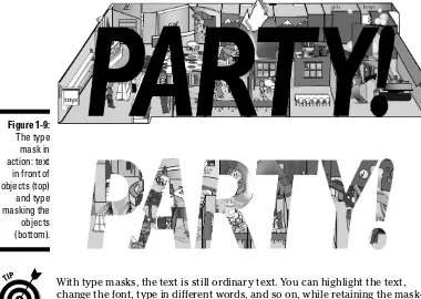
Using Type as a Mask
Illustrator enables you to do a remarkable number of things to your type, but some modifications seem forbidden. For example, if you try to fill type with a gradient (read through Chapter 5), the type just turns black. And what if you want to get really fancy and fill text with another piece of artwork that you create in Illustrator? There’s just no way you can do that!
Figure 1-8:
Circle type with a new fill (gradient) and stroke (pattern) on the circle.
Figure 1-7:
Or is there?
By using the Clipping Mask feature (read more about this in Chapter 10), you can create the appearance that text is being filled with a gradient, artwork, or anything that you can put the text in front of. And what can’t you put text in front of? Absolutely . . . nothing! (Say it again, y’all. . . .)
A clipping maskis a special feature of Illustrator: It uses the front-most object (called the clipping object) to hide the objects behind it in a unique way. Everything outside the clipping object is hidden, and the fill and the stroke of the clipping object become transparent, enabling you to see whatever’s behind and apparently filling the clipping object. A type maskis what you get when you use type as your clipping object. This may sound strange but will make a lot more sense after you create a type mask of your own.
Creating a type mask is simple. Here’s how:
1. Create the artwork you want to fill your type with.
This can be absolutely anything. The only catch is that it must be bigger than the type that you want to use as fill.
For example, if you want to fill your text with a gradient, you create a rectangle (or any other object, provided that it’s larger than your type) and fill it with a gradient (see Chapter 5), or create the artwork that you want to fill the type with. You can even use a pixel-based image, such as a scanned photograph of your loved one. The only stipulation is that whatever you fill the text with must be larger than the text. Think of the text as a cookie cutter and the object you’re filling the text with as cookie dough. You cut away everything outside the text.
2. Create type in front of whatever you want to fill the text with.
Create your type by using the ordinary Type tool. Using the Character palette (see Chapter 15), choose a font size large enough so that the type is almost (but not quite) as large as the artwork behind it. If you already created your type, select it with any selection tool and choose Object➪Arrange➪Bring to Front and drag it in front of your object.
3. Use any selection tool to select the text and the object or objects behind the text and then choose Object➪Clipping Mask➪Make.
To select multiple objects, just hold down the Shift key while clicking each of them with any selection tool.
With type masks, the text is still ordinary text. You can highlight the text, change the font, type in different words, and so on, while retaining the mask-ing properties.
Any time that you want to make the text stop masking out what’s behind it, select the text and choose Object➪Clipping Mask➪Release.
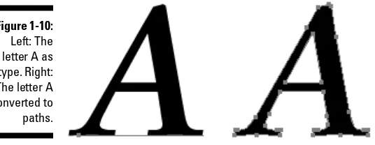
Converting Type to Paths
The type possibilities in Illustrator are nigh infinite. To make them truly infi-nite, you need take only one step — convert the type to paths. You gain absolute control over every point of every letter of every word of type.
Edit carefully and spell-check the text before you convert it. After you con-vert text to a path, you can’t edit it as type. You also can’t highlight it with the Type tool and retype it, change the font, or anything editorial like that. Figure 1-9:
You may want to make this conversion for the following reasons:
⻬To manipulate type like you do any other object in Illustrator:Type stops being type and becomes just another Illustrator path, at which point you can do absolutely anything to it that you can do to other paths.
⻬To bypass the need for the font files associated with the type: If you give someone a graphic file containing a type that isn’t installed on the recipient’s computer, the graphic won’t display or print properly if opened in Illustrator or placed into a page-layout program. Converting the type to paths creates a file that displays and prints exactly as you created it, regardless of the fonts installed on the recipient’s computer.
This action is also a good way to make sure that the text can’t be retyped. You should always convert text to paths for any logo that you send to other people, which helps guarantee that the logo will always look how you created it.
To convert type to paths, as shown in Figure 1-10, follow these steps:
1. Use the Selection tool to select the type that you want to convert to a path.
Okay, you’re altering type, so you should be able to do this by using the Type tool — but you can’t. This is just one of those little frustrations that have been around for years in Illustrator.
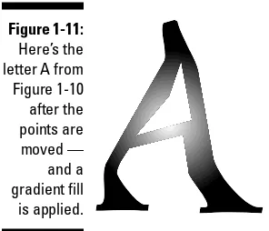
2. Choose Type➪Create Outlines.
All the points that make up the type suddenly appear, enabling you to edit the Type while you edit any other object in Illustrator (as shown in Figure 1-11). Why the name Create Outlines? Only some long-gone Adobe programmer knows for sure. A better name might be Create Paths from Text, which is what this command really does.
Figure 1-11:
Ten Tantalizing Techniques
In This Chapter
䊳Tackling three-dimensional (totally tubular) text
䊳Tracing a pixel-based image for good art fast (good fast art?)
䊳Lighting up a (virtual) neon glow around an image
䊳Applying Auto Trace to text for a funky, “ancient” look
䊳Stringing up your artwork and scattering 3-D pearls
䊳Cleaning up after Illustrator (facing the aftermath of creativity)
䊳Getting animated as text writes itself onscreen
䊳Dropping into the (perspective) shadows
䊳Ghosting part of an image to get visual interest and legibility
䊳Getting Illustrator to build a cube for you
I
n this book, we focus on individual tools and features of Illustrator — which is fine, as far as it goes. After you have a handle on using the tools and features by themselves, the next level of mastery is to combine them. In almost infinite ways, you can produce almost anything that you can visualize. To harness the true power of Illustrator, use all its different capabilities in a synergistic whole that surrounds us and binds the galaxy together . . . oops. Got a bit carried away there. Peruse this chapter to discover how to use mul-tiple features and functions to create some specific spectacular results.Making Text Three-Dimensional
1. Create your text.
Any text will do, but large, fat, sans-serif text works best. We use 100-point Antique Olive Black, as shown in Figure 2-1.
2. Select the text with the Selection tool and then choose Type➪Create Outlines.
As a first step in modifying your text to extremes, you have to turn it into paths.
3. In the Color palette ( Window➪Color), set the Fill to None and the Stroke to Black. Use the Stroke palette ( Window➪Stroke) to set the stroke to 1 point ( pt).
This handy trick makes the paths of the text easier to see and work with. See Chapter 5 for more information on Fills and Strokes.
4. Simplify the type.
Strategically delete path segments of the letters by clicking them with the Direct Selection tool and pressing the Delete key, one segment at a time. The goal here is to create letters that are single, continuous lines, as in Figure 2-2, where the inner-tube is gone.
Figure 2-2:
Convert the text to outlines, deleting path segments.
Figure 2-1:
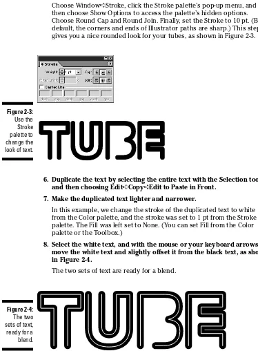
Choose Window➪Stroke, click the Stroke palette’s pop-up menu, and then choose Show Options to access the palette’s hidden options. Choose Round Cap and Round Join. Finally, set the Stroke to 10 pt. (By default, the corners and ends of Illustrator paths are sharp.) This step gives you a nice rounded look for your tubes, as shown in Figure 2-3.
6. Duplicate the text by selecting the entire text with the Selection tool and then choosing Edit➪Copy➪Edit to Paste in Front.
7. Make the duplicated text lighter and narrower.
In this example, we change the stroke of the duplicated text to white from the Color palette, and the stroke was set to 1 pt from the Stroke palette. The Fill was left set to None. (You can set Fill from the Color palette or the Toolbox.)
8. Select the white text, and with the mouse or your keyboard arrows, move the white text and slightly offset it from the black text, as shown in Figure 2-4.
The two sets of text are ready for a blend.
Figure 2-4:
The two sets of text, ready for a blend.
Figure 2-3:
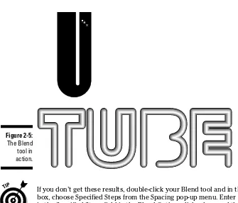
9. Select both sets of text with the Selection tool.
Click and drag with the Selection tool over all the text.
10. Select the Blend tool from the Toolbox and blend the two sets of text.
To blend the two sets of text, click an endpoint of any letter in the white text. Then click the same endpoint of the same letter in the black text. It may help to zoom way in on the two points by clicking and dragging over them with the Zoom tool. (See Chapter 1 for more on the Zoom tool and Chapter 10 for more on the Blend tool.)
When you’re in the proper position to make the first click with the Blend tool, a little multiply (x) sign appears to the lower right of the tool. (Look for this in the upper-right leg of the letter U in Figure 2-5.) When you’re in the proper position for the second click, a little plus (+) sign appears to the lower right of the Blend tool.
The two paths blend together in a series of subtle steps, creating the appearance of a gradient flowing along a path. Totally tubular! Check it out in Figure 2-5.
If you don’t get these results, double-click your Blend tool and in the dialog box, choose Specified Steps from the Spacing pop-up menu. Enter (type in) 10
in the Specified Steps field in the Blend Options dialog box, and then click OK.
Figure 2-5:
Tracing Hastily
Tracing pixel-based images is one of the most common uses of Illustrator. By using a digital image as a guide and taking full advantage of the Layers palette and its arcane powers, you can create decent artwork with great ease. Just follow these steps:
1. Open a new Illustrator document.
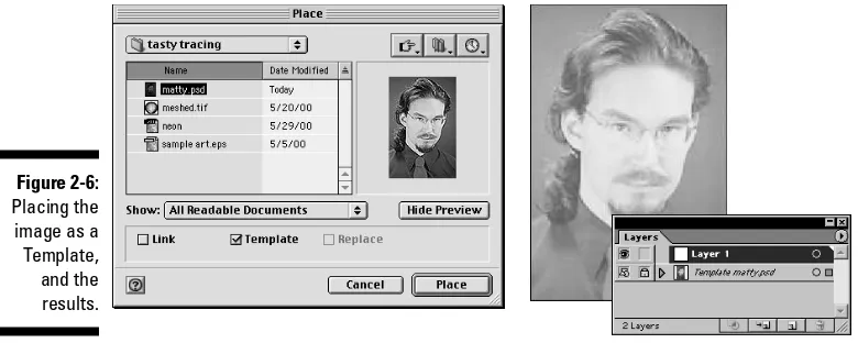
2. Choose File➪Place and select a pixel-based image.
Almost any image will do. Its visual resolution can be low (you don’t need anything higher than 72 pixels per inch, or ppi), out of focus, dirty, scratchy, or otherwise funky. Remember, the image is just a guide — you won’t be printing it. As long as you can tell what the image is, that’s good enough.
3. In the Place dialog box, select the Template check box.
Don’t worry about linking the original image; it’s destined for deletion after you trace it (insert villainous laugh here).
4. Click OK.
The image appears in a Template layer, locked out and faded by 50 per-cent, as shown in Figure 2-6.
5. If your Layers palette isn’t already open, choose Window➪Layers. Double-click the layer above the Template layer.
The Layer Options dialog box appears, enabling you to give the layer a name. For this example, name it Pencil Sketchand click OK.
Figure 2-6:
6. Double-click the Pencil tool to open the Pencil Tool Preferences dialog box and then clear the Edit Selected Paths option.
Whenever you trace, you probably want to draw a lot of pencil lines close together. By clearing the Edit Selected Paths option, you make this task a lot easier because you won’t be replacing your last line with the next line that you draw.
7. Change the Fill and Stroke color and the Stroke width to make seeing the lines you draw easier.
With the Pencil tool still selected, set the Fill color to None and the Stroke color to Black by using the Color palette. Set the stroke weight to 1 pt in the Stroke palette. By changing the Fill and Stroke before you start drawing, you ensure that each line has those Fill and Stroke values.
8. Using the image in the Template layer as a guide, trace the image in as much detail as you want.
See the results of our efforts in this specific example in Figure 2-7.
You can add color to your graphic by using the paths that you just cre-ated. The catch is that when you trace with the Pencil tool, the tendency is to make a whole lot of short, unconnected open path segments. They look great as lines, but when you try to fill them correctly with color, doing so is virtually impossible because you need long, closed paths.
Figure 2-7:
closed paths. To make the graphic as editable as possible, create color in one layer and keep your original pencil sketch safely hidden in a dif-ferent layer. The next step shows how.
9. Duplicate the Pencil Sketch layer.
In the Layers palette, drag the pencil sketch layer onto the Create New Layer button. This action creates a new layer with the same contents as the Pencil Sketch layer.
10. To avoid confusion, name the duplicate layer. Double-clicking this new layer opens the Layer Options dialog box, in which you name this layer Color; then click OK.
11. Click the View button in the Layers palette (the eye icon to the left of the layer name) for the Pencil Sketch layer to hide it.
Hiding the Pencil Sketch layer enables you to focus on coloring the image. After you hide the Pencil Sketch layer, you join your various lines to create closed paths around all the major shapes in the artwork. You then fill those paths with color later on.
12. Unite separate path segments into closed paths by using the Join command.
To use the Join command, select two points in separate paths by using the Direct Selection tool and then choose Object➪Path➪Join. This com-mand unites the endpoints of two separate paths into a single point, as shown in Figure 2-8. In this example (or for any image of a face), you can join the hair into one closed path, the face into another, the lips into another, and so on. You may need to add extra lines by using the Pencil tool in order to make your creation work, but you can close the majority of your paths with the Join command. Unfortunately, this command works on only two points at a time, so you need to repeat the Join com-mand several times to create each closed path.
To make sure it holds its color properly, choose a Fill color at any time to test your path.
13. After you create your closed paths, fill them with color by using the Swatches palette or the Color palette, as shown in Figure 2-9.
Figure 2-9:
The areas filled with color.
Figure 2-8:
In the Layers palette, click the Template layer. Drag it onto the Trash Can icon in the lower-right corner of the Layers palette. This removes the image you were tracing from the Illustrator document, reducing file size and giving you an unobscured vision of your artwork.
15. View and position the Pencil Sketch layer.
In the Layers palette, click the View button for the Pencil Sketch layer. Click and drag the Pencil Sketch layer above the Color layer. When a dark bar appears above the Color layer, release the mouse button. The pencil sketch is positioned over the colors.
The illustration is now 98 percent done. You may need to make a few minor tweaks, but because your pencil sketch and the colors are in separate layers, you can quickly and easily target the areas to change by hiding or locking layers. The final illustration, shown in Figure 2-10, may not be absolutely per-fect, but it took about 15 minutes to create! With a little practice, patience, and perseverance, you can create illustrations that put this one to shame!
Neon Glow
You can create a neon glow (the illusion that the graphic is made from neon lights) in many ways. This technique uses the Appearance palette to add mul-tiple strokes of different colors to a single path. The technique is especially cool because it’s a “live” effect and can be applied to the stroke of any
path — even to text! You can change the path or enter in new text, and the glow matches the changes! Best of all, even though it may be labor-intensive to create, you can save the effect as a Style to apply to other objects at any point in the future just by clicking in the Style palette.
For this technique, you need the Appearance palette, the Swatches palette, the Stroke palette, and the Styles palette. Find them all under the Window menu, open them, and you’re ready to rock. Just follow these steps:
1. Open a new document in Illustrator. 2. Create a piece of simple artwork.
In this example, we create a star by using the Star tool (see Chapter 4 for info on basic shapes), but this technique works equally well with text, path segments, or any other object.
3. Add additional strokes by using the Appearance palette.
Choose Window➪Appearance. From the Appearance palette’s pop-up menu, choose Add New Stroke. After you do this, you don’t see any dif-ference in the graphic itself (because the second stroke is identical to the first), but you see two strokes listed in the palette. Every object in Illustrator always starts with one stroke listed in the palette. You don’t need to worry about the color of the strokes at this point. You’re just adding the strokes so that you can modify them later. Repeat the Add New Stroke command until you have five strokes total listed in the Appearance palette (see Figure 2-11). With all these strokes, you’re ready to add color and change the width to neon-ize the text.
4. Turn the bottom stroke into a thick red stroke.
In the Appearance palette, click the second stroke from the bottom; set its stroke color to dark orange (by clicking any dark orange swatch in the Swatches palette), and then set the stroke weight to 20 pt in the Stroke palette.
This weight is the same as that of the bottom stroke; thus, this stroke totally hides the red stroke. (Don’t worry — we correct the problem shortly.)
6. Make the third stroke from the bottom light orange and narrower than the underlying strokes.
Click the third stroke from the bottom in the Appearance palette. Set the stroke color to light orange by clicking any light orange swatch in the Swatches palette. Set the stroke weight to 12 pt in the Stroke palette.
7. Make the second stroke from the top yellow and narrower than the underlying strokes.
Click the second stroke from the top in the Appearance palette. Set the stroke color to yellow by clicking a yellow swatch in the Swatches palette and set the stroke width to 8 pt in the Stroke palette.
8. Make the top stroke white and narrower than all the other strokes.
Click the top stroke in the Appearance palette. Set the stroke color to white by clicking the white swatch in the Swatches palette, and set the stroke weight to 2 pt in the Stroke palette.
Your Appearance palette should look something like Figure 2-12. At this point, your object should look halfway decent as a neon glow effect. You could use Steps 1–9 with very different colors to create striped text. This time, however, you complete the neon glow effect by softening the edges of the strokes by using the Gaussian Blur effect.
Figure 2-12:
9. Soften the edges to the white stroke by using the Gaussian Blur effect.
With the top stroke selected, choose Effect➪Blur➪Gaussian Blur. The Gaussian Blur dialog box opens. Set the Radius to 1.5 and click OK. The white stroke is blurred.
10. Soften the remaining strokes one-at-a-time exceptfor the bottom stroke.
Select the next stroke down by clicking it in the Appearance palette and applying the same Gaussian Blur effect that you applied to the white stroke (see Figure 2-13.)
Selecting the top menu item in the Effect menu (this is the name of the last Effect you applied) repeats the last Effect you used with the same settings.
Do notapply the effect to the bottom stroke. Remember, neon tubes glow, but they are still hard glass tubes!
The result is a neon stroke! Save this stroke and apply it anywhere you want. Click the New Style button in the Styles palette, create any text or path you want, and then click the style in the palette to apply the neon stroke, as shown in Figure 2-14.
Figure 2-14:
Save your neon stroke with the Styles palette.
Figure 2-13:
Ancient Type
One secret of top digital designers is to use the worst features of a program and make them work. This idea may seem illogical, but part of good design is to think of things that others don’t. Most people never waste time deliber-ately using the worstpart of a program! Well, you heard it here first: This technique for creating ancient-looking type combines the Auto Trace tool (arguably, one of Illustrator’s worst tools) with the Rasterize command (a command that you normally want to avoid) to create a happy accident! Just follow these steps:
1. Create some large text.
Any text will do, but fonts with big serifs, such as Adobe Garamond, work best, as shown in Figure 2-15. You also get better results if you use large text (60 pt or more).
Well, it’s a start — but the Auto Trace tool only works with pixel data. Before we can use the text, we need to convert it to pixels by using the Rasterize command. That’s next.
2. Select the text with the Selection tool and choose Object➪Rasterize.
The Rasterize dialog box appears. As shown in Figure 2-16, select a Resolution of 72 ppi, set the Background to White, and select the Art Optimized (Supersampling) for Anti-Aliasing. Leave the rest of the set-tings at their defaults and then click OK.
Your text converts automatically to pixels. (Pretty neat, eh?)
3. Choose the colors for the Auto Trace tool to use.
The Auto Trace tool detects only the shapes of what it traces — not the color — so you have to determine in advance what colors to use. Click the Auto Trace tool, set its Stroke to Black and its Fill to None. Because you do this before you start using the tool, the objects that the Auto Trace tool creates are set to these colors.
Figure 2-15:
Start big: 74 pt Adobe
4. Click the Auto Trace tool and trace the letters.
The Auto Trace tool creates paths around highly contrasting areas (such as between the black text and its white background). You have the best luck with this tool if you remember the following:
•To Auto Trace a solid letter (such as H or T), click anywhere in the dark area of the letter.
•To Auto Trace a letter with a hole in it(such as A, O, or P) first click the inside edge of the hole, where the dark meets the white. If you click the outside of the letter first, the whole thing fills in with black, hiding the inner hole!
By and large, the poor old Auto Trace tool isn’t very consistent. Whenever you click a dark solid, Auto Trace traces the whole thing properly; but to trace a white area, you have to click its edge. Don’t worry that the white holes fill with black when you Auto Trace them. You can take care of this later by using the Compound Path command.
5. After you trace all the letters, click the rasterized type with the Selection tool and delete it.
Not to worry; the project doesn’t use the rasterized type anyway (except as something to trace). It just gets in your way, so get rid of it!
You’re now ready to add the finishing touches by using the Compound Path command to poke holes in your text (in letters such as P, O, and B).
6. Click and drag over those letters (by using the Direct Selection tool), and then choose Object➪Compound Path➪Make.
Make sure that you select the hole and the main part of the letter. This makes the holes completely see-through, as any hole should be. Repeat this step for each letter, one letter at a time.
Sit back and admire the results, as shown in Figure 2-17.
Making Artwork on a (Shoe)String
You typically use the Scatter brush to scatter objects randomly along a path, but you can rein in all the settings to make this brush place objects in an orderly manner along a path, as though they were strung like beads on a necklace. Just follow these steps:
1. Create any object that you want to place along a path.
In this instance, we create a pearl to use to form a pearl necklace. To create the pearl, we use the Blend tool to blend two circles — a small white circle and a larger white circle (see Chapter 12 for details on the Blend tool). This technique gives you a little more control than the Gradient Fill and also creates a simpler object.
After you create the pearl using the Blend tool, you need to expand it by using the Object➪Expand command. Unfortunately, some artwork that you create in Illustrator is just too complex to be made into a brush. Artwork created by using the Blend tool just happens to be one of these objects. Fortunately, you can use the Expand command to simplify an object without changing its appearance. A blended object that has been expanded can be made into a brush. See Chapter 11 for more informa-tion on the Expand command.
2. Choose Window➪Brushes and click the New Brush button.
Before you can create a new Scatter brush, the artwork that you want to use in the new brush must be selected. If the artwork isn’t selected, the Scatter Brush option is grayed out in the New Brush dialog box.
3. In the New Brush dialog box that appears, choose New Scatter Brush and click OK.
The Scatter Brush Options dialog box appears.
4. Specify the settings for the new brush.
For this example, we set the Size and Spacing to 100% and set the Scatter and Rotation to 0% so that the artwork doesn’t change size or rotate when it’s applied to a path.
We also set Size, Spacing, Scatter, and Rotation to Fixed to make sure that the previous settings don’t change.
We set the Rotation Relative To option to Page. This setting makes the artwork keep the same rotation, no matter which way the path turns. Finally, we set the Colorization Method to Tints so that the color of the pearls matches the Stroke color, as shown in Figure 2-18.
Click OK and voilà — you have a new brush based on a blended object. (Is that sneaky or what?)
5. Test the new brush.
Choose the Paintbrush tool from the Toolbox and paint a loose loop, like a necklace. The result is a string of pearls, as Figure 2-19 lavishly depicts.
Figure 2-18:
Cleaning Up After Illustrator
Although the other techniques in this chapter are creative techniques, this one is not. This technique prevents the creation of unnecessarily large files and extra work. You can build a whole bunch of information into a file, but that bulk of information makes the file slower to copy and print and less stable. A few commands are all you need to make a streamlined file that has just the necessary information and none of the fat. This is especially impor-tant whenever you give your file to other people. Here are the steps:
1. With the finished document open, choose Object➪Path➪Cleanup.
The Cleanup dialog box appears, as shown in Figure 2-20, giving you the option of deleting stray points, unpainted objects, and empty text paths. Check all three options (if they aren’t already checked) and click OK. After you click OK, everything taking up file space that doesn’t appear in your document is deleted.
The invisible, unnecessary elements can contain fill, stroke, and text information, even though you don’t see them and they don’t print. Illustrator doesn’t know that; it leaves all that stuff in the document. Results: Great big files, long print times, and unprintable grumbling.
Figure 2-19:
2. Choose Window➪Brushes and click the tiny triangle in the upper-right corner of the Brushes palette.
3. In the resulting pop-up menu, choose Select All Unused and then click the Trash button in the lower-right corner of the Brushes palette.
All brushes in the palette, whether you use them or not, are embedded in the saved file. Deleting the unused brushes saves some space.
4. Choose Window➪Swatches and click the tiny triangle in the upper-right corner of the Swatches palette.
5. In the resulting pop-up menu, choose Select All Unused and then click the Trash button in the lower-right corner of the Swatches palette.
All swatches in the palette, whether you use them or not, get embedded in the saved file. Deleting the unused swatches saves some space.
6. Choose Window➪Styles and click the tiny triangle in the upper-right corner of the Styles palette.
7. In the resulting pop-up menu, choose Select All Unused and then click the Trash button in the lower-right corner of the Styles palette.
All styles in the palette, whether you use them or not, get embedded in the saved file. Deleting the unused styles saves space. And hassle. And your faithful authors from having to say it again.
Getting Animated
Writing about animation is a little bit like dancing about architecture. Animation makes a lot more sense if you can see it happening. Fortunately, animating from Illustrator is so straightforward and clear that you don’t have to see anything actually move until you put it in motion.
The basic principle in creating Illustrator animations is almost embarrass-ingly simple. Ever have one of those flipbooks of drawings that you can riffle to make the pictures move? Same thing. Whenever you export an Illustrator file in the Flash format, you can export each layer as a separate frame in a
play, the effect is as though you were clicking through the layers (showing the next one and hiding the previous one) really fast. Play begins at the bottom layer and goes upward in order to the top layer.
For a simple (but entertaining) example of this effect, the following steps demonstrate how to animate text to make it look as though it’s typing itself:
1. Create a new document in Illustrator. 2. Type some spontaneous foolishness.
For this example, we use Say what?so it will seem to be sayingitself.
3. Highlight each letter with the Type tool and give each one a different Fill color.
Take a gander at Figure 2-21 for the result. All our letters are gray here because we are very boring people (in fact, this whole book is printed in full color, but we just couldn’t bring ourselves to use any color that wasn’t a shade of gray). But feel free to make every letter a different, vivid color.
4. In the Layers palette, duplicate the layer by dragging it on top of the Create New Layer button.
The Create New Layer button is the second button from the right at the bottom of the Layers palette. We duplicated the layer eight times, once for each letter, plus one extra. The idea is to keep duplicating layers, as shown in Figure 2-22, until you create one more layer than the number of letters you have.
Figure 2-22:
Duplicating the Text layer.
Figure 2-21:
5. Hide all layers except for the second layer from the top by clicking the View button.
The View button (the eyeball icon) sits to the left of the layer name in the Layers palette.
6. Highlight the last letter in the text and press the Delete key.
In our case, we deleted the question mark.
7. Hide all layers except for the third layer from the top and delete the last two characters.
We got rid of the question mark and the letter t. Figure 2-23 adroitly demonstrates this sleight-of-hand.
8. Hide all layers except for the fourth layer from the top and delete the last three letters.
We exterminated the question mark, the letter t, and the last letter a.
9. Keep going down through the layers in this way, deleting one more letter each time until only one letter remains in the second layer from the bottom and the bottom layer is blank.
10. Show all the layers.
Hidden layers won’t export to the Flash file.
11. Choose File➪Export, and after the Export dialog box appears, select the Flash (SWF) format.
When you name your file, make sure that its name ends with the .SWF
extension. Flash files have a hard time playing when they don’t have that extension (even on a Mac).
12. Click Export.
13. In the Export As box at the top of this dialog box, choose AI Layers to SWF Frames.
Because this animation has few frames, use a slow frame rate, such as 3 frames per second (fps). For a more dynamic animation, create more layers and use a faster frame rate. Select the Generate HTML check box. Otherwise, leave the remaining settings as they are.
You can now integrate your SWF more easily by generating a file that includes HTML code. This will allow your SWF file to be viewed at the correct original size in the browser; otherwise, your file will fill the browser window. It also eliminates the need for further editing of code to integrate your file into your Web site.
14. Click OK.
15. Test your animation by opening it in your Web browser.
If the animation doesn’t play, you may not have the necessary Flash plug-in installed. Go to www.macromedia.comto find instructions on
downloading and installing the plug-in for your browser.
Perspective Shadows
Perspective shadows are among the most popular artistic techniques ever. They almost magically add depth to any illustration. Although we use text in this example, the technique works with any object. Illustrator has a built-in drop shadow filter, but it’s rather limited compared with what you can do on your own with little trouble. To create drop shadows, follow these steps:
Figure 2-24:
1. Create text or an object to which you want to apply a shadow. 2. Duplicate the text or object by copying it and choosing Edit➪Paste in
Front.
This command places the copy directly in front of the previous object.
3. Keep the copy selected and click the Free Transform tool in the Toolbox.
A control box appears around the text.
4. Click the top center control handle, drag it beneath the bottom of the text, and don’t release the mouse button.
5. Still holding down the mouse button, press and hold the Ctrl key (Windows) or Ô(Mac) and drag to the left. Release your mouse. With the Selection tool, reposition the shadow so that it touches the bottom of the original word.
By holding the Ctrl key (Windows) or Ô(Mac) while you drag the center handles of the Free Transform box, you can skew the selection. That’s the secret of creating a perspective drop shadow, as shown in Figure 2-25.
Granted, the shadow as shown is rather sharp. You can soften it by using a gradient — provided that you’re putting the shadow on anything other than text. Unfortunately, gradients can’t fill text. If you use text for this technique, we have to stick an extra step in here: Convert your text to paths by choosing Type➪Create Outlines. Then, apply the gradient, as shown in Figure 2-26.
Figure 2-26:
Apply the White, Black gradient to the shadow.
Figure 2-25:
option in the Swatches palette.
Wait a minute — that doesn’t look quite right. You need to set the direc-tion of the gradient.
7. To set the gradient’s direction, choose the Gradient tool, click at the bottom of the shadow, and then drag to where the shadow meets the text.
Finally, the shadow is all set! Figure 2-27 tells the tale.
Haunted by a Ghost(ing)
Many magazines use the ghosting technique to solve the age-old problem of keeping text legible when it overlaps a graphic. If the graphic image is com-plex or highly detailed, it can distract attention from the text and make the text hard to read. A ghostis a subtle fade that wafts over part of the image, keeping the text readable without losing the visual interest of the graphic. Ready to ghost part of a graphic? That’s the spirit! Here goes:
1. Open the graphic in Illustrator.
2. Using the Rectangle tool, drag a rectangle over the part of the image that you want to fade and then fill the rectangle with White.
3. Choose Window➪Transparency. Using the Opacity slider in the upper-right corner of the Transparency palette, set the Opacity to 70%, as shown in Figure 2-28.
You may need to set a higher or lower opacity, depending on what you’re ghosting.
Figure 2-27:
Cubing the Square
Although Illustrator may never go out and mow your lawn or do your taxes, you can get it to do some of your work for you. For example, you can begin creating a graphic image by using the basic shapes created with the Circle tool, the Rectangle tool, the Star tool, and so on. These simple shapes may not be the final form of what you want, but a little manipulation (using only the Transform tools) can turn them into an astonishing variety of shapes. In the following steps, for example, you use rectangles and the Transform tools to create a cube:
1. Use the rectangle tool to draw a square.
If you want a perfect square, hold down the Shift key while you draw.
2. Select the square with the Selection tool. Click the square again and drag it. When you start dragging, hold down the Alt key (Windows) or Option (Mac).
Holding down the Alt key (Windows) or Option (Mac) while you drag makes a copy of whatever you currently have selected. This maneuver is one of the primary ways that Illustrator power-users avoid making extra work for themselves. The trick is to press the Alt key (Windows) or Option (Mac) after you start dragging and to keep holding it down until you release the mouse.
Figure 2-28:
Transform Again.
As if summoned from another dimension, a third box appears. The Transform Again command is another way that Illustrator power-users avoid extra work. This command repeats the last transformation made on the currently selected object. Transformations don’t have to be made by using the Transform tools. Copying by using the Alt key
(Windows) or Option (Mac) is considered a transformation, as is simply moving by dragging.
4. With the Direct Selection tool, click the right side of the first square and drag it up and to the left.
This action creates the shape shown in Figure 2-29.
5. Click the right side of the second square. Choose Object➪Transform➪
Transform Again.
The side moves the same way that the first square moved. Now you have two sides of the cube, but one is facing the wrong way.
6. Click the left side of the second square with the Selection tool. 7. Choose the Reflect tool from the Toolbox. Hold down the Alt key
(Windows) or Option (Mac) and click the selected side.
The Reflect dialog box opens.
8. Choose the Vertical axis option and click OK.
This flips the second side of the cube so that it’s the mirror image of the first.
9. Move the second side so that it touches the right side, as shown in Figure 2-30.
Figure 2-29:
10. Select the third square with the Selection tool; then choose the Rotate tool, hold down the Alt key (Windows) or Option (Mac), and click the center of the square.
11. In the Rotate dialog box that appears, rotate the square 45 degrees by typing 45into the Angle field and then click OK.
12. Position the square over the first two sides, as shown in Figure 2-31.
13. With the square still selected, click the Scale tool; then click in the center of the square to set the origin point.
14. Click and drag outside the square until it lines up with the tops of the other two sides of the cube.
There you have it! A stunning three-dimensional object that looks like it will pop right off the page, as shown in Figure 2-32.
Figure 2-31:
The fit isn’t quite right, but the cube is coming together.
Figure 2-30:
Fill the three sides with appropriate colors, and you have a toy chest, a build-ing block, or a reallysimple cube-puzzle in less time than it takes to tell about it.
Figure 2-32: