Learning Highcharts
Create rich, intuitive, and interactive JavaScript data
visualization for your web and enterprise development
needs using this powerful charting library — Highcharts
Joe Kuan
Learning Highcharts
Copyright © 2012 Packt Publishing
All rights reserved. No part of this book may be reproduced, stored in a retrieval system, or transmitted in any form or by any means, without the prior written permission of the publisher, except in the case of brief quotations embedded in critical articles or reviews.
Every effort has been made in the preparation of this book to ensure the accuracy of the information presented. However, the information contained in this book is sold without warranty, either express or implied. Neither the author, nor Packt Publishing, and its dealers and distributors will be held liable for any damages caused or alleged to be caused directly or indirectly by this book.
Packt Publishing has endeavored to provide trademark information about all of the companies and products mentioned in this book by the appropriate use of capitals. However, Packt Publishing cannot guarantee the accuracy of this information.
First published: December 2012
Production Reference: 1131212
Published by Packt Publishing Ltd. Livery Place
35 Livery Street
Birmingham B3 2PB, UK. ISBN 978-1-84951-908-3 www.packtpub.com
Credits
Author Joe Kuan
Reviewers Torstein Hønsi
Tomasz Nurkiewicz
Gert Vaartjes
Acquisition Editor Kartikey Pandey
Lead Technical Editor Ankita Shashi
Technical Editors Devdutt Kulkarni
Ankita Meshram
Pooja Pande
Copy Editors Aditya Nair
Alfida Paiva
Project Coordinator Abhishek Kori
Proofreader Maria Gould
Indexer
Monica Ajmera Mehta
Graphics Aditi Gajjar
Production Coordinator Nilesh R. Mohite
Foreword
Back in 2003, when I wanted to implement charts for my home page, Flash-based charting solutions were totally dominating the market. I resented the idea of meeting my nontechnical readers with a prompt to install a browser plugin just to view my content, so I went looking for other solutions. There were server-side libraries that produced a static chart image, but they didn't provide any form of interactivity. So I built a chart based on an image created dynamically on the server, overlaid with tool tips created in JavaScript. This still runs on my website and has survived the coming
of the touch age without modification. But I still had an idea of something simpler.
By 2006 all major browsers had support for vector graphics through either SVG or VML, so this seemed the way to go. I started working on Highcharts on weekends and vacations, and released it in 2009.
It was an instant success. Today, three years later, it has grown to become the
preferred web charting engine by many, perhaps most, developers. Our bootstrapper company has nine persons working full time on developing, marketing, and selling Highcharts, and we have sold more than 22,000 licenses. Our clients include more than half of the 100 greatest companies in the world.
I was thrilled when Packt Publishing contacted me for reviewing this book. I soon realized that the author, Joe Kuan, has a tight grip on Highcharts, jQuery, and general JavaScript. He also does what I love the most to see from Highcharts
users—he bends, tweaks, and configures the library, and creates charts that surpass
what we even thought possible with our tool. All done step by step in increasingly complex examples.
I can't wait to recommend this book to our users.
About the Author
Joe Kuan
was born in Hong Kong and continued his education in the UK from secondary school to university. He studied Computer Science at University of Southampton for B.Sc. and Ph.D. After his education, he worked with different technologies and industries in the UK for more than a decade. Currently, he is working for iTrinegy – a company specializing in network emulation andperformance monitoring. Part of his role is to develop frontend and present complex network data into stylish and interactive charts. He has adopted Highcharts with iTrinegy for nearly three years. Since then, he has been contributing blogs and software on Highcharts and Highstocks.
Apart from his busy family schedule and active outdoor lifestyle, he occasionally writes articles for his own blog site http://joekuan.wordpress.com and puts some demonstrations up at http://joekuan.org. You can contact him at [email protected].
I hope this book has its place in the web publishing market. This book is like all technical books; they are nurtured by two teams of people—technical and personal. For the technical people, I am grateful to Packt Publishing for asking me to write this book—an opportunity that has never come to my mind and a valuable journey I will look back on. To the team of reviewers; Tomasz Nurkiewicz
for giving purposeful comments beneficial to the readers, and
Torstein Hønsi and Gert Vaartjes for making sure of technical correctness, and Kartikey Pandey and Ankita Shashi for improving the readability. For the people whom I care about the most, I am thankful to my loving parents for showing me the importance of kindness and hard work in life, and my wife, for continual unconditional support and patience in helping me get this book sitting on a shelf. Finally, for my big little boy, Ivan:
About the Reviewers
Torstein Hønsi
is a programmer and entrepreneur who has a passion for frontend developing and user interface design. He is the creator and lead developer of the Highcharts JavaScript library, and the CTO of Highsoft Solutions, the software company founded to manage Highcharts. Apart from work, he enjoys spending time with his family, preferably in the great outdoors of Norway.Tomasz Nurkiewicz
is a Java developer with six years of experience, typically working on the server side. He is also a Scala enthusiast. Currently, he is developing a track and trace system for Kezzler AS in Oslo, Norway. Tomasz strongly believes in the power of testing and automation. He claims that every functionality not tested automatically is not trustworthy and will eventually break.Tomasz happily implements monitoring and data visualization solutions, hence his interest in client-side JavaScript charting libraries. He is also a technical blogger and blogs at http://nurkiewicz.blogspot.com.
Gert Vaartjes
started as a specialist in geographical information systems. While customizing these programs, he was intrigued by what's actually under the hood. Here started his passion for programming. This programming journey led him through all kinds of programming languages. As a technical consultant, he worked for several governmental and nongovernmental companies. He has been developing software for more than 10 years. Now he's working as a programmer at Highsoft Solutions, focusing on backend integration of the Highcharts product.When he is not programming, you can find him working on his small-scale farm
www.PacktPub.com
Support files, eBooks, discount offers
and more
You might want to visit www.PacktPub.com for support files and downloads related to
your book.
Did you know that Packt offers eBook versions of every book published, with PDF and ePub
files available? You can upgrade to the eBook version at www.PacktPub.com and as a print book customer, you are entitled to a discount on the eBook copy. Get in touch with us at
[email protected] for more details.
At www.PacktPub.com, you can also read a collection of free technical articles, sign up for a range of free newsletters and receive exclusive discounts and offers on Packt books and eBooks.
TM
http://PacktLib.PacktPub.com
Do you need instant solutions to your IT questions? PacktLib is Packt's online digital book
library. Here, you can access, read and search across Packt's entire library of books.
Why Subscribe?
• Fully searchable across every book published by Packt
• Copy and paste, print and bookmark content
• On demand and accessible via web browser
Free Access for Packt account holders
Table of Contents
Preface
1
Chapter 1: Web Charts
7
A short history of web charting 7
HTML image map (server-side technology) 8
Java applet (client side) and servlet (server side) 9
Adobe Shockwave Flash (client side) 11
The uprising of JavaScript and HTML5 12
HTML5 (SVG and canvas) 12
SVG (Scalable Vector Graphics) 12
Canvas 14
JavaScript charts on the market 15
jqPlot 15
amCharts 16
Ext JS 4 Charts 16
YUI 3 Charts 16
FusionCharts 17
JS Charts 17
Flot and Flotr 17
Why Highcharts? 18
Highcharts and JavaScript frameworks 18
Presentation 19
License 20
Simple API model 20
Documentations 20
Openness (feature request with user voice) 21
Highcharts – a quick tutorial 22
Directories structure 22
Table of Contents
Experimenting with the automatic layout 41
Experimenting with the fixed layout 43
Framing the chart with axes 45
Accessing the axis data type 45
Adjusting intervals and background 48
Using plot lines and plot bands 53
Extending to multiple axes 56
Revisiting the series configuration 61
Exploring PlotOptions 63
Styling the tooltips 68
Formatting the tooltips in HTML 69
Using the callback handler 70
Applying a multiple series tooltip 71
Animating charts 72
Expanding colors with gradients 74
Summary 78
Chapter 3: Line, Area, and Scatter Charts
79
Introducing line charts 79
Extending to multiple series line charts 82
Sketching an area chart 86
Mixing line and area series 90
Simulating a projection chart 90
Contrasting spline with step line 92
Extending to a stacked area chart 93
Plotting charts with missing data 96
Combining scatter and area series 98
Polishing a chart with an artistic style 100
Summary 104
Chapter 4: Bar and Column Charts
105
Introducing column charts 106
Overlapped column chart 108
Table of Contents
[ iii ]
Mixing the stacked and single columns 111
Comparing the columns in stacked percentages 112
Adjusting column colors and data labels 113
Introducing bar charts 116
Giving the bar chart a simpler look 118
Constructing a mirror chart 120
Extending to a stacked mirror chart 124
Converting a single bar chart into a horizontal gauge chart 126
Sticking the charts together 128
Summary 130
Chapter 5: Pie Charts
131
Understanding the relationship of chart, pie, and series 131
Plotting simple pie charts – single series 132
Configuring the pie with sliced off sections 133
Applying a legend to a pie chart 136
Plotting multiple pies in a chart – multiple series 137
Preparing a donut chart – multiple series 139
Building a chart with multiple series types 142
Summary 146
Chapter 6: Gauge, Polar, and Range Charts
147
Loading gauge, polar, and range charts 147
Plotting a speedometer gauge chart 148
Plotting a twin dials chart – a Fiat 500 speedometer 148
Plotting a gauge chart pane 149
Setting pane backgrounds 150
Managing axes with different scales 152
Extending to multiple panes 153
Gauge series – dial and pivot 156
Polishing the chart with fonts and colors 158
Converting a spline chart to a polar/radar chart 160
Plotting range charts with market index data 164
Using a radial gradient on a gauge chart 167
Summary 171
Chapter 7: Highcharts APIs
173
Understanding the Highcharts class model 174
Highcharts constructor – Highcharts.Chart 175
Navigating through Highcharts components 176
Using object hierarchy 176
Using the Chart.get method 177
Table of Contents
Using Highcharts APIs 177
Chart configurations 179
Getting data in Ajax and displaying new series with Chart.addSeries 180 Displaying multiple series with simultaneous Ajax calls 184
Extracting SVG data with Chart.getSVG 186
Selecting data points and adding plot lines 191
Using Axis.getExtremes and Axis.addPlotLine 192
Using Chart.getSelectedPoints and Chart.renderer methods 193
Exploring the series update 194
Continuous series update 196
Running the experiment 198
Applying a new set of data with Series.setData 199 Using Series.remove and Chart.addSeries to reinsert series with new data 201
Updating data points with Point.update 203
Removing and adding data points with Point.remove and Series.addPoint 206 Exploring SVG animations performance on browsers 209
Comparing Highcharts' performance on large datasets 211
Summary 213
Chapter 8: Highcharts Events
215
Introducing Highcharts events 216
Portfolio history example 217
Top-level chart 219
Constructing the series configuration for a top-level chart 220
Launching an Ajax query with the chart load event 221 Activating the user interface with the chart redraw event 222 Selecting and unselecting a data point with the point select and unselect events 222 Zooming the selected area with the chart selection event 223
Detail chart 226
Constructing the series configuration for the detail chart 227
Hovering over a data point with the mouseOver and mouseOut point events 228
Applying the chart click event 229
Changing the mouse cursor over plot lines with mouseover event 235 Setting up a plot line action with the click event 235
Stocks' growth chart example 237
Plot averaging series from displayed stocks series 238 Launching a dialog with the series click event 243 Launching a pie chart with the series checkboxClick event 244 Editing the pie chart's slice with the point click, update, and
remove events 246
Summary 248
Chapter 9: Highcharts and jQuery Mobile
249
A short introduction of jQuery Mobile 249
Table of Contents
[ v ]
Understanding page initialization 252
Linking between mobile pages 256
Highcharts in touch screen environments 258
Integrating Highcharts and jQuery Mobile using an Olympic
medals table application 258
Loading up the gold medals page 259
Detecting device properties 260
Plotting a Highcharts chart on mobile device 261
Switching graph options with the jQuery Mobile dialog box 266 Changing the graph presentation with a swipeleft motion event 269 Switching graph orientation with the orientationchange event 271
Drilling down for data with the point click event 273
Building a dynamic content dialog with the point click event 275
Applying the gesturechange (pinch actions) event to a pie chart 277
Summary 280
Chapter 10: Highcharts and Ext JS
281
Short introduction to Sencha Ext JS 281
A quick tour of Ext JS components 283
Implementing and loading Ext JS code 283
Creating and accessing Ext JS components 284
Using layout and viewport 285
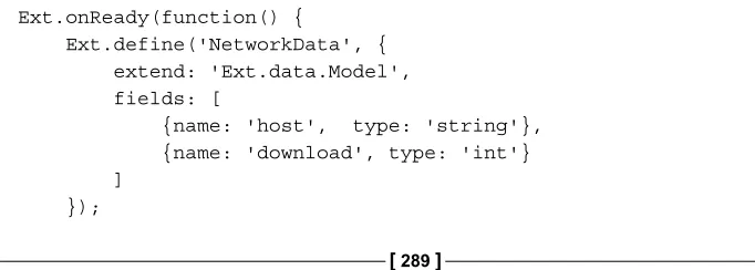
Example of using JsonStore and GridPanel 289
The Highcharts extension 291
Step 1 – removing some of the Highcharts options 291 Step 2 – converting to Highcharts extension configuration 292 Step 3 – constructing a series option by mapping the JsonStore
data model 293
Step 4 – creating the Highcharts extension 293
Passing series specific options in the Highcharts extension 295 Converting a data model into a Highcharts series 295
X-axis category data and y-axis numerical values 295
Numerical values for both x and y axes 296
Performing pre-processing from store data 297
Plotting pie charts 298
Table of Contents
Module APIs 300
addSeries 301
removeSerie and removeAllSeries 301
setTitle and setSubTitle 301
draw 302
Event handling and export modules 302
Extending the example with Highcharts 302
Displaying a context menu by clicking on a data point 309 A commercially Rich Internet Application with Highcharts – AppQoS 311
Summary 313
Chapter 11: Running Highcharts on the Server Side
315
Running Highcharts on the server side 316
Highcharts on the server side 316
Using Xvfb and web browsers (Unix solution) 317
Setting up a Highcharts export example on the client side 317
Installing Xvfb and a web browser 320
Starting up the Xvfb server 321
Applying server-side change 322
Running the server task 322
Rhino and Batik (Java solution) 323
Node.js/Node and Node-Highcharts (JavaScript solution) 324
Installing Node and modules 324
Setting up the Node server 325
Running the Node-Highcharts module 325
Starting the Node server and issuing a URL query 327
PhantomJS (headless webkit) 327
Preparing the series data script 328
Preparing the PhantomJS script 328
Comparison between the approaches 331
Summary 332
Preface
Learning Highcharts aims to be the missing manual for Highcharts from every angle. It is written for web developers who would like to learn about Highcharts using the following features included in the book:
• A step-by-step guide on building presentable charts from basic looking ones
• Plenty of examples with real data covering all the Highcharts series types—line/spline, column, pie, scatter, area range, column range, gauge, and polar
• Subject areas that haven't yet been covered in online reference manuals and demos such as chart layout structure, color shading, series update performance, and so on
• Applications demonstrating how to create dynamic and interactive charts using Highcharts' APIs and events handling
• Applications demonstrating how to integrate Highcharts with a mobile framework such as jQuery Mobile and a Rich Internet Application framework such as Ext JS
• Applications demonstrating how to run Highcharts on the server side for automating charts generation and export their graphical outputs
This book is not a reference manual as the Highcharts team has already done an
excellent job in providing a comprehensive online reference, and each configuration
is coupled with jsFiddle demos. This book is also not aiming to be a chart design guide or not tutorial for programming design with Highcharts.
Preface
What this book covers
Chapter 1, Web Charts, describes how web charts have been done since the birth of HTML to the latest HTML 5 standard with SVG and canvas technologies. This chapter also gives a short survey of charting software on the market using the HTML 5 standard and discusses why Highcharts is a better product.
Chapter 2, Highcharts Configurations, covers the common configuration options in chart components with plenty of examples and explains how the chart layout works.
Chapter 3, Line, Area, and Scatter Charts, demonstrates from plotting a simple line, area, and scatter charts to a poster-like chart including all three series types.
Chapter 4, Bar and Column Charts, demonstrates bar and column charts as well as various derived charts such as stacked chart, percentage chart, mirror chart, group chart, overlap chart, mirror stacked chart, and horizontal gauge chart.
Chapter 5, Pie Charts, demonstrates how to build various charts, from a simple pie chart to a multiseries chart, such as multiple pies in a chart and a concentric rings pie chart, that is, a donut chart.
Chapter 6, Gauge, Polar, and Range Charts, gives a step-by-step guide on constructing a twin dial speedometer and demonstrates polar chart characteristics and its similarity to a cartesian chart. It also illustrates the use of range data on area and column range charts.
Chapter 7, Highcharts APIs, explains the usage of Highcharts APIs and illustrates this by using a stock market demo to draw dynamic charts. The chapter discusses the use of different methods to update the series and analyses the performance of each method on various browsers, as well as the scalability of Highcharts.
Chapter 8, Highcharts Events, explains Highcharts events and demonstrates them through various user interactions with the charts from the portfolio application demos.
Preface
[ 3 ]
Chapter 10, Highcharts and Ext JS, gives a short introduction on Sencha's Ext JS and describes the components likely to be used in an application with Highcharts. It also shows how to use a module, Highcharts extension, in order to plot Highcharts graphs within an Ext JS application.
Chapter 11, Running Highcharts on the Server Side, describes different approaches for running Highcharts on the server side for automating chart generation and exporting
the charts into SVG or image files.
What you need for this book
Readers are expected to have basic knowledge of web development in the following areas:
• Structure of HTML document and its syntax
• Ajax
As this book is all about Highcharts which is developed in JavaScript, readers should be comfortable with the language at an intermediate level. Highcharts is developed as an adapter plugin to support several popular JavaScript frameworks such as jQuery, Mootools, and Prototype. By default, Highcharts uses jQuery library, which is the most popular amongst them. This book not only follows such choice so that all the examples are implemented in jQuery, but also uses a very moderate way. Hence,
a basic knowledge of jQuery should be sufficient and preferably some knowledge of
jQuery UI would be an advantage, as it is lightly used in Chapter 7 and Chapter 8.
Who this book is for
This book is written for web developers who:
• Would like to learn how to incorporate graphical charts into their web applications
• Would like to migrate their Adobe Flash charts for an HTML 5 JavaScript solution
Preface
Conventions
In this book, you will find a number of styles of text that distinguish between
different kinds of information. Here are some examples of these styles, and an explanation of their meaning.
Code words in text are shown as follows: "The renderTo option instructs Highcharts to display the graph onto the HTML <div> element with 'container' as the ID
value, which is defined in the HTML <body> section."
A block of code is set as follows:
<svg xmlns="http://www.w3.org/2000/svg" version="1.1">
<path id="curveAB" d="M 100 350 q 150 -300 300 0" stroke="blue" stroke-width="5" fill="none" />
<!-- Mark relevant points -->
<g stroke="black" stroke-width="3" fill="black"> <circle id="pointA" cx="100" cy="350" r="3" /> <circle id="pointB" cx="400" cy="350" r="3" /> </g>
<!-- Label the points -->
<g font-size="30" font="sans-serif" fill="black" stroke="none" text-anchor="middle">
<text x="100" y="350" dx="-30">A</text> <text x="400" y="350" dx="30">B</text> </g>
</svg>
Any command-line input or output is written as follows:
java -jar batik-rasterizer.jar /tmp/chart.svg
New terms and important words are shown in bold. Words that you see on the
screen, in menus or dialog boxes for example, appear in the text like this: "The first
four series—UK, Germany, S. Korea, and Japan are stacked together as a single column and US is displayed as a separate column."
Warnings or important notes appear in a box like this.
Preface
[ 5 ]
Reader feedback
Feedback from our readers is always welcome. Let us know what you think about this book—what you liked or may have disliked. Reader feedback is important for us to develop titles that you really get the most out of.
To send us general feedback, simply send an e-mail to [email protected], and mention the book title via the subject of your message.
If there is a topic that you have expertise in and you are interested in either writing or contributing to a book, see our author guide on www.packtpub.com/authors.
Customer support
Now that you are the proud owner of a Packt book, we have a number of things to help you to get the most from your purchase.
Downloading the example code
You can download the example code files for all Packt books you have purchased
from your account at http://www.PacktPub.com. If you purchased this book elsewhere, you can visit http://www.PacktPub.com/support and register to have
the files e-mailed directly to you.
Errata
Although we have taken every care to ensure the accuracy of our content, mistakes
do happen. If you find a mistake in one of our books—maybe a mistake in the text or
the code—we would be grateful if you would report this to us. By doing so, you can save other readers from frustration and help us improve subsequent versions of this
book. If you find any errata, please report them by visiting http://www.packtpub. com/support, selecting your book, clicking on the erratasubmissionform link, and
entering the details of your errata. Once your errata are verified, your submission
Preface
Piracy
Piracy of copyright material on the Internet is an ongoing problem across all media. At Packt, we take the protection of our copyright and licenses very seriously. If you come across any illegal copies of our works, in any form, on the Internet, please provide us with the location address or website name immediately so that we can pursue a remedy.
Please contact us at [email protected] with a link to the suspected pirated material.
We appreciate your help in protecting our authors, and our ability to bring you valuable content.
Questions
Web Charts
In this chapter you will learn the general background of web charts. This includes a short history of how web charts used to be made before Ajax and HTML5 became the new standard. The recent advancement in JavaScript programming will be
briefly discussed. Then the new HTML5 features—SVG and canvas, which are
the main drive behind JavaScript charts, are introduced and demonstrated. This is followed by a quick guide on the other JavaScript graphing packages that are available on the market. Finally, an introduction of Highcharts is given, which explains the advantages of Highcharts over the other products. In this chapter we will cover the following:
• A short history of web charting
• The uprising of JavaScript and HTML5
• JavaScript charts on the market
• Why Highcharts?
Downloading the example code
You can download the example code files for all
Packt books you have purchased from your account at http://www.PacktPub.com. If you purchased this book elsewhere, you can visit http://www.PacktPub.com/support
and register to have the files e-mailed directly to you.
A short history of web charting
Web Charts
HTML image map (server-side technology)
This technique has been used since the early days of HTML, when server-side operations were the main drive. Charts were only HTML images generated from the web server. Before there was any server-side scripting language such as PHP, one of the common approaches was to use Common Gateway Interface (CGI), which executes plotting programs (such as gnuplot) to output the images. Later, when PHP became popular, the GD graphic module was used for plotting. One product that uses this technique is JpGraph. The following is an example of how to include a chart image in an HTML page:<img src="pie_chart.php" border=0 align="left">
The chart script file—pie_chart.php—is embedded inside an HTML img tag. When the page is loaded, the browser sees the img src attribute and sends an HTTP request for pie_chart.php. As far as the web browser is concerned, it has no knowledge whether the .php file is an image file or not. When the web server (with PHP support) receives the request, it recognizes the .php extension and executes the PHP scripts. The following is the cut down JpGraph example; the script outputs the image content and streams it back as an HTTP response, in the same way as normal image content would be sent back.
// Create new graph
$graph = new Graph(350, 250);
// Add data points in array of x-axis and y-axis values $p1 = new LinePlot($datay,$datax);
$graph->Add($p1);
// Output line chart in image format back to the client $graph->Stroke();
Furthermore, this technology combines with an HTML map tag for chart navigation, so that when users click on a certain area of a graph, for example a slice in a pie chart, it can load a new page with another graph.
This technology has the following advantages:
• Server-side technology, which means chart creation does not necessarily require user interaction to initiate.
• Ideal for automation tasks, for example scheduled reports or e-mail alerts with the graph attached.
Chapter 1
[ 9 ] It has the following disadvantages:
• More workload on the server side
• Pure HTML, a limited technology—little interactions can be put on the graphs and no animations
Java applet (client side) and servlet
(server side)
Java applet enables the web browser to execute multiplatform Java Byte Code to achieve what HTML cannot do, such as graphics display, animations, and advanced
user interactions. This was the first technology to extend traditional server-based
work to the client side. To include a Java applet in an HTML page, HTML applet (deprecated) or object tags are used and require a Java plugin to be installed for the browser.
The following is an example of including a Java applet inside an object tag. As Java does not run on the same environment in Internet Explorer as other browsers, the conditional comments for IE were used:
<!--[if !IE]> Non Internet Explorer way of loading applet --> <object classid="Java:chart.class" type="application/x-java-applet" height="300" width="550" >
<!--<![endif] Internet way of loading applet -->
<object classid="clsid:8AD9C840..." codebase="/classes/"> <param name="code" value="chart.class" />
</object> <!--[if !IE]> --> </object>
<!--<![endif]-->
Web Charts
An example of a Java product is JFreeChart. It comes with 2D and 3D solutions and
is free for nonprofit use. JFreeChart can be run as an applet, servlet, or standalone
application. The following shows part of the code used to plot data points within an applet:
public class AppletGraph extends JApplet {
// Create X and Y axis plot dataset and populate // with data.
// Create a jFreeChart object with the dataset
JFreeChart jFreeChart = new JFreeChart(combinedDomainXYPlot); // Put the jFreeChart in a chartPanel
ChartPanel chartPanel = new ChartPanel(jFreeChart); chartPanel.setPreferredSize(new Dimension(900,600)); // Add the chart panel into the display
getContentPane().add(chartPanel); }
To run a chart application on the server side, a servlet container is needed, for example Apache Tomcat. The standard web.xml file is defined to bind a URL to a servlet:
<?xml version="1.0" encoding="UTF-8"?>
When the servlet container, such as Tomcat, receives an HTTP request with the URL http://localhost/servlets/piechart, it resolves the request into a servlet application. The web server then executes the chart servlet, formats the output into an image, and returns the image content as an HTTP response.
This technology has the following advantages:
• Advanced graphics, animations, and user interfaces
Chapter 1
[ 11 ] It has the following disadvantages:
• Applet security issues
• If the plugin crashes, it can hang or crash the browser
• Very CPU intensive
• Requires Java plugin
• Long startup time
• Standardization problem
Adobe Shockwave Flash (client side)
Flash is widely used because it offers audio, graphics, animation, and videocapabilities on web browsers. Browsers are required to have the Adobe Flash Player plugin installed. As for plotting graphs, this technique is the common choice (because there weren't many other options) before the HTML5 standard became popular. Graphing software adopting this technology basically ship with their own exported
Shockwave Flash (SWF) files. These SWF files contain compressed vector-based
graphics and compiled ActionScript instructions to create a chart. In order for the
Flash Player to display the graphs, the SWF file is needed to be loaded from an
HTML page. To do that, an HTML object tag is needed. The tag is internally created and injected into the document's DOM by the software's own JavaScript routines. Inside this object tag, it contains dimension and SWF path information for plotting the graph, and the graph variable data is also passed inside this tag. So, as soon as the browser sees an object tag with specific parameters, it calls the installed Flash
Player to process both the SWF file and the parameters. To pass the graph's plot data from the server side to the client side's Flash Player, flashVars is embedded inside a param tag with the data type. The following is an example from Yahoo YUI 2:
<object id="yuiswf1" type="..." data="charts.swf" width="100%" height="100%">
<param name="allowscriptaccess" value="always">
<param name="flashVars" value="param1=value1¶m2=value2"> </object>
This technology has the following advantage:
• Pretty graphics and animations with rich user interactions
It has the following disadvantage:
Web Charts
The uprising of JavaScript and HTML5
The role of JavaScript has been shifted significantly from a few simple client
routines to a dominant language for creating and managing web user interfaces. The programming technique is nothing like what it was a decade ago. This is driven by a group of pioneers such as Douglas Crockford who is responsible for transforming the language for educating and making JavaScript a better language with his book
JavaScript: The Good Parts, O'Reilly Media / Yahoo Press; and both Sam Stephenson, creator of Prototype JavaScript library (http://www.prototypejs.org), and John Resig, creator of JQuery library (http://jquery.com), who brought JavaScript into a framework for building more complicated web frontend software.
To give an introduction of the new programming style is beyond the scope of this book. However, throughout this book, we will see examples in jQuery (because Highcharts uses a jQuery library as the default choice and jQuery is the most popular JavaScript framework). Readers are expected to know the basics of jQuery and CSS selector syntax. Readers should also be familiar with advanced JavaScript scripting described in the book JavaScript: The Good Parts, such as prototypes, closure, inheritance, and function objects.
HTML5 (SVG and canvas)
In this section, two HTML5 technologies, SVG and canvas, are covered with examples.
SVG (Scalable Vector Graphics)
HTML5 is the biggest advancement so far in the HTML standard. The adoption of the standard is growing fast (also fuelled by Apple mobile devices, which stopped supporting Adobe Flash). HTML5 comes with many new features. Again, it is
beyond the scope of this book to cover them. However, the most relevant part to web charting is Scalable Vector Graphics (SVG). SVG is an XML format for describing vector-based graphics, which is composed of components such as paths, text, shapes, color, and so on. The technology is similar to PostScript except that PostScript is a stack-based language. As implied by its name, one of the major advantages of SVG is that it is a lossless technology (same as PostScript); it doesn't suffer from any pixelation effect by enlarging the image. A reduced image size will not suffer from loss of original content.
Chapter 1
[ 13 ]
The following is a simple example of SVG code—a single curved line between two points:
<svg xmlns="http://www.w3.org/2000/svg" version="1.1">
<path id="curveAB" d="M 100 350 q 150 -300 300 0" stroke="blue" stroke-width="5" fill="none" />
<!-- Mark relevant points -->
<g stroke="black" stroke-width="3" fill="black"> <circle id="pointA" cx="100" cy="350" r="3" /> <circle id="pointB" cx="400" cy="350" r="3" /> </g>
<!-- Label the points -->
<g font-size="30" font="sans-serif" fill="black" stroke="none" text-anchor="middle">
<text x="100" y="350" dx="-30">A</text> <text x="400" y="350" dx="30">B</text> </g>
</svg>
The preceding SVG code is executed in the following steps:
1. Draw a path with id="curveAB" with data (d). First, move M to an absolute coordinate (100, 350), then draw a Bézier quadratic curve from the current position to (150, -300) and finish at (300, 0).
2. Group (g) the two circle elements—"pointA" and "pointB"—with the center coordinates (100, 350) and (400, 350) respectively with a radius of 3 pixels.
Then fill both circles in black.
3. Group the two text elements A and B, started at (100, 350) and (400, 350), which display with the sans-serif font in black, and then shift along the x axis (dx) 30 pixels left and right, respectively.
Web Charts
Canvas
Canvas is another new HTML5 standard, which is used by some JavaScript chart software. The purpose of canvas is as its name implies; you declare a drawing area in the canvas tag, then use the new JavaScript APIs to draw lines and shapes in pixels. Canvas has no built-in animation routine, so the API calls in timing sequences are used to simulate an animation. Also, there is no event handling support; developers need to manually attach event handlers to certain regions in the canvas. Hence, fancy chart animation may prove more complicated to implement.
The following is an example of canvas code, which achieves the same effect as the preceding SVG curve:
<canvas id="myCanvas" width="500" height="300" style="border:1px solid #d3d3d3;">Canvas tag not supported</canvas>
<script type="text/javascript">
var c=document.getElementById("myCanvas"); var ctx=c.getContext("2d");
// Draw the quadratic curve from Point A to B ctx.beginPath();
// Draw a black circle attached to the start of the curve ctx.fillStyle="black";
// Draw a black circle attached to the end of the curve ctx.beginPath();
ctx.arc(400,250,3, 0, 2* Math.PI); ctx.stroke();
ctx.fill();
// Display 'A' and 'B' text next to the points ctx.font="30px 'sans-serif'";
Chapter 1
[ 15 ]
As you can see, both canvas and SVG can do the same task whereas canvas takes more instructions:
Instead of a continuous path description in SVG, a sequence of JavaScript drawing methods are called. Instead of a single tag with multiple attributes, multiple attribute setting routines are called. SVG is mostly declarative, while canvas enforces an imperative programming approach.
JavaScript charts on the market
There are many different chart libraries on offer on the market. It is impossible to discuss each one of them. They are open source, but some of them are short-lived in terms of not having a comprehensive set of basic charts, such as pie, line,
and bar charts and they look rather unfinished. Here, a handful of commercial
and open source products are discussed, including all the basic charts (and some with extras). Some of them still support the Flash plugin, which is an option for backward compatibility, the reason being SVG and canvas are not supported in older browsers. Although some of them are not free for commercial development, which is understandable, they do offer a very affordable price.
See http://code.google.com/p/explorercanvas/. Many libraries use this add-on to emulate canvas prior to IE 9.
jqPlot
Web Charts
amCharts
amCharts offers a full set of charts in both 2D and 3D with other interesting charts such as radar, bubble, candlestick, and polar. All the charts look pretty and support animations. amCharts is free for commercial use but a credit label will be displayed in the upper-left corner of the charts. The only minor drawback is that the constructor API style seems a bit clumsy. Each attribute assignment has to be done either by calling a method or as an assignment statement explicitly, but not by the
object specifier's style.
Ext JS 4 Charts
Ext JS is a very popular Ajax application framework developed by Sencha, a pioneer company specializing in web application development. In Ext JS 4, it comes with the pure JavaScript charts library unlike its predecessor Ext JS 3, which uses the YUI 2 Flash chart library. As the market trend is moving away from Adobe Flash, Sencha responds with a home brew charting library. Ext JS 4 covers all the basic 2D charts plus the gauge and radar charts, and all the charts support animations. The license is free for open source and noncommercial usage, and a developer license is needed
for commercial development. A great benefit of Ext JS 4 charts is the integration with
the comprehensive set of UI components, for example, for a chart with a storage framework, displaying/updating both the chart and the table of data with editors is very simple to do.
YUI 3 Charts
Chapter 1
[ 17 ]
FusionCharts
FusionCharts is probably one of the most impressive looking and has the most comprehensive charts out there in the market. Not only does it come with a full-range variety of interesting 2D charts (radar, dial, map, and candlestick) available as a separate product, but it also offers fully interactive 3D charts. All the chart animations are very professionally done. Basically, FusionCharts can be run in two modes, Flash or JavaScript. For the JavaScript mode, FusionCharts use their own extended Highcharts library to achieve the same 2D and 3D effect, and look the same as their Flash version. Although FusionCharts comes with a higher price tag, this is the only product that has the best looking charts and rotatable 3D charts.
JS Charts
JS Charts offers all the basic charts in both 2D and 3D looks. JS Charts uses the HTML5 canvas technology to render charts. The bars and lines look good with animations, however, the presentation of a pie chart is slightly behind and it offers no animation support. The product is free for noncommercial use and commercial license is on per domain basis. The constructor API is similar to amCharts done via method calls.
Flot and Flotr
Web Charts
Why Highcharts?
Although Highcharts only has the basic 2D charts, it offers very appealing and professional looking charts in the market. It is a product which stands out by paying attention to details, not only on the presentation side but also in other areas that are described later on. The product was released in late 2009 and developed by a Norwegian company called Highsoft Solutions AS, created and founded by Torstein
Hønsi. Highcharts is not their first product, but by far their best selling one.
Highcharts and JavaScript frameworks
Although Highcharts is built with the JavaScript framework library, it is implemented in such a way that it doesn't totally rely on one particular framework. Highcharts is packaged with adapters, to make its interfaces to framework, pluggable.
As a result, Highcharts can be incorporated under MooTools, Prototype, or jQuery JavaScript frameworks. This empowers users without compromising their already developed product or allows them to decide on using the framework which is best suited to their projects. Highcharts uses jQuery as the default
framework implementation, hence it only requires users to load the jQuery library before Highcharts.
To use Highcharts under the MooTools environment, users simply do the following: <script src="//ajax.googleapis.com/ajax/libs/mootools/1.4.5/mootools-yui-compressed.js"></script>
<script type="text/javascript"
src="Highcharts-2.2.2/js/adapters/mootools-adapter.js"></ script>
<script type="text/javascript"
src="Highcharts-2.2.2/js/highcharts.js"></script>
And to use Highcharts under Prototype, users need to do the following: <script src="//ajax.googleapis.com/ajax/libs/prototype/1.7.1.0/ prototype.js"></script>
<script type="text/javascript"
src="Highcharts-2.2.2/js/adapters/prototype-adapter.js"></ script>
<script type="text/javascript"
Chapter 1
[ 19 ]
Presentation
Highcharts strikes the right balance of look and feel. The charts themselves are visually pleasant and yet the style is simple. The default choices of color are
soothing without a sharp contrast conflicting each other, which is aided by the
subtle shadow and white border effects. None of the text nor the colors of the axes are in black or any dark color, which keeps the viewers' attention centered to the colored data presentation.
All the animations (initial, update, tooltip) in Highcharts are finely tuned—smooth
with a gradual slowdown motion. For instance, the initial animation of the donut chart, which is a multiseries pie chart, is the most impressive one. This is the area where Highcharts is clearly better; the animations in other charts are too mechanical, too much, and sometimes off-putting.
The round corners of tooltip and legends (both inner and outer) with a simple
border do not fight for the viewers' attention and nicely blend inside the chart. The
following is a tooltip sample:
Web Charts
In a nutshell, every element in Highcharts does not compete with each other for viewers' attention; they share the load equally and work together as a chart.
License
Highcharts has free noncommercial as well as commercial licenses. The free
license for personal and nonprofit purposes is Creative Commons – Attribution NonCommercial 3.0. Highcharts offers different flavors of commercial licenses
for different purposes. They have a one-off single website license and, thankfully, developer licenses. For web development products, a developer license is a better model than charging in units of website basis or a very high priced OEM license because of the following reasons:
• It is easy for the software companies to work out the math in their development plans
• There is less worry regarding how many copies are being sold, so as to not violate the license
As usual, the developer license does not automatically grant the use of Highcharts
indefinitely. The license only permits the unlimited use of all the versions released
within a year from the license purchase date. Thereafter, an update license is required if developers decide to use a newer version and so on. Moreover, any condition can be negotiated for the OEM license, and most commonly, the quote is based on the number of developers on the project and the number of deployments.
Simple API model
Highcharts has a very simple API model. For creating a chart, the constructor
API expects an object specifier with all the necessary settings. As for dynamically
updating an existing chart, Highcharts comes with a small set of APIs. The
configuration properties are described in detail in Chapter 2, Highcharts Configurations. The API calls are discussed in Chapter 7, Highcharts APIs.
Documentations
Highcharts' online documentation is one of the areas that really outshines the others.
It is not just a simple documentation page to dump all the definitions and examples.
Chapter 1
[ 21 ]
The left-hand side of the documentation page is organized in an object structure as how you would pass it to create a chart. You can expand and collapse the object's attributes further like in a JavaScript console. This has helped the users to become familiar with the product by using it naturally.
The well thought out part of the documentation is on the right-hand side with the
definitions of the attributes. Each definition comes with a description and an online demonstration for each setting linking to the jsFiddle website.
This instant jsFiddle demo invites users to explore different property values and observes the effect on the chart. Hence, the whole documentation browsing process
becomes very effective and fluid.
Web Charts
In addition, Highcharts is hosted on GitHub, an online public source control service, which allows JavaScript developers to contribute and clone their own versions.
Highcharts – a quick tutorial
In this section, you will see how to implement your first Highcharts graph. First, download the latest version from the Highcharts website.
Directories structure
When you unpack the downloaded ZIP file, you should see the following directories' structure under the Highcharts-2.x.x top-level directory:
The following is what each directory contains and is used for:
• index.html: This is the demo HTML page, which is the same as the demo page on the Highcharts website, so that you can still experiment
with Highcharts offline.
• examples: This contains all the source files for the examples.
Chapter 1
[ 23 ]
• exporting-server: This is a directory for the server-side function to export
charts into an image file using Batik, which is a Java-based toolkit for
managing SVG content, and exporting the server is one of its usages.
• js: This is the main directory with Highcharts code. Each JavaScript filename
has two suffixes, .src.js, which contains the source code with comments in it, and .js, which is the minification of JavaScript source files.
• adapters: This has the adapter facility for using with MooTools or Prototype
modules. It contains the following files:
° exporting.js for client-side exporting and printing functions
° canvas-tools.js – we need to use a third-party tool, canvg, to support Android 2.x, as the native browser has no SVG support but can display the canvas
• themes: This has a set of JavaScript files pre-built with settings such as background colors, font styles, axis layouts, and so on. Users can load
one of these files in their charts for different styles.
All you need to do is move the top-level Highcharts-2.x.x/js directory inside your web server document's root directory.
To use Highcharts, you need to include Highcharts-2.x.x/js/highcharts. js and a jQuery library in your HTML file. The following is an example showing the percentage of web browsers' usage for a public website. The example uses the
minimal configuration settings for getting you started quickly. The following is the
top half of the example: <!DOCTYPE HTML> <html>
<head>
<meta http-equiv="Content-Type"
content="text/html; charset=utf-8"> <title>Highcharts First Example</title>
<script src="//ajax.googleapis.com/ajax/libs/jquery/1.7.1/jquery. min.js"></script>
<script type="text/javascript"
src="Highcharts-2.2.2/js/highcharts.js"></script>
Web Charts
Chapter 1
<!-- Highcharts rendering takes place inside this DIV --> <div id="container"></div>
</div> </body> </html>
The spline graph is created via an object specifier that contains all the properties and
series data required. Once the chart object is created, the graph is displayed in the
browser. Within this object specifier, there are major components corresponding to the structure of the chart.
The renderTo option instructs Highcharts to display the graph onto the HTML <div> element with 'container' as the ID value, which is defined in the HTML <body> section. The type option is set to the default presentation type as 'spline' for any series data, as follows:
chart: {
renderTo: 'container', type: 'spline'
}
Web Charts
The categories option in the xAxis property contains an array of x axis labels for each data point. Since the graph has at least 50 data points, printing each x axis label will make the text overlap each other. Rotating the labels still results in the axis looking very packed. The best compromise is to print every third label, (tickIntervals: 3) which causes the labels to be nicely spaced out from each other.
For the sake of simplicity, we use 50 entries in xAxis.categories
to represent the time. However, we will see a more optimal and logical way to display date time data in the next chapter.
xAxis: {
categories: [ 'Jan 2008', 'Feb', .... ], tickInterval: 3
},
The options in yAxis are to assign the title of the y axis and set the minimum possible value to zero, otherwise Highcharts will display a negative percentage range along the y axis, which is unwanted for this dataset.
yAxis: { title: {
text: 'Percentage %' },
min: 0 },
The plotOptions property is to control how each series is displayed according to its type (line, pie, bar, and so on). The plotOptions.series option is the general
configuration applied to all the series type instead of defining each setting inside the
series array. In this example, the default lineWidth for all the series is set to 2 pixels wide, as follows:
plotOptions: { series: {
lineWidth: 2 }
Chapter 1
[ 27 ]
The series property is the heart of the whole configuration object, which defines all
the series data. It is an array of the series configuration objects. For this example, the
name option is the name of the series that appears in the chart legend and tooltip. The data is an array of y axis values, which has the same length as the xAxis. categories array to form (x,y) data points.
series: [{
name: 'Internet Explorer',
data: [54.7, 54.7, 53.9, 54.8, 54.4, ... ] }, {
name: 'FireFox',
data: [36.4, 36.5, 37.0, 39.1, 39.8, ... ] }, {
The following screenshot shows how the final Highcharts should look on a
Web Charts
Chapter 1
[ 29 ]
Web Charts
The following screenshot shows how it should look on a Firefox browser:
Summary
Web charting has been around since the early days of HTML, emerging from server-side technology to client-server-side. During this period, several solutions have been adopted to work around the shortcomings of HTML. Now, with the new HTML5, which is rich in features, web charting has come back to HTML and this time it is for good, with the aid of unleashed JavaScript.
A number of JavaScript chart products were mentioned in this chapter.. Among these, Highcharts emerges with a distinct graphical style and smooth user interactions.
In the next chapter, we will explore the Highcharts configuration object in greater detail with plenty more examples. The configuration object is the core part of the
Highcharts Configurations
All Highcharts graphs share the same configuration structure and it is crucial for us
to get familiar with the core components. However, it is not possible to go through
all the configurations in this book. In this chapter, we will explore the properties that
are mostly used from a functional point of view and demonstrate them with ongoing examples. We will learn the concept of how Highcharts manages layout, and
then explore how to configure axes, specify single series and multiple series data,
followed by formatting and styling tooltips in both JavaScript and HTML. Finally, we will get to know how to polish our charts with various types of animations and to apply color gradients. In this chapter we will cover the following:
• Understanding Highcharts layouts
• Framing the chart with axes
• Revisiting the series configuration • Styling the tooltips
• Animating charts
• Expanding colors with gradients
Configuration structure
Highcharts Configurations
The following is a list of the major components:
• chart: Configurations for the top-level chart properties such as layouts, dimensions, events, animations, and user interactions
• series: Array of series objects (consisting of data and specific options) for
single and multiple series, where the series data can be specified in a number
of ways
• xAxis/yAxis: Configurations for all the axis properties such as labels, styles, intervals, plotlines, plot bands, and backgrounds
• tooltip: Layout and format style configurations for the series data tooltips
• title/subtitle: Layout and style configurations for the chart title and subtitle
• legend: Layout and format style configurations for the chart legend
• plotOptions: Contains all the plotting options, such as display, animation,
and user interactions for common series and specific series types
• exporting: Configurations control the layout and the function of print and export features
Understanding Highcharts layouts
Before we start to learn how Highcharts layouts work, it is imperative that we
understand some basic concepts first. To do that, let us first recall the chart example
used in Chapter 1, Web Charts, and set a couple of borders to be visible. First, set a border around the plot area; to do that we can set the options of plotBorderWidth and plotBorderColor in the chart section, as follows:
chart: {
renderTo: 'container', type: 'spline',
plotBorderWidth: 1,
Chapter 2
[ 33 ]
The second border is set around the Highcharts container. Next, we extend the preceding chart section with additional settings:
chart: {
renderTo: 'container', ....
borderColor: '#a1a1a1', borderWidth: 2,
borderRadius: 3 },
Basically, this sets the container border color with the width of 2 pixels and the corner radius to 3 pixels.
Highcharts Configurations
By default, Highcharts displays have three different areas—spacing area, labeling area, and plot area. The plot area is the area inside the inner rectangle that contains all the plot graphics. The labeling area is the area where labels such as title, subtitle, axis title, legend, and credits go around the plot area, so that it is between the edge of the plot area and the inner edge of the spacing area. The spacing area is the area between the container border and the outer edge of the labeling area. The following screenshot shows three different kinds of areas. A gray dotted line is inserted to illustrate the boundary between the spacing and labeling areas.
Each chart label positioning can be operated in one of the following two layouts:
• Automatic layout: Highcharts automatically adjusts the plot area size based on the labels' positions in the labeling area, that is, the plot area does not overlap with the label element at all. Automatic layout is the simplest way
to configure, but has less control; this is the default way of positioning the
chart elements.
• Fixed layout: There is no concept of labeling area. The chart label is
specified in a fixed location such that it has a floating effect on the plot
Chapter 2
[ 35 ]
The spacing area controls the offset of the Highcharts display on each side. As long
as the chart margins are not defined, increasing or decreasing the spacing area has the global effect on the plot area measurement in both automatic and fixed layouts.
Chart margins and spacings
In this section, we will see how chart margins and spacing settings have an effect
on the overall layout. Chart margins can be configured with the properties margin, marginTop, marginLeft, marginRight, and marginBottom, and they are not enabled by default. Setting chart margins has a global effect on the plot area, so that none of
the label positions nor the chart spacing configurations can affect the plot area size. Hence, all the chart elements are in a fixed layout mode with respect to the plot area.
The margin option is an array of four margin values covered for each direction, the same as CSS starting from north and going clockwise. Also, the margin option has a lower precedence than any of the directional margin options, regardless of the order in the chart section.
Spacing configurations are enabled by default with a fixed value on each side. These can be configured in the chart section with the property names spacingTop, spacingLeft, spacingBottom, and spacingRight.
In this example, we are going to increase or decrease the margin or spacing property on each side of the chart and observe the effect. The following are the chart settings:
chart: {
renderTo: 'container', type: ...
Highcharts Configurations
The following screenshot shows what the chart looks like:
The marginTop property fixates the plot area's top border 10 pixels away from the
container border. It also changes the top border into fixed layout to any label elements, hence the chart title and subtitle float on top of the plot area. The spacingLeft
property increases the spacing area on the left-hand side, hence it pushes the y-axis title further in. As it is in the automatic layout (without declaring marginLeft), it also pushes the plot area's west border in. Setting marginRight to 0 will override all
the default spacing on the chart's right-hand side and turn it into fixed layout mode.
Finally, setting spacingBottom to 0 makes the legend touch the lower bar of the container. Hence, it also stretches the plot area downwards. This is because the bottom edge is still in automatic layout even though spacingBottom is set to 0.
Chart label properties
Chart labels such as xAxis.title, yAxis.title, legend, title, subtitle, and credits share the common property names, which are as follows:
Chapter 2
[ 37 ]
• floating: This is for the label position having a floating effect in the plot area. Setting this to true will cause the label position to have no effect on the adjacent plot area's boundary.
• margin: This is the margin setting between the label and the side of the plot area adjacent to it. Only certain label types have this setting.
• verticalAlign: This is for vertical alignment for the label; keywords are 'top', 'middle', and 'bottom'.
• x: This is for horizontal positioning in relation to alignment.
• y: This is for vertical positioning in relation to alignment.
As for the labels' x and y positioning, they are not used for absolute positioning
within the chart. They are designed for fine adjustment with the label alignment. The
following diagram shows the coordinate directions, where the center represents the label location:
We can experiment with these properties with a simple example of the align and y position settings, by placing both title and subtitle next to each other. The title is shifted to the left with align set to 'left', whereas the subtitle alignment is set to 'right'. In order to make both titles appear on the same line, we change the subtitle's y position to 15, which is the same as the title's default y value:
title: {
text: 'Web browsers ...', align: 'left'
},
subtitle: {
text: 'From 2008 to present', align: 'right',
Highcharts Configurations
The following is a screenshot showing both titles aligning on the same line:
In the following subsections, we will experiment with how the changes in alignment for each label element will affect the layout behaviors towards the plot area.
Title and subtitle alignments
Title and subtitle have the same layout properties, and the only difference is that the default values and title have the margin setting. Specifying verticalAlign to any
value can change from the default automatic layout to the fixed layout (internally
this switches floating to true). However, manually setting the subtitle's floating property to false does not switch it back to automatic layout. The following is an example of having title in automatic layout and subtitle in fixed layout:
title: {
text: 'Web browsers statistics' },
subtitle: {
text: 'From 2008 to present', verticalAlign: 'top',
y: 60 },
The verticalAlign property for the subtitle is set to 'top', which switches the
Chapter 2
[ 39 ]
This is currently a defect reported in Highcharts. The assignment in verticalAlign forces both title and subtitle
into fixed layout (that is, floating is true). You can find the
bug report at http://github.com/highslide-software/ highcharts.com/issues/962.
Legend alignment
Legends show different behaviors for the verticalAlign and align properties. Apart from setting the alignment to 'center', all other settings in verticalAlign and align remain in automatic positioning. The following is an example of the legend located on the right-hand side of the chart. The verticalAlign property is switched to the middle of the chart, where the horizontal align is set to 'right':
legend: {
align: 'right',
verticalAlign: 'middle', layout: 'vertical', },
The layout property is assigned to 'vertical' so that it causes the items inside the legend box to be displayed in a vertical manner. As we can see, the plot area is automatically resized for the legend box:
Axis title alignment
Axis titles do not use verticalAlign. Instead, they use the align setting, which is either 'low', 'middle', or 'high'. The title's margin value is the distance between the axis title and the axis line. The following is an example of showing the y-axis title rotated horizontally instead of vertically (which it does by default), and displayed on the top of the axis line instead of next to it. Moreover, we use the y property to finely tune the title location:
yAxis: { title: {