Working with
Windows Forms and
Controls
C
h
ap
ter
3
A user interface is a means by which a user interacts with an application. The user interacts with a Windows-based application through Windows Forms and controls.
A well-designed user interface makes an application user-friendly. Most of the Windows-based interfaces provide drag-and-drop features to facilitate easy interaction between the user and the application. For example, when you drag a file in the Windows Explorer to any folder, the file will be moved to the target folder. You can use the drag-and-drop feature to make an application more accessible and user friendly.
This chapter discusses how to work with Windows Forms applications using various controls and their properties, methods, and events. In addition, this chapter discusses how to perform drag-and-drop operations using Clipboard in a Windows application.
In this chapter, you will learn to: Work with Windows forms
Work with the Windows forms controls Perform drag-and-drop operations using
clipboard
Windows Forms is a representation of any window displayed in an application. A form is used to accept input from a user and display the information entered. For example, in the case of a Library management system, a librarian may need to provide the username and password to enter the system by using a form.
A Sample Form for Accepting Data from a User
The preceding sample form contains text box controls, which enable the librarian to enter data. The form also contains a button control called Logon Now. This control can be used to initiate the task of opening the Library Management System application for use, if the username and password are valid.
Note
When you create a new project for a Windows application, a form is automatically added to the project. This form has the default name Form1.cs, as shown in the following figure.
Form1 Added to a Project by Default
Every form in Windows is a class derived from the Form class of the
System.Windows.Forms namespace. The Form class is derived from the Control class defined in the same namespace. Therefore, every form inherits many predefined properties, methods, and events associated with its base classes. You can use these properties, events, and methods to control the appearance and behavior of a form.
Properties of Windows Forms are used to determine their appearance at run time. It has various properties, such as size, background color, and position. When you create a form, the properties are set with default values. For example, the caption displayed in the title bar of the default Form in a project is set to Form1. However, you can change the default values according to your needs.
The commonly used properties of a form are described in the following table.
Properties Description
Name Is used to specify the name of a form. By default, the Name property of the first form that you add to a project is set to Form1.
BackColor Is used to specify the background color of a form.
BackgroundImage Is used to specify the background image for a form. You can remove a background image associated with a form by right-clicking the button next to the BackgroundImage property and selecting Reset from the shortcut menu.
Font Is used to specify the style, size, and type of font for the text to be displayed on various controls in a form.
Size Is used to specify the height and width of a form.
StartPosition Is used to specify the position of the form on the screen. This property can have the following values:
Manual: The location and size of the form determine its starting position.
CenterScreen: The form is displayed at the center of the screen.
WindowsDefaultLocation: The form is displayed at the Windows default location and has the dimensions specified in the Size property of the form.
WindowsDefaultBounds: The form is displayed at the Windows default location and its dimensions are determined by Windows operating system.
CenterParent: A form can be opened as a child of another form. Setting StartPosition of the form to CenterParent displays the form at the center of the parent form.
Properties Description
WindowState Is used to specify whether a form will be displayed as a normal, maximized, or minimized window on startup.
Properties of a Form
Sometimes, you may need to change the default properties of a form. For example, a caption, such as Library Logon Form is more relevant than the caption Form1. You can change the default properties of forms and controls by using the Properties window. To change the caption of a form, perform the following steps:
1. Right-click the form in the design mode and select Properties from the shortcut menu, as shown in the following figure.
Selecting Properties from the Shortcut Menu
The following figure shows the Properties window, listing the properties of a form.
2. Set the value of the Text property to Library Logon Form and press the ENTER key, as shown in the following figure.
Changing the Text Property for a Form
The caption of the form changes, as shown in the following figure.
Windows Forms methods enable you to perform various tasks, such as opening, activating, and closing the form.
The commonly used methods are explained in the following table.
Methods Description Example Explanation
Show() Is used to display a form.
Form1 frmObj = new Form1();
frmObj.Show();
This code creates a new instance of the
Form1 form by using the new
keyword. The
Show() method displays the instance ofForm1 form.
Hide() Is used to hide a form. Form1 frmObj = new Form1();
frmObj.Hide();
This code creates a new instance of the
Form1 form by using the new
keyword. The
Hide() method hides the instance of
Form1 form.
Activate() Is used to activate a form and set the focus on it. When you use this method, it brings the form to the front (if it is the current application) or flashes the form caption (if it is not the current application) on the task bar.
Form1 frmObj = new Form1();
frmObj.Activate();
This code sets focus on a form named
Form1.
Close() Is used to close a form. Form1 frmObj = new Form1();
frmObj.Close();
This code closes the form named Form1.
Methods Description Example Explanation
Y coordinates of the desktop as its parameters.
200); specified location.
Common Windows Forms Methods
An event is generated when a user performs an action, such as clicking the mouse or pressing a key. When a user clicks a form, the Click event is generated for the form. Each form and control has a predefined set of events associated with it. You can instruct an application to perform a specific action when an event takes place. For example, you can write code for adding items to a list as soon as a form is loaded.
The common events used in a form are described in the following table.
Event Description
Click Occurs when a user clicks anywhere on a form.
FormClosed Occurs when a form is closed.
Deactivate Occurs when a form loses focus and is no longer active.
Load Occurs when a form is loaded in the memory for the first time. This event can be used to initialize variables used in a form. This event can also be used to specify the initial values to be displayed in various controls in a form.
MouseMove Occurs when a mouse is moved over a form.
MouseDown Occurs when the left mouse button is pressed on a form.
MouseUp Occurs when the mouse button is released.
Common Windows Forms Events
You can specify the action to be performed on the occurrence of an event within a special method called, event handler. You can add code for an event handler by using the Code Editor window.
To write code for an event corresponding to an object, open the Properties window for that object. Click the Events button ( ) on the toolbar in the Properties window and
select an event from the list of events. For example, if you open the Properties window for button1 and click the Events button ( ), the events corresponding to button1 will be listed in the Properties window.
The following figure shows the list of events for the button1 control.
When you double-click on any event in this list, for example, KeyDown, the declaration for the event handler is automatically provided in the Code Editor window, as shown in the following figure.
The Code Editor Window
You can type code within the event handler. When an event is raised, code in the corresponding event handler is executed.
The following code shows an event handler for the Load event of Form1:
private void Form1_Load(object sender, EventArgs e) {
}
In the preceding code:
sender: Provides a reference of the object that raised the event.
A control is a component used to accept input from a user or display some information on a form. Each control has its own set of properties, methods, and events that make it suitable for a particular task. You can set the properties of a control during design time by using the Properties window. You can also set the properties of a control at run time by writing code.
VC# provides a number of controls that can be added to a form for accepting user input. To add a control, drag the control from the toolbox and place it on the form at the required location. You can also load a control on a Windows Forms by double-clicking the control on the toolbox.
Consider a scenario of a Badminton club, which provides badminton court and other facilities to its members to play Badminton. A person needs to fill out the membership registration form and provide a nominal fee for getting a membership of the club. The following figure shows the membership registration form.
Controls Used in a Form
StatusStrip Control TextBox Control with Multiline property set to true.
ComboBox Control
RadioButton Control TextBox
Control
GroupBox Control
Note
Snaplines gives an accurate way to align controls on a form.
There are various controls available in VC#. Some of the controls, which are used in the membership registration form, are described in subsequent topics.
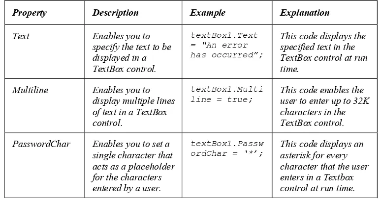
This control is used to display text to a user and accept input from the user. By default, you can enter a maximum of 2048 characters in this control. The properties of this control determine its appearance. In the membership registration form, the TextBox controls are used to accept the name and address from a user.
The commonly used properties of the TextBox control are explained in the following table.
Property Description Example Explanation
Text Enables you to specify the text to be displayed in a TextBox control.
textBox1.Text = “An error has occurred”;
This code displays the specified text in the TextBox control at run time.
Multiline Enables you to display multiple lines of text in a TextBox control.
textBox1.Multi line = true;
This code enables the user to enter up to 32K characters in the TextBox control.
PasswordChar Enables you to set a single character that acts as a placeholder for the characters entered by a user.
textBox1.Passw ordChar = ‘*’;
This code displays an asterisk for every character that the user enters in a Textbox control at run time.
The TextBox Control Properties
In the membership registration form, Label controls are used to display the text showing Name, Address, City and so on. This control is used to display the text that cannot be edited by the user directly. This control is used for providing information or description of another control on the form. The commonly used properties of the Label control are explained in the following table.
Property Description Example Explanation
Text Is used to set the text to be displayed in the Label control.
label1.Text = “An error has occurred”;
This code displays the specified text in the Label control at run time.
AutoSize Enables automatic resizing of the Label control according to the length of its caption. This property is used when you want to change the text of a label at run time.
label1.AutoSize = true;
This code changes the size of the Label control to accommodate the text entered in it.
The Label Control Properties
In the above scenario, the LinkLabel control is not implemented. However, it can be used to display the link to the Web site of the club. This control is used to display text as a link. When you click the link, it opens another form or Web site. The LinkLabel control has all the properties of a Label control as well as its own properties. The commonly used properties are explained in the following table.
Property Description Example Explanation
LinkColor Is used to get or set the
This code sets the color of the link text to purple.
ActiveLinkColor Is used to get or set the color used to display the active link.
linkLabel1.Acti veLinkColor = Color.Red;
This code sets the color of an active link to red.
DisabledLinkColor Is used to get or set the linkLabel1.Disa bledLinkColor =
This code sets the color of a disabled
The Label Control
Property Description Example Explanation
color of a disabled link. Color.Gray; link to gray.
LinkVisited Is used to get or set a value indicating whether a link should be
displayed as though it was visited.
linkLabel1.Link Visited = true;
This code sets the value indicating that the link should be displayed as though it was visited.
The LinkLabel Control Properties
You can create links to a form or a web site by using a LinkLabel control. To create a link to another form, you can use the following code in the LinkClicked event of the
LinkLabel control:
Form2 frm = new Form2(); frm.Show();
In the preceding code, an instance of the Form2 form is created and the Show() method of the form is called to display the form on the screen.
To create a link from a form to a website, you can use the following code:
System.Diagnostics.Process.Start("http://www.microsoft.com");
In the preceding code, the Start() method of the Process class, which exists in the
System.Diagnostics namespace is invoked. This method starts the default browser with
the specified URL.
In the membership registration form, the ListBox control is used to select the month of joining. It is used to provide a user-friendly interface so that the user does not need to type the month name. The ListBox control lets the user select an option from the given list. The ListBox control is used to display a list of items to a user. The user can select an item from the list. You can add items to this control by using the Properties window. For example, to add the items, Australia and France, to the ListBox control, select the ListBox control, and press the F4 key to switch to the Properties window. Click the ellipse button ( ) next to the Items property.
The String Collection Editor dialog box opens, as shown in the following figure.
The String Collection Editor Dialog Box
Type Australia in the String Collection Editor, and press the Enter key.Then, type France and click the OK button.
You can also add items to a ListBox control at runtime by using the Add() method of the Items collection, as shown in the following code:
listBox1.Items.Add("Australia"); listBox1.Items.Add("France");
The commonly used properties of the ListBox control are described in the following table.
Property Description Example
SelectionMode Is used to get or set the mode behavior of the ListBox control. You can set this property by using the Properties window as well as at run time. This property can contain None, One, MultiSimple, or MultiExtended as its value.
If you set this property of a ListBox control to None, a user cannot select any item from the ListBox control.
When you set the property to One, a user can select only a single value from the ListBox control.
If you set this property to MultiSimple, a user can select multiple items from the ListBox control.
If you set the value of this property to MultiExtended, a user can select multiple items and use the Shift, Ctrl, and arrow keys to make selections from the ListBox control.
The default value of this property is One.
listBox1.Selection Mode =
SelectionMode.Mult iSimple;
The preceding code sets the selection mode behavior for listBox1
toMultiSimple
Sorted Is used to indicate whether the items in the ListBox control should be sorted.
listBox1.Sorted = true;
The preceding code results in sorting the contents of the
listBox1 control.
SelectedIndex Is used to set or retrieve the position of the currently selected item in the list box. This property is not available during design time and cannot be set by using the Properties window. You can use this property in the Code window to retrieve the index corresponding to the item selected by a user at run time.
listBox1.SelectedI ndex = 2;
Property Description Example
SelectedItem Is used to set or retrieve the currently selected item. This property is not available at design time. You can use this property in the Code window to retrieve the item selected by a user at run time.
MessageBox.Show (listBox1.Selected Item.
ToString());
The preceding code displays a message box that shows the selected item from the list box at run time.
The ToString()
method is used to convert the value returned by the
SelectedItem property into a string object.
The ListBox Control Properties
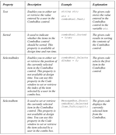
In the membership registration form, the ComboBox control is used to select the city. The ComboBox control is slightly different from the ListBox control because it allows the user to select an option from the given list and also allows him to type new text in it. The reason for using ComboBox for entering the city is that it is not possible to write all the cities into the control. So, the main cities are listed in the ComboBox control and for any other city, the user can type the name. If a ListBox control had been used instead of the ComboBox control, then the user would not be able to write anything in the control. The ComboBox control is used to display a drop-down list of items. It is a combination of a text box in which a user enters an item, and a drop-down list from which the user selects an item. This control can be populated using the Properties window.
To populate a ComboBox control, select it and press the F4 key to switch to the Properties window. Click the ellipse button next to the Items property. The String Collection Editor dialog box opens. Enter the items to be displayed in the combo box and click the OK button. You can also populate a combo box at run time by using the Add() method of the Items collection, as shown in the following code:
comboBox1.Items.Add("Australia"); comboBox1.Items.Add("France");
The preceding code adds the items, Australia and France to the ComboBox control named comboBox1.
The commonly used properties of the ComboBox control are explained in the following table.
Property Description Example Explanation
Text Enables you to either set or retrieve the value entered by a user in the ComboBox control.
string str;
str =
comboBox1.Text;
The given code stores the value entered in the ComboBox control in the variable str.
Sorted Is used to indicate whether the items in the ComboBox control should be sorted. This property is available at design time and run time.
comboBox1.Sorted = true;
The given code results in sorting the contents of the ComboBox control.
SelectedIndex Enables you to either set or retrieve the position of the currently selected item in the ComboBox control. This property is not available at design time. You can use this property in the Code window to set or retrieve the index of the item selected by a user in the combo box.
comboBox1.Selecte dIndex = 0;
The given code selects the first item in the ComboBox control.
SelectedItem Is used to set or retrieve the currently selected item in the ComboBox control. This property is not available at design time. You can use this property in the Code window to set or retrieve the item selected by a
MessageBox.Show(c omboBox1.Selected Item.ToString());
The CheckBox control may be used to implement questions that have answers as Yes/No or True/False. In the membership registration form, this control is used for the Sharing option. If the sharing option is selected, it means that the membership facilities can be shared by two persons.
The following table explains the commonly used properties of the CheckBox control.
Property Description Example Explanation
Text Is used to set or retrieve the option text of a CheckBox control.
checkBox1.Text = “Yes”;
checkBox2.Text = “No”;
The given code display two check boxes at run time with the text “Yes” and “No”, respectively.
Checked Is used to set or retrieve the status of the Checkbox control.
checkbox1.Checked = true;
The given code selects
checkBox1.
The CheckBox Control Properties
In the membership registration form, the Button control is used to submit information. After completing the form, the user needs to press the Register Now! button to submit the information. This control is used to perform an action when a user clicks it. For example, you may create a Login button on a form. When a user clicks the button, the details entered by the user are validated. The Button control has the Text property, which is used to display text on a button, as shown in the following code:
button1.Text = "Login Please";
The preceding code sets Login Please as the caption of the Button control named button1.
In the above scenario, the radio button is used to select the gender. Out of a group of radio buttons only one button can be selected. Therefore, it is used for selecting one among mutually exclusive options.
The CheckBox Control
The Button Control
The following table explains the commonly used properties of the RadioButton control.
Property Description Example Explanation
Text Is used to either set or retrieve the option text of the RadioButton
The given code displays two radio buttons at run time with the text “One” and “Two”, respectively.
Checked Is used to display the RadioButton control as selected.
radioButton1.Ch ecked = true;
The given code selects the RadioButton control named
radioButton1.
The RadioButton Control Properties
This control is used to group related controls. For example, you can create a GroupBox control to group two RadioButton controls, which are used to accept the gender of a member. This control allows the group of controls to be easily moved together at design time. You can specify the caption to be displayed for this control by setting its Text property. To set this property at design time, use the Properties window. You can also set the Text property at run time, as shown in the following code:
groupBox1.Text = "Select Gender";
In addition, Visual Studio 2005 provides a large number of controls that can be used to develop very sophisticated GUI applications. The following table describes some useful additional controls.
Control Name Purpose Properties Description
Panel Is used to provide logical grouping of
AutoScroll Sets the Panel control different from a GroupBox control. Setting AutoScroll to
The GroupBox Control
Control Name Purpose Properties Description controls can be grouped in a Panel control to provide a logical visual cue.
Panel control does not have a Text property, while the GroupBox control has got the Text property.
FlowDirection Specifies the direction in which the controls will be placed. The default value is LeftToRight.
FlowLayoutPanel Is used to arrange other controls such as text box and label in a horizontal or a vertical flow direction. It can automatically
WrapContents Setting this property to True will enable the other controls to be wrapped inside the FlowLayoutPanel control. If any control is not fitting in a line it is wrapped up in the next line.
TabControl Is used to arrange other controls such as text box and label in multiple tabs. For example, the Project Properties screen of Visual Studio 2005 displays information in various tabs.
Control Name Purpose Properties Description
RowCount Is used to get or set the number of rows in the TableLayoutPanel control.
ColumnCount Is used to get or set the number of columns in the TableLayoutPanel control. TableLayoutPanel Is used to
arrange other controls such as text box and label in a layout similar to a grid. Depending on the properties set for the control, it can
accommodate new controls by automatically expanding itself. This enables creating sophisticated layout that adapt to the dynamic changes in the application environment at run time.
GrowStyle Is used to get or set the value specifying whether the TableLayoutPanel control can expand dynamically to accommodate more controls in it. The default value is AddRows, indicating that the new controls will be added downward by increasing the number of rows of
TableLayoutPanel control.
IsSplitterFixed Is used to get or set the value indicating whether the splitter can be moved or is fixed. The default value is false, making the splitter movable.
SplitContainer Is used to arrange other controls in two panels separated by a moveable bar. It can be used to create complex user interfaces. It is more suitable in a situation where the control selection in one panel will decide the information to be displayed in the other panel.
Control Name Purpose Properties Description
control. The default value is LargeIcon.
Value Is used to get or set the value for the control within the specified range of minimum and maximum numbers.
Maximum Is used to get or set the maximum numeric value that can be entered in the control. The default value is 100.
Minimum Is used to get or set the minimum numeric value that can be entered in the control. The default value is 0. NumericUpDown Is used to accept
the numeric input from the user. It is a combination of a textbox and a pair of arrows that can be used to set the value for the control. The value can be which the Value property of the control should increase or decrease by clicking the arrow buttons on the control.
TreeView Is used to display
information in a hierarchical form. For example, the left pane of Windows Explorer window
Control Name Purpose Properties Description
where the list of folders is displayed in a hierarchy. It is made up of nodes, which can be parent or parent node and the contained nodes become the child nodes.
SelectedNode Is used to get or set the currently selected tree node in this control. If there is no currently selected node, then this property holds a null value.
Image Is used to get or set the image to display in this control. This property can be set either at design or run time. PictureBox Is used to
display graphic files of various formats. It support files of bitmap, GIF, JPEG, metafile, or icon formats.
ImageLocation Is used to get or set the path of the image file to be displayed in this control.
ImageList Is used to act as a repository of images in the application. Images stored in this control can be used by other controls to display images by setting the respective properties.
Images Is used to get the collection of images in this control.
MonthCalendar Is used to display a graphical user interface for
Control Name Purpose Properties Description
control that can be adjusted to show the date information according to the application’s need.
Document Is used to retrieve the contents of the currently displayed web page in the WebBrowser control.
In addition, it can add the combine the Web controls with Windows Forms controls within the same application.
DocumentTitle Is used to retrieve the title or the location of the currently opened document in this control.
VScrollBar Is used to provide the scrolling function to the
Control Name Purpose Properties Description
controls that do not have a scrollbar. Ideally, it can also be used to control the numeric input to the text box control. HScrollBar is another variation of this control with similar functionality.
Maximum Is used to get or set the maximum value of the scrollable range.
Minimum Is used to get or set the minimum value of the scrollable range. HScrollBar Is used to
provide the scrolling function to the controls that do not have a scrollbar.
Maximum Is used to get or set the maximum value of the scrollable range.
BalloonTipIcon Is used to get or set the icon to display on the balloon tip associated with the
NotifyIcon. NotifyIcon Is used to create
an icon in the notification area. This class cannot be inherited.
BalloonTipText Is used to get or set the text to display on the balloon tip associated with the
NotifyIcon.
AsciiOnly Is used to get or set a value indicating whether the MaskedTextBox control accepts characters outside of the ASCII character set.
Mask Is used to get or set the input mask to use at run time. MaskedTextBox Is used to set a
Control Name Purpose Properties Description
TextMaskFormat Is used to get or set a value that determines whether literals and prompt characters are included in the formatted string.
CheckedIndices Is a collection of checked indexes in this
CheckedListBox.
CheckedItems Is a collection of checked items this CheckedListBox.
CheckedListBox Is used to display a ListBox in which a check box is displayed to the left of each item.
CheckOnClick Is used to get or set a value indicating whether the check box should be toggled when an item is selected.
BrowsableAttributes Is used to get or set the browsable attributes associated with the object attached to the property grid.
CommandsActiveLin kColor
Is used to get or set the color of active links in the
executable commands region.
CommandsDisabledL inkColor
Is used to get or set the unavailable link color for the executable commands region.
PropertyGrid Is used to provide a user interface for browsing the properties of an object.
CommandsLinkColor Is used to get or set the link color for the executable commands region.
Just a minute:
Which of the following control serves as a repository for images?
1. PictureBox
2. ListView
3. ImageList
4. ListBox
Answer:
3. ImageList
The events associated with various controls can be categorized as follows:
Keyboard events
Mouse events
Control-specific events
The following table describes the common events used in controls.
Type Event Description
KeyDown Occurs when a user presses a key while a control has the input focus.
Keyboard events
KeyUp Occurs when the user releases a key.
Type Event Description
KeyPress Occurs when the user presses a key. The keyboard related events take place in the sequence
KeyDownÆ KeyPressÆKeyUp.
The KeyPressEventArgs object is passed as a parameter with every KeyPress event. The KeyUp and KeyDown events receive a KeyEventArgs object as a parameter.
The KeyEventArgs parameter provides information on the key that was pressed by the user. It contains the KeyCode property that specifies the physical keyboard button pressed by the user, tThe Modifier property, which specifies whether the user has pressed Shift, Ctrl, or Alt key, and the KeyData property combines the Key code and the Modifier property.
MouseDown This event occurs when the mouse pointer is over a control and the user presses the mouse button.
MouseUp This event occurs when the mouse pointer is over a control and the user releases the mouse button. Mouse events
MouseMove This event occurs when the mouse pointer is moved over a control.
Resize This event occurs when a control is resized. Control-specific
events
VisibleChanged This event occurs when the Visible property of a control is changed.
Common Control Events Description
Consider a scenario. You are creating an application to get information about the employees working in a company. In that application, the employees are required to fill qualifications and hobbies. If the employee selects sports as a hobby, the options such as name of the sports, level, and achievements in sports should be displayed. Otherwise, these options must be hidden. This could be achieved by placing the controls on the form and hiding them initially. When the user selects the appropriate option, these options appear. However, this approach is not correct as the controls will always acquire memory and space on the form irrespective of the fact whether the user has selected sports as the hobby or not
The best approach in this scenario is to load the controls dynamically if the users select sports as a hobby. The loading of controls at run time is called dynamic loading of controls.
Every control is a class derived from the System.Windows.Forms.Control class.
Therefore, when you load a control from the ToolBox in the form, an object of the class is created. To add a control at run time, create an instance of the control to be added, set the properties of the control, and add the new control to the Controls collection of the parent control.
For example, to dynamically load a button control during the form load event, you need to specify the following code in the Form1_Load event of the Form named Form1:
Button btn = new Button(); this.Controls.Add(btn);
The button control, btn, will be shown in the top-left corner of Form1. You can also dynamically change the properties of btn. For example, to change the text of the btn control on the form, you can add the following code to the preceding code:
btn.Text = "Click Me";
After dynamically loading the control, you need to add functionality to that control. For adding functionality to the control you need to create event handlers at run time.
Just a minute:
Write the steps, which need to be taken, while dynamically adding a control to a form?
Answer:
Create an instance of the control to be added
Set the properties of the control
Add the control to the Controls collection of the parent control
Event handlers can be created at run time. This is required if a control is added to a form at run time or if a handler needs to be added to an event when a specified condition is met. When you create an event handler at run time, you must first create a method that has the same parameters as the event that you want to handle. You must then connect the event with code that specifies the handler for the event.
In the following example, a button is dynamically added to a form named Form1, and a Click event is attached to the code:
public partial class Form1 : Form {
// creating an instance of the control to be added Button btn = new Button();
public Form1() {
InitializeComponent();
// connect the event with code that specifies the handler // for the event involved
btn.Click += new EventHandler(btn_Click); }
private void Form1_Load(object sender, EventArgs e) {
// setting the text property of the control btn.Text = "Click Me";
// adding the new control to the Controls collection of the // parent control
this.Controls.Add(btn); }
// creating a method that has the same parameters as the event that // you want to handle
private void btn_Click(object sender, EventArgs e) {
MessageBox.Show("New Button Click"); }
}
Problem Statement
Create an application to accept a user name and a password through a startup screen. The application should check whether the login name is “sa” and the password is “callcenter”. The user should be provided with three login attempts. After three unsuccessful login attempts, the application should display an error message and close the screen.
Solution
To create a Login Form, you need to perform the following tasks: 1. Create a new VC# application.
2. Design the application form. 3. Add code to validate the user input.
4. Execute the application and verify the output.
Task 1: Creating a New VC# Application
To create a new VC# application, you need to perform the following steps:
1. Select StartÆAll ProgramsÆMicrosoft Visual Studio 2005ÆMicrosoft Visual Studio 2005. The Start Page - Microsoft Visual Studio window is displayed.
2. Select FileÆNewÆProject. The New Project dialog box is displayed.
The New Project Dialog Box
3. Select the project type as Visual C# from the Project types pane and Windows Application from the Templates pane.
4. Type the name of the new project as LoginForm in the Name text box. 5. Specify the location where the new project is to be created as
c:\chapter3\Activity1 in the Location combo box. 6. Click the OK button.
Task 2: Designing the Application Form
When you create a VC# application, by default, the Form1 form is added to the project. To add controls to the Form1 form, you need to perform the following steps:
Note
TableLayoutPanel control has 2 rows and 2 columns. A TableLayoutPanel Tasks popup menu will appear automatically.
If Toolbox is not appearing select ViewÆToolbox. The Toolbox is displayed in the left pane of the window.
2. Right-click the TableLayoutPanel control and select the Add Row option to add a new row to the control.
3. Drag three Label controls, a Button control, and two TextBox controls to the form from the All Windows Forms tab in the Toolbox window.
The following figure shows a sample form.
Note
5. Set the Text and Name properties of the form and controls, as listed in the following table.
Control Text Property Name Property
Form1 Login Form Form1
label1 Enter User Name label1
label2 Enter Password label2
textBox1 txtUserName
textBox2 txtPassword
button1 Login cmdLogin
label3 Display User Defined Error Message lblMessage
Properties of Controls
6. Set the PasswordChar property of the txtPassword control to *.
7. Set the Anchor property of label1,label2,txtUserName,txtPassword, and cmdLogin control to None.
8. Set the ColumnSpan property of the cmdLogin control to 2. 9. Set the Visible property of the lblMessage control to False.
Note Text here Anchor property defines the edges of the container to which a certain control is bound. When a control is anchored to an edge, the distance between the control’s closest edge and the specified edge will remain constant.
Task 3: Adding Code to Validate the User Input
To check whether the user has entered the correct username and password, data need to be validated. To validate the user input, you need to perform the following steps:
1. Declare a class level integer variable named Ctr, as shown in the following code:
2. Double-click the cmdLogin button in the design view of the form to create the cmdLogin_Click() event handler. Type the following code in the event handler of the button to perform the validation check:
string LoginName, Password; LoginName = txtUserName.Text; Password = txtPassword.Text; Ctr = Ctr + 1;
// Checking whether login and password are correct or not if ((LoginName == "sa") && (Password == "callcenter")) {
lblMessage.Visible = true;
lblMessage.Text = "Welcome to Diaz Telecommunications"; Ctr = 0;
} else
//After three unsuccessful logon attempts, application should display an error //message
if (Ctr < 3) {
lblMessage.Visible = true;
lblMessage.Text = "Incorrect User Name or Password. Please try again.";
txtUserName.Focus(); }
else {
MessageBox.Show("Unauthorized Access. Aborting..."); Close();
Task 4: Executing the Application and Verifying the Output
To execute the application and verify the output, you need to perform the following steps: 1. Select DebugÆStart Debugging to execute the application.
The following window will be displayed on the screen.
Output of the Login Form Application
2. Type the correct user name and password and check whether the application displays a welcome message, “Welcome to Diaz Telecommunications”. 3. Type a wrong user name and password thrice and check whether the application
Most of the GUI-based applications provide the drag-and-drop function. This function enables you to drag an item from one location to another in an application. This function can also be used to drag an item from one location to another in different applications. For example, you can drag the controls from the Toolbox window to a form.
A function that most of you would have performed is the cut and paste operation. This function involves storing a piece of information in a temporary repository of the operating system known as the clipboard. VC# applications can incorporate the drag-and-drop and clipboard features by using some properties, methods, and events associated with the Windows Forms Controls.
There are a series of events that needs to be handled by the Windows Forms application to perform the drag-and-drop operation. The following table describes the common events used in the operation.
Event Description
ItemDrag Is specific to a TreeView or a ListView control. It is triggered when a user drags an item in these controls. This event receives
ItemDragEventArgs as an argument type, which contains information about the item that is being dragged and whether any mouse button was pressed alongside.
DragEnter Is triggered when a user drags an item onto the control’s boundaries. This event receives DragEventArgs as an argument type, which contains information about the item that is being dragged, the mouse pointer location, and whether any mouse button or the Shift, Ctrl, or Alt keys were pressed alongside.
DragOver Is triggered when a user drags an item while the mouse pointer is within the limits of the control’s boundaries. This event receives DragEventArgs as an argument type.
DragDrop Is triggered on the completion of the drag-and-drop operation. This event receives DragEventArgs as an argument type.
The Drag-and-Drop Operation Events
Note
Event Description
GiveFeedback Is triggered while the drag operation is in progress. This event can be used to provide any visual indication to the user that the drag-and-drop operation is in progress. For example, changing the mouse pointer while the drag operation is going on. This event receives
GiveFeedbackEventArgs as an argument type.
Events Used to Perform Drag-and-Drop Operations
To perform the drag-and-drop operation, the user has to perform a series of steps. These steps are:
1. Initiate the drag-and-drop operation for a control by calling the DoDragDrop()
method from the MouseDown or the ItemDrag event of the control.
2. Handle the events to provide information about the drag-and-drop operation to the user. These events include DragEnter,DragLeave, and GiveFeedback. 3. To enable the destination control to accept the dropped data, set its AllowDrop
property to true.
4. Write code in the DragDrop event of the destination control specifying how the dropped data should be handled.
The DoDragDrop method takes two arguments. The syntax is as follows: DoDragDrop(<data to be dragged>, <effect that dragging will have>)
An essential feature supported by all Windows operating systems is the clipboard. The clipboard acts as a temporary storage area for any application running on Windows operating system. Clipboard function can be incorporated in a VC# application by using the methods provided by the System.Windows.Forms.Clipboard class.
The Drag-and-Drop Operation Phases
Storing Data on Clipboard
The Clipboard class provides various methods to store data on Clipboard. These methods are:
SetAudio(): Adds a System.IO.Stream to the clipboard in the WaveAudio format.
SetData(): Adds data to the clipboard in the specified format.
SetDataObject(): Attemps to place data on the system clipboard the specified number of times and with the specified delay between attempts, optionally leaving the data on the clipboard after the application exists.
SetFileDropList(): Adds a collection of filenames to the clipboard in the System.Windows.Forms.DatFormats.FileDrop format.
SetImage(): Adds an image to the clipboard in the Bitmap format.
SetText():Adds text data to the clipboard in the format indicated by the specified TextDataFormat value.
The parameter of the SetDataObject() method specifies whether data stored on the clipboard should persist even after the application has been closed. The IDataList
interface of the SetDataObject method can be used to retrieve data from the clipboard in various formats.
Identifying the Type of Data on Clipboard
When data has been stored on Clipboard, the application can identify the type of currently stored data by using the ContainsAudio(), ContainsData(),
ContainsFileDropList(), ContainsImage(), and ContainsText() methods of the
Clipboard class.
Retrieving Data from Clipboard
Data stored on Clipboard can be retrieved by using various methods provided by the
Clipboard class. These methods are the GetAudioStream(), GetData(),
GetDataObject(), GetFileDropList(), GetImage(), and GetText(). When the GetDataObject() method is used to retrieve data from Clipboard, it returns data as an instance of the IDataObject interface. This interface can be used to provide a
Just a minute:
Which event occurs when a user drags an item in a TreeView or ListView control?
1. DragEnter event
2. DragOver event
3. GiveFeedback event
4. ItemDrag event
Answer:
4. ItemDrag event
Performing drag-and-drop operations between applications is same as enabling this action within an application. The applications involved in the drag-and-drop operation must support drag-and-drop operations.
In the following example, you will create a Windows-based application that will support the drag-and-drop operations between itself and the WordPad word processor, which is included with the Windows operating system.
For the following example to be functional, you need to add a text box control named textBox1 to the form and write the following code in the corresponding textbox events:
private void textBox1_DragEnter(object sender, DragEventArgs e) {
if (e.Data.GetDataPresent(DataFormats.Text)) e.Effect = DragDropEffects.Copy; else
e.Effect = DragDropEffects.None;
}
private void textBox1_DragDrop(object sender, DragEventArgs e) {
textBox1.Text = e.Data.GetData(DataFormats.Text).ToString(); }
To perform a drag-and-drop procedure between this application and Wordpad, you need to perform the following steps:
1. Run your application. While the application is running, click StartÆAll ProgramsÆAccessoriesÆWordPad. This will start WordPad with a new file automatically opened.
2. Type a string in the file.
3. Select the string in the WordPad file using the mouse and then drag the selected text to the TextBox control in your Windows-based application. The text that you have dragged gets copied to the text box.
Problem Statement
Create an application to use the drag-and-drop feature of VC#. Use the TextBox and TreeView controls as the source of data and the ListBox control as the destination. How will you create the application?
Solution
To create an application to demonstrate the drag-and-drop operation, you need to perform the following tasks:
1. Create a new VC# application. 2. Design the application form.
3. Add code to perform the drag-and-drop operation. 4. Execute the application and verify the output.
Task 1: Creating a New VC# Application
To create a new VC# application, you need to perform the following steps:
1. Select StartÆAll ProgramsÆMicrosoft Visual Studio 2005ÆMicrosoft Visual Studio 2005. The Start Page - Microsoft Visual Studio window is displayed.
2. Select FileÆNewÆProject. The New Project dialog box is displayed.
3. Select the project type as Visual C# from the Project types pane and Windows Application from the Templates pane.
4. Type the name of the new project as DragandDrop in the Name text box. 5. Specify the location where the new project is to be created as
c:\chapter3\Activity2 in the Location combo box. 6. Click the OK button.
Task 2: Designing the Application Form
When you create a VC# application, by default, the Form1 form is added to the project. To add controls to the Form1 form, you need to perform the following steps:
1. Drag two Label controls, a TextBox control, a TreeView control, and a ListBox control to the form from the All Windows Forms tab in the Toolbox window.
2. Right-click the control and then, select Properties from the shortcut menu to open the Properties window for each control added in Step 1.
3. Set the Text and Name properties of the form and controls. The following table lists controls and their text and name properties.
Control Text Property Name Property
Form1 Performing Drag and Drop Operations Form1
label1 Source Control Label1
label2 Destination Control Label2
textBox1 txtSource
listBox1 lstDestination
treeView1 Not Applicable treeViewSource
Controls and Their Properties
4. Set the AllowDrop property of the lstDestination control to True. 5. Click the ellipse button next to the Nodes property of the treeViewSource
control to open the TreeNode Editor dialog box.
6. Click the Add Root button to add a parent node. This will add Node0 at the root level.
7. Select Node0 and set its Name property to ParentNode and the Text property toParent Node.
8. Select Parent Node and click the Add Child button in the TreeNode Editor dialog box to add a child node.
9. Select Node1 and set its Name property to ChildNode1 and Text property to Child Node 1.
10. Repeat Steps 8 and 9 to create two more child nodes to the control. Set the Name and Text property of the child nodes, as listed in the following table.
Child Node Text Property Name Property
When you have created all the child nodes, the TreeNode Editor dialog box will appear, as shown in the following figure.
The TreeNode Editor Window
When all the controls have been added and configured, the form would appear, as shown in the following figure.
Design of the Performing Drag and Drop Operation Form
Task 3: Adding Code to Perform the Drag-and-Drop Operation
To enable the drag-and-drop function, you need to perform the following steps:
1. Right-click the txtSource control and select Properties to open the Properties window.
2. Click the button to view the events of the txtSource control.
3. Double-click the MouseDown event available in the events list to create the txtSource_MouseDown event handler. This event is used to start the drag operation. Write the following code in the event handler:
txtSource.DoDragDrop(txtSource.Text, DragDropEffects.Move);
In the preceding code, the DoDragDrop() method is used to set the data to be dragged
5. Click the button to view the events of the treeViewSource control. 6. Double-click the ItemDrag event available in the events list to create the
treeViewSource_ItemDrag event handler. This event is triggered when you drag an item from this control. Write the following code in the event handler:
// Stroring the selected item of tree view control in SelectedItem. TreeNode SelectedItem = (TreeNode)e.Item;
// Intiating the drag-and-drop operation by calling DodragDrop() method
treeViewSource.DoDragDrop(SelectedItem.Text, DragDropEffects.Move|DragDropEffects.Copy );
7. Press Shift+F7 to go to the design view of the form, and then select the lstDestination control on the form. Press the F4 key to view the Properties window.
8. Click the button to view the events of the lstDestination control. 9. Double-click the DragEnter event available in the events list to create the
lstDestination_DragEnter event handler. This event is triggered when you drag either text box text or node from the treeview control to the list box. Write the following code in the event handler:
if (e.Data.GetDataPresent(DataFormats.Text)) e.Effect = DragDropEffects.Move;
In the preceding code, the if statement ensures that data being dragged is of an acceptable type (in this case, Text). The code then sets the effects that will happen when the drop occurs to a value in the DragDropEffects enumeration.
10. Create the DragDrop event handler for the lstDestination control in same manner. This event is triggered when you have completed the drag-and-drop operation. Write the following code in the event handler:
// Adding the dragged text to the list box
lstDestination.Items.Add(e.Data.GetData(DataFormats.Text).ToString()) ;
Task 4: Executing the Application and Verifying the Output
To execute the application and verify the output, you need to perform the following steps: 1. Select DebugÆStart Debugging to execute the application.
The following window will be displayed on the screen.
The Output Screen of the Performing Drag and Drop Operations Application
2. Expand the Parent Node of the treeViewSource control and drag any child node onto the lstDestination control. Check if the child node text gets added to thelstDestination control.
If the application performs as desired, the final output will appear, as shown in the following figure.
The Output Screen of the Performing Drag and Drop Operations Application
1. Which namespace will you include to inherit a Form class? a. System.Windows
b. System.Text
c. System.Windows.Forms d. System.Drawing
2. What is the third step of a typical drag-and-drop operation? a. Handle the DragDrop event of destination control b. Set the AllowDrop property of destination control c. Handle drag event
d. Call the DoDragDrop method
3. What is the default maximum size of text that a user can enter in the TextBox control?
a. 2 K b. 4 K c. 8 K d. 12 K
4. The default value of the SelectionMode property of the ListBox Control is: a. None
b. One
c. MultiSimple d. MultiExtended
5. Which property of the ListBox control is not available at design time? a. Sorted
b. Items
c. SelectionMode d. SelectedItem
In this chapter, you learned that:
A form is used to accept input from a user and present information back to the user.
A form has many properties, methods, and events.
An event gets generated on performing an action such as clicking the mouse or pressing a key from the keyboard.
When an event is raised, code within the event handler is executed.
Controls can be added to a form to accept input from the user or display some information on the form.
Some commonly used controls are the TextBox, Label, CheckBox, RadioButton, and Button controls.
Controls can be added either at design time or at run time.
The drag-and-drop function enables the user to move an item on a form from one location to another.
There are various events that need to be handled to support the drag-and-drop operation in an application. These events are:
z ItemDrag event z DragEnter event z DragOver event z DragDrop event z DragLeave event z GiveFeedback event
Clipboard is the temporary repository of data.
The Clipboard function can be incorporated in the application by using the methods provided by the System.Windows.Forms.Clipboard class.
Exercise 1
Create a form for accepting the user name and password. When a user clicks the OK button, the application should verify that the user name is “Adminuser” and the password is “admin”. The application should enable the user to type the user name and password three times. If in all three attempts, the user enters a wrong user name or password, the application should display an error message and close.
When the user enters the correct user name and password and clicks the OK button, another form should open.
This form should accept details about a student, as shown in the following figure.
The preceding form should contain the following features:
The Course drop-down list should display the following items: z Web Application Developer
z Database Administrator z Network Administrator
The Timeslot list should display the following items: z 7:00 – 9:00
z 9:00 – 11:00 z 11:00 – 1:00 z 1:00 – 3:00 z 3:00 – 5:00
The Address text box should enable the user to enter multiple lines.
The Age text box should be disabled. The input to the Age text box should be controlled by a vertical scroll bar control.
When a user clicks the OK button, the application must ensure that the user has entered details in all the text boxes. If the user has not specified data in one or more text boxes, the application should display an error message.
If all the details are specified, a message box showing all details, such as name, age, address, gender, course, time slot, and facilities should be displayed and the controls should be reinitialized.
When the user clicks the Close button, the Student Details form should be closed.
Exercise 2
Create a form to enable the user to set and retrieve data from Clipboard. The form should have the TreeView control with two parent nodes, Languages, and Databases. The Language node, in turn, should have the following child nodes:
VC#
VB.NET
The Databases parent node should have the following child nodes:
SQL Server 2005
Oracle
The TreeView control should act as the source of Clipboard information. Add a ListBox control that should act as a destination of the Clipboard information.
There should be two buttons on the form. One button should enable the user to set the text of the currently selected node onto the Clipboard.