About This E-Book
EPUB is an open, industry-standard format for e-books. However, support for EPUB and its many features varies across reading devices and applications. Use your device or app settings to customize the presentation to your liking. Settings that you can customize often include font, font size, single or double column, landscape or portrait mode, and figures that you can click or tap to enlarge. For additional information about the settings and features on your reading device or app, visit the device manufacturer’s Web site.
Many titles include programming code or configuration examples. To optimize the presentation of these elements, view the e-book in single-column, landscape mode and adjust the font size to the smallest setting. In addition to presenting code and configurations in the reflowable text format, we have included images of the code that mimic the presentation found in the print book; therefore, where the reflowable format may compromise the presentation of the code listing, you will see a “Click here to view code image” link. Click the link to view the print-fidelity code image. To return to the
Android™ User Interface Design
Implementing Material Design for Developers
Second Edition
Ian G. Clifton
Many of the designations used by manufacturers and sellers to distinguish their products are claimed as trademarks. Where those designations appear in this book, and the publisher was aware of a trademark claim, the designations have been printed with initial capital letters or in all capitals. The author and publisher have taken care in the preparation of this book, but make no expressed or implied warranty of any kind and assume no responsibility for errors or omissions. No liability is assumed for incidental or consequential damages in connection with or arising out of the use of the information or programs contained herein.
For information about buying this title in bulk quantities, or for special sales opportunities (which may include electronic versions; custom cover designs; and content particular to your business, training goals, marketing focus, or branding interests), please contact our corporate sales department at [email protected] or (800) 382-3419.
For government sales inquiries, please contact [email protected].
For questions about sales outside the U.S., please contact [email protected]. Visit us on the Web: informit.com/aw
Library of Congress Control Number: 2015950113 Copyright © 2016 Pearson Education, Inc.
All rights reserved. Printed in the United States of America. This publication is protected by
copyright, and permission must be obtained from the publisher prior to any prohibited reproduction, storage in a retrieval system, or transmission in any form or by any means, electronic, mechanical, photocopying, recording, or likewise. To obtain permission to use material from this work, please submit a written request to Pearson Education, Inc., Permissions Department, 200 Old Tappan Road, Old Tappan, New Jersey 07675, or you may fax your request to (201) 236-3290.
Google is a registered trademark of Google, Inc.
Android, Chromecast, Gmail, Google Maps, Google Play, and Nexus are trademarks of Google, Inc. Amazon and Kindle Fire are registered trademarks of Amazon.com, Inc.
Java is a registered trademark of Oracle and/or its affiliates.
Illustrator and Photoshop are registered trademarks of Adobe Systems Incorporated. ISBN-13: 978-0-134-19140-9
ISBN-10: 0-134-19140-4
Text printed in the United States on recycled paper at RR Donnelley in Crawfordsville, Indiana. First printing: November 2015
Editor-in-Chief Mark Taub
Executive Editor Laura Lewin
Managing Editor Kristy Hart
Project Editor Namita Gahtori Copy Editor
Cenveo® Publisher Services Indexer
Cenveo Publisher Services Proofreader
Cenveo Publisher Services Technical Reviewers Cameron Banga
Joshua Jamison Adam Porter
Editorial Assistant Olivia Basegio Cover Designer Chuti Prastersith Compositor
Contents at a Glance
Introduction
Part I The Basics of Android User Interfaces 1 Android UI and Material Design
2 Understanding Views—The UI Building Blocks
3 Creating Full Layouts With View Groups and Fragments
4 Adding App Graphics and Resources
Part II The Full Design and Development Process 5 Starting A New App
6 Prototyping and Developing the App Foundation
7 Designing the Visuals
8 Applying the Design
9 Polishing with Animations
Part III Advanced Topics for Android User Interfaces 10 Using Advanced Techniques
11 Working with the Canvas and Advanced Drawing
12 Developing Custom Views
13 Handling Input and Scrolling
Appendix A Google Play Assets
Contents
Introduction
Audience for This Book Organization of This Book How to Use This Book This Book’s Website
Conventions Used in This Book
Part I The Basics of Android User Interfaces 1 Android UI and Material Design
A Brief History of Android Design Material Design
The Android Design Website Core Principles
Standard Components
Supporting Multiple Devices Avoiding Painful Mistakes Summary
2 Understanding Views—The UI Building Blocks What Is a View?
Displaying Text Displaying Images
Views for Gathering User Input Other Notable Views
Listening to Events Other Listeners Summary
3 Creating Full Layouts With View Groups and Fragments Understanding ViewGroup and the Common Implementations Encapsulating View Logic with Fragments
The Support Library Summary
Resource Qualifiers Understanding Density Supported Image Files Nine-Patch Images XML Drawables Other Resources Summary
Part II The Full Design and Development Process 5 Starting A New App
Design Methods Defining Goals High-Level Flow Wireframes
Continuing with Content Pieces Summary
6 Prototyping and Developing the App Foundation Organizing into Activities and Fragments
Creating the First Prototype Evaluating the First Prototype Summary
7 Designing the Visuals
Wireframes and Graphical Design Tools
Styles Lighting Colors
Text Considerations Other Considerations Designing Step-by-Step Summary
8 Applying the Design
Breaking Comps into Views
Developing the Woodworking App Basic Testing Across Device Types Summary
9 Polishing with Animations Purpose of Animations View Animations Property Animations
Property Animation Control ViewPropertyAnimator Animating Form Errors Animating Icons
Simple Transitions Summary
Part III Advanced Topics for Android User Interfaces 10 Using Advanced Techniques
Identifying Jank
Using Systrace to Understand Jank Optimizing Images
Additional Performance Improvements Hierarchy Viewer
Custom Fonts
Complex TextViews RecyclerView
Summary
11 Working with the Canvas and Advanced Drawing Creating Custom Drawables
Paint Canvas
Working with Text Working with Images Color Filters
12 Developing Custom Views General Concepts
Measurement Layout
Drawing
Saving and Restoring State Creating a Custom View Summary
13 Handling Input and Scrolling Touch Input
Other Forms of Input Creating a Custom View Summary
Appendix A Google Play Assets Application Description
The Change Log Application Icon Screenshots Feature Graphic Promotional Graphic Video (YouTube) Promoting Your App Amazon Appstore
Appendix B Common Task Reference Dismissing the Software Keyboard Using Full Screen Mode
Keeping the Screen On
Determining the Device’s Physical Screen Size Determining the Device’s Screen Size in Pixels Determining the Device DPI
Checking for a Network Connection
Checking if the Current Thread Is the UI Thread Custom View Attributes
Preface
Android has evolved at an incredible speed, and keeping up with the changes is a difficult job for any developer. While working to keep up with the latest features and API changes, it can be easy to
neglect the design changes Android is undergoing. When Google announced the Material Design guidelines, even designers who had long dismissed Android’s visuals started paying attention.
It’s more important than ever for Android developers to understand the core aspects of design and the Material Design guidelines go some of the way toward making that possible; however, without years of background in design, it can be difficult to make sense of everything. This book will guide you through the real-world process of design starting from an abstract idea and sketches on paper and working all the way through animations, RenderScript, and custom views. The idea is to touch on each of the core concepts and cover enough so that you can have productive conversations with designers or even create everything yourself.
Design has many purposes, but two of the most important are usability and visual appeal. You want brand-new users to be able to jump into your app and get started without any effort because mobile users are more impatient than users of nearly any other platform. Users need to know exactly what they can interact with, and they need to be able to do so in a hurry while distracted. That also means you have to be mindful of what platform conventions are in order to take advantage of learned
behavior.
If you have picked up this book, I probably do not need to go on and on about how important design is. You get it. You want to make the commitment of making beautiful apps that are a pleasure to use. This book will serve as a tutorial for the entire design and implementation process as well as a handy reference that you can keep using again and again. You will understand how to talk with designers and developers alike to make the best applications possible. You will be able to make apps that are visually appealing while still easy to change when those last-minute design requests inevitably come in.
Ultimately, designers and developers both want their apps to be amazing, and I am excited to teach you how to make that happen.
Acknowledgments
About the Author
Ian G. Clifton is a professional Android application developer, user experience advocate, and author. He has worked with many developers and designers, and led Android teams, creating well-known apps such as Saga, CNET News, CBS News, and more.
Ian’s love of technology, art, and user experience has led him along a variety of paths. In addition to Android development, he has done platform, web, and desktop development. He served in the U.S. Air Force as a Satellite, Wideband, and Telemetry Systems Journeyman and has also created quite a bit of art with pencil, charcoal, brush, camera, and even wood.
You can follow Ian G. Clifton on Twitter at http://twitter.com/IanGClifton and see his thoughts about mobile development on his blog at http://blog.iangclifton.com. He also published a video series called “The Essentials of Android Application Development LiveLessons, 2nd Edition,” available at
Introduction
Audience for This Book
This book is intended primarily for Android developers who want to better understand user interfaces (UI) in Android. To focus on the important topics of Android UI design, this book makes the
assumption that you already have a basic understanding of Android, so if you haven’t made a “Hello, World” Android app or set up your computer for development, you should do so before reading this book (the Android developer site is a good place to start:
http://developer.android.com/training/basics/firstapp/index.html).
Most developers have limited or no design experience, so this book makes no assumptions that you understand design. Whenever a design topic is important, such as choosing colors, this book will walk you through the basics, so that you can feel confident making your own decisions and understand what goes into those decisions.
Organization of This Book
This book is organized into a few parts. Part I, “The Basics of Android User Interface,” provides an overview of the Android UI and trends before diving into the specific classes used to create an interface in Android. It also covers the use of graphics and resources. Part II, “The Full Design and Development Process,” mirrors the stages of app development, starting with just ideas and goals, working through wireframes and prototypes, and developing complete apps that include efficient layouts, animations, and more. Part III, “Advanced Topics for Android User Interfaces,” explores much more complex topics including troubleshooting UI performance problems with Systrace and creating custom views that handle drawing, scrolling, and state saving.
This book also has two appendices. The first focuses on Google Play assets (and covers the
differences to know about when preparing for the Amazon Appstore as well), diving into app icon creation. The second covers a variety of common UI-related tasks that are good to know but don’t necessarily fit elsewhere (such as custom view attributes).
The emphasis throughout is on implementation in simple and clear ways. You do not have to worry about pounding your head against complex topics such as 3D matrix transformations in OpenGL; instead, you will learn how to create smooth animations, add PorterDuff compositing into your
custom views, and efficiently work with touch events. The little math involved will be broken down, making it simple. In addition, illustrations will make even the most complex examples clear, and every example will be practical.
How to Use This Book
This book starts with a very broad overview before going into more specific and more advanced topics. As such, it is intended to be read in order, but it is also organized to make reference as easy as possible. Even if you’re an advanced developer, it is a good idea to read through all the chapters because of the wide range of material covered; however, you can also jump directly to the topics that most interest you. For example, if you really want to focus on creating your own custom views, you can jump right to Chapter 12, “Developing Custom Views.”
This Book’s Website
You can find the source code for the examples used throughout this book at
https://github.com/IanGClifton/auid2 and the publisher’s website at
http://www.informit.com/store/android-user-interface-design-implementing-material-9780134191409. From there, you can clone the entire repository, download a full ZIP file, and browse through individual files.
Conventions Used in This Book
This book uses typical conventions found in most programming-related books. Code terms such as class names or keywords appear in monospace font. When a class is being referred to
specifically (e.g., “Your class should extend the View class”), then it will be in monospace font. If it’s used more generally (e.g., “When developing a view, don’t forget to test on a real device”), then it will not be in a special font.
Occasionally when a line of code is too long to fit on a printed line in the book, a code-continuation arrow ( ) is used to mark the continuation.
You will also see some asides from time to time that present useful information that does not fit into flow of the main text.
Note
Notes look like this and are short asides intended to supplement the material in the book with other information you may find useful.
Tip
Tips look like this and give you advice on specific topics.
Warning: Potential Data Loss or Security Issues
Chapter 1. Android UI and Material Design
It is a good idea to have an overview of the user interface (UI) as it pertains to Android, so that’s the starting point here. You will learn a brief history of Android design to see how it evolved to Material Design before diving into some core design principles. You will also learn some of the high-level components of Android design and some of the changes that have come to Android design as the world’s most popular mobile operating system has evolved.
A Brief History of Android Design
Android had a very technical start with a lot of amazing work going on to make it a platform that could run on a variety of devices without most apps having to care too much about the details. That base allowed Android to handle many types of hardware input (trackballs, hardware directional pads, sliding keyboards, touch interface, and so on). It also kept Android largely focused on scalable design, much more closely related to fluid web design than typical mobile design. The underlying code could even handle running on a device that did not have a graphics processing unit (GPU). Unfortunately, all of that also meant that early design for Android was blasé and focused on the
lowest common denominator, so embellishments like animations were sparse. Colors were bland and often inconsistent, and most input and visual organization was based on what had been done in the past rather than pushing things forward.
In 2010, Google hired Matias Duarte (most known for his excellent work with WebOS) as the Senior Director of Android User Experience, which made it clear that Google had become serious about the user experience for Android and its related visual design. The Android beta was released way back in 2007, so Matias and his colleagues had a lot of work in front of them. How do you go from a very functional but visually bland UI to one that enhances that functionality by improving the entire design and user experience?
About a year later, the first Android tablets running Honeycomb (Android 3.0) were revealed. These tablets gave Google the opportunity to really experiment with the UI because there was no prior version of Android that had been designed for tablets, and therefore users did not have strong expectations. With the radical new Holo theme, these tablets were a significant departure from the previous Android styles.
By the end of 2011, Google had revealed Android 4.0, Ice Cream Sandwich, which showed how they were able to improve the tablet-only Honeycomb styling to tone down some of the “techieness” and smooth out the user experience. The tablet/phone divide was eliminated and the platform was brought together in a much more cohesive manner, emphasizing interaction, visuals, and simplicity. Even the default system font changed to the newly created Roboto, significantly improving on the previous Droid fonts. Regardless of whether you are the kind of person who gets giddy over straight-sided Grotesk sans serif fonts, you will appreciate the attention to detail this font signifies.
Android 4.1, Jelly Bean, was revealed at Google I/O in 2012. A release focused primarily on usability, Jelly Bean gave Android a much better sense of polish. “Project Butter” brought about a much more fluid user experience with graphics improvements such as triple buffering. Even
interactive), support for photo spheres (panoramas that can cover 360 degrees), and wireless mirroring. Android 4.3 followed with many more features, including OpenGL ES 3.0 support.
Android 4.4 finished off the 4.x version with major system improvements, allowing Android to run on devices with as little as 512MB of RAM.
Figure 1.1 The home screen for Android 1.6 (top left), 2.3 (top right), 4.2 (bottom left), and 5.0 (bottom right)
Material Design
Although Android 5.0 and Material Design are closely linked, Material Design isn’t just a design language for Android 5.0 and beyond. It is meant to be a set of design principles that apply across device types and arbitrary software versions. That means best practices from Material Design should be applied to older versions of Android and even web apps. Google describes it this way:
A material metaphor is the unifying theory of a rationalized space and a system of motion. The material is grounded in tactile reality, inspired by the study of paper and ink, yet technologically advanced and open to imagination and magic.
If you’re like most nondesigners, your immediate reaction is “What?” It is easy to dismiss this type of statement as just “designer fluff” and not appreciate the meaning, but designers have guiding
principles that are meant to make their work better and more coherent just like developers (who have principles such as “Don’t repeat yourself”). Google’s description is saying that Material Design is based on real paper and ink, but it isn’t limited to just what those elements can do in the physical world.
General Concepts
In the Material Design world, paper is the primary surface that everything else exists on. It can grow and shrink, unlike paper in the real world. That means a piece of paper can appear in the center of the screen by growing from a single pixel to its full size and it can even change shape. Paper always shows up with some kind of transition (growing or sliding into place); it is never just suddenly there at full size. Pieces of paper can push each other when their edges collide. Pieces of paper can be split into two, and multiple pieces can join to become one. A sheet of paper can never go through another, but one sheet of paper can slide over another.
The fact that paper can slide in front of other paper means that Material Design exists in a 3D
environment. The third dimension, plotted on the Z-axis, is how close the object is to the surface of the screen, which affects the shadow it casts and whether it is in front of or behind another piece of paper. Material Design treats the Z-axis as very finite, meaning that there is no significant amount of depth that can be shown (just how many pieces of paper thick is your actual screen?). This limitation means that differences in depth are much more noticeable. Paper is always one density-independent pixel thick (the concept of density-independent pixels, or dips, is covered in detail in Chapter 4, “Adding App Graphics and Resources,” but you can simply think of a dip as a unit for now), which means that it does not bend or fold.
Figure 1.2 Simple perspective means closer objects are larger, but with that cue alone it is unclear if an object is closer or just larger than the others
Figure 1.4 A simple shadow can indicate that an object is closer, but the lack of a size change (due to perspective) can create confusion
Figure 1.5 When you combine all of these principles, it is much more obvious that the middle item is closer even with the outside pieces of paper being raised from the surface slightly
Figure 1.6 3D rendering of a Material Design app
In addition to paper, ink is the other major component of Material Design. Ink is what colors paper and creates text on paper. It has no thickness. It can move around on a piece of paper (e.g., a photo can move from the top to the bottom of a piece of paper or grow from a thumbnail to a larger photo on that paper). It can grow or shrink, and change color or shape. It is generally bold and purposeful. Many apps have been designed with very subdued colors or even just shades of gray, but Material Design calls for a vibrancy to the design. Chapter 7, “Designing the Visuals,” discusses color choice in detail.
Interaction and Animation
One of the most important aspects of app design that is often ignored is interaction. What happens when the user touches this button? Sure, it shows a new screen, but what is the process to get there? Does the button grow or shrink or change color? Does the new content slide in or grow from the old content? Material Design puts much more emphasis on interaction and animation than previous design guidelines, which will help make your apps feel well polished.
Touch events in the past were often expressed with a simple background color change. Tapping a row in a list might have caused the background to suddenly go from white to orange or blue. Material
Design is about natural transitions, so the typical touch reaction is a ripple. You can imagine dropping a rock in a pond and seeing the water ripples move outward from that point; that is similar to the
response of an interactive element in Material Design. In addition, an item’s paper can react. If a standalone piece of paper reacts to touch, the whole paper rises up as if eager to meet the finger. This is important to note because it is the opposite of traditional design where objects like buttons are pushed down in an effort to mimic the physical world (called skeuomorphic design).
doesn’t start out at its top speed when you press the accelerator, a piece of paper sliding off the screen in response to your touch shouldn’t start at its maximum speed. As small as the paper may be, it does have mass. The way an animation changes as it goes from 0% complete to 100% complete is called interpolation. Choosing to have an interpolation that accelerates rather than being linear might seem like an unimportant detail, but it is one of those many little pieces that come together to make your app that much better. In addition, it is actually easy to do (Chapter 9, “Polishing with
Animations,” explains animations in great detail).
Another important note about animations is that their purpose is not to “wow” the user. It is not to distract the user or arbitrarily make things interesting. The purpose is to help the user understand the transition from what was on the screen to what will be on the screen. Animations guide the user’s eyes to the important elements and explain what is changing. When done right, these transitions create some enjoyment for the user and can even lead the user to trigger them again just to watch the
animation.
Typography
When Android 4.0 was released, Google also unveiled Roboto. Roboto is a typeface designed
specifically for today’s mobile devices, making it appear crisp on a variety of densities. For Android 5.0, Roboto has been updated to fix some of its more noticeable quirks, improving some characters (such as the capital “R”) and making the dots for punctuation and tittles (the dots above lowercase “i” and “j”) the more common circle rather than a harsh square. You can see some of the changes in
Figure 1.7.
Figure 1.7 Some of the more noticeable differences between the original Roboto font (top) and the revised version (bottom)
covered in much more detail in Chapter 7, “Designing the Visuals.”
Metrics and Alignment
Material Design emphasizes a 4dp (or four density-independent pixel) grid. That means every element on the screen is aligned based on a multiple of four. For instance, the left and right sides of the screen are typically indented 16dp on a phone, so thumbnails and text in a list all start 16dp from the left. When images such as thumbnails or icons are shown to the left of a list item, the Material Guidelines say that the text that follows is indented a total of 72dp from the left edge of the screen. These layout and alignment concepts are covered in detail in Chapter 5, “Starting a New App.” They’re also used throughout the example implementations in this book.
The Android Design Website
That was quite a bit about Material Design, but there is a lot more to it. Throughout this book, you will be learning more about Material Design, what factors into certain decisions, and how to actually implement it all, but it is also a good idea to look at the Android design website
(http://developer.android.com/design/). That site will give very specific details about how Material Design applies to specific Android components. You should also look at the Material Design spec from Google (http://www.google.com/design/spec/material-design/), which has a lot of great video clips for demonstrating things that are hard to understand with just words, such as interaction
animations.
You don’t need to have the content of either of those sites memorized before you start designing your own app or implementing a design someone else has created, but you should look through them to have an idea of what is there and be ready to come back to them any time you have a question. Note that the Android developer website (including the design portion of it) has a huge number of pages, giving descriptions and tutorials for a variety of topics. That is great because it means you can almost always find some help there, but it also means that many of the pages are not as up-to-date as would be ideal. If you see a page there that seems to disagree with Material Design, it is most likely just outdated (you can often tell by looking at whether the screenshots show an older version of Android such as 4.x with the Holo blue in the status bar), so you should prefer the guidance provided by the Material Design spec. It’s also worth noting that the Material Design guidelines are regularly being updated, adding examples and details to further clarify the principles.
Core Principles
It is impossible to come up with a perfect checklist that lets you know that your app is exactly right when everything is checked, but guiding principles can make a big difference. Start with your users’ goals to define exactly what your app should do. You might be surprised how many apps do not have a clear user goal in mind before launching, and it is reflected in their design. User goals and product goals are explained in detail in Chapter 5, “Starting a New App,” but it’s important to look at the core principles first.
Do One Thing and Do It Well
to and that it does so well. When you’re starting on a new app, list everything you want it to do. Next, start crossing off the least important things in that list until you have narrowed it down to just the absolute essentials. You can always add functionality later, but you can’t add a clear focus halfway through making a jack-of-all-trades app. A narrow focus also helps ensure that the desired features and functionality are clear.
You are probably ready when you can answer the question, “Why would someone use this app?” without including conjunctions (such as “and” and “or”) and without using a second sentence. Here are two examples:
Good: “Users will use this app to write quick notes to themselves.”
Bad: “Users will use this app to write notes to themselves, browse past notes, and share notes with other users on Twitter.”
Yes, being able to browse notes can be an important part of the app, but writing the notes is the most important part. Making that decision makes it clear that you should be able to begin a new note in a single touch from the starting screen, probably via a floating action button (or “FAB”). Of course, you could be building an app where organizing those notes is the most important part; in that case, you will emphasize browsing, sorting, and searching.
Figure 1.8 The Contacts app is a good example of an app with a singular and obvious focus As tempting as it can be to make an app that does many things, such as an email app that can modify photos before adding them as attachments, you need to start with a single focus and make that part of the app excellent before moving on. If the email portion is terrible, no one will download the app just to use the photo manipulation aspect of it.
There are times when your app does have multiple purposes because these features are too
intertwined to separate or the requirements are outside of your control. In those cases, you should split the functionality in a clear and meaningful way for the user. For instance, consider the Gallery in Android. It allows users to look at their photos and manipulate them in simple ways. It doesn’t allow users to draw images or manage the file system, so it has a clear and obvious focus. The Gallery has a quick link to jump to the Camera app, but the Camera also has its own icon that the user can go to from the launcher. Conceptually, the Camera app just takes photos and videos. As complex as the code is to do that well, users don’t have to think about it. In fact, users do not need to know that the Camera app and the Gallery app are part of the same app in stock Android (some manufacturers do create separate, custom apps for these features, and Google provides their own replacements). If users want to look at photos, they will go to the Gallery. If users want to take photos, they will go to the Camera app.
Play Nicely with Others
Just because your app does only one thing extremely well doesn’t mean it needs to limit the user’s experience. One of the best parts about Android is that apps are really just components in the overall user experience. Your app should handle reasonable Intents, which is the class Android uses to indicate what the user is trying to do and to find an appropriate app to accomplish that objective. Is it an app for a particular site? Have it handle links for that site. Does it let the user modify images? Handle any Intent for working with an image.
Figure 1.9 Default UI for letting a user share with whichever app he or she chooses
The time you spend implementing sharing for third-party services in your own app is time that could be spent making your app better. Why would you spend a week developing some tolerable sharing tools when you can pass that work off to the user’s favorite apps? You can bet that regardless of whichever Twitter client the user is going to share with, the developer of that app spent more time on it than you can afford to for a single feature. You use existing Java classes, so why not use existing Android apps?
This does not just go for sharing either. You can build an amazing alarm app that, from the user perspective, just triggers other apps. That sounds simple, but once you combine it with the system to allow that app to start playing a music app or preload a weather or news app, your clear, easy
functionality becomes extremely valuable.
Visuals, Visuals, Visuals
One of the major challenges of mobile applications is that you often have a lot of information to convey, but you have very little screen real estate to do so. Even worse, the user is frequently only taking a quick look at the app. That means it needs to be easy to scan for the exact information
desired. Use short text for headers, directions, and dialogs. Make sure that buttons state a real action, such as “Save File” instead of “Okay,” so that a button’s function is immediately obvious.
Use images to convey meaning quickly. Use consistent visuals to anchor the user. Always include all applicable touch states. At a minimum, anything the user can interact with should have a normal state, a pressed state, and a focused state. The pressed state is shown when the user is actively touching the view, so excluding it means the user is unsure what views can be interacted with and whether the app is even responding. The focused state is shown when a view is selected by means of the directional pad or other method so that the user knows what view will be pressed. It can also be used in touch mode, such as how an EditText will highlight to show users where they are entering text. Without a focused state, users cannot effectively use alternate means of navigation.
Visuals are not just limited to images either. Users of your app will quickly learn to recognize repeated words such as headers. If a portion of your app always says “Related Images” in the same font and style, users will learn to recognize the shape of that text without even needing to read it.
Easy but Powerful
People are judgmental. People using an app for the first time are hyperjudgmental, and that means it is critical that your app be easy to use. The primary functions should be clear and obvious. This need ties in with visuals and a recognizable focus. If you jump into that note-taking app and see a big plus icon, you can guess right away that the plus button starts a new note. The powerful side of it comes when pressing that plus button also populates meta-data that the user does not have to care about (at that moment), such as the date the note was started or the user’s location at that time. When the note is saved, the app can scan it for important words or names that match the user’s contacts. Suddenly the app is able to do useful things such as finding all notes mentioning Susan in the past month without the user having to consider that ability when creating the note.
group of articles to add to the list. Simple features like these are intuitive and make the user feel empowered.
Figure 1.10 Each image-processing technique along the bottom has a simple thumbnail illustrating the effect
One last thing to remember about making your app easy but powerful is that the user is always right, even when making a mistake. When the user presses a “delete” button, in 99% of cases, the user meant to press that button. Don’t ask the user “Did you really mean to do that thing you just did?” Assume the user meant to, but make it easy to undo the action. Don’t make features difficult to access to keep the user from making a mistake. Make features easy to use, including undo, to encourage the user to explore your app. An app that does this extremely well is Gmail. When you delete an email, you have the option to undo it. The app doesn’t ask you whether you meant to delete it because that gets in the way of a good user experience. Of course, if it’s not reasonably possible to undo an action (like the extreme case of formatting the device), then a confirmation dialog is a good idea.
Platform Consistency
When in doubt, follow the user experience expectations of the platform. Even when you’re not in doubt, you should follow the user experience expectations of the platform. In other words, unless you have an extremely good reason, you should not do things differently from how they are done in the built-in apps. “We want our iOS app and Android app to look/behave similarly” is not a good
excuse. Your Android users use their Android devices on a daily basis; they rarely (if ever) use iOS devices (or other mobile platforms). These platforms have very different user expectations, and using the behavior or styles of another platform in your Android app will lead to user confusion and
frustration.
belong in an Android app. The actual Android back button should have an obvious and intuitive function in your app, and adding another element to the UI that does the same thing creates user
confusion. There is no need to exit your app, because the user can either back out of it or simply press the home button. Your button is either going to artificially replicate one of these scenarios or, worse, it will truly exit the app and slow down its next startup time. That does not just slow down the user experience; it wastes power rereading assets from disk that might have been able to stay in memory. Using styling from another platform not only looks out of place, but it is also awkward for the user. For example, Android has a specific sharing icon that looks quite distinct from other platforms such as iOS and Windows Phone. Users are likely to be confused if an icon from another platform is used. Take advantage of what the user has already learned from other apps on Android by being consistent with the platform.
Most Android developers have to deal with a manager or other person at some time who insists on making the user experience worse by copying aspects of the iOS app such as a loading screen. Fight this! Not only is it a waste of your time to develop, making the user experience worse also leads to lower app use and user retention. When your app has an artificial 2-second delay to show a splash screen that’s little better than a full-screen branding advertisement and the competitor’s app opens in a hundred milliseconds, which is the user going to want? Worse, it’s easy to make mistakes
implementing something like a splash screen, causing your app to open to the real content after an artificial delay despite the fact that the user switched to another app because the splash screen took too long. Now it feels like the app is being aggressive, trying to force the user to use it, and it is even more likely to be uninstalled and given a low rating.
Bend to the User
One of the great things about Android is that users have a lot of choice right from the beginning. A construction worker might choose a rigid device with a physical keyboard over a more powerful thin device. Someone with larger hands has the option to pick a device with a 6-inch screen over a much smaller screen. Android makes it extremely easy to support these different scenarios. Just because it can be difficult to support landscape and portrait on other platforms does not mean that the support should be dropped for Android as well.
Bending to the user does not just mean adjusting your app to give the best experience on a given device; it also means picking up on user habits. How much you pick up their habits is up to you. The simplest method is just giving preferences that the user can set. Is your app a reading app? It might make sense to offer an option to force a particular orientation for reading while lying down. If your app shows white text on a black background at night, but the user always switches it back to black on white, your app can learn that preference.
Standard Components
Regardless of whether you meticulously sketch your design concepts, quickly rough them out to refine later, or dip your pet’s feet in ink and have him walk around on a large piece of paper hoping for something magical to appear, it is important to know the standard components of Android.
System Bars
status info on the right, such as battery and signal levels. The navigation bar (shown in Figure 1.12) is at the bottom of the screen and consists of back, home, and overview software buttons when hardware buttons are not present. Apps that were built against older versions of Android will also cause a
menu button to appear in the navigation bar. Tablet devices had a combined bar that displayed both status and navigation controls for Android 3.x (Honeycomb), but the UI was updated for Android 4.2 to be like phones, with the status bar on top and the navigation bar at the bottom.
Figure 1.11 The standard Android status bar (top) and the status bar colored by an app (bottom)
Figure 1.12 The standard Android navigation bar is typically black but can also be colored For the most part, these do not need to be considered much during design. You can hide the status bar, but you almost never should. It’s acceptable to hide the system bars during video playback and it’s fine to hide the status bar when it might interfere with the user experience. Casual games should typically still show the status bar (no reason for the user to have to leave a game of solitaire to see what notifications are pending or what time it is). Nearly all apps should show the status bar. How do you know if yours is an exception? Try your app with the status bar being displayed and see if it
interferes with the user experience. If it does not, you should display the status bar. Code examples demonstrating how to show and hide these bars are available in Appendix B, “Common Task Reference.”
Notifications
Right from the start, Android was designed with multitasking in mind. A user shouldn’t have to stare at a progress bar in an app that is downloading resources, nor should a user have to exit an app to have access to the most important information on his or her device. Notifications are a great feature that many apps do not take advantage of. If your app does something in the background, such as syncing a playlist, it should show a notification while that is happening. If your app has important information the user should be aware of, such as a stock alert that the user has set, it should be displayed as a notification.
Figure 1.13 The Android 5.0 update for notifications changed to a light background with dark text The design of notifications is covered in Chapter 7, “Designing the Visuals,” and the implementation (including supporting older versions of Android) is in Chapter 8, “Applying the Design.”
App Bar
The app bar is the toolbar that sits at the very top of the app, just below the status bar. Previously called the action bar, this toolbar is now able to be implemented just like any other view. This actually fixes some issues with the old action bar (which was implemented as part of the window, which limited its capabilities) and has a few design changes. See Figure 1.14 for an example.
Figure 1.14 The primary components of an Android app
you. The standard height is now 56dp on mobile devices (the action bar was 48dp), but it can actually be taller if needed and even animate between sizes. Other sheets of paper can push against the app bar, slide behind it, or even go in front of it. You can also have a second toolbar at the bottom of the app, which is typically just referred to as a “bottom toolbar” and not an app bar.
The app bar makes sense for most apps, but you can hide it as needed (such as for an app focused on reading or watching videos). A common behavior in Material Design is for the app bar to slide away as the user is interacting with the content (such as when scrolling down the page) but come back when the user might need it (such as when scrolling back up). You will work with the Toolbar class throughout this book. It is a concrete implementation available in the support library that makes an app bar as easy as any view and it has built-in support for creating menus.
Tabs and Navigation Drawer
Tabs have been a common form of navigation since well before PCs, and they continue to be
effective. In Android, tabs always go at the top. If there is an app bar, the tabs are the bottom portion of that bar (see Figure 1.14 for an example). As opposed to most other navigation methods, tabs are easily understood and increase the visibility of different sections of your app. When in a fixed
position, having two or three tabs is ideal. If you have more tabs, you can make them scrollable, but you should consider another means of navigation, such as a navigation drawer.
The navigation drawer is a navigation mechanism where there are several sections to the app or when navigating from deep in the app to different top-level sections is common. The drawer is accessed either by pressing the hamburger menu icon (the three horizontal lines that are stacked vertically) or by swiping in from the left. It should always take the full height of the screen. That means it goes in front of the app bar and behind the status bar. In the past, navigation drawers were often implemented below the app bar (called the action bar then), but that was an implementation limitation (the action bar was part of the window décor, which makes sliding views in front of it problematic). Any navigation drawer you create now should always be the full screen height.
Both tabs and navigation drawers are covered in more depth in Chapter 6, “Prototyping and Developing the App Foundation.”
The FAB
The “FAB” is a fairly iconic piece of Material Design. It is the circular floating action button that is shown in an accent color when there is a primary action for a given page (see Figure 1.14 for an example). This allows the important action to draw more attention and also be in a position that might make more sense (from a layout perspective or from a thumb-reach perspective). Although it stands for floating action button, you can also think of it as the frequently accessed button because it should always be for an action that is very frequently used on a given page. If this is a note-taking app and the user is on the page listing all notes, the FAB would almost definitely be for creating a new note (either with a large plus icon or with an icon that combines a note with a plus). A FAB is not
required, so don’t force one onto a page where it doesn’t make sense. If the user is browsing archived notes and cannot add any, then it’s just fine to have no FAB. Never use the FAB for an uncommon action, such as accessing settings.
Supporting Multiple Devices
multiple devices cannot be overstated. If you’re not doing anything with the NDK (and if you don’t know what that is, you’re not using it, so wipe that sweat off your forehead), it’s typically very easy to support a range of devices wider than you even know to exist. In fact, most work that you do to support a variety of devices will be done simply by providing alternate layouts for different devices. You will group UI components into fragments (more on those in Chapter 3, “Creating Full Layouts with View Groups and Fragments”) and combine fragments as necessary to provide an ideal
experience on each different device. The fragments will typically contain all the logic necessary to load data, handle interactions, and so on, so they can be easily used across different device types. Because your views will use identifiers, your code can say something like “Change the additional info TextView to say ‘Bacon’” and it does not have to worry about whether that TextView is at the top of the screen, the bottom, or is currently invisible.
Note
If your curiosity gets the better of you and you want to know what the NDK is, it’s the native development kit that allows you to develop Android apps in C/C++. The primary use case is for CPU-intensive code such as game engines and physics simulations. You can read more about it here: http://developer.android.com/tools/sdk/ndk/index.html.
Throughout this book, you will see many different techniques for supporting multiple devices. At this point, it is just important for you to keep in mind the devices that are out there. Best practices go a long way toward making your app usable on devices that you might not have even considered. For example, including a focused state for all of your UI elements allows you to remove the dependence on having a touch screen. That means your app will be usable on Android TV (though you will want to provide a specific set of layouts for that platform), and it will also be more usable for people with impairments who find that a means of navigation other than the touchscreen works better.
Avoiding Painful Mistakes
Following the guidelines for Material Design will make your app great, but there are a few painful mistakes that many designers and developers still make. Two of these come from old Android standards that are outdated: the menu key and the context menu. In addition, there are two other common mistakes that will call negative attention to your design: incorrect notification icons and styles from other platforms.
Menu Button
Before Android 3.x, devices were expected to have a menu key. Unfortunately, this actually led to several problems. For one, the user had no way of knowing if the menu key did anything in a given app. He or she had to press it to see what happened. Because it often did nothing, users would forget to even try pressing it for apps that did make use of it, leading to confusion on how to access certain features.
Long Press
The long press gesture (sometimes called long touch or long click) was used to bring up a context menu, similar to right-clicking on a desktop application. This use of the long press has gone away and should instead be replaced with selection. Long pressing on a given item should select it and then enable a contextual action bar. Selecting one or more items might give you the options to delete, archive, or flag them. If your app does not have the ability to select items, then long press should not do anything. Android 5.0’s ripple will slowly expand out without selecting the item, which lets the user know “your touch is recognized but it is treated as a regular touch because there is no long press action on this item.”
The long press is also used to display the title of a toolbar item. Thus, you can long press on an unclear icon and have it display the title so that you know what it does. Fortunately, Android will handle this for you as long as you declare titles for your menu items (and you always should as they’re also used for accessibility).
Notification Icons
Notification icons have very specific guidelines, and it is particularly important to follow these
guidelines because notifications show up in the status bar across apps. Notification icons should have pixels that are fully white or fully transparent. Not red. Not green. Not translucent. They should be white or transparent. This is because Android will use these as masks and they will appear next to other icons that follow these rules. When your icon breaks these rules, it looks bad and it calls attention to the app as not being properly designed for Android.
Styles from Other Platforms
Although already mentioned in the “Platform Consistency” section, it is worth repeating that you
should not use styles from other platforms. One of the most common mistakes in the design of Android apps is to take the design from an iOS app and “port” it over to Android. iOS apps follow a different set of design and interaction guidelines, which cause an iOS-style app to look and feel out of place on Android. It tells users that the people responsible for the app do not care about their Android users and made the app just because “release Android app” was on a checklist somewhere. The app won’t be featured in Google Play and may actually result in users seeking out a competing app. If you’re told by managers or designers to implement it anyway, point out the Material Design guidelines, point out this book, and point out anything you can to change their minds. You want to make something you can be proud of and that users will actually want; don’t just make a sloppy port.
Summary
Now that you have finished this chapter, you should have a good idea about what a modern Android app looks like. You now know the standard components (such as the app bar) and the outdated ones that should be avoided (such as the menu button). You understand some high-level goals from the “Core Principles” section that you can apply to future apps, and you may find it useful to come back to this chapter later on once your app has started being designed.
Before continuing on to Chapter 2, be sure to look at the Android design website (at
http://developer.android.com/design/) and the Material Design website
Chapter 2. Understanding Views—The UI Building Blocks
Sometimes it is best to start with the building blocks before diving into much more complex topics, and that is the goal here. This chapter is all about views, which allow your apps to display their content to your users. You will learn all the major view subclasses and gain a fundamental
understanding of key attributes such as view IDs, padding, and margins. If you have already built any apps, most of this will be review for you, so feel free to skim through the chapter as you move toward the heart of the book.
What Is a View?
Views are the most basic component of the UI, and they extend the View class. They always occupy a rectangular area (although they can display content of any shape) and can handle both drawing to the screen and events such as being touched. Everything that is displayed on the screen utilizes a view. There are two primary types of views: those that stand alone, such as for displaying some text or a picture, and those that are meant to group other views. This chapter focuses on those that stand alone, with the exception of some specialized views. Chapter 3, “Creating Full Layouts with View Groups and Fragments,” covers the ViewGroup class and its subclasses (i.e., views that group together one or more other views).
Android gives you the flexibility of defining how you use your views using Java within the
application code and with XML in external files, typically referred to as “layouts.” In most cases, you should define your layouts with XML rather than creating them programmatically because it keeps your application logic separate from the visual appearance, thus keeping your code cleaner and easier to maintain. You also get the advantage of resource qualifiers, which are explained in Chapter 4, “Adding App Graphics and Resources.”
Views are highly customizable, and the easiest way to make changes to views is by changing XML attributes in your layout files. Fortunately, most XML attributes also have Java methods that can accomplish the same thing at runtime. And, if nothing else, you can always extend an existing view to modify it in some way or extend the View class itself to create something completely custom.
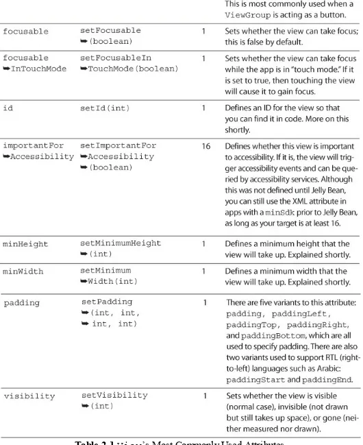
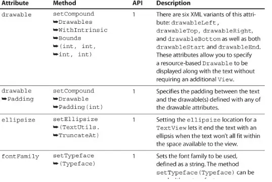
See Table 2.1 for a list of the most commonly used attributes for the View class. Remember that all other views extend the View class, so these attributes apply to all views (though child classes can handle the attributes differently or even ignore them). The API levels refer to the version of the Android SDK where the attributes were introduced. API level 4 was Android 1.6, called “Donut.” API level 11 was Android 3.0, or “Honeycomb.” API level 16 was Android 4.1, the first version of “Jelly Bean.” For a complete list of the API levels, you can see the table at
Table 2.1 View’s Most Commonly Used Attributes
View IDs
view in XML is done with android:id="@+id/example". The “at” symbol (@) signifies that you’re referring to a resource rather than providing a literal value. The plus (+) indicates that you are creating a new resource reference; without it, you’re referring to an existing resource reference. Then comes id, defining what type of resource it is (more on this in Chapter 4). Finally, you have the name of the resource, example. These are most commonly defined using lowercase text and underscores (e.g., title_text), but some people use camel case (e.g., titleText). The most important thing is that you’re consistent. In Java, you can refer to this value with R.id.example, where R represents the resources class generated for you, id represents the resource type, and example is the resource name. Ultimately, this is just a reference to an int, which makes resource identifiers very efficient.
You can also predefine IDs in a separate file. Typically, this file is called ids.xml and is placed in the values resource folder. The main reasons for defining IDs like this rather than in the layout files directly are to use the IDs programmatically (such as creating a view in code and then setting its ID), to use the IDs as keys in a map, or to use the IDs for tags. The View class has a setTag() method, which allows you to attach any object to that view for later retrieval. Calling that method with a key allows you to attach multiple objects that are internally held with a SparseArray for efficient retrieval later. This is especially handy when using the “View Holder” pattern (covered in Chapter 10, “Using Advanced Techniques”) or when the view represents a specific object that it needs access to later.
Note
The R class is generated for you as you make changes in Android Studio. By default, this is built for you whenever it needs to be updated. You can also manually force Android Studio to build your project from the Build menu.
Warning: R Class Versus android.R Class
Although your R class will be generated for you, there is also an android.R class. Unfortunately, IDEs will sometimes import this class when you really mean the R class that’s specific to your app. If you see your resource references not resolving, verify that you have not imported android.R.
It is a good idea to always use R within your code to reference your own R class and android.R to reference the Android R class explicitly (meaning that R.id.list refers to an ID that you have defined called “list” and android.R.id.list refers to the Android-defined “list” ID).
Understanding View Dimensions
One of the challenges designers and developers alike often have, when first starting to think about layouts in Android, is the numerous possible screen sizes and densities. Many design specialties
(e.g., print and earlier versions of iOS) are based on exact dimensions, but approaching Android from that perspective will lead to frustration and apps that do not look good on specific resolutions or
densities.
and shrink to accommodate a given device. The two primary means of doing so are the layout parameters match_parent (formerly fill_parent) and wrap_content. When you tell a view to use match_parent (by specifying that as a dimension in either the XML layout or by programmatically creating a LayoutParams class to assign to a view), you are saying it should have the same dimensions as the parent view or use up whatever space is remaining in that parent. When you tell a view to use wrap_content, you are saying it should only be as big as it needs to be in order to display its content. Using match_parent is generally more efficient than
wrap_content because it doesn’t require the child view to measure itself, so prefer match_parent if possible (such as for the width of most TextViews).
You can specify dimensions in pixel values as well. Because screens have different densities,
specifying your layouts in pixels will cause screen elements to appear to shrink the higher the density of the device. For example, specifying 540 pixels high on a 55-inch high-definition TV (which is 27 inches high, because screen sizes are measured diagonally) means the pixels take up 13.5 inches. On a phone with a 5-inch screen, those same pixels are under an inch-and-a-half in landscape orientation. Instead, you should use density-independent pixels (abbreviated as dp or dip) to have dimensions automatically scale for you based on the device’s density. The six densities Android currently specifies based on dots per inch (DPI) are listed in Table 2.2. Since the original Android devices were MDPI devices, everything else is relative to that density (e.g., extra high density is twice as dense along each axis as MDPI). If you specify a line that is 2dp thick, it will be 2 pixels thick on an MDPI device, 3 pixels thick on an HDPI device, and 8 pixels thick on an XXXHDPI device.
Table 2.2 Android Densities
Fortunately, you don’t have to create specific layouts for each density. The main consideration with so many densities is the graphical assets. Android will automatically scale images for you, but obviously blowing up a small image will not look as sharp as having an image of the correct size. Graphics assets and other resources are covered in detail in Chapter 4, “Adding App Graphics and Resources.”
There are times when you want a view to be at least a certain size but bigger if needed. A good example is for anything that the user can touch and the smallest you want a touchable view is 48dp (roughly 9 mm). In these cases, you can use the minHeight and minWidth properties. For example, you can define a minHeight of 48dp but the layout_height as wrap_content. That guarantees that the view will be at least tall enough to touch, but it can be larger to accommodate more content.
actual content, the bevel around the screens as the padding, and the space between the devices as the margins. Visually, it’s not always obvious whether spacing is from padding or margins, but
Figure 2.1 A visual demonstration of layouts with padding (dark cyan) and margins (space between the edge and the color)
Android also supports RTL (right-to-left) languages such as Arabic. Because it is common to indent the leading side of text differently from the trailing side, you can run into layouts where the only difference would be padding or margins for an RTL language compared to an LTR (left-to-right) one. Fortunately, Android solved this by adding new versions of padding and margins to easily
accommodate this in Android 4.2. By replacing “left” with “start” and “right” with “end,” you can easily have layouts that dynamically adjust based on language orientation. For example, if an LTR language would have a 72dp padding on the left, you would normally specify
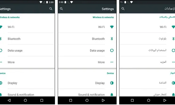
paddingLeft="72dp" in your layout. By adding paddingStart="72dp" to that same layout, the padding will automatically apply to the left side in English and the right side in Arabic. If you support older versions of Android, they’ll use the padding left values. Any newer versions will use the padding start values. If you aren’t supporting older versions of Android, you don’t need to specify the padding left value. See Figure 2.2 for an example of what happens to the layout based on the language’s layout direction. Notice that the spacing is almost like a mirror image where the LTR layout shows the dividers going all the way to the right with no margin, but the RTL layouts show them going all the way to the left with no layouts and the spacing around the icons is consistent.
Figure 2.2 Here you can see the Settings screen shown in English both as naturally appearing (left-to-right) on the left and with a forced to-left layout in the middle compared to a natural
right-to-left language on the right
Warning: Problematic Samsung Devices
of these attributes required integers instead of floats, which means you can get a crash when the layouts are inflated on those specific devices. Fortunately, Android Studio will warn you via lint with a message that says, “Attribute paddingStart referenced here can result in a crash on some specific devices older than API 17.”
Although that message is not as clear as it could be, the solution is to put the layouts in a layout folder with a resource qualifier (covered in depth in Chapter 4, “Adding App Graphics and Resources”) to prevent the layouts from loading on those devices. Most people choose to put the versions of the layouts with these attributes in a layouts-v17 folder, preventing those layouts from loading on older versions of Android, or layouts-ldrtl, preventing the layouts from loading on a device that’s not set up to use a layout direction of left to right.
Additional detail about this issue is available at
https://code.google.com/p/android/issues/detail?id=60055.
Displaying Text
One of the most fundamental ways in which you will communicate with your users is through text. Android gives you tools both to make displaying text easy and to make handling localization almost no work at all. Resources, covered in depth in Chapter 4, allow you to specify the displayed strings (among other types of content) outside of your layouts, letting the system automatically select the correct strings for a given user’s language.
Text sizes are in scale-independent pixels (sp). Think of scale-independent pixels as the same as density-independent pixels but with the user’s preferred scaling applied on top. In most cases, 1sp is the same as 1dp, but a user might prefer to have fonts bigger, so they’re easier to read, or even
smaller to see more on the screen. If you take the size in sp, times the density multiplier in Table 2.2, times the user’s preferred scale, you’ll get the resulting size. For example, if you specify 14sp
(typical for body text) and it runs on an XXHDPI device (a 3× multiplier) and the user has a preferred font size of 10 percent larger, then the result is 14 × 3 × 1.1 or 46 pixels. More important than
understanding that formula is knowing that font sizes are in sp and your layouts should always be able to accommodate different font sizes.
TextView
TextView is one of the most common views in Android. As its name suggests, it displays text. What its name does not tell you is that it actually supports a wide variety of appearances and content. In fact, you can even specify a Drawable (such as an image) to appear to the left, top, right, and/or bottom of a text view. You can add text shadows, change colors, and have portions of text bold and others italicized. You can even have metadata associated with specific portions of text within a text view, allowing for click events on specific words or phrases, for example. Figure 2.3 shows a single text view that uses “spans,” which allow the display of a variety of styles and even an inline image. Examples of text views are shown throughout the book, but Chapter 10, “Using Advanced
Figure 2.3 A single TextView showing a variety of spans
Text views are robust but very easy to use. In fact, the majority of views that display text extend the TextView class precisely for those reasons. In addition, utilities are available that make some of the more difficult processes easy to do, such as converting portions of the text to links with the
Linkify class (you can specify whether you want phone numbers to go to the dialer, links to go to a browser, or even custom patterns to do what you’d like) and converting most basic HTML (with the aptly named Html class) into styled text that uses the Spanned interface.
Table 2.3 TextView’s Most Commonly Used Attributes
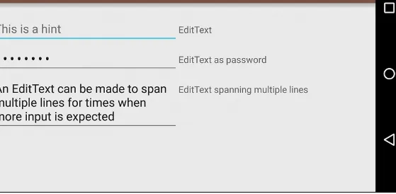
EditText
EditText is the primary means for allowing the user to input text such as a username or password. Because it extends TextView, the attributes in Table 2.3 are applicable. With EditText, you can specify the type of text the user will input via the inputType attribute or the
Figure 2.4 Examples of using EditText for different types of input