SIMULTANEOUS VISUALIZATION OF DIFFERENT UTILITY NETWORKS FOR
DISASTER MANAGEMENT
Stefan Semm, Thomas Becker, Thomas H. Kolbe
Technische Universität Berlin, Institute of Geodesy and Geoinformation, 10623 Berlin, Germany (stefan.semm, thomas.becker, thomas.kolbe)@tu-berlin.de
Commission II, WG II/6
KEY WORDS: Networks, Infrastructure, Disaster, Decision Support, GIS, Cartography, Visualization, Management
ABSTRACT:
Cartographic visualizations of crises are used to create a Common Operational Picture (COP) and enforce Situational Awareness by presenting and representing relevant information. As nearly all crises affect geospatial entities, geo-data representations have to support location-specific decision-making throughout the crises. Since, Operator’s attention span and their working memory are limiting factors for the process of getting and interpreting information; the cartographic presentation has to support individuals in coordinating their activities and with handling highly dynamic situations. The Situational Awareness of operators in conjunction with a COP are key aspects of the decision making process and essential for coming to appropriate decisions. Utility networks are one of the most complex and most needed systems within a city. The visualization of utility infrastructure in crisis situations is addressed in this paper. The paper will provide a conceptual approach on how to simplify, aggregate, and visualize multiple utility networks and their components to meet the requirements of the decision-making process and to support Situational Awareness.
1. INTRODUCTION AND MOTIVATION
Major incidents or major crisis events require the cooperation of different authorities and organizations such as police, fire workers, rescuers, companies, and administration, usually over a long period in time. A common understanding of the current situation, occurring events, structures, processes and the available geodata (Becker et al., 2011) is an absolute must in order to achieve coordinated action and to avoid misunderstandings. The necessity of the so-called Common Operational Picture (COP), (Steenbruggen et al., 2011) arises by a common visual presentation of the event site and its near surrounding. It enforces a common understanding of the current situation and supports the interactions between actors. A COP provides the needed information at the right time and in the right context, by using maps, web services, etc., thus supporting the decision making process during a crisis. In addition to the COP a common understanding of “what is going on” is needed and is handled as Situational Awareness (SA) in literature, see (Endsley, 1995). “SA is viewed as consisting of a person's state of knowledge about a dynamic environment. It incorporates the perception of relevant elements, comprehension of the meaning of these elements in combination with and in relation to operator goals, and a projection of future states of the environment based on this understanding.” (Endsley, 1995). Simplified and minimal visualizations, which preserve the context and relevant information, will help operators in making appropriate decisions. One of the most complex systems in urban environments are utility networks. In today's technologically advanced society the dependency of every citizen and company on having a working infrastructure is extremely high. Failures of critical infrastructure, such as the Italian blackout in 2003 or the failure of power supply in wide parts of Europe in 2006, demonstrate the strong linkage of networks across borders and the effects of infrastructure failures. A COP in such a case requires the joint visualization of infrastructure assets, urban features, position of action forces, and many more. To give a motivation for the need of such a joint visualization a brief use case/scenario is presented in the
next paragraph that is adapted from a real scenario that occurred in summer 2008.
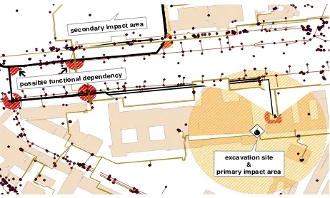
Figure 1. Scenario - excavation of a second world war bomb and its resulting impact areas
During construction works in Berlin in July 2008, an aircraft bomb from the second world war was excavated. Immediately after excavation, different institutions with responsibilities for collecting precise information about the location and circumstance were called. Based on the address, the collected information, and the pre-existing-knowledge of the operators, a security buffer zone around the bomb was determined and reported (Figure 1). It was decided to widen the institutions involved by requesting the support of the fire department and external utility companies. The reason for this was due to the risk of a second area being impacted, in addition to the primary impact area (orange hatched areas). The functional dependencies (red hatched areas) of utilities and the possible resulting cascading effects (Becker et al., 2011) have made this scenario supposable. Subsequently, a staged and existing disaster management plan was executed. The nearby hospital, citizens, and workers were informed and instructed about an upcoming evacuation. The area around the bomb excavation was blocked with pedestrians, nearby highways, metro-, bus-,
¸
À
possible functional dependency e
e
secondary impact are a
excavation site & primary impact area
and urban railway-lines and utility networks affected by the blocks. A bomb-excavation-scenario, in which the nearby transformer-station could have been destroyed, highlights that complex consequences involving and propagating different networks and instances cannot easily be detected by these visualizations due to graphical overload. This is due to networks becoming more dense due to expansion to satisfy increasing supply requests. Accordingly, network objects and their visual representations becomes increasingly heterogeneous, complex, fragmented and mutually interdependent from each other as well (Overbye et al., 1999). Thus, specialists in disaster response, mitigation, and recovery require reliable, actual, and formatted information. As utility networks are complex and highly diverse, a joint visualization of multiple networks quickly encounters limitations. This will lead to substantial problems in reaching situational awareness, having significant impact on the decisions to be made (Overbye and Raymond, 1999). Consequently, visualizations have to be simplified and minimized radically, while preserving as much information as possible. Thus, a simultaneous visualization of multi-utility networks has to meet the following requirements:
Reducing visual complexity
Visually reducing information density
Providing simultaneous cartographic representation of multi-utility networks
Preserving information variety (function of components, functional dependency of objects)
Connectivity of objects
In the following sections, we will present a new approach to develop a comprehensive understanding of urban features and mutual dependencies.
2. CHALLENGES IN THE VISUALIZATION OF COMPLEX UTILITY NETWORKS
The previously described use case emphasizes that in crises situations well-grounded decisions have to be made by different actors. Therefore not only buildings and human beings are of interest in the decision-making process but also infrastructure assets such as pipes, cables, and canals. The location of and type of the assets are of immanent importance since the blackout of one, may influence other infrastructure by cascading effects (Becker et al., 2011). Thus, further events or breakdowns at unforeseen locations (see 2nd impact area in Figure 1) may occur. The challenge is to create a cartographic visualization of the current scene including existing infrastructure that is suitable for the disaster situation, is appropriate for the stress level of actors, and backs the process of perception of human beings. As (Artmann and Garbis, 1998) states “a map is not simply the externalized memory of the team members’ collective situation awareness; it is also an important tool through which they can discuss and coordinate their collective efforts.”. In order to develop a concept for such a visualization, existing infrastructure data for different commodity types are examined against well-known cartographic design rules, such as visual differentiation, minimum dimension, orientation and generalization.
2.1 Visual perception
The visual perception of an object by location and type is the most important phase of map recognition. The rapidness and reliability of perception is strongly related to density and readability of map content. Our examinations of existing utility networks in Berlin revealed that each utility network company uses its own cartographic representations, which conform to well-known cartographic design rules. Different colours for
lines, shapes and symbols are used to transport the real world objects into map space and finally to the user. However, the aim of such cartographic representations is for as-built documentation for maintenance and repair and not for use in crises. The additional integration of further utility networks into a scene will decrease the perception of the scene by increasing the density of cartographic objects. Thus, the common visualisation of urban objects and multi-utility networks leads to the issue that recently valid design schema for the representation of one utility network will become invalid in the context of representing multiple utility networks. A new cartographic design schema and related design rules have to be developed for such a representation.
Figure 2. Cartographic Representation of multiple utility networks - uniformly (left) and systematically colorized (right)
according to (RAL, 2001)
A starting point for the visual differentiation of utility networks is colorization – used to represent the transported commodity type, and thickness – used to represent the network hierarchy. In particular the colour is widely used to encode distinct information - their usage is seen to be critical due to their strong influence on human’s perception and cognitive load (Steinrücken, 2009; Bertin and Berg, 1983). Uniform portrayals, as shown in Figure 2 (left), prevent the perception of commodity types, whereas Figure 2 (right) enables the identification of different network hierarchies (red lines) and the network affiliation (yellow = gas, green = wastewater, blue = freshwater, red = district heat).
2.2 Minimum dimensions and distances
Our investigations on multiple utility networks revealed that in order to meet the requirements of cartographic minimum dimension (Hake, 1995; Lechthaler and Stadler, 2006), as shown in Table 3, very large scales should be used. The range of scales where minimum dimensions and distances between line objects were preserved is from 1:800 to 1:150 and for point objects from 1:300 to 1:60.
mm pt.
Line thickness 0,4 1
Line space 0,8 2
Circle, filled 1,5 4
Rectangle, filled 1,1 x 2,3 3 x 6
Table 3. Graphic minimum dimension and distance with respect to displays (Lechthaler and Stadler, 2006)
If smaller scales are used, relevant objects and relation information that form the basis for decision-making gets lost (compare Figure 2, Figure 4, and Figure 5). Furthermore, clusters can induce ostensible symbols, which can be portrayed when two or more symbols are overlapping each other. Figure 4 shows that the map content and the perception of the scene changes radically when the scale is decreasing. In crises situations the displayed scales are not suitable to enforce a ISPRS Annals of the Photogrammetry, Remote Sensing and Spatial Information Sciences, Volume I-2, 2012
common understanding of the crises situation. The minimum scale for our use case scenario would be 1:2000 because only with this scale will the primary and secondary impact areas be clearly displayed. Although this scale is appropriate for disaster managers to be able to get the COP and plan coordinated activity, the current map is not suitable to transport the required information.
Figure 4. object density at scales (from left to right) 1:60; 1:300; 1:800 – lines are displayed by 1pt and points by 4pt (red
square = 6m x 6m)
The reason is that the larger scale prevents orientation, whilst the smaller scale induces content related issues. To overcome the orientation and cluttered visualization issues, as depicted in Figure 5, the available networks are investigated on existing network hierarchies and functional equivalences, in order to perform semantic and geometric generalisation.
2.3 Network hierarchies and orientation issues
Situational Awareness (SA) and COP require a joint visualization of the needed information and objects with different spatial extents, e.g. overview, detailed view. It was argued by (Fairbairn, 2001), that information is effectively deduced, transported, and refined when using different scale ranges for complex visualizations, i.e small-, meso- and large scale. Each range encodes unique and dedicated information (MacEachren, 2004; MacEachren et al., 2006), within this information process chain. As (Hopfstock, 2012) states that “the visual component of the data is used in the data supply chain so that the graphic presentation enables a communicative, map-based acquisition of geographic information that stimulates the visual reasoning of users and, ultimately, supports decision making”. Therefore, it is necessary a) to identify the features to be displayed, b) to define the scale on which the data has to be displayed and c) to define a valid generalisation processes for map production. Since this paper provides just a conceptual framework we set the focus on the first 2 points and interested readers for point (c) are directed to (Nielsen and Meyers, 2007; Mackaness et. al., 2007).
Figure 5. Highly cluttered visualization and orientation issue caused by an interrupted orientation chain
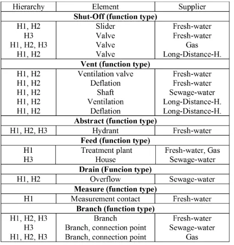
The investigation on a part of the available utility networks in Berlin, revealed that three main, distinct hierarchies are
generally used. Networks can be distinguished into a) H1 = transport lines, main lines, high pressure, excess voltage; b) H2 = distribution, collection, medium pressure, high voltage; c) H3 = house service lines, low pressure, low voltage. Pipes/Channels, devices and setups belong to one of these hierarchies. Since fresh-, sewage-water, gas and long-distance-heat transmit flowing media, the devices became comparable as well (cf. Table 6). In a next step, each hierarchy has to be set in relation to the scale of the supply chain, to ensure the display of the right information for a specific spatial context. Adapted for our network visualization, the perception of graphical objects at small-scale (range from 1:20000 to 1:6000) should provide more clarification of the general situation. The small-scale provides an overview (district level of a city), initially supporting exploration and analytical reasoning. Thus, objects of H1 have to be displayed at this scale. The meso-scale-range (from 1:6000 to 1:800) has still overview-character but an enhanced degree of detail. The purpose of meso scale is to clarify the linkage between small-scale and detailed view (large scale). It is needed to transport location information and object relation information between large and small scales. Therefore, network objects of H1 and H2 have to be displayed at this scale. The large-scale range below 1:800 provides the highest degree of detail in our network visualization. Knowledge from large-, and meso-scale is used to deduce and further refine location and situation information. At large-scale detailed object, and spatial relations can be clarified and the received information can be linked back to meso- and small-scale. Hence, the associated network hierarchy for this scale is H3. However, violations of minimum distances and object dimensions have crucial impacts on geographic contextualization. Interruptions and disturbances in the orientation chain at any point prohibit situational awareness (Anderson, 2000; Artmann and Garbis, 1998). When the information chain is disturbed, scale specific expressions and the context information of the affected area gets lost. Accordingly, failure propagation, situation assessment, and location-specific decision-making throughout the crisis is impossible.
Figure 6. excerpt of functional equivalences across networks and hierarchies
2.4 Functional equivalences of network objects
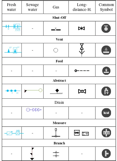
The joint visualization of multiple utility networks involves large numbers of object classes, as we have identified in our investigation. We recognized large amounts of object variances that are just variations of standard functionalities. A slider and a valve for example share the same functionality within the network – the functionality Shut-off (Table 6). In total, we identified seven function types valid for all investigated utility networks. To support human vision and cognition in terms of rapid decision making, it was decided to provide knowledge of features’ function type (semantic generalisation) rather than information about the diversity of network features. Such information diversity causes increased cognitive loads and graphical stress. Observable results are - troubles in (re-) cognition and association of objects, their role, and relations. Throughout a crisis and under various stressors misinterpretation can happen and prevents a common understanding of the situation from being established. In terms of our use-case, the disaster manager has to rapidly decide, which objects he has to block to stop the supply of commodity, e.g. gas through the nearby gas pipe. By having a huge set of object classes, the operator might be overstrained to pick the correct choice. The usage of incorrect devices in conjunction with a bomb explosion would cause unpredictable consequences for each network.
3. VISUALIZATION CONCEPTS FOR MULTI UTILITY NETWORKS
During a crisis response, various information sources have to be collected and combined by different stakeholders (Paton and Flin, 1999; Dransch, 2007). The aim of our conceptual framework is to develop a visualization for multiple utility networks that can provide support for coordinated activity (MacEachren, 2005) and for dialogue about decisions, situations, strategies, and information. Hence, we focused on semantic and spatial generalisation (Hake, 1994). The aim was to reduce the textual complexity, the graphical stress and object density. Subsequently, we have visually implemented the textual, rehashed information in a conceptual way to significantly simplify and minimize the visualization, whilst preserving as much information as possible.
3.1 Directional Simplification
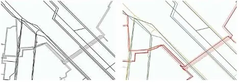
Network visualizations can be optimized by straightening curved lines and restricting directional distinctness to horizontal, vertical and 45° directions. These angular peculiarities are selectively processed by the human‘s brain, as discovered by several neuroscientists (Heeley and Buchanan-Smith, 1997; Vogels and Orban, 1985). Through directional restrictions, objects of equal angular peculiarity are cognitively grouped; the visualization appears ordered and structured. The Figures 7, 8, and 9 show optimized recognition by reduced geometrical complexity (compare Figure 7 left, 7 right). Comparable approaches can be found in the design of metro plans, presented by (Avelar and Hurni, 2006; Cabello and de Berg, 2005). However, the design rules for metro lines are not fully applicable to multiple utility networks because a) pipes or lines of two or more networks must not share the same direction and b) they must not share any start, end or intermediate node, in contrast to metro lines. Hence, utility networks should be made comparable by generalization and aggregation of lines and network components on a semantic and geometric level.
3.2 Line Aggregation
Networks are highly dense structures and hard to visualize (Zlatanova and Du, 2006). Known level-of-detail mechanisms would fail, because line objects remain close, therefore generalization mechanisms would hide relevant information. Thus, several rules have to be taken into account. Firstly, different networks need to be perceived as being different (Hake and Grünreich, 1994; Steinrücken, 2009). The most efficient way to address human‘s perception is the usage of colors (Steinrücken, 2009; Bertin and Berg, 1983). Each network obtains a unique color for its identification (see Figure 8) in accordance to the well-known and standardized RAL-colors (RAL, 2001).
Figure 7. Comparison of network representations using original geodata (left) and schematic abstraction (right)
Secondly, besides the visual incorporation of objects with their respective networks, objects should also be recognizable as being equivalent across multiple networks. To ensure the visual recognition of equivalent objects and hierarchies, overarching gradation rules of colors, brightness, and dimensions have to be defined and applied to equivalences. By this means, dark/thick strengthens the importance and light/thin reduces the importance. Thick and dark objects appear graphically dominant whereas thin and light objects appear less significant. According to the identified hierarchies, objects of higher relevance / hierarchy need to be graphically in the foreground of the scene (dark/thick) and objects of lower hierarchy in the background (light/thin). Those color gradations are well known from cartographic design principles (Hake and Grünreich, 1994; Steinrücken, 2009).
Figure 8. Functional equivalences across networks and hierarchies
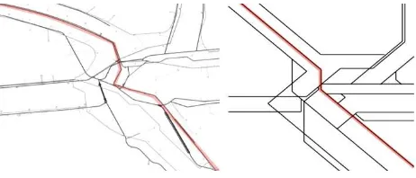
Visual-textual association is prevented when objects have smaller minimum distances. As already mentioned in 3.1 some issues with the direct use of the metro maps design concept exist. We observed problems when locating thinner lines in line bundles and with identifying the appropriate line color and hierarchy, since the colors of closely neighbored lines influence each other (Figure 8, 9). A line-aggregate can include a set of ISPRS Annals of the Photogrammetry, Remote Sensing and Spatial Information Sciences, Volume I-2, 2012
different pipes and channels. Thus, we propose a method that uses a buffer of 1pt per scale type and the related hierarchy level to summarize objects, into one aggregate, when violating the minimum distance (compare Figure 8 and 10). Thus far, at a small scale all objects of H1, within a buffer of 16 m - 4,8 m will be summarized. Similar applies for meso-scale, where objects within a vicinity of 4,8 m to 0,64 m will be summarized. The aggregates reduce the number of objects, whilst preserving the needed object information.
Figure 9. representation of infrastructure following the metro map concept and the proposed symbolization
The aggregates further indicate the location of multiple lines and additionally underline the importance of objects for decision-making. Failures in those confined spaces might affect other objects in the near surrounding and the information about these is essential for crisis response and the estimation of potential consequences.
Figure 10. Proposed visualization for schematic abstracted lines and symbols with design elements, color code, and dimensions
Moreover, to pronounce their cognition, aggregates were extended in their thickness and colorized with black, ensuring the highest level of graphical dominance in order to catch the disaster managers’ attention (Figure 10). It is important to preserve information about supplier and hierarchy, so color-coded box annotations at defined intervals were added to the aggregated lines (Figure 10). Finally, to ensure the safe and quick identification of these annotations, they are designed as 8pt. thick and 12pt. long rectangles. Smaller dimensions certainly influence the color impression of each box by surrounding objects, as described by (Steinrücken, 2009). The order of objects can be determined, when rotating each box-group with 90° at its ride hand side anchor point. Line crossings and branches can be visualized implicitly.
3.3 Symbol-Aggregation
As already indicated in 2.4, the investigations on existing utility networks drew out seven main functionalities of network components. The identified equivalences from contextual rehash can be visually expressed by one common symbol (Table 11). We have decided to design new symbols, which are associable, intuitive, simple and systematical, in accordance with cartographic design principles. The symbols already used by each supplier were designed for as-built documentation, rather than for rapid cognition, as required for disaster management. Moreover, a disaster manager might not have the knowledge about the symbols of other suppliers, so domain specific symbols may cause confusion or misinterpretation. Finally, to implement the network overarching applicability of those symbols, they were designed to be graphically neutral (chosen color = grey).
Figure 11. Suppliers' and new designed common symbols for main functions
Another key aspect is the symbol placement. To express the spatial location of a network component, the initial position of the symbol is replaced by a color-coded point (compare Figure 9 and 10). Therefore, position information, network, and hierarchy incorporation can be expressed for each symbol. A point was chosen to ensure the graphical distinction of symbol placement and color-boxes. In addition, the circularity of the placement point is comparable to the shape of the symbols and the relation between both becomes apparent. Finally, a graphical link between symbols of identical type (1: n relation) is created expressing the semantic connection between identical objects (Figure 10) and avoiding additional symbol density. According to network affiliation and hierarchy, these links were color-coded and dotted to make them distinguishable from line objects. The links were thinned to reduce their graphical dominance and to avoid misinterpretation, linking connection lines must not cross any pipe or channel – connections are seen to be local. By this means, qualitative and quantitative object
Symbole der Fernwärmehaustechnik
Übersicht äl gülti
Symbole der Fernwärmehaustechnik
Übersicht
äl
gülti
ISPRS Annals of the Photogrammetry, Remote Sensing and Spatial Information Sciences, Volume I-2, 2012information can be expressed by the numbers of connection lines (Figure 10).
4. CONCLUSIONS AND FUTURE WORK
Crises require a common operational picture and situational awareness and the available visual representations should a) act as an object of collaboration to get SA and COP, b) provide support for dialogue, and c) support coordinated activity – even under time pressure and stress. The prerequisite for making appropriate decisions in crises is the perception of relevant elements, the comprehension of the meaning of these elements and the relevance for the current situation. Although, networks are complex structures and the joint visualization of multiple utility networks for decision-making is a challenge the paper presents a framework addressing key issues in these visualizations and providing a conceptual solution for the design of a multiple utility network visualization. The problems subsequently caused by violated cartographic minimum distance, and dimensions have been resolved by semantic and geometric generalization and information variances were reduced to ensure readability and perception. To be able to develop a facts-based visualization the GIS data of four utility networks were investigated to capture, classify, and abstract the issues related to context and visualization. Further research is currently being undertaken on the development of map-production algorithms to be able to create the proposed visualizations. Moreover, it is intended to use the proposed visualization to create status reports for decision making throughout a crisis. Finally, end-user evaluations and proof-of-concept tests will show the reliability of these visualizations.
REFERENCES
Artman, H., Garbis, C., 1998. Situation Awareness as Distributed Cognition. In: Cognition and cooperation. Proceedings of 9th Conference of Cognitive Ergonomics. Green, T., Bannon, L., Warren, C. (eds.), Limerick,pp. 151-156.
Avelar, S., Hurni, L., 2006. On the Design of Schematic Transport Maps. Cartographica 41(3), pp. 217-228.
Becker, T., Nagel, C., Kolbe, T. H., 2011. Integrated 3D Modeling of Multi-utility Networks and Their Interdependencies for Critical Infrastructure Analysis, In: Advances in 3D Geo-Information Sciences. Kolbe, T. H., König, G., Nagel, C. (eds), Springer Berlin, pp. 1-20.
Bertin, J., 2010. Semiology of graphics: Diagrams, Networks, Maps. ESRI Press
Fairbairn, D., Andrienko, G., Andrienko, N., Buziek, G., Dykes, J., 2001. Representation and its Relationship with Cartographic Visualization, Cartography and Geographic Information Science, 28 (1), pp. 13-28
Cabello, S., Berg, M., Kreveld, M., 2005. Schematization of Networks. Computational Geometry, 30(3), pp. 223-238. Dransch, D., 2007. Designing Suitable Cartographic Multimedia Presentations. In: Multimedia Cartography, Cartwright, W., Peterson, M. P., Gartner, G. (eds), Springer, Berlin-Heidelberg, pp.75-80
Endsley, M. R., 1995. Towards a theory of Situation Awareness in Dynamic Systems. Human Factors 37(1), pp. 32-64. Hake, G., Grünreich, D., 1994. Kartographie. de Gruyter, Berlin
Heeley, D. W., Buchanan-Smith, H. M., 1997. The oblique effect in orientation acuity. Vision Research 37(2), pp. 235-242. Hopfstock, A., 2012. The Importance of Cartographic Design In the SDI environment, ArcUSER 15(1), pp.54-57
Lechthaler, M., Stadler, A., 2006. Kartographische Gestaltung einer bildschirmgerechten Visualisierung von Geobasisdaten. In: Kartographie als Kommunikationsmedium, Wiener Schriften zur Geographie und Kartographie, Kriz, K., Cartwright, W., Bucher A., Kinberger, M., (eds.) Wien, Vol. 17, pp. 248-255.
MacEachren, A. M., 2004. How maps work: Representation, Visualization, and Design, Guilford Press, New York
MacEachren, A. M., 2005. Moving geovisualization toward support for group work. In: Exploring Geovisualization, Dykes, J., MacEachren A.M., Kraak, M.-J. (eds.), Elsevier pp. 445-461.
Mackaness, W., Ruas, A., Sarjakoski, L. T., 2007. Generalisation of Geographic Information. Elsevier Science
West-Nielsen, P., Meyer, M., 2007. Automated Generalisation in a Map Production Environment. In: Generalisation of Geographic Information. Mackaness, W., Ruas, A., Sarjakoski, L. T.,(eds), Elsevier Science, Amsterdam, pp. 301–313.
Overbye, T. J., Klump, R. P., Weber, J. D., 1999. A Virtual Environment for Interactive Visualization of Power System Economic and Security Information. Power Engineering Society Summer Meeting, IEEE, Edmonton, Alta , Canada
Paton, D., Flin, R., 1999. Disaster stress: an emergency management perspective, Disaster Prevention and Management,8(4), pp. 261 – 267
RAL e.V., 2001. German RAL Color Sets the Standard for Color Measurement. PCI Magazine, March 2001, pp. 58-59. Anderson, J. R., 2000. Cognitive Psychology and its Implications. W.H. Freeman & Co Ltd
Steenbruggen, Y.G.M., Nijkamp, Peter, Smits, J.M., Grothe, M.J.M., 2011, Traffic incident management: A common operational picture to support situational awareness of sustainable mobility, No 0033, Serie Research Memoranda, VU University Amsterdam, The Netherlands, http://hdl.handle.net/1871/23925. (11. Jan. 2012)
Steinrücken, J., 2009. Automatisierte Erzeugung personalisierter ad-hoc-Karten in einem Service-basierten GIS (Mapping on Demand), University of Bonn. Germany. http://www.ikg.uni-bonn.de/publikationen/dissertationen.html (13.Jan. 2012)
Tomaszewski, B. M., Robinson, A. C., Weaver, C., Stryker, M., MacEachren, A., 2007. Geovisual Analytics and Crisis Management. Proceedings of the 4th International ISCRAM Conference, 2007, Delft, Netherlands.
Vogels, R., Orban, G.A., 1985. The effect of practice on the oblique effect in line orientation judgments., Vision Research 25(11): 1679-1687.
Zlatanova, S. and Y. Du (2006). An Approach for 3D Visualization of Pipelines. In: Innovations in 3D Geo Information Systems, Abdul-Rahman A., Zlatanova, S., Coors, V. (eds). Berlin, Springer: pp. 501-517.