TOWARDS THE DEVELOPMENT OF A TAXONOMY FOR VISUALISATION OF
STREAMED GEOSPATIAL DATA
B. H. Sibolla a,c*, T. Van Zyl b, S. Coetzee c
a Meraka Institute, Council for Scientific and Industrial Research, Pretoria, South Africa – BSibolla@csir.co.za b School of Computer Science and Applied Mathematics, University of the Witwatersrand, Johannesburg, South Africa-
Terence.VanZyl@wits.ac.za c
Center for GeoInformation Science, Department of Geography, Geoinformation and Meteorology, University of Pretoria, South Africa – Serena.coetzee@up.ac.za
Commission II, WG II/6
KEY WORDS: Geovisualisation, Geospatial Visual Analytics, Sensor Networks, Taxonomy
ABSTRACT:
Geospatial data has very specific characteristics that need to be carefully captured in its visualisation, in order for the user and the viewer to gain knowledge from it. The science of visualisation has gained much traction over the last decade as a response to various visualisation challenges. During the development of an open source based, dynamic two-dimensional visualisation library, that caters for geospatial streaming data, it was found necessary to conduct a review of existing geospatial visualisation taxonomies. The review was done in order to inform the design phase of the library development, such that either an existing taxonomy can be adopted or extended to fit the needs at hand. The major challenge in this case is to develop dynamic two dimensional visualisations that enable human interaction in order to assist the user to understand the data streams that are continuously being updated. This paper reviews the existing geospatial data visualisation taxonomies that have been developed over the years. Based on the review, an adopted taxonomy for visualisation of geospatial streaming data is presented. Example applications of this taxonomy are also provided. The adopted taxonomy will then be used to develop the information model for the visualisation library in a further study.
* Corresponding author
1. INTRODUCTION
Geospatial data has very specific characteristics that need to be carefully presented in its visualisation in order for the user and the viewer to gain knowledge from it. The science of visualisation has gained much traction over the last decade as a response to various visualisation challenges. Geospatial data visualisation, geovisualisation, and geospatial visual analytics, have borrowed from the domain of information visualisation, which is defined as the use of computer aided, interactive visual representations of alphanumeric data in order to help users to better understand real life systems and phenomena. This helps the user who is effectively the viewer to understand the structure of the data and the inherent relationships (Card et al. 1999, Voigt 2002, Kiem et al. 2006). MacEachren et al (1992) define geovisualisation as “... the use of concrete visual representations ... to make spatial contexts and problems visible, so as to engage the most powerful human information processing abilities, those associated with vision”. The
similarities between these two fields are thus evident, which is why a taxonomy of geospatial visualisation must also consider and extend, from among others, information visualisation.
The study presented here was prompted by the development of a visualisation library that is specific to live streaming of geospatial data and historical access of this data when it enters the resting phase. The data is streamed from multiple earth observation in-situ sensors and will be extended to remote sensing sources. The different types of sensors measure a variety of phenomena, from lightning strikes to more long term
type of monitoring such as water flow and energy consumption. The geospatial visual analytics library focuses on dynamic 2D display and access to streaming data. The requirements of streaming data visual analytics include fast display and exploration of live data as well as access to stored data to aid the human to gain better understanding of the phenomenon in question. As a result, a need to investigate the status of geospatial visualisation was identified, such that a relevant existing taxonomy could be identified and adopted or a new taxonomy developed. Adopting a taxonomy is essential because the taxonomy is then used to inform the development of the information model for the visualisation library.
A taxonomy is a classification of things or concepts as well as the principles underlying such a classification, which is developed in order to inform the design phase preceding development (Daassi et al. 2005). A taxonomy is developed as an early step to understanding a set of phenomena (Simon 1969). According to Buja et al (1996), the reasons why it is important to develop a taxonomy for visualisations are twofold: firstly to help users to choose a fitting visualisation technique that will help them answer questions in the applied field adequately; secondly, to find gaps in the visualisation field and as a result help guide research into new techniques.
A number of taxonomies have been devised in the field of data visualisation. A summarised review of the most notable information visualisation taxonomies, based on available literature, is presented, followed by a review of notable geospatial taxonomies. The taxonomy that has been adopted for ISPRS Annals of the Photogrammetry, Remote Sensing and Spatial Information Sciences, Volume III-2, 2016
the geospatial visualisation library currently under development is then presented.
A comparison of various visualisation packages is beyond the scope of this review, we highlight rather the similarities and relationships that can be seen in the various taxonomies that have been deployed.
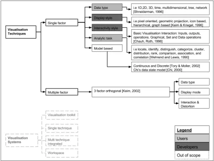
Figure 1. A classification of information visualisation techniques and systems, which is based on the review of visualisation classifications found in scientific literature
2. REVIEW OF VISUALISATION TAXONOMIES
Extensive research has been done with respect to classifications of types of information visualisations over the years. Before discussing these classifications it is important to note that information visualisations can be classified in terms of techniques and systems. The classification has been found to be a major cause for debate on the subject of visualisation taxonomies (Chengzhi et al, 2003). According to Chengzhi et al (2003), a visualisation system “is an integrated implementation of visualisation techniques for applications”.
Figure 1 presents the overview of the reviewed classifications and their relationships.
As evident in Figure 1, the classifications are based on five single factors, other classifications can be found that are effectively combinations of the main five. Examples of these are Keim’s 3 factor orthogonal taxonomy (Keim, 2002) and Chengzhi et al (2003).
The focus of this review will be on visualisation techniques for geospatial data. Visualisation systems are only mentioned for the sake of clarifying the difference.
2.1 Classification by data type
The earliest and most commonly used classification is that by data type. Shneiderman (1996) gives a description of seven data types, briefly, these are: 1-, 2-, 3-, dimensional data, temporal data, multidimensional data, tree and network data. Shneiderman (1996) proposed what he described as a “type -by-task-taxonomy”. The seven tasks of this classification, related to the seven data types listed earlier, are: Overview, Zoom, Filter, Details on Demand, Relate, History and Extract.
2.2 Classification by mode of display
Keim and Kriegel (1996) introduced a taxonomy of visualising large amounts of multidimensional data. This taxonomy classified visualisations by the mode of data representation. Five classes were introduced in the study, namely and very briefly discussed:
Pixel oriented techniques, which map each data value to a coloured pixel, and are more suitable for space filling, as opposed to discrete visual applications.
Geometric projection techniques, which reduce the dimensionality of multidimensional data and display them as interesting projections onto a 2D space.
Icon based techniques are used more for discrete data. Each data item is mapped onto an icon. The most common application of this technique is Chernoff’s faces, where an icon represents two dimensions and the remaining dimensions are mapped onto the face of the icon.
Hierarchical based techniques include dimensional stacking and treemaps. In this type of technique the high dimensional space is subdivided into subspaces of lower dimensions and these are presented in a hierarchical fashion.
Graph based techniques use specific layout algorithms, query languages and graphs in order to effectively display a large graph.
2.3 Classification by degree of interactivity
Chuah and Roth (1996) provided a more comprehensive take on visualisation interactivity. They introduced a set of basic visualisation interaction (BVI) primitives to address visualisation interfaces. The primitives are classified as inputs, outputs and operations.
2.4 Classification by analytic task
This classification is centred on the tasks that the user will perform in order to understand and derive knowledge from the data. Wehrend and Lewis (1990) classified the user’s analytic tasks as: locate, identify, distinguish, categorize, cluster,
distribution, rank, compare, associate and correlate. This classification is independent of the application field. Extensions to this classification can be found, amongst others, in the work of Zhou and Feiner (1998), according to Chengzhi et al, (2003).
2.5 Model based classification
Elaborating on his previous work, Chi (2000) showed that it is insufficient to categorize information visualisation techniques by data type only, he thus proposed the Data State Model. In summary, the Data State Model has four data stages, three types of data transformations, four types of within stage operators. The details of the taxonomy can be found in Chi (2000).
Tory and Moller (2004) discuss classification of visualisation by algorithms. This type of classification is also referred to as classification by design model. It looks at the assumptions that are made about the data being visualised. It emphasizes the human aspect of visualisation by considering the user’s design concept. Tory and Moller (2002) classified these models as discrete and continuous. The discrete model is more applicable to information visualisation (visualising abstract information), whereas the continuous model is more suitable for scientific visualisations (visualising realistic models). The continuous model is further subdivided into the number of independent variables (dimensions) and the number of dependent variables and data types. The discrete model is subdivided into connected and unconnected visualisations. The two classes are each further subdivided into the designers’ constraints on the attributes.
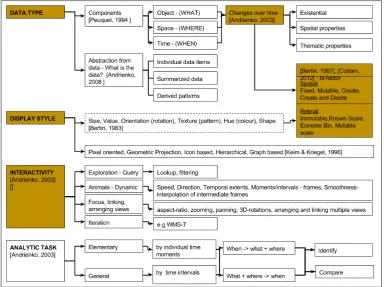
Figure 2. A classification of Geospatial Visualisation Taxonomies based on available literature (the shaded blocks represent items of interest to the application)
3. REVIEW OF GEOSPATIAL VISUALISATION TAXONOMIES
Apart from thematic attributes, geospatial data has specific characteristics such as location and time and they need to be strongly reflected in any related taxonomy. Andrienko et al (2008) discuss the unique attributes of spatial data. Most geospatial visualisation classifications derive from the general classes discussed above. However due to the specific nature of this data, the classifications have been extended to fit geospatial data. A summary of notable geospatial visualisation taxonomies is thus presented. Figure 2 provides an overview of geospatial visualisation taxonomies from literature.
Based on accessible scientific literature, most of geospatial visualisations follow the four types above: data-type based visualisations, mode of display, degree of interactivity and a few are based on analytical task. A combination of these classifications is found mostly in the more recent classifications.
Bertin (1967) describes what have been termed the building blocks of data visualisation. Bertin talks about arbitrary data, he breaks down the visualisation space into two spheres, spatial and retinal variables, with spatial variables being those that describe the location and position, and retinal representing more visual features. Bertin’s work was meant for static, paper based, visualisations but has also been extended and adapted for computerised dynamic data visualisations by others. Bertin devised a framework that is based on two notions: question types, which refer to the components of the data; and reading levels. He further elaborates that there are as many questions types as the number of variables available in the data, and for each question type there are three reading levels. The reading levels are elementary, intermediate and overall.
Peuquet (1984) follows on from Bertin. The manner in which data is represented is linked to the specific analytic task that is being solved. In order to examine and analyse spatiotemporal data, Peuquet (1994) discusses a typology of queries involving time and change, where one class of queries addresses the changes in an object, the second class addresses the spatial distribution of an object or objects and the third class addresses the time relative to attributes of specific locations or objects. Following this she extends her “Dual representational framework” which has the following dimensions, location based view (where), object based view (what), to a triad framework which introduces a third view; the time based view (when). Based on these views, the user is able to pose three different kinds of questions about when, what, where, based on the other two views.
Andrienko et al (2003), classify and evaluate geospatial data visualisation techniques and tools first by characteristics of the data, and secondly by types of exploratory activities they support. Adapted from Blok (2000), Andrienko et al, classify spatio-temporal data by the kinds of changes that occur over time. These are existential changes, changes in spatial properties, changes in thematic properties. Classification by data exploration tasks (task typology) draws and expands from Bertin (1983) and Peuquet(1984). Andrienko et al, felt that Bertin’s framework was missing a key factor, which distinguishes between elements by means of comparison or relating between the elements. Blok, however, provided for differentiating questions of exploratory tasks in the form of
identification and comparison. Andrienko et al (2003) conducted an evaluation of existing techniques from the perspective of the type of data they can be applied to as well as exploratory tasks that can be supported by these techniques. They classified data in terms of the types of changes they undergo and then looked at exploratory tasks that each can support, extending on Bertin, Peuquet and Blok respectively. From our interpretation this paper touches on three categories discussed in the general visualisation section, namely, classification by data type, Interactivity and Analytical task.
Andrienko et al (2008) discuss data visualisation from the perspective of visualisation of dynamics, movement and change. As a result of the “big data” challenge, specifically frequency and volume, ways of data visualisation have had to evolve. Traditionally visualizations depict data in its direct format, record by record; however, due to the high speed of acquisition, high data volumes and complexities inherent in big data, analysts have moved to either summarising the data or deriving patterns from it, before it can be visualised. In this review, summarising data and drawing patterns are proposed as alternative approaches that aid the user to derive knowledge and be able to interpret the data timeously and with ease. Kiem and Kriegel (1996), on the other hand, look at big data visualisation from the perspective of multi-dimensionality.
Cottam et al (2012) extend Bertin’s data visualisation theory of spatial and retinal variables. They argue that spatial variables may be dynamic in two ways: change in existing values, and change in number of visual elements (i.e. creating or deleting). These are then broken down into four categories: fixed, where categories of retinal variables: Immutable, where retinal variables are left unchanged; Known scale, where scale is fixed but the values may change within the scale limits; Extreme Bin, with a known scale with room to accommodate data that falls outside the bounds such as top or bottom bounds; Mutable scale, where scale changes as a result of new data and thus presentation too is changed.
Chengzhi et al (2003), argue that geo-visualisation classification should be classified according to the visualisation needs of the users as well as the concerns of the algorithm developers. They state that user classification focuses on representation style and degree of interactivity, whereas the developers of algorithms use data type and analytic task as classification classes.
The classifications reviewed above either discuss the characteristics of the data, the display methods and the exploratory needs of the user. Where change is applied it is either change driven by the change in behaviour of the object itself or user driven change in visualisation. Classifications by interactivity and analytic tasks depend mostly on the needs of the user and are driven by technology needs, whereas classification by data type is deeply rooted in the characteristics of the data. The next section discusses the classification that has been adopted in our visualisation library in relation to and based on the classifications discussed in the sections above. ISPRS Annals of the Photogrammetry, Remote Sensing and Spatial Information Sciences, Volume III-2, 2016
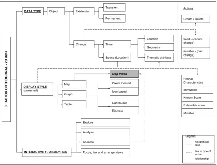
Figure 3. Visualisation library taxonomy for 2D streaming data visualisations
4. A TAXONOMY FOR VISUALISATION OF STREAMED GEOSPATIAL DATA
The proposed taxonomy framework is a combined three factor classification as seen in Figure 3 and is applicable to 2D visualisations of data that is continually being updated via data streaming infrastructures. The classification is based on data type, display style, interactivity and exploratory tasks. It addresses the needs of the developers of visualisation algorithms, while also taking into account the visualisation requirements of the user. The logic behind this taxonomy is to look at the possible ways that data can be visualised as per the needs of the user, and at the same time advise the development team as to what times of visualisations are applicable and suitable to which types of data. Examples of applications are provided in section 4.2.
4.1 Proposed classification
In agreement with Chengzhi et al (2003), in this application, the algorithm developers explore geospatial streaming data and its characteristics. The developers have come up with the following description of streaming data types, based on possible, expected types of sensor observations:
Transient event e.g. a recorded lightning strike A geographically stationary feature e.g.
measurement of water flow in a water reservoir A moving feature e.g. a motor vehicle with changing
GPS coordinates
A moving feature, changing shape e.g. cloud cover over an area of interest
A moving event, changing shape e.g. a fire front of fire event
We then use the notion of a geographical feature as an object, following which an object can be classified by existentiality or change.
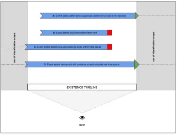
Andrienko et al (2003), touched on the subject of existential changes. They gave an example of the SpaTemp visualisation system that takes into account the “age” of events when it displays them. CommonGIS, their software system uses a space-time cube, where the two planar dimensions represent location and the third dimension is time. The older events are placed at the bottom of the cube; thematic attributes are displayed as change in size or a different colour.
In our classification an existential object is either transient or persistent (permanent). The level of persistence is illustrated in Figure 4, and described below. The level of persistence is based on the viewer’s scope of visualisation. In order to describe the existential stage of an object we refer to the object as an event in time:
Event starts to exist within the view and will continue to exist even after the viewer's time scope had lapsed Event starts to exist and ceases to exist within the
viewer's time scope
Event exists before and will cease to exist within the time scope
Event exists before and will continue to exist outside the viewers time scope
The existence of an object can also direct one as to whether an object should be created or deleted with respect to the viewer’s scope. A typical example would be a lightning strike. If a lightning strike had occurred spontaneously in the viewer’s scope of interest, the event will be “deleted” from the next view port of the viewer.
An object is subject to change. Changes that can occur within an object are primarily changes in time and location. Change can be described as fixed or mutable, meaning that one or more aspects of an object will undergo some form of change (mutable) or will remain fixed during the period of change. Change in location results in a change in thematic attribute, an example would be a moving car that changes roads it is using as
it moves along. The thematic attribute here is the name of a road on which the car is traveling. Change in time, results in the object changing, either, location, geometry or thematic attribute or one or more of these at a time. A moving fire front changes its location through time as well as thematic attributes, such as the fire radiative power.
In order to visualise the behaviour of objects as described above, we include the display style factor as a second classification in our taxonomy. Display style is influenced by available and innovative computer vision technology and yet also sensitive enough to reflect the characteristics of the data at hand. We look at three classic ways of visualising geospatial data, and these are: map, graph and table.
Figure 4. Existentiality timeline for geospatial objects and events
Visual representation (display type)
Data Type Map Graph Table
Existential Change map symbol, appear disappear
Discrete time line Add Columns of time interval, moment of existence (start – stop times) to table
Location Map vectors, trajectory lines, directional arrows
Continuous/ discrete time lines
Location, displacement, speed, velocity etc. as table columns
Thematic Map symbolisation e.g. colour ramp, opacity change to be updated with change
Append data to time attribute graph
Highlight table entry when new thematic data is received
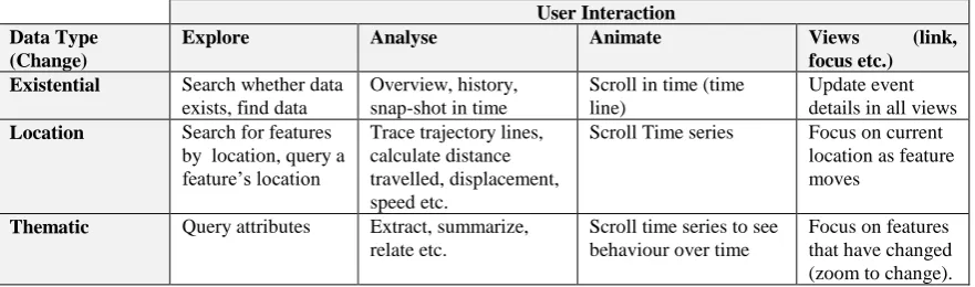
Table 1. Example of relationship between data type and visual representations that user would expect, with respect to continuously updating data streams
User Interaction Data Type
(Change)
Explore Analyse Animate Views (link,
focus etc.)
Scroll Time series Focus on current location as feature moves
Thematic Query attributes Extract, summarize, relate etc. Table 2. Example of relationship between data type and the type of interactions and analysis that
the user expects to perform
User Interaction Visualisation
(Display type)
Explore Analyse Animate Views
(focus, link)
Map Query features, zoom in/
out
Table Sort, filter Categorise,
correlations,
Table 3. Example of relationship between visual representation and expected user interaction
A 2D map specifically emphasises the geometric and location characteristics of an object, whereas a graph will highlight trends in the actual data values. A map video is introduced as a subset of map display. The map video displays a fused, interactive, time series video of data where this data is available. A table is included as a classic view that can be ported between multiple systems which can provide a more traditional form of visual analysis. For maps and graph displays, we apply Cottam’s extension of Bertin’s retinal characteristics, 2012. This follows that as an object’s variables undergo change, the way they are displayed also has to reflect the change. The retinal dimension categories go from immutable, where there is virtually no change, to known scale, extreme bin and mutable representation as well as continuous and discrete plots. Table 1 gives an example of the relationship between data types and the types of visualisations that the user would expect.
Visual Analytics includes human interaction to bring in the dimension of human expertise in solving problems. In order to incorporate this, we combine the interactivity requirements of the user with the explorative analytic tasks, as these both relate to the user’s requirements from the system in order to answer questions about the data. The user has a set of questions that they want to answer with the data and in order to do this they need to interact with the data in a certain way. We have subdivided this interaction into: data exploration, data analysis,
animation (for time series) and the classic one of “focus, link and arrange views“. We follow Andrienko et al (2003) in terms of the interactivity tasks that would be beneficial to a user; however, we combine the analytic tasks and interactivity as we believe that they are tightly coupled. See tables 2 and 3 for examples of relationships between the types of interaction and analysis that the user expects to perform against data type and visual representation respectively.
The classification discussed above has been tested with a number of streamed datasets from in-situ sensors. The sensors include water flow monitoring sensors, weather sensors and electricity consumption sensors. These sensors are all installed in a controlled location and data is received at different intervals.
5. CONCLUSION
Geospatial data with its unique characteristics and dynamic nature poses quite a challenge to visualisation. The major challenge is to develop visualisations that enable human interaction in order to aid cognition. A number of visualisation taxonomies have been developed in order to understand the visualisation of this dynamic and spatially diverse data type. Most of these taxonomies borrow from the information visualisation domain. A review of the most prominent taxonomies available in literature was performed and similarities and relationships were drawn from these. The taxonomy developed for a geospatial streaming data framework has been presented. The taxonomy uses three factors, namely; data type, display type, interactivity and analytics. The primary basis of the taxonomy is the data type focusing on the ISPRS Annals of the Photogrammetry, Remote Sensing and Spatial Information Sciences, Volume III-2, 2016
characteristics of the streaming data that is anticipated. The display type and user framework which includes the interactivity and user analytics are regarded as supporting views to the main classification of the data. Display style takes into account the trends and innovation in computer vision technology, whereas interactivity and analytics bring in the user expertise to the classification. Two items of note in this classification are the existentiality timeline of the data and the inclusion of map video classification to show change through time. The review of visualisation classifications has contributed to knowledge of the current status of geovisualisation. As a result, this knowledge has assisted in identifying the gaps in visualisation of streaming data, which is the focus of the research. The identified classification for the visualisation toolkit will help design tools such that a user can choose an applicable visualisation for their own case study.
6. REFERENCES
Andrienko, N., Andrienko, G., Gatalsky, P., 2003. Exploratory spatio-temporal visualization: an analytical review. Journal of Visual Languages & Computing, 14(1), pp. 503 541.
Andrienko, G., Andrienko, N., Dykes, J., Fabrikant, S. I., Wachowicz, M., 2008. Geovisualization of dynamics, movement and change: key issues and developing approaches in visualization research. Information Visualization, 7(3-4), pp. 173-180.
Bertin, J., 1981.Graphics and Graphic Information Processing. New York:deGruyter, Berlin.
Blok, C., 2000. Monitoring change: characteristics of dynamic geo-spatial phenomena for visual exploration. In: Spatial Cognition II, Lecture Notes in Artificial Intelligence, Springer, Berlin, Heidelberg, Vol. 1849, pp. 16–30.
Buja, A., Cook, D. Swayne, DF., 1996. Interactive high dimensional data visualization. Journal of Computational and Graphical Statistics, 5, pp. 78-99.
Card, S., Mackinlay, J., Shneiderman, B., 1999. Readings in Information Visualization: Using Vision to Think. Morgan Kaufmann Publishers.
Chengzhi, Q., Chenghu, Z., Tao, P., 2003.Taxonomy of visualization techniques and systems: Concerns between users and developers are different. In: Proceedings of Asia GIS Conference, Wuhan, China.
Chi, EH., 2000. A Taxonomy of Visualization Techniques Using the Data State Reference Model. Proceedings of the IEEE Symposium on Information VisualizationInfoVis, pp 69-76.
Chuah, M., Roth, S., 1996. On the semantics of interactive visualisation. Proceedings of IEEE Visualization, pp. 29-36.
Cottam, J.A, Lumsdaine, A., Weaver, C., 2012. Watch this: A taxonomy for dynamic data visualization. IEEE VAST, pp. 193-202.
Daassi. C., Nigay. L., Fauvet. MC.,, 2005. A taxonomy of temporal data visualization techniques. Information-Interaction-Intelligence, (5)2, pp. 41-63.
Dodge, S., Weibel, R., Lautenschütz, A. K., 2008. Taking a systematic look at movement: Developing a taxonomy of movement patterns. In: Proceedings of the AGILE Workshop on GeoVisualization of Dynamics, Movement and Change.
Dodge, S., Weibel, R., Lautenschütz, A. K., 2008. Towards a taxonomy of movement patterns. Information Visualization, 7 (3–4), pp. 240–252
Keim, D.A., Kriegel, H.-P., 1996. Visualization techniques for mining large databases: A comparison. IEEE Transactions on Knowledge and Data Engineering, 8(6), pp. 923-936.
Keim, D.A., 2002. Information visualization and visual data mining. IEEE Transaction on Visualization and Computer Graphics, 8(1), pp.1-8.
Keim, D.A., Mansmann, F., Schneidewind, J., Ziegler, H., 2006. Challenges in Visual Data Analysis. Proceedings of Information VisualizationIEEE, pp. 9-16.
MacEachren, A. M., Buttenfield, B.P., James, B., Campbell,J. Monmonier, M., 1992. Visualisation, In Abler, R., Marcus, M. and Olson, J. (eds.), Geography’s Inner Worlds: Pervasive
Themes in Contemporary American Geography. NJ: Rutgers University Press, New Brunswick, pp.99-137.
Peuquet, D.J., 1994. It’s about time: a conceptual framework for the representation of temporal dynamics in geographic information systems. Annals of the Association of American Geographers,84 (3), pp.441–461.
Shneiderman, B., 1996. The eyes have it: A task by data type taxonomy of information visualizations, Proceedings of IEEE Symposium on Visual Languages, Los Alamos, CA, pp. 336-343.
Simon, H.A., 1969. The Sciences of the Artificial. MIT Press.
Tory, M., Moller, T., 2004. Rethinking visualization: a high-level taxonomy. In: IEEE Symposium on Information VisualizationINFOVIS, pp. 151–158.
Voigt, R., 2002. “An Extended Scatterplot Matrix and Case Studies in Information Visualization”. Master's thesis,
Hochschule Magdeburg-Stendal,
www.vrvis.at/via/resources/DA-RVoigt/masterthesis.html
Yang, P., Tang X. M., Wang H. B., 2008. Dynamic cartographic representation of spatio-temporal data. The XXI International Society for Photogrammetry and Remote Sensing Proceedings, Beijing China, Volume XXXVII, XXI Congress, pp.7-12.