Visualizing Data
Ben Fry
Visualizing Data by Ben Fry
Copyright © 2008 Ben Fry. All rights reserved. Printed in the United States of America.
Published by O’Reilly Media, Inc., 1005 Gravenstein Highway North, Sebastopol, CA 95472.
O’Reilly books may be purchased for educational, business, or sales promotional use. Online editions are also available for most titles (safari.oreilly.com). For more information, contact our
corporate/institutional sales department: (800) 998-9938 or[email protected].
Editor: Andy Oram
Production Editor: Loranah Dimant Copyeditor: Genevieve d’Entremont Proofreader: Loranah Dimant
Indexer: Ellen Troutman Zaig Cover Designer: Karen Montgomery Interior Designer: David Futato Illustrator: Jessamyn Read
Printing History:
December 2007: First Edition.
Nutshell Handbook, the Nutshell Handbook logo, and the O’Reilly logo are registered trademarks of O’Reilly Media, Inc.Visualizing Data, the image of an owl, and related trade dress are trademarks of O’Reilly Media, Inc.
Many of the designations used by manufacturers and sellers to distinguish their products are claimed as trademarks. Where those designations appear in this book, and O’Reilly Media, Inc. was aware of a trademark claim, the designations have been printed in caps or initial caps.
While every precaution has been taken in the preparation of this book, the publisher and author assume no responsibility for errors or omissions, or for damages resulting from the use of the information contained herein.
This book uses RepKover™, a durable and flexible lay-flat binding.
iii
Table of Contents
Preface
. . .vii
1. The Seven Stages of Visualizing Data
. . .1
Why Data Display Requires Planning 2
An Example 6
Iteration and Combination 14
Principles 15
Onward 18
2. Getting Started with Processing
. . .19
Sketching with Processing 20
Exporting and Distributing Your Work 23
Examples and Reference 24
Functions 27
Sketching and Scripting 28
Ready? 30
3. Mapping
. . .31
Drawing a Map 31
Locations on a Map 32
Data on a Map 34
Using Your Own Data 51
4. Time Series
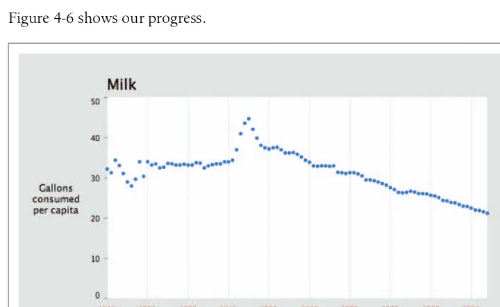
. . .54
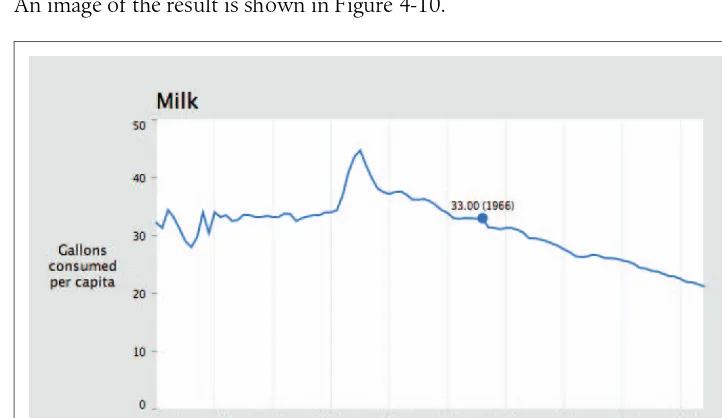
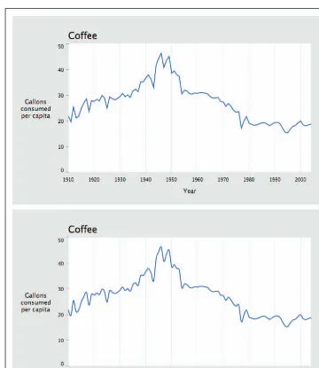
Milk, Tea, and Coffee (Acquire and Parse) 55
Cleaning the Table (Filter and Mine) 55
A Simple Plot (Represent and Refine) 57
Labeling the Current Data Set (Refine and Interact) 59
Drawing Axis Labels (Refine) 62
Choosing a Proper Representation (Represent and Refine) 73
Using Rollovers to Highlight Points (Interact) 76
Ways to Connect Points (Refine) 77
Text Labels As Tabbed Panes (Interact) 83
Interpolation Between Data Sets (Interact) 87
End of the Series 92
5. Connections and Correlations
. . .94
Changing Data Sources 94
Problem Statement 95
Preprocessing 96
Using the Preprocessed Data (Acquire, Parse, Filter, Mine) 111
Displaying the Results (Represent) 118
Returning to the Question (Refine) 121
Sophisticated Sorting: Using Salary As a Tiebreaker (Mine) 126
Moving to Multiple Days (Interact) 127
Smoothing Out the Interaction (Refine) 132
Deployment Considerations (Acquire, Parse, Filter) 133
6. Scatterplot Maps
. . .145
Preprocessing 145
Loading the Data (Acquire and Parse) 155
Drawing a Scatterplot of Zip Codes (Mine and Represent) 157
Highlighting Points While Typing (Refine and Interact) 158
Show the Currently Selected Point (Refine) 162
Progressively Dimming and Brightening Points (Refine) 165
Zooming In (Interact) 167
Changing How Points Are Drawn When Zooming (Refine) 177
Deployment Issues (Acquire and Refine) 178
Table of Contents | v
7. Trees, Hierarchies, and Recursion
. . .182
Using Recursion to Build a Directory Tree 182
Using a Queue to Load Asynchronously (Interact) 186
An Introduction to Treemaps 189
Which Files Are Using the Most Space? 194
Viewing Folder Contents (Interact) 199
Improving the Treemap Display (Refine) 201
Flying Through Files (Interact) 208
Next Steps 219
8. Networks and Graphs
. . .220
Simple Graph Demo 220
A More Complicated Graph 229
Approaching Network Problems 240
Advanced Graph Example 242
Mining Additional Information 262
9. Acquiring Data
. . .264
Where to Find Data 265
Tools for Acquiring Data from the Internet 266
Locating Files for Use with Processing 268
Loading Text Data 270
Dealing with Files and Folders 276
Listing Files in a Folder 277
Asynchronous Image Downloads 281
Using openStream( ) As a Bridge to Java 284
Dealing with Byte Arrays 284
Advanced Web Techniques 284
Using a Database 288
Dealing with a Large Number of Files 295
10. Parsing Data
. . .296
Levels of Effort 296
Tools for Gathering Clues 298
Text Is Best 299
Regular Expressions (regexps) 316
Grammars and BNF Notation 316
Compressed Data 317
Vectors and Geometry 320
Binary Data Formats 325
Advanced Detective Work 328
11. Integrating Processing with Java
. . .331
Programming Modes 331
Additional Source Files (Tabs) 334
The Preprocessor 335
API Structure 336
Embedding PApplet into Java Applications 338
Using Java Code in a Processing Sketch 342
Using Libraries 343
Building with the Source for processing.core 343
Bibliography
. . .345
vii
Preface
1When I show visualization projects to an audience, one of the most common ques-tions is, “How do you do this?” Other books about data visualization do exist, but the most prominent ones are often collections of academic papers; in any case, few
explain how to actually build representations. Books from the field of design that
offer advice for creating visualizations see the field only in terms of static displays, ignoring the possibility of dynamic, software-based visualizations. A number spend most of their time dissecting what’s wrong with given representations—sometimes providing solutions, but more often not.
In this book, I wanted to offer something for people who want to get started build-ing their own visualizations, somethbuild-ing to use as a jumpbuild-ing-off point for more com-plicated work. I don’t cover everything, but I’ve tried to provide enough background so that you’ll know where to go next.
I wrote this book because I wanted to have a way to make the ideas from
Computational Information Design, my Ph.D. dissertation, more accessible to a wider audience. More specifically, I wanted to see these ideas actually applied, rather than limited to an academic document on a shelf. My dissertation covered the process of getting from data to understanding; in other words, from considering a pile of infor-mation to presenting it usefully, in a way that can be easily understood and inter-acted with. This process is covered in Chapter 1, and used throughout the book as a framework for working through visualizations.
This book uses Processing (http://processing.org), a simple programming environ-ment and API that I co-developed with Casey Reas of UCLA. Processing’s program-ming environment makes it easy to sit down and “sketch” code to produce visual images quickly. Once you outgrow the environment, it’s possible to use a regular Java IDE to write Processing code because the API is based on Java. Processing is free to download and open source. It has been in development since 2001, and we’ve had about 100,000 people try it out in the last 12 months. Today Processing is used by tens of thousands of people for all manners of work. When I began writing this book, I debated which language and API to use. It could have been based on Java, but I realized I would have found myself re-implementing the Processing API to make things simple. It could have been based on Actionscript and Flash, but Flash is expensive to buy and tends to break down when dealing with larger data sets. Other scripting languages such as Python and Ruby are useful, but their execution speeds don’t keep up with Java. In the end, Processing was the right combination of cost, ease of use, and execution speed.
The Audience for This Book
In the spring of 2007, I co-taught an Information Visualization course at Carnegie Mellon. Our 30 students ranged from a freshman in the art school to a Ph.D. candi-date in computer science. In between were graduate students from the School of Design and various other undergrads. Their skill levels were enormously varied, but that was less important than their level of curiosity, and students who were curious and willing to put in some work managed to overcome the technical difficulties (for the art and design students) or the visual demands (for those with an engineering background).
This book is targeted at a similar range of backgrounds, if less academic. I’m trying to address people who want to ask questions, play with data, and gain an under-standing of how to communicate information to others. For instance, the book is for web designers who want to build more complex visualizations than their tools will allow. It’s also for software engineers who want to become adept at writing software that represents data—that calls on them to try out new skills, even if they have some background in building UIs. None of this is rocket science, but it isn’t always obvi-ous how to get started.
Preface | ix
Background Information
Because the audience for this book includes both programmers and non-programmers, the material varies in complexity. Beginners should be able to pick it up and get through the first few chapters, but they may find themselves lost as we get into more complicated programming topics. If you’re looking for a gentler introduc-tion to programming with Processing, other books are available (including one writ-ten by Casey Reas and me) that are more suited to learning the concepts from scratch, though they don’t cover the specifics of visualizing data. Chapters 1–4 can be understood by someone without any programming background, but the later chapters quickly become more difficult.
You’ll be most successful with this book if you have some familiarity with writing code—whether it’s Java, C++, or Actionscript. This is not an advanced text by any means, but a little background in writing code will go a long way toward understand-ing the concepts.
Overview of the Book
Chapter 1,The Seven Stages of Visualizing Data, covers the process for developing a
useful visualization, from acquiring data to interacting with it. This is the framework we’ll use as we attack problems in later chapters.
Chapter 2,Getting Started with Processing, is a basic introduction to the Processing
environment and syntax. It provides a bit of background on the structure of the API and the philosophy behind the project’s development.
Chapters 3 through 8 cover example projects that get progressively more complicated.
Chapter 3,Mapping, plots data points on a map, our first introduction to reading
data from the disk and representing it on the screen.
Chapter 4,Time Series, covers several methods of plotting charts that represent how
data changes over time.
Chapter 5,Connections and Correlations, is the first chapter that really delves into
how we acquire and parse a data set. The example in this chapter reads data from the MLB.com web site and produces an image correlating player salaries and team per-formance over the course of a baseball season. It’s an in-depth example illustrating how to scrape data from a web site that lacks an official API. These techniques can be applied to many other projects, even if you’re not interested in baseball.
Chapter 6,Scatterplot Maps, answers the question, “How do zip codes relate to
Chapter 7,Trees, Hierarchies, and Recursion, discusses trees and hierarchies. It cov-ers recursion, an important topic when dealing with tree structures, and treemaps, a useful representation for certain kinds of tree data.
Chapter 8, Networks and Graphs, is about networks of information, also called
graphs. The first half discusses ways to produce a representation of connections between many nodes in a network, and the second half shows an example of doing the same with web site trafficdata to see how a site is used over time. The latter project also covers how to integrate Processing with Eclipse, a Java IDE.
The last three chapters contain reference material, including more background and techniques for acquiring and parsing data.
Chapter 9,Acquiring Data, is a kind of cookbook that covers all sorts of practical
techniques, from reading data from files, to spoofing a web browser, to storing data in databases.
Chapter 10,Parsing Data, is also written in cookbook-style, with examples that
illus-trate the detective work involved in parsing data. Examples include parsing HTML tables, XML, compressed data, and SVG shapes. It even includes a basic example of watching a network connection to understand how an undocumented data protocol works.
Chapter 11,Integrating Processing with Java, covers the specifics of how the
Process-ing API integrates with Java. It’s more of an appendix aimed at advanced Java pro-grammers who want to use the API with their own projects.
Safari® Books Online
When you see a Safari® Books Online icon on the cover of your favorite technology book, that means the book is available online through the O’Reilly Network Safari Bookshelf.
Safari offers a solution that’s better than e-books. It’s a virtual library that lets you easily search thousands of top tech books, cut and paste code samples, download chapters, and find quick answers when you need the most accurate, current informa-tion. Try it for free athttp://safari.oreilly.com.
Acknowledgments
Preface | xi
I owe a great deal to my editor, Andy Oram, and assistant editor, Isabel Kunkle. With-out Andy’s hard work and helpful suggestions, or Isabel’s focus on our schedule, I might still be working on the outline for Chapter 4. Thanks also to those who reviewed the draft manuscript: Brian DeLacey, Aidan Delaney, and Harry Hochheiser.
This book is based on ideas first developed as part of my doctoral work at the MIT Media Laboratory. For that I owe my advisor of six years, John Maeda, and my committee members, David Altshuler and Chris Pullman. Chris also pushed to have the ideas published properly, which was a great encouragement.
I’d also like to thank Casey Reas, my friend, inspiration, and collaborator on Process-ing, who has ensured that the project continues several years after its inception. The content of the examples has been influenced by many courses I’ve taught as workshops or in classrooms over the last few years—in particular, my visualization courses at Harvard University and Carnegie Mellon (co-taught with Golan Levin), and workshops at Anderson Ranch in Colorado and at Hangar in Barcelona. I owe a lot to these student guinea pigs who taught me how to best explain this work. Finally, thanks to my family, and immeasurable thanks to Shannon Hunt for edit-ing, input, and moral support. Hers will be a tough act to follow while I return in
kind as she writesher book in the coming months.
Conventions Used in This Book
The following typographical conventions are used in this book: Plain text
Indicates menu titles, menu options, menu buttons, and keyboard accelerators (such as Alt and Ctrl).
Italic
Indicates new terms, URLs, email addresses, filenames, file extensions, path-names, directories, and Unix utilities.
Constant width
Indicates commands, options, variables, functions, types, classes, methods, HTML and XML tags, the contents of files, and the output from commands.
Constant width bold
Shows commands or other text that should be typed literally by the user. Constant width italic
This icon signifies a tip, suggestion, or general note.
This icon indicates a warning or caution.
Using Code Examples
This book is here to help you get your job done. In general, you may use the code in this book in your programs and documentation. You do not need to contact us for permission unless you’re reproducing a significant portion of the code. For example, writing a program that uses several chunks of code from this book does not require
permission. Selling or distributing a CD-ROM of examples from O’Reilly booksdoes
require permission. Answering a question by citing this book and quoting example code does not require permission. Incorporating a significant amount of example
code from this book into your product’s documentationdoes require permission.
We appreciate, but do not require, attribution. An attribution usually includes the
title, author, publisher, and ISBN. For example: “Visualizing Databy Ben Fry.
Copy-right 2008 Ben Fry, 978-0-596-51455-6.”
If you think your use of code examples falls outside fair use or the permission given
here, feel free to contact us at[email protected].
We’d Like to Hear from You
Please address comments and questions concerning this book to the publisher: O’Reilly Media, Inc.
1005 Gravenstein Highway North Sebastopol, CA 95472
800-998-9938 (in the United States or Canada) 707-829-0515 (international or local)
707-829-0104 (fax)
We have a web page for this book, where we list errata, examples, and any addi-tional information. You can access this page at:
Preface | xiii
The author also has a site for the book at:
http://benfry.com/writing
To comment or ask technical questions about this book, send email to:
For more information about our books, conferences, Resource Centers, and the O’Reilly Network, see our web site at:
1
Chapter 1
CHAPTER 1
The Seven Stages of Visualizing Data
1The greatest value of a picture is when itforces us to notice what we never expected to see.
—John Tukey What do the paths that millions of visitors take through a web site look like? How do the 3.1 billion A, C, G, and T letters of the human genome compare to those of the chimp or the mouse? Out of a few hundred thousand files on your computer’s hard disk, which ones are taking up the most space, and how often do you use them? By applying methods from the fields of computer science, statistics, data mining, graphicdesign, and visualization, we can begin to answer these questions in a mean-ingful way that also makes the answers accessible to others.
All of the previous questions involve a large quantity of data, which makes it extremely difficult to gain a “big picture” understanding of its meaning. The prob-lem is further compounded by the data’s continually changing nature, which can result from new information being added or older information continuously being refined. This deluge of data necessitates new software-based tools, and its complex-ity requires extra consideration. Whenever we analyze data, our goal is to highlight its features in order of their importance, reveal patterns, and simultaneously show features that exist across multiple dimensions.
Why Data Display Requires Planning
Each set of data has particular display needs, and thepurposefor which you’re using
the data set has just as much of an effect on those needs as the data itself. There are dozens of quick tools for developing graphics in a cookie-cutter fashion in office pro-grams, on the Web, and elsewhere, but complex data sets used for specialized appli-cations require unique treatment. Throughout this book, we’ll discuss how the characteristics of a data set help determine what kind of visualization you’ll use.
Too Much Information
When you hear the term “information overload,” you probably know exactly what it means because it’s something you deal with daily. In Richard Saul Wurman’s book
Information Anxiety(Doubleday), he describes how theNew York Timeson an aver-age Sunday contains more information than a Renaissance-era person had access to in his entire lifetime.
But this is an exciting time. For $300, you can purchase a commodity PC that has thousands of times more computing power than the first computers used to tabulate the U.S. Census. The capability of modern machines is astounding. Performing sophisticated data analysis no longer requires a research laboratory, just a cheap machine and some code. Complex data sets can be accessed, explored, and analyzed by the public in a way that simply was not possible in the past.
The past 10 years have also brought about significant changes in the graphic capabil-ities of average machines. Driven by the gaming industry, high-end 2D and 3D graphics hardware no longer requires dedicated machines from specific vendors, but can instead be purchased as a $100 add-on card and is standard equipment for any machine costing $700 or more. When not used for gaming, these cards can render extremely sophisticated models with thousands of shapes, and can do so quickly enough to provide smooth, interactive animation. And these prices will only decrease—within a few years’ time, accelerated graphics will be standard equipment on the aforementioned commodity PC.
Data Collection
We’re getting better and better at collecting data, but we lag in what we can do with it. Most of the examples in this book come from freely available data sources on the Internet. Lots of data is out there, but it’s not being used to its greatest potential because it’s not being visualized as well as it could be. (More about this can be found in Chapter 9, which covers places to find data and how to retrieve it.)
Why Data Display Requires Planning | 3
getting so good at measuring and recording things, why haven’t we kept up with the methods to understand and communicate this information?
Thinking About Data
We also do very little sophisticated thinking about information itself. When AOL released a data set containing the search queries of millions of users that had been “randomized” to protect the innocent, articles soon appeared about how people could be identified by—and embarrassed by—information regarding their search habits. Even though we can collect this kind of information, we often don’t know quite what it means. Was this a major issue or did it simply embarrass a few AOL users? Similarly, when millions of records of personal data are lost or accessed ille-gally, what does that mean? With so few people addressing data, our understanding remains quite narrow, boiling down to things like, “My credit card number might be stolen” or “Do I care if anyone sees what I search?”
Data Never Stays the Same
We might be accustomed to thinking about data as fixed values to be analyzed, but data is a moving target. How do we build representations of data that adjust to new values every second, hour, or week? This is a necessity because most data comes from the real world, where there are no absolutes. The temperature changes, the train runs late, or a product launch causes the traffic pattern on a web site to change drastically. What happens when things start moving? How do we interact with “live” data? How do we unravel data as it changes over time? We might use animation to play back the evolution of a data set, or interaction to control what time span we’re looking at. How can we write code for these situations?
What Is the Question?
As machines have enormously increased the capacity with which we can create (through measurements and sampling) and store data, it becomes easier to dis-associate the data from the original reason for collecting it. This leads to an all-too frequent situation: approaching visualization problems with the question, “How can we possibly understand so much data?”
As a contrast, think about subway maps, which are abstracted from the complex shape of the city and are focused on the rider’s goal: to get from one place to the next. Limit-ing the detail of each shape, turn, and geographical formation reduces this complex data set to answering the rider’s question: “How do I get from point A to point B?”
circuit boards, the map simplified the complicated Tube system to a series of verti-cal, horizontal, and 45˚diagonal lines. While attempting to preserve as much of the relative physical layout as possible, the map shows only the connections between sta-tions, as that is the only information that riders use to decide their paths.
When beginning a visualization project, it’s common to focus on all the data that has been collected so far. The amounts of information might be enormous—people like to brag about how many gigabytes of data they’ve collected and how difficult their visualization problem is. But great information visualization never starts from the standpoint of the data set; it starts with questions. Why was the data collected, what’s interesting about it, and what stories can it tell?
The most important part of understanding data is identifying the question that you want to answer. Rather than thinking about the data that was collected, think about how it will be used and work backward to what was collected. You collect data because you want to know something about it. If you don’t really know why you’re collecting it, you’re just hoarding it. It’s easy to say things like, “I want to know what’s in it,” or “I want to know what it means.” Sure, but what’s meaningful?
The more specific you can make your question, the more specific and clear the visual result will be. When questions have a broad scope, as in “exploratory data analysis” tasks, the answers themselves will be broad and often geared toward those who are themselves versed in the data. John Tukey, who coined the term Exploratory Data Analysis, said “...pictures based on exploration of data should force their messages
upon us.”*Too many data problems are labeled “exploratory” because the data
col-lected is overwhelming, even though the original purpose was to answer a specific question or achieve specific results.
One of the most important (and least technical) skills in understanding data is ask-ing good questions. An appropriate question shares an interest you have in the data, tries to convey it to others, and is curiosity-oriented rather than math-oriented. Visualizing data is just like any other type of communication: success is defined by your audience’s ability to pick up on, and be excited about, your insight.
Admittedly, you may have a rich set of data to which you want to provide flexible access by not defining your question too narrowly. Even then, your goal should be to highlight key findings. There is a tendency in the visualization field to borrow from
the statistics field and separate problems intoexploratoryandexpository, but for the
purposes of this book, this distinction is not useful. The same methods and process are used for both.
In short, a proper visualization is a kind of narrative, providing a clear answer to a question without extraneous details. By focusing on the original intent of the ques-tion, you can eliminate such details because the question provides a benchmark for what is and is not necessary.
Why Data Display Requires Planning | 5
A Combination of Many Disciplines
Given the complexity of data, using it to provide a meaningful solution requires insights from diverse fields: statistics, data mining, graphic design, and information visualization. However, each field has evolved in isolation from the others.
Thus, visual design—-the field of mapping data to a visual form—typically does not address how to handle thousands or tens of thousands of items of data. Data mining techniques have such capabilities, but they are disconnected from the means to inter-act with the data. Software-based information visualization adds building blocks for interacting with and representing various kinds of abstract data, but typically these methods undervalue the aesthetic principles of visual design rather than embrace their strength as a necessary aid to effective communication. Someone approaching a data representation problem (such as a scientist trying to visualize the results of a study involving a few thousand pieces of genetic data) often finds it difficult to choose a rep-resentation and wouldn’t even know what tools to use or books to read to begin.
Process
We must reconcile these fields as parts of a single process. Graphic designers can learn the computer science necessary for visualization, and statisticians can communicate their data more effectively by understanding the visual design principles behind data representation. The methods themselves are not new, but their isolation within indi-vidual fields has prevented them from being used together. In this book, we use a pro-cess that bridges the individual disciplines, placing the focus and consideration on how data is understood rather than on the viewpoint and tools of each individual field.
The process of understanding data begins with a set of numbers and a question. The following steps form a path to the answer:
Acquire
Obtain the data, whether from a file on a disk or a source over a network.
Parse
Provide some structure for the data’s meaning, and order it into categories.
Filter
Remove all but the data of interest.
Mine
Apply methods from statistics or data mining as a way to discern patterns or place the data in mathematical context.
Represent
Choose a basic visual model, such as a bar graph, list, or tree.
Refine
Improve the basic representation to make it clearer and more visually engaging.
Interact
Of course, these steps can’t be followed slavishly. You can expect that they’ll be involved at one time or another in projects you develop, but sometimes it will be four of the seven, and at other times all of them.
Part of the problem with the individual approaches to dealing with data is that the separation of fields leads to different people each solving an isolated part of the prob-lem. When this occurs, something is lost at each transition—like a “telephone game” in which each step of the process diminishes aspects of the initial question under consideration. The initial format of the data (determined by how it is acquired and parsed) will often drive how it is considered for filtering or mining. The statistical method used to glean useful information from the data might drive the initial presen-tation. In other words, the final representation reflects the results of the statistical method rather than a response to the initial question.
Similarly, a graphicdesigner brought in at the next stage will most often respond to specific problems with the representation provided by the previous steps, rather than focus on the initial question. The visualization step might add a compelling and interactive means to look at the data filtered from the earlier steps, but the display is inflexible because the earlier stages of the process are hidden. Furthermore, practitioners of each of the fields that commonly deal with data problems are often unclear about how to traverse the wider set of methods and arrive at an answer. This book covers the whole path from data to understanding: the transformation of a jumble of raw numbers into something coherent and useful. The data under consid-eration might be numbers, lists, or relationships between multiple entities.
It should be kept in mind that the termvisualizationis often used to describe the art
of conveying a physical relationship, such as the subway map mentioned near the
start of this chapter. That’s a different kind of analysis and skill from information
visualization, where the data is primarily numericor symbolic(e.g., A, C, G, and T— the letters of geneticcode—and additional annotations about them). The primary focus of this book is information visualization: for instance, a series of numbers that describes temperatures in a weather forecast rather than the shape of the cloud cover contributing to them.
An Example
An Example | 7
What Is the Question?
All data problems begin with a question and end with a narrative construct that pro-vides a clear answer. The Zipdecode project (described further in Chapter 6) was developed out of a personal interest in the relationship of the zip code numbering system to geographicareas. Living in Boston, I knew that numbers starting with a zero denoted places on the East Coast. Having spent time in San Francisco, I knew the initial numbers for the West Coast were all nines. I grew up in Michigan, where all our codes were four-prefixed. But what sort of area does the second digit specify? Or the third?
The finished application was initially constructed in a few hours as a quick way to take what might be considered a boring data set (a long list of zip codes, towns, and their latitudes and longitudes) and create something engaging for a web audience that explained how the codes related to their geography.
Acquire
The acquisition step involves obtaining the data. Like many of the other steps, this can be either extremely complicated (i.e., trying to glean useful data from a large sys-tem) or very simple (reading a readily available text file).
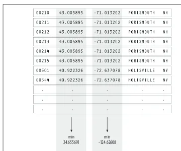
A copy of the zip code listing can be found on the U.S. Census Bureau web site, as it is frequently used for geographic coding of statistical data. The listing is a freely available file with approximately 42,000 lines, one for each of the codes, a tiny por-tion of which is shown in Figure 1-1.
Acquisition concerns how the user downloads your data as well as how you obtained the data in the first place. If the final project will be distributed over the Internet, as you design the application, you have to take into account the time required to down-load data into the browser. And because data downdown-loaded to the browser is proba-bly part of an even larger data set stored on the server, you may have to structure the data on the server to facilitate retrieval of common subsets.
Parse
After you acquire the data, it needs to be parsed—changed into a format that tags each part of the data with its intended use. Each line of the file must be broken along its individual parts; in this case, it must be delimited at each tab character. Then, each piece of data needs to be converted to a useful format. Figure 1-2 shows the lay-out of each line in the census listing, which we have to understand to parse it and get out of it what we want.
Each field is formatted as a data type that we’ll handle in a conversion program:
String
A set of characters that forms a word or a sentence. Here, the city or town name is designated as a string. Because the zip codes themselves are not so much num-bers as a series of digits (if they were numnum-bers, the code 02139 would be stored as 2139, which is not the same thing), they also might be considered strings.
Float
A number with decimal points (used for the latitudes and longitudes of each
location). The name is short forfloating point, from programming nomenclature
that describes how the numbers are stored in the computer’s memory.
Figure 1-2. Structure of acquired data
An Example | 9
Character
A single letter or other symbol. In this data set, a character sometimes desig-nates special post offices.
Integer
A number without a fractional portion, and hence no decimal points (e.g., –14, 0, or 237).
Index
Data (commonly an integer or string) that maps to a location in another table of data. In this case, the index maps numbered codes to the names and two-digit abbreviations of states. This is common in databases, where such an index is used as a pointer into another table, sometimes as a way to compact the data further (e.g., a two-digit code requires less storage than the full name of the state or territory).
With the completion of this step, the data is successfully tagged and consequently more useful to a program that will manipulate or represent it in some way.
Filter
The next step involves filtering the data to remove portions not relevant to our use. In this example, for the sake of keeping it simple, we’ll be focusing on the contigu-ous 48 states, so the records for cities and towns that are not part of those states— Alaska, Hawaii, and territories such as Puerto Rico—are removed. Another project could require significant mathematical work to place the data into a mathematical
model or normalize it (convert it to an acceptable range of numbers).
Mine
This step involves math, statistics, and data mining. The data in this case receives only a simple treatment: the program must figure out the minimum and maximum values for latitude and longitude by running through the data (as shown in Figure 1-3) so that it can be presented on a screen at a proper scale. Most of the time, this step will be far more complicated than a pair of simple math operations.
Represent
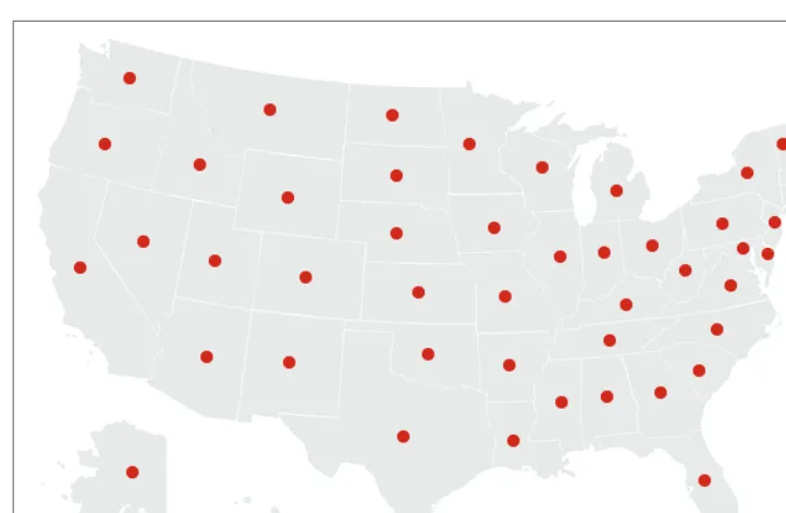
Figure 1-3. Mining the data: just compare values to find the minimum and maximum
Figure 1-4. Basic visual representation of zip code data
min 24.655691
max 48.987385
max -67.040764
An Example | 11
Refine
In this step, graphicdesign methods are used to further clarify the representation by calling more attention to particular data (establishing hierarchy) or by changing attributes (such as color) that contribute to readability.
Hierarchy is established in Figure 1-5, for instance, by coloring the background deep gray and displaying the selected points (all codes beginning with four) in white and the deselected points in medium yellow.
Interact
The next stage of the process adds interaction, letting the user control or explore the data. Interaction might cover things like selecting a subset of the data or changing the viewpoint. As another example of a stage affecting an earlier part of the process, this stage can also affect the refinement step, as a change in viewpoint might require the data to be designed differently.
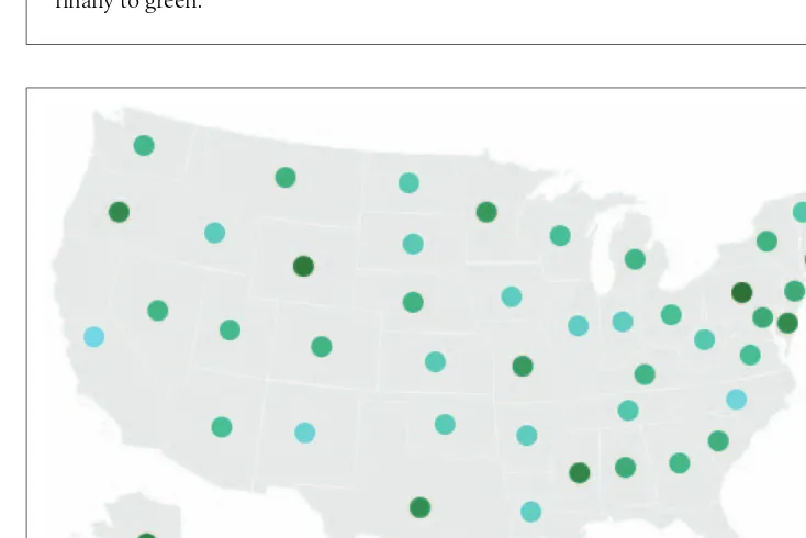
In the Zipdecode project, typing a number selects all zip codes that begin with that number. Figures 1-6 and 1-7 show all the zip codes beginning with zero and nine, respectively.
Another enhancement to user interaction (not shown here) enables the users to traverse the display laterally and run through several of the prefixes. After typing part or all of a zip code, holding down the Shift key allows users to replace the last num-ber typed without having to hit the Delete key to back up.
Typing is a very simple form of interaction, but it allows the user to rapidly gain an understanding of the zip code system’s layout. Just contrast this sample application with the difficulty of deducing the same information from a table of zip codes and city names.
The viewer can continue to type digits to see the area covered by each subsequent set of prefixes. Figure 1-8 shows the region highlighted by the two digits 02, Figure 1-9 shows the three digits 021, and Figure 1-10 shows the four digits 0213. Finally, Figure 1-11 shows what you get by entering a full zip code, 02139—a city name pops up on the display.
Figure 1-6. The user can alter the display through choices (zip codes starting with 0)
An Example | 13
In addition, users can enable a “zoom” feature that draws them closer to each sub-sequent digit, revealing more detail around the area and showing a constant rate of detail at each level. Because we’ve chosen a map as a representation, we could add more details of state and county boundaries or other geographic features to help viewers associate the “data” space of zip code points with what they know about the local environment.
Figure 1-8. Honing in with two digits (02)
Iteration and Combination
Figure 1-12 shows the stages in order and demonstrates how later decisions com-monly reflect on earlier stages. Each step of the process is inextricably linked because of how the steps affect one another. In the Zipdecode application, for instance:
• The need for a compact representation on the screen led me to refilter the data to include only the contiguous 48 states.
• The representation step affected acquisition because after I developed the appli-cation I modified it so it could show data that was downloaded over a slow
Figure 1-10. Honing in further with four digits (0213)
Principles | 15
Internet connection to the browser. My change to the structure of the data allows the points to appear slowly, as they are first read from the data file, employing the data itself as a “progress bar.”
• Interaction by typing successive numbers meant that the colors had to be modi-fied in the visual refinement step to show a slow transition as points in the dis-play are added or removed. This helps the user maintain context by preventing the updates on-screen from being too jarring.
The connections between the steps in the process illustrate the importance of the individual or team in addressing the project as a whole. This runs counter to the com-mon fondness for assembly-line style projects, where programmers handle the techni-cal portions, such as acquiring and parsing data, and visual designers are left to choose colors and typefaces. At the intersection of these fields is a more interesting set of properties that demonstrates their strength in combination.
When acquiring data, consider how it can change, whether sporadically (such as once a month) or continuously. This expands the notion of graphic design that’s tra-ditionally focused on solving a specific problem for a specific data set, and instead
considers the meta-problem of how to handle a certain kind of data that might be
updated in the future.
In the filtering step, data can be filtered in real time, as in the Zipdecode application. During visual refinement, changes to the design can be applied across the entire sys-tem. For instance, a color change can be automatically applied to the thousands of elements that require it, rather having to make such a tedious modification by hand. This is the strength of a computational approach, where tedious processes are mini-mized through automation.
Principles
I’ll finish this general introduction to visualization by laying out some ways of think-ing about data and its representation that have served me well over many years and many diverse projects. They may seem abstract at first, or of minor importance to the job you’re facing, but I urge you to return and reread them as you practice visualiza-tion; they just may help you in later tasks.
Figure 1-12. Interactions between the seven stages
Each Project Has Unique Requirements
A visualization should convey the unique properties of the data set it represents. This book is not concerned with providing a handful of ready-made “visualizations” that can be plugged into any data set. Ready-made visualizations can help produce a quick view of your data set, but they’re inflexible commodity items that can be implemented in packaged software. Any bar chart or scatter plot made with Excel will look like a bar chart or scatter plot made with Excel. Packaged solutions can provide only packaged answers, like a pull-string toy that is limited to a handful of canned phrases, such as “Sales show a slight increase in each of the last five years!” Every problem is unique, so capitalize on that uniqueness to solve the problem. Chapters in this book are divided by types of data, rather than types of display. In other words, we’re not saying, “Here’s how to make a bar graph,” but “Here are sev-eral ways to show a correlation.” This gives you a more powerful way to think about maximizing what can be said about the data set in question.
I’m often asked for a library of tools that will automatically make attractive represen-tations of any given data set. But if each data set is different, the point of visualiza-tion is to expose that fascinating aspect of the data and make it self-evident. Although readily available representation toolkits are useful starting points, they must be customized during an in-depth study of the task.
Data is often stored in a genericformat. For instance, databases used for annotation of genomicdata might consist of enormous lists of start and stop positions, but those lists vary in importance depending on the situation in which they’re being used. We don’t view books as long abstract sequences of words, yet when it comes to informa-tion, we’re often so taken with the enormity of the information and the low-level abstractions used to store it that the narrative is lost. Unless you stop thinking about databases, everything looks like a table—millions of rows and columns to be stored, queried, and viewed.
In this book, we use a small collection of simple helper classes as starting points. Often, we’ll be targeting the Web as a delivery platform, so the classes are designed to take up minimal time for download and display. But I will also discuss more robust versions of similar tools that can be used for more in-depth work.
Principles | 17
Avoid the All-You-Can-Eat Buffet
Often, less detail will actually convey more information because the inclusion of overly specific details causes the viewer to miss what’s most important or disregard the image entirely because it’s too complex. Use as little data as possible, no matter how precious it seems.
Consider a weather map, with curved bands of temperatures across the country. The designers avoid giving each band a detailed edge (particularly because the data is often fuzzy). Instead, they convey a broader pattern in the data.
Subway maps leave out the details of surface roads because the additional detail adds more complexity to the map than necessary. Before maps were created in Beck’s style, it seemed that knowing street locations was essential to navigating the subway. Instead, individual stations are used as waypoints for direction finding. The impor-tant detail is that your target destination is near a particular station. Directions can be given in terms of the last few turns to be taken after you exit the station, or you can consult a map posted at the station that describes the immediate area aboveground.
It’s easy to collect data, and some people become preoccupied with simply accumu-lating more complex data or data in mass quantities. But more data is not implicitly better, and often serves to confuse the situation. Just because it can be measured doesn’t mean it should. Perhaps making things simple is worth bragging about, but making complex messes is not. Find the smallest amount of data that can still con-vey something meaningful about the contents of the data set. As with Beck’s under-ground map, focusing on the question helps define those minimum requirements. The same holds for the many “dimensions” that are found in data sets. Web site traf-ficstatistics have many dimensions: IP address, date, time of day, page visited, previ-ous page visited, result code, browser, machine type, and so on. While each of these might be examined in turn, they relate to distinct questions. Only a few of the vari-ables are required to answer a typical question, such as “How many people visited
pagexover the last three months, and how has that figure changed each month?”
Avoid trying to show a burdensome multidimensional space that maps too many points of information.
Know Your Audience
In what way will your audience use the piece? A mapping application used on a mobile device has to be designed with a completely different set of criteria than one used on a desktop computer. Although both applications use maps, they have little to do with each other. The focus of the desktop application may be finding locations and print maps, whereas the focus of the mobile version is actively following the directions to a particular location.
Onward
19
Chapter 2
CHAPTER 2
Getting Started with Processing
2The Processing project began in the spring of 2001 and was first used at a workshop in Japan that August. Originally built as a domain-specific extension to Java targeted at artists and designers, Processing has evolved into a full-blown design and proto-typing tool used for large-scale installation work, motion graphics, and complex data visualization. Processing is a simple programming environment that was created to make it easier to develop visually oriented applications with an emphasis on anima-tion and provide users with instant feedback through interacanima-tion. As its capabilities have expanded over the past six years, Processing has come to be used for more advanced production-level work in addition to its sketching role.
Processing is based on Java, but because program elements in Processing are fairly simple, you can learn to use it from this book even if you don’t know any Java. If you’re familiar with Java, it’s best to forget that Processing has anything to do with it for a while, at least until you get the hang of how the API works. We’ll cover how to integrate Java and Processing toward the end of the book.
The latest version of Processing can be downloaded at:
http://processing.org/download
Processing consists of:
• The Processing Development Environment (PDE). This is the software that runs when you double-click the Processing icon. The PDE is an Integrated Development Environment with a minimalist set of features designed as a sim-ple introduction to programming or for testing one-off ideas.
• A collection of commands (also referred to as functions or methods) that make up the “core” programming interface, or API, as well as several libraries that sup-port more advanced features, such as drawing with OpenGL, reading XML files, and saving complex imagery in PDF format.
• A language syntax, identical to Java but with a few modifications. The changes are laid out in detail toward the end of the book.
• An active online community, hosted athttp://processing.org.
For this reason, references to “Processing” can be somewhat ambiguous. Are we talk-ing about the API, the development environment, or the web site? I’ll be careful to differentiate them when referring to each.
Sketching with Processing
A Processing program is called asketch. The idea is to make Java-style programming
feel more like scripting, and adopt the process of scripting to quickly write code.
Sketches are stored in thesketchbook, a folder that’s used as the default location for
saving all of your projects. When you run Processing, the sketch last used will auto-matically open. If this is the first time Processing is used (or if the sketch is no longer available), a new sketch will open.
Sketches that are stored in the sketchbook can be accessed from File➝Sketchbook.
Alternatively, File ➝Open... can be used to open a sketch from elsewhere on the
system.
Advanced programmers need not use the PDE and may instead use its libraries with the Java environment of choice. (This is covered toward the end of the book.) How-ever, if you’re just getting started, it’s recommended that you use the PDE for your first few projects to gain familiarity with the way things are done. Although Process-ing is based on Java, it was never meant to be a Java IDE with trainProcess-ing wheels. To better address our target audience, its conceptual model (how programs work, how interfaces are built, and how files are handled) is somewhat different from Java’s.
Hello World
Programming languages are often introduced with a simple program that prints “Hello World” to the console. The Processing equivalent is simply to draw a line:
Sketching with Processing | 21
Enter this example and press the Run button, which is an icon that looks like the Play button on any audio or video device. The result will appear in a new window, with a gray background and a black line from coordinate (15, 25) to (70, 90). The (0, 0) coor-dinate is the upper-lefthand corner of the display window. Building on this program to change the size of the display window and set the background color, type in the code from Example 2-1.
This version sets the window size to 400×400 pixels, sets the background to an
orange-red, and draws the line in white, by setting the stroke color to 255. By default, colors are specified in the range 0 to 255. Other variations of the parameters
to thestroke( ) function provide alternate results:
stroke(255); // sets the stroke color to white stroke(255, 255, 255); // identical to stroke(255)
stroke(255, 128, 0); // bright orange (red 255, green 128, blue 0) stroke(#FF8000); // bright orange as a web color
stroke(255, 128, 0, 128); // bright orange with 50% transparency
The same alternatives work for thefill( )command, which sets the fill color, and
the background( ) command, which clears the display window. Like all Processing methods that affect drawing properties, the fill and stroke colors affect all geometry drawn to the screen until the next fill and stroke commands are executed.
It’s also possible to use the editor of your choice instead of the built-in editor. Simply select “Use External Editor” in the Preferences window (Processing ➝ Preferences on Mac OS X, or File ➝ Preferences on
Windows and Linux). When using an external editor, editing will be disabled in the PDE, but the text will reload whenever you press Run.
Hello Mouse
A program written as a list of statements (like the previous examples) is called abasic
mode sketch. In basic mode, a series of commands are used to perform tasks or cre-ate a single image without any animation or interaction. Interactive programs are
drawn as a series of frames, which you can create by adding functions titledsetup( )
anddraw( ), as shown in thecontinuousmode sketch in Example 2-2. They are built-in functions that are called automatically.
Example 2-1. Simple sketch
size(400, 400); background(192, 64, 0); stroke(255);
Example 2-2 is identical in function to Example 2-1, except that now the line follows
the mouse. Thesetup( )block runs once, and thedraw( )block runs repeatedly. As
such,setup( )can be used for any initialization; in this case, it’s used for setting the
screen size, making the background orange, and setting the stroke color to white. Thedraw( )block is used to handle animation. Thesize( )command must always be the first line insidesetup( ).
Because thebackground( )command is used only once, the screen will fill with lines
as the mouse is moved. To draw just a single line that follows the mouse, move the
background( )command to thedraw( )function, which will clear the display window
(filling it with orange) each timedraw( ) runs:
void setup( ) { size(400, 400); stroke(255); }
void draw( ) {
background(192, 64, 0); line(150, 25, mouseX, mouseY); }
Basicmode programs are most commonly used for extremely simple examples, or for scripts that run in a linear fashion and then exit. For instance, a basic mode program might start, draw a page to a PDF file, and then exit.
Most programs employ continuous mode, which uses the setup( ) and draw( )
blocks. More advanced mouse handling can also be introduced; for instance, the
mousePressed( ) method will be called whenever the mouse is pressed. So, in the following example, when the mouse is pressed, the screen is cleared via the
background( ) command: void setup( ) { size(400, 400); stroke(255); }
void draw( ) {
line(150, 25, mouseX, mouseY); }
Example 2-2. Simple continuous mode sketch
void setup( ) { size(400, 400); stroke(255);
background(192, 64, 0); }
void draw( ) {
Exporting and Distributing Your Work | 23 void mousePressed( ) {
background(192, 64, 0); }
More about basic versus continuous mode programs can be found in the
Program-ming Modes section of the Processing reference, which can be viewed from Help➝
Getting Started or online athttp://processing.org/reference/environment.
Exporting and Distributing Your Work
One of the most significant features of the Processing environment is its ability to
bundle your sketch into an applet or application with just one click. Select File ➝
Export to package your current sketch as an applet. This will create a folder named
applet inside your sketch folder. Opening theindex.html file inside that folder will open your sketch in a browser. The applet folder can be copied to a web site intact and will be viewable by users who have Java installed on their systems. Similarly, you
can use File➝Export Application to bundle your sketch as an application for
Win-dows, Mac OS X, and Linux.
The applet and application folders are overwritten whenever you export—make a
copy or remove them from the sketch folder before making changes to theindex.html
file or the contents of the folder.
More about the export features can be found in the reference; seehttp://processing.
org/reference/environment/export.html.
Saving Your Work
If you don’t want to distribute the actual project, you might want to create images of
its output instead. Images are saved with the saveFrame( ) function. Adding
saveFrame( )at the end ofdraw( )will produce a numbered sequence of TIFF-format
images of the program’s output, namedscreen-0001.tif,screen-0002.tif, and so on. A
new file will be saved each timedraw( )runs. Watch out because this can quickly fill
your sketch folder with hundreds of files. You can also specify your own name and file type for the file to be saved with a command like:
saveFrame("output.png")
To do the same for a numbered sequence, use#s (hash marks) where the numbers
should be placed:
saveFrame("output-####.png");
Examples and Reference
While many programmers learn to code in school, others teach themselves. Learning on your own involves looking at lots of other code: running, altering, breaking, and enhancing it until you can reshape it into something new. With this learning model in mind, the Processing software download includes dozens of examples that demon-strate different features of the environment and API.
The examples can be accessed from the File➝Examples menu. They’re grouped into
categories based on their functions (such as Motion, Typography, and Image) or the libraries they use (such as PDF, Network, and Video).
Find an interesting topicin the list and try an example. You’ll see commands that are
familiar, such asstroke( ),line( ), andbackground( ), as well as others that have not
yet been covered. To see how a function works, select its name, and then right-click and choose Find in Reference from the pop-up menu (Find in Reference can also be found beneath the Help menu). That will open the reference for that function in your default web browser.
In addition to a description of the function’s syntax, each reference page includes an example that uses the function. The reference examples are much shorter (usually four or five lines apiece) and easier to follow than the longer code examples.
More About the size( ) Method
The size( ) command also sets the global variables width and height. For objects
whose size is dependent on the screen, always use the width and height variables
instead of a number (this prevents problems when thesize( ) line is altered):
size(400, 400);
// The wrong way to specify the middle of the screen ellipse(200, 200, 50, 50);
// Always the middle, no matter how the size( ) line changes ellipse(width/2, height/2, 50, 50);
In the earlier examples, thesize( )command specified only a width and height for
the new window. An optional parameter to thesize( )method specifies how
graph-ics are rendered. A renderer handles how the Processing API is implemented for a
particular output method (whether the screen, or a screen driven by a high-end graphics card, or a PDF file). Several renderers are included with Processing, and each has a unique function. At the risk of getting too far into the specifics, here are
examples of how to specify them with thesize( )command along with descriptions
Examples and Reference | 25
size(400, 400, JAVA2D);
The Java2D renderer is used by default, so this statement is identical to
size(400, 400). The Java2D renderer does an excellent job with high-quality 2D vector graphics, but at the expense of speed. In particular, working with pixels is slower compared to the P2D and P3D renderers.
size(400, 400, P2D);
The Processing 2D renderer is intended for simpler graphics and fast pixel opera-tions. It lacks niceties such as stroke caps and joins on thick lines, but makes up for it when you need to draw thousands of simple shapes or directly manipulate the pixels of an image or video.
size(400, 400, P3D);
Similar to P2D, the Processing 3D renderer is intended for speed and pixel oper-ations. It also produces 3D graphics inside a web browser, even without the use
of a library like Java3D. Image quality is poorer (thesmooth( )command is
dis-abled, and image accuracy is low), but you can draw thousands of triangles very quickly.
size(400, 400, OPENGL);
The OpenGL renderer uses Sun’s Java for OpenGL (JOGL) library for faster ren-dering, while retaining Processing’s simpler graphics APIs and the PDE’s easy applet and application export. To use OpenGL graphics, you must select Sketch
➝ Import Library ➝ OpenGL in addition to altering your size( ) command.
OpenGL applets also run within a web browser without additional modifica-tion, but a dialog box will appear asking users whether they trust “Sun Micro-systems, Inc.” to run Java for OpenGL on their computers. If this poses a problem, the P3D renderer is a simpler, if less full-featured, solution.
size(400, 400, PDF, "output.pdf");
Loading and Displaying Data
One of the unique aspects of the Processing API is the way files are handled. The
loadImage( ) andloadStrings( ) functions each expect to find a file inside a folder
nameddata, which is a subdirectory of thesketch folder.
File handling functions includeloadStrings( ), which reads a text file into an array of
Stringobjects, andloadImage( ), which reads an image into aPImageobject, the con-tainer for image data in Processing.
// Examples of loading a text file and a JPEG image // from the data folder of a sketch.
String[] lines = loadStrings("something.txt"); PImage image = loadImage("picture.jpg");
These examples may be a bit easier to read if you know the programming concepts of
data types and classes. Each variable has to have a data type, such as String or
PImage.
TheString[]syntax means “an array of data of the classString.” This array is
cre-ated by theloadStringscommand and is given the namelines; it will presumably be
used later in the program under that name. The reasonloadStringscreates an array
is that it splits the something.txtfile into its individual lines. The second command
creates a single variable of classPImage, with the nameimage.
The data Folder
Thedatafolder addresses a common frustration when dealing with code that is tested locally but deployed over the Web. Like Java, software written with Processing is sub-ject to security restrictions that determine how a program can access resources such as the local hard disk or other servers via the Internet. This prevents malicious developers from writing code that could harm your computer or compromise your data.
Functions | 27
To add a file to a Processing sketch, use the Sketch➝Add File command, or drag the
file into the editor window of the PDE. Thedatafolder will be created if it does not
exist already.
To view the contents of thesketchfolder, use the Sketch➝Show Sketch Folder
com-mand. This opens the sketch window in your operating system’s file browser. In the file commands, it’s also possible to use full path names to local files, or URLs
to other locations if thedata folder is not suitable:
// Load a text file and an image from the specified URLs
String[] lines = loadStrings("http://benfry.com/writing/map/locations.tsv"); PImage image = loadImage("http://benfry.com/writing/map/map.png");
Functions
The steps of the process outlined in the first chapter are commonly associated with specific functions in the Processing API. For instance:
Acquire
loadStrings( ),loadBytes( )
Parse
split( )
Filter
for( ),if (item[i].startsWith( ))
Mine
min( ),max( ),abs( )
Represent
map( ),beginShape( ),endShape( )
Refine
fill( ),strokeWeight( ),smooth( )
Interact
mouseMoved( ),mouseDragged( ),keyPressed( )
This is not an exhaustive list, but simply another way to frame the stages of visualiza-tion for those more familiar with code.
Libraries Add New Features
Several core libraries come with Processing. These can be seen in the Libraries sec-tion of the online reference (also available from the Help menu from within the
PDE); seehttp://processing.org/reference/libraries.
One example is the XML import library. This is an extremely minimal XML parser (based on the open source project NanoXML) with a small download footprint (approximately 30KB) that makes it ideal for online use.
To use the XML library in a project, choose Sketch ➝Import Library ➝ xml. This
will add the following line to the top of the sketch:
import processing.xml.*;
Java programmers will recognize theimport command. In Processing, this line also
determines what code is packaged with a sketch when it is exported as an applet or application.
Now that the XML library is imported, you can issue commands from it. For instance,
the following line loads an XML file namedsites.xml into a variable namedxml:
XMLElement xml = new XMLElement(this, "sites.xml");
Thexmlvariable can now be manipulated as necessary to read the contents. The full
example can be seen in the reference for its class,XMLElement, athttp://processing.org/
reference/libraries/xml/XMLElement.html.
The thisvariable is used frequently with library objects because it lets the library
make use of the core API functions to draw to the screen or load files. The latter case
applies to the XML library, allowing XML files to be read from the data folder or
other locations supported by the file API methods.
Other libraries provide features such as writing QuickTime movie files, sending and receiving MIDI commands, sophisticated 3D camera control, and access to MySQL databases.
Sketching and Scripting
Processing sketches are made up of one or more tabs, with each tab representing a piece of code. The environment is designed around projects that are a few pages of code, and often three to five tabs in total. This covers a significant number of projects developed to test and prototype ideas, often before embedding them into a larger project or building a more robust application for broader deployment.
Sketching and Scripting | 29
In the second scenario, the desired outcome is known, but the correct means of rep-resenting the data and interacting with it have not yet been determined.
The idea of sketching is identical to that of scripting, except that you’re not working in an interpreted scripting language, but rather gaining the performance benefit of compiling to Java class files. Of course, strictly speaking, Java itself is an interpreted language, but its bytecode compilation brings it much closer to the “metal” than lan-guages such as JavaScript, ActionScript, Python, or Ruby.
Processing was never intended as the ultimate language for visual programming; instead, we set out to make something that was:
• A sketchbook for our own work, simplifying the majority of tasks that we undertake
• A programming environment suitable for teaching programming to a non-traditional audience
• A stepping stone from scripting languages to more complicated or difficult lan-guages such as full-blown Java or C++
At the intersection of these points is a tradeoff between speed and simplicity of use. If we didn’t care about speed, it might make sense to use Python, Ruby, or many other scripting languages. That is especially true for the education side. If we didn’t care about making a transition to more advanced languages, we’d probably avoid a C++ or Java-style syntax. But Java is a nice starting point for a sketching language because it’s far more forgiving than C/C++ and also allows users to export sketches for distribution via the Web.
Processing assembles our experience in building software of this kind (sketches of interactive works or data-driven visualization) and simplifies the parts that we felt should be easier, such as getting started quickly, and insulates new users from issues like those associated with setting up Java.