Applications display the population distribution, the data distribution of a randomly generated sample, and the sampling distribution of the sample mean or proportion. Expanded Chapter 1, providing key terminology to create a foundation for understanding the big picture of the statistical inquiry process—the importance of asking good statistical questions, designing an appropriate study, conducting descriptive analyzes and inferences, and drawing a conclusion.
Ask and Answer Interesting Questions
In 2005, the American Statistical Association (ASA) endorsed guidelines and recommendations for the introductory statistics course as described in the report. Guidelines for Assessment and Instruction in Statistics Education (GAISE) for the College Introductory Course” (www.amstat.org/education/gaise).
Present Concepts Clearly
We believe that understanding these two statistics is an essential part of statistical literacy for the everyday citizen, as they are prevalent in the mass media and medical literature. The report states that the overarching goal of all introductory statistics courses is to produce statistically literate students, meaning that students must develop statistical literacy and the ability to think statistically.
Connect Statistics to the Real World
We emphasize the most important cases for practical application of inference: large sample, variance unknown, two-sided inference, and independent samples.
Promoting Student Learning
In words: This function explains in plain language the definitions and symbolic notations in the body of the text (which should be more formal for technical accuracy). Did you know: These marginal fields provide information that helps contextually understand the statistical question at hand.
Real-World Connections
To attract students to important material, we highlight key definitions, guidelines, procedures, "In Practice" comments, and other summaries in boxes throughout the text. Practice boxes and text references alert students to the way statisticians actually analyze data.
Exercises and Examples
Concepts and Investigations exercises require the student to explore real data sets and conduct investigations for mini-projects. Some more difficult, optional exercises (marked with an icon) are included to introduce some additional concepts and methods.
Technology Integration
Sungur, University of Minnesota–Morris ■ MISSOURI Lynda Hollingsworth, Northwest Missouri State University; Robert Paige, Missouri University of Science and Technology;. Linda Dawson, Washington State University, Tacoma Bernadette Lanciaux, Rochester Institute of Technology Scott Nickleach, Sonoma State University.
Contributors
Pearson would like to acknowledge and thank the following people for their work on Global Publishing.
Reviewers
Using Data to Answer Statistical
Sample Versus Population
We realize that you are probably not reading this book hoping to become a statistician. And with the ever-increasing ways in which statistics are used, it's an exciting time to be a statistician.).
Using Data to Answer Statistical Questions
Medical studies use statistics to evaluate whether new ways of treating diseases are better than existing ways. For example, this book will enable you to more effectively evaluate claims about medical research studies so you know when to be skeptical.
Defining Statistics
The people who took part in the study regularly took an aspirin or a placebo (a pill without an active ingredient). You will learn when to trust the results of studies reported in the media and when to be sceptical.
Reasons for Using Statistical Methods
Practicing the Basics
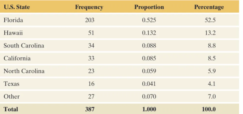
Based on these results, the report concluded that the percentage of all people between the ages of 18 and 64 in poverty is between 13.2% and Now you will see a table showing the number of people. When asked if they believed in heaven, what percentage of respondents said yes, definitely; yes, probably; no, probably not; and no, definitely not.
Sample Versus Population
Find a topic that interests you and search for a corresponding GSS code name to enter as a row variable. You can get data for a specific survey year, such as 2008 by entering YEAR(2008) in the Selection Filter option box before clicking Run the Table.
We Observe Samples But Are Interested in Populations
The General Social Survey and polling organizations such as the Gallup poll typically select samples of about 1,000 to 2,500 Americans to learn about the opinions and beliefs of the population of all Americans. The same applies to surveys in other parts of the world, such as the Eurobarometer in Europe.
Descriptive Statistics and Inferential Statistics
How close is the sample value of 54% likely to the true (unknown) percentage of the population that favors gun control. Surprisingly, the absolute size of the sample matters much more than the size relative to the total population.
Sample Statistics and Population Parameters
We will see (in Chapters 4 and 6) why a well-designed sample of 834 people gives a sample percentage value that is very likely to fall within about 3-4% (the so-called margin of error) of the population value . In fact, we will see that inferential statistical analyzes can predict characteristics of entire populations quite well by selecting samples that are small relative to the population size.
Randomness and Variability
Estimation from Surveys with Random Sampling
When constructing a 95% confidence interval using a simple random sample of n subjects and finding the margin of error for the estimate of a population proportion, Find an approximate margin of error for these results reported in the environmental study report.
Testing and Statistical Significance
When the difference between the results for the two treatments is so large that it would be rare to see such a difference under ordinary random variation, we say that the results are statistically significant. How this is determined and how it depends on sample size are topics we will study in later chapters.
The Basic Ideas of Statistics
Practicing the Basics
Do most predictions fall within the margin of error of actual vote percentages? The financial option was offered to 9.7% more smokers in the study than non-smokers who were employees of the company.
Using Calculators and Computers
The outcome of interest of the study was the status of smoking cessation six months after the initial cessation was reported. If there was no real impact of the financial incentive, it is unlikely that the observed difference of 9.7% occurred by chance alone.
Using (and Misusing) Statistics Software and Calculators
Data Files
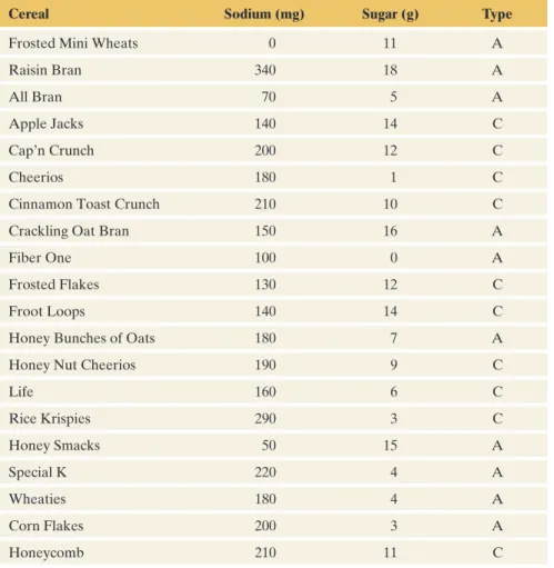
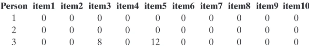
To construct a similar data file for your class, try Activity 3 in Student Activities at the end of the chapter. How do you record the responses of the first three people in the data file for the 10 highlighted items.
Databases
The result of this one sample corresponds to a sample proportion of 0.30 voting for a Democrat. Notice how the sample proportion for each sample (indicated by the blue triangle in the middle graph) “skips” the population proportion of 0.50 (indicated by the orange semicircle).
Web Apps
Practicing the Basics
In part a, what appears to be the effect of sample size on the amount by which sample proportions tend to vary around the population proportion, 0.60. This is desirable because the sample tends to be a good reflection of the population.
GETTInG To Know ThE ClaSS
- Different Types of Data
- Graphical Summaries of Data
- Recognizing and Avoiding Misuses
- Different Types of Data
Air pollution is a concern for many people, and the use of energy from fossil fuels affects air pollution. Scientists use descriptive statistics to investigate energy use, to learn whether air pollution affects the climate, to compare different countries in terms of how they contribute to the world's air pollution and climate change problems, and to measure the impact of global warming.
Variables
Life would be uninteresting if everyone looked the same, ate the same food and had the same thoughts. For example, the amount of time spent in a day can vary both by student and by day.
Variables Can Be Quantitative (Numerical) or Categorical (in Categories)
When defining a quantitative variable, why do we say that numerical values must represent different quantities? For example, a bank may be interested in the average size of loans granted to its customers, but an 'average' bank account number for its loan accounts is of no use.
Quantitative Variables Are Discrete or Continuous
However, some numeric variables, such as area numbers or bank account numbers, are not considered quantitative variables because they do not vary in quantity.
Distribution of a Variable
Practicing the Basics
In this section we will learn about graphs for categorical variables and then graphs for quantitative variables. The two primary graphical displays for summarizing a categorical variable are the pie chart and the bar chart.
Graphical Summaries of Data
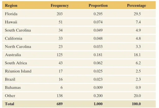
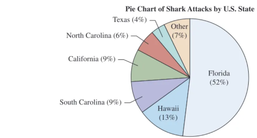
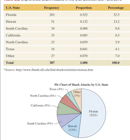
The remaining 7% of attacks took place in other United States. The pie chart and bar chart are both simple to construct using software. Pie Chart of Shark Attacks from the United States mFigure 2.1 Pie Chart of Shark Attacks Across the United States The label for each slice of the pie indicates the category and percentage of attacks in a state.
Pareto Charts
We will see that the bar graph can easily summarize how results compare for different groups (for example, if we want to compare fatal and non-fatal attacks in the United States). The bar graph in Figure 2.2 displays the categories in descending order of the category percentages except for the Other category.
Dot Plots
Stem-and-Leaf Plots
The stem-and-leaf plot looks like the dot plot turned on its side, with the leaves taking the place of the dots. Arranging the leaves on each line in ascending order gives us the stem-and-leaf plot.
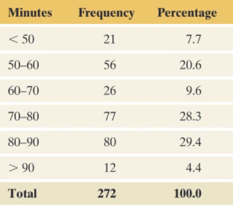
Histograms
The height of the bars in the histogram represents the frequency (or relative frequency) of observations that fall into the intervals. What information does the histogram not show that you can get from a dot plot or a stem-and-leaf plot.
Choosing a Graph Type
If you use too few intervals, the graph is usually too rough (see margin). If you use too many intervals, the graph can be irregular, with many very short columns and/or gaps between columns (see margin).
The Shape of a Distribution
A distribution is symmetric if the side of the distribution below a central value is a mirror image of the side above the central value. The distribution is skewed if one side of the distribution extends further than the other side.
Identifying Skew
The parts of the curve for the lowest values and for the highest values are called the tails of the distribution. Sometimes, especially with small data sets, the shape of the distribution may not be so obvious.
Time Plots: Displaying Data over Time
Practicing the Basics
Mention where most prices tend to fall and comment on the shape of the distribution.). Construct a stem and leaf plot using stems 1 and 2 and the decimal parts of the numbers for the leaves.
Measuring the Center of Quantitative Data
Describing the Center: The Mean and the Median
To find the mean, we sort the data from smallest to largest observation. The median measures the center by dividing the data into two equal parts, regardless of the actual numerical values above or below that point.
A Closer Look at the Mean and the Median
We find the mean by adding all the observations together and then dividing this sum by the number of observations, which is 20:. If we were to place identical weights on a line representing where the observations occur, then the line would balance by placing a pivot point at the mean.
Comparing the Mean and Median
For skewed distributions, the mean lies against the direction of skewness (the longer tail) in relation to the median, as Figure 2.9 shows. As expected, the mean of 4.6 falls in the direction of skewness, above the median of 1.8.
The Mode
Practicing the Basics
For which data sets, if any, would you expect the mean and median to be the same. For which, if any, data sets would you expect the mean and median to differ.
Measuring the Variability of Quantitative Data
Measuring Variability: The Range
Measuring Variability: The Standard Deviation
The most basic property of the standard deviation is as follows: j The greater the standard deviation s, the greater the variability of the data. You may be wondering why the denominators of variance and standard deviation use n - 1 instead of n.
Interpreting the Magnitude of s
The Empirical Rule
Practicing the Basics
Under "Options", you can request to show the standard deviation of the points you create by clicking in the graph. If the smallest observation is less than 1 standard deviation below the mean, the distribution tends to be skewed to the right.
Using Measures of Position to Describe Variability
Write a short paragraph summarizing the distribution of the youth unemployment rate and explaining some of the above statistics in context. Check that the mean number of married men is 0.16 and the standard deviation is 0.37.
Measures of Position: The Quartiles and Other Percentiles
Quartiles divide the distribution into four parts, each containing one quarter (25%) of the observations. Notice that one-quarter of the observations fall below Q1, two-quarters (one half) below Q2 (median), and three-quarters below Q3.
Measuring Variability: The Interquartile Range
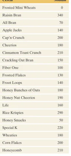
As with the range and standard deviation s, the more variability in the observations, the larger the IQR tends to be. For example, if the peak sodium value was 1000 instead of 340, the range would change dramatically from 340 to 1000, but the IQR would not change at all.
Detecting Potential Outliers
In contrast, the range depends only on the minimum and maximum values, the most extreme values, so the range changes as the extreme value changes. So it is often better to use the IQR rather than the range or standard deviation to compare variability for distributions that are highly skewed or have severe differences.
The Box Plot: Graphing a Five-Number Summary of Positions
Some software can also provide a plot that extends the whiskers to the minimum and maximum, even if outliers exist. However, an extreme value can then cause the box plot to give the impression of severe skewing when in fact the remaining observations are not skewed at all.
The Box Plot Compared with the Histogram
The histogram suggests that the distribution is bimodal (two different hills), but we couldn't learn this from the boxplot. A box plot indicates a skewness with respect to the relative lengths of the whiskers and the two parts of the box.
Side-by-Side Box Plots Help to Compare Groups
The side with the larger part of the box and the longer mustache usually skews in that direction. However, the box plot will not show us if there is a large gap in the distribution that is contributing to the skewness.
The z-Score Also Identifies Position and Potential Outliers
Practicing the Basics
Use the box plot to give approximate values for the five-number summary of energy consumption. Interpret the information on the plot and use it to describe the shape of the distribution.
Recognizing and Avoiding Misuses of Graphical Summaries
Answer by providing statistical support. Again 2.80 Florida students Refer to the FL Student Survey dataset on the book's website and weekly TV viewing data. To wrap up this chapter, let's see how we should also be wary of misleading graphic summaries.
Beware of Poor Graphs
Practicing the Basics
For this data, make the appropriate graph and comment on the shape of the distribution. For this data, 93% of the damage (that is, all but the two most expensive damage) falls within one standard deviation of the mean.
The Association Between Two
Example 1 has two categorical variables, but we will also learn how to examine associations between pairs of quantitative variables. For example, you might want to answer questions like, "What is the relationship between the daily amount of gasoline used by cars and the amount of air pollution?" or "Do high schools with higher funding per student tend to have higher average SAT scores for their students?".
Response Variables and Explanatory Variables
The Association Between Two Categorical Variables
How can we research the percentage of foods that contain pesticide residues compared to organic and conventionally grown foods. For this study, Table 3.1 shows food frequencies for all possible combinations of categories of the two variables, food type, and pesticide status.
Contingency Tables
The process of taking a data file and finding the frequencies for the cells of a crosstab is called crosstabling the data.
Conditional Proportions
The alternate display shown in the margin next to Figure 3.2 compares the conditional proportions for each food type by superimposing the present and absent proportions on top of each other. It is called a side-by-side bar graph and allows for easy and direct comparison of conditional ratios.
Looking for an Association
In Chapter 5, we will discuss the relationship between marginal and conditional proportions when two variables are independent (not associated). We will discuss odds and odds ratio, along with relative risk, in Chapter 11, Section 11.3.
Measuring the Strength of an Association Between Two Categorical Variables
Practicing the Basics
Use the contingency table to show the percentages for the response variable categories, separately for each explanatory variable category. Calculate the ratio of child to adult passengers and adult passengers who survived.
The Association Between Two Quantitative Variables
We see that the form for internet use is bimodal, with one mode being around 45% and the other around 85%. Is it true that countries with higher internet usage tend to have higher Facebook usage?
Looking for a Trend: The Scatterplot
We will treat Internet use as the explanatory variable and Facebook use as the response variable. We plot Internet usage on the horizontal axis and Facebook usage on the vertical axis.
How to Examine a Scatterplot
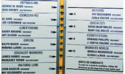
For each of Florida's 67 counties, the Buchanan and Butterfly Ballot database on the book's website lists the Buchanan vote and the vote for the 1996 Reform Party nominee (Ross Perot). Overall, the total vote for Buchanan in 2000 was only 3% of the total vote for Perot in 1996.
Summarizing the Strength of Association
This pattern represents a strong association in the sense that we can predict the y-value fairly well by knowing the x-value.
The Correlation
The correlation r takes the extreme values of +1 and -1 only when the data points perfectly follow a straight line pattern as seen in the first two graphs in Figure 3.7. For example, the scatterplot in Figure 3.7 with correlation r = 0.8 shows a stronger association than the one with correlation r = 0.4, for which the data points fall further from a straight line.
Properties of the Correlation
Practicing the Basics
In Example 7, we found that the correlation between Internet use and Facebook use (measured in percentages of the population) was 0.614. If one pair of (x, y) values is removed, the correlation for the remaining four pairs is -1.
Predicting the Outcome of a Variable
For the county represented by the most distant observation, approximately how many votes did you expect Buchanan to get if the point followed the same pattern as the rest of the data. A regression line is often called a prediction equation because it predicts the value of the response variable y at any value of x.
Interpreting the y-Intercept and Slope
The absolute value of the slope describes the magnitude of the change in yn for a 1-unit change in x. We'll get a better sense of how the slope works in context as we explore upcoming examples.
Finding a Regression Equation
The slope is the coefficient of the explanatory variable, denoted in the data file by bat. Because the slope b = 26.1 is positive, the association is positive: The predicted team score increases as the team's batting average increases.
Residuals Measure the Size of Prediction Errors
In a scatter plot, the vertical distance between the point and the regression line is the absolute value of the residual. We can easily make software find the regression line and residual for each of the 67 counties.
The Method of Least Squares Yields the Regression Line
The second property tells us that the line passes through the center of the data. The software does not round between the different steps of the calculation, so it will give more accurate results.
The Slope, the Correlation, and the Units of the Variables
In summary, we have learned that the correlation describes the strength of the linear association. The values of the y-intercept and the slope of the regression line also depend on the units, whereas the correlation does not.
This means that we can use the square of the correlation to judge how accurate the regression equation is. Then r2 = 1 and all (100%) of the variability in the y values can be explained by the linear relationship between x and y.
Associations with Quantitative and Categorical Variables
Practicing the Basics
Interpret the y-intercept and slope of the equation in part a in the context of the number of sit-ups and the time for the 40-meter dash. Comment on the use of the correlation coefficient as a measure of the relationship between fuel consumption and constant vehicle speed.
Cautions in Analyzing Associations
Extrapolation Is Dangerous
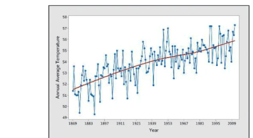
Question If the current trend continues, what would you predict for the annual mean temperature for 2015. It is not reasonable to assume that the same linear trend will continue for the next 988 years.
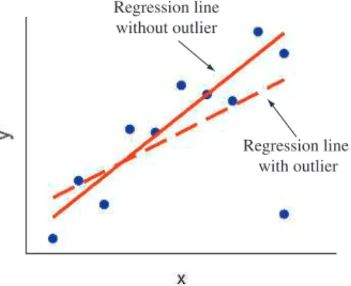
Be Cautious of Influential Outliers
It meets both conditions to affect an observation: it has a relatively extreme value for the explanatory variable (college), and it is a regression outlier, deviating far from the linear trend of the other points. Is the observation recorded incorrectly, or does it somehow just deviate from the rest of the data?
Correlation Does Not Imply Causation
It shows a negative trend between crime rate and education for counties with urbanization = 0 (none of the residents living in a metropolitan area), a separate negative trend. Question Sketch lines representing (a) the overall positive relationship between crime rate and education, and (b) the negative relationship between crime rate and education for provinces with urbanization = 0.
Simpson’s Paradox
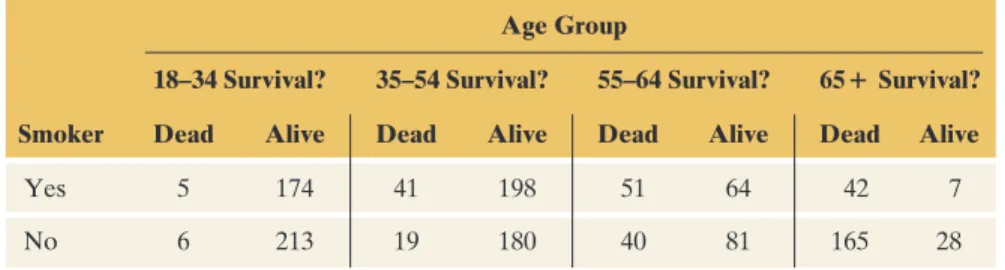
How can you explain the association in Table 3.7, where smoking appears to help women live longer? When we looked at the data for each age group in Table 3.8 separately, we saw the opposite: smokers had lower survival rates than non-smokers.
The Effect of Lurking Variables on Associations
Confounding
Practicing the Basics
The data in the Animals file on the book's website show observations on the average longevity (in years) and average gestation period (in days) for 21 animals. Using software, verify the given numbers for the correlation and slope of the regression line shown on the plot.
ANSwerS to the ChAPter Figure QueStioNS
The slope b describes the direction of the association (positive or negative, like the correlation) and gives the effect on yn of a one-unit increase in x. The regression line can be used to predict a value of the response variable y for a given value of the explanatory variable x.
SuMMAry oF NotAtioN
Experimental and Observational
Good and Poor Ways to Sample
In this chapter, we will learn that the design of the study can have a large impact on its results. If the study is not well designed and implemented, the results can be meaningless or, even worse, misleading.
Experimental and Observational Studies
For these and other statistical analyzes to be useful, we must have "good data." But what's the best way to collect data to make sure it's "good". This will help us understand when we can trust the conclusions of a study and when we should be skeptical.
Types of Studies: Experimental and Observational
The purpose of the experiment was to examine the relationship between this variable and the response variable—the amount of brain activity changes—to determine whether it increased. The study found that drug use was similar in schools that tested for drugs and schools that did not test for drugs.
Advantage of Experiments Over Observational Studies
Determining Which Type of Study Is Possible
Using Data Already Available
The Census and Other Sample Surveys
Practicing the Basics
Are the variables y = the amount spent per year on tobacco company prevention campaigns in the US. A study published in the July 7, 2014 issue of the American Journal of Medicine suggested that lack of exercise contributed more to weight gain than overeating.
Good and Poor Ways to Sample
Using the Internet, report two such characteristics recorded at the 2010 US meeting. Hint: Visit the following website: www.census.gov/2010.census.) a lurking variable that could explain this risk of a to declare.
Sampling Frame and Sampling Design
Simple Random Sampling
Selecting a Simple Random Sample
So that a school district cannot predict which financial statements will be reviewed, the auditors often take a simple random sample of the financial statements. By using simple sampling, the auditors hold the school district accountable for all accounts.
Sources of Potential Bias in Sample Surveys
In the United States, the area code and 3-digit exchange are usually chosen randomly from the list of all such codes and exchanges. Responses from those not in the sampling frame may be quite different from those in the frame.
Poor Ways to Sample
Literary Digest magazine conducted a poll to predict the outcome of the 1936 presidential election between Franklin Roosevelt (Democrat and incumbent) and Alf Landon (Republican). How could the Literary Digest poll make such a big mistake, especially with such a large sample size.
A Large Sample Size Does Not Guarantee an Unbiased Sample
Practicing the Basics
This conclusion was based on a survey conducted across various social media networks in which 2% of respondents reported being sexually harassed online. In order to obtain reliable information about Professor Smith, we would have to take a simple random sample of the 78 reviews left by students on the site and construct new overall ratings based on those in the random sample.
Good and Poor Ways to Experiment
Response bias due to the way the question was asked 4.30 Types of bias Give an example of a survey that would. However, based on a survey published online, a sports journalist found that only 30% of athletics fans agreed with the above statement.
The Elements of a Good Experiment