ANALYSIS OF EMR USER INTERFACE REQUIREMENT BY
MEDICAL STUDENT
1SHATILAH ZAKARIA, 2MOHD KHANAPI ABD GHANI
1 2 Biomedical Computing and Engineering Technologies (BIOCORE) Applied Research Group
Centre for Advance Computing Technology (C-ACT)
Faculty of Information and Communication Technology, Universiti Teknikal Malaysia Melaka
E-mail: [email protected] , [email protected]
ABSTRACT
The aim of this study is to analyse user interface requirement for electronic medical record (EMR) system. This study is done through semi-structured interview with final year medical student. A participatory design approach was used to collect EMR user interface requirement from one of medical school in Malaysia. The scopes of analysis involve identifying the layout usage of user interface, navigation menu, navigation menu arrangement, user interface components and screen colour. The input collected from the study will be used to develop EMR user interface model.
Keywords: EMR, user interface design, user requirement, survey, HCI
1 INTRODUCTION
EMR is a systematic collection of electronic health information about an individual or population. The record is in digital format that in theoretically allowed to be shared across healthcare. EMR include of information about patient demographic, medical history, medication, vital sign, personal statistic and many others that related with health. It is designed to represent data accurately captures the state of the patient and allow entire patient history to be view. There are lots of barrier in implementing EMR, this include financial, organizational, individual, technical, social, attitude & behavioural and many others.[1]–[3]
The main purpose of this study is to analyse and identify the most preferable user interface design for EMR by medical students through preliminary survey.
The current healthcare delivery system in Malaysia is currently far more than efficient compare to the other country. Over the year since 1980, the demand for timely and accurate information has grown and several programs have started collecting data for specific purpose. Unfortunately according to Ministry of Health Malaysia HIMS Blueprint 2013, until now no upgrade has been done.
Electronic medical records (EMR)
implementation in Malaysia has begun since year
2005[4] with the objective to access accurate and timely for data for statistical reporting, outcome measurement, prediction and alerts. The growth and
usage of information communication and
technologies (ICT) has becomes a crucial issues. The implementation of EMR would open the potential of sharing of data sources for medical research and spread of medical knowledge.
2 LITERATURE REVIEW
Lack of good user interface has been recognized as major problem in user acceptance and applications routine. Unfortunately, based on literature review, only few research studies have looked at design principles for building intuitive and effective healthcare user interface. User interface design is not satisfied because of the sequence of navigation does not meet the physician work style. [1]
Poor interface design decisions for EMR is proved to be able slow down the recording and reviewing. For instance, during data entry, more time were spend by physician in selecting the appropriate option from pull-down menus[2], radio buttons and check boxes rather than in jotting down a few words on a piece of paper. Similarly, in term of data retrieval, the effort of authorizing, clicking hyperlinks and menu selections may be tedious compared to the simple act of flipping through a set of pages in a patient’s file.[5]
environments can lead to increase time efforts
from physicians. This can be proving when users operate under severe opportunity-cost time pressures, and engage in goal- directed activities. In order user to accomplish a task during time consuming, this situation can lead to incorrect use of the system. This type of EMR is believed as does not meet the demands of goal-directed activities when its usage has increases time with the computer instead of time with the patients.[2]
There are several reasons EMR has not been widely adopted; financial, organizational and technology problem, deficiency of user-centred interfaces such as inconsistency, poor screen design, insufficient navigation control and difficulties to access important procedures.[3] The lack of understanding in the cognitive needs of the users and a failure to fully take into account HCI[6] were most of the reason mentions related with EMR problems.
Many end users have trouble with unsatisfied user interface (UI) in medical record. Users always find it difficult to use the system due to this poor user interface and has becomes one of the reason users refuse to use the system. [3]
Based on the literature review, designing user interface for EMR development does not involve users from the beginning. Usually, users only involved at the testing and requirement process to improve the system to functioning the way users need and want.
Designing user interface for medical field is still the same like many other fields when it uses
user interface components to do data
representation. To create a simple yet complex system such as EMR, it is crucial especially when involved web based system and characteristic in HCI should be followed.[7]
3 METHODOLOGY
This is a mix methods research study that compares how physician and future physician comprehend user interface for EMRs. The survey was spread using writing and online medium. Most of the questions are in graphic format. The participants are required to design a common layout based on their most preferable desire. Their summations about the user interface were analysed.
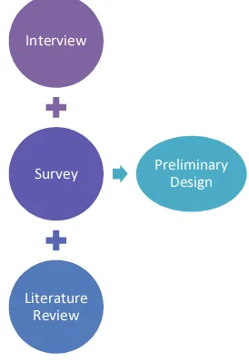
Figure 1 show the methodology that was use develop the survey and to obtain the preliminary results. The preliminary design is derived from intensive interview, survey and literature review. Participants or users in this survey is define as
final year medical students that had experience with practical training and some doctors that works at the nearest hospital.
Figure 1 Methodology of preliminary survey
3.1 Participants
The respondent consists of ninety three healthcare personnel (82 respondents are combination of final semester medical students and physician in practice from medical school while 11 of the respondent are physicians from the nearest hospital).
Table 1 shows, 49 are females and 33 are males that were selected from medical college. Participants ranged in age from 20 – 30 years old are 88 respondents; respondents between ages 31- 40 years old is one and senior respondents between ages 41 – 50 are four. The target group is medical field users and the entire respondent at least has experience handle real patients and exposed to current technologies that uses a lot user interface. 86% of the respondents are right handed users.
Interview
Survey
Literature Review
Table 1 Demographic of all respondent
Demographics Female Male
Student 49 33
Physician 4 7
Age Range
20 – 30 52 36
31 – 40 1 0
41 – 50 0 4
Handedness
Left Hand 5 8
Right Hand 48 32
3.2 Procedure
A questionnaire was constructed based on an extensive review of literature in the area of user acceptance and user interface.
3.3 Questionnaire Items
The questionnaire consisted of three parts. The first part is about demographic question to get information of respondent; age, experience in medical area and handedness. The second part is about the interface; offline and online design, screen layout, data display layout, main menu and colours. This question used image based question in order to help the medical respondent understand of user interface. The third part consisted of respondent satisfaction about screen, usefulness and ease of use factors. This question used five-point Likert-scale where 1 = strongly disagree to 5 = strongly agree.
4 RESULTS
As to strengthen the design model, an interview based on EMRs prototype named CIS was also conducted as additional information from real users. Both results of survey and interview will be focusing on user interface elements such as screen layout, information layouts and many others.
4.1 Survey
Based on Table 2, 62 participants choose EMRs to be in web based compare to standalone with only 31 votes. According to [8] [9], most telehealth solutions are in standalone and it hardly to find the real online healthcare service. Web-based are usually not preferred for decision support system but recently advances in web
technologies were used for an efficient interface for medical expert system [10].
Table 2 EMR types
Value Label Frequency
Standalone 31
Web 62
For the screen layout in
Table 3, shows that image 2 has leaded the results 43 and image 3 with 31. The rest of the screen layout are followed by image 1 and image 2 respectively 16 and three.
Table 3 Screen Layout
Value Label Frequency
Image 1 16
Image 2 43
Image 3 31
Image 4 3
Based on result from
Table 3, Figure 2 below shows image 2 of screen layouts design. This image is preferred by participants because it followed the normal design of a website or known as F-shaped. A typical website design is describes as where the menu usually placed on the left and contains header and footer. This also proves that most of the users are exposed to normal web design.
Figure 2 Screen layout image 2 of
Table 3
Figure 3 show the second highest preference of screen layout from the result of
navigate from one menu to another because its
display at the top of the page.
Figure 3 Screen layout image 3 from
Table 3
For data layout in Table 4, shows that respondent choose image 4 with the vote 38 and image 3 with 37. While for image 1 and image 2 results are respectively four and 14.
Table 4 Data Layout
Value Label Frequency
Image 1 4
Image 2 37
Image 3 14
Image 4 38
Based on the results in Table 4, Figure 4 below shows the highest preference for data layout design. The strength of the data layout is that the data are sorting into group and tabs component are used in order to separate different information. Using tabs can help fixed size of dimension to display data.
Figure 4 Data layout image 4 from Table 4
Figure 5 show the second highest chosen for data layout design. The characteristic of the
layout is that all data are group in a legend and then divided into several different groups that were arranged side by side. The strength of the layout is that, users are able to see all data without have to click-to-open and legends are used to group the information’s.
Figure 5 Data layout image 2 from Table 4
For main menu in Table 5 shows that icon is most preferred compare to button, link and tabs. To date, icon usage is the most in-trend item in web and mobile applications. Icon usage has proved to increase user experience [11]–[14]. Due to this question is in multiple choices, few users have voted to have combination of button-icon and tab-button-icon in EMR.
Table 5 Main Menu
Value Label Frequency
Icon 43
Button 26
Button, Icon 1
Hyperlink 3
Hyperlink, Tab, Icon 1
Tab 16
Tab, Button, Icon 3
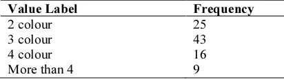
Number of colour an EMR should have also taken into
consideration, based on
important area[15] and many others. However,
most respondent also agree that blue colour is
most suitable colour for EMR system.
Table 6 Number of colour an interface should have
Value Label Frequency
2 colour 25
3 colour 43
4 colour 16
More than 4 9
Table 7 shows that 39 participants choose blue warm colour and this followed by green and violet. According to [16], blue colour is always advantageous and a good contrast that give high legibility of performing. It also said that colours can influence users’ behaviours and cognitive processes, such as the memorization of
Grayscale, Blue Warm 3
Green 11
The last part of the questionnaire is the Likert-scale that were classes into three section; Usefulness (Q1- Q5), Ease of use (Q6-Q8) and Screen (Q9- Q13). The details of the results are show in Table 8.
Table 8 Likert scale results
Var. Mean Std.
Usefulness is defined as acceptance, intention to use, and actual use of these technologies will also be higher. Usefulness is also related to use a particular system would enhance his or her job performance and can be measured by the quality of learners' experience during the interactions with the interface of an application [17]–[21]. From the results, means and range are from 3 - 4, most participants choose to natural and agree to each questions.
Ease of use is defined as degree to which a person believes that using a particular system would be free of effort, make users comfortable using it and due to the friendly interface it can helps the healthcare workers to perform actions intuitively [20], [22], [23]. Results of the survey indicated that users also are inclined to agree.
Screen is define whole system has generally consistent visual and functional characteristics; layout conventions, buttons, dialog boxes, entry modules and other interface artefacts across all component modules[21], [24]–[26]. From the results, participants have also agreed that screen such as predictable navigation and bold font are useful.
Table 9 Descriptive statistic and Cronbach’s Alpha
coefficient for the 13 item instruments
Variables Mean S.D Cronbach’s α
Usefulness (5) 3.91 .74 .92
Ease of use (3) 3.76 .78 .82
Screen (5) 4.09 .68 .73
Entire
instruments (13) 0.89
4.2 Interview
An interview session was conducted a few times with a physician that involves with a prototype CIS system. Most of the discussion is about the user interface and function of the system.
From the discussion, a user interface for EMRs requires the following as in order to reduce complicatedness. The user interface design should have simple interface; every single page should not contain too many information and has too many items such as drop-down menu and text field. In the other hand, it also means that each page should have direct usage and a simple interface can ease the user to use and learn without complicated functions. When using the EMRs, the physicians also suggest that there is no need to have too many clicked in order to complete a form and too many clicks to change from one interface to another. The system also should have the notification function where the physician does not need to click at the refresh button to retrieve information or hover to stay activated. In term of colour usage, the physician suggests to use warm colour, avoid bright colour that could strain the eye for long term usage.
5 DISCUSSION
In this paper we have establish a preliminary user interface design for common healthcare users want. This discussion will cover user interface elements such as screen layout information design, alignment of objects, icon, font and colour.
5.1 User Interface Elements
Figure 6 show the sketch results from most highly chosen interface. It shows that the interface contains of header, footer, main menu and large area of data display. At the menu area, icons were used and are separated by menus that are able to show and hide. The function of hiding is good
way to keep the users focus when using the interface.
Figure 6 Sketch UI from highly chosen
Figure 7 show the sketch second highly chosen interface by the participants. It contains of menu bar at the top, header, footer and large area or data to display. The large display area is a good way to display adequate information.
Figure 7 Sketch UI from second chosen
On the other hand, both sketch of Figure 6 and Figure 7 still need to be combined with additional information that is interview and literature in order to finalise the preliminary user interface.
In designing a user interface; clean and simple data insertion and try not display everything in one screen is a must. However, even after all the findings, most EMRs still repeating the same mistake because the developer did not want the physician to navigate from one screen and try to avoid time consuming in data loading. Based on design of EMRs such as [6], [23], [27] most EMRs tend to use tabs component nested with another tabs component.
interface. The usage of CSS and JavaScript is
already expanding nowadays, according to [29], Cascading Style Sheets (CSS) is a language that can be used to set the styles (colour, size, and so forth) of structured documents such as HTML or XML (eXtensible Markup Language). While, JavaScript allow developer to create an intuitive, interactive and simple user interfaces through coding. The combination of both has proved that the user interface works like the user wants.
Based on the survey results, the final sketch of the survey is finally come out. Figure 8 show the final of preliminary design of the user interface.
Figure 8 Preliminary sketch user interface design
5.1.1 Screen layout
The user interface consists of three headers; first, to display roles and logout button. Secondly, to display navigation links and finally to display patient information’s. The interface contains of two menu area; main menu on the left and sub menu on the right and information area at the middle. Clear, grid structure and ordered screens help in presentation to the capabilities of the user.
5.1.2 Information design
The information displayed in a grid and group. All important information such as diagnosis, vitals and visits were displays using the same appearance and behaviour.
5.1.3 Alignment of object
For the button, every okay button will be place on the right while cancel button at the left of the form. The placement of button is considered important as it could affect the time needed to submit a form.
Main menu of the design is placed at the left side of the screen as to ease the user and avoid from getting lost even though the hyperlink of menu already show at the hyperlink header.
Sub menu is placed at the right of the screen as most users are right handed and most user even
left handed use mouse with right hand. Easy to navigate and avoid user to cross the screen can avoid time consuming. Any sub menu item is dependable on the click main menu item.
A header that contain of hyperlink of locations is acts as maps of the navigation. This function is not using too much space and at the same time helps the user to know the current location.
Patient information area is located below of hyperlink header. By displaying only necessary and important information about the patient only, physician can avoid data leak especially on important information such as allergy of the patient.
5.1.4 Icon
In this design, SVG and font icons are used compare to raster format. These types of icon are more flexible in resize and ease to load. Common icons that familiar by the mobile user were used as this can help them get familiar when using the interface. Example of font icon can be seen in Figure 9.
Figure 9 Font icons
5.1.5 Font
Typeface also known as font family is important in displaying data. In this preliminary design, a font type sans serif is suitable compare to serif font due to lower-resolution digital displays; fine details like serifs may disappear or appear too large.
5.1.6 Colour
6 CONCLUSION
From the finding, we can conclude that medical students preferred to have EMR in web-based form. Other than that, the design of the user interface should be in F-shape layout that resembles any normal web site. For displaying information, they preferred the information to be displays in cluttered free with information are in group as to avoid lost during browsing. Other elements that attract are icon usage in the interface instead of using buttons, tabs or hyperlink components that using text. Icon usage has been proving to help user remember and fasten daily work. Number of colour to be use also matter. They suggesting that an interface should use at least three types of colour and blue warm colour are the most preferable because of its good contrast.
Based on the result of the data analysis, we present a preliminary data collection on user interface requirement through semi-structured interview by medical students. This input is used to develop user interface model that would covered the most preferred EMR user interface design. . Simple yet complex style for EMR is still crucial to meet everyone’s satisfaction. As a preliminary user interface model, the findings do not cover several important issues such as user interface design that is suitable for every department. This user interface design model is expected to be beneficial for system developer to develop a practical user interface design for EMR system. research equipment and tools.
REFERENCES
[1] K. Zheng, R. Padman, and M. P. Johnson,
“User interface optimization for an electronic
medical record system.,” Stud. Health
Technol. Inform., vol. 129, no. Pt 2, pp.
1058–62, Jan. 2007.
[2] V. Ilie, O. Turel, and P. D. Witman,
“Towards a New Design Paradigm for
Complex Electronic Medical Record
Systems: Intuitive User Interfaces,” in 2013
46th Hawaii International Conference on
System Sciences, 2013, pp. 2585–2594.
[3] E. Nygren, “From Paper to Computer Screen
. Human Information Processing and Interfaces to Patient Data . The user-interface challenge Experiences of computerized medical,” vol. 222, no. 1, pp. 317–326, Sep. 1997.
[4] H. Mohd, S. Mastura, and S. Mohamad,
“Acceptance Model of Electronic Medical
Record,” J. Adv. Inf. Manag. Stud., vol. 2(1),
no. June 2005, pp. 75–92, 2005.
[5] P. Sharda, A. K. Das, T. a Cohen, and V.
Patel, “Customizing clinical narratives for the electronic medical record interface using
cognitive methods.,” Int. J. Med. Inform., vol.
75, no. 5, pp. 346–68, May 2006.
[6] C. M. Johnson and J. P. Turley, “The
significance of cognitive modeling in
building healthcare interfaces.,” Int. J. Med.
Inform., vol. 75, no. 2, pp. 163–72, Feb.
2006.
[7] S. Zakaria and M. K. A. Ghani, “The Impact
of EMR User Interface Design on Doctor
Satisfaction,” e-Proceeding Softw. Eng.
Postgraduates Work., p. 94, 2013.
[8] J. S. Dhillon, C. Ramos, B. C. Wunsche, and healthcare solution on health vault system.,”
J. Med. Syst., vol. 36, no. 3, pp. 1095–105,
Jun. 2012.
[10] S. Tsumoto, “Web based medical decision
support system for neurological diseases,” in
Proceedings IEEE/WIC International
Conference on Web Intelligence (WI 2003),
2003, pp. 629–632.
[11] M. L. A. Kunnath, R. A. Cornell, M. K.
research study on the effect of pictorial
icons on a user-learner’s performance,”
Comput. Human Behav., vol. 23, no. 3,
“Factors affecting the design of computer icons,” Int. J. Ind. Ergon., vol. 29, no. 4, pp. 211–218, 2002.
[14] R. Yan, “Icon Design Study in Computer
Interface,” Procedia Eng., vol. 15, no. 0, pp. 3134–3138, 2011.
[15] N. Bonnardel, A. Piolat, and L. Le Bigot,
“The impact of colour on Website appeal
and users’ cognitive processes,” Displays,
vol. 32, no. 2, pp. 69–80, 2011.
[16] D. Bhattacharyya, B. Chowdhury, T.
Chatterjee, M. Pal, and D. Majumdar,
“Selection of character/background
colour combinations for onscreen
searching tasks: An eye movement, subjective and performance approach,”
Displays, vol. 35, no. 3, pp. 101–109,
2014.
[17] A. Ant Ozok, H. Wu, M. Garrido, P. J.
Pronovost, and A. P. Gurses, “Usability and perceived usefulness of personal health records for preventive health care: A case study focusing on patients’ and primary care providers' perspectives.,”
Appl. Ergon., vol. 45, no. 3, pp. 613–628,
Oct. 2013.
[18] C. M. Johnson, T. R. Johnson, and J.
Zhang, “A user-centered framework for
redesigning health care interfaces.,” J.
Biomed. Inform., vol. 38, no. 1, pp. 75–
87, Feb. 2005.
[19] D. Mowery, J. Wiebe, S. Visweswaran,
H. Harkema, and W. W. Chapman, “Building an automated SOAP classifier
for emergency department reports.,” J.
Biomed. Inform., vol. 45, no. 1, pp. 71–
81, Feb. 2012.
[20] V. Vathanophas and T. Pacharapha,
“Information Technology Acceptance in Healthcare Service : The Study of Electronic Medical Record ( EMR ) in Thailand,” pp. 1–5, 2010.
[21] C. Y. W. Maziar Seraf, “A Study of User
Interface Design Principles and
Requirements for Developing a Mobile
Learning Prototype,” pp. 1014–1019, 2012.
[22] B. A. Y. Al-nassar and M. S. Abdullah,
“Barriers for Implementation of Electronic Medical Record ( EMR ).” “Interface design principles for usable decision support: A targeted review of best
practices for clinical prescribing
interventions.,” J. Biomed. Inform., vol. 45, qualitative studies to improve the usability of
an EMR.,” J. Biomed. Inform., vol. 38, no. 1,
pp. 51–60, Feb. 2004.
[28] D. Herzberg, N. Marsden, P. Kübler, C.
Leonhardt, S. Thomanek, H. Jung, and A.
Becker, “Specifying computer-based
counseling systems in health care: a new approach to user-interface and interaction design.,” J. Biomed. Inform., vol. 42, no. 2, pp. 347–55, Apr. 2009.
[29] D. G. Saputra and F. N. Azizah, “A Metadata
Approach for Building Web Application User
Interface,” Procedia Technol., vol. 11, no.
Iceei, pp. 903–911, 2013.