CARTOGRAM: A NEW PERSPECTIVE TO UNDERSTAND THE DISTRIBUTION OF
GEO-POLITICAL DATA
Hua LIAOa, Weihua DONGa
a State Key Laboratory of Remote Sensing Science, Beijing Key Laboratory for Remote Sensing of Environment and Digital Cities &
School of Geography, Beijing Normal University, Beijing, China. [email protected], [email protected]
KEY WORDS: Cartogram, Global Competitiveness Index, Distribution, GCI
ABSTRACT:
The global competitiveness index (GCI) of a country is a comprehensive indicator to measure its social-economic development, sustainability and prospects reflecting national competitiveness by World Economic Forum (WEF, 2013). Thematic maps are commonly used to visualize such geo-distributed data. Cartogram resizes the area of polygons according to a specific variable providing a new perspective to understand the distribution of country’s competitiveness on world. Essentially, cartogram presents a different cognitive space which differs from the well-known geographic space. In this paper, we generate the GCI cartogram with a combination of color scheme and compare it with the traditional thematic map to gain a better understanding of the distribution of country’s competitiveness.
1. INTRODUCTION
“Cartography are more than techniques and maps are more than tools” (Lobben, 2004). Maps provide us with not only visualization of geographic distributed data but also an approach to further understand the information and explore the pattern under the data. New techniques have changed the way of generating maps and provide us with new perspectives to understand the geographic information. Different from conventional thematic maps, value-by-area maps or the cartograms distort areas of polygons in proportion to its attribute data (Tolber, 2004). A number of cartograms have been created in the Worldmapper project (http://www.worldmapper.org) showing socioeconomic, environmental and political data of the world (Hennig, 2011; Barford and Dorling, 2008).
Numerous methods has been proposed to generate cartograms aimed to control the shape distortion and maintain the topology (e.g. Dougenik et al., 1985; House and Kocmoud, 1998; Keim et al., 2004, 2005; Gastner and Newman, 2004; Inoue and Shimizu 2006; Henriques et al., 2009) or to improve the efficiency of the algorithm (e.g., Sun, 2013). Other types of cartograms such as dorling cartogram and pseudo-cartogram also have been generated for spatial data representation (e.g., Dorling, 2011; van Kreveld and Speckmann, 2007).
Effectiveness and accuracy for information presentation of cartograms has also gained concentration by researchers. A classical cartogram was created by Gastner and Newman (2004) showing US election results which has been proved to be more effective and accurate than the choropleth maps to represent the actual political implications resulting from the elections (Dorling and Hennig, 2010). However, the effectiveness of cartograms is doubted by researchers because of its shape distortions and topology disconnectivity (Sun and Li, 2010; Tolber, 2004). Aimed to eliminate these drawbacks, Roth et al (2010) presented an alternative technique to cartogram called value-by-alpha maps which changes the alpha of the color according to the attribute.
The thematic maps, the commonly used form to present social data, has advantages of being easily recognized of its accuracy of geographic representation and thematic information presented by color schemes. This paper generates cartogram of the global competitiveness index of China and surrounding countries with combination of color schemes for a better understanding of the distribution of competitiveness of these countries.
2. DATA AND METHODS
The global competitiveness index (GCI) is one of measurements to evaluate the competiveness of countries across the world which is produced by the World Economic Forum (WEF, 2013). The GCI is modelled by three types of sub-indexes: basic requirements, efficiency enhancers and innovation and sophistication factors which each is composed of specific indicators of infrastructure, economy, and education and so on. The GCI scores of 18 countries obtained from the WEF report are shown in Table 1. Gastner and Newman’s algorithm which is integrated into ESRI ArcGIS (http://www.esri.com) as an
extension tool
(http://arcscripts.esri.Com/details.asp?dbid=15638) developed by Tom Gross is adopted to generate cartograms in this paper.
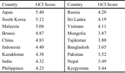
Table 1. GCI score (WEF, 2013) of the mapped countries in Figure 1 and 2.
Country GCI Score Country GCI Score
Japan 5.40 Russia 4.20
Philippines 4.23 Kyrgyzstan 3.44 The International Archives of the Photogrammetry, Remote Sensing and Spatial Information Sciences, Volume XL-4/W3, 2013
ISPRS/IGU/ICA Joint Workshop on Borderlands Modelling and Understanding for Global Sustainability 2013, 5 – 6 December 2013, Beijing, China
This contribution has been peer-reviewed.
3. RESULTS
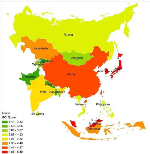
The GCI cartogram is shown in Fig 2. And the GCI represented by the thematic map is also created for comparison (Fig 1). The same color scheme is applied to the two maps. All counties are distorted according to the GCI scores and the distribution of the competiveness is reshaped on this brand new display. We can see from Figure 1 that small area countries such as Japan, South Korea and Malaysia have the top level of GCI score (with GCI score between 4.88 and 5.40). Large area countries such Russia, China and India have relative lower GCI scores. Countries with lowest GCI score are mainly located in the west. These thematic information is represented by the red to green color scheme of the map.
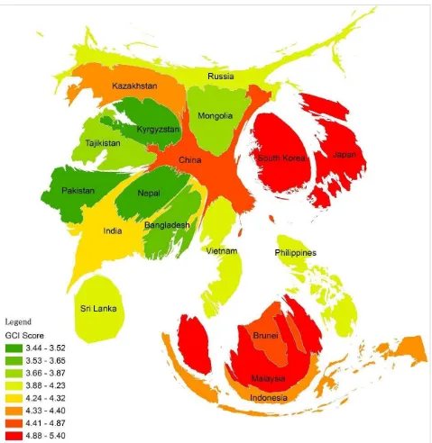
The cartogram of Figure 2 can be regarded as a GCI space. It can be clearly seen from figure 2 that top GCI level countries such as Japan, South Korea and Malaysia are largely expanded compared to the original area indicating their national competitiveness in this region. On the contrary, China shrinks largely indicating a relative lower competitiveness. The same trend is also revealed by Russia and India.
4. CONCLUSION
In this paper, cartogram was used to visualize the global competitiveness index of China and the surrounding countries. Regardless of their actual areas, the cartogram provides us with a new conceptual space to understand the distribution of competitiveness of these countries. The GCI cartogram reveals the pattern that countries in the east and south have a relative higher competitiveness than the countries in the west and north generally.
It should be emphasized that with the combination of color, cartogram can be significantly pragmatic to represent two variables (Li and Clarke, 2012). Other traditional charts such as bar and pie can be also employed to add more information. Although cartograms may cause difficulties in recognizing shapes, it is an effective tool to explore patterns and implications that are not easily revealed in traditional thematic maps.
REFERENCES
Barford, A. and Dorling, D., 2008. Telling an old story with new maps, In Geographic Visualization: Concepts, Tools, Applications, ed. by Dodge, M., McDerby, M. and Turner, M.,John Wiley & Sons, West Sussex.
Dorling, D. and Hennig, B.D., 2010. General Election 2010.
Political Insight, 1 (2), pp. 72.
Dorling, D., 2011. Area cartograms: Their use and creation. The map reader: Theories of mapping practice and cartographic representation, pp. 260.
Dougenik, J. A., Chrisman, N. R., and Niemeyer, D. R., 1985. An algorithm to construct continuous area cartograms.
Professional Geographer, 37(1), pp. 75-81.
Gastner, M.T., and Newman, M.E.J., 2004. Diffusion-based cartogram creation using self ‐ organizing maps. International Journal of Geographical Information Science, 23(4), pp. 483-511.
House, D. and Kocmoud, C., 1998. Continuous cartogram construction, In IEEE Conference on Visualization, Research Triangle Park, NC, Oct 18–23, pp. 197–204. Inoue, R., and Shimizu, E., 2006. A new algorithm for
continuous area cartogram construction with triangulation of regions and restriction on bearing changes of edges. Cartography and Geographic Information Science, 33(2), pp. 115-125.
Keim, D. A., North, S. C. and Panse, C., 2004. CartoDraw: A fast algorithm for generating contiguous cartograms, IEEE Transactions on Visualization and Computer Graphics, 10, pp. 95–110.
Keim, D. A., North, S. C. and Panse, C., 2005. Medial-axes based cartograms, IEEE Computer Graphics and Applications, 25, pp. 60–68.
van Kreveld, M., and Speckmann, B., 2007. On rectangular cartograms. Computational Geometry, 37(3), pp. 175-187. Li, L., and Clarke, K. C., 2012. Cartograms showing China's
population and wealth distribution. Journal of Maps, 8(3), pp. 320-323.
Lobben, A. K., 2004. Tasks, Strategies, and Cognitive Processes Associated With Navigational Map Reading: A Review Perspective. The Professional Geographer, 56(2), pp.a270-281.
Roth, R. E., Woodruff, A. W., and Johnson, Z. F., 2010. Value-by-alpha Maps: An alternative technique to the cartogram. The Cartographic Journal, 47(2), pp. 130. Sun, H., and Li, Z., 2010. Effectiveness of cartogram for the
representation of spatial data. The Cartographic Journal, 47(1), pp. 12-21.
Sun, S., 2013. A fast, free-form rubber-sheet algorithm for contiguous area cartograms. International Journal of Geographical Information Science, 27(3), pp. 567-593. Tobler, W., 1973. A continuous transformation useful for
WEF (World Economic Forum), 2013. Global Competitiveness
Report 2012-2013. http://www3. weforum. org/docs/
WEF_GlobalCompetitivenessReport_2012-13.pdf. (13 Aug. 2013)
The International Archives of the Photogrammetry, Remote Sensing and Spatial Information Sciences, Volume XL-4/W3, 2013 ISPRS/IGU/ICA Joint Workshop on Borderlands Modelling and Understanding for Global Sustainability 2013,
5 – 6 December 2013, Beijing, China
This contribution has been peer-reviewed.
Figure 1. The GCI represented by the thematic map. Some countries (North Korea, Bhutan, and Burma) are not presented because of lacking data.
The International Archives of the Photogrammetry, Remote Sensing and Spatial Information Sciences, Volume XL-4/W3, 2013 ISPRS/IGU/ICA Joint Workshop on Borderlands Modelling and Understanding for Global Sustainability 2013,
5 – 6 December 2013, Beijing, China
This contribution has been peer-reviewed.
Figure 2. The GCI represented by the cartogram. Some countries (North Korea, Bhutan, and Burma) are not presented because of lacking data.
The International Archives of the Photogrammetry, Remote Sensing and Spatial Information Sciences, Volume XL-4/W3, 2013 ISPRS/IGU/ICA Joint Workshop on Borderlands Modelling and Understanding for Global Sustainability 2013,
5 – 6 December 2013, Beijing, China
This contribution has been peer-reviewed.