The
New
Design
Fundamentals
A Curated Collection of Chapters
from the O’Reilly Design Library
N
LO
©2016 O’Reilly Media, Inc. The O’Reilly logo is a registered trademark of O’Reilly Media, Inc. D1813
Seriously useful.
Free ebooks and reports from O’Reilly
at
oreil.ly/fr-design
Data-Informed Product Design
Pamela Pavliscak
Laura Klein Dsign for
Voice Interfaces
Building Products that Talk
Free ebooks, reports and other articles on UX design, data-informed design, and design for the IoT. Get insights from industry experts and stay current
from the O’Reilly Design Library
The ability to design a good user experience is increasingly important today, and yet bad design is everywhere. Many UX and UI designers lack the fundamental skills needed to guide users through an app or website without effort or confusion. The O’Reilly Design Library provides the knowledge and advice you need to build your skillset and stay current with the latest trends—whether you need to help your client gain a competitive edge, or design interfaces for critical services.
Chapter 1. The Problems that Information Architecture Solves Chapter 2. Defining Information Architecture
Designing with Data
Improving User Experience with Large Scale User Testing
Available in Early Release
Chapter 1. Why Does Data Matter?
Designing Social Interfaces
Principles, Patterns, and Practices for Improving the User Experience
Available in Early Release
Chapter 1. Mommy, What’s a Social User Experience Pattern?
Mapping Experiences
Aligning for ValueAvailable in Early Release
Chapter 1. Locating Value with Alignment Diagrams
Design Sprint
A Practical Guidebook for Creating Great Digital Products
Available in Early Release
Chapter 1. What Is a Design Sprint?
Tragic Design
The True Impact of Bad Design and How to Fix It
Available for Preorder
Chapter 1. How Bad UX Killed Jenny
Articulating Design Decisions
Communicate with Stakeholders, Keep Your Sanity, and Deliver the Best User Experience
Available in Early Release
CHAPTER 1
The Problems That Information
Architecture Solves
And it doesn’t really matter if I’m wrong I’m right Where I belong I’m right
Where I belong.
– Fixing a Hole (Lennon-McCartney)
What we’ll cover:
• The dematerialization of information
• The challenges of information overload and contextual proliferation • How information architecture can help people deal with these challenges
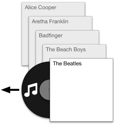
Marla was in the mood for The Beatles. She walked over to the shelf where she kept her LP records and looked through her collection. Fortunately, Marla was very organized: her record collection was neatly sorted alphabetically by the artist’s name. Alice Cooper, Aretha Franklin, Badfinger… and there, next to her Beach Boys albums, were The Beatles. She pulled the Sergeant Pepper’s Lonely Hearts Club Band vinyl disc out of its sleeve and onto the turntable, and relaxed as the music started.
Figure 1–1. Marla’s music is embedded in physical objects–vinyl records–so she must choose how to organize them on the shelf
Now meet Marla’s son, Mario. Instead of vinyl discs, Mario’s record collection consisted of compact discs (CDs). Because the music in the discs was stored digitally, he could now randomize the order in which the songs are played. He’d been promised that the music would also sound better, and the discs would last longer than the previous
individual physical discs that contained it. He still had to choose whether to organize the discs by the artist’s name or the album’s name; he couldn’t do both.
But then, in 2001, Mario got an iMac. The colorful computer’s advertising campaign invited him to “Rip, mix, burn” his music–in other words, liberate it from the plastic discs that contained it and get it into his computer (“Rip!”). Once there, it would sound just as good as the CDs, but now he could explore it any way he pleased: he could browse his collection by artist, genre, album title, song title, year produced, and more. He could search it. He could save backup copies. He could make playlists that combine the music from various albums (“Mix!”) and record it onto blank discs that are starting to become popular (“Burn!”) to share with his friends. (Much to the chagrin of the people who produced the music.)
Figure 1–2. Being digital, Mario’s music collection can be organized in more than one way and can live in multiple devices simultaneously
Hello iTunes
Figure 1–3: iTunes 1.0 browsing by Artist and Album. Image: http://www.guidebookgallery.org/apps/itunes/playing
The first version of iTunes had a few distinct modes–for example, there was a “ripping” mode that showed progress when the user was extracting music from a CD into the computer–but its focus was clearly on allowing people like Mario to find and play music from their own collections. As a result of this reduced feature set, it had a very simple user interface and information structures. Mario loved it, and playing music became one of his favorite uses for his Mac.
“department” had its own categorization scheme: rock, alternative, pop, hip-hop/rap, etc. for music, kids & family, comedy, action & adventure, etc. for movies, and so on.
iTunes was not just where Mario listened to and organized his music anymore. Now it was where he went to:
• Buy, rent, and watch movies • Buy, rent, and watch TV shows • Preview and buy music
• Buy applications for his iPod • Search for and listen to podcasts
• Browse and subscribe to “iTunes U” university courses • Listen to streaming radio stations
• Listen to audiobooks
• Browse and listen to music shared by others in his household
Each of these functions introduced new content types with particular categorization schemes. iTunes still had a search box as it did on day one, but search results were now much more difficult to parse, since they included different (and incompatible) media types. Was the result for “Dazed and confused” referring to the movie, the movie soundtrack, the Led Zeppelin song, or one of its myriad covers?
Later, when Mario bought his first iPhone, he was surprised to discover that the
functionality that he was used to having in iTunes on the Mac (music, movies, TV shows, podcasts, etc.) had now been “unbundled” into various apps, as shown in Figure 1–4. In the iPhone, iTunes is not where you play music; for that there is an app called
Figure 1–4: iOS’s unbundled iTunes apps.
Mario bought Apple products in part because of the company’s reputation for excellent design. He’d heard that Apple “controls the hardware and the software”, and is thus able to provide a unified, coherent experience across all of its products. Yet managing his media across his Mac and iPhone is neither unified nor coherent. Also, over time Mario has become a consumer and an organizer of an information ecosystem; he has to deal with the information structures that are designed into the system by Apple and his own organization schemes for his personal music collection, which now transcends many device form factors and contexts. Mario can’t quite put his finger on it, but he can tell that something big is amiss with the design of these products, even though he finds them visually appealing.
The Problems Information Architecture Solves
Mario is experiencing two problems:
• The tool he used to manage and navigate his simple library of 40 or so music albums has changed to one that deals with hundreds of millions of different data objects of various types (songs, movies, TV shows, apps, podcasts, radio streams, university lectures, and more), each with different organization schemes, business rules (eg., In which device he is allowed to play back his rented movie within the next 24 hours), and ways of interacting with the information (eg., viewing, subscribing, playing, transcoding, etc.)
• The functions provided by this tool are no longer constrained to Mario’s computer; they are now available across multiple devices, including his iPhone, iPod, Apple TV, CarPlay, and Apple Watch. Each of these devices brings with it different constraints and possibilities that define what they can (and cannot) do with these information structures (eg., “Siri, play With a Little Help From My Friends ”), and Mario doesn’t experience them as a consistent, coherent interaction model.
Let’s look at these challenges in a bit more detail.
Information overload
People have been complaining about having to deal with too much information for
problems that we’d have to deal with in the future. (As you can see from Mario’s example, this future is now!)
In the 19th and 20th Centuries, electronic media such as the telegraph, telephone, radio, and television, allowed more information to reach more people over greater distances than ever before. However, the process really sped up in the second half of the Twentieth Century with the appearance of digital computers and their eventual connection into what became the Internet. Suddenly, massive amounts of information could be shared with anyone in the world. The Internet–and the World Wide Web, especially–were
conceptualized as two-way, interactive media. For example, you could not only receive email, but also send it. Sir Tim Berners-Lee meant for the Web to be a read-write medium; the first Web browser, called WorldWideWeb, gave as much prominence to editing Web pages as it did to browsing them. Compared to previous information
mediums, publishing on the Web was fast, cheap, and efficient. As a result, the amount of information being published in information environments like Facebook, Twitter, and Wordpress, dwarfs anything that has ever come before.
It’s important to note that while every advance in information technologies has increased the overall amount of information available and has made it possible for more people to publish and have access to information, the resulting glut has also led to the creation of new technologies to help people organize, find, and make better use of information. For example, the invention of the movable type printing press in the 15th Century made more books and pamphlets available more cheaply to more people. This, in turn, led to the creation of technologies such as encyclopedias, alphabetic indexes, and public libraries, which allowed people to better manage and make sense of the new information sources.[1]
It should not be surprising, then, that some of the great success stories of the early Web, such as Google and Yahoo!, were companies founded to help users find information online.[2] Still, there is much more information out there than we can manage, and the
findability techniques that were effective in the late 1990s (for example, Yahoo!’s curated hierarchical directory) are ineffective today.
So back to Mario. Instead of the 400 or so songs in his record collection, he can now peruse the iTunes Store’s collection of 37 million songs[3]. Not that he can flip through it
like he could with his CDs (or even his local Tower Records[4]); here, he’s going to need a
bit of help to find what he’s looking for.
Context proliferation
While the information explosion has been happening for a long time, the second problem Mario faces is newer: The relentless miniaturization of electronics, combined with widespread adoption of wireless communications technologies, has resulted in a
proliferation of small, inexpensive Internet-connected devices that are transforming the way that we interact with information and with each other.
As we mentioned earlier, there was a time when information existed in a tightly coupled relationship with the artifacts that conveyed that information. Recall Marla’s record collection. The music in her copy of Sergeant Pepper’s was set into a singular vinyl disc that sat on her shelf. Marla’s copy was a reproduction: many more people had similar vinyl discs with that particular music on it. However, this particular container (the disc) and the information (the music) were irrevocably tied together after being manufactured.
Going back even further back to a time before mechanical reproductions, we find an even tighter relationship between information and its containers. Think of early
(pre-Gutenberg) books: Making a copy of a hand-written codex–the only reproduction technology available before the invention of the movable type press–was an extremely onerous process. It wasn’t easy or cheap to make copies, so individual instances of information artifacts such as books were even more valuable. Because of the rarity and cost of these early books, reading them was an activity reserved for particular classes of people (eg., scholars, monks, aristocrats, etc.) in specific times and places (eg., an abbey library during daylight hours.)
Whereas physical books–especially the expensive, hand-written ones–had constraints on when and where you could use them, ebooks have no such limitations. You are as likely to be reading a Kindle book while taking a bath as you are standing in line at the
supermarket. The result is that the information (eg., the text of the book) is not just decoupled from the artifact that contains it (eg., the paper book) but also from the contexts in which we access it (eg., the quiet abbey library).
Another important difference between physical media (like printed books) and their digital counterparts is that the latter can gather information about their usage, including highlights, annotations, and reading patterns, and provide additional functionality based on this meta-data. For example, Kindle apps include a feature called “popular highlights” which allows the reader to identify the passages of a book that have been most
highlighted by other Kindle readers. (Figure 1–3.) Decoupling information from its physical containers has also made it cheaper to reproduce and distribute, and this in turn has made it more available to more people. Fortunately, the days when information was only accessible to monks in abbey libraries are long-gone.
Figure 1–3. The Kindle iPad app includes features that use metadata to allow you to explore books in interesting new ways that were previously impossible
Sergeant Pepper’s along with her on a trip, she needed to bring the physical vinyl disc with her, and her music library back home would have a gap where that particular album used to be. On the other hand, when Mario wants to bring Sergeant Pepper’s on a trip, all he needs to do is drag a copy of the bits that represent the album from his computer onto his iPhone. Both devices now have exact replicas of the information, and neither music library is reduced as a result of the operation.
The next logical step in the dematerialization of information is for it to permeate our surroundings and become an ever-present feature of our personal interactions with the world. We can already see the beginnings of this ambient digital information layer in what is being referred to as the “Internet of Things”–the proliferation of small Internet-connected devices into everyday contexts and activities–and in “wearable” computers, whose constant proximity to our bodies allows them to record health and activity data and serve us small morsels of information in the form of just-in-time notifications. Devices like the Fitbit activity monitors and the Nest thermostat serve as two-way information conduits between our physical environments and cyberspace, learning from our behavior patterns and adjusting themselves accordingly to suit our needs.
A fascinating example of this trend towards blurring of physical and information spaces was an innovating marketing campaign carried out in 2011 by South Korean supermarket chain Home Plus. In a bid for increased market share, Home Plus appealed to
smartphone-wielding commuters by plastering subway stations with photographs of shelves full of groceries. Customers could walk up to these virtual shelves and order their groceries by snapping photos of QR codes associated with products. (Figure 1–4.)
Figure 1–4: Commuter shopping Home Plus’s virtual supermarket shelves. Image: http://theinspirationroom.com/daily/2011/homeplus-virtual-subway-store
To summarize, we are not only having to deal with more information than ever before, we are also having to do so in a wide variety of different physical and psychological contexts. This will take getting used to: We bring different expectations to a Web search entered on a computer keyboard in a quiet office than one tapped into a 5-inch glass screen in a football stadium or spoken into a car’s Bluetooth audio system while driving at 50 miles per hour. Increasingly, organizations have to consider how users will access their information in these and many other wildly different contexts. They will obviously want these experiences to be consistent and coherent regardless of the where and how they are being accessed.
So Mario is not only faced with finding new music to listen to from a collection of 37 million songs; he’s having to do so in multiple devices–notebook computers,
smartphones, TV set-top-boxes, and more–that provide very different ways interacting with the information, and in a wide variety of different contexts. Mario is going to need a lot of help from the people who design these products and services.
Part of the reason Mario is confused is that while most software applications are designed to solve very specific problems, the successful ones tend to outgrow their problem-set boundaries to encompass more and more functionality over time. As a result, they lose clarity and simplicity. So while iTunes started its life as a tool to enable the digitization and management of music collections in personal computers, it grew to become a media platform that encompasses the original music ripping, playing, and organizing
functionalities plus other media types (movies, podcasts, audiobooks, university courses, other software applications) multiplied by other jobs (buying, renting, streaming,
subscribing, sharing) multiplied by various device/interaction paradigms (Microsoft Windows computers, iPods, iPads, Apple Watches, Apple TVs). In other words, iTunes went from being a tool to being an ecosystem.
Given the information and device class proliferation we mentioned earlier, this is a situation many organizations are already struggling with. What is needed is a systematic, comprehensive, holistic approach to structuring information in a way that made it easy to find and understand–regardless of the context, channel, or medium the user employs to access it. In other words, someone needs to step out of the product development trenches and look at the broader picture in the abstract, to understand how it all fits together so that information can be easier to find and understand. This is exactly what information
architecture does.
Places made of language
As we’ve said before, the experience of using digital products and services increasingly happens through multiple devices in different places and times. It’s important to
recognize that we interact with these products and services through the use of language: labels, menus, descriptions, visual elements, content, and their relationships with each other, create an environment that differentiates these experiences and facilitates
understanding (or not!). For example, the language employed by a recipe app on a mobile phone is bound to be different than that employed by an auto insurance company’s website. These differences in language help define them as distinct “places” that people can visit to accomplish certain specific tasks: they create a frame for the information they convey, allowing us to understand it relative to concepts we already know.
“Information architecture is a discipline well suited for attending to these challenges. It has been working with them in one way or another for decades.”[6]
Consistency across channels
How does information architecture achieve this coherence? To begin with, it does so by asking the designer to think about these challenges in the abstract. Where other design disciplines are focused on specific instances of an artifact–the label on a bottle of detergent, the look-and-feel of an app’s user interface–information architecture asks designers to define semantic structures that can be instantiated in multiple ways
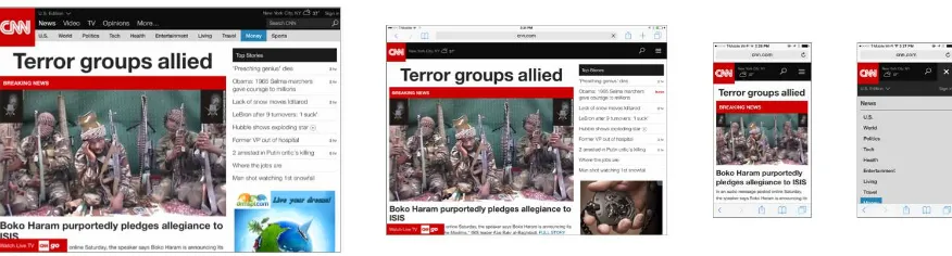
depending on the needs of different channels. A navigation structure that works well in a Web page should function differently when presented on a 5-inch touchscreen, but the language employed in both should be consistent. (Figure 1–5.)
Figure 1–5. CNN.com uses a responsive layout that adapts page elements to fit in different screen sizes, while using a consistent organization structure throughout
In their landmark book Pervasive Information Architecture, Andrea Resmini and Luca Rosati argue for consistency as a critical component of what they call a pervasive information architecture –that is, one that is experienced across multiple channels and contexts. As they explain it,
Consistency is the capability of a pervasive information architecture to serve the contexts it is designed for (internal consistency), and to preserve this logic across different media, environments, and uses (external consistency)… Consistency needs to be designed with the context it is addressing clear in mind, and in respect to the several media and environments that the service or process will span.[7]
them should be familiar and consistent. In order to do so, they must be abstracted from actual implementations.
Systems thinking
Because of this emphasis on abstracting solutions to complex challenges, information architecture also requires that the designer think systemically about the problems at hand. Where other design disciplines focus on the design of particular artifacts, information architecture is concerned with defining the semantic systems that the individual artifacts– apps, websites, voice interfaces, etc.–will be working within. Peter’s book Intertwingled is an impassioned plea for systems thinking in the design of complex information
environments. He calls out the dangers of low-level thinking when trying to design these new types of products and services:
In the era of ecosystems, seeing the big picture is more important than ever, and less likely. It’s not simply that we’re forced into little boxes by organizational silos and professional specialization. We like it in there. We feel safe. But we’re not. This is no time to stick to your knitting . We must go from boxes to arrows. Tomorrow belongs to those who connect.[8]
You can’t design products and services that work effectively and consistently across various interaction channels if you don’t understand how they influence and interact with each other and with various other systems that affect them. As mentioned earlier, each interaction channel brings to the mix different limitations and possibilities that should inform the whole, so designers need to gain a high-level, comprehensive understanding of the entire ecosystem. As a discipline, information architecture is ideally suited to this task.
That said, information architecture not only produces high-level, abstract models: the design of products and services that are findable and understandable requires the creation of many low-level artifacts as well. Traditionally, many people think of website
navigation structures when they think of information architecture, and this view isn’t entirely off: navigation menus and their ilk are certainly within the remit of what information architecture produces. It’s just that you can’t get there without having explored the more abstract territory first. Effective information environments strike a balance between structural coherence (high-level invariance) with suppleness (low-level flexibility), so well-designed information architectures consider both.
book Introduction to General Systems Thinking, computer scientist Gerald Weinberg uses the following story to illustrate what he calls fallacies of absolute thought:
A minister was walking by a construction project and saw two men laying bricks. “What are you doing?” he asked the first.
“I’m laying bricks,” he answered gruffly.
“And you?’’ he asked the other. ”I’m building a cathedral," came the happy reply.
The minister was agreeably impressed with this man’s idealism and sense of participation in God’s Grand Plan. He composed a sermon on the subject, and returned the next day to speak to the inspired bricklayer. Only the first man was at work.
“Where’s your friend?” asked the minister.
“He got fired.”
“How terrible. Why?”
“He thought we were building a cathedral, but we’re building a garage.”[9]
So ask yourself: am I designing a cathedral or a garage? The difference between the two is important, and it’s often hard to tell them apart when your focus is on laying bricks. Sometimes–as in the case of iTunes–designers start working on a garage, and before they know what’s happening they’ve grafted an apse, choir, and stained-glass windows on it, making it hard to understand and use. Information architecture can help ensure that you’re working on the plans for a great garage (the best in the world!)–or a cathedral, if such is the problem you’re trying to solve. In the rest of the book, we’ll show you how.
Recap
Let’s recap what we’ve learned thus far:
• Throughout history, information has shown a tendency to dematerialize, going from having a one-to-one relationship with its containers, to our digital information which is completely detached from its containers.
• Information architecture is a design discipline that is focused on making information findable and understandable. Because of this, it is uniquely well suited to address these issues.
• Information architecture addresses these issues by asking the designer to think about problems through two important perspectives: that our products and services are perceived as places made of language, and that they function as ecosystems that can be designed for maximum effectiveness.
• That said, information architecture doesn’t operate solely at the level of abstractions: for it to be effective, it needs to be defined at various levels.
In chapter two we will give you a deeper overview of the discipline of IA, and will have a shot at defining the damned thing[10].
1. http://www.boston.com/bostonglobe/ideas/articles/2010/11/28/information_overload_the_early_ye ars/ ↩
2. Google’s stated mission is to “organize the world’s information and make it universally accessible and useful.” ↩
3. http://en.wikipedia.org/wiki/ITunes_Store ↩
4. R.I.P. ↩
5.
http://www.telegraph.co.uk/technology/mobile-phones/8601147/Tesco-builds-virtual-shops-for-Korean-commuters.html ↩
6. Hinton, Andrew, “Understanding Context”, O"Reilly 2014 ↩
7. Resmini, Andrea; Rosati, Luca (2011–03–23). Pervasive Information Architecture: Designing Cross-Channel User Experiences (Kindle Locations 2267–2272). Elsevier Science. Kindle Edition. ↩
8. Morville, Peter (2014–08–12). Intertwingled: Information Changes Everything (Kindle Locations 149–151). Semantic Studios. Kindle Edition. ↩
9. Weinberg, Gerald (2011–04–07). An Introduction to General Systems Thinking (Kindle Locations 1393–1404). Weinberg & Weinberg. Kindle Edition. ↩
CHAPTER 2
Defining Information Architecture
We say nothing essential about the cathedral when we speak of its stones. – Antoine de Saint-Exupéry
What we’ll cover:
• A working definition (or four!) of information architecture
• Why it’s so hard to point to something and say, “that’s a great IA”! • A model for effective IA design
If you’re new to information architecture, at this point you may be wondering what this is all about. This chapter has answers for you! And if you have been working in one of the UX design disciplines for a while, you may be thinking, “But isn’t information
architecture about making sitemaps, wireframes, and website navigation menus?” Well, yes – these are important elements of information architecture design. But there is much more to this story! In this chapter, we’ll give you a broader picture of what information architecture is – and isn’t.
A Definition
Let’s start by clarifying what we mean by information architecture.
in•for•ma•tion ar•chi•tec•ture n.
• The structural design of shared information environments.
• The combination of organization, labeling, search, and navigation systems within digital ecosystems.
• The art and science of shaping information products and experiences to support usability and findability.
• An emerging discipline and community of practice focused on bringing principles of design and architecture to the digital landscape.
The reason we can’t serve up a single, all-powerful, all-purpose definition is a clue to understanding why it’s so hard to design good digital products and services. We’re talking about the challenges inherent in language and representation. No document fully and accurately represents the intended meaning of its author. No label or definition totally captures the meaning of a document. And no two readers experience or understand a particular document or definition or label in quite the same way. The relationship between words and meaning is tricky at best.[1] And here’s the paradox of defining
information architecture: by defining and clarifying semantic concepts, IA makes them more understandable and findable, but at a cost, because definitions are so imperfect and limiting at the same time. The definition of IA itself is a great illustration of this paradox.
We’ll now descend from our philosophical soapbox and get down to basics. Let’s expand on our definitions to explore some basic concepts of information architecture.
Information
We use the term information to distinguish information architecture from data and knowledge management. Data is facts and figures. Relational databases are highly structured and produce specific answers to specific questions. Knowledge is the stuff in people’s heads. Knowledge managers develop tools, processes, and incentives to encourage people to share that stuff. Information exists in the messy middle. With information systems, there’s often no single “right” answer to a given question. We’re concerned with information of all shapes and sizes: websites, documents, software applications, images, and more. We’re also concerned with metadata: terms used to describe and represent content objects such as documents, people, processes, and organizations.
Structuring, organizing, and labeling
Structuring involves determining the appropriate levels of granularity[2] for the
information “atoms” in your product or service, and deciding how to relate them to one another. Organizing involves grouping those components into meaningful and distinctive categories, creating the right contexts for users to understand the environment they are in and what they’re looking at. Labeling means figuring out what to call those categories and the navigation structure elements that lead to them.
Finding and managing
Art and science
Disciplines such as usability engineering and ethnography bring the rigor of the scientific method to the analysis of users’ needs and information-seeking behaviors. We’re increasingly able to study patterns of usage and subsequently make
improvements to our websites. But the practice of information architecture will never be reduced to numbers; there’s too much ambiguity and complexity. Information architects must rely on experience, intuition, and creativity. We must be willing to take risks and trust our intuition. This is the “art” of information architecture.
Just Because You Can’t See It, Doesn’t Mean It
Isn’t There
One of the challenges people have with information architecture is that they can’t easily point to it. How many times have you heard someone say, “Boy, that website’s
information architecture is really terrific!” or, “I can’t find anything on this app! Its information architecture sucks!” Our bet is, not many. But the fact that you can’t readily see the information architecture in things doesn’t mean it’s not there. As de Saint-Exupéry said, sometimes what is essential is invisible to the eye.
To illustrate, think of the game of chess. Perhaps the image that comes to your mind is of a chessboard like the one shown in Figure 2–1, with beautifully sculpted wooden pieces, a goblet of brandy sitting near a flickering fireplace. And certainly that beautiful
chessboard is a common instantiation of the game we call chess. However, chess is more than that. You could argue that what makes chess “chess” is a set of information
Figure 2–1. A chess board with pieces in the opening position. Image:
http://commons.wikimedia.org/wiki/Chess#mediaviewer/File:Opening_chess_position_from_black_side.jpg
To begin with, chess has a taxonomy of pieces which represent army units: pawns, rooks, bishops, knights, kings, and queens. In play, there are two sets (“armies”) of such pieces: “black” and “white”. These armies face each other in a field which consists of an eight-by-eight grid of alternating light- and dark-colored squares. This field – the chessboard – creates a context (a “place”) for the battle to take place.
The different types of pieces can move and interact in different ways in this board; there are lots of rules which determine how these armies can interact. Differences in their range, scope, and numbers determine their relative worth to each army. (Table 2–1.)
Table 2–1
Name Symbol Amount per army Relative value
Pawn 8 1
Bishop 2 3
Rook 2 5
Queen 1 9
King 1 -
(The king is invaluable: its capture ends the game.)
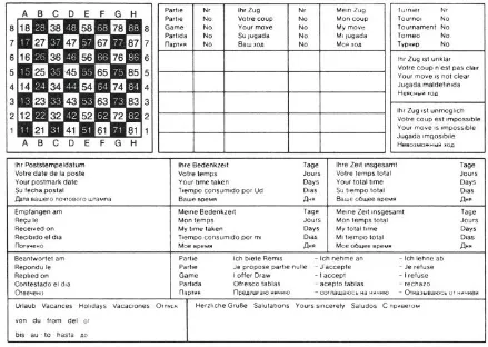
Figure 2–2. Correspondence chess postcard. Image: By Schach Niggemann GFDL
(http://www.gnu.org/copyleft/fdl.html) or CC-BY-SA–3.0 (http://creativecommons.org/licenses/by-sa/3.0/), via Wikimedia Commons
Figure 2–3. Deep Green chess, played on an iPhone with a touchscreen interface
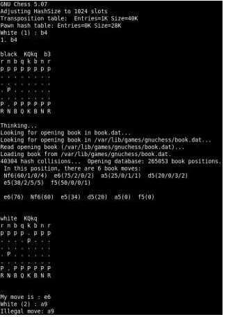
Figure 2–4. GNU Chess, played with a command line interface
And of course, there are also countless variations of physical chess sets, ranging from our beautiful wooden set, to cheap “travel” sets with minimally rendered graphics on
Figure 2–5. Intense game of chess unfolding in a cheap magnetic travel set. Photo (cropped): https://www.flickr.com/photos/wfryer/4806518911/in/photolist–8jJEBH–6akZjs
These incarnations of chess are all physically very different from each other. Yet they are all still chess. Why? Because they make manifest and afford the underlying information structures and rules of chess. Expressing and supporting these information structures is what makes them chess; their physical form and interaction mechanisms are interaction or industrial design. In many ways, this in-the-abstract, platonic chess, is more “real”–but less tangible–than the physical (or virtual) chess sets that we interact with, since it is what makes chess different from other games.
understanding over time: it’s only in retrospect that we can point to them and say: “that’s a damned good information architecture!”
Towards a Damned Good Information
Architecture
Users. Content. Context. You’ll hear these three words again and again throughout this book. They form the basis of our model for practicing effective information architecture design. Underlying this model is a recognition that you can’t design useful information architectures in a vacuum. An architect can’t huddle in a dark room with a bunch of content, organize it, and emerge with a grand solution. It simply won’t hold up against the light of day.
Websites, intranets, apps, and other information environments are not lifeless, static constructs. Rather, there is a dynamic, organic nature to both the information systems and the broader contexts in which they exist. This is not the old world of yellowing cards in a library card catalog. We’re talking complex, adaptive systems with emergent qualities. We’re talking rich streams of information flowing within and beyond the borders of departments, business units, institutions, and countries. We’re talking messiness and mistakes, trial and error, survival of the fittest.
We use the concept of an “information ecology”[3] composed of users, content, and
context to address the complex dependencies that exist. And we draw upon our trusty Venn diagram (see Figure 2–6) to help people visualize and understand these
relationships. The three circles illustrate the interdependent nature of users, content, and context within a complex, adaptive information ecology.
Figure 2–6. The infamous three circles of information architecture
Is this an oversimplified view of reality? Yes. Is it still useful? Absolutely. We’ve been using this model for 20 years. It’s held up well in all sorts of environments, from global websites of Fortune 100 corporations to standalone intranet applications within small nonprofits. More importantly, we find these three circles incredibly helpful whenever we’re confronted by a difficult question. After mouthing the trusty phrase “It depends”— as all smart practitioners of information architecture do—we develop our answer by deconstructing the question into three parts that coincide with our three circles. For example, when asked what are the most important qualities that an information architect should bring to the table, the answer becomes quite simple: some knowledge of users and their needs (which might come from exposure to human–computer interaction and a variety of other fields), content (think technical communication and journalism), and context (read a book on organizational psychology).
The three circles help with other tough questions, too, such as:
• What research and evaluation methods should information architects be familiar with?
• What kinds of people should be part of the team that designs the information architecture?
• What kinds of books and blogs should I read to keep up with the field and its
practice?
• What should go into the IA strategy that I propose to my new prospect?
Should technology have its own circle? Maybe. But we find that technology usually gets too much attention. Also, we increasingly find that much of what falls under the rubric of technology can be expressed within the “context” circle. After all, what technology brings to the table are new possibilities and constraints that give shape to the final product, and this is squarely within the realm of the context we’re designing for.
Incidentally, we think it’s important for information architects to have a good sense of humor. Perhaps you’ve already figured this out. The work we do involves high levels of abstraction, ambiguity, and occasionally absurdity, and to some degree we’re all still making it up as we go along.
If there’s one thing that many years of information architecture consulting has taught us, it’s that every situation is unique. We don’t just mean that websites are different from intranets or that extranets should vary by industry. We mean that, like fingerprints and snowflakes, every information ecology is unique. The Toyota intranet is vastly different from that of Ford or GM. Fidelity, Vanguard, Schwab, and Etrade have each created unique online financial-service experiences. Despite all the copycatting, benchmarking, and definitions of industry best practices that have surged throughout the business world in recent years, each of these information systems has emerged as quite distinctive.
That’s where our model comes in handy. It’s an excellent tool for learning about the specific needs and opportunities presented by a particular project. Let’s take a look at how each of our three circles contributes to the emergence of a totally unique information ecology.
Context
All digital design projects exist within a particular business or organizational context. Whether explicit or implicit, each organization has a mission, goals, strategy, staff, processes and procedures, physical and technology infrastructure, budget, and culture. This collective mix of capabilities, aspirations, and resources is unique to each
organization.
The key to success is understanding and alignment. First, you need to understand the business context. What makes it unique? Where is the business today and where does it want to be tomorrow? In many cases, you’re dealing with tacit knowledge. It’s not written down anywhere; it’s in people’s heads and has never been put into words. We’ll discuss a variety of methods for extracting and organizing this understanding of context. Then, you need to find ways to align the information architecture with the goals, strategy, and culture of the business. We’ll discuss the approaches and tools that enable this
custom configuration.
You also need to understand the contextual differences imposed by the channels that the user will be using to interact with your organization. Will they be experiencing your services primarily via apps on mobile phones, or via a website on a desktop-based browser? Both platforms have things they can do well, and things they can’t. For example, smaller screens mean less space, which in turn implies shorter labels and navigation menus. If your service will be used via more than one channel, you need to consider how these channels will overlap and interact with each other. All of these factors form part of the context that will shape your information architecture.
Content
We define “content” very broadly to include the documents, applications, services, schema, and metadata that people need to use or find in your systems. To employ a technical term, it’s the stuff that makes up your sites and apps. Our library backgrounds will be evident here in our bias toward textual information, and that’s not such a bad thing, given the heavily textual nature of many digital systems. Among other things, the Web is a wonderful communication tool, and communication is built upon words and sentences trying to convey meaning. Of course, we also recognize it as a tool for tasks and transactions, a flexible technology platform that supports buying and selling, calculating and configuring, sorting and simulating. But even the most task-oriented e-commerce website has “content” that customers must be able to find.
As you survey content across a variety of digital systems, the following facets bubble to the surface as distinguishing factors of each information ecology.
Ownership
Who creates and owns the content? Is ownership centralized within a content authoring group or distributed among functional departments? How much content is licensed from external information vendors? The answers to these questions play a huge role in influencing the level of control you have over all the other dimensions.
Websites and intranets are becoming the unifying means of access to all digital formats within the organization. Oracle databases, product catalogs, Lotus Notes discussion archives, technical reports in MS Word, annual reports in PDF, office-supply purchasing applications, and video clips of the CEO are just a few of the types of documents, databases, and applications you’ll find on a given site.
Structure
All documents are not created equal. An important memo may be fewer than 100 words. A technical manual may be more than 1,000 pages. Some information systems are built around the document paradigm, with the fully integrated document as the smallest discrete unit. Other systems take a content component or digital asset approach, leveraging some form of structural markup (XML or JSON, for example) to allow management and access at a finer level of granularity.
Metadata
To what extent has metadata that describes the content and objects within your system already been created? Have documents been tagged manually or
automatically? What’s the level of quality and consistency? Is there a controlled vocabulary in place? Or have users been allowed to tag the content? These factors determine how much you’re starting from scratch with respect to both information retrieval and content management.
Volume
How much content are we talking about? A hundred applications? A thousand pages? A million documents? How big is your system?
Dynamism
What is the rate of growth or turnover? How much new content will be added next year? And how quickly will it go stale?
All of these dimensions make for a unique mix of content and applications, which in turn suggests the need for a customized information architecture.
Users
When we worked on the first corporate website for Borders Books & Music, back in the mid–90s before Amazon became a household name, we learned a lot about how customer research and analysis was applied towards the design and architecture of physical
bookstores.
Borders had a clear understanding of how the demographics, aesthetic preferences, and purchasing behaviors of their customers differed from those of Barnes & Noble. It is no mistake that the physical layout and the selection of books differed significantly between these two stores, even within the same town. They were different by design. And that difference was built upon an understanding of their unique customer or market segments.
Differences in customer preferences and behaviors within the physical world translate into different information needs and information-seeking behaviors in the context of websites and apps. For example, senior executives may need to find a few good
documents on a particular topic very quickly. Research analysts may need to find all the relevant documents and may be willing to spend several hours on the hunt. Managers may have a high level of industry knowledge but low navigation and searching
proficiency. Teenagers may be new to the subject area but really know how to handle a search engine.
Do you know who’s using your system? Do you know how they’re using it? And perhaps most importantly, do you know what information they want from your systems? These are not questions you can answer in brainstorming meetings or focus groups. As our friend and fellow information architect Chris Farnum likes to say, you need to get out there in the real world and study your “users in the mist.”
Recap
Let’s recap what we’ve learned in Chapter 2:
• There’s more than one way to define information architecture, and that’s OK. • Information architecture is not something you can easily point to; it is mostly
abstract and exists below the surface, in the deep semantic structures of products and services. This is OK too!
• Our model for practicing effective information architecture design considers three things: users, context, and content.
1. For a humorous perspective on the trickiness of the English language, see Bill Bryson’s The Mother
Tongue: English & How It Got That Way (William Morrow). ↩
2. Granularity refers to the relative size or coarseness of information chunks. Varying levels of granularity might include: journal issue, article, paragraph, and sentence. ↩
Why Does Data Matter?
Introduction
In this chapter we want to give you a high level introduction into how bringing data into the design process can transform your business. To do this, we’ll give some historical examples of the critical role that data played in illuminating core problems which will hopefully show you how powerful data can be. We’ll also cover how digital interfaces have fundamentally changed our ability to use data and some of the emerging tools and services which allows even the smallest companies to gather their own data at scale. Because we are using this chapter to set the foundation for the rest of the book, we will also use it to provide some basic terminology and touch on the different philosophical approaches to data and design. Ideally we’d like to take these data terms and transform them into design terms which you will feel comfortable with.
This chapter is much more about giving you a basic understanding of the relationship between data, business and design, rather than teaching you how to design or making you an expert statistician or data scientist. We’d like to show you how data and design are just tools that you use to build really great experiences for your users. If you are building great experiences for your users, then you have a great foundation for your business. We will feel successful if we can get you to leave this chapter convinced that understanding the data that you can gather about your users will make your design and therefore your business better.
The Power of Digital Interfaces
It might feel like using data is big news now, but the truth is that we’ve been using data for a long time already. For the past 20 years, we’ve been moving and replicating more and more experiences that we used to have in the physical world into the digital world. Sharing photos, having conversations, duties that we used to perform in our daily work have all become digital. We could probably have a separate discussion as to how much the migration from the physical “real” world to the digital world has benefitted or been
detrimental to our society, but you can’t deny that it’s happening and only continues to accelerate at a breakneck pace.
Let’s take a look at what it means for these experiences to be moving from the physical to the digital. Not too long ago, the primary way that you shared photos with someone was that you would have to have used your camera to take a photo at an event. When your roll was done, you’d take that film to the local store where you would drop it off for processing. A few days or a week later you would need to pick up your developed photos and that would be the first time you’d be able to evaluate how well the photos that you took many days prior actually turned out. Then, maybe when someone was at your house, you’d pull out those photos and narrate what each photo was about. If you were going to really share those photos with someone else, you’d maybe order duplicates and then put them in an envelope to mail to them – and a few days later, your friend would get your photos as well. If you were working at a company like Kodak that had a vested interest in getting people to use your film, processing paper or cameras more, then there are so many steps and parts of the experience that I just described which are completely out of your control. You also have almost no way to collect insight into your customer’s behaviors and actions along the process.
Now let’s take the same example of sharing a photo in the digital world. Your user will take out their phone and take a photo. They may open up your Instagram, apply some filters to the photo and edit it on the spot before adding a caption and then sharing it. They might also choose to share it on different channels, like Twitter or via email. The entire experience of sharing a photo has been collapsed and condensed into one uninterrupted flow and a single screen, one that you can hold in the palm of your hand. And because all of this is digital, data is continuously being collected along the way. You have access to all kinds of information that you wouldn’t have had before. Location, time spent in each step, which filters were tried but not used, what was written about the photo and to whom the photo was sent. You can also gather consumption data on the photo, how many people viewed it or liked it? Not only are you able to gather that information on just one user, but you can gather it for each and every single user. And that data is both precise as well as dynamic – so you could get an instant understanding of how your customers behaviours and interactions might be changing and evolving with respect to your product and in reaction to changes you make to your product.
Commoditization of data
We are seeing that data is quickly becoming commoditized with companies and services springing up to help you with your data. There are so many tools and services available now that can really help you gather data about your customers that there is almost no excuse to not be leveraging data more in your design and product development cycle. We’re seeing this commoditization of data happening in all aspects,
Companies like usertesting.com and others are making it easier to get qualitative data even if you don’t have dedicated user research facilities, in fact you could argue that services like this can be stronger than traditional labs because the virtual nature of the service allows you to gather feedback from customers around the world. Optimizely, and other companies are making quantitative data collection easier by allowing companies to run quick and easy AB tests on their websites as well. We see data boot camps springing up … and there are also companies where you can outsource your data analysis to as well so that you don’t need to bear the expense of hiring and keeping data analysts on staff.
Finally we see more and more places where there are new data degrees emerging.
Quantitative data at scale
We thought it would be fun to include a little bit of history in this chapter, that by taking a step back, way back, it might help to give our readers some perspective into how the smart use of data has been something we have been doing for a very long time. As designers, we pride ourselves on being excellent at solving problems, seeing how others have used data to illuminate and solve the problems they face in other industries can be quite enlightening.
The 15th century marked the beginning of the Age of Discovery, when Europeans
embarked on expeditions to explore the world. However, on especially long trips where they could not store fruits and vegetables, scurvy – a serious disease, was a significant problem. In May 1747, aboard the British Navy ship HMS Salisbury, naval surgeon James Lind conducted an experiment to identify a cure for scurvy. He chose six pairs of seamen suffering from the disease and gave a different “remedy” to each pair, in addition to their normal rations. Five of these pairs of sailors showed no significant improvement, but one pair, who had been prescribed oranges and lemons, quickly showed signs of recovering from the disease.
each had two oranges and one lemon given them every day. The consequence was, that the most sudden and visible good effects were perceived from the use of the oranges and lemons.”1
By this simple experiment, Lind managed to demonstrate that oranges and lemons were a more effective cure for scurvy than any of the other known remedies. Eventually, the Navy started giving citrus fruit to all sailors on long voyages, to protect against the disease.
In another historical example, Dr. John Snow was working with the Reverend Henry Whitehead in the midst of the 19th century cholera outbreak in London. As described by
Steven Johnson in his book “The Ghost Map”, the two men worked together to take a truly multidisciplinary approach. John Snow’s scientific understanding behind the transmission of the disease was powerfully coupled with Rev. Henry Whitehead’s human understanding of the local community and their behaviors to help uncover the source and ultimately stop the spread of the disease.
The link between British scientists and how we use data in design today might not seem immediately obvious, but Lind is credited with not only conducting the first ever clinical trial, but the first controlled experiment on multiple groups, where all factors remained the same aside from a single variable. As for Dr. Snow and Rev. Whitehead, you can see here how qualitative data was gathered and used to both provide more insight into uncovering what was going on in the communities and how that qualitative data collected at scale was able to bring insight and clarity to a phenomenon that was initially confounding.
The history of the modern “data scientist” is much more recent.2 It was in the 1960s that
statisticians like John Tukey started to think more about what it was to bring a scientific approach to data analysis. In the 1970s we see these analysts start to recognize that the power they can bring to the data is to fill it with insight and more information. As we jump ahead to today, there is no question that data science is a term which now captures all the work that is done to both capture, measure and to interpret the vast amount of data that represents our users on a daily basis.
We now take it for granted that in medicine, new treatments will be fully researched and rigorously evaluated against other options, before being adopted. We expect the same level of rigour in the design and engineering of safety-critical systems like aircraft, automobiles or nuclear power stations. But in the design of consumer-facing and recreational software and web sites, where human lives are rarely at stake, the pursuit of the best possible designs through a similar approach of testing various options using a scientifically structured methodology is a relatively new phenomenon. Based on the sheer volume of articles, publications, talks that we see generated about data and business, data and technology, data and marketing… it’s clear that data is a very hot topic and the currency of the day. What we want to do with this book is to take the term “data science” and expand it even further to move beyond the realm of people who consider themselves statisticians and to something that designers will start to embrace as part of their skillset as well.
Data roles
As you start to incorporate the usage of data in your day to day, you’ll find that in addition to navigating the data itself, you’ll also need to navigate the various people who work with data in different ways. In some cases there might be just one person who represents each of the roles we describe, in other cases there might be an entire team based around a particular role and in some cases you will find one person might play multiple roles. We break these roles up into two key groups; those that help to create and capture the data (producers) and those who use the data and information generated from it in their work (consumers).
Data can be generated in so many ways –through tracking of user behaviors in your product, or through interviews with customers or by soliciting user feedback through surveys. The people we often find associated with the generative side of data are; data analysts, data scientists, user researchers, designers and marketers.
Data analysts and scientists3should be involved throughout the lifecycle of a product. They help to take the mass of data that is collected from a product and then help to clean, interpret, transform, model and validate that data. All of this work is done with the intent of helping the business to make better decisions. Data analysts and scientists often bring insight which can help the business predict where it needs to go, but they can also help to analyze the resulting data from a business decision to understand if the business accomplished what it set out to do. Common background for data analysts and scientists will include statistics, information management , technology and business intelligence.
User researchers4 are complimentary to data analysts and scientists and in some cases will overlap with them in terms of skills and interests – especially as user researchers start to do more of their work on a bigger and bigger scale. Typically user researchers are championing the user by seeking to understand who your users are and what they want. They are interested in both attitudinal and behavioral information about your users. They will tend to do this by focusing on qualitative information gathering via interviews, surveys, diary studies and other forms of ethnographic research. Common backgrounds for people involved in user research might include psychology, cognitive science, as well as the standard backgrounds that you often find for designers.
Designers, as we’ve been insisting throughout this book need to also be concerned with the generation of data. It’s not new for designers to seek information about our users or to gather information about our designs as we evaluate them. In some companies that don’t have the room for dedicated user researchers or analysts the designer will have to step into those roles occasionally to get the information that they need to generate their
designs. Designers can also play a key role in the generation of data based on what they design and choose to prototype. Designers can just as easily come from a tech or art background. Human factors or HCI are also fairly common as well.
Marketers can also be great collaborators in terms of data generation and too often we find that a weak tie between product and marketing means that a lot of valuable information which could be shared by both teams can get lost. Marketers are often seeking to understand the target audience, the market size of that audience and as a result often generate a lot of data around customers. Many people in marketing will have a strong business background.
On the consumption side of data roles, we find people who are actively taking the insights generated from the data to help them make decisions about how to push the business forward. In this bucket, we typically find; business managers, product managers and, of course, designers.
Business managers and product managers look to data to get stronger insights into how the business is performing. Business metrics (which we cover in more depth in Chapter 2) are monitored and used to provide a health check on how the business is performing. They also look for impact of business decisions and to see if the changes that are being done in the product are performing as expected.
Designers should not only be caring about the business metrics, but also thinking about any additional metrics with respect to usability or the user interface. Of course designers should also be actively involved in understanding the data that comes back from user researchers or analysts on their own design throughout the product development cycle. The key for designers is to interpret these results and understanding them within the context of the larger business.
User researchers and analysts should also be consumers of each others data. Looking to see how a broader understanding of the data that is being collected on their product can provide clarity into why they might be seeing locally in their own data.
These roles do not have strict boundaries or definitions. However, as you might find yourself playing into either a consumer or producer of data it can be helpful to understand which side of this divide it is that you are fitting into at that specific point in time.
Our use of terminology in this book
Big data5
- it seems that finding a formal definition of “big data” can be quite difficult. The term first emerged in 2007 and has generally come be used to describe very large data sets (structured and unstructured) which can has the potential to be analyzed and mined for information.
Design thinking – also a very common term which is used to describe a process for creating new ideas and solving problems. The term was popularized by Tim Brown6 and the folks at IDEO to describe a process where innovation comes from direct observation of users and relies on creating strong empathy for them. What we hope to do in this book is to not only show how all kinds of data fits nicely into the construct of design thinking, but how design thinking as a practice can also be applied to the data itself.
The design council in the UK introduced the notion of the “double diamond”7 design process model in 2005. The phases of this model are as follows:
Phase 1: Discovery – where activities like market research, user research help to identify the user needs. Much of what we discuss in this book is leveraged at this stage of the design process.
Phase 2: Definition – in this stage you are aligning the user needs to the business. It’s for this stage that its especially important to understand what your business objectives are and which metrics will help you and your team align to them best. We cover this in more detail in Chapter 2.
Phase 3: Development – the design solutions are developed and iterated on at this stage of the process and it’s in this phase that the designer should be thinking proactively about the kind of data that they will need to capture to best understand the effectiveness of their work.
Phase 4: Delivery – this represents the time where the product is finalized and launched. At this stage we think it’s most important for the designer to be able to close the loop and determine the effectiveness of what they have done. Understanding the resulting data from their design and how it provides insight into which next steps they should or shouldn’t take are the key things at this stage.
Quantitative and qualitative data at scale – for the purposes of this book we really focus on gathering either qualitative or quantitative data at scale. For us what that means is looking to getting enough information that it can be interpreted at a level that gives you the confidence that whatever you interpret as a result from that data will scale. That the
data you are gathering and interpreting is statistically significant. We’ll talk more about the details around making sure that your data is sound in Chapter 3.
Data vs. Design vs. designer vs. designing – it may seem obvious, but we do want to call out that the design that is produced by a designer is a tool (in the same way that we are advocating for the fact that ‘data’ is also a tool) that is used to help the designer craft a solution for their users. The act of designing is something that we want to redefine as a process that not only speaks to the work of crafting a design, but also taking into account and incorporating data.
Data driven vs. Data Informed vs. Data Aware
Before proceeding we’d like to spell out some differences we have perceived in how data and design have been positioned in the industry. The three terms are “data driven”, “data informed” and one we have coined, “data aware”. You are probably already somewhat familiar with the debate between “data driven” and “data informed” and you are also probably aware of the different views that surround those terms as well as the potential pitfalls of taking too binary approach to data.
One of the best descriptions that we’ve ever seen on the difference between data-driven and data-informed comes by way of Andrew Chen. In a well referenced post entitled “Know the difference between data-informed and data-driven” 8, he explains that “[…]the
difference […] in my mind, is that you weigh the data as one piece of a messy problem you’re solving with thousands of constantly changing variables. While data is concrete, it is often systematically biased. It’s also not the right tool, because not everything is an optimization problem. And delegating your decision-making to only what you can measure right now often de-prioritizes more important macro aspects of the problem.”
The words “not everything is an optimization problem” sum up the philosophy behind this book. Our intent is to broaden the definition of “data” from being an overly strong association with AB test results to acknowledging that what companies need and should gather are multiple forms of data gathered from many different sources. In reality, many companies are already collecting all kinds of data on their customer’s behaviors: business analytics, trace log data, user experience lab-based data, interview data, customer feedback data, NPS and other industry standard data formats, call center data around issues and complaints. However one of the things we are concerned with in this book is that AB testing at scale has captured the imagination as THE tool to use even when not systematically conducted because of the enticement of large numbers …and the obsession in or industry with ‘scale’ as if large numbers can’t be wrong. We want to acknowledge that the intersection of data and design can be so much more than AB testing and to recognize that it can be equal parts art and science.
Data driven design implies that the data that are collected are what drives design decisions. In some instances, this is the right way forward. We will give examples through the book where data are gathered and directly effect the design decision that was made next. The data is used to answer a specific question and the results are unequivocal.
8