Kivy: Interactive Applications
in Python
Create cross-platform UI/UX applications and games
in Python
Roberto Ulloa
Kivy: Interactive Applications in Python
Copyright © 2013 Packt Publishing
All rights reserved. No part of this book may be reproduced, stored in a retrieval system, or transmitted in any form or by any means, without the prior written permission of the publisher, except in the case of brief quotations embedded in critical articles or reviews.
Every effort has been made in the preparation of this book to ensure the accuracy of the information presented. However, the information contained in this book is sold without warranty, either express or implied. Neither the author, nor Packt Publishing, and its dealers and distributors will be held liable for any damages caused or alleged to be caused directly or indirectly by this book.
Packt Publishing has endeavored to provide trademark information about all of the companies and products mentioned in this book by the appropriate use of capitals. However, Packt Publishing cannot guarantee the accuracy of this information.
First published: September 2013
Production Reference: 1190913
Published by Packt Publishing Ltd. Livery Place
35 Livery Street
Birmingham B3 2PB, UK.
ISBN 978-1-78328-159-6
www.packtpub.com
Credits
Author Roberto Ulloa
Reviewers Anai Arroyo B.
Andrés Vargas González
Javier de la Rosa
Hugo Solis
Acquisition Editor James Jones
Commissioning Editor Sruthi Kutty
Technical Editors Ruchita Bhansali
Gauri Dasgupta
Monica John
Project Coordinator Michelle Quadros
Proofreader Amy Johnson
Indexer
Monica Ajmera Mehta
Graphics Ronak Dhruv
Production Coordinator Nilesh R. Mohite
About the Author
Roberto Ulloa has a diverse academic record in multiple disciplines within the
field of Computer Science. He obtained an MSc from the University of Costa Rica and also taught programming and computer networking there. He then spent two years researching about cultural complexity at PhD level at the CulturePlex Lab of the University of Western Ontario.He loves travelling and enjoys an itinerant life, living among different cultures and environments. He loves nature and has spent many months volunteering in Central and South America.
Acknowledgments
I would like to thank Su, for not hesitating one second in encouraging and trusting my ability to write this book; for believing in me and motivating me with endless cups of coffee.
Javier de la Rosa, with whom I worked on my first Kivy project—the one that gave birth to the blog post that caught the attention of my publishers.
My technical reviewers, Anaí Arroyo, Javier de la Rosa, Hugo Solís and Andrés Vargas for their time and corrections.
My supervisor, Gabriela Barrantes, who has been a constant source of support and inspiration throughout my academic life.
My family and friends, for whom this book will be a surprise, and who've paid with the time that I didn't have to share with them.
The editorial personnel, for their patience in answering my questions.
About the Reviewers
Anaí Arroyo
is a PMI certified Project Manager who loves software development and is passionate about how technology can be used to improve the quality of people's life and volunteering as a way to contribute to make a positive difference. Over the last years, she has worked in the Education field, collaborating in the design and development of Learning Management and Student Information Management systems.Andrés Vargas González is currently pursuing a Master of Science in Computer
Science through a Fulbright Fellowship at University of Central Florida (UCF). He received a Bachelor's degree in the same field from Escuela Superior Politécnica del Litoral (ESPOL) in Ecuador.He is a member of the Interactive Systems and User Experience Lab at UCF. His current research is on machine learning techniques to reduce the time on gesture recognition in context. His previous works include enterprise multimedia distribution and exploring usability of multi-touch interfaces in Information Systems, which was tested on his DIY multi-touch surface. He is also interested in web
Besides his academic and professional interests, he enjoys hiking high elevations, learning from different cultures, biking by the city, and finally, playing and watching soccer.
First and foremost, I would like to thank my four mothers for the values, love, and inspiration I got from them every moment of my life. I also wish to express my sincere gratitude to Shivani Wala for providing me an opportunity to be part of this great project. At the same time my special thanks to Michelle Quadros for keeping me updated with the deadlines and any doubt I had. Last but not least I wish to avail myself of this opportunity, express a sense of gratitude and love to my relatives, professors, and friends.
Javier de la Rosa
is a full-stack Python developer since 2005, when he first met the Django web framework. During his years in Yaco, one of the main FLOSS-based companies in Spain, he leaded the Research and Development Team, participating in both European and national projects. Late in 2009, he started to collaborate with The CulturePlex Lab for Cultural Networks research, at the Western Unviersity in Canada, in his sparse time. As a result, he left Yaco in 2010 and joined the laboratory to lead and supervise technical and software developments. Today, he is still in charge of the developers team as well as conducting his own research on Big Culture, where he mixes his background as a BA and MA in Computer Sciences, Logics and Artificial Intelligence by the University of Seville, and his recent acquired skills as a 3rd year PhD student in Hispanic Studies at Western University in Canada. Currently, he just started his 1st year as a PhD in Computer Sciences, focusing on Graph Databases and Query Languages.Hugo Solis is an assistant professor in the Physics Department at University
of Costa Rica. His current research interests are computational cosmology, complexity and the influence of hydrogen on material properties. He has wide experience with languages including C/C++ and Python for scientific programming and visualization. He is a member of the Free Software Foundation and he has contributed code to some free software projects. Currently, he is in charge of the IFT, a Costa Rican scientific non-profit organization for the multidisciplinary practice of physics. (http://iftucr.org)www.PacktPub.com
Support files, eBooks, discount offers
and more
You might want to visit www.PacktPub.com for support files and downloads related to
your book.
Did you know that Packt offers eBook versions of every book published, with PDF and ePub files available? You can upgrade to the eBook version at www.PacktPub.com and as a print book customer, you are entitled to a discount on the eBook copy. Get in touch with us at [email protected] for more details.
At www.PacktPub.com, you can also read a collection of free technical articles, sign up for a range of free newsletters and receive exclusive discounts and offers on Packt books and eBooks.
TM
http://PacktLib.PacktPub.com
Do you need instant solutions to your IT questions? PacktLib is Packt's online digital book library. Here, you can access, read and search across Packt's entire library of books.
Why Subscribe?
• Fully searchable across every book published by Packt • Copy and paste, print and bookmark content
• On demand and accessible via web browser
Free Access for Packt account holders
Table of Contents
Preface 1
Chapter 1: GUI Basics – Building an Interface
7
Hello World! 8
Basic widgets – labels and buttons 11
Layouts 14
Embedding layouts 18
Our Project – comic creator 22
Summary 28
Chapter 2: Graphics – The Canvas
31
Basic shapes 32
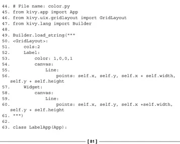
Images, colors, and backgrounds 38
Rotating, translating, and scaling 41
Comic creator – PushMatrix and PopMatrix 44
Summary 48
Chapter 3: Widget Events – Binding Actions
51
Attributes, id and root 52
Basic widget events – dragging the stickman 54 Localizing coordinates – adding stickmen 59 Binding and unbinding events – sizing limbs and heads 62
Binding events in the Kivy language 67
Creating your own events – the magical properties 69
Kivy and properties 72
Summary 75
Chapter 4: Improving the User Experience
77
Scatter – multitouching to drag, rotate, and scale 85 Recording gestures – line, circles, and cross 89 Simple gestures – drawing with the finger 91
Summary 95
Chapter 5: Invaders Revenge – An Interactive Multitouch Game
97
Invaders Revenge – an animated multitouch game 98
Atlas – efficient management of images 99
Boom – simple sound effects 101
Ammo – simple animation 102
Invader – transitions for animations 103
Dock – automatic binding in the Kivy language 105 Fleet – infinite concatenation of animations 107
Scheduling events with the Clock 108
Shooter – multitouch control 110
Invasion – moving the shooter with the keyboard 113 Combining animations with '+' and '&' 115
Summary 117
Preface
Mobile devices have changed the way applications are perceived. They have increased in interaction types, the user expects gestures, multi-touches, animations, and magic-pens. Moreover, compatibility has become a must-have if you want to avoid the barriers imposed by major Operative Systems. Kivy is an Open Source Python solution that covers these market needs with an easy to learn and rapid development approach. Kivy is growing fast and gaining attention as an alternative to the established developing platforms.
This book introduces you into the Kivy world, covering a large variety of important topics related to interactive application development. The components presented in this book were not only selected according to their usefulness for developing state-of-the- art applications, but also for serving as an example of broader Kivy functionalities. Following this approach, the book covers a big part of the Kivy library.
Instead of giving a detailed description of all the functions and properties, it provides you with examples to understand their use and how to integrate the two big projects that come with the book. The first one, the comic creator, exemplifies how to build a user interface, how to draw vector shapes in the screen, how to bind user interactions with pieces codes and other components related to improve the user experience. The second project, Invaders Revenge, is a very interactive game that introduces you to the use of animations, scheduling of tasks, keyboard events, and multi-touch control.
The book keeps the readers attention by stating small problems and their solutions. The sections are short and straightforward, making the learning process constant. These short sections will also serve as a reference when they finish the book. However, serving as a reference doesn't prevent the text from achieving the main goal, which is teaching with bigger projects that connects the small topics. At the end of the book, the readers will feel comfortable to start their own project.
What this book covers
Chapter 1, GUI Basics – Building an Interface, introduces basic components and layouts of Kivy and how to integrate them through the Kivy Language.
Chapter 2, Graphics – The Canvas, explains the use of the canvas and how to draw vector figures on the screen.
Chapter 3, Widget Events - Binding Actions, teaches how to connect the interactions of the user through the interface with particular code inside the program.
Chapter 4, Improving the User Experience, introduces a collection of useful components to enrich the interaction of the user with the interface.
Chapter 5, Invaders Revenge – An Interactive Multitouch Game, introduces components and strategies to build highly interactive applications.
What you need for this book
This book requires a running installation of Kivy with all its requirements. The installation instructions can be found at http://kivy.org/docs/ gettingstarted/installation.html.
Who this book is for
Conventions
In this book, you will find a number of styles of text that distinguish between different kinds of information. Here are some examples of these styles, and an explanation of their meaning.
Code words in text are shown as follows: "Missile and Shot inherits from the same class called Ammo, which also inherits from Image. There is also the Boom class that will create the effect of explosion when any Ammo is triggered."
A block of code is set as follows:
# File name: hello.py import kivy
kivy.require('1.7.0')
from kivy.app import App
from kivy.uix.button import Label
class HelloApp(App): def build(self):
return Label(text='Hello World!')
if __name__=="__main__": HelloApp().run()
New terms and important words are shown in bold. Words that you see on the screen, in menus or dialog boxes for example, appear in the text like this: "Consider App as an empty window as shown in the following screenshot (Hello World! output)".
Warnings or important notes appear in a box like this.
Reader feedback
Feedback from our readers is always welcome. Let us know what you think about this book—what you liked or may have disliked. Reader feedback is important for us to develop titles that you really get the most out of.
To send us general feedback, simply send an e-mail to [email protected], and mention the book title via the subject of your message.
If there is a topic that you have expertise in and you are interested in either writing or contributing to a book, see our author guide on www.packtpub.com/authors.
Customer support
Now that you are the proud owner of a Packt book, we have a number of things to help you to get the most from your purchase.
Downloading the example code
You can download the example code files for all Packt books you have purchased from your account at http://www.packtpub.com. If you purchased this book elsewhere, you can visit http://www.packtpub.com/support and register to have the files e-mailed directly to you.
Errata
Piracy
Piracy of copyright material on the Internet is an ongoing problem across all media. At Packt, we take the protection of our copyright and licenses very seriously. If you come across any illegal copies of our works, in any form, on the Internet, please provide us with the location address or website name immediately so that we can pursue a remedy.
Please contact us at [email protected] with a link to the suspected pirated material.
We appreciate your help in protecting our authors, and our ability to bring you valuable content.
Questions
GUI Basics – Building
an Interface
Kivy emerges as a successor of PyMT (a library for multitouch applications) with a simple but ambitious goal in mind — same code for every commonplace platform: Linux / Windows / Mac OS X / Macosx / Android / iOS (Mathieu Virbel, http:// txzone.net/2011/01/kivy-next-pymt-on-android-step-1-done/). This support is being extended to Raspberry Pi thanks to a founding campaign started by Mathieu Virbel, the creator of Kivy. Kivy was introduced in the EuroPython 2011, as a Python framework designed for creating natural user interfaces.
So, let's start creating user interfaces using one of its fun and powerful components, the Kivy language (.kv). The Kivy language helps us to separate the logic from the presentation. This is a fundamental engineering concept that helps to keep an easy and intuitive code. Nonetheless, it is possible to build a Kivy application using pure Python and Kivy as a library. We will also learn those concepts in later chapters because they allow us to modify interfaces dynamically.
This chapter covers all the basics for building a graphical user interface (GUI) in Kivy. Afterwards, you will be able to build practically any GUI you have in your mind, and even make them responsive to the size of window! The following is a list of all the skills that you're about to learn:
• Launching a Kivy application • The Kivy language
• Creating and using widgets (GUI components) • Basic properties and variables of the widgets
• Fixed, proportional, absolute, and relative coordinates • Organizing GUIs through layouts
Apart from Python, this chapter requires some knowledge about Object-Oriented Programming (http://en.wikipedia.org/wiki/Object-oriented_programming) concepts. In particular, inheritance (http://en.wikipedia.org/wiki/
Inheritance_(object-oriented_programming)) and the difference between instances (http://en.wikipedia.org/wiki/Instance_(computer_science)) and classes (http://en.wikipedia.org/wiki/Class_(computer_science)) will be assumed. Before starting, you will need to install Kivy (The instructions can be found in http://kivy.org/docs/installation/installation.html). The book examples were tested on Kivy 1.7.0 but a more recent version should work as well.
At the end of this chapter, we will be able to build a GUI starting from a pencil and paper sketch. We will introduce the main project of the book — the Comic Creator, and implement the main structure of the GUI.
Hello World!
Let's put our hands on our first code. The following is yet another Hello World program:
1. # File name: hello.py 2. import kivy
3. kivy.require('1.7.0') 4.
5. from kivy.app import App
6. from kivy.uix.button import Label 7.
8. class HelloApp(App): 9. def build(self):
10. return Label(text='Hello World!') 11.
This is merely a Python code. Launching a Kivy program is not different from launching any other Python application. In order to run the code, you just have to open a terminal (line of commands or console) and specify the command, python hello.py --size=150x100 (--size is a parameter to specify the screen size). In the preceding code, the lines 2 and 3 verify if you have the appropriate version of Kivy installed in your computer.
If you try to launch your application with an older Kivy
version (say 1.6.0), an exception is raised for the specified
version. There is no exception raised if you have a more recent version. Of course, backwards compatibility is desired but not always possible, and so you might face problems if you use a newer version.
We omit this statement in most of the examples inside the book, but you will be able to find it again in the online codes, which you can download, and its use is strongly encouraged in real life projects. The program uses two classes from the Kivy library (lines 5 and 6): App and Label. The App class is the starting point of any Kivy application. The following screenshot shows the window containing a Label with the
Hello World text:
Hello World Output
The way we use the App class is through inheritance. App becomes the base class of HelloApp (line 8), the subclass or child class. In practice, this means that the HelloApp class has all the properties and methods of App in addition to whatever we define in the body (lines 9 and 10) of the HelloApp class.
So, is Kivy just another library for Python? Well, yes. But as part of the library, Kivy offers its own language to separate the logic from the presentation. For example you could write the preceding Python code in two separate files. The first file would then include the Python lines as shown in the following code:
14. # File name: hello2.py 15. from kivy.app import App
16. from kivy.uix.button import Label 17.
18. class Hello2App(App): 19. def build(self): 20. return Label() 21.
22. if __name__=="__main__": 23. Hello2App().run()
The hello2.py code is very similar to hello.py. The difference is that the line 20 doesn't have the Hello World! message. Instead, the message has been moved to the text property in the second file (hello2.kv) which contains the Kivy language:
24. # File name: hello2.kv 25. #:kivy 1.7.0
26. <Label>:
27. text: 'Hello World!'
How does Python or Kivy know that these files are related? This is quite important and tends to be confusing at the beginning. The key is in the name of the subclass of the App, that is, HelloApp.
The initial part of the App's subclass name has to coincide with
the name of the Kivy file. For example, if the definition of the
class is class FooApp(App), then the name of the file must
be foo.kv and it must be in the same directory of the main file
(the one that executes the App's run() method).
Once that consideration is included, this example can be run in the same way we ran the hello.py. We just need to be sure that we are calling the new main file (hello2. py), python hello2.py -–size=150x100.
The <Label>: rule (line 26) indicates that we are going to modify the Label class by setting 'Hello World!' in the text property (line 27). This code generates the same output that was shown in the previous screenshot. There is nothing you can't do using pure Python and importing the necessary classes from the Kivy library as we did in the first example (hello.py). However, the separation of the logic from the presentation results in simpler and cleaner code. Therefore, this book explains all the presentation programming through the Kivy language, unless dynamic components are added.
You might be worrying that modifying the Label class affects all the instances we create from Label, because, they will all contain the same Hello World text. That is true. Therefore, in the following section, we are going to learn how to directly modify specific instances instead of classes.
Basic widgets – labels and buttons
In the previous section, we were already using the Label class, which is one of the widgets that Kivy provides. Widgets are the little interface blocks that we use to set up the GUI. Kivy has a complete set of widgets including buttons, labels, checkboxes, dropdowns, and so on. You can find them all in the Kivy API kivy.uix (http:// kivy.org/docs/api-kivy.html) under the package kivy.uix.
It's a good practice to create your own Widget for your applications instead of using the Kivy classes directly as we did in hello2.kv (line 26). The following code shows how to do that through inheritance:
28. # File name: widgets.py 29. from kivy.app import App
30. from kivy.uix.widget import Widget 31.
32. class MyWidget(Widget): 33. pass
34.
35. class WidgetsApp(App): 36. def build(self): 37. return MyWidget() 38.
In line 32 of the preceding code (widgets.py), we inherit from the base class Widget and create the subclass MyWidget, and, in line 37, we instantiated MyWidget instead of modifying the Kivy Label class directly as we did in hello2.py. The rest of the code is analogous to what we covered before. The following is the corresponding Kivy language code (widgets.kv):
41. # File name: widgets.kv 42. <MyWidget>:
43. Button:
44. text: 'Hello' 45. pos: 0, 100 46. size: 100, 50 47. color: .8,.9,0,1 48. font_size: 32 49. Button:
50. text: 'World!' 51. pos: 100,0 52. size: 100, 50 53. color: .8,.9,0,1 54. font_size: 32
Notice that now we are using buttons instead of labels. Most of the basic widgets in Kivy work in a very similar manner. In fact, Button is just a subclass of Label that includes more properties such as background color.
Compare the notation of line 26 (<Label>:) of hello2.kv with the line 43 (Button:) of the preceding code (widgets.kv). We used the class notation (<Class>:) for the Label (and for MyWidget) but another notation (Instance:)
for Button. We just defined that MyWidget has two instances of Button (on line 43 and 49), and then we set the properties of those instances (the color is in RGBA format that stands for red, green, blue, and alpha/transparency).
The size and pos properties consist of fixed values, that is, the exact pixels on the window.
Notice that the coordinate (0, 0) is at the bottom-left corner, that is, the Cartesian origin. Many other languages (including CSS) use the top-left corner as the (0, 0)
The following screenshot shows the output of the widgets.py and widgets.kv code files with some helpful annotations (on white color):
Creating our own widget
A couple of things could be improved in the previous code (widgets.kv). The first thing is that there are many repeated properties for the buttons such as pos, color and font_size. Instead of that, let's create our own Button as we did with MyWidget. The second is that the fixed position is quite annoying because the widgets don't adjust when the screen is resized because the position is fixed. Let's make the widgets more responsive:
55. # File name: widgets2.kv 56. <MyButton@Button>: 57. color: .8,.9,0,1 58. font_size: 32 59. size: 100, 50 60.
61. <MyWidget>: 62. MyButton: 63. text: 'Hello'
64. pos: root.x, root.top - self.height 65. MyButton:
66. text: 'World!'
67. pos: root.right - self.width, root.y
In this example, each Button's position is responsive in the sense that they will always be displayed in the corners of the screen, no matter what the window size is. In order to achieve that, we need to use the self and root variables. You might be familiar with the variable self. As you have probably guessed, it is just a reference to the Widget itself. For example, self.height (line 64) has a value of 50 because that is the height of that particular MyButton. The root variable is a reference to the Widget class at the top of the hierarchy. For example, the root.x (line 64) has a value of 0 because that is the position in the X-axis of the MyWidget instance created on in line 37 of widgets.py. Since, the MyWidget instance is the only one in the WidgetsApp, it uses all the space by default; therefore, the origin is (0, 0). The x, y, width, and height are also the widgets properties.
Still, fixed coordinates are an inefficient way of organizing widgets and elements in the window. Let's move on to something smarter: layouts.
Layouts
No doubt that fixed coordinates are the most flexible way of organizing elements in an n-dimensional space; however, it is very time-consuming. Instead, Kivy provides a good set of layouts instead, which facilitate the work of organizing widgets. A Layout is a Widget subclass that implements different strategies to organize embedded
widgets. For example, one strategy could be organizing widgets in a grid (GridLayout). Let's start with a simple FloatLayout example. It works very similar to the way we organize widgets directly inside another Widget, except that now we can use proportional coordinates (proportions of the total size of the window) rather than fixed coordinates (exact pixels). This means that we don't need the calculations we did in the previous section with self and root. The following is the Python code:
68. # File name: floatlayout.py 69.
70. from kivy.app import App
71. from kivy.uix.floatlayout import FloatLayout 72.
73. class FloatLayoutApp(App): 74. def build(self):
75. return FloatLayout() 76.
77. if __name__=="__main__": 78. FloatLayoutApp().run()
There is nothing new in the preceding code (floatlayout.py) except for the use of FloatLayout (on line 75). The interesting parts are in the Kivy language (floatlayout.kv):
81. color: .8,.9,0,1 82. font_size: 32 83. size_hint: .4, .3 84.
85. <FloatLayout>: 86. Button:
87. text: 'Hello'
88. pos_hint: {'x': 0, 'top': 1} 89. Button:
90. text: 'World!'
91. pos_hint: {'right': 1, 'y': 0}
In the floatlayout.kv code file, we use two new properties, size_hint and pos_hint, which work with the proportional coordinates with values ranging from 0 to 1; (0, 0) is the bottom-left corner and (1, 1) the top-right corner. For example, the size_hint on line 83 sets the width to 40 percent of the current window width and the height to 30 percent of the current window height. Something similar happens to the pos_hint but the notation is different: a Python dictionary where the keys (for example, 'x' or 'top') indicate which part of the widget is referenced. For instance, 'x' is the left border. Notice that we use the top key instead of y in line 88 and right instead of x in line 91. The top and right properties respectively reference the top and right edges of the Button, so it makes the positioning simpler. That doesn't mean we could have used x and y for both the axes. For example, something like pos_hint: {'x': .85, 'y': 0} on line 91. The right and top keys avoids some calculations and makes the code clearer. The next screenshot illustrates the output of the previous code with the available keys for the pos_hint dictionary:
Using FloatLayout
Could have we used top and right with the fixed positioning of widgets2.kv (in line 64 and 67)? Yes, we could; but notice that pos doesn't accept Python dictionaries ({'x':0,'y':0}) that just lists of values (0,0). Therefore, instead of using the pos property, we have to use the x, center_x, right, y, center_y, and top properties directly. For example, instead of pos: root.x, root.top - self. height, we would have used the following code:
x: 0
top: root.height
Notice that these properties always specify fixed values (pixels) and not proportional ones.
If we want to use proportional coordinates, we have to be inside a Layout (or an App), and use the pos_hint property.
If we are using a Layout instance, can we force the use of fixed values? Yes, but there can be conflicts if we are not careful with the properties we use. If we use any Layout, then pos_hint and size_hint will have the priority. If we want to use fixed positioning properties (pos, x, center_x, right, y, center_y, and top), we have to ensure that we are not using the pos_hint property. Secondly, if we want to use the size, height, or width properties, we need to give a None value to the size_hint axis we want to use with the absolute values. For example, size_hint: (None, .10) allows using the height property, but it keeps the width as 10 percent of the windows size. The following table summarizes everything we learned about the positioning and sizing properties. The first and second columns indicate the name of the property and its respective value. The third and fourth columns indicate if it is available for layouts and for widgets:
Property Value For layouts For widgets size_hint A pair [w, h] where, w and h
express a proportion (from 0 to 1 or None)
Yes No
size_hint_x size_hint_y
A proportion from 0 to 1 or None
indicating width (size_hint_x) or height (size_hint_y)
Yes No
pos_hint A dictionary with one x-axis key (x, center_x, or right) and one y-axis key (y, center_y, or top). The values are proportions from 0 to 1
size A pair [w, h] where, w and h indicate fixed width and height in pixels
Yes, but set
size_hint: (None, None)
Yes
width A value indicating a fixed number of pixels
Yes, but set
size_hint_x: None
Yes
height A value indicating a fixed number of pixels
Yes, but set
size_hint_y: None
Yes
pos A pair [x, y] indicating a fixed coordinate (x, y) in pixels
Yes, but don't use
pos_hint
Yes
x, right, or center_x
They have fixed number of pixels Yes, but don't use x,
right, or center_x
in pos_hint
Yes
y, top, or
center_y The have fixed number of pixels
Yes, but don't use y, top, or center_y in pos_ hint
Yes
We have to be careful because some of the properties behave different according to the layout we are using. Kivy currently has seven different layouts; six of them are briefly described in the following table. The left column shows the name of the Kivy Layout class and the right column describes briefly how they work:
Layout Details
FloatLayout This layout organizes the widgets with proportional coordinates with the size_hint and pos_hint properties. The values are numbers between 0 and 1 indicating a proportion to the window size.
Relative Layout
This layout operates in the same way as FloatLayout does, but the positioning properties (pos, x, center_x, right, y, center_y, and
top) are relative to the Layout size and not the window size.
GridLayout This layout organizes widgets in a grid. You have to specify at least one of the two properties: cols (for columns) or rows (for rows).
BoxLayout This layout organizes widgets in one row or one column depending whether the value of property orientation is horizontal or vertical.
StackLayout This layout is similar to BoxLayout but it goes to the next row or column when it runs out of space. In this layout, there is more flexibility to set the orientation. For example, 'rl-bt' organizes the widgets in right-to-left and bottom-to-top order. Any combination of lr (left to right), rl
(right to left), tb (top to bottom), and bt (bottom to top) is allowed.
Anchor
The seventh layout, which is the ScatterLayout, works similar to RelativeLayout but it allows multitouch gesturing for rotating, scaling, and translating. It is
slightly different in its implementation so we will review it later. The Kivy API (http://kivy.org/docs/api-kivy.html) offers a detailed explanation and good examples on each of them. The behavioral difference of the properties depending on the Layout is sometimes unexpected but the following are some of the hints that will help you in the GUI building process:
• The size_hint, size_hint_x, and size_hint_y properties work on all the layouts but the behavior might be different. For example, GridLayout will try to take an average of the x hints and y hints on the same row or column respectively.
• It is advisable to use values from 0 to 1 with the size_hint, size_hint_x, and size_hint_y properties. However, you can also use values bigger than 1. Depending on the Layout, Kivy makes the Button bigger than the container or tries to recalculate a proportion based on the sum of the hints on the same axis.
• The pos_hint property works only in FloatLayout, RelativeLayout, and BoxLayout. In BoxLayout, only the x keys (x, center_x, and right) work in the vertical orientation and vice versa. An analogous rule applies for the fixed positioning properties (pos, x, center_x, right, y, center_y, and top). • The size_hint, size_hint_x, and size_hint_y properties can always be
set as None in favor of size, width, and height.
There are more properties and particularities of each Layout, but with the ones we have covered, you will be able to build almost any GUI you desire. In general, the recommendation is to use the layout as it is. Don't try to force the layout through an odd configuration of properties. Instead, it is better to use more layouts and embed them to reach our design goals. In the next section, we will teach you how to embed layouts, and we will offer a more comprehensive example of them.
Embedding layouts
The layouts studied in the previous section are subclasses of Widget. We have already been embedding widgets inside widgets since the beginning of this chapter and, of course, it won't matter if the widgets we are embedding are layouts as well. The following Python code is the base of a comprehensive example about embedding Layouts:
92. # File name: layouts.py 93. from kivy.app import App
96. class MyGridLayout(GridLayout): 97. pass
98.
99. class LayoutsApp(App): 100. def build(self):
101. return MyGridLayout() 102.
103. if __name__=="__main__": 104. LayoutsApp().run()
There's nothing new in the preceding code, we just implemented the MyGridLayout class. The final result is shown first in the following screenshot with a few indications in different colors:
In the preceding screenshot all the types of Kivy layouts are embedded into a GridLayout of 2 rows by 3 columns. This is a big example, so we are going to study the corresponding Kivy language code (layouts.kv) in five fragments. Don't be overwhelmed by the amount of code, it is very straightforward. The following code is the fragment 1:
105. # File name: layouts.kv (Fragment 1) 106. <MyGridLayout>:
107. rows: 2 108. FloatLayout: 109. Button: 110. text: 'F1'
112. pos: 0, 0 113. RelativeLayout: 114. Button: 115. text: 'R1'
116. size_hint: .3, .3 117. pos: 0, 0
In the preceding code, MyGridLayout is first defined by the number of rows (line 107). Then we add the first two layouts, FloatLayout and RelativeLayout with one Button each. Both the buttons (F1 and R1) have defined the property
pos: 0,0 (lines 112 and 117) but you can notice in the preceding screenshot
(Embedding Layouts) that the Button F1 (line 110) is in the bottom-left corner of the whole window, whereas the Button R1 (line 115) is in the bottom-left corner of the RelativeLayout. The reason for this is that the coordinates in FloatLayout are not relative to the position of the layout. It is important to mention that this wouldn't have happened if we have used pos_hint, which always use the relative coordinates.
In the fragment 2, one GridLayout is added to MyGridLayout as shown in the following code:
118. # File name: layouts.kv (Fragment 2) 119. GridLayout:
120. cols: 2 121. spacing: 10 122. Button: 123. text: 'G1'
124. size_hint_x: None 125. width: 50
126. Button: 127. text: 'G2' 128. Button: 129. text: 'G3'
130. size_hint_x: None 131. width: 50
In the fragment 3, an AnchorLayout is added as shown in the following code:
132. # File name: layouts.kv (Fragment 3) 133. AnchorLayout:
134. anchor_x: 'right' 135. anchor_y: 'top' 136. Button:
137. text: 'A1'
138. size_hint: [.5, .5] 139. Button:
140. text: 'A2'
141. size_hint: [.2, .2]
In the preceding code, we have specified anchor_x to right and anchor_y to top (line 134 and 135). You can notice in the previous screenshot (Embedding Layouts) how both the buttons (lines 136 and 139) of AnchorLayout have been placed in the top-right corner. This layout is very useful to embed other layouts inside it, for example top menu bars or side bars.
In the fragment 4, a BoxLayout is added as shown in the following code:
143. # File name: layouts.kv (Fragment 4) 144. BoxLayout:
145. orientation: 'horizontal' 146. Button:
147. text: 'B1' 148. Button:
149. text: 'B2'
150. size_hint: [2, .3] 151. pos_hint: {'y': .4} 152. Button:
153. text: 'B3'
The preceding code illustrates the use of BoxLayout in its horizontal orientation. Also, in lines 150 and 151 we use size_hint and pos_hint to move the button B2
further up.
Finally, the fragment 5 adds a StackLayout as shown in the following code:
154. # File name: layouts.kv (Fragment 5) 155. StackLayout:
156. orientation: 'rl-tb' 157. padding: 10
160. size_hint: [.6, .2] 161. Button:
162. text: 'S2'
163. size_hint: [.4, .4] 164. Button:
165. text: 'S3'
166. size_hint: [.3, .2] 167. Button:
168. text: 'S4'
169. size_hint: [.4, .3]
Here we have added four buttons of different sizes. To understand the rules applied to organize the widgets in the rl-tb (right-to-left and top-to-bottom) orientation (line 156) please refer back to the previous screenshot (Embedding Layouts). Also, you can notice that the padding property (line 157) adds 10 pixels of space between the widgets and the border of the StackLayout.
Our Project – comic creator
You now have all the necessary concepts to create any interface you want. This section describes the project that we will complete along this section itself and the following three chapters. The basic idea of the project is a comic creator, a simple application to draw a stickman. The following sketch is a wireframe of the GUI we have in mind.
Total Figures: 1 Kivy Started Clear Remove Group Color Gestures
...
We can distinguish several separate areas in the preceding sketch. Firstly, we need a drawing space (top-right) for our comics. We also need a tool box (top-left) with some drawing tools to draw our figures, and also some general options (second from bottom to top) such as clearing the screen, removing the last element, grouping elements, changing colors, and using the gestures mode. Finally, it will be useful to have a status bar (center-bottom) to provide some information to the user such as quantity of figures or the last action that has been performed. According to what we have learned along this chapter, there are multiple solutions to organize this screen but we will use the following:
• We'll use AnchorLayout for the toolbox area in the top-left corner • We'll use Gridlayout of two columns for the drawing tools
• We'll use AnchorLayout for the drawing space in the top-right corner • We'll use RelativeLayout to have a relative space to draw in
• We'll use AnchorLayout for the general options and status bar area at the bottom
• We'll use BoxLayout with vertical orientation to organize the general options on top of the status bar. We'll use also BoxLayout with horizontal orientation for the buttons of the general options, and again for the labels of the status bar.
We'll follow this structure by creating different files for each area: comiccreator. py, comiccreator.kv, toolbox.kv, generaltools.kv, drawingspace.kv, and statusbar.kv. Let's start with comiccreator.py as shown in the following code:
170. # File name: comiccreator.py 171. from kivy.app import App 172. from kivy.lang import Builder
173. from kivy.uix.anchorlayout import AnchorLayout 174.
175. Builder.load_file('toolbox.kv') 176. Builder.load_file('drawingspace.kv') 177. Builder.load_file('generaloptions.kv') 178. Builder.load_file('statusbar.kv') 179.
180. class ComicCreator(AnchorLayout): 181. pass
183. class ComicCreatorApp(App): 184. def build(self):
185. return ComicCreator() 186.
187. if __name__=="__main__": 188. ComicCreatorApp().run()
We are explicitly loading some of the files with the Builder.load_file instruction (from line 175 to 178). There is no need to load the comiccreator.kv because it gets automatically loaded by the ComicCreatorApp name.
The Builder class is in charge of loading and parsing all the Kivy language. The load_file method allows us to specify a file containing
Kivy language rules that we want to include as part of the project.
For the ComicCreator we choose AnchorLayout. It is not the only option, but it illustrates more clearly within the code that the next level is composed of the AnchorLayout instances. You might wonder whether it might be possible to use a simple Widget. That would have been clear enough but unfortunately it is not possible because Widget doesn't honor the size_hint and pos_hint properties, which are necessary in the AnchorLayout internals.
The following is the code of the comiccreator.kv:
189. # File name: comiccreator.kv 190. <ComicCreator>:
191. AnchorLayout: 192. anchor_x: 'left' 193. anchor_y: 'top' 194. ToolBox:
195. id: _tool_box
196. size_hint: None,None 197. width: 100
198. AnchorLayout: 199. anchor_x: 'right' 200. anchor_y: 'top' 201. DrawingSpace:
202. size_hint: None,None
203. width: root.width - _tool_box.width
204. height: root.height - _general_options.height - _status_ bar.height
205. AnchorLayout:
206. anchor_x: 'center' 207. anchor_y: 'bottom' 208. BoxLayout:
209. orientation: 'vertical' 210. GeneralOptions:
212. size_hint: 1,None 213. height: 48
214. StatusBar:
215. id: _status_bar 216. size_hint: 1,None 217. height: 24
The preceding code follows the proposed structure for the comic creator. There are basically three AnchorLayout instances in the first level (lines 191, 198, and 205) and a BoxLayout that organizes the general options and the status bar (line 208).
The lines 197, 213 and 217 set the width of the ToolBox to 100 pixels, the height of the GeneralOptions to 48 pixels, and the height of the StatusBar to 24 pixels respectively. This brings up an interesting problem. We would like that the
DrawingSpace uses all the remaining width and height of the screen (no matter what the windows size is). In other words, we want the drawing space as big as possible without covering the other areas (tool box, general options and status bar). In order to solve this, we introduced the use of id (in lines 195, 211, and 215) that allows us to refer to other components inside the Kivy language. On lines 203 and 204 we subtract the tool_box width to the root width (line 203) and the general_options and status_bar height to the root height (line 204). Accessing these attributes is only possible through the id's we created, which can be used as variables inside the Kivy language.
Let's continue with the toolbox.kv as shown in the following code:
218. # File name: toolbox.kv 219. <ToolButton@ToggleButton>: 220. size_hint: None,None 221. size: 48,48
222. group: 'tool' 223.
224. <ToolBox@GridLayout>: 225. cols: 2
We created a ToolButton class that defines the size of the drawing tools and also introduces a new Kivy Widget: ToggleButton. The difference from the normal Button is that it stays clicked until we click on it again. The following is an example of the toolbox with a ToolButton activated:
Toolbox area with an active ToggleButton
Moreover, it can be associated to other ToggleButton instances, so just one of them is clicked at a time. We can achieve this by assigning the same group property (line 222) to the ToggleButton instances we want to react together. In this case, we want all the instances of ToolButton instances to be part of the same group, so we set the group in the ToggleButton class definition (line 222).
On line 224, we implemented the ToolBox as a subclass of GridLayout and we added some character placeholders ('O', '/', and '?') to the ToolButton. These placeholders will be substituted for something appropriate representations in the following chapters.
The following is the code of generaloptions.kv:
233. # File name: generaloptions.kv 234. <GeneralOptions@BoxLayout>: 235. orientation: 'horizontal' 236. padding: 2
237. Button:
238. text: 'Clear' 239. Button:
240. text: 'Remove' 241. ToggleButton: 242. text: 'Group' 243. Button:
In this case, when we used the ToggleButton instances (in lines 241 and 245), we didn't associate them to any group. Here, they are independent from each other and will just keep a mode or state. The preceding code only defines the GeneralOptions class, but there is no functionality associated yet. The following is the resulting screenshot of this area:
General Options area
The statusbar.kv file is very similar in the way it uses the BoxLayout:
247. # File name: statusbar.kv 248. <StatusBar@BoxLayout>: 249. orientation: 'horizontal' 250. Label:
251. text: 'Total Figures: ?' 252. Label:
253. text: "Kivy started"
The difference is that it organizes labels and not buttons. The output is as shown in the following screenshot:
Status Bar area
The following is the code of drawingspace.kv:
254. # File name: drawingspace.kv 255. <DrawingSpace@RelativeLayout>: 256. Label:
257. markup: True
258. text: '[size=32px][color=#3e6643]The[/color] [sub]Comic[/sub] [i][b]Creator[/b][/i][/size]'
In the previous example, size and color are self-explanatory; sub refers to the sub-indexed text; b refers to bold and i refers to italics. The following is the screenshot that shows the final GUI of our comic creator:
Final GUI of the Comic Creator
Along the following chapters we are going to add the respective functionality to this interface that, for now, consists of placeholders. However, it is exciting that with just a few lines of code, we implement a GUI that is ready to go for the rest of the book Comic Creator project. We will be working on its logic from now on.
Summary
This chapter covered all the basic, and some not so basic, concepts of Kivy. You learned how to configure classes, instances, and templates. The following is a list of Kivy elements we used in this chapter:
• We learned basic widgets such as Widget, Button, ToggleButton, and Label • Layouts such as FloatLayout, RelativeLayout, BoxLayout, GridLayout,
StackLayout, and AnchorLayout
• A number of properties such as pos, x, y, center_x, center_y, top, right, size, height, width, pos_hint, size_hint, group, spacing, padding, color, text, font_size, cols, rows, orientation, anchor_x, and anchor_y • We also learned variables such as self, root, and id and markup tags such
as size, color, b, i, and sub
Graphics – The Canvas
Any Kivy Widget contains a Canvas object. Be careful with the name because it might be confusing:
A Canvas is not the place where we draw. Instead, a
Canvas contains all the drawing instructions that will render the graphical representation of the Widget.
The coordinate space refers to the place where we draw, what you might have thought to be the canvas is in the first place. In this chapter, you are going to learn how to draw and manipulate the representation of the widgets through the instructions that we add to the Canvas instances:
• Draw basic geometric shapes (straight and curve lines, ellipses and polygons) through vertex instructions
• Using colors and rotating, translating, and scaling the coordinate space through the context instructions
• The difference between vertex and context instructions and how they complement each other
• The three different sets of instructions of the Canvas that we can use to modify the order of execution
• Storing and retrieving the current coordinate space context through PushMatrix and PopMatrix
Another important concept related to this is the Widget. A Widget is pretty much a place marker (with its position and size), but not necessarily a placeholder because the instructions of the Canvas of a Widget are not restricted to the specific area of the Widget, but to the whole coordinate space. At the same time, the coordinate space is not even restricted to the visual space of the Kivy window and this might also create some difficulties.
In this chapter, you will learn the available statements to draw and change the context of the coordinate space. More importantly, you will understand the canvas as a set of instructions, the implications of sharing a coordinate space, and the concept of widgets as place markers. In the last section of the chapter, we will illustrate the acquired knowledge within the comic creator. Here, you will also learn the most common technique to deal with the problem of sharing the same coordinate space. By the end, we will be on complete control of the graphics that are displayed on the screen.
Basic shapes
Before we start, let me introduce the Python code that we will use in most of this chapter's examples:
1. # File name: drawing.py 2. from kivy.app import App
3. from kivy.uix.relativelayout import RelativeLayout 4.
5. class DrawingSpace(RelativeLayout): 6. pass
7.
8. class DrawingApp(App): 9. def build(self):
10. return DrawingSpace() 11.
12. if __name__=="__main__": 13. DrawingApp().run()
We have created the subclass DrawingSpace from RelativeLayout. We could have chosen any Widget but we are going to integrate some of these ideas into our comic creator project later on, it is best to use RelativeLayout which the comic creator uses as drawing space.
The VertexInstruction subclasses allows us to draw vector shapes in the coordinate space. The ContexInstruction
classes let us apply changes to the coordinate space context. For example, changing the colors or applying transformations (Rotate, Translate, and Scale). The coordinate space context describes the conditions in which the shapes (vertex instructions) are drawn in the coordinate space.
The following is the screenshot of the first example of this chapter (you should run that code with a screen size of 500x200: python drawing.py --size=500x200) that illustrates the use of vertex instructions:
Vertex Instructions
The letters in blue and yellow in the preceding screenshot are references that will simplify the explanation (not part of the Kivy code). You can see 10 basic figures that we are learning to draw with VertexInstruction instances. Almost all the available VertexInstruction subclasses are represented in this example and we can create any 2D geometric shape with them. We will work on the with the Kivy language (drawing.kv) by small fragments, since we need to consider many details. Let's start with the shape A (rectangle) in the preceding screenshot:
14. # File name: drawing.kv (vertex instructions) 15. <DrawingSpace>:
16. canvas: 17. Rectangle:
18. pos: self.x+10,self.top-80
A Rectangle is a good starting point because it resembles the way we set properties in widgets. We just have to set the pos and size properties.
All the values to specify the properties (for example,
pos and size) of the vertex instructions are given in
fixed values.
This means that we cannot use size_hint or pos_hint as we did in the Chapter 1, GUI Basics: Building an Interface. However, we can still use the properties of self (for example, lines 18 and 19) to achieve similar effects.
Let's proceed with the shape B (Pac-Man-like shape) as shown in the following code:
20. Ellipse:
21. angle_start: 120 22. angle_end: 420 23. pos: 110, 110 24. size: 80,80
The Ellipse works very similar to the Rectangle but we have three new properties: angle_start, angle_end, and segments. The first two properties specify the initial and final angle of the ellipse. The angle 0° is north (or 12 o'clock) and they add up in the clock direction. That explains the angle 120° (90° + 30°) in line 21. It is not yet clear why the angle_endproperty is 420° (360° + (90°-30°)) and not just 60°. If you were to specify just 60°, Kivy would follow a counter clockwise direction painting the mouth of the Pac-Man instead of its body. Since, we need Kivy to follow the clockwise direction to paint the Ellipse, we have to be sure that our second angle is bigger than the first one.
Let's continue with the shape C (triangle) in the previous screenshot:
25. Ellipse: 26. segments: 3 27. pos: 210,110 28. size: 60,80
We can analyze the shapes D, E, F, and G all together as shown in the following code:
29. Triangle:
30. points: 310,110,340,190,380,130 31. Quad:
32. points: 410,110,430,180,470,190,490,120 33. Line:
34. points: 10,30, 90,90, 90,10, 10,60 35. Point:
36. points: 110,30, 190,90, 190,10, 110,60 37. pointsize: 3
The Triangle, Quad, and Line shapes work similarly. Their points property (lines 30, 32, and 34) indicates the corners of a triangle, a quadrilateral, or a line respectively. Line has many other properties but for now we just introduce its basic use. A Point is also similar to these three. It uses the points property (line 36) but in this case to indicate a set of points (look at the second row and first column of the screenshot). It uses the pointsize (line 37) property to indicate the size of the Point.
Now let's proceed with the shape as shown in the following code:
38. Bezier:
39. points: 210,30, 290,90, 290,10, 210,60 40. segments: 360
41. dash_length: 10 42. dash_offset: 5
The Bezier is a curved line that uses the points property as a set of attractors of the curve line. There is a mathematical formalism behind the Bézier curves that we are not going to cover in this book because it is out of its scope. If you are interested, you can find enough information about it on Wikipedia at http://en.wikipedia.org/ wiki/Bézier_curve). The points are attractors because the line does not touch all of them (it only touches the first and the last of them). Indeed, the points of the Bezier (line 39) are relatively equivalent to the ones of the Line (line 34) and the Point (line 36); they have just been translated 100px to the right. You can compare the different results of the trace in the previous screenshot (shapes F, G, and H). We have also included two other properties, dash_length (line 41) for the length of the dashes of the discontinuous line and dash_offset (line 42) for the distance between the dashes.
Let's cover the last shapes I and J as shown in the following code:
43. Mesh:
44. mode: 'triangle_fan'
45. vertices: 310,30,0,0, 390,90,0,0, 390,10,0,0, 310,60,0,0 46. indices: 0,1,2,3
48. mode: 'triangle_fan'
49. vertices: 430,90,0,0, 470,90,0,0, 490,70,0,0, 450,10,0,0, 410,70,0,0
50. indices: 0,1,2,3,4
We add two Mesh instructions (in lines 43 and 47). A Mesh is a compound of triangles and it has many applications in computer graphics and games. There is not enough space in this book to cover the advanced techniques for using this VertexInstruction, but we will learn its basics and be able to draw flat polygons. The property mode is set to triangle_fan (line 44), which means that the triangles of the mesh are filled with color instead of only drawn borders, for example.
The vertices property is a tuple of coordinates. For the purposes of this example we will just ignore all the 0s. That leaves us with four coordinates (or vertices) in line 45. Again, these points are relatively equivalent to the ones as shapes F, G, and H. Let's imagine how the triangles are created as we traverse them left to right on the vertex list using 3 vertex points each time. The shape I is composed by two triangles. The first triangle uses the first, second, and third vertices; and the second triangle uses the first, third, and fourth vertices. In general, if we are in the ith vertex of the list, a triangle is drawn using the first vertex, the (i-1)th vertex and the ith vertex. The final Mesh (shape J) presents another example. It contains three triangles that are surrounded by a blue line in the following screenshot:
Triangles of the mesh
The indexes property contains a list with the same number of vertices (not counting the 0s) and instructs the order in which the vertices list is traversed, altering the triangles that compose the Mesh
The next example will illustrate how you can build the set of figures in the following screenshot:
Line examples
The Python code for this example should be run in a screen size of 400 x 100: python drawing.py --size=400x100. The following is the drawing.kv code for the
preceding screenshot:
51. # File name: drawing.kv (Line Examples) 52. <DrawingSpace>:
53. canvas: 54. Line:
55. ellipse: 10, 20, 80, 60, 120, 420, 180 56. width: 2
57. Line:
58. circle: 150, 50, 40, 0, 360, 180 59. Line:
60. rectangle: 210,10,80,80 61. Line:
62. points: 310,10,340,90,390,20 63. close: True
In the preceding code, we added four Line instructions using very specific properties. The first Line (in line 54, shape A) is similar to our Pac-Man (line 20). The ellipse property (line 55) specify x, y, width, height, angle_start, angle_end, and segments respectively. The order of the parameters can be difficult to remember so always keep the Kivy API next to you (http://kivy.org/docs/api-kivy. graphics.vertex_instructions.html). We also set the width of the Line to make it thicker (line 56).
The second Line (in line 57, shape B) introduces a property that has no counterpart in the vertex instructions, that is, circle. The difference is that the first three
We have covered most of the topics related to vertex instructions and now, you should be able to draw any geometrical shape in two dimensions with Kivy. If you want more details about each of the instructions, you should visit the Kivy API at http://kivy.org/docs/api-kivy.graphics.vertex_instructions.html. It is the turn of context instructions to decorate these boring black and white polygons.
Images, colors, and backgrounds
In this section, we will learn how to add images and colors to shapes and how to position graphics at a front or back level . We continue using the same Python code of the first section: python drawing.py --size=400x100. The following screenshot (Images and colors) shows the final result of this section:
Images and colors
The following is the corresponding drawing.kv code:
64. # File name: drawing.kv (Images and colors) 65. <DrawingSpace>:
66. canvas: 67. Ellipse: 68. pos: 10,10 69. size: 80,80
70. source: 'kivy.png' 71. Rectangle:
72. pos: 110,10 73. size: 80,80
74. source: 'kivy.png' 75. Color:
76. rgba: 0,0,1,.75 77. Line:
78. points: 10,10,390,10 79. width: 10
80. cap: 'square' 81. Color:
84. pos: 210,10 85. size: 80,80
86. source: 'kivy.png' 87. Rectangle:
88. pos: 310,10 89. size: 80,80
This code starts with an Ellipse (line 67) and a Rectangle (line 71). We use the source property, which inserts an image to decorate the polygon. The image
kivy.png is 80 x 80 pixels with a white background (without any alpha/transparency channel). The result is shown in the first two columns of the previous screenshot (Images and colors).
In line 75, we use the context instruction Color to change the color (with the rgba property: red, green, blue, and alpha) of the coordinate space context. This means that the next VertexInstructions will be drawn with the color changed by rgba. A ContextInstruction changes the current coordinate space context. In the previous screenshot, the blue bar at the bottom (line 77) has a transparent blue (line 76) instead of the default white (1,1,1,1) as seen in the previous examples. We set the ends shape of the line to a square with the cap property (line 80).
We change the color again in line 81. After that, we draw two more rectangles, one with the kivy.png image and other without it. In the previous screenshot (Images and color) you can see that the white part of the image has become as green as the basic Rectangle on the left. Be very careful with this. The Color instruction acts as a light that is illuminating the kivy.png image. This is why you can still see the Kivy logo on the background instead of it being all covered by the color.
There is another important detail to notice in the previous screenshot. There is a blue line that crosses the first two polygons in front and then crosses behind the last two. This illustrates the fact that the instructions are executed in order and this might bring some unwanted results. In this example we have full control of the order but for more complicated scenarios Kivy provides an alternative.
We can specify three Canvas instances (canvas.before,
The following drawing.kv file shows an example of these three sets (lines 92, 98, and 104) of instructions:
90. # File name: drawing.kv (Before and After Canvas) 91. <DrawingSpace>:
92. canvas.before: 93. Color:
94. rgba: 1,0,0,1 95. Rectangle: 96. pos: 0,0 97. size: 100,100 98. canvas:
99. Color:
100. rgba: 0,1,0,1 101. Rectangle: 102. pos: 100,0 103. size: 100,100 104. canvas.after: 105. Color:
106. rgba: 0,0,1,1 107. Rectangle: 108. pos: 200,0 109. size: 100,100 110. Button:
111. text: 'A very very very long button' 112. pos_hint: {'center_x': .5, 'center_y': .5} 113. size_hint: .9,.1
In each set, a Rectangle of different color is drawn (lines 95, 101, and 107). The following diagram illustrates the execution order of the canvas. The number on the top-left margin of each code block indicates the order of execution:
DrawingSpace
(1) (2) (6)
canvas.before: Color: rgba: 1,0,0,1 ... canvas: Color: rgba: 0,1,0,1 ... canvas.after: Color: rgba: 0,0,1,1 ...
(3) (4) (5)
canvas.after: ... canvas.before: ... canvas: ... Button
Please note that we didn't define any canvas, canvas.before, or canvas.after for the Button, but Kivy does. The Button is a Widget and it displays graphics on the screen. For example, the gray background is just a Rectangle. That means that it has instructions in its internal Canvas instances. The following screenshot shows the result (executed with python drawing.py --size=300x100):
Before and after canvas
The graphics of the Button (the child) are covered up by the graphics of instructions in the canvas.after. But what is executed between canvas.before and canvas? It could be code of a base class when we are working with inheritance and we want to add instructions in the subclass that should be executed before the base class Canvas instances. A practical example of this will be covered when we apply them in the last section of this chapter in the comic creator project. The canvas.before will also be useful when we study how to dynamically add instruction to Canvas instances in Chapter 4, Improving the User Experience.
For now, it is sufficient to understand that there are three sets of instructions (Canvas instances) that provide some flexibility when we are displaying graphics on the screen. We will now explore some more context instructions related to three basic transformations.
Rotating, translating, and scaling
The Rotate, Translate, and Scale classes are the context instructions that are applied to the coordinate space, and indirectly to the vertex instructions. This may bring unexpected results if we forget that the coordinate space is of the size of the screen (actually bigger than that because there is no restriction in the coordinates and we can draw outside of the window), and this might affect all the subsequent components that are drawn. In this section, you will learn more about these
problems; then, in the next section, we can analyze them more deeply and you will learn techniques that will facilitate working with the instructions.
Let's start with the new drawing.kv code as follows:
114. # File name: drawing.kv (Rotate, Translate, and Scale) 115. <DrawingSpace>:
118. Rectangle:
119. source: 'kivy.png' 120. Rotate:
121. angle: 90 122. axis: 0,0,1 123. Color:
124. rgb: 1,0,0 125. Rectangle:
126. source: 'kivy.png' 127. Translate:
128. x: -100 129. Color: 130. rgb: 0,1,0 131. Rectangle:
132. source: 'kivy.png' 133. Translate:
134. y: -100 135. Scale:
136. xyz:(5,.5,0) 137. Color:
138. rgb: 0,0,1 139. Rectangle:
140. source: 'kivy.png'
In this code, the first thing we do is position the coordinate (0,0) of the DrawingSpace in the center of the screen (line 116). The displacement of the origin coordinate is only possible because DrawingSpace is a RelativeLayout. We create a Rectangle with the figure kivi.png that we modified to indicate the original X axis and Y axis. You can see the resulting image at the top-right corner of the following screenshot (executed with python drawing.py --size=200x200):
In line 120, we apply the Rotate instruction by 90° on the Z axis specified in line 122. The value is (x, y and, z), which means we could use any vector in the 3D space. Imagine nailing a pin in the bottom-left corner of the DrawingSpace. Then, we rotate it in the counter clock direction.
By default, the pin nail of the rotation is always the coordinate (0, 0), but we can alter this behavior with the origin property.
The top-left section of the previous screenshot (Rotate, translate, and scale) shows the result after the rotation. We drew the same Rectangle with red Color (using the rgb property instead of the rgba property) to highlight it. After adding a rotation to the coordinate space context, we have also modified the relative X axis and Y axis. In line 128, this is taken into consideration, and the canvas is translated 100px to the bottom-left part using the X axis instead of the Y axis (as we may have expected). We drew the same Rectangle with green Color. You can notice that the image is still rotated and it will remain rotated as long as we don't bring the coordinate space context to its original angle.
The context instructions are persistent until we change them. This persistency is also broken when the context instructions were inside a RelativeLayout and we are now working outside of it.
In this section, we learned how to use basic transformations, but it can be summarized as follows:
The Canvas is a set of instructions that contains context instructions and vertex instructions. The context instructions apply changes (colors or transformation) to the coordinate space context. That affects the conditions