RESPONSIVE
DESIGN
WORKFLOW
To report errors, please send a note to [email protected] New Riders is an imprint of Peachpit, a division of Pearson Education.
Copyright © 2013 by Stephen Hay
Project Editor: Michael J. Nolan Production Editor: Rebecca Winter
Development Editor: Margaret S. Anderson/Stellarvisions Copyeditor: Gretchen Dykstra
Proofreader: Patricia Pane Indexer: Jack Lewis
Cover & Interior Designer: Charlene Charles-Will Compositor: Danielle Foster
NOTICE OF RIGHTS
All rights reserved. No part of this book may be reproduced or transmitted in any form by any means, electronic, mechanical, photocopying, recording, or otherwise, without the prior written permission of the publisher. For information on getting permission for reprints and excerpts, contact [email protected].
NOTICE OF LIABILITY
The information in this book is distributed on an “As Is” basis without warranty. While every precaution has been taken in the preparation of the book, neither the author nor Peachpit shall have any liability to any person or entity with respect to any loss or damage caused or alleged to be caused directly or indirectly by the instructions contained in this book or by the computer software and hardware products described in it.
TRADEMARKS
Many of the designations used by manufacturers and sellers to distinguish their products are claimed as trademarks. Where those designations appear in this book, and Peachpit was aware of a trademark claim, the designations appear as requested by the owner of the trademark. All other product names and services identified throughout this book are used in editorial fashion only and for the benefit of such companies with no intention of infringe -ment of the trademark. No such use, or the use of any trade name, is intended to convey endorsement or other affiliation with this book.
ISBN 13: 978-0-321-88786-3 ISBN 10: 0-321-88786-7
9 8 7 6 5 4 3 2 1
Acknowledgements
Writing a book is hard (let’s go shopping). And while this isn’t a big book, I’m amazed at how much work—by so many people—has gone into it.
I’d like to thank Michael Nolan, who saw writing potential in me nine years
ago, and again last year when I finally had the mental space to jump into the
deep end and try. A friendly man with impeccable taste in authors.
A huge thanks to Margaret Anderson, Secret Weapon of Authors™, who was this book’s emergency power supply. Margaret is half psychologist, half development editor, half mental coach, and half project manager. But wait,
you say. That’s four ha—yup. Indeed. Margaret made my first trek into
book-writing territory as painless as it could be. It only hurts when I laugh.
Thanks also to copy editor Gretchen Dykstra, who spiced up all my boring black text by adding red. Lots and lots of red. Gretchen taught me lots about the English language, especially the fact that I don’t know how to write it. I think it should become public knowledge that authors are only as good as their copy editors.
A huge thank you to Charlene Will for this book’s design. Also Rebecca Winter, Patricia Pane, Danielle Foster, Jack Lewis, and the rest of the
Peachpit/New Riders team. An incredible amount of work done by a bunch of friendly and talented people.
But that’s not all. Oh, no, that’s not all. Many thanks to . . .
Jake Archibald, eerily talented developer, for agreeing to tech edit this book for me. I chose him because of his superior knowledge, friendly demeanor, and politically incorrect humor. He repaid me by telling me that my JavaScript should be more JavaScripty. What does that even mean? He’s an oracle.
Ana Nelson, author of Dexy, which now plays an important role in my work. Thanks to Ana for spending suspicious amounts of time with me on Skype answering all of my questions, and even adding stuff to Dexy so it could accommodate my bizarre use cases. She even taught me a little Python along
the way. I’m the first official Ana Nelson fanboy; group therapy awaits.
Tim Kadlec, who had just finished his book and was my big example and
took all my questions gracefully. Bruce Lawson, for recommending the Secret Weapon™. Aarron Walter, Mike Rohde, and Travis Holmes for their
image contributions.
And all those who have inspired my work—whether they know it or not— in person, online, during conversations, or through their great work. These include Stephanie and Bryan Rieger, Jeremy Keith, Scott Jehl, Christian Heilmann, Remy Sharp, Brad Frost, Lyza Danger Gardner, Karen McGrane, Jason Grigsby, Kristina Halvorson, Peter-Paul Koch, Krijn Hoetmer, Jennifer Robbins, Robert Jan Verkade, Marrije Schaake, Bert Bos, Luke Wroblewski, Vasilis van Gemert, and many, many others. I’m privileged to call some of these people my friends.
My mother and my sister, of course, who are always encouraging, and to my father, who would have loved to see this book come to be.
My beautiful, wonderful kids, for having lost some free time with me and for having put up with some serious moodiness on my part.
And finally, Marjolein, my partner in crime. Her support, advice, love, and
Contents
Foreword
xvby Ethan Marcotte
1
In Splendid Variety These Changes Come
1The birth of static hi-fi mockups. . . 2
The static mockup comfort zone . . . 4
The specialist invasion . . . 5
We’re all interaction designers . . . 8
Jump from the waterfall . . . 8
The straw that broke… . . . 9
The elephant in the room . . . .10
This is not gospel. . . .11
This is a challenge . . . .12
2
From the Content Out
13 Microstructure vs. modular structure . . . .14The lazy person’s content inventory . . . .16
Our universal example: This book’s website . . . .16
Progressive enhancement as design principle: The zero interface . . . .17
Creating the example content inventory . . . .19
3
Content Reference Wireframes
25Stop making this stuff so complicated. . . .27
Baby steps: Creating low-fi web-based wireframes . . . .29
Setting up your base markup . . . .29
Setting up your base styles . . . .32
Adjusting the wireframe to be “mobile first” . . . .35
Adding navigation . . . .37
Creating variants for larger screen sizes . . . .39
Let’s bust some myths . . . .46
Interaction designers should make wireframes . . . .46
Wireframes should be detailed . . . .47
Do content reference wireframes limit design choices? . . . .47
Isn’t it too early to think about layout? . . . .48
What should I wireframe? . . . .48
When do I involve the client (a.k.a. “Where’s my fancy deliverable?”) . . . .49
4
Designing in Text
51It’s all content . . . .52
Starting design with plain text . . . .54
Marking up plain text . . . .55
The book page text in Markdown . . . .56
What changes mean at this point. . . .59
It’s about thinking . . . .61
Converting plain text to HTML . . . .61
Using the command line . . . .62
Converting to HTML . . . .66
5
Linear Design
69 Developing a design language . . . .70Using the Design Funnel . . . .71
Serve your design to actual devices . . . .74
Enhancing your structured content . . . .76
Introducing templates . . . .78
Your project folder so far . . . .81
Think and sketch . . . .81
Playing with type and color. . . .83
6
Breakpoint Graphs
89Documentation for breakpoints. . . .92
Anatomy of a breakpoint . . . .92
Visualizing breakpoints . . . .95
Breakpoint graph components . . . .95
Creating a simple breakpoint graph . . . .97
Major and minor breakpoints . . . . 100
Adding more complexity. . . . 101
A more complex example: A podcast player . . . . 102
What we’ve covered . . . . 105
7
Designing for Breakpoints
107 First, a bit about sketching. . . . 108How to sketch . . . . 109
Sketching on devices . . . . 113
Sketching as a habit . . . . 115
Only sweat the major breakpoints (for now) . . . . 116
Think about your content while sketching . . . . 118
Text . . . . 119
Navigation . . . . 119
Tables . . . . 120
8
Creating a Web-Based Design Mockup
125Hurdles to acceptance . . . . 127
Clients (generally) don’t care . . . . 127
Other people . . . . 128
You. . . . 130
Presenting your mockups. . . . 132
Let’s get to work . . . . 132
Evolving your responsive wireframe . . . . 133
From static page to static site generator . . . . 139
Templating . . . . 139
Choosing an SSG . . . . 140
Introducing Dexy. . . . 141
Installing Dexy . . . . 142
Get your assets in here! . . . . 146
Including style sheets. . . . 146
Adding content. . . . 148
Sectioning content . . . . 148
Dexy’s command center: The dexy.yaml file. . . . 151
Finishing your design mockup with CSS . . . . 153
Multiple pages . . . . 154
9
Presentation, Round One: Screenshots
157Why not present in the browser right away? . . . . 159
The presentation/realism balance . . . . 159
Screenshots: Going from web-based (back) to images. . . . 161
How to make screenshots . . . . 163
Manual screenshots . . . . 163
Automated screenshots . . . . 164
Presenting screenshots . . . . 169
10
Presentation, Round Two: In the Browser
171 You’ll find many bugs in your design. . . . 172Collaboration and communication . . . . 173
How to present your interactive mockups . . . . 175
Use devices to impress . . . . 175
Explaining your design . . . . 176
Testing and client review . . . . 177
Client review . . . . 178
Take good notes . . . . 179
11
Creating Design Guidelines
187Design manuals and the web . . . . 189
The content and structure of design guidelines. . . . 191
Websites are different . . . . 192
My wish list for design guideline software . . . . 193
Creating your design documentation . . . . 195
Writing the documentation . . . . 196
Inserting example material . . . . 198
Creating screenshots . . . . 199
Making the Dexy configuration file . . . . 200
Testing your Dexy project. . . . 201
Taking screenshots of specific elements. . . . 202
Including rendered HTML . . . . 204
Including syntax-highlighted code . . . . 206
Making the documentation your own. . . . 210
Now it’s time to go . . . . 211
Foreword
by Ethan Marcotte
I have to be blunt: this is a wonderful book you’re about to read.
There’s a quote by Ludwig Wittgenstein that I’ve always loved: “The limits of my language are the limits of my world.” Something’s always seemed magical about that image: the broader your vocabulary, the broader your horizons.
I think of it often, especially as I remember my first studio job. Because look -ing back, I realize my introduction to web design was, well, pretty narrow, framed as it was by four little words: discover, design, develop, and deploy. Those were, I was taught, the discrete, task-based phases into which each design project was segmented. Research preceded design, and then coding followed, leading to site launch. Simple. Straightforward. Linear.
That model of working felt a bit like a relay race: teams would have to finish
their work before the next could begin, handing work down the line before a site could launch. Of course, the truth was often quite a bit messier. And as we began designing beyond the desktop, bringing our work to more and more
screens, that old, linear workflow began to show its limitations. Teams need to collaborate more; research, design, and development are more closely related
than we once thought, and that old waterfall method kept them siloed.
Thankfully, in these pages, Stephen shares his years of thinking about a more web-native, responsive design process. And as he leads us from design exercises, to a new mode of wireframing, to introducing clients to responsive design, one thing becomes clear: this is a better way to work.
If the limits of our world are set by our language, then Stephen’s book is a veritable dictionary: one full of concepts and techniques to reinvent the way you think about not only design, but the web in general.
“Not everything is design.
But design is about everything.
So do yourself a favor: be ready for anything.”
The web is a place of constant change, innovation, and well, wonder. The things we can do on, with, and because of the web are absolutely amazing, particularly when you remember what the early days of the commercial web were like. Thinking about the early days, the way we built websites in 1995 and what design possibilities were available to us then—it all seems laughable now.
In some ways, the web design process is completely different today, but in others, it’s exactly the same.
Designers have scrambled since the beginning of the commercial web to
translate the ideas in their heads to the browser. The first popular web design -ers were those clever enough to devise hacks that helped to achieve this goal. From spacer GIFs and layout tables to sliding doors, faux columns, and image
replacement, to frameworks, CSS preprocessors, and JavaScript polyfills, we’ve
traveled through a whole spectrum of creative ways to get our designs onto the web, even if that meant breaking the semantic web in the process, by com-bining our content with meaningless presentational elements.
And yet, while people, devices, browsers, and the entire web have changed, design processes have remained largely the way they’ve been since the very beginning of the web—even before the web, actually.
The birth of static hi-fi mockups
I used to work in print design. I graduated a few months before moving from the United States to the Netherlands. It took me weeks of calling every creative agency in the phone book in my area before one called me back and— after an interview—offered me the chance to be an intern. This was 1992, three years before most of the general public in the Netherlands was offered commercial internet access. The small agency had one desktop computer; I believe it was an Apple Macintosh LC. It was not for design. It was for things like writing letters and creating invoices. Design proposals were drawings, done by hand with very expensive colored markers.the best visualization possible. At the time, marker renderings were still top dog. Prepress work was outsourced in whole or in part to specialized agencies. Having worked with computers quite a bit as a student, I was surprised that they weren’t utilized as much in the industry. But that changed quickly.
I was hired six months later. My pet love for typography led me to find ways
to use QuarkXPress on the company’s Macintosh Quadra 700 (bought quite soon after my internship started) to set type, print it out, and draw on top of it, incorporating real type into marker renderings. This made things much more realistic for our clients and gave them a more accurate impression of what they were getting. Other designers I knew did the same thing. We started incor-porating color-printed images into our design impressions instead of drawing them. It wasn’t long before I started using a combination of Photoshop and QuarkXPress to create complete mockups on the screen. I did a lot of packag-ing design, and I felt pretty smart dopackag-ing everythpackag-ing on the computer, printpackag-ing it out and then drawing shadows and such on top of the print with markers, until I started doing all of it in Photoshop because it all looked so real. Clients loved that type of rendering, and the more experienced marker renderers we used to outsource to stopped getting work from us altogether.
I felt fantastic about what I was doing, but failed to notice that it was taking me longer and longer to do what I used to do with markers in a fraction of the time. I was creating a product instead of visualizing an idea. However, after all the work involved, if we did get an account, some of what I’d done actually saved me production time. Lots of copy was typeset, and layout was
essen-tially finished. Besides, this way of working was becoming the norm. When I first started doing Photoshop comps, it was pretty normal to pitch against
agencies that still did everything by hand. And we won almost every time, because clients had the feeling they knew what they were getting. Eventually, everyone did it this way.
Interesting discussions ensued. Were we as designers less creative because we used new tools? The impression was that markers on paper were
some-how an extension of our creativity, while computers stifled or stole that
Like it or not, that’s the way things went. Clients had come to expect
high-quality, high-fidelity prints of design ideas. We still pasted these on presenta -tion board, which was really the only way to say, “Hey, this is just a proposal, an impression.” But we couldn’t knock it, because for print, visuals from a computer are closer to reality than marker drawings.
The static mockup comfort zone
After we’d been making hi-fi static mockups for print work for a couple ofyears, a funny thing happened. The web was born. One might expect this col-lection of world-changing technologies to catalyze changes in process similar to the way design had moved from manual rendering to computer-aided rendering. But everything stayed the same. We stuck with Photoshop comps. We made pretty pictures of what we were going to make later. And clients accepted it. And we’ve worked that way for years.
Think about this for a minute: the changes in design that came about with the rise of desktop publishing were geared toward making designs more realistic. They were showing—more accurately than ever before—what the end product
would look like. Why didn’t that same shift happen when the web came along?
I have my pet theories, one of which is that some things just weren’t as nice on the web. In the early days, type was not anti-aliased. Photoshop type was, and thus looked better. And if it looks better, it sells better.
This tendency to want to make pretty pictures of websites started causing problems; eventually I tired of explaining to clients after a site was built that they had been presented an impression and that the web was just plain uglier than the mockups we made for them. I turned off anti-aliasing and asked my employees to do the same. I didn’t want clients to be unpleasantly surprised. For years, we had tried to be as realistic as we could in image editors like Illustrator and Photoshop. We paired this with the gifts of a) talking a lot and b) being able to explain vividly and accurately how things on the web would really look. Those tactics saved our butts on many projects. But those times are over.
Designing for the web is even more challenging now that we have what developer Jake Archibald calls do stuff sites in addition to get stuff sites. When designing do stuffsites (web applications), we need to think not only about form and content, but also about interaction. It is challenging to express this visually.
The specialist invasion
Long ago, many firms had just one person who did most of their web design.
I don’t mean things like project management and back-end programming. I mean visual design, interaction design, and often front-end development.
Front-end development around 1998 consisted mainly of HTML. There
was also a lot of Flash going on. My first employees had no idea what CSS
was; I had to explain it to them. There was still a lot we couldn’t do with CSS. JavaScript—well, let’s not even go there.
It certainly was possible for one person to design a website, mock up some pages in Photoshop, “slice” those Photoshop images up, and put them back together in HTML, allowing for the replacement of Photoshop-rendered text with the real thing, whether for small static brochure websites or as tem-plates for a CMS.
Figure 1.1
We used very simple drawings, then often called wireframes or schematics, to depict websites’ underlying visual structure as we started thinking about them systematically and modularly (Figure 1.1). Even get stuff websites had do stuff aspects to them, and these things needed to be communicated during the design process.
We began to see a shift, in my experience around 2002, when projects were large enough and web work had become complex enough that we could start
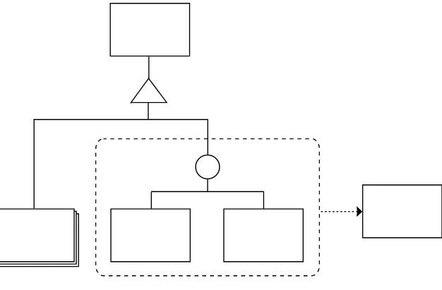
specializing in one or two specific aspects of the front-end experience. Many
designers still wrote HTML, while site diagrams and wireframes were often the realm of the information architect. Tools like Jesse James Garrett’s visual vocabulary gave us an abstracted way of communicating site structure and basic interaction simultaneously (Figure 1.2).1 As interactions expanded from client-server interactions to smaller and more subtle interactions on the client side, specialists used increasingly detailed wireframes to demonstrate them. Wireframes began to look more and more like working web pages, only without color and imagery. Sometimes they were connected to one another to create prototypes with working links for clients to click through.
Before we knew it, something had happened: it became inefficient, though
not impossible, to remain a generalist web designer. “Web design” had given
1 http://jjg.net/ia/visvocab/
Figure 1.2
birth to the specialist fields of information architecture, interaction design,
visual design, and front-end development, happily followed years later by
such fields as the desperately needed content strategy and the often ambigu-ous user-experience design. Wireframes, at this point one of the important deliverables of interaction designers, had become detailed enough that the role of the graphic/visual designer had changed slightly. In many web design
and development firms, even at the time of this writing, visual design follows interaction design as part of the traditional waterfall process. This often means that designers are handed intricate wireframes that have been seen and approved by the client (Figure 1.3). As the client has seen and signed off on something that is quite detailed even in terms of page layout, it’s often
difficult or impossible for the visual designer to deviate from the basic design
of the wireframes, effectively reducing the work of the visual designer to a color-by-numbers exercise. Visual designers are often required to base their work on these wireframes, changing typography and positioning things to an invisible grid, adding color and imagery, basically pouring decoration sauce onto the wireframe dish.
In this scenario, the real design work is done by interaction designers. They’re the ones solving problems, while the visual designers are left to color within the lines. This hardly seems fair, as designers who don’t solve problems are merely decorators. And decoration is not design.
In the waterfall
model of website development, each step is done in isolation and the results of each step form the input for each subsequent step, similar to the way an assembly line works.
Figure 1.3
We’re all interaction designers
Archibald’s distinction between get stuff sites and do stuff sites isn’t always clear-cut; sometimes even get stuff sites involve quite a bit of doing stuff.Searching or filtering information, logging in or requesting documents, filling
out forms, even clicking through sections of the site are interactions that users do without thinking.
I’m of the opinion that the interaction designer and the visual designer should be the same person. In fact, I would assert that if you work on the design or development of the front-end web at all, you are in some way an interaction designer. There are aspects of what you do that can affect the experience (and thus the interaction) users have with your site or application. A devel-oper who’s concerned with optimizing performance is actively trying to improve user experience and interaction. A designer’s purposeful use of color, space, size, and composition on a form is an attempt to make that interaction quick and easy for the user. The content strategist concerning herself with the importance of one type of content as opposed to another is thinking about improving the experience for the user.
This is not to say that “pure” interaction designers don’t have their place. What I am saying is that graphic designers have been solving interaction, readability, usability, and aesthetic problems for centuries. There’s no need to reduce them to decorators on the web. At the very least, interaction design, visual design,
and content strategy (and perhaps other fields) should overlap much more
than they often do today. This can be achieved by transforming each step in the design and development process from one that involves disciplines working in isolation to one that encourages collaboration during each step.
Jump from the waterfall
I propose leaving the waterfall method of web design workflow behind in
I support an evolutionary, iterative design process in which features and ele -ments are added on an as-needed basis. This process is based on the principle of progressive enhancement: starting with nothing more than universally accessible structured content and working from that point forward to the desired complexity. This process starts small and grows. It’s messy. No finish
-ing wireframes first and hand-ing them over to the designer. The wireframe is
simple. The wireframe becomes the design. It evolves into it—in the browser.
The web affords us a wonderful opportunity: to be able to design and test a design in the actual medium for which we’re designing. It’s time to stop designing pictures of websites and start designing all aspects of the user experience simultaneously and in a practical way.
This book presents my attempt at creating such a process.
The straw that broke…
The thought process behind this book started about four years ago when I was working on a client project, creating my design in “Photoshop tem-plates” as we called them: Photoshop documents representing web pages and the elements they contain. We needed depictions of quite a few pages to visualize the necessary elements. This was the normal way of doing things. However, in this case the company doing the front-end development required that every single element be exactly depicted in the Photoshop documents. If links were to be blue, this needed to be consistent across all of the Photoshop documents. We couldn’t simply note the fact that links were such-and-such blue. The Photoshop documents were the documentation. Again, this was pretty much the norm at the time, but it didn’t make me any happier when the client came back with feedback that some metadata needed to be placed between each paragraph and heading sizes needed to be changed. What followed was about two days of opening Photoshop documents, increasing their vertical size to accommodate the necessary changes, making
changes that involved moving each bit by hand, and finally doing this across
What in the name of all that is holy would have happened if that project was a “responsive” design project? After doing the same types of edits in
about 100 different Photoshop documents (hypothetically 20 pages at five
screen sizes), I would be curled in a fetal position in a corner of some dark place, that’s what.
When I realized that two days of work could have been done with two lines of CSS, I decided at that moment that I would never make Photoshop
“tem-plates” again and I set out to create a new workflow that would save time and
my sanity.
When I became an independent consultant in 2010, I had the opportunity to
experiment with this workflow; clients had to accept my way of working as
simply “how I work.” I found that it worked well, not only for me but also for my clients. It wasn’t without its problems (and still isn’t). But compared to the waterfall method, it’s quicker, easier, and more fun, and clients tend to like
seeing the evolution of the design from structured content to finished design.
They also seem to appreciate how much work goes into creating a web design. I don’t have to tell them this; they infer it from the process.
The elephant in the room
One of the most important reasons to consider a new workflow is responsive
web design. In its most stripped-down form, responsive web design makes a single, static representation of a screen or page absolutely meaningless. An image created in an image editor is not a depiction of a page in any browser, let alone in a variety of browsers within the context of an even larger variety of viewports on a variety of platforms (Figure 1.4). As far as I’m concerned, responsive web design has rendered these static representations obsolete.
Image editors remain a valuable tool—for image editing (surprise!), creating image assets, and creating exploratory images in the vein of mood boards or variations of them such as Samantha Warren’s Style Tiles.2 Photoshop and other image editors have become visual playgrounds for some. But as far as I’m concerned, the use of image editors for the creation of static mockups
is officially old school, and I would encourage designers to put some of that
creative energy to use exploring the medium for which they design.
This is not gospel
This is my process as it is today. It’s messy in places. It’s not a complete, A to Z procedure for designing and developing websites. It’s visual design as I think it should be, with heavy overlap with content strategy, interaction design, usability, and reality.
The design workflow presented in this book has been used in real-life proj -ects. It cannot be dismissed with a hand wave and a comment like, “That might work for freelancers, but not for our huge, real web projects.” Indeed,
this workflow has been used for large projects as well as small.
The ideas in this book are eclectic. Some are old, some are new, many are
mash-ups of different ideas. You may find that your way of thinking aligns with some ideas better than others. The workflow set forth in this book is not
right or wrong; it just might challenge some deep-seated thoughts and habits.
Figure 1.4
This is a challenge
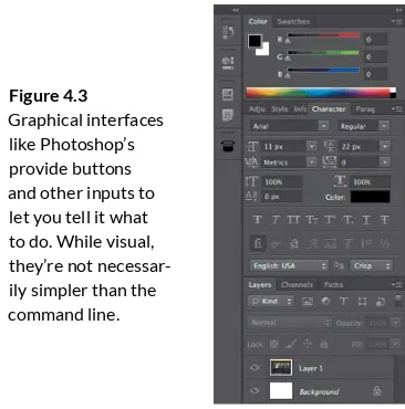
This book will push you to think differently about how you design and what tools you use to do so. It will challenge you to learn some HTML and CSS if you don’t know them already, as well as some commands in the dreaded com-mand line interface. It will encourage you to look outside your own discipline for tools and thinking; you’ll learn how some tools used by developers can free you up for more creative thinking instead of pixel-pushing, how to work
more quickly and efficiently. You’ll learn to actually enjoy it when clients make changes to your design. Well, to a degree.
This book documents almost two years of experimentation, observation, reading, thinking, and doing. This process works for me, but that doesn’t
mean it will work for you as it’s described here. I invite you to find what
works for you, your clients, and your team. My hope is that at least some of the thoughts in these pages will change the way you design for the web and the way you think about it.
“I know many, many people
who would rather stab themselves
in the eye with a pencil than be
responsible for a large-scale
content inventory. Me, I’m weird.
I love ’em.”
The first step in the responsive design workflow is to create a content inven
-tory. Even if you’re familiar with content inventories, allow me to explain how I approach the idea of structured content. You’ll probably find that the content inventory I propose differs from what you’re accustomed to.
It’s often said that content is king. I tend to disagree. Designer Paul Rand described design as the “method of putting form and content together.” Rand’s statement confirms my opinion as a designer that content and form can either strengthen or damage one another. That said, structured content can stand on its own. Form (composition, color, imagery, and typography)—and the design that comes from combining it with content—can make information more accessible, understandable, and readable; it can make user interfaces feel easy to use.
Thus, I feel that design—as content and form combined—is king. Structured content is a very high-level official. This structure need not (and should not) be represented in a solely visual manner, but rather via metadata available in the medium in which it’s presented: markup languages such as HTML or structural elements of a word processor, for example.
Structured content is semantic; it’s about what the individual pieces of content are. This is a heading. This is a paragraph. This is a table cell that corresponds to a certain table heading. HTML, while not perfect, is now the primary way we structure our content on the web. We attempt to use the markup language semantically in order to describe what each element is. Where no element is available, we rely on HTML attributes such as class, de facto stan
-dards and conventions such as Microformats, or other metadata stan-dards such as RDFa and Microdata.
Microstructure vs.
modular structure
The login form in Figure 2.1 is a structural element built from the smaller structural elements grouped within it. Some would call larger grouping ele
-ments modules or components. This form component consists of some basic HTML elements:
A heading
A label and input field for a username A label and input field for a password
A checkbox for remembering the user’s login data A button
A link for registering and for retrieving a forgotten password
See what we’ve done here? The above list is a very simple content inventory. We’ll come back to this later, but remember this example for when we do.
On a web page or on a screen within a web application, components are often built from smaller components or elements. For the purposes of this book, we’re concerned with the components of a page, rather than the micro
-structure of HTML building blocks that these components are made of. For example, we’re more interested in the “main navigation” component than the
<li> or other elements it’s constructed from. We’re more interested in the login form block than the input fields and buttons. We’re primarily interested in components where elements are combined to work together as a whole (for example, the form elements combine to create a login form).
Figure 2.1
The lazy person’s
content inventory
Jeff Veen has called content inventories “A Mind-Numbingly Detailed Odyssey Through Your Web Site.”1 Content inventories often list existing
con-tent. They’re also usually exhaustive. We don’t want that—it’s way too much work. The first step in our responsive design workflow is to inventory only the things that need to be on the page, whether or not they exist yet. And by “inven
-tory,” I mean make a simple list. This version of the content inventory is not meant to replace traditional content inventories. We’re simply borrowing the idea of a content inventory and using it as a starting point for design.
Remember the content inventory of the login form? This type of content inventory is the first step in the responsive design workflow: a simple list of the larger, meaningful components that need to be on the page. Think about the first page you’d normally want to visualize in an image editor like Photoshop. Think about the major content components you’d need on the page. That’s the starting point for your list. Since there’s a good chance you’re not the person who’ll decide which content goes where, it’s a good idea to talk to that person before designing. Even though you’ll just be creating design comps, you can only produce an appropriate design if you consider real content. Some of the necessary content may be listed on a traditional content inventory somewhere. If so, great! Try to use some of that actual content later in the design process.
Our universal example:
This book’s website
Throughout this book, we’ll use a relatively simple example project to explain and illustrate each step in the responsive design workflow. The book’s web
-site (www.responsivedesignworkflow.com) contains everything you’ll need for each step, and it’s simple enough that the basic concepts won’t be clouded by the size of the project. But don’t let the simplicity fool you: I’ve used this
1 Jeffrey Veen, “Doing a Content Inventory (Or, A Mind-Numbingly Detailed Odyssey Through Your Web Site)”. Adaptive Path. http://www.adaptivepath.com/ideas/doing-content-inventory. NOTE
same workflow successfully on large projects for large organizations. Once you’ve gone through all the steps, you’ll start to see ways to implement the ideas on your own projects, both big and small. I encourage you to either walk through the creation of the book website, or if you prefer, to apply each step to a project of your own.
Every project starts with goals, with reasons to be. The book’s website pro
-vides a specific and central place to promote the book, while offering various ways to purchase it. It also serves as a repository for errata and other news regarding availability, translations, and other useful information.
Progressive enhancement as
design principle: The zero interface
Before we continue, I want to explain one of my governing design principles: the zero interface. I introduced this principle during a college lecture I gave several years ago and it became so integral to my thinking that I named my consultancy after it.
The zero interface is precisely what it implies: no interface at all. There’s noth
-ing between the user and the information that user wants, or the result the user is trying to achieve. The zero interface lets the user order something
ON THE SAME PAGE ABOuT PAGES
from Amazon.com simply by thinking about ordering it. Think, done. I’d like that new book by David Sedaris. Think, done. I’d like everything I need to know about renewing my passport. Think, done.
Of course, this kind of user interface doesn’t exist—yet. But that’s not the point. When we design as if it does exist, it can help us make better choices.
The key thing to remember is this: anything you add to the zero interface is perhaps one step too many. It might exclude certain users or break your appli
-cation on certain platforms. It might convolute the message or confuse your users. It might distract users from what they’re trying to do.
If you use the zero interface as a design principle, you’ll find yourself asking the same questions every time you’re tempted to add an element to your site or app, whether it’s a drop shadow, an entire section, or new functionality: Who needs this? Why do they need it? Are there more effective alternatives? Does it help reach the goals for this site? Since the ideal of “think, done” is not currently possible, what step or component is absolutely necessary for the user to accomplish her primary task?
For example, web designers often start by developing an idea for a general page layout. Navigation is one of the first things they draw in. But it’s impor
-tant to think critically: how do you know you need navigation? This is a shady example, since you’ll most often need navigation. Base the choice on need rather than common practice. Take a footer, for instance. Do you really need one for your specific site? Get into the habit of thinking critically and chal
-lenging perceptions, even if—especially if—you’re considering an often-used design pattern.
The reality is that as designers and front-end developers we don’t often have the luxury of making these decisions on our own. Many of us are expected to just shut up and do the work we’ve been asked to do. This is unfortunate, but it’s a fact of life we have to deal with. That doesn’t mean you have to execute your work as a mindless drone. Anyone involved in the broader design pro
Creating the example
content inventory
Remember that, for our purposes, a content inventory is just a list. It’s a good idea to number each item on the list, so it’ll be easier to refer to specific items later. Again, we’re looking for essential functionality and content; we’re think
-ing about content components as opposed to microstructure (HTML elements) or layout areas (header, footer, illustrious “main content,” and “sidebar”).
So what about the book website? In this case, it’ll only be one page. This might change in the future, and if it does, then that will justify design changes as well. Regardless, the process of creating a content inventory remains the same.
Here’s a preliminary list:
1. Title
2. Book synopsis/description
3. Purchase options and available formats 4. Errata
5. Publisher information
The goal is not to create an exhaustive inventory of the site’s content, but simply to enumerate the content of the page you’re going to visualize. You’ll want to do this for each page you mock up. This example is the entire site, so that’s killing two birds with one stone—you get the idea.
Since the inventory is just a list, you can make it in whatever format you pre
-fer: a plain-text file, a spreadsheet, a mind map, or whatever fits your way of working. Then add a little more information about each item, similar to what you might find in a traditional content inventory. Note that in the following example, the descriptions are relevant to this particular website (and thus don’t apply to every book website):
1. Title
2. Book synopsis/description
This should include an image of the book and perhaps an image of a spread.
3. Purchase options and available formats
You’ll need to get more information from the publisher about this. For now, you can steal the basic format from other book sites by the same publisher. This will give you something to discuss and refine. (See “Instigating Discussion.”)
4. Errata
Obviously, this will be empty since this book contains no mistakes whatsoever. Well, one can hope, right?
5. Publisher information
This could include contact information, but will it be enough to remain a separate element in this inventory? That’s another one to discuss with the publisher.
Let’s imagine that you discussed our little content inventory with the project editor and he gave you some feedback. First of all, he said it’s quite common to include author information, such as a short bio and a photo. He also agreed with the single-page idea and that the purchase/format options would be the same as the publisher’s other books, except for the price—which you can safely leave as a variable for now. However, he mentioned that since the book will contain code examples and various software is discussed, links to soft
-ware and any necessary code should be included in the page. Also, it turns out that no extra section is needed for publisher information, since that will be part of the book description section.
This is valuable information, so you’ll need to add it to the content inventory:
1. Title
The title of the book won’t be a logo, but the book’s cover uses a specific font; the typographical treatment of the title should be consistent with that of the book.
2. Book synopsis/description
2
2 Karen McGrane wrote an excellent little post in defense of Lorem Ipsum in certain situations: http://karenmcgrane.com/2010/01/10/in-defense-of-lorem-ipsum/
INSTIGATING DISCuSSION
Sometimes, you’ll have only a vague idea of what components will be needed for a mockup. This could be because you don’t have enough information from the client, or because a very annoying project schedule has you designing before the content is finalized. Or it could be that the content is known, but you have some questions about it, like which bits are the most important. You could just throw some Lorem Ipsum in there (and Lorem Ipsum does have its place), but that would increase the chances that the mockup would differ significantly from the end result.2 You have to know enough about the content to design with it.
When you don’t know enough about the content of a page, you might try making it up or stealing bits from another source. I’m not suggesting you steal actual content from other sites; I mean using the same basic structure that other sites use. For example, for the book site, I’ve suggested in my notes that I don’t know exactly what elements should be available in the purchase options and available formats section. By looking at similar websites, you can get an idea of possible elements and structure for this section. By adapting this reference content to the inventory, you accomplish two things:
1. You make it clear that you don’t yet have enough information. 2. You create a discussion piece.
If the client (in this example, the publisher) sees the content inventory, she’ll have the opportunity to provide you with the information you need. If that content or information is unavailable, then you might have enough to talk about and encourage the client to make a decision about the content in question.
3. Purchase options and available formats
The book will be available in at least one e-book format and as a printed paperback. Buttons or links will bring the user to the book page on a website (either the publisher’s website or a website like Amazon.com) where the book can be purchased. A sample chapter will be available for download.
4. Resources
This will include categorized—and when necessary, annotated—links to resources named in the book. Links can be to anything from articles to books. Any necessary code will also be available for download; demos will be linked to.
5. Errata
Errata will be published for each reprint or new edition of the book sorted with the newest edition first.
This is detailed enough for right now. While it’s important to design based on real content, it’s important to remember that you’ll be creating a mockup, not a website, so the smallest details can come later. There’s no exact formula for determining what must be included at this stage. Generally, if you find your
-self stuck because there are unanswered questions about content, then you need to get answers to those questions. But if you’re obsessing about details that have little or no influence on your overall design, then you could prob
-ably prune your content inventory a bit, or put the details in the notes.
In the next chapter, we’ll start creating responsive wireframes with the help of this content inventory.
Try it out
creating a content inventory even if it’s not expected of you. It’s good prac
-tice and will help you spot potential holes in the content, which you can then take to your team. Ideally, content strategists, interaction designers, visual designers, and even front-end developers should all be involved in the pro
-cess of creating this content inventory. If there’s one recurring theme in this book, it’s that we need to stop working in isolation. Websites should not be built as automobiles on an assembly line. We need to accept that our disciplines overlap, and that we should embrace this overlap and work together. Whatever you can do to move your team in that direction will be all to the good.
At the basic level, content inventories are relatively easy to make. The first iteration should be done quickly, similar to a list of ideas in a brainstorming session. With each person thinking critically from his or her own expertise, the first iteration will probably be better than you think. In an ideal world, we’d have content strategists on every design or redesign project, doing the footwork on these inventories and persistently asking questions of clients in order to get the information we need.
Create an inventory only for pages that will be visualized in the form of a mockup. In other words, if you’d normally create a Photoshop comp of it, it’s a candidate for a content inventory.
You can try it out now if you like. If you’re a visual designer, think about any page you might be designing and create a simple content inventory following the process outlined in this chapter.
If you’re a developer and have received a Photoshop comp for a recent project, look at it critically and see if it all makes sense. See if you can reverse engineer a content inventory from what you see. If you’re a designer, see if you can do the same with a wireframe you’ve been given. Try to identify the major content components of the page and analyze where the design or wireframe handles these well and where it doesn’t.
If you’re an interaction designer, you create the content inventory, adding interaction notes to each component, describing possible interactions and any other considerations for the designers and developers.
And leave your intricate wireframes at home, because old-school wireframes are back. And this time, they’re pissed.
“A journey of a
thousand li
starts beneath
one’s feet.”
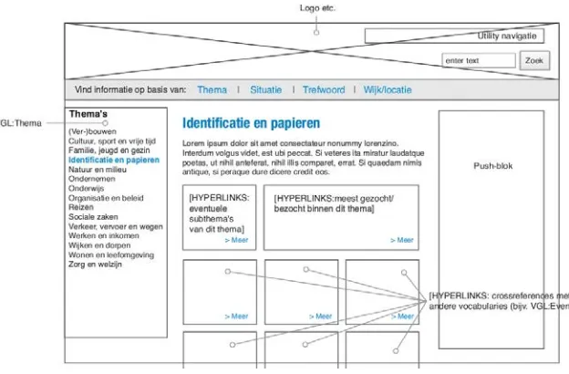
In the early days of web design, wireframes—sometimes called schematics— were simple drawings with boxes indicating where page components would go on the page. They were the precursors to mockups, a way to quickly try out content placement to get a feel for the general skeleton of the page. Nowadays, wireframes are often exceedingly detailed. They often contain
actual content. Some actually look like almost-finished websites, devoid only of color, imagery, and typography. The layout is done. Decisions have been
made about the content and the placement of this content.
At the risk of sounding like a grumpy old man saying, “Back in my day…,” I find the current strain of intricate wireframes a very odd and limiting deliverable
(Figure 3.1). The people who create them (often interaction designers) have done a lot of visual design thinking. Visual designers often receive these wireframes with a disclaimer that they’re not intended to represent final designs. Yet this is exactly how some clients perceive them. I once had a client question whether I had sufficiently familiarized myself with the project materials because my visual design was so different from the wireframes made several months earlier. In the
end, I was asked to use the wireframes as a basis for the layout. This sort of thing happens often enough that it’s frustrating. Disclaimers of the “this is not the
final design” variety are thus either untrue, or they render the entire deliverable useless. It doesn’t represent the final design, but it might if the client really likes it.
If the wireframe does represent the design, then it’s a design, not a wireframe. If it doesn’t, then why so much detail?
The problem with intricate wireframes, disclaimer or not, occurs when clients see them. If your wireframes are for team use only, disclaim them all you want.
But as in the experience I noted above, when you show wireframes to a client,
Figure 3.1
you’re presenting a visualization; it’s logical that the client might have expecta
-tions based on what they see. On the other hand, I’ve been involved on the flip side of the wireframe problem: more than once I’ve had clients and interaction designers actually negatively review my design proposals because they looked too much like the wireframes. How’s that for a rock and a hard place? What if the interaction designer already came up with the best solution for something?
So for some projects, designers are damned if they follow the wireframes too
closely and damned if they don’t. And that’s damned frustrating.
Stop making this stuff
so complicated
Detailed wireframes were presumably brought to life as a result of clients making fundamental changes when the design was already in the mockup
stage. This is logical; changing a mockup can be an unholy amount of work. In fact, that’s one of the primary reasons I changed my workflow and wrote
this book. But creating a colorless, imageless “pre-mockup” in a different application is not the answer. The answer, as designer Mark Boulton says,
is to stop going for the big reveal. Take your clients by the hand from the very beginning, and allow them to walk through your entire workflow with you. You won’t need intricate wireframes. You just need to go back to using them
the way they used to be: old-school wireframes.
I like to call those old-school wireframes content reference wireframes
(Figure 3.2). I prefer that name because it describes how the wireframes deal
Figure 3.2
with content: they simply refer to it as opposed to depicting it. Every step in the responsive workflow is based on a simple idea; where step one involves making a simple list of content to be used, this step involves making simple
wireframes that are nothing more than box drawings containing references
to specific pieces of content.
What I propose in this book is that we stop heaping responsibility on the
shoulders of wireframes. Let’s use them to start visualizing content place
-ment and relative importance in differing screen environ-ments. Let’s leave definitive layout and interaction design choices for later when we have a proper stage for them. In the workflow set forth in this book, low-fi wire
-frames will eventually evolve into hi-fi prototypes that can be studied, tested, revised, and client-approved.
NOW WAIT juST A
COTTON-PICKING MINuTE
Baby steps: Creating low-fi
web-based wireframes
The first thing I’ll ask you to do is to forget your pet application for creating
wireframes, unless it’s a text editor. We’ll be using a text editor, HTML, CSS,
and a browser to create our low-fi wireframes. Don’t worry—it’s easy.
For the book site, the content reference wireframe will be easy to make, not
only because we’re making just one instead of many, but also because we’ll
start with structured content first.1
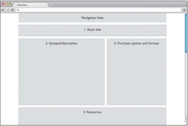
At this point, we’re just sketching an impression of the layout in the browser,
so the linear layout is a great place to start.
Setting up your base markup
To start, you’ll need a basic HTML document. I’m assuming you have some HTML knowledge and can divert from my examples and use your own boil
-erplates as you wish. If you don’t have HTML experience, you might want to
copy (or preferably, type) the code in my examples exactly.
Open your text editor and create a basic, boilerplate HTML document similar to this one:
<!DOCTYPE html> <html lang="en"> <head>
<meta charset="utf-8">
<title>Responsive Design Workflow</title>
</head> <body>
</body> </html>
1 The idea of starting with structured content is similar to methodologies like Luke Wroblewski’s
Next, look at your content inventory and prioritize the content. Consider a browsing environment where you’d be limited to viewing content in a linear fash
-ion (and those environments are common enough). Which content is important
enough to be at the top? What’s not as important and should be underneath?
Another way of thinking about it is this: imagine that your job is to turn the content into a printed document, such as a book. Your content inventory sug
-gests sections. Many of these sections will have a heading, and some of the sections might have subsections with headings of their own. How would you structure the content? What would come first? What would come last?
Let’s take a look at the book site content inventory again:
1. Title
2. Book synopsis/description
3. Purchase options and available formats 4. Resources
5. Errata
This one is pretty simple. It seems logical and in the correct order in terms of priority. Let’s go ahead with it.
Remember to work together. Linear content order is something that should
be discussed among visual and graphic designers, content strategists, interac
-tion designers, and clients, all of whom have valuable input or considera-tions
to add to the discussion.
The next step is to create container elements in the HTML document that will
represent the content from our inventory in the order we’ve determined. In
the case of the book site, we’ll place these elements in the body element:
The id attributes are optional, but as your wireframe evolves into a more
detailed prototype, it makes reading your own code easier. Id attributes identify elements in your code, so this use—while optional—is totally appropriate.
With applications such as OmniGraffle and Photoshop, you’d have no HTML
elements at all, so while some bit of HTML semantics is arguably better than none, your wireframe code becomes more important if you’ll be using it as a basis for production later on. In that case, stick with your normal coding
conventions (as long as they’re good).
If you save your HTML document and open it in a web browser, you won’t see anything, since we haven’t added any textual content. Let’s add some
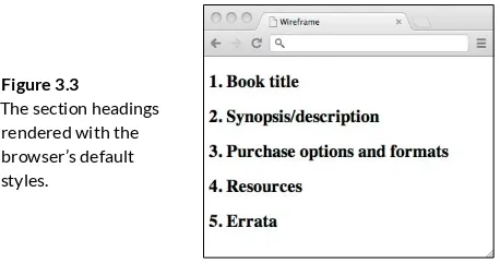
headings to the sections and number them, which will allow us to look at the page and see how the sections in the wireframe correspond to the
content inventory:
p<h1>3. Purchase options and formats</h1></section>
Now when you view the document you’ll see the content inventory displayed
as HTML headings (Figure 3.3).
Next, we need to add some wireframe styles. To keep things clean, we’ll add
a special class attribute to the body element, which we’ll remove later when
the wireframe becomes a prototype:
<body class="wireframe">
This will ensure that the CSS rules you write for the wireframe won’t be
carried over into the prototype.
Setting up your base styles
Create a style sheet for styles that will almost always be used, regardless of
viewport size. Call the document base.css and place it either in a folder with
your HTML document or in a subfolder called “styles,” “css,” or whatever you prefer. If you’re a developer, it’s fine to stick with your own naming conven -tions, but be aware that the examples here assume there’s a directory called
“styles” in the same folder as your HTML file.
Now open base.css in your text editor and give the body element a back-ground color:
body {
background-color: white; font-family: sans-serif; }
NOTE
If you prefer to use a CSS reset or normal-ize and are aware of the pros and cons, go right ahead.
Figure 3.3
Next, add some style to the wireframe sections. These styles are purely for the purposes of your wireframes, so they mostly deal with how blocks are
presented. You might choose a border, a background, or a combination of the
two. Keep it simple! Here’s an example (also see Figure 3.4), but feel free to create your own styles:
.wireframe section {
background-color: whitesmoke; border: 1px solid gainsboro; }
I’m using CSS color names here, but of course you can use any colors you please. These styles will be applied to sections only when the body element has the class wireframe, which is used only during the wireframe stage. This is the reason we set the font family: to make sure the wireframe styles don’t
conflict with any styles we’ll add when the wireframe evolves into a
full-blown design prototype.
To see how this looks in the browser, link to the style sheet from your HTML file:
<head>
<meta charset="utf-8">
Now open the file in your browser. We’re getting there, but there’s a bit of tweaking to do. The headings are pretty large, dark, and flush left. I think
centering the text in this case might make it slightly easier to read at a glance. Let’s change that a bit:
.wireframe section {
background-color: whitesmoke; border: 1px solid gainsboro; font: small sans-serif; text-align: center; color: silver;
}
.wireframe h1 { font-weight: 100; }
The reason I’m using small for the font size instead of a specific unit (such as
px or em) is that in cases like this where I simply want text to appear smaller, keywords like small are quick to use without even thinking about it. The key to making wireframes this way is to work as quickly as possible; detail is not
yet important.
Next, let’s add margins, and remove the default padding and margins on the
body element:
.wireframe { margin: 0; padding: 0; }
.wireframe section { margin: 1em;
.wireframe h1 { font-weight: 100; }
This is looking reasonable (Figure 3.5). Depending on your own code, you may
need to add or remove certain styles, such as adding some padding to the sections if you’ve chosen not to use borders.
This entire process of setting up wireframe base documents should take no
more than a couple of minutes. After you’ve done it once, you can use the same setup for each project, which you’ll then have up and running almost instantly.
Note that while I’ve walked through this step by step, it’s very basic CSS and quite easy to do, even for beginners. You now have a linear, flexible-width wireframe that you can open and demonstrate in web browsers, even on mobile devices.
Adjusting the wireframe to be “mobile first”
If you can, either put your files on a web server and open the HTML page on a smartphone browser or use a mobile emulator. Whenever possible, try to test files on actual devices (yes, even wireframes). If you’re unable to do one of the above, you can simply make your browser window smaller, but this is apoor substitute.
What you’ll see is your wireframe in its current state: a listing of your content
Focusing on how the wireframe looks in a linear fashion, as it will on many phones, try to estimate roughly how long you’ll expect each section to be. It doesn’t matter at this point if your estimate is correct. We know only that the defaults are not correct. So we estimate very roughly, and add some styles to the specific sections to reflect these estimates. We’ll target the specific sec -tions using their IDs, and continue namespacing with the wireframe class to
avoid conflicts.
.wireframe #book-title { height: 5em; } .wireframe #synopsis { height: 30em; } .wireframe #purchase { height: 20em; } .wireframe #resources { height: 50em; } .wireframe #errata { height: 40em; }
An interactive way of adjusting these values is to use your browser’s devel
-oper tools to adjust the CSS in the browser until you feel the height is about right, and then transfer that value into your style sheet (Figure 3.6).
Again, look at what happens in the browser. The values might be way off, but
the feeling is somewhat more realistic, as the sections are not all the same
size. Sections take up more space than headings alone, and these heights may vary significantly. Note that this process keeps moving back to the content. You’re asking questions about the content and thinking about the content’s
effects on the page. If you’re designing a web application (as opposed to a
Figure 3.6
more informational web page such as our example), you’ll already be thinking
about things like the relative size of user interface (UI) elements and how much information you’ll need to pack onto the screen. You might get some insight into future design choices such as a scrollable screen area versus
multiple screens.
In fact, after the last changes you might have noticed the first problem our
current wireframe has brought to light: in this linear format, we’re forced to scroll down to get to any of the bottommost sections (such as buying the
book). We’ve forgotten to add navigation!
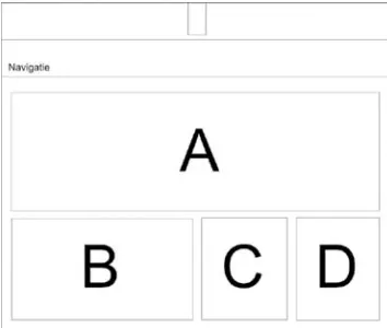
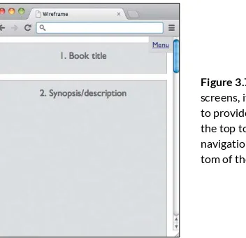
Adding navigation
Navigation on small screens can be tough, with a lot of variables to consider. If we simply add navigation at the top of the page under the title or logo, that navigation might take up too much vertical space, in effect showing no more than menu items until the user scrolls down. Some developers solve this problem by collapsing the menu items with JavaScript, which works only if JavaScript is supported. My preferred method is to put the navigation at the
bottom of the page and have a Menu link or button at the top of the page, which lets users jump down to the menu. This allows you to enhance the experience in environments where JavaScript is supported: the navigation is moved to the top and collapsed until the user clicks or taps the Menu link,
which will show the menu items in a drop-down menu.
Thinking about navigation at this stage seems contrary to “keeping things simple,” but it’s good practice. You’ll want to visualize how the navigation changes when the wireframe becomes responsive and is viewed at different
screen widths.
Navigation involves interaction, and this is an opportunity for interaction designers, visual designers, and front-end developers to get together and
think through the pros and cons of the different design options. This will also help later on if the client has questions about why certain choices were made. The moment when the completed wireframes are shown to the client is a
wonderful time to start explaining (and demonstrating!) these considerations, that is, early in the design process.
First, we’ll add a section for navigation after the content sections:
<nav>
<h1 id="nav">Navigation links</h1> </nav>
Then add a link to enable jumping to that navigation. We’ll put it above the sections, just within the “page” div:
<div id="page">
<a href="#nav" class="menu">Menu</a>
... </div>
We’ll give the navigation the same styles as content sections:
.wireframe section, .wireframe nav, .wireframe .menu {
background-color: whitesmoke; border: 1px solid gainsboro; font: small sans-serif; text-align: center; color: gray;
margin: 1em; }
Also, we’ll add a rule to move the menu link to the top right of the page.
.wireframe .menu { position: absolute; top: 0;
right: 0;
background-color: gainsboro; padding: 0.5em;