Stock Charts For Dummies®
Published by: John Wiley & Sons, Inc., 111 River Street, Hoboken, NJ 07030-5774,
www.wiley.com
Copyright © 2018 by John Wiley & Sons, Inc., Hoboken, New Jersey Published simultaneously in Canada
No part of this publication may be reproduced, stored in a retrieval system or transmitted in any form or by any means, electronic, mechanical, photocopying, recording, scanning or otherwise, except as permitted under Sections 107 or 108 of the 1976 United States Copyright Act, without the prior written permission of the Publisher. Requests to the Publisher for permission should be addressed to the Permissions Department, John Wiley & Sons, Inc., 111 River Street, Hoboken, NJ 07030, (201) 748-6011, fax (201) 748-6008, or online at
http://www.wiley.com/go/permissions.
Trademarks: Wiley, For Dummies, the Dummies Man logo, Dummies.com, Making Everything Easier, and related trade dress are trademarks or registered trademarks of John Wiley & Sons, Inc., and may not be used without written permission. All other trademarks are the property of their respective owners. John Wiley & Sons, Inc., is not associated with any product or vendor mentioned in this book.
LIMIT OF LIABILITY/DISCLAIMER OF WARRANTY: WHILE THE PUBLISHER AND
AUTHOR HAVE USED THEIR BEST EFFORTS IN PREPARING THIS BOOK, THEY MAKE NO REPRESENTATIONS OR WARRANTIES WITH RESPECT TO THE ACCURACY OR COMPLETENESS OF THE CONTENTS OF THIS BOOK AND SPECIFICALLY DISCLAIM ANY IMPLIED WARRANTIES OF MERCHANTABILITY OR FITNESS FOR A
PARTICULAR PURPOSE. NO WARRANTY MAY BE CREATED OR EXTENDED BY SALES REPRESENTATIVES OR WRITTEN SALES MATERIALS. THE ADVICE AND STRATEGIES CONTAINED HEREIN MAY NOT BE SUITABLE FOR YOUR SITUATION. YOU SHOULD CONSULT WITH A PROFESSIONAL WHERE APPROPRIATE. NEITHER THE PUBLISHER NOR THE AUTHOR SHALL BE LIABLE FOR DAMAGES ARISING HEREFROM.
For general information on our other products and services, please contact our Customer Care Department within the U.S. at 877-762-2974, outside the U.S. at 3993, or fax 317-572-4002. For technical support, please visit
https://hub.wiley.com/community/support/dummies.
Wiley publishes in a variety of print and electronic formats and by print-on-demand. Some material included with standard print versions of this book may not be included in e-books or in print-on-demand. If this book refers to media such as a CD or DVD that is not included in the version you purchased, you may download this material at http://booksupport.wiley.com.
For more information about Wiley products, visit www.wiley.com.
Library of Congress Control Number: 2017962794
Stock Charts For Dummies®
To view this book's Cheat Sheet, simply go to
www.dummies.com
and search for “Stock Charts For Dummies Cheat Sheet” in the
Search box.
Part 1: Getting Started with Stock Charts
Chapter 1: Brushing Up on Stock Charting Basics Minimizing the Emotional Roller Coaster of Investing
Viewing Stocks from Varying Perspectives
Discovering All the Tools You Can Use with Your Charts Getting Organized with Your Charts
Customizing Your Charts Putting Everything Together
Chapter 2: Using Charts to Minimize Your Emotional Roller Coaster Getting Ready for the Emotions of Owning a Stock
Building a Chart to Track and Control Emotions Checking Out Index Charts
Defining Trends
Part 2: Viewing the Money Trail through Different Lenses Chapter 3: Focusing on Chart Settings
Choosing Chart Attributes Setting Overlays
Selecting Indicators
Chapter 4: Burning the Candle at Both Ends with Candlestick Charts
Crafting Your Chart
Reading and Using Your Chart to Make Decisions
Chapter 5: Spotting Differences with Bar Charts Beginning with Bar Chart Basics
Building a Bar Chart from the Ground Up Putting a Bar Chart to Work
Chapter 6: Seeing What’s Trending with Line Charts What Is a Line Chart?
Making a Line Chart the Easy Way
Reading and Using Your Chart Line by Line
Chapter 7: Getting the Lay of the Land with Area Charts Comparing Area Charts to Line Charts
Making an Area Chart You Can Show Off Adding a Personal Touch with Styles Knowing When Area Charts Matter
Part 3: Using Chart Tools for Decision Making Chapter 8: Charting Different Time Periods
Converting Candlestick Charts to Different Periods Converting Bar Charts to Different Periods
Converting Line and Area Charts to Different Periods Taking It One Day at a Time with Daily Charts
Embracing Short-Term Thinking with 60-Minute Charts Seeing the Big Picture with Weekly Charts
Knowing When a Monthly Chart Can Come in Handy Picking the Right Chart for the Right Range
Shifting Your Focus to Closing Prices Chapter 9: Reading a Price Chart
Running with Bulls and Sleeping with Bears: Uptrends and Downtrends Bucking the Trend: When a Stock Isn’t Trending
Leveling Out: It’s All about the Base
Reaching the Top: Muffins, Spires, or Something Else? Scaling for Profit: It’s Only Money
Chapter 10: Harnessing the Power of Overlays Keeping Track of Moving Averages
Getting into the Groove with Channel Investing
Finding Your Sweet Spot between Horizontal Support and Resistance Chapter 11: Using Indicators to Facilitate Chart Analysis
Rolling with Momentum Indicators Using Volume with Price
Determining How Many Indicators to Use on One Chart
Chapter 12: Making Sense of Relative Strength Indicators Relative Strength Investing Basics: Seeking Better-Performing Stocks
Measuring a Stock’s Relative Strength to the S&P 500, a Sector, and an Industry Ranking Stocks with SCTR
Checking Out Performance Charts Using Relative Rotation Graphs (RRG)
Part 4: Getting Organized and Managing Stock Trends
Chapter 13: Organizing Charts into Industry or Sector Groups Recognizing the Importance of Sectors and Industry Groups
Creating and Populating ChartLists Organizing Your ChartLists
Chapter 14: Keeping Track of What’s Going On Making a Watch List
Creating and Using Your Three Main ChartLists Setting Alerts
Chapter 15: Conducting Breadth Analysis Investigating Bullish Percent Indexes
Studying the Percentage of Stocks above the 200 DMA Reviewing the Breadth of Different Exchanges
Chapter 16: A Quick Check of the Week’s Action Counting the Days
Responding to Weird Price Action Tracking Key Events
Spotting a Break of Support on Indexes
Part 5: Personalizing Your Stock Charts with Styles Chapter 17: Customizing Candlestick Charts
Picking Your Personal Candlestick Indicators Saving Your Personal Style
Trading Using a Candlestick Chart with Your Settings Sharing Your Customized Charts
Chapter 18: Fine-Tuning Your Bar Charts Adjusting Bar Chart Settings to Your Liking
Trading Using a Daily Bar Chart with Your Settings Trading Using a Weekly Bar Chart with Your Settings
Creating a Custom Weekly Line Chart Developing Your Own Monthly Line Chart Setting Up a Specialized Monthly Area Chart
Part 6: Putting Your Stock Charting Expertise to Work
Chapter 20: Using Your Charts to Inform Your Buy, Hold, and Sell Decisions
Separating the Strong from the Weak
Knowing When to Hold ’Em and When to Fold ’Em Selling Stocks Before They Head South
Chapter 21: Putting It All Together Gauging the Market’s Direction
Narrowing Your Focus to Certain Sectors Using Targeted Scans
Working with Price Displays, Overlays, and Indicators Taking Away Lessons from Your Wins and Losses Part 7: The Part of Tens
Chapter 22: Ten Common Investing Mistakes and How to Avoid Them
Trying to Fight the Market Instead of Following It Buying a Loser
Chasing a 25–35 Percent Off Sale in Great Companies Falling for a 75 Percent Off Sale
Forgetting That Commodity Stocks Are Very Volatile Buying a Story Instead of a Stock
Investing in a Sick Sector Selling a Winner Too Soon
Continuously Avoiding What’s Worked Not Buying Stocks in Falling Markets
Chapter 23: Ten Tips for Cashing In on Tomorrow’s Amazingly Great Stock
Being Prepared for Big Moves in a Short Time
Understanding That You Don’t Have to Be First to Buy Waiting on the Big-Name IPOs
Seeing Huge Gaps on Earnings Watching for Crisis in a Stock
Using Volatility to Warn the End Is Near
Using the U.S. Dollar as a Guide About the Authors
Advertisement Page Connect with Dummies
Introduction
So you’ve familiarized yourself with the world of investing and you’re ready to dive in, or
perhaps you’re already in the market but looking for more tools to improve your stock picking and portfolio management. Great! Charting gives you a way to visualize trends in the market. You can help improve your visualization with various tools that we show you how to use in this book, such as overlays and indicators. You also get to explore many different chart types, including
candlestick charts, bar charts, line charts, and area charts, as well as discover the pros and cons of each chart type.
Beyond the basics, we introduce you to various strategies you can use to organize and manage your charts to make your stock trading easier and more successful. Yes, you’ll still risk taking a loss when trading stocks, but with these tools we can help you minimize losses if one of your stocks takes an unexpected dive.
About This Book
First we introduce you to the basics of getting started in the world of stock charting. Then we take you on a tour of the most common charts that are used by traders. After you understand how to build these charts, we focus on chart settings and how the various options can impact your trading decision making. Finally we discuss how you can organize and manage your charts to trade more effectively and efficiently.
When you feel comfortable with stock charting, it’s time to develop your own style. We show you how to put all you’ve learned into building a trading style using charts to improve your stock trading decision making.
You don’t have to read this book from cover to cover (but we won’t mind if you do!); simply find the topic you’re interested in, read up on it, and put away the book until you need it again. And you can skip anything that’s marked with the Technical Stuff icon or included in a shaded box called a sidebar; such information is interesting but not crucial to understanding a given topic.
Within this book, you may note that some web addresses break across two lines of text. If you’re reading this book in print and want to visit one of these web pages, simply key in the web address exactly as it’s noted in the text, pretending as though the line break doesn’t exist. If you’re reading this as an e-book, you’ve got it easy — just click the web address to be taken directly to the web page.
Foolish Assumptions
need to read a basic book on investing in stocks before trying to move on to the more technical world of charting.
We also assume that you know how to operate a computer and use the Internet. If you don’t have high-speed access to the Internet now, be sure you have it before you try to trade stocks. Many of the resources we recommend in this book are available online, but you need high-speed access to be able to work with many of these valuable tools.
Icons Used in This Book
For Dummies books use little pictures, called icons, to flag certain chunks of text. Here’s what they actually mean:
Watch for these little flags to get ideas on how to improve your charting skills or where to find other useful resources.
We mark information that’s particularly important for you to remember with this icon.
If you read the charts wrong, mistakes can be made. A minor mistake can cost you a bunch of money, so we use this icon to point out particularly perilous areas.
We use this icon to point out information that’s interesting but not crucial to your understanding of the topic at hand.
Beyond the Book
In addition to the material in the print or e-book you’re reading right now, this product also comes with some access-anywhere goodies on the web. When you just want a quick reminder of charting basics, go to www.dummies.com and search for “Stock Charts For Dummies Cheat Sheet” in the
Search box. There you’ll find explanations on how to find key chart settings, various chart types you can use, key decision-making tools you can add to charts, and how to use charts for spotting trends.
Part 1
IN THIS PART …
Begin with the basics of building your stock charts.
Chapter 1
Brushing Up on Stock Charting Basics
IN THIS CHAPTER
Keeping your emotions in check as you invest Getting different views of charting
Making decisions with charting tools
Organizing and managing trends for your stocks Tweaking your personal stock charts
You can find hundreds of books talking about technical analysis and stock charting, but if you don’t build your stock charts properly to do that analysis, you could end up getting the wrong
information. In this book we introduce you to the various types of stock charts out there, as well as the tools you can use to make these charts work even better for you when you’re trying to make stock buying and selling decisions. This chapter gives you the basics.
Minimizing the Emotional Roller Coaster of
Investing
Before you even start working with charts, it’s important to understand how your emotions can help make good and bad stock purchase and sale decisions. In Chapter 2, we discuss the key
emotional drivers of stock trading decisions and what economic forces drive those decisions (such as changes within a company and the effect of institutional investors). We also explain how
building charts can help you track stock price changes and control emotions, and we provide some fundamentals on index charts and trends.
Getting a better understanding of your own emotional reactions to these key factors that can impact the movement of stocks can help you make better business decisions based on facts rather than emotions.
Viewing Stocks from Varying Perspectives
Click the green button on the home page that says, “Free 1-Month Trial,” and you’ll have one month to try out the members-only sections of www.StockCharts.com for free.
All chartists should know how to build these critical chart types:
Candlestick charts: These charts give you a detailed view of key stock information daily: open, high, low, and close.
Bar charts: These charts give you less detail than a candlestick chart does — only the opening price and the closing price — but they can be easier to read than candlestick charts.
Line charts: These charts show you the stock price trend with a simple line, which makes it easier to view a stock’s trend over a long period of time.
Area charts: These charts show you the same information as a line chart, but they can be more dramatic because the area below the line is a solid color. They are most commonly found on TV financial news.
Discovering All the Tools You Can Use with
Your Charts
As you become more familiar with the types of charts, you’ll find out that many variables can make the chart look different and offer you different information. Some of the key variables include
Time frames: In Chapter 8 we discuss the critical time periods you can set for various types of decision making and how each of these time frames impacts the information you see on the chart. Choosing the wrong time frame for the decision you’re trying to make could lead to a bad decision.
Using a price chart: With the proper tools, a price chart can help you determine the trends in the stock market. In Chapter 9, we show you how to spot uptrends and downtrends in a stock price, help you determine volatility and its impact on price, and give you suggestions about what to do if a stock isn’t trending. We also talk about the various types of bases you may find in a stock chart and how these bases can impact your decision making. You’ll also find
information about determining whether a stock price is likely to start falling.
Using indicators: Indicators are another type of tool you can add to a chart. There are many types of indicators; we introduce you to the best ones for beginners in Chapters 11 and 12. You find momentum indicators and how to use them, as well as various types of indicators to
determine the strength of a stock.
Getting Organized with Your Charts
After you’re familiar with the various types of charts and tools available, it’s time for you to start organizing how the charts can help you with your stock investing or trading decisions. Check out the following:
In Chapter 13, we introduce you to the power of organizing your choices by industry groups and/or sectors. This task enables you to improve your stock picking.
We show you how to keep track of what’s going on with your stocks in Chapter 14. This task lets you better manage your stock portfolio.
Chapter 15 focuses on various types of indexes you can use in your charts to help you compare your stocks to the broader market. This task enables you to better analyze how your portfolio is doing versus the broader market.
Chapter 16 gives you strategies for doing a weekly check of the stocks you’re holding or watching. This task helps you more efficiently track your portfolio.
Customizing Your Charts
After you have a good handle on what tools you like to use consistently for various types of
decisions you need to make, you’ll want to save these various chart styles to make it easier to use them again and again. In Part 5, we show you how to customize your charts and save the ones you like. You find out how to personalize your charts by seeing how various combinations of
indicators and overlays can help support your personal trading style.
Putting Everything Together
Ultimately, it’s time to take everything you’ve learned and put it all together to help you make better buying and selling decisions. We discuss some strategies in Part 6 that help you use your charts to gauge the market’s direction as well as identify leading sectors and the best stocks in those sectors. You can use these techniques to narrow your focus to the sectors in which you want to invest or trade. We also show you how to build your charts to more effectively use these tools in order to improve your investing or trading results.
tips for how to pull together everything discussed to make good use of stock charts in the future and help you better understand how to use the information discussed in books like
Trading For Dummies, 4th Edition, by Lita Epstein, MBA, and Grayson D. Roze and
Chapter 2
Using Charts to Minimize Your Emotional
Roller Coaster
IN THIS CHAPTER
Preparing to own stocks
Evaluating individual stocks and index charts Seeing trends
To minimize the risks of owning stocks, you need to develop strategies for reducing your
emotional reactions to the ups and downs of the market. Instead, think of your portfolio purely as a business at which you want to make money. Don’t fall in love with any part of your portfolio. With the help of the fundamentals in this chapter, you can use stock charts to take the emotions out of your decision making.
Getting Ready for the Emotions of Owning a
Stock
One of the hardest things to do is to watch your money invested in stocks drop in value on any given day for any reason. This emotional turmoil is one of the difficult parts of investing or trading in the stock market, especially for new entrants.
In the following sections, we describe two important actions you can take to prepare yourself for this turmoil: understanding a few basics of the stock market and arming yourself with information to level the playing field.
Understanding a few market basics
By controlling your own investments or even following along with a broker’s investment choices, you can have an understanding of the macro part of the economy. While you may not move out of harm’s way when the market is set up to fail immediately, you can at least
understand when to be more cautious. You may also recognize which sectors (different areas of the economy, such as finance or energy) of the economy are breaking down. This
recognition can help you avoid these potholes.
News noise
If you turn on any financial TV show, you find people reporting news about stocks in almost the same way they would a sporting event. As you become more accustomed to working with charts, you’ll find most of the news to be just noise, with maybe a few bits of information you can use as further research with your charting.
A great example of news noise is gross domestic product (GDP). Gross domestic product is how much economic activity is happening in the economy. You continually hear that an economy is growing fast or slow. However, the stock market doesn’t speed up or slow down based on this news. When the economy and the stock market are compared side by side, it is clear that one does not predict or follow the other. In the United States, the GDP has ranged from positive 5 percent growth (which is huge) in some quarters, to negative growth in other quarters. The stock market does not reflect this huge variance.
If a country’s GDP were soaring at 4 percent over two quarters, you would think the stock market would be too. If a country is sporting 4 percent GDP but the stock market has been going lower for the same six months, the GDP is not a timely clue for investors to use for investing. Over long periods of time, if the country’s economic output is improving, the stock market is probably improving.
Changes inside a company
Stocks are also hit by other forces that you as the owner of shares in an individual company may be unaware of. Changes in government policy toward the company, internal problems in the
company, or changes in sales of finished products for the company can have a positive or negative effect on the stock, long before any announcement.
For example, suppliers have insider knowledge about how things are going at the companies they supply. They can quickly determine whether a company is increasing or decreasing its order size. They may notice the first signs of a company in trouble, because the bills are being paid more slowly or the company is cutting down on standing orders.
Reading reports by analysts may give you some hint of what they are expecting to see in the upcoming quarterly or annual company reporting. You can never know for sure what is going to happen until it is formally announced by a company, but the financial press certainly may alert you to the possibility of a major news story regarding a particular company or its stock.
Institutional investors
Institutional investors are large investors that buy millions of dollars of shares in individual
stocks. They may be fund managers like Fidelity, hedge funds, large family trusts, or huge brokers with big clients.
With millions of dollars at stake, some investment companies go to extreme lengths to keep track of activity. Here are a few examples:
They interview every management member they can for clues. One concern about this is that the company leadership isn’t going to tell you to sell the shares. They will always find something on which to put a positive spin.
Some large investors use satellites to track vehicle traffic at box stores like Lowes and Home Depot. If they think the volume is improving in various parts of the country, they’ve obtained powerful knowledge that the average retail investor doesn’t have.
For holiday shopping seasons, institutional investors buy traffic-flow monitoring data from survey companies that place employees in malls to count customer traffic. They compare that store-level knowledge with the car volume from the satellite monitoring companies. Then they try to figure out who is getting the sales and who is not.
While a company stock may still jump up or down on an earnings announcement, lots of serious investors are willing to make sure they have a good idea as to whether the company is going to have a good number.
For an investor without helicopters, satellites, money, interview suppliers, and management teams to disperse, these tactics can all sound a little overwhelming, but don’t let them scare you. You can level the playing field by being nimble and using different sources of data, as you find out in the next section.
Leveling the playing field
Framing a range of how well a company is doing can help an individual investor. Is the company doing better now than last month or a year ago? How can you gather that information? Are things improving? How can you follow this information? You get a couple of ideas in the following sections.
Tracking institutional investors
telling everyone else what they are doing, but they do have to release their current holdings in a stock, and this information can be timely.
For a stock to move up in price, it needs the large institutional investors to start investing in the stock. If enough large institutional investors are trying to buy up the stock, this action pushes the price higher. As the price goes higher, most investors are happy to keep owning the stock because they are making money. Conversely, when large institutions want to sell their position and there aren’t enough buyers, this pushes the stock down.
The key for tracking moves by institutional investors is trading volume. In Chapter 3, we talk about how to display volume on charts. When these investors are making a big move in a stock, whether buying or selling, the volume of trades goes up. If they are selling, you will likely see a downward trend in stock price. If they are buying, you will likely see an upward trend in stock price. You find discussions about volume throughout this book.
Studying pressures on stock prices
When a stock sale takes place, a buyer is buying the shares from a seller. When more investors are trying to buy shares than sell shares over a short period, this pushes the price up. You may hear that there can’t be more buyers than sellers — that the numbers are equal. But the number of people with the desire to buy can be higher than the number of people with the desire to sell. The way that comes into balance is through the buyer raising his bid to buy the shares. The imbalance is where you see the price forced to trade higher, so the seller is motivated to let the shares be sold to a buyer who is willing to pay more.
Understanding that stocks trading higher in price are probably moving higher because there are more buyers than sellers is an important piece of knowledge. You have a way to see that actually happening. Using a stock chart can give you this information.
While you can’t keep track of a stock price in your head for every stock in the market, you can use the history of the stock price, and this information can be shown on a stock chart. A stock price moving up is the sum of all known information about the stock at any given time by investors. Some may have more information or less information, but the price of the stock reflects a balance between buyers’ and sellers’ opinions. Throughout this book, we show you how to take advantage of the history you can see in charts to help you make better buying and selling decisions.
Building a Chart to Track and Control
Emotions
prices for the last year? Is the price at the lowest price of the year? Is the price wobbling within a range and not really doing anything significant?
Throughout this book, we show you how to use various types of charts and their tools to help you better understand market trends and make better trading and investing decisions. Using charts not only helps keep your emotions in check as you invest but also helps you track emotions and opinions that investors have about particular stocks.
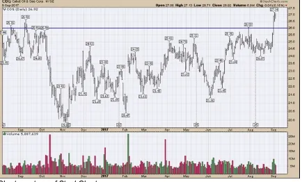
Figure 2-1 shows a stock chart using a price bar to represent the trading range for a day (see Chapter 5 for an introduction to bar charts). The top of the bar represents the high and the bottom of the bar represents the low. The little tab on the left is where the price started in the morning, and the little tab on the right is where the price closed at the end of trading. The stock shown is Cabot Oil and Gas (COG).
Chart courtesy of StockCharts.com
FIGURE 2-1: A stock chart showing new highs.
Around September 1, 2017, the price pushed up above $26 to new highs. It had pushed up against this level a few times before and fallen back. Eventually, enough buyers took an interest in the stock to push it above $26. You can also see that the volume (depicted in the bottom panel) was around 5 million shares a day as a rough average for most of August. All of a sudden, the volume accelerated, and three trading days had a total volume of roughly 22 million, or more than 7 million shares a day. That extra volume of 7 million shares at $26/share is probably not a household investor buying shares. That totals over $182 million.
Charting software fills the chart using the previous highs and previous lows. To do this, it adjusts the scale. As the stock price continues higher, the software adjusts the scale to
accommodate the latest price information and fill the space vertically.
By using charts, you can see the broad picture of all the investors, and the price action shows you that they were buying more stock as the price made new highs. Without doing any investigating into the company’s earnings or the products it’s selling, your first clue is that opinions are getting more optimistic, a trend that is showing up in large institutional-size investing.
After you have a frame of reference for the price on the right-hand side of the chart, you can look back through the history to see other pieces of information. When and how did the stock bottom out? What was the size of the trading range for the year? Are the price bars changing in size? You can see that the stock has been moving higher on a jagged path since the lowest price in November 2016.
Checking Out Index Charts
Charts based on a particular index help you visualize how a group of stocks are affected by price changes in the market. Figure 2-1 shows a daily stock chart for one particular stock. Figure 2-2 shows the daily chart for a group of 30 stocks added together to represent an average. Making up this index are some banks; brokers; insurance, computer hardware, computer software, and energy companies; and others. This is called the Dow Jones Industrial Average (commonly called the Dow). The ticker symbol is $INDU on StockCharts.com. The companies in the index are chosen
by the Dow Jones Company. By keeping track of the general price direction for some of the largest stocks in the United States, you can determine whether the stock market is moving higher or lower.
FIGURE 2-2: An index chart.
The chart of the index shows that the Dow has been rising quickly and moving from the bottom left to the top right. The last price on the right is near all-time highs. While the market doesn’t go up every day, the general trend is up.
The chart of Cabot Oil and Gas in Figure 2-1 was not nearly as great-looking for the last year, but the recent price action is improving. As the economy rolls along, some sectors improve and others fall behind. Then management in those companies tries to get more efficient to improve the
company performance. This cycle continues every day but takes time to play out. If all the companies are struggling to make higher profits, the index reflects this weakness in investor opinion. By keeping track of the index, you get a picture for the broader group of stocks. The following sections provide just a few examples of stock indexes you can follow.
Indexes around the world
You can track various indexes around the globe. Table 2-1 notes the key ones to track.
TABLE 2-1
Key Indexes to Track
Index Name Ticker Symbol
Dow Jones Industrial Average 30 Stocks $INDU S&P 500 list of 500 major U.S. companies $SPX S&P 100 List of the Top 100 U.S. Companies $OEX NASDAQ 100 list of top stocks on the NASDAQ $NDX Index for all the stocks on the NYSE $NYA Index for all the stocks on the NASDAQ $COMPQ Russell 1000 holds the largest 1,000 companies $RUI Russell 2000 holds about 2,000 small-cap companies $RUT Canadian Stock Exchange $TSX London Stock Exchange $FTSE
There are indexes for the entire world. There are indexes for each country and for each geographic region. There are commodity indexes, currency indexes, and bond indexes as well. There are
charts for comparing currencies; for example, the $USDCAD compares the U.S. dollar exchange rate to the Canadian dollar. You can put together a chart of your favorite indexes based on the types of stocks in which you choose to invest.
Charts of the indexes can give you a sense of the value relative to the past. By using
Commodity indexes
A commodity is any basic good that can be sold on the market, such as energy products (like oil and gas) and farm products (like wheat and corn). When you see the long-term price chart of 19 different commodities shown in Figure 2-3, what does that chart tell you very quickly? The scale across the bottom is measured in years from 1968 to 2017. The price is only the end-of-month price, which communicates what you want to know without the daily trading details. The price on the commodity index ($CRB) broke to new 45-year lows in 2016. Why are the commodities that the world has been built on at the lowest prices in 45 years? In one picture, the chart has probably altered your perception of what is going on in the world. Without doing thousands of hours of research into each commodity, you can see a significant change in the world based on investor attitudes to those asset classes.
Chart courtesy of StockCharts.com
FIGURE 2-3: The commodities ($CRB) index.
The S&P 500
The main stock index that all investors worldwide pay attention to is the S&P 500. This is really the best anchor point from which to view the U.S. market and the main index that all other markets are compared to.
Chart courtesy of StockCharts.com
FIGURE 2-4: The S&P 500 ($SPX) index.
For investors, understanding the direction of the S&P 500 ($SPX) is the best way to gauge the broad economy.
Defining Trends
The contrast between the four charts in this chapter gives you a glimpse of the value of using charts to help you make trading or investing decisions. On each chart, there are trends where you see the price move in a general direction for a period of time. Trends can last a few days, weeks, or months. Understanding these trends and the direction in which the market is moving helps reduce your anxiety about trading and minimize the emotional roller coaster of investing. When you feel anxious about a trade, take the time to review your charts and determine whether the change you see in the trend differs from your original plan for trading the stock. Then you can make a less emotional decision about whether to buy, hold, or sell the stock.
On Figure 2-4, a trend line has been drawn in to highlight the uptrend. Making money using charts usually involves defining a new uptrend and recognizing the end of the trend. (See Chapter 9 for more about uptrends and downtrends.)
Part 2
IN THIS PART …
Sort out the various chart settings you can use on StockCharts.com.
Light up with candlestick charts, which display price movement throughout the day.
Build a picture with bar charts, which show price movement but don’t have as much price detail as candlestick charts, which can make it easier to find trends.
Chapter 3
Focusing on Chart Settings
IN THIS CHAPTER
Introducing chart attributes
Picking overlays for the price panel
Placing indicators above and below the price panel
How you set up your chart enables you to get a clear picture of a stock’s trend. In this chapter we show you how to use the flexibility of charting to build a useable display using three key
components: chart attributes, overlays, and indicators.
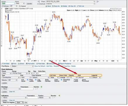
In Figure 3-1 from StockCharts.com, you can see that the place for setting parameters, known as
the workbench, is below the chart. You can access this tool for setting up charts online at
stockcharts.com/freecharts/ under SharpCharts. You can then work through the steps online
as we describe the process.
Chart courtesy of StockCharts.com
Choosing Chart Attributes
Chart attributes give you the primary choices for how you want to set up your chart. Chart attributes define things like the size and shape, the type of price display and color, and the
background. Because there are different price display types like candlesticks, bars, and lines, each chart has different display requirements and choices. To show you how this works, we take you through the steps of seting up a chart in this section.
Some important decisions you have to make are the amount of data to display and how you want to display that data. These choices include the time period for the chart, the number of periods you want to display, the setup for the bars, and the type of chart. You also choose the colors and other appearance attributes.
Starting with the time period, range, and spacing
The first group of settings includes the time period for each bar, the dates you would like to see, and the spacing.
Period
When it comes to charts, the most popular time period for investors and swing traders is daily. This means that price information will be for one day. You can see how to set the periods in Figure 3-2. Common time period choices include
Monthly Weekly
Daily (shown in Figure 3-2) 1 Hour
Chart courtesy of StockCharts.com
FIGURE 3-2: Period, range, and spacing selections.
For this book, we focus on daily charts. In Chapter 8, we discuss when other time periods should be considered.
Range
Range displays how many periods you want to display, which is an important choice depending on the information you seek. Stock charts show quickly, without a lot of description, where price has been for a particular period of time. When you set the range, you know the stock’s movement for that period of time.
Some default range settings are
1 day 5 days 10 days
1 month (roughly 22 trading days)
3 months (25 percent of a year, 63 trading days) 6 months (50 percent of a year, 129 trading days) 12 months (one year, 258 trading days)
5 years 10 years Year to Date
Select Start/End Date
Fill the Chart (as shown in Figure 3-2)
Traders or investors choose a time frame based on the type of decisions they want to make. For example:
Short-term traders select a three-month time frame most often, because they plan to exit in the same day or within a few days. The three-month time frame gives them enough information to see the trend visually, but not too much information that can make it difficult to see an exit point. These charts can be intraday to describe what is happening for the day. Using a chart with five to ten days broken into one-hour candles can show a stock starting to improve or break down.
Investors are less concerned with intraday movements and tend to select a one-year chart so they can catch longer trends. Because they will likely hold a stock for months or years, investors want to see how the stock has done over many years rather than just a few months. When they are trying to pick an entry or exit point, long-term investors will look to monthly charts.
Institutional investors tend to use 20-year charts with monthly time frames, but they will look at many different time frames as they make decisions for their portfolios.
The range selection has a relationship with the individual time period. Chart users will want to pair enough data to see the trend that gives them the ability to see the most recent information clearly.
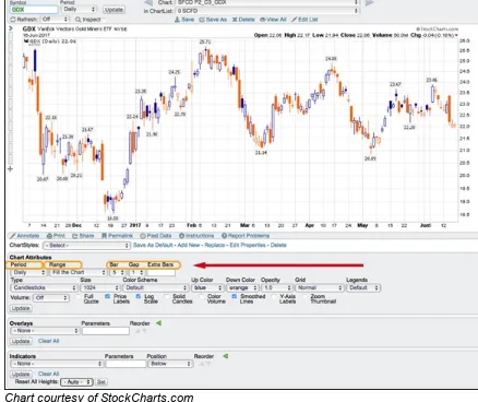
Bar, gap, and extra bars
This area of the chart attributes changes automatically on StockCharts.com depending on which
range you use. Set the range to Fill the Chart, so the software will calculate settings using three components. The software uses the width of each daily price bar, the space between the bars (gap), and the extra bars setting to pick the number of days to display. When you get more expertise, you may want to do your own fills, but that’s more complicated than you need to get right now. In Figure 3-2, the width of each bar is 5, and the space between the bars (the gap) is 1.
extra bars in the Extra Bars box.
Defining the price display
Now take a look at the next area of chart attributes. Here you set the type, size, and color of price information (see Figure 3-3).
Chart courtesy of StockCharts.com
FIGURE 3-3: Type, size, and color scheme settings.
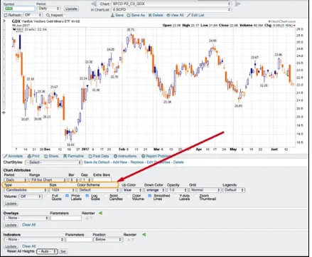
Type
Type refers to the type of display for the price information. Common display types are as follows (we discuss each type of chart and how best to use it in the chapters indicated):
Candlesticks (Chapter 4; this type is shown in Figure 3-3) Bar (Chapter 5)
Line (Chapter 6) Area (Chapter 7)
Performance (Chapter 12)
Size
chart.
With the huge variety of display surfaces, individuals will want to optimize the chart to fit on the display they have. For example, for mobile phones, smaller charts are better. It makes sense to have specific lists of charts set up to browse on the various devices you use. You can set up custom settings for each of your devices to improve the percentage of the screen that your charts cover. In Figure 3-3, the size of 1024 is typical for a laptop.
Color scheme
Everyone has personal favorite colors. You can choose the colors for your chart display.
Background color is the first critical choice. This parameter personalizes the chart and allows you to control the overall mood of the display. Using black or dark backgrounds for a change from traditional white space on presentation charts can grab attention. For printing your charts, white backgrounds are best. Using white with gridlines helps for printing, but various color backdrops can help make your chart your own.
If you’re sharing charts on social media, black or dark backgrounds stand out in the scrolling but are harder to read. Lightly shaded backgrounds can improve the attractiveness of the chart while still providing uniqueness.
Accessibility options on the computer are very important, and many mainstream users find that some accessibility settings help them. The same is true in charting software. Depending on the quality of your vision, certain themes for the charts may be softer on the eyes. If you have specific vision issues, we recommend trying different backgrounds from the drop-down menu. For example, people with light sensitivity may want to use dark backgrounds, while people who need a lot of brightness on the charts may choose white or light colors for the background. You can also enhance the display choices of the data in front of the background to make the information stand out. When you change the background, it is very common to alter the price display so the two parts complement each other.
You may find the wide range of drop-down menus for setting colors daunting, so initially use the default settings to get you started (as shown in Figure 3-3). As you become more familiar with charting and your personal preferences, you can start playing with the colors of the price
information to help you personalize your chart.
Up color and down color
different colors as we discuss different decision-making strategies throughout this book. Figure 3-4 shows blue for the up color and orange for the down color.
Chart courtesy of StockCharts.com
FIGURE 3-4: Additional color and appearance settings.
Opacity
Opacity allows you to darken or lighten the price bars. A setting of 1.0 (as shown in Figure 3-4) means as bright as possible. An opacity of 0.0 makes the price invisible. The opacity tool is very nice for using area charts that you commonly see on TV. The opacity options are Auto, 0.9, 0.8, 0.7, 0.6, 0.5, 0.4 0.3, 0.2, 0.1, and 0.0. Note: This feature is available only for members.
Grid
Grid lines are easy to see on the screen. The grid setting allows you to adjust the look of the grid lines as well as the darkness of the lines. Your options are
Off
Normal (shown in Figure 3-4) Dashed
Dense
Dense (Dark)
Note: This feature is available only for members.
Legends
This area controls how much information is shown in the legend. You can see the legend choices at the far right after the grid choices. The legend information is the amount of information about the stock(s) in the chart and is shown at the top left of the chart. Here are the options:
None: Removes all information
Minimal: Shows just the ticker symbol
Default: Includes overlays and indicator names (this setting is shown in Figure 3-4) Verbose: Spells out the company name instead of the ticker symbol
Displaying volume and toggles
Volume, which measures the number of stock trades in a day, tends to be a supportive indicator. High volume at certain times can be critical for helping with price discovery. How volume is displayed is unique and not the same as other charting information.
Volume can be toggled on or off by using the volume drop-down menu shown in Figure 3-5 on the left side of the check-mark toggles. The options are
Off: No volume is displayed.
Overlay: The volume is displayed inside the price panel. Separate: The volume is displayed below the price panel.
Chart courtesy of StockCharts.com
In Figure 3-5, the volume is set in the overlay position. If price is in the bottom corner of the chart, seeing the price or the volume can be problematic because they overlap. Using the drop-down menu to choose Separate moves the volume bars below the price panel into a separate display. Eight toggles are listed across the bottom of the chart, as shown in Figure 3-5:
1. Full Quote: Adds the Text panel on the top of the chart.
2. Price Labels: Puts the price label on the price bars at highs and lows.
3. Log Scale: Uses a percentage grid for long time periods where the price has moved substantially.
4. Solid Candles: Fills in hollow candles like the big one next to the “4.” This is strictly a matter of user preference.
5. Color Volume: Shades the up days different from the down days. 6. Smoothed Lines: Makes the lines on line charts look smoother.
7. Y-Axis Labels: Adds the current price label onto the vertical axis on the far-right edge of the chart.
8. Zoom Thumbnail: Adds the box on the right with the last 18 price bars.
Setting Overlays
Overlays are display formats you add to a stock chart that help you understand price movement. You build overlays by clicking in the Overlays area below a chart. In the drop-down box where it says “None” (refer to Figure 3-1), you select a choice from the drop-down menu. The charting software automatically gives typical parameters. Each time you add an overlay, a new line below appears with “None” in the drop-down box so you can add another. We help you discover how to apply these overlays for making stock choices throughout this book.
The list of overlay choices is significant. Some of the common overlays are as follows:
Moving averages: Helps you more easily spot a trend by smoothing out price action based on past prices
Horizontal line: Enables you to more easily see the top and bottom of a trend Price channels: Helps you see the highest high and the lowest low on a chart Bollinger Bands: Shows the upper and lower limits of normal price movements
Keltner channels: Shows the upper and lower limits for price movements based on an average of prices
Moving average envelopes: Forms a channel using the simple moving averages Events: Marks important events such as dividends and stock splits
Two other overlay choices that help you determine when to sell a stock are
Chandelier exits: Helps you set stop-losses for selling a stock Parabolic SAR: Helps you see trend reversals
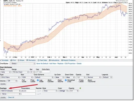
To give you an example of a common overlay, Figure 3-6 shows a simple moving average envelope on this chart of Apple Inc. (AAPL).
Chart courtesy of StockCharts.com
FIGURE 3-6: Overlay example.
Plotting things that have similar prices with the same scale (Bond Yield %) uses an overlay called “Price (same scale).” Viewing two stocks on the same price panel does not entail the use of an overlay. For two stocks on the same panel, you use the Indicators drop-down menu with a different display option (see the next section for more on indicators). The Reorder option allows you to indicate the order for the various overlays you choose. Style lets you pick one of the following:
Solid (Thin) Solid (Thick) Dashed
Dashed (Thin) Dashed (Thick) Area
Dots
Opacity options are the same as those in the Chart Attributes area. Note: These features are available only to members.
Selecting Indicators
Indicators help you see price movement. These options are based on significant research done over the years by some very smart technicians to create indicators that help analyze price
movement. Most of the indicators are derived from price, or price and volume. We help you figure out how to apply the indicators for making stock choices throughout this book.
Chart courtesy of StockCharts.com
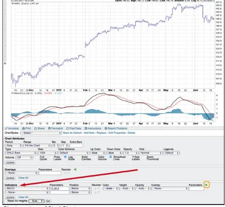
FIGURE 3-7: Indicators.
Guests at StockCharts.com are able to add indicators but not alter the display. Notice
the arrow on the left where we point to indicators. This feature expands for members to set additional display features. Figure 3-7 shows it expanded.
Common indicators
Fifty different indicators are available. Some of the more popular indicators are as follows:
Relative Strength Indicator (RSI): Shows how strongly a stock is moving in its current direction, whether up or down
Chaikin Money Flow (CMF): Combines price and volume to show the movement of money in and out of a stock
On-Balance Volume (OBV): Combines price and volume to show how money is moving in and out of a stock
Percent Volume Oscillator (PVO): The PPO indicator applied to volume rather than price Force Index: Shows the movement of price and volume
Price Momentum Oscillator (PMO): Tracks the stock’s rate of change Stochastics: Shows speed of stock price relative to past movements
StockCharts Technical Ranking (SCTR): Ranking based on a stock’s technical strength
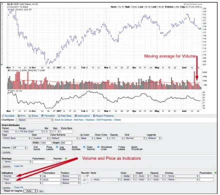
Volume and price as indicators
Two indicators need specific discussion (see Figure 3-8 to see the settings for these indicators):
Volume Price
Chart courtesy of StockCharts.com
FIGURE 3-8: Volume and price as indicators.
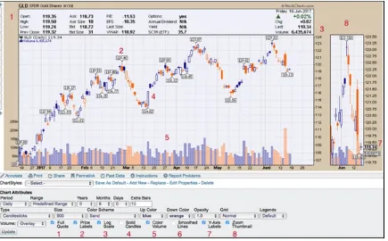
Using the volume indicator setting rather than the volume setting under Chart Attributes allows you to calculate unique things like a moving average of volume. Because volume offers clues in
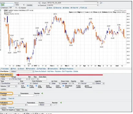
The price indicator is useful when you want to display two stock prices on the same chart. An example might be the GLD ETF for gold and the GDX ETF, which is an ETF that tracks a group of gold miners. By choosing GLD for the main chart, you can plot the GDX price underneath using the price indicator and add GDX in the parameter box (you can see this setup in Figure 3-8).
If you change the position to “Behind Price,” the chart will display both GLD and GDX on the same panel. The scale for the indicator will be on the left.
Chapter 4
Burning the Candle at Both Ends with
Candlestick Charts
Candlestick charts provide users a graphic way to display price movement throughout the day on a daily chart. This type of display first became popular in Japan and today is one of the most
popular charts in North America, especially for stock traders who need information for shorter periods of time, such as hourly or daily.
In this chapter, we break down the parts and colors of a candlestick chart, explain how to create one, and show you how to use one to make investing decisions.
Each person has a different way of thinking about the market, which means different displays can be suited to different types of investors. Many longer-term investors find candlesticks too complex and would like to use something less detailed. You may find bar charts (see Chapter 5) or line charts (see Chapter 6) give you just the right information for what you need.
Deciphering the Parts of a Candlestick Chart
The name “candlestick” was given to this type of chart because it has a body (or candle) for each day pictured in the chart. The chart reader can see the opening and closing stock price with a wider area in between called the body for each day with a wick strung through the body of the candle. The wicks sticking out from the candlestick bar show the extremes of the price movement throughout the day.
Chart courtesy of StockCharts.com
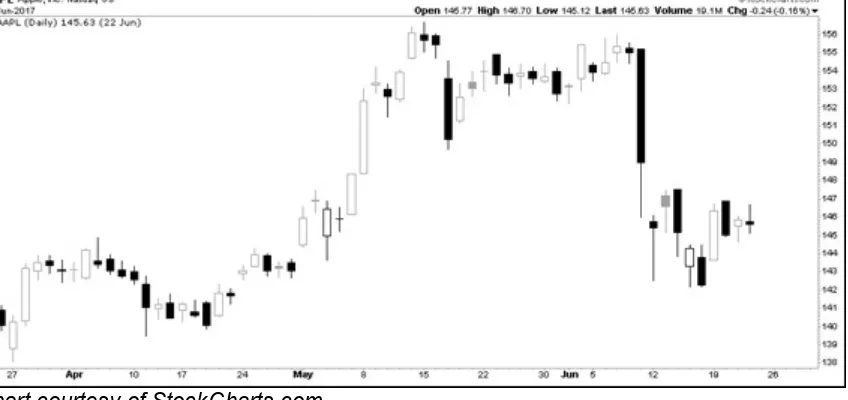
FIGURE 4-1: Apple Inc. candlesticks.
The important distinction is that the body of the candle reflects what happened during the day:
If it is hollow, the close was higher than the open. If it is filled in, the closing price was lower than when the markets opened.
On a hollow candle, the close is shown at the top of the body of the candle. On a filled-in candle, the close is shown at the bottom of the body of the candle. If the close is roughly the same as the open, the candle will appear to have no body, like on Apple’s chart for May 2. This candle shape is called a doji.
Notice the closing price of Apple Inc. on May 3 was lower than on May 2, but the candle is still hollow. The filling of the candle doesn’t reflect the change from the day before. It may
coincidentally reflect the direction from the previous close. The hollow or filled candle style is a subtle change that makes the individual candles for each day stand out more than other displays we discuss in this book.
The following sections go into more detail on the parts of a candlestick chart.
The candle body
When looking at the body of the candlestick, pay close attention to the components as well as the shapes of the candles.
Candlestick components
Each candle body has several components, which you can see in Figure 4-2. These components provide various pieces of information:
The difference between the two prices, which is the body Hollow candle moved higher through the day
Filled candle moved lower through the day
The highest price of the day, shown by the top shadow (the upper “wick”) The lowest price of the day, indicated by the lower shadow (the lower “wick”)
© John Wiley & Sons, Inc.
FIGURE 4-2: Candlestick components.
Candlestick shapes
appearance gives you a feel for the price action throughout the day. You can visualize these differences in the candlestick shapes shown in Figure 4-3:
A long, hollow body suggests the price moved up significantly in a single day, with buying pressure pushing it aggressively higher. (1)
A short, hollow body suggests the market was positive through the day but change was not huge. (2)
A line across the middle of the shadow, referred to as a doji, means the market opened and closed at or near the same level, usually meaning the market is balanced at that price. (3) A small, filled candle suggests the market was soft that day without a lot of momentum. (4) A large, filled candle suggests selling pressure was evident as the price moved significantly lower. (5)
Chart courtesy of StockCharts.com
FIGURE 4-3: Candlestick shapes.
Shadows on a hollow candle
The size of each shadow shows you how far the price moved away from the two key times of the day, the open and the close. You can see the differences in shadows in Figure 4-4. The shadows, or wicks, mean different things on a hollow body of the candle:
Long shadows above a hollow candle suggest very little support at the higher level. Bearish. (A bear market is a market in which stock prices are falling. People holding stock tend to begin selling stock.) (1)
Short shadows above a hollow body suggest the high was near to the close. Bullish. (A bull market is a market in which stock prices are rising. People tend to buy stock in this type of market.) (2)
No shadow above means the price climbed all day and closed at the highest price of the day. Very bullish. (3)
past the open to close at a higher level. Bullish. (4)
Long shadows below a hollow body mean the price moved significantly lower during the day, but then buyers came in and pushed the price back up above the open. Bullish. (5)
Chart courtesy of StockCharts.com
FIGURE 4-4: Shadows on hollow candles.
Shadows on a filled candle
As we note in the preceding section, the size of each wick shows you how far the price moved away from the two key times of the day, the open and the close. The shadows mean different things on a filled body of the candle. Shadow differences on filled candles are shown in Figure 4-5:
Long shadows above a filled-in body suggest very little support at the higher level. The price traded higher during the day and then dropped and fell below the open to close down on the day. Bearish. (1)
Short shadows above a filled body suggest the price tried to go higher after the open but then traded down, moved below the open, and closed down from there. Bearish. (2)
Little or no shadow above means the price opened and fell all day. The close was below the opening price of the day and couldn’t go higher. Bearish. (3)
Small shadows below a filled body mean the price closed near the lows of the day. Bearish. (4)
Chart courtesy of StockCharts.com
FIGURE 4-5: Shadows on filled candles.
Windows
When the stock market opens in the morning, the opening price may not be the same as the previous day’s close. News about the company, the related industry, or other news in politics may have come out after the market closed on the previous day, causing a gap between the previous day’s close and the open the next day. The candlestick chart style does not try to connect the price points together. An example of this can be found on the Apache (APA) chart (refer to Figure 4-5) on April 27. On a candlestick chart these are called windows rather than gaps.
Introducing Color onto a Candlestick Chart
Introducing color on a candlestick chart is a method of quickly comparing the current candle’s price to yesterday’s closing price. The software uses the difference between a close higher than the day before or lower than the day before. For example, choosing one color that will show a close higher than the day before highlights an up day. Using a second color for a day when the market closes lower than the day before highlights a down day.The majority of the time, the information from the hollow or filled candlestick coincides with the color code of the day:
A hollow candle that shows price moved up from the open to the close may also show that the price closed up compared to the previous day.
A filled candle shows price moved down from the open to the close. This closing price may also be lower than the close of the previous day.
While we can’t show you color in this black-and-white print book, you can go to
www.stockcharts.com and try it out yourself. In the create-a-chart box in the top middle of
candlestick chart of BAC.
You can see two distinguishing candles that show up when you use color to view the candles. Their unique qualities show up best on a color candlestick chart, but you can see the difference in the shading on a monochrome chart as well:
The filled candles show price action moving down between the open and close. This becomes even more distinct when color is used because when the price closes above the previous day, the computer will use an up color with a filled candle.
The hollow candles show price action moving up between the open and close. When you use color, if the price closes below the previous day, the computer will use the color you chose as the down color with a hollow candle.
Examples of these two unique candles are shown in Figure 4-6. The candles of interest are on March 8 and March 22. These candles show up infrequently but represent important information:
The March 8 candle closed below the open but above the previous day. It is a filled candle because it closed below the open, and the colored candlestick chart displays the color of an up day, meaning that it closed above the previous day.
On March 22 the intraday price action was up, so the candle is hollow, but the price closed below the previous day, so it is given the color of a down day compared to the day before.
Chart courtesy of StockCharts.com
FIGURE 4-6: Unique candles.
It does not always work out, but these unique candles sometimes mark turns in the market or important inflection points in the market. In the Citigroup example in Figure 4-6, they marked a short-term high on March 8 and very close to a short-term low on March 22. You can see other instances on the chart where these unique candles had no short-term influence.
Crafting Your Chart
you how to create a candlestick chart on www.stockcharts.com. To get started, go to stockcharts.com/freecharts/, enter the stock symbol you’re interested in seeing under
“Create a SharpChart,” and click Go.
In the Chart Attributes area, you can create a candlestick chart by selecting Candlesticks in the Type drop-down menu. StockCharts.com defaults to a candlestick chart type for new visitors to
the website. After selecting Candlesticks, you will need to click Update if the chart was in a different display format. You can see the tool for Chart Attributes in Figure 4-7.
Chart courtesy of StockCharts.com
FIGURE 4-7: Selecting candlesticks as a chart type.
There’s no harm in trying some of the other selections for the chart. A good one to change is the size from the Size drop-down menu. For example, you can select Landscape or 900 from the Size menu and click Update. This expands the chart out to the right if you’re on a landscape-oriented display, such as a laptop computer.
This action doesn’t save the chart style that you create, but it does let you experiment with the settings. Members can save the chart style as a default. In Parts 3 and 4, we introduce all the
possible options for creating your own chart style, and in Chapter 17, we show you how to build a customized candlestick chart.
Reading and Using Your Chart to Make
Decisions
Candlestick charts are primarily for short-term trading decisions; longer-term traders or investors tend to use candlestick charts to pick entry and exit points. It is important to understand when candles matter most in stock buying and selling decisions; you also need to become familiar with some of the most common patterns. This section introduces those critical decision-making points.
Knowing when candles matter
Candlesticks are built based on intraday price movements, so daily candlesticks aren’t typically used with long time horizons of a year or more. For shorter-term trading opportunities, though, candlesticks can be helpful. The following sections discuss short-term signs you may interpret from individual candles and candle groups.
Investigating individual candles
Candlestick signals typically have a life of five to ten candles. In Figures 4-3 and 4-4, the bullish examples show up more often in the direction of the uptrend. As you might expect, it is easier to find hollow candles with a small top shadow in an uptrend. In Figure 4-5, the bearish candles are plentiful in a downtrend. It is easier to find filled candles with small bottom shadows in a
downtrend.
As each candle is interpreted to suggest bullishness or weakness, it is important to realize the next move expected may not follow through on the next candle.
Looking at groups of candles
Individual candles may not be very reliable to trade with, but looking at candles collectively can be helpful. Looking across a few months of candles gives you more information, and trading in the direction of the trend is usually more profitable.
Chart courtesy of StockCharts.com
FIGURE 4-8: Consolidation.
Pairing two or more candles can be a little more valuable to confirm a pattern within a trending market. How is that done? The first candle sets a bullish or bearish expectation for the next day, and the next day, investors watch to see whether the move based on the directional bias starts to happen. If it does, they investigate buying the stock on that basis and go through a process to decide.
Technical analysis tools work better when stocks are trending. A stock moving sideways for years is hard to profit from. However, a stock moving sideways for a month or so also allows you the opportunity to buy near recent lows. The term for a stock with price action moving sideways is
consolidating. Consolidating happens when the price of a stock stays between two price levels and moves sideways. The stock shown in Figure 4-8 consolidated for three months between $67 and $73.
Conversely, a sustainable move above a previous consolidation range will usually need to be a larger hollow candle. The thinking behind the candle size is that if the price moves above a
consolidation area, the new buyer has to be willing to pay more for the stock than at any time in the consolidation period. If only a few new buyers are willing to buy into the stock at a higher level, the chart is most likely to fall back into the consolidation range. Rarely are timid moves above a consolidation zone the best ones to buy.
Buying based on bullish candlestick patterns
Candlesticks carry a lot of information. Understanding candlestick patterns can be very beneficial to see a change in trend or typical price action that supports a move in the direction of the main trend.
On March 2, the stock fell hard after the market opening, but by the end of the day the price had recovered above the previous close and above the open to create a long shadow under the first hollow candle. This shape of candle is a bullish candlestick called a hammer and is often seen at the bottom of a countertrend move. This is exactly what you would look for to end a downward move. When March 3 had similar price action (another hammer) and closed higher, this was very strong price action. The stock continued higher for most of March.
One reason to use a candlestick display is to help find bullish setups. StockCharts.com
Chart courtesy of StockCharts.com
Chapter 5
Spotting Differences with Bar Charts
IN THIS CHAPTER
Exploring the basics of bar charts Creating a bar chart
Using a bar chart
Looking at the price movement of a stock and trying to glean information from it can seem overwhelming for first-time users. In this chapter, we explore bar charts, which are one of the simplest forms used to view daily price readings.
Beginning with Bar Chart Basics
A bar chart is a chart type that is used for displaying price. When it is displayed in black, the price bars used today look a lot like the price charts from the business section of the newspaper. The following sections go over the structure of a price bar and different kinds of bar charts.
Price bar components
A price bar has four main components:
Open price: The price at which the stock opens (shown on the left) High price: The highest price of the day
Low price: The lowest price of the day
Close price: The price at which the stock closed for the day (shown on the right)
© John Wiley & Sons, Inc.
FIGURE 5-1: An OHLC bar.
Different types of bar charts
Chart courtesy of StockCharts.com
FIGURE 5-2: An OHLC bar chart.
Because the individual price bars look the same, your attention is not drawn to them, unlike the big down candles found on the candlestick chart type. In the Tesla example shown in Figure 5-2, your eye tends to see the trend more than the individual bars.
© John Wiley & Sons, Inc.
FIGURE 5-3: An HLC bar.