SEXY WEB
DESIGN
BY
ELLIOT JAY STOCKS
Summary of Contents
Foreword . . . xv
Preface . . . xvii
1. Interfaces are Sexy . . . 1
2. Research . . . 25
3. Structure . . . 45
4. Navigation and Interaction . . . 61
5. Aesthetics . . . 85
6. Deliverables . . . 129
SEXY WEB
DESIGN
iv
Sexy Web Design
by Elliot Jay Stocks
Copyright © 2009 SitePoint Pty. Ltd.
Expert Reviewer: Jina Bolton Editor: Kelly Steele
Expert Reviewer: Dan Rubin Indexer: Fred Brown
Managing Editor: Chris Wyness Cover Design: Alex Walker
Technical Editor: Raena Jackson Armitage
Technical Director: Kevin Yank
Printing History:
First Edition: March 2009
Notice of Rights
All rights reserved. No part of this book may be reproduced, stored in a retrieval system or transmitted in any form or by any means, without the prior written permission of the publisher, except in the case of brief quotations embodied in critical articles or reviews.
Notice of Liability
The author and publisher have made every effort to ensure the accuracy of the information herein. However, the information contained in this book is sold without warranty, either express or implied. Neither the authors and SitePoint Pty. Ltd., nor its dealers or distributors, will be held liable for any damages caused either directly or indirectly by the instructions contained in this book, or by the software or hardware products described herein.
Trademark Notice
Rather than indicating every occurrence of a trademarked name as such, this book uses the names only in an editorial fashion and to the benefit of the trademark owner with no intention of infringement of the trademark.
Published by SitePoint Pty. Ltd. 48 Cambridge Street Collingwood, Victoria, Australia 3066
Web: www.sitepoint.com Email: [email protected]
v
About the Author
Always aspiring to create a unique look that’s out of the ordinary, Elliot Jay Stocks’s design is frequently featured in online and offline publications. His work is showcased on various design inspiration web sites, where it’s used as an example of how accessible web design can still look beautiful. Elliot's portfolio includes Automattic, The Beatles, Blue Flavor, Twiistup, EMI Records, and Carsonified.
Elliot is also known to write about design trends, issues, and techniques for industry-leading publications such as Practical Web Design and Computer Arts Projects. He can be seen regularly at design conferences around the globe taking to the stage as both a speaker and a workshop host. Elliot’s site can be found at http://elliotjaystocks.com/.
About the Expert Reviewers
Jina Bolton resides and works in San Francisco as an interaction designer at Crush + Lovely. Jina is a co-author of The Art & Science of CSS (Melbourne: SitePoint, 2007); she has also written articles for publications including
A List Apart, .net Magazine, SitePoint, and Vitamin, and has spoken at conferences around the world. She enjoys traveling and learning Italian, and digs sushi and robots—and it’s no coincidence that you’ll find her website at http://sushiandrobots.com.
Dan Rubin is an accomplished user interface designer and usability consultant. He has over 10 years experience as a leader in the fields of web standards and usability. Dan is a sought-after public speaker and author, most recently penning Pro CSS Techniques (Berkeley: Apress, 2006) and Web Standards Creativity (Berkeley: friends of ED, 2007). He was an expert reviewer for The Art & Science of CSS (Melbourne: SitePoint, 2007), and blogs at http://superfluousbanter.org.
About the Technical Editor
Raena Jackson Armitage made her way to SitePoint via a circuitous route involving web development, training, and speaking. A lifelong Mac fangirl, she’s written for The Mac Observer and About This Particular Macintosh. Raena likes knitting, reading, and riding her bike around Melbourne in search of the perfect all-day breakfast. Raena’s personal web site is at http://raena.net.
About the Technical Director
As Technical Director for SitePoint, Kevin Yank oversees all of its technical publications—books, articles, newsletters, and blogs. He has written over 50 articles for SitePoint, but is best known for his book, Build Your Own Database Driven Website Using PHP & MySQL. Kevin lives in Melbourne, Australia, and enjoys performing improvised comedy theatre and flying light aircraft.
About SitePoint
To Samantha—partly for your patience, understanding, and support while I wrote evening after evening, but mostly because you’re my source
of happiness and inspiration!
To Mum and Dad—you nurtured my creativity from a very early age and you’ve always encouraged me at every step along the way. To the citizens of the Internet—who would’ve thought a network of computers could allow me
to meet so many great friends, travel the world, expose my work to millions of people, and indulge
xiii
Good Luck, You Sexy Thing . . . 146
Foreword
I like sexy things.
Now, hold on a moment—you can lower that eyebrow. I’m talking about objects that are beautiful and exciting—and that are quite removed from sex. I like it when I have a head-turning, jaw-dropping, breathtaking reaction from an item—whether it’s a 1957 Corvette Stingray, a MacBook Air, or the elegant flourish of a beautiful typeface’s ampersand. I’m talking about objects that are so well de-signed and downright stunning in both functionality and aesthetics that I stop and think, “Whoa—that’s sexy!”
I’d like to just make one point clear. “Sexy” may be a four-letter word. But it’s a good four-letter word. An item that’s sexy is exciting. Appealing. Intriguing. Slick. It’s an Eames lounge chair. It’s that smokey bar jazz song. It’s the upscale sushi lounge with soft, dim candle lights accompanied by the raspy, dramatic crooning of Portishead. Whatever it is that you find to be sexy, pay attention to it. Why do you find it sexy? Is it simply how it looks or is crafted? Is it how it works, too? Chances are, if you think an object is sexy, it’s more than a pleasure to look at: it’s a joy to use as well.
“Whether you’re designing a book, a software application, a piece of hardware, or a web site … think sexy.”—Kathy Sierra
So, what about sexy web design? That is, after all, the title of this book. Well, the way I see it, sexy web design is all about the details—every intricate, delicate particular. When I see a web site that pairs great typography with a solid, well-designed grid, and makes use of stunning imagery and ornamentation, I just have to check it out. And as a designer for the Web, this is precisely the kind of reaction I want for my own work. That’s where Mr. Stocks comes into play. Elliot is a consistent maker of objects that are sexy, when it comes to the Web.
In April of 2008, I was flown out to London for an unique opportunity: it was a live, onstage Photoshop battle for the Future of Web Design conference put together by Carsonified. The girl’s team, consisting of Hannah Donovan (Creative Director at Last.fm) and myself, was against the boy’s team of Jon Hicks (Hicksdesign) and none other than Elliot Jay Stocks. While I was certain that Hannah would totally rock this competition, I was a little nervous at the thought of being in a Photoshop battle against Elliot. Thankfully, my nerves were calmed a bit thanks to the Belgian beer that Elliot provided for the four of us during the contest.
xvi
style. These web sites are both visually beautiful, and user-friendly. Elliot has an attention to detail that inspires many web designers around the world, including myself. Oh yeah, it’s sexy, too.
“The visual image is a kind of tripwire for the emotions.”—Diane Ackerman
If you’re looking to begin creating sexy web sites yourself, then you’re in luck. In this book, Elliot takes you through a holistic web interface design process. He helps you understand what interface design means, and he goes over the research needed to create a product that is of the highest quality. Then, he takes you through important layers in web design: the structure, interaction, and aesthetics. Finally, he gives tips for great design deliverables to ensure that the design is built and maintained properly. Again, it’s all about attention to detail. Following Elliot’s process, you’ll create a great-looking, great-working web site … one you can call sexy.
I hope you’re as excited as I am about this book. I feel so very fortunate to have been involved. It’s the book I wish existed back when I was starting out in web design a decade ago. Watching this book grow and develop from concept to outline to draft reminds me of the very design process written about within these pages. There’s a joy in watching an idea come to life. And when that web site or application idea becomes something beautiful and sexy—that’s when joyful creation becomes a truly thrilling passion.
Preface
One of the great things about the Web is that virtually anyone can become a web designer: the tools are relatively cheap, the creation is instant, and the exposure is global. Of course, this is both a blessing and a curse, the title designer being brandished too easily in some instances. Web design is a craft, and creating a site that is truly beautiful, usable, and—most of all—enjoyable, requires skill, knowledge of design principles, and a mind open to exploring new techniques.
Who Should Read This Book?
What makes a web designer? Can a beginner with their first copy of Dreamweaver qualify? Or does it have to be an industry professional with an established reputation in design? The answer is both, and everyone in between. If you’re responsible for the look, the feel, or the mood of a web site, you’re a web designer—and this book is for you.
Whether you’re completely new to web design, a seasoned pro looking for inspiration, or a developer wanting to improve your sites’ aesthetics, there’s something for everyone here. How? Because instead of trying to cover every possible area of creating a web site, I’ve focused purely on the design stage; that is, everything that happens before a single line of code is written.
However, great design is more than just aesthetics. Long before we open our graphics program of choice, we’ll be conducting research, dealing with clients, responding to briefs, sketching out sitemaps, planning information architecture, moving from doodles to diagrams, exploring different ways of interactivity, and building upon design traditions.
But ultimately, we’ll be finding out how to create web sites that look drop-dead gorgeous.
The SitePoint Forums
The SitePoint Forums1 are discussion forums where you can ask questions about anything related to web design, development, hosting, and marketing. You may, of course, answer questions, too. That’s how a discussion forum site works—some people ask, some people answer—and most people do a bit of both. Sharing your knowledge benefits others and strengthens the community. A lot of fun and experienced web designers and developers hang out there. It’s a good way to learn new stuff, get questions answered in a hurry, and just have fun.
The Design Your Site forum2 has sub-forums devoted to discussing tools, techniques, and even design critiques. It’s free to sign up, and it takes just a few minutes.
1
xviii
This Book’s Web Site
No book is perfect, and we expect that watchful readers will be able to spot at least one or two mistakes before the end of this one. The Errata page on the book’s web site will always have the latest information about known typographical errors and updates. You’ll find the book’s web site at http://www.sitepoint.com/books/sexy1/. If you find a problem, you’ll also be able to report it here.
The SitePoint Newsletters
In addition to books like this one, SitePoint publishes free email newsletters, such as SitePoint Design View, SitePoint Market Watch, and SitePoint Tech Times, to name a few. In them, you’ll read about the latest news, product releases, trends, tips, and techniques for all aspects of web de-velopment. Sign up to one or more SitePoint newsletters at http://www.sitepoint.com/newsletter/.
Your Feedback
If you can’t find an answer through the forums, or if you wish to contact us for any other reason, the best place to write is [email protected]. We have a well-staffed email support system set up to track your inquiries, and if our support team members are unable to answer your question, they’ll send it straight to us. Suggestions for improvements, as well as notices of any mistakes you may find, are especially welcome.
Conventions Used in This Book
You’ll notice that we’ve used certain typographic and layout styles throughout this book to signify different types of information. Look out for the following items:
Code Samples
Code in this book will be displayed using a fixed-width font, like so:
<h1>A Perfect Summer's Day</h1>
<p>It was a lovely day for a walk in the park. The birds were singing and the kids were all back at school.</p>
If additional code is to be inserted into an existing example, the new code will be displayed in bold:
body {
background: #336699;
xix
A vertical ellipsis is used to highlight remarks inside the code examples:
<body>
⋮ This code remark doesn't need to be entered
</body>
Some lines of code are intended to be entered on one line, but we’ve had to wrap them because of page constraints. A ➥ indicates a line break that exists for formatting purposes only, and should be ignored.
background: #FFFFFF url("../resources/headers/logos/
➥banner-logo-600px.png") top left no-repeat;
Tips, Notes, and Warnings
Hey, You!
Tips will give you helpful little pointers.
Ahem, Excuse Me …
Notes are useful asides that are related—but not critical—to the topic at hand. Think of them as extra tidbits of information.
Make Sure You Always …
… pay attention to these important points.
Watch Out!
xx
Acknowledgements
Thanks to everyone at SitePoint for making this book possible and for asking me to write it in the first place—especially Raena, who kept me focused and inspired with her great ideas and insight. Thanks to Jina and Dan for their expert reviews and for their continued friendship, even though they had to plough through my early drafts!
Thanks to the magazine editors, event organizers, clients, and employers of the world who’ve helped raise my profile to the extent where I’m being asked to write books. I’m honored.
Thanks to the talented designers working magic out there on the Internet; your wonderful work provides a constant source of inspiration, and has helped to make this book what it is.
Chapter
1
Interfaces are Sexy
I’m going to be honest. The reason I’m a designer is a simple one:
I like making stuff look pretty.
There, I said it. You know my secret. I’ve laid myself bare and that’s a fair way to start a book. But web design goes beyond making things look pretty. It’s also about making them work. Rather than just concocting passive visuals, web designers create interfaces, systems that allow a person to interact with an object or system to achieve a goal. The best web designs give clear visual signals on how to go about the task.
Sexy Web Design
2
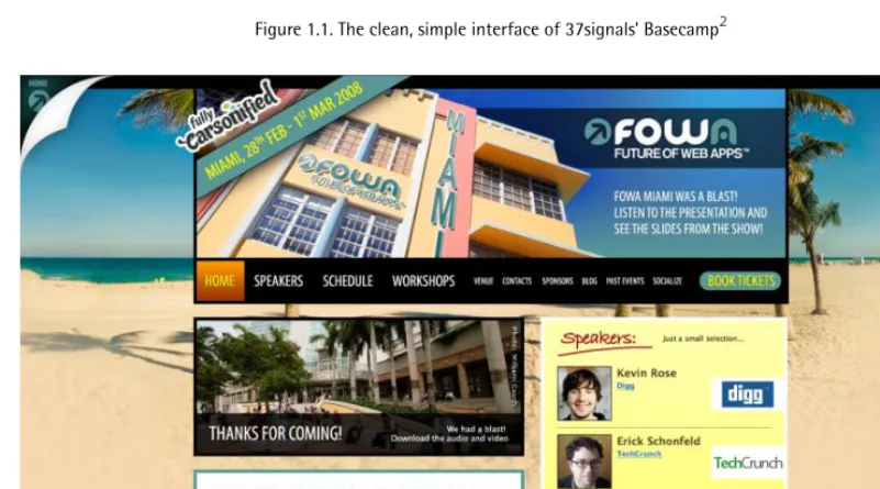
Figure 1.1. The clean, simple interface of 37signals’Basecamp2
3
Interfaces are Sexy
So what are we hoping to achieve when we design a web site? Well, my aim is to create an interface that people find genuinely enjoyable to use. And although a web site—by its interactive nature—has to be used, I’m also interested in how it’s viewed. After all, we’re web designers, so we need to concentrate on the look. Functionality will form a significant part of the book—but the main focus will be on creating interfaces that look great while engaging the user.
Interfaces
Interfaces are all around us, and once you know how to spot one, you’ll start to see them everywhere. Think of you—the user—and an object that you need to control, or a goal that you want to achieve. In between the object and ourselves we have the interface: a simple method of achieving our goal. Although it’s not true to say that an interface is always simple, it’s true that an interface’s role is to simplify a task.
Users are People Too!
By the way, while we’re sitting here comfortably, right at the beginning of the book, let me add a brief note on the term user. It’s one that fails to particularly appeal to me, given how it seems so tech-centric. Keep in mind that a user is simply a human being, an average Joe, a passerby on the street who might be a web-savvy tech-support guru, or an elderly lady who’s only just started using a computer. People use web sites, so it’s a handy term, but just try to keep in mind that we’re talking about regular humans, rather than some kind of machine-operating robot.
Interfaces in the Real World
Before we leap on to the Web, let’s think about interfaces around us in the real world. This will help to coax us into the habit of analyzing the processes of interaction. We’ll start with a simple example: a plug. (Oh, and I wholeheartedly confess that I started with a plug because it was the first thing I saw when I looked up from my screen.) Figure 1.3 shows us an everyday UK wall plug. It can be helpful to break an interaction apart into its components: the user (this can be an object), the interface itself, feedback, and the goal.
Feedback
I click the switch down, electricity surges through the cable to my laptop, and I’m able to carry on writing for another hour. Lucky me!
Sexy Web Design
4
usually have a little red indicator which appears when the power is turned on; you can see this in Figure 1.3. Therefore, I know I’ve achieved my goal (if it’s not too big a term to call it that) because of the feedback provided by the indicator on the top of the depressed switch.
Figure 1.3. The ON indicator shows me it’s on.
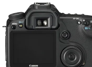
Let’s take another example: a digital camera, like the one shown in Figure 1.4. When we’re about to take a photo, there’s a bit more going on here in terms of interface. In fact, I’d say that my camera’s interface is built up of three mini interfaces:
■ the function buttons on the hardware, which allow me to change the settings
■ the LCD screen, which provides me with information on the camera’s settings
■ the shutter button, which is clickable, and provides me with audible feedback when I press it Yet this more complex, layered interface still fits neatly into our system:
Feedback Goal
Interface User
Sounds + visual indicators; the photo is displayed
A photo Function buttons + LCD screen
5
Interfaces are Sexy
Figure 1.4. Your standard digital camera (Photo: Canon)
Interfaces on the Web
Now that we know how to break down an interaction into its parts, let’s look at some interactions on the Web.
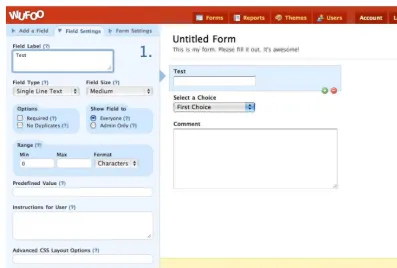
Imagine a form, like the one shown in Figure 1.5. You want the user to fill in your form, but you don’t want them to submit it without filling in the required fields. What’s more, you want to show and hide certain fields depending on what they input (for example, if someone answers that they have a car, you might want to show a drop-down menu that lists car manufacturers). The form interface provides us with feedback in the guise of a message or indicator.
Feedback Goal
Interface User
Submission message Form submission
Required form fields + Optional form fields + Submit button
Sexy Web Design
6
Figure 1.5. A form in action
It’s not all about bare-bones functionality, though. Remember: this book is about sexy web design, so we’ll be looking at ways to build interfaces that are stunning as well as useful.
Web Design Goals
Let’s face it, the Web is often a fairly barren landscape: just think of its dull, text-based roots. In many respects, progress has been limited in the short time that’s passed since the Web’s conception. Web technologies have evolved and improved, but they’ve hardly been radical changes; the core elements of HTML are still at the heart of what we do, and as such there are myriad constraints in which we have to work. Even if you forget design centered on web standards and consider Flash, factors such as the limited viewport, or screen size, variable connection speeds, and restricted hardware capabilities suggest there’s major scope for improvement.
Like all goals, successful and engaging web design is as much about overcoming technical challenges as it is about creating an attractive product. But technicalities shouldn’t hinder you from achieving your goal: to create a site that’s a joy to behold.
What Your Site Does
7
Interfaces are Sexy
This sobering thought also reminds us that we should hold off from firing up Photoshop for a moment and invest some time into the logic behind our web site. I’m not talking about logic in a technical, code-heavy sense; just that we should consider the processes involved in using a web site. At its basic level, that means questions like: “What is the major call to action for this site? What do we want the user to do?” At the other end of the spectrum, we have factors such as where to place elements or which photo to use.
How Your Site Looks
Let’s establish one standard rule here:
The more attractive an item looks, the longer people will want to look at it.
Yes, that’s right: design an appealing-looking website and users are more likely to receive your client’s message, buy their product, engage in their community, or do what you want them to do. What’s more, they’ll return, like I often do to the beautiful Fall For Tennessee3 site shown in Figure 1.6. Now, there’s a reason to care about great design (and probably more valid than my “I like to make stuff look pretty” mantra).
Sexy Web Design
8
Usability and Accessibility
With the Internet allowing our work to reach a global audience, we have to try and cater for a massive range of people: blind users, elderly users, underage users, users with slow Internet connections or older, unreliable machines, users with little knowledge of the way web sites work, technology enthusiasts who expect nothing short of cutting edge … the whole spectrum.
While part of a web site’s accessibility depends on the markup, quite a lot of it is governed by the design. Throughout the book, we’ll be taking both accessibility and usability into consideration throughout the design phase. If you keep your users in mind at all times, then the road to usability nirvana will be an easy one.
Design Process
Like the creation of any successful artifact, a web site needs to evolve. It involves planning and preparation, and takes shape over a period of time. The more planning and forward-thinking we can do as designers, the better. Preparation helps us sort a project into nice, neat, orderly
piles—defining specific goals along the way—and assists in foreseeing any potential problems that could set us back. In general, it’s safe to say that planning out the site’s creation process in detail makes everyone’s lives easier. Happy designers. Happy developers. Happy clients. All of them happy people, if not slightly shiny.
Research
Research is a stage that’s often misunderstood and often overlooked. When a project’s budget is tight, the research phase is almost certainly one of the victims, usually because it’s less tangible than the stages that make up the finished product. But it does still make up the final product! Without research, we’re flying blind: we’re jumping straight into the creative process without fully understanding the context in which we’re creating.
If you’re feeling a little daunted by this research concept, relax. It’s a stage that only needs to use up a small amount of time, and a lot of the preliminary client and designer discussions that happen all fall under the umbrella of research.
The most common form research takes is asking the client to name web sites that he or she likes and dislikes. Questioning the client further, asking why they like or dislike those web sites—or elements of those sites—is even more helpful. In fact, in many instances, I’ve even found this to be as informative as a design brief! If the client can then explain how those preferences relate to their own brand values that they’re trying to portray—or the functionality they want their own customers to experience—then you have a design brief right there.
9
Interfaces are Sexy
of research that you can apply to your projects, but they’re all interchangeable. Keep it loose, keep your mind open, and prepare for the project in any way that feels natural and helpful to you, your colleagues, and your client.
Structure
With our research complete, and a collection of sources of guidance and inspiration, it’s time to start planning. But where do we start?
Stay away from that computer! Seriously—go and sit away from a computer (there are such places), get some paper and a pen, and start scribbling.
The structure of a site should come freely, with as little restraint as possible. In the beginning, keep it loose, and approach the task without being encumbered by exact technical concerns. They’re worth considering, it’s true, but the decisions at this stage should be based on what the site can become—rather than worrying about how specific form elements should be displayed. Figure 1.7 shows you one of my very rough, early diagrams.
Sexy Web Design
10
Information Architecture
As the plan for the site gradually evolves, you can begin focusing on certain areas. What should be the key message that hits the user when the site loads? What is the primary call to action? How many pages should there be? What should be on each page? What elements should be on all pages? How does each element relate to the goals of the web site? Each of these questions relate to inform-ation architecture; in terms of the Web, this is the science of organizing information in a useful and logical manner.
There are debates about how much of this we should do as designers, and indeed, Information Ar-chitecture is often a job in itself. However, as so many projects require us designers to pick up some of the reins of an information architect, it’s important that we get a grounding in the practice.
Wireframing
In my wild, heady days of web design youthfulness, I regularly made the mistake of starting a site design by jumping straight into Photoshop. In my defense, this was a case of the circumstances at hand: the company I was working for at the time often sprang projects on us that had almost no time frame. The brief arrived in the morning and they needed the site live by the evening … of the previous day. But whereas some of these turned out to be relatively successful web sites, I would recommend that you first draw up decent wireframes—blueprints for your design—on paper before heading straight into creating full-blown designs. Sure, you can use Photoshop to create your wireframes, like the one in Figure 1.8—in fact, you can use any tool you wish—but I’d recommend starting off with good ol’ fashioned pen and paper.
In the Wireframing section of Chapter 2, I’ll take you through a variety of techniques, starting with pen and paper, and finishing with some neat, computer-generated diagrams, ready to form the basis of your actual designs.
11
Interfaces are Sexy
Figure 1.8. Wireframes start to take shape
Tone, Mood, and Atmosphere
Rounded corners and gradients might look great on some sites, but terrible on others. Your messy, grungy background image might sit well on a site for a heavy metal band, compared to, say, a dental practice. So we’ll be exploring the various moods and atmospheres we can create using changes in visual style. We’ll look at what approaches to take, when to use them, and when to use alternatives.
Sexy Web Design
12
almost subliminal manner. For example, the imagery used in the design for the Dara’s Garden4 site, shown in Figure 1.9, creates an atmosphere of relaxed elegance.
Figure 1.9. The relaxed and elegant site for Dara’s Garden
Interaction
There’s very little you can do on a web site without involving some form of interaction. Reading through information still involves scrolling through the text, and fairly much everything above that involves interaction on a more complex scale: pushing buttons, submitting search queries, opening menus, navigating through multiple pages … the simple act of visiting a web site invariably means that you’ll be engaging in an interactive experience.
Navigation
13
Interfaces are Sexy
around your web site. You can see a variety of navigation styles being used on Erratic Wisdom5 in Figure 1.10.
Figure 1.10. A variety of navigation styles on the Erratic Wisdom web site
Forms
Forms can be extremely tedious to style, but taking the time to apply some polish so they look right—like Mint,6 shown in Figure 1.11— can really make the difference between a slapdash job and a great design. It’s more than about changing the colors to match your site’s palette; aspects such as aligning input fields’ widths and positions to the grid can allow the user to scan through the form elements and find out how best to fill in the information. Taking inspiration from some of the best examples on the Web, we’ll design forms that use inline messages to give extra information to the user, guiding them through the form completion process. We’ll look at everything from the humble search form, to the newsletter sign-up, right through to the registration process on a more complex web application.
5
Sexy Web Design
14
Figure 1.11. The preferences panel inside Mint illustrates the attention given to creating great-looking forms
Audio and Video
With the popularity of sites like YouTube7 and MySpace,8 audio and video players have become commonplace on the Web. Although often restricted by the interaction systems they’ve inherited from offline media, we’ll look at how these can work very effectively. We’ll also try to maximize the potential of these particular interfaces: how to make them as unobtrusive as possible and let the media speak for itself. The video player interface used on the Vimeo9site is shown in Figure 1.12.
7
http://youtube.com/
8
15
Interfaces are Sexy
Figure 1.12. The minimal but informative interface on the Vimeo player
Desktop Behavior
Sexy Web Design
16
Figure 1.13. A desktop-like experience in the browser from 280 Slides
Aesthetics
Let’s face it: this is the fun part. You’ve planned your project, prepared your research, sorted out your wireframes and information architecture … now it’s time to crack open the tins of paint and start throwing colors at the canvas, Jackson Pollock style!11
Not only is this phase the most satisfying to every designer’s inner artist, but we really can relax a little and have some fun; we’ve planned everything up to this point so that we have a clear idea of the framework on which we can work our design magic. I must admit that I’ve sometimes been a little too eager to jump into fully-fledged Photoshop mockups without doing the groundwork. But it’s definitely worth the wait!
Layout and Composition
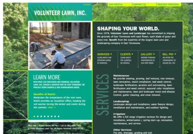
People talk about web design as a young medium, and while in many senses that’s true, they’re disregarding the immense history of design practices that the new mode inherits; hence, the key principles of web design are exactly the same as those of print. Traditional graphic design concepts such as layout, typography, and color theory remain just as relevant on the Web; all that’s changed is the constraints under which we work. In Figure 1.14, we can see how the Volunteer Lawn site12 packs in plenty of information without becoming overwhelming or cluttered.
11
17
Interfaces are Sexy
Figure 1.14. Volunteer Lawn’s site layout has lots to see without getting lost amidst clutter
One key difference between design for print and design for the Web is the nature of the medium. A printed brochure has fixed dimensions, and every copy looks exactly alike. For the Web, the di-mensions and layouts can vary—for example, the size of the browser window or the capabilities of the device they’re using—and the possible combinations are different for every user. Are they viewing the site on a 30-inch Apple Cinema Display or a mobile phone? What fonts do they have on their system? Are they running the latest version of the Flash Player? Can the user even see the web site, or are they relying on a screen reader to convey the site’s content?
The truth is we’re unable to control exactly how our web site is experienced, and this point is rein-forced to me every time I embark on a new project. But rather than treat this as an obstacle, we should embrace this flexibility as the chance to use the medium to its full advantage. After all, my grandmother is unable to increase the font size on her local paper, but she can enlarge it on her newspaper’s web site. Working on the Web is our chance to serve up content flexibly, in a way best suited to our users.
A Change of Scenery
Sexy Web Design
18
The Artistic Layer
Here’s another unfortunate truth: a lot of people see what web designers do as utterly pointless. Why bother creating a seamlessly repeating, background-image texture when you could have a flat color? Why add a subtle shadow beneath your content boxes when a simple 1-pixel border will do? Well, because we know how much difference it can make! That’s one of my main passions when it comes to design: adding that extra touch of TLC to a project can really improve a site’s look, re-gardless of how subtle it is. Attention to detail goes a long way towards creating a visually rewarding experience for people: it can be the distinction between good and great design. Figure 1.15 illustrates small embellishments on the Decor8 site13, such as the fabric patterns, stitched motif, and the neat display of a range of information. It really is that subtle!
Figure 1.15. Lots of visually pleasing enhancements on the Decor8 site
We’re going to explore how we can apply these little touches to our web sites. How does your choice of color reflect the message you’re trying to convey? How can we evoke the right atmosphere with our design? Let’s consider how Art principles—yes, with a capital A—influence design. We’re going to give designs soul, personality, and character!
19
Interfaces are Sexy
Typography
In recent times, typography on the Web has developed a bit of a cult following, having been largely ignored by designers in the Web’s formative years. Sites such as I Love Typography14 are at the forefront of this reinvigorated interest in the art form, and designers like Jason Santa Maria, whose site you can see in Figure 1.16, are leading the pack with experiments in type.
Relatively new techniques—such as image replacement, Flash text replacement, and CSS3’s improved support for including typefaces in your style sheets—are slowly opening up more methods for dis-playing type on the Web. We’ll be exploring some of the tricks we can use in our design to create fantastic effects, as well as what we can achieve with the most common, web-safe fonts for great-looking type. Here we’ll examine traditional typographic techniques that are easy to implement, yet can help spice up some ordinary text. But rest assured, our focus extends beyond usability; there’s room for experimentation here, and I intend to use it. Because believe it or not, the concepts of sexy type and accessible text aren’t necessarily mutually exclusive!
And why stop there? Let’s look at the exciting artifacts that have been produced by print designers and see how far we can take those on the Web.
Figure 1.16. Jason Santa Maria’s 15 continually changing use of bold typography
Images
It’s possible to achieve great design on the Web without the use of any imagery: well-structured grids, mindful use of color, and typographic treatments can be enough to create a beautiful look without an image in sight. However, imagery does play a key role in conveying a sense of atmosphere. An image can take many forms: a photograph of a person for an About page, or an illustrative diagram to explain a concept on a blog post—these kind of images add visual value to content. But then there’s the presentational, or decorative aspect: for instance, an image might simply be a box shadow or a rounded corner—the kind of thing that enhances the visual styling of the page. Since this is a book about design, presentational images will be our main focus.
14
Sexy Web Design
20
Another example of imagery used frequently in web design is, of course, iconography. In a way, iconography is a combination of content and presentation: it adds meaning to content while dressing it up in a visually pleasing manner.
Given that so much of a web site’s visual style can be controlled by imagery, and because images can be broken down into so many subgroups that perform different functions, we’ll be spending a significant amount of time in this area of web design.
Convention versus Innovation
You know what really winds me up? Boring web sites. No, hang on—that’s wrong. What really winds me up are web designers who settle for the mundane, rather than attempt an uncommon path. It really is easy to design a great-looking web site that incorporates a few bold, original elements to set it apart from the crowd. I’m going to show you how having a little bit of courage to be differ-ent—despite how small—can really go a long way.
Figure 1.17. Some bold use of whitespace on the Revyver site16
21
Interfaces are Sexy
Drop-down form elements are a traditional way of displaying price ranges (such as $10–$20, $21–$50, and so on), but the Kayak site, pictured in Figure 1.18, opted for draggable sliders to filter their search results instead. A slider is still a convention (more from the desktop than the Web), but using it in this sense gives the site visitor a visual way of customizing their results. It’s an interesting ex-ample of how a convention—used in a new way—can actually become an innovation.
Figure 1.18. Instead of using drop-down menus for price filtering, Kayak uses draggable sliders17
Deliverables
So you’ve designed the best-looking web site in the world and you’re shopping for the suit or gown you’ll be wearing to the celebrity-packed design awards ceremony that you just know you’ll be invited to. But hang on a minute—your site needs to be built first!
The good news is that, although web site building is beyond the scope of this title, there are already several wonderful books on the subject (with many published by SitePoint, of course!) that will guide you on your way to development enlightenment. So, you’re covered, whether your tastes favor front-end code like HTML, CSS, or JavaScript, or server-side heavy stuff like PHP, Rails,
or—yikes—.NET. Brave you.
But you and I aren’t getting off that lightly, and if I’m going down, I’m taking you with me. So, last but by no means least, we’re going to look at deliverables—that is, how to split your lovely Photoshop output into individual image files, ready for a developer to build. It’s not all slicing and dicing, though. Imagery needs to be prepared with its final context in mind, so that a great design concept can still look sensational when recreated on an actual web page.
Sexy Web Design
22
is created with that consideration in mind. The appearance and usability of the end result should remain paramount in the designer’s head: substance should never be sacrificed for style.
Design Comps
When you finish designing a web site and prepare for its development phase—whether it’s to be handled by you or another developer—what exactly is it you hand over? Your final design
comp—short for comprehensive artwork—is your completed design, ready for a developer to build. I’ll be looking at the best way to present your static designs using a simple guide to best practices. But before we even get to the finished stage, we’ll be exploring ways of showcasing your ideas to the client as the design progresses. In essence, we’ll be getting down and dirty with how to handle all these files flying back and forth.
Figure 1.19. Part of our finalized design comp
Style Guides
It’s not just files, though. Often it’s useful—and sometimes essential—that we hand over style guides along with the finished design. Style guides are also associated with brand, identity, and logo design, and are used to ensure that the brand is carried across all of the paraphernalia produced by a business, but they’re equally important in web design. Mostly, this is because you might be handing over the design to a third party who’ll actually be building the site—but on web sites where there are thou-sands of pages generated dynamically, style guides are like page templates: indications of how certain sections of the design can be applied to a page, regardless of the variable content.
23
Interfaces are Sexy
And be assured: style guides are useful for you as well as other people. You may find you have to return to a job several months after completion, only to find that you’ve forgotten how things should look and work!
Let’s Start Working
Chapter
2
Research
Before we decide how we’re going to create our design, we need to decide what it is we’re going to create. Well, that’s easy—the client just gives us a design brief, and then we get to work—right? Well, you could do that, but you’d be missing out on the all-important research stage. Fortunately, we’ve got a whole chapter devoted to just that.
The Brief
A design brief details what the client expects of the design you’ll build. A brief is an understanding between client and designer, rather than a formal document denoting a contract between two parties. And the better you understand each other, the more likely the outcome will make both parties proud. Most importantly, the more detailed the brief (even if it takes the form of several email, phone, or face-to-face conversations back and forth), the more chance you have of fulfilling its re-quirements. In other words, brief is a totally inappropriate term!
Imagine you receive a note like this: Dear web designer,
I’d like a web site, please. I want it to look really cool and stylish! It should be really fun and easy to use.
Sexy Web Design
26
a client asks me for a site that looks utterly terrible and fails to work. Now that’d be an interesting brief!
Guiding a Brief
To receive a detailed brief from our client, we should help them out a little. Remember, some people can do with a bit of help in putting a brief together.
Kick things off by asking questions. Giving your client a set of focused, direct questions should result in quality answers. Vague, open-ended questions begets nebulous answers—that is, nothing useful!
Some Basic Questions
The questions you ask will really depend on the kind of site you’re building, but there are some basic questions that are useful for any project:
■ What do you want someone to do once they’ve visited your site—that is, what is the call to action?
■ How should a user feel when they visit your site, and what should be their lasting experience?
■ Name three sites that appeal to you and explain what it is you like about them.
■ Name three sites you don’t like and explain why you dislike them.
■ What is your budget and ideal time frame?
These questions are important, because you’ll instantly find out some practical guides for the design you’ll create, such as:
■ the business goal behind the site
■ the intended emotional effect
■ what you could possibly emulate
■ what you should definitely avoid being influenced by
■ how much time you can spend
27
Research
Working with an Established Framework
You might find that your client already has a strong idea about what they expect from the design, especially if they’re a larger company. They may have specific guidelines or requirements based on organizational policy, or they may have already sought recommendations from other web pro-fessionals, such as information architects or usability consultants. Larger projects might involve more in-depth research into the target audience; this could take the form of user-testing on existing web sites with the creation of user personas—character sketches of typical visitors to your site—as a guide to your site’s future audience. In this book we’re concentrating mostly on smaller projects, so these kinds of situations are beyond the scope of our example project—but if you find yourself in this situation, naturally it will form part of the brief, and you’ll need to take these requirements into account.
Expanding the Brief
Imagine our client sends an email containing the following brief, based on the five questions we asked them:
Sexy Web Design
28
What Has the Brief Told Us?
■ main goal: buy access all areas ticket
■ look: visually rich, clear and uncluttered, an atypical style with a big impact
■ feel: fun; the access all areas ticket title alludes to a VIP pass at a gig
■ technology: not keen on Flash
What Do We Still Need to Find Out?
■ We know that the primary goal of this site is to encourage the visitors to buy tickets, but can the client also define any additional goals?
■ Are they entirely against the use of Flash, or are they happy to use it where the site would most benefit?
■ Apart from ticket sales, what’s the main information the site should convey about the event?
■ In terms of visual style, what are they looking for? Are they after a design aesthetic in particular?
■ How soon is as soon as possible? (This is irrelevant to us in our fictional situation, but it certainly would matter in the real world!)
As hypothetical as this is, you can still see that some answers have the tendency to create more questions. This is good, though: it’s all part of the process, and more questions help you to refine the brief.
The Finalized Brief
After some more discussion with the client regarding these questions, we can add more detail to our brief.
It’s worth noting that our client has given us some technical information, such as the use of Flash and fixed widths, but it’s unlikely that most clients will be that web-savvy. Remember, hold your client’s hand when required. It’s probably unnecessary for you to explain every last decision to them, but try to answer any questions they might have. For instance, if they’re adamant that all text should be resizable, be sure to explain to them that image-based text is unable to be resized as cleanly as normal text.
Project Desirables
■ The main objective is to encourage the user to buy an access all areas ticket.
■ The secondary objective is for the user to buy another ticket type.
■ A general objective is to generate interest in the event.
■ Information should be immediately obvious and clearly displayed.
29
Research
Technical Requirements
■ The design can be of a fixed width.
■ Top-level navigation will remain the same across each page, but there will be various sub-menus that change depending on where you are.
■ JavaScript may be employed for an enhanced user experience.
■ Flash can be used in moderation, but only for small parts of the site. All key elements (such as the navigation and main content) should be rendered in HTML.
■ Images may only be used for h1 and h2 headings; h3 and lower will be text.
■ Advertising will be used on the site (sparingly) in the form of sponsor logos, so space should be reserved for it.
First Steps
Let’s begin with the first logical step. We’re going to be creating a web site for an event, so we need to analyze the brand values associated with the event: these in turn will be the core concepts that the site needs to convey. Let’s imagine we ask our client for some brand values, and they give us the following ideas to work with:
■ fun and exciting: more than just a conference
■ credibility: advice from the absolute experts
■ inventive and innovative: a group of creative people open to new ideas
Already that might start conjuring up some stylistic ideas in our minds, but let’s leave that for the moment. We should be asking ourselves: what makes up an event site? Our client has yet to specify the actual pages they want, so we’ll help them out by brainstorming:
■ Home: an introduction to the event; leads people into other parts of the site
■ Bookings: to sell the ticket types
■ Schedule: for details about the event
■ Speakers: an easy glance at the experts involved
■ Venue: where the event is located and the facilities available
■ Sponsors: may appear in the sidebar or footer, rather than a page of its own
■ Community: parties, links to social networks, photos, and so on
Let’s take a look some of the values we want to convey with our site, and take a peek at how other event web sites go about it.
The Element of Fun
Sexy Web Design
30
With the fun element being such an important selling point, it makes sense for us to give this a lot of prominence on our web site. Although it’s important to stress the knowledge that can be gained at such events, we all know that we’re just as interested in the parties! That’s why we’ll suggest to our client that a whole page should be dedicated to social gatherings happening around the event, with the imagery of the site portraying a fun, party-like atmosphere.
Gravitas and Authority
But we mustn’t get carried away with all this fun malarkey. We need to make it clear that this is a credible, serious event, too. Otherwise, how else are delegates going to convince their bosses to pay for this out of their training budget? The web site for Web Directions North, shown in Figure 2.1, is neat, clean, and means business.
Figure 2.1. The straightforward design of Web Directions North1
31
Research
well as the prominent position, the text is short and easily digestible: a nice, memorable chunk to take away.
Figure 2.2. We know exactly what we’ll gain from Sidebar Workshops2
Inventive and Innovative
Our client also wants us to ensure that the design suggests a feeling of invention and innovation. One way to present this idea with the most impact will be to create a design that breaks the rules slightly, whether that’s in terms of color, layout, or type. As we look around for inspiration for our design, we’ll be sure to keep our eyes out for examples that exemplify this goal. The real opportunity for trying something new will come later, however, when it’s time to plan the aesthetics of the design—we’ll get to that in Chapter 5.
Achieving a Balance: Information and Atmosphere
Balancing the display of information while conveying the right atmosphere is a huge challenge. When I designed the Future of Web Applications (FOWA) Miami 2008 site,3 I attempted to get the best of both worlds by giving the site a fun kind of feel with the beach in the background, but keeping the information neatly organized in the foreground. You can see this on the schedule page in Figure 2.3, with the clear separation of time slots and information. We decided that it would be more helpful if I designed some icons to visually indicate each type of session; that way, users could clearly see if it was a presentation, a lunch break, or a party, and so on. This allowed for the opportunity to throw a bit more of the playful feeling into the mix, so I threw in some little dudes.
2
Sexy Web Design
32
Figure 2.3. Adding fun to a schedule with some playful icons on the FOWA Miami 2008 site
33
Research
Figure 2.4. More great design on the Sidebar Workshops site
What Matters the Most?
If you think about what might be the most important information relating to an event, you might say date, location, and price—but in all likelihood there are other elements that entice potential attendees.
Sexy Web Design
34
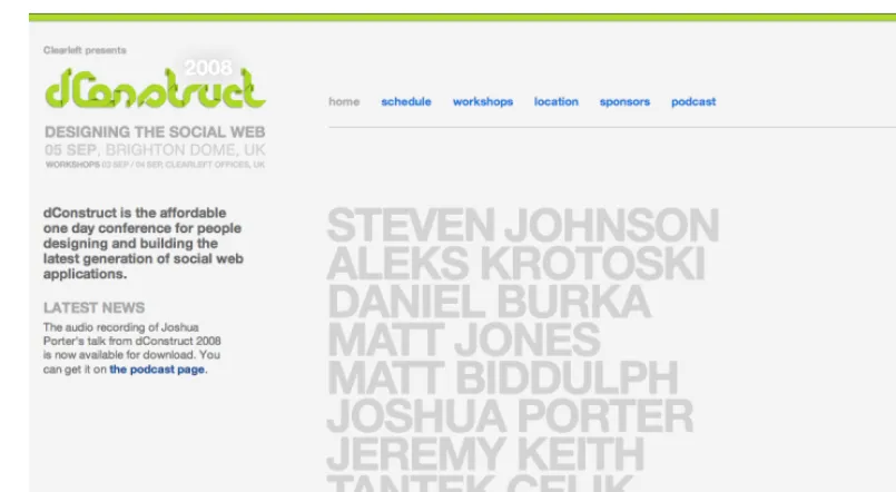
Figure 2.5. Speakers are the priority on the 2008 dConstruct site’s homepage …
35
Research
Venues and locations can sometimes be a drawcard for delegates. And when the location is also a popular holiday destination like Miami, then you should really shout about it.
Figure 2.7. The FOWA Miami 2009 site is unapologetic for its bold declaration of the location
Brand Consistency
Brand consistency is the goal of keeping a consistent look, feel, and message across all of a company’s communications, including its web site. Depending on the project, you could find yourself in one of a number of potential situations. Let’s take a look.
From Scratch
If the brand for the event is yet to exist, then our site will be providing the beginnings of a defined experience and acting as a style guide for other events to follow. Be mindful that limits may still apply, though: this might be the first event, but it should probably tie in with already established concepts by the company. That might translate to a simple action like incorporating the parent company’s logo into the footer, or it may be more complex: there could be a particular set of style guidelines that we have to follow, such as a color scheme or font.
Redesign
Sexy Web Design
36
Tie-ins
You may need to create a design that closely ties in with a previously established identity. The An Event Apart web site6 seen in Figure 2.8 has its own branding, but incorporates the exact same look and feel of its sister site, A List Apart.7 Rather than taking only small elements of the design patterns as you might find when a child site is borne of a parent company, the two are treated as equals: two sides to the same coin.
Figure 2.8. The literal tie-in of the web sites for An Event Apart and A List Apart
6
37
Research
For our project, we’ll need to incorporate the company logo of the organization running the event—but we’ll have free rein when it comes to the actual event branding, since it’ll be the first of its kind (that is, the first scenario—From Scratch—above). This will demonstrate how you can be creative while still operating within a few guidelines. Guidelines are good, by the way: they take away some of the scare factor of a completely blank canvas!
Inspiration Resources
So far we’ve been looking to other events’ web sites for inspiration, but we don’t have to stick to that niche. It’s become quite popular to collect examples of first-rate design and archive them as sets on Flickr,8 an image-sharing service. To start off, check out Patrick Haney’s massive collection,9 and the Web Design Inspiration Flickr pool10 which he administers. For even more Flickr sources, check out Vandelay Design’s list of 99 Flickr groups for design inspiration.11 And numerous web sites exist, such as Smashing Magazine12 and UI Pattern Factory,13 that are excellent sources of in-teresting design examples.
Atmosphere Inspiration
Let’s get an idea of the kind of atmosphere we’d like our site to have—the feeling we evoke through color, subject matter, and texture. You may be familiar with the concept of a mood board, which describes a general collection of images, textures—almost anything that conveys the same mood
you want to achieve. Let’s take the term wooden: a traditional mood board might entail, for example, cutting out images of wooden furniture from catalogs or photographs of trees from magazines, and then laying them down on a canvas to make a montage.
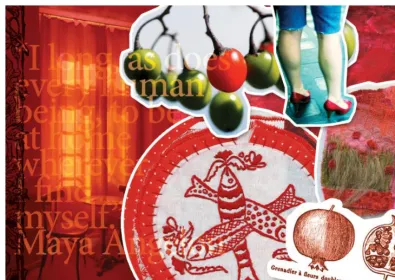
Oh, and by the way, it’s unnecessary to use an actual board—any surface (physical or virtual) will do! There is even a variety of software tools available to help you create your own mood boards if you want to do so digitally. Figure 2.9 shows a mood board created in Photoshop from public domain and Creative Commons-licensed images found on the Web.
Sexy Web Design
38
Figure 2.9. A mood board14
Collating a photo set on Flickr is akin to the action of creating a mood board, particularly when re-searching atmosphere. I’ve collected some, which you’ll see in Figure 2.10.
Figure 2.10. My atmosphere set on Flickr15
14
39
Research
Composition Inspiration
We aim to create a unique and interesting web site, setting it apart from the kind of site you see every day. A noteworthy way to stand apart from the other sites is to think of an unusual composition or layout. We'll need to take a few risks in the interests of originality, so I’ve been collecting design examples which follow the same mantra. Of course, we’ll still be mindful of the site’s usability—it’s important to stick with what users will understand—but you’ll see that even a little thinking outside the box can go a long way. Here’s my composition set on Flickr, in Figure 2.11.
Figure 2.11. My set of composition examples16
Functionality Inspiration
Our site will contain a number of functional elements, like navigation mechanisms, a ticket purchase form, a schedule, and plenty more. It’s useful to look at all the different ways other designers have chosen to implement each of these elements.
Chris Messina17has been collecting examples of user interface (UI) design on Flickr for years now, and his collections go beyond pure inspiration into the realm of an indispensable resource. You’ll also find a wealth of UI examples collected at Pattern Tap,18 where users have collected, tagged and commented on widgets from all over the Web.
16
http://www.flickr.com/photos/elliotjaystocks/sets/72157612161071649/
17
Sexy Web Design
40
Figure 2.12. Chris Messina’s design pattern sets on Flickr19
Look Outside the Web
I’m a keen believer in the idea that if you only use web sites for inspiration, you’ll only ever build a web site that looks like other web sites. Of course there’s nothing wrong with that—it’s essential that a web site looks and behaves like one—but you risk your design growing stale if you search for stimuli in only one place.
There’s a whole world out there full of outstanding design—architecture, fashion, product, packaging ... why confine yourself to one medium and limit your creative potential? Take your trusty camera and go for a walk—collect photos of signs, textures, anything that grabs your fancy. Doodle in a notebook whenever you have an interesting idea. Before you know it, you’ll have a huge collection of inspiring material from the real world.
41
Research
Figure 2.13. My offline inspiration set
Collection Tools
I’ve been saving interesting and inspiring snippets in my Flickr profile, but it’s not the only way. RealMac Software20—the team behind web development application RapidWeaver—have recently released LittleSnapper,21 a Mac application that allows you to collect sources of inspiration from the Web and share them with your peers. It’s a nifty new tool for Mac-based designers, and one I’d heartily recommend.
For Windows users, TechSmith’s Snagit22 application captures screenshots and screen images, with a library you can use to organize your screenshots by tags, URLs, and date.
Then there’s Evernote,23, suitable for both Mac and Windows, an all-encompassing note-keeping application that you can access from just about everywhere, thanks to versions for your desktop, phone, and web browser. You can create, upload, and save images, text and audio, and if there’s text contained within the image, Evernote’s optical character recognition (OCR) engine will identify it and make it searchable. That's very handy for when your notes archive becomes rather large!
20
http://realmacsoftware.com/
21
http://realmacsoftware.com/littlesnapper/
22
Sexy Web Design
42
Figure 2.14. The extremely powerful Evernote
43
Research
Research: an Ongoing Process
Chapter
3
Structure
It’s time to think about the way we’ll structure our design—so grab your paper and pen and get ready to doodle.
Let’s make the most of our nice paper medium. First, let’s make some loose sketches. And if you end up drawing characters and swirly lines instead of actual diagrams, that’s fine too; if you feel like adorning the page with drawings that come from thoughts about events or events’ web sites, feel free.
Remember what we were saying in Chapter 1: keep it loose.
Notepads
Sexy Web Design
46
Figure 3.1. Some sketches for a recent project
Once you’ve warmed up your pen (and your brain!) it’s time to start thinking about the way certain parts of our site will work. At this stage, it’s unnecessary to worry about everything fitting neatly together; the idea is that we look at the overall picture before concentrating on precise details.
Sitemaps
You might have seen a sitemap on a web site—it’s a list of many of the pages you’ll find on that site. At the design stage, however, we’ll use a sitemap as a way to draw our web site’s structure like a map. But instead of thinking of them like a map that portrays the elements physically (like on an atlas), imagine them as a description of the way the pages link together. It’s good to get a sitemap drawn before leaping into the design, because it gives you an understanding of how the site will work.
Initial Sketches
47
Structure
Figure 3.2. Getting some ideas down on paper
Web site pages rarely exist in isolation, and so there are often various ways (through different pages) to reach the same page. For instance, on our site’s Schedule page, there’ll be a listing of the sessions happening at the event which will include the speakers’ names. Yet to access more information about each speaker, the names will be hyperlinked back to their profiles on the Speakers page. Likewise, there’ll be links from those profiles back to the sessions. This demonstrates that there are more ways to reach the pages than by just using the main navigation bar.
Sitemaps versus Navigation
One thing I’ve struggled with in the past is the difference between writing down a navigation list and a sitemap. In essence, you might think that they’re similar; after all, a navigation list is a list of pages on the site that the user can reach by clicking on the navigation items’ names.
But what if you have a page like a legal notice that’s pointless to display on your main navigation? Perhaps you might want to just keep it for a footer-based navigation bar? In that case, there’s no way to tell that it’s there unless you start with your sitemap first.
Sexy Web Design
48
If you’re planning out a process that happens without actually moving between pages (for instance, you might have a registration form that updates its contents using Ajax), it’s worth creating separate diagrams to describe these processes, since it’s potentially confusing to draw separate pages for this concept.
The important thing here is that it makes more sense to decide on your sitemap before your naviga-tion, because you need to decide how the site fits together as a whole before deciding how it’s navigated by your users.
Finished Diagrams
Once you’ve sketched through a few ideas and have settled on a sitemap concept you’re happy with, it’s a good idea to tidy it up. You could start by drawing a neater version (if, like me, your early sketches and notes are extremely rough!), or you could use some kind of visual editor to orderly display your ideas.
Applications like Microsoft Visio,2OmniGraffle,3 or ConceptDraw MindMap4 are popular tools to use, or you could simply use whatever tool you’re comfortable with: there’s nothing wrong with producing a sitemap in Photoshop or Illustrator.
I’ve recently started using WriteMaps,5 a simple online tool for creating and sharing sitemaps. I like it because you can create a reasonably good-looking sitemap in seconds, like the one you see in Figure 3.3. Although it lacks the full functionality offered by desktop drawing tools, it more than makes up for it in ease of use. WriteMaps also provides you with a URL for each sitemap you make, which means it’s extremely easy to share them with your clients or colleagues; plus you can export them to XML files if you need them later.
49
Structure
Figure 3.3. A sitemap created with WriteMaps
Figure 3.4. A finished sitemap
Sexy Web Design
50
Wireframing
Sitemaps deal with the structure of a web site; wireframes deal with the structure of individual pages. In a wireframe, we sketch out each page to try out different visual placements for each element.
Figure 3.5. One of my initial ideas for a layout