Applications for iPhone, Android, Palm Pre, BlackBerry,
Windows Mobile, and Nokia S60
Beginning
Smartphone
Web
Development
Beginning Smartphone
Web Development
Building JavaScript, CSS, HTML and Ajax-based
Applications for iPhone, Android, Palm Pre, BlackBerry,
Windows Mobile, and Nokia S60
■ ■ ■
Copyright © 2009 by Gail Rahn Frederick with Rajesh Lal
All rights reserved. No part of this work may be reproduced or transmitted in any form or by any means, electronic or mechanical, including photocopying, recording, or by any information storage or retrieval system, without the prior written permission of the copyright owner and the publisher.
ISBN-13 (pbk): 978-1-4302-2620-8 ISBN-13 (electronic): 978-1-4302-2621-5
Printed and bound in the United States of America 9 8 7 6 5 4 3 2 1
Trademarked names may appear in this book. Rather than use a trademark symbol with every occurrence of a trademarked name, we use the names only in an editorial fashion and to the benefit of the trademark owner, with no intention of infringement of the trademark.
President and Publisher: Paul Manning Lead Editor: Tom Welsh
Technical Reviewer: James Pearce
Editorial Board: Clay Andres, Steve Anglin, Mark Beckner, Ewan Buckingham, Gary Cornell, Jonathan Gennick, Jonathan Hassell, Michelle Lowman, Matthew Moodie, Duncan Parkes, Jeffrey Pepper, Frank Pohlmann, Douglas Pundick, Ben Renow-Clarke, Dominic Shakeshaft, Matt Wade, Tom Welsh
Coordinating Editor: Debra Kelly
Copy Editors: Patrick Meader, Katie Stence, and Sharon Terdeman Compositor: MacPS, LLC
Indexer: BIM Indexing & Proofreading Services Artist: April Milne
Cover Designer: Anna Ishchenko
Distributed to the book trade worldwide by Springer-Verlag New York, Inc., 233 Spring Street, 6th Floor, New York, NY 10013. Phone 1-800-SPRINGER, fax 201-348-4505, e-mail [email protected], or visit
http://www.springeronline.com.
For information on translations, please e-mail [email protected], or visit http://www.apress.com.
Apress and friends of ED books may be purchased in bulk for academic, corporate, or promotional use. eBook versions and licenses are also available for most titles. For more information, reference our Special Bulk Sales– eBook Licensing web page at http://www.apress.com/info/bulksales.
The information in this book is distributed on an “as is” basis, without warranty. Although every precaution has been taken in the preparation of this work, neither the author(s) nor Apress shall have any liability to any person or entity with respect to any loss or damage caused or alleged to be caused directly or indirectly by the information contained in this work.
Contents at a Glance
■
Contents at a Glance... iv
■
Contents ... v
■
About the Authors ... x
■
About the Technical Reviewers ... xi
■
Acknowlegments... xii
■
Introduction... xiiii
Part I: Getting Started with Mobile Web Development ... 1
■
Chapter 1: Introduction to Mobile Web Development... 3
■
Chapter 2: Set Up Your Mobile Web Development Environment... 15
Part II: The Syntax of the Mobile Web ... 45
■
Chapter 3: Mobile Markup Languages... 47
■
Chapter 4: Device Awareness and Content Adaptation ... 97
■
Chapter 5: Adding Interactivity with JavaScript and AJAX... 135
Part III: Advanced Mobile Web Development Techniques ... 161
■
Chapter 6: Mobile Web Usability ... 163
■
Chapter 7: Enhancing Mobile Web Pages for Smartphone Browsers... 187
Part IV: Deploying into the Mobile Ecosystem... 211
■
Chapter 8: Optimizing Mobile Markup... 213
■
Chapter 9: Validating Mobile Markup... 239
■
Chapter 10: Testing a Mobile Web Site... 259
■
Chapter 11: Deploying a Mobile Web Site ... 273
■
Chapter 12: How to Play Well in the Mobile Ecosystem ... 289
■
Chapter 13: The Future of the Mobile Web ... 303
Part V: Appendixes ... 315
■
Appendix A: Sample User-Agents from Mobile Devices ... 317
■
Appendix B: Sample Request Headers from Mobile Devices... 321
■
Appendix C: Glossary... 325
Contents
■
Contents at a Glance ... iv
■
Contents ... v
■
About the Authors ... x
■
About the Technical Reviewers... xi
■
Acknowledgments ... xii
■
Introduction ... xiii
Part I: Getting Started with Mobile Web Development ...1
■
Chapter 1: Untroduction to Mobile Web Development ...3
Mobile Web vs. Desktop Web ... 4
Mobile Markup Languages ... 6
HTML and XHTML ... 7
XHTML Mobile Profile ... 7
WML... 8
Other Mobile Markup Languages ... 9
Mobile Scripting Languages ... 10
Mobile Style Sheets... 11
Mobile Industry Groups and Standards Bodies... 11
The Mobile Ecosystem... 12
Code Samples... 13
Summary ... 13
■
Chapter 2: Set Up Your Mobile Web Development Environment ...15
Recommended IDEs ... 16
Mobile MIME Types ... 19
Web Server Configuration... 21
Apache... 21
Microsoft IIS ... 21
Firefox and Mobile Add-Ons ... 23
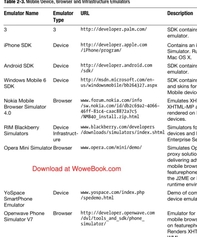
Mobile Browser Emulators ... 34
Actual Mobile Devices ... 39
Other Development Tools ... 39
File Comparison... 39
Source Code Control... 40
Summary ... 43
Part II: The Syntax of the Mobile Web ...45
■
Chapter 3: Mobile Markup Languages ...47
Selecting a Mobile Markup Language ... 47
XHTML ... 48
Why Not HTML? ... 49
HTML 5 ... 49
XHTML-MP... 51
Example XHTML-MP Document... 51
DTDs for XHTML-MP ... 52
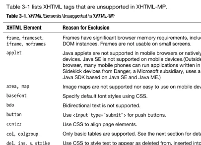
XHTML Elements Not Supported in XHTML-MP... 52
Updated and Mobile-Specific Features in XHTML-MP... 53
Common Implementation Bugs ... 59
CSS for Mobile Devices ... 61
CSS2 ... 62
Wireless CSS and CSS Mobile Profile ... 62
Determining CSS Support on a Mobile Device... 68
Best Practices for Mobile CSS ... 68
External, Internal, and Inline Stylesheets ... 69
Media Selectors and Media-Dependent Style Sheets ... 70
WML... 71
Tag Hierarchy ... 74
Special Characters ... 74
Header and Metadata ... 75
Text Formatting ... 76
Links ... 78
Other WML Language Features ... 95
Summary ... 96
■
Chapter 4: Device Awareness and Content Adaptation...97
Device Awareness ... 98
Using HTTP Request Headers to Identify Mobile Devices... 98
Using a Device Database to Obtain Device Capabilities ... 99
Content Adaptation ... 120
Creating Device Groups ... 122
Choosing Adaptation Points... 124
Summary ... 134
■
Chapter 5: Adding Interactivity with JavaScript and AJAX ...135
Iterative Development Approach ... 136
JavaScript in Mobile Browsers... 136
ECMAScript Mobile Profile... 137
Embedding JavaScript in a Markup Document ... 138
JavaScript Fragmentation in Mobile Browsers... 142
Examples of Mobile JavaScript ... 144
AJAX in Mobile Browsers ... 148
Example of AJAX for Mobile Browsers ... 154
Testing AJAX Support in Mobile Browsers ... 158
Summary ... 159
Part III: Advanced Mobile Web Development Techniques ...161
■
Chapter 6: Mobile Web Usability ...163
Best Practices for Usable Mobile Web Sites... 164
Case Study #1: Bank of America ... 165
Case Study #2: CNN... 166
Case Study #3: Wikipedia ... 168
Case Study #4: Flickr... 170
Mobile Browser Layout Comparison... 172
Designing Mobile Web pages ... 174
Flexible Reference Design ... 174
Standard Layout ... 175
News Web Site ... 176
Search Web site... 177
Service Web Site ... 178
Portal Web Site ... 179
Media-Sharing Web Site... 180
Design Guidelines ... 181
Tips for Developing Mobile Web Pages ... 181
Creating a Web Page for the Maximum Number of Users ... 183
Creating a Better Mobile User Experience... 184
Summary ... 186
■
Chapter 7: Enhancing Mobile Web Pages for Smartphone Browsers ...187
Common Web Techniques for Smartphone Browsers ... 188
Viewport Meta Tag ... 188
Detecting Orientation Changes in JavaScript ... 190
WebKit in Mobile Browsers ... 195
Safari Mobile for iPhone ... 199
Browser for Android Mobile Devices ... 200
webOS Browser for Palm Pre ... 201
BlackBerry Browser... 202
Nokia Web Browser on Series 60 Smartphones... 204
Internet Explorer Mobile for Windows Mobile ... 206
Opera Mini and Opera Mobile Browsers... 207
■
Chapter 8: Optimizing Mobile Markup ...213
Post-Processing Techniques for Mobile Markup... 214
Minimize External Resources ... 214
Remove Whitespace, Comments and Unnecessary Markup ... 216
Adapt and Transcode Images ... 223
MIME Multipart Encoding of a Response Document... 224
Web Server Optimizations for Mobile Browsers ... 229
gzip or deflate Response Compression ... 229
Caching Directives in HTTP Response Headers... 232
Summary ... 238
■
Chapter 9: Validating Mobile Markup ...239
Importance of Valid Markup on the Mobile Web... 240
What Validation Does Not Test ... 244
Public Markup Validators... 245
W3C Markup Validation Service ... 246
W3C CSS Validation Service ... 248
W3C mobileOK Checker... 250
mobiReady... 252
Validome... 254
Summary ... 257
■
Chapter 10: Testing a Mobile Web Site ...259
Mobile Web Testing Methodology ... 260
Mobile Browser Testing Considerations ... 262
Choosing Mobile Devices to Use in Testing... 262
Testing on Actual Mobile Devices... 263
Acquiring Mobile Devices ... 264
Developer Programs ... 265
Testing in Mobile Emulators ... 268
Testing in Desktop Browsers... 269
Summary ... 272
■
Chapter 11: Deploying a Mobile Web Site ...273
Routing Mobile Traffic to a Mobile Web Site ... 273
Standard Mobile Web Domain and Pathnames ... 274
Mobile Switching Algorithms... 276
Mobile Switching Products... 279
Mobile SEO and Traffic Acquisition ... 280
Mobile Search Engines and Crawlers... 280
Using Link Relationships for Mobile Site Discovery ... 282
Mobile Sitemaps... 283
SEO for the Mobile Web... 284
SEO Practices to Forget... 285
Summary ... 287
■
Chapter 12: How to Play Well in the Mobile Ecosystem...289
Operators, Transcoders, and Proxies, Oh My! ... 289
Transcoders on the Public Internet... 292
Standardizing Transcoder Behavior ... 295
Summary ... 302
■
Chapter 13: The Future of the Mobile Web...303
Mobile Web Experts on the Future of Mobility... 304
Summary ... 313
Part V: Appendixes ...315
■
Appendix A: Sample User-Agents from Mobile Devices...317
User-Agents from Mobile Devices ... 317
LG VX-9100... 317
Nokia 5310b XpressMusic ... 317
SonyEricsson C905 ... 318
Motorola Droid ... 318
Motorola Cliq (MB200) ... 318
Android G1 Developer Edition ... 318
Palm Pre ... 319
Apple iPhone... 319
Blackberry Curve 8310 ... 319
How to Capture the User-Agent for a Mobile Device ... 319
■
Appendix B: Sample Request Headers from Mobile Devices ...321
Request Headers from Mobile Devices... 321
LG VX-9100... 321
Nokia 5310b XpressMusic ... 322
SonyEricsson C905 ... 322
Motorola Droid ... 322
Motorola Cliq (MB200) ... 323
Android G1 Developer Edition ... 323
Palm Pre ... 323
Apple iPhone... 323
Blackberry Curve 8310 ... 324
How to Capture Headers from a Mobile Device... 324
■
Appendix C: Glossary ...325
■
Appendix D: Case Study: Testing Mobile Browser Caching and Performance ...333
About the Authors
Gail Rahn Frederick is a mobile software architect, Mobile Web enthusiast, and instructor of standards-based Mobile Web development. Her mobile applications and Mobile Web sites have been deployed to 10+ mobile operators in 6+ countries in North America and Europe. Gail teaches Mobile Web development for smartphones and other devices, including defensive programming and other survival tips for the mobile ecosystem, at Learn the Mobile Web (http://learnthemobileweb.com) and Portland Community College (http://www.computers.pcc.edu). At Medio Systems (http://medio.com), she leads a mobile software team developing personalized search and discovery products with a focus on mobile analytics. Gail lives at the base of an extinct volcano in Portland, Oregon.
About the Technical Reviewers
James Pearce has the Mobile Web in his veins, having worked at Argogroup, AnywhereYouGo, and, a decade ago, as founder of mobile blog WAPtastic. He was most recently CTO at dotMobi. James develops and runs a range of contemporary mobile web sites and services, and writes and speaks extensively on the topic. He can be found online at http://tripleodeon.com.
Rocco Georgi is co-founder and CTO of London-based PavingWays Ltd., a consulting company that helps customers expand their business to the Mobile Web and mobile devices. He has been working as a web developer since 1999. At PavingWays Ltd., he specializes in bringing web-based applications to mobile devices of any kind. As an active writer and conference speaker on topics such as mobile web development and mobile widgets, Rocco shares his experiences with the community.
A. Todd Emerson has held leadership positions at mobile data solutions companies since 2000. Todd has launched white-label mobile data solutions at US and European mobile operators, and his solution designs include a wide array of mobile-centric technologies including Mobile Web, rich client, data synchronization, messaging, and voice recognition. Tens of millions of mobile subscribers actively use Todd’s solutions. In addition to his work with mobile operators, Todd is the founder of Kikata, a business solutions company that focuses on delivering
Acknowledgments
To my partner Kim, thank you for your love and patience while I spent days, nights, and weekends writing this book. Your support is everything to me. I’m back now.
To Fish and Chips, we can’t wait to meet you.
To Debra Kelly, Tom Welsh, Steve Anglin, and everyone at Apress, thank you for guiding me through the publishing labyrinth and for providing candid feedback to improve my book. Your good humor through the ups and downs of my pregnancy is deeply appreciated.
To Rajesh Lal, thank you for contributing your mobile design and usability expertise in Chapters 6 and 7. Nokia is lucky to have you.
To my technical reviewers James Pearce, Rocco Georgi, and Todd Emerson, thank you for your detailed analysis of every chapter of this book. Your efforts immeasurably improved its quality and timeliness.
To Andrea Trassati of dotMobi, Francois Daost of W3C, Bennett Marks of Nokia and formerly OMA, and Luca Passani of WURFL, the mobile industry veterans who contributed interviews and reviewed selected portions of the text, your assistance was invaluable. Thank you.
To John T. Keith at Cloud Four, thank you for allowing me to use your innovative mobile browser research. To Rob, Brian, and everyone at Medio, thank you for graciously encouraging me to follow this dream. To Luni, without your mentorship, I would still be writing C++ for Windows desktops.
To the memory of Dr. Karl Stockhausen, whom we lost to melanoma during the writing of this book, I am blessed to have known such a brilliant, caring, upstanding, outspoken, hilarious, and occasionally ornery young man. You inspire me to live bravely.
And, of course, to Nixon, our trusty black Labrador, who curled up nearby for most of the writing of this book, thank you for never complaining, not even once. Yes, I am finally ready to throw the ball for you at Mt. Tabor Park.
Gail Rahn Frederick
I want to extend my thanks to Steve Anglin and Gail Frederick for giving me this great opportunity, and to Debra Kelly for all her support. I also want to thank Samir, my mentor, who makes me feel excited about everything I do and points me in the right direction.
Introduction
I believe in the W3C’s principle of One Web—that services and information on the web should be thematically consistent and accessible to all kinds of devices, without regard to differences in presentation capabilities.
Informally, the One Web principle means that if I write my grocery list online at home in Firefox, I should be able to view the list and check off my purchases at the grocery store using my mobile phone. That said, the Mobile Web and its ecosystem are unique in many ways—in access patterns, user behaviors, browser technologies, and client capabilities.
A recent mobiThinking report coined the maxim “utility is the engine of the Mobile Web”. This phrase has become my mantra for Mobile Web development and I encourage you to adopt it as well. Mobile Web content succeeds when it solves a real problem for a user on the move. Driving directions, public transportation, business listings, news headlines, social networking, and banking are all examples of content that succeeds on the Mobile Web because real people using mobile phones in their daily lives find this information to be relevant, local, and immediately available.
The Mobile Web is experiencing exponential growth. It’s the Desktop Web circa 1994. Everyone knows it is time to jump on board, but few understand how to get started. This book argues that a standards-based approach to Mobile Web development, with a deep knowledge of web and mobile standards and a healthy skepticism for rushed standardization efforts, provides the best methodology for building web content for mobile devices. This book is written for web developers and designers who are beginning to explore the Mobile Web. No prior experience with mobile devices is assumed. The first two parts of the book introduce you to the basic concepts, standards, and conventions of Mobile Web development. The third part teaches you mobile design and usability principles and specialized enhancements for powerful web browsers on smartphones. The final part of the book shows you how to optimize, validate, test, and deploy a Mobile Web site on the public Internet and into the mobile ecosystem.
I hope you find the book to be an enlightening guide and accurate reference for mobilizing Web content and maximizing its reach on the Mobile Web. Best wishes in your mobile adventures.
Part
Getting Started with
Mobile Web Development
Part 1 introduces the mobile industry, mobile users, and the Mobile Web. You’ll meet web policymakers, authors of mobile best practices, and drafters of Mobile Web standards. You’ll learn to evaluate a standard or best practice and judge its appropriateness for your mobile web project.
With this knowledge of the ecosystem, you’ll prepare for a mobile web development project by setting up a development environment, selecting an IDE, and configuring a web server with common mobile MIME types. Then you’ll extend Firefox with add-ons for viewing mobile web pages on the desktop, using mobile emulators and actual mobile devices for more accurate views of the Mobile Web.
Once the development environment is ready, you’ll examine the markup and scripting languages that drive rich, lightweight web experiences on all kinds of mobile devices, especially smartphones. You’ll study HTML, XHTML-MP, and WML, then style mobile markup using CSS. Finally, you’ll review best practices for coding web pages for mobile devices.
Chapter
Introduction to Mobile
Web Development
Mobile is a totally new medium. Best practices from the desktop world simply do not apply. The unique attributes of the mobile device, ecosystem and user require new best practices for Mobile Web development.
This book teaches you the syntax, semantics, and ecosystem of the Mobile Web. You will learn to build adaptive, responsive, and standards-compliant Mobile Web sites guaranteed to work on any mobile browser. Simple development tips and techniques will improve web usability on small screens. You will enrich your Mobile Web site for advanced smartphone browsers (browsers in high-end mobile phone with integrated Internet features such as email and desktop-capable Web browsing) capable of rendering full HTML and proprietary extensions. After development, you learn to test thoroughly on actual mobile devices, optimize Mobile Web pages for network transport, and maximize survival in the mobile ecosystem by avoiding transcoding.
The Mobile Web is the Wild West. The big guns control the ecosystem, and shootouts are commonplace. A determined individual can stake a claim, build a homestead, and establish a community, and independent outposts flourish in remote locations. But the best way to survive is to show up armed. The most effective weapons for a mobile developer in the Wild West include:
deep technical understanding of mobile standards and best practices
critical thinking skills and a healthy sense of skepticism fanatical devotion to syntactic correctness
an appreciation of the needs of mobile users
A standards-based approach to Mobile Web development ensures compliance and usability across mobile browsers and platforms. Knowing all the rules—and knowing when to ignore the rules—is necessary for success on the Mobile Web.
Mobile Web vs. Desktop Web
Fundamentally, there is one Web. Its content is standardized markup, styles, scripts, and multimedia viewable using web browsers. In this book, by convention, we call this the Web the Desktop Web. It is what we surf in Firefox or Opera or Internet Explorer on our desktops, laptops, and netbooks.
The Web is a vast collection of servers linked by TCP/IP computer networks. Many of these servers, known as web servers, implement the Hypertext Transfer Protocol (HTTP) to share documents and files. Web servers provide access by Uniform Resource
Identifiers (URIs) to text files, markup documents, and binary resources.
In an HTTP request, the client sends a web server the URI of the desired resource and a collection of request headers, one of which contains a list of MIME types that advertise the content types supported on the client.
In an HTTP response, the web server sends the client the document itself (markup, text, or binary) and another set of headers, one of which contains the MIME type describing the file type of the document transmitted to the client.
The Mobile Web uses the plumbing of the Desktop Web and adds new MIME types, markup languages, document formats, and best practices to provide web content optimized for the small screens, resource constraints, and usability challenges of web browsers on mobile devices.
The Mobile Web introduces new components into the web ecosystem, including: Markup languages and styles optimized for mobile devices
MIME types that differentiate mobile markup from desktop HTML Browser clients with a wide variety of capabilities
Network proxies that further adapt your content to cater for those clients
Desktop Web filtering software can prevent viewing of objectionable web pages, but web filters work by blocking page access rather than adapting page syntax.
Mobile Web development is a new discipline for these reasons:
The Mobile Web ecosystem is totally new. The Mobile Web uses the plumbing of the Desktop Web, but it has new best practices and new gotchas derived from the unique attributes of mobile devices. Desktop metaphors do not apply. Bandwidth consumption is a concern, even for smartphones. Rich Web 2.0 features such as JavaScript frameworks and Asynchronous JavaScript and XML (AJAX) must be used judiciously, or you risk draining battery power. Operators frequently control and block traffic to Mobile Web sites. Transcoding proxies often attempt to reformat mobile markup en route to a mobile browser. Finally, defensive programming is essential to reduce exposure to transcoders and mobile network problems.
The Mobile Web user is totally new. Mobile Web users have unique usage patterns and navigation methods. Mobile users are keenly goal-directed and location-aware. Roaming in and out of coverage areas, mobile users count network access problems among the top factors affecting the Mobile Web browsing experience. In fact, cost-sensitive mobile users prefer to cancel the network transaction rather than risk a chargeable mistake.
Table 1-1. Characteristics of the Mobile Web and Desktop Web
Mobile Web Desktop Web
Average Session Length
2 – 3 minutes 10 – 15 minutes
Minimum Screen Size 90 × 60 800 × 600
Maximum Screen Size 240 × 400 for popular devices Unlimited
Browser Vendors 12+ and growing Two with market share over 5% Browser Bugs Frequent.
Permanent, except for smartphones with updatable OSes.
Rare and patchable
W3C1 Standards Spotty.
Sometimes ignored or challenged by mobile industry.
Mature and accepted
Markup Languages WML CHTML
JavaScript and AJAX Not on 90% of mobile devices. Available as ECMAScript-MP and JavaScript.
Document Object Model (DOM) and supported events vary. Proprietary APIs are common.
Usually available
Addressable Clients 3 billion mobile subscribers worldwide 1 billion total notebooks, desktops and servers
Mobile Markup Languages
Today’s mobile devices include based, but not necessarily standards-compliant, mobile browsers that allow users to view web content in several mobile markup languages, including:
XHTML and HTML
XHTML Mobile Profile (XHTML-MP) CHTML (iMode)
Wireless Markup Language (WML)
1
HTML and XHTML
HTML is the luxury automobile of mobile markup languages. As the standard markup language of the web, HTML is well-known among web developers and designers. Many mobile browsers support the full tag set of HTML, but, those browsers might not enable a satisfactory user experience for direct viewing of desktop HTML websites. The screen resolution, storage, and bandwidth limits of a mobile device necessitate optimized markup and styles—and of course, mobile users expect dedicated services appropriate to their mobility.
XHTML combines the tag set of HTML with the strict syntax compliance of XML. Mobile browsers process and render XML-formatted markup more easily than the loose syntax rules of HTML. XHTML is the best markup choice for HTML-capable mobile browsers. Smart mobile browsers in Android, iPhone, Nokia Series 60, Windows Mobile, and BlackBerry devices all support XHTML, HTML, JavaScript, and AJAX. This feature set and the optional additions of adequate client-side caching and CSS extensions form a foundation for interactive Mobile Web applications. This book describes how to build advanced web applications for smartphone browsers.
NOTE: Mobile Web sites targeting only smartphones can use the full feature set of HTML 4 and, in the near future, HTML 5. However, HTML and XHTML use on a Mobile Web site comes at a price. Using HTML and XHTML sacrifices compatibility with high-volume featurephones (low-cost, mass-market mobile phones with fewer features) that use older browsers. (Featurephone users surf the Mobile Web in strikingly high numbers—despite the smartphone hype.) Using desktop markup also invites transcoders—network appliances designed to optimize the Desktop Web for mobile devices by reformatting markup—to misinterpret the markup as intended for desktop browsers and machine readapt it for mobile browsers. This book teaches you strategies for both situations: how to maximize HTML compatibility for mobile browsers and how to avoid double-transcoding of mobile-optimized HTML.
XHTML Mobile Profile
Specified and maintained by the Open Mobile Alliance
(http://openmobilealliance.org), XHTML Mobile Profile (XHTML-MP) is the de facto standard markup for the Mobile Web. As its Mobile Profile suffix indicates, this markup language is a subset of XHTML deemed useful for mobile computing devices, including phones:
XHTML-MP 1.0 sets the base tags for mobile markup.
XHTML-MP 1.2 adds more form tags and text input modes. At the time of writing, many mobile browsers do not support XHTML-MP 1.2.
Virtually all new Mobile Web sites use XHTML-MP to reach mobile users.
This markup language introduces to the Mobile Web the familiar concept of separating markup structure and presentation. XML-formatted markup defines the document structure and Cascading Style Sheets (CSS) control the presentation. Most XHTML-MP mobile browsers support Wireless CSS, CSS Mobile Profile, and/or CSS 2. Yes, most means that not all mobile browsers that support XHTML-MP also support CSS. Welcome to the wild world of Mobile Web development! This book teaches you how to use a device database to identify mobile browser quirks such as shoddy CSS support, so you can adapt your markup accordingly. Fortunately, mobile browsers are rapidly improving in their adherence to web standards and general quality levels.
XHTML-MP is the markup language specified by the second version of the Wireless Application Protocol (WAP). A technically inaccurate but popular industry synonym for XHTML-MP is WAP2.
WML
Wireless Markup Language (WML) is an older, simpler markup language for low-power mobile devices. It was standardized at the Wireless Application Protocol Forum (now the Open Mobile Alliance) in 1998. WML is a dialect of Extensible Markup Language (XML) that uses a deck and card metaphor. A single markup document can contain multiple user interface (UI) screens, or cards. WML was designed to display text on monochrome mobile devices with extremely limited memory and processing power. A mobile
developer writes WML in plaintext using an integrated development environment (IDE) or text editor or generates the code using a server-side web scripting language. In some mobile networks, WML gateway servers compile the markup into binary format for compact (and hence faster) transmission to the device. A WML-capable mobile browser decompiles and renders the binary WML or renders textual WML directly.
WML has two major versions: WML 1.1and WML 1.3. Among other advances, WML 1.3 introduced support for color images. Today, virtually all mobile browsers support WML 1.3 and other markup languages. About 5% of mobile devices in use today in the USA support only WML in the browser; the other 95% support and prefer XHTML-MP, XHTML, and/or HTML.
WML is the markup language specified by the first version of the WAP specification. For this reason, the mobile industry also refers to WML as WAP1. This is technically
incorrect as the WAP specifications cover the entire the protocol stack (including the markup itself), but the synonym endures nonetheless.
simple Mobile Web applications or to provide a textual Mobile Web experience for older mobile phones.
For example, the Trimet public transit system in Portland, OR, offers a simple WML site for looking up schedules for buses and light rail. Every stop on every transit route is identified by a unique numeric ID posted prominently at the stop. Trimet site users enter the stop ID into a WML form to find the next expected arrival times of buses and trains at the stop. The site also allows transit schedules to be browsed by route number or location. The Trimet transit site has a constrained but important feature set for mobile users. Its small document sizes make for fast performance on even 2G mobile networks. Because the site uses WML, virtually every mobile phone in use today can view transit schedules. WML is a great choice to maximize a municipal Mobile Web site’s availability to a diverse population of transit riders. You can find the Trimet WML site for transit schedules at http://wap.trimet.org. (Many other Mobile Web sites and apps are available for Trimet riders, including many that target the iPhone and other smartphones. See http://trimet.org/apps/ for more information.)
Other Mobile Markup Languages
This book focuses on the widely used markup languages on the Mobile Web: XHTML, HTML, XHTML-MP, and WML. There are other standardized mobile markup languages that were not widely adopted. Some of these markups predate reliable Internet access on mobile devices or were subsumed by later, more popular standards. These markup languages merit brief mention but no further discussion.
HDML
WML might be the legacy language of the Mobile Web, but it is not the first markup language viewable on a mobile phone. That honor belongs to HDML (Handheld Device Markup Language), a WML precursor designed by Openwave (formerly Unwired Planet), a mobile infrastructure provider and browser vendor. HDML was submitted to the W3C in 1997, but never standardized nor widely adopted. However, HDML was influential in shaping the syntax and usability of WML.
Mobile phones in the mid 1990s were monochrome, and most were limited to three-line displays. Some of these primitive devices included support for rendering HDML
documents. HDML browsers were notoriously stringent about syntax correctness. As a tinkerer, I once prototyped a forms-based web site in HDML for my analog mobile phone. The web site worked, but I gave up because the browser enforced tiny maximum file sizes for HDML documents. It didn’t help that the browser was also utterly
CHTML
I-mode mobile devices on the Japanese DoCoMo mobile network use an HTML subset called Compact HTML (CHTML) for rendering web content. The Japanese mobile browser company Access created CHTML and submitted it to the W3C for
standardization in 1998. CHTML uses the structure of HTML with a severely constrained tag set to deliver web content to very small information appliances like low-end mobile phones. CHTML excludes support for these HTML features:
Images in JPEG format (GIF format is supported) Tables
Image maps
Multiple fonts and styles (only one font is supported on I-mode devices)
Background colors and images Frames
Style sheets
CHTML is found only on mobile devices in the Japanese market, while I-mode services in CHTML are being rapidly reimplemented in XHTML.
XHTML Basic
XTML Basic is a recommended mobile markup language that was a transitional step in the downgrade from HTML to XHTML-MP for limited mobile devices. Recommended in 2000 by the W3C, its tag support was expanded by the Open Mobile Alliance to create XHTML-MP.
Many mobile browsers support the XHTML Basic DTD, but Mobile Web developers prefer to work in the more widely supported XHTML-MP.
Mobile Scripting Languages
Client-side scripting in mobile browsers used to be the exclusive domain of
smartphones, but this is rapidly changing. By 2010, many mass-market mobile devices will support ECMAScript-MP, or mobile JavaScript. Mobile JavaScript is a fantastic tool for creating interactive Mobile Web experiences. As with any client-side mobile
browser. DOM and event support can vary from one browser vendor and version to another. On-device testing is critical for success with mobile JavaScript.
Client-side scripting can also reduce Mobile Web browsing performance. Mobile users can disable JavaScript execution. Because of this, even markup designed for mobile devices that support JavaScript must gracefully adapt to a non-scripted environment. Flexible Mobile Web design implements markup first and iteratively enhances it with client-side scripting. This book teaches device awareness and content adaptation techniques that enable conditional inclusion of scripting to target only mobile browsers with support for JavaScript.
NOTE: WML provided its own scripting language, WMLScript. WMLScript is linked from WML documents and supports form validation, dialog boxes, card navigation, and URI navigation. WMLScript is not discussed in this book; instead, we focus on JavaScript and ECMAScript-MP, forward-looking scripting languages for client-side scripting in mobile browsers.
Mobile Style Sheets
Style sheets for mobile markup documents conform to one of three CSS dialects. The best mobile browsers support CSS2, the style standard used with XHTML and HTML on the Desktop Web. Mobile browsers that support XHTML-MP use Wireless CSS and/or CSS Mobile Profile, independent but related subsets of CSS2 that enable limited browsers to support common style properties. Mobile CSS subsets remove
computationally intensive CSS features such as property inheritance and 3D element alignment.
Mobile Industry Groups and Standards Bodies
Adherence to Mobile Web industry standards and best practices is important for flexible and cross-platform development. Several Internet and mobile industry bodies govern Mobile Web standards and recommended best practices, including:
W3C: This body standardizes mobile markup languages and publishes best practices documents for Mobile Web development and testing.
dotMobi (http://mtld.mobi): This body controls the .mobi top-level domain, the content of which must be device-adaptive and
compatible with mobile devices. This body also publishes best practices for Mobile Web development and nurtures mobile developers, marketers, and operators with online communities.
Mobile Marketing Association: This body centralizes technology recommendations and best practices for marketing and advertising on mobile devices.
Open Mobile Terminal Platform (OMTP) (www.omtp.org/): This operator-sponsored mobile industry group standardizing mobile-device access from Web applications.
Mobile Web development is a young discipline and is experiencing an explosion of standards and best practices activity. A wise Mobile Web developer is well-versed in these industry documents and uses critical thinking to decide which best practices apply when developing Mobile Web content targeting geographies and mobile device models.
The Mobile Ecosystem
The mobile ecosystem is a rich, chaotic, and thrilling world. As a Mobile Web developer, you can expect to come into contact with several parts of the ecosystem. OEMs and mobile software vendors control the mobile-browser software that ships on mobile devices. The mobile operator sells mobile phones and network service. The operator controls mobile device access to the Web. Independent mobile developer communities are often organized around a mobile platform or service component. Developer
communities provide camaraderie and technical interactions with peers working in the industry on Mobile Web and application projects.
EXERCISE 1. BROWSE THE MOBILE WEB
Familiarize yourself with the Mobile Web by browsing the Web on different kinds of mobile phones. Find or borrow a few devices from different manufacturers with different screen sizes and modalities (especially touchscreens). At a minimum, use at least one featurephone and one smartphone. Next, use the mobile devices to do the following:
1. Navigate to and launch the web browser.
2. Browse mobile-optimized web pages. If you have trouble finding mobile-optimized sites, use a mobile search engine such as Google (http://google.com), Yahoo! (http://yahoo.com), or Bing (http://bing.com). Next, look in the Mobile Web search results category for links to Mobile Web pages.
3. Browse desktop web pages.
Record your experiences as you browse the Web on mobile devices with varying capabilities, then answer these questions:
How easy or hard was it to find the web browser on the mobile phone? How many keypresses did it take to launch the browser?
Were Mobile Web pages viewable on the phone? Were they usable? Why or why not? Were desktop web pages viewable on the phone? Were they usable? Why or why not? Were desktop web pages presented in an adapted or transcoded view? How did this
view of the web affect your browsing experience?
Which mobile search engine did you select? Why? Could you easily distinguish between web- and mobile-optimized web search results?
How easy did you find it to search for a nearby restaurant on the phone? Could you click the phone number to start a call to the restaurant? Were the driving directions available and accurate?
Finally, make sure that each mobile device used in this exercise has a data plan that allows browsing the public Internet.
Code Samples
Code and markup in this book was written in Eclipse PDT using PHP 5 on a Windows-desktop computer. The code is hosted in a Linux, Apache, MySQL, and PHP (LAMP) environment. The theme for the sample code in this book is a fictional fresh produce market called Sunset Farmers’ Market.
You can find code samples, errata, and other information from this book at http://learnthemobileweb.com/books/. Also, you can browse to
http://learnto.mobi/books/ on a mobile device to view code samples in a mobile browser.
Summary
In the introduction, I evaluated the foundational differences between the Desktop Web and the Mobile Web. I introduced the uniqueness in mobility that necessitates mobile-markup languages targeting the small form-factors of mobile devices and goal-directed mobile users. I also introduced you to the markup and scripting languages of the Mobile Web, and I casually mentioned a few outlier languages of historical significance only. I surveyed the mobile ecosystem and introduced you to mobile-industry groups and standards bodies.
Chapter
Set Up Your Mobile Web
Development Environment
In this chapter, you’ll learn how to set up your Mobile Web development environment.
Mobile Web development requires many of the traditional tools for web development: a server-side scripting language, a robust integrated development environment (IDE) with support for scripting and markup languages, a configurable web server, and a browser for viewing and testing web pages. File comparison and source code control tools are strongly recommended to track and manage changes to your project.
As a Mobile Web developer, you require new tools, web server configuration, and web-browser configuration to complete your development environment. The IDE provides you with syntax coloring and autocomplete for mobile markup languages. However, you must also extend your web server configuration to support mobile MIME types. You can configure Firefox, a flexible and open web browser, to mimic a mobile device and enable desktop browsing of the Mobile Web. You can also use mobile phone emulators for a more accurate view of the Mobile Web on a specific mobile browser or device, but you should use mobile-specific test tools to test your content and its interoperability with real handsets.
You can view Web pages in a mobile context using one of three tools, listed here in order of increasing authenticity:
1. Firefox with mobile add-ons allows the browser to impersonate mobile devices, so you can view of Mobile Web documents. Firefox is a convenient developer tool for testing mobile markup, but it is a poor visual imitation of an actual mobile device. It is suitable only for developer testing.
2. Mobile browser emulators execute the actual mobile browser code (or close to it) to simulate all browser features, including document rendering. This is a closer approximation of the actual behavior of mobile browsers; however, you should be aware that emulators are not available for many types of handset.
3. Mobile browsers on actual mobile devices are the best tools for examining the behavior of a web page on a mobile device. Testing on an actual mobile device most accurately represents how mobile users interact with web pages see Chapter 11 for more information about testing Mobile Web pages).
Recommended IDEs
An IDE is a set of developer tools that facilitate designing, programming, executing, and debugging a web application (or any other type of software).
Mobile Web development does not require a specific IDE. The choice is yours, provided that the IDE supports web development in any markup language. Web development employs a markup language and a server-side runtime language (PHP, Java, .NET, and so on) to build web documents, as well as CSS and JavaScript files for styling and client-side interactivity, respectively.
An IDE should provide syntax coloring and autocomplete, and surface syntax errors for the markup, scripting languages, and ideally, the CSS. Some IDEs can import web development project settings from other IDEs. Pick the IDE that makes you most productive and do not hesitate to switch if you are unsatisfied with its usability. You will spend a lot of time building your Mobile Web development project in the IDE, so it is important to choose one that supports efficient web development.
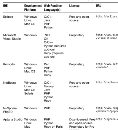
Web developers usually choose an IDE based on its support for a server-side runtime language. Markup language support is built into every mature IDE. Table 2-1 lists popular web development IDEs by development platform and their runtime language support. All of these IDEs support HTML, XHTML, and provide at least modest support for mobile markup languages.
Adobe Dreamweaver and other dedicated web design environments are suitable for producing Mobile Web page layouts, but lack the runtime language support to convert a layout into a Mobile Web application.
Table 2–1. Popular Web Development IDEs by Platform and Runtime Language
Windows PHP Proprietary http://www.nusphere.com
/products/phped.htm
Aptana Studio Windows Linux
Zend Studio Windows Linux Mac
PHP Proprietary http://www.zend.com/en
Figure 2–1. Eclipse PHP Development Tools 3.3 viewing an XHTML-MP 1.1 markup document
Mobile MIME Types
Mobile MIME types (or content types) identify the format of Mobile Web content. Text documents containing mobile markup, binary files containing viewable or playable content like ringtones, wallpaper and videos, and binary executable mobile applications are differentiated by web servers and browser clients in an HTTP transaction using MIME types.
MIME types are used in several ways during an HTTP transaction between a Mobile Web browser and web server—and by the transcoders or proxies that lie between them:
Mobile Browser: The mobile browser sends a list of supported MIME types as the value of the Accept HTTP request header. The Accept request header advertises the content types supported on the mobile device. Unfortunately, some mobile devices are known to report content support inaccurately in this request header. Web servers consider the values in this header and consult a database of mobile device characteristics to determine the best content to send in the HTTP response.
Web Server: The web server is configured to associate file
extensions of mobile content with mobile MIME types. (Web servers generally come preconfigured to support mobile MIME types. However, the webmaster must manually add the additional mobile MIME types.) The MIME type associated with a web document is used as the value of the Content-Type header in the HTTP response. When the web server returns a file to a mobile browser and uses the correct mobile MIME type, the mobile browser knows how to interpret the file: as a web page, mobile application, wallpaper, ringtone, video, and so on. (In some cases, the browser itself might not render the file, but it will prompt the user to save or install it.) Transcoders and gateways: You will often encounter transforming
HTTP proxy servers between the device and your web server. These proxy servers can inspect the Accept and Content-Type headers when deciding how to manipulate the original content on behalf of the device. For example, a PNG image might be transformed into a GIF image, or an HTML document might be converted to XHTML. Server-Side Runtime Languages: You can override the MIME type
associated with a document using a server-side runtime language. Listing 2-1 shows sample PHP code that uses a built-in function at the start of the script to set the MIME type for an HTTP response that contains an XHTML-MP document.
Listing 2-1. Set the MIME Type for a HTTP Response with PHP <?php
Mobile MIME type configuration on a web server is critical to the mobile accessibility of web content. The mobile browser uses the MIME type in the HTTP response to
determine whether the web document should be viewed in the browser, viewed by launching a mobile OS component (such as setting an image as wallpaper), or viewed by launching a native mobile application (such as playing a video in the video player). Table 2-2 lists MIME types for some of the Mobile Web’s common file types. Table 2-2. MIME Types for Common Mobile File Types
MIME Type(s) File
Extension(s)
Contents Common Uses
application/vnd.wap.xhtml+xml
application/xhtml+xml xhtml XHTML-MP markup Mobile Web pages
text/html html (or htm
on Windows servers)
HTML markup Mobile Web pages for HTML-capable smartphones and mobile devices
text/css css CSS1, CSS2, and
Wireless CSS
Cascading style sheets for Mobile Web documents application/javascript
text/javascript js JavaScript Scripting language used with HTML and XHTML-MP 1.1 and 1.2
multipart/mixed - MIME
multipart-encoded document
Allows markup and related web resources (images, CSS, scripts, and so on) to be downloaded in a single HTTP response envelope
text/vnd.wap.wml wml WML markup Lightweight Mobile Web pages for older or low-end mobile devices
text/vnd.wap.wmlscript wmls WML Script Scripting language used with WML
audio/mp3
audio/mpeg mp3 MP3 audio Ringtones and full track music
audio/x-midi midi MIDI audio Ringtones
image/gif gif GIF image Wallpapers
image/jpg
image/jpeg jpg jpeg JPG image Wallpapers
image/png png PNG image Wallpapers
video/3gpp 3gp 3GP video Mobile video
Web Server Configuration
File extensions for mobile markup and related mobile documents are associated with MIME types. Web servers hosting Mobile Web content must be configured to associate mobile file extensions with the correct MIME type. The process of adding new MIME types into web server configuration is different for each model of web server.
Apache
The Apache web server uses the AddType directive in mod_mime configuration to add new MIME types into mime.types, httpd.conf, or .htaccess configuration files.
Apache’s mime.types and http.conf files are global web server configuration files. These files control the overall behavior of the Apache web server.
Apache uses .htaccess files for local or directory-specific Apache configuration. The contents of an .htaccess file affect the directory (and all subdirectories) in which it is placed. The Apache Project (http://httpd.apache.org) recommends that you use .htaccess files only when access to the main Apache configuration file is restricted. (For example, it recommends you use .htaccess use in a shared web-hosting environment where users have nonadministrative access to control their own web documents, but not to the overall Apache server.) Excessive use of .htaccess files impacts server performance.
The AddType configuration directive specifies a MIME type and a list of file extensions to be served with the MIME type using this format:
AddType <MIME type> <file extension> [<file extension>] ...
Listing 2-2 shows an.htaccess configuration file that adds support for mobile MIME types. This file associates both .xhtml and .xhtm file extensions with the MIME type for XHTML-MP markup. Similarly, the .wml file extension is associated with the MIME type for WML markup, while the .wmls file extension is mapped to the MIME type for WML Script.
Listing 2-2. Apache .htaccess Configuration for Mobile MIME Types
# Add Mobile MIME types for XHTML-MP, WML, and WML Script file extensions AddType application/vnd.wap.xhtml+xml .xhtml .xhtm
AddType text/vnd.wap.wml .wml AddType text/vnd.wap.wmlscript .wmls
Microsoft IIS
The Microsoft Internet Information Services (IIS) web server provides user interface, command-line, and programmatic methods for managing MIME type associations with file extensions.
In addition to using the IIS management applications for MIME type configuration, IIS 7 introduces command-line syntax for managing MIME types. Listing 2–3 shows a
command that associates .xhtml files containing XHTML-MP markup with the application/vnd.wap.xhtml+xml MIME type.
Listing 2-3. Adding a MIME Type into Microsoft IIS 7 at the Command Line appcmd set config /section:staticContent ^
/+"[fileExtension='.xhtml',mimeType='application/vnd.wap.xhtml+xml']"
These Microsoft TechNet articles provide more information about managing MIME types through the IIS management applications or scripting:
IIS 4 and 5: http://technet.microsoft.com/en-us/library/bb742440.aspx
IIS 6:
www.microsoft.com/technet/prodtechnol/WindowsServer2003/Libra ry/IIS/cd72c0dc-c5b8-42e4-96c2–b3c656f99ead.mspx?mfr=true
IIS 7: http://technet.microsoft.com/en-us/library/cc725608(WS.10).aspx
Nginx
Nginx (http://nginx.net/) is a lightweight Web server that is well suited to serving static files. On busy sites, a common configuration is to have a server such as Apache or IIS providing the dynamic page generation proxied behind an nginx instance that takes care of images, style sheets, and other static files without the accompanying resource requirements.
You can use the types directive to make configuring MIME types in nginx.conf
straightforward. Listing 2-4 shows an example command that associates the .xhtml file extension with the MIME type for XHTML-MP markup and the .wml file extension with the MIME type for WML markup.
Listing 2-4. Adding MIME Types into Nginx types {
application/vnd.wap.xhtml+xml xhtml; text/vnd.wap.wml wml;
}
Mobile Web Browsers on the Desktop
client-side performance problems. The most accurate way to view web pages in a mobile context is to use an actual mobile device because this will likely let you see the effects of network latency and any proxies present.
NOTE: If you develop Mobile Web content primarily for iPhone, Android, or Nokia Series 60 3rd Edition or later, you should also use a WebKit browser such as Apple Safari (http://
apple.com/safari/) or Google Chrome (http://google.com/chrome). Browsers in these mobile devices use WebKit. Safari and Chrome are WebKit-based desktop browsers that allow user-agent modification and provide code inspectors.
Firefox and Mobile Add-Ons
Firefox is an open-source, standards-compliant, and extensible web browser from the Mozilla Foundation that you can customize easily using add-ons. Add-ons are
extensions and themes developed in the XUL (XML User Interface Language, https://developer.mozilla.org/en/XUL) programming language. Mozilla hosts a directory of add-ons at https://addons.mozilla.org/.
NOTE: In case you were wondering, the acronym XUL, pronounced as zool, is indeed a play on the god Zuul from the classic geek movie, Ghostbusters. In that movie, Sigourney Weaver’s character is possessed by Zuul and famously declares: “There is no Dana. There is only Zuul.”
XUL the programming language uses XML to define the user interface and JavaScript for application logic. The XUL slogan reads: “There is no data. There is only XUL.”
In case you were really wondering, the XML namespace used in XUL documents is shown in Listing 2-5. Who says that developers don’t have a sense of humor? Listing 2-5. Namespace URI for XML-Based XUL Programming Language Used in Firefox Extensions http://www.mozilla.org/keymaster/gatekeeper/there.is.only.xul
The next step is to download and install several add-ons that work together to allow Firefox to mimic a mobile device and render web documents written in mobile markup languages. Start by downloading the latest version of Firefox at
http://www.mozilla.com/en-US/products/firefox/. The following sections will explain how to install and use the add-ons. After you install all the add-ons, restart Firefox to enable them in the browser.
Figure 2-3. Add-ons dialog box in Firefox 3.0.11 after installing mobile add-ons
XHTML Mobile Profile
The XHTML Mobile Profile add-on provides support for the
application/vnd.wap.xhtml+xml MIME type. This add-on allows Firefox to view XHTML-MP Mobile Web documents in the browser window. Without this extension, Firefox prompts the user to save an XHTML-MP document as a file.
Version 0.5.3 of the XHTML Mobile Profile add-on also adds support for the
multipart/mixed MIME type. Multipart encoding is a mobile-markup optimization that bundles a markup document and its dependent resources (images, CSS, scripts, and so on) into an envelope for transmission in a single HTTP response. Many mobile browsers and operators support multipart encoding for Mobile Web content. This add-on displays the HTML component of a multipart-encoded document in the browser window. For more information about multipart encoding, see Chapter 9.
Install XHTML Mobile Profile by browsing in Firefox to https://addons.mozilla.org/en-US/firefox/addon/1345 and clicking the Add to Firefox button.
wmlbrowser
The wmlbrowser add-on allows Firefox to render WML documents in the browser window. Its WML rendering is suitable for developing and debugging WML code, and its layout of WML documents weakly resembles the actual display on mobile devices. Regardless, I still strongly recommend testing on emulators and actual mobile devices. You will learn more about WML in Chapter 3.
Without this extension, Firefox prompts the user to save a WML document as a file. Install wmlbrowser by browsing in Firefox to https://addons.mozilla.org/en-US/firefox/addon/62 and clicking the Add to Firefox button.
This add-on likewise has no options and needs no configuration. When enabled, it allows WML mobile markup to be viewed in the browser window.
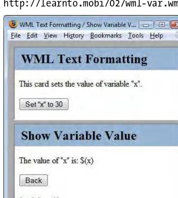
You can see a screenshot of wmlbrowser rendering the sample WML document at http://learnto.mobi/02/wml-var.wml (see Figure 2-4).
Figure 2-4. A WML document with two cards viewed in Firefox 3.0.11 with wmlbrowser add-on
User Agent Switcher
The User Agent Switcher add-on enables Firefox to change the user-agent value that identifies the browser to web servers in HTTP transactions. This add-on sets the value of the User-Agent HTTP request header to one of many user-agents configured by the user. Mobile Web developers use User Agent Switcher to mimic the user-agents of mobile devices. Web sites detect mobile devices using the User-Agent request header and use it as the basis for content adaptation. Step one to impersonate a mobile device in Firefox is to send the phone’s user-agent in web requests.
Install User Agent Switcher by browsing in Firefox to https://addons.mozilla.org/en-US/firefox/addon/526 and clicking the Add to Firefox button.
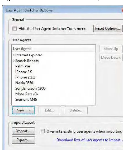
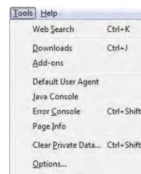
This add-on allows the user to save user-agents from many sources. When enabled, the Tools ➤ Default User-Agent menu allows the user to easily change the value of the User-Agent HTTP request header.
Figure 2-5 is a screenshot of the Options dialog box for User Agent Switcher.
Figure 2-5. The Options dialog box for the User Agent Switcher Add-On
The Options dialog box is found by selecting the Tools ➤ Default User-Agent ➤ Edit User-Agents menu item. This dialog allows you to view and modify the list of installed user-agents. See Appendix A for sample user-agents from mobile devices. The mobile developer community mobiForge (http://mobiforge.com) also provides a pre-packaged set of mobile user-agents for User Agent Switcher. See
http://mobiforge.com/developing/blog/user-agent-switcher-config-file and look for the attachment to the blog post.
Figure 2-6. Selecting a user-agent value using the Tools menu in Firefox 3.0.11
Use the Tools menu to change the value of the User-Agent request header to a value previously added in the Options dialog box.
Modify Headers
The Modify Headers add-on allows rule-based modification of HTTP request headers sent by Firefox. Mobile Web developers use this extension to modify Firefox request headers to exactly match those sent by a mobile device. Step two to impersonate a mobile device in Firefox is to send the exact set of HTTP request headers sent by the phone in web requests.
It is possible to modify the User-Agent request header using Modify Headers but recommended to use instead the more robust support in the User Agent Switcher add-on.
Without this extension, Firefox sends its default set of HTTP request headers when making requests to web servers.
Install Modify Headers by browsing in Firefox to https://addons.mozilla.org/en-US/firefox/addon/967and clicking the Add to Firefox button.
Figure 2-7. Modify Headers dialog box is available in the Tools menu of Firefox 3.0.11
The Modify Headers add-on uses a dialog box to configure simple rules for changing the HTTP request headers sent in Firefox. Each rule adds, modifies or filters (suppresses) a single request header. Rules are executed sequentially and may be individually enabled and disabled.
The example rules in Figure 2-8 change several request headers in Firefox: They add MSISDN: 5035551212.
They update the Via header to Via: 127.0.0.1.
They update the Connection header to Connection: close. They remove the Keep-Alive header.
The second MSISDN rule is not executed because it is disabled.
By default, Modify Headers modifies Firefox request headers only when the Modify Headers dialog box is open, but that setting may be changed by clicking the Configuration button on the dialog.
It can be helpful to view Firefox request headers while you are writing rules to modify them to mimic a mobile device. The Live HTTP Headers add-on displays HTTP request and response headers in a Firefox window. Or, browse to
http://learnto.mobi/view.php from Firefox to view request headers.
See Appendix B for samples of HTTP request headers from mobile devices.
Live HTTP Headers
The Live HTTP Headers add-on allows users to view request and response headers from HTTP transactions in Firefox. Mobile Web developers review HTTP headers to check that Firefox is accurately impersonating a mobile device and to gain a deeper understanding of the HTTP transaction.
Without this extension, Firefox surfaces only a summary of header information in the Tools ➤ Page Info dialog.
Install Live HTTP Headers by browsing in Firefox to https://addons.mozilla.org/en-US/firefox/addon/3829 and clicking the Add to Firefox button.
Figure 2-9 shows the Live HTTP Headers menu item in the Tools menu of Firefox.
Figure 2-9. The Live HTTP Headers dialog box available in the Tools menu of Firefox
Figure 2-10. The Live HTTP Headers dialog box displaying Headers and add-on configuration
The Live HTTP Headers dialog box displays a real-time stream of HTTP request and response headers. Clear the Capture checkbox to pause header collection. Use the Config tab to change add-on configuration. Its configuration settings allow developers to filter the web content for which headers are viewed and saved.
Figure 2-11. Live HTTP Headers adding Headers to Firefox’s Page Info dialog box
Small Screen Renderer
The Small Screen Renderer add-on creates a view in Firefox that displays web pages on a very small screen, similar to that of a mobile device. This add-on is designed to provide an approximation of how a web page might be displayed on the small screen of a mobile device. Mobile Web developers use the add-on as a sanity check, so they can have a reasonable degree of confidence that their page layouts are adequate for small screens. However, testing Mobile Web pages in emulators and actual mobile devices provides a much more accurate view of mobile browser page rendering.
Without this extension, Firefox renders web pages in the entirety of the browser window. Install Small Screen Renderer by browsing in Firefox to
This add-on has no options and no configuration. When enabled, small-screen view can be toggled in Firefox’s View menu.
Select View ➤ Small Screen Rendering to enable and disable small-screen viewing of web pages in Firefox, as shown in Figure 2-12.
Figure 2-12. Toggling Small Screen Rendering in the View menu of Firefox
The Small Screen Rendering add-on simulates how a web page might be viewed on a mobile device. For example, Figure 2-13 shows a small screen view of CNN’s desktop web site in Firefox.
Firebug
The Firebug add-on allows live editing and debugging of HTML, CSS, and JavaScript in any web page. Firebug provides DOM inspection and assessments of web site
performance. Mobile web developers use Firebug to review markup and style syntax, find errors, debug client-side scripts, and improve performance.
Without this extension, Firefox does not allow editing of web content viewed in a browser window. Other extensions provide JavaScript debugging, DOM inspection, and performance indicators. Firebug aggregates these important features of
web-development tools into a single extension and provides clean integration into the Firefox browser.
Install Firebug by browsing in Firefox to
https://addons.mozilla.org/en-US/firefox/addon/1843 and clicking the Add to Firefox button. Or, visit the Firebug website at http://getfirebug.com/.
This add-on has options that control the web pages that Firebug can inspect and the types of web content to be inspected. Figure 2-14 shows the Tools ➤ Firebug menu in Firefox.
Figure 2-14. The Tools ➤ Firebug menu in Firefox