Informasi Dokumen
- Penulis:
- Mico Yuk
- Stephanie Diamond
- Sekolah: John Wiley & Sons, Inc.
- Topik: Data Visualization For Dummies
- Tipe: book
- Tahun: 2014
- Kota: Hoboken
Ringkasan Dokumen
I. Introduction
Data visualization (data viz) is increasingly vital in today's data-driven world. It transforms complex datasets into visual formats that enhance comprehension and insights, which is essential for businesses aiming to leverage big data for competitive advantage. This section introduces the significance of data visualization, emphasizing its role in storytelling through data, and the necessity of moving beyond traditional reporting methods. The authors assert that effective data visualization can unlock valuable insights, enabling organizations to make informed decisions based on comprehensive data analysis.
II. Getting Started with Data Visualization
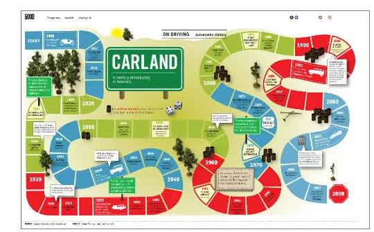
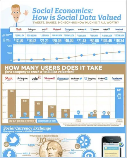
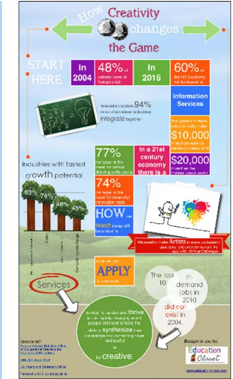
This section provides foundational knowledge about data visualization, including its importance and the various types used across different fields. It highlights the distinctions between data visualizations and infographics, offering criteria to differentiate them. The authors advocate for understanding the audience and context when creating visualizations, ensuring that the chosen format effectively communicates the intended message. This foundational knowledge is crucial for educators and students as it sets the stage for deeper exploration of data visualization techniques and applications.
III. Knowing What You Must about Big Data
Big Data refers to the vast volumes of data generated from various sources, including social media and customer interactions. This section explores the implications of Big Data for businesses, emphasizing the need for effective data management and visualization to derive actionable insights. The authors discuss the characteristics of Big Data, such as volume, variety, and velocity, and how these factors influence business decisions. Understanding Big Data is essential for students and professionals aiming to harness its potential for strategic advantage in their respective fields.
IV. Using Charts Effectively
This section focuses on the effective use of charts in data visualization. It guides readers on selecting appropriate chart types based on the data being represented and the story being told. The authors discuss the importance of clarity and simplicity in chart design, advising against overly complex visuals that may confuse the audience. By emphasizing the principles of effective chart use, this section serves as a practical resource for students and educators, enhancing their ability to communicate data insights clearly and effectively.
V. Adding a Little Context
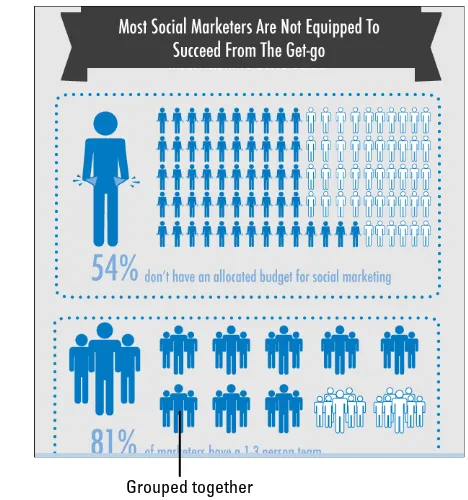
Contextualizing data visualizations is critical for enhancing understanding and interpretation. This section emphasizes the importance of text and labeling within visualizations, guiding readers on how to effectively integrate contextual information without overwhelming the visual. The authors provide strategies for positioning text and choosing appropriate fonts and colors, ensuring that the visualization remains clear and informative. This guidance is invaluable for educators and students alike, as it highlights the balance between visual appeal and informative content.
VI. Paying Attention to Detail
Attention to detail in data visualization can significantly impact user comprehension. This section explores how users digest data and the common visual patterns that aid understanding. The authors discuss design patterns, such as Z and F patterns, and emphasize the importance of consistency across devices. This focus on detail is essential for students and professionals aiming to create user-friendly visualizations that facilitate effective data interpretation and decision-making.
VII. Defining an Easy-to-Follow Storyboard
Storyboarding is a crucial step in the data visualization process, allowing creators to outline the narrative their visualization will convey. This section guides readers through developing a storyboard that aligns with business objectives and audience needs. The authors emphasize the importance of identifying key performance indicators (KPIs) and documenting goals to ensure that the visualization effectively communicates its intended message. This structured approach is particularly beneficial for students learning to create impactful data visualizations.
VIII. Developing a Clear Mock-Up
Creating a mock-up is an essential part of the data visualization process, enabling designers to visualize their concepts before finalizing the product. This section provides practical advice on developing effective mock-ups, including the use of black-and-white sketches to focus on layout and structure. The authors encourage readers to utilize various tools and templates, fostering a hands-on approach to learning about visualization design. This practical guidance is valuable for students and educators in the field of data visualization.
IX. Adding Effective Visuals to Your Mock-Up
Effective visuals are key to successful data visualizations. This section discusses the traits of effective visuals and how they contribute to clarity and insight. The authors provide strategies for integrating visuals into mock-ups, emphasizing the importance of alignment between data and visual representation. By focusing on the principles of effective visual design, this section enhances the ability of students and professionals to create compelling and informative data visualizations.
X. Adding Functionality and Applying Color
Functionality and color application are crucial elements of data visualization design. This section explores how to enhance visualizations with interactive features and appropriate color schemes. The authors discuss the psychological effects of color and provide guidelines for choosing colors that enhance readability and user engagement. This focus on functionality and aesthetics is essential for students and educators aiming to create effective and appealing data visualizations.
XI. Adding Some Finishing Touches
Finishing touches can elevate a data visualization from good to great. This section highlights the importance of including useful links, timestamps, and legal information in visualizations. The authors emphasize the need for clarity and transparency in data presentation, ensuring that users can trust the information being conveyed. This focus on detail is particularly beneficial for students and professionals in the field of data visualization, as it reinforces best practices for ethical data presentation.
XII. Exploring User Adoption
User adoption is a critical factor in the success of data visualizations. This section discusses strategies for promoting user engagement and ensuring that visualizations meet user needs. The authors provide insights into measuring user adoption and the importance of maintaining data accuracy and accessibility. Understanding user adoption is essential for students and professionals aiming to create impactful data visualizations that drive decision-making within organizations.
XIII. Evaluating Real Data Visualizations
Evaluating existing data visualizations can provide valuable insights into best practices and common pitfalls. This section guides readers through the evaluation process, focusing on design elements, interactivity, and user experience. The authors encourage critical analysis of various visualizations to identify strengths and weaknesses, fostering a deeper understanding of effective data presentation. This evaluative approach is beneficial for students and educators in enhancing their data visualization skills.
XIV. Recognizing Newbie Pitfalls
New data visualization creators often encounter common pitfalls that can undermine their work. This section identifies these pitfalls and provides strategies for avoiding them. The authors emphasize the importance of focusing on the story rather than the tools and highlight the need for clarity in data presentation. This guidance is invaluable for students and professionals, helping them navigate the challenges of creating effective data visualizations.
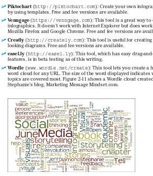
XV. Top Ten Data Visualization Resources
This section curates a list of essential resources for data visualization practitioners. The authors recommend books, websites, and tools that can enhance understanding and skills in data visualization. By providing access to valuable resources, this section supports students and educators in their ongoing learning and development in the field of data visualization.
XVI. Top Ten Fears of New Data-Viz Creators
Understanding the fears and concerns of new data visualization creators can help them build confidence and competence. This section addresses common anxieties, such as making incorrect design choices or failing to engage the audience. The authors offer reassurance and strategies for overcoming these fears, fostering a positive learning environment for students and professionals in the field of data visualization.
Referensi Dokumen
- Data Visualization For Dummies ( Mico Yuk )
- Advanced Data Visualization (ADV) Platforms ( Noel Yuhanna )
- Social Media Marketing For Dummies ( Stephanie Diamond )
- The Visual Marketing Revolution ( Stephanie Diamond )
- The Visual Display of Quantitative Information ( Edward Tufte )