Joomla!
®
Templates
Angie Radtke
Upper Saddle River, NJ • Boston • Indianapolis • San Francisco New York • Toronto • Montreal • London • Munich • Paris • Madrid
The mission of
Joomla! Press
is to enhance the Joomla! experience
by providing useful, well-written, and engaging publications for
all segments of the Joomla! Community from beginning users
to platform developers. Titles in
Joomla! Press
are authored by the leading
experts and contributors in the community.
Visit
informit.com/joomlapress
for a complete list of available publications.
A Message from Open Source Matters
Since Joomla! launched in September 2005, it has grown to become one of the most popular content management systems in the world. As this book goes to press in July 2012, Joomla! has been downloaded over 32,000,000 times and provides support for 64 different languages. Joomla! has received multiple awards, and estimates indicate that approximately 2.8% of all Internet Web sites are using Joomla!.
The key to Joomla!’s success has always been the help and contributions freely given by a large and diverse group of volunteers from all over the world. The Joomla! project isn’t backed by venture capital firms, and it isn’t led by a single individual or corporation. It is volunteers who write the code and then test it, translate it, document it, support it, extend it, promote it, and share it.
Volunteers are also continually planning and organizing events all over the world where people come together to learn, connect, and share about Joomla!. These events include hundreds of local user groups, as well as national and international conferences. The first Joomla! World Conference will take place in November 2012 in San Jose, California (go to http://conference.joomla.org for more information).
Work is underway on many improvements and new ideas aimed at keeping Joomla! on a path of continued growth and innovation. Our community is open to all. If the idea of working alongside a diverse group of bright and passionate volunteers from all over the world who are helping to make Joomla! better sounds fun and rewarding to you, then I invite you to join us. To learn more, please go to http://www.joomla.org.
Best regards,
Paul Orwig
President, Open Source Matters
tions appear in this book, and the publisher was aware of a trademark claim, the designations have been printed with initial capital letters or in all capitals.
The author and publisher have taken care in the preparation of this book, but make no expressed or implied warranty of any kind and assume no responsibility for errors or omissions. No liability is assumed for inciden-tal or consequential damages in connection with or arising out of the use of the information or programs contained herein.
The publisher offers excellent discounts on this book when ordered in quantity for bulk purchases or special sales, which may include electronic versions and/or custom covers and content particular to your business, training goals, marketing focus, and branding interests. For more informa-tion, please contact:
U.S. Corporate and Government Sales (800) 382-3419
For sales outside the United States, please contact: International Sales
[email protected] Visit us on the Web: informit.com/aw
Library of Congress Cataloging-in-Publication Data
Radtke, Angie.
Joomla! templates / Angie Radtke. p. cm.
Includes bibliographical references and index. ISBN 978-0-321-82731-9 (pbk. : alk. paper)
1. Joomla! (Computer file) 2. Web sites—Authoring programs. 3. Web site development. I. Title.
TK5105.8883.R32 2013
006.7'8—dc23 2012017878 Copyright © 2013 Pearson Education, Inc.
All rights reserved. Printed in the United States of America. This publica-tion is protected by copyright, and permission must be obtained from the publisher prior to any prohibited reproduction, storage in a retrieval sys-tem, or transmission in any form or by any means, electronic, mechanical, photocopying, recording, or likewise. To obtain permission to use material from this work, please submit a written request to Pearson Education, Inc., Permissions Department, One Lake Street, Upper Saddle River, New Jersey 07458, or you may fax your request to (201) 236-3290.
ISBN-13: 978-0-321-82731-9 ISBN-10: 0-321-82731-7
Contents
Introduction xvii
Acknowledgments xxi About the Author xxiii
1 The Basis: Designing the Content and Visual Concept 1
It All Starts with the Structure 1
Recognizing User Expectations 2
Page Layout—Visually Structuring Content 3
Designing with Grids 3
Implementation 5
Push to Front Principle 7
The Graphical Layout—Visual Appearance Matters 7
Colors—A Central Element 8
Designing the Navigation—The Core of the Design 12
Content Design—To Make It Fun to Read 12
Font Design—We Do Not Have Many Options 13
Fixed and Fluid Layouts 16
2 Accessibility—What Is It? 19 The Legal Basis 20
Visual Impairment 21
Initial Situation and Findings 21
Technical Aids 22
What Can We Do? 28
Motor Disabilities 29
Initial Situation and Findings 29
Technical Aids 30
What Can We Do? 30
Deafness 31
Initial Situation and Findings 31
Technical Assistance 31
What Can We Do? 31
Learning Disabilities 31
Initial Situation and Findings 32
Seniors 33
Initial Situation and Findings 33
What Can We Do? 34
3 CSS and HTML—Getting the Basic Structure into Shape 35
A Few Words about the History 35
Which Version of HTML Should I Use? 36
HTML 4.01 and XHTML 1.0 36
HTML5 37
The Basic HTML Structure 38
A Brief Introduction to CSS 38
Adding CSS Statements 38
CSS Selectors 40
Inheritance 44
Using Multiple Classes Together 44
Positioning and Box Model 47
CSS Hacks and Browser Problems 52
Conditional Comments 52
The * Hack 52
Internet Explorer Again: hasLayout 53
CSS Tuning 54
CSS3—A Brief Overview 55
Vendor Prefixes 55
Overview of the Three Most Useful CSS Statements 56
border-radius 56
box-shadow 56
linear-gradient 57
4 Responsive Web Design 59 But How Does It Work? 59
CSS3 Media Queries 60
Option 1—Integration into the Main Stylesheet 60
Option 2—Integrating Separate Stylesheets 61
Adapting Graphics and Videos 61
Contents ix
5 PHP and Joomla! 63 Integrating PHP 63
Comments 65
echo 65
Outputting Strings 65
Outputting Variable Values 65
Conditions: if Statements 66
if Statement 66
else Statement 68
For Pros: Accessing Objects and Their Values 68
Parameter Basics 68
Using Parameters 69
6 MooTools 71 Why MooTools? 72
MooTools Quick Start—Dollar Functions and Events 73
The MooTools Core in Action 74
The Class System 76
The MooTools Principle 79
Related Links 81
7 Tools 83
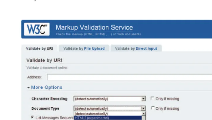
HTML Validator and CSS Validator 83
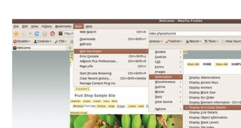
Web Developer Toolbar 84
Firebug 85
Helpful Tools for Accessibility 86
Colour Contrast Analyser 86
Accessibility Extensions for Internet Explorer and Mozilla Firefox 87
Wave 88
WCAG 2 Checker of the University of Toronto 89
Tilt 3D 89
8 Now for the Details: A First Look at Templates 91 Atomic 91
beez_20 and beez5 91
The Template Manager: Templates 94
The Template Preview 95
Template Details 97
Installing Templates 99
9 The Underlying Structure 101
The Heart of the Matter, the index.php 102
The css Folder 102
templateDetails.xml 103
The images Folder 103
The html Folder 103
The javascript Folder 103
The language Folder 103
component.php 103
error.php 104
template_thumbnail.png and template_preview.png 104
favicon.ico 104
The fonts Folder 105
The index.html 105
10 The index.php: The Heart of the Matter 107 The Document Head 107
Safety First: Security 107
Which Document Type? 108
HTML Language Indicator 108
jdoc: include type:head 109
Integrating CSS and JavaScript 112
Integrating MooTools 113
Reading Direction from Right to Left 113
And Off We Go: The Body 114
11 The XML File and the Template Parameters 117 templateDetails.xml: General Information 117
Customizing Template Names 119
Integrating Files and Folders 123
Defining Module Positions 123
Contents xi
Template Parameters: config 124
Adding Your Own Form Fields and Accessing Them 126
Adding Form Elements 129
12 The Language Files 135
How Joomla! Translates Constants to Multiple Languages 135
Adding Your Own Languages 136
Joomla! Conventions for Using Language Strings 137
Language Files in index.php Using the Examples of Skip Links 137
13 Modules—Dynamics within the Presentation 139 jdoc:include 139
The name Attribute 140
The style Attribute and the Default Styles 144
Beez Styles 146
Integrating the Module Flexibly into the Layout 149
Adapting ID and CSS 150
The Module Class Suffix 151
The Menu Module 155
Horizontal Navigation with Subnavigation 156
Folded Out Menu 157
Styling Individual Menu Items via Individual Classes 159
Link Image 159
Allocating Individual Link Titles 160
14 Designing Default Output Individually 161 Inspecting the Default Output 161
The Page Class Suffix 162
Template Overrides 165
Model-View-Controller 166
Shifting Output to the Template 168
Adapting Output 169
15 The System Template: Adapting and Modifying Output 173
System Notices 173
Integrating the Messages into the index.php File 176
Adapting the Language 176
Error Messages 176
Replacing System Graphics 179
component.php and How to Do Magic with It 179
Component View with Search Engine–Friendly URLs 181
The component.php File as the Basis for Custom Views 182
offline.php 183
16 Advanced Template Customization Tricks 185 When the Reading Direction Changes: Right-to-Left Languages 185
IntegratingRTLCSS 186
TestingRTL Mode 187
PHP Browser Switch 187
PHP Tricks 189
StructuringtheHomepageDifferently—Access to the Views 190
Outputting the Current Date with PHP 190
17 The Default Templates and Their Features 193
beez_20 and beez5 Templates 193
Accessibility in General 194
beez_20: Selectable Design 196
Position of the Navigation Column 197
JavaScript and WAI-ARIA 199
beez5: Using HTML5 205
Atomic Template 207
Contents xiii
19 Step by Step to a New Layout 217 Step 1: Positioning the Navigation 218
Problem 218
Action 218
Step 2: Filling the Center Column with Content 218
Problem 218
Action 218
Optimizing Step 2: More Meaningful Names for Module Positions 219
Step 3: Adjusting the Number of Articles 223
Problem 223
Action 223
Step 4: Visually Designing the Header 223
Problem 223
Actions 223
Result 234
Step 5: Integrating the Module Position for the Header Picture 235
Problem 235
Action 235
Step 6: Adapting the Footer 239
Problem 239
Action 240
Step 7: Adapting the Minimum Height of Content 240
Problem 240
Step 8: The First Tests 241
Font Enlargement 241
Keyboard Operation 242
Browser Check 243
Step 9: Customizing Typography 245
Problem 1 245
Action 1 245
Problem 2 246
Action 2 246
Step 10: Formatting Module Headings 246
Problem 246
Step 11: Assigning the Background Image to the Homepage Article 249
Step 12: Final Tests 253
Validating CSS 253
Validating HTML 253
Browser Check 255
Accessibility Checks 257
20 Integrating Custom Features 259
The Header Image—A Background Image? 259
EditingModuleContent 261
AdaptingCSS 262
BackgroundImagesin the Module’sOwnHTML 264
BrowserCheck 264
Using HTML5 Effectively 265
AddingtheHTML5Overrides 267
Adaptingindex.php 269
AddingtheJavaScriptFiletoDealwithInternet Explorer 271
AdaptingCSS 271
21 Final Tasks: Fine-Tuning and Creating an Installable Zip Archive 273
Fine-Tuning 273
Creating a Print Stylesheet 273
Adjusting error.php and offline.php 274
Right-to-Left View 274
Removing Superfluous Files 274
Creating Previews 274
Changing Favicon 275
Optimizing index.php 275
Adapting the XML File 277
Creating a Zip Archive 278
Appendix 279
Useful Links 279
Joomla! 279
Assistive Technologies 279
Contents xv
HTML5 280
Design 280
Typography 280
Colors 281
Icons 281
JavaScript 281
WAI ARIA 281
Checker Tools 281
Helpful Functions 282
CSS Classes Used and Their Elements 283
Templates 283
Components 287
Modules 305
Introduction
J
oomla! is one of the best known Open Source content management systems with many hundreds of thousands of applications in the most varied areas of use. It offers the best possible conditions for implementing a comprehensive and accessible Web pres-ence. Thousands of extensions for almost any purpose are freely available. The developer and user community is huge. On the Internet you can find many different platforms for exchanging information with other users and developers. That’s an advantage you should not underestimate! But a Web site without individual design is inconceivable. After all, it’s not just the content that makes a Web site truly unique; above all, it’s the individual design. This design is the job of the Joomla! templates. In addition to the design aspect, they are also responsible for structuring the content. They create the framework and are basically a template for the content. So they control not only what something looks like but also where the content is located within the document. Joomla! template designers are responsible not only for the design but also for the architecture of the information. When designing a Web site, you need to take into account all requirements of the client as well as the expectations of the visitors.A small, but important part of these requirements is accessibility. With Joomla!, it’s really easy to create accessible Web pages.
To develop Joomla! templates, you need some knowledge of different areas of Web technology, much of which has little to do with Joomla! itself. In our time of increas-ingly manifold technical possibilities, it is difficult to be an expert in all available Web technologies, so we tend to specialize in certain areas. For instance, you have the front-end developer who knows all there is to know about HTML and Cascading Style Sheets (CSS), the designer who can use Photoshop with all its functions, the PHP specialist, and the JavaScript expert. To develop Joomla! templates, you need some of all this specialized knowledge.
Why This Book Is Unique
This book does not replace a specialized reference work on usability, CSS design, infor-mation architecture, PHP, JavaScript, accessibility, or HTML5, but it discusses certain aspects of these topics and others. The aim of this book is to give you the required basic knowledge you need to develop Joomla! templates.
particularly hard to achieve because I could easily have written whole books on each topic. I hope I succeeded and that you find my book helpful.
How This Book Is Organized
My first aim is to show you how Joomla! templates are constructed and how you can create an accessible, standards-compliant template by using the technical possibilities offered by Joomla! in combination with the most modern forms of technology.
In the opening chapters of the book, you will find general basic information on the individual Web technologies, comments on design, and a list of helpful tools. In principle, the things I describe in this part are the basic requirements you need to build a template in the first place. They are meant to help you get started with these topics. If you are a Web designer, you will probably already be familiar with most of the information con-tained in this part. In that case, you can move straight on to the second part.
The subsequent chapters discuss the technical background of constructing templates. Using concrete examples, I show you the technical options and internal interrelations.
The final chapters are more practical and presented in the form of a workshop. I dem-onstrate how to turn a template created in Photoshop to a Joomla! template, step by step.
As happens with any vigorous, ongoing project, Joomla! is always evolving. This book contains the most recent information available at the time of publication but see informIT.com/title/0321827317 for bonus chapters on future releases.
What You Need to Know Before Using This Book
This book is not a “click instruction” but aims to explain contexts and encourage work-ing independently. It is not a CSS book either, although CSS is an important component in building your Joomla! template and is discussed frequently. Photoshop, JavaScript, and PHP are also important tools for your Web design. This book doesn’t provide tutorials on these tools, so you may find it helpful to consult textbooks on these topics.When you start reading this book, keep these hints in mind.
As an Open Source project, Joomla! is subject to constant changes. In some chap-ters I refer to code by specific line numbers. It may well be that these lines move about a bit during the development, because code sections are inserted or removed. I added the references anyway to help you get close to the right place. So if you look something up and it’s not on the specified line number, please just look a bit above or below it.
Introduction xix
To get the most out of the book, you should install Joomla! (with the sample data that comes with it) onto a Web server. You need to have full access to the file system. The best option is to install a local Web server on your computer, such as XAMPP (www.apachefriends.org/en/xampp.html). This is especially important by the time you get to Chapter 8, “Now for the Details: A First Look at Templates.”
You will also find it very helpful if you can work with Firefox and install the extension Firebug, which will make your work much easier. You can find out what Firebug is and where to get it when you get to Chapter 7, “Tools.”
Joomla! templates is a wide topic. I have tried very hard to cover all the important points in sufficient detail, but I may have missed something. If you do notice anything, I would be grateful if you could get in touch. Just e-mail me at [email protected].
Acknowledgments
I
n 2010, Joomla! was at the center of my creative activities. I spent much time using— and greatly enjoying—Joomla!. Working with the templates and the default output has helped me both professionally and personally. I have learned so much and am happy with the outcome of my work. This book was created as a result of it.Those people with whom I spent a large amount of my time chatting on Skype were also involved. We worked out concepts, made plans, and contrived specific solutions. This includes the always prepared Jean-Marie Simonet, whose commitment I can only admire. Then there is Andrea Tarr, who turned out to be a fellow campaigner for accessibility. There is also Elin Waring, who never seems to sleep. My gratitude goes to Mark Dex-ter, who always remains calm, and Bill Richardson, the good spirit of bug tracking, who sometimes had to test my patches twice. And I should not forget to mention my “rubber ducky,” Sam Moffat, who was able to solve my problems just by listening to me (maybe he has magic powers?). I also owe thanks to Mahmood and Ofer, who took care of the RTL-CSS of the templates, and to Henk van Cann for listening, to Ian MacLennan, Andrew Eddy, Louis Landry, Jennifer Marriott, and many others.
Special thanks to my colleague and friend Michael Charlier, who supported me with many helpful tips and important advice. I would also particularly like to thank my friend Biggi Mestmäcker for having the patience of a saint, for providing the linguistic fine polish, and for the fact that she still answers the phone when I call. Also I would like to thank the editor of the German edition, Boris Karnikowski, for his encouraging words and his trust in me.
I am very happy that my book has also been translated into English and would like to thank the U.S. team at Pearson for their wonderful work. Special thanks are due to Almut Dworak, the translator, whose valuable feedback has certainly helped improve this edition significantly.
About the Author
Angie Radtke, along with her colleagues at her communications agency, Der Auftritt (www.der-auftritt.de),has been conceiving, designing, and implementing targeted commu-nications solutions since 1999, primarily in the areas of Internet and print. She specializes in marketing-oriented, accessible Web presences and tends to use the open source content management system Joomla!, depending on the customer’s wishes.
Appealing design, accessibility, and use of a content management system are not mutu-ally exclusive, and therein lies the basis of Radtke’s work. She invests a lot of time and energy in further developing Joomla!. Radtke was actively involved in promoting acces-sibility in the previous version, Mambo, and her dedication continues today. She devel-oped the two default templates, Beez 2.0 and Beez 5, and she sees herself as an interface between Joomla!’s program logic and its actual output of contents.
Radtke is increasingly involved in passing on her knowledge to others—for example, in training sessions, presentations, and workshops on Joomla! and through accessible Web design. In 2006, she and coauthor Michael Charlier published Barrierefreies Webdesign: Zugängliche Websites attraktiv gestalten (München: Addison-Wesley), a book on designing attractive, accessible Web sites.
1
The Basis: Designing the
Content and Visual Concept
C
reating a Web site is a constant challenge. You need to combine content, design, and interaction and use the technology you have available to create a unified whole. At the same time, you need to incorporate the existing corporate design used by the business or institution. Good Web sites are always geared toward specific target groups and ensure that as many people as possible can access the content. They support the user in absorb-ing the information provided but do not limit the user to just a sabsorb-ingle way of usabsorb-ing it. Successful businesses want to set themselves apart from the competition and project a specific image—good products and services alone are no longer enough.A good corporate design reflects the company’s philosophy and the underlying cor-porate culture. The effect of the design is determined by the interaction of its basic ele-ments. Are the colors harmonious? Is the logo expressive? Does the design contain typical features that people will recognize? And so on.
Design is a very powerful form of communication. It creates emotions, transmits a message, and triggers different reactions in the viewer. An overall design that differs too much from common expectations will cause visitors to leave your site.
The first impression is crucial. When users visit a Web site, they decide in the first few seconds whether or not to stay. We all know what it’s like when you meet someone for the first time. Your first impression decides how you behave. Your impression and response have a lot to do with your own experiences and your own personal perception. People react on the basis of their personal backgrounds and social context. For example, things that have a positive connotation in the United States may trigger negative reactions in Europe or Asia.
It All Starts with the Structure
The client hires a designer to create a pretty shell that corresponds to the corporate identity of the company. If the designer does a good job, the client is happy and gets someone to integrate the whole thing into a template. And that’s where the first prob-lems arise. A template can look however you want it to look, but certain conventions still must be observed.
With Joomla!, almost anything is possible: it just depends how much effort you are willing to invest.
Once the design is implemented correctly, the next step is inserting the content. But what if the designer failed to allow room for longer words in the navigation, or what if the headers are too long and suddenly spill over onto two lines? It does not take much to ruin the whole design.
A good content-related structure makes a Web site much more usable. The prettiest design and the best technology are of little use if the content is insufficiently structured.
Before you start designing, you should have finished developing your underlying con-cept with regard to the content. The design is only there to enhance the content and help the viewer absorb the information.
This of course does not mean that all content has to be available in its entirety right from the start. After all, we are working with a content management system that can be expanded. But you should at least know what type of information must be displayed and how it will be presented.
Tip
It pays to get a good copywriter!
Recognizing User Expectations
Web applications have to be based on the motivation, the aim, and the expected behavior of the user because human beings are creatures of comfort and want to have as little as possible to do with operating your Web site. Usually, users are looking for information. The aim should be to lead them to this information as quickly and with as few com-plications as possible. You need to take into account that users follow their habits and experiences when searching for information. The Web has become an accepted part of life in recent years. Web sites with technical, visual, and structural defects are not readily accepted because, with the huge deluge of information out there, anything the users can-not find directly on your Web site they will try to find elsewhere.
One of the most important aspects in the Web design process is finding out the goal of the users. What is their motivation to visit the Web sites you have designed, and how can you support them in terms of visual design and technology?
Page Layout—Visually Structuring Content 3
This process is not always easy, as your view of the content may be significantly different from that of the user. Do not forget: you know your information and how it’s organized, but your user does not.
Page Layout—Visually Structuring Content
The layout design of the individual site areas is a central element for presenting content. The term column layout became common in the times of table layouts. A table layout is nothing more than a structural grid that enables you to arrange your content consistently. Originally, it was a term from newspaper layouts, and site designers later brought this type of presentation to the Web. Tables were the first choice for presenting content online.
You may have heard the term the golden ratio. Artists and architects have long used this ratio, which appears frequently in nature. Wikipedia offers the following definition:
In mathematics and the arts, two quantities are in the golden ratio if the ratio of the sum of the quantities to the larger quantity is equal to the ratio of the larger quantity to the smaller one.1
This sounds very technical and hard to understand. Simply put, you could describe it as a ratio of one-third to two-thirds. Elements that are arranged on the screen in this ratio often appear very harmonious and well balanced. Figure 1.1 shows what a golden ratio looks like.
Designing with Grids
In addition to the golden ratio rule, using the grids can make your design process simpler. In every graphics program you will find a grid view. If you use the grids, you will find it considerably easier to position individual elements on the screen.
1. http://en.wikipedia.org/wiki/Golden_ratio
In principle, grids are a combination of vertical columns, horizontal areas, and empty spaces. Grids help designers find structure and patterns within their design. The result is usually a more harmonious, well-proportioned overall picture. An example of a typical grid is shown in Figure 1.2.
Grids, positioned as background images in the graphics program, serve as guidelines for the chosen design. This makes it easier to position columns and boxes.
To create suitable grids, you need to use a little bit of math because you have to com-bine the width of the individual columns with a corresponding amount of blank space so that the whole layout stretches over the total selected width. Fortunately, others have already taken care of the math for you.
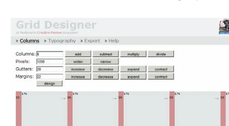
On the Web site www.960.gs you will find a collection of grid patterns for various graphics programs, each with a total width of 960 pixels.
If you want to create grids for individual page widths, Grid Designer by Rasmus Schultz (http://grid.mindplay.dk) can help. This program gives you the option of enter-ing individual data on the total width, number of columns, and desired distances. Grid Designer then automatically creates the desired template for you. See Figure 1.3 for an example of using Grid Designer.
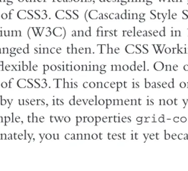
Among other reasons, designing with grids will become more important in the future because of CSS3. CSS (Cascading Style Sheets) was developed by the World Wide Web Consortium (W3C) and first released in 1996. The requirements for modern Web design have changed since then. The CSS Working Group of the W3C has been thinking about a more flexible positioning model. One of the group’s ideas is the grid-positioning module of CSS3. This concept is based on the idea of grids, but although it is eagerly awaited by users, its development is not yet finished. The grid-positioning module offers, for example, the two properties grid-columns for columns and grid-rows for rows. Unfortunately, you cannot test it yet because browsers do not currently support it.
Page Layout—Visually Structuring Content 5
For further information, have a look at Transcending CSS: The Fine Art of Web Design by Andy Clarke and Molly Holzschlag (Berkeley, CA: New Riders, 2007) or visit www. alistapart.com/articles/outsidethegrid.
Implementation
Once your structure is established, you can visually arrange the various basic elements— information on the company, the navigation, and content of the columns—on the screen. Doing so allows users to understand the site as a whole and find their way around it easily.
Over the years, a few clear conventions for layout designs have developed on the Web. The header usually contains information about the company, the purpose of the site, central navigation elements such as company and contact information, and possible navigation aids such as links to a sitemap or a search function. As a header, this type of information is in the viewer’s direct field of vision and can be easily found if there are any problems.
In our Western direction of reading, the eye moves from left to right and top to bot-tom over the pages, so the logo is usually placed at the top left in the primary visual area.
The average user expects to find the navigation on the left side. However, this design is often debated because some say it is boring and lacks innovation. But people fol-low familiar patterns, even when moving around the Internet. They have their own
experiences and will react accordingly. Familiar positioning shortens the time users require to grasp the overall content. They can then turn more quickly to specific content on the site. The first few seconds are crucial because users who do not directly find what they are looking for can soon lose interest.
The main content is generally placed on the center of the page. Larger Web sites and portal sites frequently feature additional information on the right, offering a brief sum-mary and then linking to more detailed information.
Usability experts generally use eye-tracking systems to test a site. These systems track the eye movements and viewing direction of users when they are looking at a Web site. It records which areas of the Web site users look at, how long they look at it, which area they look at first, and so on. Tests done with this system have shown that familiar posi-tioning leads users to take in the content more quickly. For a short demonstration of an eye-tracking system on a Web site, check out www.youtube.com/watch?v=lo_a2cfBUGc.
This setup is of course not obligatory, but because of its success, it is recommended. Consider municipality or utility company Web sites. In general, they are not visited fre-quently, and when they are visited, it is usually in situations of stress: for example, the trash was not collected or there was a mistake on a bill. In such cases, users are glad to find their way around without having to search an unfamiliar layout. So adhering to the (relatively few) design conventions of the Web is generally an indispensable requirement for achieving a high level of accessibility.
Many designers prove that the three-column design does not have to be boring. A List Apart, shown in Figure 1.4, is a striking site that uses a three-column design.
The Graphical Layout—Visual Appearance Matters 7
A relatively new approach to this traditional concept relates to the arrangement of the contents on the start page.
Push to Front Principle
On large portal sites in particular, the tendency is often to link directly from the start page to deeper contents to show the complexity of the site. This approach is called the “push to front” principle. The term was coined by my colleague and friend Dr. Michael Charlier. He clearly pinpoints the problems of very large portal sites: the larger the offer-ings of a Web site, the more difficult it becomes to effectively structure the contents in terms of usability.
Whereas the classic navigation design merely attempts to offer visitors paths toward the desired content, the push to front method aims to visually present as many teasers as possible to visitors on the top levels of a site, and then direct them to the content on the lower levels. This approach helps users discover content that, due to unfamiliarity, they might not have been looking for but that is relevant to the topic and provides clear information. Increasingly, context-sensitive methods are used as well.
The development of the push to front principle was triggered by the information explosion of recent years, particularly on large portals. Web sites with tens of thousands of individual documents are no longer an exception—such an amount of material cannot be clearly and logically categorized in practice, nor can it be made manageable with the classic navigation design.
Instead of presenting many links to different content, which would be confusing, the new architectural model works with teasers and information boxes that have enough content to give users a first impression of what each topic is about. Because such teasers require a relatively large amount of space, they are constantly being replaced and in some cases even automatically rotated. The aim is to present as much content as possible, as early as possible, and as close to the front as possible. At the same time, the indispensable navigation links are radically reduced—four to seven basic categories give visitors (and also the site maintainer) a clear initial overview of what goes where.
At the end of the page, the main menu with the always-visible items of the second navigation level is usually repeated. This solution, which is becoming increasingly popular, removes, in one fell swoop, all accessibility and usability problems of the normal slide-out navigation. Furthermore, as a mini sitemap, it can offer an excellent guide, especially to visitors who are unfamiliar with the site. Even if you do not need this navigation, it will not get in your way.
The start page forms the center of the concept. It guides user behavior on the site and ultimately determines whether the site will be successful. Its design should correspond to the expectations and the usual reading behavior of the visitors and should keep offering them new visual anchor points that they can hold on to.
Colors—A Central Element
Colors have a great influence on human emotions and moods. Their effects are complex because they vary according to cultural background and gender. Even the shade of a color can produce different moods. Dark blue appears more serious than a light, glow-ing blue, for example. Colors can often be adapted to target groups: women prefer shades of red, whereas men find blue more appealing, and colors such as black and silver-gray appear elegant. In many cases the choice of colors is determined in advance by the cor-porate design of the client.
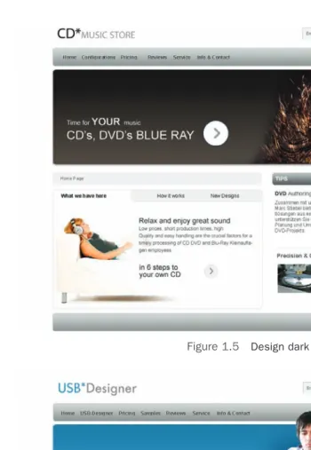
The effects of colors and the visual materials used should not be underestimated. In Figures 1.5 and 1.6 you can see two identical designs that differ only in their choice of colors and the images used. The difference in their effect is astonishing.
Finding Colors
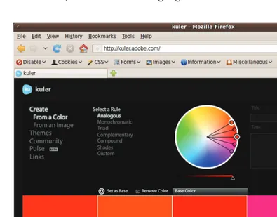
Often you need to find a color complementary to the company color you are already using to emphasize certain content. The Adobe Kuler (http://kuler.adobe.com) is a very special tool. A Flash application helps you find the most suitable color combinations. You simply enter hexadecimal color values and the program finds the matching color combi-nation. See Figure 1.7.
If you are interested in colors, you may also find this Web site fun to investigate: www.colorlovers.com.
Until a few years ago, for technical reasons, you were fairly limited when it came to selecting colors. You were only able to choose the so-called Web-safe colors to ensure a fairly uniform presentation. Computer technology has greatly improved since then. Mil-lions of different colors now are at users’ disposal.
Many designers encountered clients who stood next to the monitor with a pantone color guide to check whether the company color was correctly implemented. They then had to explain that you can never assume that colors are represented in the same way on different systems. The representation can differ greatly due to different, uncalibrated monitors and different graphics cards. Old cathode ray tube monitors usually have colors darker than thin-film transistor screens as well as clear differences among their operating systems. Also, not many users have properly calibrated their monitors.
Colors in the Context of Accessibility
Certain color combinations can cause problems when designing an accessible Web site, so color selection is especially important.
The Graphical Layout—Visual Appearance Matters 9
Figure 1.5 Design dark
people have learned which colors lay behind what they can see. They know, for example, that grass is green and can identify other shades of green by comparison.
Much more common than total colorblindness is red-green colorblindness. People with this impairment have a genetic anomaly that prevents them from being able to distinguish between the colors red and green. Mixed colors that contain red and green appear blurred. About 9 percent of men suffer from red-green blindness. Usually the peo-ple concerned do not perceive this colorblindness as a great restriction. It only becomes a problem if recognizing the color difference is essential for taking in important informa-tion. The traffic light is a good example of compensating for colorblindness: red is always at the top, green always at the bottom.
The Graphical Layout—Visual Appearance Matters 11
Online tools such as www.vischeck.com or http://colorfilter.wickline.org can help us get an approximate impression of what colorblind people actually see.
Contrasts
If the contrast in a Web site is too low, the design can appear washed out and boring. Too high a contrast, on the other hand, can make the design look too busy and chaotic.
Contrast not only is important for the overall appearance of a Web site, but it is also a critical aspect of making a Web site easy to read. If you are thinking about creating an accessible site, you should choose your foreground and background colors so that the dif-ference remains visible even for visitors with impaired color vision or visitors who may be viewing the page on a grayscale monitor.
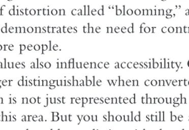
The foreground and background colors should clearly contrast with your text ele-ments. But it is not possible to select color and contrast settings that suit everyone. Black text on white background has the greatest color contrast. To avoid annoying glare effects, it may be appropriate to slightly tint the background. Some people with vision impairment require very strong contrasts to be able to separate the individual elements of a page. For these people, color combinations such as white text on a light orange background do not have enough contrast. For others, strong contrasts can result in a type of distortion called “blooming,” and the content becomes harder to read. Figure 1.8 demonstrates the need for contrast as well as hue so that differences can be seen by more people.
Color values also influence accessibility. Colors with hues that are very similar in value are no longer distinguishable when converted to grayscale. In certain designs—whenever information is not just represented through color differences—you can make a compro-mise with this area. But you should still be aware that people with color vision impair-ments may not be able to distinguish the design very well.
Figure 1.8 The colors red and gray are easy to distinguish for people with normal vision. When converted to grayscale, the color differences
At http://juicystudio.com/services/colourcontrast.php you will find the color contrast analyzer. You enter two color values, and the system tells you whether the colors have enough contrast in the context of accessibility.
Designing the Navigation—The Core of the Design
The navigation should be clearly set apart from the content of the page. It forms the design anchor point that guides users even when they advance further into the lower lev-els of multilayered Web page offerings.
Each page should indicate as clearly as possible
Where the visitor is currently located in relation to the Web presence as a whole Which other main areas are present
How these can be reached You can achieve this by
Emphasizing the navigation items and their parent elements Adding margins, making the text bold, or using small graphics
Indicating information not just by using different text color, as, for example, to accomodate people with impaired vision
Indicating visited and not-visited links Creating a uniform design for your links
Clearly highlighting links located within the text flow and creating a uniform design presentation for links within the text and navigation
Arranging the links in a logical, consistent order so they can be reached via the tab key on a keyboard
Offering breadcrumb navigation
Content Design—To Make It Fun to Read
Graphical elements such as small icons or photos give the eye something to focus on. They guide viewers from one section to another so they can absorb the information one step at a time.
The Graphical Layout—Visual Appearance Matters 13
content is harder to grasp if there are too many line breaks. Long sections of continuous text should be broken up with headers, or the eye gets tired too quickly. If the distance between the lines is too large or too small, it can also make it hard for the reader to understand the content of your text.
With CSS you have the option of formatting the line spacing very simply via the property line-height. This property can be specified as an absolute value in pixels or as a relative value in the form of percentage or em.
p { line-height:1.4em}
The text formatting itself has great importance. Text formatting is the specification of font type, font size, font weight, character and word spacing, and font color. CSS offers a number of such text formatting options.
Font Design—We Do Not Have Many Options
When selecting the font type, we as designers are restricted. This statement would have been universal until fairly recently were it not for Web fonts. But first we need to explain a few fundamental points.
Fonts can be classified generally into two categories, those without serifs (sans serif) and those with serifs. Serif fonts, such as Times and Georgia, have little lines or flares at the ends of strokes in each letter; sans serif fonts, such as Arial and Helvetica, look smoother because they are composed of only the letter strokes without the decorative touches. Sans serif fonts are easier to read on the screen, and serif fonts are better suited for use in printing. Smaller fonts used in continuous text are harder to read: on the screen where everything is represented in pixels, serifs tend to clump together or even disappear. On paper, even fine serifs are clearly visible and help us grasp the word from its shape.
The design effect of fonts can be very different. Sans serif fonts appear clearer and more modern; serif fonts can appear old-fashioned.
Recently, there is a growing tendency to combine both types of fonts on a page by using sans serif fonts, such as Arial or Helvetica, on the Web in the continuous text and serif fonts, such as Times or Georgia, in the generously sized headers. Have a look at the Web site www.alistapart.com as an example of the effect this kind of combination can produce.
When constructing your Web site, make sure your CSS contains the generic font fam-ily as well as the font itself. This ensures that at least the desired font type is displayed even if the font you selected is not available on the system of the user.
p { font-family: verdana,sans-serif;)
Web Fonts
and objected. Like texts, photos, and graphics, fonts are subject to copyright protection. As soon as a font is directly integrated into a page, it resides on the Web server and is thereby publicly accessible and open to abuse. This is not in the best interest of commer-cial font providers.
Until recently, the safest option to make sure that the font was displayed as intended was to use system fonts. But there is hope: the Web fonts are coming and will offer more design freedom in the future.
The W3C has formed a working group focused on Web fonts. The result is a new file format for Web fonts: WOFF (Web Open Font Format). The format was developed by Erik van Blokland and Tal Leming together with Mozilla developer Jonathan Kew.
WOFF fonts are compressed, so they have a much shorter loading time. You can also save meta information, such as information on the copyright. Ultimately, the data of OpenType or TrueType fonts is only repackaged in WOFF, so basically no new functions are required. Via @font-face, WOFF fonts can be embedded in Web pages together with TrueType and OpenType fonts.
The Beez template by Joomla! makes use of this technique and integrates the selected font Titillium Maps via CSS.
@font-face {
Here you can see that this font is embedded several times with different file extensions. The reason is that not all browsers currently support the .woff format. In addition to Firefox, the following browsers do offer support for the .woff format:
Safari, v.5.1 Opera, v.11.10
Microsoft Internet Explorer, v.9 Camino, v.2.1a
Mobile Safari under iOS v.5 Chrome, v.6
The Graphical Layout—Visual Appearance Matters 15
Once you have integrated the font into the page, you can use it very easily without further complications.
h1
{ font-family: 'Titillium Maps', Arial; }
You should choose your font carefully because there are still browsers that do not sup-port any of the specified file formats or cannot interpret the statement @font-face at all. In the preceding example, you can see that an alternative font—in this case, Arial—is specified for this case.
Different fonts have a different default tracking and height. Web fonts are often smaller than system fonts. If you adapt them to the right size with CSS font-size, the font size may differ from the size of the alternative font. You can test font sizes in Firefox 2 and other browsers.
Free fonts under the SIL Open Font License can be converted to WOFF files. You can find a converter at www.fontsquirrel.com/fontface/generator.
Font manufacturers had to rethink their licensing models, and many providers have now added Web fonts to their offerings.
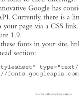
The ever-innovative Google has considered the topic of Web fonts and now offers the Google Font API. Currently, there is a limited pool of available fonts that can be easily integrated into your page via a CSS link. You can see some of the fonts available from Google in Figure 1.9.
To include these fonts in your site, link to the Google Font API with the following code in your head section:
<link rel="stylesheet" type="text/css"
href="http://fonts.googleapis.com/css?family=Font+Name">
The offered fonts are on the Google server and from there are directly integrated into the page. The API takes care of browser compatibility and makes using the fonts very simple.
There is a downside: normally, every designer creates a draft in a graphics program, and for that you need the fonts in readable format. The Google API does not offer the fonts in their original format, so you have to go searching on the Web. I quickly found doing so was tedious and unproductive. Only with Lobster was I able to relatively quickly find what I was looking for.
There are other methods for integrating your own fonts into your design. For exam-ple, you can use image replacement techniques, using Flash or Cufon (http://cufon.shoqo-late.com/generate/), a JavaScript solution.
But none of these solutions are completely without disadvantages. The image replace-ment methods limit the usability regarding the accessibility, especially for blind people, while the other two methods require Flash or JavaScript to work.
Font Size—Scalability of Text
It is often tempting to use very small fonts to get more information to fit onto the screen. Also, larger fonts appear less elegant. But small fonts are hard or impossible to read, not just for people with vision impairment and the elderly. Fortunately, the common browsers still offer the option of zooming in on fonts or even the whole page, but you should still offer an easy-to-read standard font size.
Fixed and Fluid Layouts
In Web design, a distinction is made between fixed and fluid layouts. Fluid layouts adapt to the screen size and offer space to scalable text. The Web makes it possible for viewers to actually influence what they are seeing. Windows can be adapted in size, fonts can be tailored to individual needs, and even color settings can be edited by users. Fluid layouts place special demands on design implementation because they need to work indepen-dently of the width of the relevant browser window or the monitor resolution.
The column width of the design is specified in percentage (%) or ems, which offers the option of using the whole view area of the screen if the user finds it optimal. If the browser window changes, the content display changes automatically.
Tip
The golden ratio for a two-column layout is 62 percent to 38 percent.
This flexibility is a good thing, but it can lead to massive problems in our design. If pages have only a small amount of text, they can appear homogeneous and well bal-anced when viewed with a resolution of 800 ✕ 600 pixels. But if you look at the same
page with a resolution of 1280 ✕ 1024 pixels, all the content may be crammed up at the
Fixed and Fluid Layouts 17
begins to waver and can no longer connect the end of a line with its beginning. In such cases, it makes sense to specify a maximum width for the view area. Standard conforming browsers offer the CSS property max-width for this purpose.
Internet Explorer 6 does not support max-width. Whether you still want to support this browser is a decision you need to make for yourself. Keep in mind that some large companies, governments, and people, particularly in developing countries, still use this browser (or, rather, have to). If you decide to support Internet Explorer 6, you have to use a little trick to get the same result as in other browsers.
*html #content
{ width: expression((body.offsetWidth >1000)?'1000px':'auto'); }
expression is a proprietary property of Internet Explorer and is only understood by this browser. This solution is not compliant to standards and therefore is not valid, but it can be useful in certain cases. If the browser window is wider than 1000 pixels, our container #content is assigned the fixed width of 1000 pixels. If it is smaller than 1000 pixels, it behaves according to our relative specifications.
Fixed design layouts offer the designer the option of controlling the representation more precisely. Individual page areas remain consistent in their arrangement: no elements will start sliding around. It is much easier to integrate graphics because you will know how large they need to be to fill certain page areas. Also, the length of the text lines is easier to manage.
2
Accessibility—What Is It?
F
or most people, using the Internet has become so commonplace that they take it for granted. Information from all over the world is ready for you to retrieve. Perhaps more important is the local information available to you with just a few keystrokes: you can look up the special offers of local retailers, the operating hours of most businesses, and even phone numbers from your home computer. You no longer need to bother with inconvenient trips to the library or numerous phone calls: you just look online to get the information you need.But not everyone benefits from the convenience of today’s technology. In particular, people with physical or mental disability face barriers that make accessing information or using services difficult or even impossible for them. Many of these barriers can be over-come if a Web site’s content is designed to be accessible to everyone.
Building in accessibility—that is, designing the Web experience so that all people have access to the information and functionality on a site—is fundamental to Web design. You need to be aware of the issues that hinder accessibility and the techniques that enhance it when you build your template. The accessibility of your Web site can be crucial to its success because online businesses want to reach the greatest number of people possible, and those with disability constitute a considerable target group. Accordingly, accessible Web design aims to make content and interactions on the Web as accessible and barrier-free as possible for all user groups.
A significant percentage of the U.S. population have a physical impairment that makes it difficult for them to access information on the Internet. The types of impairments are manifold, and the resulting requirements for design and technical implementation are therefore also varied. People who are blind, for example, have different requirements than people with other types of visual impairments. Some people have difficulty with the usual input methods: for example, not everyone can use a mouse or operate a standard keyboard. About 35 million Americans are hearing impaired. Some of them are children, and their hearing loss is so severe that they have trouble learning sign language. This makes it all the more important that texts are presented clearly.
sound in the workplace. These and other environmental factors should be kept in mind as you design for accessibility.
Building accessibility into your Web design is not always about meeting recommen-dations and legal requirements (which government authorities are obliged to do). Even small steps toward accessibility can significantly improve the usability of Web sites for all visitors.
Joomla!, with its widespread use, can have a big impact on Web accessibility. With the standard templates Beez 2.0 and Beez 5.0, it has now become relatively simple to create accessible sites that many people can use.
In this chapter, after we examine the legal reasons for being concerned with acces-sibility, I describe the problems that various user groups are faced with when trying to access online information. Guidelines and derived checklists offer points of reference for reducing barriers, but the barriers themselves can only be effectively reduced if you have a precise idea of where the problems lie and which solutions are available.
The Legal Basis
Efforts to make computers accessible for people with disabilities are in fact older than the Internet. In December 1982, the United Nations General Assembly adopted the World Programme of Action (WPA) concerning Disabled Persons, in which the accessibility of modern technologies for people with disabilities plays a significant role. In the following years, large IT companies such as IBM, Microsoft, and Sun Microsystems made the first important contributions to improve this accessibility. In December 1993—HTTP was hardly 2 years old—the UN General Assembly adopted a resolution demanding equal access to information and communication for people with physical disabilities. Soon, the first countries began to draw up regulations, and laws were implemented.
With the creation of the World Wide Web Consortium (W3C) in 1994, an expert advisory board took on the task of creating guidelines for a more accessible Web in addi-tion to many other standardizaaddi-tion measures. These efforts were largely complete in 1998 and formed the basis for Section 508 of the Rehabilitation Act Amendment, passed by the United States in December 1998, making it a legal obligation for the U.S. govern-ment and its agencies to adhere to certain accessibility requiregovern-ments. The W3C Web Accessibility Initiative adopted these guidelines in May 1999 as Web Content Accessibil-ity Guidelines 1.0 (WCAG1.0). Other countries soon followed suit and introduced simi-lar laws and guidelines.
The WCAG 2 was published in December 2008. It differs significantly from the previ-ous version in a few respects.
According to the WCAG 2, Web sites should be
Perceivable for every person and every technical device, for example, by provid-ing text alternatives for images, subtitles for audio, and adaptable presentation and color contrast
Visual Impairment 21
navigation and avoiding visual stimuli that could induce seizures in users with photosensitive epilepsy
Understandable, for example, by being readable and predictable and offering help with input
Robust, for example, by being compatible with assistive technologies In practice, you should be aware of the following improvements:
Improved requirements for color contrasts. More precise requirements for forms.
Scripting: Web sites can now manage without fallback solutions, but the JavaScript itself should be accessibly structured.
More precise requirements for multimedia (subtitles, synchronization, operation, etc.). More precise requirements for operation via keyboard.
More precise requirements for dynamic updating of contents.
So far, the guidelines are just recommendations, and the law for private sector com-panies is still somewhat vague. Section 255 of the Telecommunications Act, which does apply to private sector companies, requires telecommunication products and services to be accessible whenever accessibility is “readily achievable” (see U.S. Legal Activities on Web Accessibility, www.uiaccess.com/us-legal.html). It is a good idea to be aware of these guidelines; you can read the W3C recommendations at www.w3.org/TR/WCAG/.
Visual Impairment
When most people think about Web accessibility, they think first about people who are blind. There is more to visual impairment than just blindness, just as there is more to accessibility than accommodating those with visual impairments.
Initial Situation and Findings
The monitor is basically the classic symbol of a computer, and for people who have dif-ficulty seeing or cannot see at all it is a problem. I am not talking about a small minority: about a quarter of the working population has problems with vision to different degrees of severity, and with growing age that number rapidly increases. Some vision problems can be easily corrected with eyeglasses or contacts, and others are only partially cor-rected. Some eye problems, such as cataracts or glaucoma, are operable or can at least be alleviated. Others, such as retinitis pigmentosa or diabetic retinopathy, cause a progressive decrease in vision and often lead to total blindness. People who suffer from tunnel vision lose their peripheral vision and have an extremely restricted field of vision, sometimes just the size of a coin held at arm’s length.
People are considered legally blind if their visual acuity—with corrective lenses—is 20/200 or less or if their visual field is 20 degrees or less. The number of people who are legally blind in the United States exceeds 2 million. Some of them can decipher text on the computer only by enlarging text on the screen and adjusting color settings; others must rely on acoustic output or must feel the text using a braille display. To do so, they require assistive technologies.
The requirements of different people affected by vision impairments are extraordi-narily different. It is therefore not possible to achieve a general optimization of colors, contrast, or font size. Whereas a person with tunnel vision may prefer tiny yellow letters on a dark blue background, a person with presbyopia (age-related farsightedness) may be grateful for large black letters on a slightly tinted background. Accessibility for people with vision impairment is therefore primarily about avoiding any barriers that could pre-vent them from being able to adjust the page display to suit their needs. You have a rich assortment of tools available to choose from.
Technical Aids
Some technical aids are already included as standard features of every personal computer and can be used without limitations, but others have to be purchased and are costly.
Adjusting the Screen Resolution
The average Internet user today uses a screen resolution of 1024 × 768 pixels or 1280 × 768 pixels on a 17- to 19-inch monitor. This does not mean that you can optimize your Web site for these parameters without problems, although some Web sites do. Depending on the monitor, graphics card, and operating system, there are different settings available, and they are used in different ways. Older users often set a resolution of 800 pixels width or less even on large monitors. This causes all elements (not just the text, but also icons and frames) to appear considerably enlarged, which is considered more pleasant by these users even though pixels may be clearly visible or pictures may look blurry. Windows offers another method of globally adapting size, which primarily affects fonts. Web sites that are intended to be accessed by the greatest possible number of visitors should be generally set up so that they are still usable at a resolution of 800 pixels, with medium-sized fonts, and if possible, without scrollbars.
Adapting Font Size
Until a few years ago, a user could enlarge only the font size of a Web site’s text. Now, most browsers enable users to scale the entire page by using Ctrl (or Command for Mac) plus to increase the size, Ctrl (or Command) minus to decrease the size, and Ctrl (or Command) 0 to reset to the default size. Full scalability is very useful, but it can force the page outside of the viewport, resulting in parts of the page being cut off. For that reason, some people still prefer to zoom only the text.
Visual Impairment 23
If you have a demanding design with lots of words and long sentences, your design can start to fall apart at this zoom level.
If you want to optimize your site for Internet Explorer 6, you should also ensure that you choose relative size specifications, such as in percentage or ems, for the font. Theo-retically, px is also valid for specifying a size and should be scalable by all browsers, but Internet Explorer does not change the display size for font changes only when px is used. Because of this limitation and because many designers are unaware of it, some Web sites with fashionable and space-saving small fonts are inaccessible for many visitors.
Standards-compliant browsers scale the font even with fixed pixel sizes specified. In Firefox, you will find the corresponding function in the menu View g Zoom g Zoom Text Only.
Opera can even scale graphics—although the quality suffers. In Internet Explorer, version 7 and later, use Page g Text Size.
Defining Custom Stylesheets
The common browsers offer the option of creating custom stylesheets, but they are not always easy to find. On Web sites where the separation of content and presentation has been implemented consistently, and the entire layout is in the stylesheets, users can use this method to adapt the appearance of the Web site entirely to their own needs. This is a strong argument in favor of implementing the separation of content and presenta-tion stated in the WCAG 2 guidelines. Following are instrucpresenta-tions for setting up personal stylesheets for the two most common browsers, Firefox and Internet Explorer.
Firefox
Each system offers the option of loading user-specific data: programs can even be adapted individually. You probably are familiar with the following Windows folders:
Documents and Settings g User Name g Application Data
In this area, you will find user-specific settings for the various programs, including the browsers.
Firefox uses an external stylesheet for representing Web sites only if it does not find an alternative in the user settings.
Once you have created your individual stylesheet, it is important that you save it under the name userContent.css in the folder Chrome, because the browser uses naming conventions to detect whether a corresponding file is present or not. You can find this folder as follows:
Under Windows: Documents and Settings g User Name g Application Data g Mozilla g Firefox g Profiles g Xyz g Chrome
Under Mac OS X: User Name g Library g Application Support g Firefox g Profiles g Xyz g Chrome
Internet Explorer
In Internet Explorer, the option for integrating your own stylesheets can be found in the menu Internet Options g Accessibility (see Figure 2.1).
The stylesheet does not follow any naming conventions. You can name it anything you like and integrate it.
Screen Magnifiers
Software magnifying glasses for screen output can make individual areas of the display considerably larger. Simple versions are available in most operating systems (see Fig-ure 2.2), and others can be purchased as add-ons.
Figure 2.1 Accessibility options in Internet Explorer
Visual Impairment 25
In Windows 7, you can find the integrated screen magnifier by typing “magnifier” in the Start menu (see Figure 2.3).
In Windows XP, you can find the integrated screen magnifier under
Start g All Programs g Accessories g Accessibility g Magnifier
Onscreen Keyboards
Windows 7 also includes a simple onscreen keyboard as default (see Figure 2.4), which can be operated with just one key (normally the space bar). You can find it by typing “keyboard” in the Start menu.
In Windows XP, you can find this program under
Start g All Programs g Accessories g Accessibility g On-Screen Keyboard
The keyboard functions in a way that will feel very strange at first. You start the key-board with the space bar. A blue bar cycles through all the rows in order from top to bottom. You can adjust how fast it cycles. Once it is in the row where the desired key is
Figure 2.3 Finding the magnifier in Windows 7
located, you stop it by pressing the space bar. Then the individual keys of that row are highlighted in sequence from left to right. Once the desired key is highlighted, press the space bar to use that key. This is faster than you might think, and practice makes perfect. Commercial versions offer considerably more comfort and higher speed.
There are also mouse keys that work under a similar principle: bars or lines run over the screen to form a coordinate system to enable the user to navigate to any point on the screen and trigger a function there.
With Mac OS X Snow Leopard, you can activate an onscreen keyboard under
System Preferences g Language & Text g Input Preferences g Keyboard & Character Viewer
This puts a tiny American flag (with just one star) on your menu bar. Click on it, and then click on the Show Keyboard Viewer for the onscreen keyboard to appear.
Inverting the Screen Color
You can enable and configure the settings for screen color inversion in Windows under
Start g Settings g Control Panel g Accessibility g Display g Settings for High Contrast
You can enable and configure the settings for screen color inversion on Mac OS X under
System Preferences g Universal Access g Seeing g Display
Note
The operating systems Mac and Windows also offer an option for inverting the screen to increase the contrast. In Windows, the user can decide between different color com-binations for foreground and background color and can choose a custom font size.
Screen Readers and Braille Displays
For people who need to use screen readers and braille displays, the commonly available computers have little to offer. You need to buy the screen reader software with output options via voice synthesizers separately, and the same goes for the extremely expensive and fragile braille display for reading braille.
The braille display is a tactile device you can connect to the computer. Every letter of the alphabet is represented by eight pins that can move up or down. Users feel the pat-tern by touching it with their fingertips and can thereby read text letter by letter. There are also braille devices with 24 ✕ 36 individually navigable image points to make simple