P E T E R G A S S T O N
M U L T I - D E V I C E W E B D E V E L O P M E N T
W I T H
H T M L 5
,C S S 3
, A N DJ A V A S C R I P T
T H E M O D E R N W E B
T H E M O D E R N W E B
•
•
•
•
•
T
H
E
MOD
E
R
N
W
E
B
T
H
E
MOD
E
R
N
W
E
ADVANCE PRAISE FOR THE MODERN WEB
“This is a useful book, and it’s an important book. If you follow Peter Gasston’s advice, then test your sites across all browsers and on a variety of devices, you’ll impress your bosses and please your users. You’ll also be making the Web better and keeping it open.”
—BRUCELAWSON, AUTHOROFINTRODUCINGHTML5
“Peter Gasston has now done for the modern web platform what he already did for CSS: write a consult-it-first compendium of information for web devel-opers of practically any skill level.”
—STEPHENHAY, AUTHOROFRESPONSIVEDESIGNWORKFLOW
“Peter Gasston strikes a great balance between producing fantastic real-world code and staying right on top of the latest developments in web technology. He has a considerable gift for explaining difficult technical topics in a lucid and entertaining manner.”
—CHRISMILLS, DEVELOPERRELATIONSMANAGER, OPERASOFTWAREANDAUTHOROF PRACTICALCSS3
PRAISE FOR PETER GASSTON’S THE BOOK OF CSS3
“I can honestly say I will never need another book on this subject, and I doubt anyone else will either. The Book of CSS3 covers it all and covers it well.”
—DEVONYOUNG, CSS3.INFO
“One of the best technology books I’ve read.”
—CRAIGBUCKLER, OPTIMALWORKSWEBDESIGN
“This book deserves a place within easy reach of the developer’s keyboard and is a must have for anyone looking to join the visual revolution that CSS3 is bringing to the Web.”
—C.W. GROTOPHORST, CHOICEMAGAZINE
“There are a lot of neat things that you can do in CSS3, and this book is a great introduction to these features.”
—STEVENMANDEL, .NETDEVELOPER’SJOURNAL
“An easy-to-read, easy-to-implement handbook of the newest additions to the Cascading Style Sheet specification.”
T H E M O D E R N W E B
M u l t i - D e v i c e W e b
D e v e l o p m e n t w i t h H T M L 5 ,
C S S 3 , a n d J a v a S c r i p t
by Peter Gasston
THE MODERN WEB. Copyright © 2013 by Peter Gasston.
All rights reserved. No part of this work may be reproduced or transmitted in any form or by any means, electronic or mechanical, including photocopying, recording, or by any information storage or retrieval system, without the prior written permission of the copyright owner and the publisher.
Printed in USA
First printing
17 16 15 14 13 1 2 3 4 5 6 7 8 9
ISBN-10: 1-59327-487-4 ISBN-13: 978-1-59327-487-0
Publisher: William Pollock Production Editor: Serena Yang Cover Ilustration: Charlie Wylie
Developmental Editors: Keith Fancher and William Pollock Technical Reviewer: David Storey
Copyeditor: LeeAnn Pickrell Compositor: Susan Glinert Stevens Proofreader: Ward Webber Indexer: Nancy Guenther
For information on book distributors or translations, please contact No Starch Press, Inc. directly:
No Starch Press, Inc.
38 Ringold Street, San Francisco, CA 94103
phone: 415.863.9900; fax: 415.863.9950; [email protected]; www.nostarch.com
Library of Congress Cataloging-in-Publication Data
A catalog record of this book is available from the Library of Congress.
No Starch Press and the No Starch Press logo are registered trademarks of No Starch Press, Inc. Other product and company names mentioned herein may be the trademarks of their respective owners. Rather than use a trademark symbol with every occurrence of a trademarked name, we are using the names only in an editorial fashion and to the benefit of the trademark owner, with no intention of infringement of the trademark.
For Dave, Jim, Morena, Nick, Rupert, Steve, and all of the other organizers of the London Web Standards group, who help to
About the Author
Peter Gasston has been a web developer for over 12 years in both agency and corporate settings. He was one of the original contributors to CSS3.info, the leading online destination for CSS3. Gasston is the author of The Book of CSS3 (No Starch Press) and has been published in
Smashing Magazine, A List Apart, and .net magazine. He gives talks about
technologies at developer conferences and runs the web development blog Broken Links (http://broken-links.com/). Gasston lives in London, England.
About the Technical Reviewer
B R I E F C O N T E N T S
Acknowledgments . . . xv
Introduction . . . 1
Chapter 1: The Web Platform . . . 11
Chapter 2: Structure and Semantics . . . 21
Chapter 3: Device-Responsive CSS. . . 39
Chapter 4: New Approaches to CSS Layouts . . . 65
Chapter 5: Modern JavaScript. . . 89
Chapter 6: Device APIs. . . 107
Chapter 7: Images and Graphics. . . 125
Chapter 8: New Forms . . . 141
Chapter 9: Multimedia . . . 161
Chapter 10: Web Apps . . . 177
Chapter 11: The Future. . . 191
Appendix A: Browser Support as of March 2013 . . . 211
Appendix B: Further Reading. . . 217
C O N T E N T S I N D E T A I L
ACKNOWLEDGMENTS xv
INTRODUCTION 1
The Device Landscape . . . 2
Desktop/Laptop . . . 2
Mobile. . . 3
Tablet . . . 5
TV . . . 5
The Others . . . 6
The In Betweeners . . . 6
The Multi-screen World . . . 7
Context: What We Don’t Know . . . 7
Some Context Stereotypes . . . 8
“Fast” Is the Only Context That Matters . . . 8
What You’ll Learn . . . 9
Further Reading . . . 10
1 THE WEB PLATFORM 11 A Quick Note About Terminology . . . 12
Who You Are and What You Need to Know. . . 12
Getting Our Terms Straight . . . 13
The Real HTML5. . . 13
The HTML5 Template . . . 14
New Best Practices . . . 15
CSS3 and Beyond . . . 16
Vendor-Specific Prefixes. . . 17
CSS Frameworks and Preprocessors . . . 18
Browser Support . . . 18
Test and Test and Test Some More . . . 19
Summary . . . 20
Further Reading . . . 20
2 STRUCTURE AND SEMANTICS 21 New Elements in HTML5 . . . 22
What’s the Point? . . . 23
The Downside of HTML5 Sectioning Elements . . . 24
WAI-ARIA . . . 26
The Importance of Semantic Markup. . . 28
Microformats . . . 29
RDFa . . . 30
Microdata . . . 31
The Microdata API . . . 32
Chapter 5: Modern JavaScript. . . 214
Chapter 6: Device APIs. . . 215
Chapter 7: Images and Graphics. . . 215
Chapter 8: New Forms . . . 215
Chapter 9: Multimedia . . . 216
Chapter 10: Web Apps . . . 216
Chapter 11: The Future. . . 216
B FURTHER READING 217 Introduction . . . 217
Chapter 1: The Web Platform . . . 218
Chapter 2: Structure and Semantics . . . 219
Chapter 3: Device-Responsive CSS. . . 220
Chapter 4: New Approaches to CSS Layouts . . . 221
Chapter 5: Modern JavaScript. . . 221
Chapter 6: Device APIs. . . 222
Chapter 7: Images and Graphics. . . 223
Chapter 8: New Forms . . . 223
Chapter 9: Multimedia . . . 224
Chapter 10: Web Apps . . . 225
Chapter 11: The Future. . . 225
A C K N O W L E D G M E N T S
Huge thanks are due to David Storey, the technical reviewer for this book; his deep knowledge of the field meant his feedback was invaluable to me. Although he corrected and guided me many times, if there are any errors in this book they’re entirely my responsibility.
Keith Fancher, Serena Yang, Bill Pollock, and the rest of the No Starch Press team provided fantastic support and guidance throughout the writing of this book. Their collective contribution is beyond measure.
Dimitri Glazkov helpfully answered a few questions on web components, and Bruce Lawson gave extra feedback on the new HTML5 elements in Chapter 2. His work as well as that of his fellow HTML5 Doctors was a con-stant reference during the writing of this book.
Although I’ve never met him, I’d like to thank David Walsh for main-taining an excellent website that I have used a lot.
Stephen Hay and Chris Mills have been generally useful in helping me to consolidate ideas, as well as incredibly nice people to know.
Great thanks to my friends and occasional colleagues Giles McCartney, Richard Locke, and Tom Shirley. Thanks also to all my other colleagues at Preloaded, Poke, Top10, Believe.in, and rehabstudio.
I N T R O D U C T I O N
We are in a time of unprecedented
inno-vation on the Web. Not too long ago, one
company, Microsoft, dominated the web
landscape; in 2003, Internet Explorer was
used on some 95 percent of computers worldwide.
This domination brought the advantage of a stable
market for developers, but there was also a serious drawback: Microsoft chose to end nonessential work on IE, and innovation on the Web stag-nated—a consequence of a lack of competition and a closed environment.
And the way we access the Web has changed enormously too—think devices. No longer are we limited to browsing the Web with a desktop or laptop. So many categories of devices exist now—including smartphones, tablets, and games consoles—that I’m running out of fingers to count them on.
This book is about front-end web development in this new web- everywhere era. It’s about learning methods to make first-class websites, apps, or anything built on open web technologies, with the multi-device world aforethought. This is not a book about how to make mobile websites or smart TV apps; it’s about learning the latest developments in current and near-future web technologies so you’ll be better able to build sites capable of offering the best experience everywhere.
I’ll return to what you’ll learn from this book in more detail at the end of the introduction, but first I want to talk about the bewildering array of today’s web-enabled devices.
The Device Landscape
The year 2008 was a landmark year and not only because of the theatrical release of Indiana Jones and the Kingdom of the Crystal Skull, which intro-duced the phrase “nuking the fridge” into our vernacular. This was the year that saw the number of Internet-connected devices exceed the num-ber of people using them. This super-connectivity between devices is com-monly known as the Internet of Things (IoT), and this book is aimed at an already substantial and fast-growing subset of those things, namely things with web browsers.
The range of web-enabled devices is enormous and getting broader by the day. As I write this, I’m the owner of the following devices that have a web browser: a desktop, a laptop, a tablet, a smartphone, an ebook reader, and a games console. I suspect that’s not an uncommon scenario to more affluent members of society; many people could add a smart TV and a por-table games console to that list.
Of course, with this incredible range of web-enabled devices comes incredible opportunity for web developers, and this book is here to help you make the most of that. But first, let’s look at some of the core device categories and define some key terms so you’ll better understand what you’re dealing with.
Desktop/Laptop
The Web as we’ve known it until recently has primarily targeted the larger screens and more powerful processors of desktop or laptop computers (shorthand: desktops), where the operator is usually seated and using a fast Ethernet or Wi-Fi broadband connection. This mode is still the default for people at work in offices, so many business-to-business (B2B) sites are built
But desktop computer use is on the wane as many people nowadays, especially home users, tend toward mobile or tablet devices (which I’ll come to shortly). In the last quarter of 2012, global PC shipments were down almost 5 percent from the previous year. That said, research shows that people still tend to use desktops when performing tasks that involve significant amounts of text, multitasking across different tabs of a browser, or using programs that require close control of the content, such as image editing. Desktops are also used when security is a major concern, such as for Internet banking.
But even within this venerable and mostly stable group variation abounds. The 1024×768 screen resolution is slowly dying away but still prominent, while newer versions of Apple’s MacBook Pro sport a resolu-tion of 2880×1800. Sites optimized for the former will look quite small and be somewhat lost on the latter.
The desktop browser world includes five major players: Chrome, Safari, and Opera, which share the WebKit engine (Opera had its own engine, Presto, which is now being phased out); Firefox; and Internet Explorer (ver-sion 9 can be considered semimodern and 10 fully modern). Thankfully they all tend to implement features in a standard way, and they all have a frequent or semifrequent update cycle (or are moving toward it), so users tend to get new features fairly quickly. Of course, a sizable percentage of users are still running older, less capable browsers, so you should always build with that in mind. (Much of the innovation in web standards comes to desktop browsers first because they’re the ones that developers tend to use on a daily basis. Therefore much of this book is written with desktop browsers in mind, although what you’ll learn can be applied anywhere.)
Mobile
When I say mobile, I generally mean phones. The range is wide: from older,
cheaper hardware running rudimentary web browsers to mid-range fea-ture phones with browsers optimized for speed over power to high-powered expensive smartphones with browsers on par with those on your main com-puter, as well as a series of apps that often use an embedded browser to view content.
In many countries, a majority of Internet users are on a mobile device; in India, for example, some 55 percent of web visits are made on mobile devices, and in Egypt nearly 70 percent of people rely on phones as their sole access to the Web. Worldwide estimates are that the number of mobile web users will exceed that of desktop computer users sometime between 2014 and 2015.
Across the developing world, the dominant mobile device is the feature
phone, which has functions beyond basic phoning and texting but often lacks
smartphone sales were estimated to account for 27 percent of the global market; at the end of 2012, estimates were that 1 billion smartphones were in use, with that number predicted to double by 2015.
The sheer variety of mobiles and mobile browsers in the global mar-ket means that I’m selective about the coverage in this book, so for future-proofing I target phones with fully capable web browsers, that is, features on par with their desktop equivalents.
The WebKit engine dominates the smartphone browser market because it’s used on iPhone, Android, Blackberry, and more, powering many differ-ent browsers. Each OS uses a slightly differdiffer-ent version of WebKit, but gen-eral interoperability is good.
Windows Phone OS from version 7.5 and up uses a mostly desktop-equivalent Internet Explorer as its browser; older models have IE9, and more recent models, IE10. Firefox is also available as an option for Android, and Firefox OS, a full operating system based around the browser, is set to launch in 2013. That launch may well impact the market in the long term.
Opera has a significant share in the global mobile browser market thanks to Opera Mini, a proxy browser that compresses requested pages and returns the data as a kind of image with very limited interactivity. Opera Mini is lightweight and fast, which makes it popular in countries with limited Inter-net connectivity, but its lack of full interactivity means I won’t give it much attention. As I write this, Opera has announced that it’ll be releasing new mobile browsers based on WebKit, although no details are available.
Today’s smartphones, although getting more powerful all the time, tend to have less available memory and storage, and lower potential con-nection speeds, than desktop or laptop computers. On the surface, this would seem to make them the poor cousin of web-enabled devices, but as Jonathan Stark says in “The 10 Principles of Mobile Interface Design”:
Smartphones are actually more powerful than desktops in many ways. They are highly personal, always on, always with us, usually connected, and directly addressable. Plus, they are crawling with powerful sensors that can detect location, movement, accelera-tion, orientaaccelera-tion, proximity, environmental conditions, and more.
Obviously the advantage of mobile is just that: its mobility—the abil-ity to find things around you, get directions, and look up information fast when out of the house or office. But increasingly, mobile devices are being used at home while watching TV or on the morning commute or when bored standing in line. Mobile is really less about being on the move and more about always being available.
Tablet
Tablet computers have been around for years, but it wasn’t until Apple came along with the iPad in 2010 that they became more of a leisure item than a desktop accessory. Many other devices have followed the iPad, with Android-based tablets doing especially well in the mid-sized 7" range and Microsoft pushing forward with the heavily tablet-focused Windows 8. From a market that was negligible at best in 2009, estimates are some 390 million tablets will be in use worldwide by 2015. That’s an incredible figure, and the growth is exponential.
Their larger size and reliance on Wi-Fi (in many cases) makes tablets portable rather than truly mobile; they exist in a space more akin to a lap-top than a mobile device. Most people use them at home, and although they are carried around, they’re usually taken out and used only when the user is stationary, rather than walking down the street. That said, it’s not uncom-mon to see them used as somewhat awkward and ungainly cameras in pub-lic places!
Like smartphones, tablets are tactile, relying on touch input in most cases (although some also accept stylus input). Research shows they tend to be used for entertainment and browsing when time is less of an issue. The core browsers on tablets are essentially the same as those on mobile devices.
TV
The TV is still the most-used screen in the home, though mostly for passive viewing rather than interactivity. That’s changing as the new breed of web (or smart) TVs and media boxes begin to get a foot in the door. Although global figures are hard to come by, predictions are that there will be 100 million web-enabled TVs in Europe and North America by 2016.
Although many web TVs use applications rather than websites, they’re often built using web technologies and sometimes contain an embedded browser view. After all, if you’re making a Twitter app, you want your users to be able to open links.
The biggest drawback with web TV is that navigating with a TV remote is a horrible experience, made worse by some of the multibutton monstrosi-ties that have been built to provide the level of interactivity required for Inter-net use—notably, a keyboard. Some manufacturers are making gesture- and voice-controlled TVs or remote controls that incorporate a trackpad, but the best solution seems to be to pair a mobile or tablet with the TV and use that as an interactive control.
The emerging common behavior is for web TVs to be used for video and interactive services, with a real-time social aspect happening concur-rently on the user’s mobile or tablet. Recent research shows that 77 percent of people use another screen while watching (if that’s the right word) TV, and of that figure, only 5 percent or so are performing an activity that’s rel-evant or complementary to what’s on screen.
The Others
These four broad categories—desktop/laptop, mobile, tablet, and TV— cover the majority of the web-enabled device market, but they’re by no means exclusive. Many other devices have web browsers, even if they aren’t always used with great frequency.
Each of the current generation of home games consoles has a browser: The PlayStation 3 uses the WebKit-based NetFront, Microsoft’s Xbox 360 has Internet Explorer 9, and Nintendo’s Wii U has a custom build of WebKit. Likewise, portable games consoles have browsers: The PlayStation Vita uses NetFront, as do newer versions of the Nintendo 3DS (older versions use Opera). Bear in mind that each uses a slightly different control system. (For more on the topic, see Anna Debenham’s amazing work in the field as listed in “Further Reading” on page 10.)
And let’s not forget ebook readers, such as Amazon’s Kindle, the Kobo, Barnes & Noble’s Nook, and a series from Sony. (When I use the term ebook
readers, I’m referring specifically to “e-ink” readers, as each company also
has a full-color screen version that is more like a tablet.) The ebook browsers tend to be WebKit based, and their challenges come from low-powered pro-cessors, little memory, and very slow refresh rates. They wouldn’t be the first-choice browser of many, but as ebooks become more interactive, they may become more popular.
The In Betweeners
The iPhone 4 has a screen size of 3.5" diagonally, and the iPhone 5, 4". Samsung’s Galaxy S III has a diagonal length of 4.8"; LG’s Optimus Vu, 5"; and Samsung’s Galaxy Note II, 5.5". Google’s Nexus 7 is 7" diagonally, and Amazon’s Kindle Fire HD comes in 7" and 8.9" formats. The iPad mini is 7.9" diagonally and the iPad, 9.7".
In other words, the great variety of screen sizes makes the distinction between mobile and tablet quite hard to pin down. The only criteria I can think of to separate them are based on whether they have native telecom ability, can fit comfortably in a pocket, and can be used comfortably with one or two hands.
runs a full version of the Linux desktop. The PadFone by Asus is a phone that turns into a tablet when docked with a larger touchscreen. Your TV becomes a media center when you plug Apple TV or Roku into it.
This change is set to outdate all of our existing terminology. In the foreseeable future, the word tablet will be as meaningful as the floppy disk icon currently used to mean save in many software applications. One day, everything will be screens.
The Multi-screen World
The idea of a user being a “mobile user” or “tablet user” is somewhat mis-guided because people are much more likely to use many devices, often at the same time. Research conducted for Google in 2012 indicated that 81 percent of participants used their smartphone while watching TV, and 66 percent had it available while using a desktop. This use of multiple devices concurrently is known as simultaneous screening.
Meanwhile, 90 percent of participants started a task on one device and finished it on another; for example, they browsed shopping websites on a smartphone and then moved to a laptop at the time of purchase. This movement between consecutive devices depending on the task being per-formed is labeled subsequent screening.
In other words, visitors to your website will visit from two or three dif-ferent devices, and although they’ll have slightly difdif-ferent aims each time, they’ll still want access to the same information.
Context: What We Don’t Know
The most important thing to bear in mind is how much we don’t know about the people using our sites. We don’t know where they are—I don’t mean geographically, as we can use GPS to locate them. I mean whether they’re at home, at work, on the bus, and so on. In essence, we have no idea of the context in which someone is using our site.
The common presumption is that people using mobile are on the move and in a hurry, often using low-bandwidth 3G connections, but that’s not always the case: Mobile is often used at home with a good fast Wi-Fi connec-tion. But even the connection doesn’t tell the whole story; the signal may be poor or the bandwidth reduced because of congestion in the neighbor-hood. In fact, the 3G (or 4G in many countries) networks might actually provide a much better connection in many cases.
There’s also the issue of size. The presumption is that for a large-screen device like a TV, viewers want a richer graphical environment, but a large screen doesn’t equal a powerful processor or a fast connection. Many web-enabled TVs have processors no more powerful than a smartphone, and the connection speed is open to the same vagaries as any other device. And with size comes the question of portability. The more portable the device, the less certain we can be of the context in which it’s being used.
Really, the cardinal rule is this: We cannot make presumptions. And having said that, I’m going to break my own rule.
Some Context Stereotypes
To avoid repetition in this book, I rely on a few shorthand contexts based on common scenarios. These won’t necessarily be the most common
sce-narios, but ones that I think are common enough to serve a useful purpose. One example: Mobile users don’t have a super-fast Internet connection. Often mobile users are using their devices from home with a mega-fast fiber-optic connection broadcast over clear Wi-Fi from 2 feet away, but the opposite is often just as true: They’re away from home and relying on a very weak 3G signal (as happens to me too often). Many smartphones are built with scenarios like this in mind; they limit the number of connections that can be made at any time in order to not gobble precious data from the user’s limited tariff.
Likewise, a user with a desktop computer will likely have a direct broad-band connection, providing fast data transfer rates. That’s not always true, of course—many people in rural areas have extremely low broadband speeds or still use dial-up—but the first scenario is common enough that I can use it as a shorthand.
I use shorthands like these throughout the book simply to avoid con-stant clarification and repetition, but I can’t drum home enough the idea that these presumptions can’t, and shouldn’t, be foremost in your mind when building and planning websites or applications.
“Fast” Is the Only Context That Matters
You have a challenge. You don’t know who your users are, where they are, what they are doing, or which device they are doing it with. You can find out some (although not all) of that information, but their full context is com-pletely unknowable and varies for each individual. The only thing you can reasonably know for certain is that either they want access to what you’re offering or they want to find out it’s not what they want. Either way, they want the answer quickly.
Your site needs to be fast—and feel fast—regardless of the device it’s being displayed on. And fast means not only technical performance (which is incredibly important) but also the responsiveness of the interface and how easily users can navigate the site and find what they need to complete the task that brought them to you in the first place.
What You’ll Learn
I’ll be up-front and start by telling you what I won’t be teaching in this book: designing to the strengths of each platform. I can’t do that because I can’t teach what I don’t know. I became a developer rather than a designer for a reason, and that’s because when I use Photoshop, the result looks as if I were using the mouse while wearing boxing gloves.
What I will teach is modern coding methods and techniques that you can use to build websites that work across multiple devices or that are tai-lored to the single device class you’re targeting. (The technologies them-selves are all explained in Chapter 1, so I won’t go into detail here.)
As you read this book, keep in mind these two very important points:
• The pool of technologies is so vast that I can’t cover it all. I’ll teach you what I consider to be the core techniques and technologies that you need to know to build web projects across the range of devices.
• Not everything in this book will end up having widespread adoption— at least not in the form I show in this book. The Web is constantly evolv ing, and book publishing means taking just a single snapshot of a moment. Some things will change; some will wither and be removed. I’ve tried to mitigate this by covering only technologies that are based on open standards rather than vendor-specific ones and that already have some level of implementation in browsers.
As a web developer, you should do this: Stay informed. Keep up-to-date with the developments in web standards, be curious, be playful, keep on top of it all. You’re lucky enough to work in an industry based on sharing knowl-edge, so follow some of the people and websites I mention in this book, find your own sources, get on Twitter, go to local web development community meetups. Stay involved and be active. There’s never been a more exciting time to work in web development, but you’ll need to put in an extra shift to really take advantage of it.
Above all, think of what you build in the greater scheme of things. If you’re building a website, don’t think of “building a site for web and mobile,”
Further Reading
Statistics used in this chapter were taken from many sources, nota-bly Vision Mobile’s “The Mobile Industry in Numbers” at http://www .visionmobile.com/blog/2012/10/infographic-the-mobile-industry-in-numbers/
and Cisco’s “The Internet of Things” at http://blogs.cisco.com/news/
the-internet-of-things-infographic/.
You can find a good primer on the IoT in The Next Web’s article “Why 2013 Will Be the Year of the Internet of Things”: http://thenextweb
.com/insider/2012/12/09/the-future-of-the-internet-of-things/.
David Storey wrote a great post about the non-smartphone mobile web, “See your site like the rest of the world does. On the Nokia X2-01,” at http://
generatedcontent.org/post/31441135779/mobileweb-row/.
The best article I’ve read on designing for mobile devices, and from which I quote in this chapter, is Jonathan Stark’s “The 10 Principles of Mobile Interface Design”: http://www.netmagazine.com/features/
10-principles-mobile-interface-design/. Jason Grigsby’s excellent article
“Responsive Design for Apps” is a good primer for designing for mul-tiple screen dimensions and capabilities: http://blog.cloudfour.com/
responsive-design-for-apps-part-1/.
UX Magazine’s article by Brennen Brown, “Five Lessons from a Year of
Tablet UX Research,” has some great findings on how people use tablets:
http://uxmag.com/articles/five-lessons-from-a-year-of-tablet-ux-research/.
A good starting point for Anna Debenham’s research on games con-sole browsers is an A List Apart article “Testing Websites in Game Console
Browsers”: http://www.alistapart.com/articles/testing-websites-in-game-con
sole-browsers/.
Jason Grigsby (again) gave an excellent talk, “The Immobile Web,” on developing for TV. The video is at http://vimeo.com/44444464/, and the
accompanying slides are at http://www.slideshare.net/grigs/the-immobile-web/.
For the full research on multi-device usage, see Google’s blog post “Navigating the New Multi-screen World” at http://googlemobileads.blogspot
.co.uk/2012/08/navigating-new-multi-screen-world.html.
Making your websites Future Friendly is always good: See http://
1
T H E W E B P L A T F O R M
In this chapter, I’m going to talk about
the web technologies that you’ll learn in
this book, the knowledge you’ll need to get
the most from reading it, and the demands
and requirements of working on the multi-device Web.
This chapter is about making sure we’re on the same
page, figuratively speaking—I know we’re literally on the same page because you’re reading this now—before we get into the really technical things in the next chapters.
A Quick Note About Terminology
Throughout the book, I refer quite often to building websites or sites, but this terminology is just convenient shorthand to avoid repetition. The fea-tures you’ll learn from this book are relevant to websites, web applications, packaged HTML hybrid applications—in short, anything that can use HTML, CSS, and JavaScript. But that’s a mouthful, so I mostly just say “websites,” except when I need to be more specific.
I also use “browsers” and “user agents” interchangeably when what I mean is any instance of software that renders web pages or applications. Again, I’m just trying to avoid repetition. Once more, I’m trying to avoid repetition.
Who You Are and What You Need to Know
Before I begin, I’ll explain some of the presumptions I’m making about you and tell you what you need to know to get the most out of this book. First, let’s talk about you. Whether you’re a professional, you’d like to be, or you’re just someone who enjoys playing around with the Web, you have a working knowledge of HTML, CSS, and JavaScript—not to any deep, inti-mate level, but enough that you don’t need me to teach you what they are or how to write them.
Perhaps you learned to build websites a while ago and need to bring your skills up to date; maybe you’re learning web development at school and want extra lessons; or perhaps you’re a working developer but don’t get the opportunity to keep up with developments in coding for the Web. Whether any of those descriptions fit, I assume you want to get involved in building websites in a modern way, which work across multiple devices and are sympathetic to the dimensions and capabilities of each device—that’s doubtless why you picked up a book with this title.
This book builds on your knowledge of web development. It’s not a beginner’s guide, but it’s not an advanced book either. Rather, this book is a snapshot of current, new, and near-future features in HTML, CSS, JavaScript, and related technologies, with a bias toward those that are best for building sites in the multi-device world.
As well as that basic knowledge, you need to know your way around the developer tools in your browser, although not in any power-user kind of way. In some of the JavaScript examples, I log results into a tool’s developer con-sole; this is a standardized method of working and is the same if you use the native tools in Chrome, Firefox, IE9+, Opera, Safari, or third-party tools like Firebug. I might, for example, use a line of code like this:
console.log('Hello World');
Figure 1-1: A Hello World message logged in the console in Firebug
If you’re still reading this, either you have all the knowledge required to proceed, or you’re getting ready to try to bluff your way through. Regardless, let’s move on to talk about technology.
Getting Our Terms Straight
There’s some confusion over what HTML5 actually is. There’s what the general public (and, for many of us, our clients) believe, and what it actu-ally is. HTML5 is not a brand new platform that we use to build websites; it’s not a rich multimedia environment; it’s not a thing you enable to make your websites work across multiple devices. HTML5 is basically an attempt to evolve the Web to meet the demands of the way we use it today, which has mutated dramatically from its earliest iteration as a simple network of linked documents.
To the public at large, HTML5 has become a shorthand term for a series of related and complementary technologies, including CSS3, SVG, JavaScript APIs, and more. Although some developers are happy to use this broader meaning, I don’t really like this conflation of all the technologies, so I’m happier with calling HTML5 the web platform. I actually prefer Bruce
Lawson’s proposed term, New Exciting Web Technologies (NEWT), which is
both a cool acronym and has a cute logo, but I have to admit that I’ve lost this battle, so the web platform it is.
The web platform is vast. To see how vast, take a look at http://platform
.html5.org/, which lists all of the technologies that are considered part of
the platform; the list is really quite impressively long and contains far more than I could ever hope to cover in one book.
Instead, I’ll concentrate on the core, the technologies I feel are suf-ficient and useful for authoring websites that work across multiple devices: HTML5, CSS3, SVG, Canvas, and some device APIs. I’ll explain each of these as I get to them throughout the course of the book, but first I want to clarify in more detail what is meant by HTML5 and CSS3.
The Real HTML5
New features in HTML5 include ways to structure documents for pro-viding meaning and accessibility; I cover this in Chapter 2. HTML5 also has a whole range of new form functionality and UI controls that make it easier to build applications, which we’ll look at in Chapter 8. And HTML5 includes what many people still associate with it—native (without plug-ins) video, which is covered in Chapter 9.
Two main groups are working on HTML5, and their roles and responsi-bilities are broadly this: The WHATWG (you don’t need to know what that acronym means), a consortium of browser makers and “interested parties,” through the main spec editor Ian Hickson, creates a “living spec” of HTML— basically a versionless specification that constantly incorporates new features and updates existing ones; and the W3C (World Wide Web Consortium), the Web’s standards body, takes snapshots of this spec to create numbered ver-sions, ensuring compatibility of implementation by the browser vendors.
The situation is, in fact, a bit more complex than that and plenty of political wrangling is going on, but that’s of interest only to standards wonks and shouldn’t make any practical difference to you.
The W3C has proposed, although not confirmed as I write this, that HTML5 (the W3C snapshot) be brought to Recommendation status—that is, “done”—by 2014, with HTML5.1 to follow in 2016. HTML5 would also be broken into separate modules rather than a single monolithic spec, so work can progress on different aspects without delaying the whole. These dates don’t really matter to you, however; all you need to know is when HTML5 is in browsers and ready to use.
The HTML5 Template
As someone with basic working knowledge of HTML, you’re familiar with fundamental page markup. But things have changed a little bit in HTML5— not much, but enough to mention. The following code block shows the basic template that I’ll use for all of the examples in this book (you can also see this in the example file template.html):
<!DOCTYPE html>
Most of it should be familiar to you, but I will discuss two points of interest. First is the Doctype. This is a remnant from the days when you had to tell the browser which type of document you were writing: strict HTML, transitional HTML, XHTML1.1, and so on. In HTML5, that’s no longer necessary—there is only one flavor of HTML—so the Doctype declaration really isn’t needed any more. In theory, that is.
for compatibility with legacy pages on the Web; standards mode is for modern, standards-compliant behavior; and almost standards mode is standards mode with a few quirks.
To know which mode to use, the browser looks to the Doctype. You always want to use standards mode, so the Doctype in HTML5 is the short-est possible that triggers standards mode:
<!DOCTYPE html>
The second point of interest, and the only other change to the standard HTML5 template, is the meta tag, which declares the range of Unicode
characters used to render the text on the page—UTF-8 is the default used across the Web, so this is what you’ll use in most cases. The meta tag uses the charset attribute:
<meta charset="utf-8">
That’s really it. If a client ever asks you to “make their website HTML5,” you can update those two tags and charge them a fortune for it. (Please don’t; that was just a joke.)
I could have included plenty of other options, which I’ve left out for the sake of clarity and simplicity. The popular HTML5 Boilerplate website
pro-vides a comprehensive template, so look through the documentation to see what the template does—but please keep in mind it should be a starting point, not used verbatim.
New Best Practices
In addition to the changes to the core template, HTML5 has one or two new best practices that you should consider implementing. HTML5 has been written to take advantage of the many different ways developers write code, so these shouldn’t be considered hard-and-fast rules, but in my opin-ion, they’ll make your code easier to write and maintain.
The first best practice is that you are no longer required to use the
type attribute when calling the most common external resources. Using
HTML4.01 or XHTML, you had to declare a type for each link, script, or style tag:
<link href="foo.css" rel="stylesheet" type="text/css"> <script src="foo.js" type="text/javascript"></script>
But when working on the Web, CSS and JavaScript are the de facto default resource types used with these tags, so writing them out every time is a little redundant. Therefore, you can now drop them, making your code a little cleaner while still being understood perfectly well by the browser:
The only time you need to use the tags is when you’re not using default CSS or JavaScript; for example, some releases of Firefox have experimental implementations of recent versions of JavaScript, and for safety’s sake they require that you include a flag on the type attribute if you want to use it:
<script src="foo.js" type="application/javascript;version=1.8"></script>
HTML5 is also very forgiving of syntax. Whether your preference is to use all lowercase characters, quote your attribute values, or close empty elements, HTML5 is happy to parse and understand them. That being the case, all of these are equal:
<img src=foo.png> <img src=foo.png /> <IMG SRC="foo.png"/>
N O T E Attribute values require quotation marks when they have multiple values, such as a
list of class names, or if they contain certain special characters.
Some attributes, known as Boolean attributes, have only true or false val-ues; their presence is presumed to mean true unless otherwise specified, so you don’t need to supply a value—unless you’re using an XML-like syntax where values are required, in which case you use the name of the attribute itself. This means both of these are the same:
<input type="checkbox" checked>
<input type="checkbox" checked="checked">
My own preference is to use all lowercase, all quoted, but not to close empty elements:
<img src="foo.png">
This is the style I use throughout the book, as I find it neater and easier to work with, and the text editor I use has syntax highlighting, which makes looking through the code nice and clear. You can use whichever system you want, but be consistent to help with maintainability.
CSS3 and Beyond
As HTML5 is to HTML4.01, so CSS3 is to CSS2.1: an evolutionary iteration that standardizes some existing features that are implemented slightly differ-ently across browsers, and introduces a whole new set of features to make CSS fit for purpose in a world where web browsers can be embedded anywhere.
traversal for styling much easier, and more dynamic effects such as two- and three-dimensional transitions and transitional animations (you can read more about these in The Book of CSS3, by this author, from this publisher).
But beyond the many glittery visual effects, the real revolution of CSS3 has come through media queries, a syntax that allows you to provide styles to browsers based on their dimensions and capabilities, the first step toward true multi-device styling. I cover media queries in Chapter 3, along with a range of other CSS properties that are useful for building responsive and adaptive websites.
The next big challenge for CSS to solve is the issue of layout—that is, to enable layouts that are truly sympathetic to the capabilities of the user agent viewing them. These include properties for dynamic user interfaces and CSS-controlled grid systems, which you’ll read more about in Chapter 4.
CSS3 is not a single spec as CSS2.1 was, where everything is described in the same document; it’s far too big and complex for that. Instead CSS3 is modular—a series of shorter, more specific specs that can be implemented by browsers in a modular way. As with HTML5, the idea of waiting until CSS3 is “ready” before using it is pretty foolish, as some modules will be ready and implemented long before others.
CSS modules are given level numbers to show how many iterations they’ve been through; some are already at level 4, and they could well be implemented before others that are at level 3. This doesn’t mean, however, that one day we’ll have a CSS4; there won’t be. CSS3 is a shorthand term for “everything more recent than CSS2.1,” and one day that distinction will be dropped and everything will be just CSS.
Vendor-Specific Prefixes
When browsers implement features in an experimental or prestandard way, they try to make them safe by using vendor-specific prefixes to avoid compatibility problems with standardized property names. Consider, for example, that a CSS Apes module proposes a new property called gorilla,
and both Firefox and WebKit implement it experimentally but slightly dif-ferently. If both used the same property name, the effect would be different in each browser; instead, they avoid those potential conflicts by using a vendor prefix:
-moz-gorilla: foo; -webkit-gorilla: foo;
In principle, the system is great, but in reality, things have gotten some-what confused. Among other problems, some prefixed properties became so widely used by developers that other browser makers felt the need to implement their rivals’ vendor prefixes too, which is justifiable but kind of makes the whole thing nonsensical.
CSS Frameworks and Preprocessors
Nowadays using a helping hand with CSS development is pretty de rigueur, especially when working on large development teams and/or on large proj-ects. Usually these helpers come in the form of frameworks or preprocessors and quite often both.
A framework is a set of predefined CSS rules that you can use for rapid development; they usually cover typography, forms, and, quite often, layout patterns. Blueprint.css is one of the more venerable frameworks, used on
many well-known websites, but the popular current framework is Bootstrap
by Twitter, which offers many preformatted layout, typography, and form options, a range of reusable components, and even JavaScript extensibility.
Preprocessors are programs that work on the server-side, offering exten-sions and shorthand syntax in a CSS-like language that is transformed into correctly formatted stylesheets at build time. These extensions include time-saving features like variables and nested rules, and custom functions that provide incredible power to the user. The two key rivals in the preprocessor arena are LESS and Sass, with the latter being the most popular.
While both have their role in modern web development, I won’t discuss or use either in this book, as what I’m teaching is the more fundamental language that both depend on.
Browser Support
You should understand by now that the multi-device web is unknowably vast and varied, that the range of browsers running on those devices is immense, and that even within those browsers there is a variety of versions and implementations (I hope you understand that, as most of the introduc-tion was dedicated to trying to get that point across). That being the case, some of the features in this book may well not be implemented or may be implemented slightly differently.
Rather than covering the levels of implementation in the text, I treat every new feature as if it’s fully implemented and make a note of real-world implementation oddities and curiosities in Appendix A.
Also, cutting-edge standard proposals are subject to change, even when experimental implementations have already shipped in some browsers (the Grid Layout module featured in Chapter 4 was updated while I wrote this book), so by the time you read this, some of the syntax in the book may already be out-of-date. This is an unfortunate risk when working with evolving standards in dead tree publishing, but I try to mitigate it by noting features that may be at risk of changing and by keeping a list of errata and updates on the companion website, http://modernwebbook.com/.
You’ll probably want to follow a few online resources to learn about levels of implementation, although most tend to be focused on desktop and mobile browsers. Can I Use... shows levels of support for a wide range of technologies
in recent past, current, and future versions of popular browsers, whereas
HTML5 Please shows how safe it is in general to use cutting-edge features,
The HTML5 Test is a site that tells you how many features from the HTML5 spec your browser supports, but also very usefully keeps records of implementation levels across many different browsers and devices, including TV and games console browsers, and also allows you to do side-by-side comparisons of up to three different browsers. The site is limited to only HTML5 support, however.
Test and Test and Test Some More
With the device landscape the way it is, the only way to be sure that the sites you build work across multiple devices is to test. Test at the start of the project, test at the end, and test at every opportunity all the way through. If you’re planning a multi-device project, factor in testing to take up to 40 to 50 percent of build time. Seriously.
You can’t find a substitute for testing on actual devices, so start build-ing a library of as many devices as you can. If you work near other agencies, consider pooling resources so you can get a broader range. In many cities, open device labs are being assembled, with a range of devices donated by local developers and companies that are available for anyone to use. Search online for your nearest lab, or consider getting involved with creating one at your company or place of work.
And don’t stick to only mobile and tablet testing; think about games con-sole browsers if you’re targeting your sites at a younger audience (research suggests that some one in four teens in the US use their games console browser to go online) or TV devices if your sites are aimed at a leisure market.
If you can’t get access to actual devices, some dedicated tools are avail-able, and most (if not all) OS creators and/or device manufacturers have free-to-download software development kits (SDKs) with device emulators. In the mobile and tablet space, Android, Windows Phone, and Blackberry all have SDKs, and doubtless many more besides. Apple’s Xcode, available through the App Store, features an iOS Simulator that lets you switch between device and OS versions for testing.
Once set up, many of these SDKs also allow you to connect physical devices via USB to do debugging via a paired browser, but an easier way to do this is with Opera’s Mobile Emulator; once opened and connected to an Opera desktop version, you can use the developer tools on the desktop to debug the page on the mobile. If you need to use WebKit—and as it’s the dominant multi-device engine, why wouldn’t you?—software called weinre lets you connect a version of Chrome or Safari on the desktop with Android, iOS, or Blackberry emulators/simulators.
Summary
This chapter provided you with all the information you need to get started in modern web development. I disambiguated the common meaning of HTML5 and introduced you to the web platform. You learned what HTML5 is useful for and how to start writing it, and you also had a brief introduc-tion to CSS3.
The chapter’s key messages are in the latter parts: First, always keep up-to-date about the levels of implementation of web platform features across common browsers; and second, test, and then test, test, test some more, and when you think you have no more testing to do, test again. Then once more for good luck.
With all of that explained, let’s roll our sleeves up and get to work.
Further Reading
In case you missed it, the list of technologies that make the web platform is at http://platform.html5.org/. Bruce Lawson proposed NEWT on his blog:
http://www.brucelawson.co.uk/2010/meet-newt-new-exciting-web-technologies/.
The W3C’s HTML5 spec is at http://www.w3.org/TR/html5/, and the
WHATWG’s living spec is at http://whatwg.org/html. More usefully, they also
have an Edition for Web Developers, which leaves out some of the more arcane
language and is, therefore, more readable: http://developers.whatwg.org/.
The complete HTML5 Boilerplate is at http://html5boilerplate.com/.
Remem ber, just use the bits you need; don’t copy the whole thing verbatim. For finding out about feature implementation levels, I recommend Alexis Deveria’s site Can I Use... at http://caniuse.com/, the community site
HTML5 Please at http://html5please.com/, and The HTML5 Test at http://
html5test.com/.
The LabUp! website is a resource for finding or getting involved with open device testing labs: http://lab-up.org/. The chief tester at the BBC,
David Blooman, wrote a long and detailed article, “Testing for Dummies,” about how a global organization performs multi-device testing: http://
mobiletestingfordummies.tumblr.com/post/20056227958/testing.
Patrick Meenan’s slides for his talk “Taming the Mobile Beast” contain a wealth of links and information on testing mobile devices: http://www
.slideshare.net/patrickmeenan/velocity-2012-taming-the-mobile-beast/, and Anna
Debenham’s article for A List Apart, “Testing Websites in Game Console
Browsers,” is about . . . well, the title’s quite self-explanatory: http://www
.alistapart.com/articles/testing-websites-in-game-console-browsers/.
Opera has written detailed instructions about remote debugging at
http://www.opera.com/dragonfly/documentation/remote/. weinre is available
to download from http://people.apache.org/~pmuellr/weinre/docs/latest/. You
can get more information on Adobe Edge Inspect at http://html.adobe.com/
2
S T R U C T U R E A N D S E M A N T I C S
Remember the parable about the man who
built his house on sand? Or the pigs who
made their houses out of straw and sticks?
Losers. They lost because they didn’t put
enough value on the importance of structure.
To make good sites you need good structure, and on the Web that starts with HTML. How you mark up your pages gives them a solid structure both now and in the future. Whatever the context, whether you’re building a heav-ily interactive web app, a hybrid mobile app, or a one-page brochure site, putting a sound structure in place is a top priority. A solid structure makes your pages more accessible and easier to author and maintain, and helps browsers and other user agents make sense of your pages. A well-structured DOM can also give a performance boost, making parsing easier for the browser and requiring less memory.
HTML5 and related technologies make all of this easy. Using existing and well-implemented methods, you can create pages that are solid, mean-ingful, high performing, and rich in data.
New Elements in HTML5
One of the major new features in HTML5 is a range of new semantic ele-ments, extending the suite far beyond its roots in marking up scientific documents with headings, lists, and paragraphs. Most of the new elements are aimed at giving a page better structure and developers more options for marking up areas of content than just using a div with an associated id
or classes.
Here’s one example. In the past, developers might have used this:
<div class="article">...</div>
In HTML5, they have the option of using this:
<article>...</article>
The W3C’s HTML5 spec lists ten structural elements. Of these, three already existed in HTML4: body, h1–h6 (if we cheat a little and count them
as a single entity), and address. Of the seven new elements, four are what are
known as sectioning content; I’ll get to what this means in a little while, but
for now here’s the list:
article An independent part of a document or site, such as a forum
post, blog entry, or user-submitted comment
aside An area of a page that is tangentially connected to the content
around it, but which could be considered separate, like a sidebar in a magazine article
nav The navigation area of a document, an area that contains links to
other documents or other areas of the same document
section A thematic grouping of content, such as a chapter of a book, a
page in a tabbed dialog box, or the introduction on a website home page The other three structural elements define areas within the sectioned content:
footer The footer of a document or of an area of a document, typically
containing metadata about the section it’s within, such as author details
header Possibly the header of a document, but could also be the header
of an area of a document, generally containing heading (h1–h6) elements
to mark up titles
hgroup Used to group a set of multiple-level heading elements, such as
HTML5 has other new elements that don’t affect the basic structure of a page; I’ll cover them where necessary throughout the rest of this book. For now, let’s look further into the reason these new elements were created in the first place.
What’s the Point?
The stated aim of these new elements is to provide clear document outlines for better parsing by the browser and other machines, notably assistive technology like screen readers. Consider these outlines to be like document maps, showing the hierarchy of the content within, which headings are most important, the parent-child relationships between content areas, and so on.
In HTML4, this task was mostly done using the header elements, h1
through h6: The h1 would be unique or the most important heading on the
page, h2 elements were usually the direct children of h1, and so on. Seeing
something like this was fairly common:
<h1>Great Apes</h1> <h2>Gorilla</h2>
<h3>Eastern Gorilla</h3> ...
<h3>Western Gorilla</h3> ...
<h2>Orangutan</h2> ...
Nesting headings in this way creates this document outline:
1. Great Apes a. Gorilla
i. Eastern Gorilla ii. Western Gorilla b. Orangutan
N O T E Great ape fans will notice that I’ve left out the bonobo and the chimpanzee. That’s for
reasons of space and clarity, not because of any bias.
The structure I’ve created makes visual sense, and using headings in this way to create a document outline is known as implicit sectioning.
In HTML5, the sectioning content elements introduced earlier in this chapter create the sections in the outline, not the headers within those sec-tions. This is explicit sectioning. So to get the same structure with our Great Apes markup in HTML5, we’d go for something like this:
<h1>Great Apes</h1> <section>
<article>
<h1>Eastern Gorilla</h1> ...
</article> <article>
<h1>Western Gorilla</h1> ...
</article> </section> <section>
<h1>Orangutan</h1> ...
</section>
The resulting outline would be the same as in the HTML4 example because each section or article element creates a new section in the outline.
These are the sectioning content elements I mentioned earlier, along with
aside and nav.
Each outline section should have a heading—any heading will do. In my example, I’ve used all h1 headings, but the heading level used doesn’t
really matter because the sectioning content is what creates new sections. I could have rolled a die and used that number for each heading level for all the difference it makes.
N O T E I’m being a little glib here. You can (and should) still use h1 to h6 in a hierarchical
way, as it aids in backward compatibility and makes styling easier.
As well as the heading (or headings, and possibly an hgroup element
to wrap them in), each section can contain a distinct header and footer,
plus further sections and sectioning roots. These roots are elements such as
blockquote and figure, which can have their own outlines but don’t
contrib-ute to the overall document outline.
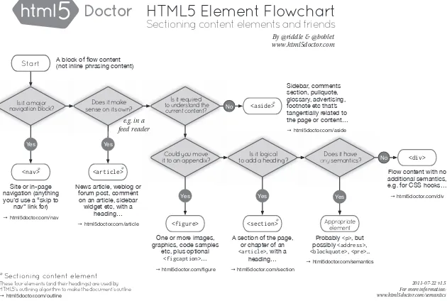
If this discussion isn’t making a lot of sense to you, you’re in good com-pany. The confusion over what each of the sectioning content elements does is so common that the good HTML5 Doctor has created a flowchart (Figure 2-1) to help you choose the right element for the task at hand.
A flowchart. To help you choose an element. If you’re a good judge of tone, you might have started to get the impression that I’m not a fan of the new HTML5 structural elements. If so, you’re right.
The Downside of HTML5 Sectioning Elements
As implied through my perceivable mounting sense of frustration in the previous section, coming to grips with some of these new elements can be quite challenging, especially understanding the difference between article
and section. To recap: A section can contain articles and sections, and an
Start
These four elements (and their headings) are used by HTML5’s outlining algorithm to make the document’s outline
→html5doctor.com/outline
Figure 2-1: If you’re confused about which sectioning element is the correct one to use, the HTML5 Doctor has the answer.
In his book The Truth About HTML5 (CreateSpace, 2012), Luke Stevens says this about the vague description of article:
Specifications fail when they leave things up to you to work out.
The whole point of a specification is to specify exactly what you
should do. But here it’s open to interpretation, has no clear ben-efit, and repeats existing functionality. . . .
I can’t disagree. My prediction is that these elements will be badly mis-used by many people unless clearer definitions can be found.
For technical reasons, I suggest not using the new elements on the open Web: For one, they’re simply not supported in older versions of Inter-net Explorer (8 and below). To make those browsers recognize the new ele-ments, you have to create them in JavaScript. You can do this fairly easily; just implement the popular HTML5Shiv using conditional comments:
<!--[if lt IE 9]>
<script src="html5shiv.js"></script> <![endif]-->
But doing this creates a dependency on JavaScript for your visitors; anyone using old IE with JavaScript disabled doesn’t see any of the content contained inside the new elements. Although that may be only a small percentage of users, accessibility should mean that everyone gets to see your
On top of that, no currently available browsers support the new outlin-ing algorithm (the JAWS screen reader does, albeit with bugs), so all your hard work doesn’t really have much benefit—this is likely to change in the future, of course.
In the end, the decision to use the new structural elements is, of course, up to you. They’re not mandatory—you can still use div elements as you do
currently. I find it hard to recommend using them, however, unless you’re prepared to read the HTML5 spec and fully understand exactly how the new elements work on the outline of a document—and you’re working in an environment where legacy browsers aren’t an issue. As things are at the time of writing, I would look for an alternative way to show page structure. Luckily, one is available, in the shape of WAI-ARIA.
WAI-ARIA
The Web Accessibility Initiative’s Accessible Rich Internet Applications suite
(WAI-ARIA to its friends) was created to address the shortfall in accessibility
that was created as the Web moved beyond simple document markup and into an era of applications and interactivity.
WAI-ARIA does this by creating a number of HTML extensions (or, in fact, extensions for any DOM-based languages, such as SVG and XML), allowing developers to make browsers and assistive technology aware of interactive content. For example, if you have a link that uses JavaScript to create an on-screen dialog overlay when clicked, you have no way to make the browser aware of it; the markup just looks like a standard link:
<a href="http://example.com">Launch popup</a>
Because the event is attached to the link using script, the screen read-ing device has no information about what happens here and can’t give any context to the user, who remains unaware of the functionality. WAI-ARIA introduces a new attribute, aria-haspopup, for just this situation, giving
infor-mation to the user about what’s going on:
<a href="http://example.com" aria-haspopup="true">Launch popup</a>
A whole range of new attributes is available, among them what are known as landmark roles; these attributes make screen readers and other
accessible navigation devices aware of your page’s structure, so the user can easily find their way around your document. This solution goes some way toward fulfilling the structural obligations that the new HTML5 elements were created to fulfill.
N O T E As mentioned, at the time of writing, some user agents and assistive technologies
Landmark roles are applied using the role attribute with a series of
predefined values. These values do not directly correspond to the HTML5 structural elements, but they mostly match very well. For example, if you want to define the document area that contains general information about the site, such as the logo and strap line, you add the banner role:
<div role="banner">...</div>
This role is broadly analogous to the header element and, in most cases,
will be used in its place.
Some landmark roles don’t have an HTML5 equivalent: Believe it or not, no suitable element exists for indicating where the main content of a page is, so to let the screen reader know the location of key content, we have the main role:
<div role="main">...</div>
Eight landmark roles are defined in the WAI-ARIA spec:
application Shows an area of a page that’s an interactive application
rather than a document
banner As mentioned, indicates general site content, probably
con-tained in the page header; in this specific context, analogous to the
header element
complementary Shows content that’s related, but not integral, to the
main content, like a sidebar; analogous to the aside element
contentinfo Gives you information about the document, such as legal
instructions. Often located in the footer, so in this context, is analogous to the footer element
form Indicates any form except search, for example, a contact form
main Indicates the core content of a document
navigation Contains groups of links for navigating this or related
doc-uments, analogous to nav
search Indicates forms specifically used to search this site or others
As well as being useful for navigating and providing some semantic value, the landmark roles make convenient styling hooks for CSS. Using the Exact Attribute Value Selector, you can easily apply rules to, for example, the page header:
div[role='contentinfo'] { background-color: blue; }


![Figure 6-3: Movement along the three-dimensional axes (This image is taken from the Mozilla Developer Network _and_motion_data_explained/[MDN] article, “Orientation and Motion Data Explained”: http:// developer.mozilla.org/en-US/docs/DOM/Orientation](https://thumb-ap.123doks.com/thumbv2/123dok/3935159.1878579/127.504.121.297.348.452/movement-dimensional-developer-explained-orientation-explained-developer-orientation.webp)
