Pro WPF 4.5 in C#
Microsoft’s Windows Presentation Foundation (WPF) provides you with a development frame-work for building high-quality user experiences for the Windows operating system. It blends together rich content from a wide range of sources and allows you unparalleled access to the processing power of your Windows computer.
Pro WPF 4.5 in C# is a thorough, authoritative guide to how WPF really works. Packed with no-nonsense examples and practical advice, this book will teach you everything you need to know in order to use WPF in a professional setting. The book begins by building a firm foundation of elementary concepts, using your existing C# skills as a frame of reference, before moving on to discuss advanced concepts and demonstrate them in a hands-on way that emphasizes the time and effort savings that can be gained.
•UnderstandthefundamentalsofWPFprogramming,fromXAMLtocontrolsanddataflow •Developrealisticapplicationscenariostoseenavigation,localization,anddeployment in action
•ExploretheadvanceduserinterfacecontrolsthatWPFprovides
•LearntomanagedocumentsfromwithinWPF:textlayout,printing,anddocumentpack-aging are all covered
•Usegraphicsandmultimediatoaddpunchtoyourapplications
This book is designed for developers encountering WPF for the first time in their professional lives.AworkingknowledgeofC#andthebasicarchitectureof.NETishelpfultofollowthe examples easily, but all concepts are explained from the ground up.
•UnderstandthefundamentalsofWPFprogramming,fromXAMLtocontrolsanddataflow •Developrealisticapplicationscenariostoseenavigation,localization,
•ExploretheadvanceduserinterfacecontrolsthatWPFprovides
•LearntomanagedocumentsfromwithinWPF:textlayout,printing,anddocument
•Usegraphicsandmultimediatoaddpunchtoyourapplications
lives.AworkingknowledgeofC#andthebasicarchitectureof.NETishelpfultofollowthe
Contents at a Glance
About the Author ...xxvi
About the Technical Reviewer ...xxvii
Acknowledgments ...xxviii
Introduction ...xxix
Part I: Fundamentals ...1
Chapter 1: Introducing WPF ...3
Chapter 2: XAML ...21
Chapter 3: Layout ...53
Chapter 4: Dependency Properties ...93
Chapter 5: Routed Events ...105
Part II: Deeper Into WPF ...141
Chapter 6: Controls ...143
Chapter 7: The Application ...195
Chapter 8: Element Binding ...227
Chapter 9: Commands ...243
Chapter 10: Resources ...269
Chapter 11: Styles and Behaviors ...283
Part III: Drawing and Animation ...305
Chapter 12: Shapes, Brushes, and Transforms ...307
Chapter 13: Geometries and Drawings ...347
Chapter 14: Effects and Visuals ...369
Chapter 16: Advanced Animation ...431
Part IV: Templates and Custom Elements ...463
Chapter 17: Control Templates ...465
Chapter 18: Custom Elements ...505
Part V: Data ...555
Chapter 19: Data Binding ...557
Chapter 20: Formatting Bound Data ...601
Chapter 21: Data Views ...647
Chapter 22: Lists, Trees, and Grids ...665
Part VI: Windows, Pages, and Rich Controls ...705
Chapter 23: Windows ...707
Chapter 24: Pages and Navigation ...741
Chapter 25: Menus, Toolbars, and Ribbons ...787
Chapter 26: Sound and Video ...813
Chapter 27: 3-D Drawing ...837
Part VII: Documents and Printing ...881
Chapter 28: Documents ...883
Chapter 29: Printing ...935
Part VIII: Additional Topics ...965
Chapter 30: Interacting with Windows Forms ...967
Chapter 31: Multithreading ...983
Chapter 32: The Add-in Model ...997
Chapter 33: ClickOnce Deployment ...1021
n n n
Introducing WPF
The Windows Presentation Foundation (WPF) is a modern graphical display system for Windows. It’s a radical change from the technologies that came before it, with innovative features such as built-in hardware acceleration and resolution independence, both of which you’ll explore in this chapter.
WPF is the best toolkit to use if you want to build a rich desktop application that runs on Windows Vista, Windows 7, and Windows 8 in desktop mode (as well as the corresponding versions of Windows Server). In fact, it’s the only general-purpose toolkit that targets these versions of Windows. By comparison, Microsoft’s new Metro toolkit—although exciting—is limited to Windows 8 systems only. (WPF
applications can even be made to run on ancient Windows XP computers, which are still found in many businesses. The only limitation is that you must configure Visual Studio to target the slightly older .NET 4.0 Framework, rather than .NET 4.5.)
In this chapter, you’ll take your first look at the architecture of WPF. You’ll learn how it deals with varying screen resolutions, and you’ll get a high-level survey of its core assemblies and classes. You’ll also consider how WPF has evolved from its initial release to version 4.5.
The Evolution of Windows Graphics
Before WPF, Windows developers spent nearly 15 years using essentially the same display technology. That’s because every traditional, pre-WPF Windows application relies on two well-worn parts of the Windows operating system to create its user interface:
• User32: This provides the traditional Windows look and feel for elements such as windows, buttons, text boxes, and so on.
• GDI/GDI+: This provides drawing support for rendering shapes, text, and images at the cost of additional complexity (and often lackluster performance).
Over the years, both technologies have been refined, and the APIs that developers use to interact with them have changed dramatically. But whether you’re crafting an application with .NET and Windows Forms or even Visual Basic 6 or MFC-based C++ code, behind the scenes the same parts of the Windows operating system are at work. Different frameworks simply provide different wrappers for interacting with User32 and GDI/GDI+. They can provide improvements in efficiency, reduce complexity, and add
n
Note The basic division of labor between User32 and GDI/GDI+ was introduced more than 15 years ago and
was well established in Windows 3.0. Of course, User32 was simply User at that point, because software hadn’t yet
entered the 32-bit world.
DirectX: The New Graphics Engine
Microsoft created one way around the limitations of the User32 and GDI/GDI+ libraries: DirectX. DirectX began as a cobbled-together, error-prone toolkit for creating games on the Windows platform. Its design mandate was speed, and so Microsoft worked closely with video card vendors to give DirectX the hardware acceleration needed for complex textures, special effects such as partial transparency, and
three-dimensional graphics.
Over the years since it was first introduced (shortly after Windows 95), DirectX has matured. It’s now an integral part of Windows, with support for all modern video cards. However, the programming API for DirectX still reflects its roots as a game developer’s toolkit. Because of its raw complexity, DirectX is almost never used in traditional types of Windows applications (such as business software).
WPF changes all this. In WPF, the underlying graphics technology isn’t GDI/GDI+. Instead, it’s DirectX. In fact, WPF applications use DirectX no matter what type of user interface you create. That means that whether you’re designing complex three-dimensional graphics (DirectX’s forte) or just drawing buttons and plain text, all the drawing work travels through the DirectX pipeline. As a result, even the most mundane business applications can use rich effects such as transparency and anti-aliasing. You also benefit from hardware acceleration, which simply means DirectX hands off as much work as possible to the graphics processing unit (GPU), which is the dedicated processor on the video card.
n
Note DirectX is more efficient because it understands higher-level ingredients such as textures and gradients
that can be rendered directly by the video card. GDI/GDI+ doesn’t, so it needs to convert them to pixel-by-pixel
instructions, which are rendered much more slowly by modern video cards.
One component that’s still in the picture (to a limited extent) is User32. That’s because WPF still relies on User32 for certain services, such as handling and routing input and sorting out which application owns which portion of screen real estate. However, all the drawing is funneled through DirectX.
Hardware Acceleration and WPF
WPF: A Higher-Level API
If the only thing WPF offered was hardware acceleration through DirectX, it would be a compelling improvement but a limited one. But WPF includes a basket of high-level services designed for application programmers.
The following are some of the most dramatic changes that WPF ushers into the Windows programming world:
• A web-like layout model: Rather than fix controls in place with specific coordinates, WPF emphasizes flexible flow layout that arranges controls based on their content. The result is a user interface that can adapt to show highly dynamic content or different languages.
• A rich drawing model: Rather than painting pixels, in WPF you deal with primitives— basic shapes, blocks of text, and other graphical ingredients. You also have new features, such as true transparent controls, the ability to stack multiple layers with different opacities, and native 3-D support.
• A rich text model: WPF gives Windows applications the ability to display rich, styled text anywhere in a user interface. You can even combine text with lists, floating figures, and other user interface elements. And if you need to display large amounts of text, you can use advanced document display features such as wrapping,
columns, and justification to improve readability.
• Animation as a first-class programming concept: In WPF, there’s no need to use a timer to force a form to repaint itself. Instead, animation is an intrinsic part of the framework. You define animations with declarative tags, and WPF puts them into action automatically.
• Support for audio and video media: Previous user interface toolkits, such as Windows Forms, were surprisingly limited when dealing with multimedia. But WPF includes support for playing any audio or video file supported by Windows Media Player, and it allows you to play more than one media file at once. Even more impressively, it gives you the tools to integrate video content into the rest of your user interface, allowing you to pull off exotic tricks such as placing a video window on a spinning 3-D cube.
• Styles and templates: Styles allow you to standardize formatting and reuse it throughout your application. Templates allow you to change the way any element is rendered, even a core control such as the button. It has never been easier to build modern skinned interfaces.
• Commands: Most users realize that it doesn’t matter whether they trigger the Open command through a menu or through a toolbar; the end result is the same. Now that abstraction is available to your code, you can define an application command in one place and link it to multiple controls.
• Page-based applications: Using WPF, you can build a browser-like application that lets you move through a collection of pages, complete with forward and back navigation buttons. WPF handles the messy details such as the page history. You can even deploy your project as a browser-based application that runs right inside Internet Explorer.
Resolution Independence
Traditional Windows applications are bound by certain assumptions about resolution. Developers usually assume a standard monitor resolution (such as 1366 × 768 pixels), design their windows with that in mind, and try to ensure reasonable resizing behavior for smaller and larger dimensions.
The problem is that the user interface in traditional Windows applications isn’t scalable. As a result, if you use a high monitor resolution that crams in pixels more densely, your application windows become smaller and more difficult to read. This is particularly a problem with newer monitors that have high pixel densities and run at correspondingly high resolutions. For example, it’s common to find consumer monitors (particularly on laptops) that have pixel densities of 120 dpi or 144 dpi (dots per inch), rather than the more traditional 96 dpi. At their native resolution, these displays pack the pixels in much more tightly, creating eye-squintingly small controls and text.
Ideally, applications would use higher pixel densities to show more detail. For example, a high-resolution monitor could display similarly sized toolbar icons but use the extra pixels to render sharper graphics. That way, you could keep the same basic layout but offer increased clarity and detail. For a variety of reasons, this solution hasn’t been possible in the past. Although you can resize graphical content that’s drawn with GDI/GDI+, User32 (which generates the visuals for common controls) doesn’t support true scaling.
WPF doesn’t suffer from this problem because it renders all user interface elements itself, from simple shapes to common controls such as buttons. As a result, if you create a button that’s 1 inch wide on your computer monitor, it can remain 1 inch wide on a high-resolution monitor—WPF will simply render it in greater detail and with more pixels.
This is the big picture, but it glosses over a few details. Most importantly, you need to realize that WPF bases its scaling on the system DPI setting, not the DPI of your physical display device. This makes perfect sense—after all, if you’re displaying your application on a 100-inch projector, you’re probably standing several feet back and expecting to see a jumbo-size version of your windows. You don’t want WPF to suddenly scale down your application to “normal” size. Similarly, if you’re using a laptop with a high-resolution display, you probably expect to have slightly smaller windows—it’s the price you pay to fit all your information onto a smaller screen. Furthermore, different users have different preferences. Some want richer detail, while others prefer to cram in more content.
So, how does WPF determine how big an application window should be? The short answer is that WPF uses the system DPI setting when it calculates sizes. But to understand how this really works, it helps to take a closer look at the WPF measurement system.
WPF Units
A WPF window and all the elements inside it are measured using device-independent units. A single device-independent unit is defined as 1/96 of an inch. To understand what this means in practice, you’ll need to consider an example.
[Physical Unit Size] = [Device-Independent Unit Size] x [System DPI] = 1/96 inch x 96 dpi
= 1 pixel
Essentially, WPF assumes it takes 96 pixels to make an inch because Windows tells it that through the system DPI setting. However, the reality depends on your display device.
For example, consider a 19-inch LCD monitor with a maximum resolution of 1600 by 1200 pixels. Using a dash of Pythagoras, you can calculate the pixel density for this monitor, as shown here:
= 100 dpi
In this case, the pixel density works out to 100 dpi, which is slightly higher than what Windows assumes. As a result, on this monitor a 96-by-96-pixel button will be slightly smaller than 1 inch.
On the other hand, consider a 15-inch LCD monitor with a resolution of 1024 by 768. Here, the pixel density drops to about 85 dpi, so the 96-by-96-pixel button appears slightly larger than 1 inch.
In both these cases, if you reduce the screen size (say, by switching to 800 by 600 resolution), the button (and every other screen element) will appear proportionately larger. That’s because the system DPI setting remains at 96 dpi. In other words, Windows continues to assume it takes 96 pixels to make an inch, even though at a lower resolution it takes far fewer pixels.
n
Tip As you no doubt know, LCD monitors are designed to work best at a specific resolution, which is called the
native resolution. If you lower the resolution, the monitor must use interpolation to fill in the extra pixels, which can
cause blurriness. To get the best display, it’s always best to use the native resolution. If you want larger windows,
buttons, and text, consider modifying the system DPI setting instead (as described next).
System DPI
So far, the WPF button example works exactly the same as any other user interface element in any other type of Windows application. The difference is the result if you change the system DPI setting. In the previous generation of Windows, this feature was sometimes called large fonts. That’s because the system DPI affects the system font size but often leaves other details unchanged.
n
Note Many Windows applications don’t fully support higher DPI settings. At worst, increasing the system DPI
can result in windows that have some content that’s scaled up and other content that isn’t, which can lead to
obscured content and even unusable windows.
[Physical Unit Size] = [Device-Independent Unit Size] x [System DPI] = 1/96 inch x 120 dpi
= 1.25 pixels
In other words, when you set the system DPI to 120 dpi, the WPF rendering engine assumes one device-independent unit equals 1.25 pixels. If you show a 96-by-96 button, the physical size will actually be 120 by 120 pixels (because 96 x 1.25 = 120). This is the result you expect—a button that’s 1 inch on a standard monitor remains 1 inch in size on a monitor with a higher pixel density.
This automatic scaling wouldn’t help much if it applied only to buttons. But WPF uses
device-independent units for everything it displays, including shapes, controls, text, and any other ingredient you put in a window. As a result, you can change the system DPI to whatever you want, and WPF adjusts the size of your application seamlessly.
n
Note Depending on the system DPI, the calculated pixel size may be a fractional value. You might assume that
WPF simply rounds off your measurements to the nearest pixel. However, by default, WPF does something different.
If an edge of an element falls between pixels, it uses anti-aliasing to blend that edge into the adjacent pixels. This
might seem like an odd choice, but it actually makes a fair bit of sense. Your controls won’t necessarily have straight,
clearly defined edges if you use custom-drawn graphics to skin them; so some level of anti-aliasing is already
necessary.
The steps for adjusting the system DPI depend on the operating system. The following sections explain what to do, depending on your operating system.
Windows Vista
1. Right-click your desktop and choose Personalize.
2. In the list of links on the left, choose Adjust Font Size (DPI).
Windows 7 and Windows 8
1. Right-click your desktop and choose Personalize.
2. In the list of links at the bottom-left of the window, choose Display.
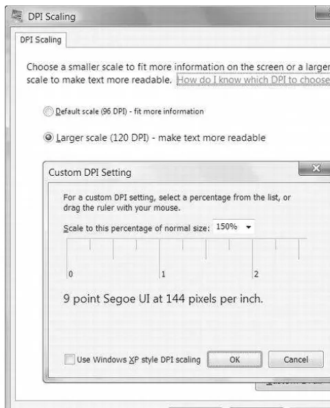
3. Choose between Smaller (the default option), Medium, or Larger. Although these options are described by scaling percentages (100%, 125%, or 150%), they actually correspond to the DPI values 96, 120, and 144. You’ll notice that the first two are the same standards found in Windows Vista and Windows XP, while the third one is larger still. Alternatively, you can click Set Custom Text Size to use a custom DPI percentage, as shown in Figure 1-1. (For example, 175% scales the standard 96 dpi to 168 dpi.) When using a custom DPI setting, you have an option named Use Windows XP Style DPI Scaling, which is described in the following sidebar.
DPI SCAlIng
Because older applications are notoriously lacking in their support for high DPI settings, Windows Vista
introduced a technique called
bitmap scaling. Later versions of Windows also support this feature.
With bitmap scaling, when you run an application that doesn’t appear to support high DPI settings, Windows
resizes it as though it were an image. The advantage of this approach is that the application still believes it’s
running at the standard 96 dpi. Windows seamlessly translates input (such as mouse clicks) and routes them
to the right place in the application’s “real” coordinate system.
The scaling algorithm that Windows uses is a fairly good one—it respects pixel boundaries to avoid blurry
edges and uses the video card hardware where possible to increase speed—but it inevitably leads to a
fuzzier display. It also has a serious limitation in that Windows can’t recognize older applications that
dosupport high DPI settings. That’s because applications need to include a manifest or call SetProcessDPIAware
(in User32) to advertise their high DPI support. Although WPF applications handle this step correctly,
applications created prior to Windows Vista won’t use either approach and will be stuck with bitmap scaling
even when they support higher DPIs.
There are two possible solutions. If you have a few specific applications that support high DPI settings but
don’t indicate it, you can configure that detail manually. To do so, right-click the shortcut that starts the
application (in the Start menu) and choose Properties. On the Compatibility tab, enable the option named
Disable Display Scaling on High DPI Settings. If you have a lot of applications to configure, this gets tiring
fast.
The other possible solution is to disable bitmap scaling altogether. To do so, choose the Use Windows XP
Style DPI Scaling option in the Custom DPI Setting dialog box shown in Figure 1-1. The only limitation of this
approach is there may be some applications that won’t display properly (and possibly won’t be usable) at
high DPI settings. By default, Use Windows XP Style DPI Scaling is checked for DPI sizes of 120 or less but
unchecked for DPI sizes that are greater.
Bitmap and Vector Graphics
When you work with ordinary controls, you can take WPF’s resolution independence for granted. WPF takes care of making sure that everything has the right size automatically. However, if you plan to
incorporate images into your application, you can’t be quite as casual. For example, in traditional Windows applications, developers use tiny bitmaps for toolbar commands. In a WPF application, this approach is not ideal because the bitmap may display artifacts (becoming blurry) as it’s scaled up or down according to the system DPI. Instead, when designing a WPF user interface, even the smallest icon is generally implemented as a vector graphic. Vector graphics are defined as a set of shapes, and as such they can be easily scaled to any size.
n
Note Of course, drawing a vector graphic takes more time than painting a basic bitmap, but WPF includes
optimizations that are designed to lessen the overhead to ensure that drawing performance is always reasonable.
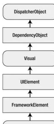
Figure 1-2 includes these key components:
• PresentationFramework.dll: This holds the top-level WPF types, including those that represent windows, panels, and other types of controls. It also implements higher-level programming abstractions such as styles. Most of the classes you’ll use directly come from this assembly.
• PresentationCore.dll: This holds base types, such as UIElement and Visual, from which all shapes and controls derive. If you don’t need the full window and control abstraction layer, you can drop down to this level and still take advantage of WPF’s rendering engine.
• WindowsBase.dll: This holds even more basic ingredients that have the potential to be reused outside of WPF, such as DispatcherObject and DependencyObject, which introduces the plumbing for dependency properties (a topic you’ll explore in detail in Chapter 4).
• milcore.dll: This is the core of the WPF rendering system and the foundation of the Media Integration Layer (MIL). Its composition engine translates visual elements into the triangle and textures that Direct3D expects. Although milcore.dll is considered part of WPF, it’s also an essential system component for Windows Vista and Windows 7. In fact, the Desktop Window Manager (DWM) uses milcore.dll to render the desktop.
The Architecture of WPF
WPF uses a multilayered architecture. At the top, your application interacts with a high-level set of services that are completely written in managed C# code. The actual work of translating .NET objects into Direct3D textures and triangles happens behind the scenes, using a lower-level unmanaged component called milcore.dll. milcore.dll is implemented in unmanaged code because it needs tight integration with Direct3D and because it’s extremely performance-sensitive.
Figure 1-2 shows the layers at work in a WPF application.
n
Note milcore.dll is sometimes referred to as the engine for “managed graphics.” Much as the common
language runtime (CLR) manages the lifetime of a .NET application, milcore.dll manages the display state. And just
as the CLR saves you from worrying about releasing objects and reclaiming memory, milcore.dll saves you from
thinking about invalidating and repainting a window. You simply create the objects with the content you want to
show, and milcore.dll paints the appropriate portions of the window as it is dragged around, covered and uncovered,
minimized and restored, and so on.
• WindowsCodecs.dll: This is a low-level API that provides imaging support (for example, processing, displaying, and scaling bitmaps and JPEGs).
• Direct3D: This is the low-level API through which all the graphics in a WPF application are rendered.
• User32: This is used to determine what program gets what real estate. As a result, it’s still involved in WPF, but it plays no part in rendering common controls.
The most important fact that you should realize is Direct3D renders all the drawing in WPF. It doesn’t matter whether you have a modest video card or a much more powerful one, whether you’re using basic controls or drawing more complex content, or whether you’re running your application on Windows XP, Windows Vista, or Windows 7. Even two-dimensional shapes and ordinary text are transformed into triangles and passed through the 3-D pipeline. There is no fallback to GDI+ or User32.
The Class Hierarchy
Throughout this book, you’ll spend most of your time exploring the WPF namespaces and classes. But before you begin, it’s helpful to take a first look at the hierarchy of classes that leads to the basic set of WPF controls.
The following sections describe the core classes in this diagram. Many of these classes lead to whole branches of elements (such as shapes, panels, and controls).
n
Note The core WPF namespaces begin with System.Windows (for example, System.Windows, System.Windows.
Controls, and System.Windows.Media). The sole exception is namespaces that begin with System.Windows.Forms,
which are part of the Windows Forms toolkit.
System.Threading.DispatcherObject
WPF applications use the familiar single-thread affinity (STA) model, which means the entire user interface is owned by a single thread. It’s not safe to interact with user interface elements from another thread. To facilitate this model, each WPF application is governed by a dispatcher that coordinates messages (which result from keyboard input, mouse movements, and framework processes such as layout). By deriving from DispatcherObject, every element in your user interface can verify whether code is running on the correct thread and access the dispatcher to marshal code to the user interface thread. You’ll learn more about the WPF threading model in Chapter 31.
System.Windows.DependencyObject
In WPF, the central way of interacting with onscreen elements is through properties. Early on in the design cycle, the WPF architects decided to create a more powerful property model that baked in features such as change notification, inherited default values, and more economical property storage. The ultimate result is the dependency property feature, which you’ll explore in Chapter 4. By deriving from DependencyObject, WPF classes get support for dependency properties.
System.Windows.Media.Visual
Every element that appears in a WPF window is, at heart, a Visual. You can think of the Visual class as a single drawing object that encapsulates drawing instructions, additional details about how the drawing should be performed (such as clipping, opacity, and transformation settings), and basic functionality (such as hit testing). The Visual class also provides the link between the managed WPF libraries and the milcore.dll that renders your display. Any class that derives from Visual has the ability to be displayed on a window. If you prefer to create your user interface using a lightweight API that doesn’t have the higher-level framework features of WPF, you can program directly with Visual objects, as described in Chapter 14.
System.Windows.UIElement
UIElement adds support for WPF essentials such as layout, input, focus, and events (which the WPF team refers to by the acronym LIFE). For example, it’s here that the two-step measure and arrange layout process is defined, which you’ll learn about in Chapter 18. It’s also here that raw mouse clicks and key presses are transformed to more useful events such as MouseEnter. As with properties, WPF implements an enhanced event-passing system called routed events. You’ll learn how it works in Chapter 5. Finally, UIElement adds supports for commands (Chapter 9).
System.Windows.FrameworkElement
FrameworkElement is the final stop in the core WPF inheritance tree. It implements some of the members that are merely defined by UIElement. For example, UIElement sets the foundation for the WPF layout system, but FrameworkElement includes the key properties (such as HorizontalAlignment and Margin) that support it. UIElement also adds support for data binding, animation, and styles, all of which are core features.
System.Windows.Shapes.Shape
Basic shapes classes, such as Rectangle, Polygon, Ellipse, Line, and Path, derive from this class. These shapes can be used alongside more traditional Windows widgets such as buttons and text boxes. You’ll start building shapes in Chapter 12.
System.Windows.Controls.Control
replace the standard appearance of a control with your own stylish drawing. You’ll learn about control templates in Chapter 17.
n
Note In Windows Forms programming, every visual item in a form is referred to as a control. In WPF, this isn’t
the case. Visual items are called elements, and only some elements are actually controls (those that can receive
focus and interact with the user). To make this system even more confusing, many elements are defined in the
System.Windows.Controls namespace, even though they don’t derive from System.Windows.Controls.Control and
aren’t considered controls. One example is the Panel class.
System.Windows.Controls.ContentControl
This is the base class for all controls that have a single piece of content. This includes everything from the humble Label to the Window. The most impressive part of this model (which is described in more detail in Chapter 6) is the fact that this single piece of content can be anything from an ordinary string to a layout panel with a combination of other shapes and controls.
System.Windows.Controls.ItemsControl
This is the base class for all controls that show a collection of items, such as the ListBox and TreeView. List controls are remarkably flexible—for example, using the features that are built into the ItemsControl class, you can transform the lowly ListBox into a list of radio buttons, a list of check boxes, a tiled display of images, or a combination of completely different elements that you’ve chosen. In fact, in WPF, menus, toolbars, and status bars are actually specialized lists, and the classes that implement them all derive from ItemsControl. You’ll start using lists in Chapter 19 when you consider data binding. You’ll learn to enhance them in Chapter 20, and you’ll consider the most specialized list controls in Chapter 22.
System.Windows.Controls.Panel
This is the base class for all layout containers—elements that can contain one or more children and arrange them according to specific layout rules. These containers are the foundation of the WPF layout system, and using them is the key to arranging your content in the most attractive, flexible way possible. Chapter 3 explores the WPF layout system in more detail.
WPF 4.5
WPF is a mature technology. It’s been part of several releases of .NET, with steady enhancements along the way:
• WPF 3.0: The first version of WPF was released with two other new technologies: Windows Communication Foundation (WCF) and Windows Workflow Foundation (WF). Together, these three technologies were called the .NET Framework 3.0.
• WPF 3.5 SP1: When the .NET Framework Service Pack 1 (SP1) was released, the designers of WPF had a chance to slip in a few new features, such as slick graphical effects (courtesy of pixel shaders) and the sophisticated DataGrid control.
• WPF 4: This release added a number of refinements, including better text rendering, more natural animation, and support for multitouch.
• WPF 4.5: The latest version of WPF has the fewest changes yet, which reflects its status as a mature technology. Along with the usual bug fixes and performance tweaks, WPF 4.5 adds a number of refinements to that data binding system,
including improvements to data binding expressions, virtualization, support for the INotifyDataError interface, and data view synchronization. You’ll see these new features in Chapter 8, Chapter 19, and Chapter 22.
The WPF Toolkit
Before a new control makes its way into the WPF libraries of the .NET platform, it often begins in a separate Microsoft download known as the WPF Toolkit. But the WPF Toolkit isn’t just a place to preview the future direction of WPF—it’s also a great source of practical components and controls that are made available outside the normal WPF release cycle. For example, WPF doesn’t include any sort of charting tools, but the WPF Toolkit includes a set of controls for creating bar, pie, bubble, scatter, and line graphs.
This book occasionally references the WPF Toolkit to point out a useful piece of functionality that’s not available in the core .NET runtime. To download the WPF Toolkit, review its code, or read its
documentation, surf to http://wpf.codeplex.com. There, you’ll also find links to other Microsoft-managed WPF projects, including WPF Futures (which provides more experimental WPF features) and WPF testing tools.
Visual Studio 2012
Although you can craft WPF user interfaces by hand or using the graphic-design-oriented tool Expression Blend, most developers will start in Visual Studio and spend most (or all) of their time there. This book assumes you’re using Visual Studio and occasionally explains how to use the Visual Studio interface to perform an important task, such as adding a resource, configuring project properties, or creating a control library assembly. However, you won’t spend much time exploring Visual Studio’s design-time frills. Instead, you’ll focus on the underlying markup and code you need to create professional applications.
Multitargeting
In the past, each version of Visual Studio was tightly coupled to a specific version of .NET. Visual Studio 2012 doesn’t have this restriction—it allows you to design an application that targets any version of .NET from 2.0 to 4.5.
Although it’s obviously not possible to create a WPF application with .NET 2.0, all later versions have WPF support. You may choose to target an older version, such as .NET 3.5 or .NET 4 to get the broadest possible compatibility. For example, a .NET 3.5 application can run on the .NET 3.5, 4, and 4.5 runtimes. Or, you may choose to target .NET 4.5 to get access to newer features in WPF or in the .NET platform. However, if you need to support legacy Windows XP computers, you can’t target a version part of .NET 4, because this is the last .NET release that supports Windows XP.
When you create a new project in Visual Studio, you can choose the version of the .NET Framework that you’re targeting from a drop-down list at the top of the New Project dialog box, just above the list of project templates (see Figure 1-4).
Figure 1-4. Choosing the target version of the .NET Framework
You can also change the version you’re targeting at any point afterward by double-clicking the Properties node in the Solution Explorer and changing the selection in the Target Framework list.
The Visual Studio Designer
Visual Studio includes a rich designer for creating WPF user interfaces. But just because Visual Studio 2012 allows you to drag and drop WPF windows into existence doesn’t mean you should start doing that right now—or at all. As you’ll learn in Chapter 3, WPF uses a flexible and nuanced layout model that allows you to use different strategies for sizing and positioning the elements in your user interface. To get the result you need, you’ll need to choose the right combination of layout containers, arrange them appropriately, and configure their properties. Visual Studio can help you out in this task, but it’s far easier if you learn the basics of XAML markup and WPF layout first. Then, you’ll be able to watch as Visual Studio’s visual designer generates your markup, and you can modify it by hand as needed.
After you’ve mastered the syntax of XAML (Chapter 2) and you’ve learned about the family of WPF layout controls (Chapter 3), it’s up to you to choose how you want to create your windows. There are professional developers who use Visual Studio, those who use Expression Blend, those who write XAML by hand, and those who use a combination of both methods (for example, creating the basic layout structure by hand and then configuring it with the Visual Studio designer).
The Last Word
In this chapter, you took your first look at WPF and the promise it holds. You considered the underlying architecture and briefly considered the core classes.
Clearly, WPF introduces many significant changes. However, there are five key principles that
immediately stand out because they are so different from previous Windows user interface toolkits such as Windows Forms. These principles are the following:
• Hardware acceleration: All WPF drawing is performed through DirectX, which allows it to take advantage of the latest in modern video cards.
• Resolution independence: WPF is flexible enough to scale up or down to suit your monitor and display preferences, depending on the system DPI setting.
• No fixed control appearance: In traditional Windows development, there’s a wide chasm between controls that can be tailored to suit your needs (which are known as
owner-drawn controls) and those that are rendered by the operating system and essentially fixed in appearance. In WPF, everything from a basic Rectangle to a standard Button or more complex Toolbar is drawn using the same rendering engine and completely customizable. For this reason, WPF controls are often called lookless controls—they define the functionality of a control, but they don’t have a hardwired “look.”
• Declarative user interfaces: In the next chapter, you’ll consider XAML, the markup standard you use to define WPF user interfaces. XAML allows you to build a window without using code. Impressively, XAML doesn’t limit you to fixed, unchanging user interfaces. You can use tools such as data binding and triggers to automate basic user interface behavior (such as text boxes that update themselves when you page through a record source, or labels that glow when you hover overtop with the mouse), all without writing a single line of C#.
n n n
XAML
XAML (short for Extensible Application Markup Language and pronounced zammel) is a markup language used to instantiate .NET objects. Although XAML is a technology that can be applied to many problem domains, its primary role in life is to construct WPF user interfaces. In other words, XAML documents define the arrangement of panels, buttons, and controls that make up the windows in a WPF application.
It’s unlikely that you’ll write XAML by hand. Instead, you’ll use a tool that generates the XAML you need. If you’re a graphic designer, that tool is likely to be a graphical design program such as Microsoft Expression Blend. If you’re a developer, you’ll probably start with Microsoft Visual Studio. Because both tools are equally at home with XAML, you can create a basic user interface with Visual Studio and then hand it off to a crack design team that can polish it up with custom graphics in Expression Blend. In fact, this ability to integrate the workflow between developers and designers is one of the key reasons that Microsoft created XAML.
This chapter presents a detailed introduction to XAML. You’ll consider its purpose, its overall architecture, and its syntax. Once you understand the broad rules of XAML, you’ll know what is and isn’t possible in a WPF user interface—and how to make changes by hand when it’s necessary. More important, by exploring the tags in a WPF XAML document, you can learn a bit about the object model that underpins WPF user interfaces and get ready for the deeper exploration to come.
n
What’s New WPF 4.5 adds nothing new to the XAML standard. In fact, even the minor refinements of XAML
2009 still aren’t fully implemented. They’re supported only in loose XAML files, not compiled XAML resources (which
is what virtually every WPF application uses). In fact, XAML 2009 will probably never become a fully integrated part
of WPF, because its improvements aren’t terribly important, and any change to the XAML compiler raises security
and performance concerns. For that reason, XAML 2009 isn’t covered in this book.
Understanding XAML
Graphical User Interfaces Before WPF
With traditional display technologies, there’s no easy way to separate the graphical content from the code. The key problem with a Windows Forms application is that every form you create is defined entirely in C# code. As you drop controls onto the design surface and configure them, Visual Studio quietly adjusts the code in the corresponding form class. Sadly, graphic designers don’t have any tools that can work with C# code.
Instead, artists are forced to take their content and export it to a bitmap format. These bitmaps can then be used to skin windows, buttons, and other controls. This approach works well for straightforward interfaces that don’t change much over time, but it’s extremely limiting in other scenarios. Some of its problems include the following:
• Each graphical element (background, button, and so on) needs to be exported as a separate bitmap. That limits the ability to combine bitmaps and use dynamic effects such as antialiasing, transparency, and shadows.
• A fair bit of user interface logic needs to be embedded in the code by the developer. This includes button sizes, positioning, mouseover effects, and animations. The graphic designer can’t control any of these details.
• There’s no intrinsic connection between the different graphical elements, so it’s easy to end up with an unmatched set of images. Tracking all these items adds
complexity.
• Bitmaps can’t be resized without compromising their quality. For that reason, a bitmap-based user interface is resolution-dependent. That means it can’t
accommodate large monitors and high-resolution , which is a major violation of the WPF design philosophy.
If you’ve ever been through the process of designing a Windows Forms application with custom graphics in a team setting, you’ve put up with a lot of frustration. Even if the interface is designed from scratch by a graphic designer, you’ll need to re-create it with C# code. Usually, the graphic designer will simply prepare a mock-up that you need to translate painstakingly into your application.
WPF solves this problem with XAML. When designing a WPF application in Visual Studio, the window you’re designing isn’t translated into code. Instead, it’s serialized into a set of XAML tags. When you run the application, these tags are used to generate the objects that compose the user interface.
n
Note It’s important to understand that WPF doesn’t require XAML. There’s no reason Visual Studio couldn’t use
the Windows Forms approach and create code statements that construct your WPF windows. But if it did, your
window would be locked into the Visual Studio environment and available to programmers only.
In other words, WPF doesn’t require XAML. However, XAML opens up worlds of possibilities for collaboration, because other design tools understand the XAML format. For example, a savvy designer can use a tool such as Microsoft Expression Design to fine-tune the graphics in your WPF application or a tool such as Expression Blend to build sophisticated animations for it. After you’ve finished this chapter, you may want to read a Microsoft white paper at http://windowsclient.net/wpf/white-papers/
n
Tip XAML plays the same role for Windows applications as control tags do for ASP.NET web applications. The
difference is that the ASP.NET tagging syntax is designed to look like HTML, so designers can craft web pages by
using ordinary web design applications such as Microsoft Expression and Adobe Dreamweaver. As with WPF, the
actual code for an ASP.NET web page is usually placed in a separate file to facilitate this design.
The Variants of XAML
People use the term XAML in various ways. So far, I’ve used it to refer to the entire language of XAML which is an all-purpose XML-based syntax for representing a tree of .NET objects. (These objects could be buttons and text boxes in a window or custom classes you’ve defined. In fact, XAML could even be used on other platforms to represent non-.NET objects.)
There are also several subsets of XAML:
• WPF XAML encompasses the elements that describe WPF content, such as vector graphics, controls, and documents. Currently, it’s the most significant application of XAML, and it’s the subset you’ll explore in this book.
• XPS XAML is the part of WPF XAML that defines an XML representation for formatted electronic documents. It’s been published as the separate XML Paper Specification (XPS) standard. You’ll explore XPS in Chapter 28.
• Silverlight XAML is a subset of WPF XAML that’s intended for Microsoft Silverlight applications. Silverlight is a cross-platform browser plug-in that allows you to create rich web content with two-dimensional graphics, animation, and audio and video. Chapter 1 has more about Silverlight, or you can visit http://silverlight.net to learn about it in detail.
• WF XAML encompasses the elements that describe Windows Workflow Foundation (WF) content. You can learn more about WF at http://tinyurl.com/d9xr2nv.
XAML Compilation
The creators of WPF knew that XAML needed to not only solve the problem of design collaboration—it also needed to be fast. And though XML-based formats such as XAML are flexible and easily portable to other tools and platforms, they aren’t always the most efficient option. XML was designed to be logical, readable, and straightforward, but not compact.
WPF addresses this shortcoming with Binary Application Markup Language (BAML. BAML is really nothing more than a binary representation of XAML. When you compile a WPF application in Visual Studio, all your XAML files are converted into BAML, and that BAML is then embedded as a resource into the final DLL or EXE assembly. BAML is tokenized, which means lengthier bits of XAML are replaced with shorter tokens. Not only is BAML significantly smaller, but it’s also optimized in a way that makes it faster to parse at runtime.
CReATIng XAMl WITh VISuAl STuDIo
In this chapter, you’ll take a look at all the details of XAML markup. Of course, when you’re designing an
application, you won’t write all your XAML by hand. Instead, you’ll use a tool such as Visual Studio that can
drag and drop your user interface into existence. Based on that, you might wonder whether it’s worth
spending so much time studying the syntax of XAML.
The answer is a resounding
yes
. Understanding XAML is critical to WPF application design. It will help you
learn key WPF concepts, such as attached properties (in this chapter), layout (Chapter 3), routed events
(Chapter 4), the content model (Chapter 6), and so on. More important, a whole host of tasks are possible—
or are far easier to accomplish—with handwritten XAML. They include the following:
Most WPF developers use a combination of techniques, laying out some of their user interface with a design
tool (Visual Studio or Expression Blend) and then fine-tuning it by editing the XAML markup by hand.
However, you’ll probably find that it’s easiest to write all your XAML by hand until you learn about layout
containers in Chapter 3. That’s because you need to use a layout container to properly arrange multiple
controls in a window.
XAML Basics
The XAML standard is quite straightforward once you understand a few ground rules:
• Every element in a XAML document maps to an instance of a .NET class. The name of the element matches the name of the class exactly. For example, the element <Button instructs WPF to create a Button object.
• As with any XML document, you can nest one element inside another. As you’ll see, XAML gives every class the flexibility to decide how it handles this situation. However, nesting is usually a way to express containment—in other words, if you find a Button element inside a Grid element, your user interface probably includes a grid that contains a button inside.
• You can set the properties of each class through attributes. However, in some situations, an attribute isn’t powerful enough to handle the job. In these cases, you’ll use nested tags with a special syntax.
n
Note If you’re completely new to XML, you’ll probably find it easier to review the basics before you tackle XAML.
To get up to speed quickly, try the free web-based tutorial at
www.w3schools.com/xml
.
Before continuing, take a look at this bare-bones XAML document, which represents a new blank window (as created by Visual Studio). The lines have been numbered for easy reference:
1 <Window x:Class="WindowsApplication1.Window1"
2 xmlns="http://schemas.microsoft.com/winfx/2006/xaml/presentation" 3 xmlns:x="http://schemas.microsoft.com/winfx/2006/xaml"
4 Title="Window1" Height="300" Width="300"> 5
8 </Window>
This document includes only two elements—the top-level Window element, which represents the entire window, and the Grid, in which you can place all your controls. Although you could use any top-level element, WPF applications rely on just a few:
• Window
• Page (which is similar to Window but used for navigable applications)
• Application (which defines application resources and startup settings)
As in all XML documents, there can be only one top-level element. In the previous example, that means that as soon as you close the Window element with the </Window> tag, you end the document. No more content can follow.
Looking at the start tag for the Window element, you’ll find several interesting attributes, including a class name and two XML namespaces (described in the following sections). You’ll also find the three properties shown here:
4 Title="Window1" Height="300" Width="300">
Each attribute corresponds to a separate property of the Window class. All in all, this tells WPF to create a window with the caption Window1 and to make it 300 by 300 units large.
n
Note As you learned in Chapter 1, WPF uses a relative measurement system that isn’t what most Windows
developers expect. Rather than letting you set sizes using physical pixels, WPF uses
device-independent units
that
can scale to fit different monitor resolutions and are defined as 1/96 of an inch. That means the 300-by-300-unit
window in the previous example will be rendered as a 300-by-300-
pixel
window if your system DPI setting is the
standard 96 dpi. However, on a system with a higher system DPI, more pixels will be used. Chapter 1 has the full
story.
XAML Namespaces
Clearly, it’s not enough to supply just a class name. The XAML parser also needs to know the .NET namespace where this class is located. For example, the Window class could exist in several places—it might refer to the System.Windows.Window class, or it could refer to a Window class in a third-party component or one you’ve defined in your application. To figure out which class you really want, the XAML parser examines the XML namespace that’s applied to the element.
Here’s how it works. In the sample document shown earlier, two namespaces are defined:
2 xmlns="http://schemas.microsoft.com/winfx/2006/xaml/presentation" 3 xmlns:x="http://schemas.microsoft.com/winfx/2006/xaml"
The xmlns attribute is a specialized attribute in the world of XML that’s reserved for declaring namespaces. This snippet of markup declares two namespaces that you’ll find in every WPF XAML document you create:
• http://schemas.microsoft.com/winfx/2006/xaml/presentation is the core WPF namespace. It encompasses all the WPF classes, including the controls you use to build user interfaces. In this example, this namespace is declared without a
namespace prefix, so it becomes the default namespace for the entire document. In other words, every element is automatically placed in this namespace unless you specify otherwise.
• http://schemas.microsoft.com/winfx/2006/xaml is the XAML namespace. It includes various XAML utility features that allow you to influence how your
document is interpreted. This namespace is mapped to the prefix x. That means you can apply it by placing the namespace prefix before the element name (as in <x:ElementName>).
As you can see, the XML namespace name doesn’t match any particular .NET namespace. There are a couple of reasons the creators of XAML chose this design. By convention, XML namespaces are often uniform resource identifiers (URIs) as they are here. These URIs look like they point to a location on the Web, but they don’t. The URI format is used because it makes it unlikely that different organizations will inadvertently create different XML-based languages with the same namespace. Because the domain
schemas.microsoft.com is owned by Microsoft, only Microsoft will use it in an XML namespace name. The other reason that there isn’t a one-to-one mapping between the XML namespaces used in XAML and .NET namespaces is because it would significantly complicate your XAML documents. The problem here is that WPF encompasses well over a dozen namespaces (all of which start with System.Windows). If each .NET namespace had a different XML namespace, you’d need to specify the right namespace for each and every control you use, which quickly gets messy. Instead, the creators of WPF chose to combine all of these .NET namespaces into a single XML namespace. This works because within the different .NET namespaces that are part of WPF, there aren’t any classes that have the same name.
The namespace information allows the XAML parser to find the right class. For example, when it looks at the Window and Grid elements, it sees that they are placed in the default WPF namespace. It then searches the corresponding .NET namespaces until it finds System.Windows.Window and System. Windows.Controls.Grid.
The Code-Behind Class
XAML allows you to construct a user interface, but in order to make a functioning application, you need a way to connect the event handlers that contain your application code. XAML makes this easy by using the Class attribute that’s shown here:
1 <Window x:Class="WindowsApplication1.Window1"
The x namespace prefix places the Class attribute in the XAML namespace, which means this is a more general part of the XAML language. In fact, the Class attribute tells the XAML parser to generate a new class with the specified name. That class derives from the class that’s named by the XML element. In other words, this example creates a new class named Window1, which derives from the base Window class.
n
Note This magic happens through the C# feature known as
partial classes
. Partial classes allow you to split a
class into two or more separate pieces for development and fuse them together in the compiled assembly. Partial
classes can be used in a variety of code management scenarios, but they’re most useful in situations like these,
where your code needs to be merged with a designer-generated file.
Visual Studio helps you out by automatically creating a partial class where you can place your event-handling code. For example, if you create an application named WindowsApplication1, which contains a window named Window1 (as in the previous example), Visual Studio will start you out with this basic skeleton of a class:
namespace WindowsApplication1 {
/// <summary>
/// Interaction logic for Window1.xaml /// </summary>
public partial class Window1 : Window {
public Window1() {
InitializeComponent(); }
} }
When you compile your application, the XAML that defines your user interface (such as Window1. xaml) is translated into a CLR (common language runtime) type declaration that is merged with the logic in your code-behind class file (such as Window1.xaml.cs) to form one single unit.
The InitializeComponent() Method
Currently, the Window1 class code doesn’t include any real functionality. However, it does include one important detail—the default constructor, which calls InitializeComponent when you create an instance of the class.
n
Note The InitializeComponentmethod plays a key role in WPF applications. Therefore, you should never delete
the InitializeComponent() call in your window’s constructor. Similarly, if you add another constructor to your window
class, make sure it also calls InitializeComponent().
n
Note If you can’t stand the suspense, jump ahead to the end of the chapter. You’ll see the code for the
automatically generated InitializeComponent() method in the section “Code and Compiled XAML.”
Naming Elements
There’s one more detail to consider. In your code-behind class, you’ll often want to manipulate controls programmatically. For example, you might want to read or change properties or attach and detach event handlers on the fly. To make this possible, the control must include a XAML Name attribute. In the previous example, the Grid control does not include a Name attribute, so you won’t be able to manipulate it in your code-behind file.
Here’s how you can attach a name to the Grid:
6 <Grid x:Name="grid1"> 7 </Grid>
You can make this change by hand in the XAML document, or you can select the grid in the Visual Studio designer and set the Name property by using the Properties window.
Either way, the Name attribute tells the XAML parser to add a field like this to the automatically generated portion of the Window1 class:
private System.Windows.Controls.Grid grid1;
Now you can interact with the grid in your Window1 class code by using the name grid1:
MessageBox.Show(String.Format("The grid is {0}x{1} units in size.", grid1.ActualWidth, grid1.ActualHeight));
This technique doesn’t add much for the simple grid example, but it becomes much more important when you need to read values in input controls such as text boxes and list boxes.
The Name property shown previously is part of the XAML language, and it’s used to help integrate your code-behind class. Somewhat confusingly, many classes define their own Name property. (One example is the base FrameworkElement class from which all WPF elements derive.) XAML parsers have a clever way of handling this. You can set either the XAML Name property (using the x prefix) or the Name property that belongs to the actual element (by leaving out the prefix). Either way, the result is the same— the name you specify is used in the automatically generated code file and it’s used to set the Name property.
That means the following markup is equivalent to what you’ve already seen:
<Grid Name="grid1"> </Grid>
The eight-ball window includes four controls: a Grid (the most common tool for arranging layout in WPF), two TextBox objects, and a Button. The markup that’s required to arrange and configure these controls is significantly longer than the previous examples. Here’s an abbreviated listing that replaces some of the details with an ellipsis (…) to expose the overall structure:
<Window x:Class="EightBall.Window1"
xmlns="http://schemas.microsoft.com/winfx/2006/xaml/presentation" xmlns:x="http://schemas.microsoft.com/winfx/2006/xaml"
Title="Eight Ball Answer" Height="328" Width="412"> <Grid Name="grid1">
<Grid.Background> ...
n
Tip In an old-fashioned Windows Forms application, every control has a name. In a WPF application, there’s no
such requirement. The examples in this book usually omit element names when they aren’t needed, which makes
the markup more concise.
By now, you should have a basic understanding of how to interpret a XAML document that defines a window and how that XAML document is converted into a final compiled class (with the addition of any code you’ve written). In the next section, you’ll look at the property syntax in more detail and learn to wire up event handlers.
Properties and Events in XAML
So far, you’ve considered a relatively unexciting example—a blank window that hosts an empty Grid control. Before going any further, it’s worth introducing a more realistic window that includes several controls. Figure 2-1 shows an example with an automatic question answerer.
</Grid.Background> <Grid.RowDefinitions> ...
</Grid.RowDefinitions>
<TextBox Name="txtQuestion" ... > ...
</TextBox>
<Button Name="cmdAnswer" ... > ...
</Button>
<TextBox Name="txtAnswer" ... > ...
</TextBox> </Grid> </Window>
In the following sections, you’ll explore the parts of this document—and learn the syntax of XAML along the way.
n
Note XAML isn’t limited to the classes that are part of WPF. You can use XAML to create an instance of any class
that meets a few ground rules. You’ll learn how to use your own classes with XAML later in this chapter.
Simple Properties and Type Converters
As you’ve already seen, the attributes of an element set the properties of the corresponding object. For example, the text boxes in the eight-ball example configure the alignment, margin, and font:
<TextBox Name="txtQuestion"
VerticalAlignment="Stretch" HorizontalAlignment="Stretch" FontFamily="Verdana" FontSize="24" Foreground="Green" ... >
For this to work, the System.Windows.Controls.TextBox class must provide the following properties: VerticalAlignment, HorizontalAlignment, FontFamily, FontSize, and Foreground. You’ll learn the specific meaning for each of these properties in the following chapters.
To support this system, the XAML parser needs to perform a bit more work than you might initially realize. The value in an XML attribute is always a plain-text string. However, object properties can be any . NET type. In the previous example, there are two properties that use enumerations (VerticalAlignment and HorizontalAlignment), one string (FontFamily), one integer (FontSize), and one Brush object (Foreground). To bridge the gap between string values and nonstring properties, the XAML parser needs to perform a conversion. The conversion is performed by type converters, a basic piece of .NET infrastructure that’s existed since .NET 1.0.
1. It examines the property declaration, looking for a TypeConverter attribute. (If present, the TypeConverter attribute indicates what class can perform the conversion.) For example, when you use a property such as Foreground, .NET checks the declaration of the Foreground property.
2. If there’s no TypeConverter attribute on the property declaration, the XAML parser checks the class declaration of the corresponding data type. For example, the Foreground property uses a Brush object. The Brush class (and its
derivatives) use the BrushConverter because the Brush class is decorated with the TypeConverter(typeof(BrushConverter)) attribute declaration.converters
If there’s no associated type converter on the property declaration or the class declaration, the XAML parser generates an error.
This system is simple but flexible. If you set a type converter at the class level, that converter applies to every property that uses that class. On the other hand, if you want to fine-tune the way type conversion works for a particular property, you can use the TypeConverter attribute on the property declaration instead.
It’s technically possible to use type converters in code, but the syntax is a bit convoluted. It’s almost always better to set a property directly—not only is it faster, but it also avoids potential errors from mistyping strings, which won’t be caught until runtime. (This problem doesn’t affect XAML, because the XAML is parsed and validated at compile time.) Of course, before you can set the properties on a WPF element, you need to know a bit more about the basic WPF properties and data types—a job you’ll tackle in the next few chapters.
n
Note XAML, like all XML-based languages, is
case-sensitive
. That means you can’t substitute <button> for
<Button>. However, type converters usually aren’t case-sensitive, which means both Foreground=”White” and
Foreground=”white” have the same result.
Complex Properties
As handy as type converters are, they aren’t practical for all scenarios. For example, some properties are full-fledged objects with their own set of properties. Although it’s possible to create a string representation that the type converter could use, that syntax might be difficult to use and prone to error.
Fortunately, XAML provides another option: property-element syntax. With property-element syntax, you add a child element with a name in the form Parent.PropertyName. For example, the Grid has a Background property that allows you to supply a brush that’s used to paint the area behind the controls. If you want to use a complex brush—one more advanced than a solid-color fill—you’ll need to add a child tag named Grid.Background, as shown here:
<Grid Name="grid1"> <Grid.Background> ...
</Grid.Background> ...
</Grid>
This still leaves one detail—namely, after you’ve identified the complex property you want to configure, how do you set it? Here’s the trick: inside the nested element, you can add another tag to instantiate a specific class. In the eight-ball example (shown in Figure 2-1), the background is filled with a gradient. To define the gradient you want, you need to create a LinearGradientBrush object.
Using the rules of XAML, you can create the LinearGradientBrush object by using an element with the name LinearGradientBrush:
The LinearGradientBrush class is part of the WPF set of namespaces, so you can keep using the default XML namespace for your tags.
However, it’s not enough to simply create the LinearGradientBrush object—you also need to specify the colors in that gradient. You do this by filling the LinearGradientBrush.GradientStops property with a collection of GradientStop objects. Once again, the GradientStops property is too complex to be set with an attribute value alone. Instead, you need to rely on the property-element syntax:
<Grid Name="grid1"> <Grid.Background> <LinearGradientBrush>
<LinearGradientBrush.GradientStops> </LinearGradientBrush.GradientStops> </LinearGradientBrush>
</Grid.Background> ...
</Grid>
Finally, you can fill the GradientStops collection with a series of GradientStop objects. Each GradientStop object has an Offset and Color property. You can supply these two values by using the ordinary property-attribute syntax:
<Grid Name="grid1"> <Grid.Background> <LinearGradientBrush>
<LinearGradientBrush.GradientStops>
<GradientStop Offset="0.00" Color="Red" /> <GradientStop Offset="0.50" Color="Indigo" /> <GradientStop Offset="1.00" Color="Violet" /> </LinearGradientBrush.GradientStops>
</LinearGradientBrush> </Grid.Background> ...
</Grid>