Python
Machine Learning
Case Studies
Five Case Studies for the Data Scientist
—
Python Machine
Learning Case
Studies
Five Case Studies for the
Data Scientist
Python Machine Learning Case Studies
Danish Haroon
Karachi, Pakistan
ISBN-13 (pbk): 978-1-4842-2822-7 ISBN-13 (electronic): 978-1-4842-2823-4 DOI 10.1007/978-1-4842-2823-4
Library of Congress Control Number: 2017957234 Copyright © 2017 by Danish Haroon
This work is subject to copyright. All rights are reserved by the Publisher, whether the whole or part of the material is concerned, specifically the rights of translation, reprinting, reuse of illustrations, recitation, broadcasting, reproduction on microfilms or in any other physical way, and transmission or information storage and retrieval, electronic adaptation, computer software, or by similar or dissimilar methodology now known or hereafter developed. Trademarked names, logos, and images may appear in this book. Rather than use a trademark symbol with every occurrence of a trademarked name, logo, or image we use the names, logos, and images only in an editorial fashion and to the benefit of the trademark owner, with no intention of infringement of the trademark.
The use in this publication of trade names, trademarks, service marks, and similar terms, even if they are not identified as such, is not to be taken as an expression of opinion as to whether or not they are subject to proprietary rights.
While the advice and information in this book are believed to be true and accurate at the date of publication, neither the authors nor the editors nor the publisher can accept any legal responsibility for any errors or omissions that may be made. The publisher makes no warranty, express or implied, with respect to the material contained herein.
Cover image by Freepik (www.freepik.com) Managing Director: Welmoed Spahr Editorial Director: Todd Green
Acquisitions Editor: Celestin Suresh John Development Editor: Matthew Moodie Technical Reviewer: Somil Asthana Coordinating Editor: Sanchita Mandal Copy Editor: Lori Jacobs
Compositor: SPi Global Indexer: SPi Global Artist: SPi Global
Distributed to the book trade worldwide by Springer Science+Business Media New York, 233 Spring Street, 6th Floor, New York, NY 10013. Phone 1-800-SPRINGER, fax (201) 348-4505, e-mail [email protected], or visit www.springeronline.com. Apress Media, LLC is a California LLC and the sole member (owner) is Springer Science + Business Media Finance Inc (SSBM Finance Inc). SSBM Finance Inc is a Delaware corporation.
For information on translations, please e-mail [email protected], or visit http://www.apress.com/rights-permissions.
Apress titles may be purchased in bulk for academic, corporate, or promotional use. eBook versions and licenses are also available for most titles. For more information, reference our Print and eBook Bulk Sales web page at http://www.apress.com/bulk-sales.
iii
Contents at a Glance
About the Author ...
xi
About the Technical Reviewer ...
xiii
Acknowledgments ...
xv
Introduction ...
xvii
■
Chapter 1: Statistics and Probability ...
1
■
Chapter 2: Regression ...
45
■
Chapter 3: Time Series ...
95
■
Chapter 4: Clustering ...
129
■
Chapter 5: Classification ...
161
■
Appendix A: Chart types and when to use them ...
197
Contents
About the Author ...
xi
About the Technical Reviewer ...
xiii
Acknowledgments ...
xv
Introduction ...
xvii
■
Chapter 1: Statistics and Probability ...
1
Case Study: Cycle Sharing Scheme—Determining Brand Persona ...
1
Performing Exploratory Data Analysis ...
4
Feature Exploration...
4
Types of variables ...
6
Univariate Analysis ...
9
Multivariate Analysis ...
14
Time Series Components ...
18
Measuring Center of Measure ...
20
Mean ...
20
Median ...
22
Mode ...
22
Variance ...
22
Standard Deviation ...
23
Changes in Measure of Center Statistics due to Presence of Constants ...
23
■ CONTENTS
vi
Correlation ...
34
Pearson R Correlation ...
34
Kendall Rank Correlation ...
34
Spearman Rank Correlation ...
35
Hypothesis Testing: Comparing Two Groups ...
37
t-Statistics ...
37
t-Distributions and Sample Size ...
38
Central Limit Theorem ...
40
Case Study Findings ...
41
Applications of Statistics and Probability ...
42
Actuarial Science ...
42
Biostatistics ...
42
Astrostatistics ...
42
Business Analytics ...
42
Econometrics ...
43
Machine Learning ...
43
Statistical Signal Processing ...
43
Elections ...
43
■
Chapter 2: Regression ...
45
Case Study: Removing Inconsistencies in Concrete
Compressive Strength ...
45
Concepts of Regression...
48
Interpolation and Extrapolation...
48
Linear Regression ...
49
Least Squares Regression Line of y on x ...
50
Multiple Regression ...
51
Stepwise Regression ...
52
■ CONTENTS
Assumptions of Regressions ...
54
Number of Cases ...
55
Missing Data ...
55
Multicollinearity and Singularity ...
55
Features’ Exploration ...
56
Correlation ...
58
Overfitting and Underfitting ...
64
Regression Metrics of Evaluation ...
67
Explained Variance Score ...
68
Mean Absolute Error ...
68
Mean Squared Error ...
68
R
2...
69
Residual ...
69
Residual Plot ...
70
Residual Sum of Squares ...
70
Types of Regression ...
70
Linear Regression ...
71
Grid Search ...
75
Ridge Regression ...
75
Lasso Regression ...
79
ElasticNet ...
81
Gradient Boosting Regression ...
82
Support Vector Machines ...
86
Applications of Regression ...
89
Predicting Sales ...
89
Predicting Value of Bond ...
90
Rate of Inflation ...
90
■ CONTENTS
viii
Agriculture ...
91
Predicting Salary ...
91
Real Estate Industry...
92
■
Chapter 3: Time Series ...
95
Case Study: Predicting Daily Adjusted Closing Rate of Yahoo ...
95
Feature Exploration ...
97
Time Series Modeling ...
98
Evaluating the Stationary Nature of a Time Series Object ...
98
Properties of a Time Series Which Is Stationary in Nature ...
. 99
Tests to Determine If a Time Series Is Stationary ...
99
Methods of Making a Time Series Object Stationary ...
102
Tests to Determine If a Time Series Has Autocorrelation ...
113
Autocorrelation Function ...
113
Partial Autocorrelation Function ...
114
Measuring Autocorrelation ...
114
Modeling a Time Series ...
115
Tests to Validate Forecasted Series ...
116
Deciding Upon the Parameters for Modeling ...
116
Auto-Regressive Integrated Moving Averages ...
119
Auto-Regressive Moving Averages ...
119
Auto-Regressive ...
120
Moving Average ...
121
Combined Model ...
122
Scaling Back the Forecast ...
123
Applications of Time Series Analysis ...
127
Sales Forecasting ...
127
Weather Forecasting ...
127
■ CONTENTS
Disease Outbreak ...
128
Stock Market Prediction ...
128
■
Chapter 4: Clustering ...
129
Case Study: Determination of Short Tail Keywords for Marketing ...
129
Features’ Exploration ...
131
Supervised vs. Unsupervised Learning ...
133
Supervised Learning ...
133
Unsupervised Learning ...
133
Clustering ...
134
Data Transformation for Modeling ...
135
Metrics of Evaluating Clustering Models ...
137
Clustering Models ...
137
k-Means Clustering ...
137
Applying k-Means Clustering for Optimal Number of Clusters ...
143
Principle Component Analysis ...
144
Gaussian Mixture Model ...
151
Bayesian Gaussian Mixture Model ...
156
Applications of Clustering ...
159
Identifying Diseases ...
159
Document Clustering in Search Engines ...
159
Demographic-Based Customer Segmentation ...
159
■
Chapter 5: Classification ...
161
Case Study: Ohio Clinic—Meeting Supply and Demand ...
161
Features’ Exploration ...
164
Performing Data Wrangling ...
168
Performing Exploratory Data Analysis ...
172
■ CONTENTS
x
Classification ...
180
Model Evaluation Techniques ...
181
Ensuring Cross-Validation by Splitting the Dataset ...
184
Decision Tree Classification ...
185
Kernel Approximation ...
186
SGD Classifier ...
187
Ensemble Methods ...
189
Random Forest Classification ...
190
Gradient Boosting ...
193
Applications of Classification ...
195
Image Classification ...
196
Music Classification ...
196
E-mail Spam Filtering ...
. 196
Insurance ...
196
■
Appendix A: Chart types and when to use them ...
197
Pie chart ...
197
Bar graph...
198
Histogram ...
198
Stem and Leaf plot ...
199
Box plot ...
199
About the Author
xiii
About the Technical
Reviewer
Acknowledgments
xvii
Introduction
This volume embraces machine learning approaches and Python to enable automatic rendering of rich insights and solutions to business problems. The book uses a hands-on case study-based approach to crack real-world applications where machine learning concepts can provide a best fit. These smarter machines will enable your business processes to achieve efficiencies in minimal time and resources.
Python Machine Learning Case Studies walks you through a step-by-step approach to improve business processes and help you discover the pivotal points that frame corporate strategies. You will read about machine learning techniques that can provide support to your products and services. The book also highlights the pros and cons of each of these machine learning concepts to help you decide which one best suits your needs.
By taking a step-by-step approach to coding you will be able to understand the rationale behind model selection within the machine learning process. The book is equipped with practical examples and code snippets to ensure that you understand the data science approach for solving real-world problems.
Python Machine Leaarning Case Studies acts as an enabler for people from both technical and non-technical backgrounds to apply machine learning techniques to real-world problems. Each chapter starts with a case study that has a well-defined business problem. The chapters then proceed by incorporating storylines, and code snippets to decide on the most optimal solution. Exercises are laid out throughout the chapters to enable the hands-on practice of the concepts learned. Each chapter ends with a highlight of real-world applications to which the concepts learned can be applied. Following is a brief overview of the contents covered in each of the five chapters:
Chapter 1 covers the concepts of statistics and probability.
Chapter 2 talks about regression techniques and methods to fine-tune the model. Chapter 3 exposes readers to time series models and covers the property of stationary in detail.
CHAPTER 1
Statistics and Probability
The purpose of this chapter is to instill in you the basic concepts of traditional statistics and probability. Certainly many of you might be wondering what it has to do with machine learning. Well, in order to apply a best fit model to your data, the most important prerequisite is for you to understand the data in the first place. This will enable you to find out distributions within data, measure the goodness of data, and run some basic tests to understand if some form of relationship exists between dependant and independent variables. Let’s dive in.
■
Note
This book incorporates
Python 2.7.11
as the de facto standard for coding
examples. Moreover, you are required to have it installed it for the
Exercises
as well.
So why do I prefer Python 2.7.11 over Python 3x? Following are some of the reasons:
• Third-party library support for Python 2x is relatively better than
support for Python 3x. This means that there are a considerable number of libraries in Python 2x that lack support in Python 3x.
• Some current Linux distributions and macOS provide Python 2x
by default. The objective is to let readers, regardless of their OS version, apply the code examples on their systems, and thus this is the choice to go forward with.
• The above-mentioned facts are the reason why companies prefer
to work with Python 2x or why they decide not to migrate their code base from Python 2x to Python 3x.
Case Study: Cycle Sharing
Scheme—Determining Brand Persona
CHAPTER 1 ■ STATISTICS AND PROBABILITY
2
The cycle sharing scheme provides means for the people of the city to commute using a convenient, cheap, and green transportation alternative. The service has 500 bikes at 50 stations across Seattle. Each of the stations has a dock locking system (where all bikes are parked); kiosks (so customers can get a membership key or pay for a trip); and a helmet rental service. A person can choose between purchasing a membership key or short-term pass. A membership key entitles an annual membership, and the key can be obtained from a kiosk. Advantages for members include quick retrieval of bikes and unlimited 45-minute rentals. Short-term passes offer access to bikes for a 24-hour or 3-day time interval. Riders can avail and return the bikes at any of the 50 stations citywide.
Jason started this service in May 2014 and since then had been focusing on increasing the number of bikes as well as docking stations in order to increase convenience and accessibility for his customers. Despite this expansion, customer retention remained an issue. As Jason recalled, “We had planned to put in the investment for a year to lay out the infrastructure necessary for the customers to start using it. We had a strategy to make sure that the retention levels remain high to make this model self-sustainable. However, it worked otherwise (i.e., the customer base didn’t catch up with the rate of the infrastructure expansion).”
A private service would have had three alternatives to curb this problem: get sponsors on board, increase service charges, or expand the pool of customers. Price hikes were not an option for Jason as this was a publicly sponsored initiative with the goal of providing affordable transportation to all. As for increasing the customer base, they had to decide upon a marketing channel that guarantees broad reach on low cost incurred.
Nancy, a marketer who had worked in the corporate sector for ten years, and Eric, a data analyst, were explicitly hired to find a way to make things work around this problem. The advantage on their side was that they were provided with the dataset of transaction history and thus they didn’t had to go through the hassle of conducting marketing research to gather data.
Nancy realized that attracting recurring customers on a minimal budget required understanding the customers in the first place (i.e., persona). As she stated, “Understanding the persona of your brand is essential, as it helps you reach a targeted audience which is likely to convert at a higher probability. Moreover, this also helps in reaching out to sponsors who target a similar persona. This two-fold approach can make our bottom line positive.”
As Nancy and Eric contemplated the problem at hand, they had questions like the following: Which attribute correlates the best with trip duration and number of trips? Which age generation adapts the most to our service?
Following is the data dictionary of the Trips dataset that was provided to Nancy and
CHAPTER 1 ■ STATISTICS AND PROBABILITY
Exercises for this chapter required Eric to install the packages shown in Listing 1-1.
He preferred to import all of them upfront to avoid bottlenecks while implementing the code snippets on your local machine.
However, for Eric to import these packages in his code, he needed to install them in the first place. He did so as follows:
1. Opened terminal/shell
2. Navigated to his code directory using terminal/shell
3. Installed pip:
python get-pip.py
4. Installed each package separately, for example:
pip install pandas
Listing 1-1. Importing Packages Required for This Chapter
%matplotlib inline
import random import datetime import pandas as pd
import matplotlib.pyplot as plt import statistics
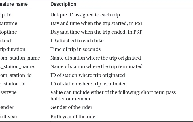
Table 1-1. Data Dictionary for the Trips Data from Cycles Share Dataset
Feature name
Description
trip_id Unique ID assigned to each trip
Starttime Day and time when the trip started, in PST
Stoptime Day and time when the trip ended, in PST
Bikeid ID attached to each bike
Tripduration Time of trip in seconds
from_station_name Name of station where the trip originated
to_station_name Name of station where the trip terminated
from_station_id ID of station where trip originated
to_station_id ID of station where trip terminated
Usertype Value can include either of the following: short-term pass
holder or member
Gender Gender of the rider
CHAPTER 1 ■ STATISTICS AND PROBABILITY
4
import numpy as np import scipy
from scipy import stats import seaborn
Performing Exploratory Data Analysis
Eric recalled to have explained Exploratory Data Analysis in the following words:
What do I mean by exploratory data analysis (EDA)? Well, by this I
mean to see the data visually. Why do we need to see the data visually?
Well, considering that you have 1 million observations in your dataset
then it won’t be easy for you to understand the data just by looking at it,
so it would be better to plot it visually. But don’t you think it’s a waste of
time? No not at all, because understanding the data lets us understand
the importance of features and their limitations.
Feature Exploration
Eric started off by loading the data into memory (see Listing 1-2).
Listing 1-2. Reading the Data into Memory
data = pd.read_csv('examples/trip.csv')
Nancy was curious to know how big the data was and what it looked like. Hence, Eric
wrote the code in Listing 1-3 to print some initial observations of the dataset to get a feel
of what it contains.
Listing 1-3. Printing Size of the Dataset and Printing First Few Rows
print len(data) data.head()
Output
CHAPTER 1 ■ STATISTICS AND PROBABILITY
trip_id
431 10/13/2014 10:31
10/13/2014
10:48 SEA00298 985.935 2nd Ave & Spring St
Occidental Park/
10:48 SEA00195 926.375 2nd Ave & Spring St
Occidental Park/
10:48 SEA00486 883.831 2nd Ave & Spring St
Occidental Park/
10:48 SEA00333 865.937 2nd Ave & Spring St
Occidental Park/
10:49 SEA00202 923.923 2nd Ave & Spring St
Occidental Park/ Occidental Ave S & S Washing... starttime stoptime bikeid tripduration from_station_name to_station_name
Table 1-2. Print of Observations in the First Seven Columns of Dataset
from_station_id
CBD-06
PS-04
Member
Male
1960.0
CBD-06
PS-04
Member
Male
Male
1970.0
CBD-06
PS-04
Member
Female
1988.0
CBD-06
PS-04
Member
Female
1977.0
CBD-06
PS-04
Member
1971.0
to_station_id
usertype
gender birthyear
CHAPTER 1 ■ STATISTICS AND PROBABILITY
6
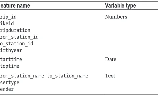
After looking at Table 1-2 and Table 1-3 Nancy noticed that tripduration is
represented in seconds. Moreover, the unique identifiers for bike, from_station, and
to_station are in the form of strings, contrary to those for trip identifier which are in the form of integers.
Types of variables
Nancy decided to go an extra mile and allocated data type to each feature in the dataset.
After looking at the feature classification in Table 1-4 Eric noticed that Nancy had
correctly identified the data types and thus it seemed to be an easy job for him to explain what variable types mean. As Eric recalled to have explained the following:
In normal everyday interaction with data we usually represent numbers
as integers, text as strings, True/False as Boolean, etc. These are what
we refer to as data types. But the lingo in machine learning is a bit more
granular, as it splits the data types we knew earlier into variable types.
Understanding these variable types is crucial in deciding upon the type
of charts while doing exploratory data analysis or while deciding upon a
suitable machine learning algorithm to be applied on our data.
Continuous/Quantitative Variables
A continuous variable can have an infinite number of values within a given range. Unlike discrete variables, they are not countable. Before exploring the types of continuous variables, let’s understand what is meant by a true zero point.
Table 1-4. Nancy’s Approach to Classifying Variables into Data Types
Feature name
Variable type
trip_id bikeid tripduration from_station_id to_station_id birthyear
Numbers
Starttime Stoptime
Date
from_station_name to_station_name Usertype
Gender
CHAPTER 1 ■ STATISTICS AND PROBABILITY
True Zero Point
If a level of measurement has a true zero point, then a value of 0 means you have nothing. Take, for example, a ratio variable which represents the number of cupcakes bought. A value of 0 will signify that you didn’t buy even a single cupcake. The true zero point is a strong discriminator between interval and ratio variables.
Let’s now explore the different types of continuous variables.
Interval Variables
Interval variables exist around data which is continuous in nature and has a numerical value. Take, for example, the temperature of a neighborhood measured on a daily basis. Difference between intervals remains constant, such that the difference between 70 Celsius and 50 Celsius is the same as the difference between 80 Celsius and 100 Celsius. We can compute the mean and median of interval variables however they don’t have a true zero point.
Ratio Variables
Properties of interval variables are very similar to those of ratio variables with the difference that in ratio variables a 0 indicates the absence of that measurement. Take, for example, distance covered by cars from a certain neighborhood. Temperature in Celsius is an interval variable, so having a value of 0 Celsius does not mean absence of temperature. However, notice that a value of 0 KM will depict no distance covered by the car and thus is considered as a ratio variable. Moreover, as evident from the name, ratios of measurements can be used as well such that a distance covered of 50 KM is twice the distance of 25 KM covered by a car.
Discrete Variables
A discrete variable will have finite set of values within a given range. Unlike continuous variables those are countable. Let’s look at some examples of discrete variables which are categorical in nature.
Ordinal Variables
Ordinal variables have values that are in an order from lowest to highest or vice versa. These levels within ordinal variables can have unequal spacing between them. Take, for example, the following levels:
1. Primary school
2. High school
3. College
CHAPTER 1 ■ STATISTICS AND PROBABILITY
8
The difference between primary school and high school in years is definitely not equal to the difference between high school and college. If these differences were constant, then this variable would have also qualified as an interval variable.
Nominal Variables
Nominal variables are categorical variables with no intrinsic order; however, constant differences between the levels exist. Examples of nominal variables can be gender, month of the year, cars released by a manufacturer, and so on. In the case of month of year, each month is a different level.
Dichotomous Variables
Dichotomous variables are nominal variables which have only two categories or levels. Examples include
• Age: under 24 years, above 24 years
• Gender: male, female
Lurking Variable
A lurking variable is not among exploratory (i.e., independent) or response (i.e., dependent) variables and yet may influence the interpretations of relationship among these variables. For example, if we want to predict whether or not an applicant will get admission in a college on the basis of his/her gender. A possible lurking variable in this case can be the name of the department the applicant is seeking admission to.
Demographic Variable
Demography (from the Greek word meaning “description of people”) is the study of human populations. The discipline examines size and composition of populations as well as the movement of people from locale to locale. Demographers also analyze the effects of population growth and its control. A demographic variable is a variable that is collected by researchers to describe the nature and distribution of the sample used with inferential statistics. Within applied statistics and research, these are variables such as age, gender, ethnicity, socioeconomic measures, and group membership.
Dependent and Independent Variables
An independent variable is also referred to as an exploratory variable because it is being used to explain or predict the dependent variable, also referred to as a response variable or outcome variable.
CHAPTER 1 ■ STATISTICS AND PROBABILITY
of cycles can be ensured. In that case, what is your dependent variable? Definitely tripduration. And what are the independent variables? Well, these variables will comprise of the features which we believe influence the dependent variable (e.g., usertype, gender, and time and date of the day).
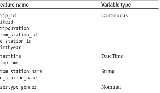
Eric asked Nancy to classify the features in the variable types he had just explained.
Nancy now had a clear idea of the variable types within machine learning, and also
which of the features qualify for which of those variable types (see Table 1-5). However
despite of looking at the initial observations of each of these features (see Table 1-2) she
couldn’t deduce the depth and breadth of information that each of those tables contains. She mentioned this to Eric, and Eric, being a data analytics guru, had an answer: perform univariate analysis on features within the dataset.
Univariate Analysis
Univariate comes from the word “uni” meaning one. This is the analysis performed on a single variable and thus does not account for any sort of relationship among exploratory variables.
Eric decided to perform univariate analysis on the dataset to better understand the
features in isolation (see Listing 1-4).
Listing 1-4. Determining the Time Range of the Dataset
data = data.sort_values(by='starttime') data.reset_index()
print 'Date range of dataset: %s - %s'%(data.ix[1, 'starttime'], data.ix[len(data)-1, 'stoptime'])
Output
Table 1-5. Nancy’s Approach to Classifying Variables into Variable Types
Feature name
Variable type
trip_id bikeid tripduration from_station_id to_station_id birthyear
Continuous
Starttime Stoptime
DateTime
from_station_name to_station_name
String
CHAPTER 1 ■ STATISTICS AND PROBABILITY
10
Eric knew that Nancy would have a hard time understanding the code so he decided to explain the ones that he felt were complex in nature. In regard to the code in Listing
1-4, Eric explained the following:
We started off by sorting the data frame by
starttime
. Do note that
data frame is a data structure in Python in which we initially loaded
the data in Listing
1-2
. Data frame helps arrange the data in a tabular
form and enables quick searching by means of hash values. Moreover,
data frame comes up with handy functions that make lives easier when
doing analysis on data. So what sorting did was to change the position
of records within the data frame, and hence the change in positions
disturbed the arrangement of the indexes which were earlier in an
ascending order. Hence, considering this, we decided to reset the indexes
so that the ordered data frame now has indexes in an ascending order.
Finally, we printed the date range that started from the first value of
starttime
and ended with the last value of
stoptime
.
Eric’s analysis presented two insights. One is that the data ranges from October 2014 up till September 2016 (i.e., three years of data). Moreover, it seems like the cycle sharing service is usually operational beyond the standard 9 to 5 business hours.
Nancy believed that short-term pass holders would avail more trips than their counterparts. She believed that most people would use the service on a daily basis rather than purchasing the long term membership. Eric thought otherwise; he believed that new users would be short-term pass holders however once they try out the service and become satisfied would ultimately avail the membership to receive the perks and benefits offered. He also believed that people tend to give more weight to services they have paid for, and they make sure to get the maximum out of each buck spent. Thus, Eric decided
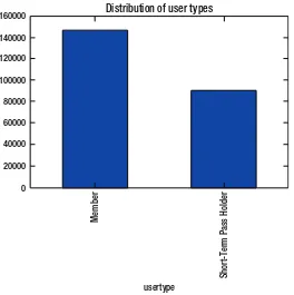
to plot a bar graph of trip frequencies by user type to validate his viewpoint (see Listing 1-5).
But before doing so he made a brief document of the commonly used charts and situations for which they are a best fit to (see Appendix A for a copy). This chart gave Nancy his perspective for choosing a bar graph for the current situation.
Listing 1-5. Plotting the Distribution of User Types
groupby_user = data.groupby('usertype').size()
CHAPTER 1 ■ STATISTICS AND PROBABILITY
Nancy didn’t understand the code snippet in Listing 1-5. She was confused by the
functionality of groupby and size methods. She recalled asking Eric the following: “I can understand that groupby groups the data by a given field, that is, usertype, in the current situation. But what do we mean by size? Is it the same as count, that is, counts trips falling within each of the grouped usertypes?”
Eric was surprised by Nancy’s deductions and he deemed them to be correct.
However, the bar graph presented insights (see Figure 1-1) in favor of Eric’s view as the
members tend to avail more trips than their counterparts.
Nancy had recently read an article that talked about the gender gap among people who prefer riding bicycles. The article mentioned a cycle sharing scheme in UK where 77% of the people who availed the service were men. She wasn’t sure if similar phenomenon exists for people using the service in United States. Hence Eric came up
with the code snippet in Listing 1-6 to answer the question at hand.
Listing 1-6. Plotting the Distribution of Gender
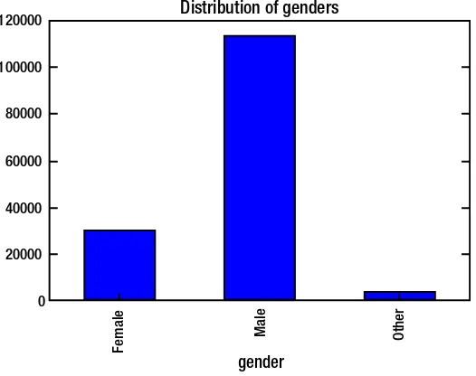
groupby_gender = data.groupby('gender').size()
groupby_gender.plot.bar(title = 'Distribution of genders')
160000
140000
120000
100000
80000
60000
40000
20000
0
Member
Short-T
erm Pass Holder
usertype
Distribution of user types
CHAPTER 1 ■ STATISTICS AND PROBABILITY
12
Figure 1-2 revealed that the gender gap resonates in states as well. Males seem to
dominate the trips taken as part of the program.
Nancy, being a marketing guru, was content with the analysis done so far. However she wanted to know more about her target customers to whom to company’s marketing message will be targetted to. Thus Eric decided to come up with the distribution of
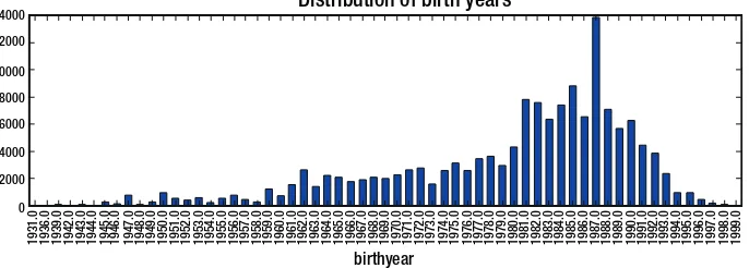
birth years by writing the code in Listing 1-7. He believed this would help the Nancy
understand the age groups that are most likely to ride a cycle or the ones that are more prone to avail the service.
Listing 1-7. Plotting the Distribution of Birth Years
data = data.sort_values(by='birthyear')
groupby_birthyear = data.groupby('birthyear').size()
groupby_birthyear.plot.bar(title = 'Distribution of birth years', figsize = (15,4))
120000
100000
80000
60000
40000
20000
0
Female
Male Other
gender
Distribution of genders
CHAPTER 1 ■ STATISTICS AND PROBABILITY
Figure 1-3 provided a very interesting illustration. Majority of the people who had
subscribed to this program belong to Generation Y (i.e., born in the early 1980s to mid to late 1990s, also known as millennials). Nancy had recently read the reports published by Elite Daily and CrowdTwist which said that millennials are the most loyal generation to their favorite brands. One reason for this is their willingness to share thoughts and opinions on products/services. These opinions thus form a huge corpus of experiences— enough information for the millenials to make a conscious decision, a decision they will remain loyal to for a long period. Hence Nancy was convinced that most millennials would be members rather than short-term pass holders. Eric decided to populate a bar graph to see if Nancy’s deduction holds true.
Listing 1-8. Plotting the Frequency of Member Types for Millenials
data_mil = data[(data['birthyear'] >= 1977) & (data['birthyear']<=1994)] groupby_mil = data_mil.groupby('usertype').size()
groupby_mil.plot.bar(title = 'Distribution of user types')
14000 12000 10000 8000 6000 4000 2000 0
1931.0 1936.0 1939.0 1942.0 1943.0 1944.0 1945.0 1946.0 1947.0 1948.0 1949.0 1950.0 1951.0 1952.0 1953.0 1954.0 1955.0 1956.0 1957.0 1958.0 1959.0 1960.0 1961.0 1962.0 1963.0 1964.0 1965.0 1966.0 1967.0 1968.0 1969.0 1970.0 1971.0 1972.0 1973.0 1974.0 1975.0 1976.0 1977.0 1978.0 1979.0 1980.0 1981.0 1982.0 1983.0 1984.0 1985.0 1986.0 1987.0 1988.0 1989.0 1990.0 1991.0 1992.0 1993.0 1994.0 1995.0 1996.0 1997.0 1998.0 1999.0
Distribution of birth years
birthyear
Figure 1-3. Bar graph signifying the distribution of birth years
120000 100000
80000 60000
40000
20000
0
Member
usertype
CHAPTER 1 ■ STATISTICS AND PROBABILITY
14
After looking at Figure 1-4 Eric was surprised to see that Nancy’s deduction appeared
to be valid, and Nancy made a note to make sure that the brand engaged millennials as part of the marketing plan.
Eric knew that more insights can pop up when more than one feature is used as part of the analysis. Hence, he decided to give Nancy a sneak peek at multivariate analysis before moving forward with more insights.
Multivariate Analysis
Multivariate analysis refers to incorporation of multiple exploratory variables to understand the behavior of a response variable. This seems to be the most feasible and realistic approach considering the fact that entities within this world are usually interconnected. Thus the variability in response variable might be affected by the variability in the interconnected exploratory variables.
Nancy believed males would dominate females in terms of the trips completed. The
graph in Figure 1-2, which showed that males had completed far more trips than any
other gender types, made her embrace this viewpoint. Eric thought that the best approach to validate this viewpoint was a stacked bar graph (i.e., a bar graph for birth year, but each
bar having two colors, one for each gender) (see Figure 1-5).
Listing 1-9. Plotting the Distribution of Birth Years by Gender Type
groupby_birthyear_gender = data.groupby(['birthyear', 'gender']) ['birthyear'].count().unstack('gender').fillna(0)
groupby_birthyear_gender[['Male','Female','Other']].plot.bar(title = 'Distribution of birth years by Gender', stacked=True, figsize = (15,4))
14000 12000 10000 8000 6000 4000 2000 0
Distribution of birth years by Gender
1931.0 1936.0 1939.0 1942.0 1943.0 1944.0 1945.0 1946.0 1947.0 1948.0 1949.0 1950.0 1951.0 1952.0 1953.0 1954.0 1955.0 1956.0 1957.0 1958.0 1959.0 1960.0 1961.0 1962.0 1963.0 1964.0 1965.0 1966.0 1967.0 1968.0 1969.0 1970.0 1971.0 1972.0 1973.0 1974.0 1975.0 1976.0 1977.0 1978.0 1979.0 1980.0 1981.0 1982.0 1983.0 1984.0 1985.0 1986.0 1987.0 1988.0 1989.0 1990.0 1991.0 1992.0 1993.0 1994.0 1995.0 1996.0 1997.0 1998.0 1999.0
gender Male Female Other
birthyear
CHAPTER 1 ■ STATISTICS AND PROBABILITY
The code snippet in Listing 1-9 brought up some new aspects not previously
highlighted.
We at first transformed the data frame by unstacking, that is, splitting,
the gender column into three columns, that is, Male, Female, and Other.
This meant that for each of the birth years we had the trip count for all
three gender types. Finally, a stacked bar graph was created by using this
transformed data frame.
It seemed as if males were dominating the distribution. It made sense as well. No? Well, it did; as seen earlier, that majority of the trips were availed by males, hence this skewed the distribution in favor of males. However, subscribers born in 1947 were all females. Moreover, those born in 1964 and 1994 were dominated by females as well. Thus Nancy’s hypothesis and reasoning did hold true.
The analysis in Listing 1-4 had revealed that all millennials are members. Nancy was
curious to see what the distribution of user type was for the other age generations. Is it that the majority of people in the other age generations were short-term pass holders?
Hence Eric brought a stacked bar graph into the application yet again (see Figure 1-6).
Listing 1-10. Plotting the Distribution of Birth Years by User Types
groupby_birthyear_user = data.groupby(['birthyear', 'usertype']) ['birthyear'].count().unstack('usertype').fillna(0)
groupby_birthyear_user['Member'].plot.bar(title = 'Distribution of birth years by Usertype', stacked=True, figsize = (15,4))
14000 12000 10000 8000 6000 4000 2000 0
Distribution of birth years by Usertype
1931.0 1936.0 1939.0 1942.0 1943.0 1944.0 1945.0 1946.0 1947.0 1948.0 1949.0 1950.0 1951.0 1952.0 1953.0 1954.0 1955.0 1956.0 1957.0 1958.0 1959.0 1960.0 1961.0 1962.0 1963.0 1964.0 1965.0 1966.0 1967.0 1968.0 1969.0 1970.0 1971.0 1972.0 1973.0 1974.0 1975.0 1976.0 1977.0 1978.0 1979.0 1980.0 1981.0 1982.0 1983.0 1984.0 1985.0 1986.0 1987.0 1988.0 1989.0 1990.0 1991.0 1992.0 1993.0 1994.0 1995.0 1996.0 1997.0 1998.0 1999.0 birthyear
CHAPTER 1 ■ STATISTICS AND PROBABILITY
16
Whoa! Nancy was surprised to see the distribution of only one user type and not two (i.e., membership and short-term pass holders)? Does this mean that birth year information was only present for only one user type? Eric decided to dig in further and
validate this (see Listing 1-11).
Listing 1-11. Validation If We Don’t Have Birth Year Available for Short-Term Pass Holders
data[data['usertype']=='Short-Term Pass Holder']['birthyear'].isnull(). values.all()
Output
True
In the code in Listing 1-11, Eric first sliced the data frame to consider only
short-term pass holders. Then he went forward to find out if all the values in birth year are missing (i.e., null) for this slice. Since that is the case, Nancy’s initially inferred hypothesis was true—that birth year data is only available for members. This made her recall her
prior deduction about the brand loyalty of millennials. Hence the output for Listing 1-11
nullifies Nancy’s deduction made after the analysis in Figure 1-4. This made Nancy sad,
as the loyalty of millenials can’t be validated from the data at hand. Eric believed that members have to provide details like birth year when applying for the membership, something which is not a prerequisite for short-term pass holders. Eric decided to test his deduction by checking if gender is available for short-term pass holders or not for which
he wrote the code in Listing 1-12.
Listing 1-12. Validation If We Don’t Have Gender Available for Short-Term Pass Holders
data[data['usertype']=='Short-Term Pass Holder']['gender'].isnull().values. all()
Output
True
Thus Eric concluded that we don’t have the demographic variables for user type ‘Short-Term Pass holders’.
Nancy was interested to see as to how the frequency of trips vary across date and time (i.e., a time series analysis). Eric was aware that trip start time is given with the data, but for him to make a time series plot, he had to transform the date from string to date
time format (see Listing 1-13). He also decided to do more: that is, split the datetime into
CHAPTER 1 ■ STATISTICS AND PROBABILITY
Listing 1-13. Converting String to datetime, and Deriving New Features
List_ = list(data['starttime'])
List_ = [datetime.datetime.strptime(x, "%m/%d/%Y %H:%M") for x in List_] data['starttime_mod'] = pd.Series(List_,index=data.index)
data['starttime_date'] = pd.Series([x.date() for x in List_],index=data.index) data['starttime_year'] = pd.Series([x.year for x in List_],index=data.index) data['starttime_month'] = pd.Series([x.month for x in List_],index=data.index) data['starttime_day'] = pd.Series([x.day for x in List_],index=data.index) data['starttime_hour'] = pd.Series([x.hour for x in List_],index=data.index)
Eric made sure to explain the piece of code in Listing 1-13 as he had explained to Nancy:
At first we converted start time column of the dataframe into a list.
Next we converted the string dates into python datetime objects. We
then converted the list into a series object and converted the dates from
datetime object to pandas date object. The time components of year,
month, day and hour were derived from the list with the datetime objects.
Now it was time for the time series analysis of the frequency of trips over all days
provided within the dataset (see Listing 1-14).
Listing 1-14. Plotting the Distribution of Trip Duration over Daily Time
data.groupby('starttime_date')['tripduration'].mean().plot.bar(title = 'Distribution of Trip duration by date', figsize = (15,4))
Wow! There seems to be a definitive pattern of trip duration over time.
3000
2500
2000
1500
1000
500
0
starttime date
Distribution of Trip duration by date
CHAPTER 1 ■ STATISTICS AND PROBABILITY
18
Time Series Components
Eric decided to brief Nancy about the types of patterns that exist in a time series analysis.
This he believed would help Nancy understand the definite pattern in Figure 1-7.
Seasonal Pattern
A seasonal pattern (see Figure 1-8) refers to a seasonality effect that incurs after a fixed
known period. This period can be week of the month, week of the year, month of the year, quarter of the year, and so on. This is the reason why seasonal time series are also referred to as periodic time series.
Cyclic Pattern
A cyclic pattern (see Figure 1-9) is different from a seasonal pattern in the notion that the
patterns repeat over non-periodic time cycles.
-2
0-10
05
10
60
seasonal
Figure 1-8. Illustration of seasonal pattern
1975 1980 1985 1990 1995
Year
30
40
50
60
70
80
90
Monthly housing sales (millions)
CHAPTER 1 ■ STATISTICS AND PROBABILITY
Trend
A trend (see Figure 1-10) is a long-term increase or decrease in a continuous variable.
This pattern might not be exactly linear over time, but when smoothing is applied it can generalize into either of the directions.
Eric decided to test Nancy’s concepts on time series, so he asked her to provide her
thoughts on the time series plot in Figure 1-7. “What do you think of the time series plot?
Is the pattern seasonal or cyclic? Seasonal is it right?”
Nancy’s reply amazed Eric once again. She said the following:
Yes it is because the pattern is repeating over a fixed interval of time—
that is, seasonality. In fact, we can split the distribution into three
distributions. One pattern is the seasonality that is repeating over time.
The second one is a flat density distribution. Finally, the last pattern is
the lines (that is, the hikes) over that density function. In case of time
series prediction we can make estimations for a future time using both
of these distributions and add up in order to predict upon a calculated
confidence interval.
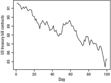
On the basis of her deduction it seemed like Nancy’s grades in her statistics elective course had paid off. Nancy wanted answers to many more of her questions. Hence she decided to challenge the readers with the Exercises that follow.
0 20 40 60 80 100
Day
85
86
87
88
89
90
91
US treasur
y bill contracts
CHAPTER 1 ■ STATISTICS AND PROBABILITY
20
EXERCISES
1.
Determine the distribution of number of trips by year. Do you
see a specific pattern?
2.
Determine the distribution of number of trips by month. Do you
see a specific pattern?
3.
Determine the distribution of number of trips by day. Do you see
a specific pattern?
4.
Determine the distribution of number of trips by day. Do you see
a specific pattern?
5.
Plot a frequency distribution of trips on a daily basis.
Measuring Center of Measure
Eric believed that measures like mean, median, and mode help give a summary view of the features in question. Taking this into consideration, he decided to walk Nancy through the concepts of center of measure.
Mean
Mean in layman terms refers to the averaging out of numbers Mean is highly affected by outliers, as the skewness introduced by outliers will pull the mean toward extreme values.
• Symbol:
• μ-> Parameter -> population mean
• x’-> Statistic -> sample mean
• Rules of mean:
• ma bx+ =a+bmx
• mx y+ =mx+my
We will be using statistics.mean(data) in our coding examples. This will return the
CHAPTER 1 ■ STATISTICS AND PROBABILITY
Arithmetic Mean
An arithmetic mean is simpler than a geometric mean as it averages out the numbers (i.e., it adds all the numbers and then divides the sum by the frequency of those numbers). Take, for example, the grades of ten students who appeared in a mathematics test.
78, 65, 89, 93, 87, 56, 45, 73, 51, 81
Calculating the arithmetic mean will mean
mean=78+65+89+93+87+56+45+73+51+81=
10
71 8.
Hence the arithmetic mean of scores taken by students in their mathematics test was 71.8. Arithmetic mean is most suitable in situations when the observations (i.e., math scores) are independent of each other. In this case it means that the score of one student in the test won’t affect the score that another student will have in the same test.
Geometric Mean
As we saw earlier, arithmetic mean is calculated for observations which are independent of each other. However, this doesn’t hold true in the case of a geometric mean as it is used to calculate mean for observations that are dependent on each other. For example, suppose you invested your savings in stocks for five years. Returns of each year will be invested back in the stocks for the subsequent year. Consider that we had the following returns in each one of the five years:
60%, 80%, 50%, -30%, 10%
Are these returns dependent on each other? Well, yes! Why? Because the investment of the next year is done on the capital garnered from the previous year, such that a loss in the first year will mean less capital to invest in the next year and vice versa. So, yes, we will be calculating the geometric mean. But how? We will do so as follows:
[(0.6 + 1) * (0.8 + 1) * (0.5 + 1) * (-0.3 + 1) * (0.1 + 1)]1/5 - 1 = 0.2713
CHAPTER 1 ■ STATISTICS AND PROBABILITY
22
Median
Median is a measure of central location alongside mean and mode, and it is less affected by the presence of outliers in your data. When the frequency of observations in the data is odd, the middle data point is returned as the median.
In this chaapter we will use statistics.median(data) to calculate the median. This
returns the median (middle value) of numeric data if frequency of values is odd and otherwise mean of the middle values if frequency of values is even using “mean of middle two” method. If data is empty, StatisticsError is raised.
Mode
Mode is suitable on data which is discrete or nominal in nature. Mode returns the observation in the dataset with the highest frequency. Mode remains unaffected by the presence of outliers in data.
Variance
Variance represents variability of data points about the mean. A high variance means that the data is highly spread out with a small variance signifying the data to be closely clustered.
3. Why n-1 beneath variance calculation? The sample variance
averages out to be smaller than the population variance; hence, degrees of freedom is accounted for as the conversion factor.
4. Rules of variance:
i. sa bx2+ =b2sx2
ii. s s s
x y+ = x+ y
2 2 2(If X and Y are independent variables)
sx y2- =sx2+sy2
iii. s s s s s
x y+ = x+ y+ r x y
2 2 2
2 (if X and Y have correlation r)
s s s s s
x y+ = x+ y+ r x y
2 2 2
CHAPTER 1 ■ STATISTICS AND PROBABILITY
We will be incorporating statistics.variance(data, xbar=None) to calculate variance
in our coding exercises. This will return the sample variance across at least two real-valued numbered series.
Standard Deviation
Standard deviation, just like variance, also captures the spread of data along the mean. The only difference is that it is a square root of the variance. This enables it to have the same unit as that of the data and thus provides convenience in inferring explanations from insights. Standard deviation is highly affected by outliers and skewed distributions.
• Symbol: σ
• Formula: s2
We measure standard deviation instead of variance because
• It is the natural measure of spread in a Normal distribution
• Same units as originalobservations
Changes in Measure of Center Statistics due to Presence
of Constants
Let’s evaluate how measure of center statistics behave when data is transformed by the introduction of constants. We will evaluate the outcomes for mean, median, IQR (interquartile range), standard deviation, and variance. Let’s first start with what behavior each of these exhibits when a constant “a” is added or subtracted from each of these.
Addition:Adding a
• x’new= +a x’
• mediannew= +a median
• IQRnew= +a IQR
• snew=s
• sx new2 =sx2
CHAPTER 1 ■ STATISTICS AND PROBABILITY
24
Multiplication:Multiplying b
• x’new=bx’
• mediannew=bmedian
• IQRnew=bIQR
• snew=bs
• sx new2 =b2sx2
Wow! Multiplying a constant to each observation within the data changed all five measures of center statistics. Do note that you will achieve the same effect when all observations within the data are divided by a constant term.
After going through the description of center of measures, Nancy was interested in understanding the trip durations in detail. Hence Eric came up with the idea to calculate the mean and median trip durations. Moreover, Nancy wanted to determine the station from which most trips originated in order to run promotional campaigns for existing customers. Hence Eric decided to determine the mode of ‘from_station_name’ field.
■
Note
Determining the measures of centers using the statistics package will require us
to transform the input data structure to a list type.
Listing 1-15. Determining the Measures of Center Using Statistics Package
trip_duration = list(data['tripduration']) station_from = list(data['from_station_name'])
print 'Mean of trip duration: %f'%statistics.mean(trip_duration) print 'Median of trip duration: %f'%statistics.median(trip_duration) print 'Mode of station originating from: %s'%statistics.mode(station_from)
Output
Mean of trip duration: 1202.612210 Median of trip duration: 633.235000
Mode of station originating from: Pier 69 / Alaskan Way & Clay St
The output of Listing 1-15 revealed that most trips originated from Pier 69/Alaskan
Way & Clay St station. Hence this was the ideal location for running promotional campaigns targeted to existing customers. Moreover, the output showed the mean to be greater than that of the mean. Nancy was curious as to why the average (i.e., mean) is greater than the central value (i.e., median). On the basis of what she had read, she realized that this might be either due to some extreme values after the median or due to the majority of values lying after the median. Eric decided to plot a distribution of the trip
CHAPTER 1 ■ STATISTICS AND PROBABILITY
Listing 1-16. Plotting Histogram of Trip Duration
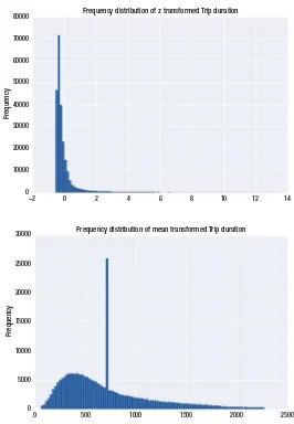
data['tripduration'].plot.hist(bins=100, title='Frequency distribution of Trip duration')
plt.show()
The distribution in Figure 1-11 has only one peak (i.e., mode). The distribution is
not symmetric and has majority of values toward the right-hand side of the mode. These extreme values toward the right are negligible in quantity, but their extreme nature tends to pull the mean toward themselves. Thus the reason why the mean is greater than the median.
The distribution in Figure 1-11 is referred to as a normal distribution.
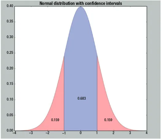
The Normal Distribution
Normal distribution, or in other words Gaussian distribution, is a continuous probability distribution that is bell shaped. The important characteristic of this distribution is that the mean lies at the center of this distribution with a spread (i.e., standard deviation) around it. The majority of the observations in normal distribution lie around the mean and fade off as they distance away from the mean. Some 68% of the observations lie within 1 standard deviation from the mean; 95% of the observations lie within 2 standard deviations from the mean, whereas 99.7% of the observations lie within 3 standard deviations from the mean. A normal distribution with a mean of zero and a standard
deviation of 1 is referred to as a standard normal distribution. Figure 1-12 shows normal
distribution along with confidence intervals.
Frequency distribution of Trip duration
80000
70000
60000
50000
40000
30000
20000
10000
0
0 5000 10000 15000 20000 25000 30000
Frequenc
y
CHAPTER 1 ■ STATISTICS AND PROBABILITY
26
These are the most common confidence levels:
Confidence level
Formula
68% Mean ± 1 std.
95% Mean ± 2 std.
99.7% Mean ± 3 std.
Skewness
Skewness is a measure of the lack of symmetry. The normal distribution shown previously is symmetric and thus has no element of skewness. Two types of skewness exist (i.e., positive and negative skewness).
0.40
0.35
0.30
0.25
0.20
0.15
0.10
0.05
0.00 –4 –3
0.159 0.159
0.683
Normal distribution with confidence intervals
–2 –1 0 1 2 3 4
CHAPTER 1 ■ STATISTICS AND PROBABILITY
As seen from Figure 1-13, a relationship exists among measure of centers for each
one of the following variations:
• Symmetric distributions: Mean = Median = Mode
• Positively skewed: Mean < Median < Mode
• Negatively skewed: Mean > Median > Mode
Going through Figure 1-12 you will realize that the distribution in Figure 1-13(c) has
a long tail on its right. This might be due to the presence of outliers.
Outliers
Outliers refer to the values distinct from majority of the observations. These occur either naturally, due to equipment failure, or because of entry mistakes.
In order to understand what outliers are, we need to look at Figure 1-14.
Minimum Value in
the Data 25th Percentile (Q1)
Potential
Outliers Interquartile Range(IQR) Maximum (Minimum Value in the Data, Q1 – I.5*IQR)
Potential
Negative direction The normal curve Positive direction represents a perfectly (b) Normal (no skew) (c) Positively skewed
CHAPTER 1 ■ STATISTICS AND PROBABILITY
28
From Figure 1-14 we can see that the observations lying outside the whiskers are
referred to as the outliers.
Listing 1-17. Interval of Values Not Considered Outliers
[Q1 – 1.5 (IQR) , Q3 + 1.5 (IQR) ] (i.e. IQR = Q3 - Q1)
Values not lying within this interval are considered outliers. Knowing the values of Q1 and Q3 is fundamental for this calculation to take place.
Is the presence of outliers good in the dataset? Usually not! So, how are we going to treat the outliers in our dataset? Following are the most common methods for doing so:
• Remove the outliers: This is only possible when the proportion of
outliers to meaningful values is quite low, and the data values are not on a time series scale. If the proportion of outliers is high, then removing these values will hurt the richness of data, and models applied won’t be able to capture the true essence that lies within. However, in case the data is of a time series nature, removing outliers from the data won’t be feasible, the reason being that for a time series model to train effectively, data should be continuous with respect to time. Removing outliers in this case will introduce breaks within the continuous distribution.
• Replace outliers with means: Another way to approach this is
by taking the mean of values lying with the interval shown in
Figure 1-14, calculate the mean, and use these to replace the
outliers. This will successfully transform the outliers in line with the valid observations; however, this will remove the anomalies that were otherwise present in the dataset, and their findings could present interesting insights.
• Transform the outlier values: Another way to cop up with outliers
is to limit them to the upper and lower boundaries of acceptable data. The upper boundary can be calculated by plugging in the values of Q3 and IQR into Q3 + 1.5IQR and the lower boundary can be calculated by plugging in the values of Q1 and IQR into Q1 – 1.5IQR.
• Variable transformation: Transformations are used to convert the
inherited distribution into a normal distribution. Outliers bring non-normality to the data and thus transforming the variable can reduce the influence of outliers. Methodologies of transformation include, but are not limited to, natural log, conversion of data into ratio variables, and so on.
Nancy was curious to find out whether outliers exist within our dataset—more
precisely in the tripduration feature. For that Eric decided to first create a box plot
(see Figure 1-15) by writing code in Listing 1-18 to see the outliers visually and then
CHAPTER 1 ■ STATISTICS AND PROBABILITY
Listing 1-18. Plotting a Box plot of Trip Duration
box = data.boxplot(column=['tripduration']) plt.show()
Nancy was surprised to see a huge number of outliers in trip duration from the box
plot in Figure 1-15. She asked Eric if he could determine the proportion of trip duration
values which are outliers. She wanted to know if outliers are a tiny or majority portion of
the dataset. For that Eric wrote the code in Listing 1-19.
Listing 1-19. Determining Ratio of Values in Observations of tripduration Which Are Outliers
q75, q25 = np.percentile(trip_duration, [75 ,25]) iqr = q75 - q25
print 'Proportion of values as outlier: %f percent'%(
(len(data) - len([x for x in trip_duration if q75+(1.5*iqr) >=x>= q25-(1.5*iqr)]))*100/float(len(data)))
Output
Proportion of values as outlier: 9.548218 percent
30000
25000
20000
15000
10000
5000
0
tripduration
CHAPTER 1 ■ STATISTICS AND PROBABILITY
30
Eric explained the code in Listing 1-19 to Nancy as follows:
As seen in Figure
1-14
, Q3 refers to the 75th percentile and Q1 refers
to the 25th percentile. Hence we use the
numpy.percentile()
method
to determine the values for Q1 and Q3. Next we compute the IQR by
subtracting both of them. Then we determine the subset of values by
applying the interval as specified in Listing
1-18
. We then used the
formula to get the number of outliers.
Listing 1-20. Formula for Calculating Number of Outliers
Number of outliers values = Length of all values - Length of all non outliers values
In our code, len(data) determines Length of all values and Length of all non outliers
values is determined by len([x for x in trip_duration if q75+(1.5*iqr) >=x>=
q25-(1.5*iqr)])).
Hence then the formula in Listing 1-20 was applied to calculate the ratio of values
considered outliers.
Listing 1-21. Formula for Calculating Ratio of Outlier Values
Ratio of outliers = ( Number of outliers values / Length of all values ) * 100
Nancy was relieved to see only 9.5% of the values within the dataset to be outliers. Considering the time series nature of the dataset she knew that removing these outliers wouldn’t be an option. Hence she knew that the only option she could rely on was to apply transformation to these outliers to negate their extreme nature. However, she was interested in observing the mean of the non-outlier values of trip duration. This she then
wanted to compare with the mean of all values calculated earlier in Listing 1-15.
Listing 1-22. Calculating z scores for Observations Lying Within tripduration
mean_trip_duration = np.mean([x for x in trip_duration if q75+(1.5*iqr) >=x>= q25-(1.5*iqr)])
upper_whisker = q75+(1.5*iqr)
print 'Mean of trip duration: %f'%mean_trip_duration
Output