Tapworthy
Designing great iPhone aPPs
Josh Clark
Tapworthy: Designing Great iPhone Apps
by Josh Clark
Copyright ©2010 Josh Clark. All rights reserved. Printed in Canada.
Published by O’Reilly Media, Inc. 1005 Gravenstein Highway North, Sebastapol, CA 95472. O’Reilly books may be purchased for educational, business, or sales promotional use. Online editions are also available for most titles (http://my.safaribooksonline.com). For more informa-tion, contact our corporate/institutional sales department: 800-998-9938 or
Editor: Karen Shaner Indexer: Ron Strauss
Production Editor: Nellie McKesson Cover Design: Monica Kamsvaag
Interior Design: Josh Clark and Edie Freedman
Printing History:
June 2010: First Edition.
ISBN: 9781449381653 [TI]
While every precaution has been taken in the preparation of this book, the publisher and author assume no responsibility for errors or omissions, or for damages resulting from the use of the information contained herein.
Contents
AbouT The AuThor ...viii
ACknowledGMenTS ... ix
InTroduCTIon ... 1
designing apps for delight and usability
But First . . . Breathe 1
No Geek Credentials Required 2 Advice from the Real World 3
1. TouCh And Go ... 4
how we use iPhone apps
On the Go: One Hand, One Eye, One Big Blur 6
Get It Done Quick 8
One Tool in a Crowded Toolbox 9 Bored, Fickle, and Disloyal 10 Double-Tap, Pinch, Twist, What? 11
Clumsy Fingers 13
So, What, Do I Design for Dummies? 13
2. IS IT TAPworThY? ...16
Crafting your app’s mission
There’s Not an App for That 18
What’s Your Story? 19
What Makes Your App Mobile? 20 First Person: Josh Williams and Gowalla 22
Mobile Mindsets 32
“I’m Microtasking” 32
“I’m Local” 33
“I’m Bored” 37 What Makes You So Special Anyway? 40
Wait, Wait, Come Back! 42
Throw Out the Babies, Too 47 Can’t I Get That on the Web? 50
3. TInY TouChSCreen ...54
designing for size and touch
A Physical Feel 56
Rule of Thumb 58
The Magic Number Is 44 62
Don’t Crowd Me 64
First Person: James Thomson and PCalc 67
Pointed Design 73
Take It From the Top 73
Design to a 44-Pixel Rhythm 75
Be a Scroll Skeptic 77
Edit, Edit, Edit 82
Secret Panels and Hidden Doors 85 First Person: Rusty Mitchell and USA Today 90
4. GeT orGAnIZed ...96
Structuring your app the Apple way
Contents
Modal Views and Navigational Cul-de-Sacs 117
A Tangled Web 119
Storyboarding Your App on Paper 122 Put Something Ugly on Your iPhone 124 First Person: Jürgen Schweizer and Things 127
5. The STAndArd ConTrolS ... 134
using the built-in interface elements
The Power of Standard Visuals 137 The Navigation Bar Shows the Way 138
The Toolbar 143
“So an Icon Goes into a Bar . . .” 145
The Search Bar 149
Table Views Are Lists on Steroids 152 Setting the Table: Indexes and Grouped Lists 156 Table View Editing Tools 158
Text Me 160
Editing Text 162
Fixing Typoz 163
Is That for Here or to Go? 164 Don’t Make ’Em Keybored 165 Multiple Choice: Pickers, Lists, and Action Sheets 167
On the Button 172
Yes and No: Switches 173
Segmented Controls Are Radio Buttons 174
Sliders Stay on Track 176
Settings: A Matter of Preference 176
Is There More? 180
v Download from Library of Wow! eBook
6. STAnd ouT ... 182
Creating a unique visual identity
What’s Your App’s Personality? 185 Gussying Up Familiar Pixels 186
You Stay Classy 189
Keep It Real 191
Designing Custom Toolbar Icons 194 Metaphorically Speaking 196 I Call My New Invention “The Wheel” 201 And Now for Something Completely Different 203 First Person: Craig Hockenberry, Gedeon Maheux, and Twitterrific 205
7. FIrST IMPreSSIonS ... 212
Introducing your app
Your Icon Is Your Business Card 213 Building Your App’s Icons 219
What’s In a Name? 222
While You Wait: The Launch Image 223 The Illusion of Suspended Animation 226 Put Out the Welcome Mat 228 Instructions Can’t Make You Super 230
The First Screen 233
First Person: Joe Hewitt and Facebook 236
8. SwIPe! PInCh! FlICk! ... 242
working with gestures
Finding What You Can’t See 244
Pave the Cowpaths 245
Contents
Piggybacking Standard Gestures 249
Shake, Shake, Shake 252
Two’s a Crowd 254
Awkwardness for Self Defense 255
Phone Physics 257
9. know The lAndSCAPe ... 262
The spin on screen rotation
Why Do People Flip? 264
A Whole New Landscape 267
Making a Complicated Turn 269
Don’t Lose Your Place 272
10. PolITe ConVerSATIon ... 274
Alerts, interruptions, and updates
When To Interrupt 276
Remain Calm and Carry On 278
Pushy Notifications 280
No Stinkin’ Badges 282
Yep, I’m Working on It 284
Bending Time: Progress Bars and Other Distractions 287
11. howdY, neIGhbor ... 292
Playing nice with other apps
Public Square: Contacts, Photos, and Events 294 Tag, You’re It: Passing Control to Other Apps 297 Roll Your Own: Browsers, Maps, and Email 299
Happy Trails, Neighbor 302
IndeX ... 304
Josh Clark is a designer, developer, and author who helps creative people clear technical hassles to share their ideas with the world. As both speaker and consultant, he’s helped scores of companies build tapworthy iPhone apps and ef-fective websites. When he’s not writing or speaking about clever design and humane software, he builds it. Josh is the creator of Big Medium, friendly software that makes it easy for regular folks to manage a website.
Before the interwebs swallowed him up, Josh worked on a slew of national PBS programs at Boston’s WGBH. He shared his three words of Russian with Mikhail Gorbachev, strolled the ranch with Nancy Reagan, hobnobbed with Rockefellers, and wrote trivia questions for a primetime game show. In 1996, he created the uberpopular “Couch-to-5K”(C25K) running program, which has helped millions of skeptical would-be exercisers take up jogging.
Josh makes words, dishes advice, and spins code in his hypertext laboratory at
www.globalmoxie.com. Follow him on Twitter at www.twitter.com/globalmoxie. Josh is also the author of Best iPhone Apps and iWork ’09: The Missing Manual,
aCknowleDgments
In many cases, all it takes is one person to make an iPhone app, but it takes lots more to write a book about iPhone apps. Many thanks to all the breathtakingly bright folks who gave so much time to share their design process with me, among them: Facebook’s Joe Hewitt, Iconfactory’s Craig Hockenberry and Gedeon Maheux, Gowalla’s Josh Williams, Cultured Code’s Jürgen Schweizer, Mercury Intermedia’s Rusty Mitchell, TLA Systems’ James Thomson, and ShadiRadio’s Shadi Muklashy.
A whole bevy of editors saved me from myself time and again by pointing out technical errors, half-baked ideas, and far too many lame jokes. Thanks to Karen Shaner, the ringleader for this editorial effort, and to technical reviewers Louis Rawlins, Rob Rhyne, James Thomson, and Shawn Wallace who were gener-ous with their advice and cheerfully unsparing in their criticism. Thanks to my friends Peter Meyers, Jonathan Stark, and David VanEsselstyn for their thought-ful feedback and encouragement throughout.
I’m indebted to Edie Freedman whose sharp eye and gentle guidance immeasur-ably proved the interior design of this book. Thanks, too, to Chris Nelson for shepherding these pages through the marketing and business labyrinth to get this book into your hands.
And finally, very special thanks to Ellen, who endured more than anyone de-serves during the writing of this book and responded with nothing but care and support.
—Josh Acknowledgments
Introduction
“we neeD an iPhone aPP.”
You’ve almost certainly heard that one at the office. Or in a conversation with chums. Maybe even around your own kitchen table. Since you’re reading this book, you’ve probably even said it yourself.You’re right: you do need an iPhone app. Apple’s glossy gadget touched off a whole new kind of computing—personal, intimate, and convenient—that has be-come both passion and habit for millions of regular folks. That’s not going away; looking ahead, we’re not going to spend less time with our phones, our tablets, our on-the-go internet devices. More and more, getting in front of people means getting on mobile devices, starting with the iPhone. It’s a device with the follow-ing and technology to get your stuff out there with a rare combination of volume and style.
but First . . . breathe
An iPhone app isn’t an end in itself. It’s not something to be hustled through, just so you can check it off your list. There’s a whiff in the air of the go-go website panic of the 1990s, when everyone rushed to cobble together some HTML just to have a website, any website, with little consideration of either usefulness or usability. It was at once a period of heady innovation and herd-following medi-ocrity. The same holds for iPhone apps today. There are mind-bending creations to be found in the App Store, but the store is also chockablock with time-wasting duds. You can do better.
Set your app apart with elegant design. This means something more than pretty pixels. Design is what your app does, how it works, how it presents itself to your au-dience. Tapworthy apps draw people in with both efficiency and charm. They cope with small screens and fleeting user attention to make every pixel count, every tap rewarding. That means great app design has to embrace a carefully honed
concept, a restrained feature set, efficient usability, and a healthy dollop of person-ality. All of this takes time, thought, and talent, but perhaps most of all, it takes a little common sense. This book distills observation of real people using real apps into plain-spoken principles for designing exceptional interfaces for the iPhone and iPod Touch. (Most of the advice in this book applies equally to iPhone and iPod Touch—and often to other smart phones, too. To keep things simple, though, I refer to iPhone throughout. It’s okay with me if you mentally add “and iPhone Touch” after each mention. The iPad gets passing attention, too, but the size and context of its use make the iPad a whole different animal. This book focuses on designing for the small screen, leaving iPad design for another day.)
no Geek Credentials required
This book teaches you how to “think iPhone.” It isn’t a programming book. It’s not a marketing book. It’s about the design and psychology and culture and usability and ergonomics of the iPhone and its apps. From idea to polished pixel, this book explains how to create something awesome: an iPhone app that delights. You’ll learn how to conceive and refine your app’s design in tune with the needs of a mobile audience—and their fingers and thumbs. Designing a handheld device that works by touch is entirely different from designing any other kind of software interface. Experienced designers and newcomers alike will uncover the shifts in mindset and technique required to craft a great app.
You’ll still dive deep into the nitty-gritty of iPhone interface elements. This book explains the hows and whys of every button, toolbar, and gee-whiz gizmo. But it does so from the human perspective of what people want, expect, and need from your app. Throughout, you’ll find design concepts explained in the context of familiar physical objects and real-world examples. Humane explanations for cre-ating humane software.
to make aesthetic, technical, and usability decisions that will make your app a pleasure to use. The book’s aim is to establish a common vocabulary that helps geeks and civilians speak in the same tongue about the goals and mechanics of great apps. This mission is simple enough: when everyone around the table un-derstands the ingredients of tapworthy apps, more apps will be tapworthy.
Advice from the real world
Great apps seem effortless, and the best make it seem as if the design process came fast and easy. That’s rarely true. No matter how sensational the designer or developer, designing a great app takes hard work and careful consideration. Throughout this book, you’ll find interviews with iPhone superstars who each share their process, breakthroughs, and misfires. You’ll get a behind-the-scenes look at the making of popular apps including Facebook, Twitterrific, USA Today, Things, and others. Early sketches and design mockups show how these apps evolved from concept to polished design—and not always in a straight line.
Looking over the shoulders of the best in the industry cemented the principles described in this book. These apps show how careful attention to both style and substance yields interfaces that are functional and easy to use, sure, but also cre-ates user experiences that are in some way intimately personal. When did anyone ever say that about software? We are in a new era of the oh-so-personal computer, and that means we all have to think about software differently.
“We need an iPhone app.” Yes, you do, but more specifically, you need a tapworthy
app. Designing one begins with understanding exactly how and why people use their iPhones in the first place. That’s where this book begins, too.
1
Touch and Go
ah, the DayDreams
of the gentle iPhone app designer. His reveries roam a sun-dappled land where we users give his app our full and adoring at-tention. Our fingers swipe, tap, pinch, twist, and flick across the screen with the grace of ballerinas. We instantly understand every icon, tap effortlessly through every screen, take note of every button, and have easy command of all iPhone conventions and gestures. We understand the app because we study it and luxuri-ate in it just as much as the app designer does.This, alas, is hooey. The cold reality is that most people don’t give much thought to app de-signs at all, nor should they. The best app designs become almost invisible, and the con-trols seem to fade to the back-ground to put the user’s task or entertainment front and center. Creating this kind of understated but effective de-sign is harder than it looks, but the habits of a mobile audience make it essential.
People often spend only moments at a time with an app, tap quickly through screens without exploring details, then move
on to another app. They use iPhone apps on the treadmill, in the car, or in the supermarket. They glance only briefly at the screen so that they can plant their eyes on more urgent surroundings—the road ahead, the date across the table, tonight’s reality TV show. They don’t know all the standard touchscreen gestures, and they’re not particularly interested in learning new ones. The meaning of your
Photo: Natalie Meadows pspnerd.deviantart.com
carefully crafted icons are lost on them, and, chances are, they find many of your app’s features only by accident, if ever.
Don’t despair. It’s not that people don’t care about your app. They may even swoon over it. In the long history of gizmos and gadgets, few devices have in-spired as much affection as the iPhone. Along with its big brother, the iPad, the iPhone is in many ways the most personal of personal computers. Our collections of apps are a form of self-expression, where Home-screen icons are as telling as the contents of a handbag or the style of clothes we wear. We ♥ iPhone. And by extension, we ♥ apps. If all goes well, we’ll ♥ your app, too.
But just as in matters of the ♥, so go matters of the iPhone. Attention strays, frus-tration gathers, misunderstandings mount. Even when users love an app, few will give it their full attention or try to understand every nuance. As an app designer, you’re embroiled in this dysfunctional romance. You have to forgive and antici-pate users’ foibles while also crafting an experience that draws them in to explore further. Throughout this book, you’ll discover strategies to do just that.
Most of this book explores the nitty-gritty details of specific interface elements and design decisions. Before diving into all that “how,” this chapter explores the
why. In order to organize your screens, choose your features, or even choose your color scheme, you first have to know what you’re up against. This chapter intro-duces you to iPhone users with a quick survey of the habits and know-how that people bring to the mobile environment. The next chapter will help you build on this broad profile to identify the needs of your particular audience and fine-tune your feature set. From there, you’ll dive into all the considerations of crafting the interface for those features.
on the Go: one hand, one eye, one big blur
have someone’s full attention, it’s likely to be in a distracting environment that could break the spell at any time—a crowded subway car, a lively restaurant, the family living room.
That means people are manhandling your app in one paw, with just one eye on the screen, paying only partial attention to your carefully crafted interface. They see a completely different app than the one you see as the designer.
You build…
They see…
This blurry vision of your app calls for careful attention to the organization of information on your screen, with big, juicy, can’t-miss visual targets and a merci-less spirit of editing—all topics you’ll begin to tackle in the next chapter. But more than that, this context of when and where your audience whips out their apps also tells you something about how they use them.
Get It done Quick
The distracted, quick-draw reality of how people use iPhone apps means that sessions get chopped up into quick sprints, wedged between other activities. When a friend suggests going to the roller derby on Saturday, you break from conversation to dash the rendezvous into your calendar, then quickly return to chit-chat. When the wait at the post office gives you a spare minute, you scan your email, Twitter account, and favorite website before it’s your turn at the counter. Get in, get out.
The best apps fold neatly into the fabric of a busy schedule. This demands a spe-cial degree of efficiency in the interface—get me there in just a tap or two—but
So you’re building an app to fly an airplane.
You might build this:
it also demands visual simplicity. In the context of scattered attention and a distracting environment, you can’t expect people to have the time or patience to study the screen.
As with all things, there are exceptions. Some will spend hours at a time losing themselves in an immersive game. Others will spend long stretches engrossed in an ebook novel or tapping out thoughtful notes. But those very same apps— game, ebook reader, notebook—will just as likely be used for a 30-second sprint in the same person’s next session. This means that even apps that encourage lon-ger, more contemplative interactions should anticipate and design for quick hits. (You’ll explore more about the specific mindsets that people bring to mobile apps starting on page 32.)
one Tool in a Crowded Toolbox
With all this sprinting, where are your users rushing off to? It’s often to another app. When you’re engrossed in the design of your own app, it’s naturally the cen-ter of your attention, and it’s easy to imagine that it will be your audience’s cencen-ter of attention, too: for them, it will no longer be an iPhone, it will simply be a de-vice for running Acme SuperNotepad. As an iPhone user yourself, you know bet-ter. Every app is just one among many, a character in a big dramatic cast of which you are not the director.
Not only will people hop away to other apps, but those other apps can and will interrupt yours with push notifications. Phone calls will ring in and text mes-sages will saunter through. Users will also expect to share content from your app with other apps and possibly vice versa. For app designers, this means you have to think about your app not in isolation but as part of a community of neighbor apps that will share space, communicate, and occasionally step on each other’s toes. (Chapter 11 explores how your app can mingle with the crowd and avoid being the antisocial guy in the corner.)
This noisy throng of apps on your audience’s iPhones means that you have to think crisply about your app’s role at this party. The best apps have a focused job description. The more tightly you define the idea for your app, the clearer it will be to your audience when and why they should use it. Think of the iPhone as a
toolbox with lots and lots of specific tools. The “right tool for the right job” rule applies here. When you assume that people will have lots of other tools in their kit, that means your app doesn’t have to do everything. Choose an idea, focus it, figure out the minimum your app has to do to make it happen, and then polish, polish, polish. You’ll learn more about focusing your app in the next chapter.
bored, Fickle, and disloyal
While your app has to collaborate with other apps, it also has to compete with them. iPhone users churn through a remarkable number of apps, offering up very little loyalty in return. If your app doesn’t hold their interest, they have no qualms about moving along, which also means they won’t talk it up to friends (sayonara to word-of-mouth marketing). This easy-come-easy-go mindset makes it all the more important, if you weren’t already convinced, to craft a great user experience tuned to your audience’s wants and needs. If you don’t get it right in your first outing, most people won’t look back.
App users have a big app appetite, downloading about 10 apps per month on average, but they rarely use these apps frequently or for long. Studies show that the average user never launches an app more than 20 times before abandoning it. Less than 15 percent of downloaded apps get so much as a glance over the course of a week, and two months after purchase, only a third of downloaded apps get used at all. At the bottom of the heap, popular but unsophisticated gimmick apps (fart sounds, gag IQ tests, ringtones) get used only a handful of times before cus-tomers give ’em up.
double-Tap, Pinch, Twist, what?
If you’re an iPhone savant who explores every last obscure feature of your iPhone, here’s a headline: Most people aren’t like you. Spend a little time with an everyday iPhone user (or for a real surprise, look over the shoulder of an iPhone new-comer) to see just how little they’ve explored the standard iPhone controls and especially touchscreen gestures—the taps, flicks, and swipes that make the iPhone do its thing.
This disinterest in learning gestures might seem odd since the iPhone’s touch-screen is one of the things that was so revolutionary about the device—the inno-vation that makes the iPhone so effortless. And sure, even first-time users get the obvious physical metaphors immediately: swiping screens, tapping buttons, flick-ing number spinners, draggflick-ing maps. No problem there; you can count on those interactions because they work just like manipulating objects in the real world. Drag it to move it, tap it to push.
It’s when you get to mildly fancy dance steps beyond taps and swipes that you start to lose people. Even some standard gestures of the built-in apps go unknown and unused for a big swath of people. This is especially true for multitouch ges-tures, the ones that require more than one finger. In testing sessions, many iPhone users say multitouch feels awkward, including even the standard pinch gesture for zooming in and out. When possible, most fall back to a single-finger option— double-tapping a map, for example, to zoom in—a reminder that it’s best to craft
Familiar physical metaphors work well to suggest touchscreen gestures, even for iPhone newcomers. User tests show that first-timers instinctively get how to swipe a picker menu to spin its dials, as in Lose It! (left). In the Air Hockey app (right), newbies immediately understand that they can nudge the mallet with their finger to play.
your app for one-handed maneuvers. (You’ll learn more about optimizing for one-handed use on page 58.)
Gestures, of course, are especially tricky to get across to users because they aren’t a labeled part of the interface, and they’re not easily discovered. In the built-in Maps app, for example, even self-described experts often aren’t familiar with the two-finger single tap to zoom out. In other cases, custom landscape modes go unseen because users never think to tip the Stocks app on its side, for example, to work with charts. You can’t assume that people will figure out your app’s gestures no matter how simple, standard, or consistent. Treat gestures as shortcuts for ac-tions that can be accomplished by another (though often slower) route, so that there’s always a backup plan. You’ll explore gestures more thoroughly in Chapter 8 and device rotation in Chapter 9.
We might forgive users for not instantly grokking gestures which are, after all, invisible, but even labeled icons and buttons go unrecognized, their meaning ob-scure to your app’s newcomers. We’re not just talking custom icons either. Even when icons are consistent across all the built-in apps, for example, uptake is slow on what individual icons represent.
Clumsy Fingers
Fingers are a dazzling engineering invention, capable of a whole slew of remark-able things: A finger can test the direction of the wind, plug a hole in a dike, test the temperature, and even direct an elevator to a specific floor. Fingers, however, are lousy at precision touchscreen interactions. A touchscreen stylus or a mouse pointer can easily hits its target within a pixel or two. In comparison, the finger is all thumbs. It’s a blunt instrument that clubs whole swaths of pixels at a time and, to make things worse, obscures the screen so that when you’re wielding this clumsy pointer you can’t even see what you’re pointing at.
Add a rushed and distracted user to the mix, and things get messy. People miss buttons, they tap the wrong target, they “overswipe” by tapping a bottom icon when they mean to scroll the screen. If you put more than a few tappable items on an iPhone screen, users will accidentally tap the wrong one sooner or later. Designing for touch takes careful effort and an attention to ergonomics that’s new to many software designers. You’ll explore these topics further in Chapter 3.
So, what, do I design for dummies?
Impatient, distracted, clumsy, fickle, incurious, and uneducated. It’s not exactly the description of an ideal dinner guest. But iPhone users aren’t stupid, and neither are you. Chances are, when you’re tapping away at your favorite device, you fit many of these descriptions yourself. We all have better things to do than scratch our heads over an iPhone screen. Our preoccupied
iPhone habits flow naturally from
the very concept of mobile apps—getting stuff done on the go— Photo: Adam Frederick
and those behaviors are only reinforced by a device that’s so deceptively easy to use that we can allow ourselves to be careless.
So why bother? If most people never pay conscious attention to your design, if they neither notice it nor think about it, then does the design even matter? Why sweat the details for users who routinely stumble past them? If users (like you and me) are so careless, then the answer must be a dumbed-down interface, right?
Here’s the thing: careless ≠ dumb.
People don’t want dumb from your app; they want simplicity and ease. We’re all just trying to use our iPhones to work, to play, to learn, to communicate. The best apps get out of our way to let us do that; they become invisible. Great apps don’t make us think—at least not about their interfaces. They embrace complicated tasks but shield us from all the complexity under the hood, making it effortless for us to glide through and accomplish our goals. Tap the Fly button to fly the plane, tap the Land button to bring it to earth.
2
Is It Tapworthy?
is it worth it?
That’s the calculation running in your users’ heads with every tap and swipe. Just by launching your app, users have to spend scarce re-sources—time, attention, thought—that are in especially short supply for mobile apps. What do they get in return? You just saw how mobile users churn through apps at the speed of distraction. Unless you meet their needs and, even better, entice them to slow down and explore, they’ll keep on going. Tapworthy design starts with a firm understanding of your audience and their goals.In the big picture, an app is tapworthy if it makes your users’ lives better by help-ing them get stuff done, make them laugh, stay connected, fill downtime, or do whatever they otherwise need to do to be awesome in that moment. Tapworthy apps might be easy on the eyes,
too, but the fundamentals of great design don’t hinge on making things pretty. In app design, beauty derives from function, and every interface element has to be focused on helping your users do what they’re there to do.
Designing tapworthy iPhone apps means design-ing for an economy of time, attention, and screen space.
Every tap should have a pay off: information,
delight, a completed task, a sense of satisfaction. A great app re-wards the user at every turn, from the first glimpse of its app icon
through every tap and swipe. This takes both careful editing and definition of purpose. Clearly stating what your app does and how it’s unique brings needed
Photo: Peyri Herrera
focus to the design process. You’ll start to dig into the details of designing for the small screen in the next chapter, but before you start slinging pixels and making interface decisions, you have to start with more fundamental choices: What does your app do . . . and why?
There’s not an App for That
If only fresh ideas meant automatic success. “Build a better mousetrap,” the saying goes, “and the world will beat a path to your door.” Lots of would-be mousetrap millionaires have taken that advice to heart: Over 4,000 patents for mousetrap designs are on file in the US, but only about 20 ever turned into successful com-mercial products. The dense thicket of apps in the App Store is an even more
concentrated example, with the vast majority—even worthy ones—languishing in obscurity and indifference. There are lots of reasons for an app to flop, but it doesn’t help if the problem was already solved by another app . . . or perhaps the problem never needed solving in the first place. Our friends in the mousetrap industry learned the hard way that it’s tough to improve on the no-frills snap trap; better to invest your efforts in something altogether different, something new and needed.
Great design is a worthy pursuit in itself, and I don’t mean to suggest that your goal as an app designer must be App Store success, whatever that might mean to you. Marketing and design considerations do align, however, when you meet your audience’s needs in an effective and novel way. If Apple’s marketing mantra is “There’s an app for that,” make it your goal to find a case where that’s not yet true. With the number of apps in the App Store swiftly approaching the gajillion mark, it’s not easy to get a new app noticed, and you won’t help matters by mimicking what a few hundred other apps are already doing. If you’re building yet an-other to-do list app, tip calculator, or flashlight, be sure it does
something different from (and hopefully better than) the throngs of similar apps that have already found cozy homes in the App Store.
This is Marketing 101, sure, but it leads to a crucial question: what specific problem does your app uniquely solve for users? Too often, people start from the other end of the stick, effectively asking, “What does this app do for me, the app creator?” Maybe there’s an iPhone feature you’re itchin’ to work with, or your company has specific content it wants to get out there, or you have astounding skills in a particular technology. It makes good sense to build on your passions and strengths, of course, and those considerations are sensible ways to choose the broad domain for your app. But that addresses only what you (or your company) will get out of the app, not users. You have to bend your content, interests, and competencies to meet bonafide user needs.
Features, content, and gee-whiz animations may be crucial building blocks for your app, but they’re not the reason to use your app. At the broadest level, it’s the reason—the why—that makes an app tapworthy. People will use your app if it solves a problem, gives them a superpower, or just helps them unwind, but with-out a clear, persuasive vision of when and why people will use your app, you’re just building a technology demonstration, a curiosity.
what’s Your Story?
The best apps give users elegant solutions to precise needs—the more focused, the better. As you plan your app, think in terms of actual use cases or scenarios—brief story lines that cast the user as hero completing specific tasks in specific contexts. Like any good yarn, your app’s story should answer “the five W’s” that budding news reporters learn to pack into their lead paragraphs: who, what, when, where, and why. “Who” identifies the audience for your app, “what” identifies the actions they’ll take, “when” and “where” zero in on context, and “why” describes their motivation and goals. By focusing on these story elements of your use cases— especially the why—you’ll uncover your app’s tapworthy conditions, the moments your users will need your app’s superpowers.
Here’s the hitch: in order for this to work, your use cases have to be plausible. There has to be an audience of people who not only want to do what you describe
(the “who” and the “what”) but more important, they have to want to do it on their iPhone (the “where” and the “when”). It’s all too easy to lose sight of this mobile context. The iPhone is, after all, a full-fledged computer with an Internet connection and a grown-up processor capable of all kinds of complex tasks. For folks used to designing websites or desktop software, it’s tempting to think of the iPhone as a “regular,” if downsized, computer. While that’s true in a technical sense, it doesn’t translate to real-life use.
People behave very differently when using mobile apps on the go than we do when typing away at our desks. Just because you can put sophisticated software or a complete content reference on an iPhone doesn’t mean anyone will actually want to use it there. The iPhone’s form factor and relatively underpowered pro-cessor mean that the device is better for some uses than others. That means the “why” of your use cases has to embrace not only why users would use your app’s features or content but why they’d use it on an itty-bitty handheld device.
what Makes Your App Mobile?
As extraordinary as your app might be in features, content, and technical razzle dazzle, it’s only tapworthy if your users find it convenient, necessary, and easy to use in a mobile context. “Mobile” means on the go, of course, but in the iPhone context it’s helpful to think of its meaning more flexibly as “away from my desk.” Whether you’re on the peak of Kilimanjaro or just curled up on your couch, both are mobile contexts—each with their own opportunities and potential distrac-tions. What mobile context are you designing for? Why would you use this app when you’re away from your desk or computer? Why is it especially convenient to have anytime-anywhere access to this app in your pocket?
in the brush. By wrapping your five W’s tightly around a mobile context, you’ve got the makings of a must-have app for your audience.
iBird is an example of an accessory, an app that augments an activity—a bird-watching expedition in this case—but accessories don’t have to be so explicitly
mobile. Other iPhone accessories like a calculator, guitar tuner, or recipe collec-tion are just as useful on your couch or in your kitchen. These, too, are mobile contexts—nontraditional computing environments— where you can craft a con-vincing set of five W’s for an app to extend and enhance another activity. No mat-ter what the specific setting, consider how your app can take advantage of the size and portability of the iPhone to do something that desktop computers cannot.
iBird Explorer Plus, like any field guide, is intended for the field. Its utility as a mobile app is naturally baked into its essential concept.
First Person: Josh williams and Gowalla
Gowalla is a location-based social network that lets you and your entourage check in when you arrive at a new place, a way to share activities, discover new places, and find out what’s happening nearby. The app gives you a pass-port to fill with stylish stamps as you roam your city (or anywhere in the world). The app stamps your “passport” with a sleek icon for each new location you visit, and if you’re lucky, you’ll also find a virtual item (guitars, koi fish, cutoff shorts, you name it) hidden at the new spot. Pick up or swap these collect-em-all icons to build a pixel-perfect collection of virtual swag, a goal that turns the app into a global scavenger hunt.
Gowalla built on the demonstrated strengths of Alamofire, the company behind the app (and since renamed Gowalla). The inspiration for the app began with Alamofire’s talent for building playful, collectible icons for Web and software interfaces. In 2005, the company created IconBuffet, a website for designers to collect, trade, and buy sets of icons for use in their own projects. This pixel swap meet led the company in 2008 to create PackRat, a Facebook game for collecting and stealing virtual cards sporting the company’s signature icon stylings.
IconBuffet was the Gowalla team’s first experiment with icon collecting. The website was aimed at software and Web designers, offering colorful collections of stylized icons. Although the icons were intended for practical use in interface design, the site’s users instead treated them as collectibles and social markers.
PinCh & Zoom
The success of the Facebook game and the company’s unique skill for icon design led them to start thinking about what an icon-collecting game might look like on the iPhone—an idea that evolved into Gowalla.
Josh Williams is CEO of Gowalla and lead designer for the app. He shared the story behind the app’s inspiration and evolution.
big Talent for little Icons
Josh Williams: People are drawn to the personality of these icons, and we learned that for the people who play our games, the icons are more than just game pieces; they’re a fun representation of their social status. we learned a lot from the original Iconbuffet experiment. we built that site thinking that people would come and collect these icons and use them for practical purposes in website designs. ultimately, we found that 90 percent actually never used them for anything at all. They were
just there to collect the icons for kicks. And then with Packrat, we learned that people would spend four, five, even ten hours a day flipping cards on
Alamofire’s PackRat game for Facebook capitalized on the IconBuffet discovery that a substantial audience enjoyed collecting icons. Soon, hundreds of thousands of users were playing the game to collect, steal, and buy icons through their Facebook accounts.
Facebook just to collect these icons. There’s a big draw in this strong urge to collect and share these pretty little things. we started thinking about how we could develop a location-based game to use that social aspect and those game mechanics to encourage people to get out and explore their world around them.
we came up with a couple of game ideas, but they weren’t really mobile at all, and nothing was really sticking. I decided just to get away for a week and went out to Tahoe in the fall of 2008, and I worked up some pencil sketches in a tiny, iPhone-sized notebook. The idea was that there would be these collect-ible icons layered on top of a map. we decided that this is what we needed to spend our time on, and we gave ourselves a three-month deadline.
Get to Pixels Fast
PinCh & Zoom
I do a good bit of the design work, and I’m an Illustrator junkie. You’ll find a lot of web designers who swear by Photoshop, but for me, I do all my design in Illustrator. The vast majority of the artwork you see coming out of here is coming from Illustrator just because it allows a remarkable level of pixel preci-sion. So we develop the broad strokes of the visuals in Illustrator—the colors, the button shapes, the overall style. once those are set in place, we set design mockups aside and focus instead on the code.
Making It work
Josh: The early design was extraordinarily bare-boned. we just wanted to figure out how to specify a location both on the phone and in the database so that you can “pick up” or “drop” an icon at a certain location. So really for about six weeks we were playing around with something that was completely utili-tarian just to see if we could make it work.
when we finally got this prototype working, we discovered that it kind of sucked. For anyone who just picked it up, it made no sense whatsoever. we didn’t see all the problems while we were designing it, because we knew how it worked and we knew what it was supposed to do. So we’d been looking at it through the goggles of how we imagined it would be used. but unless you had one of us there to explain how it worked, you wouldn’t get it. The reality was that no one had really done anything like this before—this idea of mixing a virtual scavenger hunt on top of a location-based social network. we made all these assumptions that we thought made perfect logical sense from a design standpoint, but it turns out that a lot of those assumptions were off.
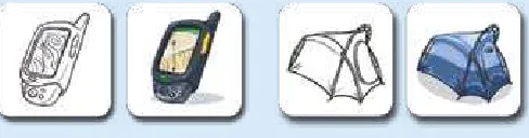
Icons are Gowalla’s primary visual build-ing block as well as the app’s currency. Icon design moves quickly from sketch to pixel as shown in these Gowalla icons of a GPS device and a tent. To keep the production line moving, the team col-laborates with Iconfactory, the company that produces about a third of Gowalla’s icons. Icons: David Lanham, Iconfactory.
Try, Try Again
Josh: one of the things that drove us back to the drawing board was that the check-in button appeared and disappeared depending on how close you were to a known location. That meant people often didn’t even know there was a check-in button, even though checking in was the whole reason for the app. we had thought that as you got close to a location where an item was hidden, it would be really cool to have an indicator tell you you’re getting warmer, warmer, now you’re hot, now you’re there, and then you can check in. but the check-in button didn’t actually appear until you were within the given range. It was terrible and really unintuitive, but the thing is that it made sense in the abstract: why display a button if it can’t be used yet? It turns out that it’s help-ful to have something there—a dimmed button—to let people know that their goal is to check in and get an item.
on top of that, our original GPS logic for checking into a location was way too strict. So the app says there’s an item at Stubb’s bar-b-Q in Austin, but I’m at Stubb’s right now, and the stupid thing’s telling me that I need to walk 43 me-ters southwest. So I’ve got to get up from my lunch and walk down the street? And then, maybe if I’m lucky and I happen to stand in the right 15 meter radius,
PinCh & Zoom
the check-in button appears and I can tap it and actually get the item. we real-ized that it sucked.
Finding Focus
Josh: we knew there was potential, but the design was wonky and the GPS logic was off. The special sauce was all wrong. So we had to go back and revisit both from a technical standpoint and a design standpoint to really figure out how people would flow through the app. we took a really deep dive to con-sider what’s most important in the app and, at the same time, pour some eye candy into it to make the best use of the iPhone.
during that time, there was definitely a lightbulb moment: oh man, we’re building something really big and meaningful here, something more than just a simple game. we realized that game mechanics could be used to give an incentive to a mass-market audience to share their locations and encourage people to go out and visit more and different places. That really changed our attitude and made us realize that we had to be more aggressive about making design decisions to make something that would appeal to people beyond the gamer crowd.
optimizing for the Primary Task
Josh: It was important that we make it as stupid-simple as possible to pull out your phone, launch the app, and check in where you are. That’s the core experience we had to optimize—to make it as fast as possible. It has to be ex-traordinarily simple to choose your location and then actually check in. I’m a big fan of the “bFb” [big F—kin‘ button] and I think you always want to make it almost painfully obvious what people are supposed to do next. So on the de-tail view for a check-in spot, we’ve got a big orange check-in button. You can’t miss it.
but before version 2, every time you launched the app, you got the Passport screen, the dashboard of where you’ve been instead of a view of what’s going on right now. That was a problem. we wanted to put more emphasis on making
it easier to help you check in, or to find where your friends are. So we made the Activity screen the first screen.
The Passport screen still has some problems. The screen displays the num-ber of stamps and pins you’ve earned. If you tap that numnum-ber, it takes you to a view that shows all those stamps or pins, but the problem is that it’s not plainly obvious that you can actually tap that number. I’d like to improve the design so that we keep that data there, but make it more obvious that this is something that you can interact with.
building for exploration
Josh: Starting with Gowalla 2.0, we baked in some new features to let users continue to use the app beyond the 10 seconds that it takes to check in. we let people leave comments about their location, upload photos, see where friends are, and find where most people in the neighborhood are going to-night. we wanted to support this almost toy-like interaction where you can just play with it and go in different directions and tangents based on your current location. I like this idea that you can kind of get lost in it, that there’s a sense of exploring.
PinCh & Zoom
Still, the core activity is the check in, and it has to be optimized for that. The challenge is to do all these other things without adding more cruft to the interface. how do we allow for all of those kinds of angles, but still keep that process super simple? Those are the kinds of things that are a continual box-ing match around here. I believe that you can have a dense level of informa-tion but still keep the flow extraordinarily simple.
Colorful Personality
Josh: we’re obviously big fans of bright, bold, even garish colors. not every-one likes it. It’s not the majority of people, but we definitely hear, “oh man, green and orange. That’s like the worst color combination ever. It feels like I just puked all over my screen and stuff, and what’s with all the avocado?” I get that it’s not for everyone, but the flip side is that it’s a talking point. It’s our brand. Most people love it, but the people who don’t are very vocal about it as well. It adds a level of personality, and people talk about it both for the good and the bad.
we’ve used orange historically in a lot of our products, and so that makes an-other appearance here. This time it just happened to be coupled with green. And I think that was kind of the outdoor, earthy vibe that we were trying to put across. You’ve got the green representative of getting out there and ex-ploring, and orange . . . well, because we like orange.
Josh says the Outback wanderlust of the film Australia inspired the Gowalla logo (left). The original app icon (middle) was green to conjure a sense of the outdoors but was later replaced by a brighter icon (right).
less Flash, More Function
Josh: You have to be careful with the eye candy, though, because if you have too much, you distract from the functionality. In some of the earlier design iterations, we used more gradients and more gloss and shine in places. Since then, we’ve systematically stopped using gradients in the app. we’re using flat colors almost everywhere, except for the icons themselves. Part of that no-gradients decision comes from a style standpoint. we wanted to dial it back a bit. Another part of it, though, is that it also reduces our development time. It’s less work for our programmers to go in and write code that uses these flat colors.
our goal with the design is to create the right frame. In the end, we’re celebrat-ing these icons. The app needs to be the appropriate settcelebrat-ing for those, and it should highlight them, not distract from them. You have to look at everything as a whole from the top down. It’s not just about having a great design but a great design that’s appropriate for the device or the environment it resides in. early on, we thought about making it look more like an actual passport where you’re flipping through the pages and, you know, take the metaphor and just beat it to death. In some ways, that would be really cool, but the flip side to doing this rich immersive graphical treatment is that we realize that the iPhone’s not the only platform we want to operate on. we have to keep in mind Android and weboS and blackberry. whatever design we come up with has to translate to those platforms. we don’t want the Android version to look like a bad hack of the iPhone version. You have to boil down some of your design elements to very basic, sensible things that can be reused from one platform to the next.
The App doesn’t have to do It All
PinCh & Zoom
get in the habit of coming back to the website. when you show up at a restau-rant and you’re about to sit down for dinner on a date, that’s not exactly the best time for an immersive Gowalla experience. So, when you’re out on your iPhone, you just want to check in quickly and get back to real life. but later, when you have more time to explore, we want to invite you to come back to the website where you can dive in and interact in a deeper way with a differ-ent set of features.
Mobile Mindsets
As you ponder the features and mission of your app, always return to the mo-bile use cases where your app might provide a solution. A good way to do that is to step back and think about the reasons we launch apps in the first place. Of course, there are as many individual reasons to use the iPhone as there are iPhone users, but it turns out every mobile impulse typically boils down to one of three mindsets:
• “I’m microtasking.”
• “I’m local.”
• “I’m bored.”
“I’m Microtasking”
As smart phones keep getting smarter, more and more of us are leaving our lap-tops behind, leaning instead on our trusty phones to keep up when we’re away from home or office. Unlike laptops, notebooks, or messy collections of Post-It notes, our iPhones rarely leave our sides, making them handy vessels for bottling brainstorms, managing to-dos and itineraries, or capturing on-the-go informa-tion like expenses or billable hours.
Slowly but surely, we’re learning to get stuff done on the small screen, but it’s im-portant to keep this miniature revolution in perspective: the iPhone can’t match a laptop in many respects, and you shouldn’t assume people will use it the same way. No matter how blazingly fast your fingers and thumbs might be, for example, delicately pecking away at a touchscreen keyboard won’t win any speed records. The iPhone is better tuned for parking quick notes than powering through the Great American Novel. A new style of device encourages a new set of work habits.
work sessions, the best productivity apps are tuned for short but frequent hits, encouraging users to capture new information and ideas as they happen, typi-cally to be processed and massaged later. The iPhone is likewise ideal for reading and even editing documents in the otherwise lost time of grocery-store lines or subway commutes. (This also happens to be true of the best iPhone games, which are typically designed for quick but tasty bites of gameplay, just a few minutes at a time.) There’s room for more leisurely exploration, too, as you’ll see on page 37, but in all of the iPhone’s contexts, the device’s quick-draw convenience lets users make the most of downtime, whether for work, play, or creative contemplation.
Productivity and reference apps in particular should be tuned to make the most of these intrawork interludes, making themselves tapworthy with efficient inter-faces that are well-suited to this evolving style of work. As you consider your app’s use cases, build the resulting features around microtask sprints of brief activity. Identify the recurring tasks that your users will perform with your app, and then polish, polish, polish. Optimize the design and workflow to make those tasks quick and effortless to accomplish on the go. Tapworthy apps get it done fast.
“I’m local”
We launch mobile apps to get the skinny on our surroundings: “I’m local, tell me what’s happening around me.” We’ve celebrated the personal computer since
Tapworthy apps accommodate users in a hurry, optimizing for frequent, recur-ring jobs. The to-do list app Things (left) makes it fast to add new tasks from any screen: Just tap the + icon that’s always parked at the bottom left of every screen. The built-in Calendar app takes a similar approach for new events, placing its + icon at the top right of all screens.
the days of disco, but the iPhone is the most personal computer yet—a device that knows tons about you and your surroundings. More than just a precocious phone, the iPhone is a personal sensor device tricked out with a camera, micro-phone, GPS, motion detector, and compass, all backed with Internet know-how. With sight, hearing, and touch, it lacks only smell and taste to round out the five senses (and really, that would just be creepy).
The iPhone is at once hyperlocal weatherman, restaurant radar, source of directions, know-it-all travel guide, and more. Trekkies, eat your heart out. Sensor-savvy apps turn the iPhone into the tricorder of Star Trek yore. Like a pack of pointy-eared science officers, we whip out our phones for a confident read on our personal habitat, using the iPhone’s sensors to filter sprawling amounts of information for a local view of our immediate environment. Fascinating.
Tapworthy apps take advantage of iPhone sensors to give personal context to tasks and info where ap-propriate. For most location-based apps, the whole goal is to put an appealingly nearsighted lens on a vast universe of data. The built-in Maps app is of course the most familiar example of this type of app, and the App Store is full of plenty of novel map-driven apps. A few examples among many:
• Yelp lists nearby businesses and dishes reviews from über-opinionated locals.
• Zillow is a drive-by home shopper’s dream reference, mapping nearby homes for sale, along with property values in the neighborhood.
• HearPlanet is an on-the-fly audio guide, speaking descriptions of sites and landmarks around you.
As useful as these what’s-nearby apps can be, the genre has quickly grown famil-iar—perhaps over-familiar—as general-purpose local guides have popped up faster than you can say, “Where’s the nearest Starbucks?” With any app, it’s important
to stake out how it’s different from the rest, but if you’re playing in this crowded sandbox, it’s especially crucial to do something beyond what the other kids are doing. As usual, paying special attention to defining a unique set of five W’s helps you stake out your own tapworthy territory on the map. Think hard about how you can craft your location-based app around a very specific audience (who), con-tent (what), or need (when and why). The highly personal context provided by the iPhone’s location sensors encourages a peculiarly personal niche focus. As more and more geotagged data makes its way into the world, we’re surrounded by data ghosts whispering information about our immediate environment. A creatively tuned iPhone app is like a set of special goggles for bringing some of these ghosts into view, letting your audience focus on a hobby interest or particular need.
Location-based map mashups are perhaps the most obvious way to put iPhone sensors to work, but it’s worth thinking creatively as you plan your app about other ways that personal location can be put to use. The camera and microphone, for example, let you go beyond “what’s nearby” to provide info about “what’s in front of me.” Audio-minded apps can analyze your sound environment for dictation, transcription, making music, or even helping you tune out extra noise.
Identify your audience, and help people connect with their passions (or maybe just a restroom at an urgent mo-ment). These apps make themselves unique with narrow content and focused audiences. From left: SitOrSquat finds nearby public restrooms; Trees Near You tells you what type of trees are around you if you happen to be in New York; abikenow serves the public bike-sharing programs of Dublin, Brussels, and Lyon, telling residents where bikes are available for pickup and spaces available for drop-off.
Shutterbug apps use the iPhone’s camera to dish info about what users are looking at. Take a photo of just about any product with Amazon Mobile (left), and the app will identify it and provide an Amazon link for more info. RedLaser (middle) does a similar trick, but with bar codes; aim the camera at a bar code, and the app tells you where to find the best price. Babelshot (right) translates photographed text to and from scores of languages, a nifty trick for travel.
These examples feature the iPhone sensors as the main event, tied directly to the apps’ key features. But there are also opportunities to provide more subtle inter-ventions, providing location-based info, for example, in apps where geography hasn’t been a traditional concern. In to-do list manager OmniFocus, for instance, you can use your location to show tasks that are tied to nearby locations, handy for tackling errands while you’re out and about. Similarly, Shopper is a grocery list organizer that detects what store you’re in and organizes your shopping list according to the order in which you’ll encounter the aisles and departments of that store.
When you put a fistful of sensors in users’ hands, it opens lots of opportunities to present tasks and information in entirely new ways. Tapworthy apps consider what it means to be local and act on that knowledge to change the app’s interac-tion. Don’t force it, though; think practical, not gimmick. Not all apps need to be photo-fantastic, audio-optimized, and geographically generous. But used in the right place, the iPhone’s sensors can personalize your app to make its features more helpful and relevant.
“I’m bored”
Let’s not kid ourselves. All this talk of microtasking and local data analysis makes it sound like every iPhone-wielding citizen is a paragon of productivity. The iPhone is swell at getting stuff done, but your glossy gadget is even better at wast-ing time. For every productivity enhancer in the App Store, there are at least three productivity killers, and that’s a good thing. The world shouldn’t always rush rush rush, and well-crafted iPhone apps can help us unwind, relax, and find shelter for mindful moments. The iPhone is great for staving off boredom for the same rea-son it’s great for microtasking: it’s always with you, at the ready to fill downtime with easy distraction, giddy gaming, or even high-minded escape into the world of literature. What could be more tapworthy than helping you survive a dull-as-paste moment?
Even a quick peek at the App Store’s numbers reveals that Apple’s online emporium is more arcade than office. Games dominate, accounting for three quarters of the most popular paid downloads since the store opened. And it’s no wonder: the
iPhone is a fun, quirky, and genuinely delightful gaming device. Its limited but intuitive controls—the touchscreen and motion-detecting accelerometer—make iPhone games accessible to everyone, but fresh enough to grab seasoned gamers. With a huge library of games, most available for less than a pack of Slim Jims, there’s no shortage of casual games to enjoy in bites of a few minutes at a time. We’re hooked.
The boredom battle doesn’t fall only to guns-a-blazin’ video games. The antidote for boredom is simple enough: something that’s better than what I’m stuck with right now. When we’re bored, we want something to occupy us beyond the bleak reality of the Post Office line, the tedious meeting, the eternal wait at the bus stop.
We want something to do. And, often, we want something to make us laugh—a fact that has, on mobile devices, shifted the whole nature of consumer software. It turns out that millions of people think that novelty apps for making fart sounds are a gas. The commercial appeal of toilet humor isn’t anything new (just ask Chaucer), but it’s the first time that it’s become a full-fledged software genre. Until now, most folks bought computer software to do work, period. Now, on the iPhone, users want entertainment, too, even if it’s occasionally vacuous or flatu-lent. On this device, people see software as content, not merely a set of tools.
This doesn’t mean your app has to rumble with intestinal distress. But it does mean that you should consider how your app might give your audience some moments of delight and distraction, or even encourage them to slow down and lose themselves for a while. All but the most simple utility apps (like the built-in
Weather and Clock apps, for example), can give users something to explore or play with to pleasantly pass the time.
The common thread to boredom-busting apps is exploration. A great app gives you someplace to go, a world to creatively travel or distractedly get lost. That’s why video games are such effective crusaders in the war on boredom, and why ebooks, news apps, YouTube, and Twitter clients are so popular on the iPhone, too. They all provide a story, an escape. But what might not be so obvious at first blush is that relatively mundane, workaday apps can provide a similar experience of exploration, too. Even get-it-done-quick apps can afford opportunities to slow down for thoughtful contemplation.
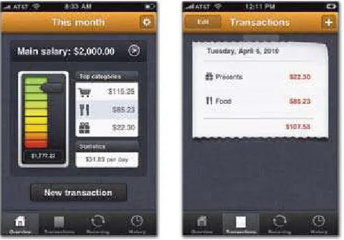
That’s especially true for apps that collect personal information. Calorie trackers, fitness logs, and to-do lists, for example, are essentially catalogs of the user’s past or future achievement. When presented in the right way, these apps transform themselves into personal-history video games. While these apps are (and should be) focused on micro-tasks for collecting and tracking info, an important use case is to allow users to massage that meticulously gathered data to see their progress and sort out where they’re headed.
As important as it is to plan your app to accommodate frequent, rapid micro-tasking, don’t forget the more occasional but equally important leisurely crawl through the app. Whether it’s the user’s own content, usage history, fresh news,
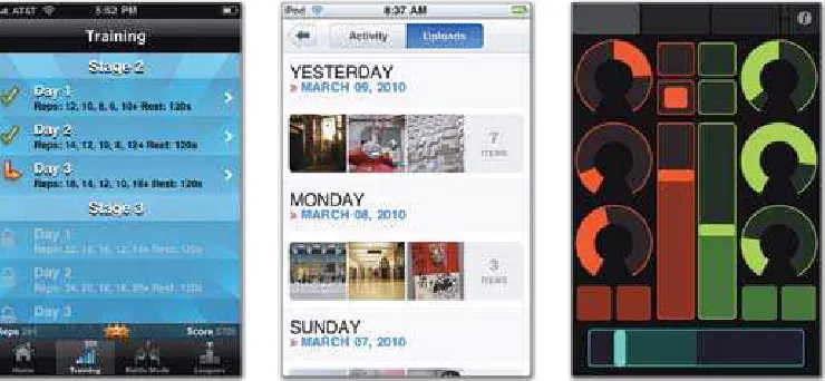
Health and fitness apps, like all apps that collect user info, gives users boredom-busting opportunities to explore their personal histories. Lose It! (left) lets you browse your calorie intake on weekly, daily, and meal-by-meal basis to review your weight-loss prog-ress; here, a chart lets you explore your daily calories. RunKeeper (right) stores your running stats, letting you revel in minute-by-minute reviews of all of your runs. Here, a bar chart shows your pace for every minute of the run; tap a bar to see its details.
community, or recommended content, consider what you can give users to ex-plore. That’s your boredom buster.
what Makes You So Special Anyway?
So you’ve got an idea of what you want your app to do, and you’ve got a pretty good sense of how and why people will use your app on the go when they’re multitasking, local, or bored. You’re off to a good start. But chances are, someone’s already got an app that does something at least vaguely similar to what you’ve got in mind. How will your app be different? What will make your app stand out from the rest?
With a new angle, even upstart newcomers can get a toehold in territory already staked out by established apps. Consider the category of “check-in” apps that let you share your current location with friends. Loopt was among the first iPhone apps to do this, providing an efficient system for plotting your pals on a map, making it easy to meet up with them wherever they might roam. As more apps joined the category, the best of these fresh faces added a new spin that made check-ins more fun. Foursquare added a point system to the formula, turning the activity into an urban game where everyone in the city is a player: check in
more than anyone else at your favorite watering hole, and you become its mayor, a competitive incentive for exploring your own city. As you saw earlier in this chapter, Gowalla tweaked the recipe by letting you collect virtual objects, pick up icons, and add “stamps” to the app’s passport as you roam your city. Instead of scoring points, Gowalla focuses on serendipity and the surprisingly addictive dis-covery of unexpected objects when you go to a new spot.
All three of these apps focus on the same activity—announcing your location— but all offer distinctly different rewards for doing it. These different approaches— efficiency, competition, and discovery—give these apps distinct personalities which in turn suggest different audiences and use cases. Despite surface similar-ity, the three apps are unique.
What makes your app special? Some possibilities: a unique set of rewards or in-centives; a tight focus on a specific audience; niche content that no one else can provide; a new way to visualize or present information; technology that simply works better; a big network of other users to play with; a solution for saving money over other apps; or a website or real-world component that enhances what you do or see in the app.
All of the advantages in that list are, in a sense, “skills.” If you do any of those things better or differently from others, you have a hook. But it also helps to think about apps like we think about human beings. It’s not just skills that make us want to spend time with certain people. There’s also the slippery but irresistible matter of charisma. Personality and looks matter, too (sometimes more than we care to admit), and the same goes for apps. Much of this book emphasizes efficiency, fo-cus, and substance, but there’s no doubt that style matters. Even if your app does exactly the same job as everyone else, you make an impact if it does that job with a flourish.
Just go carefully. Like people, apps with oversized personalities are as likely to distract and disgruntle as they are to seduce. Overdoing it with animations and sound effects will irritate users who don’t want to be bothered. If you choose to make your app’s graphical style one of its main differentiators, be sure that the style isn’t so noisy that it drowns out your app’s actual info and features. Adjust the style and design to suit the content and audience, and be careful not to
become so smitten with your app’s good looks that you begin to confuse form with function. Great design isn’t just about aesthetics.
wait, wait, Come back!
Your app’s shelf life on a user’s Home screen is exactly as long as it can hold that user’s attention. iPhone owners chew through apps, gulping down their content, then tossing them out and moving on. Apps with a fixed amount of content or data are particularly vulnerable to getting jilted; once your users read your ebook, play all the levels of your game, or flip through all the flash cards of your vocabu-lary builder, there’s nothing left to keep them around. If that’s your intent, that’s fine; some apps simply have a limited lifespan, and once the content is exhausted, that’s the end. But if you’re trying to create a long-term relationship with your audience, your app has to keep giving. It has to have a heartbeat to stay alive and remain tapworthy.
Certain kinds of apps have a built-in heartbeat thanks to the fundamental nature of their key features. Tools that organize personal info (to-do lists, calendars,