JUMP START CSS
Jump Start CSS
by Louis LazarisCopyright©2013 SitePoint Pty. Ltd.
English Editor: Paul Fitzpatrick
Product Manager: Simon Mackie
Cover Designer: Alex Walker
Technical Editor: Rachel Andrew
Notice of Rights
All rights reserved. No part of this book may be reproduced, stored in a retrieval system or transmitted in any form or by any means, without the prior written permission of the publisher, except in the case of brief quotations embodied in critical articles or reviews.
Notice of Liability
The author and publisher have made every effort to ensure the accuracy of the information herein. However, the information contained in this book is sold without warranty, either express or implied. Neither the authors and SitePoint Pty. Ltd., nor its dealers or distributors will be held liable for any damages to be caused either directly or indirectly by the instructions contained in this book, or by the software or hardware products described herein.
Trademark Notice
Rather than indicating every occurrence of a trademarked name as such, this book uses the names only in an editorial fashion and to the benefit of the trademark owner with no intention of infringement of the trademark.
Published by SitePoint Pty. Ltd.
48 Cambridge Street Collingwood VIC Australia 3066 Web: www.sitepoint.com Email: [email protected]
ISBN 978-0-9874674-4-7 (print)
About Louis Lazaris
Louis Lazaris is a web designer and blogger who has been creating and coding websites for more than a decade. You can find him on Twitter1or you can read more on CSS on his website, Impressive Webs2.
About SitePoint
SitePoint specializes in publishing fun, practical, and easy-to-understand content for web professionals. Visit http://www.sitepoint.com/ to access our blogs, books, newsletters, articles, and community forums. You’ll find a stack of information on JavaScript, PHP, Ruby, mobile development, design, and more.
About Jump Start
Jump Start books provide you with a rapid and practical introduction to web development languages and technologies. Typically around 150 pages in length, they can be read in a weekend, giving you a solid grounding in the topic and the confidence to experiment on your own.
1
https://twitter.com/ ImpressiveWebs 2
Preface
. . . xi
Who Should Read This Book . . . xi
Conventions Used . . . xi
Code Samples . . . xi
Tips, Notes, and Warnings . . . xiii
Supplementary Materials . . . xiii
Want to take your learning further? . . . xiii
Acknowledgments . . . xiv
Chapter 1
An Introduction to CSS
. . . 1
The Sample Project . . . 1
How are web pages built? . . . 2
What Is CSS? . . . 3
How do I include CSS in a web page? . . . 4
Using Inline Styles . . . 4
Using the
<style>Element . . . 4
Using
@importinside a
<style>element . . . 5
The Best Way: Using the
<link>Element . . . 5
Introducing CSS Selectors . . . 6
Universal Selector . . . 6
Element Type Selector . . . 6
ID Selector . . . 7
Class Selector . . . 8
Descendant Combinator . . . 9
Child Combinator . . . 10
General Sibling Combinator . . . 11
Attribute Selector . . . 12
Pseudo-class . . . 13
Pseudo-element . . . 14
Using Multiple Selectors . . . 14
The Cascade and Specificity . . . 15
Always Use Standards Mode . . . 18
A Skeleton for Our Sample Website . . . 19
Summary . . . 23
Chapter 2
Layout Techniques
. . . 25
The Box Model . . . 25
Block versus Inline . . . 27
Shorthand versus Longhand CSS . . . 29
Float-based Layouts . . . 32
Clearing Floats . . . 36
Positioning in CSS . . . 39
Absolute and Relative Positioning . . . 40
What about Responsive Web Design? . . . 43
Using
box-sizingfor Intuitive Sizing . . . 44
Adding More Layout Styles . . . 46
Floating the
“
Latest Recipes
”
Images . . . 47
Layout Styles for the Header . . . 50
Laying out the Promo Photo . . . 52
Laying out the Footer . . . 54
Laying out the
“
Most Popular
”
Recipes . . . 56
What
’
s the future of CSS Layouts? . . . 57
Flexbox . . . 58
Other New Layout Features . . . 58
Chapter 3
Backgrounds, Borders, and
More
. . . 61
Backgrounds . . . 62
Borders . . . 65
Rounded Corners . . . 67
Values and Units . . . 69
Px Units . . . 69
Em Units . . . 70
Rem Units . . . 71
Percentages . . . 73
Integers . . . 74
Keywords . . . 74
Color Values . . . 75
Transparency . . . 76
The Opacity Property . . . 77
RGBA and HSLA Colors . . . 78
Opacity versus Color-based Transparency . . . 81
Other Values . . . 81
Adding Shadows to Elements . . . 82
Adding a Shadow to the Header . . . 82
Adding a Shadow below the Promo Image . . . 84
Adding Shadows to Small Images . . . 85
Adding Shadows to Buttons . . . 85
Adding the Divider Shadow . . . 88
What about text shadows? . . . 89
Summary . . . 90
Chapter 4
Links, Text, and Custom Fonts
. . . 91
Changing Link Color . . . 94
Using Custom Web Fonts . . . 97
Using
@font-face. . . 99
Including the Different Font Files . . . 100
Generating the Font Files . . . 102
@font-face
Review . . . 108
Using Our New Fonts on RecipeFinder . . . 109
Cleaning Things Up . . . 112
Styling the Footer Section . . . 117
The
line-heightProperty . . . 118
Adding Styles to Text in the Sidebar . . . 120
Summary . . . 122
Chapter 5
Getting Fancy
. . . 123
Hover Effects . . . 124
Transitions . . . 127
Multiple Transitions on a Single Element . . . 129
Vendor Prefixes . . . 130
Transforms . . . 131
translate . . . 131
scale . . . 132
rotate . . . 132
skew . . . 132
Multiple Transforms on a Single Element . . . 133
Defining the Origin of a Transform . . . 133
Combining Transitions and Transforms . . . 134
Linear Gradients . . . 136
Positions for Color Stops . . . 138
Changing a Linear Gradient's Direction . . . 139
Adding More Linear Gradients . . . 140
Radial Gradients . . . 143
More Options for Radial Gradients . . . 144
Keyframe Animations . . . 146
Graceful Degradation and Page Performance . . . 151
Other Cutting-edge Features . . . 151
Making RecipeFinder Responsive . . . 152
min- and max- Dimensions . . . 152
Converting Pixels to Percentages . . . 153
Fixing the Size of Images . . . 155
Adding Media Queries . . . 157
Adding the Viewport Meta Tag . . . 157
Summary . . . 160
Chapter 6
Debugging Your CSS
. . . 161
Understand How CSS
“
Errors
”
Work . . . 162
CSS Comments . . . 164
Validating CSS . . . 166
CSS Hacks . . . 168
Reduced Test Cases . . . 168
Get Help Online . . . 169
Use Online Coding Tools . . . 170
Test Your Layout Early in Multiple Browsers . . . 170
Use Developer Tools and a Good Text Editor . . . 171
Do you remember your first educational toy? One of the first that many children get is the big, chunky puzzle—four to ten easy-to-grip pieces that fit into spaces on a board.
This is one of the first experiences a child has with matching shapes to corresponding spaces, helping them develop their shape recognition skills.
My wife thinks I was never given one of these puzzles. Every time I put the dishes away, the plastic food storage containers stump me. I end up trying to put medium containers into small containers and square containers into round ones. It's as if, in her words, I never got the proper training as a child. I pretend she's just joking, but maybe she's right—I really can't remember.
If you've purchased this little book, in terms of CSS knowledge, you're a lot like an infant with its first shapes puzzle. I hope to teach you as much as possible, as quickly as possible, about the fundamentals of CSS. And I hope later in life you'll look back and be thankful that you took the time to "learn your shapes."
Who Should Read This Book
This book is suitable for beginner level web designers and developers. Some knowledge of HTML is assumed.
Conventions Used
You’ll notice that we’ve used certain typographic and layout styles throughout this book to signify different types of information. Look out for the following items.
Code Samples
Code in this book will be displayed using a fixed-width font, like so:
<h1>A Perfect Summer's Day</h1>
If the code is to be found in the book’s code archive, the name of the file will appear at the top of the program listing, like this:
example.css
.footer {
background-color: #CCC; border-top: 1px solid #333; }
If only part of the file is displayed, this is indicated by the wordexcerpt:
example.css (excerpt)
border-top: 1px solid #333;
If additional code is to be inserted into an existing example, the new code will be displayed in bold:
function animate() {
new_variable = "Hello";
}
Also, where existing code is required for context, rather than repeat all it, a ⋮ will be displayed:
function animate() { ⋮
return new_variable;
}
Some lines of code are intended to be entered on one line, but we’ve had to wrap them because of page constraints. A ➥ indicates a line break that exists for formatting purposes only, and that should be ignored.
Tips, Notes, and Warnings
Hey, You!
Tips will give you helpful little pointers.
Ahem, Excuse Me
…
Notes are useful asides that are related—but not critical—to the topic at hand. Think of them as extra tidbits of information.
Make Sure You Always
…
…pay attention to these important points.
Watch Out!
Warnings will highlight any gotchas that are likely to trip you up along the way.
Supplementary Materials
http://www.sitepoint.com/books/jscss1/
The book’s website, containing links, updates, resources, and more.
http://www.sitepoint.com/books/jscss1/code.php
The downloadable code archive for this book.
http://www.sitepoint.com/forums/forumdisplay.php?53-css
SitePoint’s forums, for help on any tricky web problems.
Our email address, should you need to contact us for support, to report a prob-lem, or for any other reason.
Want to take your learning further?
Learnable for one low price. Enroll now and start learning today! Join Learnable and you’ll stay ahead of the newest technology trends: http://www.learnable.com.
Acknowledgments
Chapter
1
An Introduction to CSS
Welcome to Jump Start CSS! This book is an introduction to CSS that'll teach you the basics so you can start sprucing up your web pages using Cascading Style Sheets (CSS), the industry standard technology for formatting web pages.
For the most part, this book will not serve as a theoretical source for the topics we'll be discussing—there are plenty of other resources for that. In this brief volume, we'll be focusing on practical information. I'll be showing you, in rapid fashion, what the various aspects of CSS are, and how you can use them to build web pages.
The Sample Project
In order to give you hands-on experience with CSS, this book is centered around a sample project that we'll be building together.
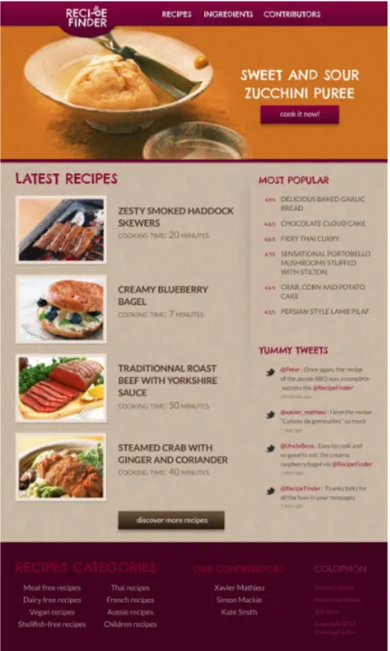
The sample project is a phony website called RecipeFinder. You can access a com-pleted version of that website by visiting http://spbooks.github.io/JSCSS1/ in any web browser.
Figure 1.1. The website we'll be building in this book
Now, before we get into building our project, let's properly introduce the elements of CSS and how it's used to style web pages.
How are web pages built?
HTML consists ofelements, many of which have what are called opening and closingtags. These instruct web browsers how content (copy, photos, videos, and so on) should be presented on screen. For example:
<header>
<h1>RecipeFinder</h1> </header>
In this case, the content that's visible on the page is the text“RecipeFinder.” Everything else you see there (specifically the information inside the angle brackets) is HTML, and it's invisible on the page when viewed in a browser. What it does is to help mark where sections of content begin and end. For this reasonHTMLis what's called a markup language. In fact, it stands for Hyper Text Markup Language.
As mentioned, this is not a book on HTML, but if you want to learn more, two possible resources are SitePoint's online HTML Concepts1or the Mozilla Developer Network's Introduction to HTML.2
What Is CSS?
CSSstands for Cascading Style Sheets and is a separate, but complementary, language to HTML. CSS is what we use to apply styles to the content on our web page.
Let's use the HTML from the example above to give you a first taste of CSS. Don't worry if this looks foreign to you right now—just become familiar with the look of the code:
What you see above is referred to as arule set. Notice the curly braces that wrap three lines of code. Also, notice that each line inside the curly braces has a colon and a semi-colon. Everything inside the curly braces is called adeclaration block. 1
http://reference.sitepoint.com/html/html-concepts 2
The portion prior to the first curly brace is what defines which part of the web page we are styling. This is referred to as theselector. We'll discuss more on selectors later in this chapter. In this case, our CSS is targeting the<header>HTML element.
Each of the three lines in the declaration block is referred to as a—you guessed it—declaration. Additionally, each declaration consists of aproperty(the part before the colon) and avalue(the part after the colon). Finally, each CSS declaration ends with a semi-colon.
What I've shown you here is a very simple example. Other CSS code examples might be more complex, but most are fairly easy to figure out through trial and error―so don't be too intimidated if you come across something you don't recognize.
So what does that code do? Well, we'll get into the specifics on CSS properties later, so hang tight while we continue discussing some further important basics that'll serve as a foundation for the rest of this book.
How do I include CSS in a web page?
CSS can be inserted into a web page in four different ways. Let's take a look at each one, saving the most highly recommended method for last.
Using Inline Styles
Any HTML element on a web page can be styled usinginline styles. Here's an ex-ample, using some of the HTML we've already introduced:
<h1 style="color: blue; background-color: #333;">RecipeFinder</h1>
In this case, the CSS is contained inside of an HTMLattributecalledstyle. The attribute tells the browser that what follows inside the quotation marks is CSS. In this example, the styles will only apply to the element to which they're attached (the<h1>element in this case). This is a very inefficient way of inserting CSS and should be avoided in almost all circumstances.
Using the
<style>
Element
<style>
In this example, the styles will apply only to the element(s) targeted in the selector. So, in this instance, the styles will apply to all <header> elements on the page where this<style>element appears.
Using
@import
inside a
<style>
element
You also have the option to include CSS in a separate file. It's similar to a text file, but has a file extension of“.css”. So a chunk of CSS inside a separate file can be imported into your HTML like this:
<style>
@import url(css/style.css); </style>
The@importmethod of including CSS has been known to cause some problems—for example, multiple CSS files loaded via@importwill often take longer to down-load3—so, in general, you'd do well to avoid using it.
The Best Way: Using the
<link>
Element
The best way to include CSS in a web page is by means of the<link>element:
<link rel="stylesheet" href="css/style.css">
This element, which would be placed in the<head>element of your HTML docu-ment, is much like@importin that it references an external file. This enables you to keep all your CSS code separate from the HTML. In addition, this method doesn't cause some of the issues that can arise when using@import. Also, because the styles are not“inline,”scattered among the HTML, your CSS will be that much easier to maintain.
3
Introducing CSS Selectors
As already alluded to, a CSS selector is the part of a CSS rule set that actually selects the content you want to style. Let's look at all the different kinds of selectors avail-able, with a brief description of each.
Universal Selector
Theuniversal selectorworks like a wild card character, selecting all elements on a page. You'll recall, from our brief overview earlier, that every HTML page is built on content placed within HTML tags. Each set of tags represents an element on the page. Look at the following CSS example, which uses the universal selector:
* {
color: green; font-size: 20px; line-height: 25px; }
The three lines of code inside the curly braces (color,font-size, andline-height) will apply to all elements on the HTML page. As seen here, the universal selector is declared using an asterisk. You can also use the universal selector in combination with other selectors—something we'll discuss a little later in this chapter.
Element Type Selector
Also referred to simply as a“type selector,”this selector must match one or more HTML elements of the same name. Thus, a selector ofnavwould match all HTML
<nav>elements, and a selector ofulwould match all HTML unordered lists, or
<ul>elements.
The following example uses an element type selector to match all<ul>elements:
ul {
list-style: none; border: solid 1px #ccc; }
<ul>
There are three main elements making up this part of the page: Two<ul>elements and a<div>. The CSS will apply only to the two<ul>elements, and not to the
<div>. Were we to change the element type selector to use div instead oful, then the styles would apply to the<div>and not to the two<ul>elements.
Also note that the styles will not apply to the elementsinsidethe<ul>or<div>
elements. That being said, some of the stylesmaybe inherited by those inner ele-ments—more on this later in the book.
ID Selector
An ID selector is declared using a hash, or pound symbol (#) preceding a string of characters. The string of characters is defined by the developer. This selector matches any HTML element that has an ID attribute with the same value as that of the selector, but minus the hash symbol.
<div id="container"></div>
In this case, the fact that this is a<div>element doesn't matter—it could be any kind of HTML element. As long as it has an ID attribute with a value ofcontainer, the styles will apply.
An ID element on a web page should be unique. That is, there should only be a single element on any given page with an ID ofcontainer. This makes the ID selector quite inflexible, because the styles used in the ID selector rule set can be used only once per page.
If there happens to be more than one element on the page with the same ID, the styles will still apply, but the HTML on such a page would be invalid from a tech-nical standpoint, so you'll want to avoid doing this.
In addition to the problems of inflexibility, ID selectors also have the problem of very high specificity—an issue we'll be talking about later in this chapter.
Class Selector
The class selector is the most useful of all CSS selectors. It's declared with a dot preceding a string of one or more characters. Just as is the case with an ID selector, this string of characters is defined by the developer. The class selector also matches all elements on the page that have their class attribute set to the same value as the class, minus the dot.
Take the following rule set:
.box {
padding: 20px; margin: 10px; width: 240px; }
These styles will apply to the following HTML element:
<div class="box"></div>
class attribute is beneficial, because it allows you to reuse styles, and avoid needless repetition. In addition to this, class selectors have very low specificity—again, more on this later.
Another reason the class selector is a valuable ally is that HTML allows multiple classes to be added to a single element. This is done by separating the classes in the HTML class attribute using spaces. Here's an example:
<div class=”box box-more box-extended”></div>
Descendant Combinator
The descendant selector or, more accurately, the descendantcombinatorlets you combine two or more selectors so you can be more specific in your selection method. For example:
#container .box { float: left;
padding-bottom: 15px; }
This declaration block will apply to all elements that have a class ofboxthat are inside an element with an ID ofcontainer. It's worth noting that the.boxelement doesn't have to be an immediate child: there could be another element wrapping
.box, and the styles would still apply.
Look at the following HTML:
<div id="container"> <div class="box"></div>
<div class="box-2"></div> </div>
<div class="box"></div>
If we apply the CSS in the previous example to this section of HTML, the only ele-ment that'll be affected by those styles is the first<div>element that has a class of
Similarly, the second<div>element with a class ofboxwon't be affected because it's not inside an element with an ID ofcontainer.
You should be careful when using the descendant combinator in your CSS. This kind of selector, while making your CSS a little easier to read, can unnecessarily restrict your styles to a specific context—in this case, the styles are restricted to boxes inside of#container—which can make your code inflexible.
Child Combinator
A selector that uses the child combinator is similar to a selector that uses a descend-ant combinator, except it only targets immediate child elements:
#container > .box { float: left;
padding-bottom: 15px; }
This is the same code from the descendant combinator example, but instead of a space character, we're using the greater-than symbol (or right angle bracket.)
In this example, the selector will match all elements that have a class ofboxand that areimmediate childrenof the#containerelement. That means, unlike the descendant combinator, there can't be another element wrapping.box—it has to be a direct child element.
Here's an HTML example:
<div id="container"> <div class="box"></div>
<div>
<div class="box"></div> </div>
</div>
Again, selectors that use this combinator can be somewhat restricting, but they can come in handy—for example, when styling nested lists.
General Sibling Combinator
A selector that uses a general sibling combinator matches elements based on sibling relationships. That is to say, the selected elements are beside each other in the HTML.
h2 ~ p {
margin-bottom: 20px; }
This type of selector is declared using the tilde character (~). In this example, all paragraph elements (<p>) will be styled with the specified rules, but only if they are siblings of<h2>elements. There could be other elements in between the<h2>
and<p>, and the styles would still apply.
Let's apply the CSS from above to the following HTML:
<h2>Title</h2>
<p>Paragraph example.</p> <p>Paragraph example.</p> <p>Paragraph example.</p> <div class="box">
<p>Paragraph example.</p> </div>
In this example, the styles will apply only to the first three paragraph elements. The last paragraph element is not a sibling of the<h2>element because it sits inside the<div>element.
Adjacent Sibling Combinator
p + p {
text-indent: 1.5em; margin-bottom: 0; }
This example will apply the specified styles only to paragraph elements that imme-diately follow other paragraph elements. This means the first paragraph element on a page would not receive these styles. Also, if another element appeared between two paragraphs, the second paragraph of the two wouldn't have the styles applied.
So, if we apply this selector to the following HTML:
<h2>Title</h2>
...the styles will apply only to the second, third, and fifth paragraphs in this section of HTML.
Attribute Selector
The attribute selector targets elements based on the presence and/or value of HTML attributes, and is declared using square brackets:
input[type="text"] { background-color: #444; width: 200px;
}
There should not be a space before the opening square bracket unless you intend to use it along with a descendant combinator. The above CSS would match the fol-lowing element:
But it wouldn't match this one:
<input type="submit">
The attribute selector can also be declared using just the attribute itself, with no value, like this:
input[type] {
background-color: #444; width: 200px;
}
This will match all input elements with an attribute oftype, regardless of the value.
You can also use attribute selectors without specifying anything outside the square brackets (thus targeting based on the attribute alone, irrespective of the element). It's also worth noting that, when using values, you have the option to include quotes (single or double,) or not.
Pseudo-class
A pseudo-class uses a colon character to identify a pseudo-state that an element might be in—for example, the state of being hovered, or the state of being activated. Let's look at a common example:
a:hover { color: red; }
In this case, the pseudo-class portion of the selector is the:hoverpart. Here we've attached this pseudo-class to all anchor elements (<a>elements). This means that when the user hovers their mouse over an<a>element, the color property for that element will change to red. This type of pseudo-class is a dynamic pseudo-class, because it occurs only in response to user interaction—in this case, the mouse moving over the targeted element.
the state is the“hover”state. We'll look at other examples of pseudo-classes later in the book.
Pseudo-element
Finally, CSS has a selector referred to as a pseudo-element and, used appropriately, it can be very useful. The only caveat is that this selector is quite different from the other examples we've considered. Let's see a pseudo-element in context:
.container:before {
This example uses one kind of pseudo-element, the:beforepseudo-element. As the name suggests, this selector inserts an imaginary element into the page, inside the targeted element, before its contents.
Don't worry—we'll cover pseudo-elements in greater detail later in the book.
Using Multiple Selectors
Each of the selectors shown above can be combined with one or more other selectors. For the most part, you'll want to avoid combining too many selectors together, but here are a few quick examples to help you grasp the concept:
p.box {
color: blue; }
In this example, we're combining the element type selector with a class selector. As a result, this will target only paragraph elements that have a class of.box. This is a poor choice of selector, and should be avoided in almost all circumstances. In normal practice, it's more than enough to specify a selector with a class such as
#form [type=text] { border: solid 1px #ccc; }
This selector combines the ID selector with the attribute selector. This will target all elements with a type attribute oftextthat are inside an element with an ID of
form.
p, div, .box { color: black; }
Here we're using commas to separate our selectors. This is a useful method to use to combine multiple selectors in a single rule set. In this case, the styles will apply to all paragraph elements, all<div>elements, and all elements that have a class of
box.
The Cascade and Specificity
At first glance, the following concepts can seem difficult to grasp. But the truth is, if you're a CSS beginner, there are methods you can employ to ensure that they don't cause too many problems for you.
First, let's look at what we mean when we refer to style sheets ascascadingand howspecificityties in.
Usually, when a browser interprets a CSS document, it does so from top to bottom, giving precedence—or overriding abilities—to the declarations that appear lower down in the document.
Let's look at a simple example so you can understand what I mean when discussing precedence and overriding abilities. Assume the following two declaration blocks appear in a single CSS file:
p {
p {
font-size: 30px; }
Here we're using the exact same selector for both rule sets—the element type selector, which targets all paragraph elements. The difference between these two rule sets, however, is the value of the font-size property. Here we're defining thefont-size
twice for the same element. So what will the size of the font actually be? Well, since the rule set that defines the font size at 30px appears after the previous rule set, then the font will be sized at 30px.
This is a very simple example, but it neatly demonstrates how selectors targeting styles later in a CSS document have precedence over the same selectors that appear earlier in the CSS file. Simple, right? Unfortunately, different selectors have different levels of specificity. Look at the following example:
div p {
color: blue; }
p {
color: red; }
If all the<p>elements on a web page were nested inside a<div>, the first rule set (which usesdiv p,) would always apply, overriding any of the same styles defined in the second rule set (which uses onlyp). This is because the descendant selector (used in the first example) takes precedence over the element type selector (used in the second example).
In this instance, the color value for paragraph elements inside of<div>elements will beblue—despite the fact that the second color declaration appears later in the document. So although the browser does give some importance to the order of these rule sets, that order is superseded by the specificity of the first rule set.
#main {
In this case, it might seem that the second rule set, which uses two type selectors, a class selector and a descendant selector all in one, would have precedence over the first rule set, which only uses the ID selector. But this isn't the case. The color value on the container element would become green because the ID selector (used in the first example) has very high specificity and thus takes precedence over the second rule set.
It should be noted here that when we refer to the overriding of selectors and selectors taking precedence, we're assuming that the same styles are defined on these different rule sets. So, for example, in the previous code block, if the#mainrule set defined color and the bodydiv.containerselector defined a different property, then they would both apply, because there'd be nothing being overridden. To recap, then: specificity does not affect all styles, but only the styles that are duplicated across multiple selectors.
This use of the ID selector—and its strong override abilities—clearly illustrates why it's important to avoid using it, wherever possible. Traditionally, CSS developers have encouraged the ID selector's use for unique elements, and, according to standards, it's a perfectly valid CSS selector. But please keep in mind that overusing it may cause all sorts of problems in the long run.
In order to avoid being tripped up by specificity, use the class selector widely and learn what's referred to as "Object Oriented CSS" or "modular CSS".4
4
For more advanced learning on this subject, see SMACSS [http://smacss.com/] and An Introduction to Object Oriented CSS.
Selective Treatment
The suggestion to avoid ID selectors only applies to IDs in CSS, not in HTML. ID attributes are absolutely necessary for local, or same-page, links and can be very useful when attempting to target elements using JavaScript.
Other selectors will also add certain levels of specificity, but not so much that they'll cause problems. If, for example, you have to target something with a pseudo-class or child selector, that's fine. Use those selectors whenever you find them to be practical.
There are a number of detailed articles online explaining cascade and specificity. These include a series on SitePoint's CSS Reference,5which are highly recommend once you've a good grasp of some of the basics introduced in this book.
Always Use Standards Mode
A basic rule of thumb is that every HTML document you create should use“standards mode.”For a beginner, this might sound a bit too techy, but it's actually quite simple to ensure that all your HTML pages comply.
To ensure your CSS is rendered properly by the browser (meaning, it's in standards mode,) make sure the HTML document to which your styles are applying has the following tag at the top, before all other content:
<!doctype html>
That's it. This tag is referred to as an HTML5 document type declaration or“ doc-type.”In older documents, you'll occasionally come across other lengthier doctypes, which are commonly used for XHTML or HTML4 web pages. For example:
<!DOCTYPE html PUBLIC "-//W3C//DTD XHTML 1.0 Strict//EN"
"http://www.w3.org/TR/xhtml1/DTD/xhtml1-strict.dtd">
5
You can do some further reading on doctypes at SitePoint's HTML reference6but, for now, all you need to know is that, if you use the simple HTML5 doctype, your pages will render in standards mode and your CSS will be much easier to code and debug.
A Skeleton for Our Sample Website
We've covered quite a bit of ground, already, without touching our sample project. Let's conclude this chapter by using some of the selectors we've learned about to build a CSS skeleton for the RecipeFinder website.
First, we need to add an external CSS file to our project that'll help us achieve similar results in almost all browsers and on any device. Of course, not every web browser supports every CSS feature (more on this later,) but we can make a fairly normalized cross-browser start to our project by using something called a“CSS reset.”
What do we mean by "normalized cross-browser"? Well, every browser applies certain styles to elements on a web page by default. For example, if you use an un-ordered list (the<ul>element) the browser will display the list with some existing formatting styles, including bullets next to the individual list items (the<li> ele-ments inside the<ul>). By using a CSS reset document at the top of your CSS file, you can reset all these styles to a bare minimum. To put it another way, it clears the ground before we start building something new.
At this stage, it's not necessary to understand everything in a CSS reset. Most experts wouldn't be able to speak intelligently on every line of CSS in such a document. The important thing to understand is that it's a valuable tool in your CSS arsenal, and it's imperative that you use one on every project to avoid as many cross-browser problems as possible.
That said, you can't just throw a CSS reset document into a pre-existing site, and expect it to "fix" everything. That's not how CSS resets work. A reset is designed to be used as a starting point, not as a quick-fix for existing websites that aren't behaving in different browsers.
6
Two of the most popular CSS resets are Eric Meyer's Reset7and Nicolas Gallagher's Normalize.css.8Normalize.css is what we'll use as a foundation for our project. So our base HTML will look like this:
<!doctype html> <html lang="en"> <head>
<meta charset="utf-8"> <title>RecipeFinder</title>
<link rel="stylesheet" href="css/normalize.css"> <link rel="stylesheet" href="css/styles.css">
<!--[if lt IE 9]>
<script src="http://html5shiv.googlecode.com/
➥svn/trunk/html5.js"></script>
Notice the two CSS file references. One isNormalize.cssand the other is the stylesheet that we're going to build. Remember what we talked about earlier regarding the cascade? To ensure that the Normalize.css styles work correctly, this file has to be referenced first, prior to any other CSS we add. This ensures that any styles we add later in the CSS will override whatever is in ourNormalize.cssfile.
The HTML5 Shiv
You'll probably notice in our HTML that we've included a<script>tag that references a file calledHTML5shiv. This is necessary to enable older versions of Internet Explorer to apply CSS to all HTML5 tags. For more information on this, see this article by Remy Sharp.9
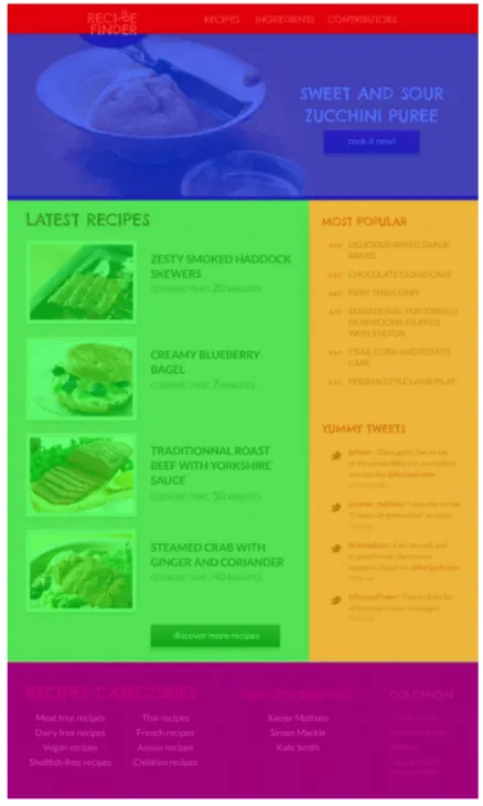
Now that we have that basic foundation in place, let's look at our RecipeFinder graphic again and decide how we want to divide up our page. Then we'll choose
some CSS selectors to attach to declaration blocks that we'll populate throughout the book.
Notice in Figure 1.2 the different sections of the website have been overlaid with colors, so you can envision roughly how the HTML structure will be defined.
Figure 1.2. The RecipeFinder website with colors indicating how we'll divide up the layout
a:link, a:visited {
Here you can see we're making generous use of the class selector (e.g. .promo) and we've also included use of the element type selector (e.g.h1andh2) as well as the descendant selector (e.g. .media img) and the child combinator (e.g.body > header).
You'll also notice another convention we've used here: portions of the CSS have been indented to match the indenting that will exist in the HTML itself. You don't have to do this, but it's a nice way to keep the CSS easy to scan when it starts building up.
If there's anything you don't understand in our CSS skeleton, don't worry too much about it right now.We'll go into more detail in the coming chapters as we put some meat on those bones, so to speak.
What about the HTML?
This book is not about HTML, so although there will be some code snippets showing what HTML we're dealing with when writing the CSS, the HTML will, for the most part, not be shown or discussed.
If you want to get the most out of the tutorial that runs through this book, I suggest that you download the code archive and use the HTML file provided in the download. You can remove the completed CSS file that's included with the archive and build your own CSS file step-by-step as you progress through the book.
All the code examples in this book, if patched together correctly, will build the complete CSS file (minus all the extra vendor prefixes for newer CSS fea-tures—more on this in Chapter 5).
Summary
In this chapter, you've learned about the different components of a CSS rule set, you've been introduced to the different ways to select elements via CSS, and you've had a glimpse of some relevant concepts with regards to the cascade and specificity.
I've also introduced the sample project, and we've put together a base CSS file that is preceded by a set of styles that normalizes some browser differences.
Chapter
2
Layout Techniques
In this chapter, I'm going to introduce you to some layout techniques. You’ll get hands-on experience with these when we implement some of them into the skeleton we built for our CSS in Chapter 1.
Before that, there are some additional fundamental concepts that we didn’t cover in Chapter 1 that you’ll get to know.
The Box Model
Figure 2.1. A graphic representation of the box model
The box model components in this diagram are exaggerated. Normally, the only large and visible area of any HTML element is the content area. Using this larger-than-life example, however, we can discuss each component, starting from the inside and working our way out:
Content The content portion of the box model holds—you guessed it—the actual content. We introduced this briefly in Chapter 1 when discussing HTML elements. The content can be text, images, or whatever else is visible on a web page.
Padding The padding of an element is defined using the padding property. The padding is the space around the content. It can be defined for an indi-vidual side (for example,padding-left: 20px) or for all four sides in one declaration—padding: 20px 10px 30px 20px, for instance. When declaring all four sides, you’re using ashorthandproperty. There'll be more on shorthand later in the chapter. Often when a CSS property takes multiple values like this, they start at the top and go clockwise in relation to the element. So, in the example just cited, this would apply 20px of padding to the top, 10px to the right, 30px to the bottom, and 20px to the left.
Border The border of an element is defined using the border property. This is a shorthand property that defines the element'sborder-width,
Margin Finally, the last part of the box model is the element’s margin. Margins are similar to padding, and are defined using similar syntax (for example,
margin-left: 15pxormargin: 10px 20px 10px 20px). However, unlike padding, the margin portion of an element exists outside the element. A margin creates space between the targeted element and surrounding elements.
Every element on a web page has these box model components. Sometimes the de-fault characteristics of these components differ on certain types of elements. For example, form elements start out with a certain width and height, even if you don’t define those properties. Also, as mentioned in Chapter 1, unordered lists (<ul>
elements,) will start out with predefined margins and padding due to the browser's internal stylesheet, even if those are not set in the CSS.
Block versus Inline
Another concept you should be familiar with is that most HTML elements fall under two categories: block or inline. A block-level element is more of a structural, layout-related element, while an inline-level element is usually found inside of block-level elements, flowing in the same context as text.
Block-level elements include elements like<div>,<p>, and<section>, whereas inline elements include<span>,<b>, and<em>. These are just a few examples.
Using CSS, you can change an element’s default behavior in this regard by using the display property, like this:
span {
display: block; }
Figure 2.2. A visual demonstration of the difference between block and inline
Block elements have certain characteristics. First, unless given a specific width, they always expand horizontally to fit inside their parent container and will also, by default, expand vertically to hold their contents. So there is normally no need to, say, add a specific width to a block element unless you require its width to be smaller than the available space within its parent element. And there's rarely a need to give an explicit height to a block element since, in most cases, it will naturally expand to hold its contents.
As mentioned, block elements are structural-type elements and so will, by default, start below the elements on the page that appear before them in the HTML. This is an important part of understanding how they differ from inline elements.
In essence, inline elements behave like words and letters within of a paragraph. As you can see in Figure 2.2, an inline element will flow naturally with text, and usually it'll contain nothing but text or other inline elements. It's worth noting that inline elements are subject to CSS properties that affect text. For example, line-height and letter-spacing are CSS properties that can be used to style inline elements. However, those same properties wouldn't affect block elements.
For reasons concerned with layout, you’ll occasionally want to have something that somewhat resembles both block and inline. This is possible by setting an element to a value ofinline-block, which you can do as follows:
.example {
display: inline-block; }
This gives us the best of both worlds—allowing the element to stay inline with text, and still be subject to text-based CSS, while at the same time accepting width, height, and margin values like a block element. Later in this chapter, we’ll use inline-block to style the main navigation of our example site.
Shorthand versus Longhand CSS
Yet another important concept to understand is the difference between shorthand and longhand CSS properties. As we’ve already discussed, a single CSS declaration usually consists of a property followed by a colon, followed by a value, then a semi-colon.
Shorthand properties work a bit differently. A shorthand property’s value is actually a set of values, each of which maps to an existing CSS longhand property. Let’s look at an example that we’ve already introduced—theborderproperty:
.example {
border: dashed 2px blue; }
The rule set above, which contains just one declaration, can also be written in longhand, like this:
which, in a large CSS file, will make a small impact on page speed and probably a big impact on future code maintenance.
It should also be noted that if you leave out one of the values of a shorthand property, it will cause that value to revert to its initial, or default, state. Let’s combine our previous two code examples so you can see how this works:
.example {
Here we’ve used the same selector on two different rule sets. As we learned in Chapter 1, the second rule set will take precedence over the first, overriding any styles that are the same in both rule sets.
In the first rule set, we’ve defined all three border-related properties in longhand, setting the values to display a dashed border that’s 2px wide and colored blue. But what’s the result of these two rule sets? Well, the border will become 3px wide (the default border width for a visible border,) and it'll be colored green, not blue. This happens because the second rule set uses shorthand to define the border-style as
solid, but doesn’t define the other two properties (border-widthand
border-color).
This might sound a bit complicated at first, but it’s worth experimenting with to get the hang of it. Just understand that if you don’t define all the properties repres-ented in a shorthand property, the missing ones will revert to their defaults, rather than inheriting from any existing styles.
In most cases, this won’t cause too many problems, but in some instances (for ex-ample, when using the font shorthand property) it could have undesirable and confusing results, as described in an article on my site.1
1
Another thing to understand about shorthand is that for certain shorthand properties, the missing values are inherited based on the existing values. Two good examples, which you’ll often use in this way, aremarginandpadding. For example:
.box {
padding: 20px 10px 15px; }
Notice there are three values specified. If you recall from Chapter 1, these values represent padding for the top, right, bottom, and left, in that order. The fourth value (referencing the left padding) is missing, but it is assumed to be 10px, which matches the opposite side padding (the second value declared). If we had omitted two values, then the bottom would inherit from the top in addition to the left inheriting from the right.
The same principle applies to other shorthand properties likemargin, border-color, andborder-width. So the following two lines of code would yield the exact same results:
.example {
margin: 10px 20px 10px 20px; }
.example {
margin: 10px 20px; }
In the first declaration, we’re defining all four margin values explicitly (top,right,
bottom, andleft). In the second declaration, we’re omitting thebottomandleft, so they'll inherit from thetopandrightvalues. In the same way, the following two examples would also produce the same result:
.example {
border-width: 10px 10px 10px 10px; }
.example {
Again, we’re defining all four explicitly in the first declaration, but in the second declaration, we’re letting the missing values inherit from the only value that’s defined: the top value for the border width.
Using shorthand in this way is a good habit to pick up early because it'll help you to omit unnecessary stuff in your code, making it easier to read.
Float-based Layouts
The first layout technique that we’re going to discuss is the only current example that works in every browser and doesn’t use HTML tables (tables are not good for layout2). There are a number of new techniques that we’ll touch on later in the chapter that are supported in some modern browsers, but float-based layouts are still necessary for websites that need to look good in older browsers like Internet Explorer versions 7, 8, and 9. Even modern browsers have sketchy support for newer layout methods so, at the time of writing, float-based layouts are the primary layout method used in CSS.
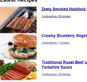
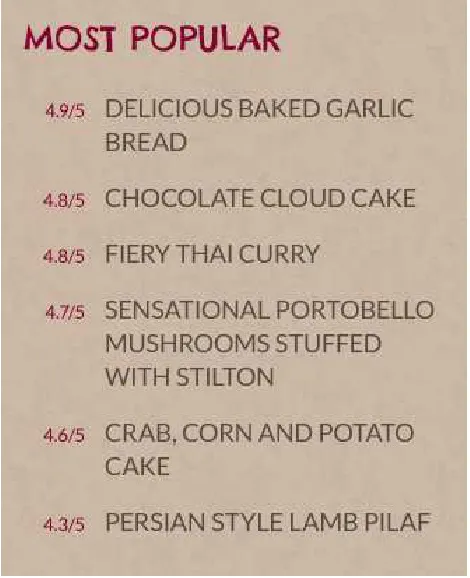
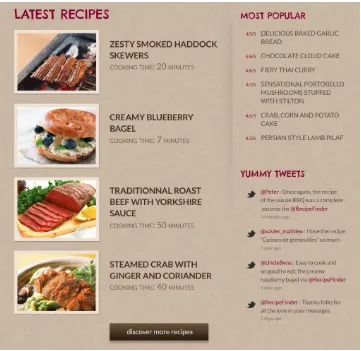
In our RecipeFinder website, we have an ideal place to use a float-based layout: the main content area. This area is divided into two vertical columns, as shown in Figure 2.3:
2
Figure 2.3. The two-column area of RecipeFinder
Let’s add some layout styles to that section of code, so we can get things started:
.main {
width: 1020px; margin: 0 auto; }
.latest { width: 640px; float: left; }
width: 360px; float: right; }
You’ll recognize these selectors from Chapter 1, where we introduced the bare CSS. The HTML that this applies to includes the.mainelement, which wraps both columns. You’ll notice we’ve applied a margin declaration to.main.
As discussed earlier, this margin declaration is shorthand and would be equivalent to the following:
.main {
margin: 0 auto 0 auto; }
But we’ve omitted the final two values for brevity, as they're inherited from the existing values. While the zero values are probably easy to figure out (they declare that no margins should exist on the top and bottom of the.mainelement), theauto
values will be new to you.
A value ofautoset on the left and right margins of an element that has an explicitly defined width, will automatically center that element horizontally inside its parent. It won't center the contents of the element; only the element itself. In the case of the.mainelement, its parent is the<body>element, which has no set width. So whatever the horizontal size (or width,) of the browser, the.mainelement will center itself horizontally on the page as a result of this margin declaration.
That’s a CSS technique that you’ll want to tattoo on the back of your hand—you’ll use it often. But it only works with horizontal centering. Vertical centering is a trickier thing to accomplish in CSS.3
CSS Units
You’ll notice that throughout the examples, numerical values are appended with "px.”This refers to pixels and is just one kind of CSS unit. Other commonly used units include percentages (%), ems, and rems. We’ll discuss more CSS units in the next chapter.
3
Next in our CSS, we have the two elements inside the.mainelement. The first is the left column, which has a class of.latest (referring to the“latest recipes”). The other column is an<aside>element to which we’ve applied a class of.sidebar.
As discussed earlier in the section covering block and inline elements, since both of these elements are block-level, they will, by default, appear one after the other, stacked vertically, rather than side-by-side filling the available horizontal space of their parent element—which, in this case is the.mainelement.
To have them appear side by side in a two-column format, we use the float property, which tells the browser to push the element towards a specified side of the page, as far as it can go. The float property can accept one of three values:none,left, or
right.
To achieve the effect we want, we applyfloat: leftto the left column, andfloat: rightto the right column. In addition, the specified widths help balance the columns so they match how they look in the Photoshop mock-up.
Figure 2.4. Our two columns after adding the float property
Pretty bland, isn't it? We haven’t added many styles yet, so what we see is mostly what’s left as a result of ourNormalize.cssfile, along with some browser defaults (like blue text links).
Clearing Floats
This next concept,“clearing floats,”is something you’ll have to deal with in almost all float-based layouts. To illustrate why we need to do this, let's add two new temporary declarations to our.mainelement, which is the element that contains our“floated”columns:
.main {
width: 1020px;
outline: solid 1px red; background: green; }
The last two declarations are only temporary styles, to illustrate a point. Figure 2.5 shows what happens when those styles are added to the CSS and the page is re-freshed.
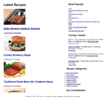
Figure 2.5. The floated columns cause the container to collapse
What we might normally expect to happen here is that the background appear green and a full red outline appear around all the contents of the.mainelement. But all we see is a 2px horizontal line at the top of the.mainelement.
to be done is remove one of the float declarations, and the full green background and red outline will appear as expected.
So in order to remedy the situation, floats need to be“cleared.”We can do this by adding a new section of code to ourstyles.cssfile:
.cf:before,
This float clearing method (often referred to as a“clearfix,”hence thecfclass se-lector,) comes again via Nicolas Gallagher.4Don’t be intimidated by what you see here; you don’t have to understand everything in this chunk of code. Once we have this in our stylesheet we just need to add a class ofcfto any element that collapses due to floats.
Notice this fix uses pseudo-elements (which we briefly introduced in Chapter 1,) and a couple of new properties, including theclearproperty.
Theclearproperty prevents an element from being affected by floated elements that appear before it. Floats generally cause all other elements to wrap around them, making them bump up against the side opposite the float direction. But adding the
clearproperty to subsequent elements causes those elements to drop below the floated element, just as they would if there were no floats present.
To cause the new styles to apply to our layout, let’s add a new class to our.main element:
<div class="main cf">
4
Notice the space separating the two classes. This is one of the features briefly mentioned in Chapter 1 that makes classes a far superior selector in comparison to other options: the fact that you can use multiple classes on a single HTML element.
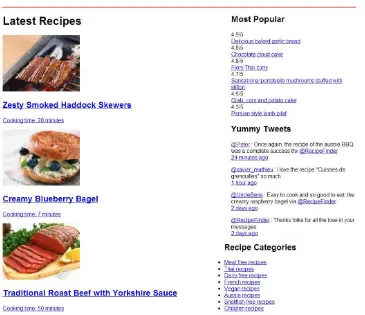
With those styles in place, the green background and red outline will appear as expected, confirming that our floated elements are now“clear.”We can then remove the background and outline we added.
Another benefit of clearing the floats is that our footer content is now appearing below the.maincontent, where it should be (albeit still unstyled) instead of bumping up against the right side of the left column as it was prior to adding the clearfix. It’s worth noting that we could have caused the footer to drop below the
.mainelement’s content simply by adding“clear: both”to the footer element itself. However, this would not have fixed the float clearing problem where the.main
element was collapsing.
Positioning in CSS
Another useful layout technique involves the use of CSS’s position property. Al-though it's possible to use this technique for layouts, in most cases you wouldn't use it for large structural elements the way you would with floats. Positioning, however, can come in handy to help place or align a specific element in a very precise manner.
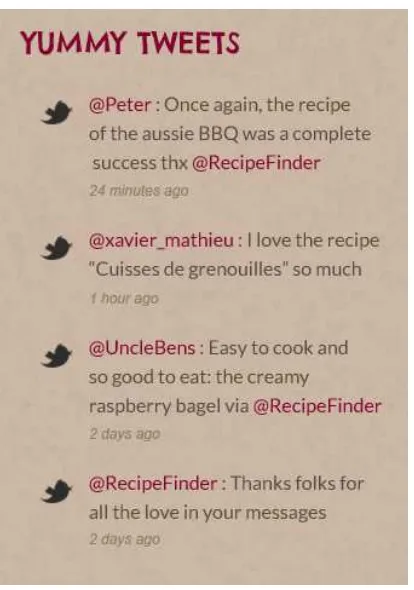
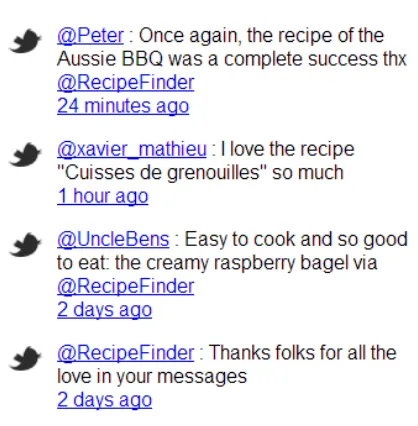
Figure 2.6. Our Yummy Tweets, as they appear in our original design
We’re going to use thepositionproperty to place the Twitter icons that you see next to each of those tweets. But before we do this, let’s consider exactly what properties we’ll use and how they work.
Absolute and Relative Positioning
CSS allows us to place an element anywhere on a page using thetop,bottom,left, andright properties along with thepositionproperty. Let’s look at an example:
.example {
position: absolute; top: 100px;
If there are no other positioning-related styles on our page, the.exampleelement shown above would be positioned 100px from the top and 100px from the left of the browser window (also called theviewport).
But this isn’t very practical. It’s not often that you’ll want to position an element relative to the browser window like this. The real practical value of absolute posi-tioning comes from combining it with a positioned parent element. Let’s improve on the code we just wrote and demonstrate what's meant by“positioned parent”:
.wrapper {
Now, instead of positioning the element relative to the full browser window, we're forcing positioning to occur relative to the.wrapperelement. The relative positioning set on.wrappercreates apositioning contextfor any positioned child elements. Now let’s combine this technique with the pseudo-elements we introduced in Chapter 1, so we can position our Twitter icon next to each tweet in our sidebar. Here is the HTML for a single“Yummy Tweet”:
<div class="tweet">
<p><a href="#">@Peter</a> : Once again, the recipe of the Aussie
➥BBQ was a complete success thx <a href="#">@RecipeFinder</a><br> <a href="#" class="date">24 minutes ago</a></p>
</div>
.tweet:before {
A pseudo-element uses the single-colon or double-colon syntax (we’re using single-colon for better browser support5) in combination with another CSS selector, to add a phony (i.e.“pseudo”) element inside the targeted element (the.tweetelement). In this example, we’re using abeforepseudo-element, so the inserted element will appear before the.tweetelement’s content.
Notice that the.tweet element is positioned relatively. Also notice that there are 55 pixels of padding set on the left side of the.tweetelement. Next, in the pseudo-element selector, we’re using the content property to define what exactly we want to insert (in this case it’s a transparent PNG Twitter icon,) and then we’re positioning the pseudo-element absolutely, 4px from the top and 40px from the left.
If we wanted, we could have inserted the Twitter icon inside our HTML using an
<img>tag. But in this case, since the icons are just decoration, we have the option to use a pseudo-element or background image. By contrast, the images that appear in the“Latest Recipes”section are not just decoration but are part of the main con-tent; so those shouldn't be inserted as background images or pseudo-elements via CSS, but should be placed into the HTML using<img>tags. We’ll talk more about backgrounds in the next chapter.
Since our pseudo-element is placed on the page using a class selector of.tweet, the pseudo-element will appear on every element on the page that has a class of
tweet. After we add these styles and refresh the page, our Yummy Tweets section will look like Figure 2.7.
5
Figure 2.7. Our Yummy Tweets after adding the Twitter icons using pseudo-elements
Adding the pseudo-element using absolute positioning is just one step towards styling this area. Overall, our website still needs a lot of styling, as does the Yummy Tweets section.
What about Responsive Web Design?
One of the biggest trends in the web design industry right now is Responsive Web Design (RWD). This book is an introduction to CSS, so we won’t be covering that particular technique in exhaustive detail; however, I will introduce the topic here, and in Chapter 5 we’ll use responsive design techniques to complete the coding of RecipeFinder.
RWD is centered on the use of media queries, a CSS feature that we haven’t discussed yet. Let’s take a quick look at the syntax for media queries so you can see how they can be used to build a responsive web design:
@media (max-width: 1500px) {
}
@media (max-width: 1200px) {
}
@media (max-width: 900px) {
}
What you see above are referred to in CSS asat-rules. There are other at-rules (identified by the @ symbol,) such as the@font-facerule, which we’ll talk about in Chapter 4.
The@mediaat-rules are used to define different CSS styles depending on certain media features, such as the width of the browser window. Inside the@mediablocks, (each of which starts and ends with the opening and closing curly braces,) you can include full rule sets. You can even repeat certain rule sets in separate media query blocks in order to override existing styles.
In Chapter 5, once we have the bulk of the site done, we’ll add some custom media queries to make the RecipeFinder website responsive.
Using
box-sizing
for Intuitive Sizing
.box {
width: 400px; padding-left: 20px; padding-right: 20px; }
Although the width of the.boxelement is defined explicitly as 400px, the actual width of the element will end up being 440px, because the left and right padding add to the width.
For a long time this has been an irritation that we’ve learned to deal with in CSS layouts. With thebox-sizingproperty, however, we can tell the browser to render all of our widths and heights at an exact pixel size, including any borders or padding settings. That is, if we define an explicit width or height, padding and borders will not affect that width and height.
We’re going to add this property to the top of our custom styles, using the universal selector:
The three lines of code you see here are exactly the same, but because some browsers’ support for these properties is“experimental,”we’re forced to use vendor prefixes (the-webkit-and-moz-prefixes in this example) for maximum browser compatib-ility. We’ll talk more about vendor prefixes in Chapter 5.
If we had added this padding prior to adding thebox-sizingdeclarations, the left column would no longer fit next to the right column inside of.main. But, by using
box-sizing, we prevent the padding from adding to the overall width of the column.
Adding More Layout Styles
We’ve already sized and centered the.mainelement. If you’ve been following along with the code examples, you’ll notice, however, that the header, promo (which is the big photo below the header), and footer sections are not aligned with the.main
element. So, let’s align those now:
.header-inside { width: 1020px; margin: 0 auto; }
.promo {
width: 1020px; margin: 0 auto; }
.footer-inside { width: 1020px; margin: 0 auto; }
First, to help with the look we’re trying to achieve, we’ve added an inner element inside our<header>and<footer>elements. Those two new elements in the HTML are classed as.header-insideand.footer-inside, respectively. We’re doing this so we can center the content inside the header and footer, while allowing the background of those elements to expand horizontally to the edges of the browser window.
Figure 2.8. The footer has a set width, but the background color expands to the full width of the window
Here you can see that, although the width of the footer area has expanded to the left and right (mimicking what might happen on a wider browser window), the content itself stays centered. The extra element inside<footer>helps achieve this.
There’s a problem, though. The styles in each of these three declaration blocks (.header-inside, .promo, and.footer-inside) are exactly the same, and they even match the styles we added to the.mainelement. Here’s an opportunity for us to take these common styles and create a simple reusable class that we can apply to any element that needs these exact styles.
So instead of four separate rule sets with the same styles, we’ll have one rule set as follows:
.center-global { width: 1020px; margin: 0 auto; }
And then we’ll add that class to every HTML element that needs those styles. Because of this reusable class we’ve created, we'll no longer need the.header-insideclass, so we’ll remove that from our HTML and CSS. The.promoand.footer-inside
classes will be used later, so we’ll keep those.