CSS Mastery
Advanced Web
Standards Solutions
Advanced Web Standards Solutions
Copyright © 2006 by Andy Budd, Cameron Moll, and Simon Collison
All rights reserved. No part of this work may be reproduced or transmitted in any form or by any means, electronic or mechanical, including photocopying, recording, or by any information storage or retrieval system,
without the prior written permission of the copyright owner and the publisher.
ISBN-13 (pbk): 978-1-59059-614-2 ISBN-10 (pbk): 1-59059-614-5
Printed and bound in the United States of America 9 8 7 6 5 4 3 2 1
Trademarked names may appear in this book. Rather than use a trademark symbol with every occurrence of a trademarked name, we use the names only in an editorial fashion and to the benefit of the trademark owner,
with no intention of infringement of the trademark.
Distributed to the book trade worldwide by Springer-Verlag New York, Inc., 233 Spring Street, 6th Floor, New York, NY 10013. Phone 1-800-SPRINGER, fax 201-348-4505,
e-mail [email protected], or visit www.springeronline.com.
For information on translations, please contact Apress directly at 2560 Ninth Street, Suite 219, Berkeley, CA 94710. Phone 510-549-5930, fax 510-549-5939, e-mail [email protected], or visit www.apress.com.
The information in this book is distributed on an “as is” basis, without warranty. Although every precaution has been taken in the preparation of this work, neither the author(s) nor Apress shall have any liability to any person or entity with respect to
any loss or damage caused or alleged to be caused directly or indirectly by the information contained in this work.
The source code for this book is freely available to readers at www.friendsofed.comin the Downloads section.
Product numbers for the images used in Tuscany Luxury Resorts are as follows: FAN1003579, FAN1003613, FAN1006983, and DVP0703035.
Credits
Diana Van Winkle, Van Winkle Design
for all your love and support over the last 9 months.
—Andy Budd
To Mam, Dad, Emma, Agenzia—
thank you for your support.
—Simon Collison
Foreword . . . xiii
About the Authors . . . xv
About the Technical Reviewer . . . xvii
Acknowledgments . . . xix
Introduction . . . xxi
Chapter 1: Setting the Foundations
. . .1
Chapter 2: Visual Formatting Model Recap
. . .27
Chapter 3: Background Images and Image Replacement
. . .43
Chapter 4: Styling Links
. . .69
Chapter 5: Styling Lists and Creating Nav Bars
. . .85
Chapter 6: Styling Forms and Data Tables
. . .111
Chapter 7: Layout
. . .133
Chapter 8: Hacks and Filters
. . .153
Chapter 9: Bugs and Bug Fixing
. . .167
Case Study 1: More Than Doodles
. . .185
Case Study 2: Tuscany Luxury Resorts
. . .217
Foreword . . . xiii
About the Authors . . . xv
About the Technical Reviewer . . . xvii
Acknowledgments . . . xix
Introduction . . . xxi
Chapter 1: Setting the Foundations
. . .1
Structuring your code . . . 2
Use meaningful markup . . . 3
IDs and class names . . . 5
Divs and spans . . . 7
Document types, DOCTYPE switching, and browser modes . . . 8
Validation . . . 9
Browser modes . . . 10
DOCTYPE switching . . . 10
Getting your styles to hit the target . . . 11
Common selectors . . . 11
Pseudo-classes . . . 12
The universal selector . . . 13
Advanced selectors . . . 13
Child and adjacent sibling selectors . . . 14
Attribute selectors . . . 14
The cascade and specificity . . . 16
Specificity . . . 16
Using specificity in your stylesheets . . . 17
Adding a class or an ID to the body tag . . . 18
Inheritance . . . 18
Planning, organizing, and maintaining your stylesheets . . . 19
Applying styles to your document . . . 19
Commenting your code . . . 21
Adding structural comments . . . 21
Note to self . . . 22
Removing comments and optimizing your stylesheets . . . 23
Style guides . . . 23
Aligning elements using absolute positioning . . . 226
Location properties (top, bottom, left, right) . . . 227
Stacking order (z-index) . . . 229
Background image techniques . . . 230
Dividing the top in three . . . 231
“Bulletproofing” a background . . . 232
Image replacement . . . 234
Logo image replacement . . . 235
Initial cap image replacement . . . 236
Fluid imagery . . . 237
Coding a fluid image . . . 238
Using a single list item for multiple elements . . . 240
Coding the menu . . . 240
Summary . . . 244
In our wonderful world of web design, there are 3,647 ways to accomplish the same goal. Approximately. And that absurdly fictitious number is increasing every day. Instead of one, correct way of solving a particular problem, we’re both blessed and cursed by the abundant choices we have as web designers. It’s these choices that make designing for the Web fun and interesting, while at the same time overwhelming. CSS Masterywill help cure that over-whelmingitis(a word that I’ve just invented).
Andy Budd has been writing, designing, and speaking about standards-based web design for years, and we’re now lucky to see his clear, easy-to-follow way of teaching essential CSS tech-niques compiled in this very book. The result is a card catalog of indispensable solutions, tricks, and tips that a web professional such as yourself should not be without.
I’ve always frowned on publications that suggest a single, correct way of accomplishing a goal, and Andy does the complete opposite, offering multiple methods for tasks such as styling links, creating tabbed navigation, or creating columned layouts (to name but a few). Armed with these popular and stylish approaches to common design elements, you’ll be bet-ter prepared to make your own informeddecisions.
And as if that wasn’t enough, Andy’s gone ahead and enlisted the help of two imitable designers to help pull all the pieces together, showing how these essential techniques can work together. I’ve long been a fan of Cameron’s and Simon’s work, and to see two great case studies covering fluid, bulletproof designs as well as flexible style solutions, respec-tively… well, that’s just a gigantic bonus.
So dig in and start chipping away at those 3,647 ways to master your CSS.
Dan Cederholm Salem, Massachusetts
Andy Budd is a user experience designer and web standards developer living and working in Brighton, England. As the creative director of web design consultancy Clearleft (www.clearleft.com), Andy enjoys building attractive, accessible, and standards-compliant websites. His online home can be found at www.andybudd.com, where he writes about modern web design practices.
Andy is a regular speaker at international design conferences, workshops, and training events, and organized the UK’s first web 2.0 conference (www.dconstruct.org). Passionate about the quality of education in the industry, Andy runs SkillSwap (www.skillswap.org), a free community training and networking project. Andy also helped set up the Web Standards Awards (www.webstandardsawards.com), a project that aims to recognize websites for their use of web standards.
Cameron Moll, recognized as one of the industry’s most balanced new media designers, is proficient in functional web design, elegant inter-faces, and clean markup. Cameron has been involved in the design and redesign of scores of websites, and his influential techniques have found favor in circles across the Web. A marketing background and a keen eye for design lead him to merge form and function in the form of com-pelling visual experiences.
Cameron's work has been recognized by respected organizations and notable individuals such as National Public Radio (NPR), Communication Arts, and Veer. His personal site, CameronMoll.com, delivers design how-tos in the form of engaging conversation, on-topic banter, and downloadable artwork source files.
Simon Collison is Lead Web Developer at Agenzia (www.agenzia. co.uk), and has worked on numerous web projects for record labels, high-profile recording artists, and leading visual artists and illustrators, including The Libertines, Black Convoy, and Project Facade. Simon also oversees a production line of business, community, and voluntary sector websites, and passionately ensures everything he builds is accessible and usable, and complies with current web standards. Simon regularly reviews CSS-based websites for Stylegala, and does his best to keep his highly popular blog (www.collylogic.com) updated with noise about web standards, music, film, travels, and more web standards.
Andy Budd
Thanks to everybody who helped make this book possible, both directly and indirectly.
To Chris for guiding me through the writing process and helping turn my ideas into reality. And to everybody at Apress who worked tirelessly to get this book published on time. Your dedication and professionalism is much appreciated.
To my friends and colleagues at Clearleft (www.clearleft.com), Jeremy Keith (www.adactio.com) and Richard Rutter (www.clagnut.com), for providing encouragement and feedback through-out the book-writing process.
To Molly E. Holzschlag for lending your experience and breadth of knowledge to this book. Your support and guidance was invaluable, and I still don’t know where you manage to find the time.
To Jamie Freeman and Jo Acres for providing the perfect environment in which to develop my skills. I’ll pop around for tea and doughnuts soon. Thanks also to the Brighton web develop-ment community at large, and especially everybody on the BNM and SkillSwap mailing lists.
To all my colleagues who continue to share their wealth of knowledge in order to make the Web a better place. This book would not have been possible without the previous work of the following people, to name but a few: Cameron Adams, John Allsopp, Nathan Barley, Holly Bergevin, Douglas Bowman, The BritPack, Dan Cederholm, Tantek Çelik, Joe Clark, Andy Clarke, Simon Collison, Mike Davidson, Garrett Dimon, Derek Featherstone, Nick Fink, Patrick Griffiths, Jon Hicks, Shaun Inman, Roger Johansson, Ian Lloyd, Ethan Marcotte, Drew McLellan, Eric Meyer, Cameron Moll, Dunstan Orchard, Veerle Pieters, D. Keith Robinson, Jason Andrew Andrew Santa Maria, Dave Shea, Ryan Sims, Virtual Stan, Jeffrey Veen, Russ Weakley, Simon Willison, and Jeffrey Zeldman.
To all the readers of my blog and everybody I’ve met at conferences, workshops, and train-ing events over the last year. Your discussions and ideas helped fuel the content of this book.
Big thanks to Mel, for proofreading each chapter and putting up with me over the last 9 months.
Cameron Moll
I’d like to give gratitude to all the contributors to my case study. A big nod goes to Ryan Parman, whose TIMEDATE script was used to generate the day/month stamp in the upper-right corner of the Tuscany layout. Download a copy of his script here:
www.skyzyx.com/scripts/.
And endless thanks to Veer for providing the gorgeous images used in this layout. Without their help, Tuscany Luxury Resorts may have otherwise been visually drab. Somehow, without fail, Veer always delivers unique, phenomenal visual elements—photography, type, merchan-dise, and more—that are far from commonplace. Access their collections here: www.veer.com/.
Simon Collison
There are an increasing number of CSS resources around, yet you only have to look at a CSS mailing list to see the same questions popping up time and again. “How do I center a design?” “What is the best rounded-corner box technique?” “How do I create a three-column layout?” If you follow the CSS design community, it is usually a case of remembering which website a particular article or technique is featured on. However, if you are relatively new to CSS, or don’t have the time to read all the blogs, this information can be hard to track down.
Even people who are skilled at CSS run into problems with some of the more obscure aspects of CSS such as the positioning model or specificity. This is because most CSS devel-opers are self-taught, picking up tricks from articles and other people’s code without fully understanding the spec. And is it any wonder, as the CSS specification is complex and often contradictory, written for browser manufacturers rather than web developers?
Then there are the browsers to contend with. Browser bugs and inconsistencies are one of the biggest problems for the modern CSS developer. Unfortunately, many of these bugs are poorly documented and their fixes verge on the side of folk law. You know that you have to do something a certain way or it will break in one browser or another. You just can’t remember which browser or how it breaks.
So the idea for a book formed. A book that brings together the most useful CSS techniques in one place, that focuses on real-world browser issues and that helps plug common gaps in people’s CSS knowledge. A book that will help you jump the learning curve and have you coding like a CSS expert in no time flat.
Who is this book for?
How is this book structured?
This book eases you in gently, with two chapters on basic CSS concepts and best practices. You will learn how to structure and comment your code, the ins-and-outs of the CSS posi-tioning model, and how floating and clearing really works. You may know a lot of this already, but you will probably find bits you’ve missed or not understood fully. As such, the first two chapters act as a great CSS primer as well as a recap on what you already know.
With the basics out of the way, the next five chapters cover core CSS techniques such as image, link, and list manipulation; form and data-table design; and pure CSS layout. Each chapter starts simply and then works up to progressively more complicated examples. In these chapters you will learn how to create rounded-corner boxes, images with transparent drop shadows, tabbed navigation bars, and flickr-style rollovers. If you want to follow along with the examples in this book, all the code examples can be downloaded from www.friendsofed.com.
Browser bugs are the bane of many a CSS developer, so all the examples in this book focus on creating techniques that work across browsers. What’s more, this book has two whole chapters devoted to hacks, filters, bugs, and bug fixing. In these chapters you will learn about some of the most common filters, when to use them, and when not to use them. You will also learn about bug-hunting techniques and how to spot and fix common bugs before they start causing problems. You will even learn what really causes many of Microsoft Internet Explorer’s seemingly random CSS bugs.
The last two chapters are the piece de resistance. Simon Collison and Cameron Moll, two of the best CSS designers around, have combined all of these techniques into two fantastic case studies. So you learn not only how these techniques work, but also how to put them into practice on a real-life web project.
Conventions used in this book
This book uses a couple of conventions that are worth noting. The following terms are used throughout this book:
(X)HTML refers to both the HTML and XHTML languages.
Unless otherwise stated, CSS relates to the CSS 2.1 specification.
IE 5.x/Win means Internet Explorer versions 5.0 and 5.5 for Windows.
IE 6 and below on Windows refers to Internet Explorer 5.0 to 6.0 on Windows.
It is assumed that all the (X)HTML examples in this book are nested in the <body>of a valid document, while the CSS is contained in the <head>of the document for convenience. Occasionally, (X)HTML and CSS have been placed in the same code example for brevity. However, in a real document, these items need to go in their respective places to function correctly.
p {color: red;} <p>I'm red</p>
Lastly, for (X)HTML examples that contain repeating data, rather than writing out every line, the ellipsis character (…) is used to denote code continuation:
<ul>
<li>Red</li> <li>Yellow</li> <li>Pink</li> <li>Green</li>
…
</ul>
The human race is a naturally inquisitive species. We just love tinkering with things. When
I recently bought a new iMac G5 I had it to bits within seconds, before I’d even read the instructions. We enjoy working things out ourselves, creating our own mental models about how we think things behave. We muddle through and only turn to the manual when something goes wrong or defies our expectations.
One of the best ways to learn Cascading Style Sheets (CSS) is to jump right in and start tin-kering. However, if you’re not careful you may end up misunderstanding an important concept or building in problems for later on. In this chapter, I am going to review some basic, but often misunderstood, concepts and show you how to keep your (X)HTML and CSS clear and well structured.
In this chapter you will learn about
The importance of a well-structured and meaningful document
Coding best practices
Common coding mistakes
Document types, DOCTYPE switching, and browser modes
Ways to target your styles
The cascade, specificity, and inheritance
Structuring your code
Most people don’t think about the foundations of a building. However, without solid foundations, the majority of the buildings around us wouldn’t exist. While this book is about advanced CSS techniques, much of what we are going to do would not be possible (or would be very difficult) without a well-structured and valid (X)HTML document to work with.
In this section you will learn why well-structured and meaningful (X)HTML is important in CSS development. You will also learn how you can add more meaning to your documents, and by doing so, make your job as a developer easier.
Use meaningful markup
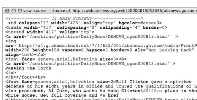
The early Web was little more than a series of interlinked research documents using HTML to add basic formatting and structure. However, as the World Wide Web increased in pop-ularity, HTML started being used for presentational purposes. Instead of using heading ele-ments for page headlines, people would use a combination of font and bold tags to create the visual effect they wanted. Tables got co-opted as a layout tool rather than a way of dis-playing data, and people would use blockquotes to add whitespace rather than to indicate quotations. Very quickly the Web lost its meaning and became a jumble of font and table tags (see Figure 1-1).
Figure 1-1. The markup for the lead story from abcnews.com on August 14, 2000, uses tables for layout and large, bold text for headings. The code lacks structure and is difficult to understand.
HTML was intended to be a simple and understandable markup language. However, as web pages became more and more presentational, the code became almost impossible to understand. As such, complicated WYSIWYG (What You See Is What You Get) tools were needed to handle this mass of meaningless tags. Unfortunately, rather than making things simpler, these tools added their own complicated markup to the mix. By the turn of the millennium, the average web page was so complicated it was almost impossible to edit by hand for fear of breaking the code. Something needed to be done.
Then along came Cascading Style Sheets. With CSS it became possible to control how a page looked externally and to separate the presentational aspect of a document from its content. Presentational tags like the font tag could be ditched, and layout could be con-trolled using CSS instead of tables. Markup could be made simple again, and people began to develop a newfound interest in the underlying code.
Meaning started to creep back into documents. Browser default styles could be overrid-den so it became possible to mark something up as a heading without it being big, bold, and ugly. Lists could be created that didn’t display as a series of bullet points, and block-quotes could be used without the associated styling. Developers started to use (X)HTML elements because of what they meant rather than how they looked (see Figure 1-2).
Figure 1-2. The markup for the lead story on abcnews.com from earlier this year is well structured and easy to understand. While it does contain some presentational markup, the code is a significant improvement on the code in Figure 1-1.
Meaningful markup provides the developer with several important benefits. Meaningful pages are much easier to work with than presentational ones. For example, say you need to change a quotation on a page. If the quotation is marked up correctly, it is easy to scan through the code until you find the first blockquoteelement. However, if the quotation is just another paragraph element tag, it will be a lot harder to find.
As well as being easy for humans to understand, meaningful markup—otherwise known as semantic markup—can be understood by programs and other devices. Search engines, for instance, can recognize a headline because it is wrapped in h1tags and assign more impor-tance to it. Screenreader users can rely on headings as supplemental page navigation.
Most importantly for the context of this book, meaningful markup provides you with a simple way of targeting the elements you wish to style. It adds structure to a document and creates an underlying framework to build upon. You can style elements directly with-out needing to add other identifiers, and thus avoid unnecessary code bloat.
(X)HTML includes a rich variety of meaningful elements, such as
h1, h2, etc.
blockquote and cite
abbr, acronym, and code
fieldset, legend, and label
caption, thead, tbody, and tfoot
As such, it is always a good idea to use an appropriate meaningful element where one exists.
IDs and class names
Meaningful elements provide an excellent foundation, but the list of available elements
isn’t exhaustive. (X)HTML was created as a simple document markup language rather than an interface language. Because of this, dedicated elements for things such as content areas or navigation bars just don’t exist. You could create your own elements using XML, but for reasons too complicated to go into, it’s not very practical at this time.
The next best thing is to take existing elements and give them extra meaning with the addition of an ID or a class name. This adds additional structure to your document, and provides useful hooks for your styles. So you could take a simple list of links, and by giving it an ID of mainNav, create your own custom navigation element.
<ul id="mainNav">
<li><a href="#">Home</a></li> <li><a href="#">About Us</a></li> <li><a href="#">Contact</a></li> </ul>
An ID name is used to identify an individual element on a page, such as the site navigation, and must be unique. IDs are useful for identifying persistent structural elements such as the main navigation or content areas. They are also useful for identifying one-off ele-ments—a particular link or form element, for example.
Across a site, ID names should be applied to conceptually similar elements in order to avoid confusion. Technically, you could give both your contact form and your contact details the ID name of contact, assuming they were on separate pages. However, you would then need to style each element based on its context, which could be problematic. Instead, it would be much simpler to use distinct ID names such as contactForm and
contactDetails.
While a single ID name can only be applied to one element on a page, the same class name can be applied to any number of elements on a page. Classes are very useful for identify-ing types of content or similar items. For instance, you may have a news page that contains the date of each story. Rather than giving each date a separate ID, you could give all of them a class name of date.
When naming your IDs and classes, it is important that you keep the names as meaningful and “un-presentational” as possible. For instance, you could give your section navigation an ID of rightHandNavas that is where you want it to appear. However, if you later choose to position it on the left, your CSS and (X)HTML will go out of sync. Instead, it would make
more sense to name the element subNavor secondaryNav. These names explain what the element is rather than how it is presented. The same is true of class names. Say you want all your error messages to be red. Rather than using the class name red, choose something more meaningful like erroror feedback(see Figure 1-3).
Figure 1-3. Good and bad ID names
When writing class and ID names, you need to pay attention to case sensitivity. CSS is gen-erally a case-insensitive language. However, the case-sensitivity of things that appear in the markup, such as class and ID names, depends on the case sensitivity of the markup lan-guage. If you are using XHTML, class and ID names are case sensitive, whereas with regular HTML they are case insensitive. The best way to handle this issue is simply to be consistent with your naming conventions. So, if you use camel case in your (X)HTML class names, carry this through to your CSS as well.
Due to the flexibility of classes, they can be very powerful. At the same time, they can be overused and even abused. Novice CSS authors often add classes to nearly everything in an attempt to get fine-grained control over their styles. Early WYSIWYG editors also had the tendency to add classes each time a style was applied. Many developers picked up this bad habit when using generated code to learn CSS. This affliction is described as classitis and is, in some respects, as bad as using table-based layout because it adds meaningless code to your document.
<h3 class="newsHead">Zeldman.com turns 10</h3> <p class="newsText">
Another milestone for Jeffrey as zeldman.com turns 10 today </p>
<p class="newsText"><a href="news.php" class="newsLink">More</a></p>
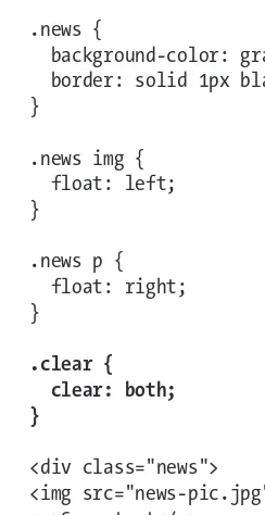
In the preceding example, each element is identified as being part of a news story by using an individual news-related class name. This has been done to allow news headlines and text to be styled differently from the rest of the page. However, you don’t need all these extra classes to target each individual element. Instead, you can identify the whole block as a news item by wrapping it in a division with a class name of news. You can then target news headlines or text by simply using the cascade.
<div class="news">
<h3>Zeldman.com turns 10</h3>
Removing extraneous classes in this way will help simplify your code and reduce page weight. I will discuss CSS selectors and targeting your styles shortly. However, this overre-liance on class names is almost never necessary. I usually only apply a class to an element
if an ID isn’t suitable, and I try to use them sparingly. Most documents I create usually only need the addition of a couple of classes. If you find yourself adding lots of classes, it’s probably an indication that your (X)HTML document is poorly structured.
Divs and spans
One element that can help add structure to a document is a divelement. Many people mistakenly believe that a div element has no semantic meaning. However, div actually stands for divisionand provides a way of dividing a document into meaningful areas. So by wrapping your main content area in a divand giving it an ID of mainContent, you are adding structure and meaning to your document.
To keep unnecessary markup to a minimum, you should only use a divelement if there is no existing element that will do the job. For instance, if you are using a list for your main navigation, there is no need to wrap it in a div.
You can remove the diventirely and simply apply the ID to the list instead:
<ul id="mainNav"> <li>Home</li> <li>About Us</li> <li>Contact</li> </ul>
Using too many divs is often described as divitus and is usually a sign that your code is poorly structured and overly complicated. Some people new to CSS will try to replicate their old table structure using divs. But this is just swapping one set of extraneous tags for another. Instead, divs should be used to group related items based on their meaning or function rather than their presentation or layout.
Whereas divs can be used to group block-level elements, spans can be used to group or identify inline elements:
<h2>Where’s Durstan?</h2>
<p>Published on <span class="date">March 22nd, 2005</span> by <span class="author">Andy Budd</span></p>
It’s generally less common to need to group or identify inline elements, so spans are seen less frequently than divs. Where you will see spans used are effects such as image replace-ment, which use them as extra hooks to hang additional styles on.
Although the goal is to keep your code as lean and meaningful as possible, sometimes you cannot avoid adding an extra nonsemantic div or span to display the page the way you want. If this is the case, don’t fret too much over it. We live in a transitional period and hopefully CSS 3 will give us much greater control of our documents. In the meantime, real-world needs often have to come before theory. The trick is knowing when you have to make a compromise and if you are doing it for the right reasons.
Document types, DOCTYPE switching,
and browser modes
A document type definition (DTD) is a set of machine-readable rules that define what is and isn’t allowed in a particular version of XML or (X)HTML. Browsers will use these rules when parsing a web page to check the validity of the page and act accordingly. Browsers know which DTD to use, and hence which version of (X)HTML you are using, by analyzing the page’s DOCTYPE declaration.
A DOCTYPE declaration is a line or two of code at the start of your (X)HTML document that describes the particular DTD being used. In this example, the DTD being used is for XHTML 1.0 Strict:
<!DOCTYPE html PUBLIC "-//W3C//DTD XHTML 1.0 Strict//EN" "http://www.w3.org/TR/xhtml1/DTD/xhtml1-strict.dtd">
CSS comes in various versions, or “levels,” so it’s important to know which ver-sion to use. CSS 1 became a recommendation at the end of 1996 and contains very basic properties such as fonts, colors, and margins. CSS 2 built on this and added advanced concepts such as floating and positioning to the mix, as well as advanced selectors such as the child, adjacent sibling, and universal selectors. At the time of writing, CSS 2 was still the latest version of CSS, despite becoming a recommendation as long ago as 1998.
Time moves very slowly at the World Wide Web Consortium (W3C), so while work on CSS 3 started before the turn of the millennium, the final release is still a long way off. To help speed development and browser implementation, CSS 3 has been broken down into modules that can be released and implemented independently. CSS 3 contains some exciting new additions, including a module for multicolumn layout. However, the selectors module is nearest completion and could possibly become a recommendation as early as 2006.
DOCTYPE declarations will typically, but not always, contain a URL to the specified DTD file. Browsers tend to not read these files, choosing instead to recognize common DOCTYPE declarations.
Validation
As well as being semantically marked up, an (X)HTML document needs to be written using valid code. If the code is invalid, browsers will try to interpret the markup themselves, sometimes getting it wrong. Worse still, if an XHTML document is being sent with the
cor-rect MIME type, browsers that understand XML simply won’t display an invalid page. Because browsers need to know which DTD to use in order to process the page correctly, a DOCTYPE declaration is required for the page to validate.
You can check to see if your (X)HTML is valid by using the W3C validator, a validator book-marklet, or a plug-in like the Firefox Developer Extension. Many (X)HTML editors now have validators built in, and you can even install a copy of the W3C validator locally on your computer. The validator will tell you if your page validates, and if not, why not.
Validation is important because it can help you track down bugs in your code. As such, it is a good idea to get into the habit of validating early and often. However, validation isn’t an end unto itself, and many otherwise good pages fail to validate due to small errors such as unencoded ampersands, or because of legacy content. So although validation is impor-tant, in the real world, a degree of common sense is required.
Various code validation tools are available. You can validate your site online by going to http://validator.w3.org/ and entering your URL. However, if you are going to validate often—which is a good idea—typing your URL each time can become a little tedious. Instead, I use a handy validation bookmarklet, or favelet, which is a small piece of JavaScript that can be stored in the bookmarks or favorites folder in your browser. Clicking the bookmark will trigger the JavaScript action. In the case of the validator bookmarklet, it runs the page you are currently on through the W3C validator and displays the results. You can find the validator bookmarklet along with many other handy web development bookmarklets on my personal site at www.andybudd.com/bookmarklets/.
If you use Firefox, you can download and install a wide variety of plug-ins. Among the numerous validator plug-ins available, my personal favorite is the Web Developers Extension plug-in. As well as allowing you to validate your (X)HTML and CSS, it enables you to do a wide variety of other useful tasks like outlining various (X)HTML elements, turning off stylesheets, and even editing styles in the browser. The Web Developers Extension can be downloaded from
http://chrispederick.com/work/firefox/webdeveloper/and is a must-have for any CSS developer using Firefox.
There is now also a developer toolbar for Internet Explorer 6 and above. You can download this toolbar from http://tinyurl.com/7mnyh. Although it is not as feature rich as the Firefox toolbar, it is still extremely useful.
As well as being important for validation, browsers have started to use DOCTYPE declara-tions for another purpose.
Browser modes
When browser manufacturers started to create standards-compliant browsers, they wanted to ensure backward compatibility. To accomplish this, they created two rendering modes: standards mode and quirks mode. In standards mode the browser renders a page according to the specifications, and in quirks mode pages are displayed in a looser, more backward-compatible fashion. Quirks mode typically emulates the behavior of older browsers such as Microsoft Internet Explorer 4 and Netscape Navigator 4 to prevent older sites from breaking.
The most obvious example of the difference between these modes revolves around the Internet Explorer on Windows proprietary box model. When Internet Explorer 6 debuted, the correct box model was used in standards mode, while the older, proprietary box model was used in quirks mode. To maintain backward compatibility with sites built for IE 5 and below, Opera 7 and above also uses IE’s faulty box model in quirks mode.
Other differences in rendering are subtler and specific to certain browsers. However, they include things like not requiring the #symbol for hex color values, assuming lengths with-out units in CSS are pixels, and increasing the font size by one step when using keywords.
Mozilla and Safari have a third mode called “almost standards mode,” which is the same as standards mode, except for some subtle differences in the way tables are handled.
DOCTYPE switching
The browser chooses which rendering method to use based on the existence of a DOC-TYPE declaration and the DTD being used. If an XHTML document contains a fully formed DOCTYPE, it will normally be rendered in standards mode. For an HTML 4.01 document, a DOCTYPE containing a strict DTD will usually cause the page to render in standards mode. A DOCTYPE containig a transitional DTD and URI will also cause the page to render in stan-dards mode, while a transitional DTD without a URI willcause the page to render in quirks mode. A badly formed or nonexistent DOCTYPE will cause both HTML and XHTML docu-ments to be rendered in quirks mode.
The effect of choosing a rendering mode based on the existence of a DOCTYPE is known as DOCTYPE switching, or DOCTYPE sniffing. Not all browsers follow these exact rules, but they give you a good idea of how DOCTYPE switching works. Eric Meyer has done some further research on this subject and has created a chart (http://meyerweb.com/ eric/dom/dtype/dtype-grid.html) that shows the various rendering modes different browsers use depending on the DOCTYPE declaration in use.
<!DOCTYPE HTML PUBLIC "-//W3C//DTD HTML 4.01//EN" "http://www.w3.org/TR/html4/strict.dtd">
<!DOCTYPE html PUBLIC "-//W3C//DTD XHTML 1.0 Transitional//EN" "http://www.w3.org/TR/xhtml1/DTD/xhtml1-transitional.dtd"> <!DOCTYPE html PUBLIC "-//W3C//DTD XHTML 1.0 Strict//EN"
"http://www.w3.org/TR/xhtml1/DTD/xhtml1-strict.dtd">
Many HTML editors will automatically add a DOCTYPE declaration for you. If you are cre-ating an XHTML document they may also add an XML declaration before the DOCTYPE declaration:
<?xml version="1.0" encoding="utf-8"?>
An XML declaration is an optional declaration used by XML files to define things such as the version of XML being used and the type of character encoding. Unfortunately, IE 6 automatically switches to quirks mode if the DOCTYPE declaration is not the first element on a page. Therefore, unless you are serving your pages as XML documents, it is best to avoid using an XML declaration.
Getting your styles to hit the target
A valid and well-structured document provides the framework to which your styles are applied. To be able to style a particular (X)HTML element using CSS, you need to have some way of targeting that element. In CSS the part of a style rule that does this is called the selector.
Common selectors
The most common kinds of selectors are type and descendant selectors. Type selectors are used to target a particular type of element, such as a paragraph, an anchor, or a heading element. You do this by simply specifying the name of the element you wish to style. Type selectors are sometimes also referred to as elementor simpleselectors.
p {color: black;}
a {text-decoration: underline;} h1 {font-weight: bold;}
Descendant selectors allow you to target the descendants of a particular element or group of elements. A descendant selector is indicated by a space between two other selectors. In this example, only anchor elements that are descendants of a list item will be styled, so anchors within a paragraph will be unaffected.
li a {text-decoration: none;}
These two types of selector are great for applying generic styles that apply across the board. To be more specific and target selected elements, you can use ID and class selec-tors. As the names suggest, these selectors will target elements with the corresponding ID or class name. ID selectors are identified using a hash character; class selectors are identi-fied with a period. The first rule in this example will make the text in the introductory paragraph bold, and the second rule will make the date green:
#intro {font-weight: bold;} .datePosted {color: green;} <p id="intro">Some Text</p>
<p class="datePosted">24/3/2006</p>
As I mentioned previously, many CSS authors develop an overreliance on class and, to a lesser extent, ID selectors. If they want to style headlines one way in the main content area and another way in the secondary content area, there is the tendency to create two classes and apply a class to each headline. A much simpler approach is to use a combination of type, descendant, ID, and/or class selectors:
#mainContent h1 {font-size: 1.8em;}
This is a very simple and obvious example. However, you will be surprised how many ele-ments you can successfully target using just the four selectors discussed so far. If you find yourself adding lots of extraneous classes to your document, it is probably a warning sign that your document is not well structured. Instead, think about how these elements differ from each other. Often you will find that the only difference is where they appear on the page. Rather than give these elements different classes, think about applying a class or an ID to one of their ancestors, and then targeting them using a descendant selector.
Pseudo-classes
There are instances where you may want to style an element based on something other than the structure of the document—for instance, the state of a form element or link. This can be done using a pseudo-class selector.
/* makes all visited links green */ a:visited {color:green;}
/* makes links red when hovered or activated */ a:hover, a:active {color:red;}
/* makes table rows red when hovered over */ tr:hover {background-color: red;}
/* makes input elements yellow when focus is applied */ input:focus {background-color:yellow;}
:linkand :visitedare known as linkpseudo-classes and can only be applied to anchor elements. :hover, :active, and :focusare known as dynamic pseudo-classes and can theoretically be applied to any element. Unfortunately, only a few modern browsers such as Firefox support this functionality. IE 6 and below only pays attention to :activeand
:hoverselectors if applied to an anchor link, and ignores :focuscompletely.
The universal selector
The universal selector is possibly one of the most powerful and least used of all the selec-tors. The universal selector acts like a wildcard, matching all the available elements. Like wildcards in other languages, the universal selector is denoted by an asterisk. The universal selector is normally used to style every element on a page. For instance, you can remove the default browser padding and margin on every element using the following rule:
* {
padding: 0; margin: 0; }
When combined with other selectors, the universal selector can be used to style all the descendants of a particular element, or skip a level of descendants. You will see how this can be put to practical effect a little later in this chapter.
Advanced selectors
CSS2 has a number of other useful selectors. Unfortunately, while modern browsers such as Firefox and Safari support these advanced selectors, IE 6 and below do not. Luckily, CSS
was created with backward compatibility in mind. If a browser doesn’t understand a selec-tor, it ignores the whole rule. That way, you can apply stylistic and usability embellishments in more modern browsers, and not worry about it causing problems in older browsers. Just remember to avoid using these more advanced selectors for anything critical to the func-tioning of your site.
Child and adjacent sibling selectors
The first of these advanced selectors is the child selector. Whereas a descendant selector will select all the descendants of an element, a child selector only targets the element’s immediate descendants, or “children.” In the following example, the list items in the outer list will be bold while list items in the nested list will remain unaffected:
#nav > li {font-weight: bold;} <ul id="nav">
It is possible to “fake” a child selector that works in IE 6 and below by using the universal selector. To do this you first apply to all of the descendants the style you want the children to have. You then use the universal selector to override these styles on the children’s descendants. So to fake the previous child selector example you would do this:
#nav li {font-weight: bold;} #nav li * {font-weight: normal;}
You may also want to style an element based on its proximity to another element. The adjacent sibling selector allows you to target an element that is preceded by another ele-ment that shares the same parent. Using the sibling selector, you could make the first paragraph following a top-level heading bold, while leaving other paragraphs unaffected:
h1 + p {font-weight: bold;} <h1>Main Heading</h1> <p>First Paragraph</p> <p>Second Paragraph</p>
Attribute selectors
As the name suggests, the attribute selector allows you to target an element based on the existence of an attribute or the attribute’s value. This allows you to do some very interest-ing and powerful thinterest-ings.
For example, when you hover over an element with a titleattribute, most browsers will display a tooltip. You can use this behavior to expand the meaning of things such as abbre-viations:
However, there is no way to tell that this extra information exists without hovering over the element. To get around this problem, you can use the attribute selector to style abbr
elements with titles differently from other elements—in this case, by giving them a dotted bottom border. You can provide more contextual information by changing the cursor from a pointer to a question mark when the cursor hovers over the element, indicating that this element is different from most.
abbr[title] {border-bottom: 1px dotted #999;} abbr[title]:hover {cursor: help;}
In addition to styling an element based on the existence of an attribute, you can apply styles based on a particular value. For instance, sites that are linked to using a rel attrib-ute of nofollowgain no added ranking benefit from Google. The following rule displays an image next to such links, possibly as a way of showing disapproval of the target site:
a[rel="nofollow"] {
background-image: url(nofollow.gif); padding-right: 20px;
}
One clever way of using the attribute selector is to capitalize on the fact that IE 6 and below does not support it. You can then apply one style to IE and another style to more standards-compliant browsers. For instance, IE has problems displaying 1-pixel dotted borders, choosing to render them dashed instead. Using an attribute selector, you could choose to apply your dotted-border style only to browsers you know will render it correctly. This is done by targeting the classattribute rather than using a class selector.
.intro {border-style: solid;}
[class="intro"] {border-style: dotted;}
Some attributes can have more than one value, separated by spaces. The attribute selector allows you to target an element based on one of those values. For instance, a group of developers have suggested using predefined keywords in the attribute of links to define the relationship one site owner has with another. You can use this information to apply an image to any links that contain the keyword friendin the relattribute.
a[rel~="friend"] {background-image: url(friend.gif);}
<a href="http://www.hicksdesign.com/" rel="friend met colleague" > John Hicks
</a>
Using the rel attribute with friend values is known as the XHTML Friends Network, or XFN for short, and is one of several new “microformats” to have developed recently. You can find out more about XFN at
http://gmpg.org/xfn/ and about the concept of microformats in general at http://microformats.org.
Once these advanced CSS 2 selectors are widely supported, the need to add extra divs or classes to your code will be greatly reduced.
The cascade and specificity
With even a moderately complicated stylesheet, it is likely that two or more rules will tar-get the same element. CSS handles such conflicts through a process known as the cascade. The cascade works by assigning an importance to each rule. Author stylesheets are con-sidered the most important, followed by user stylesheets, and finally the default stylesheets used by your browser or user agent. To give users more control, they can over-ride any rule by specifying it as !important—even a rule flagged as !importantby the author.
So the cascade works in the following order of importance:
User styles flagged as !important
Author styles flagged as !important
Author styles
User styles
Styles applied by the browser/user agent
Rules are then ordered by how specific the selector is. Rules with more specific selectors override those with less specific ones. If two rules are equally specific, the last one defined takes precedence.
Specificity
To calculate how specific a rule is, each type of selector is assigned a numeric value. The specificity of a rule is then calculated by adding up the value of each of its selectors. Unfortunately, specificity is not calculated in base 10 but a high, unspecified, base number. This is to ensure that a highly specific selector, such as an ID selector, is never overridden by lots of less specific selectors, such as type selectors. However, if you have fewer than 10 selectors in a specific selector, you can calculate specificity in base 10 for simplicity’s sake.
The specificity of a selector is broken down into four constituent levels: a, b, c, and d.
If the style is an inline style, then a = 1.
b = the total number of ID selectors.
c = the number of class, pseudo-class, and attribute selectors.
d = the number of type selectors and pseudo-element selectors.
Table 1-1. Specificity example
Selector Specificity Specificity in base 10
Style="" 1,0,0,0 1000
#wrapper #content {} 0,2,0,0 200
#content .datePosted {} 0,1,1,0 110
div#content {} 0,1,0,1 101
#content {} 0,1,0,0 100
p.comment .dateposted {} 0,0,2,1 21
p.comment{} 0,0,1,1 11
div p {} 0,0,0,2 2
p {} 0,0,0,1 1
At first glance, all this talk of specificity and high but undefined based numbers may seem a little confusing, so here’s what you need to know. Essentially, a rule written in a style attribute will always be more specific than any other rule. A rule with an ID will be more specific than one without an ID, and a rule with a class selector will be more specific than a rule with just type selectors. Finally, if two rules have the same specificity, the last one defined prevails.
Using specificity in your stylesheets
Specificity is very useful when writing CSS as it allows you to set general styles for common elements and then override them for more specific elements. For instance, say you want most of the forms on your site to be 30em wide but your search form needs to be only 15em wide:
form {width: 30em;} form#search {width: 15em;}
Whenever you want to create a new form you do not have to worry about changing any-thing in the CSS, as you know it will be styled correctly. However, on larger sites you will find more and more exceptions will start to creep in. Maybe you will have a login form that you want to be 20em wide or a larger application form that needs to be 40em wide. Each time you create a more specific style, you will probably need to override some of the general rules. This can lead to quite a bit of extra code. It can also start to get very com-plicated as one element may be picking up styles from a variety of places.
To avoid too much confusion, I try to make sure my general styles are very general while my specific styles are as specific as possible and never need to be overridden. If I find that I have to override general styles several times, it’s simpler to remove the declaration that needs to be overridden from the more general rules and apply it explicitly to each element that needs it.
Adding a class or an ID to the body tag
One interesting way to use specificity is to apply a class or an ID to the body tag. By doing this, you can then override styles on a page-by-page or even a site-wide basis. For instance, if you wanted your homepage to have a different layout from the rest of your site, you could add a class name to the body element on your home page and use it to override your styles:
#content {
You will see later on how this technique can be used to highlight the current page a visitor is on in your site navigation.
Adding an ID to every page of your site gives users the ability to override your stylesheets with their own user stylesheets. Site-wide IDs, known colloquially as CSS signatures, tend to take the format id="www-sitename-com". At a simple level the users may want to over-ride your font sizes or color scheme to make the site easier to read. They could do so by adding the following rule to their user stylesheet:
body#www-andybudd-com { font-size: 200%
background-color: black; color: white;
}
However, it doesn’t need to stop there. CSS signatures give your users the power to com-pletely restyle your site. They could hide elements they don’t like, change the layout, or come up with a completely new design.
Inheritance
for Windows and Netscape have problems inheriting font sizes in tables. To get around this, you will either have to specify that tables should inherit font sizes or set the font size on tables separately.
If you set the font size on the body, you will notice that this style is not picked up by any headings on the page. You may assume that headings do not inherit text size. But it is actu-ally the browser default stylesheet setting the heading size. Any style applied directly to an element will always override an inherited style. This is because inherited styles have a null specificity.
Inheritance is very useful as it lets you avoid having to add the same style to every descen-dant of an element. If the property you are trying to set is an inherited property, you may as well apply it to the parent element. After all, what is the point of writing this:
p, div, h1, h2, h3, ul, ol, dl, li {color: black;}
when you can just write this:
body {color: black;}
Just as sensible use of the cascade can help simplify your CSS, good use of inheritance can help to reduce the number and complexity of the selectors in your code. It you have lots of elements inheriting various styles, though, determining where the styles originate can become confusing.
Planning, organizing, and maintaining
your stylesheets
The larger, more complicated, and graphically rich your sites become, the harder your CSS is to manage. In this section, I will look at ways to help you manage your code, including splitting up your files into multiple stylesheets, grouping your styles into logical sections, and adding comments to make your code easier to read.
Applying styles to your document
You can add styles directly to the head of a document by placing them between style
tags; however, this is not a very sensible way to apply styles to a document. If you want to create another page using the same styles, you would have to duplicate the CSS on the new page. If you then wanted to change a style, you would have to do it in two places rather than one. Luckily, CSS allows us to keep all our styles in one or more external stylesheets. There are two ways to attach external stylesheets to a web page. You can link to them or you can import them:
Older browsers such as Netscape 4 do not understand importing. Therefore, you can use import to hide complicated styles from older browsers, which they may not understand. In the previous example I linked to a simple stylesheet that contained basic typographic styles most browsers will understand. I then imported a more advanced stylesheet that contained more complicated styles like floated or positioned layouts. Using this method you can even create one design for older browsers and another for more modern versions.
You do not have to confine importing to an (X)HTML document. You can also import one stylesheet from another stylesheet. This allows you to link to your basic stylesheet from the (X)HTML page and then import your more complicated styles into that stylesheet (see Figure 1-4):
@import url(/css/layout.css); @import url(/css/typography.css); @import url(/css/color.css);
Figure 1-4. Multiple stylesheets can be imported into a single stylesheet that is then linked to your HTML page.
This helps to remove some complexity from your (X)HTML documents and allows you to manage all your stylesheets in one place. Import rules need to be the first rules in a stylesheet or they may not work properly. Because imported stylesheets are considered to
come before linked stylesheets, it’s important to remember that the rules in your linked stylesheets will be overriding your imported rules and not the other way around.
While it is theoretically possible to import one stylesheet into a stylesheet that is itself being imported, this type of daisy chaining or multilevel nesting is not well supported. As such, you should probably avoid nesting imports more than two levels deep.
Very few people use Netscape 4 these days, so you probably do not need to worry too much about this browser. You could forget the simple linked stylesheet and import your styles instead. However, IE 5/6 for Windows have a strange quirk that affects pages using only the import rule. When an affected page loads, it is temporarily displayed unstyled, before the styles are finally rendered. The bug is called the “Flash of Unstyled Content” bug, or FOUC for short. Having a link or script element in the head of your document
template.html basic.css
layout.css
typography.css
prevents this bug, so even if you are not too worried about supporting Netscape 4, it may still be worth linking to a basic stylesheet and then importing your styles from there.
Commenting your code
When writing your own stylesheets, you will have a good idea how they are structured, what problems you have encountered, and why things have been done a certain way. But if you come back to that stylesheet in 6 months, there is a good chance you will have for-gotten much of this. Additionally, you may need to hand your CSS to somebody else for implementation, or another developer may have to edit your code in the future. It is therefore a good idea to comment your code.
Adding comments in CSS is very simple. A CSS comment starts with /*and ends with */. This type of commenting is known as C style commenting as it is the type of comment used in the C programming language. Comments can be single or multiline and can appear anywhere within the code.
/* Body Styles */ body {
font-size: 67.5%; /* Set the font size */ }
Adding structural comments
The first thing I do when creating a new stylesheet is add a comment block at the top to describe what the stylesheet is for, the creation date or version number, who created it, and how to get in touch with them:
/*––––––––––––––––––––––––––––––––––––––––––––––––––––––––––––––––––– Basic Style Sheet (for version 4 browsers)
version: 1.1 author: andy budd
email: [email protected] website: http://www.andybudd.com/
–––––––––––––––––––––––––––––––––––––––––––––––––––––––––––––––––––*/
This gives other developers a good overview of the file, allows them to see if it is current, and
gives them a means of tracking down the original author if something doesn’t make sense.
I then break the stylesheet down into sensible chunks. I usually start with general rules such as typography, headlines, and links. Next I tackle the major sections of a page based on how they appear in the flow of the document. This will typically include a branding sec-tion, main content, secondary content, main nav, secondary nav, and a footer section. Lastly, I deal with general elements that appear intermittently throughout the site. These are usually things like box styles, form styles, and graphical buttons. Similar to the intro-ductory comment, I use a large stylized comment header to help visually separate each section:
/* Typography
–––––––––––––––––––––––––––––––––––––––––––––––––––––––––––––––––––*/
Not everything naturally falls into a well-defined block, so some judgment is required. Keep in mind that the more you can break up and objectify your code, the easier it is to understand and the quicker you can find the rules you are looking for.
If your CSS files become very long, finding the style you want can be difficult. One way to speed things up is to add a flagto each of your comment headers. A flag is simply an extra character preceding your header text that does not naturally appear in your CSS files. A search for your flag followed by the first couple of letters in your comment header will
take you right to the part of the file you’re looking for. So in this example, a search for “=typ” will take you straight to the typography section of your stylesheet:
/* =Typography
–––––––––––––––––––––––––––––––––––––––––––––––––––––––––––––––––––*/
Because many CSS files tend to have a similar structure, you can save time by creating your own pre-commented CSS templates to use on all your projects. You can save even more time by adding a few common rules that you use in all of your sites, to create a sort of prototype CSS file. That way, you will not have to reinvent the wheel each time you start a new project. A sample prototype CSS file can be found in the code download for this book at www.friendsofed.com.
Note to self
Sometimes you may need to use a hack or workaround to solve a particular problem. In these cases it is a good idea to document the problem, the workaround you used, and, if available, a URL explaining the fix:
/*
Use the star selector hack to give IE a different font size http://www.info.com.ph/~etan/w3pantheon/style/starhtmlbug.html */
* html body { font-size: 75%; }
To make your comments more meaningful, you can use keywords to distinguish important comments. I use TODOas a reminder that something needs to be changed, fixed, or revis-ited later on; BUG to document a problem with the code or a particular browser; and
KLUDGEto explain a nasty workaround:
/* :TODO: Remember to remove this rule before the site goes live */ /* :KLUDGE: I managed to fix this problem in IE by setting a small negative margin but it's not pretty */
/* :BUG: Rule breaks in IE 5.2 Mac */
Removing comments and optimizing your stylesheets
Comments can increase the size of your CSS files quite considerably. Therefore, you may want to strip comments from your live stylesheets. Many HTML/CSS and text editors have a search and replace option, making it pretty easy to remove comments from your code. Alternatively, you could use one of several online CSS optimizers such as the one found at
www.cssoptimiser.com/. Not only does an optimizer remove comments but it also strips out whitespace, helping to shave off a few extra bytes from your code.
Some people have experimented with writing comments in PHP format and then serving their stylesheets up as PHP. The stylesheets will get sent to the PHP parser, which will strip out all the comments, before being sent to the browser. You can do this by setting the MIME type for CSS files in an .htaccessfile:
addtype application/x-httpd-php .css
However, you need to make sure that your CSS files are being cached or this approach will slow down rather than increase the speed of your site. This can be done using PHP, but it does start to get complicated—therefore, it is probably best avoided unless you are confi-dent that you know what you are doing.
The best option is probably to enable server-side compression. If you are using an Apache server, talk to your hosts about installing mod_gzip or mod_deflate. Many modern browsers can handle files compressed with GZIP, and decompress them on the fly. These Apache modules will detect whether your browser can handle such files, and if it can, send a compressed version. Server-side compression can reduce your (X)HTML and CSS files by around 80 percent, reducing your bandwidth and making your pages much faster to
download. If you don’t have access to these Apache modules, you still may be able to compress your files by following the tutorial found at http://tinyurl.com/8w9rp.
Style guides
Most websites will have more than one person working on them, and larger sites can involve several teams all working on different aspects of the site. It is possible that pro-grammers, content managers, and other front-end developers may need to understand how elements of your code and design function. Therefore, it is a very good idea to create a style guide.
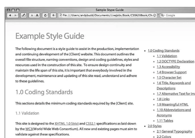
A style guide is a document, web page, or microsite that explains how the code and visual design of a site are pieced together. A good style guide should start with an overview of the site structure, file structure, and naming conventions used. It should contain detailed information about the coding standards that designers, developers, and content editors need to adhere to in order to maintain the quality of the site. This could include things like the versions of XHTML/CSS to use, the chosen accessibility level, browser support details, and general coding best practices. The style guide should detail layout and stylistic ele-ments such as the dimensions of various eleele-ments, the size of gutters, the color palette used, and the associated hex values. The style guide should also give details and examples of any special CSS styles used. For instance, if you were using a class to denote feedback, you would show what elements the class could be applied to and how those elements would look.
Style guides are a great way of handing a project over to those responsible for maintaining or implementing the site. By setting down some simple guidelines, you can help ensure the site develops in a controlled way, and help lessen the fragmentation of your styles over time. To help you create your own style guide, an example style guide is available in this
book’s code download (see Figure 1-5).
Figure 1-5.An example style guide
Organizing your stylesheets for easy maintenance
For a simple website, you can get away with using a single CSS file. With larger and more complicated sites, it can be a good idea to separate your styles for ease of maintenance. How you separate your styles is a matter of choice. I generally have one CSS file for the basic layout and another for typography and design embellishment. This way, once the lay-out is set, I rarely have to go back and change the laylay-out stylesheet. This also protects my layout stylesheet from accidentally being altered and breaking.
It’s worth bearing in mind that every CSS file means an extra call to the server. This can cause a performance hit, so some developers prefer to have one large CSS file rather than several smaller ones. The final choice really depends on the situation and is, to some degree, a matter of personal preference. I tend to favor flexibility and ease of maintenance whenever possible.
Summary
In this chapter you’ve seen how a well-structured and meaningful document can help pro-vide a solid framework for applying your styles. You’ve learned about some of the more advanced CSS selectors and how CSS handles conflicting rules. You’ve also seen how well-structured and well-commented CSS files can make your life easier and increase your pro-ductivity.
In the next chapter, you will learn about the CSS box model, how and why margins col-lapse, and how floating and positioning really works.