by Michael Alexander
Crystal Xcelsius
™FOR
Crystal Xcelsius
™FOR
by Michael Alexander
Crystal Xcelsius
™FOR
Hoboken, NJ 07030-5774 www.wiley.com
Copyright © 2006 by Wiley Publishing, Inc., Indianapolis, Indiana Published by Wiley Publishing, Inc., Indianapolis, Indiana Published simultaneously in Canada
No part of this publication may be reproduced, stored in a retrieval system or transmitted in any form or by any means, electronic, mechanical, photocopying, recording, scanning or otherwise, except as permit-ted under Sections 107 or 108 of the 1976 Unipermit-ted States Copyright Act, without either the prior written permission of the Publisher, or authorization through payment of the appropriate per-copy fee to the Copyright Clearance Center, 222 Rosewood Drive, Danvers, MA 01923, (978) 750-8400, fax (978) 646-8600. Requests to the Publisher for permission should be addressed to the Legal Department, Wiley Publishing, Inc., 10475 Crosspoint Blvd., Indianapolis, IN 46256, (317) 572-3447, fax (317) 572-4355, or online at http://www.wiley.com/go/permissions.
Trademarks:Wiley, the Wiley Publishing logo, For Dummies, the Dummies Man logo, A Reference for the Rest of Us!, The Dummies Way, Dummies Daily, The Fun and Easy Way, Dummies.com, and related trade dress are trademarks or registered trademarks of John Wiley & Sons, Inc. and/or its affiliates in the United States and other countries, and may not be used without written permission. All other trademarks are the property of their respective owners. Wiley Publishing, Inc., is not associated with any product or vendor mentioned in this book.
LIMIT OF LIABILITY/DISCLAIMER OF WARRANTY: THE PUBLISHER AND THE AUTHOR MAKE NO REP-RESENTATIONS OR WARRANTIES WITH RESPECT TO THE ACCURACY OR COMPLETENESS OF THE CON-TENTS OF THIS WORK AND SPECIFICALLY DISCLAIM ALL WARRANTIES, INCLUDING WITHOUT LIMITATION WARRANTIES OF FITNESS FOR A PARTICULAR PURPOSE. NO WARRANTY MAY BE CRE-ATED OR EXTENDED BY SALES OR PROMOTIONAL MATERIALS. THE ADVICE AND STRATEGIES CON-TAINED HEREIN MAY NOT BE SUITABLE FOR EVERY SITUATION. THIS WORK IS SOLD WITH THE UNDERSTANDING THAT THE PUBLISHER IS NOT ENGAGED IN RENDERING LEGAL, ACCOUNTING, OR OTHER PROFESSIONAL SERVICES. IF PROFESSIONAL ASSISTANCE IS REQUIRED, THE SERVICES OF A COMPETENT PROFESSIONAL PERSON SHOULD BE SOUGHT. NEITHER THE PUBLISHER NOR THE AUTHOR SHALL BE LIABLE FOR DAMAGES ARISING HEREFROM. THE FACT THAT AN ORGANIZATION OR WEBSITE IS REFERRED TO IN THIS WORK AS A CITATION AND/OR A POTENTIAL SOURCE OF FUR-THER INFORMATION DOES NOT MEAN THAT THE AUTHOR OR THE PUBLISHER ENDORSES THE INFOR-MATION THE ORGANIZATION OR WEBSITE MAY PROVIDE OR RECOMMENDATIONS IT MAY MAKE. FURTHER, READERS SHOULD BE AWARE THAT INTERNET WEBSITES LISTED IN THIS WORK MAY HAVE CHANGED OR DISAPPEARED BETWEEN WHEN THIS WORK WAS WRITTEN AND WHEN IT IS READ.
For general information on our other products and services, please contact our Customer Care Department within the U.S. at 800-762-2974, outside the U.S. at 317-572-3993, or fax 317-572-4002. For technical support, please visit www.wiley.com/techsupport.
Wiley also publishes its books in a variety of electronic formats. Some content that appears in print may not be available in electronic books.
Library of Congress Control Number: 2006920622 ISBN-13: 978-0-471-77910-0
ISBN-10: 0-471-77910-5
Manufactured in the United States of America 10 9 8 7 6 5 4 3 2 1
About the Author
Dedication
For my wonderful family: Mary, Ethan, and Emma.
Author’s Acknowledgments
Some of the people who helped bring this book to market include the following:
Acquisitions, Editorial, and Media Development
Project Editor:Christopher Morris Executive Editor:Gregory S. Croy Senior Copy Editor:Teresa Artman Technical Editor:Loren Abdulezer Editorial Manager:Kevin Kirschner Media Development Manager:
Laura VanWinkle
Editorial Assistant:Amanda Foxworth Cartoons:Rich Tennant
(www.the5thwave.com)
Composition
Project Coordinator: Michael Kruzil Layout and Graphics: Andrea Dahl,
Heather Ryan
Proofreaders: Jessica Kramer, Techbooks Indexer: Techbooks
Publishing and Editorial for Technology Dummies
Richard Swadley,Vice President and Executive Group Publisher Andy Cummings,Vice President and Publisher
Mary Bednarek,Executive Acquisitions Director Mary C. Corder,Editorial Director
Publishing for Consumer Dummies
Diane Graves Steele,Vice President and Publisher Joyce Pepple,Acquisitions Director
Composition Services
Contents at a Glance
Introduction ...1
Part I: Say Hello to Crystal Xcelsius...5
Chapter 1: Introducing Crystal Xcelsius...7
Chapter 2: Taking Crystal Xcelsius for a Spin...21
Part II: Getting Started with the Basics...43
Chapter 3: Interacting with Single Value Components ...45
Chapter 4: Calling Attention to Alerts...61
Chapter 5: Getting Graphic with Charts ...75
Chapter 6: May I Please See the Menu? ...103
Part III: Get Fancy with Advanced Components ...119
Chapter 7: Getting Geo-Graphic with Maps ...121
Chapter 8: Focusing in on Dynamic Visibility ...137
Chapter 9: Working with Crystal Xcelsius Professional ...149
Part IV: Wrapping Things Up...171
Chapter 10: Adding Style and Personality to Your Dashboards...173
Chapter 11: Taking Your Dashboards to Market ...193
Part V: The Part of Tens ...207
Chapter 12: Designing Effective Excel Models: Ten Best Practices ...209
Chapter 13: Ten Cool Crystal Xcelsius Tricks ...227
Chapter 14: Frequently Asked Questions: Two Sets of Ten ...247
Chapter 15: Ten (or So) Real World Examples ...255
Appendix: Going Beyond Spreadsheets ...265
Table of Contents
Introduction...1
About This Book...2
Foolish Assumptions ...2
How This Book Is Organized...2
Part I: Say Hello to Crystal Xcelsius...3
Part II: Getting Started with the Basics...3
Part III: Getting Fancy with Advanced Components ...3
Part IV: Wrapping Things Up...3
Part V: The Part of Tens...4
Icons Used In This Book...4
Part I: Say Hello to Crystal Xcelsius ...5
Chapter 1: Introducing Crystal Xcelsius . . . .7
Overcoming Static Cling ...8
More Than Just Fancy Graphics: The Benefits of Using Crystal Xcelsius ...10
Creating more robust presentations with interactive summary and detail layers ...11
Building what-if analyses into your presentations...13
Building tools that help make decisions ...15
Crystal Xcelsius under the Hood ...17
Importing data ...18
Building the visual model...19
Compiling and publishing the dashboard...19
Chapter 2: Taking Crystal Xcelsius for a Spin . . . .21
Creating Your First Dashboard ...21
Step 1: Importing the Excel model ...22
Step 2: Building your visual model...24
Step 3: Testing and publishing your visual model ...35
Getting Fresh with your Dashboard...39
Part II: Getting Started with the Basics ...43
Chapter 3: Interacting with Single Value Components . . . .45
Managing Interactivity: Input vs. Output ...45
Understanding Scale Behavior ...52
Chapter 4: Calling Attention to Alerts . . . .61
The Anatomy of the Alert Tab ...61
Alert Method ...63
Alert Definition ...64
Alert Levels ...65
Alert Level Display ...67
Target ...68
Applying Your First Percent Alert ...68
Applying Your First Value Alert ...72
Chapter 5: Getting Graphic with Charts . . . .75
The Basics of Crystal Xcelsius Charts...75
Understanding the chart types...76
Creating Your First Chart ...81
Understanding scale behavior...85
Leveraging the run-time scaling options ...86
Changing Chart Appearance...88
Appearance tab options ...88
Sub-tab sections by chart type...92
Understanding Combination Charts...95
Combination chart ground rules ...95
Creating a combination chart with three data series ...96
Adding a series to a combination chart ...100
Chapter 6: May I Please See the Menu? . . . .103
Delivering Choices with a Selector Component...103
Understanding the Insert Option Property...108
Position...109
Working with the Filter Component...113
Creating Your First Filtered Dashboard...114
Part III: Get Fancy with Advanced Components ...119
Chapter 7: Getting Geo-Graphic with Maps . . . .121
Understanding the Concept of Regions...121
Creating a Basic Map-Based Dashboard ...124
Applying Alerts to Map Components ...128
Assigning a value to each Region ...128
Assign a target to each Region ...130
Chapter 8: Focusing in on Dynamic Visibility . . . .137
Seeing the Basics of Dynamic Visibility...137
Dynamic visibility in a nutshell ...138
Applying basic dynamic visibility ...139
Implementing Menu-Based Visibility ...143
Chapter 9: Working with Crystal Xcelsius Professional . . . .149
Creating Drill-Down Charts ...149
Using Accordion Menu Components ...154
Working with Picture Menus...160
Using Interactive Calendar Components ...165
Part IV: Wrapping Things Up ...171
Chapter 10: Adding Style and Personality to Your Dashboards . . . .173
Employing the Five Formatting Must-Haves ...174
Using Copy and Paste ...174
Using the Properties window...175
Using the alignment and position functions ...175
Using the Grouping function ...178
Using the Object Browser...179
Adding Style and Personality...182
Using Art & Backgrounds components ...183
Applying color schemes with global style ...188
Discovering Skins and Templates ...190
Changing skins...190
Using templates to save time...192
Chapter 11: Taking Your Dashboards to Market . . . .193
Exporting a Visual Model ...193
Paying Attention to Distribution Matters...194
Macromedia Flash considerations ...195
Naming considerations...195
Directory considerations ...195
Canvas size considerations...196
Sending Data Back to Excel...199
Incorporating Input from Others ...201
Part V: The Part of Tens ...207
Chapter 12: Designing Effective Excel Models: Ten Best
Practices . . . .209
Best Practice #1...209
Best Practice #2...211
Best Practice #3...211
Best Practice #4...212
Best Practice #5...212
Best Practice #6...213
Best Practice #7...213
Best Practice #8...214
Best Practice #9...215
Best Practice #10...226
Chapter 13: Ten Cool Crystal Xcelsius Tricks . . . .227
Creating a Waterfall Chart...227
Password-Protecting Your Dashboard with Dynamic Visibility ...229
Highlighting the Below-Average Data Points in a Chart ...231
Making a Data Series Disappear and Reappear...233
Creating a Scrolling Chart ...234
Using Conditional Formatting to Create Regions on a Map...237
Making Your Own Map Component ...239
Adding an Export to PowerPoint Button...242
Nesting a Dashboard within Another Dashboard ...243
Using Crystal Xcelsius to Build Your Web Site ...244
Chapter 14: Frequently Asked Questions: Two Sets of Ten . . . .247
Basic Questions about Crystal Xcelsius and Excel...247
Common Error Messages and What They Mean ...248
Commonly Asked Component Questions ...250
Chapter 15: Ten (or So) Real World Examples . . . .255
Load Optimization (Logistics)...255
Instructor Staffing (Education) ...256
Basic ROI Calculator (Finance) ...257
Service Outage Analyzer (IT)...258
Fuel Cost Analysis (Transportation) ...260
Software Development ...260
Site Statistics (Web Site Management)...261
Google AdWords Tracker (Marketing) ...263
Headcount Visibility Reporting (HR)...264
Appendix: Going Beyond Spreadsheets ...265
Introduction
I
like to pretend that I’m a young man, but then I remember that one of my first jobs was typing up orders on a Wang computer. For you spring chickens who don’t remember Wang computers, let’s just say they don’t make them anymore. Anyway, my point is that I’ve been in the business world a long time. I remember the mad rush to invest in large data ware-houses and enterprise reporting tools. These tools came with the promise of business intelligence, affectionately called BI.Business intelligence is what you get when you analyze raw data and turn that analysis into knowledge. BI can help an organization identify cost-cutting opportunities, uncover new business opportunities, recognize changing business environments, identify data anomalies, and create widely accessible reports. Unfortunately, data warehouse and enterprise tools of the past had analysis and reporting capa-bilities that were clunky at best and not very user-friendly. This left many business professionals using tools such as Lotus 1-2-3 and Excel to analyze and report data.Fast-forward about a decade later, and you’ll see that a lot has changed. The Internet is now a cornerstone of business, new technologies have emerged to enhance the quality and performance of Web reporting, and even the previously clunky BI tools can now provide analytical capabilities that are both robust and user-friendly. Nevertheless, even with all these advances in business intelligence capabilities, most of the data analysis and reporting done in business today is still done by using a spreadsheet: that’s right, our old friend Excel, which has remained more or less unchanged for the last ten years. Make no mistake — no matter how advanced an IT manager thinks his enterprise system is, Excel is embedded somewhere in that organization’s data pipeline.
About This Book
The chapters in this book are designed to be standalone chapters that you can selectively refer to as needed. These chapters provide you with step-by-step walkthrough examples as well as instruction on the wide array of functional-ity that Crystal Xcelsius has to offer. As you move through this book, you will be able to create increasingly sophisticated dashboards using more advanced components. After reading this book, you will be able to
⻬Create basic dashboards with charts, gauges, and sliders.
⻬Add advanced functionality to your dashboards such as alerts, maps, and dynamic visibility.
⻬Create interactive business calculators and what-if analysis tools.
⻬Integrate Crystal Xcelsius models into PowerPoint presentations.
⻬Create Crystal Xcelsius–based Web pages.
The three versions of Crystal Xcelsius are Standard, Professional, and Workgroup. In this book, I focus on the components and functionalities of Crystal Xcelsius Standard and Professional. If you use Crystal Xcelsius Workgroup, you will find that much of the information found here still applies to your version. However, this book doesn’t cover the collaboration and the enterprise-level functionality of Crystal Xcelsius Workgroup.
Foolish Assumptions
I make three assumptions about you, the reader:
⻬Given that you’re even reading this book, you’ve already bought and installed Crystal Xcelsius.
⻬You are a relatively experienced Excel user familiar with basic concepts, such as referencing cells and using formulas.
⻬You have enough experience with PowerPoint to add objects, resize objects, and run a presentation.
How This Book Is Organized
Part I: Say Hello to Crystal Xcelsius
Part I is all about introducing you to Crystal Xcelsius. In Chapter 1, I share with you the various ways you can use Crystal Xcelsius as well as the core concepts that make Crystal Xcelsius components work. In Chapter 2, throw caution to the wind and create your first dashboard — without reading the instructions. At the end of Chapter 2, you will have a firm understanding of the fundamentals of using Crystal Xcelsius, including importing data, working with components, publishing your dashboard, and refreshing your data.
Part II: Getting Started with the Basics
In Part II, I take an in-depth look at some of the basic components that are key to any dashboard. In Chapter 3, I show you how Single Value components work and how to use them to build interactivity into your dashboards. In Chapter 4, I show you how to leverage alerts to enable conditional coloring in your components, allowing your audience to get an instant visual assessment on performance. Chapter 5 is all about creating charts in Crystal Xcelsius. I wrap up this part with Chapter 6, where I show you how to easily build menus and selectors into your dashboards with Selector components.
Part III: Getting Fancy with
Advanced Components
In Part III, I go beyond the basics to take a look at some of the advanced com-ponents that Crystal Xcelsius has to offer. In Chapter 7, I demonstrate the different ways you can use Map components to add flair to your visualizations. In Chapter 8, I walk you through the basics of dynamic visibility and look at some examples of how dynamic visibility can help achieve focus on the parts of your dashboard that are important. Chapter 9 focuses on the advanced com-ponents and functions that are found only in the Professional version of Crystal Xcelsius, discussing how each can be used to enhance your visual models.
Part IV: Wrapping Things Up
Part IV focuses on the last two actions a user takes when wrapping up the production of a dashboard: formatting and distribution. Chapter 10 focuses on the functions and utilities that enable you to show off your artistic side and add your own style to your visual models. In Chapter 11, I show you just how easy it is to take your dashboards to market, and I share a few other tricks on how to share the data in a visual model.
Part V: The Part of Tens
Part V is the classic Part of Tens section found in every For Dummiestitle. The chapters here each present ten or more pearls of wisdom, delivered in bite-sized pieces. In Chapter 12, I share with you ten best practices that will help you design Excel models that allow you to go beyond simple dashboards. In Chapter 13, I share ten of my best Crystal Xcelsius tricks, making ordinary components do extraordinary things. Chapter 14 focuses on answering some of the questions that I hear most often. Chapter 15 covers real-world examples of Crystal Xcelsius in the workplace.
Lastly, the appendix at the end of the book contains an essay by Loren Abdulezer about the significance of the paradigm shift that Crystal Xcelsius represents.
Icons Used In This Book
Sometimes I have to talk about certain technical things in order to keep my guru mystique. These things are interesting but not crucial, so I mark them with this icon. You don’t need to read them, but for some of the more tech-savvy of you, they may be useful.
Tips are suggestions to make your life easier. Skim these nuggets for time-savers, tricks, and just plain cool moves.
These notes denote info you ought to think about, but they’re not going to cause a disaster if you don’t pay attention.
Be sure to read text marked with this icon!If you do not follow a warning, bad things can happen: Puffs of black smoke might come out of your monitor, your workspace could be deluged by a plague of frogs, or your program simply won’t work right.
Part I
Chapter 1
Introducing Crystal Xcelsius
In This Chapter
䊳Overcoming static cling
䊳Seeing beyond fancy graphics
䊳Checking out Crystal Xcelsius under the hood
S
o here you are with this new software application — Crystal Xcelsius — in your hand, ready to read this book, hoping to see how to make some really cool dashboards that organize and present your data in a brilliant new way. Little do you know that you are on the cusp of a revolution. It’s true! I sit here writing one of the first chapters ever written about Crystal Xcelsius, which is fast becoming a force to be reckoned with in the world of business intelligence.Using cutting-edge technology, Crystal Xcelsius bridges the gap between data analysis and data presentation, empowering anyone who can point and click a mouse to create professional and compelling dashboards. Gone are the days of deferring to the local Excel guru to help analyze your data or calling the local PowerPoint guru to help you build your presentations. Crystal Xcelsius simplifies even the most complex functionalities, enabling even a beginner to play the part of the guru, creating stunning presentations with just a handful of basic techniques. So as you sit there with your copy of Crystal Xcelsius, don’t look so worried. Steady your hand, lift your head, and say with me, “I am the guru. I am the guru!”
This chapter is all about gaining some familiarity with Crystal Xcelsius before creating your first dashboard. Here, I give you an overview of the concepts behind Crystal Xcelsius, how Crystal Xcelsius works, and how you can use Crystal Xcelsius as an integral part of your daily operations.
Overcoming Static Cling
any other doctor in the 1880’s for that matter, possibly gather with a stetho-scope?) That’s a long stretch from today, where technology provides doctors with an unprecedented amount of data with dynamic visualizations of the human body that are interactive, real-time, and 3-D. Visualizationtransforms data into a form that is comprehensible to the eye, allowing you to analyze data through the sense of sight. This allows surgeons and medical students to see the breathing patterns of an asthma patient or the beating human heart in rhythm with an EKG output.
However, these advances in visualization technology aren’t limited to the medical field. Many industries have striven to move away from static data environments by using interactive visualization technologies. Consider some of the other industries that have taken advantage of interactive visualization technology:
⻬Aviation:In the early 1900s, pilots would spend the first weeks of flight training in a rocking fuselage with mock instruments. Pilots today train in flight simulators that use animation and interactive visualization to replicate a wide array of atmospheric scenarios.
⻬Sports:Professional athletes have the benefit of computer models that interactively capture their movements with animation, helping them pinpoint their problem areas and maximize their kinetic potential.
⻬Meteorology:Meteorologists use interactive visualization systems to model the effects of wind force from storms and hurricanes.
⻬Toy industry:Even popular board games that are inherently visual, such as chess, Monopoly,and Risk,have been augmented with technology that offers imaginative animations that enhance a player’s gaming experience.
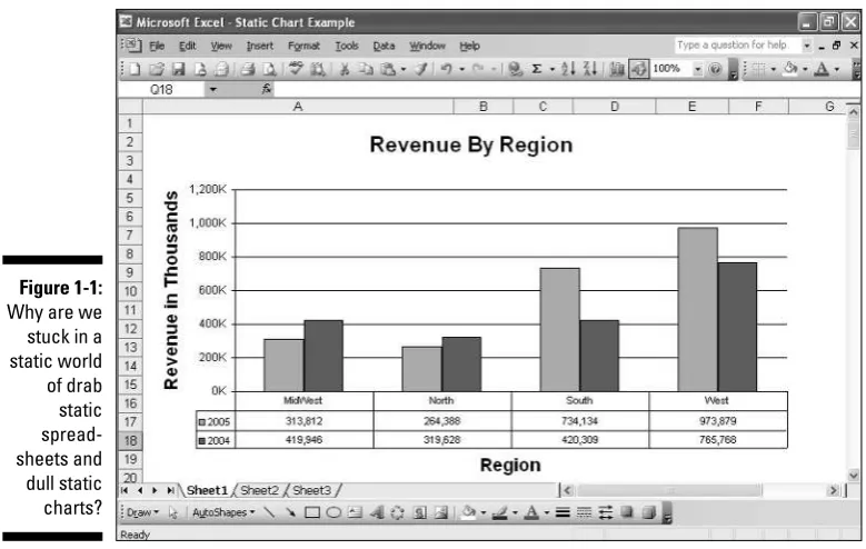
What’s the point of all this visualization talk? Well, the question that you and I should be asking is what happened to the business world? Although tools like Excel and PowerPoint have brought us a long way from the days of using paper spreadsheets and overhead projectors, by no means have they come close to the interactive visualizations that other industries have benefited from. We still sit through hours and hours of boring meetings where we point to static charts like one you see here in Figure 1-1.
Like many of us in the corporate world, Santiago Becerra, Sr. has first-hand experience with the dull data environments that leave many managers and key decision-makers ill-equipped to manage their businesses. In his various roles in the business world, he knows that the problem he constantly faces is the same problem that many organizations suffer from — that too much information is lost in the transition between data analysis and data presenta-tion. That is, after a presentation is put on paper, managers are automatically boxed into the thought processes of the presenter, often forcing them to either take the data analysis at face value or to ask for more analyses, which naturally takes up more critical company time. The question was how to provide a compelling presentation without losing the ability to interactively change the direction and scope of the data analysis behind the information being presented.
Becerra eventually joined forces with his son who had spent his career creat-ing many popular video games such as Midtown Madnessand Midnight Club.
Together, they used video game technology in conjunction with practical busi-ness concepts to create Crystal Xcelsius. With Crystal Xcelsius, the Becerra father-and-son team provided business professionals with something few
Figure 1-1:
Why are we stuck in a static world of drab static spread-sheets and dull static charts?
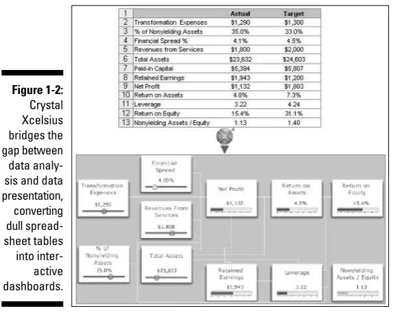
have had access to in the past: affordable, interactive visualization of busi-ness data that could be delivered in easy-to-create dynamic presentations. For the first time, managers could bridge the gap between data analysis and data presentation without the need for expensive enterprise solutions. Figure 1-2 illustrates this bridge.
More Than Just Fancy Graphics: The
Benefits of Using Crystal Xcelsius
I’ve actually met people who use Crystal Xcelsius simply for the slick look and feel of the graphics. Face it: Many of us were initially attracted to Crystal Xcelsius because of the sleek graphical components, such as the gauges shown here in Figure 1-3.
And there is nothing wrong with that at all. The truth is that when many people see the slick and easy-to-use components in Crystal Xcelsius, they tend to lift some of the restrictions they have subconsciously placed on their presentations. For example, before Crystal Xcelsius, I would never even have thoughtabout creating the gauge-based dashboard shown in Figure 1-3 because I didn’t know how to create one in Excel or PowerPoint. Indeed, the stunning graphics alone undoubtedly fosters ideas about new and exciting ways you can present your data.
Figure 1-2:
Although you can easily get lost in the stunning graphics, remember that Crystal Xcelsius is a versatile tool that allows you to do more than just create fancy-looking presentations. Take a look at some of the other things that you can accomplish with Crystal Xcelsius that you might not have thought about.
Creating more robust presentations with
interactive summary and detail layers
I exported a sample dashboard into a PowerPoint file called Chapter1 -Example_A, which you can find at the companion Web site for this book. To follow along with the demonstration in this section, go to this book’s companion Web site. (The exact address appears in the Introduction.) Open the Chapter1 - Example_APowerPoint presentation, found in the C:\Xcelsius Sample Files\Chapter 1directory, and run the slide show. Figure 1-4 shows the interactive dashboard that you see in the slide show. The idea is to select a Sales Rep from the list to see the key metrics for that Sales Rep.
To run the slide show in PowerPoint, go to the menu and choose Slide Show➪
View Show. I show you how to export Crystal Xcelsius dashboards into PowerPoint in Chapter 12.
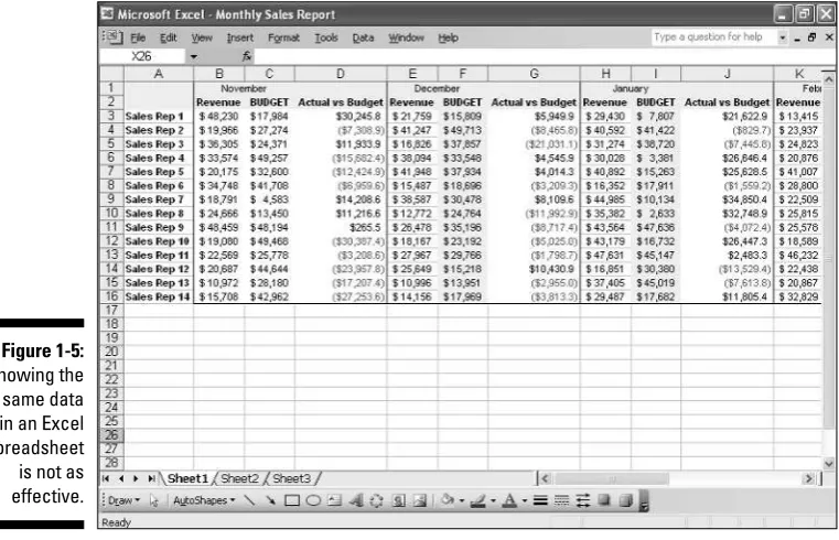
What is the point of this demonstration? Think about how much data is con-tained in this one-megabyte presentation. For 14 Sales Reps, you are showing the metrics around each rep’s actual revenue, budget target, and revenue fore-cast. Not for 1 month, mind you, but for 12 months! Consider how many slides it would take to present something similar to this dashboard in a standard slide show. You can imagine that this would take, at a minimum, 14 slides to produce similar results — with less appealing graphics.
Figure 1-3:
Many people use Crystal Xcelsius for the sleek, fluid graphics.
What about Excel? Could you fit all this information on an Excel spreadsheet? Sure, but as you can see in Figure 1-5, this data in an Excel spreadsheet is somehow not as compelling.
Figure 1-5:
Showing the same data in an Excel spreadsheet is not as effective.
Figure 1-4:
You can see that with Crystal Xcelsius, you can create multiple layers of summary and detail data in visually appealing dashboards. And because the average Crystal Xcelsius output is around 1.5 megabytes, you won’t inundate clients with unnecessarily large files.
Because of Crystal Xcelsius’s ability to produce presentations in relatively small files, you’ll likely notice something different happening in your presen-tations. I bet you start consolidating information that you would normally parse into separate presentations. This not only gives your dashboards a more robust feel, but it also allows you to present lots of data without break-ing the flow of your presentation. In addition, because you can easily build interactivity into your presentations, you won’t have to worry about showing too much information at one time.
Building what-if analyses
into your presentations
We all have an analytical side to us that feels compelled to question and ana-lyze what we see. Everyone is a data analyst on some level. This is usually a good thing, but it can be a nightmare if you’re the one giving a presentation to a roomful of inquisitive people playing the role of analyst. How many times have you given a presentation, only to be challenged with questions about the vari-ables that you use in the analysis? In these situations, you probably do one of two things: fumble through papers as you try to answer the question, or turn to the ever-embarrassing standby, “I’ll get back to you on that,” followed by an awkward pause as you try to get back into the flow of your presentation.
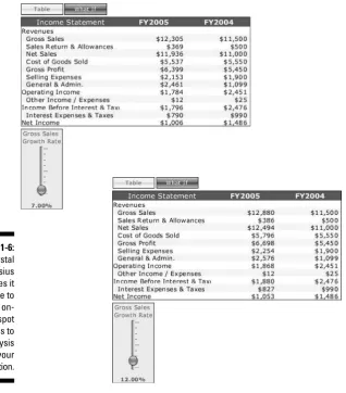
Crystal Xcelsius can help you better prepare for these situations by enabling you to build what-if analyses directly into your presentation, allowing you to literally change your presentation on the fly. To demonstrate this, I exported a sample dashboard into a PowerPoint file called Chapter1 - Example_B, which you can find at the companion Web site for this book. To follow along with the demonstration in this section, go to this book’s companion Web site. Open Chapter1 - Example_B, found in the C:\Xcelsius Sample Files\ Chapter 1directory, and run the slide show. Upon opening, you’ll see the table shown in Figure 1-6.
Imagine that it’s the end of FY (fiscal year) 2004 and you’re presenting the budget plan for FY 2005, which is based on the assumption that gross sales will grow by 7 percent. When you present this plan, a few managers are disap-pointed at the fact that the planned net income for FY 2005 is less than the net income for FY 2004, so they ask you what the net income would look like if gross sales grew at a rate of 12 percent. In a standard presentation, this is
where everything falls apart. Even if you are some mathematical genius who could quickly calculate the net income at the new growth rate, you wouldn’t have visual backup for your explanation of how the change would ripple through the other parts of the budget.
In this situation however, I don’t worry because I used Crystal Xcelsius to build myself a little insurance policy. Click the What If button to reveal a set of sliders that allow you to change the makeup of the analysis.
Now simply slide the vertical Gross Sales Growth Rate slider up to 12%, as illustrated in Figure 1-6. At this point, your presentation actually changes to reflect the new analysis!
Figure 1-6:
This is an unbelievable feat that would have been impossible without Crystal Xcelsius. The ability to make on-the-spot changes to the actual analysis behind a presentation is one of the most powerful and attractive functionalities of Crystal Xcelsius.
Building tools that help make decisions
A key benefit to building what-if analyses into your presentation is the ability to give managers a decision-making tool — a tool that allows them to test several scenarios and then choose the most appropriate scenario for the task at hand. For instance, open the PowerPoint presentation Chapter1 – Example C, found in the C:\Xcelsius Sample Files\Chapter 1directory (at this book’s companion Web site), and run the slide show. This presentation, as shown here in Figure 1-7, presents the budget plan for FY 2005, which is based on the assumption that gross sales will grow by 7 percent.
Suppose that when you present this plan, a few managers are disappointed that the planned net income for FY 2005 is less than the net income for FY 2004. In a knee-jerk reaction, they ask you to increase the gross sales until the net income for FY 2005 is more than FY 2004.
As you can see in Figure 1-8, the problem is that you will have to increase gross sales by 59 percent — yikes! — in order to beat FY 2004’s net income. Needless to say, it is unrealistic to think that the company will increase gross sales by 59 percent.
Figure 1-7:
Presenting the budget plan for FY 2005 and comparing it with actual revenue for FY 2004.
The solution is to use the other sliders, in conjunction with the gross sales slider, as levers to increase FY 2005 net income. You can test various scenar-ios to find one that is both realistic and conducive to your analysis. In this case, you can set your gross sales rate to 7%, reduce the Cost of Goods Sold to 42%, reduce Selling Expenses to 15%, and reduce General & Admin Costs to 18%. As you can see in Figure 1-9, this combination of sales growth and cost reduction helps to beat FY 2004’s net income.
Figure 1-9:
Test sce-narios to find one that is both realistic and conducive to your analysis.
Figure 1-8:
Again, this analysis could be done in Excel, but you would have to take this back to your desk to create different scenarios on different tabs, effectively making everyone wait for your answers. With Crystal Xcelsius, you can have everyone in the room as you test out the various scenarios in real-time, allowing for on-the-spot decision making.
Crystal Xcelsius under the Hood
With your newly found perspective on Crystal Xcelsius and what it can do for you, you’re probably chomping at the bit to get started building your first dashboard. But before I show you how to do that, you need to understand how Crystal Xcelsius really works.
In a nutshell, Crystal Xcelsius imports a snapshot of your Excel file, allows you to build a visual model by tying components to your data, compiles your final dashboard to a Flash SWF file, and then publishes your final dashboard to a chosen format. SWF(often pronounced swiff) is the vector-based graphics format designed to run in the Macromedia Flash Player. Figure 1-10 illustrates the basic workflow for a Crystal Xcelsius report.
Remember that Crystal Xcelsius is designed to work only with Excel XLS files. Therefore, you can not import other types of files such as text files (txt, csv, dbf) or Access MDB files. The good news, however, is that Excel spreadsheets of any size can be used in Crystal Xcelsius. Just keep in mind that the amount of data that is being moved and changed in your visualization can affect the performance of your dashboard.
Figure 1-10:
The basic workflow for a Crystal Xcelsius report.
When you install Crystal Xcelsius, it gives you the option to install the Macromedia Flash Plugin/Player. If you have not elected to install this and
if you do not already have Macromedia Flash Player installed on your com-puter, you will not be able to use Crystal Xcelsius properly. However, you can easily get Macromedia Flash Player by downloading it free from www. macromedia.com.
As mentioned before, the three versions of Crystal Xcelsius are
⻬Standard:The Standard version is designed for those who are looking to get started with interactive visual analytics. It provides the basic fea-tures of Crystal Xcelsius.
⻬Professional:The Professional version is designed for large organiza-tions that require dashboards that contain many layers of information.
⻬Workgroup:The Workgroup version is designed for environments where connections to live data are essential.
The components that are available to you depend on the version of Crystal Xcelsius you are using.
Importing data
All Crystal Xcelsius dashboards start with an Excel spreadsheet that typically contains data that has already gone through some analysis, massaging, and shaping. Crystal Xcelsius takes a snapshot of the Excel spreadsheet and imports that snapshot into memory. After the data is in memory, Crystal Xcelsius disconnects from the Excel spreadsheet.
This method of separating the data from the actual spreadsheet ensures two things. First, your final dashboard is a standalone object, independent of the location or status of the original spreadsheet. Second, it ensures that the size of your final dashboard is as small as possible, making for easy distribution.
Problems getting Crystal Xcelsius up and running?
There are three versions of Crystal Xcelsius: Standard, Professional, and Workgroup. No matter which version you have, getting Crystal Xcelsius up and running is a relatively intuitive process. However, if you find yourself having trouble getting started, help is at hand.
Building the visual model
After the data you’re using is in memory, you can start building your visual model. The visual model is essentially your dashboard in design mode. Much like a PowerPoint slide, your visual model starts off as a blank canvas on which you can add components. Componentsare those things that give your dashboard its utility and purpose: charts, gauges, menus, tables, and so on. The idea is to add individual components to your visual model, tying each component to the data that you import.
Compiling and publishing the dashboard
After you’re happy with the functionality and look of your visual model, Crystal Xcelsius is ready to compile it.
First, Crystal Xcelsius compiles your visual model to a SWF file format. Compiling to a SWF file format ensures that your final dashboard plays back smoothly on any screen size and across multiple platforms. In addition, this ensures that your dashboard file size is small so as to not inundate your users with gigantic 40MB files.
After your visual model has been compiled to a SWF file, it is then published to a format of your choice. You can choose to publish your dashboard to PowerPoint, Outlook, an HTML Web page, an Adobe Acrobat PDF file, or a Macromedia Flash file. At this point, your dashboard is ready to share!
Chapter 2
Taking Crystal Xcelsius for a Spin
In This Chapter
䊳Creating your first dashboard
䊳Getting data into Crystal Xcelsius
䊳Building a visual model
䊳Discovering the mechanics of Crystal Xcelsius components
䊳Keeping current with updates and changes
I
confess that when I buy new software, I usually don’t read the instruc-tions first. I like to jump right in and see what it can do and how easy it is to use. As far as I’m concerned, all the nuances of the program can be learned later. So in that spirit, throw caution to the wind and just get right in there and build a dashboard. That’s right, folks, we’re going for it!Is this irrational exuberance? No, not really. The purpose of this chapter is to demonstrate the intuitiveness of Crystal Xcelsius, and just how easy it is to create a professional-looking dashboard with no knowledge of programming or Flash. In the process, you will gain a firm understanding of the fundamentals of using Crystal Xcelsius, including importing data, working with components, publishing your dashboard, and refreshing your data.
To find the files I reference throughout this chapter, go to the companion Web site for this book. The site’s address can be found in this book’s Introduction.
Creating Your First Dashboard
First things first. Open Crystal Xcelsius in either of the following ways:
⻬Double-click its desktop icon.
or
⻬Choose it from the list of programs in your Windows Start menu.
Upon opening, you immediately see several windows on your screen. These are highlighted in Figure 2-2. I talk about each of these windows a little later; for now, close them.
You are left with a white canvas. This is the starting point for your dashboard.
Step 1: Importing the Excel model
This is probably a good point to remind you that this chapter is dedicated to walking through the mechanics of Crystal Xcelsius. Thus, you are taking actions on components that you might not fully understand yet. Rest assured, each component and action you encounter in this chapter is covered in detail in subsequent chapters.
Figure 2-1:
The first thing you need to do is to import the Excel model, which contains the data you are presenting with your dashboard. Again, any data you use in a Crystal Xcelsius visual model must be imported from an Excel file. This means that if your data is sitting in a text file or an Access database, you must trans-fer it to an Excel .xlsfile in order to import it into Crystal Xcelsius.
1. From the main menu, choose Data➪Import Model.
This activates the Import Model dialog box, as shown in Figure 2-3.
You can also activate the Import Model dialog box by clicking the Excel icon on the Crystal Xcelsius taskbar.
Figure 2-3:
Activate the Import Model dialog box.
Close these windows
Figure 2-2:
Open Crystal Xcelsius and then close the three windows that pop up by default.
23
2. Click the ellipsis button (the button with the three dots) to display the Open dialog box, as shown in Figure 2-4.
3. Select the Excel file you want to use and then click Open.
For this example, select the Climate By City Excel file found in the sample files folder on the companion Web site, and then click the Open button.
At this point, the Import Model dialog box contains the name and path of the Excel model you select.
4. Click OK to start importing.
In the lower-right corner of your screen is a progress meter in the Crystal Xcelsius status bar that shows you the percentage of data that has been imported. At the end of the process, the status bar reads Model Import Done.
At this point, your Excel model is stored in Crystal Xcelsius’s memory, and you’re ready to start adding components to your visual model.
Crystal Xcelsius takes a snapshot of your Excel model and imports only that snapshot into memory. After the data is in memory, Crystal Xcelsius disconnects
from the original Excel file: That is, any changes you make to your source spreadsheet will not be captured until you reimport the model. I discuss keeping up with changes in your Excel model in detail later in this chapter.
Step 2: Building your visual model
After you import your Excel model, you are a painter with a blank canvas. From here, you can add the components that give your final dashboard its look, feel, and utility. To see the list of all the components available to you, go to the main menu and choose View➪Components. This activates the Components window that you see in Figure 2-5.
Figure 2-4:
Figure 2-5:
Activate the Components window.
25
Chapter 2: Taking Crystal Xcelsius for a Spin
A word on terminology
Because Crystal Xcelsius is fairly new, some of the terminology in this book will likely be unfa-miliar. Take a moment to familiarize yourself with some of the following terms:
⻬ Excel model:The Excel model is the source spreadsheet that contains the data you want to represent in your final dashboard. This spreadsheet contains data that has typically gone through some massaging and shaping.
⻬ Visual model:The visual model is essen-tially your dashboard in design mode. Much like a PowerPoint slide, your visual model starts off as a blank canvas on which you can add components that visually represent the data you import from your Excel model. When you save your visual model, it is saved as an XLF file.
⻬ Dashboard:After you finish building your visual model, you can compile it to a SWF file and then export it to a document of a chosen format. The final document is your dashboard. Keep in mind that when I refer to a dashboard, I mean the finished product.
⻬ Canvas:The canvas is the blank page you see each time you start a new Crystal Xcelsius document. This is the foundation of your visual model, where you add the com-ponents that make up your dashboard.
Refer to Figure 2-2 to see the three windows that pop up by default when you first open Crystal Xcelsius. The Components window is one of them. It’s a little annoying — you can’t stop it from popping up by default — but you can easily get it out of your way by simply closing it. To reactivate the Components window after it’s closed, simply choose View➪Components.
Select a component from the Components window and place it onto the canvas. After the component is on the canvas, you can configure it to look and behave the way you want it to.
For this running example, I start building the visual model by adding a Table component and then setting its display properties. Follow along with these steps:
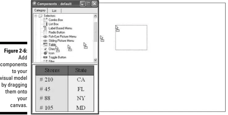
1. As illustrated in Figure 2-6, drill into the Selectors category, select the Table component, and then drag it onto the canvas.
Crystal Xcelsius gives you a preview (as shown at the bottom of Figure 2-6) of the component when you click it. This default behavior is designed to give you an idea of what each component looks like without the need to drag it onto the canvas.
A word on the component categories
Crystal Xcelsius components are segregated into eight categories:
⻬ Charts: Chart components allow you to add charting functionality to your dashboards.
⻬ Single Value: Single Value components allow you to change or represent the value of a single cell in your data. These components include gauges, sliders, and progress bars.
⻬ Selectors: Selector components are essen-tially menu providers. Components such as tables, list boxes, and radio buttons are used to offer options and capture the user selections.
⻬ Maps Library: Map components allow you to tie geographically oriented data to a graphical map, enabling map-based dashboarding.
⻬ Art & Backgrounds: These components are essentially formatting tools that control the look and feel of your dashboards.
⻬ Other: The Other category comprises spe-cialized components that don’t necessarily fit into any other category. These include calendars, trending icons, scenario buttons, and data grids.
⻬ Text: Text components allow for communi-cation between Crystal Xcelsius and a user. These include input boxes (that a user can use to give Crystal Xcelsius a required argu-ment) or labels (that Crystal Xcelsius can use to pass information back to the user).
Figure 2-6:
Chapter 2: Taking Crystal Xcelsius for a Spin
A word on the Properties window tabs
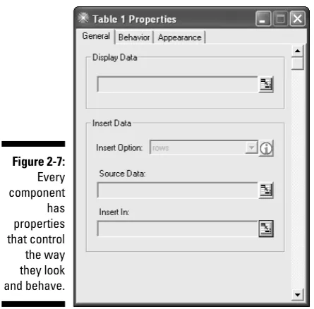
In general, the Properties window has the same structure for all Crystal Xcelsius components, but the tabs that are available differ from component to component. For example, you can see in Figure 2-10 that the Properties window for the Table component contains three tabs: General, Behavior, and Appearance. However, there are actually five possible property tabs: General, Behavior, Alerts, Appearance, and Drill Down. The Alerts and Drill Down tabs do not apply to Table components; therefore, they are not shown.
The bottom line is that the number and types of tabs you see in the Properties window depend on the component with which you are working. Each tab controls different aspects of the com-ponent’s attributes and functionality, as follows:
⻬ General: The General tab controls the min-imum required properties that enable the component to function properly. The General tab typically contains Data Source Link properties that tie the component to a range of cells, giving the component its basic functionality.
⻬ Behavior: The Behavior tab controls proper-ties that define how a component acts in run-time. This includes dynamic visibility, entry effects, zooming capabilities, and other options related to run-time interactivity.
⻬ Alerts: The Alerts tab controls the properties that allow you to dynamically change the color scheme of a component based on it values. On this tab, you can define the number of alert levels, the color of each level, the color method, and the alert targets.
⻬ Appearance: The Appearance tab controls properties that define the appearance and final look of each component. On this tab, you find options like font size, title location, and colors.
2. Right-click the Table component and choose Properties from the shortcut menu.
You can also double-click the component to get to the Properties window. (See Figure 2-7.)
You can see that the title bar on the Properties window includes the component’s name. In Figure 2-7, the title bar reads Table 1 Properties; this means the name of this particular component is “Table 1.” Every component that is added to the canvas is automatically assigned a name that consists of the component’s type and a sequentially-assigned number. So if you were to add two Pie Chart components to your canvas, their names would be Pie Chart 1 and Pie Chart 2. Any additional pie charts would be numbered in sequential order. Later, I show you how to change and use the names of your components to help manage your visual models.
You see the Properties window, as shown in Figure 2-7. The basic idea is to adjust each property of the component with which you are working in order to achieve the desired behavior. For this example, I start by adjust-ing the Display Data property of the Table component. This property tells the Table component what to display on the dashboard.
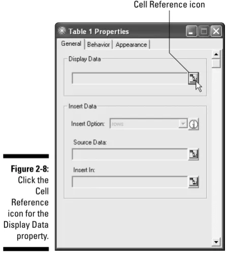
3. Click the Cell Reference icon, shown in Figure 2-8, to identify the range of cells that contains the data you want the Table component to display.
Figure 2-7:
A representation of your Excel model activates along with a dialog box used to select the desired range. From here, simply select the cell, or range of cells, to which you want to tie your component’s property.
4. Because (in this example) I want the Table component to display each city in the dataset, I select all the cities illustrated in Figure 2-9 and then click OK in the Select a Range dialog box.
Figure 2-9:
Select the range of cells to display.
Cell Reference icon
Figure 2-8:
Click the Cell Reference icon for the Display Data property.
29
When Crystal Xcelsius imports an Excel model, it imports all tabs. This means that when you link components to a range of cells in your imported model, you’re not limited to only the tab that is showing. You can select a range in any of the worksheet tabs that were imported.
As soon as you click OK, the Table component displays real data. Second, the Display Data property shows the reference to the worksheet and range of cells, as shown in Figure 2-10.
5. Repeat this process for the Source Data property.
As you can see in Figure 2-11, the Source Data property captures the actual data values that are bound to the Table component.
Figure 2-11:
Set the Source Data property.
Figure 2-10:
6. Repeat this process for the Insert In property, as shown in Figure 2-12.
This property identifies the destination cells that hold the selected data values.
Again, don’t concern yourself too much with what each property does. This is explained in subsequent chapters. The important thing is that you get comfortable with the mechanics of linking components to the imported Excel model.
7. After the Table component is configured, I added a line chart to this visual model, as shown in Figure 2-13. Follow along to see how:
a. Activate the Components window.
b. Drill into the Charts category, select the Line Chart component, and then drag it onto the canvas.
c. Right-click the Line Chart component that you just added and then choose Properties from the shortcut menu.
8. On the General tab of the Properties dialog box are a group of proper-ties (under the heading Titles) that are dedicated to labeling various parts of your chart. Fill in these properties.
Figure 2-14 shows the properties for this example.
The Titles properties also have the Cell Reference icon. This means that you can capture a value from a cell to use as a title instead of entering the title manually. Keep in mind that most property settings allow you the option of either manually entering a value or using the Cell Reference icon. Those that don’t give you this option have a disabled input box, allowing only values that come from a cell reference.
Figure 2-12:
Set the Insert In property.
9. Still on the General tab, assign a data range to the line chart. (See Figure 2-15.)
a. Select the Data Range radio button to activate the Data Range section.
b. Click the Cell Reference icon.
c. Identify the range of cells that contain the data you want captured in the Line Chart component and then click OK.
You have a configured Table component and a Line Chart component in your visual model.
Figure 2-14:
Enter the appropriate titles for your chart.
Figure 2-13:
I continue by adding a Gauge component. Here’s how:
1. Activate the Components window and drill down into the Single Value category and then into the Gauge category. From there, select Gauge-1 and drag it onto the canvas, as illustrated in Figure 2-16.
There is no difference between Gauge-0, Gauge-1, and Gauge-2 other than aesthetics. All three Gauge components function and behave the same way.
2. Configure the Gauge component, as shown in Figure 2-17.
a. Right-click on the Gauge component and activate the Properties window.
Figure 2-16:
Add a Gauge component to your visual model.
Figure 2-15:
Identify the range of cells that are to be captured in your line chart.
b. Type Lowin the Title property input box. This gauge displays the low temperature for each city.
c. Link the Data property to cell N1.
3. Add a second Gauge component (repeat Step 1) and configure the newly added gauge, as shown in Figure 2-18.
a. Activate the Properties window.
b. Type Highin the Title property input box. This gauge displays the high temperature for each city.
c. Link the Data property to cell O1.
That’s it! All the hard work (if you can call it that) is done. All that’s left to do is rearrange the components on your visual model by dragging them around the canvas just as you would on a PowerPoint slide. Figure 2-19 shows the final arrangement.
Figure 2-18:
Add a second Gauge component and configure the properties.
Figure 2-17:
At this point, do the smart thing and save your visual model. To do this, choose File➪Save. This activates the Save As dialog box. Name this visual model FirstDashboardand save it in the following directory: C:\Xcelsius Sample Files\Chapter 2.
You can also activate the Save As dialog box by clicking the floppy disk icon on the Crystal Xcelsius taskbar.
Time to test your visual model and publish it to a dashboard.
Step 3: Testing and publishing
your visual model
Before publishing and distributing your dashboard, you want to test it in order to ensure that all the components are working the way you intended. Not sur-prisingly, Crystal Xcelsius allows you to easily test your dashboard with a click of a button. That button is the Preview button, shown in Figure 2-20.
Figure 2-20:
Click the Preview button to test your visual model.
Figure 2-19:
Arrange the components by moving them around your canvas.
When you click the Preview button, Crystal Xcelsius compiles your visual model into a SWF file.
After your visual model is finished compiling, you will be working with a Flash preview of your visual model. This preview allows you to validate your visual model and to test out the look and feel of your dashboard. The preview mode is also useful when you want to experiment with components, colors, and layouts before exporting the final dashboard.
As you can see in Figure 2-21, you can test the components on your dash-board by clicking a few cities in the Table component.
The Preview button is a togglebutton (either on or off). You are in Preview mode when most of the menu commands are disabled and the Preview button looks depressed (pressed down, not sad). Exit Preview mode by click-ing the Preview button again.
When you’re satisfied that everything is working as it should, publish the final dashboard. When you publish your dashboard, Crystal Xcelsius takes two actions:
⻬It compiles your visual model into a SWF file.
⻬It embeds that file into a document or format of your choice.
Here’s how you publish a dashboard in Crystal Xcelsius:
1. Choose File➪Export.
As you can see in Figure 2-22, you have a choice of formats to which you can publish your dashboard, including Flash, HTML, PowerPoint, PDF, and Outlook.
Figure 2-21:
2. For this example, I publish the dashboard to a Macromedia Flash file, as shown in Figure 2-22.
After you make your choice, an Export dialog box activates, asking you to enter the name and location of your final dashboard.
I cover exporting Crystal Xcelsius dashboards in detail in Chapter 12.
3. Name your dashboard FinalDashboardand save it in the following directory: C:\Xcelsius Sample Files\Chapter 2.
4. Close Crystal Xcelsius and open the directory C:\Xcelsius Sample Files\Chapter 2.
You should see the following files, as shown in Figure 2-23:
• An XLS file, which is the original Excel model from which you imported the data
• The XLF file, which is the saved visual model
• The SWF file, which is the document containing the final dash-board
Figure 2-22:
Choose your publishing format.
5. Double-click the FinalDashboard.swffile to view your final dash-board.
Because this file is a SWF file, it will open in your default Web browser. For many of you, this is Internet Explorer. Figure 2-24 illustrates what the final dashboard looks like in Internet Explorer.
If you’ve followed this chapter to this point, I hope you’re really excited. Take a moment and think about what you did. In a matter of just a few mouse clicks, you took a drab-looking, static spreadsheet and transformed it into a dynamic, interactive dashboard. Figure 2-25 shows a side-by-side comparison that shows the stunning difference.
Figure 2-24:
Your final dashboard shown in Internet Explorer.
Figure 2-23:
Getting Fresh with your Dashboard
No matter how effective and visually appealing your dashboard presentations are, the world will not stand still for you; things change, and data gets
updated. Your job is to ensure that the dashboards you create have the fresh-est, most appropriately up-to-date data.
As I mention earlier, neither your final dashboard nor your Crystal Xcelsius visual model is connected to your original Excel model. This means that any changes to the data in your Excel model will not be captured by Crystal Xcelsius until you take action. Here’s how to refresh your dashboards when there is a change in data.
Figure 2-25:
Chapter 2: Taking Crystal Xcelsius for a Spin
Enabling active content
Some of you might receive the following secu-rity message when you try to open the Final Dashboard.swffile:
To help protect your security, Internet Explorer has restricted this file from show-ing active content that could access your computer. Click here for options.
This is a security setting that disables ActiveX content, preventing you from viewing your dash-board. You can permanently enable Internet Explorer to view active content on local files by taking the following actions:
1. Choose Tools➪Internet Options in Internet Explorer.
2. Click the Advanced tab in the Internet Options dialog box and then scroll down to the Security section.
3. Select Allow Active Content To Run In Files On My Computer.
Imagine that your Excel model gets updated with new data. As a result, you need to update your dashboard. The first step is to open your previously saved visual model.
1. Open the saved visual model.
If you followed the earlier running example in this chapter, you can use the FirstDashboard.xlfvisual model that you saved in the
C:\Xcelsius Sample Files\Chapter 2directory.
2. After your visual model is open, reimport the Excel model that con-tains the updated data. From the main menu, choose Data➪Import Model.
This activates the Import Model dialog box, as shown in Figure 2-26.
The Import Model dialog box looks different from earlier in this chapter. Not only are a file and file path already specified, but you now have three choices:
•Refresh Data Sources:This option is typically used when changes to the Excel model originally used are limited to data changes — that is, when the Excel model itself has not changed due to struc-tural changes such as rows and columns being inserted or deleted.
•Clear Data Sources:This option is useful when the structure of your original Excel model is significantly different and you need to delete all the links and start the model again. This essentially imports the Excel model and clears all previously established com-ponent links.
•Refresh Spreadsheet Format:This option comes in handy when you want to update some of the spreadsheet formatting that per-sists in the Label and Table components of your dashboard: for example, numeric format (number, percent, currency), cell width/height, cell colors, cell borders, and so on.
Figure 2-26:
Crystal Xcelsius components use static references to link to imported Excel models. This means that if you change the structure of your origi-nal Excel model (insert, delete, or modify rows or columns), you might risk the links that you created. For example, imagine that you originally linked a Chart component to range A2:G2, and then you decided to insert a row below row 1. You need to manually adjust the Chart compo-nent to link to range A3:G3 after reimporting the Excel file. Crystal Xcelsius continues to use the range A2:G2 until you manually change the link.
In this scenario, I want to refresh only the data sources.
3. Make sure that the Refresh Data Sources radio button is selected, and then click OK.
A confirmation dialog box appears.
4. When the confirmation message pops up (see Figure 2-27), click the Yes button to confirm.
This refreshes the data in your visual model.
In order to get these changes to your final dashboard, you have to recompile the visual model and export a new dashboard:
1. For this example, choose File➪Export➪Macromedia Flash (SWF). 2. Replace the previously saved file (FinalDashboard.swf, in this
example), as shown in Figure 2-28.
Figure 2-28:
Replace the previously saved file.
Figure 2-27:
Click the Yes button to confirm the reimport.
Part II
Chapter 3
Interacting with Single
Value Components
In This Chapter
䊳Understanding Single Value components
䊳Working with sliders and dials
䊳Using Gauge components
䊳Building a loan payment calculator
A
s their name suggests, Single Value componentsare components that link to a single cell, allowing you to modify or represent the value in that cell. Although these components are some of the easiest to understand and work with, Single Value components provide your dashboards with some of the slickest, most interactive functionality of all the components. In this chapter, I take a closer look at Single Value components to give you an understanding of how they work and how these versatile components can be used to build interactivity into your dashboards.Managing Interactivity: Input vs. Output
Before you begin, open Crystal Xcelsius and find the Single Value components in the Components window. As you can see in Figure 3-1, the Single Value components category includes⻬Dials
⻬Sliders
⻬Progress bars
⻬Gauges
⻬Value boxes
⻬Spinners
Although each one of these components functions in similar ways, they can be classified into two groups:
⻬Input components:Input components are designed to take information from the user. These components allow users to adjust dashboard vari-ables at run-time, empowering them to interactively analyze various scenarios.
⻬Output components:Output components are designed to pass informa-tion to the user.
Table 3-1 details the typical uses for each of these components.
Table 3-1
Single Value Components
Component Component Type Description
Dial Input Typically used to allow a user to modify the value of a cell in order to affect the results of other components. Dials are considered to be input components because they are used to feed specified values to a linked cell.
Slider Input Like the Dial component, used to modify the value of a cell. Sliders are considered input components because they are typically used to directly change the values in a linked cell.
Figure 3-1:
Component Component Type Description
Progress Bar Output Used to provide users with a visual measure of the linked value as compared with a maximum target value. This component is considered to be an output component because it is typically used to report a cell’s value as opposed to changing its value.
Gauge Output Used to measure the result of changes in a linked cell. Like Progress Bar components, Gauge com-ponents are considered output comcom-ponents because they are typically used to report a cell’s value as opposed to changing its value.
Value Output/Input The only Single Value component routinely used as both an input component and an output component (for example, an input box or a dynamic label).
Spinner Input Input component used to directly change the values in a linked cell, typically affecting the results of other components.
Play Button Input Used to incrementally change the value of a linked cell until it reaches a predetermined value, giving the dashboard an animated feel. Because the Play Button component modifies its linked cell, it is considered an input component.
The classification of these components as inputor outputseems based on whether the component is used to change values or not. In reality, however, this classification has more to do with the type of cells to which these com-ponents are typically linked. What do I mean by that? This classification comes down to whether the component is typically linked to a formula or a value. To show you what I mean, follow along and conduct this test that links two gauges to our Excel model. One gauge will be linked to a value while the other will be linked to a formula. This test demonstrates how cell types dictate whether the component becomes an input component or an output component.
Note: Gauges aren’t the only thing you can test. You can perform this test with any Single Value component and get the same results.